Popup Campaign BuilderElements & Editor
Which Elements Can I Add to My Popup?
Learn which element options you can add to your popup designs according to your business goals
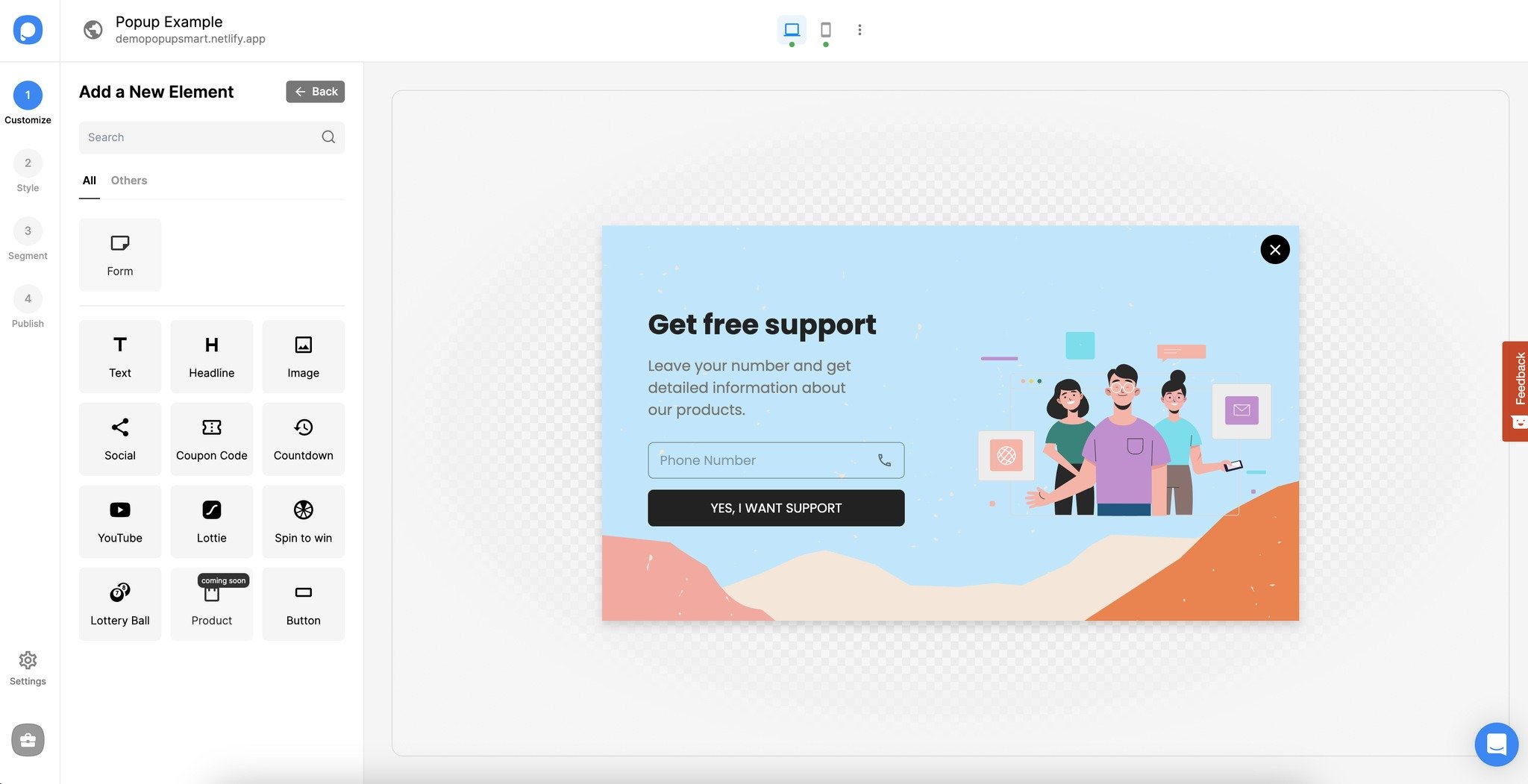
Learn which element options you can add to your popup designs according to your business goals.
If you have any questions related to which elements to add to your popup, feel free to contact us!
How is this guide?