21 Marketing Experiment Examples for 2026 Optimization
Marketing experiments are structured, data-driven tests (often A/B) that isolate one change, track key metrics, run to statistical significance, analyze results, then iterate. It outlines 21 experiment ideas across web, messaging, CRO, lead gen, and retention (e.g., speed, copy, popups, personalization, trust signals).
Marketing experiment examples range from A/B testing landing page copy and popup timing to running personalized retargeting ads and scarcity messaging tests. The 21 experiments below cover website optimization, content messaging, conversion rate optimization, lead generation, and customer retention, each with a hypothesis, step-by-step setup, and expected outcome so you can start testing this week.
According to The Marketing Agency, companies running data-driven marketing experiments see conversion rate improvements of up to 30%, with some achieving revenue increases exceeding 25% within three months.
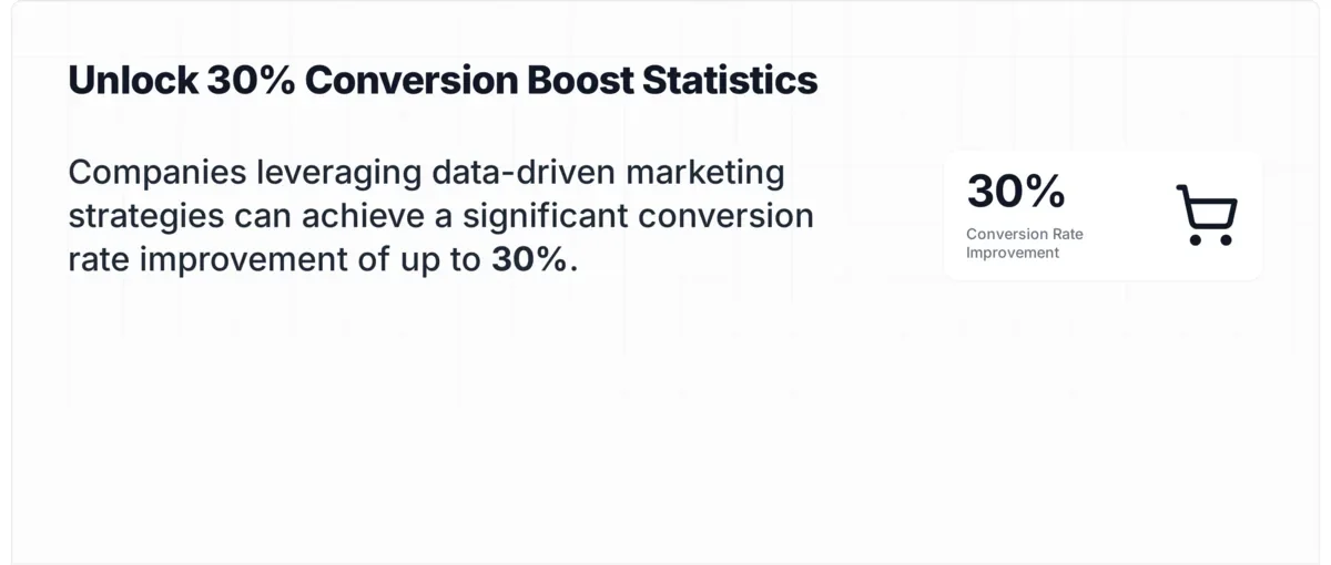
Data-driven experiments drive up to 30% conversion lift
Whether you're running your first A/B test or your fiftieth, the examples in this post are organized by category so you can jump straight to what matters for your current campaign.
What Is a Marketing Experiment?
A marketing experiment is a controlled test where you change one variable in a campaign, measure the result against a baseline, and decide whether to keep the change. It's the same scientific method you learned in school, applied to CTAs, emails, ad creatives, and landing pages.
The process follows a simple loop: form a hypothesis, isolate a single variable, split your audience, measure the outcome, then iterate. Every experiment needs a clear metric (conversion rate, click-through rate, churn rate) and enough sample size to reach statistical significance.
How to Design Effective Marketing Experiments
Before jumping into examples, here's the framework that makes experiments reliable instead of random guessing.
Three ingredients of a valid marketing experiment
1. Start with a research-based hypothesis. Don't test randomly. Pull from heatmaps, session recordings, or campaign data. A good hypothesis looks like: "Moving the signup form above the fold will increase conversions by 15% because heatmaps show 70% of visitors never scroll past the hero section."
2. Isolate one variable. If you change the headline and the button color at the same time, you won't know which change moved the needle. Test one element per experiment.
3. Pick your success metric before you start. Conversion rate, click-through rate, bounce rate, revenue per visitor. Define the metric upfront so you don't cherry-pick favorable results later.
4. Run the test long enough. A few hundred visitors per variant is the minimum for most tests. End the test early and you risk acting on noise instead of signal.
5. Document everything. Record the hypothesis, start date, sample size, and result. A spreadsheet or experiment tracker (Notion, Google Sheets) works fine. This log becomes your team's institutional knowledge.
Quick Summary of 21 Marketing Experiment Examples
| # | Experiment | Category | What You'll Learn |
|---|---|---|---|
| 1 | Page load speed optimization | Website | Speed vs. conversion correlation |
| 2 | Landing page copy changes | Website | CTA wording impact on signups |
| 3 | Popup timing for lead capture | Website | Delay vs. immediate popup performance |
| 4 | Hero image removal | Website | Text vs. image above the fold |
| 5 | Personalized homepages | Website | Behavior-based content vs. static |
| 6 | Emotional email subject lines | Content | Urgency vs. neutral open rates |
| 7 | Long-form vs. short-form blog | Content | Word count vs. engagement |
| 8 | Storytelling in emails | Content | Narrative vs. promotional CTR |
| 9 | Dynamic text in popups | Content | Personalized vs. static messages |
| 10 | Social proof on landing pages | Content | Testimonials vs. no testimonials |
| 11 | Multi-step vs. single-step forms | CRO | Form structure vs. abandonment |
| 12 | Trust signals on checkout | CRO | Security badges vs. no badges |
| 13 | Scarcity messaging | CRO | Urgency copy vs. standard copy |
| 14 | Personalized retargeting ads | CRO | Tailored vs. generic ad creative |
| 15 | Countdown timer optimization | CRO | Timer design and placement impact |
| 16 | Video vs. text testimonials | Lead Gen | Media format vs. conversion |
| 17 | Gated vs. ungated content | Lead Gen | Lead quality vs. volume tradeoff |
| 18 | Interactive quizzes vs. forms | Lead Gen | Engagement vs. completion rate |
| 19 | Re-engagement campaigns | Retention | Personalized vs. generic win-back |
| 20 | Automated loyalty emails | Retention | Milestone triggers vs. no emails |
| 21 | Satisfaction surveys | Retention | Survey feedback vs. churn rate |
Website Optimization Experiments
Website experiments test structural and design changes that affect how visitors interact with your pages. These five examples focus on speed, copy, timing, layout, and personalization.
1. Page Load Speed vs. Conversion Rate
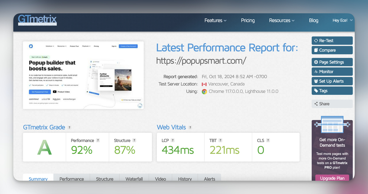
GTmetrix performance report for Popupsmart
What it is: Measure whether reducing page load time from 8+ seconds to under 3 seconds on mobile increases conversions. Use Google PageSpeed Insights or GTmetrix to benchmark before and after.
How to run it: Compress images, minify CSS/JS, enable browser caching, and consider a CDN. Then split traffic between the original (slow) page and the optimized version. Track conversion rate as the primary metric and bounce rate as secondary.
Why it works: Every additional second of load time increases bounce probability. Visitors on mobile are especially impatient. Faster pages reduce friction before the user even sees your offer.
Expected outcome: A 10-20% conversion lift on mobile if you cut load time by 50% or more. The exact number depends on your baseline speed and audience patience.
Key takeaway: Audit your mobile load time first. If it's over 4 seconds, speed optimization will likely outperform any copy or design test you could run.
2. Landing Page CTA Copy Test
Popupsmart's homepage
What it is: Swap your CTA text (e.g., "Get Started" to "Get Popupsmart Free") and measure whether the new copy converts better. At Popupsmart, we updated our CTAs to "Get Popupsmart Free" and "Create a Free Account" to make the value proposition explicit.
How to run it: Write 2-3 CTA variations. Keep everything else on the page identical. Split test the variants with equal traffic allocation. Run until you have at least 500 conversions per variant.
Why it works: CTAs that communicate a specific benefit ("Get Free Account") outperform vague ones ("Get Started") because they reduce uncertainty. The visitor knows exactly what happens after clicking.
Expected outcome: 5-15% conversion rate change. Sometimes a single word swap produces double-digit gains.
Key takeaway: Replace generic CTAs with value-specific language that tells the visitor exactly what they get. "Start Free Trial" beats "Submit" every time.
3. Popup Display Timing Test
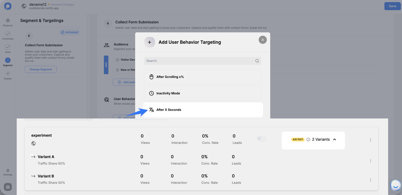
Popup timing controls in Popupsmart
What it is: Test whether delaying your popup by 30-60 seconds (instead of showing it immediately) increases lead conversions. Popup timing is one of the simplest experiments with the biggest upside.
How to run it: Create two popup variants in popup builder Popupsmart with identical design and copy. Set Version A to trigger at 5 seconds, Version B at 60 seconds. Keep all other targeting rules the same and let the built-in A/B testing feature split the traffic.
Why it works: A popup that fires before the visitor understands your page feels intrusive. Delayed popups reach visitors who've already shown interest by staying on the page, making them more receptive to an offer.
Expected outcome: 10-25% increase in popup conversion rate with a 30-60 second delay, depending on page content length.
Key takeaway: Test at least three timing intervals (5s, 30s, 60s) and pick the one that balances conversion rate with total lead volume. Longer delays convert better per impression but reach fewer visitors.
4. Hero Image Removal Test
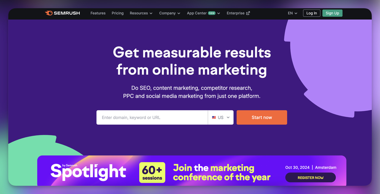
Semrush replaced the hero image with value text
What it is: Replace your hero image with a text-based value proposition and measure whether conversions increase. Semrush uses this approach, leading with benefit-driven copy instead of a stock graphic.
How to run it: Create a variant page where the hero image is replaced with a short headline + subheadline + CTA. Keep the rest of the page identical. Split traffic 50/50 and track scroll depth, bounce rate, and conversion rate.
Why it works: Hero images often look good but say nothing. Text lets you communicate your value proposition in the first 2 seconds of a page visit. Visitors who understand your offer immediately are more likely to convert.
Expected outcome: 5-15% conversion lift for pages where the hero image was decorative rather than informational.
Key takeaway: If your hero image doesn't explain what you do or reinforce your CTA, test removing it. The space above the fold is too valuable for decoration.
5. Personalized Homepage Based on User Behavior
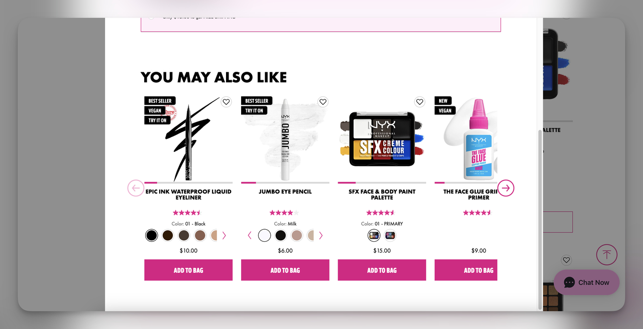
NYX shows personalized product recommendations
What it is: Show returning visitors a homepage tailored to their browsing history. Cart abandoners see their abandoned products. Category browsers see personalized product recommendations. First-time visitors see the default page.
How to run it: Segment your audience into 2-3 behavior groups (cart abandoners, category viewers, new visitors). Use a personalization tool like Dynamic Yield or Optimizely to serve different homepage variants. The control group sees the standard homepage.
Why it works: Personalized experiences reduce the cognitive effort required to find relevant products. The visitor doesn't need to re-navigate to where they left off.
Expected outcome: 15-25% conversion rate increase for returning visitors who see personalized content vs. the generic homepage.
Key takeaway: Start with your highest-value segment (cart abandoners) and personalize for them first. Once you see results, expand to other behavior groups.
Content and Messaging Experiments
These five experiments test how the words you use in emails, blog posts, popups, and landing pages affect engagement and conversions.
6. Emotional vs. Neutral Email Subject Lines

Urgency subject line from Bakley email
What it is: Test whether subject lines with FOMO increase open rates compared to neutral, informational subject lines. According to Invesp, urgency-driven subject lines can produce 22% higher open rates.
How to run it: Write two subject lines for the same email. Version A: "Your Weekly Update." Version B: "Ends Tonight: Your Weekly Update Inside." Send each to 50% of your list via Mailchimp or Klaviyo. Keep send time, sender name, and email body identical.
Why it works: Urgency triggers loss aversion. People act faster when they believe an opportunity is disappearing. The fear of missing out is a stronger motivator than the promise of gaining something.
Expected outcome: 10-22% open rate increase for the urgency variant. Watch the unsubscribe rate too. If urgency feels manipulative, it can backfire.
Key takeaway: Use urgency only when it's real. "Sale ends Friday" works if the sale actually ends Friday. Fake urgency erodes trust fast.
7. Long-Form vs. Short-Form Blog Content
What it is: Publish the same topic as a 500-word summary and a 2,000+ word guide. Measure which version drives longer session duration, lower bounce rates, and more social shares.
How to run it: Pick a topic your audience cares about. Write both versions at equal quality (don't pad the long version with filler). Publish them on separate URLs and send equal traffic via paid ads or email. Track time on page, bounce rate, and downstream conversions.
Why it works: Long-form content ranks better for competitive keywords because it covers more subtopics and earns more backlinks. But short-form content works for simple queries where the reader wants a quick answer.
Expected outcome: Long-form typically wins on session duration (+20-40%) and organic rankings. Short-form may win on completion rate and social sharing for certain audiences.
Key takeaway: Don't default to long-form for every topic. Match content length to search intent. "What is X" needs 500 words. "Complete guide to X" needs 2,000+.
8. Storytelling vs. Promotional Emails
What it is: Send one email with a direct promotional message ("Shop Our Fall Collection Now!") and another that wraps the same offer in a narrative ("How Our Fall Collection Was Inspired by Nature"). Compare click-through rates.
How to run it: Use an email marketing automation platform to split your audience 50/50. Version A is the straightforward promo. Version B leads with a story and introduces the offer mid-email. Keep the CTA button identical in both.
Why it works: Stories activate the brain's narrative processing. Readers who feel emotionally connected to a brand story are more likely to click through than readers scanning a list of product features.
Expected outcome: 10-20% higher CTR for the storytelling version, especially for brand-aware audiences. Cold audiences may prefer the direct approach.
Key takeaway: Storytelling works best for middle-of-funnel emails where the reader already knows your brand. For cold outreach, lead with the offer.
9. Dynamic Text Replacement in Popups
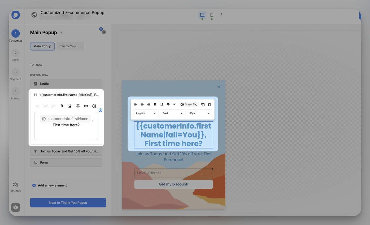
Popupsmart's dynamic text replacement
What it is: Personalize popup messages using smart tags. Instead of "Welcome! First time here?" show "Welcome, Ece! First time here?" by pulling the visitor's name from your CRM data.
How to run it: Create two popup versions in Popupsmart. Version A uses static text. Version B uses smart tags like {{customerInfo.firstName|fall=visitor}} to insert the visitor's name. Split traffic evenly and compare CTR and conversion rate.
Why it works: Personalized greetings grab attention because the visitor's own name is the most attention-getting word they can see. It signals that you know them, which builds trust and reduces the feeling of a generic ad.
Expected outcome: 15-25% increase in popup engagement rate for returning visitors whose data is available. First-time visitors see the fallback text and perform at baseline.
Key takeaway: Dynamic text works best for returning visitors. If most of your traffic is new and anonymous, focus on offer testing instead of personalization.
10. Social Proof on Landing Pages
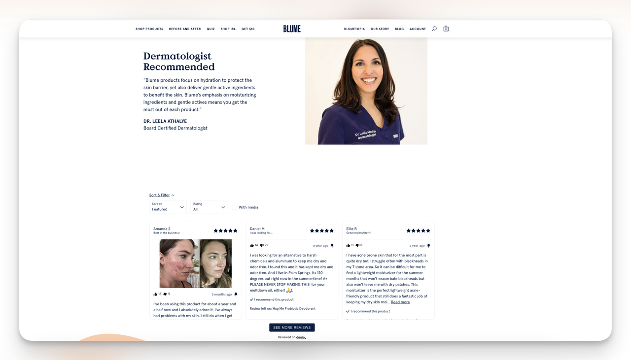
Blume combines expert and customer reviews
What it is: Add customer testimonials, star ratings, or expert endorsements near your CTA and measure whether conversions increase. Blume does this well by pairing dermatologist reviews with real customer feedback on the same page.
How to run it: Pick 2-3 high-traffic landing pages. Create a variant with social proof placed above the fold or directly next to the CTA. The control stays unchanged. Track conversion rate and bounce rate.
Why it works: Social proof reduces purchase anxiety. When visitors see that other people (especially people similar to them) had a positive experience, the perceived risk of taking action drops.
Expected outcome: 10-15% conversion rate increase when testimonials are placed near the primary CTA. Expert endorsements (doctors, industry leaders) tend to outperform peer reviews for high-consideration purchases.
Key takeaway: Place your strongest testimonial within visual range of your CTA button. If the social proof and the action button aren't on the same screen, the effect is cut in half.
Conversion Rate Optimization (CRO) Experiments
CRO experiments target the checkout funnel, product pages, and ad retargeting flows where small changes create direct revenue impact.
11. Multi-Step Forms vs. Single-Step Forms
What it is: Break a long form (name, email, company, phone, message) into 2-3 shorter steps with a progress bar. Compare completion rates against the original single-page form.
How to run it: Create a multi-step form with Popupsmart or Typeform. Step 1: email only. Step 2: name and company. Step 3: message. The control is the same form with all fields on one page. Split traffic and track form completion rate and abandonment rate.
Why it works: Multi-step forms use the commitment and consistency principle. Once someone completes Step 1 (just an email), they feel invested and are more likely to finish the remaining steps. The progress bar also reduces perceived effort.
Expected outcome: 15-25% reduction in form abandonment. The trade-off is slightly longer completion time, but the net lead volume is usually higher.
Key takeaway: Put the easiest field (email) first. If someone bounces after Step 1, you still captured their email for follow-up.
12. Trust Signals on Checkout Pages
What it is: Add or reposition security badges, payment icons, and customer reviews on your checkout page. According to a Baymard Institute study featured on Statista, 19% of consumers abandon checkout because they don't trust the site with their credit card.
How to run it: Version A is your current checkout page. Version B moves the SSL badge and payment icons (Visa, MasterCard, PayPal) directly next to the payment form, and adds 1-2 customer review snippets near the "Place Order" button. Track cart abandonment rate and conversion rate.
Why it works: Trust badges act as risk reducers at the moment of highest friction. Placing them where the visitor enters sensitive data is more effective than burying them in the footer.
Expected outcome: 5-12% reduction in cart abandonment. The impact is strongest for lesser-known brands where visitors haven't yet built trust.
Key takeaway: Position your SSL badge within 50 pixels of the credit card input field. That's the exact moment the visitor is deciding whether to trust you.
13. Scarcity Messaging on Product Pages
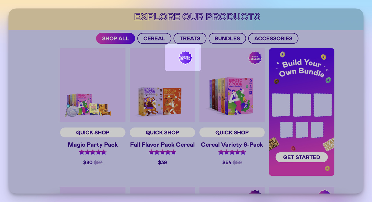
Magic Spoon's limited edition labeling
What it is: Add real-time stock indicators ("Only 3 left!") or time-limited offer messaging to product pages and measure the effect on sales. Magic Spoon uses "Limited Edition" labels on seasonal flavors to drive faster purchases.
How to run it: Version A: standard product page. Version B: same page with scarcity messaging near the add-to-cart button. The scarcity message must reflect real inventory or a real deadline. Run the test for at least two weeks with equal traffic distribution.
Why it works: Scarcity triggers the "loss aversion" bias. People value things more when they believe availability is limited. The fear of missing out drives faster purchasing decisions.
Expected outcome: 10-20% increase in add-to-cart rate. Be careful: fake scarcity ("Only 2 left!" when you have 2,000 units) damages trust if customers catch on.
Key takeaway: Only use scarcity messaging tied to actual inventory data or real promotion deadlines. Authentic urgency converts. Manufactured urgency backfires.
14. Personalized vs. Generic Retargeting Ads
What it is: Compare generic retargeting ads ("Come Back and Shop!") against personalized ones that reference the specific product the visitor viewed or left in their cart ("You left the Blue Running Shoes in your cart. Here's 10% off.").
How to run it: Segment your audience by behavior: product viewers, cart abandoners, and content readers. Create personalized ad creative for each segment. Run both ad sets on Google Ads or Meta with equal budgets. Track CTR, return visit rate, and conversion rate.
Why it works: Personalized ads feel relevant, not spammy. A visitor who sees the exact product they were considering is far more likely to click than someone seeing a generic brand ad. The specificity signals that you're paying attention.
Expected outcome: 15-30% higher CTR and 10-20% higher conversion rate for personalized retargeting vs. generic ads.
Key takeaway: Start with cart abandoner retargeting since that segment has the highest purchase intent. Personalized cart reminders with a small discount (5-10%) are the highest-ROI retargeting play for most e-commerce stores.
15. Countdown Timer Design and Placement Test
What it is: Test different countdown timer designs (bold vs. subtle), positions (top banner vs. near CTA), and durations (24 hours vs. 72 hours) to find the combination that drives the most conversions during time-limited promotions.
How to run it: Choose an upcoming promotion with a real end date. Create 2-3 countdown timer variants. Version A: small, standard timer near the product price. Version B: large, high-contrast timer at the top of the page with an animated bar. Track conversion rate, time on page, and cart abandonment.
Why it works: Countdown timers make abstract deadlines concrete. "Sale ends Sunday" is easy to dismiss. A ticking clock showing "11:42:03 remaining" creates genuine urgency that's hard to ignore.
Expected outcome: 8-15% conversion rate increase for bold, prominently placed timers vs. small, subtle ones. Timers under 24 hours create stronger urgency than multi-day countdowns.
Key takeaway: Place the countdown timer where the visitor makes the purchase decision, not just at the top of the page. A timer next to the "Add to Cart" button outperforms a banner timer.
Lead Generation Experiments
Lead generation experiments focus on how you capture contact information. The format of your form, the type of social proof, and whether you gate your content all affect lead volume and quality.
16. Video Testimonials vs. Text Testimonials
What it is: Replace text-based testimonials on your key landing pages with 30-60 second video testimonials from real customers. Measure whether the richer media format drives more signups or purchases.
How to run it: Record 3-5 short customer testimonial videos (phone quality is fine, authenticity matters more than production value). Place them in the same page location where text testimonials currently sit. Split traffic between the text and video versions.
Why it works: Video testimonials carry more emotional weight because viewers can see facial expressions, hear tone of voice, and judge authenticity in ways that text can't convey. A real person speaking about their experience is harder to fake than a written quote.
Expected outcome: 10-25% conversion rate increase for video testimonials. The effect is strongest for high-consideration products (SaaS, services, expensive goods) where trust is the primary conversion barrier.
Key takeaway: Keep testimonial videos under 60 seconds. The viewer decides within 10 seconds whether to keep watching. Lead with the strongest result ("We increased conversions by 40%") and tell the story after.
17. Gated vs. Ungated Content
What it is: Take the same piece of content (whitepaper, industry report, template) and test whether gating it behind a lead form captures higher-quality leads than making it freely available.
How to run it: Version A: the content is freely accessible. Version B: visitors fill out a form (name + email) before accessing the content. Track total downloads, lead generation form completion rate, and lead quality (measured by email engagement and follow-up conversion).
Why it works: Gated content acts as a filter. People who are willing to exchange their email for your content are more likely to be genuinely interested in your product. Ungated content reaches more people but produces fewer identifiable leads.
Expected outcome: Gated content produces 60-80% fewer downloads but 2-3x higher lead-to-customer conversion rate. The right choice depends on whether you need volume or quality.
Key takeaway: Gate your deepest, most valuable content (original research, tools, templates). Leave educational blog content ungated to build top-of-funnel awareness.
18. Interactive Quizzes vs. Static Lead Forms
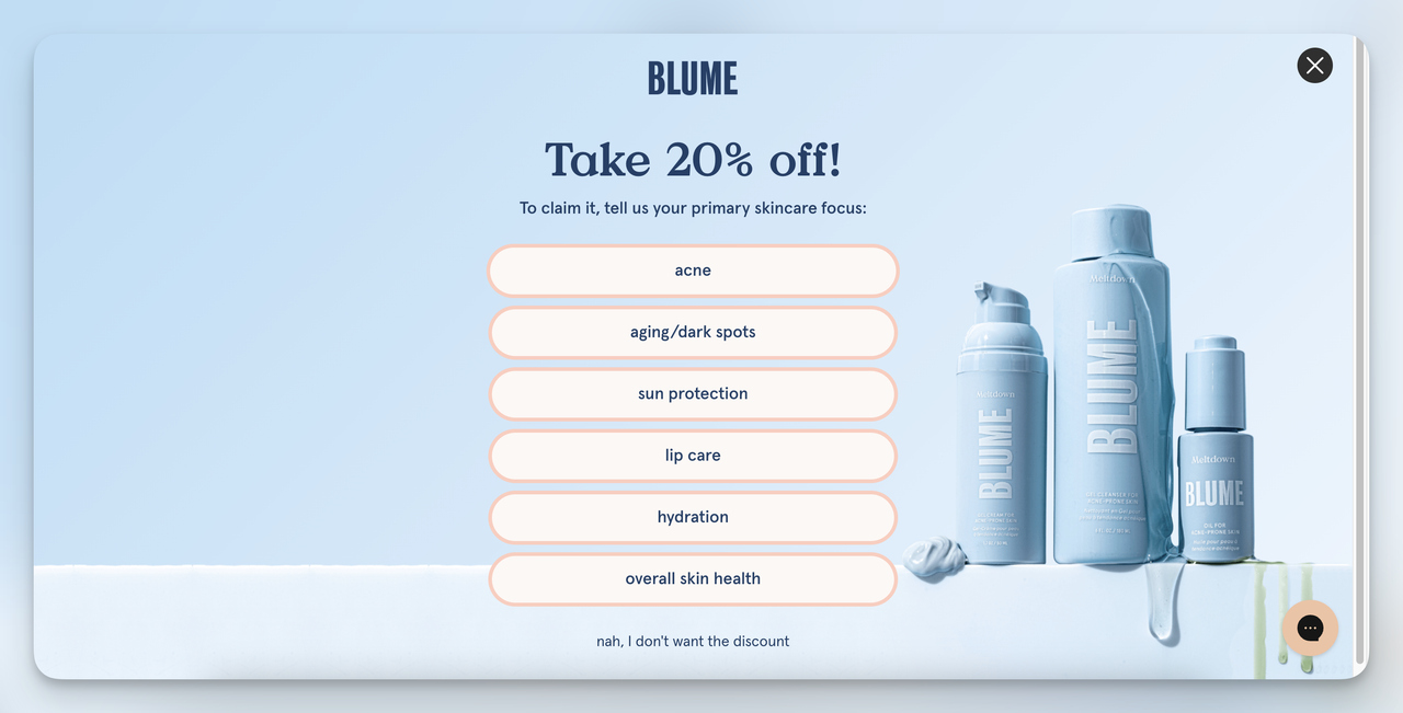
Blume's quiz-based lead capture form
What it is: Replace your standard lead form with an interactive quiz ("What's your marketing style?" or "Which popup strategy fits your store?"). The quiz asks 3-5 engaging questions, then collects contact info in exchange for personalized results.
How to run it: Build the quiz using Popupsmart. The control is your existing static form. Split traffic and track lead volume, completion rate, and engagement time. Compare the quality of leads generated by each method over 30 days.
Why it works: Quizzes tap into curiosity and self-assessment. People want to know their "type" or "score." By the time they reach the email capture step, they're already invested in seeing their result, making them far more likely to submit their contact info.
Expected outcome: 20-40% more leads from the quiz variant. Lead quality is comparable or slightly higher because the quiz pre-qualifies respondents through their answers.
Key takeaway: Keep quizzes to 3-5 questions max. Every additional question after five drops completion rate by roughly 10%. Put the email capture on the results page, not before the quiz starts.
Lead Nurturing and Customer Retention Experiments
Retention experiments are underrated. According to HubSpot's State of Marketing report, 61% of marketers say the industry is experiencing its biggest disruption in 20 years due to AI, which means your existing customers are being bombarded with alternatives. Keeping them engaged matters more than ever.
19. Personalized Re-Engagement Campaigns for Inactive Users
What it is: Send targeted win-back emails to users who haven't engaged in 60+ days. Version A: generic "We miss you!" email. Version B: personalized email referencing their past behavior with a specific incentive ("Here's 10% off the running shoes you viewed last month").
How to run it: Define "inactive" for your business (no login, no email open, no purchase in X days). Segment inactive users and split them between the generic and personalized campaigns. Track re-engagement rate (opened email + visited site), conversion rate, and unsubscribe rate over 2-4 weeks.
Why it works: Generic win-back emails blend into the inbox. Personalized ones stand out because they reference something specific the customer did, proving you remember them. The incentive lowers the friction of returning.
Expected outcome: 8-15% re-engagement rate for personalized campaigns vs. 3-5% for generic ones. The incremental revenue from reactivated customers often exceeds the discount cost.
Key takeaway: Trigger your re-engagement campaign at 45-60 days of inactivity, not 90+. The longer a customer stays dormant, the harder they are to win back.
20. Automated Loyalty Program Emails
What it is: Set up automated emails triggered by customer milestones: 500 loyalty points earned, third purchase, six-month anniversary. Compare repeat purchase rates between customers who receive these emails and those who don't.
How to run it: Use Klaviyo or Mailchimp to create milestone-triggered automations. Version A (control): no loyalty emails. Version B: automated emails at 3+ milestones with a small reward attached ("You've earned 500 points. Here's a 10% discount."). Track repeat purchase rate, customer lifetime value (CLV), and email engagement over 3-6 months.
Why it works: Milestone emails combine recognition with reward. The customer feels acknowledged (which builds emotional loyalty) and receives a tangible incentive to buy again (which drives behavioral loyalty).
Expected outcome: 12-20% increase in repeat purchase rate for the loyalty email group. CLV improvements compound over time as customers get deeper into the program.
Key takeaway: Celebrate the customer's achievement, not your program. "You've earned 500 points!" works better than "Our loyalty program has rewarded you." Make the customer the hero.
21. Post-Purchase Satisfaction Surveys to Reduce Churn
What it is: Send a short satisfaction survey (1-5 scale + one open-ended question) after key customer interactions: purchase, support ticket resolution, or subscription renewal. Use the feedback to identify at-risk customers and intervene before they churn.
How to run it: Version A: no follow-up survey. Version B: automated survey sent 24-48 hours after the interaction. Flag any response below 3/5 for immediate follow-up by your support team. Track churn rate, survey response rate, and customer feedback trends over 4-6 weeks.
Why it works: Surveys give unhappy customers a voice. When someone rates their experience 2/5 and your team reaches out within 24 hours, you can often resolve the issue before the customer cancels. The act of asking also signals that you care.
Expected outcome: 8-12% reduction in churn rate for the surveyed group, primarily from catching and resolving issues that would otherwise go unreported.
Key takeaway: Keep surveys to one question plus a rating. Anything longer than 30 seconds to complete kills response rates. The goal is to identify unhappy customers, not to run a research study.
How to Analyze Marketing Experiment Results and Iterate
Running the experiment is only half the work. Here's how to interpret results without falling into common traps.
Wait for statistical significance. A 10% conversion rate difference after 50 visitors means nothing. Use a significance calculator (like Evan Miller's sample size calculator) to determine how many visitors you need before calling a winner.
Watch for novelty effects. New elements (popups, CTAs, page designs) often perform well initially because they're unfamiliar. Check your results at week one and week four. If performance drops significantly, the initial lift was novelty, not a real improvement.
Don't ignore secondary metrics. A CTA change might boost signups 15% but also increase support tickets 30%. Always check downstream effects before rolling out a winning variant.
Build a testing cadence. Run 2-4 experiments per month. Stack winners on top of each other. A 5% lift from one test, compounded with 5% lifts from three more tests, adds up to a 21.5% total improvement.
Which Tools Work Best for Marketing Experiments?
The right tool depends on what you're testing. Here's a quick breakdown by experiment type:
| Experiment Type | Recommended Tools | Starting Cost |
|---|---|---|
| Popup and on-site messaging | Popupsmart (free plan available, A/B testing included in Advanced plan) | Free / $69/mo |
| Landing page A/B tests | VWO, Optimizely | $0–$49/mo |
| Email campaigns | Mailchimp, Klaviyo, HubSpot | Free tier available |
| Ad creative testing | Google Ads, Meta Ads Manager | Pay per click |
| Heatmaps and recordings | Hotjar, Microsoft Clarity | Free tier available |
| Statistical analysis | Google Sheets | Free |
If you're testing popups, form designs, or on-site messages, Popupsmart's A/B testing feature lets you create variants and split traffic without touching code. You can test popup timing, copy, design, and targeting rules from a single dashboard.
For broader website experiments, conversion rate optimization tools like VWO or AB Tasty handle page-level changes. Pair them with heatmap tools like Microsoft Clarity to understand why a variant won, not just that it won.
Start Running Your First Marketing Experiment
The 21 marketing experiment examples above cover the full funnel: from how your website loads to how you win back inactive customers. You don't need to run all 21. Pick the one closest to your biggest bottleneck. If your traffic is high but conversions are low, start with CRO experiments (11-15). If you're struggling with lead quality, try the lead generation experiments (16-18). If churn is your problem, jump to retention tests (19-21).
The teams that grow fastest aren't the ones with the best guesses. They're the ones that test systematically, learn from failures, and compound small wins over time.
Frequently Asked Questions
What are the 4 types of marketing experiments?
The four main types are A/B tests (comparing two versions of one variable), multivariate tests (testing multiple variables simultaneously), split URL tests (sending traffic to completely different pages), and holdout tests (comparing a group that receives a campaign against a group that doesn't). A/B tests are the most common starting point because they're simple to set up and easy to interpret.
What are common metrics for marketing experiments?
The most common primary metrics are conversion rate, click-through rate (CTR), bounce rate, and revenue per visitor. Secondary metrics include average order value, time on page, form completion rate, email open rate, and customer lifetime value. Always pick your primary metric before starting the experiment to avoid bias in interpretation.
Why are marketing experiments important for SaaS?
SaaS businesses depend on recurring revenue, which means small improvements in trial-to-paid conversion, onboarding completion, or churn rate compound over time. A 5% improvement in trial conversion doesn't just add customers this month. It adds customers every month going forward. That compounding effect makes experimentation one of the highest-ROI activities for SaaS growth teams.
What makes a good marketing experiment hypothesis?
A good hypothesis has three parts: a specific change ("moving the CTA above the fold"), a predicted outcome ("will increase signups by 10%"), and a reason based on evidence ("because heatmaps show 60% of visitors never scroll past the hero section"). If you can't articulate why you expect the change to work, the hypothesis isn't ready.

How would you rate your experience with this article? 😊