
Most CTA guides repeat two tips: a louder button colour and urgency words. Across the popups we power, between January 2024 and September 2026, we measured which button choices changed lead conversion. Only one made a reliable difference: first-person wording.
What did we measure on popup CTA buttons?
We compared popups that ask for an email address or phone number by lead conversion rate: leads per popup display, median campaign. The method is in the 2026 popup conversion benchmark.
What we measured on popup buttons (rates per popup display, median campaign; the wording rows cover English popups):
| Element | What we saw | How sure |
|---|---|---|
| First-person wording ("Send my code") | 1.18% vs 0.80% for neutral wording | Reliable |
| Value verbs ("Get", "Claim", "Unlock") vs "Subscribe" / "Join" | 1.06% vs 0.77% | Lean, not statistically reliable |
| Emoji in the headline or button | Click rate 2.76% vs 2.20%; no measurable difference in leads | Lean on clicks, not statistically reliable |
| Button colour, dark vs light popup backgrounds, urgency words, question headlines | No gap we could measure; the data are too noisy to rule out modest effects | No measurable effect |
What are the types of call to action?
You can see the most common CTAs almost every day, such as "Add to Cart", "Buy Now", "Subscribe", or "Download for Free", mostly in the form of a button.
Most pages have one primary CTA, the step you most want ("Start free trial"), and quieter secondary CTAs for visitors who aren't ready yet ("See pricing"). By format:
| Format | Where it appears | Example copy |
|---|---|---|
| Button | Product pages, forms | "Add to Cart" |
| Text link | Articles, emails | "Read the setup guide" |
| Banner, floating bar or sticky mobile bar | Top or bottom edge of the screen | "Book a call" |
| Popup | Over the page, after a trigger | "Send my code" |
| Exit-intent popup | When the visitor moves to leave | "Save my cart" |
Popupsmart builds popups, banners, floating bars and slide-ins; start from its ready-made popup templates and rewrite the button in your own words.
What Should an Effective CTA Contain?
Because CTAs are everywhere on the web, a generic one is easy to ignore. An effective CTA gets four things right:
- Clarity: You must create your CTAs with a direct and straightforward message because users would want to know what happens when they follow through with the desired action (for example, when they click the button).
- Design: The words need a button people notice, with contrast against the page, a shape that looks clickable and space around it.
- Positioning: The position of CTAs in the web page is as important as the text, format, or color. On an e-commerce site, the product page must have the "Add to Cart" button in the correct place, or the "Sign Up" button on a landing page should be placed in an appropriate place. You may examine whether CTAs are used correctly or not by performing regular A/B split tests.
- Size and accessibility: A CTA has to be easy to tap. WCAG 2.2's target size criterion asks for at least 44 by 44 CSS pixels at level AAA (24 by 24 at AA), and Apple's Human Interface Guidelines list 44x44 pt as the default control size on iOS. Put the action in text, not only an icon.
How do you write a call to action?
Name one action and the result of the click, in words the visitor would say:
- Pick one action. Make the step you most want the primary button; anything else becomes a secondary link.
- Say what happens after the click. "Send my code" tells visitors what they get; "Submit" doesn't. A 2017 Nielsen Norman Group article found that a generic "Get Started" button attracts clicks but misleads users.
- Write it in the first person. This is the one reliable finding in the table above. When I write a popup button, I read it after the words "I want to…" and rewrite it until the sentence works: "Send my code", "Save my cart", "Show me the sizes".
- Promise value, then test it. "Get" and "Claim" look stronger than "Subscribe" or "Join" in our data, but the gap is not statistically reliable, so I treat "Get my discount" as a variant to test.
- Test one change at a time. Popupsmart runs A/B split tests from the Advanced plan up (set up a popup A/B test). I leave colour and urgency words out of the first tests, since neither showed a measurable effect, and judge by leads: in our emoji data, a slightly higher click rate came with no measurable difference in leads.
Effective call to action examples
CTAs with Social Evidence
Social proof is referred to as the provision of testimonials from previous users to convince users of your credibility and to establish reliability. Next to a CTA, that can be a star rating or a one-line quote placed right by the button.
Customized CTAs with Retargeting
By using the Meta Pixel (formerly the Facebook Pixel) or Google Remarketing offers, you can present CTAs to segmented users who have visited certain pages or performed specific actions on your website. For example, you can increase the conversion rate by showing ads that are aimed at people who have viewed certain categories on your e-commerce site or who have added products to the shopping cart but have not completed their order.
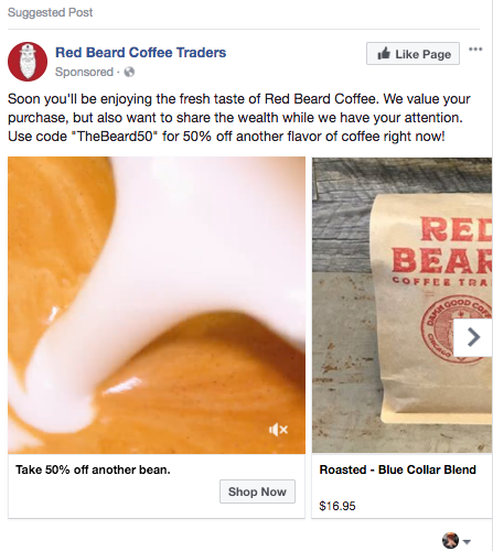
In the example above, there is a Facebook Carousel ad for Red Beard Coffee, which targets real coffee drinkers. The CTA of "Earn 50% Discount" by giving a discount code to a specific audience is an example of retargeting.
Highlight The Problem and Offer a Solution Using CTAs
Whether you provide services or sell products, you can attract users by highlighting a specific problem that your potential customers may have faced in the past. Then, with the help of a CTA, you can emphasize that you have a solution to this problem.
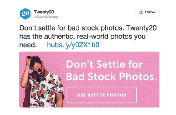
In the example above, you can see a brand that offers stock photos. "Don't settle for bad stock visuals. We have real visuals from the real world" is paired with the "Use better visuals" CTA and is able to draw traffic to the website.
Be Positive and Deliver Exactly What Users Want
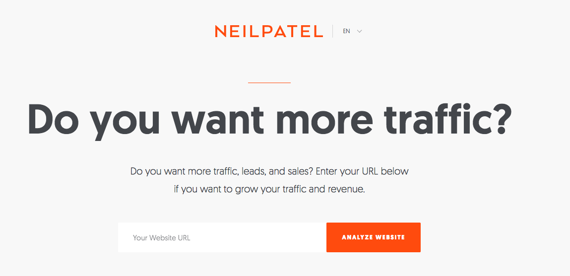
Neil Patel, whom most people in the digital marketing sector are familiar with, communicates with his users through a "Do you want more traffic, more sales?" CTA. The question names the outcome readers want, which encourages them to write their email addresses on the form.
Use the Instagram bio as a CTA
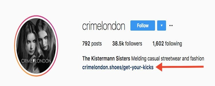
On Instagram, which is very important for almost every brand today, it is not possible to create a customized call to action button.
Nevertheless, the Instagram bio and the space reserved for the website link let you write the CTA in your own words. This means that you can use your creative CTA there.
Have Simple But Creative CTAs
Sometimes, when you say it should be "better", or "more creative", nothing comes up. In such cases, sticking to simpler ideas will save the day. Simple CTAs that attract the attention and curiosity of the target audience can be more clickable than you think.
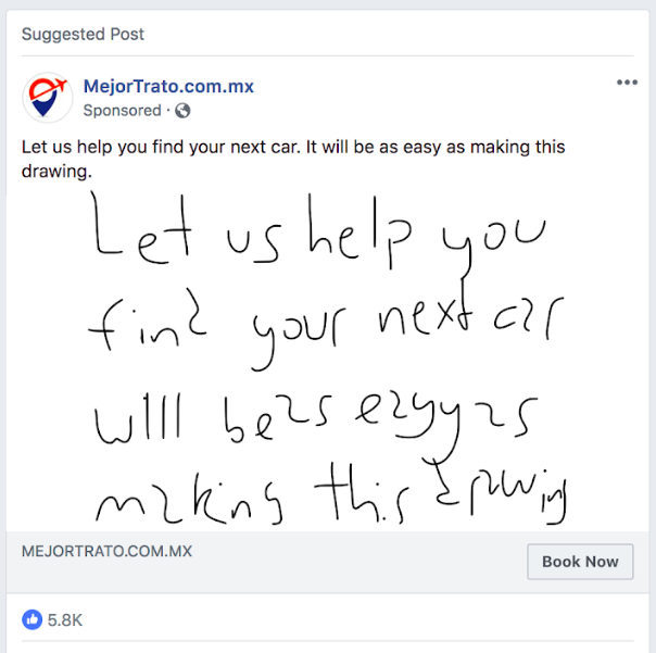
The above is a delightful visual example of a simple and creative CTA: "Let us find your next car. This will be much easier than drawing." The copy names the job, finding a car, and makes the brand's help sound easier than doing it yourself.
Feel Free to Try Different Fonts in Your CTAs
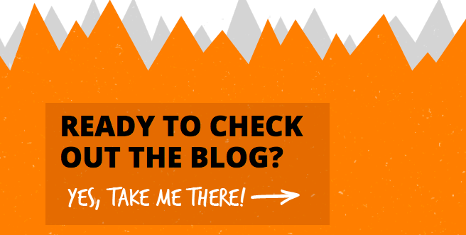
CTA text is written in a darker box as compared to the background color. This box in the form of a button is not interesting when it is viewed as a CTA. Setting the CTA text in a different font can make the button stand out; test it as a variant rather than assume it lifts clicks.
Most designers avoid sudden transitions between fonts, so keep the change to the button and keep the words readable.
Frequently asked questions
What is the difference between a CTA and CTR?
A CTA is the prompt, the button or link that asks for an action. Click-through rate (CTR) is the share of people who saw it and clicked. You judge a CTA by its CTR, then by its conversion rate.
What is a call to action in an essay or persuasive writing?
In an essay or a speech, it is the closing line that tells the reader what to do next. Wikipedia's call to action entry defines the marketing sense as text designed to prompt an immediate response or encourage an immediate sale.