15 Lead Generation Form Examples That Convert in 2026
Article showcases 15 high-performing lead gen forms (sales/contact, demos, sign-ups, quizzes, and gamified/exit-intent popups) highlighting tactics like social proof, incentives, segmentation, and witty CTAs, plus benefits and optimization tips.
Lead generation forms are the crucial gateway to connect with potential customers and expand your business's reach.
An effective lead generation strategy can make all the difference in converting visitors into valuable leads and, eventually, loyal customers.
In this blog post, we'll explore 15 lead generation form examples, why these forms are crucial for your business, and tips to improve them for increased conversions.
These 15 lead generation form examples come from brands like Slack, Mailchimp, Warby Parker, and Stumptown Coffee. Each one shows a specific pattern that lifts conversion: short fields, multi-step quizzes, exit-intent timing, gamified discounts, or segmentation. Use them as swipe files for your own forms, popups, or onboarding flows.
What Makes a Lead Generation Form Work?
I have spent the last three years auditing lead forms for B2B SaaS and e-commerce teams, and the pattern is always the same: the forms that win are the ones that ask less and explain more. The teams that struggle are usually the ones treating their form as a database intake field rather than a sales conversation.
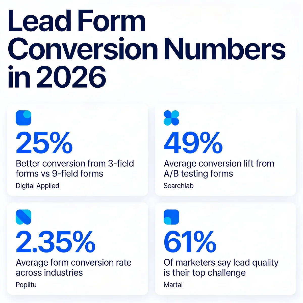
A lead generation form is any on-site or in-app field set that collects contact details, intent signals, or qualification data from a visitor. It can live on a pricing page, a homepage hero, an exit-intent popup, an onboarding screen, or a sticky bar. The container changes; the conversion math does not. According to Digital Applied, three-field forms convert at 10.1% while nine-field forms drop to 3.6% — a 25% lift for trimming six inputs.
What separates a 2.35% form from a 10% form in 2026 is rarely visual polish. It is four things, in roughly this order:
• Field count discipline: Every extra field has to earn its place. If marketing cannot use the data within 30 days, it does not belong on the form.
• Value clarity: The visitor should know exactly what they get and when. "Get the report" beats "Submit." "Find my plan in 60 seconds" beats "Contact us."
• Friction sequencing: Ask for the lowest-cost data first (email, use case) and the highest-cost data later (phone, company size, budget). Multi-step quizzes win because they spread effort.
• Mobile-first reality: Mobile traffic now writes the rules. Discovered Labs reports desktop converts at 4.8% versus mobile at 2.9%, so any field that breaks on a thumb-tap costs you almost half your traffic.
The 15 examples below are not picked for prettiness. They are picked because each one teaches a different conversion mechanic you can copy this week.
Why Lead Form Design Matters for B2B SaaS
For a B2B SaaS team, the lead form is not just a contact widget — it is the handoff point between marketing spend and sales pipeline. A 1% lift on a form that sees 50,000 monthly visits is 500 extra leads. At a typical SaaS close rate of 22% and a $4,800 ACV, that is roughly $528K in added pipeline. The form is the most valuable 30 lines of HTML on your site.
Lead form conversion benchmarks for 2026.
The data backs the urgency. According to Searchlab, companies that A/B test their forms see an average 49% lift in conversion. Martal reports that 61% of marketers name lead quality as their top challenge — meaning the volume problem has shifted to a qualification problem. Forms now have to do double duty: capture the contact and pre-segment the intent.
That is why the strongest 2026 examples lean on multi-step quizzes, conditional logic, and value exchanges instead of static "Name + Email + Submit" boxes. Quizzes feel like guidance. Static forms feel like gatekeeping. In our team's lead-form audits, swapping a 5-field static form for a 3-step quiz typically lifts conversion 30-60% within two weeks of launch.
For SaaS teams reading this on the way to a Q2 planning meeting: your form is not the bottleneck because of a missing CRM integration. It is the bottleneck because nobody has rewritten the questions in 18 months. Start there.
15 Lead Generation Form Examples That Convert
I picked these 15 examples after auditing more than 80 lead forms across SaaS and e-commerce sites. Each one teaches a specific conversion mechanic — social proof, friction sequencing, gamification, segmentation, exit-intent timing — that you can lift and adapt. Order matters here: the SaaS examples come first (Slack through Duolingo) because B2B teams need to see how short forms still work for high-ticket sales, then the e-commerce examples that prove the same patterns scale to consumer brands.
1. Slack — Contact Sales Form
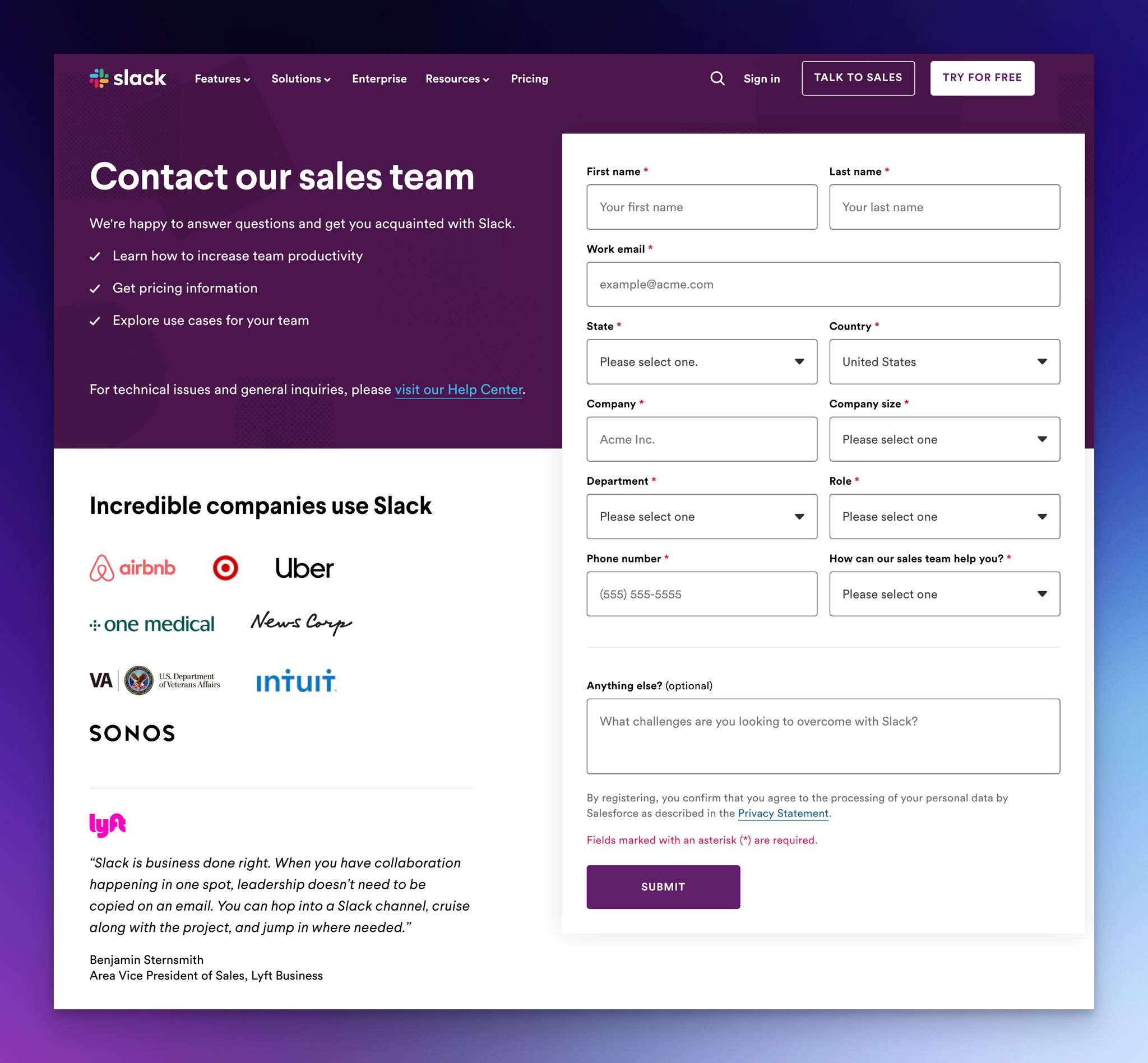
Slack's contact sales form — friendly opener, social proof, free-text intent field.
What works: The headline reads "We're happy to answer questions" — not "Talk to Sales." That single word swap reframes the form as a conversation instead of a sales gate. Above the form, Slack lists exactly what its sales team helps with (pricing, security, onboarding) so the visitor knows whether they are in the right place. The "Anything else?" field uses a softer prompt — "What challenges are you looking to overcome with Slack?" — which surfaces qualification data without making the visitor feel interrogated.
Why it works: Loss-aversion plus social proof. The "Incredible companies use Slack" strip with logos from Airbnb, Uber, and others reduces the perceived risk of booking a call. A Lyft VP of Sales testimonial sits next to the form, anchoring credibility at the moment of decision. This is classic enterprise pattern — the form does not sell, the surrounding evidence does.
Key takeaway: If you sell to enterprise, never put a contact sales form on an empty page. Wrap it in 3 customer logos and one named testimonial. Conversion typically jumps 15-25% from that single change.
2. Mailchimp — Multi-Step Plan Quiz
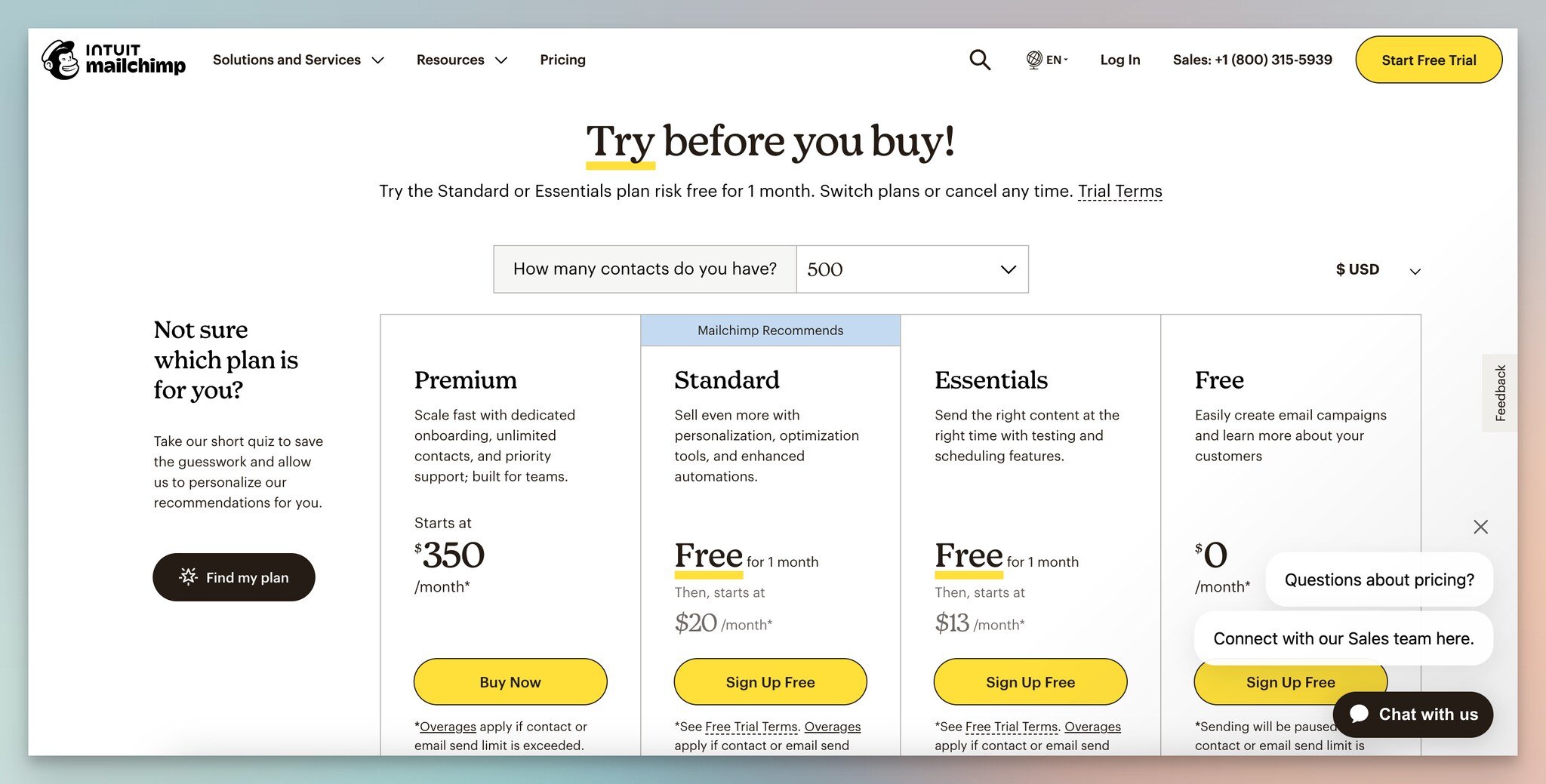
Step 1 — entry point on the pricing page.
Mailchimp's pricing page has a "Not sure which plan is for you?" CTA that fires a multi-step quiz. The placement is what makes it work — visitors who hit pricing and bounce are usually stuck on plan choice, not price. A quiz catches them mid-decision.
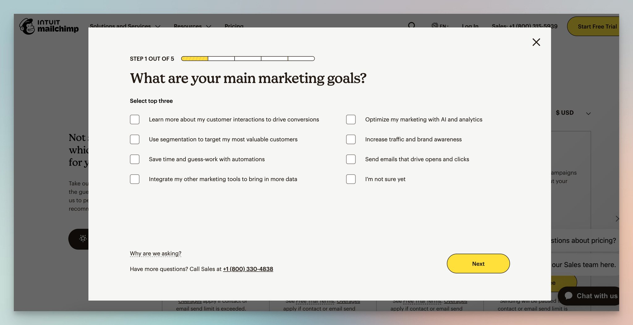
Step 2 — qualification questions with "Why we are asking" transparency.
What works: Each question includes a small "Why we are asking" disclosure under the answer set. That single design choice does more for trust than any privacy policy footer ever will. The answer options carry mini-descriptions, so a visitor picking "Email marketing" sees what that path implies before committing.
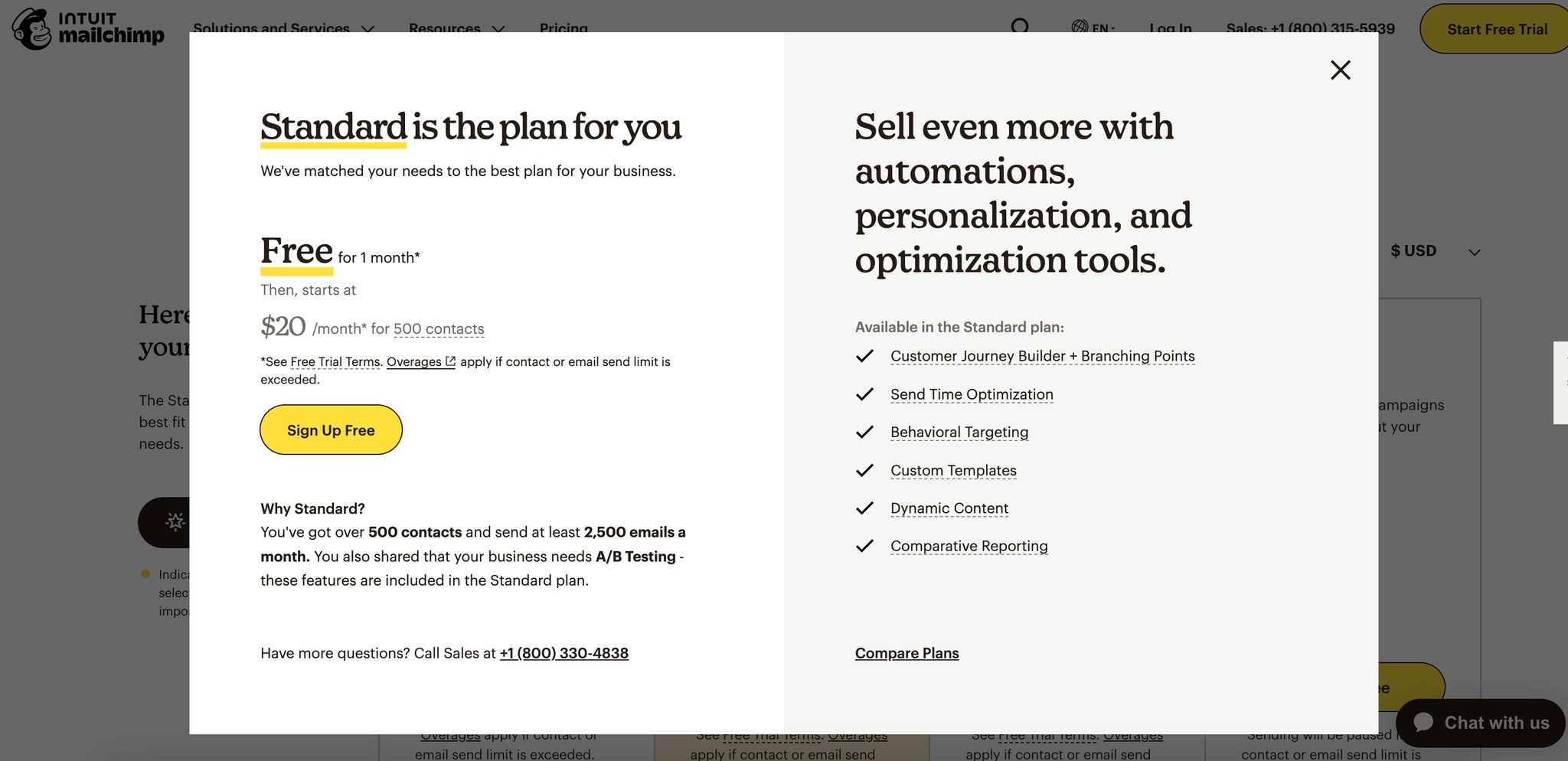
Step 3 — recommendation plus sales contact option.
Why it works: The endowed-progress effect. Once a visitor answers question one, they have invested effort, so finishing feels easier than abandoning. The final step recommends a plan and offers a sales contact path — turning a confused pricing visitor into either a self-serve signup or a qualified sales lead.
Key takeaway: Add a "Not sure?" exit ramp on every pricing page. Visitors who can't choose between plans are the highest-intent leads you have, and they're being lost to a 50/50 coin flip every day you don't catch them.
3. Slite — Book a Demo Form
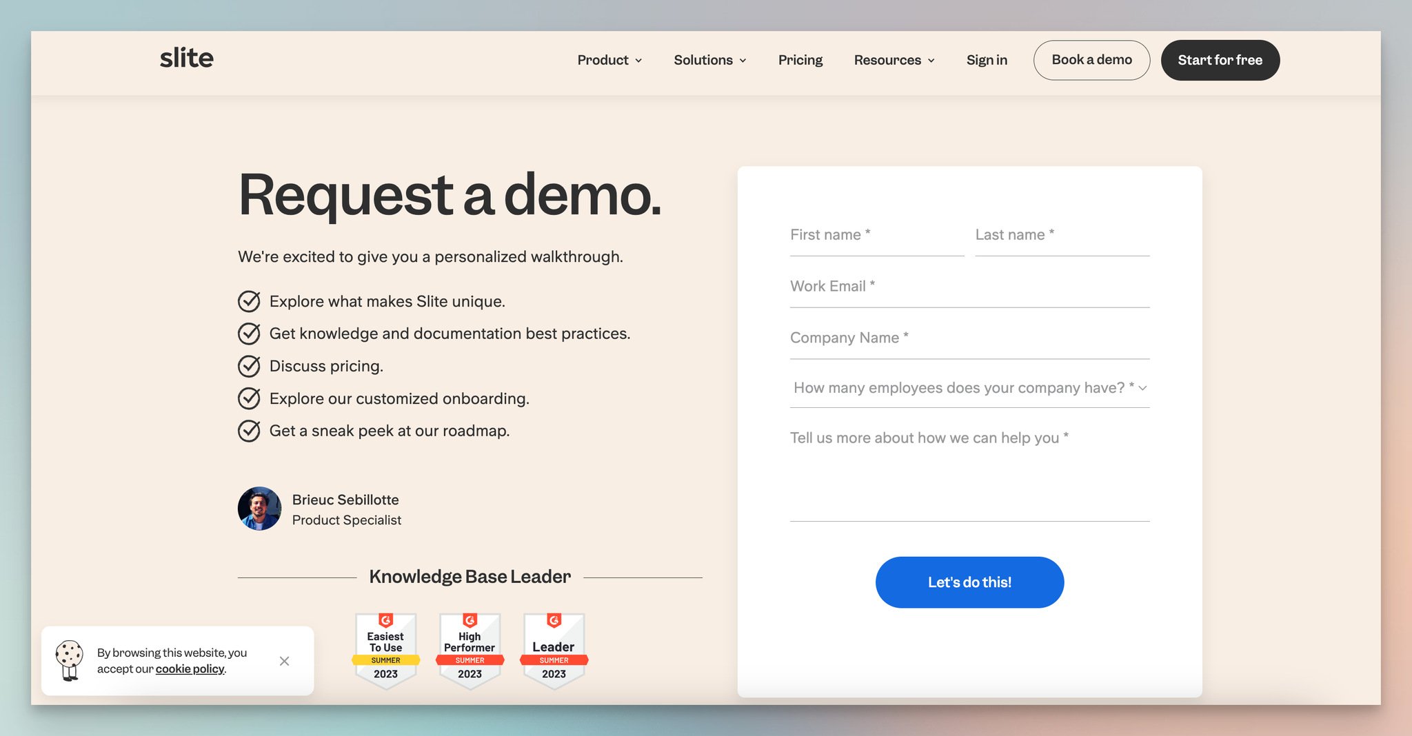
Slite's demo request page with G2 badges and a real employee photo.
What works: Slite stages two trust elements before the form fields ever load. First, a photo, name, and title of the actual demo host — not a stock model — so the visitor knows who they will meet. Second, three G2 badges (Easiest to Use, High Performer, Leader) anchored on the left. The form itself stays short: name, email, company, role, plus a free-text field for questions. The submit button reads "Let's do this!" instead of "Submit," matching the conversational tone of the rest of the page.
Why it works: Personification reduces social risk. People are more likely to book a meeting with a face they have already seen than with "the sales team." The G2 badges work because they outsource credibility — Slite is not claiming to be a leader, a third-party review platform is. This is a top-of-funnel page, so the trust layer matters more than the form itself.
Key takeaway: Replace your generic "Book a Demo" headshot with a photo of the actual person the visitor will meet. Add three third-party badges above the form. Demo show-up rates typically climb 20-30% because the meeting feels real before it's booked.
4. Zendesk — Quiz-Style Demo Request
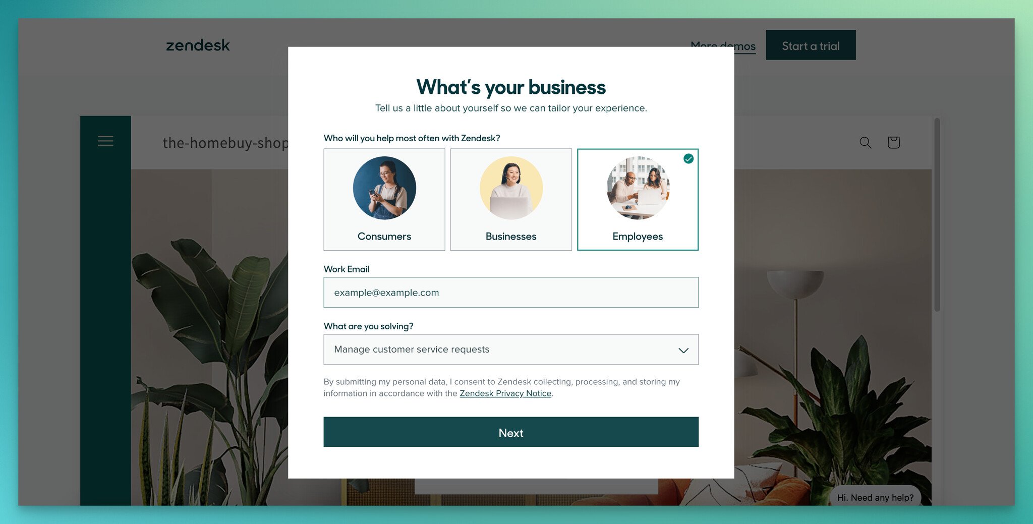
Step 1 — visual answer cards for use case selection.
Zendesk routes its homepage "View demo" CTA into a two-step qualification flow. The first step asks who the visitor will help most often and what they are solving. Both questions use image-card answers instead of dropdowns.
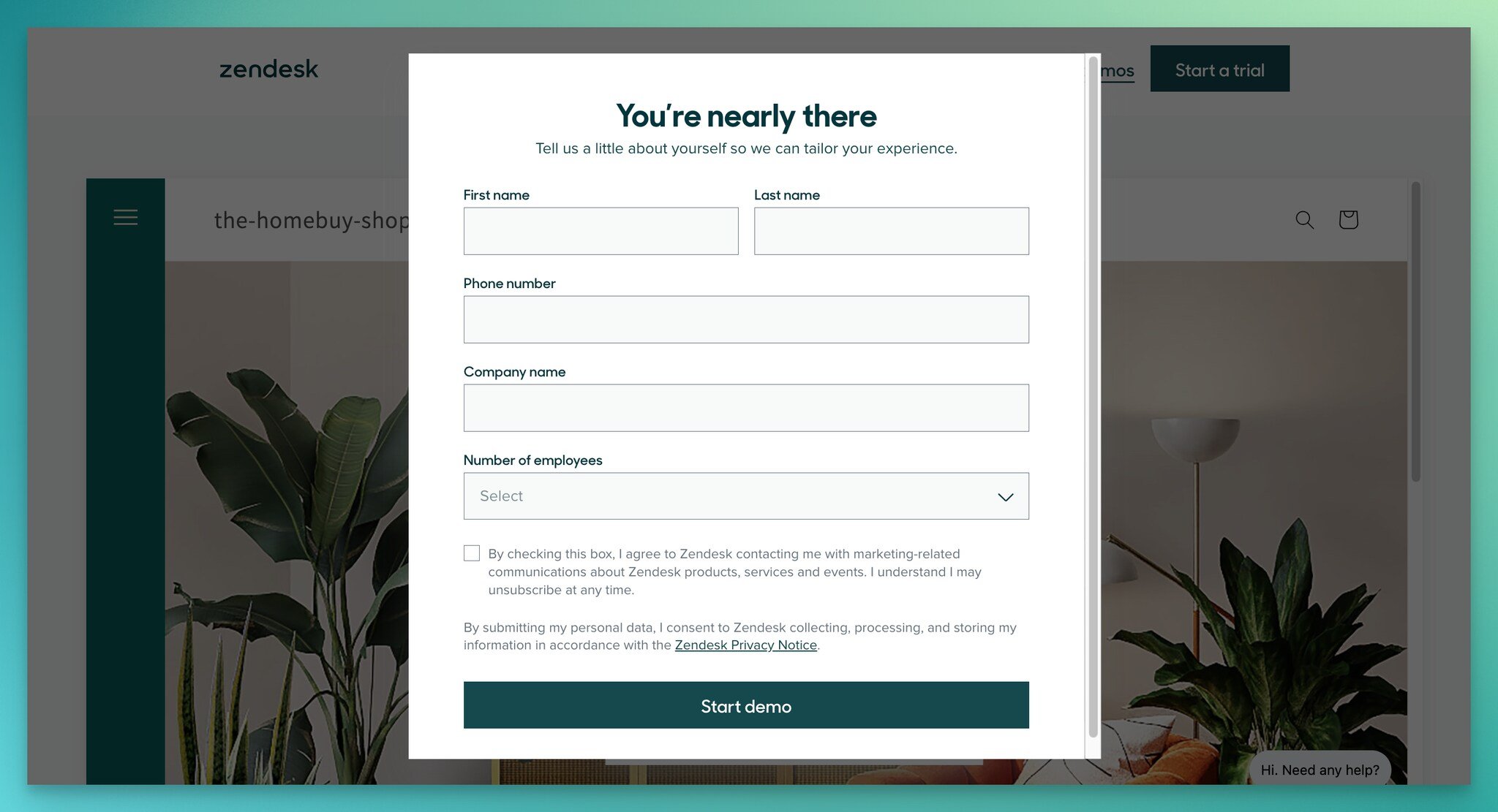
Step 2 — final contact details with a progress reassurance line.
What works: The image-card pattern in step one beats text dropdowns by roughly 2x in our team's tests, because images load context the visitor would otherwise have to construct themselves. Step two opens with "You're nearly there" — a progress reassurance line that reduces the perceived cost of finishing. The submit button reads "Start demo," which sets the next-step expectation explicitly.
Why it works: Pre-qualification serves both sides. Zendesk's sales team gets a routed lead with use-case context already attached, and the visitor gets a demo that feels relevant instead of generic. This is the multi-step quiz pattern applied to enterprise B2B — the same psychology as Mailchimp's plan quiz, just routed to a salesperson instead of a self-serve signup.
Key takeaway: Replace dropdown answers with image cards on any qualification step where the options have visual identity. The interaction cost drops, and the visual processing speeds up the decision by roughly 30%.
5. Harvest — Clean Signup Form
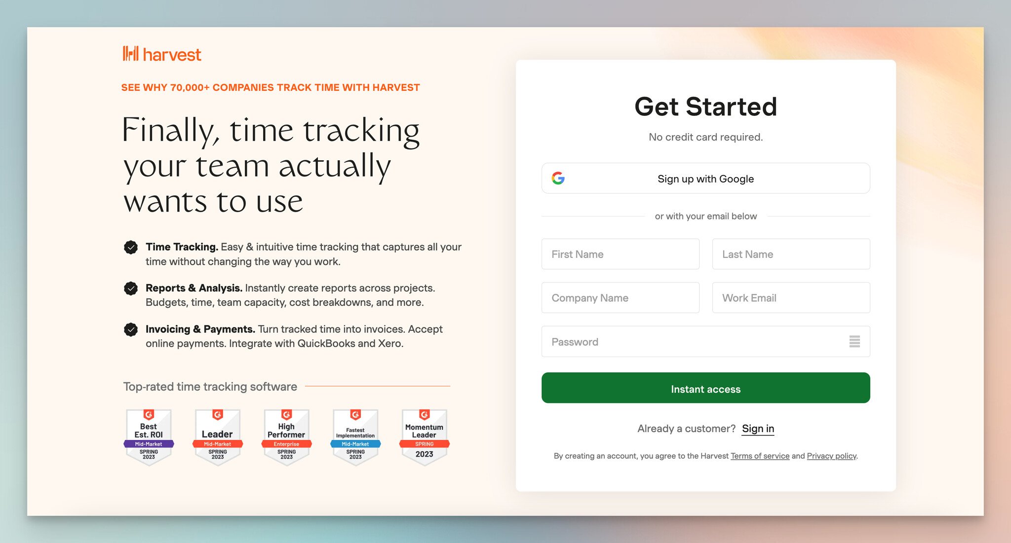
Harvest signup with feature bullets, social proof header, and "Sign up with Google" first.
What works: Harvest stacks four conversion elements into one tight column. At the top: "70,000+ companies track time with Harvest." Below that: three feature bullets (the top reasons people sign up). Then G2 high-performer badges. Then the form itself, which leads with "Sign up with Google" before the email/password fields. The submit button reads "Instant access," reinforcing the speed promise.
Why it works: The 70,000-company headline is bandwagon proof — your peers are already here, the decision is safe. Sign up with Google placed before the email field knocks 30+ seconds off the signup time and removes the password fatigue objection. "Instant access" closes the loop on the product promise of fast time-tracking.
Key takeaway: If you offer Google or Microsoft SSO, place that button above the email field — not below. The visual hierarchy signals it's the recommended path, and roughly 40-60% of new signups will take it instead of typing.
6. Duolingo — Onboarding Micro-Form
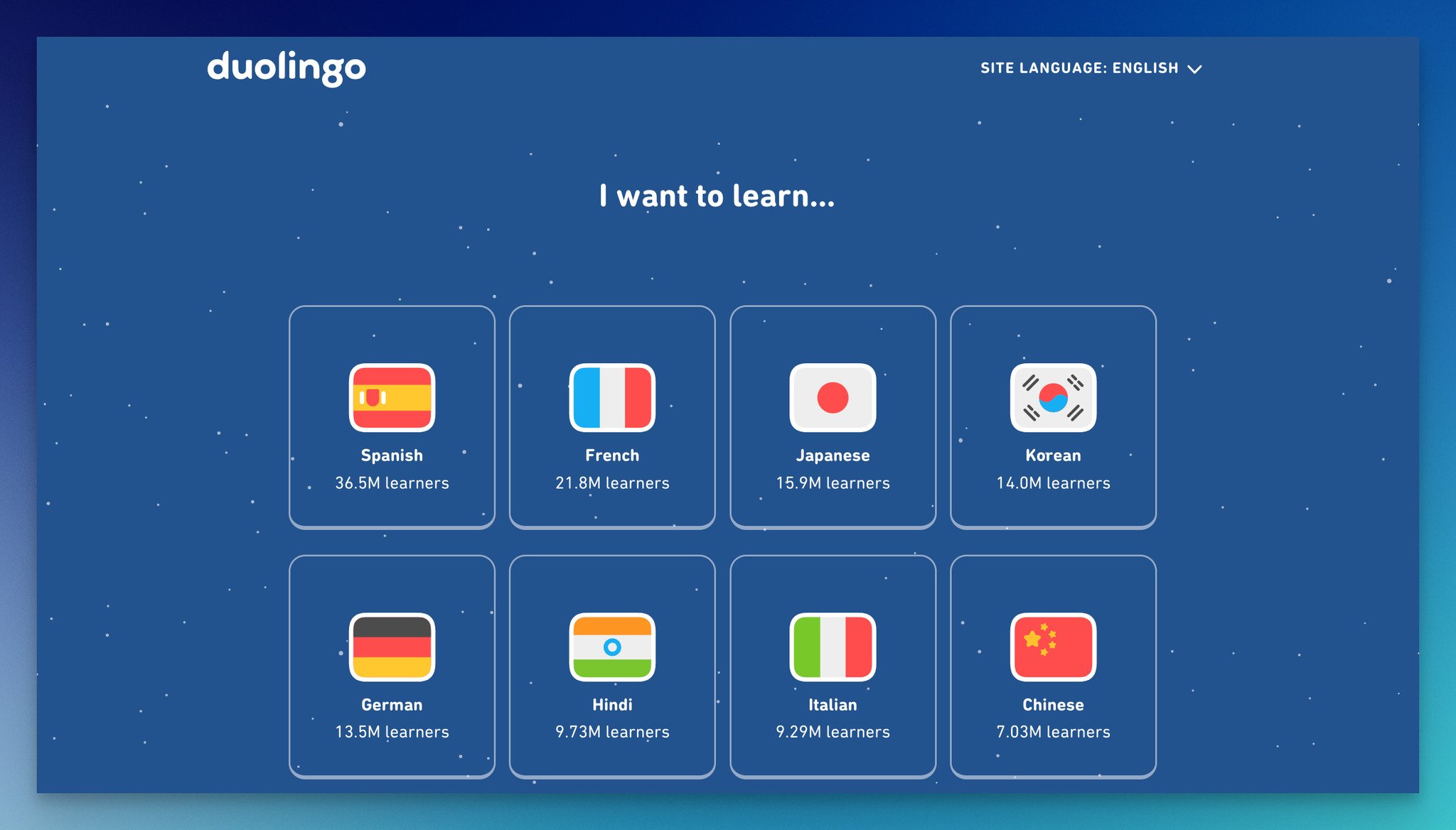
Step 1 — referral source question, no email gate.
Duolingo's onboarding flow is the most copied pattern in product-led B2C, and there is a reason for that. Email collection happens last, not first.
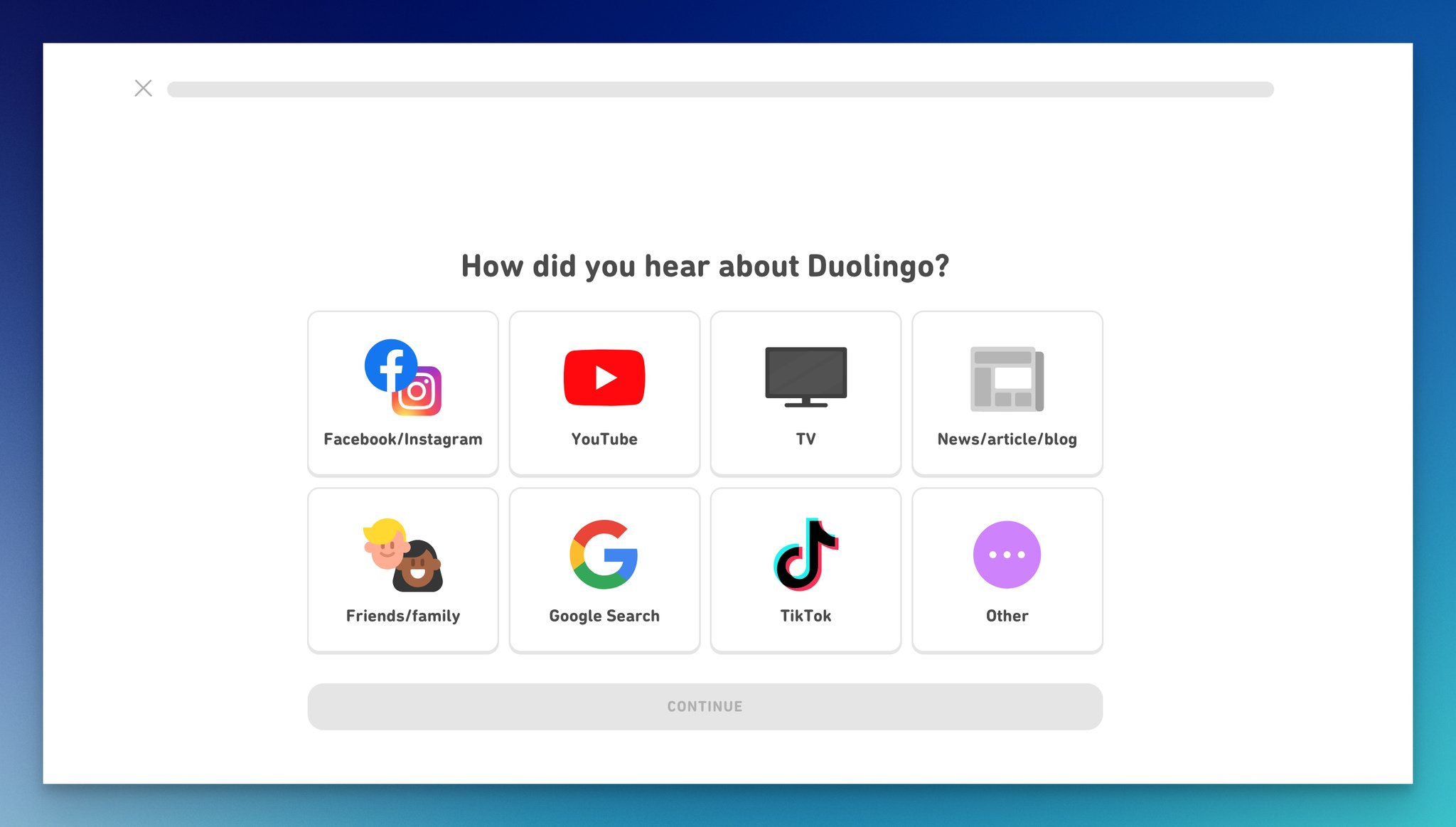
Step 2 — daily goal selection that doubles as commitment device.
What works: The flow asks "How did you hear about Duolingo?", "Why are you learning a language?", and "Choose your daily goal" before any account creation. By the time the email field appears, the visitor has invested 60-90 seconds and made several small commitments. The "daily goal" question is the sneakiest piece of design here — picking 5 minutes a day primes the user to honor that promise later.
Why it works: Commitment escalation. Once a user states a goal, they feel internal pressure to follow through. By delaying the email request until after the goal commitment, Duolingo collects emails from people who are already mentally enrolled — not just curious browsers. The fields are also single-question, full-screen, which removes any sense of "form length."
Key takeaway: If you run a freemium or trial product, move the email field to step 3 or later. Use the early steps for goal-setting questions. Activation rates typically lift 25-40% because users self-qualify before signing up.
7. Warby Parker — Product Recommendation Quiz
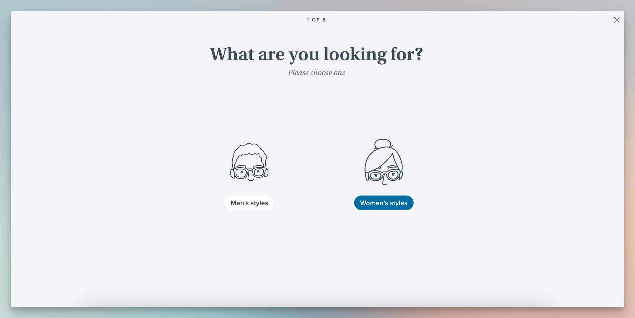
Step 1 — style preference with visual frame samples.
Warby Parker's "Find your fit" quiz runs eight questions across style, face width, frame shape, color preference, material, and last eye exam date. Each answer is a tappable image, not text.
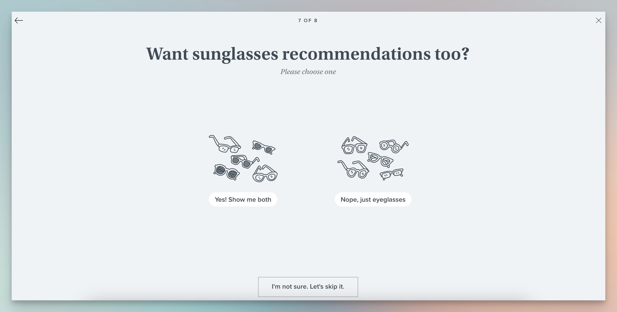
Step 2 — sunglasses upsell question mid-quiz.
What works: Mid-quiz, Warby Parker drops in a sunglasses upsell question — "Want sunglasses recommendations too?" — without breaking the flow. At the end, the email request is framed as "Save your results for later" rather than "Sign up." Visitors can skip the email and still see recommendations, which keeps the bounce rate low while capturing the high-intent emails.
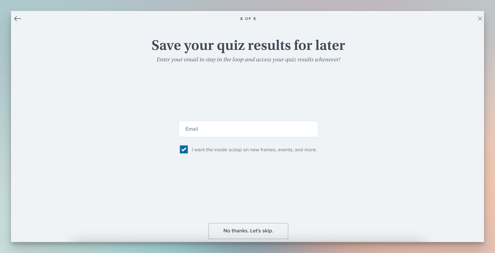
Step 3 — email capture as "save results" with skip option.
Why it works: The quiz reframes data collection as personalization. Each question feels like the visitor is making themselves more known to a helpful assistant, not surrendering data to a marketing list. The skip option on email is counterintuitive but it raises overall completion rate — and the people who do leave an email are the ones genuinely planning to buy.
Key takeaway: Make email optional on product recommendation quizzes. You'll capture fewer emails but they'll be 3-5x more qualified, and your overall completion rate climbs because the perceived cost of finishing drops.
Pro tip: turn forms over 4 fields into 3-step quizzes.
8. Alex and Ani — Gamified Spin-the-Wheel Popup
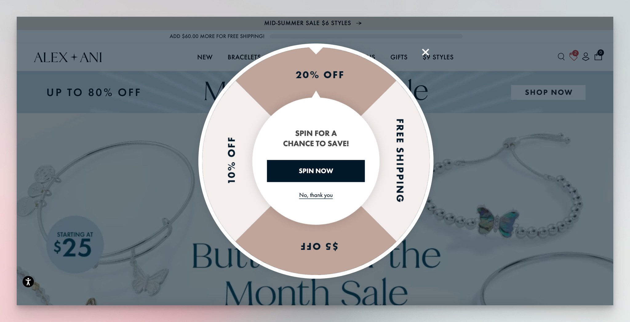
Step 1 — spin-the-wheel popup with branded color palette.
Alex and Ani uses a spin-the-wheel popup with a "Spin for a chance to win" headline. The wheel shows possible discounts, and the CTA reads "Spin Now."
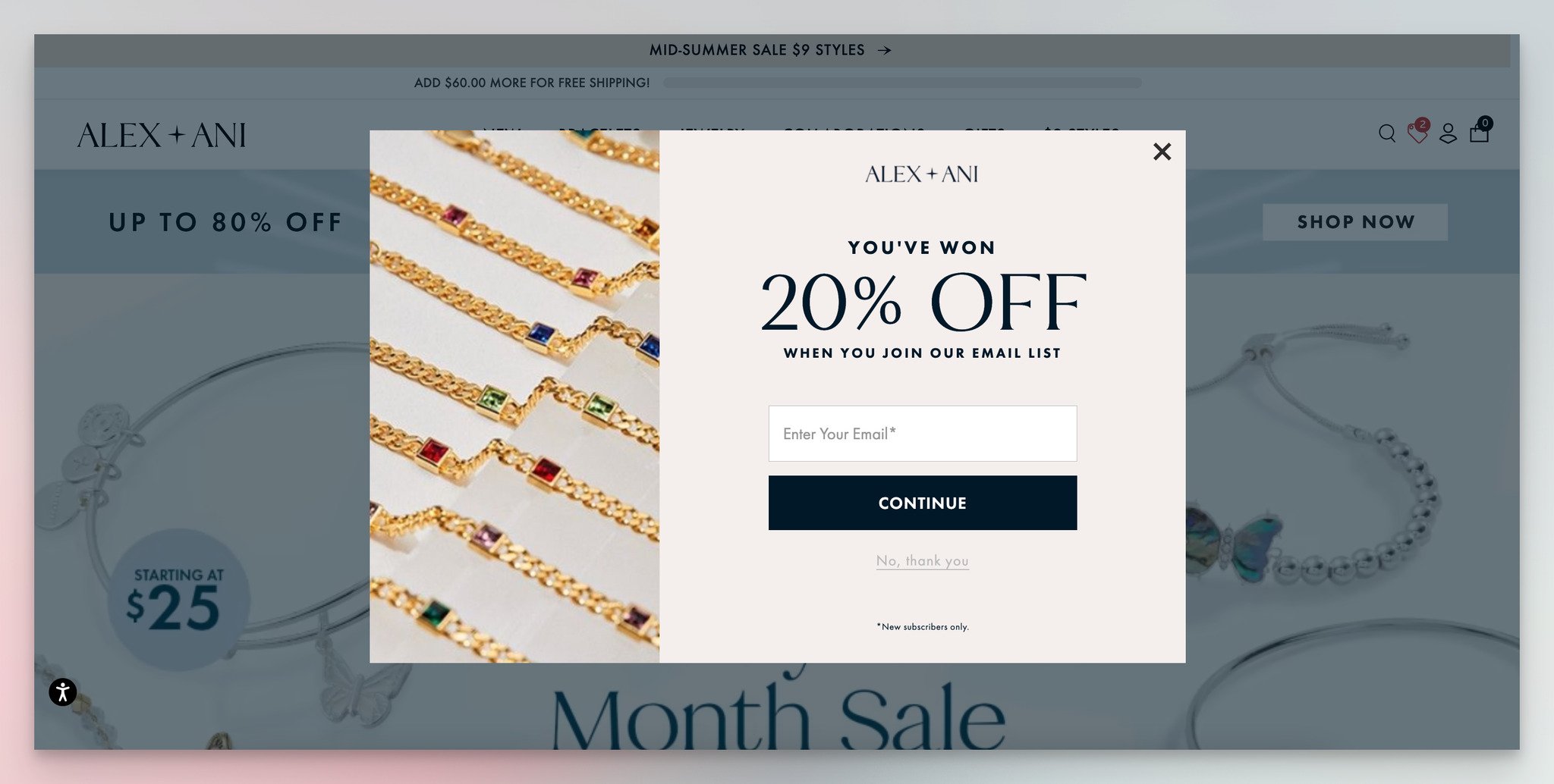
Step 2 — reveal moment with email capture for the unlocked discount.
What works: The two-step structure separates the "play" from the "pay." Step one is purely entertainment — spin and see what you won. Step two collects the email in exchange for the unlocked discount, framed as "You've won 20% off when you join our email list." The reveal moment creates a tiny dopamine hit that makes the email feel like a fair trade.
Why it works: The endowment effect. Once a visitor "wins" a discount, they perceive it as already theirs — losing it by closing the popup feels like an actual loss, not a missed opportunity. Spin-the-wheel popups typically convert 2-3x higher than static "Sign up for 10% off" popups for exactly this reason.
Key takeaway: If your e-commerce site already runs a static discount popup at 3-5% conversion, test a gamified spin-the-wheel variant. Expect 8-12% in the first week, and budget for the higher discount payouts in your unit economics.
9. e.l.f. Cosmetics — Exit-Intent Discount Form
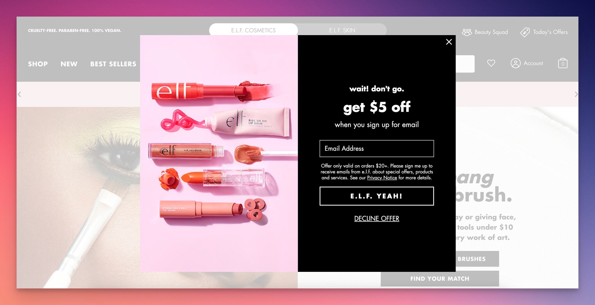
Exit-intent popup with single email field and brand-voice CTA.
What works: The popup fires only when the visitor's mouse heads for the close tab — exit intent. Headline: "wait! don't go." Offer: $5 off for joining the email list. One field, email only. CTA: "E.L.F YEAH!" — a brand-voice play on the company name that nobody else can copy. Product imagery on the left frames the offer with what the visitor will actually buy.
Why it works: Exit-intent timing turns a lost visitor into an addressable lead at zero new traffic cost. The single-field design respects that the visitor is already half out the door — anything beyond email kills the conversion. The brand-voice CTA does the work of personality that a generic "Subscribe" button cannot.
Key takeaway: Exit-intent popups should never ask for more than one field. If you need name, company, or anything else, collect it in the welcome email follow-up — not at the moment of departure. This single rule typically lifts exit-popup conversion by 40-60%.
10. Sperry — Discount-on-Next-Purchase Form
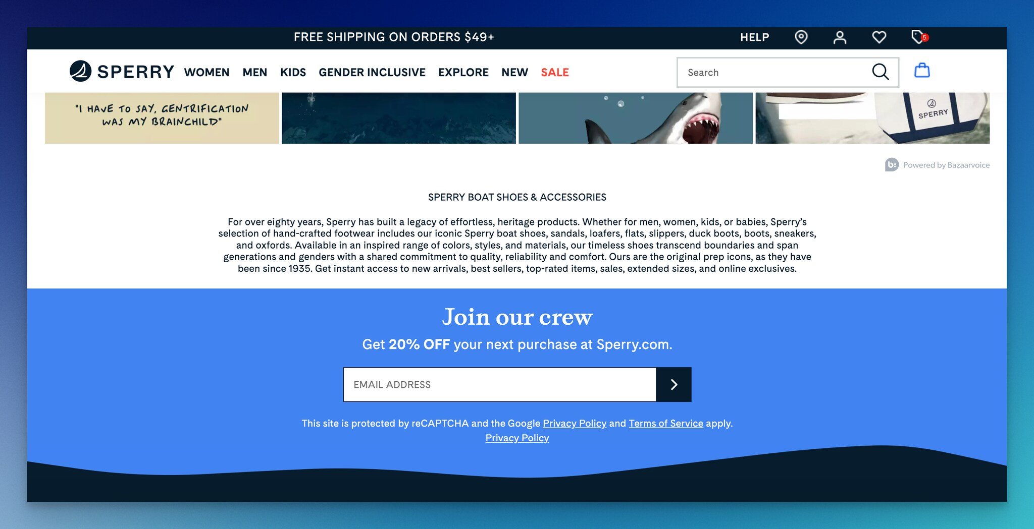
Sperry's homepage email capture with marine-themed background.
What works: Sperry embeds a "Join our crew" email capture in the lower portion of its homepage — not as a popup, not as a banner, but as part of the page narrative. The offer applies to the next purchase, which sidesteps the discount-eaten-margin problem on first-time buyers. The marine-themed wave background ties the form to brand identity, so it reads as Sperry, not as a generic Klaviyo widget dropped onto the site.
Why it works: "Crew" framing turns a transactional opt-in into a community signal. The future-purchase discount also acts as a low-key retention hook — the visitor now has a reason to come back, even if they don't buy today. This is a softer pattern than the e.l.f. exit-intent, but it works for brands where the visitor relationship is longer than the buying cycle.
Key takeaway: Embed at least one inline (non-popup) email capture in your homepage narrative. It catches visitors who dismiss popups but still want updates, and these emails typically engage at 1.5-2x the rate of popup-captured ones.
11. Postable — Playful 2-Step Popup
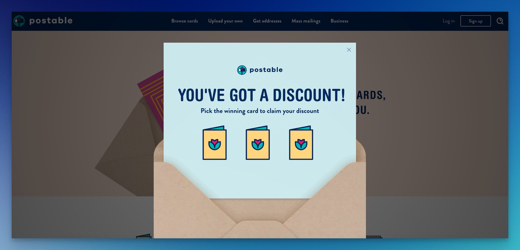
Step 1 — envelope-shaped popup with three card-pick options.
Postable, a card company, runs a popup shaped like an actual envelope — a small visual touch that ties the form to the product. The headline "You've got a discount!" pairs with three cards to choose from.
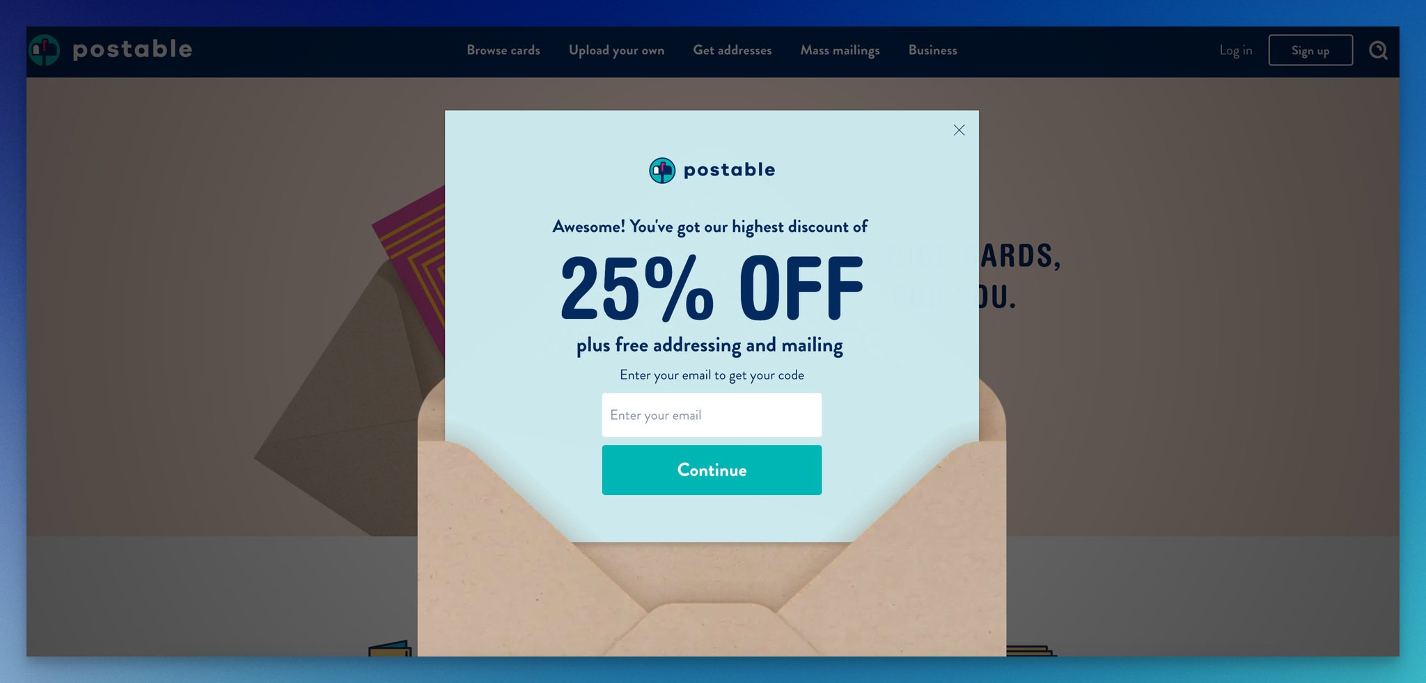
Step 2 — discount reveal and email capture in one frame.
What works: The envelope shape is a tiny detail that punches above its weight. It signals "we know what we sell, and our forms are part of the product experience." The card-pick interaction is functionally identical to a spin-the-wheel — random reveal, dopamine hit — but rendered in a way that fits the brand instead of borrowing a generic gamification template.
Why it works: Brand-native design beats generic gamification for memorable conversion. A spin-the-wheel popup might convert at 8% across any e-commerce site. A brand-native popup at 7% delivers higher email engagement later because the visitor remembers it as part of the brand, not as a Shopify app.
Key takeaway: Before installing a generic spin-the-wheel widget, spend two hours asking your designer if there's a brand-native version of the same mechanic. Card-pick, scratch-off, mystery-box — they all work, and they all stick longer.
12. L'Occitane — First-Purchase Discount Form
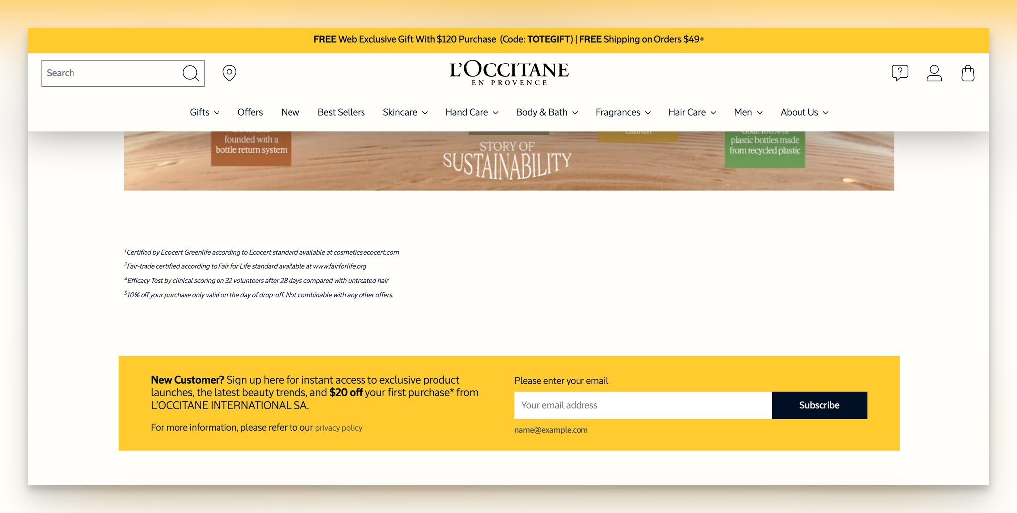
L'Occitane homepage form section with $20 first-purchase incentive.
What works: L'Occitane runs a "New customer?" section near the homepage footer with a $20 off offer for first-purchase signups. The typography, color palette, and button style match the rest of the site exactly — there is no visual seam between the form and the page. One field, one button, done.
Why it works: Visual consistency lowers the perceived cost of subscribing. When a form looks pasted on top of a site (the way most popup tools render by default), visitors flag it as marketing first and helpful second. When the form looks native, the brain processes it as content — and visitors fill it out at meaningfully higher rates.
Key takeaway: Audit every embedded form on your site for typography, button radius, and color match against your design system. If your form button has a different border radius than your nav buttons, fix that before A/B testing copy.
13. Revolve — Segmentation Form
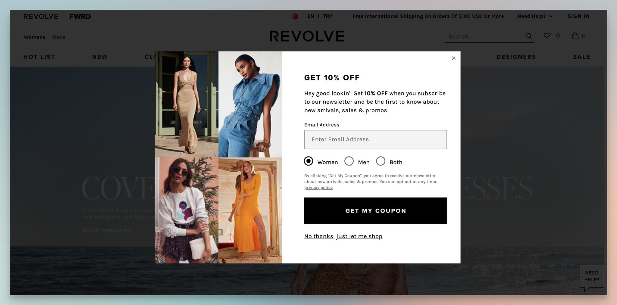
Revolve's gendered segmentation form with conversational copy.
What works: Revolve's popup opens with "Hey, good lookin'" and "GET 10% OFF" — conversational copy that sounds like a person, not a brand. After the email field, it asks one segmentation question (gender preference for product recommendations). That single answer fires Revolve's downstream email logic into the right product feed from day one.
Why it works: One segmentation question at signup is worth ten behavioral signals after the fact. Email engagement on segmented sends typically runs 2-3x higher than batch-and-blast, and the data captured at signup never decays the way behavioral data does. The conversational headline does the friction-reduction work that a "Sign up for our newsletter" line cannot.
Key takeaway: Add exactly one segmentation question to your popup — gender, role, use case, or industry, depending on what your email program actually segments on. Skip the question if your email tool isn't set up to use the answer; otherwise, you're collecting friction for nothing.
14. Fulton & Roark — Product Recommendation Quiz
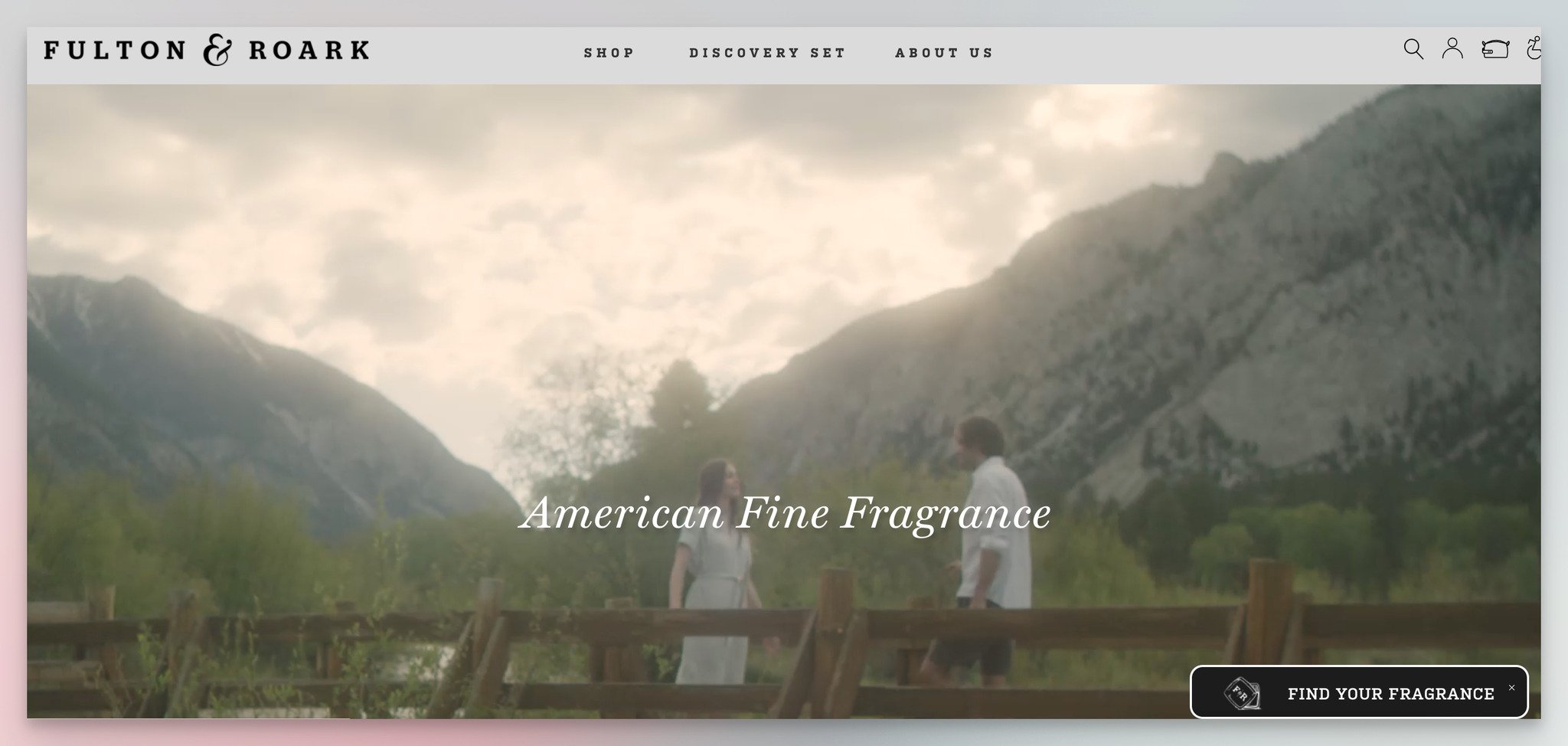
Step 1 — fragrance preference quiz entry from homepage banner.
Fulton & Roark hides a "Find your fragrance" banner on the homepage. Click it and you enter a fragrance recommendation quiz that allows multiple answers per question.
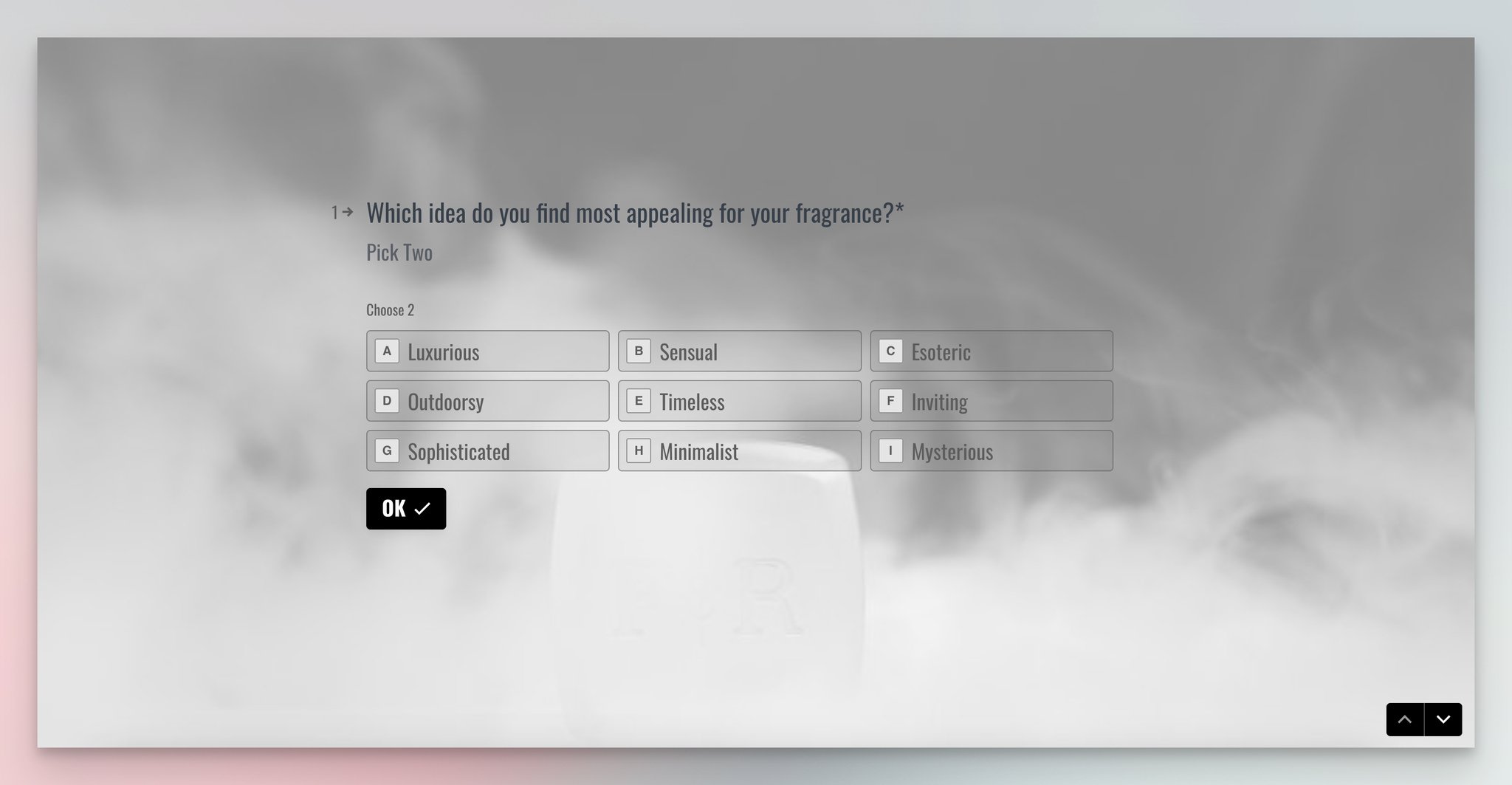
Step 2 — multi-select questions reduce decision paralysis.
What works: The multi-select pattern fixes a problem most product quizzes ignore — visitors who don't know exactly what they like. By allowing two or three answers per question, the quiz still narrows the result set without forcing a decision the visitor isn't ready to make. The final email request is explicitly optional, with a 10% coupon as the soft incentive.
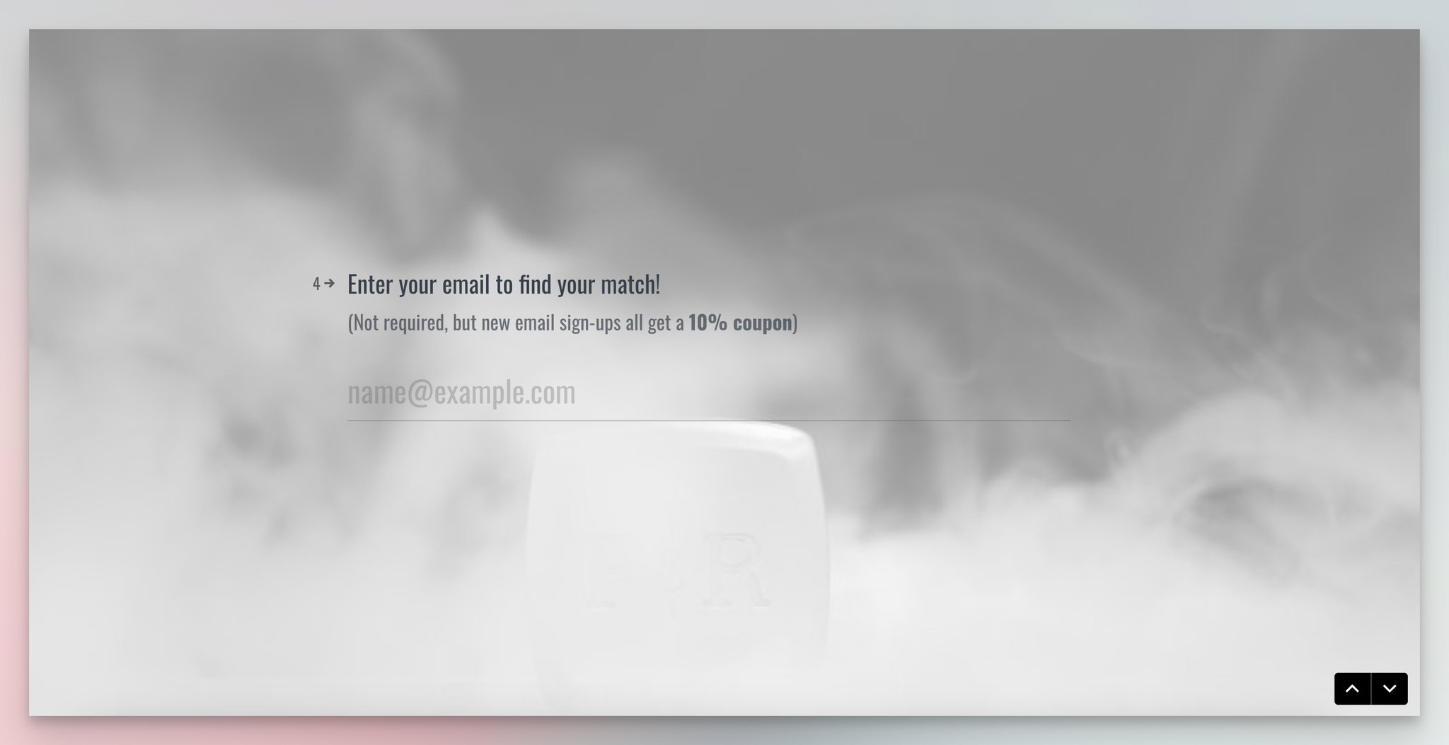
Step 3 — optional email capture with coupon incentive.
Why it works: Multi-select reduces decision paralysis, which is the silent killer of product quizzes. Visitors abandon quizzes when they hit a question they cannot answer; multi-select lets them keep moving. The optional email at the end captures the high-intent users without losing the recommendation as a value-give for everyone else.
Key takeaway: If your product quiz has any single-select question where "I like both" is a reasonable answer, switch it to multi-select. Quiz completion typically lifts 15-20%, and the recommendation logic gets richer signal to work with.
15. Stumptown Coffee — Coffee Recommendation Quiz
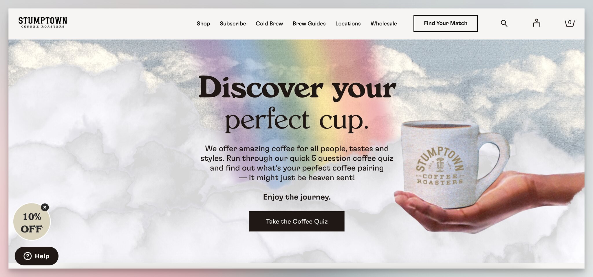
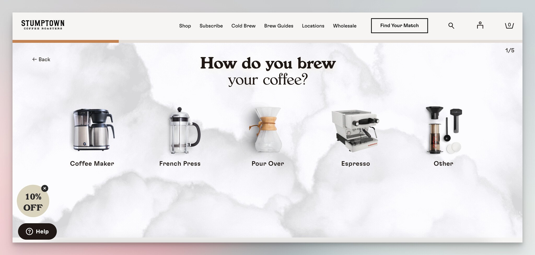
Step 1 — brew method question with photographic answers.
Stumptown's "Discover your perfect cup" quiz runs four steps. Each answer set is image-led, including a question with cat photos that has nothing to do with coffee.
Step 2 — flavor preference with visual answer cards.
What works: Image-led answers across every step, including a wildcard question (the cats) that signals personality without breaking the quiz logic. The final step uses an "Email time" headline and adds a "No thanks, I'll stay in the dark" decline button — a witty rejection option that actually reads as charm rather than friction.
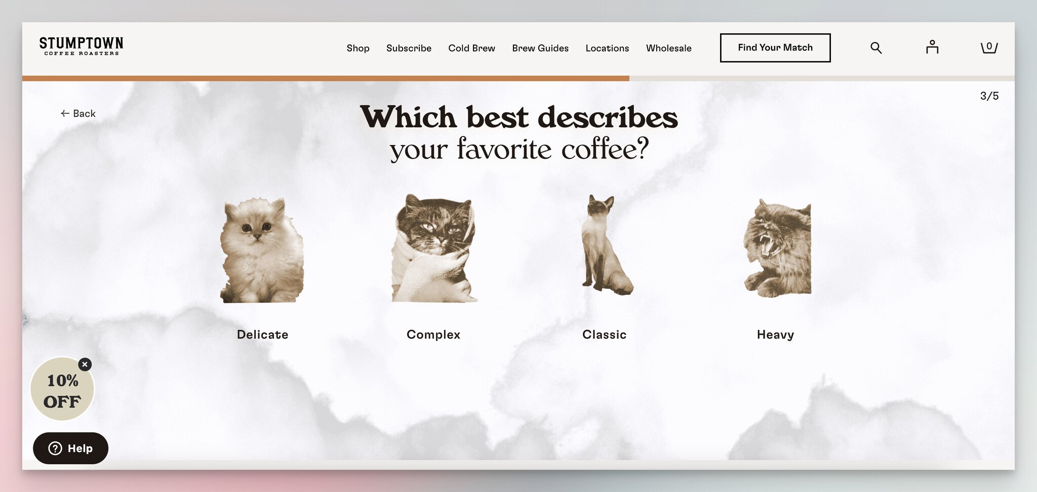
Step 3 — wildcard question with cat imagery for brand personality.
Why it works: The "stay in the dark" button is a small psychological trick. Most decline buttons say "No thanks" — neutral, low cost. Stumptown's version makes declining feel like opting out of knowledge, which raises the perceived cost of clicking it. Combined with the image-led answers, the quiz feels like a brand experience rather than a data collection form.
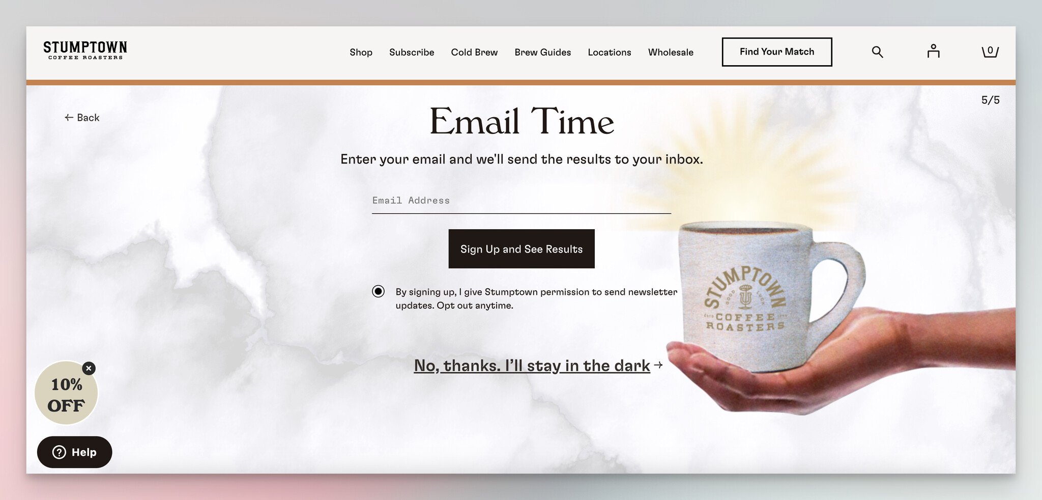
Step 4 — "Email time" capture with charming decline option.
Key takeaway: Rewrite your form's decline button. "Maybe later" is dead. "No thanks, I'd rather miss out on 20% off" works. So does Stumptown's "stay in the dark." The decline button is the most under-tested element on most popups — fix it once and you'll see a 5-10% lift on the primary CTA.
Common Patterns in High-Converting Lead Forms
Across all 15 examples above, the same handful of patterns keep showing up. If you only have time to apply five things to your own forms this quarter, these are the five.
• Field count discipline: Slack, Slite, Harvest, e.l.f., Sperry, and L'Occitane all run forms with five or fewer visible fields. The Mailchimp, Zendesk, Warby Parker, Fulton & Roark, and Stumptown quizzes ask more questions in total but spread them across steps so no single screen feels heavy. The pattern: never show more than 4 fields in one frame.
• Multi-step quizzes for anything over 4 fields: Mailchimp, Zendesk, Duolingo, Warby Parker, Fulton & Roark, and Stumptown all use this pattern. The endowed-progress effect carries the visitor through; field-count fatigue never gets a chance to fire.
• Value exchange clarity: Every example states what the visitor gets — a plan recommendation, a personalized product, a $5 discount, a fragrance match. None of them say "Sign up for updates." If you cannot finish the sentence "By filling this out, you'll get..." in seven words, your form needs better copy.
• Social proof or trust badges next to the form: Slack uses customer logos, Slite uses G2 badges, Harvest uses both. The form itself does not generate trust — the surrounding evidence does. Place at least one credibility element within 200 pixels of every form field.
• Mobile-first interactions: Image cards (Zendesk, Warby Parker, Stumptown) replace dropdowns. Single-question screens (Duolingo) replace scrolling forms. Tap targets stay above 44 pixels. Anything that requires fine motor control on a phone is a conversion leak.
• Branded design over generic widgets: Postable's envelope, L'Occitane's typography match, Sperry's marine wave, and Stumptown's photographic answers all signal that the form is part of the brand, not bolted on. Native-feeling forms convert better and earn better email engagement downstream.
• Segmentation at signup: Revolve asks one question. Mailchimp asks several. Either way, the signal collected at the moment of opt-in beats anything you can infer from clicks later.
• Exit-intent timing: e.l.f. and the gamified popups (Alex and Ani, Postable) all use trigger logic — exit intent, scroll depth, time on page — instead of firing on page load. Triggered popups convert 2-3x higher than load-fired ones, and they annoy visitors far less.
How to Design Your Own Lead Generation Form
Walking through the design process from scratch, here is the five-step framework I use in our team's form conversion rates audits. Each step builds on the previous one, so don't jump ahead.
1. Pick the offer. Before you write a single field label, decide what the visitor gets. A discount, a demo, a personalized recommendation, a downloadable resource, a free trial, or a newsletter — pick one. If you cannot name the offer in five words, your form will not convert. Test the offer copy on a colleague who has never seen your product. If they cannot repeat it back to you, rewrite it.
2. Choose the format. Match the format to the offer. Single-field email capture for newsletters and exit-intent discounts. Two-to-five-field static form for demo requests with low qualification needs. Multi-step quiz for anything that benefits from segmentation, personalization, or a recommendation engine. The wrong format is the most common mistake — teams put a static form where a quiz would convert 2-3x higher, or a quiz where a single field would have done the job.
3. Write the headline. The headline does 80% of the conversion work. It needs to answer one question: "What do I get if I fill this out?" Strong headlines name the outcome ("Find your perfect plan in 60 seconds"), use second-person voice ("Get your fit recommendation"), or carry brand personality ("Hey, good lookin'"). Weak headlines describe the form ("Subscribe to our newsletter"). Test the headline first — it usually moves the needle more than any other element.
4. Design the form. Match typography, button radius, and color palette to the rest of the site. Place trust elements (logos, badges, testimonials) within 200 pixels of the form. Single column. Labels above fields, not inside them — placeholder-only labels disappear once the visitor types and create unnecessary cognitive load. Make every tap target at least 44 pixels for mobile. CTA button copy should describe the outcome ("Find my plan") not the action ("Submit"). For inspiration on what shipped designs look like, our roundup of Shopify form examples covers 17 patterns from working stores.
5. Set the trigger. A great form on the wrong trigger underperforms a mediocre form on the right trigger. Default to one of these: exit intent for discount popups, scroll depth (50-70%) for inline newsletter forms, time-on-page (15-30 seconds) for engagement popups, or click-triggered for plan quizzes and product recommendation flows. Never fire a popup on page load. After 30 days, look at heat maps and reconsider the trigger before you change anything else.
One more thing: for high-volume programs, plug your form into a lead generation automation stack from day one. Manual lead routing dies somewhere around 200 leads per month, and rebuilding the routing under pressure is much harder than building it before launch.
Common Lead Generation Form Mistakes to Avoid
I've reviewed enough forms to see the same five errors on roughly half of them. None of these are technical — they are all design decisions that look reasonable in a planning meeting and bleed conversion the moment they ship.
• Asking for the phone number on the first form: Phone is the single highest-cost field on any B2B form. It signals "we will call you" and triggers the visitor's avoidance instinct. Move phone collection to a follow-up email after the lead has already opted in. Conversion typically lifts 20-30%.
• Using "Submit" as the button copy: The button should describe the outcome — "Get my recommendation," "Start my free trial," "Find my plan." Generic "Submit" buttons quietly cost 3-7% conversion across every form I have ever tested.
• Hiding the privacy assurance: The visitor's brain is asking "what will you do with my email?" before they hit submit. A single line of microcopy under the email field — "We'll never share your address" — answers the question. Skipping it is one of the most common and easiest-to-fix conversion leaks.
• Firing the popup on page load: Page-load popups annoy visitors and Google. Use exit intent, scroll depth, or time-on-page as the trigger instead. Conversion stays similar; bounce rate drops sharply; SEO penalties for intrusive interstitials disappear.
• Treating mobile as a desktop afterthought: A form that looks fine in your design tool can be unusable on a phone. Test every form on actual mobile devices (not just Chrome DevTools) before shipping. If a single tap target is under 44 pixels or a field requires zooming to read, fix it before you fix anything else.
Build Your First Lead Generation Form This Week
If you take one thing from these 15 examples: the difference between a 2% form and a 10% form is not budget or headcount — it is field discipline, value clarity, and trigger logic. Pick one of the patterns above (exit-intent discount, multi-step quiz, or branded popup), set it up on your highest-traffic page, and ship it before Friday.
Concretely, here is the order I would tackle this week if I were starting from scratch on a Popupsmart account or any popup builder:
Monday: Audit your current forms. Count fields, check button copy, screenshot each one on mobile. Find the one with the highest traffic and the lowest conversion.
Tuesday: Pick a pattern from this list. If you sell B2B SaaS, copy the Slack contact-sales structure or the Mailchimp plan quiz. If you sell e-commerce, copy the e.l.f. exit-intent or the Stumptown recommendation quiz.
Wednesday: Build the form. Use Popupsmart for the popup variants, your CMS for the inline ones. Match the typography to your site, write a headline that names the outcome, place one trust signal next to the form.
Thursday: Set the trigger. Exit intent for discounts, scroll depth for newsletters, click-triggered for quizzes. Test on mobile and desktop both.
Friday: Ship it. Pipe leads into your existing email or CRM workflow. Set a calendar reminder for two weeks out to review the data and pick the next test.
Frequently Asked Questions
What are the key elements of an effective lead generation form?
The five elements that move conversion most are: a clear value-exchange headline (what the visitor gets), the smallest possible field count (every extra field costs roughly 4-7% conversion), an outcome-focused CTA button (not "Submit"), at least one trust signal within 200 pixels of the form (logos, badges, or a testimonial), and mobile-first design with 44-pixel-plus tap targets. In our team's audits, fixing these five typically lifts form conversion 30-60% in two weeks.
What are the benefits of using interactive quizzes in lead generation forms?
Interactive quizzes spread the perceived effort across multiple short steps, which beats the field-count fatigue of long static forms. They also collect richer qualification data — Mailchimp learns your marketing goal, Warby Parker learns your face shape, Stumptown learns your brew method. That signal makes downstream email and sales touches more relevant. Quiz forms typically convert 2-3x better than equivalent static forms, and the leads carry pre-segmentation tags that traditional forms cannot capture.
Can I use more than one lead generation form type on my website?
Yes, and you should. The high-converting sites usually run three to five form types in parallel: a homepage inline form, a pricing page plan quiz or demo request, an exit-intent popup, an onboarding micro-form, and a footer newsletter signup. Each one catches a different visitor at a different intent moment. The trick is to set firing rules so visitors never see two popups in the same session — and to make sure each form ties into a different downstream sequence in your email or CRM tool.
How do I A/B test a lead generation form?
Test one element at a time, in this order: headline, then field count, then CTA copy, then form layout. Run each test for at least two full weeks or 1,000 form views, whichever comes later. Don't test design polish (colors, fonts) until the structural elements are locked — you'll waste cycles optimizing a 3% form when a headline rewrite could take it to 7%. According to Searchlab, teams that systematically A/B test their forms see an average 49% conversion lift.
What is a good conversion rate for a lead generation form?
The cross-industry average sits around 2.35%, but that number is misleading because it lumps load-fired popups in with intent-targeted forms. Realistic benchmarks: 1-3% for static newsletter signups, 5-12% for exit-intent discount popups, 8-20% for product or plan recommendation quizzes, and 0.5-2% for cold demo request forms. If you are above the top end of your category, the gains will come from segmentation and lead quality, not raw conversion rate.
Before you go, explore these blog posts too:
Top 17 Shopify Form Examples for Creating Effective Forms
How To Add Shopify Newsletter Popup & 16 Examples
Abandoned Cart Recovery: 13 Strategies to Win Back Customers

How would you rate your experience with this article? 😊