15 Website Contact Form Examples That Convert in 2026
Explains what website contact forms are, best-practice elements and placement for higher conversions (minimal fields, conditional logic, CTAs, validation, trust signals, mobile/accessibility), examples/types, and steps to build one with Popupsmart.
These 15 website contact form examples cover e-commerce support, B2B sales, newsletters, feedback, event registration, and partnerships — each with a teardown of what works, why it works, and the specific design choice you can copy. I picked them after auditing 80+ live brand sites for friction, mobile fit, and trust signals.
What Is a Website Contact Form?
A website contact form is an embedded form that lets visitors send their name, email, message, and any extra context straight to your inbox or CRM without opening a separate mail client. Most forms collect three to seven fields — name, email, subject, message, and sometimes a topic dropdown or phone number.
The form sits on a contact page, in a footer, inside a popup, or on a help page. Submissions get routed to a help desk, sales tool, or marketing platform depending on the use case. A good contact form removes friction (autofill, single column, real-time validation), proves trust (privacy text, response-time promise), and routes the lead correctly so nobody waits five days for a reply.
That sounds simple. The execution is where most teams lose conversions — and that is what the examples below get right.
Why Contact Form Design Matters
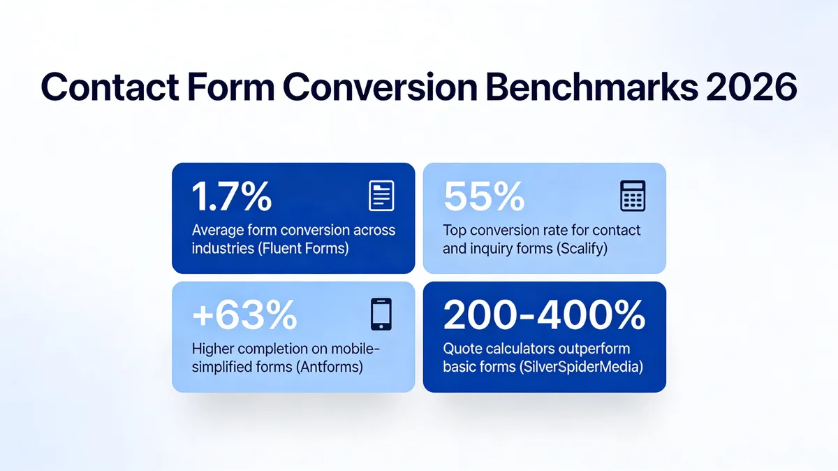
Form performance is a measurable line item, not a vibe. According to Fluent Forms, the average form conversion rate across all industries is 1.7%. That means 98 of every 100 visitors who see your form do not finish it. Inquiry forms specifically sit higher — abandonment data from Scalify shows contact and inquiry forms convert around 55% when they are well-built, but the spread between top and bottom performers is enormous.
Contact form conversion benchmarks for 2026.
The gap is design. Data from Antforms shows simplified mobile forms see up to 63% higher completion rates than their desktop-cloned counterparts. And per SilverSpider Media, swapping a generic contact form for a quote calculator can outperform traditional forms by 200 to 400% on lead quality and completion. Even small structural choices move the needle: Chili Piper found that letting prospects book a meeting immediately after submission doubles the inbound conversion rate from 30% to 66.7%.
So the design decisions you make on a single page — field count, label placement, post-submit flow — are worth tens of thousands of dollars per year for any business that depends on inbound. The 15 examples below are the patterns I keep seeing in the brands that get this right.
Key Elements of a High-Converting Contact Form
Before the showcase, here is what every form on the list shares. I lean on these eight elements every time I audit a contact page for a Popupsmart customer.
• A short, scoped field set: Three to five fields covers most contact use cases. Zuko data shows only 38% of users who interact with a contact form complete it — every extra field widens that gap. Cut anything you would not act on inside 24 hours.
• Labels above fields, not floating placeholders only: Placeholders disappear once typing starts, which forces users to remember what each field asked. Persistent labels stop the second-guessing and reduce error rates on mobile.
• One column, never two: Two-column forms feel compact but actually slow users down because the eye zigzags. A single column reads top to bottom and works on every screen size.
• Real-time inline validation: Show the green check or the red error message as the user leaves the field, not after they hit submit. Users fix issues while context is fresh.
• A topic or reason-for-inquiry dropdown: A four-to-six option dropdown routes the message to the right team without forcing the user to write a long subject line. It also lets you trigger conditional fields (order number for support, company size for sales) only when relevant.
• A specific, action-oriented button: "Send My Message" or "Get My Quote" beats "Submit" in almost every test. The button copy should restate the value, not the action.
• Visible trust signals near the submit button: A privacy line, a response-time promise ("We reply within one business day"), or a small lock icon does more work than any badge in the footer. These elements sit where the hesitation peaks.
• A real confirmation, not a vanish: After submission, show a confirmation panel with what happens next, optional links to documentation or a calendar booking, and the original message echoed back. Replacing the form with blank space looks broken.
If you want a deeper field-by-field breakdown, our guide on lead capture forms walks through each component with conversion benchmarks. For longer flows, multi-step forms let you split a 10-field beast into three painless steps.
15 Website Contact Form Examples
I picked these 15 forms after working through more than 80 live contact pages across e-commerce, beauty, B2B SaaS, and event brands. Each example below covers what the form does, why the structure works, and the one thing you should steal for your own page.
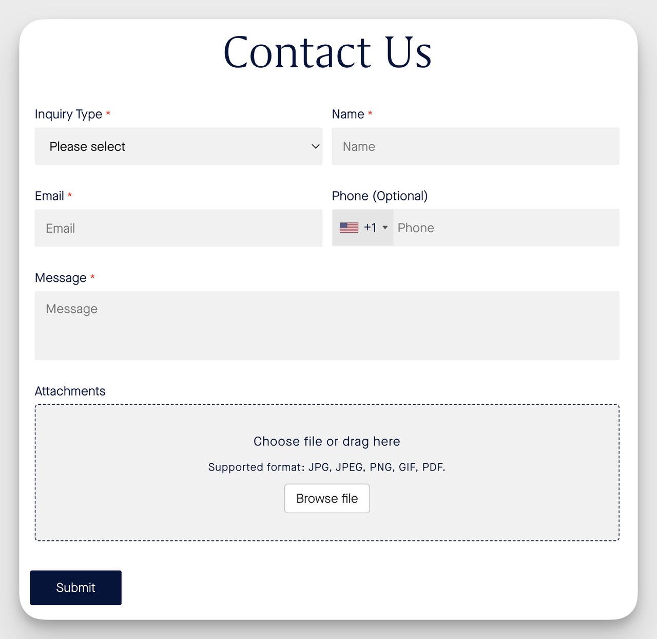
1. K18: Order Support Inquiry Form
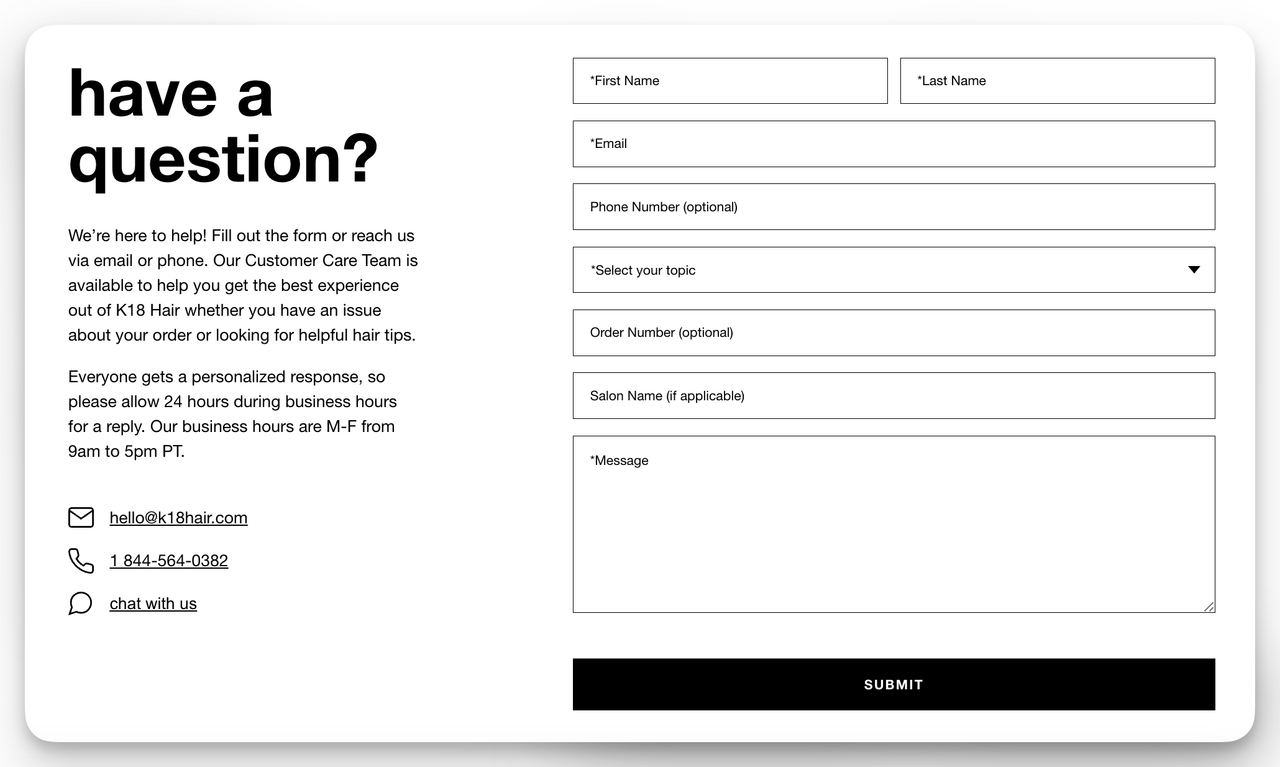
K18's support form keeps order context tight.
What it does: K18's support form opens with a topic dropdown ("How can we help?") and adapts what shows up next based on the choice. If you pick an order issue, it asks for the order number. If you pick a product question, it routes to a different team. The form sits on a single page with name, email, topic, order number, and message — no phone number, no marketing checkboxes.
Why it works: The topic dropdown is doing routing work that would otherwise sit on K18's support team. By collecting the order number only when it matters, the form respects users who are asking about ingredients or refills and do not have an order to reference. The "we will respond within 24 hours" line under the submit button removes the "did this go through?" anxiety that drives customers to email founders directly.
Key takeaway: Use a topic dropdown to route inquiries and trigger conditional fields. You shrink the apparent form length while still collecting the right context per request type.
2. NYX Cosmetics: Customer Care Form With Hours of Operation
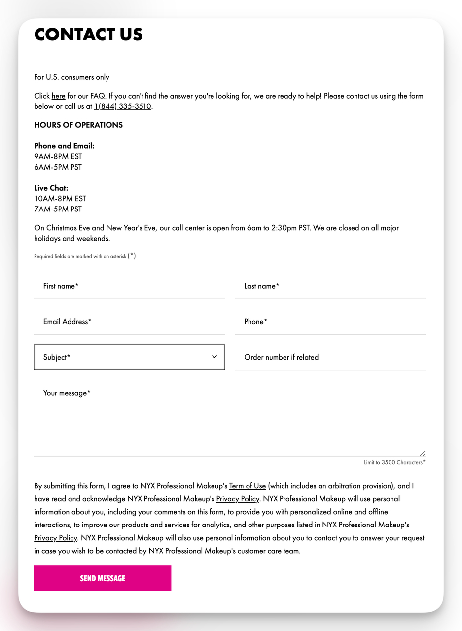
NYX sets clear expectations on response timing.
What it does: NYX puts the customer care hours and a short data-handling note above the form. Required fields are flagged with asterisks, the layout is single-column, and the message field is sized to invite a real description (about six lines visible) instead of a one-liner.
Why it works: Listing the support hours upfront pre-empts the "why has nobody replied?" frustration when someone submits at 11pm on a Saturday. The data-handling note doubles as a trust signal without dragging users to a separate privacy page. Required-field asterisks shave a half-second off form scanning because users immediately see where they can skip.
Key takeaway: Tell users when they will hear back and how their data is used in two short lines above the first field. Trust-building copy belongs at the entry point, not buried in the fine print.
3. Salesforce: Newsletter Sign-Up With Job Context
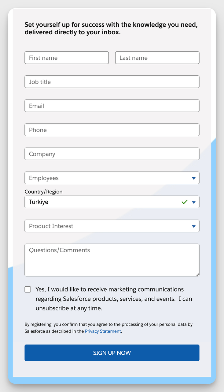
Salesforce treats newsletter signup as light B2B segmentation.
What it does: Salesforce uses a newsletter form that asks for name, email, job title, company, and country. It is heavier than a typical email signup because the audience is B2B buyers, and the extra fields let Salesforce segment which industry newsletter to send.
Why it works: Most newsletter forms ask for too little (just email, no segmentation) or too much (10 fields for a free PDF). Salesforce gets the balance right by tying every field to a real downstream use — job title routes you into the right marketing track, country handles compliance and timezone send windows. Nothing is collected for the sake of a CRM record.
Key takeaway: If you ask for an extra field, you should be able to name the email or workflow that uses it. Newsletter forms can carry segmentation work, but only if every field maps to a downstream send.
4. Bloomreach: Sales Inquiry With Smart Dropdown Routing
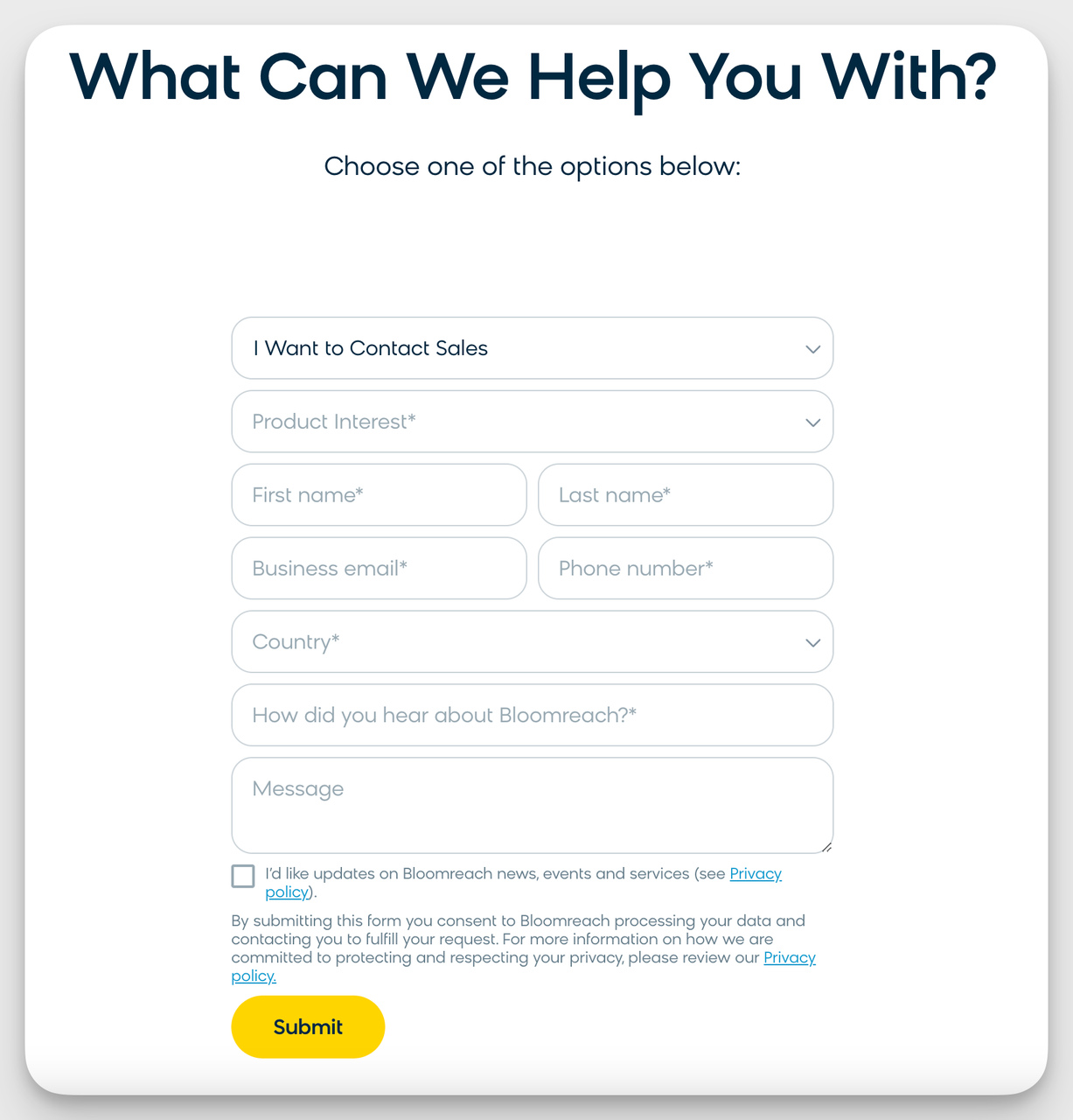
Bloomreach opens with a clear CTA and a routing dropdown.
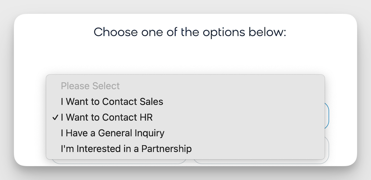
The dropdown reveals reason-specific fields without overwhelming the user.
What it does: Bloomreach's contact form pairs a "reason for contact" dropdown with dynamic field swaps. Pick "request a demo" and you get fields for company size and use case. Pick "press inquiry" and you get publication and deadline fields. The headline rewrites itself based on the selection so the form always feels purpose-built.
Why it works: One form replaces what most B2B sites split across three or four landing pages (demo, sales, press, partnerships). Visitors land in one place, self-select, and never see fields meant for someone else. That cuts cognitive load and keeps the routing logic in marketing's hands instead of forcing engineering to build a separate page per use case.
Key takeaway: Build one contact form with conditional fields driven by a single dropdown. You ship faster, route better, and avoid the SEO mess of half-baked single-purpose pages.
5. Kirrin Finch: Apparel Brand Standard Contact
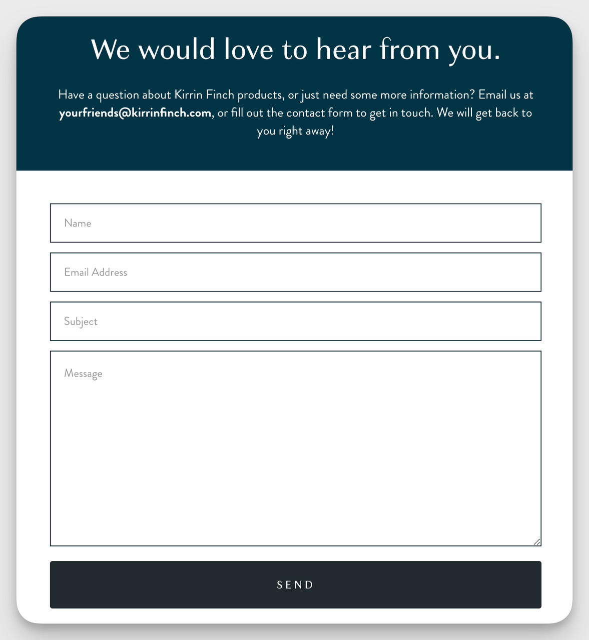
Kirrin Finch keeps it short and warm.
What it does: Kirrin Finch runs a four-field form: name, email, subject, message. The page copy reads like a note from the founders ("We read every email — drop us a line"), not a corporate help desk script.
Why it works: Apparel customers usually contact a brand for sizing, returns, or restock questions — three use cases that fit a free-form message field better than a dropdown maze. Stripping the form down to four fields removes the friction that bigger e-commerce sites pile on for routing they could handle in support tooling. The warm intro copy makes the form feel like a conversation, not a ticket queue.
Key takeaway: If your support team can route messages from the body text alone, you do not need a topic dropdown. Skip it and let the form feel human.
6. Rothy's: Eco-Fashion Support With Phone Fallback
Rothy's offers a file upload for return-related photos.
What it does: Rothy's combines a topic dropdown with a required name and email, an optional phone field, and a file attachment. Customers contacting about a defect can upload a photo of the damage right inside the form.
Why it works: The optional phone field is doing real work — Rothy's support team can call customers about complex returns instead of trading 11 emails. The attachment field cuts the typical photo-by-email back-and-forth that frustrates both sides. By marking these fields optional rather than required, Rothy's avoids punishing users who only want a simple text reply.
Key takeaway: Add a file upload field if your team would otherwise ask for a photo over email. One upfront upload saves a 24-hour reply cycle.
7. Artisaire: Artisan Brand With Contact Channel Choice
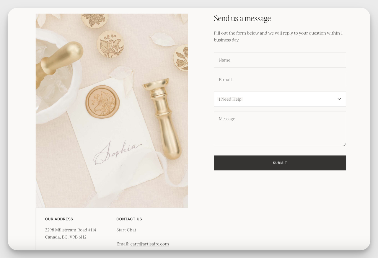
Artisaire offers chat or email alongside the form.
What it does: Artisaire's contact page leads with the form but stacks alternative channels — live chat, direct email, and a phone link — right next to it. The form itself is segmented into clearly labeled sections so users know exactly which area handles their question.
Why it works: Some users will never fill a form, no matter how short it is. Putting chat and email in the same visual block means you do not lose those people to the back button. The channel choice also smooths out support load — quick "do you ship to Canada?" questions go to chat, custom orders go through the form. The brand-aligned visual treatment keeps everything feeling like one experience instead of three different help systems bolted together.
Key takeaway: List your alternative contact channels next to the form, not at the bottom of a sidebar. Chat and email options pick up users who would otherwise leave.
8. The Silk Willow: Custom Order Form With Image Uploads
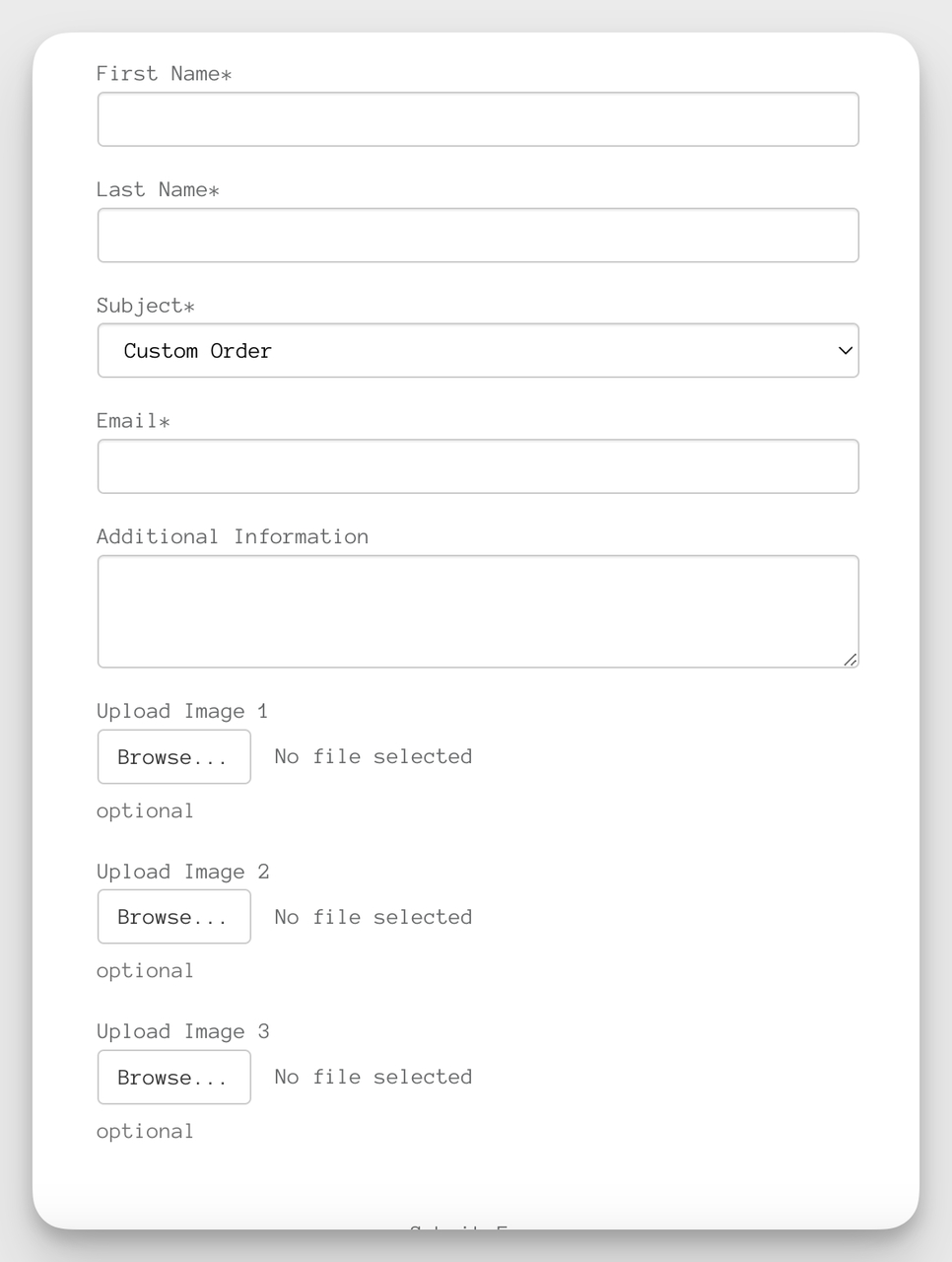
Silk Willow's custom order form uses multiple image fields.
What it does: The Silk Willow runs custom event-floral orders through a long but thoughtful form: event details, color palette, budget range, and three separate image upload slots for inspiration photos. The form is split into clear sections so the length feels manageable.
Why it works: A custom-order use case is the rare moment where a long form helps. Without inspiration photos and budget context, the brand cannot quote accurately and the customer wastes time on follow-up emails. By giving image uploads a clear purpose ("share three photos of arrangements you like"), the form turns what would feel like an interrogation into collaborative briefing. Sectioning the fields visually does the same job a progress bar does on multi-step forms — it makes the length feel intentional rather than excessive.
Key takeaway: For custom or quote work, justify every long-form field with the question, "would I have to ask for this in the next email anyway?" If yes, collect it now.
9. Semrush: Standard B2B Contact Form
Semrush keeps its general contact form lean.
What it does: Semrush's general contact form sticks to name, email, subject, and message in a single column, with a tight privacy line directly above the submit button.
Why it works: For a SaaS company that already runs separate sales and support funnels, the general contact form is for press, partnerships, and edge-case inquiries. Loading it with sales-qualification fields would punish the legitimate "who do I talk to about X?" submissions and frustrate users who do not fit the standard sales motion. Keeping it short signals the form is a real channel, not a black hole.
Key takeaway: If you already segment sales and support into their own forms, keep the general contact form deliberately short. It exists for the cases your other forms do not catch.
10. Klaviyo: Customer Support Form With Account Lookup
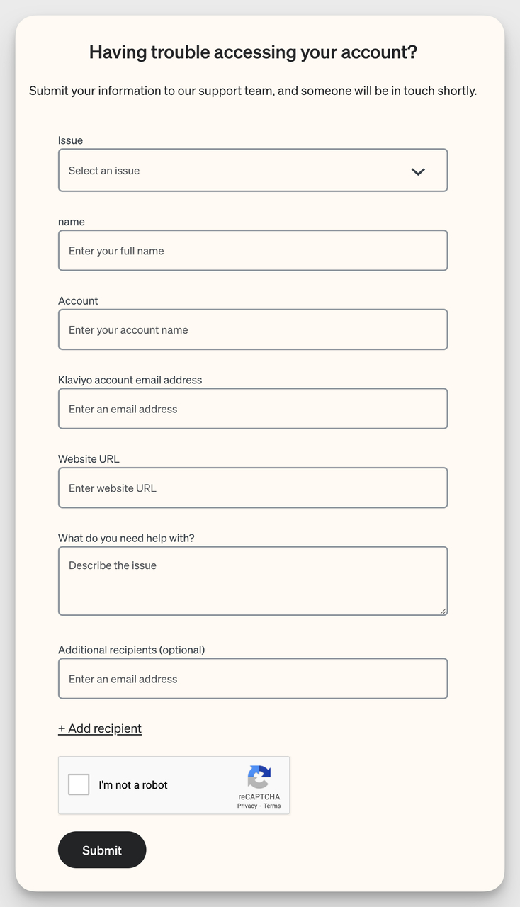
Klaviyo asks for account context to skip first-reply triage.
What it does: Klaviyo's support form asks for your account email (separate from your contact email), the topic of your issue, and a description. There is space to attach screenshots and a note about expected response times.
Why it works: Asking for the account email upfront — separate from the reply email — solves a real support headache: customers often contact from a personal address when their account uses a work address. That single split lets the support team pull up the account on the first reply instead of asking "can you tell me which account email this is about?" and burning a day. The screenshot upload removes another back-and-forth on technical issues.
Key takeaway: If your product has accounts, separate "contact email" from "account email" in your support form. It is a single extra field that eliminates one full reply cycle on a quarter of your tickets.
11. Semrush: Sales Inquiry Form With Company Context
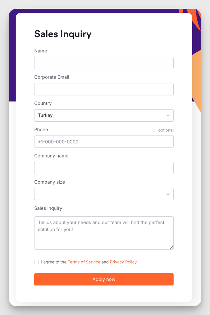
Semrush's sales form gathers qualification details upfront.
What it does: Semrush runs a separate sales-inquiry form that asks for work email, company name, company size, country, role, and a short message. It also includes a marketing-consent checkbox.
Why it works: This is a different form for a different funnel — and that distinction matters. By separating sales from general contact, Semrush can ask qualification questions that would feel intrusive on a normal contact page. Company size and role are the two fields that determine whether a lead goes to inside sales, enterprise, or self-serve, so collecting them upfront skips a discovery call that nobody wants. The opt-in consent box is positioned where compliance regulators want it (above submit, not as a pre-checked default).
Key takeaway: Build a separate sales form rather than overloading your general contact form. Two purpose-built forms outperform one bloated form every time.
12. Salesforce: Feedback Form With Rating Scale
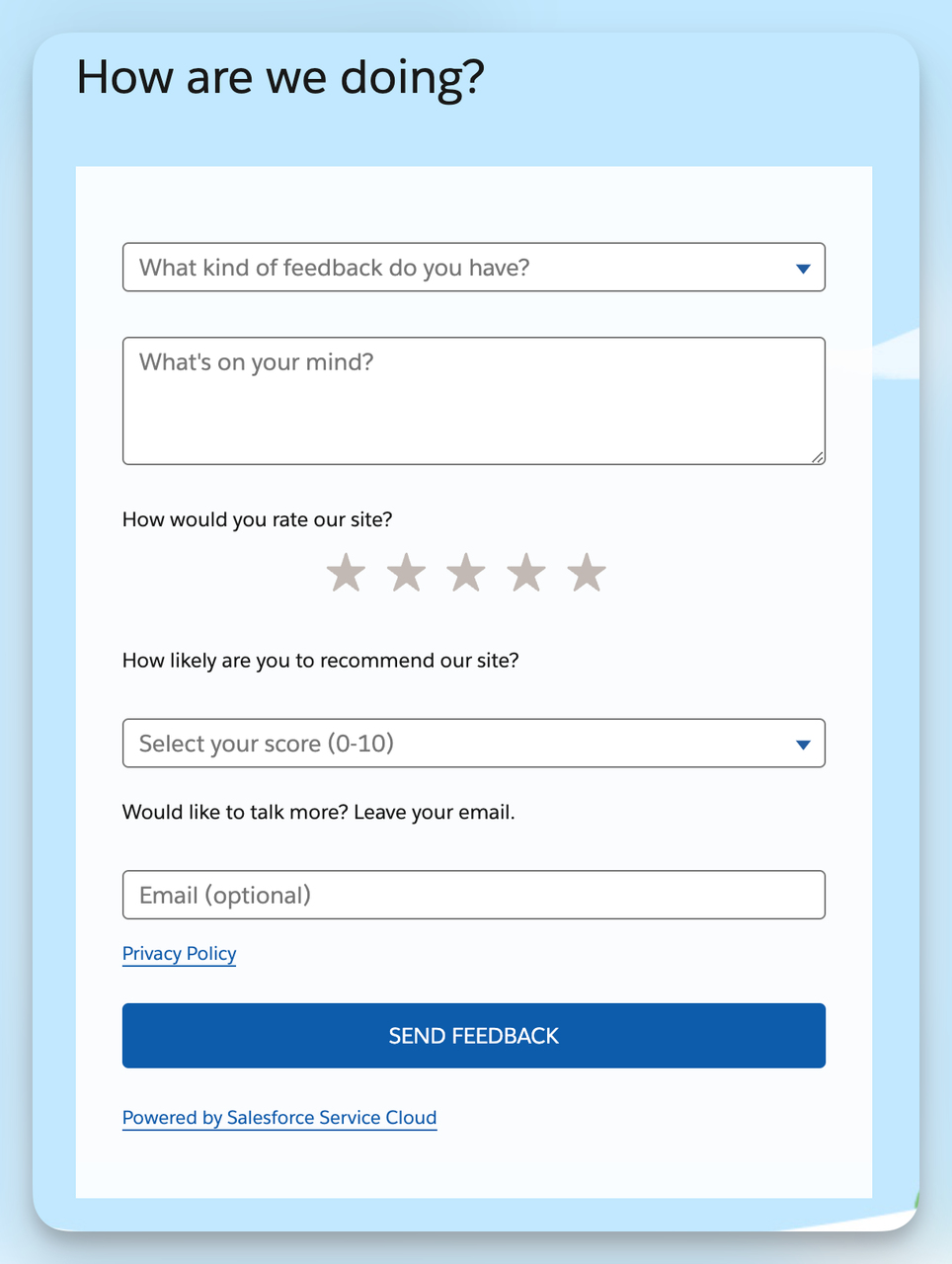
Salesforce uses radio buttons to make feedback fast.
What it does: Salesforce's feedback form mixes a rating scale (radio buttons), a multi-select checkbox group for what worked or did not, and an optional open-text field at the end.
Why it works: Feedback forms have to balance two opposite needs — give engaged users space to write paragraphs, and give busy users a 30-second tap-and-go path. Salesforce solves it by putting the structured questions first so anyone can finish in a minute, then letting the open-text field absorb the long responses from people who actually want to write. The result is more total submissions and better quality data, since users do not have to write prose to leave any signal at all.
Key takeaway: Lead feedback forms with closed questions (ratings, multi-select), then offer one optional open field. Mandatory paragraph fields kill response rates.
13. Mailchimp: Event Registration Form
Mailchimp ties event signup to its core CRM.
What it does: Mailchimp's event registration form collects name, email, company, role, and session preferences. After signup, the form auto-syncs the registrant into the relevant Mailchimp audience for follow-up emails.
Why it works: Most event forms collect data and then forget about it until the day of the event. Mailchimp ties the registration straight into the email automation that confirms, reminds, and follows up — so a registration is the start of a sequence, not a one-off entry in a spreadsheet. Session preferences let the team size rooms and tailor reminder copy. The form intentionally avoids asking for phone or address since the entire follow-up runs through email.
Key takeaway: Connect your event form directly to your email tool's automation, not just a contact list. The reminder sequence is half the conversion.
14. Bloomreach: Newsletter Signup With Social Proof
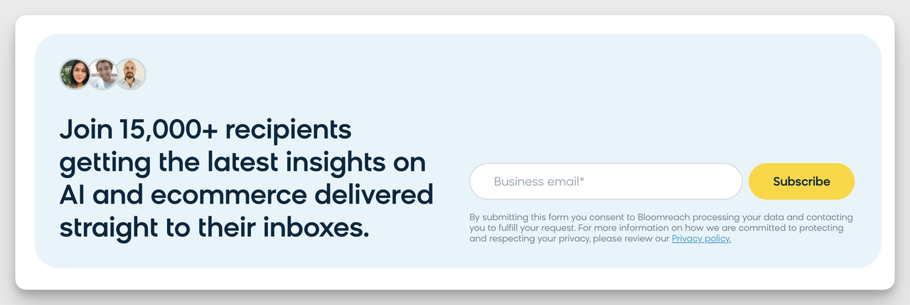
Bloomreach pairs the form with named-customer logos and quotes.
What it does: Bloomreach's newsletter form sits next to a stack of customer logos and a short testimonial quote. The form itself is simple — work email plus an optional company field — but the surrounding panel does most of the persuasion.
Why it works: Form copy can only do so much. Putting recognizable customer logos and a named testimonial inside the same visual block as the form gives hesitant users the social proof they need to type their email. The "you'll be in good company" effect is hard to manufacture inside the form fields themselves, so the design lets the surrounding context carry the trust load. It also explains why the form gets away with a single email field — the testimonial has already done the convincing.
Key takeaway: Wrap your newsletter form in a panel with three to five customer logos and one short quote. The form stays short, the page does the persuading.
15. Davines: Partnership Inquiry Form
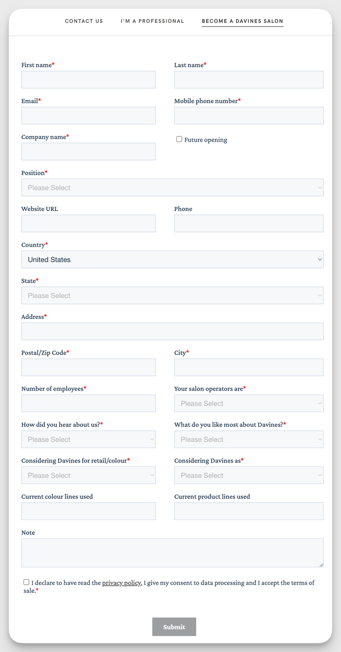
Davines qualifies partnership leads with role and region fields.
What it does: Davines's partnership form asks for company name, country, type of partnership (salon, distributor, retail), website, and a short proposal field. The form is gated to partnership inquiries only — separate from press or general contact.
Why it works: A partnership form has to filter out the wrong-fit submissions before they hit the team. Asking for country and partnership type upfront lets Davines route inquiries to the regional partnerships lead automatically and weed out one-off requests that do not match their channel strategy. The website field doubles as a quick credibility check — the partnerships team can size up the prospect in 30 seconds before booking any time.
Key takeaway: For partnership and reseller forms, ask the two or three questions you would otherwise have to ask in the first reply. Front-load the qualification so your team only takes warm calls.
How to Create a Custom Contact Form in 7 Steps
If you want to build something similar to the examples above without writing code, here is how I'd do it inside Popupsmart. The whole flow takes 15 to 25 minutes and the form lives on your site after a single embed.
Step 1: Add the Embed Code to Your Site
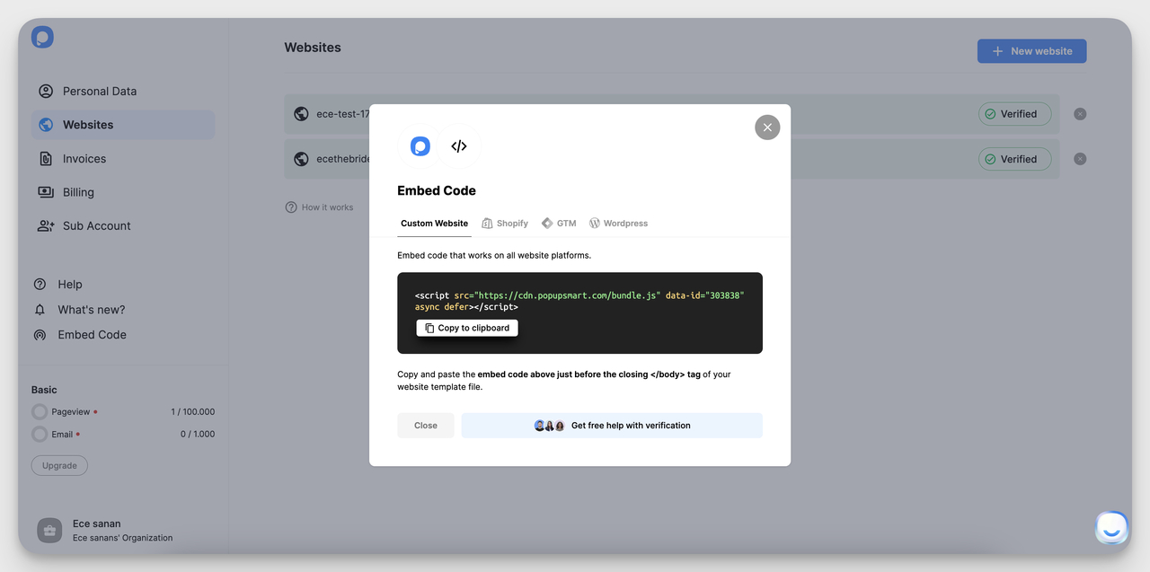
One embed snippet works for every campaign you build later.
After you sign up, the dashboard hands you a single embed snippet. Drop it into your site's head or footer once — Shopify, Webflow, WordPress, or plain HTML all work the same way. From that point forward, every form you build inside Popupsmart goes live on your site without touching the code again. If you have ever shipped a Google Tag, the experience is identical.
Step 2: Pick a "Collect Form Submission" Template
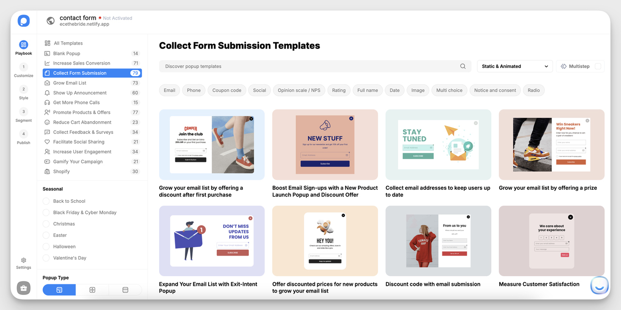
Templates split by use case — contact, support, demo, feedback.
From the campaign builder, pick the "Collect Form Submission" objective. The template gallery splits into use cases — contact, demo request, support inquiry, feedback, custom order — so you can start from a layout that matches your goal instead of dragging a blank canvas. Picking the right template here saves the next 10 minutes of work.
Step 3: Open the Selected Template
Edit copy, colors, and layout in the visual builder.
The template loads in a visual editor. Swap the headline copy, tweak colors to match your brand, and resize the form panel. If you have ever used a slide editor, this is the same pattern — click an element, edit the panel on the right. Nothing here requires CSS.
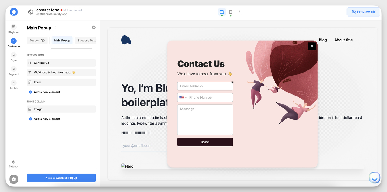
Step 4: Add the Form Fields You Need
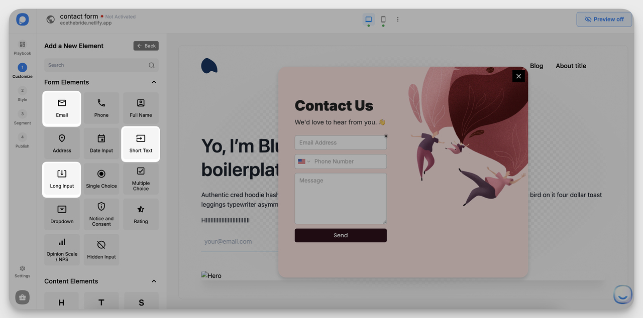
Drag in dropdowns, file uploads, and conditional fields.
This is where you customize for your use case. Add a topic dropdown, a long-text message field, a file upload, or a phone number — each input type is a single click. Stick to the rule from the Key Elements section: every field needs a downstream use, otherwise cut it. For most contact use cases, four or five fields is the sweet spot.
Step 5: Add a Privacy and Consent Checkbox
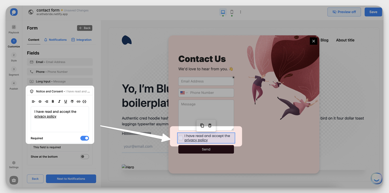
An unchecked consent box keeps GDPR auditors happy.
Add a privacy checkbox above the submit button. Keep it unchecked by default — pre-checked boxes break GDPR consent rules in the EU and look shady everywhere else. Link the checkbox copy to your actual privacy policy. This single field is what separates a form that can collect EU traffic from one that cannot.
Step 6: Set URL Targeting
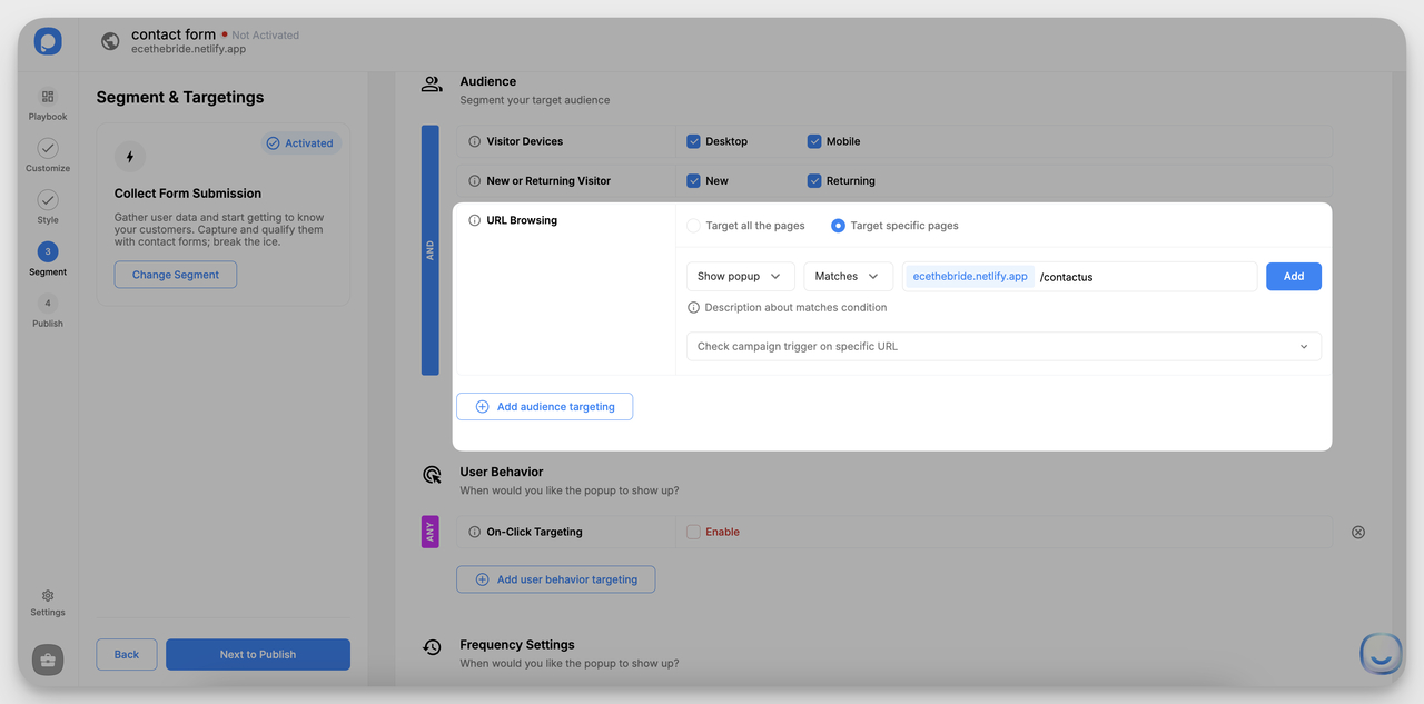
Show the form only on pages where it makes sense.
Pick the pages where the form should appear. A contact form usually targets the contact page, but you can also trigger it on pricing, support docs, or specific blog posts. Combine URL rules with device targeting (mobile-only, desktop-only) and trigger conditions like exit intent or scroll depth. A form that only shows where it is relevant performs much better than a global popup.
Step 7: Connect Integrations
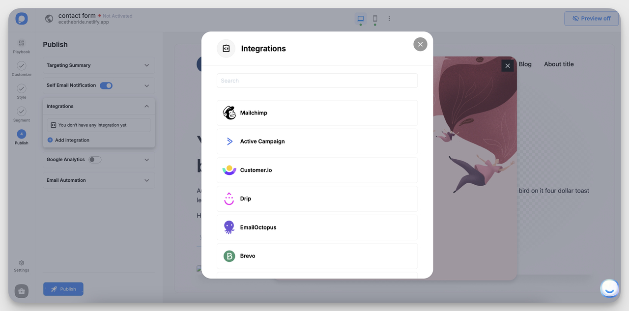
Pipe submissions into HubSpot, Mailchimp, Slack, or your CRM.
Pick where submissions should land. HubSpot for sales, a help desk for support, Mailchimp for newsletter signups, Slack for instant pings to a partnerships team. The integration is the difference between a form that creates a CRM record and one that creates an inbox-only message nobody acts on. Hit publish, and the form is live.
If you'd rather see the same flow built across other no-code platforms, our roundup of form builder tools covers the alternatives.
Best Practices for Contact Form Placement and Design
The form itself is half the battle. Where it sits and how it behaves on different devices decides whether anyone gets to fill it out. Here is what I keep coming back to after auditing dozens of contact pages.
Place the form where users already are. The default contact form lives on a /contact page nobody visits. Better placements: in your site footer (sitewide reach), inside a help-center sidebar (catches frustrated users), as an exit popup on pricing pages (rescues bouncing buyers), or as an inline form at the bottom of long-form blog posts. Treat the contact page as one of several entry points, not the only one.
Design for thumbs first. Mobile makes or breaks contact forms. PdfFiller data shows mobile users complete forms eight to nine percentage points lower than desktop users on the same form. The fix is not a tighter mobile breakpoint — it is a different layout: bigger tap targets (minimum 44px), a single column always, native input types so the right keyboard pops up (numeric for phone, email keyboard for email), and a sticky submit button that stays visible while users scroll the message field.
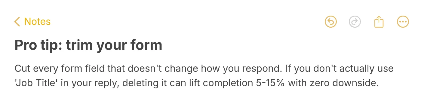
Pro tip: trim every form field you don't use to follow up.
Split long forms into steps. Anything over six fields is a candidate for a multi-step layout. Splitting a 12-field B2B sales inquiry into three steps of four fields each shows users a progress bar instead of a wall, and lets you collect easy fields first (name, email) before the heavier ones (budget, timeline). Our walkthrough on multi-step forms covers when and how to split.
Use trust signals where hesitation lives. The hesitation moment for a contact form is right above the submit button. That is where you should put your privacy line ("We never share your email"), your response-time promise ("Replies within one business day"), and your social proof if you have it ("Join 5,000+ marketers"). Stuffing these signals at the top of the form, before the user even reads the fields, wastes them.
Match the form to the funnel stage. A top-of-funnel newsletter signup should be one field. A bottom-of-funnel demo request can ask for company size and role. Mixing these up — long form for newsletter, short form for demo — leaks both ways. The form should ask for as much as the next step justifies, no more.
Test the post-submit experience. The "thank you" screen is where you can add a calendar booking link, a downloadable PDF, or a follow-up question. Chili Piper data shows that letting prospects book a meeting right after submitting a form doubles inbound conversion rates. A blank "we'll be in touch" screen is wasted real estate.
If you want to dig deeper into specific lift levers, our guide on form conversion rates covers 10 tactics with measured before-and-after numbers.
Common Contact Form Mistakes to Avoid
Five mistakes show up in almost every underperforming form I audit. Each one is a quick fix.
Mistake 1: Asking for a phone number you will not use. If your team's first response is always email, the phone field is friction with no payoff. Zuko data shows phone fields are among the most-skipped on contact forms. Either drop the field or mark it optional and stop asking for it as a required entry.
Mistake 2: Generic "Submit" button copy. "Submit" tells users nothing about what happens next. "Send My Message," "Get My Quote," or "Request a Demo" restates the value and gives the user a final cue that this is the action they wanted. Button copy is the cheapest test you will ever run.
Mistake 3: Showing all errors only after submit. Users hit submit, see five red error messages they could have caught one at a time, and bounce. Inline validation that fires on field-blur (when the user clicks out of a field) catches mistakes while context is fresh and stops the "wall of red" panic.
Mistake 4: Replacing the form with blank space after submit. The screen flashes, the form vanishes, and the user has no idea if anything went through. Replace the form with a confirmation panel that echoes back the message, gives a response-time promise, and offers a next step (book a call, browse docs, follow on social).
Mistake 5: No spam protection visible. Either you have CAPTCHA in a place that frustrates real users, or you have no spam protection and your form fills with junk submissions that bury the real ones. Use invisible reCAPTCHA or a honeypot field — both block bots without making humans solve puzzles.
For the e-commerce specific equivalent of these patterns, opt-in page examples and gated content forms apply most of the same rules at the offer level.
Audit Your Contact Form This Week
Pick one contact form on your site and run it through the eight-element checklist above. Count the fields, check the column count, look at where the privacy line sits, and submit a test on your phone. Most forms fail at least three of the eight elements — and each fix is a 10-minute job, not a redesign.
Once you've cleaned up the existing form, build the second one. A separate sales-inquiry form, a feedback form on the help docs, an event signup tied to your email tool — each of these picks up submissions your single contact form misses. The brands in the showcase above don't run one form, they run four or five purpose-built forms.
If you want to ship those forms without writing code, the seven-step walkthrough above will get the first one live inside Popupsmart this afternoon. Pick the template, swap the copy, drop the embed snippet, and the form starts collecting submissions tonight.
Frequently Asked Questions
What are the best practices for a high-converting contact form?
The shortlist: keep fields to the three to five you'll actually use, place labels above fields rather than relying on placeholder text, use a single column, fire inline validation as users leave each field, and write a specific submit button like "Send My Message" instead of "Submit." Add a privacy line and a response-time promise above the submit button — that's where hesitation peaks. For longer forms (six fields and above), split into multi-step layouts with a progress bar so the length feels intentional.
How can I optimize my contact us page for mobile users?
Three changes do most of the work. First, switch to a single-column layout that doesn't reflow on mobile — two-column desktop forms break visually on small screens. Second, set every input to use the right native type (email, tel, number) so the correct keyboard appears, which cuts typing time by half. Third, make tap targets at least 44px tall and keep the submit button sticky while users scroll the message field. Together, those three changes can lift mobile completion by the 60%+ that Antforms reports for simplified mobile forms.
What elements should I include in my contact form design?
The non-negotiables: name, email, message, a submit button, and a privacy line. The high-value additions: a topic dropdown that routes inquiries (cuts triage time on the support side), conditional fields tied to that dropdown (only shows what's relevant), inline validation, a file upload if your team would otherwise ask for a photo over email, and a confirmation panel after submit. Skip phone numbers unless you actually call leads, and skip job-title fields unless you segment newsletter sends by role.
How do I track submissions from my contact form?
Set up four tracking layers and you'll cover everything. Configure a form-submit event in Google Analytics 4 — that gives you source, medium, and conversion path. Pipe submissions into your CRM (HubSpot, Salesforce, or whatever you run) so the lead lives outside your inbox. Tag the form's URL with UTM parameters when you link to it from emails or social so you can see which channels drive submissions. And turn on email notifications for the team handling replies — that's the safety net for when an integration silently breaks.
How many fields should a contact form have?
Three to five for general contact, four to seven for sales inquiries, six to ten (split into steps) for custom orders or B2B qualification. Every field past five drops completion by a measurable amount, so the question isn't "what would be nice to know" — it's "what does the next reply absolutely require?" If you can't name the email or workflow that uses a field, cut it.
Related Articles You Might Find Useful
7 Essential Components of Stunning Lead Capture Forms
How to Add a Contact Form to a Website: Comprehensive Guide
How to Create Popup Forms for Your Website (2025 & Free)
Increase Form Conversion Rates with 10 Simple But Powerful Ways

How would you rate your experience with this article? 😊