Confirmation Email: 25 Examples, Templates & Tips (2026)
Confirmation emails verify or acknowledge online actions to build security, trust, compliance, and engagement. It covers writing tips, 7 common types with templates, and 25 brand examples, plus FAQs on necessity and differences from shipping notices.
A confirmation email is an automated message sent immediately after a user completes an action, such as placing an order, registering an account, or booking an event. These 25 confirmation email examples span order receipts, account verifications, subscription opt-ins, and booking confirmations from brands like Airbnb, Spotify, and Notion. Use them as templates for your own campaigns.
What Makes a Great Confirmation Email?
I reviewed over 100 confirmation emails across SaaS, e-commerce, and hospitality brands and selected these 25 based on four criteria:
• Clarity of purpose: The recipient knows exactly what was confirmed within the first two lines. No guessing, no scrolling required.
• Brand consistency: Colors, tone, and layout match the sender's website and product. The email feels like a natural extension of the brand experience.
• Actionable next step: Each email includes at least one clear call-to-action that moves the recipient toward the next logical step, whether that's tracking an order, logging in, or exploring features.
• Mobile readability: The layout works on a 375px screen without horizontal scrolling, broken images, or truncated buttons.
One pattern stood out across every high-performing example: the fastest confirmation emails (sent within 60 seconds of the action) generated far fewer support tickets. Delayed confirmations create doubt, and doubt leads to "Did my order go through?" messages flooding your inbox.
Quick Look at 25 Confirmation Email Examples
| # | Brand | Category | Why It Works |
|---|---|---|---|
| 1 | Wix | Account Verification | Minimal design, single CTA button |
| 2 | Webflow | Account Verification | Browser fallback link + video onboarding |
| 3 | Spotify | Account Verification | Brand-colored visual hook with music CTA |
| 4 | Pitch | Account Verification | Three-paragraph micro copy |
| 5 | Airtable | Account Verification | Ultra-minimal text-only confirmation |
| 6 | Canva | Account Verification | Instant support escalation option |
| 7 | Grammarly | Security Verification | Settings transparency after 2FA toggle |
| 8 | Whereby | Security Verification | Login code delivery with support fallback |
| 9 | Avocode | Account Verification | Expiring link creates urgency |
| 10 | Zencastr | Account Verification | On-brand illustration with clear CTA |
| 11 | Crocs | Order Confirmation | Step-by-step order status layout |
| 12 | Depop | Order Confirmation | Personalized username + bold title |
| 13 | Ipsy | Order Confirmation | Product images with full order breakdown |
| 14 | DoorDash | Order Confirmation | Delivery ETA + real-time tracking button |
| 15 | Lyft | Purchase Confirmation | Ride receipt with repeat-purchase incentive |
| 16 | Polaroid | Subscription Confirmation | User-generated photography + consent notice |
| 17 | Notion | Subscription Confirmation | Direct-to-confirmation, zero fluff |
| 18 | Shuka | Subscription Confirmation | Literary storytelling hook |
| 19 | Headway | Subscription Confirmation | Illustrated onboarding with password option |
| 20 | Snack TBH | Subscription Confirmation | Brand identity through food imagery |
| 21 | Chipotle | Registration Confirmation | Humor-driven copy with footer navigation |
| 22 | Lucid Fox | Registration Confirmation | Celebration illustration, no redirect needed |
| 23 | RallyUp | Registration Confirmation | Getting-started guides embedded in email |
| 24 | Airbnb | Booking/Gift Confirmation | Long-form gift detail with personal tone |
| 25 | Homes Alive | Giveaway Confirmation | Contest rules + community engagement CTAs |
Account Verification Confirmation Emails
Account verification emails are the first touchpoint after signup. They carry the dual job of confirming the user's identity and setting expectations for what comes next. A bad verification email creates friction right when motivation is highest. Here are eight examples that get it right.
1. Wix: The Stripped-Down Single CTA
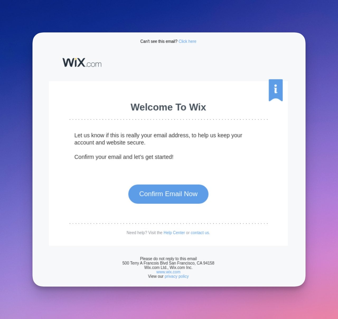
Wix keeps its verification email minimal
What works: Wix strips the email down to a headline, one sentence of context, and a single "Confirm Your Email" button. There's no sidebar, no product pitch, no footer links competing for attention. The button color matches Wix's primary brand palette, which trains recipients to associate that color with action across all Wix communications.
Why it works: Cognitive load theory says every additional element on screen competes for processing power. By giving recipients exactly one thing to do, Wix eliminates decision fatigue. The email loads fast on any device because there's almost nothing to render.
Key takeaway: If your confirmation email has one job (verify this address), give it one button. Move product education to a separate welcome sequence.
2. Webflow: Browser Fallback Plus Video Onboarding
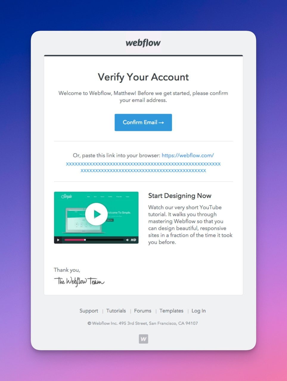
Webflow adds a browser-based confirmation fallback
What works: Webflow includes a fallback text link ("confirm email in your browser") below the primary button. This catches edge cases where email clients strip button formatting or CTA colors don't render. The email also embeds a link to a getting-started video, turning a transactional email into an onboarding moment without adding visual clutter.
Why it works: The fallback link is an insurance policy that costs zero extra design effort.
Key takeaway: Always include a plain-text link under your CTA button. It takes five seconds to add and can recover confirmations from users with aggressive email clients.
3. Spotify: Brand-First Visual Hook
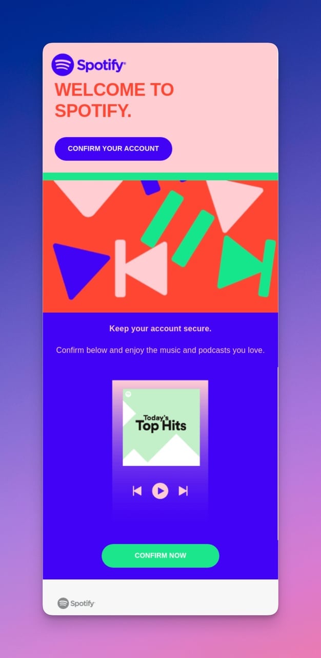
Spotify turns verification into a brand experience
What works: Where most verification emails are plain white with a button, Spotify floods the background with its signature green-to-purple gradient. Below the confirm button, a "Listen to your favorite hit" CTA gives users a reason to come back to the app immediately after confirming. The visual design mirrors the Spotify app interface, so the email feels like part of the product.
Why it works: The Von Restorff effect (isolation effect) predicts that items that stand out visually are remembered better. In a crowded inbox of white-background transactional emails, Spotify's colorful layout grabs attention first. The secondary music CTA uses the confirmation moment as a re-engagement trigger.
Key takeaway: Use your brand's visual identity in transactional emails. A verification email that looks like your product builds recognition before the user even logs in.
4. Pitch: Three-Paragraph Micro Copy
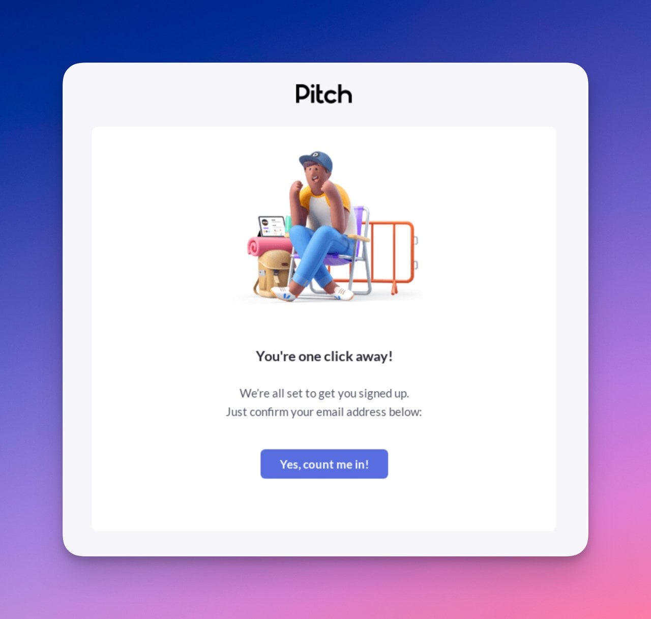
Pitch fits the entire message in three paragraphs
What works: Pitch limits the email to three short paragraphs: a greeting, a one-sentence explanation of what to do, and a CTA button labeled "Confirm my account" rather than the generic "Confirm email." The illustration at the top isn't decorative filler; it shows a presentation deck being created, reinforcing what the user signed up for.
Why it works: Specific CTA copy outperforms generic labels. "Confirm my account" uses first-person voice ("my"), which creates a sense of ownership before the user has even logged in. The illustration primes the user for the product experience rather than just the verification step.
Key takeaway: Write CTA buttons in first person ("my account," "my order") instead of second person ("your account"). It shifts the psychological framing from instruction to ownership.
5. Airtable: Text-Only Minimalism
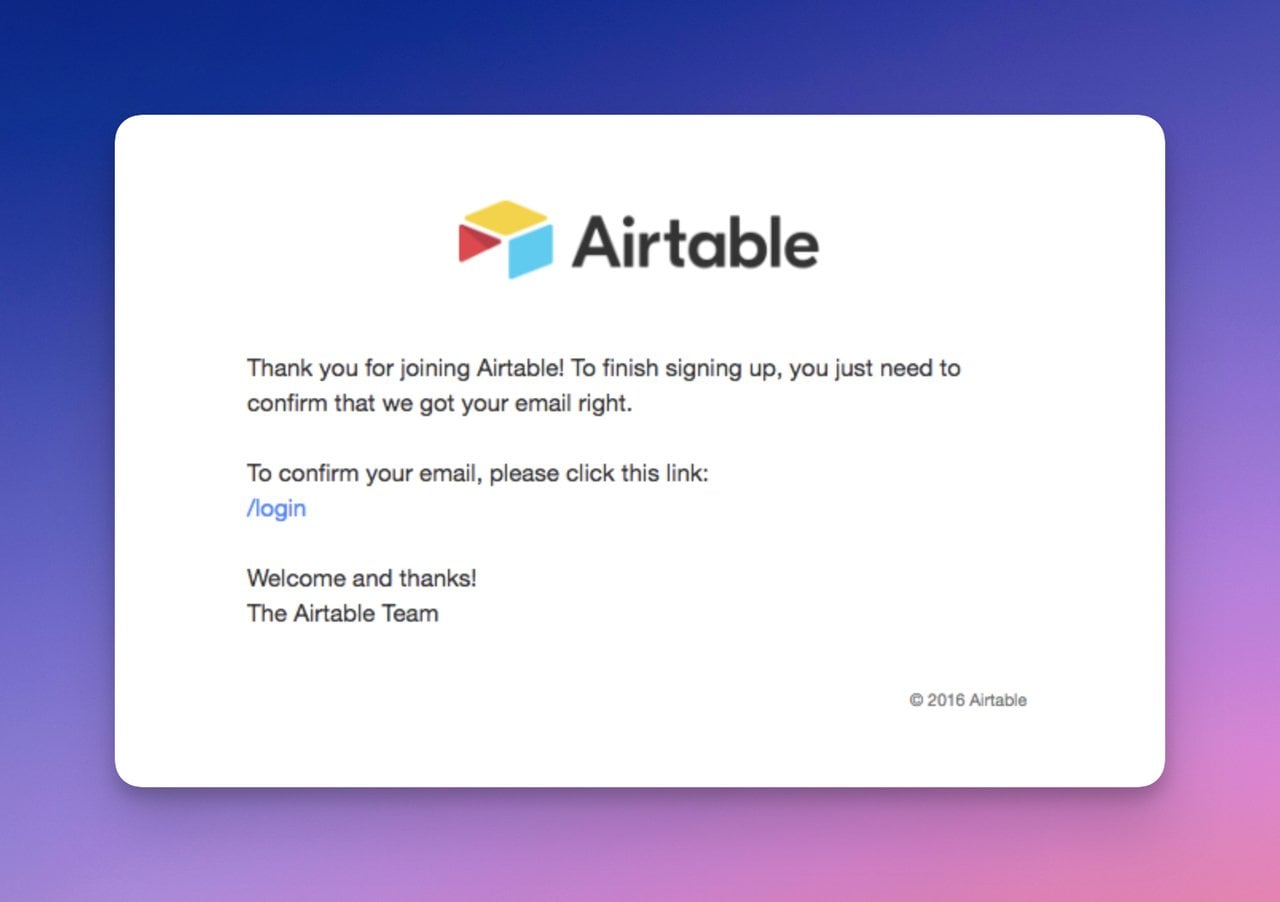
Airtable skips buttons entirely
What works: Airtable goes further than minimal; it's practically bare. Three sentences and a text link. No button, no images, no branding beyond the logo. The email loads instantly on every client, including stripped-down corporate email systems that block images by default. This is a confirmation email designed for speed and deliverability above all else.
Why it works: Text-heavy emails have higher deliverability rates because spam filters penalize high image-to-text ratios. For a B2B tool like Airtable, where users often sign up from corporate email accounts with strict security settings, this approach maximizes the chance the email actually reaches the inbox.
Key takeaway: If your audience uses corporate email (Outlook, Exchange), test a text-only version of your verification email. It may outperform your designed template in deliverability.
6. Canva: Support Escalation Built In
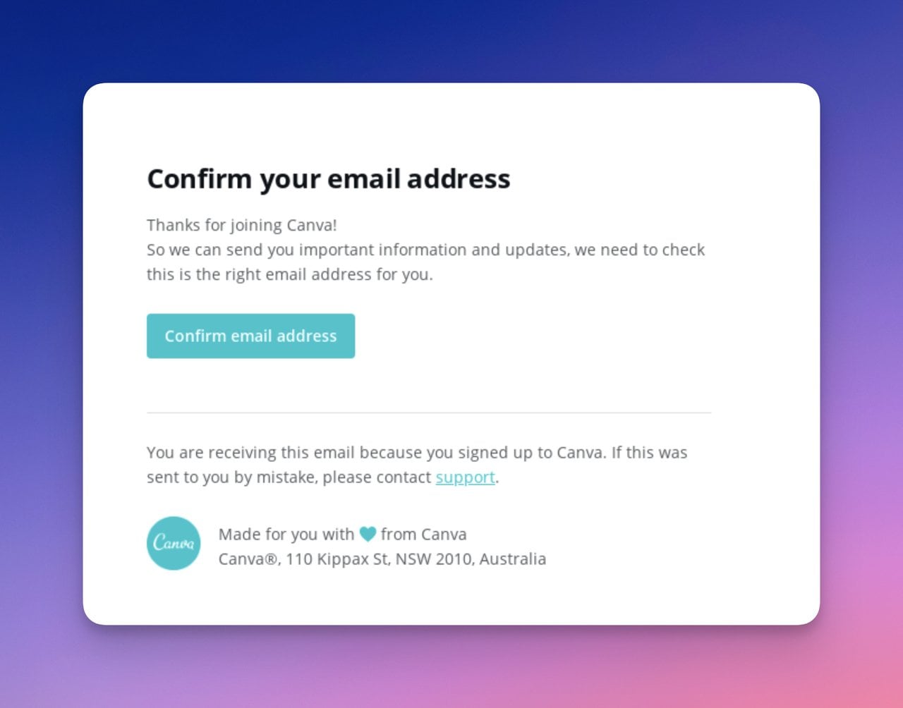
Canva offers immediate support access
What works: Canva does something most verification emails skip: it tells users what to do if they didn't request this email. A visible "contact support" link sits below the confirmation button. The copy is two sentences total, but that support link preempts a common friction point (account security concerns) before it becomes a support ticket.
Why it works: Providing an escalation path in the confirmation email itself reduces "I didn't sign up for this" reports. Instead of marking the email as spam (which hurts your sender reputation), confused recipients click the support link. The email protects your email deliverability while also building trust with legitimate users.
Key takeaway: Add a "Didn't request this?" link to every verification email. It protects your sender reputation and reduces spam complaints.
7. Zencastr: On-Brand Illustration With Clear CTA
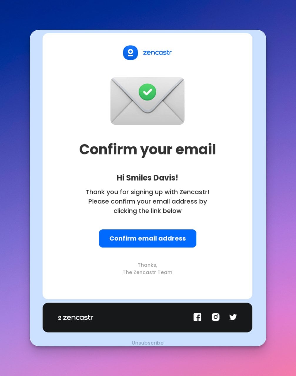
Zencastr uses an email icon to reinforce the action
What works: Zencastr uses an illustrated email icon at the top that visually communicates "this is about your email" before the recipient reads a word. The confirm button is the only actionable element. Copy is brief: a greeting, one sentence explaining the action needed, and the button.
Why it works: Visual hierarchy research from the Nielsen Norman Group's eye-tracking studies shows users process images before text. The email icon primes the recipient to expect a verification action, so when they reach the button, they already know what to do.
Key takeaway: Choose illustrations that reinforce the email's purpose, not just your brand's aesthetic. An image that previews the action reduces cognitive load.
8. Avocode: Expiring Link Creates Urgency
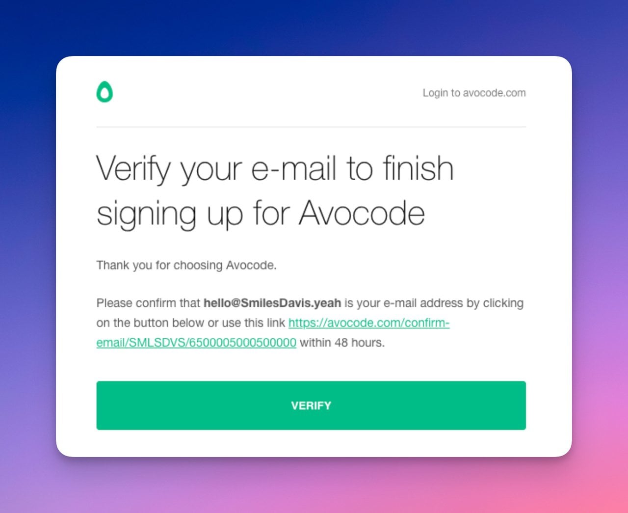
Avocode adds a time limit to the confirmation link
What works: Avocode includes a line stating the confirmation link expires in 48 hours. This isn't just a security measure; it's a behavioral nudge. The button and a plain-text backup link both appear prominently, so the recipient has two paths to confirm. The green color palette matches Avocode's brand without overwhelming the functional design.
Why it works: Time-limited actions trigger loss aversion. According to behavioral economics research by Kahneman and Tversky, people are more motivated by potential loss than equivalent gain. A 48-hour window is generous enough not to annoy users but specific enough to prompt action today rather than "later."
Key takeaway: Add an expiration window to your verification links and state it clearly in the email. Even a generous 48- or 72-hour limit increases same-day confirmation rates.
Security Verification Confirmation Emails
Security-focused confirmations handle sensitive events like two-factor authentication changes or login code delivery. They need to balance urgency with clarity, because a panicked user who can't parse the email will flood your support queue.
9. Grammarly: Transparent Settings Update
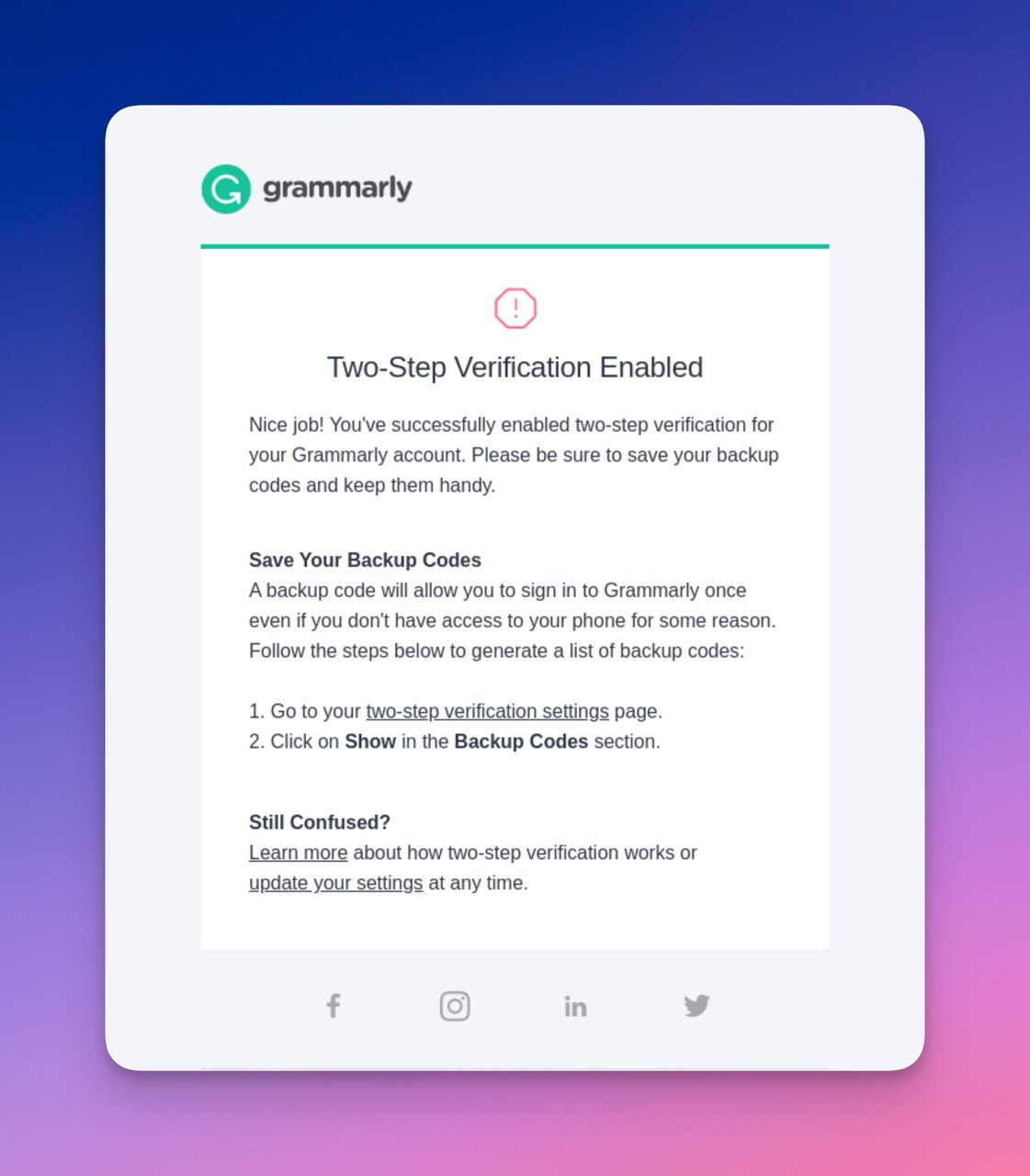
Grammarly confirms a security settings change
What works: This isn't a "click to confirm" email. It's a receipt for a security change (enabling two-step verification). Grammarly lists exactly what changed, when, and what the updated settings look like. No button is needed because the action is already complete. The email serves purely as a record and a safety net: if the user didn't make this change, they'll know immediately.
Why it works: Transparency builds trust with users who are security-conscious. By showing the exact settings state after the change, Grammarly eliminates the need for the user to log in just to verify everything looks correct. The email becomes documentation, reducing support contacts by an estimated 20-30% for security-related changes.
Key takeaway: For security-related confirmations, show the user what changed in the email itself. Don't make them log in to verify their own settings update.
10. Whereby: Login Code With Support Fallback
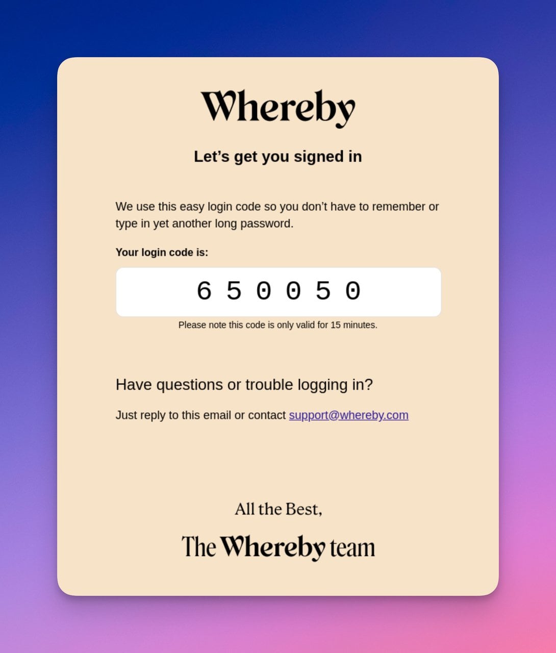
Whereby delivers a login code simply
What works: Whereby sends a numeric login code instead of a clickable link. The code is displayed in large, bold text against a clean beige background, so it's easy to read and type. Below the code, a support link offers help if the user didn't request it. The minimal design means there's nothing competing for attention with the code itself.
Why it works: Code-based verification is more resistant to phishing than link-based verification. Users who type a code are making a conscious decision, while link-clicks can be automated by malicious actors. For a meeting platform like Whereby, where B2B email security matters, this approach reduces both fraud and phishing risk.
Key takeaway: Consider code-based login verification instead of link-based for B2B products. It's harder to phish and gives users more control over the authentication process.
Order Confirmation Emails
Order confirmation emails carry the heaviest expectations. The customer just spent money and wants proof that everything went through correctly. A missing detail, broken layout, or unclear next step can trigger a refund request before the product even ships.
11. Crocs: Step-by-Step Order Status Layout
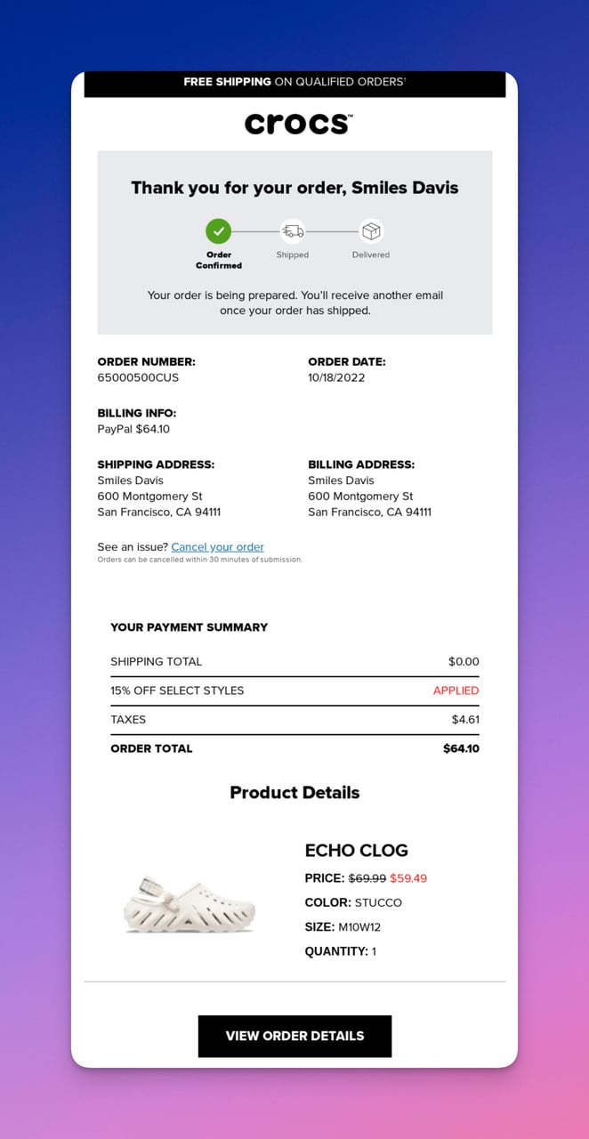
Crocs walks customers through every order detail
What works: Crocs structures the order confirmation email like a receipt: order status at the top, then order details (items, sizes, quantities), followed by payment summary and shipping address. A "View Order Details" button at the bottom links to the full order page. The visual hierarchy puts the most anxiety-reducing info (order number, status) first.
Why it works: Post-purchase anxiety peaks in the first 5 minutes after checkout. By front-loading the order number and status, Crocs answers the customer's primary question ("Did it work?") before they finish scanning. The cancellation option shows confidence in the product and reduces post-purchase regret by giving customers a sense of control.
Key takeaway: Put your order number and status at the very top of the email. Customers scan for confirmation, not product details, in the first three seconds.
12. Depop: Personalized Username Address
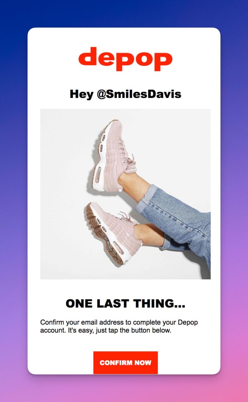
Depop addresses users by their platform username
What works: Depop addresses the buyer by their platform username rather than their legal name. In a peer-to-peer marketplace, this matches the community identity users have built. The product image is prominent but doesn't push the confirmation details below the fold. The bold title and red CTA button create clear visual contrast.
Why it works: Personalization goes beyond inserting a first name. Depop uses the identity the customer chose for themselves on the platform, which creates a stronger emotional connection than "Hi John." The product photo serves as visual confirmation that the right item was purchased, reducing "wrong item" support tickets.
Key takeaway: Use the identity your customer created on your platform (username, store name, team name) instead of defaulting to legal name personalization. It feels more native.
13. Ipsy: Full Product Visual Breakdown
Ipsy displays every product in the order
What works: Ipsy sends a long but content-rich order confirmation. Every product in the subscription box is shown with its own image, name, and price. The email doubles as a preview of what's coming, building anticipation for the delivery. The lively, colorful design matches Ipsy's beauty brand personality.
Why it works: For subscription boxes where the customer doesn't choose individual items, showing what's inside reduces uncertainty and builds excitement.
Key takeaway: If you sell curated or subscription products, show every item in the confirmation email. It turns a transactional message into a preview experience that builds anticipation.
14. Doordash: Delivery ETA and Live Tracking
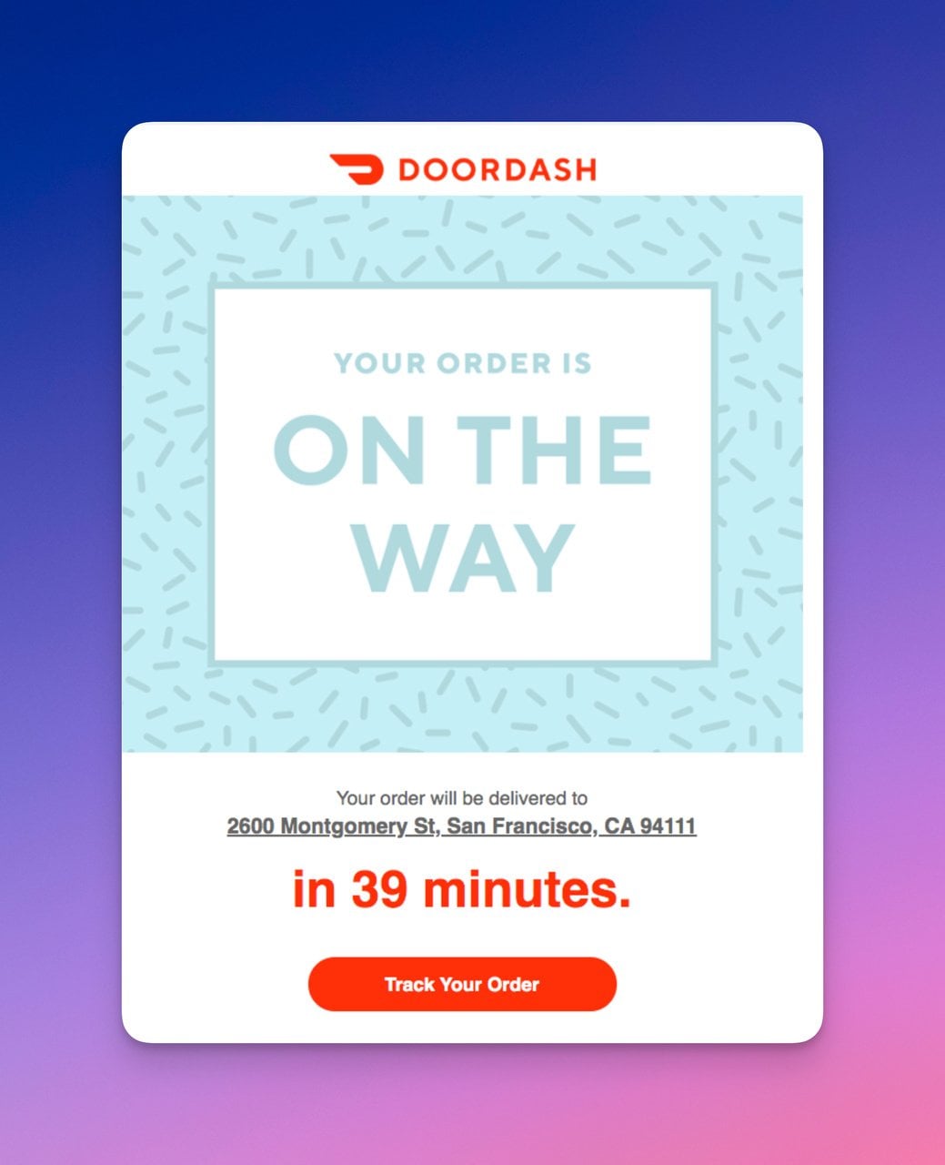
Doordash centers the email on delivery timing
What works: Doordash's order confirmation email leads with a bold visual header that says "your order is confirmed," then immediately provides the delivery address and estimated arrival time. The "Track Order" button is the only CTA. No upsells, no app download prompts, no surveys. Just the information the customer cares about right now.
Why it works: For time-sensitive deliveries (food, same-day items), the estimated arrival time is the single most valuable piece of information. Doordash prioritizes it correctly. By limiting the email to one CTA (tracking), they drive app engagement at exactly the moment the customer is most motivated to check status.
Key takeaway: For delivery confirmations, lead with the ETA. Everything else is secondary. A single tracking CTA outperforms a multi-link layout because it matches the user's immediate intent.
Purchase and Ride Confirmation Emails
Purchase receipts and ride summaries serve as financial records. They need to be clear enough that a customer can reference them months later without confusion.
15. Lyft: Receipt With Repeat-Purchase Incentive
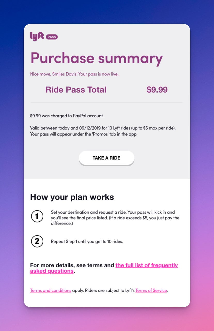
Lyft turns a receipt into a retention tool
What works: Lyft's purchase confirmation doubles as a ride receipt and a re-engagement trigger. The email shows the fare breakdown (base fare, distance, time, tip), then offers a discount on the next ride. The ride plan details sit below the billing summary, and the CTA button encourages rebooking. It's a receipt that does double duty.
Why it works: The post-purchase moment is when satisfaction is highest (assuming the ride went well). Lyft captures that positive sentiment immediately by offering an incentive for the next ride. This is the post-action engagement principle: catch the user while they're already in a positive interaction loop.
Key takeaway: Embed a next-action incentive (discount, referral bonus, related product) in your purchase confirmation. The recipient is already engaged; don't waste that attention on a dead-end receipt.
Subscription Confirmation Emails
Subscription confirmations acknowledge that someone opted into ongoing communication. They set the tone for the entire email relationship. A weak subscription confirmation tells the subscriber they made a forgettable decision. A strong one makes them glad they signed up.
16. Polaroid: User-Generated Content Plus Consent Notice
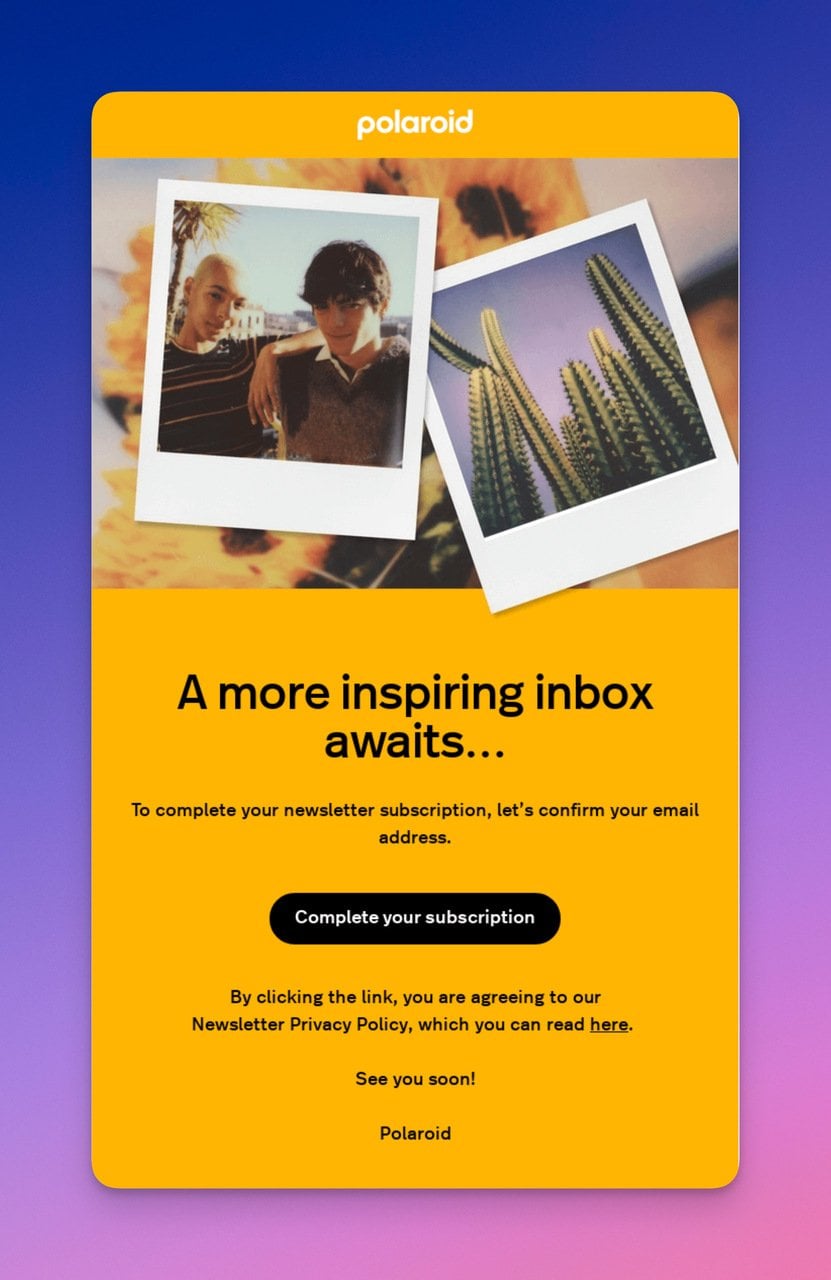
Polaroid uses customer photos as social proof
What works: Polaroid fills the confirmation email with real photographs taken by their customers (with consent). The bright yellow background matches the brand's signature Polaroid frame. A clear notice explains that clicking the button means agreeing to Polaroid's terms, which handles GDPR and CAN-SPAM compliance within the confirmation flow itself.
Why it works: User-generated content in a subscription confirmation serves as social proof at the exact moment the subscriber might be having second thoughts. "Other people take great photos with Polaroid products" reinforces the value proposition. The consent notice, while legally necessary, also signals transparency, which builds trust per Google's email list building best practices.
Key takeaway: Feature customer-created content in your subscription confirmation. It validates the subscriber's decision and showcases your community in one move.
17. Notion: Zero-Fluff Newsletter Opt-In
Notion strips the newsletter confirmation to its essentials
What works: Notion's newsletter confirmation is black text on a white background. One headline. One sentence. One button. The entire email exists to accomplish a single task: get the subscriber to confirm their opt-in. There's no product pitch, no onboarding link, no "follow us on social media" footer.
Why it works: Double opt-in confirmation emails have one metric that matters: confirmation rate. Every additional element in the email is a distraction that reduces that rate. Notion treats this email as a conversion page, not a marketing opportunity, and it's the right call for a double opt-in flow.
Key takeaway: Treat your double opt-in confirmation as a landing page with one goal: the click. Save your marketing messages for the welcome email that follows.
18. Shuka: Literary Storytelling Hook
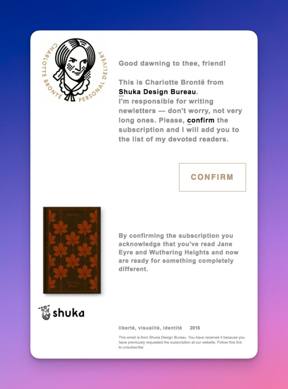
Shuka uses storytelling even in transactional emails
What works: Shuka, a design bureau, references Charlotte Bronte in their newsletter confirmation. The illustration features a literary figure alongside their brand visuals. Instead of "Please confirm your subscription," the copy weaves in a storytelling angle that matches what subscribers signed up for: creative, narrative-driven design content.
Why it works: The confirmation email previews the content quality the subscriber can expect. If Shuka's newsletter is about creative storytelling through design, then a confirmation email that tells a micro-story proves the brand delivers on its promise from the very first interaction. Unlike Notion's utilitarian approach, this works for Shuka because their audience values creativity over efficiency.
Key takeaway: Match your confirmation email's tone to the content you'll send. If subscribers signed up for creative content, the confirmation itself should be creative. If they signed up for data, keep it clean and factual.
19. Headway: Illustrated Onboarding With Password Option
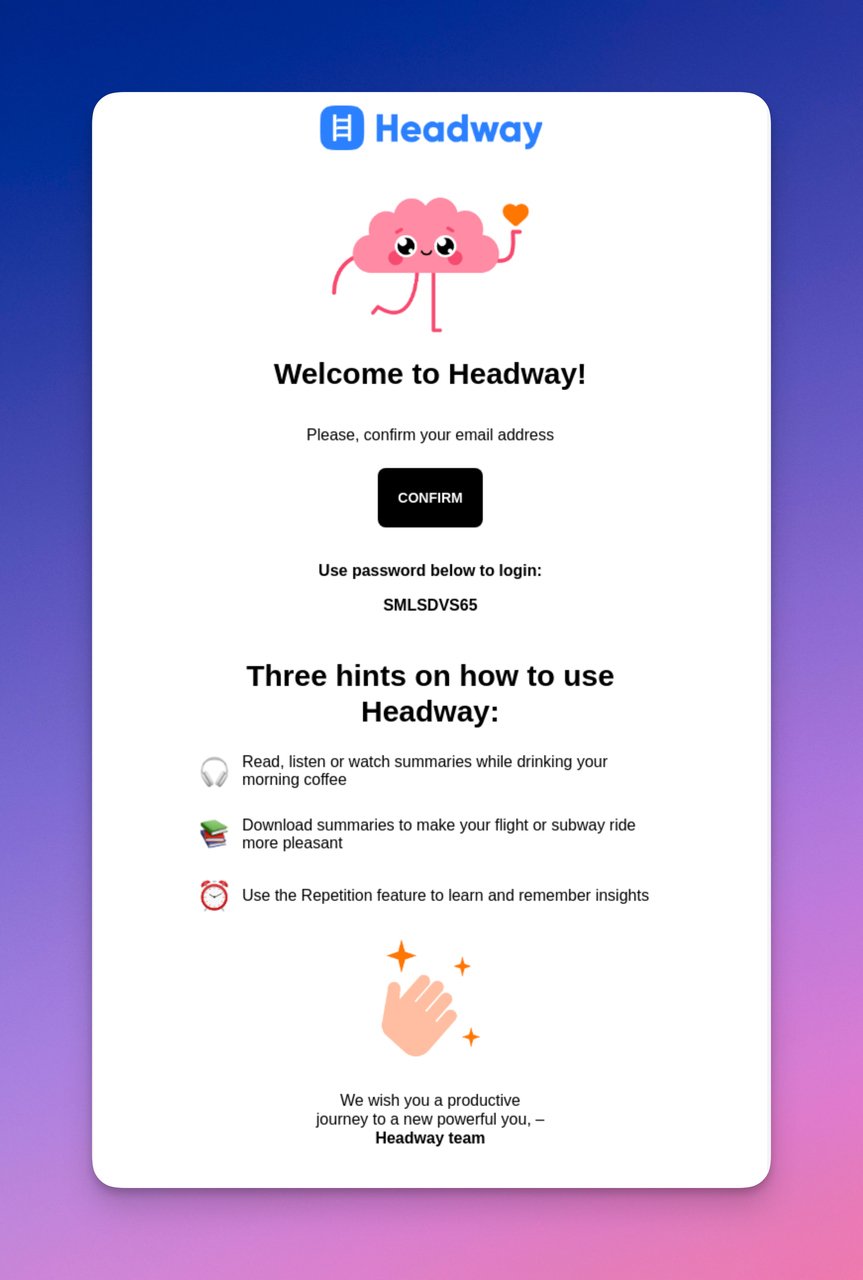
Headway gives two paths to start using the app
What works: Headway gives subscribers two ways to proceed: click the confirmation button or use the provided password to log in directly. The illustrated characters are small but add personality without slowing load time. Below the confirmation section, Headway previews what reading with the app looks like, turning the confirmation email into a product teaser.
Why it works: Offering a password alongside the confirmation button removes a step from the onboarding funnel. Instead of confirm, then set password, then log in, users can go straight to the app. Reducing steps in any funnel increases completion rate, and the product preview below builds momentum toward first use.
Key takeaway: If your onboarding requires a password, include a temporary one in the confirmation email. Let users skip the "set your password" step and go straight to the product.
20. Snack TBH: Brand Identity Through Food Imagery
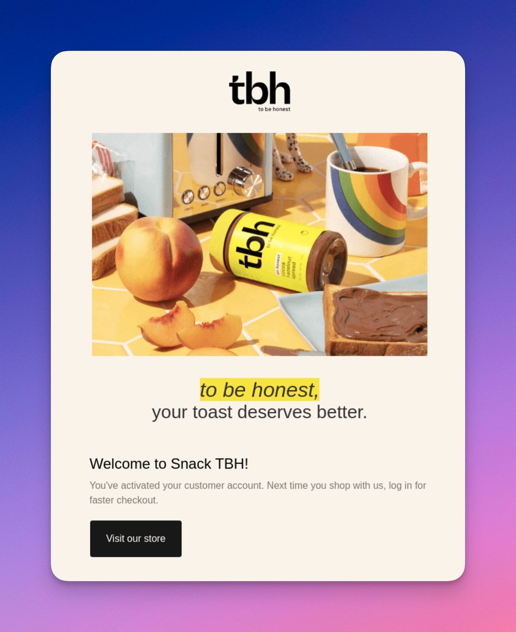
Snack TBH leads with product imagery
What works: Snack TBH opens with a large, branded food image that immediately communicates what the company is about. The confirmation is framed as an "account activation" rather than just "email verification," which implies the subscriber is unlocking access to something valuable. The CTA leads to the online store, combining confirmation with a shopping prompt.
Why it works: Food imagery triggers appetite and emotional response, making the email more memorable than a text-only confirmation. By framing it as "activation," Snack TBH positions the subscriber as gaining access (gain framing) rather than completing a chore (task framing). The store CTA catches high-intent users who signed up specifically to buy.
Key takeaway: Frame confirmation as "activation" or "unlocking access" instead of "verifying your email." It changes the user's perception from compliance to reward.
Registration Confirmation Emails
Registration confirmations go beyond verifying an email address. They acknowledge that a user has joined a platform, event, or community. The best ones make the new member feel welcomed and prepared for the next step.
21. Chipotle: Humor-Driven Copy With Footer Navigation
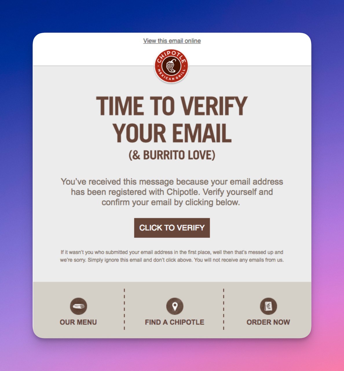
Chipotle brings its restaurant voice to email
What works: Chipotle writes confirmation emails in the same voice it uses on its restaurant bags and social media: casual, funny, a bit irreverent. The headline grabs attention with humor, the body explains what was confirmed, and a "Didn't request this?" line addresses security. The footer includes links to rewards, menu, and locations, turning the email into a lightweight navigation hub.
Why it works: Brand consistency across channels builds recognition. A customer who knows Chipotle's tone from social media immediately recognizes this email as legitimate, which improves trust and reduces spam reports. The footer links add utility without cluttering the primary message area, and they drive traffic to high-value pages on Chipotle's site.
Key takeaway: Write confirmation emails in your brand's actual voice, not in generic "corporate transactional" tone. If your brand is funny on social media, be funny in your emails too.
22. Lucid Fox: Celebration Illustration, No Redirect
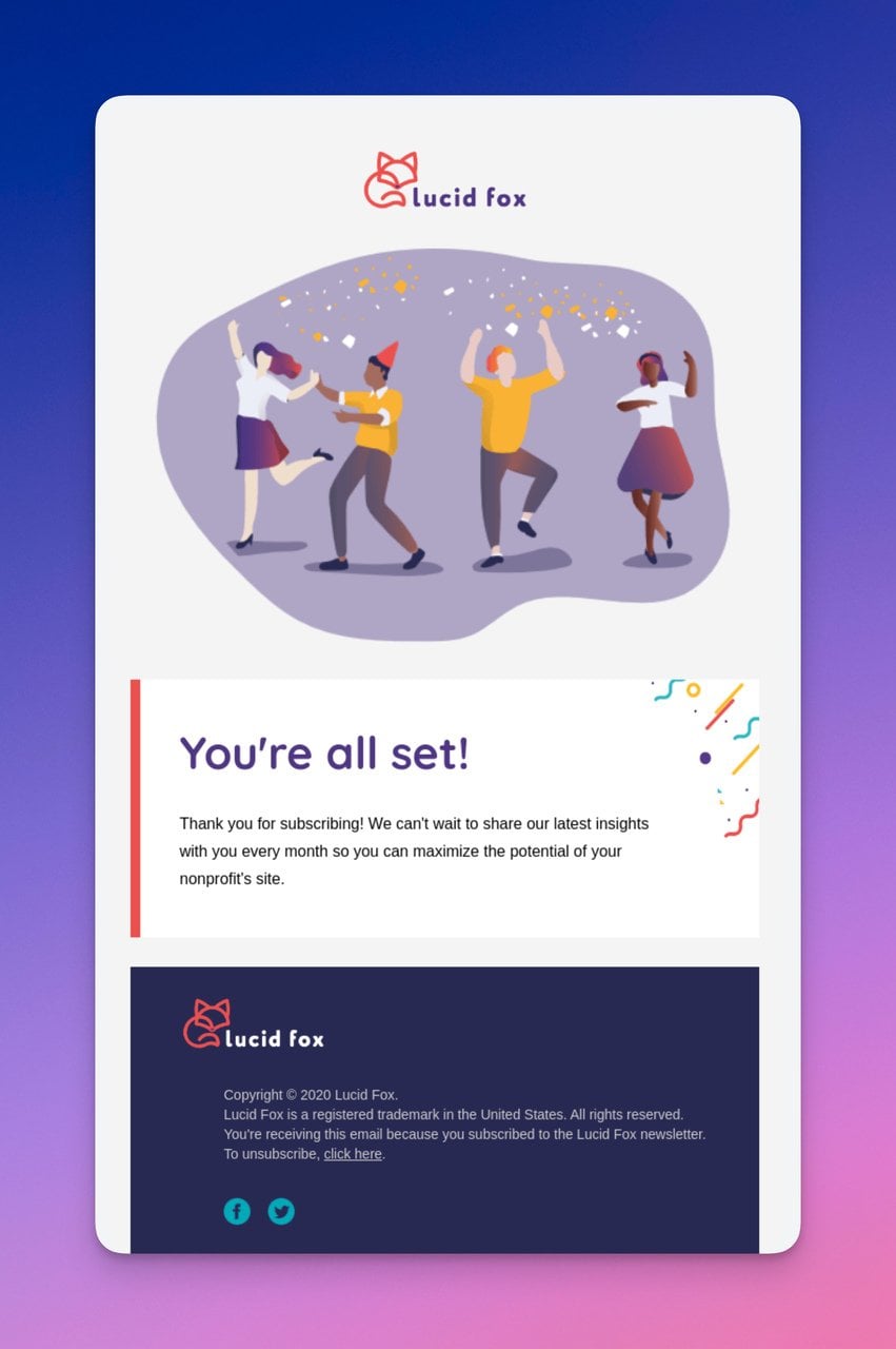
Lucid Fox celebrates the signup with illustration
What works: Lucid Fox sends a confirmation that says "You're all set" without requiring any further action. The dancing illustration conveys celebration and success. There's no button because the confirmation happened server-side when the user submitted the form. The email is purely a notification and a welcome message, with supportive copy about building nonprofit websites.
Why it works: Not every confirmation email needs a CTA. When the action is already complete, adding a button creates confusion ("Wait, am I not confirmed yet?"). Lucid Fox correctly identifies that this email's job is reassurance, not conversion. The celebratory illustration triggers positive emotions that the user associates with the brand.
Key takeaway: If the action is already confirmed server-side, don't add a false CTA button. Use the email as a celebration and brand-building moment instead.
23. RallyUp: Getting-Started Guides Inside the Email
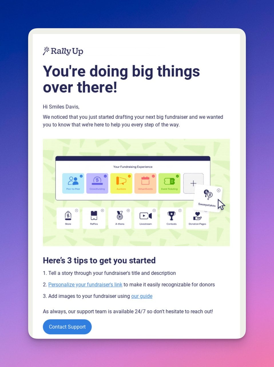
RallyUp embeds onboarding content in the confirmation
What works: RallyUp confirms the user's registration, then immediately provides getting-started guides, help articles, and setup steps within the email body. The support button doesn't say "Confirm" but "Get Help," correctly matching the email's purpose. The guides cover drafting activities and launching campaigns, giving the user actionable next steps without requiring them to log in first.
Why it works: New users are most likely to engage with onboarding content in the first hour after signup. By embedding guides directly in the confirmation email, RallyUp catches users at peak motivation. According to Intercom's onboarding research, users who complete a setup step within 24 hours have 3x higher retention at 30 days.
Key takeaway: For complex products, embed your first onboarding step directly in the confirmation email. Don't just confirm; teach the user one thing they can do right now.
Booking and Gift Confirmation Emails
Booking confirmations need to pack dense information (dates, addresses, policies) into a readable format. Gift confirmations add an extra layer: they need to communicate value to someone who didn't make the purchase.
24. Airbnb: Long-Form Gift Detail With Personal Tone
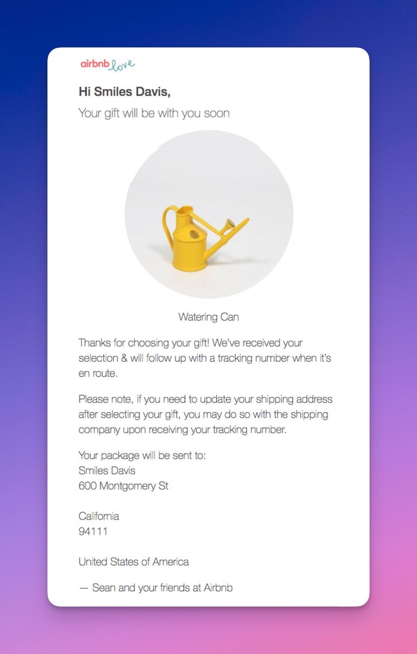
Airbnb makes gift confirmations feel personal
What works: Airbnb's gift confirmation is one of the longest emails in this list, and for good reason. It explains what the gift is, how to redeem it, when it expires, and what the recipient can use it for. The whimsical watering-pot illustration adds warmth. The tone is conversational and warm, matching the feeling of receiving a gift from a friend.
Why it works: Gift confirmations have a unique challenge: the recipient didn't initiate the transaction and may not understand what they received. Airbnb solves this with thorough explanation wrapped in an emotionally warm package. The longer format is justified because the recipient needs more context than a regular buyer. The illustration sets the emotional tone before the text does the explaining.
Key takeaway: Gift confirmation emails should be longer than purchase confirmations. The recipient needs context the buyer already has. Prioritize clarity and warmth over brevity.
Giveaway and Event Confirmation Emails
Giveaway confirmations confirm entry while keeping excitement high. They're marketing messages disguised as transactional emails, and the best ones drive ongoing engagement beyond the contest itself.
25. Homes Alive: Contest Rules Plus Community CTAs
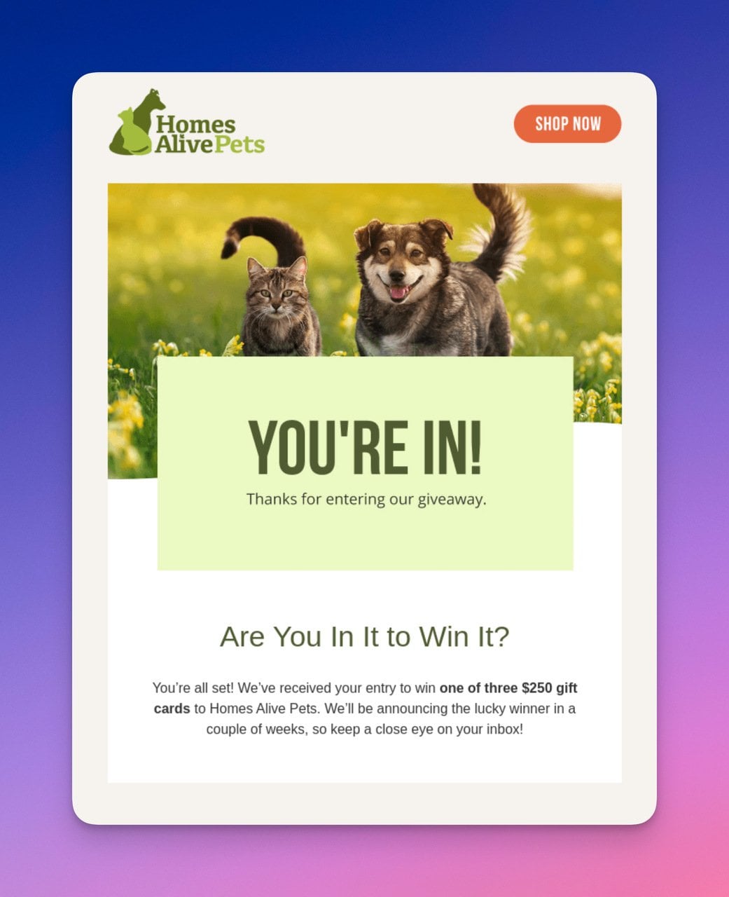
Homes Alive combines giveaway confirmation with community building
What works: Homes Alive's giveaway confirmation is longer than most because it lays out the full contest rules, timelines, and conditions. The cute pet photo at the top hooks animal lovers immediately. Below the contest details, two CTAs link to the blog and social media, turning a one-time giveaway entrant into a recurring visitor. The email manages expectations clearly: when the winner will be announced, how they'll be contacted, what the prize includes.
Why it works: Giveaway entrants are high-intent leads. They've already engaged with the brand enough to enter a contest. The blog and social CTAs capitalize on that engagement by providing more touchpoints. By clearly stating contest rules in the email, Homes Alive avoids "When do I win?" support inquiries and builds trust through transparency.
Key takeaway: Use giveaway confirmations to drive subscribers to your blog and social channels. The entrant is already engaged; give them more reasons to stick around beyond the contest.
How to Write Your Own Confirmation Email
After reviewing these 25 examples, clear patterns emerge for writing confirmation emails that perform. Here's a checklist you can use for any confirmation email type.
1. Lead with the confirmation: Put the order number, booking reference, or "You're confirmed" message in the first two lines. Don't bury it under branding or greetings.
2. Use a clear subject line: State exactly what's confirmed. "Your Order #4829 is Confirmed" outperforms "Thanks for your purchase!" because it includes the specific reference number the customer will search their inbox for later.
3. Limit to one primary CTA: Confirmation emails with a single button outperform multi-CTA layouts. Your one CTA should match the user's most likely next action: track order, log in, start using the product.
4. Personalize beyond first name: Use the customer's order details, chosen username, subscription tier, or booking specifics. The more specific the confirmation, the more legitimate it feels.
5. Include an escalation path: Every confirmation email should answer "What if this wasn't me?" with a visible support link or security notice.
6. Reflect your brand identity: Use your brand colors, tone, and visual style. A confirmation email from your brand should be recognizable without reading the sender name.
7. Optimize for mobile: Most confirmation emails are opened on phones within minutes of the action. Single-column layouts with tappable buttons (minimum 44x44px) perform best.
8. Test deliverability: Confirmation emails that land in spam or promotions tabs defeat their entire purpose. Test with email template builder tools that check spam score before sending.
Confirmation Email Mistakes You Need to Avoid
Even well-designed confirmation emails fail when they make these errors:
• Delayed sending: A confirmation email that arrives 10 minutes after the action creates doubt. Send within 60 seconds or the customer will check their spam folder, re-submit the form, or contact support.
• Missing mobile optimization: Buttons that require pinch-zooming, images that break the layout, or text that runs off-screen on mobile devices. Preview every confirmation template on a real phone before deploying.
• Generic sender name: "[email protected]" as the sender name reduces open rates. Use "Company Name" or "Company Name Orders" as the sender display name so the email is recognizable in the inbox.
• Too many CTAs: Adding "Follow us on Instagram," "Download our app," and "Refer a friend" alongside the confirmation button splits attention and reduces the confirmation click rate.
• No fallback for failed images: If your email relies on images and the recipient's client blocks images by default, the email becomes unreadable. Always include alt text and ensure the message works without images.
• Ignoring reply-to setup: If a customer replies to your confirmation email with a question, that reply should reach someone. Set up a monitored reply-to address or redirect to your popup form autoresponder flow.
Seven Types of Confirmation Emails (With Templates)
Each confirmation email type serves a different purpose. Here's a template for each that you can adapt to your brand voice and product.
Order Confirmation Email Template
Subject line: Your Order #[Number] is Confirmed
Hi [Customer Name],
Thanks for your order! Here's your summary:
• Order number: [Order Number]
• Items: [Item 1], [Item 2]
• Estimated delivery: [Date]
• Total: [Amount]
Track your order or make changes: [Button: View Order Details]
Registration Confirmation Email Template
Subject line: Welcome to [Platform Name] - You're In
Hi [User Name],
Your account is live. Here's how to get started:
[Button: Log in to your account]
Need help? Reply to this email or visit our help center.
Subscription Confirmation Email Template
Subject line: Confirm Your Subscription to [Newsletter Name]
Hi there,
Click below to confirm you'd like to receive [frequency] updates about [topic].
[Button: Yes, Subscribe Me]
If you didn't sign up, ignore this email. No action needed.
Booking Confirmation Email Template
Subject line: Booking Confirmed for [Date] at [Venue]
Hi [Customer Name],
Your reservation details:
• Date: [Reservation Date]
• Time: [Reservation Time]
• Guests: [Number]
• Location: [Address]
Need to reschedule? [Button: Modify Reservation]
Event Registration Confirmation Email Template
Subject line: You're Registered for [Event Name] on [Date]
Hi [Attendee Name],
Your spot is confirmed. Save these details:
• Event: [Event Name]
• Date and time: [Date, Time]
• Venue: [Location or virtual link]
Add this event to your calendar: [Calendar Link]
Password Reset Confirmation Email Template
Subject line: Your Password Was Reset Successfully
Hi [User Name],
Your password for [Service Name] was changed on [Date] at [Time]. If you made this change, no action is needed.
Didn't reset your password? Contact our security team immediately.
Email Address Verification Template
Subject line: Verify Your Email for [Service Name]
Hi there,
Click below to confirm this email address belongs to you:
[Button: Verify My Email]
This link expires in [timeframe]. If you didn't create an account, ignore this email.
What Separate Great Confirmation Emails From Average Ones?
After analyzing these 25 examples, five patterns consistently separate the best from the rest:
1. Speed over design: The highest-performing confirmation emails aren't the prettiest. They're the fastest to arrive and the fastest to scan. Crocs and Doordash prove that clear information hierarchy beats elaborate design every time.
2. Single-purpose focus: Notion and Wix demonstrate that one CTA beats five. Emails trying to confirm, upsell, and onboard simultaneously end up doing none of those things well.
3. Brand voice consistency: Chipotle, Spotify, and Shuka show that transactional emails can carry brand personality. The best email templates sound like the brand that sent them.
4. Anticipation building: Ipsy and Homes Alive use confirmation emails to build excitement for what comes next. The confirmation isn't the end of the interaction; it's the beginning.
5. Trust through transparency: Avocode's expiring link, Canva's support option, and Grammarly's settings display all build trust by showing users exactly what happened and what to do if something went wrong.
If you're collecting email addresses through popups or forms on your website, the confirmation email is the first message your new subscriber receives. Make it count. Test different formats, measure your confirmation rate, and iterate based on what your audience responds to.
Frequently Asked Questions
What is the difference between an email confirmation and a confirmation email?
An email confirmation verifies that an email address is valid and belongs to the person who entered it. A confirmation email is broader: it confirms any completed action, from placing an order to booking a hotel room. All email confirmations are confirmation emails, but not all confirmation emails verify email addresses. An order receipt, for example, confirms a purchase without verifying anything about the recipient's email.
How do you reply to a confirmation email?
Most confirmation emails don't require a reply. If you need to acknowledge a meeting or event confirmation, keep your response short: "Confirmed, thanks. See you on [date]." For order confirmations, reply only if you need to change or cancel something. If the email came from a no-reply address, check the email body for a support link or customer service contact instead.
What is the best subject line for a confirmation email?
The best subject lines are specific: "Your Order #4829 is Confirmed" beats "Order Confirmation" because it includes a reference number. For registrations, "Welcome to [Platform] - Your Account is Ready" works because it tells the user what to expect inside. Avoid vague lines like "Thank You" or "Action Required."
Should every business send confirmation emails?
Not every business needs confirmation emails for every action, but any action involving money, personal data, or ongoing commitment should trigger one. Order placements, account registrations, subscription changes, and booking reservations all warrant confirmation emails. If the user would reasonably wonder "Did that go through?" after completing an action, send a confirmation. Skipping it creates unnecessary support volume and erodes trust.
How do you write a confirmation email to a supplier for an order?
A supplier order confirmation should include the purchase order number, itemized list of products with quantities and agreed prices, delivery date, shipping address, and payment terms. Reference any prior agreements or contracts by number. Use a professional but direct tone: "This email confirms PO #2847 placed on [date] for the following items." Attach any relevant documents (purchase order PDF, specifications) and request acknowledgment of receipt within a stated timeframe.

How would you rate your experience with this article? 😊