Increase Form Conversion Rates with 10 Simple But Powerful Ways
Tips to boost form conversions: use well-timed, user-friendly popup forms; place CTAs near/above the fold; simplify and prefill fields; optimize for mobile; strengthen CTAs; add privacy policy, A/B test, and use countdown timers.
The ultimate goal of an online form is to capture prospects’ information. Then, why don’t your forms serve this purpose and drive higher conversion rates?
Unfortunately, there are no simple answers as to why your prospects may not be filling out forms. It could be the design, positioning, the offer of the form, or something else.
While it’s impossible to see through your customers’ minds, you can follow the best practices to increase form conversion rates.
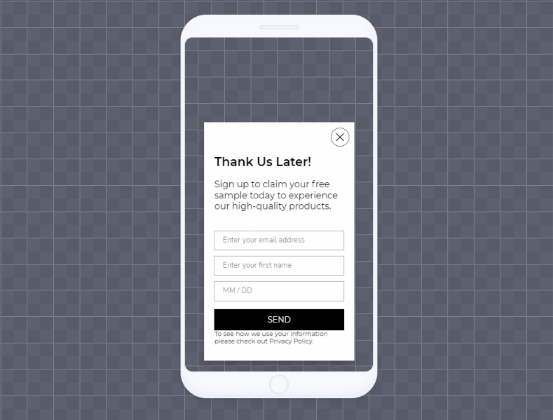
1. Create Popup Forms
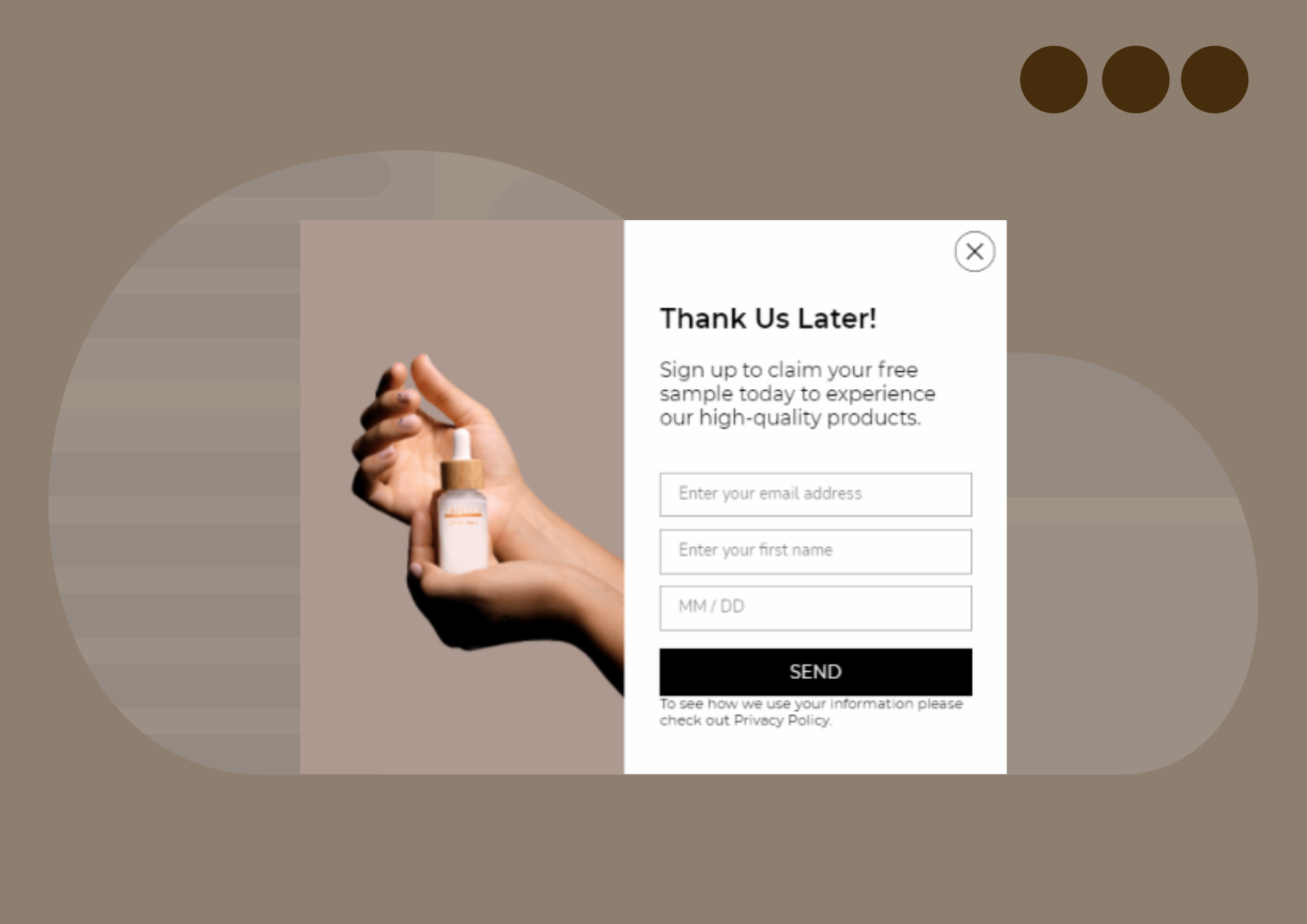
Studies show that the average conversion rate of a popup is 3.09%. If you follow the best practices, your conversion rate can even go higher.
Popup forms tend to generate more leads and conversions, particularly compared to on-page embedded forms. Why?
- They catch the eye of your site visitors.
- They have fewer form fields, which makes them easier to fill out.
- You can offer incentives on your popup forms to collect more lead data.
Popupsmart is the most user-friendly popup builder and lead generation tool on the market. It comes with advanced targeting and design options to ensure higher conversion rates.
Here are some quick tips to follow to get the most of your popups:
- Offer different incentives (e-books, discounts, coupons, etc.) to find the right one that generates more conversions.
- Use Pre-fill Popup Forms: Popupsmart popup builder offers a pre-fill feature that allows you to show a visitor a pre-populated form. So the visitor will see a complete popup form, and the only thing left to do will be to hit the submit button. It’s less time-consuming and more straightforward.
- Conversion-ready form designs: The old-fashioned popups are long gone. By using Popupsmart’s modern designs, your forms will be both visually appealing and UX-friendly.
- Set a 30-second delay on your popup. This way, you will avoid disturbing the user experience. After all, it’s a fact that most people hit the close button right away when a popup shows up the moment a visitor lands on a website.
- Make the close button obvious. It should be easy to close the popup form; otherwise, it might be spammy.
- Show your popup only once per user.
- Add a privacy policy checkbox.
- Use smart tags
With the combination above, you can drive more leads than your regular website forms. You can do all of these practices with Popupsmart. Additionally, if you turn on the autoresponder email feature, you’ll get notified when a visitor submits a form. All user data acquired from a lead generation form will be gathered in a Lead Table.
The result will bring such a huge impact on your conversions that you’ll just skip the rest of the list.
2. Place Your Forms Just Above The Fold
The ultimate purpose of a landing page is to impress and convince people enough to make them take the desired action. It’s the influence and engagement that matter.
Most studies point out that when placing your forms and CTAs on your landing page, placing them just above is more likely to bring engagement. So, positioning the most important elements like forms and CTAs on this initial part will drive the maximum engagement to reach potential customers.
Engagement starts just above the fold, while the below-the-fold is often where people become convinced to take action.
Mind that on mobile, most users scroll below before the page even loads. That’s why placing your forms too much above the fold on a page may not be ideal.
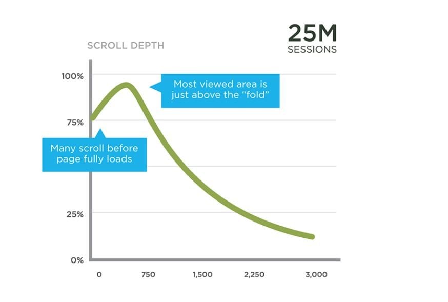
“Even though we live in a scroll-oriented world, content placed above the fold still grants 80% of our attention.” - Peep Laja
When optimizing the position of a lead generation form, the above-the-fold is a common practice because the placement grabs the attention of visitors to your CTA.
However, popups are often better than embedded website forms as users can’t scroll away or miss.
3. Design Web Forms for Usability, UX, and Appeal
Whether it’s a web form or popup opt-in form, its design carries the heavy burden of the “first impression” on its shoulders.
That’s why you should avoid intimidating form fields that seem to take forever to fill out. Not only that, the colors, background, and content are also vital elements of a lead generation form design.
Remember, first impressions are the make or break point of your campaigns.
Here are a few tips for website form design:
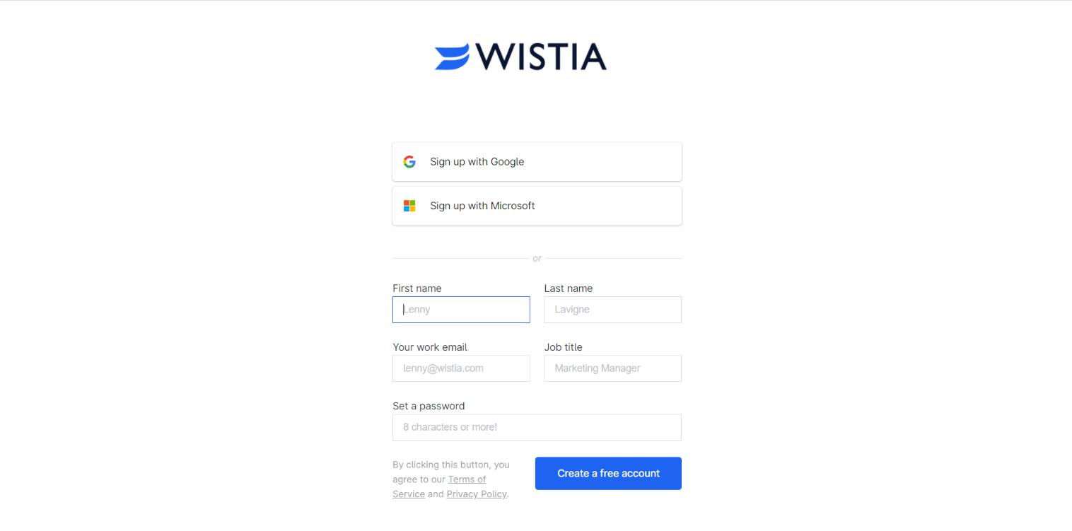
Remove Unnecessary Form Fields
Scaring away your visitors and customers with too many form fields is the best way to kill your form conversion rate.
I remember abandoning lots of checkout pages just because of the length of the form. In fact, it’s not just you or me.
Cart abandonment stats show that 18% of online shoppers abandon their carts because of a long and complicated checkout process.
If not mine, just take your own experience for it. Do you like spending your time on an online form that asks unnecessary questions? Probably not.
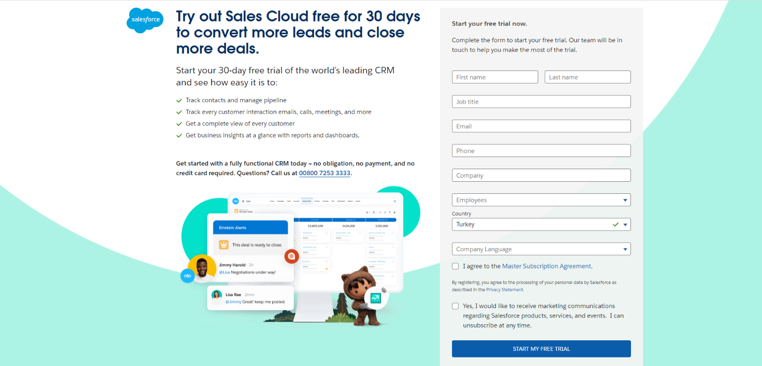
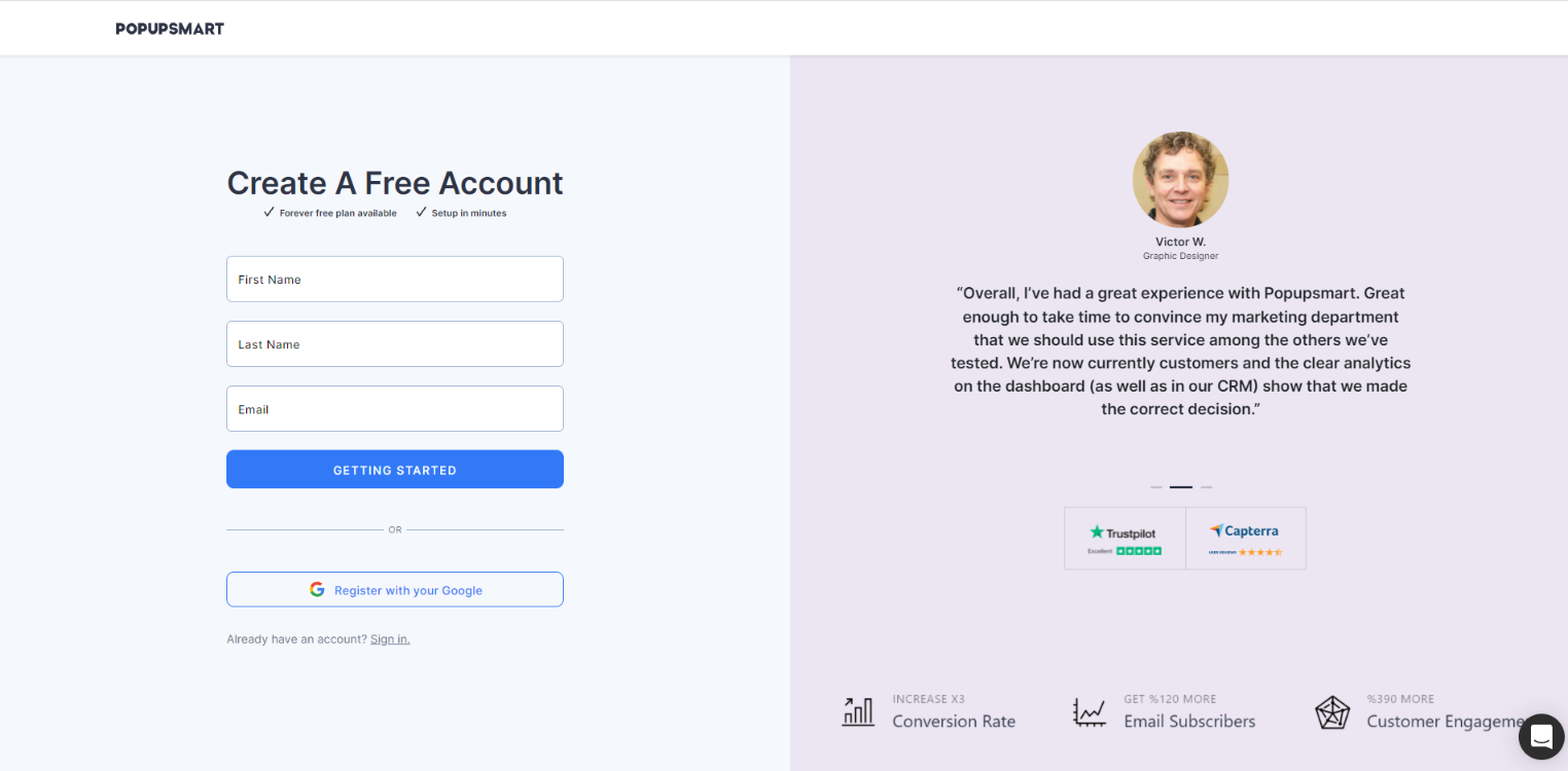
Although the optimal number of form fields depends on the type of form, the ideal number is 3 fields to maximize form conversion rates.
- Ask only what’s required.
- Mark required and non-required fields.
- Use Pre-filling for usability: Prefill the form fields to make it quicker to fill out.
- Use Company Data Enrichment feature: With Popupsmart’s data enrichment feature, you can pull data such as company name, size, and location right from the user’s domain without asking them on the form.
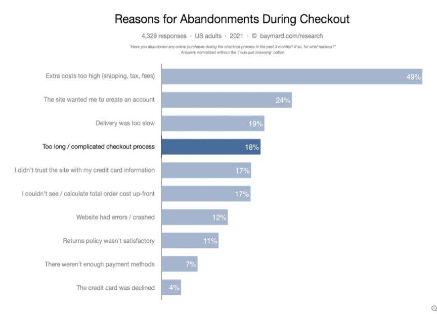
(Source: Baymard)
Fewer form fields can bring you more conversions; however, if your sales team doesn’t receive enough lead info to follow up, the high number of conversion rates won’t help the low close rates.
To sum up, A/B test the number of your fields to find the right balance to get the critical lead info with the minimum number of fields.
Order Forms From Easiest to Hardest to Fill
According to Robert Cialdini’s principle of “commitment and consistency,” when a person takes a small action or a step toward something, they feel compelled to complete it.
So, it’s best to order your lead generation form fields from easiest to hardest to fill.
Coloring and Background
If you are planning to use a popup form, make sure that it matches your brand colors and landing page design.
The contrast between the text color and background should be sufficient to make the text stand out and balanced enough not to cause an eyesore. The same principle goes for web forms as well.
Additional design tips:
- Stick to a defined color palette
- Divide multiple sections into multiple pages
Content
When it comes to increasing lead generation forms’ conversion rates, placing the image of your offer, such as an ebook, sample product, etc., can nudge potential customers to submit their info.
4. Optimize Your Lead Forms For Mobile
Mobile devices account for approximately half of the web traffic worldwide. (Statista)
The amount of mobile traffic is too high to ignore. Optimizing your web forms for mobile can make a huge difference in your conversion rates. Therefore, you need to ensure a streamlined experience for users landing on your website via mobile devices.
- Remove all unnecessary fields.
- Make your lead generation forms mobile responsive.
- Don’t let your popup form close essential elements on the screen.
All Popupsmart lead forms are mobile-friendly. You can take a look at our blog post called How to Create Converting Mobile Popups (Without Lowering Your SEO).
5. Make Them Easy to Fill Out
Long or complicated forms that take too long to fill out are simply one of the biggest causes of losing potential customers or leads.
Tips to optimize your forms for better user experience:
- Prefill Forms: Why bother making users fill out the fields you can prefill? Use the prefill function to enter certain information so they won’t have to.
- Multi-page Forms: If your form needs a lot of scrolling or has multiple sections, you can break it down into multiple pages.
- Save & Resume: If a form is too long or time-consuming to finish in one sitting, allow users to save their progress and resume later.
6. Have a Strong Call-to-Action
The words have the most decisive influence over a decision your potential customers make. Your CTA phrase should encourage users to take the desired action, filling out the form in this case.
- The title of your landing pages should be grasping enough to draw attention and make users keep on reading.
- Use power words in your CTAs such as “Buy, Now, Start, Add to Cart, Free. ”
- Personalize your calls-to-action with pronouns like” You, Your, Our, etc.”
- Add a sense of urgency: Use phrases such as “Today, Now, Last Chance.”
- Align your CTA and form with the landing page copy
7. Include a Privacy Policy
Data privacy research states that 95% of Americans feel concerned about businesses collecting information without permission.
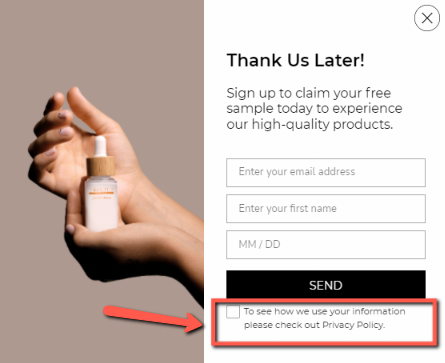
Considering the number of frauds happening every day, it’s understandable and natural for internet users to get anxious about their personal data.
So, what’s the best solution to gain your prospects’ trust? Including a privacy policy and complying with the GDPR rules can contribute to a conversion rate increase in that sense. A privacy policy proves that your company and website are reliable and trustworthy.
Create a privacy policy page and show a privacy policy checkbox on your popup and web forms. Consequently, once people trust you, they are more likely to fill out your lead forms.
8. Optimize Your Landing Page for Form Conversions
The average landing page conversion rate across all industries falls around 2.35%.
Optimizing your landing page is equally essential for increasing the conversion rate of contact forms and lead forms. The design of your landing page should guide the visitor’s eye toward the form. It shouldn’t distract users with less important elements.
You might like, Top 12 Landing Page Optimization Tools.
- Minimize the friction around your lead form.
If the ultimate goal of a landing page is to collect lead data with a web form, the form should be at the heart of the page. Make it stand out by minimizing the elements around it.
- Eye gaze
Designing your landing page with eye tracking in mind can prove even more effective than you might think. People usually follow the eye gaze pattern.
Based on a case study, you can highly improve your form conversion rates by putting faces and customer testimonials.
9. A/B Test Your Lead Generation Forms
Content marketing, email marketing, and event marketing are three of the most common lead generation strategies digital marketers adopt. However, when capturing lead through any of these strategies, you need to ensure that your call-to-action is well-positioned on the page.
The best way to determine the optimal position is to test it out and tweak it until you drive the best results.
Other things you should test out include:
- The headline of your landing page: It should be compelling.
- Your landing page copy: Use bullet points, images, testimonials, and videos to make it persuasive.
- Don’t make your landing page copy hard to read or understand. Keep it as simple and to the point as possible.
Apart from these, keep in mind that the social proof tactic is a powerful driver in the customer decision-making process. Using client testimonials, testimonial videos, trust badges, and money-back guarantees improve trust and, consequently, your conversions.
10. Add a Countdown Timer
It’s natural human behavior to get anxious when the time is running out. The exact impact goes for your customers as well. So, adding a countdown timer to your landing page or popup form might be the nudge they need to take the desired action.
According to a study, adding a countdown timer can increase revenue by 9%.
Another study points out how one brand increased sales by 332 percent by implementing a limited-offer sign and a countdown timer.
You can add a countdown timer to your popup forms with Popupsmart to immediately start boosting your form conversion rates.
Wrap-up
We’ve explained 10 proven ways on how to increase form conversion rates. By optimizing your lead generation form, you can ensure that your inbound marketing and landing page traffic don’t go to waste.
The goal of your landing page form is to successfully collect the prospect’s personal information —not selling a product to them. Marketing and sales follow after you nurture the leads you’ve captured.
Minimize the clutter around your lead forms and CTA. Otherwise, people get distracted and drift away from the desired action.
We hope you find these tips helpful and start generating more form conversions as of today.
Quick checlist to increase form conversion rates:
-
Create popup forms
-
Place your forms just above the fold
-
Design web forms for usability, UX, and appeal
-
Optimize your lead forms for mobile
-
Make them easy to fill out
-
Have a strong call-to-action
-
Include a privacy policy
-
Optimize your landing pages
-
A/B test your lead generation forms
-
Add a countdown timer
Suggested article:

How would you rate your experience with this article? 😊