10 Best Popup Message Examples To Get Inspired in 2026
Popup messages are on-screen texts meant to grab attention and boost conversions using clear, witty, brand-aligned copy, strong CTAs, and urgency/FOMO. It shares 10 examples and a quick Popupsmart workflow plus tips like using power words and keeping copy short.
A popup message is the text shown inside an on-site overlay that asks a visitor to subscribe, claim a discount, book a demo, or finish a checkout. Strong popup messages pair a benefit-led headline with a single clear action and copy that matches the brand's voice. In 2026, average popups convert at 4-5%, while well-targeted ones reach 10-20%.
This guide walks through 10 popup message examples from real brands, the writing patterns that make them work, and a short Popupsmart build-out so you can ship your own version this week. It also folds in fresh 2026 data on what's actually converting on mobile and in e-commerce, plus answers to the questions readers send us most often.
What is a popup message?
A popup message is the short body of text inside an on-site overlay — headline, supporting line, and call-to-action button copy — that asks a visitor to take a defined action. The overlay itself can be a lightbox, a sticky bar, a slide-in, a full-screen takeover, or a multi-step quiz. The message is the part visitors actually read.
Three writing choices decide whether a popup feels like an interruption or a useful nudge:
• Tone match: The copy reads in the same voice as the rest of the site. If the brand is playful on its homepage and corporate inside its popup, the popup feels like an ad.
• One job per popup: The headline names a single benefit (10% off, a free guide, a demo). Stacking two offers in one popup halves the click-through rate in nearly every test I've watched.
• A button label that finishes the sentence: "Get my 10% off" works because it completes the offer. "Submit" or "Subscribe" makes the visitor do the mental math.
A well-written popup message turns the overlay from a thing you close into a thing you read. That's the entire game.
Why strong popup messages drive conversions in 2026
Popups have grown up. The 2026 versions on top-tier sites are personalized, behaviorally triggered, and written like product copy rather than ad copy. The data shows the gap between the median and the top quartile widening, not narrowing.
According to Oscar Chat's 2026 popup benchmark report, average popup conversion rates commonly fall around 4% to 5%, while top-performing campaigns reach significantly higher. The "average" number is misleading, though. Look closer at the top decile and the math gets interesting: top-performing popups can reach 10-20% conversion rates with strong targeting and offers, according to WiserReview's popup statistics roundup.
So the median popup converts at 4-5%. The well-targeted ones convert at 10-20%. The difference is rarely the design tool — it's the message, the trigger, and how well both match the visitor's intent at that exact moment.
What separates the 4% popups from the 15% popups:
• Specific benefit in the headline: "10% off your first order" beats "Subscribe to our newsletter" because the visitor knows immediately what's in it for them.
• A trigger that respects context: Exit intent on a product page is welcome; an entry popup three seconds after page load is not. Our exit intent popup guide for WordPress covers trigger options in detail.
• Mobile-first copy: Headlines that fit on one line on a 375px screen. Button labels under four words. No cramped form fields.
• Friction-aware forms: Email-only beats email-plus-name. One question beats three. You can always ask for the name in the welcome email.
How I picked these popup message examples
I evaluated dozens of popups across e-commerce, SaaS, and DTC sites this spring and selected these 10 based on four criteria:
• Voice alignment: The popup reads like the brand, not like a generic "sign up for our newsletter" template.
• Single clear action: One offer, one button, no decision fatigue.
• Copy that does work: Every word earns its place. If you can delete it without changing the meaning, the popup is bloated.
• Reproducibility: Any team using a no-code popup builder (Popupsmart included) can recreate the pattern in under 30 minutes.
The selection skews toward email capture popups because that's where most teams are starting in 2026, but the writing principles transfer to exit-intent offers, cart-recovery popups, and SaaS demo prompts. For a broader showcase by use case, our website popup examples roundup covers a wider range of formats.
1. Co-Schedule: The honest-friction exit popup
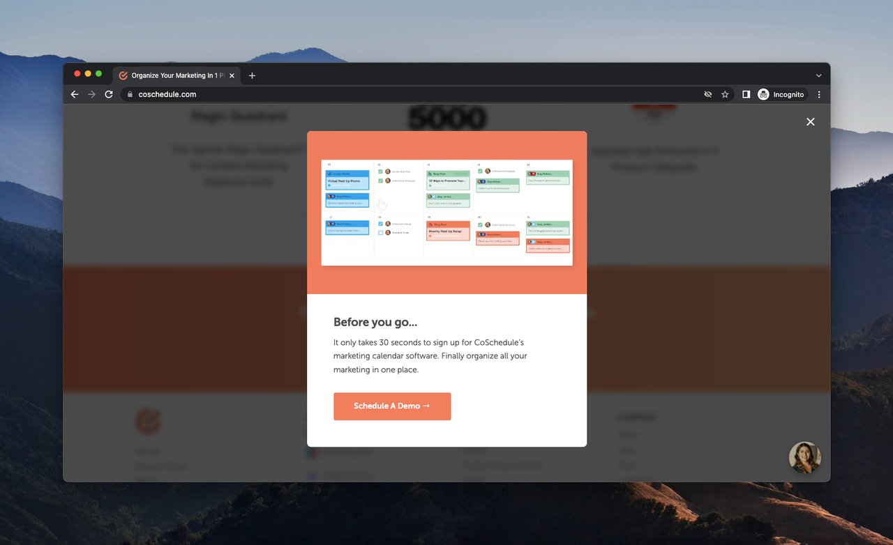
Co-Schedule's exit popup names the time cost upfront.
Co-Schedule uses an exit-intent popup that opens with "It only takes 30 seconds to sign up." Most SaaS popups try to hide the friction; this one names it directly. The body line — "Finally organize all your marketing in one place" — names the outcome the visitor was already there for, and the CTA is "Schedule A Demo" rather than the generic "Sign Up."
What works: The headline pre-empts the most common objection to SaaS sign-ups (time cost). Naming the 30-second window calibrates the visitor's expectations and reduces hesitation. The CTA jumps the visitor past the form and straight to a demo booking, which is the right next step for a B2B marketing tool.
Why it works: Behavioral economists call this "objection inoculation" — surface the visitor's resistance before they consciously form it, and you defang it. The demo-first CTA also matches the buying behavior of marketers evaluating tools: they want to see it, not configure it.
Key takeaway: If your popup asks for a sign-up, tell the visitor exactly how long it'll take. "30 seconds" beats vague promises. Then route them to the highest-intent action — demo, not free trial, not newsletter.
2. Frank Body: The voice-led email popup
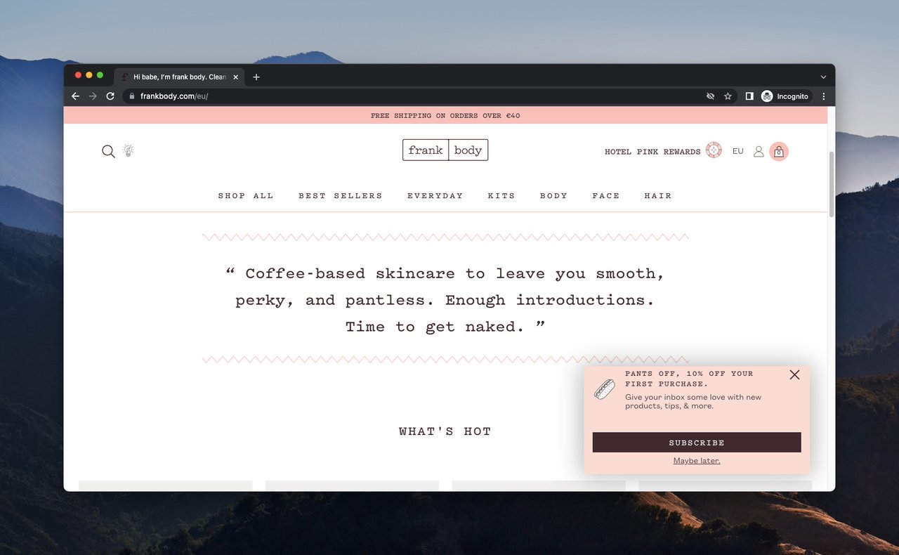
Frank Body's popup reads exactly like its product packaging.
Frank Body is a skincare brand built on a flirty, irreverent voice, and the popup commits to it fully. The headline is "Pants off." The opening line is "Hi babe." The body copy ("Give your inbox some love") makes the email signup feel like a wink rather than a transaction.
What works: Every word reads like the brand's product copy and Instagram captions. The 10% discount is there, but it's not the lead — the voice is. The CTA "I'm in" finishes the conversational tone instead of breaking it with a corporate "Subscribe."
Why it works: Voice consistency is a trust signal. When the popup sounds like the rest of the site, the visitor's brain processes it as content rather than as advertising. The Baader-Meinhof effect kicks in — readers who already enjoyed the homepage tone get more of what they liked.
Key takeaway: Write your popup in the same voice as your three best-performing product descriptions. If the popup sounds noticeably different from the rest of the site, rewrite it until it doesn't.
3. Lego: The wayfinding popup that asks for nothing
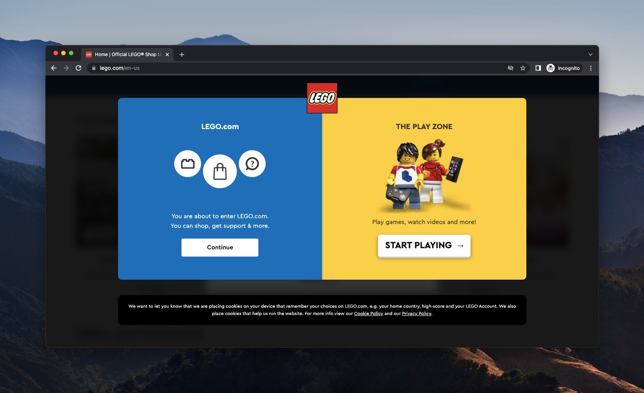
Lego uses its popup as navigation rather than capture.
Lego's popup isn't trying to capture an email at all. It's a minimal informational overlay that points visitors toward the home page and play zone. The word "more" is the only repeated element, and the popup leans on Lego characters and the brand color palette to do the work.
What works: No form. No discount. No "subscribe" pressure. The popup acknowledges that some visitors land on the wrong page and gives them two clear paths forward. It uses the brand's design system instead of a generic popup template, so it doesn't feel grafted onto the site.
Why it works: Not every popup needs to be a capture popup. For high-traffic sites with multiple audience segments (parents, kids, collectors), a wayfinding popup reduces bounce by routing visitors to the right experience before they have to navigate themselves.
Key takeaway: If your homepage serves multiple audiences, test a no-form, no-discount popup that helps visitors self-segment. Send them to the section that fits their intent, then capture later in the funnel.
4. MeUndies: The one-line offer popup
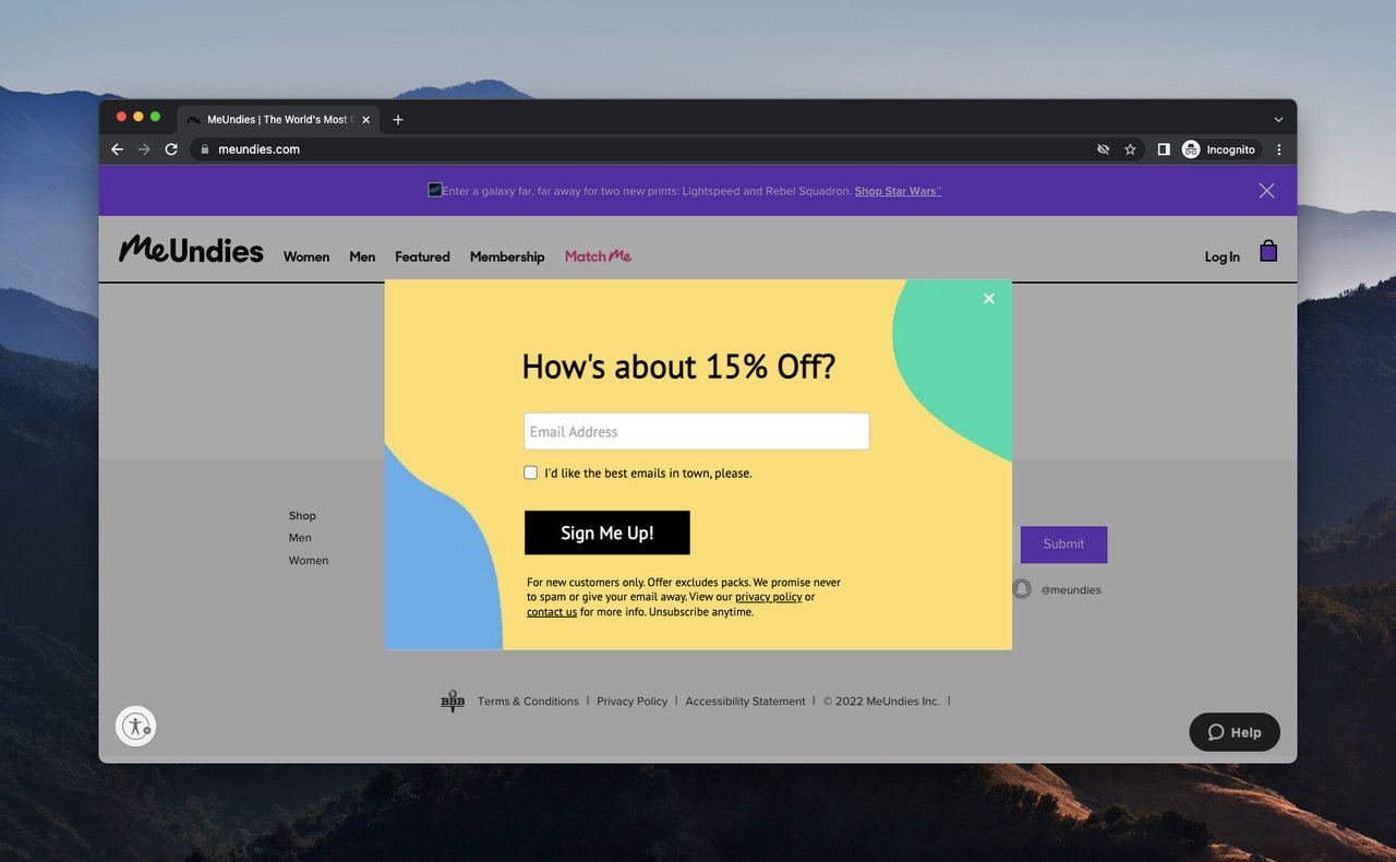
MeUndies trims its popup to a single offer and a single button.
MeUndies uses a stripped-down email popup with a single line of body copy: "How's About 15% Off?" The CTA is "I'd like the best emails in town, please" — a conversational button label that's almost a complete sentence. Form is email-only.
What works: The popup commits to brevity. No headline, sub-headline, body line, and CTA stack — just an offer phrased as a question and a button that answers it. The CTA copy positions the brand's emails as the reward, not the chore.
Why it works: Cognitive load research is consistent: every additional sentence in a popup reduces conversion. By reducing the popup to one offer and one branded button label, MeUndies asks the visitor to make exactly one decision. That maps to how visitors actually scan popups in 2026 — they read the headline, skim the button, and either close or click.
Key takeaway: Audit your popup copy this week. If you can delete a sentence and the offer still makes sense, delete it. Then test the trimmed version against the original.
5. Old Navy: The power-word popup
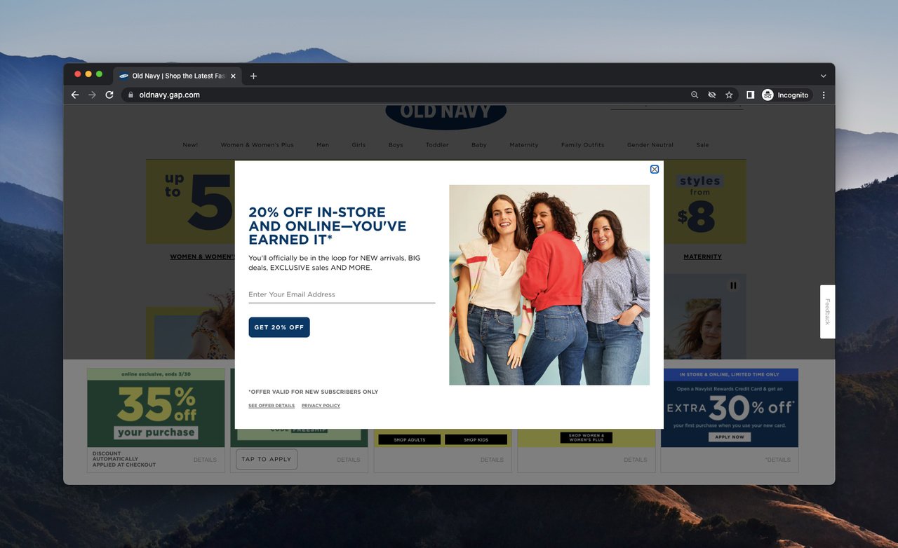
Old Navy capitalizes specific power words to direct the visitor's eye.
Old Navy leads with a 20% off discount and a "You've earned it" tagline. The interesting writing choice is in the body: "You'll officially be in the loop for NEW arrivals, BIG deals. EXCLUSIVE sales AND MORE." The selective capitalization functions like a highlighter, telling the eye where to land first.
What works: The popup uses typographic emphasis where a static popup can't use animation. Capitalizing NEW, BIG, EXCLUSIVE, and MORE creates four mini-headlines inside the body line — the visitor gets the value proposition even on a fast skim. The "You've earned it" framing flips the script from "give us your email" to "you've already qualified."
Why it works: Eye-tracking studies show readers scan popups in an F-pattern that drops off after the first 30-40 characters. Capitalizing the value words inside the body copy gives the skimmer something to grab onto even when they don't read the full sentence.
Key takeaway: If your body line has four or more benefits, capitalize the two highest-impact ones. Don't capitalize more than that — at that point you're shouting, and the technique stops working.
6. Pitviper: The popup that doesn't look like a popup
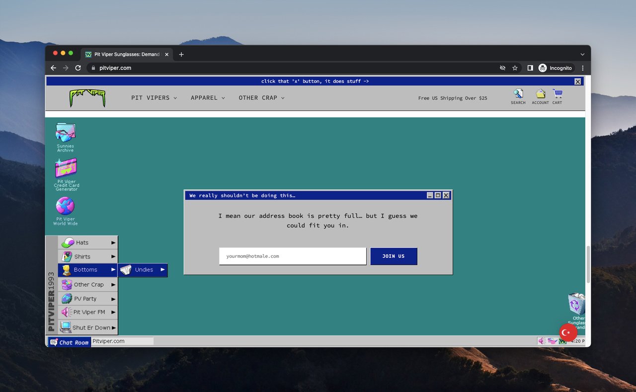
Pitviper's overlay reads as part of the page's retro design.
Pitviper ships a popup styled like an old-fashioned Windows 95 dialog box, which matches the brand's retro design system. The headline — "We really shouldn't be doing this..." — frames the offer as a guilty secret, and the body line plays up scarcity ("Our address book is pretty full, but we can fit you in").
What works: The popup is designed as a feature of the site, not as an overlay grafted on top. Visitors don't read it as "a popup interrupting me" — they read it as "another playful element of this weird, fun brand." The scarcity framing is the conversion driver, but it lands because the voice already earned trust.
Why it works: When the popup design is indistinguishable from the rest of the site's aesthetic, it bypasses the visitor's mental "close this ad" reflex. The retro frame is a Trojan horse — it makes the visitor curious instead of defensive.
Key takeaway: Build your popup with the same components, fonts, and tone as your homepage. If a designer could mistake the popup for a site section, you've nailed it.
7. The Pool Factory: The design-led popup
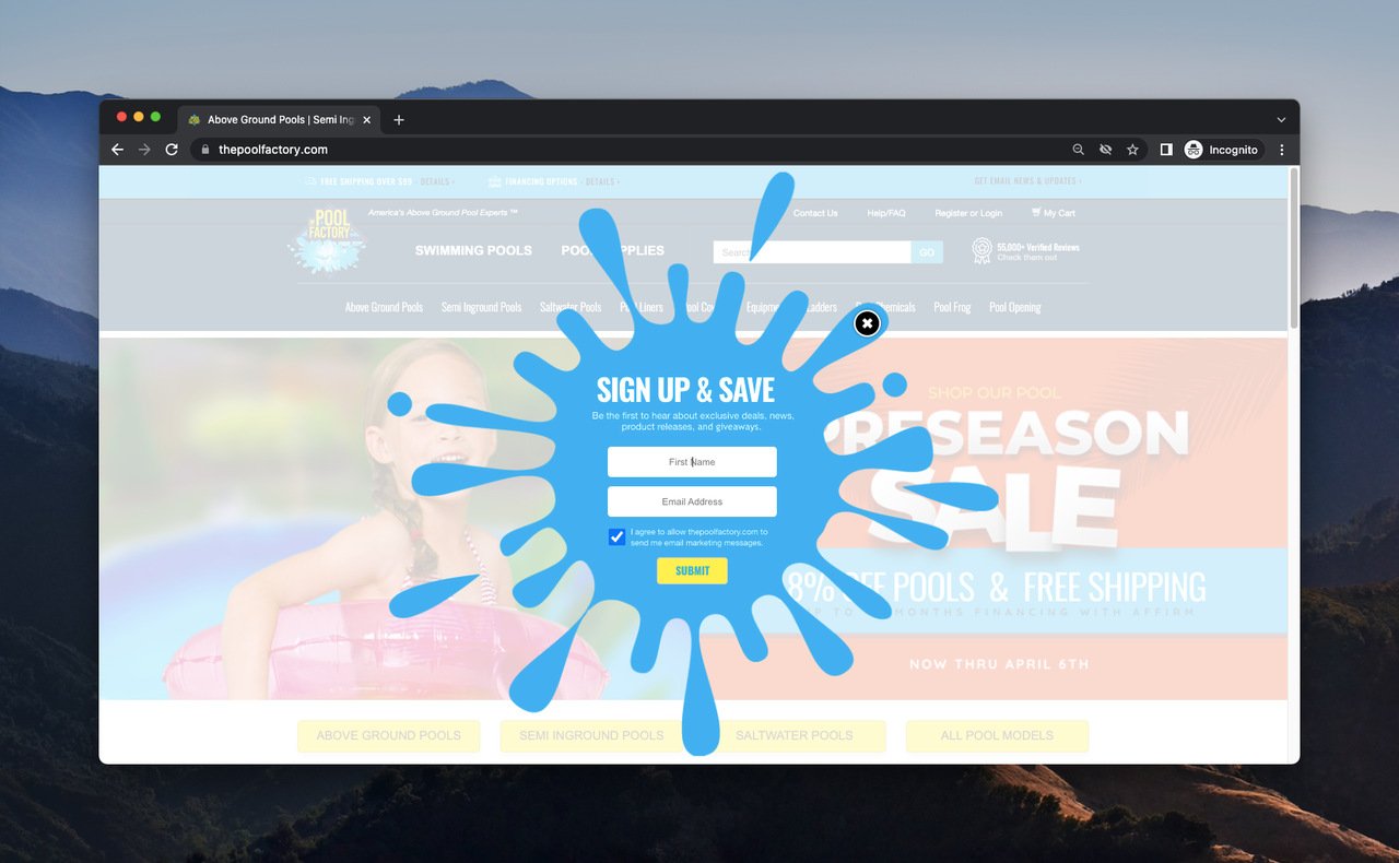
The Pool Factory leans on visual identity instead of clever copy.
The Pool Factory takes the opposite approach to MeUndies — minimal copy, but with a custom illustration that resembles a pool splash. The headline is just "SIGN UP & SAVE." The body line lists the perks: "Be the first to hear about exclusive deals, news, product releases, and giveaways."
What works: The illustration carries the brand signal. Pool brands selling above-ground pools have a strong visual category (water, summer, splashes), and the popup uses that immediately so the reader knows what site they're on. The copy then handles the rational side — what the visitor gets in exchange for the email.
Why it works: Visual-first popups outperform text-first popups when the brand has a recognizable category aesthetic. For a niche e-commerce store, leaning on category imagery does the work of three sentences of body copy. According to WiserReview's industry breakdown, e-commerce popup conversion rates average about 6-7%, higher than many other industries — partly because category-specific visuals signal relevance fast.
Key takeaway: If your brand has a strong visual category (food, fashion, outdoors), let the design carry the message. Use the copy for the offer details, not for proving you're a real brand.
8. Revolve: The compliment popup with a friendly opt-out
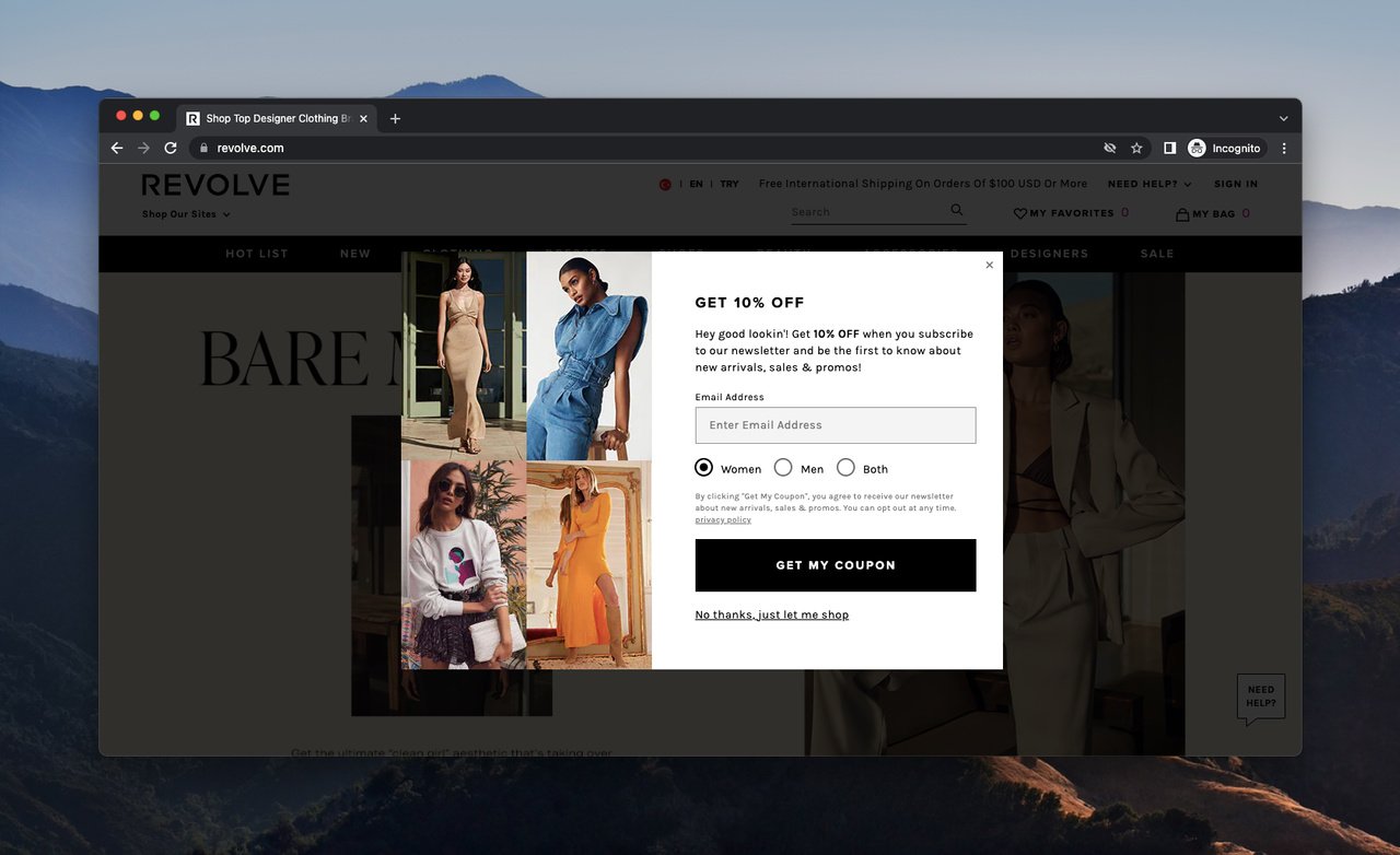
Revolve treats the opt-out as part of the popup's voice.
Designer brand Revolve opens its popup with a 10% off headline, but the writing choice that matters is the body line: "Hey, good lookin'!" followed by "be the first to know about new arrivals, sales & promos!" The opt-out link at the bottom reads "No thanks, just let me shop" — and that's the move worth studying.
What works: The opt-out copy preserves the popup's friendly voice instead of using the default "X close" or a guilt-trip "No thanks, I don't want to save money." Visitors who close the popup leave with a slightly positive impression of the brand rather than feeling like they dodged a sales pitch.
Why it works: Most teams optimize the click path; few optimize the close path. A friendly opt-out is a small detail, but it matters because 80-90% of visitors close the popup. If those visitors leave with goodwill instead of irritation, your brand metrics improve even when the popup conversion stays flat.
Key takeaway: Rewrite your popup's close link. Replace "No thanks" or a bare "X" with a one-line opt-out that matches your brand voice. Test for branded search and direct-traffic lift, not just popup conversion.
9. Tsuno: The community-first popup
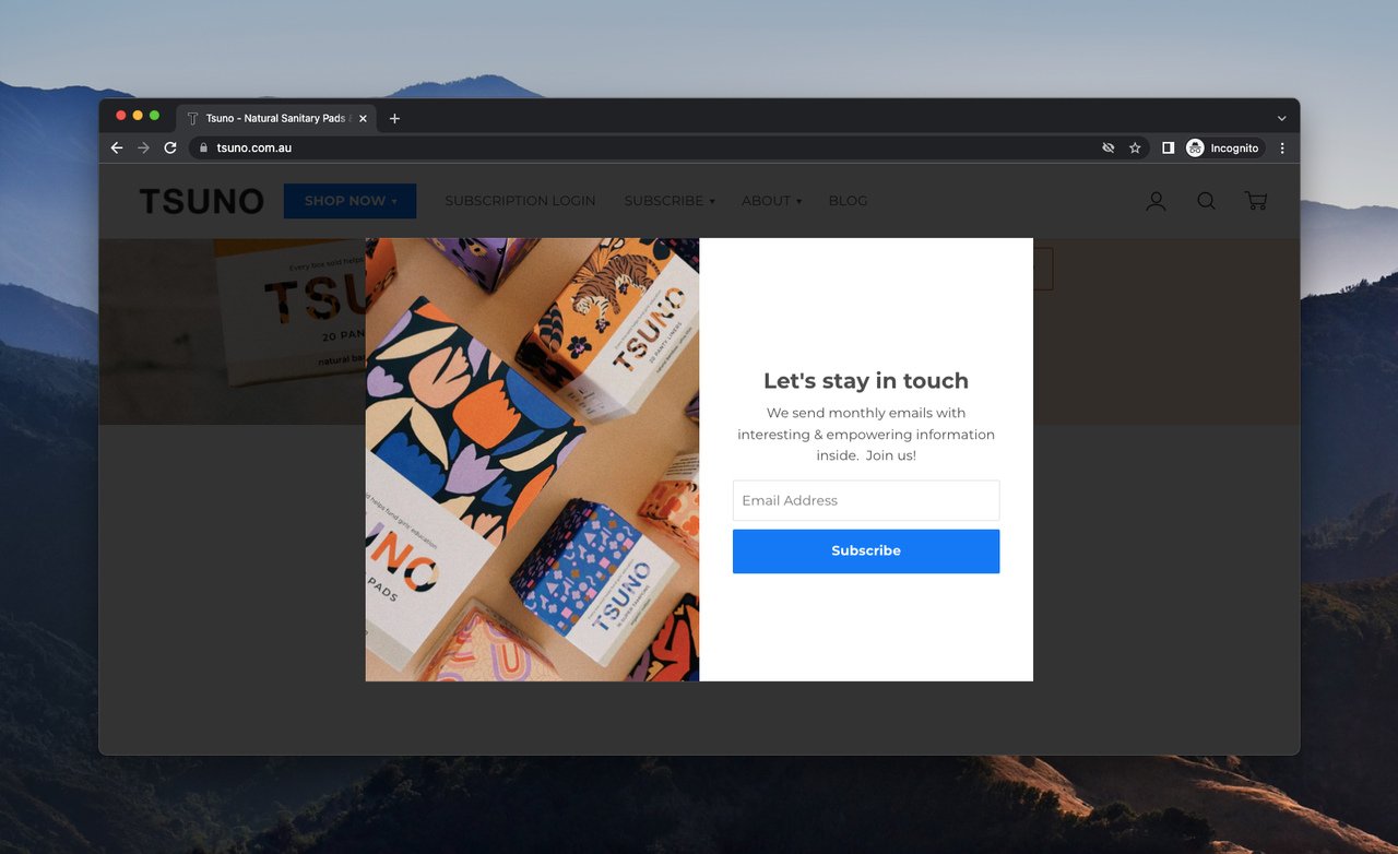
Tsuno frames the email signup as joining a community.
Tsuno sells natural sanitary products, and its popup leans into community language rather than discount language. The headline is "Let's stay in touch." The body line — "We send monthly emails with interesting & empowering information inside. Join us!" — sets clear expectations (monthly, informational, empowering) and uses "Join us!" instead of "Subscribe."
What works: Tsuno doesn't lead with a discount because its product category isn't price-sensitive in the way most e-commerce is. The popup instead pre-qualifies subscribers by telling them what the newsletter actually contains. That filtering reduces unsubscribes downstream — fewer people sign up, but the ones who do are more engaged.
Why it works: For mission-driven or values-led brands, identity-based copy ("Join us") outperforms transactional copy ("Get 10% off"). Visitors who sign up are buying into the brand's worldview, not just into a discount, and that drives higher long-term LTV. For more on this pattern, our welcome popup guide covers identity-led capture flows in depth.
Key takeaway: If your brand has a clear mission or values position, lead with identity instead of a discount. "Join us" pre-qualifies subscribers and improves the quality of the list — even if it lowers the raw signup rate.
10. Woven Store: The "gift" framing popup
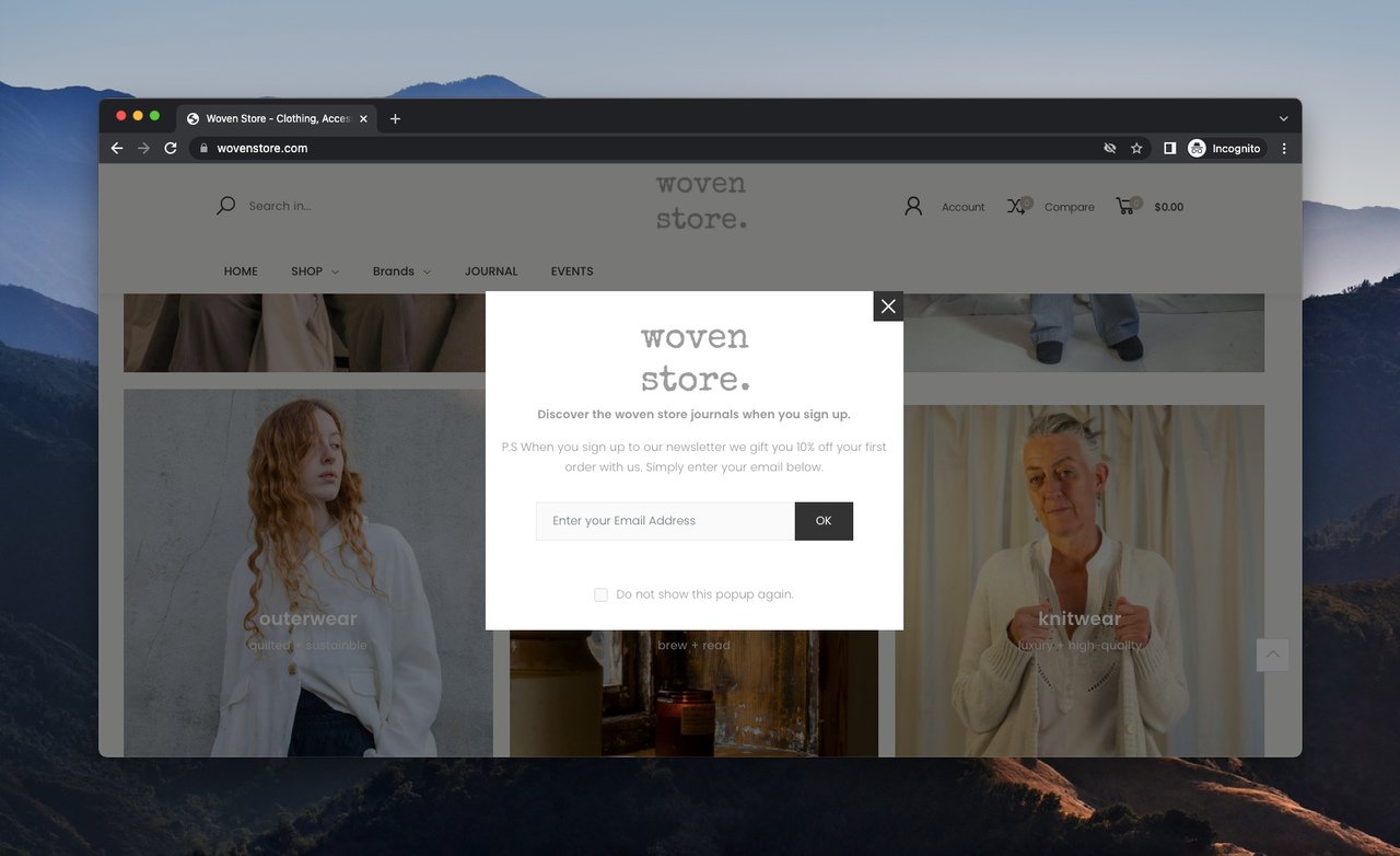
Woven Store frames the discount as a gift, not a coupon.
Clothing brand Woven Store opens with a headline inviting visitors to read the brand's journals once they sign up. The popup's footnote — "P.S When you sign up to our newsletter, we gift you 10% off your first order with us. Simply enter your email below." — is where the word choice matters: "gift" instead of "give" or "send."
What works: Reframing a discount as a gift changes the psychological transaction. A discount feels like a coupon; a gift feels like a relationship gesture. The "P.S." format also feels less like an ad and more like a personal note — the same trick direct-response copywriters have used in sales letters for decades.
Why it works: Gift framing triggers reciprocity. The visitor receives something framed as generosity, and their default response is to reciprocate (in this case, by handing over an email address and opening future emails). The P.S. format adds a second layer: P.S. lines have unusually high read rates because readers scan from top and bottom of any block of copy.
Key takeaway: Swap "Get 10% off" for "We'll gift you 10% off your first order." It's a one-word change that reframes the offer from a transaction to a relationship — and it's free to test.
Key takeaways from these popup message examples
The 10 popups above teach 10 different lessons, but five patterns repeat:
• Voice match beats clever copy. Frank Body, Pitviper, and Revolve all converted by sounding exactly like their brand. None of them wrote a "popup voice" — they used the homepage voice.
• One offer per popup. Every example commits to a single ask. The two popups that mix offers (discount + content) handle it by sequencing — they lead with one and tuck the other into a P.S. or footnote.
• Button labels should finish the sentence. "I'm in," "I'd like the best emails in town, please," and "Schedule A Demo" all complete the offer instead of restating it. "Submit" appears nowhere in this list for a reason.
• The close path matters too. Revolve's "No thanks, just let me shop" preserves voice on the way out. Designing the opt-out is a small detail that compounds across the 85% of visitors who close.
• Visual identity does heavy lifting. The Pool Factory's splash, Pitviper's retro window, and Lego's color palette all communicate brand before any word is read.
A practical note on where this is going in 2026: mobile popup conversion now outpaces desktop. According to Luca Tagliaferro's 2026 popup statistics review, mobile popups convert at 4.98% versus 3.67% on desktop — making mobile 36% more effective when the popup is designed for it. That's a meaningful inversion of the desktop-first thinking most teams still use when writing popup copy.
How to implement these popup ideas on your site
Translating an example into a live popup takes more than copy-paste. Here's the order I'd run it in, based on what's worked across our customer base since 2019.
1. Audit your current popup copy. Print out (yes, on paper) the headline, body, and button copy of your live popup. Read it aloud. If it sounds like a stranger reading from a script, the voice is off.
2. Pick the one pattern that fits your brand. Voice-led (Frank Body), trim (MeUndies), gift framing (Woven Store), community (Tsuno), or visual-led (Pool Factory). Don't try to apply all five.
3. Rewrite the button label first. The button is the highest-impact word change on most popups. Replace "Subscribe" or "Submit" with a sentence-completing CTA in your brand voice.
4. Test mobile before desktop. Most teams design popups on a 1440px screen and then check mobile. Reverse it — write and design for 375px first, and the copy will naturally tighten.
5. Match the trigger to the intent. Entry popups for first-time visitors getting a content offer, exit-intent for cart abandoners, scroll-triggered for engaged readers. Mismatched triggers kill conversion no matter how good the copy is.
6. A/B test one variable at a time. Headline OR offer OR CTA — not all three. You can't learn anything from a three-variable test on popup traffic unless you're running enterprise volume.
One important caveat: the 10-20% conversion ceiling I mentioned earlier doesn't show up on day one. The top-quartile popups I've watched typically take 6-8 iterations across 60-90 days to reach those numbers. The first version of any popup is rarely the winner — it's the baseline.
Tools to build high-converting popups
The tooling decision matters less than the copy decision, but it matters. Three things to look for in a popup builder, written by someone who built one and uses it daily:
• No-code editor with brand-system support: You should be able to import your fonts, colors, and button styles in under five minutes. If you're rebuilding your brand inside the popup tool, the tool is wrong.
• Targeting at the page-and-segment level: Triggering a popup site-wide is the fastest way to burn out your audience. Look for tools that target by URL, traffic source, device, return visit count, and behavior.
• Honest analytics: Some tools report "views" as anyone who loaded the page, which inflates the denominator. The number you want is "shown vs. converted," not "loaded vs. converted."
I co-founded Popupsmart in 2019 specifically because the existing tools at the time forced a tradeoff between targeting power and ease of use. The walkthrough below is the same one I run new team members through — it's intentionally short.
For a longer reading list before you build, the 2026 email popup guide covers high-converting email-capture patterns specifically, and the Shopify newsletter popup walkthrough covers the Shopify-specific integration steps. For B2B teams, the B2B popup examples roundup is closer to your use case than the e-commerce examples above.
One real-world data point worth grounding all of this in: Hustler Marketing's welcome flow case study documented a 5.3% average conversion rate on popup email captures alongside 782% growth in email revenue after their welcome flow rebuild. That's the kind of compounding effect that makes popup work pay off — the popup itself converts at a few percent, but the downstream email program built on those captures drives an order of magnitude more revenue.
Create effective popups with Popupsmart in under 5 minutes
Building popups with Popupsmart is straightforward. You can register for free and ship your first campaign in under five minutes. Here's the exact build flow, screenshot by screenshot.
1. Sign up if you haven't already and click the "+New Campaign" button on the dashboard.
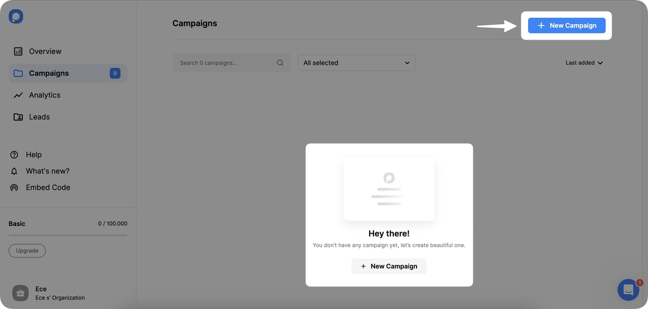
Step 1: Start a new campaign from the dashboard.
2. Name your campaign, choose a domain from the dropdown, and click Save to move to the builder.
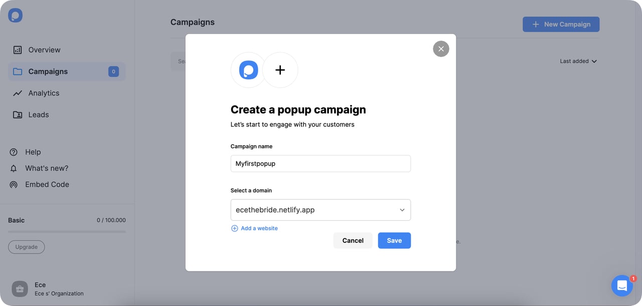
Step 2: Name the campaign and pick the domain.
3. Pick your business goal. Popupsmart has goal templates for the most common popup use cases.
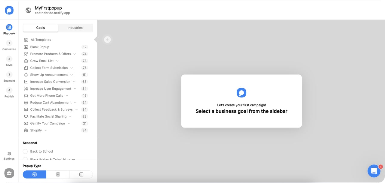
Step 3: Choose a business goal template.
You can promote products, make announcements, grow your email list, or increase phone calls. You can also collect form submissions or capture cookie consent. Pick the goal that fits your campaign.
4. Select a template from the gallery. Filter by popup type (light popup, full-screen, floating bar) or by animated and multistep options.
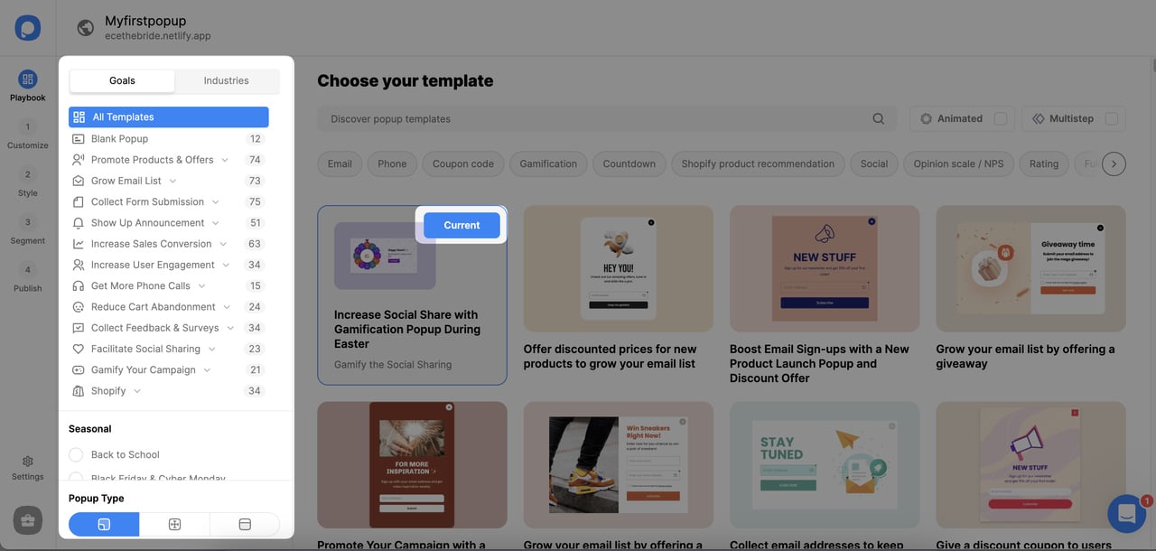
Step 4: Pick a starting template.
5. Add elements in the "Customize" step — text, image, button, form fields, countdown timer.
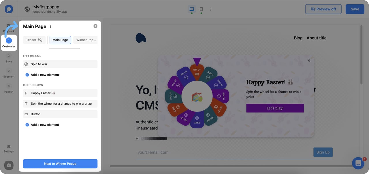
Step 5: Add and arrange popup elements.
6. Adjust design in the Style step — size, colors, font, spacing.
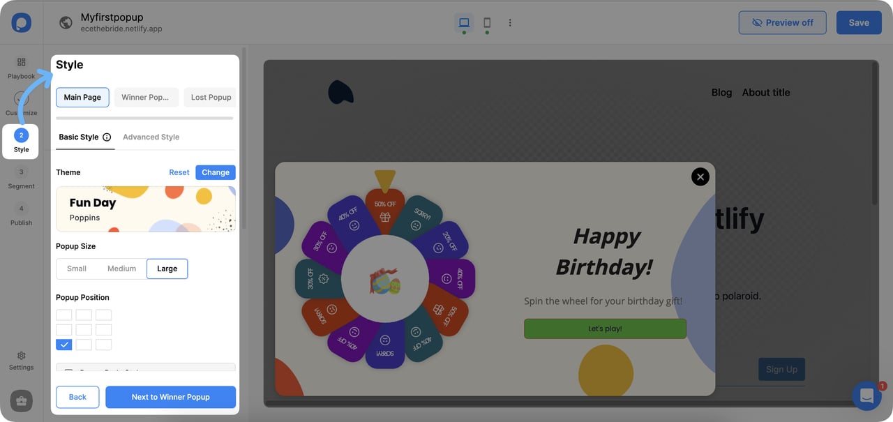
Step 6: Style the popup to match the brand.
7. Open the Segment section from the left sidebar to use a predefined audience segment.
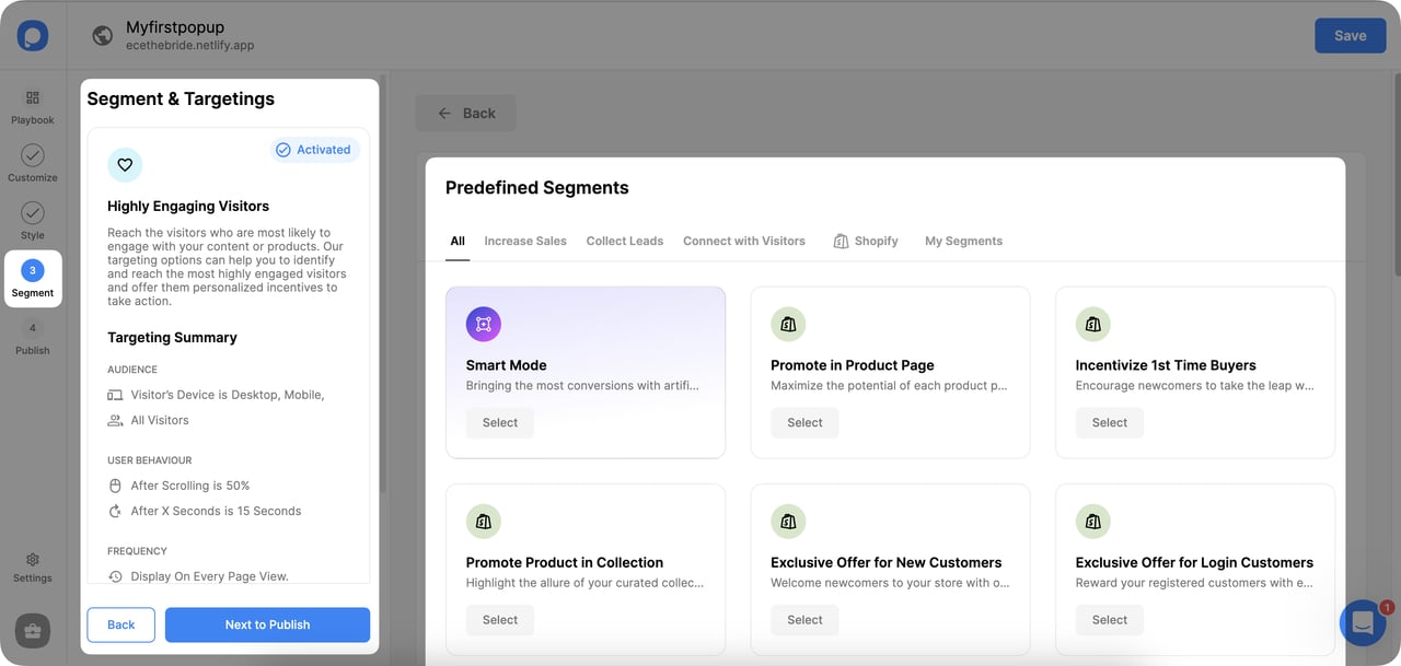
Step 7: Pick a predefined visitor segment.
8. Or build custom segmentation rules from scratch — URL targeting, device, traffic source, return-visit logic.
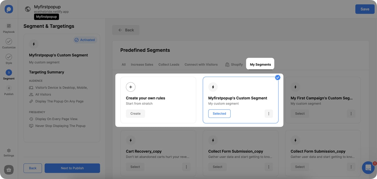
Step 8: Build custom segmentation rules.
9. When the popup looks right, jump to the Target section to set trigger behavior, scheduling, and view frequency.
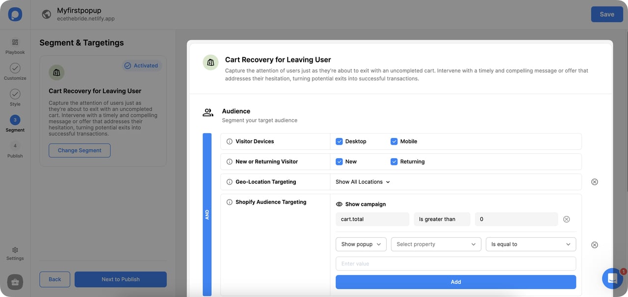
Step 9: Configure triggers, schedule, and frequency.
Choose the trigger behavior (entry, exit, scroll, click, time delay), set the schedule, and tune the view frequency so visitors don't see the same popup ten times in a session. Then click "Next to Publish."
10. Click Publish and the popup is live.
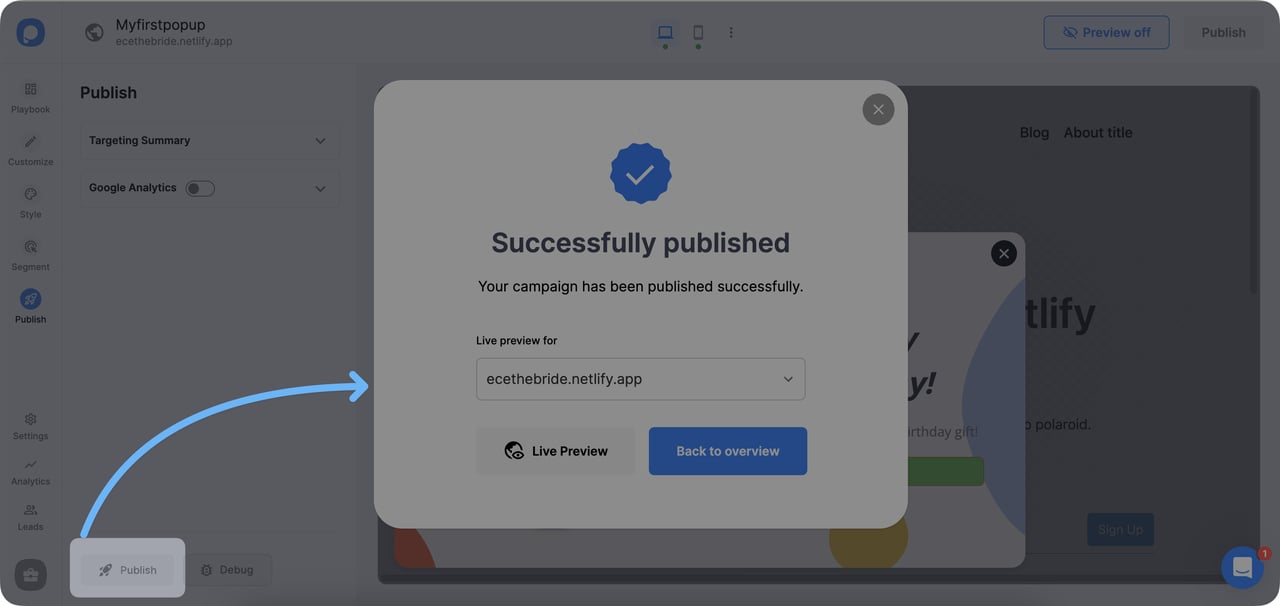
Step 10: Publish the campaign.
A note on verification: every domain on your account needs to be verified before popups will display. Verification works when the Popupsmart installation code is embedded correctly on the site — for most platforms (Shopify, WordPress, Webflow), this is a one-line snippet in the theme header.
Useful tips to write conversion-ready popup messages
A short field guide based on the patterns I see repeated by our highest-converting customers:
• Put a CTA word inside the popup body, not just the button. "Save 10% on your first order" inside the body line reinforces the action even before the visitor reads the button.
• Use urgency words sparingly. "Limited time," "today only," and "for a while" trigger FOMO, but they lose power if every popup on the site uses them. Save urgency for genuinely time-limited offers.
• Skip spammy phrasing. Don't beg ("Please subscribe!"), don't hard-sell ("You can't afford to miss this!"). Simple, clear language consistently outperforms hype.
• Use power words that earn their place. "Simple," "affordable," "free to try," "sustainable," "approved," "cancel anytime," "bestselling," "no questions asked." One per popup is enough — stacking them makes the popup feel like a late-night infomercial.
• Add personality, but don't overcook it. A small dose of humor or warmth works — visible effort to be funny doesn't. If you're not sure, default to clear over clever.
• Match the message to the moment. A welcome popup for a first-time visitor reads differently from a cart-abandonment popup. Don't reuse the same copy across triggers.
Ship your first conversion-ready popup this week
Popup messages are one of the highest-ROI writing exercises a marketing team can do. Across the 10 examples above, the writing patterns that show up most are voice consistency, one-offer simplicity, sentence-completing CTAs, and a friendly close path. None of those require a redesign — they're rewrites you can ship today.
If you're starting from scratch, pick the brand from this list that most resembles your voice (Frank Body for playful, Tsuno for mission-led, MeUndies for stripped-down, Co-Schedule for SaaS) and copy the structure, not the words. Then test against your current popup. Most teams I work with see a 30-80% conversion lift within the first two iterations once they stop using a generic template.
The hardest part isn't the copy — it's the discipline of writing it like a human and not like a marketer.
Frequently asked questions about popup messages
What makes an effective popup message?
An effective popup message has three traits: it names a single, specific benefit in the headline ("10% off your first order," not "subscribe"); it uses the brand's voice consistently across headline, body, and button; and it asks for one piece of information (usually email) instead of three. The most common failure mode is generic copy paired with multiple form fields — that combo caps conversion in the 1-2% range no matter the design.
How do I create HTML popup messages?
You have two paths. The developer path is to write a modal in HTML and CSS, then trigger it with JavaScript — usually a `display: none` div that flips to `display: block` on a timer, exit intent, or button click. The faster path is to use a no-code popup builder that handles the targeting, A/B testing, and analytics for you. For most marketing teams, the no-code path saves 20-40 hours per campaign and gives you reporting the hand-coded version doesn't include. Our walkthrough above covers the Popupsmart path; for technical implementation details, the W3Schools popup documentation covers vanilla JS modal patterns.
Where are pop-ups located in settings?
This question usually comes from people trying to turn off browser-level popup blockers, not site popups. On Chrome: Settings → Privacy and security → Site Settings → Pop-ups and redirects. On Safari: Safari → Settings → Websites → Pop-up Windows. On Firefox: Settings → Privacy & Security → Permissions → Block pop-up windows. For mobile, the path is similar: browser app settings → site permissions → pop-ups.
How do I turn off popup messages on my phone?
Two layers to disable. App-level notifications: Settings → Apps → [App name] → Notifications → toggle off. Browser-level pop-ups: Chrome on Android (Settings → Site settings → Pop-ups and redirects) or Safari on iOS (Settings → Safari → Block Pop-ups). If a popup keeps appearing on a specific site, that's usually a site-level popup (not a browser one) and clearing the site's cookies will reset the popup frequency.
What's the difference between a popup and a sticky bar?
A popup is an overlay that interrupts the page — the visitor has to acknowledge it (close it or interact with it) to continue. A sticky bar is a non-interrupting strip at the top or bottom of the page that stays visible while the visitor scrolls. Sticky bars convert lower than popups (typically 1-3% vs. 4-7%) but they don't disrupt the browsing experience. Most high-performing sites use both — sticky bars for ongoing offers, popups for time-sensitive captures.
How often should a popup show to the same visitor?
The standard is once per session, with a cooldown of 7-14 days before showing the same popup again to the same visitor. Showing the same popup on every page view caps your conversion rate fast — visitors who saw it once and didn't convert aren't more likely to convert on the fifth view. Frequency capping is a setting in any modern popup builder; if your current tool doesn't have it, that's a sign to switch.
Articles you might like:
• Shopify Cookie Popup Examples

How would you rate your experience with this article? 😊