Thank You Page Examples: 6 Engaging Ideas for 2026
Perfect thank you pages confirm and detail the user action, guide next steps with CTAs, match brand identity, add value (resources/sharing), stay polite, and be mobile-ready; examples show varied styles and 5 key types (purchase, signup, webinar, e-book, donation).
Most marketers spend weeks tuning a landing page, then point the form straight at a bland "Thanks!" screen with a link back to the homepage. That screen is your highest-intent moment, and these thank you page examples show exactly what to do with it.
The best thank you page examples turn a plain confirmation screen into a second conversion. Strong ones confirm the action, then add one clear next step — a related product, a content download, a community invite, or a feedback request. Brands like Huel and Onyx Coffee Lab show how small design choices drive measurable post-conversion clicks.
These six examples come from real e-commerce and SaaS brands, each picked apart for the conversion principle behind it and a takeaway you can ship this week. The collection covers post-purchase, subscription, and feedback flows.
What Is a Thank You Page and Why It Matters in 2026
A thank you page is the screen a visitor lands on right after they complete an action, such as a purchase, a form submission, or a newsletter signup. It confirms the action worked, sets the next expectation, and gives you a second conversion opportunity while attention is at its peak.
Here's the part most teams miss. According to Apexure, a thank you page is your highest-intent touchpoint for driving the next action, with a 100% view rate compared to a 20-30% email open rate. Everyone who converted sees this page. Almost nobody opens the follow-up email. Yet the page usually gets a fraction of the attention the form got.
I've been auditing post-conversion flows for Popupsmart customers since 2021, and the pattern is consistent: the thank you page is the most underused asset in the funnel. Fixing it doesn't take a redesign, just one clear message, one obvious next step, and a reason to keep going.
What Makes a Great Thank You Page Example
I reviewed dozens of live thank you pages across e-commerce and SaaS over the past year and selected these six based on four things I could verify by actually completing the flow myself:
• Clear confirmation: The page tells you, without ambiguity, that your action worked. No guessing whether the form went through.
• A defined next step: There's exactly one obvious thing to do next, whether that's "back to shop", checking your inbox, or answering a quick question.
• Brand consistency: Colors, logo, and tone match the rest of the site, so the page feels like a continuation, not a system message.
• Reproducibility: A marketing team with a no-code builder could rebuild the page, or a thank you popup version of it, in under an hour.
One note on imperfection: I've flagged weaknesses where I found them. A few of these pages leave conversions on the table, and saying so is more useful than pretending every example is flawless.
Key Elements of Effective Thank You Pages
An effective thank you page does three jobs: it reassures, it directs, and it deepens the relationship. The strongest pages cover six elements, though you rarely need all six on a single page.
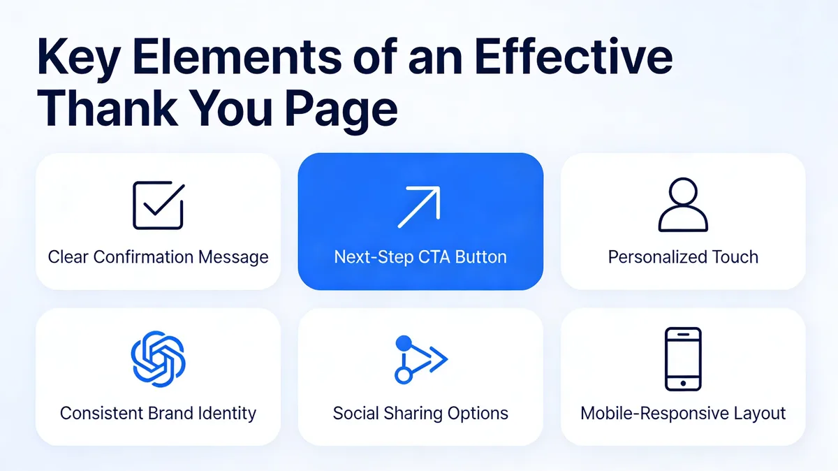
Key elements of an effective thank you page
• Confirmation message: A prominent headline that names the action: "Your order is confirmed", "You're subscribed". This is non-negotiable. Without it, visitors doubt the action worked, and doubt sends them back to search.
• Relevant details: For a purchase, show the order summary. For a webinar, show the date and join link. For a download, point to the inbox. Give people the specifics they're about to look for.
• One next step: A single button or link that moves the visitor forward, "Back to shop", "Explore the blog", "Update your preferences". One action, not five.
• Personalization: Using a first name or referencing the specific product lifts engagement. It's optional, but it's the cheapest upgrade on this list.
• Brand identity: Match your fonts, colors, and logo. A thank you page that looks like a default template breaks the experience you just built.
• Mobile responsiveness: More than half of conversions happen on phones. If the confirmation or the button breaks on a small screen, the page fails for most of your audience.
If you can't fit everything onto the page itself, a thank you popup is a clean way to layer in a secondary ask, a feedback question or a related offer, without cluttering the confirmation. Popupsmart's feedback form popup recipe is built for exactly this moment.
6 Effective Thank You Page Examples
Each example below includes the live screenshot, a teardown of what works and why, and a takeaway you can apply. They run from minimal subscription confirmations to feedback-collecting post-purchase pages, so compare them against the flow you're trying to fix.
1. Huel: The Expectation-Setting Confirmation
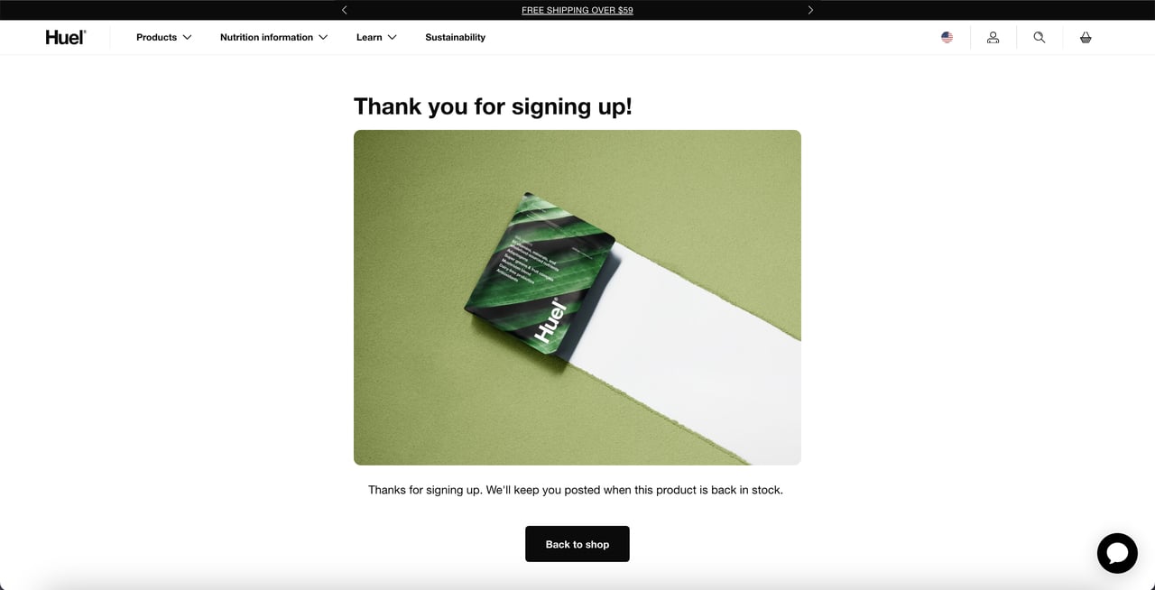
Huel confirms the signup and routes shoppers back
What works: Huel puts the thank you message at the top, pairs it with a product image, and adds a descriptive line telling the shopper they'll be notified when the item is back in stock. The page closes with a single call to action button, "Back to shop". No competing links, no menu of options.
Why it works: The page answers the question every back-in-stock signup creates, "what happens now?", before the visitor has to wonder. Then it removes the dead end. Instead of leaving the shopper stranded on a confirmation, the single button keeps them inside the store while intent is still warm.
Key takeaway: If your form solves a "notify me later" problem, state exactly when and how the notification arrives, then add one button back into your catalog so the session doesn't end on a confirmation.
2. The PenTool: The Feedback-Collecting Post-Purchase Page
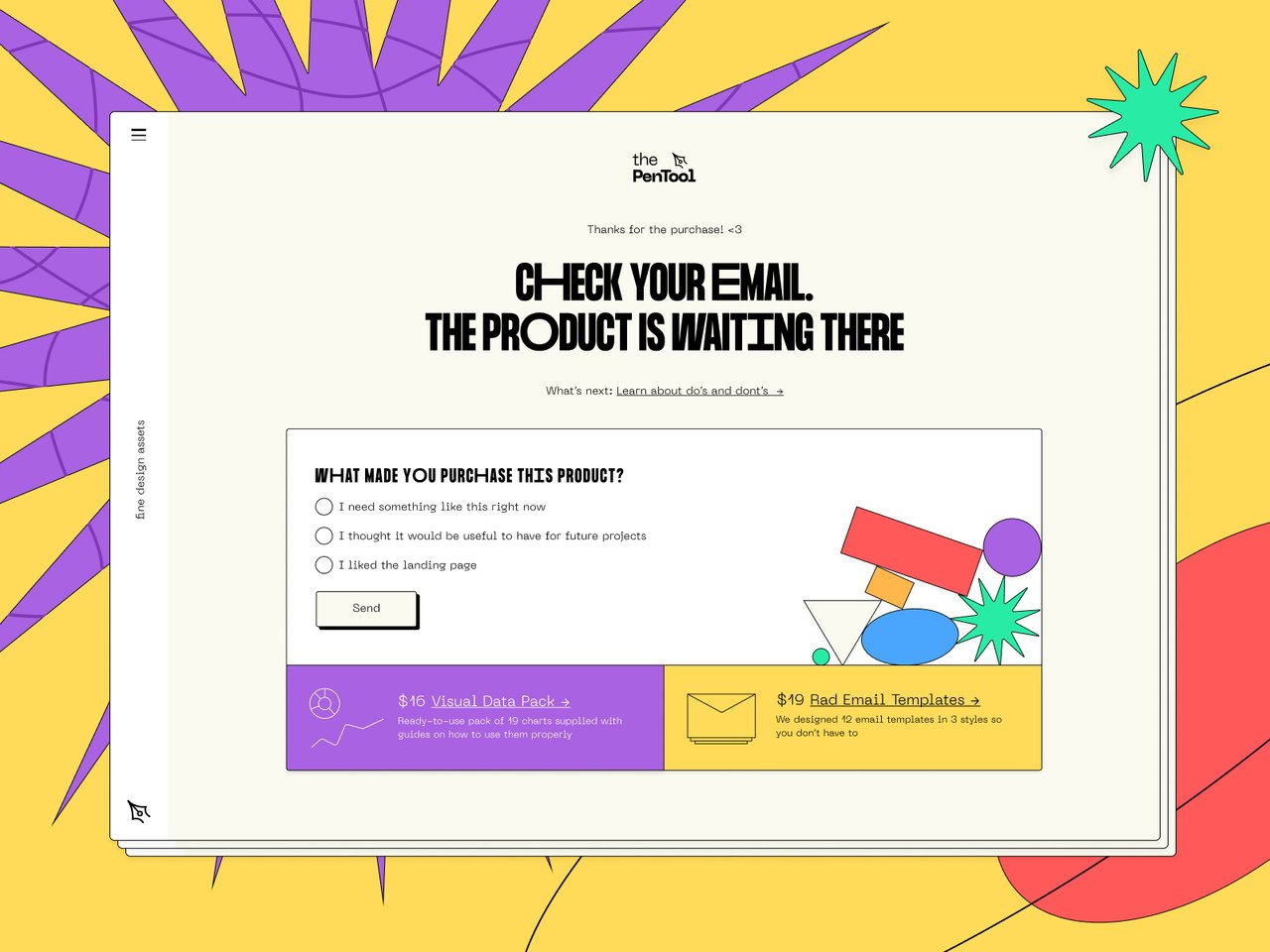
The PenTool turns the confirmation into a survey
What works: This is the most colorful page in the set, and it does something the others don't, it asks. After confirming the purchase, The PenTool poses questions to collect customer feedback and points buyers to where their product lives. The confirmation and the research happen in the same view.
Why it works: Right after a purchase is when memory of the buying experience is sharpest and goodwill is highest. Asking for feedback here gets better answers than an email survey sent three days later. The brand gets product and UX insight for free, at the exact moment the customer is most willing to give it.
Key takeaway: Add one feedback question to your post-purchase page, "What almost stopped you from buying?" works well. You'll collect conversion-blocking objections straight from people who bought anyway.
3. Onyx Coffee Lab: The Minimalist Subscription Confirmation
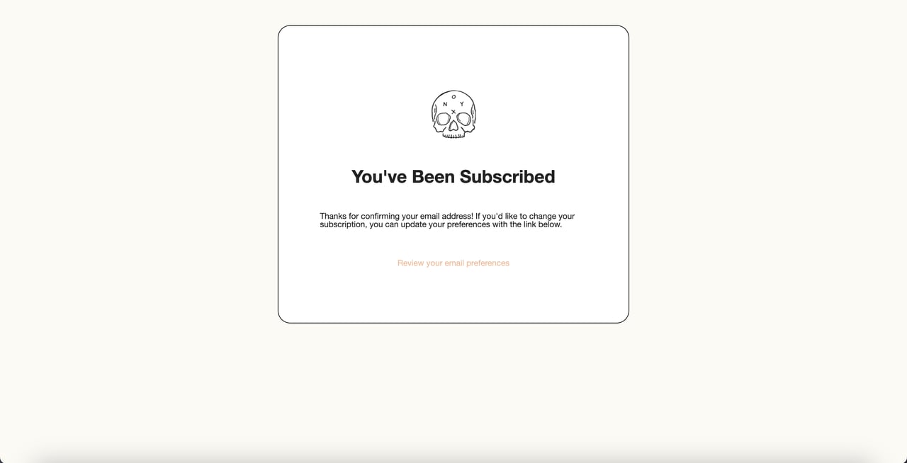
Onyx Coffee Lab keeps the confirmation stripped down
What works: This is the simplest page in the list. Logo at the top, a subscription confirmation as the headline, a clear message, done. Onyx doesn't add a shopping button. Instead, it routes new subscribers to update their email preferences.
Why it works: Unlike Huel's page, which pushes the visitor back into the store, Onyx makes a different bet, that a fresh subscriber who picks their own preferences becomes a better long-term email contact than one nudged to buy immediately. It's a deliberate trade of a short-term click for list quality. The risk: with no shopping link at all, the page can feel like a dead end for someone who was ready to browse.
Key takeaway: For newsletter signups, decide consciously whether your next step is "shop now" or "set your preferences". Both are valid; the mistake is having no next step at all.
4. Salt and Stone: The Subscription Page That Still Sells
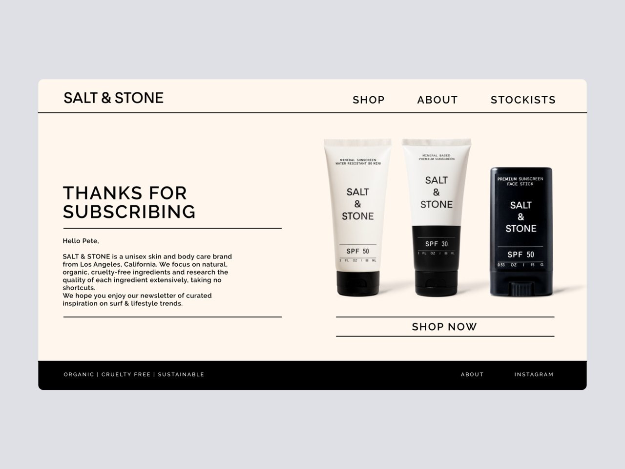
Salt and Stone pairs the thank you with featured products
What works: Salt and Stone gives a remarkable amount of the page to product imagery, then layers in the thank you message, a brand note, and a "Shop Now" button placed directly under the products. The branding and the message are tightly integrated, so it reads as one designed experience.
Why it works: The page respects the visitor's freedom to leave, there's no pressure, no modal trap, while still making the next purchase the path of least resistance. Showing actual products instead of a generic "browse our store" link gives the eye something specific to land on. It's the middle ground between Huel's hard push and Onyx's soft exit.
Key takeaway: On a subscription confirmation, show three to four real products instead of a generic shop button. Specific imagery converts better than an abstract invitation to browse.
5. Essentials: The Clean Order-Confirmation Layout
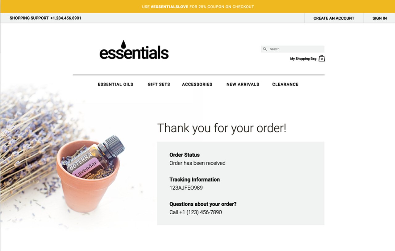
Essentials splits image and order details into two columns
What works: This cosmetics brand keeps its order confirmation pure and functional. A product image sits on the left, order details on the right. The two-column split makes the page easy to scan, and nothing competes with the information the buyer actually needs.
Why it works: After a purchase, the first thing people want is reassurance that the order details are correct. The two-column layout serves that instantly. But the page stops there, and that's its weakness. There's no link to related products or a next step, so a buyer who'd happily add one more item has nowhere to go.
Key takeaway: A clean order summary is the floor, not the ceiling. Once the details are confirmed, add a single "you might also like" row, it costs nothing and catches the buyers still in spending mode.
6. FrontEnd30: The Dark-Mode Signup With Built-In Sharing
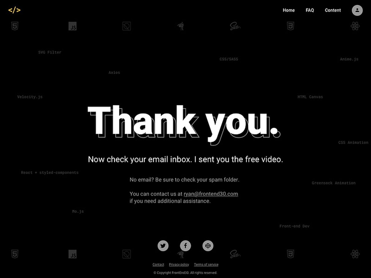
FrontEnd30 builds referral sharing into the confirmation
What works: FrontEnd30's page runs on a dark background that matches the product's own interface, so the confirmation feels native rather than bolted on. The thank you message sits at the top, the explanation is clear, and social sharing elements give new signups an easy way to spread the word.
Why it works: The moment someone signs up is the moment their enthusiasm peaks. Putting share buttons right there captures that energy before it fades, turning one signup into a small referral loop. It's the only page in this set that treats the new subscriber as a potential distribution channel, not just a contact.
Key takeaway: If your signup has any referral or word-of-mouth value, add share buttons to the thank you page. You're asking at the single highest point of goodwill in the whole funnel.
5 Types of Thank You Pages and What to Include in Each
Thank you pages aren't one template. The action that triggers the page changes what the page should say and where it should send people. Here are the five most common types and the elements each one needs.
Product Purchase Confirmation Page
This page follows a completed order. Personalization and order detail matter most here, because the buyer wants proof the transaction went through correctly. Include your thank you message, the order details, an optional note of appreciation, and a button that leads to other products. Bundles or "frequently bought together" rows work well in this spot, since the buyer is already in spending mode. Trim or expand the elements based on what your store sells.
Sign Up Thank You Page
You'll recognize this one from form submissions and newsletter opt-ins. When someone subscribes, the page should confirm the signup and set the relationship up. Include the confirmation message, a short thank you description, an image or icon to add warmth, and a button pointing to more content or products. Effort here pays off, a subscriber who lands on a thoughtful confirmation is more likely to open the next email.
Webinar Registration Thank You Page
Webinar and seminar registrations need a thank you page more than most flows, because there's a gap between registering and attending. Use the page to welcome people before the event. Include the confirmation message, a thank you line, the webinar details (date, time, join link), and a button toward product discovery while you have their attention. This page also doubles as a calendar prompt, so make the date and time impossible to miss.
E-book or Resource Download Page
A download thank you page is less common but shapes the relationship that follows. Keep it focused: the thank you message, the confirmation that the download is on its way (usually "check your inbox"), and optional recommendations for related resources. If the audience engages here, the download becomes the start of a longer relationship rather than a one-off.
Donation Thank You Page
Nonprofits rely on thank you pages more than almost anyone, because showing appreciation to a donor is part of the mission. Include the thank you message, the concrete outcome of the donation (what the money does), and a button to keep learning about the organization. Donors respond to specifics, "your gift funds 40 meals" beats "thank you for your generosity".
Common Mistakes to Avoid in Thank You Page Design
Most thank you page problems aren't design flaws, they're missed opportunities. According to Sam Thomas Davies, Head of Content at Drip, many business owners massively underutilize their thank you page. Here are the mistakes I see most often in audits.
• Linking straight to the homepage: The homepage is a dead end after conversion, it asks the visitor to start their journey over. Send them somewhere specific instead.
• No next step at all: A confirmation with nothing to click ends the session. Every thank you page needs at least one forward action.
• Treating it as a formality: A generic "Thanks for signing up!" wastes a 100% view-rate moment. Write the page like it matters, because it's the one page everyone who converts will actually see.
• Skipping mobile testing: A confirmation that breaks on a phone fails for the majority of your traffic. Test the full flow on a small screen before you ship.
• Cramming in too many CTAs: Five competing buttons is the same as no button, the visitor freezes. Pick one primary action and make it obvious.
• Asking for nothing: Feedback, a referral share, a preference selection, the post-conversion moment can carry a light ask. Wasting it is the most common mistake of all.
How to Build and Measure a High-Converting Thank You Page
Building a strong thank you page is less about tools and more about sequence: confirm, direct, then deepen. Most page builders and e-commerce systems let you customize the post-conversion screen. The harder part is layering in a secondary action without cluttering the confirmation, and that's where a thank you popup or on-site message earns its place.
With a no-code builder like Popupsmart, you can trigger a popup on the thank you page itself, a feedback form, a related-product offer, or a referral prompt, without touching the underlying page. The teams I've worked with that treat the thank you page as a real conversion surface consistently pull more value from the same traffic. For more on where popups fit across the funnel, the popup use cases guide walks through 13 scenarios, and the website popup examples collection shows the patterns in action.
To measure whether your page works, track three things: the click-through rate on your primary next-step button, the rate of any secondary action (feedback submitted, share clicked, preferences set), and the share of visitors who go on to a second conversion in the same session. If the click-through on your next step is low, the button is either unclear or pointed at the wrong destination. Test one variable at a time, headline, button copy, or destination, and let the data settle before changing the next.
Turn Your Thank You Page Into a Second Conversion
Across all six examples, the same principle holds: the strongest thank you pages never end the session. Huel routes back to the catalog, The PenTool collects research, Salt and Stone shows real products, FrontEnd30 invites a share. The weak spots, Onyx's missing shop link, Essentials' lack of a next step, are all the same mistake in different clothing: a confirmation with nowhere to go.
Pick the one page in your funnel that currently dead-ends, the order confirmation, the newsletter opt-in, the demo signup, and give it a single, specific next step. Then add one light ask: feedback, a share, a related offer. If you want to layer that secondary action in without rebuilding the page, the welcome popup guide shows how on-site messaging triggers work, and the same approach applies on a thank you page. Your highest-intent moment is already happening. Make it do more than say thanks.
Frequently Asked Questions
What should be included on a thank you page?
Every thank you page needs a clear confirmation message, relevant details about the action (order summary, webinar date, or download status), and one defined next step. Beyond that core, add personalization, brand-consistent design, and a light secondary ask like a feedback question or share prompt. You rarely need all of these on one page, match the elements to the action that triggered it.
How do you make a thank you page engaging?
Give the visitor something to do. The most engaging thank you pages, like The PenTool's feedback page or FrontEnd30's share-enabled signup, replace the dead-end confirmation with a single forward action. Match the page to your brand's design, personalize it where you can, and ask one small question or offer one relevant next step. Engagement comes from momentum, not decoration.
What is the purpose of a thank you page on a website?
The purpose of a thank you page is to confirm that a user's action succeeded, such as completing a purchase, submitting a form, or signing up, and to guide them toward the next step. It reassures the visitor, reinforces brand trust, and creates a second conversion opportunity at the highest-intent moment in the funnel.
How do you optimize thank you pages for conversions?
Start by replacing any homepage link with a specific, relevant next step. Add one secondary action that fits the context, a feedback question after a purchase, a share prompt after a signup, related products after an order. Then measure the click-through rate on your primary button and the rate of same-session second conversions, and test one element at a time. A thank you popup is a clean way to add the secondary ask without redesigning the page.
How important is mobile responsiveness for a thank you page?
It's essential. More than half of conversions now happen on phones, so a thank you page that breaks on a small screen fails for most of your audience. The confirmation message, order details, and primary button all need to render cleanly on mobile. Test the full flow on a phone before publishing, not just the desktop version.
Can thank you pages improve customer retention?
Yes. The thank you page sets the tone for the relationship that follows a conversion. A page that confirms clearly, routes preferences thoughtfully (like Onyx Coffee Lab's), or collects feedback (like The PenTool's) turns a one-time action into the start of an ongoing relationship. It's a low-cost retention lever most teams ignore.
Recommended Reading
• 70 Thank You for Your Order Messages for Ecommerce Loyalty
• 13 Opt-In Page Examples for Effective Lead Generation

How would you rate your experience with this article? 😊