7 Essential Lead Capture Forms Components in 2026
A lead capture form collects visitor emails (and sometimes more) on landing pages, often for an incentive, to nurture leads via email. Effective forms are well-positioned, clear, professional, right-length, user-friendly, trustworthy, and optimized with targeting, A/B tests, autoresponders, and app integrations.
Most lead capture forms don't fail because the offer is weak. They fail at the form itself. According to PlatoForms, for every 100 visitors who start filling out a form on your website, nearly 70 of them leave without finishing. The average form conversion rate across all industries sits at a dismal 1.7%. That's not a design problem. It's a fixable components problem — and this guide walks through all seven.
Lead capture forms convert when seven components are in place: strategic positioning, a clear title and CTA, a professional design, the right form length, user-friendly fields, visible privacy and trust signals, and a submission button with specific wording. Forms missing even one of these rarely clear a 3% conversion rate, while top performers stacking all seven consistently land above 11%.
What Is a Lead Capture Form?
A lead capture form is a short structured form placed on a website, landing page, or popup that collects a visitor's contact information (usually an email, sometimes a name, company, or phone number) in exchange for an offer. That offer might be a downloadable guide, a demo, a discount, or access to gated content. The mechanic is simple: visitors trade information for value, and you get a qualified prospect to nurture.
It's easy to confuse a lead capture form with a contact form or a newsletter signup, but they solve different jobs. A contact form is reactive — the visitor already wants to talk to you, usually for support. A newsletter signup asks for an email with no immediate reward beyond future content. A lead capture form is proactive and incentive-driven: there's a specific offer attached, and the form is designed to qualify the visitor as a marketable lead, not just a subscriber.
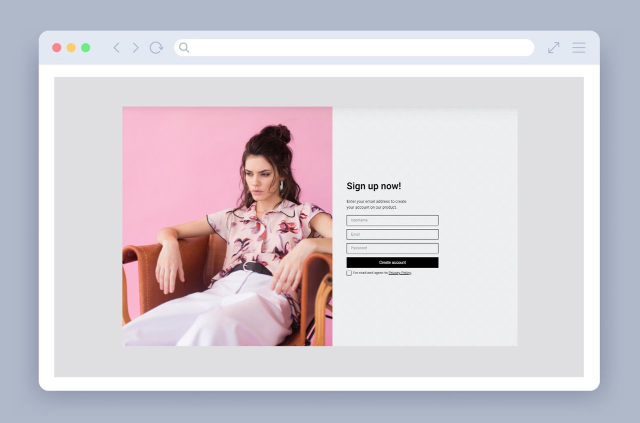
A typical signup lead capture form trading contact info for access.
This is why the format dominates B2B and SaaS marketing. According to Coherent Market Insights, 75% of respondents used web forms to gather leads in their email campaigns, compared with 37% who relied on live chat tools. Lead capture is still the default entry point for most marketing funnels — and the format your CRM, email platform, and ad channels expect to feed.
Why Lead Capture Forms Matter
Lead capture forms matter because they're still the highest-intent point of contact you get from a stranger. Someone filling out a five-field form after reading your content has told you more about themselves than a hundred Instagram followers ever will. And yet most forms waste that moment.
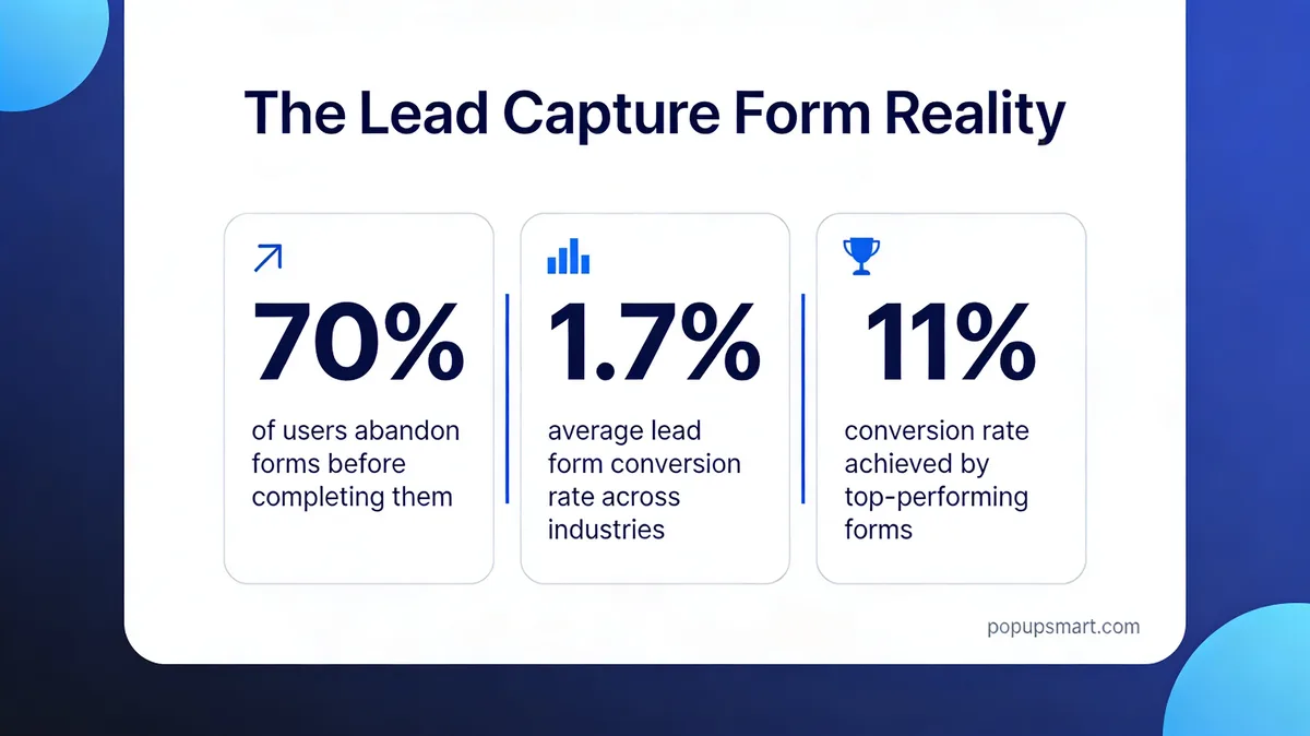
The lead capture form reality: 70% abandonment, 1.7% average, 11% top performers.
The data is brutal. PlatoForms reports that for top-performing companies, the form conversion rate jumps to over 11% — roughly 6.5x the industry average. That gap is almost entirely a function of how the form is built, not how much traffic it gets. A well-constructed form on 10,000 monthly visitors will outperform a broken form on 100,000.
Those numbers line up with broader conversion benchmarks. Digital Applied finds that the median website conversion rate across industries is 2.35%, while top performers reach 11.45%. The takeaway: a great lead capture form isn't a competitive advantage anymore. It's the price of getting conversion rates above the floor.
There's also a demand-side pressure. According to Martal, 61% of marketers say generating quality leads is their top challenge. Everyone's fighting for the same attention, and the marketers who crack this aren't buying more traffic — they're converting the traffic they already have. That's a form problem. For a deeper read on how popups and forms shape pipeline for consumer-facing brands, see our guide to B2C lead generation strategies.
Types of Lead Capture Forms
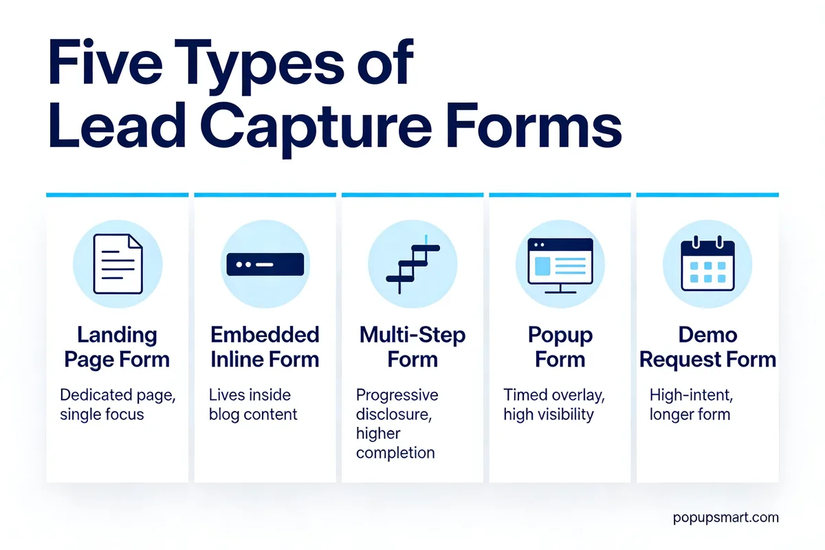
Five common types of lead capture forms and where each fits.
Not every form belongs in the same place on your site. The five formats below each solve a different visitor scenario, and picking the right one is usually a bigger lever than tweaking copy or colors.
Landing Page Forms
A landing page form lives on a dedicated page with one goal: the submission. No nav, no other offers, no distractions. These work best for ad traffic, gated content campaigns, and any time you need a clean conversion environment. HubSpot's ebook download flow is the textbook version — visitor clicks a CTA, lands on a stripped-down page, fills out the form, gets the file.
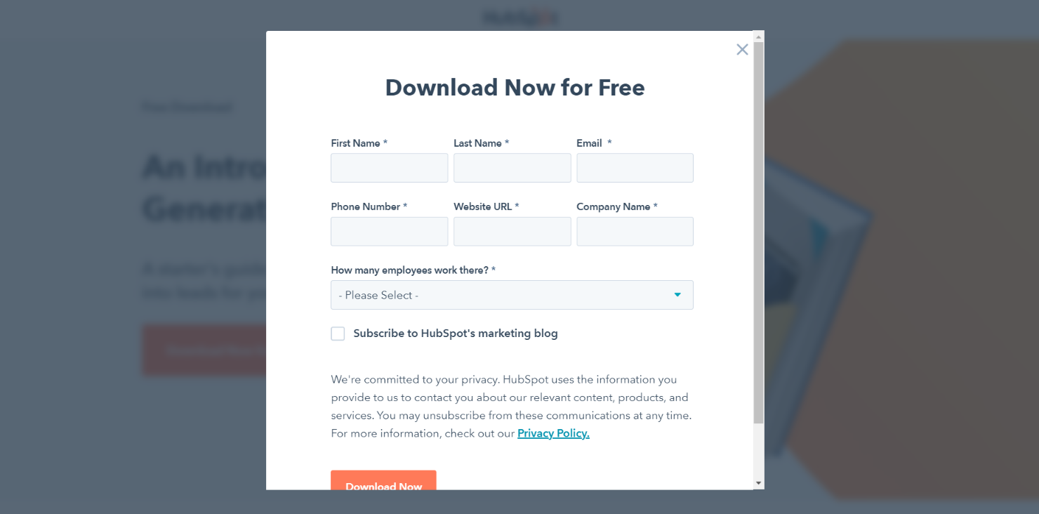
A dedicated landing page form strips the rest of the site away.
Embedded / Inline Forms
Embedded forms sit inside a blog post, resource page, or mid-page content block. They don't interrupt — they wait for the reader to arrive. Use them when someone's already engaged with the topic, like the end of a how-to article or next to a case study. They convert at lower rates than popups but tend to collect higher-intent leads because the reader has already invested time.
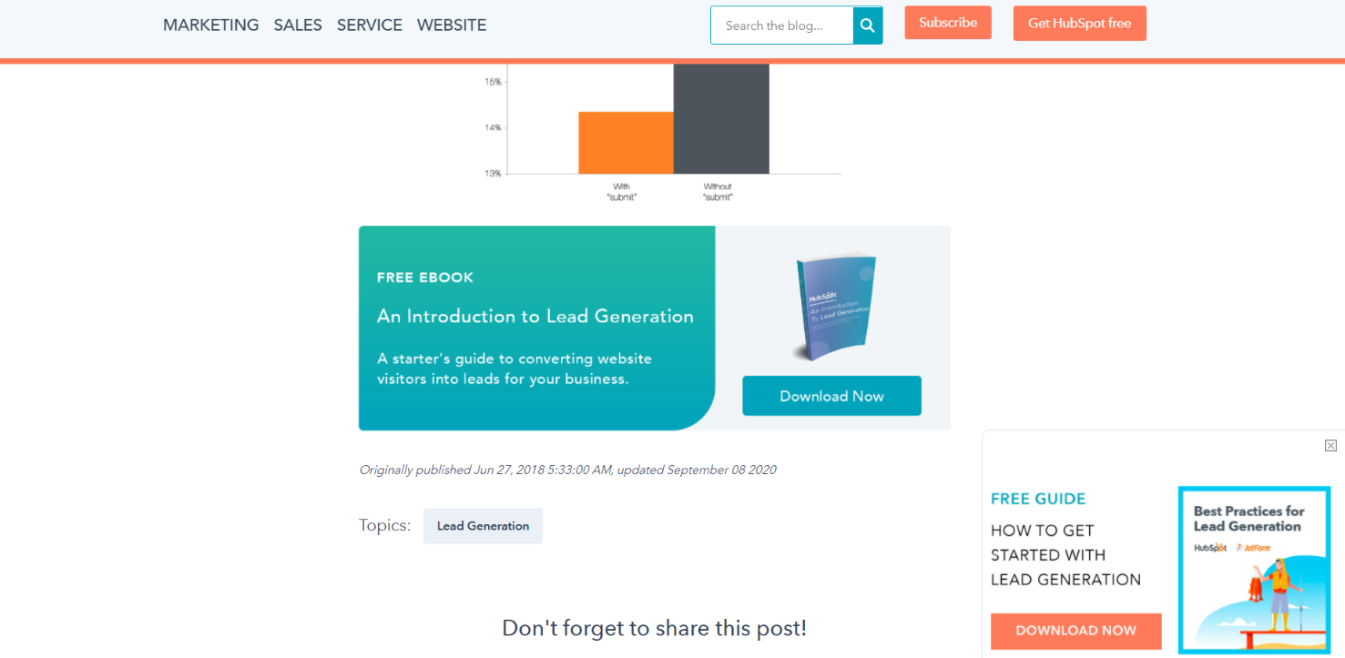
HubSpot's embedded offer at the bottom of a blog post.
Multi-Step Forms
Multi-step forms break a longer request into two or three smaller screens. Instead of showing ten fields at once, you show three, then three more. This works because of the sunk-cost effect — once someone answers the first easy question, completion rates rise sharply. They're the right choice when you genuinely need a lot of data (quote calculators, B2B demo requests, long qualification flows) but don't want the wall-of-fields rejection.
Popup / Overlay Forms
Popup forms appear over page content based on a trigger — exit intent, scroll depth, time on page, or a click. Because they're reactive to behavior, they convert well even on cold traffic, and they don't take up permanent real estate on the page. They're the right fit for newsletter opt-ins, discount offers, and content upgrades. If you're running an ecommerce site, our roundup of email capture popup examples for Shopify shows the formats that work best in that context.

A popup form triggered at the right moment pulls in visitors already engaged with the content.
Demo / Contact Request Forms
Demo request forms sit at the bottom of the funnel. They ask for more — name, company, role, company size, use case — because the leads who fill them out are closer to buying. Conversion rates are lower (often 1-3%), but lead quality is much higher. These belong on pricing pages, product pages, and anywhere a prospect is likely comparing options. A good B2B SaaS site will also surface them on competitor comparison pages where intent runs high.
Quick Overview of the 7 Essential Lead Capture Form Components
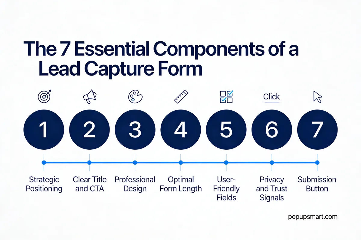
The seven components at a glance.
Before we go deep, here's the scannable version. Each of the seven components below shows up later with implementation steps and evidence:
1. Strategic Positioning — Place the form where the visitor's intent is highest (above the fold, end of content, or triggered by behavior). Expect 10-30% lifts from placement changes alone.
2. Clear Title and CTA — The headline sets the value, the button closes it. Personalized CTAs convert significantly better than generic "Submit" buttons.
3. Professional Design — Credible, modern styling that matches your brand reduces friction and cuts bounce.
4. Optimal Form Length — Short forms collect more leads; longer forms collect better leads. Match length to funnel stage.
5. User-Friendly Fields — Smart field types, inline validation, autofill, and logical order remove the small annoyances that cause drop-off.
6. Privacy and Trust Signals — A privacy link, a trust badge, and a testimonial or logo make the submit decision feel safe.
7. Submission Button — Specific, benefit-focused button copy outperforms "Submit" by a measurable margin in almost every test.
The 7 Essential Components of Lead Capture Forms
1. Strategic Positioning: Show the Form Where Intent Peaks
Strategic positioning is the decision about where on the page (and at what moment) your form shows up. It covers both physical placement — above the fold, inline, at the end of content — and trigger-based placement, like popups that fire on exit intent or after 60 seconds of reading. Get this wrong and the rest of your optimization barely matters.
Here's how to get it right:
1. For cold traffic (ads, social), keep the form above the fold on landing pages. Visitors shouldn't scroll to find it.
2. For warm traffic (blog readers), place the form at the end of the article or halfway down as an inline module. The reader needs context before deciding to convert.
3. For returning visitors, use behavior-triggered popups — exit intent on pricing pages, scroll-depth on long content, and click triggers inside articles. I've seen exit-intent popups add 5-10% to list growth on content sites within the first 30 days.
4. Pair the form with the offer image side-by-side when possible. Seeing the ebook cover or product screenshot next to the form lifts perceived value without adding a single field.
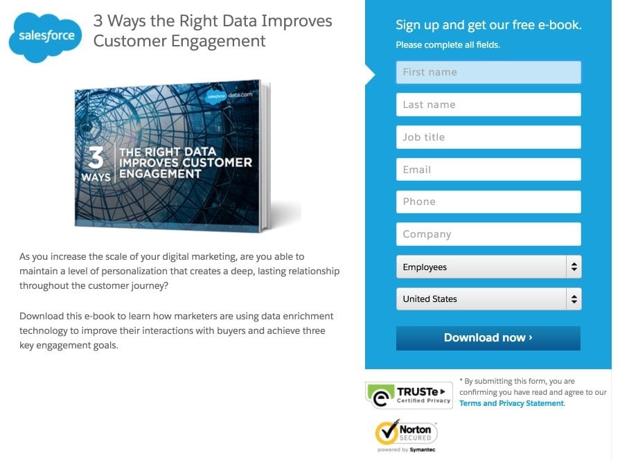
The offer image sits right next to the form — Salesforce uses this layout for most of its gated assets.
The payoff is real. A search marketing agency documented in LeadCapture.io's case study swapped unreliable form software for better-placed, better-triggered forms and watched client conversion rates hit 9.9% — three times the industry baseline of 3.3%. No new traffic, no new offer. Just placement and tooling.
2. Clear Title and CTA: Tell the Visitor Exactly What They Get
The form title is the headline above the fields. The CTA is the button underneath them. Together, they do almost all the persuasion work — everything else is just logistics. A vague title like "Get in Touch" paired with a "Submit" button is why most forms underperform, because the visitor has to guess what happens next.
Write them this way:
1. Start the title with the outcome, not the action. "Get your free 2026 SEO checklist" beats "Download now."
2. Keep the title under 10 words. Any longer and it reads like a sales page headline instead of a form prompt.
3. Make the CTA button match the promise. If the title offers a checklist, the button should say "Send me the checklist" — not "Submit," not "Go."
4. Personalize whenever you have the data. Returning visitors should see a different CTA than first-timers. Account-based targeting can go further: "See how [Company] uses Popupsmart" converts harder than any generic button I've tested.
5. Use first-person in the button copy ("Send me the guide," "Start my free trial"). It increases perceived ownership of the action.
A descriptive CTA that tells the visitor exactly what they're getting.
Personalized CTAs still win big in 2026. HubSpot's long-running research on personalized calls-to-action has consistently shown them converting far better than static ones — the effect size depends on segmentation quality, but the direction is solid. For a deeper dive into how CTA clarity affects whole-funnel performance, our piece on opt-in page examples breaks down what the best-converting pages do with their titles and buttons.
3. Professional Design: Make the Form Feel Safe to Submit
Design is the first impression your form makes, and visitors decide whether to trust it in under two seconds. A form with mismatched fonts, clashing colors, or a 2010-era look signals "this might be spam" — even if everything else is pristine. Modern, on-brand design is a trust tax you have to pay before the form gets a chance to convert.
Practical design rules:
1. Match the form's typography, color palette, and spacing to the rest of your site. A popup that looks like a different product destroys trust instantly.
2. Give the form breathing room. Padding inside the container and a clear visual separation from surrounding content help it feel like a considered element, not a banner ad.
3. Use one primary color for the CTA button — different from the rest of the page — so the eye lands on it without confusion.
4. Avoid placeholder text inside the input fields as the only label. It disappears when the user starts typing, then they forget what went where. Use labels above fields instead.
5. Mobile-first, always. More than half of form opens now happen on phones. Test the form on a real device, not just a browser resize.
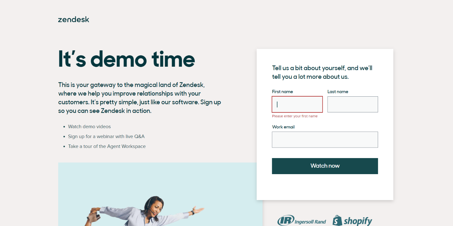
Zendesk's form feels like part of the product, not an afterthought.
4. Optimal Form Length: Match Field Count to Funnel Stage
Form length is the classic trade-off in lead capture: shorter forms collect more leads, longer forms collect better ones. The right answer isn't "always short" — it's "match the length to where the visitor is in your funnel." Top-of-funnel newsletter? Email only. Bottom-of-funnel demo request? Six or seven fields is fine.
How to decide:
1. For newsletter and content downloads: email only. Every extra field cuts conversion roughly 10-15%.
2. For lead magnets aimed at marketing-qualified leads: email plus one qualifier (role, company size, or industry). Three fields max.
3. For sales-qualified demo requests: five to seven fields is acceptable. Leads who bail on a seven-field form weren't ready anyway.
4. Use progressive profiling when possible — capture email first, then ask for more on the next interaction. Your CRM does the heavy lifting.
5. Audit your current forms: if a field can't be used to route, score, or personalize a lead within 30 days, cut it.
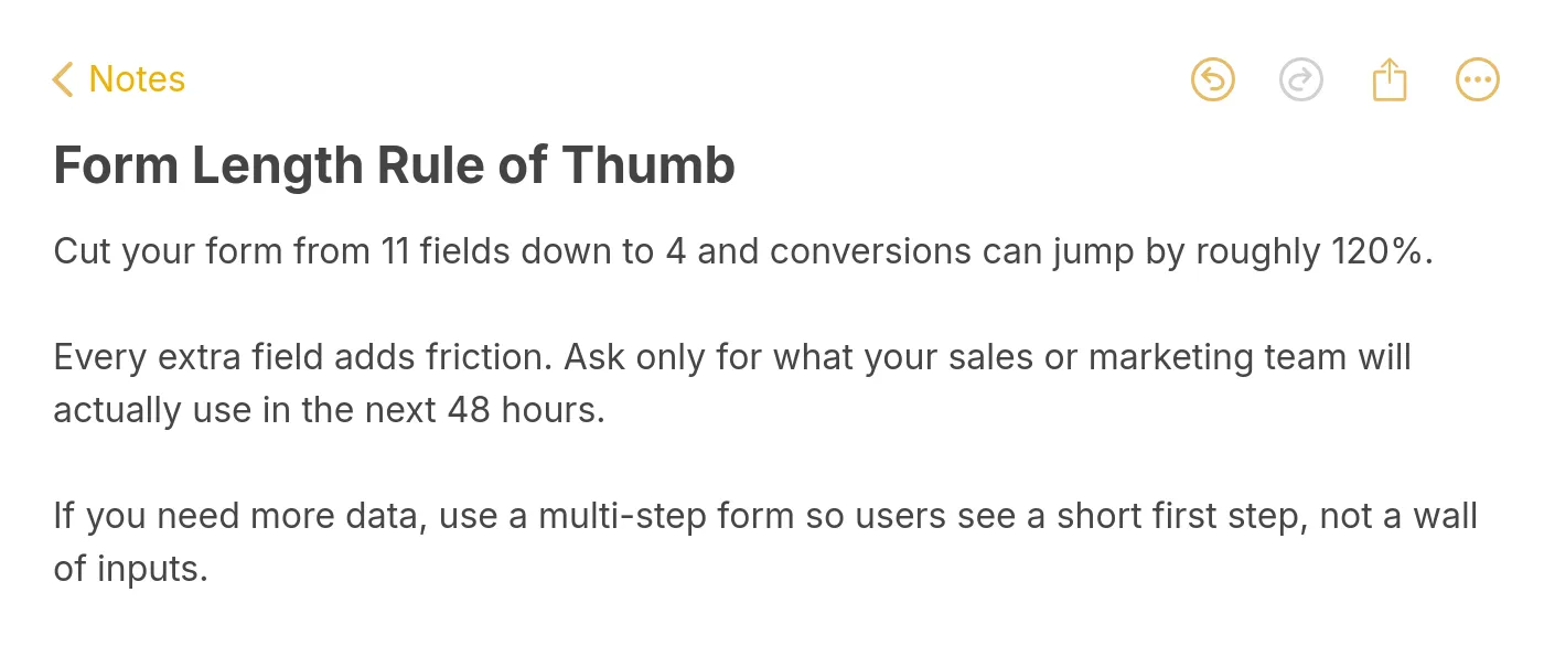
Pro tip: cutting from 11 fields to 4 is the single highest-ROI change most teams can make.
The form-length drop-off shows up clearly in the data. LeadCapture.io's form analytics found that the contact-info step has the highest drop-off at 33.4%, and it almost always coincides with fields visitors feel are premature. Pull anything non-essential out of that step, and you usually recover a third of the lost submissions inside a month. Longer isn't bad. Unjustified length is.
5. User-Friendly Fields: Remove Every Small Annoyance
User-friendly fields are the micro-UX decisions inside the form — field types, validation, tab order, autofill support, input masks. Individually each one is tiny. Together, they're responsible for 15-25% of the friction in most forms. The good news: they're almost all one-time fixes that keep paying back forever.
Checklist to work through:
1. Use the right input type for each field. type="email" triggers the email keyboard on mobile, type="tel" the numeric one. Getting this wrong forces thumb gymnastics.
2. Enable browser autofill with proper autocomplete attributes. This alone can knock 5-8 seconds off completion time.
3. Validate inline, not only on submit. Tell someone their email is malformed when they leave the field, not after they've clicked the button and feel punished.
4. Order fields in a natural sequence: name, email, company, role. Don't ask for company before name — it feels transactional.
5. Let users press Enter to advance. Tab order should be predictable. Never trap focus inside a dropdown or date picker that can't be closed.
6. On mobile, make tap targets at least 44x44 pixels and avoid stacking a label, input, and helper text so tightly they overlap when zoomed.
According to Email Vendor Selection, 54.7% of marketers found opt-in forms effective for generating leads — but the word "effective" is doing a lot of work. The forms in that effective bucket almost all share these UX basics. Get them wrong and you're optimizing copy on a form people physically struggle to fill out. For a step-by-step on reducing friction at the field level, see our guide on how to capture email addresses from website visitors.
6. Privacy and Trust Signals: Earn the Click Before You Ask for It
Trust signals are the small, visible proofs that tell a visitor it's safe to hand over their email. A privacy link, a trust badge, a customer logo, a short testimonial, a GDPR-compliant consent checkbox. Visitors scan for these almost unconsciously, and forms without them leave conversions on the table even when everything else is fine.
What to include:
1. A visible link to your privacy policy directly below the form, using plain language: "We'll never share your email."
2. A GDPR-compliant consent checkbox for EU traffic. Make it opt-in (unchecked by default) and explicit about what the subscriber is agreeing to.
3. One social-proof element near the form — a short customer quote, a star rating, a count like "Join 18,000 marketers."
4. Trust badges only if they're genuine: SOC 2, ISO 27001, Norton, "Featured in Forbes." Fake or generic badges hurt more than they help.
5. For high-sensitivity forms (finance, healthcare), add a one-sentence note about how you handle data: "Your information is encrypted and stored in the EU."
Stakes are meaningful in 2026. According to The Marketing Agency, 50% of marketers consider lead generation a top priority in their marketing campaigns — but the privacy expectations of their target audiences have climbed sharply. Forms that look extractive now convert worse than forms that look considerate, regardless of the offer. Being transparent about what you're collecting and why is a direct conversion lever, not a compliance chore. If you want to see how this looks in practice on long-form opt-in pages, our roundup of lead generation form examples highlights brands doing this well.
7. Submission Button: Write Copy That Closes the Deal
The submit button is the last thing standing between a filled-in form and a new lead. Default "Submit" copy is a leak every single time — it's vague, it implies effort, and it gives the visitor no last-second reason to click. Specific, benefit-oriented button copy is one of the highest-ROI micro-optimizations in all of conversion work.
Rules for button copy:
1. Restate the value in the button: "Send me the checklist," "Start my 14-day free trial," "Get my custom quote." The visitor should see the payoff, not the action.
2. Use first-person where it fits. "Start my free trial" outperforms "Start your free trial" in most tests because it reads as the user's own choice.
3. Avoid "Submit," "Go," and "Click here." They imply work and reveal nothing about what happens next.
4. If you need urgency, attach it to the offer, not the button: "Get 20% off (ends Friday)" is stronger than "Buy now!"
5. Match button color to your design system but make it the most visually dominant element in the form. Contrast matters more than color choice.
6. Show a micro-loading state when clicked so users don't double-submit — a tiny UX nicety that cuts duplicate leads in your CRM by double digits.
Best Practices for Optimizing Lead Capture Forms
Once the seven components are in place, optimization becomes a craft. These are the practices I lean on across every Popupsmart customer rollout, in rough order of impact.
1. Mobile-first, not mobile-compatible. Start your design from the phone, not the desktop. More than half of form traffic comes from mobile in most B2B verticals and nearly all in B2C. If your form looks decent on a laptop but cramped on an iPhone, you've already lost half your potential leads.
2. A/B test one element at a time. Title, button copy, field count, trust badge placement — test one, keep the winner, move to the next. Testing three things at once gives you noise, not signal. Allow at least 14 days per test on moderate-traffic sites to reach statistical significance.
3. Use progressive disclosure for longer forms. Instead of showing eleven fields at once, split into screens of two or three. Completion rates on multi-step forms often run 25-40% higher than the flat equivalent, even when the total field count is identical.
4. Match the incentive to the funnel stage. A $5 discount doesn't motivate a B2B buyer; a 30-page industry report doesn't motivate a bargain-hunting shopper. The best-performing forms understand their audience's actual decision criteria and offer something aligned.
5. Support autofill religiously. Use correct autocomplete attributes, sensible name values, and standard field types. Autofill takes a 20-second form down to a single tap on mobile. Any friction you add here kills conversions invisibly.
6. Test form triggers, not just form content. On popups, exit intent almost always outperforms time delay for cold traffic, but time delay wins for engaged blog readers. Scroll-depth triggers win for long-form content. Trigger is often a bigger variable than design or copy.
One non-obvious practice: revisit your forms every 90 days. Traffic composition shifts, device mixes change, browser behavior evolves. Last year's winner is often this year's laggard. Our playbook on organic lead generation covers how to fold these reviews into a broader quarterly motion, and the lead generation automation guide shows which parts of this are worth handing off to tools.
Common Mistakes to Avoid While Creating Lead Capture Forms
Most underperforming forms aren't broken. They're just carrying one or two mistakes that quietly drag conversion rates down. These are the ones I see most often in audits.
1. Asking for phone number on a top-of-funnel form. Phone number is the single biggest drop-off field on cold-traffic forms. Save it for demo requests, contact sales flows, and anywhere the visitor genuinely expects a call. On ebook downloads or newsletter signups, it's an unforced error.
2. Using "Submit" as button copy. "Submit" implies work and gives no benefit. Replace with a specific action that names the reward: "Send me the PDF," "Start my free trial," "Book my demo." This change alone routinely lifts conversions 5-15% with zero other edits.
3. Skipping the privacy link. A missing or buried privacy link signals carelessness at best, sketchiness at worst. Include a visible link below the form and a short reassurance sentence. GDPR-region traffic won't convert without it, and US traffic increasingly expects it too.
4. Not testing on mobile. Designers build on 27-inch monitors; visitors fill out forms on 6-inch screens. Always walk through the full form on a real phone before launch. Cramped fields, tiny buttons, and broken input types kill more forms than any strategic problem.
5. Over-qualifying at the wrong funnel stage. Asking a first-time visitor for company size, revenue, and use case is a great way to collect three leads a week. Match the field count to where the visitor actually is — light touch for awareness, heavier qualification once they've shown intent. Progressive profiling handles the rest across later interactions.
How to Measure Lead Form Performance
A form you can't measure is a form you can't improve. The metrics below are the ones I track on every Popupsmart rollout, and they'll tell you where to spend your next optimization hour.
1. Submission rate. Completed submissions divided by form views. This is your headline number. Healthy ranges vary by form type: 2-5% for cold-traffic landing pages, 5-15% for engaged-reader popups, 1-3% for bottom-funnel demo requests. If you're below the floor, start with the seven components above.
2. Field-level drop-off. Where exactly do people bail? According to LeadCapture.io, step 5 (contact info) has the highest drop-off at 33.4% across their sample — a strong signal that asking for too much, too fast is the most common failure mode. Tools like Hotjar, Mouseflow, and Popupsmart's built-in analytics can map this at the field level.
3. Time to complete. Benchmark against your own baseline. A form that used to take 45 seconds and now takes 80 is getting slower for a reason — usually a new field, a new validation rule, or a mobile layout shift.
4. Lead quality score. Track MQL-to-SQL conversion rates by form. A form pulling 500 leads a month at a 2% sales acceptance rate is worse than a form pulling 100 leads at 25%. Lead quality is the honest judge of whether your form is working.
5. Revenue attribution. The ultimate measure. Pipe form submissions into your CRM with source attribution, then track closed revenue per form. Some forms generate a lot of leads that never buy; others are quietly your best channel. You won't know until you measure.
Wrap Up
If you're going to do three things this week, do these. First, audit your highest-traffic form against the seven components. Most teams fail two or three without realizing it, and fixing even one usually pays for the audit inside a month. Second, cut one field from that form — any field that doesn't drive routing, scoring, or personalization inside 30 days. Length is the cheapest lever you have.
Third, replace your submit button copy with something specific to the offer. It takes five minutes, it's reversible, and in my experience it's the single highest-ROI change on any lead capture form — old or new. If you want the fastest path from audit to live, spin up a test with a no-code popup builder and ship the first variant today. The components are the hard part. The implementation is the easy part.
Frequently Asked Questions
What is the 5 minute rule for leads?
The 5-minute rule says inbound leads are dramatically more likely to convert when contacted within five minutes of submission. After that window, contact rates and qualification rates drop sharply — often by 10x within the first hour. The rule is why most high-performing B2B teams automate instant routing: the moment a lead capture form submits, the lead lands in the right rep's inbox or CRM queue with an alert. Speed beats polish for top-of-funnel response, and any form strategy without a fast follow-up plan is leaving money on the floor.
What are the methods of lead capture?
The main methods are web forms (landing page, embedded, and popup), live chat, gated content downloads, webinar registrations, demo requests, quizzes and calculators, and content upgrades inside blog posts. Web forms still dominate: according to Coherent Market Insights, 75% of marketers use web forms for email lead capture. The right method depends on funnel stage and audience — top-of-funnel works well with popups and content upgrades, middle-of-funnel with gated resources, and bottom-of-funnel with demo and quote requests. Most mature programs run three or four methods in parallel.
How to optimize lead capture forms for better conversions?
Start with placement and length. Move forms to where intent is highest (above the fold, end of content, or behavior-triggered popups), then cut any field that doesn't drive routing or scoring within 30 days. Next, rewrite your title and button copy to name the value instead of describing the action — "Send me the checklist" beats "Submit." After that, test one element at a time: trigger, design, incentive, social proof. Expect measurable lifts from each change, but give each test at least two weeks before calling a winner. Most underperforming forms get within 20% of top-performer conversion rates after three rounds of focused testing.
What are best practices for designing lead capture forms?
Design mobile-first, match the form to your brand's typography and color system, and keep one visually dominant CTA button. Use labels above fields (not placeholder-only), enable autofill with proper autocomplete attributes, and validate inline so users catch errors before they submit. Include a visible privacy link and at least one trust signal — a customer logo, a short testimonial, or a badge. Avoid placeholder-only labels, cramped spacing, and anything that makes the form look like a banner ad. The best-designed forms feel like part of the product, not a bolt-on. On mobile specifically, tap targets should be 44 pixels or larger, and nothing should require horizontal scrolling.
How many fields should a lead capture form have?
It depends on funnel stage. For newsletter signups and content downloads at the top of funnel, one field (email) is optimal — every added field cuts conversion 10-15%. For marketing-qualified offers like industry reports, two or three fields work: email plus one qualifier like role or company. For bottom-of-funnel demo and quote requests, five to seven fields is acceptable because the leads who finish are far more serious. Above seven fields, use a multi-step format to hide the total count. The honest answer: never ask for a field you won't actually use to route, score, or personalize within a month. If it won't get used, it's just drag.
Next on your reading list:

How would you rate your experience with this article? 😊