Wondering if full-screen popups help or just annoy people?
I’ll show you how to use interstitials that boost conversions without hurting trust, SEO, or mobile UX. I’ll keep it clean: right timing, clear value, easy close.
You’ll quickly learn:
- What an interstitial is (vs. modals/popovers/ads) and when to use it
- How to stay SEO-safe on mobile (no first-load takeovers, clean dismissals)
- The best types to run + a fast Popupsmart setup and simple A/B tests
Quick Summary by Popupsmart
What is an interstitial popup?
An interstitial popup is a full-screen overlay that temporarily covers the page to deliver a focused message or action, then dismisses so users can continue.
Why/when to use it
- To spotlight high-value offers or actions (e.g., welcome discount, lead magnet, age/cookie consent).
- At natural intent moments (e.g., exit intent, after meaningful scroll/time, on return visits).
Is it bad for SEO?
Not if you avoid covering main content on first load from search, use delayed/contextual triggers, make it easy to dismiss, and keep it fast and stable (no CLS/INP hits).
What Is an Interstitial Popup?
Definition (aka full-screen overlay)
An interstitial popup is a full-screen overlay that temporarily interrupts the current view to present a single, focused offer or message, then dismisses, returning the user to the underlying page.
- Also called: full-screen popup, full-page takeover, interstitial overlay
- Key traits: dominant canvas, clear CTA, easy dismissal (close button, ESC, tap outside), short life span
Interstitial vs. Modal vs. Popover vs. Interstitial Ad
Where They Appear (entry, mid-journey, exit, post-click)
- When someone first arrives (entry): Use only for important things like a welcome offer or cookie consent. On mobile, wait a few seconds or until they open a second page.
- While they’re browsing (mid-journey): Show after they’ve scrolled halfway down the page or stayed for 30–60 seconds. Great for offering a free guide or bonus content.
- When they’re about to leave (exit): On desktop, trigger when their mouse moves toward the close button. On mobile, use signs like going idle or pressing “back.” Perfect for last-minute offers or reminders.
- Right after an action (post-click): Show after they add something to the cart, check pricing, or finish reading an article. Use it to promote sign-ups, demos, or referrals.
Are Interstitial Popups Intrusive? (And When Are They Not?)
“Intrusive” means the popup blocks people from viewing the main content at the wrong time (e.g., immediately after arriving from Google) or makes closing/dismissing hard.
Legitimate exceptions (generally acceptable):
- Legal/compliance: cookie consent, privacy notices, age-gates.
- Safety/security: account verification, critical service alerts.
Intent vs. interruption:
- Helpful: contextually relevant, timed after engagement (e.g., 60% scroll), easy to close, adds value (discount, resource).
- Harmful: fires instantly on the first page from search, stacks multiple overlays, tiny/hidden close icon, unrelated offer.
Do Interstitial Popups Hurt SEO?
The short of it: They can, especially on mobile, if they cover the main content right after a user lands from Google.
❌ Risky patterns to avoid:
- Showing a popup immediately when the page loads from search.
- Making the close button hard to find or using “trick” designs.
- Showing multiple popups in the same visit.
✅ Safer, SEO-friendly patterns:
- Delay & context: Show after the visitor scrolls, spends time on page, or views a second page.
- Easy to close: Always have a clear “X,” allow tapping outside, or pressing ESC.
- Mobile-friendly size: Use smaller banners or slide-ins for the first interaction.
- Respect frequency: Limit how often people see it and skip showing it to those who already converted.
Pros and Cons of Interstitial Popups
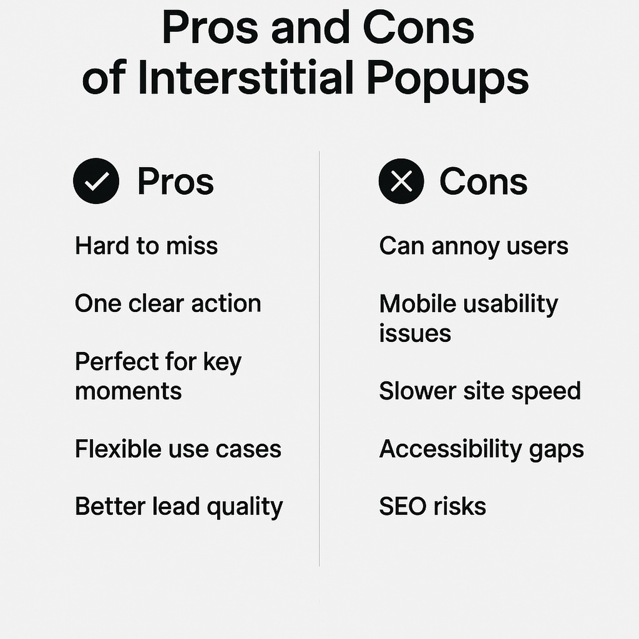
Pros
- Impossible to miss: Full-screen lets you spotlight a single, high-value action (discount, demo, lead magnet).
- Focused decisions: One clear CTA reduces choice overload and lifts completion rates when timed well.
- Great at intent moments: Exit intent, deep scroll, or post-engagement are perfect for saving abandons or capturing warm leads.
- Versatile use cases: Promos, announcements, onboarding nudges, compliance (age/cookie) all fit the format.
- Stronger signal quality: When you trade real value (e.g., gated content) for an email, list quality often improves.
Cons
- Annoyance risk: Poor timing or too-frequent displays can spike bounces and hurt brand perception.
- Mobile friction: Small screens + hard-to-hit close areas = frustration if not designed carefully.
- Performance overhead: Heavy images/scripts can hurt Core Web Vitals (CLS/INP/LCP) if not optimized.
- Accessibility pitfalls: Missing focus management, keyboard support, or ARIA labels can block users.
- Policy/SEO concerns: First-load mobile takeovers from search can trigger penalties; requires careful triggering and sizing.
Bottom line: Interstitials can be top converters when they’re relevant, timed with intent, easy to dismiss, fast, and accessible. Without those guardrails, they’re just interruptions.
How Interstitial Popups Work on Mobile (so you don’t annoy people)
Mobile screens are tiny. If you use popups, keep them simple, quick, and easy to close. Here’s exactly what to do.
1) Make it easy to use
- Big, clear close (X) in the top-right. Always visible.
- One screen = one job. One message, one button.
- Big tap targets. Buttons/inputs about a finger tall (≈44px).
- Forms that help me: show the email/phone keyboard, let me autofill, no mini scroll inside the popup.
2) Keep it fast and steady
- Load only what you need. Small images, simple animations.
- When my keyboard opens, the popup shouldn’t jump around.
- Works for everyone: I can navigate it with touch or keyboard, tap outside to close, and screen readers can find the close button.
3) Show it at the right time
- Don’t block the first page I open from Google.
- Wait for real interest: second page, 50–75% scroll, or 10–20 seconds on the page.
- Don’t nag: once per session/day is enough. If I close it, leave me alone.
4) Be gentle on first touch
- Use a small sticky bar (top or bottom),
- or a half-height bottom sheet that can expand,
- or a simple inline box in the content (no overlay).
5) Show it to the right people
- Skip me if I’m logged in, just bought, or already subscribed.
- Match the page: product page → size/shipping help; blog post → related guide (not a random 10% off).
⭐ You can also learn how to make your website more responsive by reading our article “36+ Best Responsive eCommerce Sites in 2025.”
What Makes an Interstitial Popup Intrusive? (with Examples)
Let’s call it like it is: an interstitial feels intrusive when it blocks what you came to do and makes it hard to get back. If you fix those two things, you’re most of the way there.
Red flags that your popup is intrusive
- It shows immediately on the first page of Google (especially on mobile). You haven’t earned attention yet, give people a second.
- The close is hard to find or too small. If you make people hunt for the “X,” they’ll bail.
- It fires repeatedly. If someone dismissed it, respect that choice for the session (or longer).
- It’s irrelevant to the page. A random 10% off while I’m reading a how-to? Off-putting. Offer value that fits the moment.
- It hijacks the scroll. Trapped scroll, jumpy layout, or scroll-inside-scroll = instant frustration.
Intrusive patterns (and how you fix them fast)
- Instant takeover on landing.
Fix: Delay until 50–75% scroll, 10–20s, or a second pageview. - Tiny or hidden close button.
Fix: 44px+ hit area, always visible, top-right. Also allow tap-outside/ESC to close. - Multiple popups are stacking.
Fix: One popup at a time, with session caps and suppression rules (e.g., don’t show if the user already subscribed/purchased). - Deceptive CTAs (“No thanks, I hate saving money”).
Fix: Neutral secondary text (“No thanks”), don’t shame people. - Heavy, janky animation.
Fix: Keep it simple and fast; defer scripts and lazy-load images.
Interstitial Popup Types (and when you should use each)
Here’s a quick menu so you can pick the right full-screen moment for the job.
1) Welcome full-screen offer
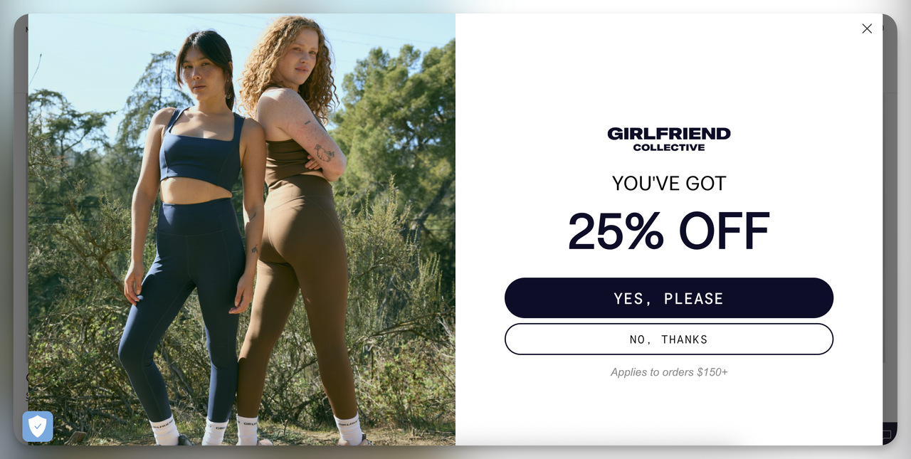
Use when: You want a clean intro for new visitors after they’ve looked around a bit.
Trigger: Second pageview or 10–20s delay / 50–75% scroll.
Suitable for: First-order discounts, “best of” guides, newsletter intros.
Skip if: It’s the very first page from Google on mobile.
Try this: “Welcome! Unlock 10% off your first order.”
2) Content gate / lead magnet
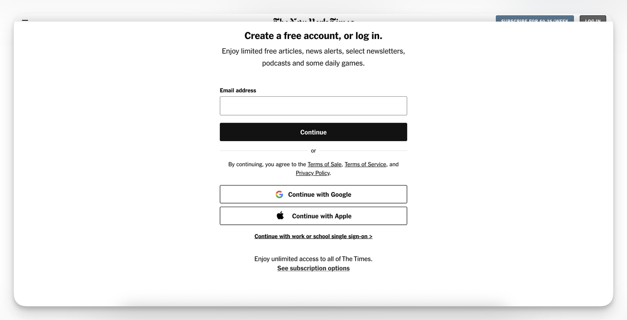
Use when: Someone has actually consumed the content and wants more.
Trigger: 60–80% scroll on a blog/resource or after video completion.
Good for: Checklists, templates, size guides, buyer’s guides.
Skip if: The page is purely navigational (category hub).
Try this: “Want the printable version? Get the PDF in one click.”
3) Exit-intent save (cart or browse abandonment)
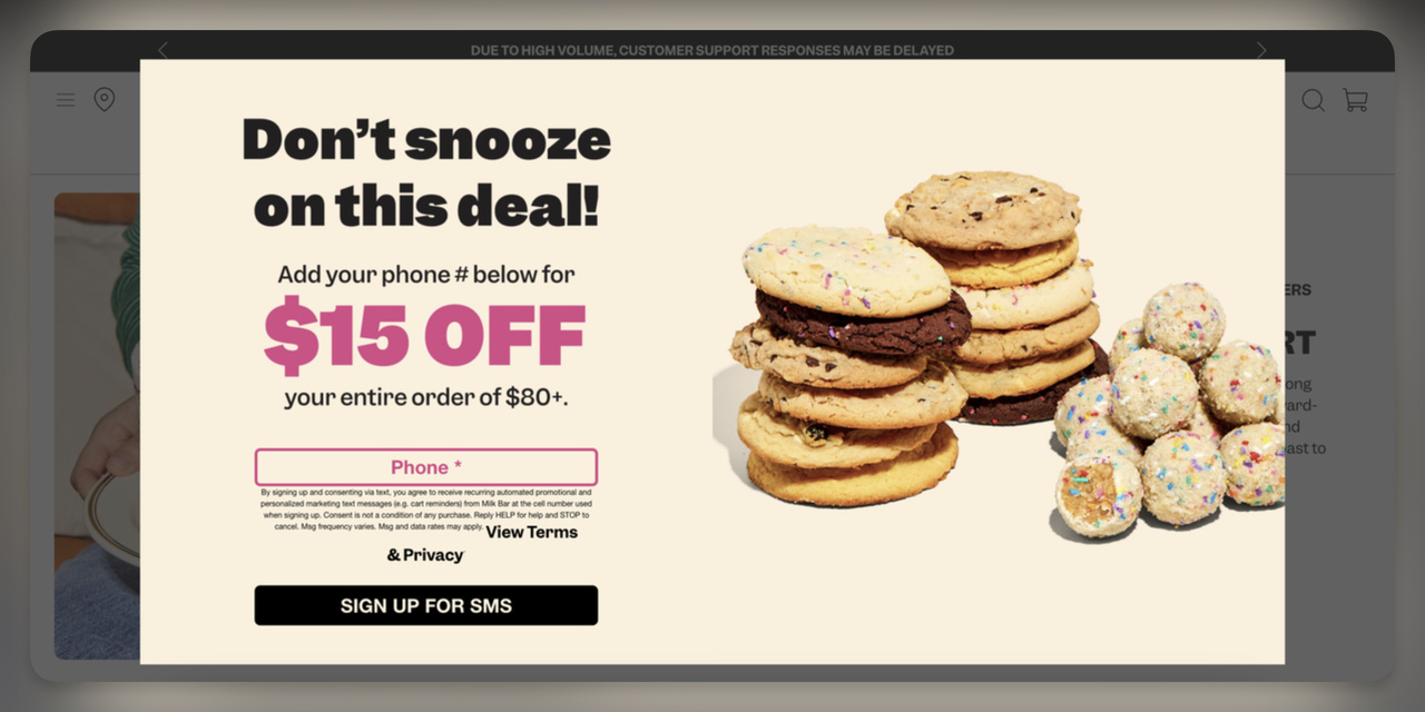
Use when: They’re about to leave, this is your last friendly nudge.
Trigger: Desktop exit intent; on mobile, idle/back button cues.
Good for: Cart reminders, free-shipping thresholds, small incentives.
Skip if: You’ve already shown another popup this session.
Try this: “Leaving so soon? Save your cart or get free shipping.”
4) Product/category assistance
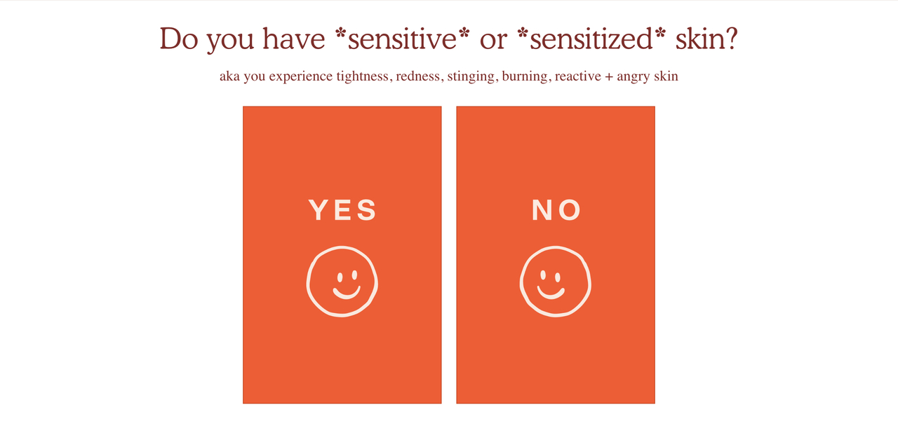
Use when: They’ve viewed multiple products or filtered a category.
Trigger: 2–3 product views, size chart clicks, long dwell time.
Good for: Fit/size quizzes, back-in-stock alerts, shipping timelines.
Skip if: They’re already in checkout.
Try this: “Not sure about sizing? Take the 30-second fit quiz.”
5) Pricing/demo prompt (SaaS & services)
Use when: They’ve compared plans or lingered on features.
Trigger: Pricing page view + 30–60s dwell / second visit.
Good for: One-click demo booking, live walkthroughs, ROI calculators.
Skip if: You can embed the scheduler inline without blocking.
Try this: “See it in action - book a 15-minute demo.”
6) Seasonal or launch takeover
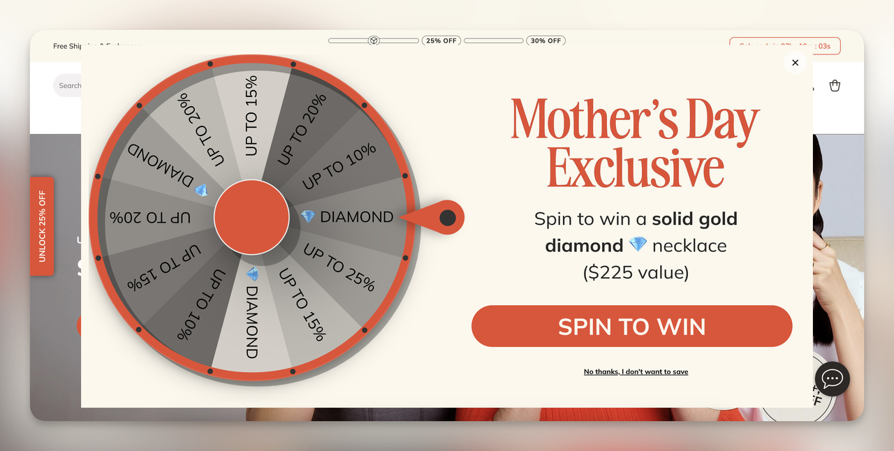
Use when: You have a time-boxed campaign that truly deserves the spotlight.
Trigger: Campaign period only; cap frequency hard.
Good for: BF/CM, holiday bundles, new collection drops, waitlists.
Skip if: It’s just a routine promo.
Try this: “48 hours only, Holiday Bundles drop. Join the early access list.”
7) Post-purchase / thank-you interstitial
Use when: You want to keep momentum without getting in the way.
Trigger: After order confirmation or signup success.
Good for: Referrals, account creation, review requests, loyalty join.
Skip if: You’re asking for payment again, keep it value-first.
Try this: “Join rewards, earn points on your next order.”
8) Legal/consent/age-gate (the acceptable “show now”)
Use when: You must ask by law or policy.
Trigger: Immediate, but make it fast and accessible.
Good for: Cookie preferences, privacy notices, and age confirmation.
Skip if: You can use a less-intrusive banner and still be compliant.
Try this: “We use cookies to improve your experience. Choose your settings.”
How to choose fast:
If your goal is to capture emails after providing value, consider using a lead magnet gate.
If your goal is to save the sale, choose exit-intent.
If your goal is campaign visibility, use a seasonal takeover with strict capping.
If your goal is to assist and reassure, use product/category assistance.
How to Create an Interstitial Popup in Popupsmart (Step-by-Step)
You’ll go from idea to life in minutes if you keep it simple and intentional. Here’s the fastest, cleanest path.
1) Pick a high-performing template (full-screen / mobile-first)
- In your dashboard, Create → Popup → Templates, choose a Full-Screen layout.
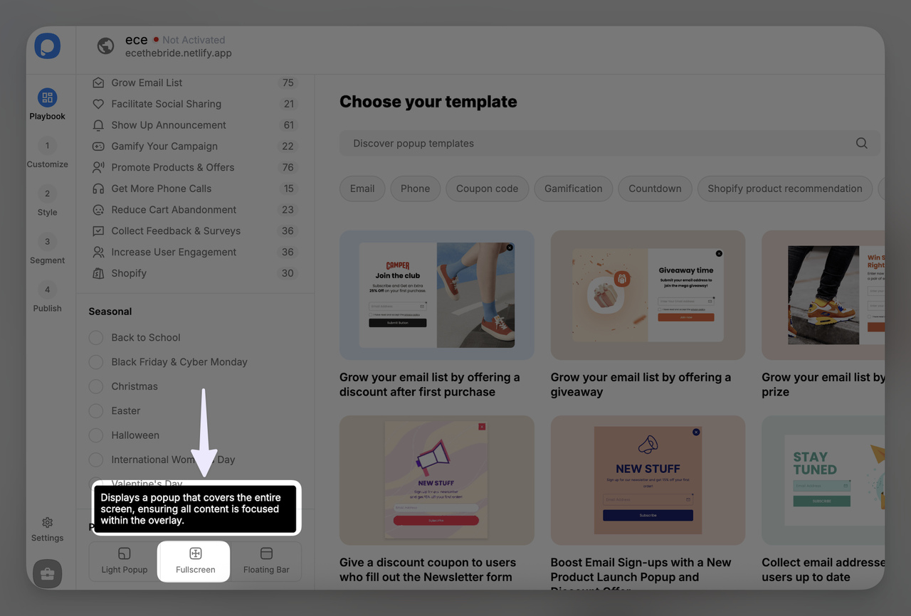
- Pick a mobile-optimized option (clear close button, single column, large text).
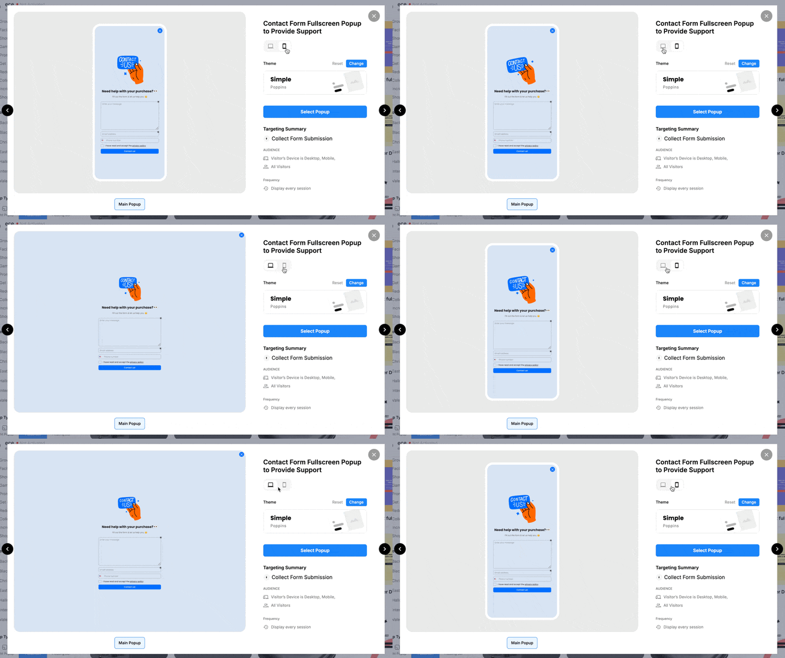
- Name it with purpose so you can find it later: FS—Welcome 10%—New Visitors—Sep.
Pro tip: If your traffic is primarily mobile, start with a bottom sheet style (half-height) and A/B test against full-screen.
2) Add your offer/copy, visuals, and trust badges
- Headline (7–10 words): Say the value, not the vibe.
“Get 10% off your first order” / “Grab the 1-page checklist” - Subhead (one line): set expectations.
“Instant code. No spam.” / “Print-friendly PDF. Keep it forever.” - CTA (one action): “Send me the code” / “Email me the checklist”
- Visuals: one clean product/hero image or none, avoid clutter.
- Trust cues: tiny row with ★★★★★ / “Trusted by 50,000+” / security icons.
- Close: big, always visible X (top-right). Add “tap outside to close.”
Pro tip: Start with one form field (email). You can enrich later.
3) Configure targeting (device, UTM/source, behavior) + suppression rules
- Device: include both desktop + mobile, but plan separate variants if copy differs.
- Source/UTM: show a matched message for utm_source=google (e.g., “New here?”) vs. utm_source=email (e.g., “Welcome back!”).
- Behavior: target product viewers, pricing visitors, or readers at 60–80% scroll.
- Geo/time: optional, use for regional promos or business hours.
- Suppress for: logged-in users, recent purchasers, recent subscribers, anyone who closed the popup in this session/day.
Pro tip: Build a reusable “Converters” segment and exclude it globally.
4) Set triggers (scroll %, exit, time) and frequency capping
- Scroll: 50–75% for content pages; 30–50% on long product/category pages.
- Time: 10–20s if scroll depth isn’t reliable; 30–60s for pricing/SaaS.
- Exit intent: on cart/checkout and high-consideration pages (desktop only).
- Cap frequency: once per session (or per day) is enough.
- Mobile safety: don’t show on the first pageview from Google; wait for a second pageview or meaningful scroll.
Pro tip: If you’re unsure, start with scroll 60% + session cap 1.
6) QA for mobile, accessibility, and performance; then publish
Run this 90-second check on a small phone:
- Is the close obvious and tappable? (≈44px target)
- Does the keyboard push anything around? (no layout jumps)
- Can you tap outside/ESC to close?
- Does it play nice with your cookie banner?
- Any CLS/jank from heavy images/animations?
Accessibility quickies:
- Focus moves into the popup and back to the opener on close.
- You can tab through fields; the close has an ARIA label.
Hit Publish when it feels like a shortcut, not a roadblock.
7) Launch an A/B test with a single variable
Pick one lever, keep everything else identical:
- Offer: 10% vs. free shipping
- Timing: 60% scroll vs. 15s delay
- Headline: value-first vs. proof-first
- Format: full-screen vs. bottom sheet
Let it run until it reaches a clear read (enough views/conversions for confidence). Set a stop-loss rule: if bounce spikes or CTR tanks, end the losing variant.
What “good” looks like: clean view→submit rate, solid ESP confirmation rate, and no hit to session metrics on key pages.
If you follow these steps, you’ll launch a respectful, high-converting interstitial that feels helpful to your visitors and plays nicely with SEO, performance, and accessibility.
Conclusion
If you treat interstitials like helpful shortcuts, not roadblocks, you’ll see the lift without the headaches. Time them after real engagement, make the value obvious, keep the close easy, and you’ll convert more visitors without hurting trust or SEO.
Your 5-minute next steps:
- Pick a clean, mobile-first full-screen template.
- Write a value-first headline and one clear CTA.
- Set smart triggers (scroll/exit/time) and cap frequency.
- Exclude people who have already purchased/subscribed/logged in.
- QA on a small phone (close button, keyboard, cookie banner, no jank).
- Launch an A/B test with one change at a time.
If you want the fast lane, you can do all of this in Popupsmart. Templates, targeting, frequency caps, integrations, and A/B testing are built in. You’ll go live in minutes, and your popup will feel like the friendly nudge you would appreciate.
FAQs
How do you make interstitial popups mobile-friendly?
Use a single column, short copy, a big visible close (≈44px tap target), and one clear CTA. Let tap-outside/ESC close it, avoid scroll-inside-scroll, and don’t show it immediately after a Google click.
Are interstitial popups legal/compliant with GDPR/CCPA?
Yes, if you do it right. Explain why you’re asking, link your privacy policy, get consent for marketing email where required, and store that consent. Cookie banners/age-gates are separate compliance cases, keep them clear and quick.
What’s a good conversion rate for interstitial popups?
It depends on intent and offer. As a starting benchmark, aim for a 5–10% view-to-submit rate on broad traffic; high-intent patterns (exit save, strong lead magnets) can perform higher. Use your own baseline and improve with testing.
How do you A/B test interstitial popups effectively?
Change one thing at a time (offer, timing, headline, or format), run until you have enough views/conversions to feel confident, and watch segment results (mobile vs. desktop, new vs. returning). Set a stop-loss rule, if bounce rises or CTR tanks, kill the variant and iterate.
- 60+ Types of Popups for Every Goal and Beyond
- Top 13 Popup Use Cases To Increase Conversions


