ChatGPT
 Perplexity
 Claude
 Grok
Grok Google AI Mode
The hard part is timing. You want your visitor's attention at the moment it matters most, and website overlays are how you put a message in front of them right then.
This guide covers the kinds of website overlays, when to use each one, 14 examples and how to build one without code. Where a number helps, it comes from Popupsmart's own 2026 popup benchmark.
What Are Website Overlays?
Website overlays are interactive elements (popups, modals, lightboxes or floating bars) that appear over a webpage's content.
Some cover the full screen. Others are smaller and less intrusive, like slide-ins or banners.
You've seen them: the box that asks for your email, the one announcing a special offer, the one with something you need to know before you go on.
Google uses the same split in its guidance on intrusive interstitials and dialogs: interstitials are overlays on the whole page, and dialogs are overlays on only a part of it. The word has a second, narrower meaning too. In a popup builder, the "overlay" is often the semi-transparent layer that dims the page behind a popup. In Popupsmart, that's a switch in the Style step, with its own colour and opacity (you'll see it in the build steps below).
How Do Website Overlays Work?
An overlay waits for a trigger you set, based on what the visitor does:
- Time-based triggers: the overlay appears after a visitor has spent a set amount of time on a page.
- Scroll-based triggers: it pops up when a visitor scrolls to a particular point on the page.
- Exit-intent triggers: it appears when the cursor moves toward the browser's close button, a sign the visitor is about to leave.
- Click triggers: it opens when a visitor clicks a specific element, such as a button or link. Most tutorial overlays start this way: a "Take the tour" link opens the first step.
The trigger decides when an overlay appears; targeting decides who sees it (new or returning visitors, a page URL, a device, a country). Targeting shows up in our benchmark too: popups targeted at new visitors only convert 1.13% vs 0.77% for popups shown to everyone.
The kinds of website overlays and when to use each
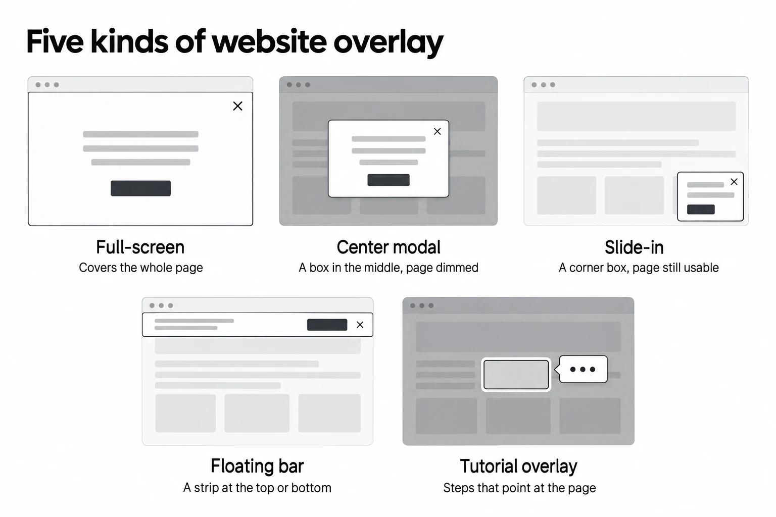
Website overlays come in five kinds by format. The first four are popup formats you'll find in most popup builders; the fifth, the tutorial overlay, belongs to onboarding and product tour tools. For a longer list by goal, placement and trigger, see our guide to types of popups.
| Kind | What it looks like | Use it for | Watch out for |
|---|---|---|---|
| Full-screen | Covers the whole page | A big launch, age or region gates, a desktop welcome offer | Google's interstitial guidance on mobile |
| Center modal (lightbox) | A box in the middle, page dimmed | Email and phone signups, discount offers, exit-intent offers | Showing it before the visitor has read anything |
| Slide-in | A corner box, page still usable | Surveys, related content, chat or call prompts | Covering a chat widget or cookie banner |
| Floating bar | A strip at the top or bottom | Free-shipping thresholds, announcements, sale countdowns | Stacking it on top of another bar |
| Tutorial overlay | Page dimmed, one element highlighted, a tooltip with steps | Onboarding new users, introducing a feature | Tours longer than a few steps; no way to skip |
Full-screen overlays
A full-screen popup takes over the whole viewport. It's hard to miss, which is the point and the risk: on a phone, a full-screen overlay that appears as someone arrives from search is exactly what Google's guidance describes as intrusive. Keep it for desktop, for visitors who have already scrolled or opened a second page, or for messages you're legally required to show.
Center modals (lightboxes)
The center modal is the default popup: a box in the middle of the screen with the page dimmed behind it. It's the kind most of the examples below use. Our benchmark has one comparison between formats: center modal popups convert 0.88% vs 0.49% for corner/slide-in boxes (median campaign). The two formats tend to carry different offers on different pages, so read it as a lean toward the centre for a signup ask, not as a verdict against slide-ins.
Slide-ins
A slide-in enters from the edge of the screen and sits in a corner, so the visitor keeps reading while it's open. It suits quieter asks: a one-question survey, a related article, a call button. In Popupsmart, any popup becomes a slide-in when you set its position to a corner, and a teaser (the small tab that reopens a closed popup) pairs well with it.
Floating bars
A floating bar is a thin strip pinned to the top or bottom of the page. It never blocks the content, which makes it the safest overlay on mobile and a good home for sitewide messages like a free-shipping threshold or a sale end date. Our announcement bar examples show how brands use them.
Tutorial and onboarding overlays
A website tutorial overlay dims the page and walks the visitor through it one step at a time. A typical one highlights a single element (a search box, a filter, a menu), shows a tooltip beside it with a line of text, and offers Next and Skip buttons with a step counter. You see them in web apps on the first login, on a dashboard after a redesign, or on a complex page like a product configurator.
A few rules keep them helpful rather than annoying:
- Keep it to three to five steps. Explain what the visitor needs now, not every feature.
- Always let people skip. A visible "Skip the tour" link and the Esc key should both end it.
- Show it once. Trigger it on the first visit, or from a "Take the tour" link, then stop.
- Make it accessible. Move keyboard focus into each step and back to the page when the tour ends; the W3C modal dialog pattern describes the behaviour screen readers expect.
Does Popupsmart suit tutorial overlays? Partly, and it's worth being plain about which part. Popupsmart builds multi-step popups, so you can make a short welcome tour of two or three screens that explains how your site works, show it only to new visitors, and open it from a "Take the tour" button with on-click targeting. What Popupsmart doesn't do is anchor a tooltip to a specific button on your page, spotlight that element, or track a user's progress through a product tour inside a logged-in app. If that's what you need, a dedicated product tour tool is the better fit.
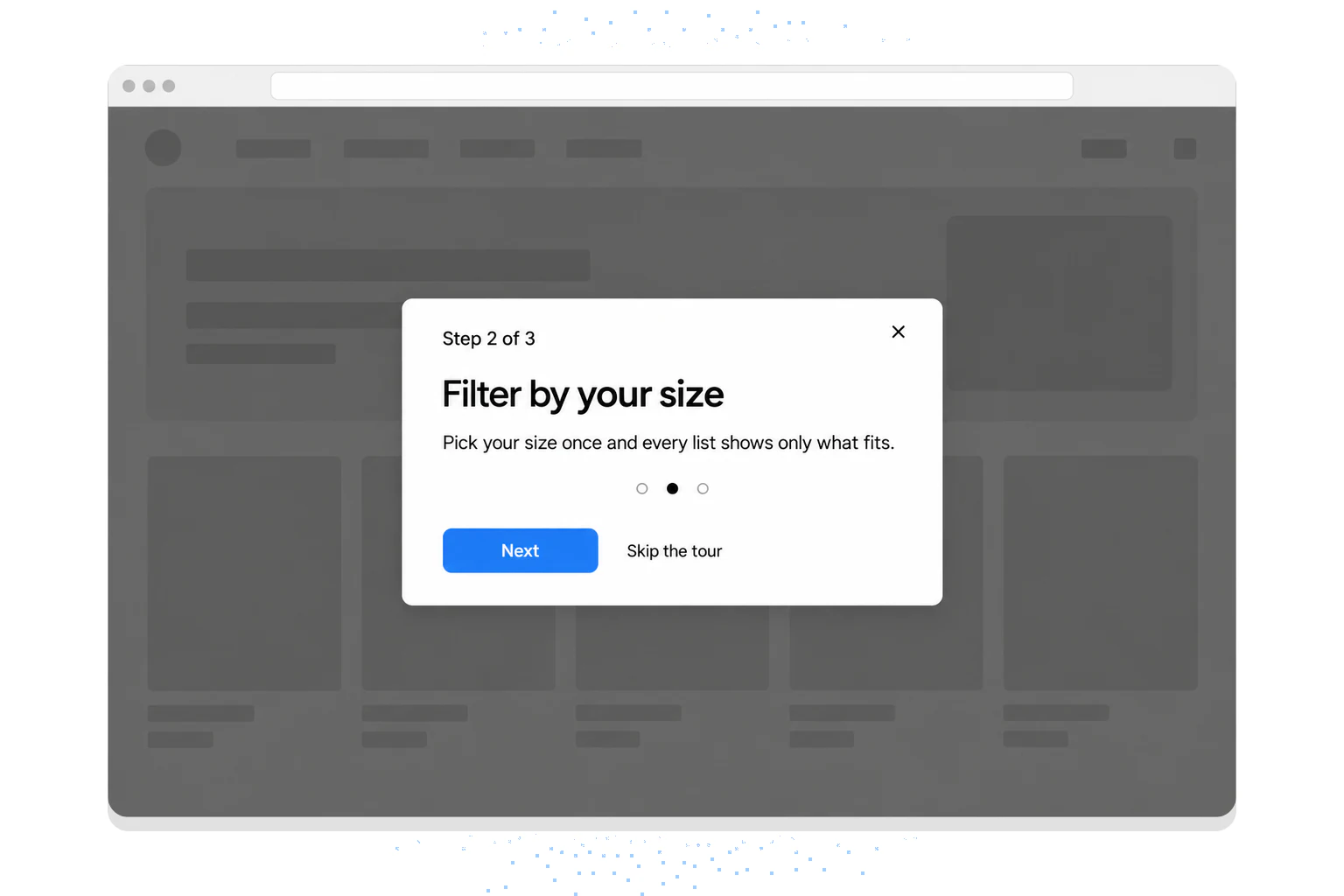
5 Types of Website Overlays by Goal
The kinds above describe the shape of an overlay. The five types below describe its job. Each image shows a Popupsmart template in the app's preview, captured in December 2024; the button under it opens the template in Popupsmart.
1. Email Capture Website Overlays
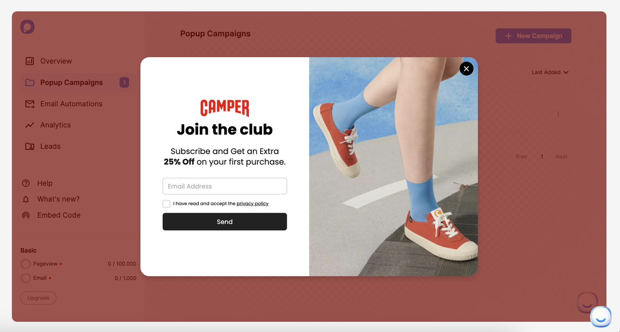
Popupsmart template preview, captured December 2024.
- Aim to grow your email list.
- Offer something valuable in exchange for an email address.
- Examples: Newsletter sign-ups, free eBooks.
2. Discount and Promotional Website Overlays
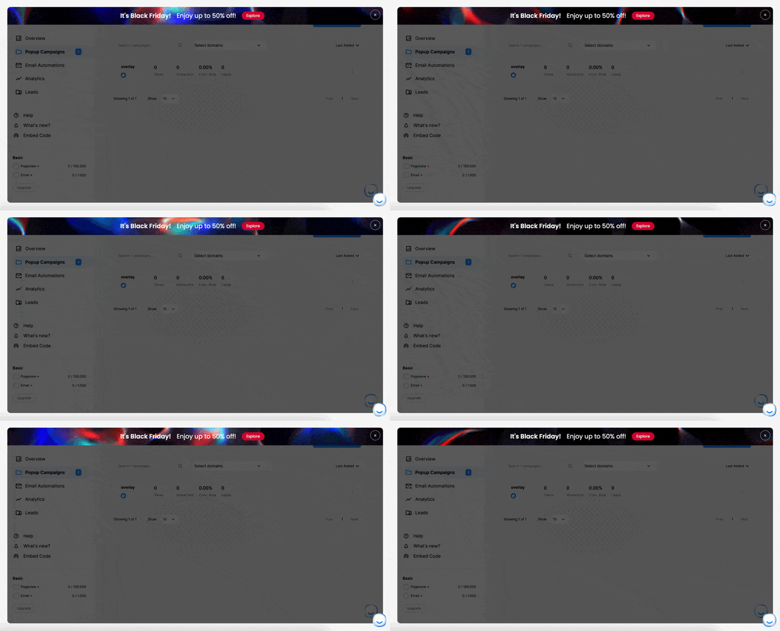
Popupsmart template preview, captured December 2024.
- Offer special deals or discounts.
- Encourage immediate action.
- Examples: Limited-time offers, first-time buyer discounts.
3. Social Proof Website Overlays
- Build trust and credibility.
- Examples: "John from New York just purchased..."
4. Survey and Feedback Website Overlays
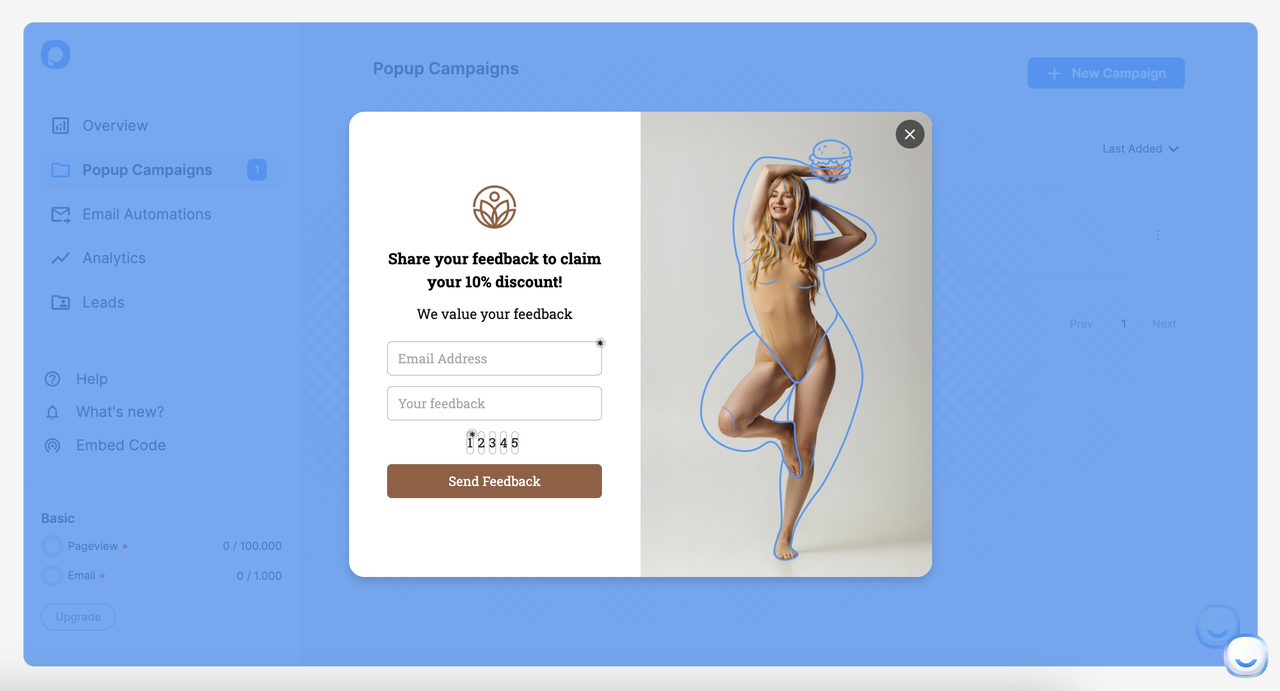
Popupsmart template preview, captured December 2024.
- Collect user feedback directly on the site.
- Help improve products or services.
- Examples: Customer satisfaction surveys.
5. Exit-Intent Website Overlays
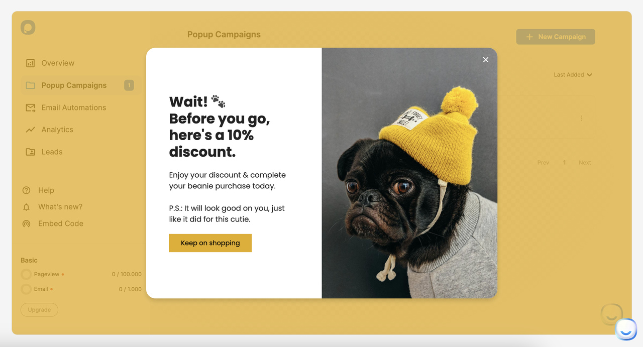
Popupsmart template preview, captured December 2024.
- Aim to retain visitors or recover abandoned carts.
- Examples: Offering a discount to prevent exit. Our exit intent popup examples collect more of them.
9 Effective Website Overlay Examples from Ecommerce Brands
I captured these overlays on the brands' own sites in early December 2024, around Black Friday and Cyber Monday, so the offers are seasonal and the live sites may show something different today. For a gallery of more popup overlay designs, see our popup overlay examples.
Website Overlay Examples 1 & 2: Blume
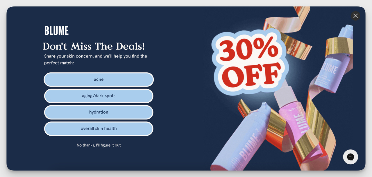
Blume, captured December 2024.
Blume’s survey website overlay asks a question instead of making a pitch. It wanted to know my skin concerns, and that made the brand feel interested in what I needed. The bright design helped too. It was fun to answer.
When You Should Use It: This works if your products can be personalized or you want to teach visitors about your range. You get an answer from the visitor and a reason for them to stay.
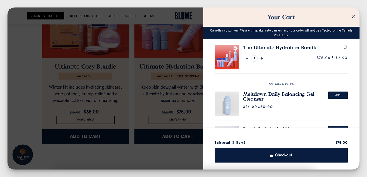
Blume, captured December 2024.
This website overlay stays inside the cart view, so you can explore additional products without disrupting the checkout process. I didn't lose my place, and the suggestion to add one more item felt like a nudge, not a detour.
When You Should Use It: This cart overlay works well during checkout to cross-sell or upsell complementary products.
Use it for raising average order value without making the shopping harder. Cart pages also stand out in our data: popups on cart and checkout pages convert 4.57% vs 1.07% on the home page (median campaign); blog pages convert 0.23%.
Website Overlay Example 3: Joy days
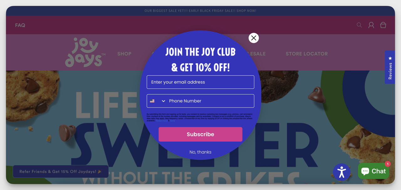
Joy Days, captured December 2024.
This one is colorful, and it's round. The 10% discount, with fields for both email and phone, made signing up feel like joining a club. Playful, but it still looked professional, and it made me want to stay rather than leave.
When You Should Use It: Use this website overlay when you notice visitors trying to leave your site. It suits a brand with a lively, approachable tone. If you collect phone numbers the same way, keep the SMS consent text under the field, as Joy Days does; our guide to SMS popups covers the wording.
Website Overlay Example 4: Sense
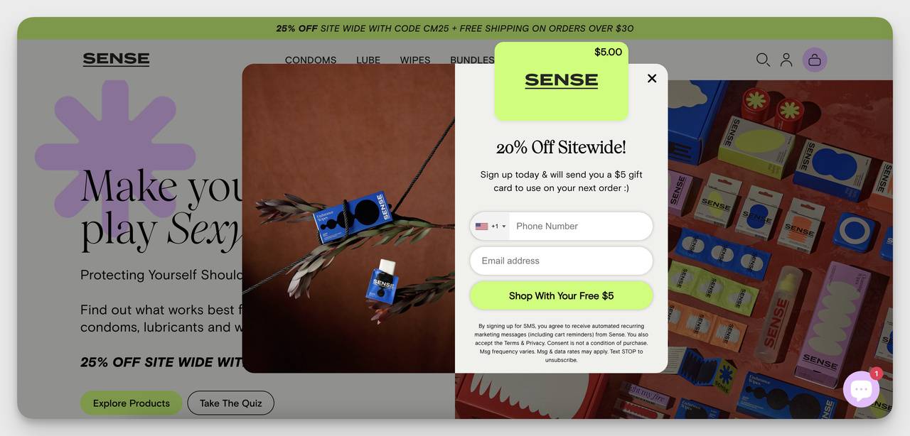
Sense, captured December 2024.
Sense doesn't show customer reviews here. It builds credibility another way: a discount, good visuals and a "trust-building" $5 incentive for signups.
That's a quieter kind of social proof, and it still works.
When You Should Use It: Show user activity, reviews or recent purchases to build trust, especially for new visitors or high-priced items.
Website Overlay Example 5: LARQ
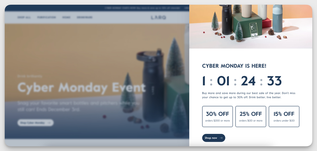
LARQ, captured December 2024.
Larq’s overlay is a sidebar that doesn’t take over the whole screen, and I liked that.
It felt less intrusive, but the countdown timer and tiered discounts still caught my eye. I could keep browsing with the offer sitting beside the page.
When You Should Use It: Use it for promotions during sales events like Cyber Monday or Black Friday. A side-bar keeps a time-sensitive offer in view without getting in the shopper's way.
Website Overlay Example 6: Hilma
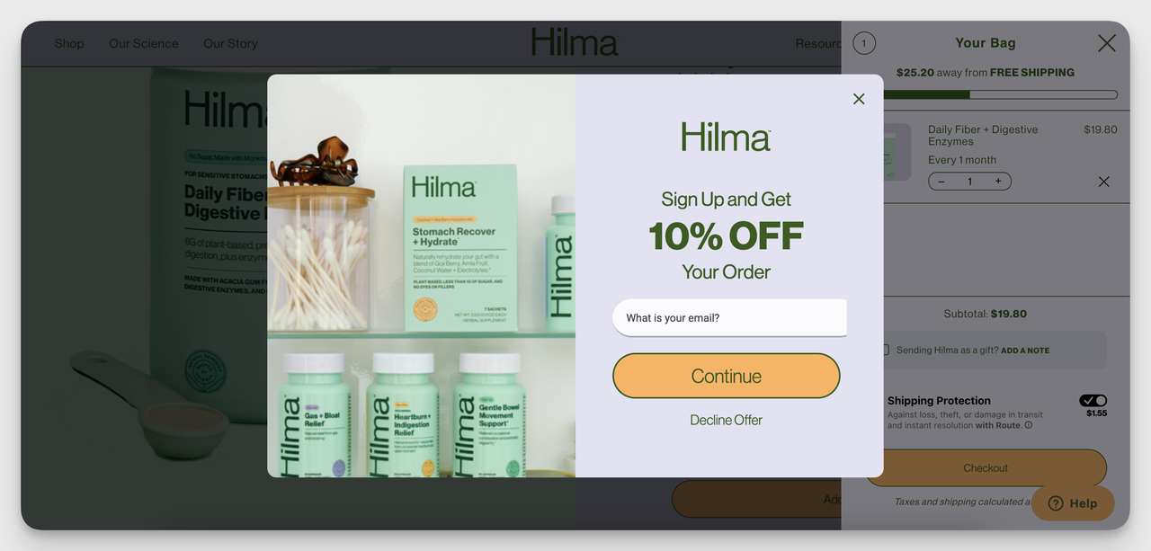
Hilma, captured December 2024.
Hilma’s overlay is a smart exit-intent strategy. It appeared just as I clicked the return button at checkout, and the 10% discount was a last-minute reason to reconsider leaving. The design is clean and easy to use.
When You Should Use It: Use this type of website overlay to re-engage users who might abandon their cart or leave the checkout process. That's where it can recover sales.
Website Overlay Example 7: Away
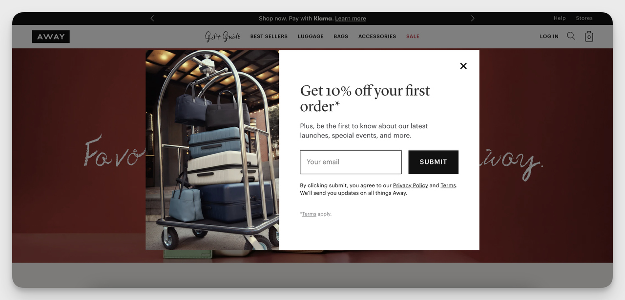
Away, captured December 2024.
Away uses a clean, minimalist design to promote a 10% discount for first-time buyers. It aligns well with their premium branding and simplicity-focused product line.
When You Should Use It: Effective on product pages or during the first visit to the site to capture user emails early in the buying journey.
Website Overlay Example 8: Tentree
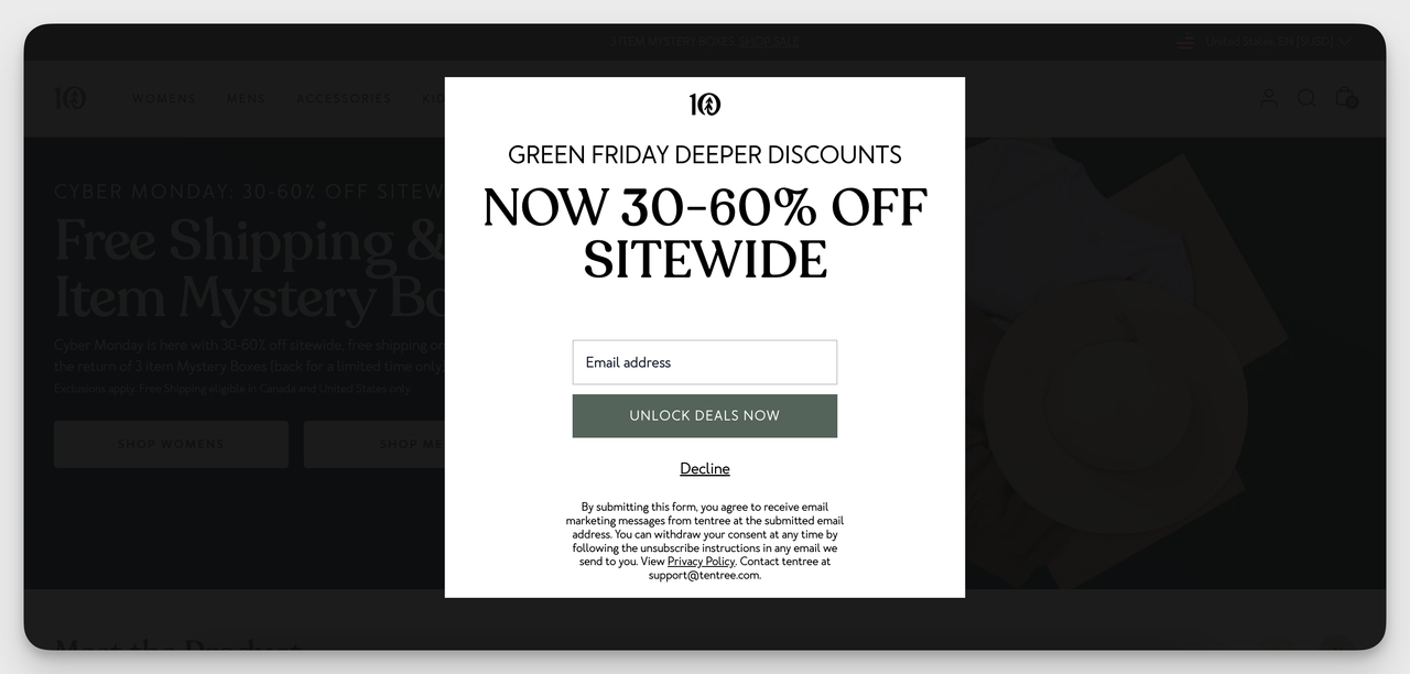
Tentree, captured December 2024.
This website overlay had my attention at once, thanks to its bold discount announcement. A "30-60% OFF Sitewide" offer above a clean email sign-up form is hard to ignore. Exciting, and still easy to fill in.
When You Should Use It: Use this kind of website overlay during big sales like Black Friday or seasonal promotions, when you want urgency and emails from the same visit.
Website Overlay Example 9: Rothy's
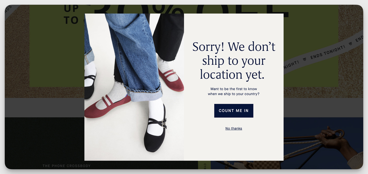
Rothy's, captured December 2024.
Rothy’s website overlay is straightforward and transparent, and I love that. It names the shipping limitation issue up front, then offers a way to stay updated by signing up.
Considerate, not pushy. As a potential customer, I noticed.
When You Should Use It: Use this type of overlay when you can't serve certain locations or during service interruptions. Visitors find out early, and they leave with a reason to come back.
Best Practices for Designing Effective Website Overlays
The practices below apply to every kind of overlay. Where our benchmark has a statement on the practice, it's quoted with its qualifier. For the design mistakes that make visitors close an overlay, see our guide to popup UX design.
1. Align Overlays with Your Brand
Use your brand's colors and fonts in the overlay, and keep its look close to the rest of the site.
The copy should sound like your brand too: formal, friendly or playful, whichever you are. An overlay that matches the site reads as part of it. One that doesn't looks like an interruption, and visitors trust it less.
2. Optimize Timing and Triggers
A lot rides on when and why your overlay appears. Pick the trigger that matches what the visitor is doing:
- Show overlays after users scroll to a specific point, once they've shown interest in the content.
- Display an overlay after a period of user inactivity to re-engage them.
- Use exit intent to catch visitors as they’re about to leave, with an offer or message worth stopping for.
Let visitors engage with your content before an overlay appears. In our benchmark, popups that wait before appearing convert 0.83% vs 0.61% for popups shown the instant the page loads (median campaign); the direction holds in every year of data but the difference is not statistically reliable, so treat it as a lean, not a rule. The exact delay length (0-5 seconds vs 21-60 seconds) makes no measurable difference to conversion.
Exit intent is not a shortcut either. Exit intent shows no statistically reliable advantage: popups on the most sensitive exit-intent setting converted 1.10% vs 0.78% without exit intent (median campaign), a gap that could be chance.
3. Target the Right Audience
An overlay works when it's relevant to the person seeing it. Segment your audience by:
- Behavior. Show a discount offer to users who add items to their cart but haven’t checked out.
- Location. Change the message for visitors from different countries or regions.
- Device type. Build separate overlays for mobile and desktop so each one fits the screen it's on.
Target this way and fewer visitors see a popup that has nothing to do with them.
4. Limit Frequency and Respect User Experience
Overusing overlays can frustrate visitors and drive them away. In our data, 40.5% of popup displays end with the visitor closing the popup (all displays pooled, February 2025 - September 2026, since close tracking began). To keep your share of those closes down:
- Set frequency caps. Limit how often the same user sees an overlay, such as once per session or day. Popupsmart's display frequency settings handle this per campaign.
- Use cookies. Remember who has seen what. If a user has already subscribed, don’t show them the email capture overlay again.
An overlay people see once, at the right moment, feels helpful. The same one on every page feels like nagging.
5. Use Compelling Visuals and Copy
A visitor decides in a glance whether to read your overlay or close it. So:
- Say the offer in as few words as you can. Users should understand the value within seconds.
- Write a call-to-action (CTA) that starts with a verb, such as “Get 10% Off Now” or “Claim Your Free Guide”.
- Add visuals, animations or icons only when they support the message, and use a contrasting color for the CTA button. Keep it simple. An overlay crowded with information gets closed, not read.
6. Optimize for Mobile
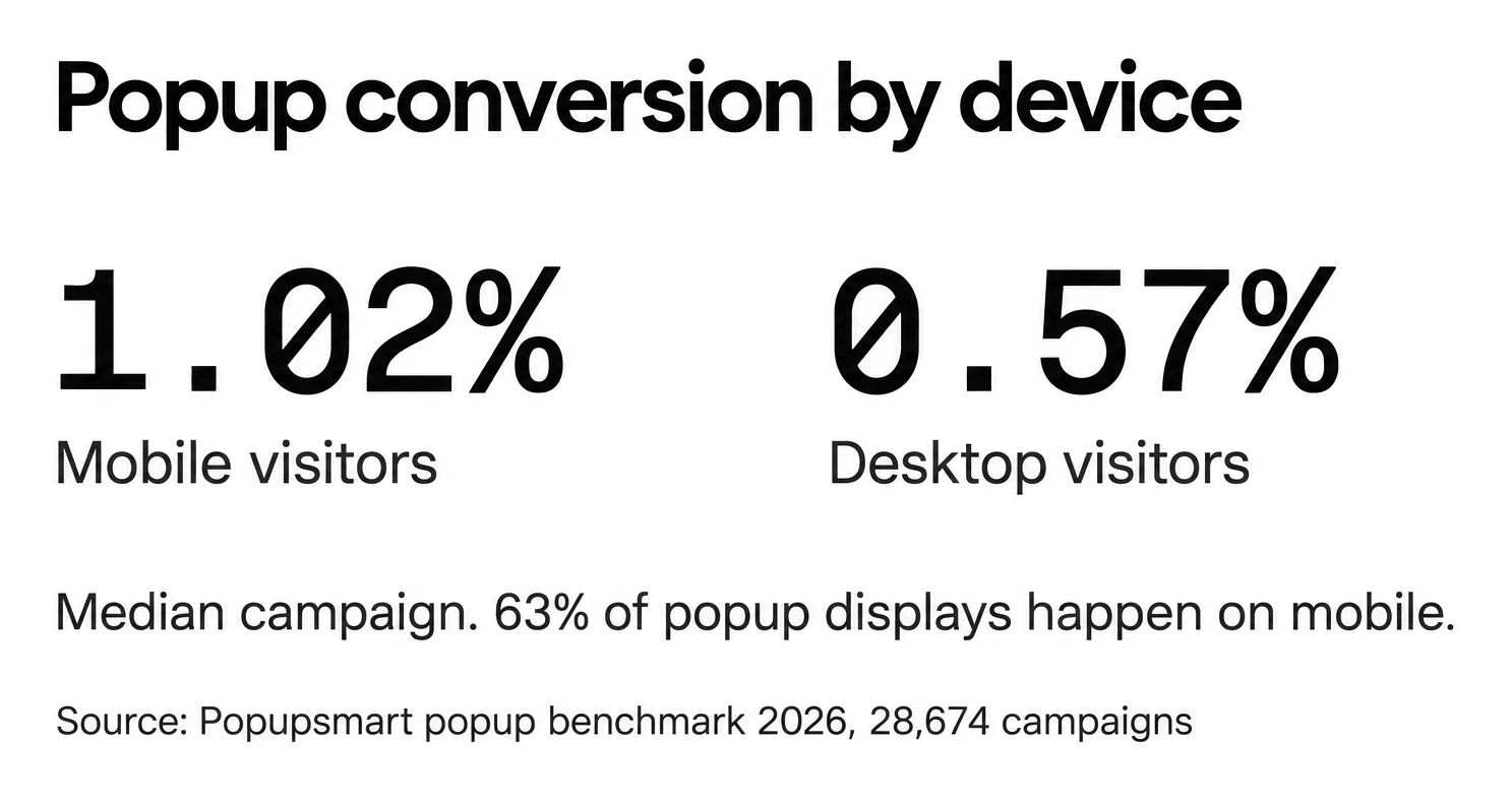
Most overlays are now seen on a phone: 63% of popup displays happen on mobile. Mobile visitors convert on popups at 1.02% vs 0.57% on desktop, and click at 2.99% vs 1.34% (median campaign). So the phone is where an overlay earns its keep, and where a careless one does the most harm. On mobile:
- Build overlays that adapt to different screen sizes.
- Use smaller overlays or slide-ins rather than full-screen popups.
- Include a visible close button, so leaving takes one tap.
Overlays built this way are easier to use on a phone, and they stay within Google’s guidelines for interstitials, which protects your SEO.
Google's page lists the patterns to avoid, such as covering the entire page with a dialog on arrival, and suggests banners that take up only a small fraction of the screen instead. Our guide to SEO-friendly popups walks through what Google's guidance does and doesn't cover, and the interstitial popup guide shows which full-page overlays are exempt.
7. Test and Continuously Optimize
No overlay is right the first time. Test one element at a time and keep what wins:
- A/B Testing: Set up an A/B test for a popup to compare design, copy, CTAs, or timing and identify the most effective version.
- Analyze Performance Metrics: Track impressions, click-through rates, and conversions to measure success. For a yardstick, across 3,034 Popupsmart popups that ask for an email or phone number (January 2024 - September 2026, each with at least 1,000 displays and 14 active days), the median converts 0.83% of its displays into leads; the top 25% reach 1.96% and the top 10% reach 3.87%. The popup conversion benchmark report has the method behind it.
- Iterate Based on Results: Rework the overlays that underperform, then test again. Visitors change, and an overlay that won last year may not win now.
8. Comply with Regulations
An overlay that collects data has to follow the rules for that data:
- GDPR and Privacy Laws: Include opt-in forms for email captures and clearly state how user data will be used. Popupsmart's data processing agreement covers how it handles the data your overlays collect.
- Cookie Consent: Use overlays to inform users about cookie policies and allow them to manage preferences.
Getting this wrong can mean fines and a hit to your brand’s reputation. Be plain about what you collect and why.
9. Ensure Accessibility
Design overlays that everyone can use, including visitors with disabilities:
- Make every overlay work with a keyboard for users who cannot use a mouse, and let the Esc key close it.
- Use legible fonts and enough contrast between text and background.
- Test with a screen reader, so visually impaired users hear what the overlay says and can act on it.
The same fixes make the overlay easier to use for other visitors too.
How to Create a Website Overlay
You can build any of the four popup kinds, and a short tutorial tour, in Popupsmart without code. Popupsmart has a free plan at $0, so you can build and publish one before you decide on anything.
Step 1: Sign Up and Log In
- Go to Popupsmart, the no-code popup builder, and create an account.
- The first time you log in, an onboarding guide walks you through installing the embed code on your site.
Step 2: Choose a Template or Start from Scratch
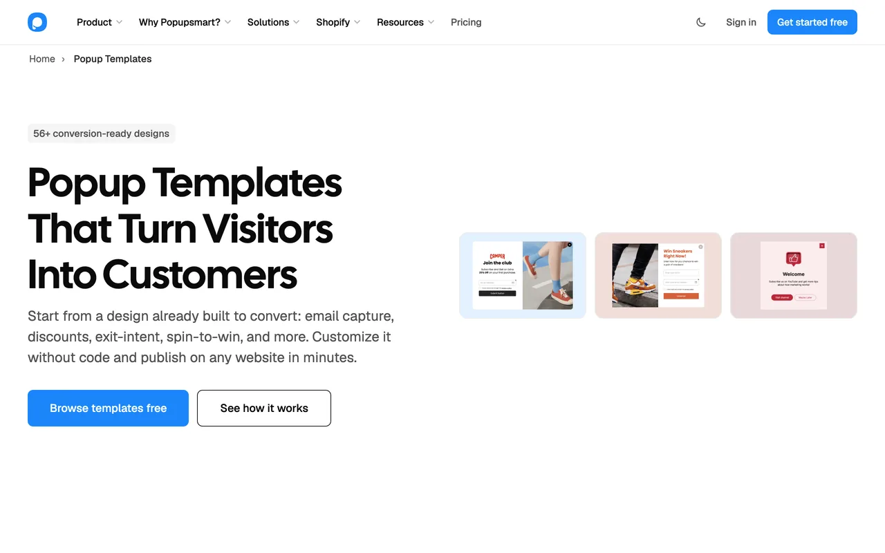
- Click New Campaign, name it and choose your domain. You'll see a library of templates for different purposes like collecting emails, reducing cart abandonment, or announcing promotions. You can browse the same designs on the popup templates page before you sign up.
- Filter by goal, or by popup type: light popups (center modals), fullscreen or floating bar. For a tutorial tour, turn on the Multistep filter.
- Browse through the options, pick one that suits your goal, or start from scratch to design your own overlay.
- Tip: Templates are great for saving time while still looking professional.
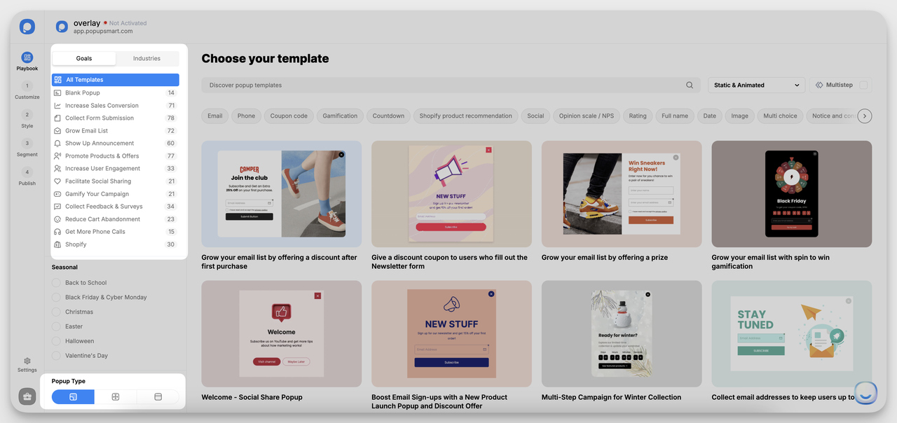
The template library in the Popupsmart app, captured December 2024.
Step 3: Customize Design and Content
- After selecting your template, head to the Customize section.
- Here, you edit the text, change images and add your branding: type in the editor, upload your visuals.
- This is also where you set up the call-to-action (CTA), the buttons and links that tell visitors what to do next.
- For a tutorial tour, add a step for each screen, keep each to one headline and one line of copy, and give every step a way out.
- Pro Tip: Keep the content short. A direct message with a clear CTA beats a clever one.
Step 4: Style Your Overlay
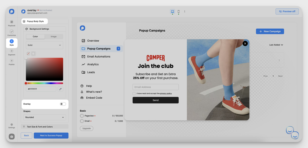
The Style step in the Popupsmart app, captured December 2024.
- Next, go to the Style section. This is where you bring your overlay to life: colors, shapes, fonts.
- Choose a background color, image, or adjust the opacity to fit your brand. You can also select the shape of the popup (rounded, square, etc.).
- Switch on Overlay to dim the page behind the popup, then pick its colour and opacity. This is the layer that turns a popup into a lightbox.
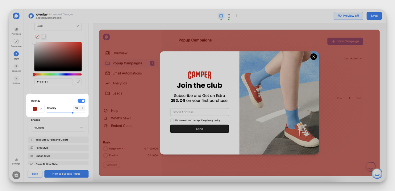
The Overlay colour and opacity settings, captured December 2024.
- Experiment with fonts and button styles to make the overlay visually appealing and cohesive with your website.
Step 5: Set Triggers and Targeting Options
This step is where you decide when and to whom the overlay appears. In Popupsmart it's called Segment:
- Exit Intent: Perfect for stopping visitors from leaving without engaging.
- Scroll Depth: Display the overlay once users scroll a certain percentage down the page.
- Time Delay: Trigger the overlay after a visitor spends a specific amount of time on the page.
- On Click: Open the overlay from a button, link or image, the usual start for a tutorial tour.
Advanced targeting options allow you to show overlays based on location, device type, new or returning visitors, or even specific URLs. Pair them with a display frequency so the same person doesn't see the overlay on every page.
Step 6: Publish and Integrate
- Once satisfied, click Publish. The overlay goes live on every site where Popupsmart's embed code is installed.
- If you haven't installed it yet, paste the embed code into your site, or use Google Tag Manager, the Shopify app or the WordPress plugin. On WordPress, Shopify and other platforms, Popupsmart's integration guides walk you through it.
- Connect your email or CRM tool so every signup lands where you send from; the integrations page lists them.
Frequently Asked Questions about Website Overlays
Are Website Overlays Effective?
They can be, when the offer, the timing and the audience fit. In Popupsmart's 2026 benchmark, the median popup that asks for an email or phone number converts 0.83% of its displays into leads; the top 25% reach 1.96% and the top 10% reach 3.87%. The gap between those numbers comes from the offer, the page and the targeting, not from the overlay format alone.
What Are the Best Triggers for Overlays?
Triggers like exit intent, scroll depth, and time delay all work, but none is a guaranteed winner. In our benchmark, popups that wait before appearing convert 0.83% vs 0.61% for popups shown the instant the page loads (median campaign), a lean rather than a rule, and exit intent shows no statistically reliable advantage. Who sees the overlay matters too: popups targeted at new visitors only convert 1.13% vs 0.77% for popups shown to everyone.
How to Make the Most of Website Overlays?
To make the most of website overlays, align them with clear goals like capturing emails or reducing cart abandonment, and show them to the visitors they fit.
Keep the design simple, mobile-friendly, and consistent with your brand. Cap how often the same person sees an overlay, offer genuine value (e.g., discounts or recommendations), and A/B test the offer and the copy before the colours.
What Is a Website Tutorial Overlay?
A website tutorial overlay dims the page and walks a visitor through it in short steps, usually with a tooltip that points at one element at a time and Next and Skip buttons. It's used to onboard new users in web apps, to introduce a new feature, or to explain a complex page on the first visit.
Can I Build a Tutorial Overlay with Popupsmart?
Partly. Popupsmart builds multi-step popups, so you can make a short welcome tour of two or three screens, show it only to new visitors, or open it from a "Take the tour" button with on-click targeting. Popupsmart does not anchor tooltips to specific elements on your page or track progress through an in-app product tour; for that you need a product tour tool.
Do Website Overlays Hurt SEO?
They can when they block the content. Google's guidance on intrusive interstitials and dialogs says overlays that obstruct the page make it hard for search engines to understand your content and may lead to poor search performance. Small banners, slide-ins and overlays that show after the visitor has engaged are the safer choice, especially on mobile.
Is a Website Overlay the Same as an Accessibility Overlay?
No. A website overlay in marketing is a popup, bar or slide-in that shows a message over the page. An accessibility overlay is a third-party script that claims to make a site accessible automatically. University accessibility teams, including the University of Iowa's, advise against accessibility overlays and recommend building accessible pages instead.
Conclusion
Website overlays capture attention and lift conversions when they're used with care. Tie each one to a goal, pick the right kind for the page, get the timing and targeting right, and make it easy to close. Do that and the visitor gets something useful while you get the signup.
Then check the numbers and keep adjusting. An overlay that nobody revisits slowly stops fitting the people who see it.
Additional Resources