36+ Best Responsive eCommerce Sites in 2025 (Examples & Key Features)
 ChatGPT
 Perplexity
 Claude
 Grok
Grok Google AI Mode
Guide highlights 36+ top responsive eCommerce sites in 2025 and explains key pillars—mobile-first design, speed, intuitive navigation, adaptive visuals, accessibility, and streamlined checkout—plus best practices to boost SEO and conversions.
In today’s hyper-competitive digital landscape, having a visually appealing online store is no longer enough, it must be responsive. A responsive eCommerce site automatically adjusts its layout, content, and features to deliver a seamless user experience across all devices, especially mobile.
A non-responsive website not only frustrates users but also increases bounce rates, lowers conversions, and damages SEO performance. In contrast, responsive sites load faster, look sharper, and convert better, directly impacting your bottom line.
In this guide, we’ve curated 36+ of the best responsive eCommerce websites, across industries, to inspire your next redesign or optimization. Let’s explore what makes them stand out and how your brand can benefit.
A Quick Summary by Popupsmart
In this comprehensive guide, we explore over 36 of the most responsive eCommerce sites in 2025, showcasing brands that master mobile-first design, intuitive navigation, and adaptive visuals. You’ll discover what makes a site truly responsive, how responsiveness impacts conversions, and actionable tips for optimizing your own store.
What Makes an eCommerce Website Truly Responsive?
Not all mobile-friendly websites are fully responsive. True responsiveness is more than just shrinking content to fit a screen, it’s about rethinking how users interact with your brand across devices. Here are the key pillars that define a truly responsive eCommerce site:
Mobile-First Design
Instead of designing for desktop and scaling down, modern brands start with mobile-first layouts that prioritize touch navigation, minimalism, and vertical scrolling. This ensures better usability where it matters most.
Fast Loading Time
Mobile users are impatient, 53% abandon pages that take longer than 3 seconds to load. Optimizing for speed (compressed images, lazy loading, efficient code) is essential for both UX and SEO.
Intuitive Navigation
From sticky headers to hamburger menus and collapsible filters, mobile navigation must be clean, logical, and easy to use with one thumb. Complicated layouts lead to high drop-off rates.
Adaptive Imagery & Layout
Responsive sites use flexible grids, scalable media, and CSS breakpoints to adjust image sizes and layouts based on screen width. This keeps visuals sharp without overwhelming the device.
Accessibility
Responsiveness also means inclusivity. Sites must meet WCAG standards with features like high contrast text, readable fonts, keyboard navigation, and screen reader compatibility.
Optimized Checkout
The mobile checkout flow should be short, simple, and distraction-free. Autofill fields, progress indicators, and secure mobile payment options (like Apple Pay or Shop Pay) improve completion rates.
Examples of Responsive E-commerce Sites by Industry
To help you better understand what makes a responsive eCommerce site truly effective, we’ve grouped standout examples by industry. Each sector has its own user behavior patterns, design priorities, and conversion goals, so responsiveness isn’t one-size-fits-all. Whether you're in fashion, tech, skincare, or home decor, these real-world examples show how brands tailor their mobile experiences to meet industry-specific demands.
From fast-loading fashion galleries to scroll-triggered product discovery in home and lifestyle brands, you’ll see how responsiveness plays out in diverse ways across different categories. Use these insights to inspire your own website redesign or optimization strategy.
Fashion & Apparel
Mobile shopping has become more than a trend, it's the default. In the fashion industry, where visual appeal and user interaction are critical, mobile web design must go beyond just responsive layouts. It has to delight, convert, and retain customers in just a few thumb scrolls. Below are 6 standout examples of mobile-first fashion and apparel websites doing exactly that.
1. ASOS
ASOS has been at the forefront of e-commerce innovation, and their mobile experience is no exception. The brand blends functionality and visual appeal, focusing on speed and usability.
Mobile Highlights:
- Swipeable full-width galleries let users browse outfits intuitively.
- A sticky bottom bar displays "Add to bag" and cart icons — always within thumb reach.
- “Quick view” overlays allow shoppers to preview products without leaving the page.
- Interactive features like “See My Fit” personalize the experience based on real body shapes.
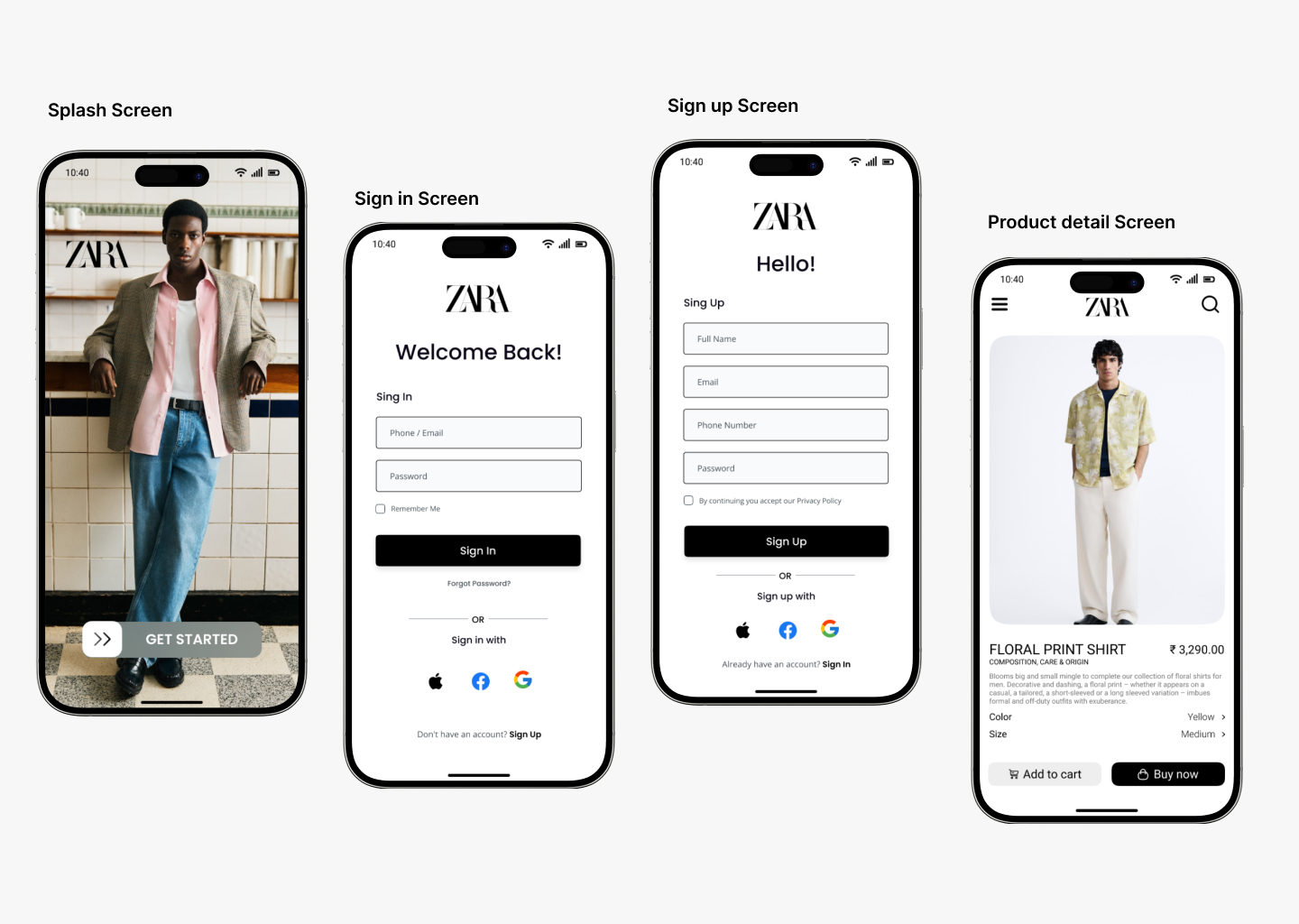
2. Zara
Zara brings its sleek, editorial design to mobile without sacrificing performance or accessibility.
Mobile Highlights:
- A slide-in burger menu creates distraction-free navigation.
- Layouts transition smoothly from desktop grids to mobile-friendly visuals.
- Smart image compression ensures <3-second load times on most networks.
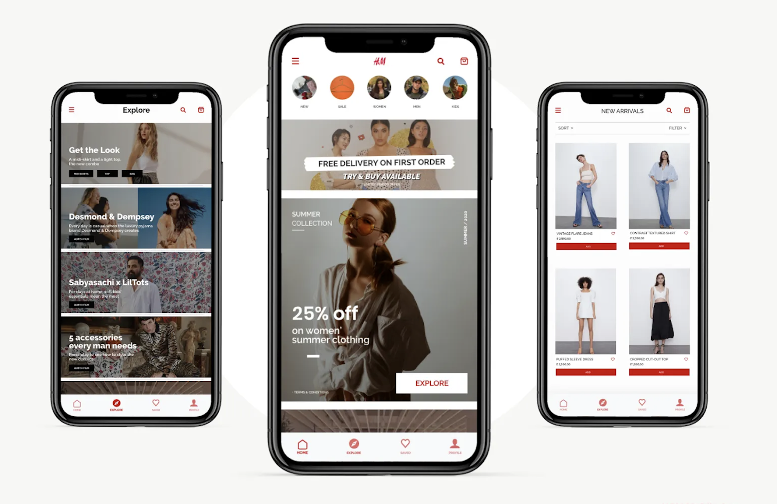
3. H&M
H&M focuses on speed and intuitiveness, building a mobile site that’s functional without clutter.
Mobile Highlights:
- The grid adapts fluidly from 4 columns to 1 for easy vertical scrolling.
- “Quick-add” buttons under thumbnails allow seamless product selection.
- Lazy-loading images improve performance without compromising quality.
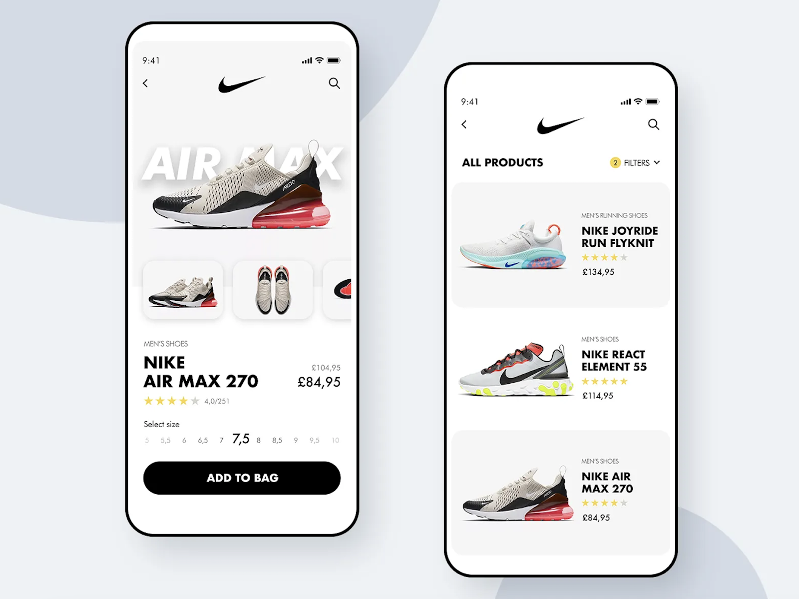
4. Nike
Nike’s mobile experience matches its brand: bold, energetic, and user-first.
Mobile Highlights:
- Designed mobile-first, with strong CTAs and vivid visuals.
- Thumb-friendly top nav bar includes search, account, and cart icons.
- Minimalist menus accessible via burger icon keep the UI clean and focused.
5. Etsy
Etsy’s marketplace thrives on personalization, and the mobile site delivers a curated feel.
Mobile Highlights:
- Predictive search delivers smart suggestions as you type.
- Category tiles streamline access to trending or seasonal items.
- Product-first design: large thumbnails and descriptions speed up browsing.
6. Express
Express blends speed with smart merchandising in their mobile setup.
Mobile Highlights:
- A compact hamburger menu opens into fast-scrolling vertical navigation.
- Users can swipe through product images directly from search results.
- “Style It With” suggestions support product discovery and upsells.
What Makes These Sites Great?
| Feature | Description |
|---|---|
| Mobile-First Layout | Designs created for smaller screens first, ensuring clarity and usability. |
| Thumb-Zone Optimization | Key actions like add-to-cart or filters placed within easy reach. |
| Performance-Oriented | Lazy loading, smart compression, and caching for <3s page loads. |
| Personalization Tools | Fit previews, recommendations, and style quizzes enhance UX. |
Skin Care & Beauty
As skincare and beauty brands compete in an increasingly mobile-first world, a frictionless mobile shopping experience becomes a brand differentiator. These six brands prove that speed, clarity, and thoughtful design are everything when it comes to converting mobile users into loyal customers.
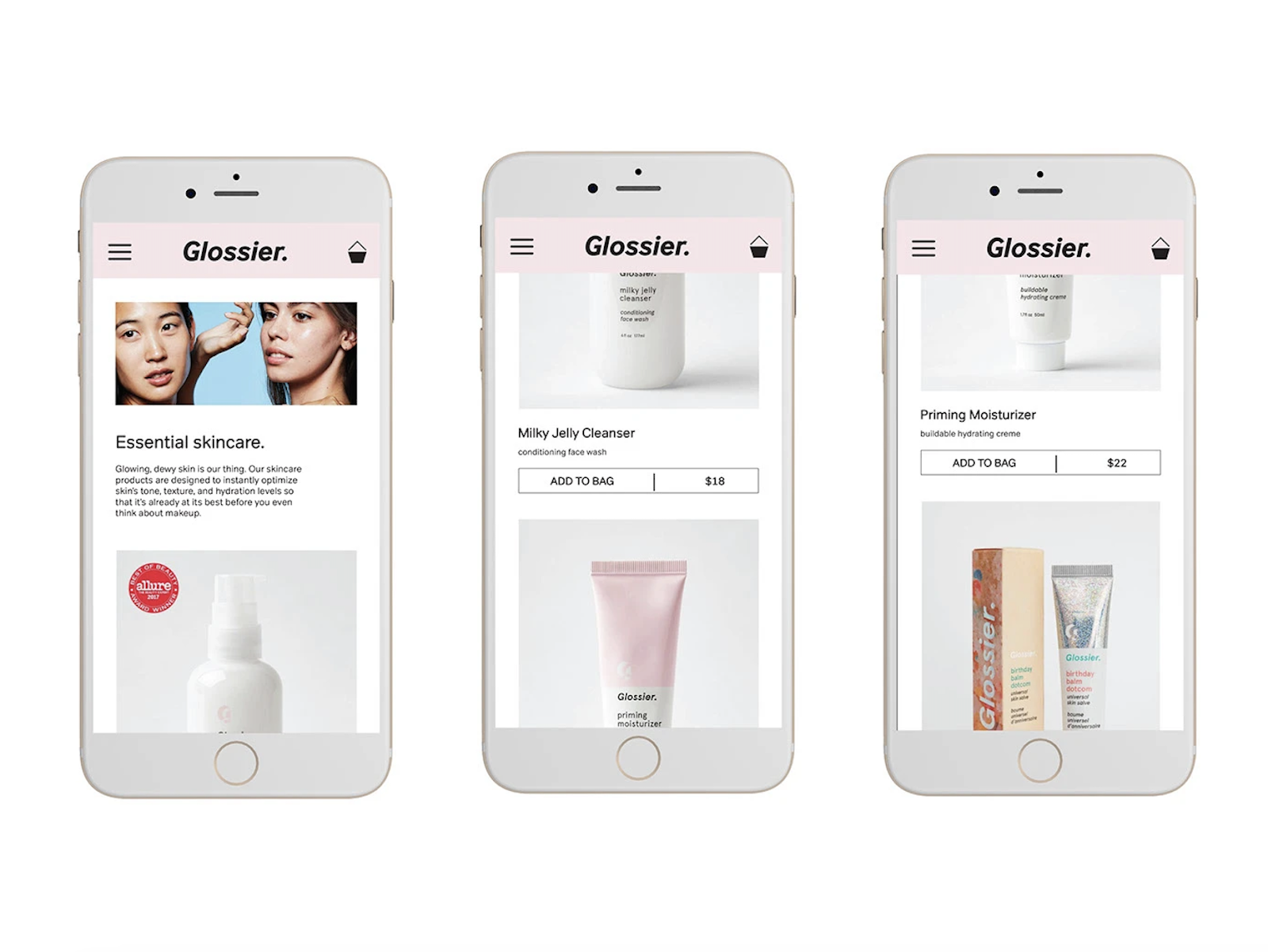
7. Glossier
A masterclass in mobile-first, clean design that feels as fresh as their product line.
Why it works:
- Minimalist UI: Clean whitespace, easy-to-read text, and bold visuals that pop.
- Context-aware popups: Product suggestions like “Try this next” are integrated seamlessly without interrupting the flow.
- High-performance visuals: HD images load instantly thanks to smart optimization.
Glossier shows that minimalist design doesn’t mean sacrificing brand personality on mobile, it elevates it.
8. ILIA Beauty
Where transparency meets usability and it shows in every pixel of their mobile UX.
Mobile-friendly features:
- Expandable FAQ-style ingredient lists: Especially useful for on-the-go users needing quick info.
- High-res images: Fluidly scale to fit any screen size without compromising detail.
- Accessibility first: WCAG-aligned font sizes, ARIA-labeled buttons, and clear tap zones.
ILIA turns information into interaction by making education fast, accessible, and beautiful.
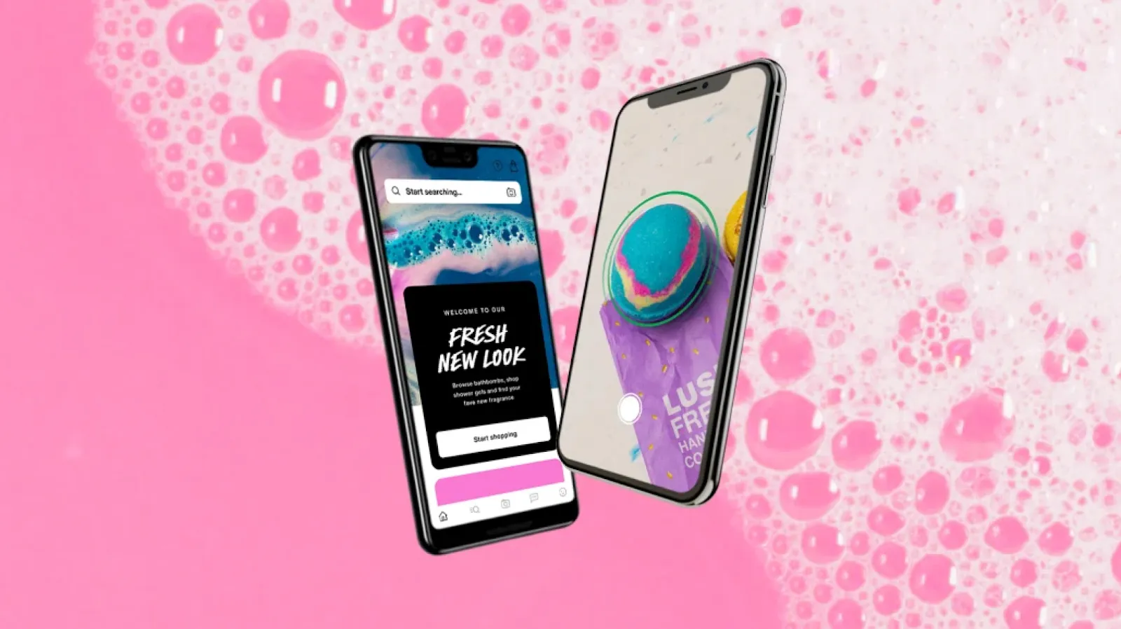
9. Lush
Vibrant, playful, and highly performant on mobile — just like their products.
Responsive design highlights:
- Grid-based mobile product display with “Add to Cart” under each thumbnail.
- Predictive search bar: Starts suggesting matches before you finish typing.
- Infinite scroll: Mobile-friendly yet light on memory, avoiding performance lags.
Lush leverages responsive design to mirror the fun, sensory-rich experience of its physical stores.
10. Adore Me
Built for mobile conversions; fast, personal, and smart.
Mobile-first innovations:
- Angular-powered frontend: Lightning-fast, almost app-like fluidity.
- Style quiz personalization: Mobile-optimized interaction drives tailored product suggestions.
- Smart checkout: Auto-fill address fields, large tap buttons, and saved payment methods.
Adore Me’s site feels like a native app without the need for an actual download.
11. Furlan Marri
A luxury watch brand that proves elegance can scale beautifully on mobile.
Why it stands out:
- Swipeable product carousels: Allows high-end watch browsing with intuitive gestures.
- Hero images dominate: Letting users zoom in on the intricate details of the craftsmanship.
- Lightweight UI: Minimal distractions, maximum focus on the product.
Furlan Marri makes luxury feel tactile — even on a 6-inch screen.
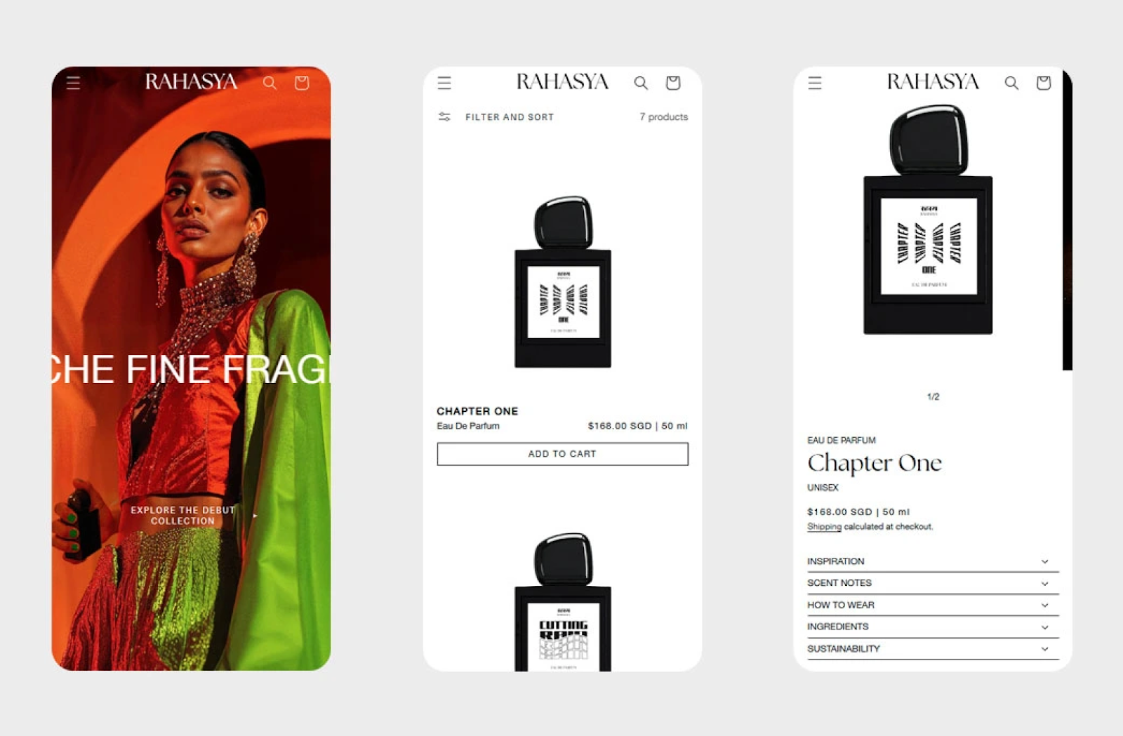
12. Rahasya Fragrances
Sensory storytelling adapted to the small screen, immersive and elegant.
What works well:
- Full-screen mobile imagery: Evokes fragrance through visuals.
- Smooth scrolling navigation: Guided exploration of fragrance families and notes.
- Streamlined checkout: With sticky CTA buttons that stay within thumb reach.
Rahasya turns browsing into a guided olfactory journey — even on mobile.
Food & Beverage
13. Dang Foods
Why it stands out on mobile:
- Clean grid layout with generous white space
- Bright product visuals that scale perfectly to screen size
- Thumb-friendly buttons and easy navigation
- Sticky header with minimal elements
🛒 Shopping on-the-go becomes effortless with Dang’s focused and clutter-free design.
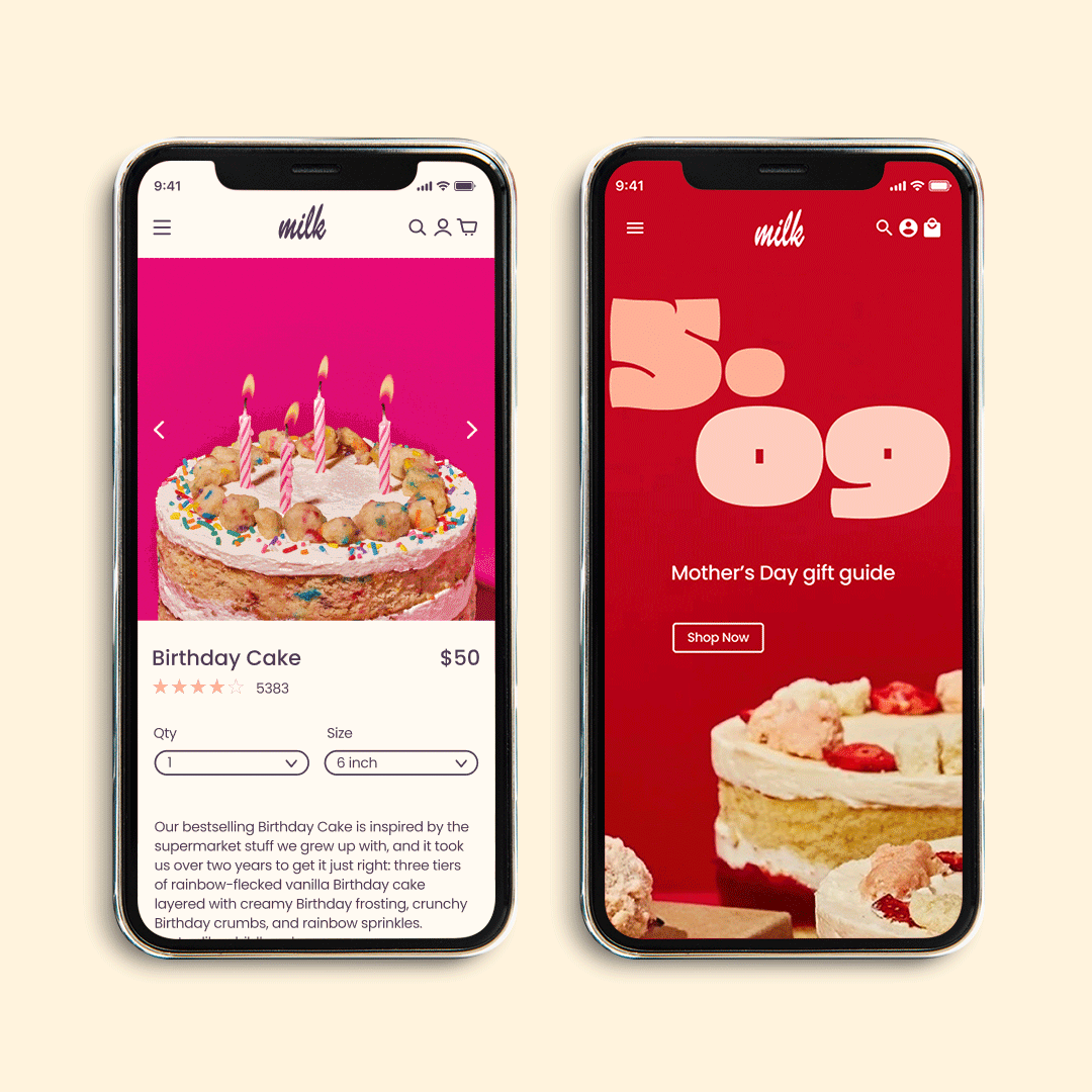
14. Milk Bar
Mobile UX Highlights:
- Hero images scale beautifully and load fast
- Subscription options and gift boxes are easy to build on mobile
- Clear, simplified navigation menu
- Frictionless mobile checkout
This is a great example of mobile design that converts sweet cravings into actual orders.
15. Verve Coffee
Top Responsive Features:
- Swipeable product sliders for blends, gear, and blogs
- Smart categorization for subscriptions vs one-time purchases
- “Scroll to learn more” layout, ideal for storytelling
- CTA buttons optimized for single-thumb use
Verve proves mobile doesn’t have to sacrifice brand storytelling for sales performance.
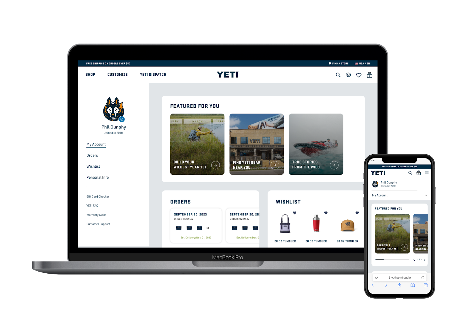
16. YETI
| Feature | Description |
|---|---|
| Hero Carousels | Crisp, immersive visuals on mobile |
| Sticky Add-to-Bag CTA | Always within reach while browsing |
| Powerful Filters | Smart filtering options in hamburger menu |
| Live Chat | Mobile-optimized customer support widget |
A perfect balance of product depth and performance in a mobile-first layout.
17. Solo Stove
Key Mobile Design Wins:
- Swipeable product sliders
- Intuitive vertical menu with bold categories
- Product reviews and UGC presented clearly
- Mobile performance stays fast despite large lifestyle visuals
Perfect for shoppers planning their next outdoor adventure—on the couch or at the campsite.
18. Athletic Greens (AG1)
Highlights at a Glance:
- Clean, focused sections with ingredient breakdowns
- High-conversion layout with CTA buttons always visible
- Smooth educational flow from benefit to science to checkout
- Fully optimized for speed and trust on mobile
A textbook example of how to design for health-conscious, mobile-first consumers.
Home & Lifestyle
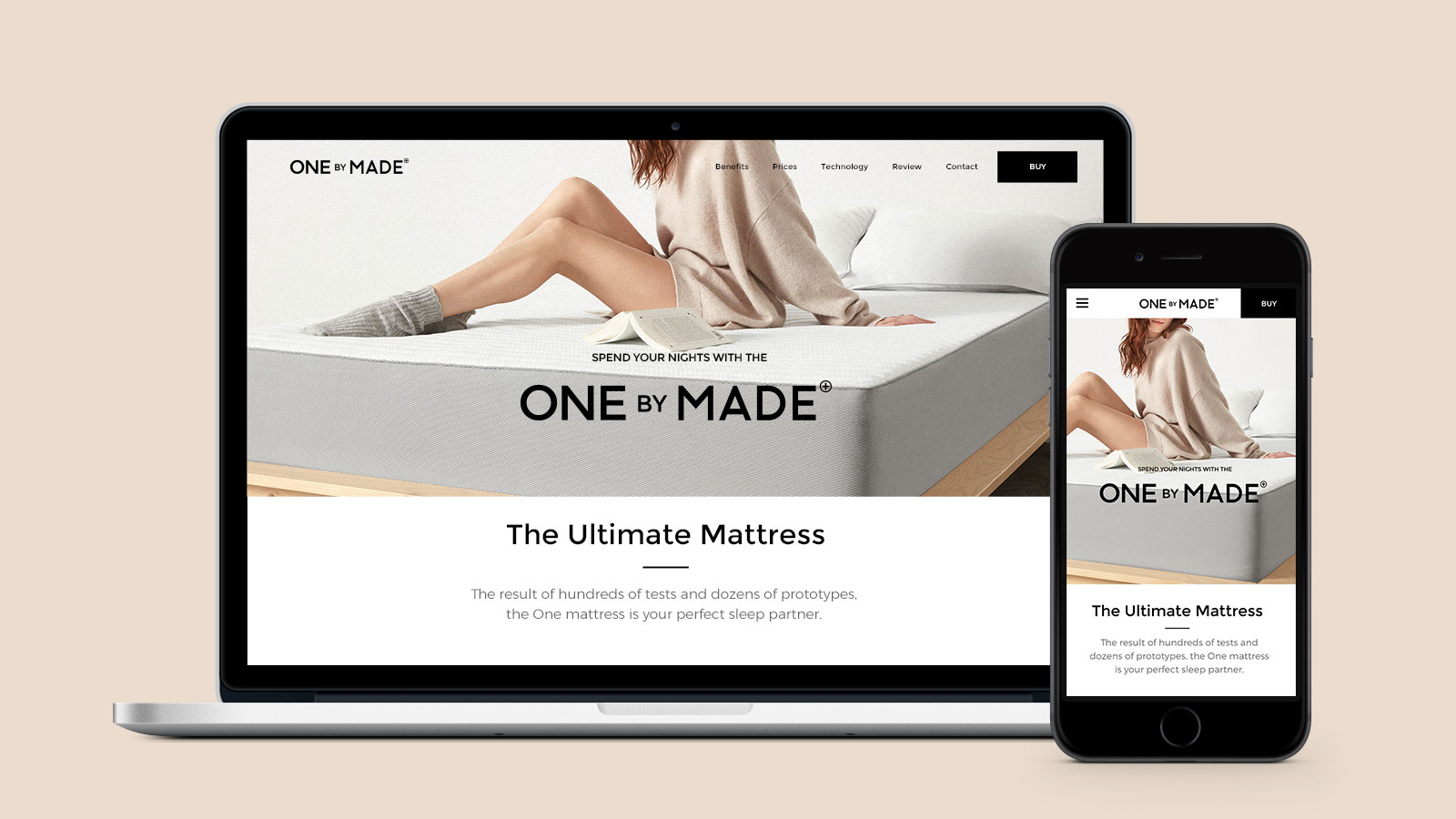
19. Made.com
Why it stands out on mobile:
- Scroll-triggered animations enhance storytelling
- Clear CTA buttons and sticky navigation
- Shoppable room imagery for contextual browsing
A stylish site combining function and beauty, perfect for mobile shoppers seeking home inspiration.
20. Our Place
Mobile UX highlights:
- Immersive product visuals with pinch-to-zoom
- Sticky “Add to Cart” bar on product pages
- Integrated recipe content for lifestyle branding
Converts cooking enthusiasts with warm design and seamless mobile shopping.
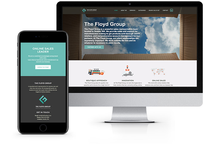
21. Floyd
| Mobile Strengths | Description |
|---|---|
| Modular Customization | Swipe to explore colors and fabrics |
| Collapsible Info Panels | Delivery, materials, and warranty details |
| Large Tap Targets | Easy navigation and selection |
Minimalism and modularity meet mobile ease of use.
22. Caraway
Key mobile features:
- Interactive homepage sliders
- Mobile-friendly personalization quizzes
- Fast-loading lightweight animations
A kitchenware site that’s sleek, personal, and performant on mobile.
23. Brooklinen
Why mobile users love it:
- Swipeable bundles and upsells
- Sticky cart bar for fast checkout
- Customer reviews easily accessible
Mobile shopping made cozy and convenient for home linens.
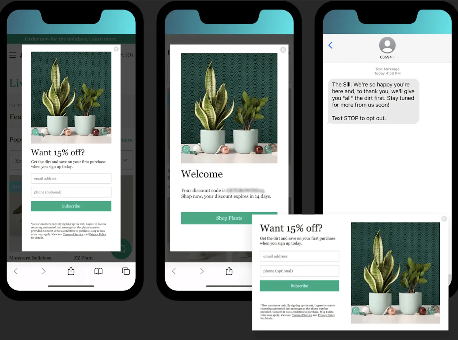
24. The Sill
Mobile highlights:
- Mobile-first navigation with care guides
- Collapsible FAQs and tips
- Personalized plant quizzes
Takes the intimidation out of buying plants on small screens.
Tech & Gadgets
25. Nothing
Mobile strengths:
- Futuristic minimalist interface with motion effects
- Scrollable, readable product specs
- Early surfacing of key buying info
Innovative tech meets elegant mobile storytelling.
26. Moment
Highlights:
- Swipeable, media-rich PDPs
- In-app-like experience with fast transitions
- Built-in guides and tutorials
Educates while it sells—perfect for creative tech buyers.
27. Framework
| Feature | Benefit |
|---|---|
| Modular Product View | Detailed component info, easy to understand |
| Collapsible Specs | Mobile-friendly, less clutter |
| Clean CTA Layout | Focused buying path |
Makes complex tech accessible on mobile.
28. Zugu Case
Mobile highlights:
- Large product images with zoom
- Comparison charts optimized for mobile
- Icon-based navigation for quick scanning
Premium cases in a conversion-optimized mobile layout.
29. Nomad
Why it works on mobile:
- Sleek dark theme and swipeable galleries
- Sticky add-to-cart buttons
- Location-aware shipping/pricing info
Luxury tech accessories designed for small screens.

30. Pela Case
Mobile highlights:
- Embedded educational content on sustainability
- Streamlined product selection and checkout
- Eco-friendly design elements
Aligns mobile UX with brand mission flawlessly.
Niche & Emerging Brands
31. Mahabis
Why it stands out on mobile:
- Popup offers like “10% off first order” appear contextually
- Clear gender categories with large tap areas
- Sticky sustainability messages reinforce brand values
Simple, clean, and conversion-focused mobile shopping for slippers.
32. Hiut Denim
Mobile highlights:
- Removed background clutter for faster load times
- Enlarged CTAs for thumb-friendly navigation
- Minimalistic product pages with easy browsing
Effortless mobile shopping experience for high-quality denim.

33. Skinny Ties
Key mobile features:
- Responsive grid layout without scrolling glitches
- Full-width product images optimized for mobile
- Clear category filters
Classic tie shopping made sleek and simple on mobile.
34. Groove Life
Mobile UX strengths:
- Clean design focused on product visuals
- Fast navigation and checkout flows
- High-resolution images load quickly
Adventure-ready accessories with a smooth mobile interface.
35. Primary
Why it works on mobile:
- Colorful, kid-friendly UI with easy age-based filtering
- Simple menu with quick access to categories
- Smooth mobile checkout process
Mobile-first design perfect for children’s basics.
36. QiQi Haircare
Mobile highlights:
- Minimal animations that don’t slow performance
- Horizontal scrolling product sections
- Clear before-after images optimized for mobile screens
Haircare brand with an engaging and fast mobile shopping site.
How Responsive Design Impacts Conversions
In today’s mobile-first world, a responsive eCommerce site is not just a nice-to-have—it’s essential for increasing sales and retaining customers. Here’s how responsive design directly boosts conversions:
- Improved User Experience (UX): Responsive sites adapt seamlessly to all screen sizes, ensuring users can easily navigate, find products, and complete purchases without frustration. A smooth UX reduces bounce rates and cart abandonment.
- Faster Loading Times: Mobile users expect quick access. Responsive design often incorporates optimized images, adaptive content, and efficient code, which all help pages load faster, an important ranking factor for Google and a critical element for keeping users engaged.
- Enhanced Accessibility: Mobile-responsive sites accommodate various devices and assistive technologies, making shopping easier for all users and broadening your audience.
- Higher SEO Rankings: Google prioritizes mobile-friendly websites in search results, meaning responsive sites get more organic traffic, which can translate to more conversions.
- Consistent Brand Experience: A cohesive look and feel across devices builds trust and encourages customers to complete their purchases.
- Optimized Checkout Flows: Responsive checkouts with clear CTAs and minimal form fields reduce friction, helping users finalize their orders swiftly.
Best Practices & Tips for Responsive eCommerce Sites
To maximize the benefits of responsive design, consider these actionable best practices:
- Mobile-First Design: Start designing for the smallest screens to ensure essential elements fit perfectly, then progressively enhance for larger devices.
- Prioritize Speed: Compress images, leverage lazy loading, and minimize JavaScript to keep loading times under three seconds.
- Simplify Navigation: Use hamburger menus, sticky headers, and intuitive filters to help users find products quickly on small screens.
- Optimize Tap Targets: Buttons and links should be large enough for easy tapping without accidental clicks (at least 44x44 pixels).
- Use Adaptive Images: Serve different image sizes based on device resolution to improve load times without sacrificing quality.
- Ensure Readable Fonts: Use font sizes and line heights that are legible without zooming.
- Implement Clear CTAs: Make calls-to-action prominent and reachable within thumb zones.
- Test Across Devices: Regularly test your site on multiple devices and browsers to catch and fix layout or functionality issues.
- Leverage Contextual Popups: Tools like Popupsmart can display personalized offers or guidance based on user behavior, enhancing engagement without intruding on the shopping experience.
- Accessibility Compliance: Follow WCAG guidelines to make your site usable for people with disabilities.
Frequently Asked Questions (FAQ)
Q1: What exactly is a responsive eCommerce website? A responsive eCommerce website automatically adjusts its layout, images, and functionality to fit different screen sizes and devices, ensuring a seamless shopping experience whether users browse on a phone, tablet, or desktop.
Q2: Why is mobile responsiveness crucial in 2025? With over half of global web traffic coming from mobile devices, responsive design ensures accessibility, faster load times, and higher user satisfaction, directly impacting sales and SEO rankings.
Q3: How does responsive design improve SEO? Google’s algorithms prioritize mobile-friendly websites in search rankings. Responsive sites avoid duplicate content issues by using a single URL and adapt to user devices, improving crawl efficiency and indexing.
Q4: Can responsive design reduce cart abandonment? Yes. Responsive sites offer smoother navigation, faster loading, and simpler checkout processes on mobile devices, which reduce user frustration and drop-offs at payment stages.
Q5: How can tools like Popupsmart enhance a responsive eCommerce site? Popupsmart enables context-aware popups, such as personalized discount offers or exit-intent messages, that are optimized for mobile users, boosting engagement and conversions without disrupting UX.
Conclusion
Creating a truly responsive eCommerce site is no longer optional, it’s a business imperative. By prioritizing mobile-first design, fast loading speeds, intuitive navigation, and accessibility, brands can deliver exceptional user experiences that drive higher conversions and build lasting customer loyalty. Leveraging best practices and tools like Popupsmart’s contextual popups can further enhance engagement, ensuring your eCommerce platform stays competitive in today’s mobile-driven market.
By showcasing 36 real-world, mobile-optimized brands across industries, this guide has highlighted practical examples of responsive design excellence you can draw inspiration from. Now, it’s time to apply these insights and make your own eCommerce site a mobile success story.
How would you rate your experience with this article? 😊