24 Best Ecommerce Landing Page Examples for 2026
An ecommerce landing page is a focused campaign page designed to drive a specific action (buy, subscribe, sign up) with minimal distractions, often reached via ads or promos. The text shares 24 examples and key best practices, metrics, and how it differs from product pages.
Landing pages are super important for any online shop. They're like your store's front window, helping to show off what you're selling, pull in more customers, and boost sales.
The best ecommerce landing page examples strip away distractions and focus every pixel on one conversion goal. These 24 examples from brands across food, fashion, electronics, and wellness show which design choices, copy strategies, and layout principles drive purchases. Each breakdown covers what works, why it works, and a takeaway you can apply today.
What Makes a Great Ecommerce Landing Page Example
I reviewed over 80 landing pages across 12 industries and narrowed this list to 24 based on four criteria:
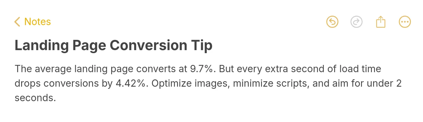
• Single conversion focus: The page drives visitors toward one primary action. Pages with competing CTAs or full navigation menus got cut, because split attention kills conversions. According to Growth Marketing Pro, the average landing page conversion rate is 9.7%, and pages with a single CTA consistently outperform multi-CTA variants.
• Visual-first storytelling: The product or offer is shown, not just described. I checked whether each page used lifestyle photography, product demos, or video within the first viewport scroll.
• Trust architecture: Reviews, press mentions, guarantees, or social proof appear before the fold or within one scroll. Pages relying purely on copy with no external validation didn't make the cut.
• Message-to-ad match: For paid traffic pages, I verified that the headline matched the ad copy promise. According to Email Vendor Selection, 67% of marketers achieve conversion rates over 10% on their landing pages, and message match is a consistent factor among top performers.
Overview of All 24 Ecommerce Landing Page Examples
| # | Brand | Category | Key Strength |
|---|---|---|---|
| 1 | st33p | Product-Focused | Subscription clarity with benefit-led copy |
| 2 | Nuka | Product-Focused | Dual CTA strategy with trust badges |
| 3 | Somvai | Product-Focused | Narrative flow ending at CTA |
| 4 | Seedlip | Product-Focused | Category-defining positioning above fold |
| 5 | KNOB | Product-Focused | Pre-order anticipation with deep spec details |
| 6 | Miracle Made | Product-Focused | Risk-reversal with 30-night trial |
| 7 | Bruvi | Subscription | Step-by-step subscription onboarding |
| 8 | Rebecca Minkoff | Promotional | Thematic product segmentation |
| 9 | Kylie Cosmetics | Promotional | New product launch with gift incentive |
| 10 | Press | Subscription | Interactive calorie calculator as lead-in |
| 11 | BOXYCHARM | Subscription | Brand partnership proof for subscriber trust |
| 12 | Taylor Stitch | Promotional | Email capture gated by discount |
| 13 | Allbirds | Promotional | Sustainability story as conversion driver |
| 14 | Taza Chocolate | Experience-Driven | Virtual tasting kits bridging digital and physical |
| 15 | Skullcandy | Product-Focused | Category navigation with promotional banners |
| 16 | OLIPOP | Product-Focused | Direct competitor comparison as positioning |
| 17 | Tkees | Collection | Clean layout with collection storytelling |
| 18 | Hamama | Product-Focused | Press mentions as credibility anchors |
| 19 | Lyre's | Seasonal | Holiday promo with ambassador personalization |
| 20 | No Cow | Product-Focused | Star ratings displayed inline with products |
| 21 | Package Free | Subscription | Subscribe-and-save model with clear savings |
| 22 | The Body Shop | Subscription | Loyalty program integration with subscription |
| 23 | The Body Shop | Targeted Audience | Niche audience targeting with exclusive discount |
| 24 | Pottery Barn | Collaboration | Designer collaboration with seasonal storytelling |
Product-Focused Ecommerce Landing Page Examples
Product-focused pages put a single product (or tight product line) at center stage. They work best for paid traffic campaigns where the visitor already knows what they want. The goal: remove every reason not to buy. According to Genesys Growth, the median landing page conversion rate across all industries sits at 6.6%, but product-focused pages with strong benefit copy and social proof regularly beat that benchmark.
1. st33p: Subscription Clarity Through Benefit-Led Copy
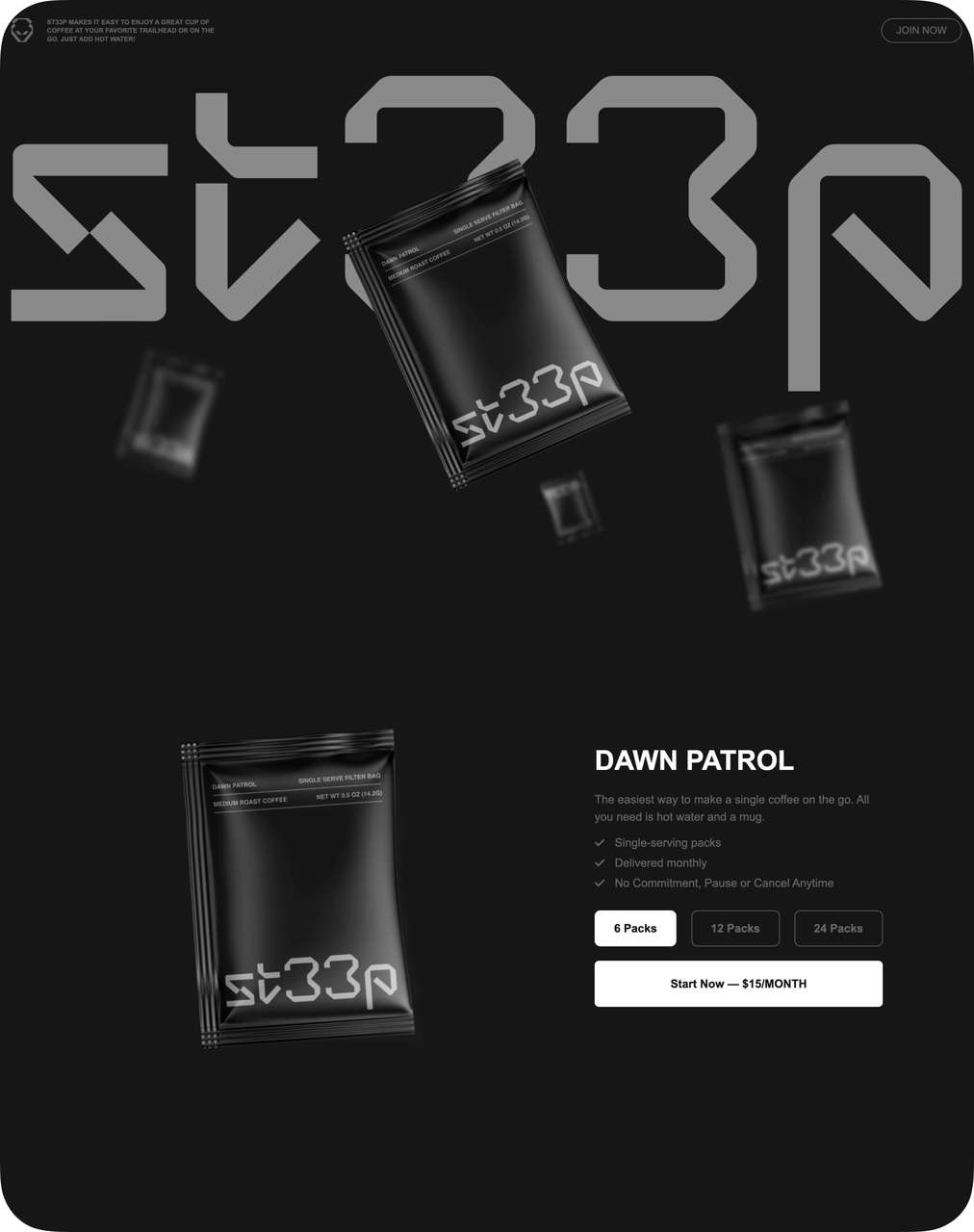
st33p hero section with benefit-led headline
What works: st33p opens with three benefit bullets visible without scrolling: single-serving packs, monthly delivery, and no commitment. The pricing is embedded directly in the CTA button rather than hidden on a separate page. This is a subscription product, yet the page never feels like it's locking you in.
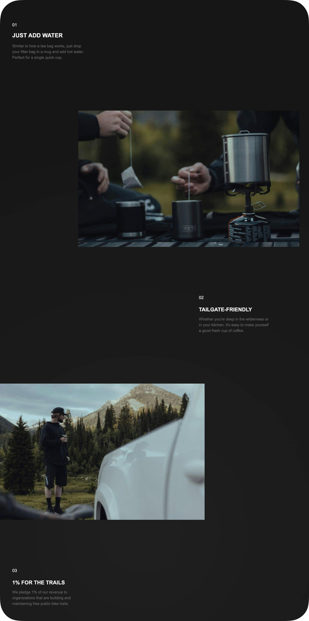
Product in use with lifestyle imagery
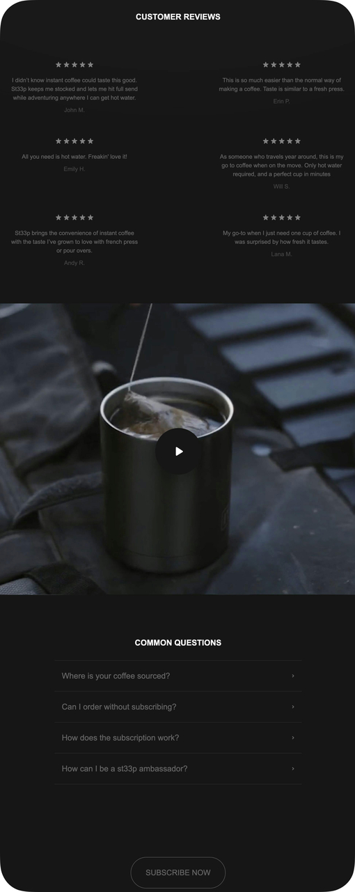
FAQ and social proof below the fold
Why it works: The Zeigarnik Effect explains why listing benefits as a sequence (step 1, step 2, step 3) keeps visitors reading. People feel compelled to complete a sequence once started. The FAQ section at the bottom addresses objections before the visitor even formulates them, reducing cognitive friction at the decision point.
Key takeaway: Put your pricing inside the CTA button itself. "Start at $15/month" converts better than a generic "Subscribe Now" because it pre-qualifies the visitor and removes a click.
2. Nuka: Dual CTA Strategy With Trust Badges
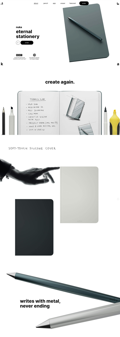
Nuka's dual-CTA hero section
What works: Nuka presents two CTAs side by side: "Watch Video" and "Order Now." The video CTA serves visitors who aren't ready to commit, while the order button captures those who are. The page shows a real daily planner filled with handwriting, so you can visualize using the notebook yourself. Award badges and media mentions (from recognizable publications) sit just below the fold.
Why it works: This applies the Fogg Behavior Model: motivation (trust badges) + ability (two easy paths) + trigger (prominent CTAs) must converge at the same moment. By offering a low-commitment path (video) alongside the purchase path, Nuka catches visitors at different stages of readiness without forcing a binary yes/no decision.
Key takeaway: Give undecided visitors a secondary CTA like "Watch Demo" or "See How It Works" next to your buy button. You'll capture leads who would otherwise bounce.
3. Somvai: Narrative Scroll That Ends at the Buy Button
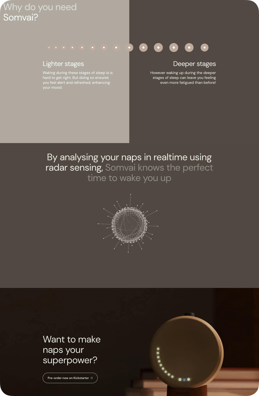
Somvai product page with feature explanation
What works: Somvai structures the entire page as a story arc: problem (bad naps) → solution (radar-sensing alarm) → proof (how it works technically) → action (pre-order). The "Pre-order now" button repeats three times at natural stopping points, so the CTA is always within reach no matter where the visitor pauses.
Why it works: This follows the persuasion architecture of long-form sales pages, but compressed into a visual scroll. The repeated CTA uses the mere exposure effect: seeing the same button multiple times increases familiarity and reduces perceived risk. Each repetition follows a new piece of evidence, so the visitor's conviction builds with each scroll.
Key takeaway: Repeat your CTA after every major proof point on the page. Three placements is the minimum for pages longer than two scrolls.
4. Seedlip: Category-Defining Positioning Above the Fold
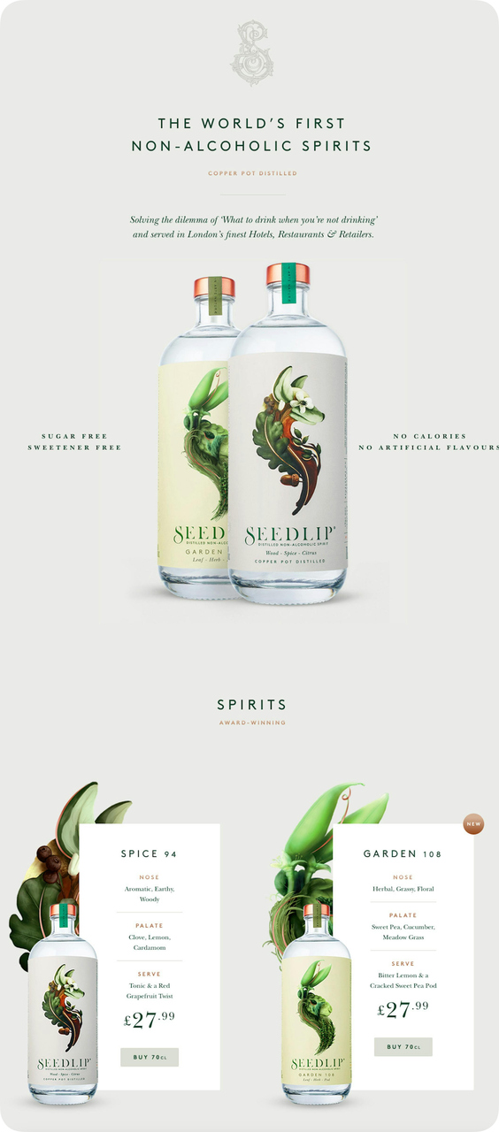
Seedlip product lineup with health attributes
What works: "The world's first non-alcoholic spirits" sits at the very top. That's not a tagline; it's a category claim. Below the bottles, icons spell out "sugar-free" and "no calories" without cluttering the visual. Each bottle variant has its own "Buy" button, keeping the path from browsing to purchasing to a single click.
Why it works: Positioning theory (Ries and Trout) says the brand that defines a category owns it. Seedlip doesn't compete with gin on taste; it creates a new mental category. The health-attribute icons function as information scent markers that let visitors confirm this product matches their intent within two seconds of landing.
Key takeaway: If your product creates or leads a category, state that claim in the first line. Let the visitor's brain file you as "the original" before competitors enter the consideration set.
5. KNOB: Pre-Order Anticipation With Deep Technical Specs
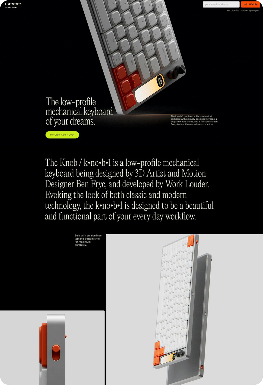
KNOB keyboard hero with pre-order CTA
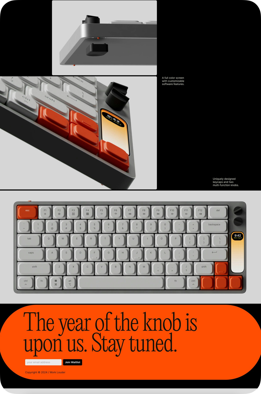
Technical deep-dive builds anticipation
What works: KNOB dedicates the entire page to one product: a mechanical keyboard. The design specs get the same visual treatment as the product photos, with close-up renders of switch mechanisms and build materials. The pre-order CTA uses anticipation language ("Be the first") instead of generic "Buy Now" copy.
Why it works: For technical products, purchase confidence comes from understanding how the product is made. This page borrows from the Kickstarter playbook: show the engineering, explain the design decisions, and let the product's craftsmanship sell itself. The scarcity signal ("Pre-Order") adds urgency without resorting to fake countdown timers.
Key takeaway: For pre-launch products, replace "Buy Now" with "Pre-Order" or "Reserve Yours" and explain the engineering behind the product. Technical buyers need specs, not just photos.
6. Miracle Made: Risk-Reversal With 30-Night Trial
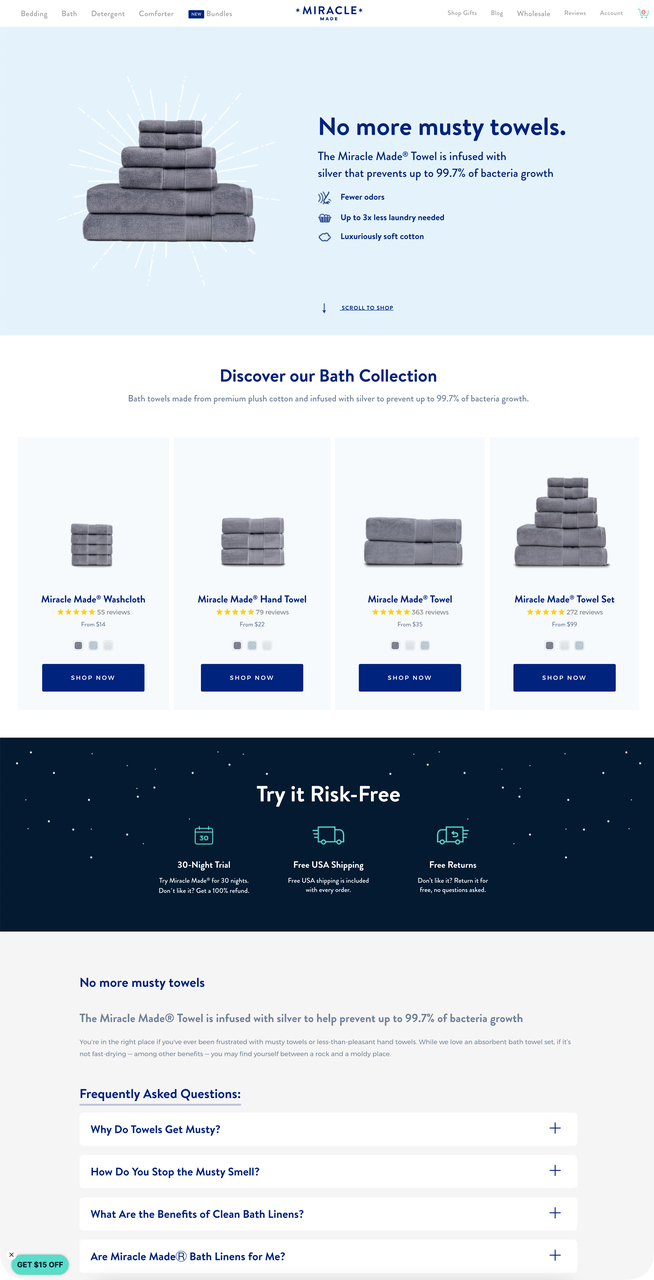
Miracle Made risk-reversal section with reviews
What works: Miracle Made's landing page stacks four conversion triggers: benefit bullets ("No more musty towels," "Up to 3x less laundry needed"), a 30-night trial guarantee, free returns, and a review carousel. Each product variant shows its own star rating and "SHOP NOW" button. The FAQ section handles specific objections about fabric care and durability.
Why it works: Risk-reversal theory (Cialdini) shows that removing downside risk increases perceived value without changing the product. The 30-night trial does the heavy lifting here. It transforms the decision from "Should I buy these towels?" to "Should I try these towels for free?" That reframing shifts the visitor from evaluation mode to commitment mode.
Key takeaway: Add a trial period or money-back guarantee directly next to your CTA. The guarantee reduces perceived risk more than any amount of benefit copy.
7. Skullcandy: Category Navigation With Promotional Banners
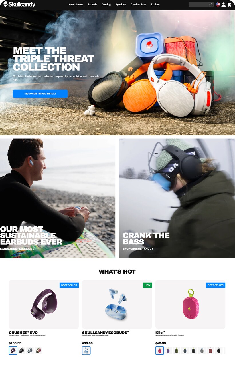
Skullcandy product grid with promotional tags
What works: Skullcandy uses "Best Seller" and "New" tags on product cards, creating visual hierarchy within the grid. The category nav bar (Headphones, Earbuds, Gaming) lets visitors self-segment within the same landing page. Promotional banners with specific price points ("Starting at $49.99") set expectations before the click.
Why it works: The Von Restorff effect (isolation effect) explains why tagged products get disproportionate attention. In a grid of similar items, the one with a "Best Seller" badge stands out and draws clicks. The category navigation follows the progressive disclosure principle, letting visitors drill into their interest without leaving the page.
Key takeaway: Tag your top 2-3 products with "Best Seller" or "Most Popular" badges. Social proof at the product-card level drives clicks more than badges on a detail page.
8. OLIPOP: Direct Competitor Comparison as Positioning
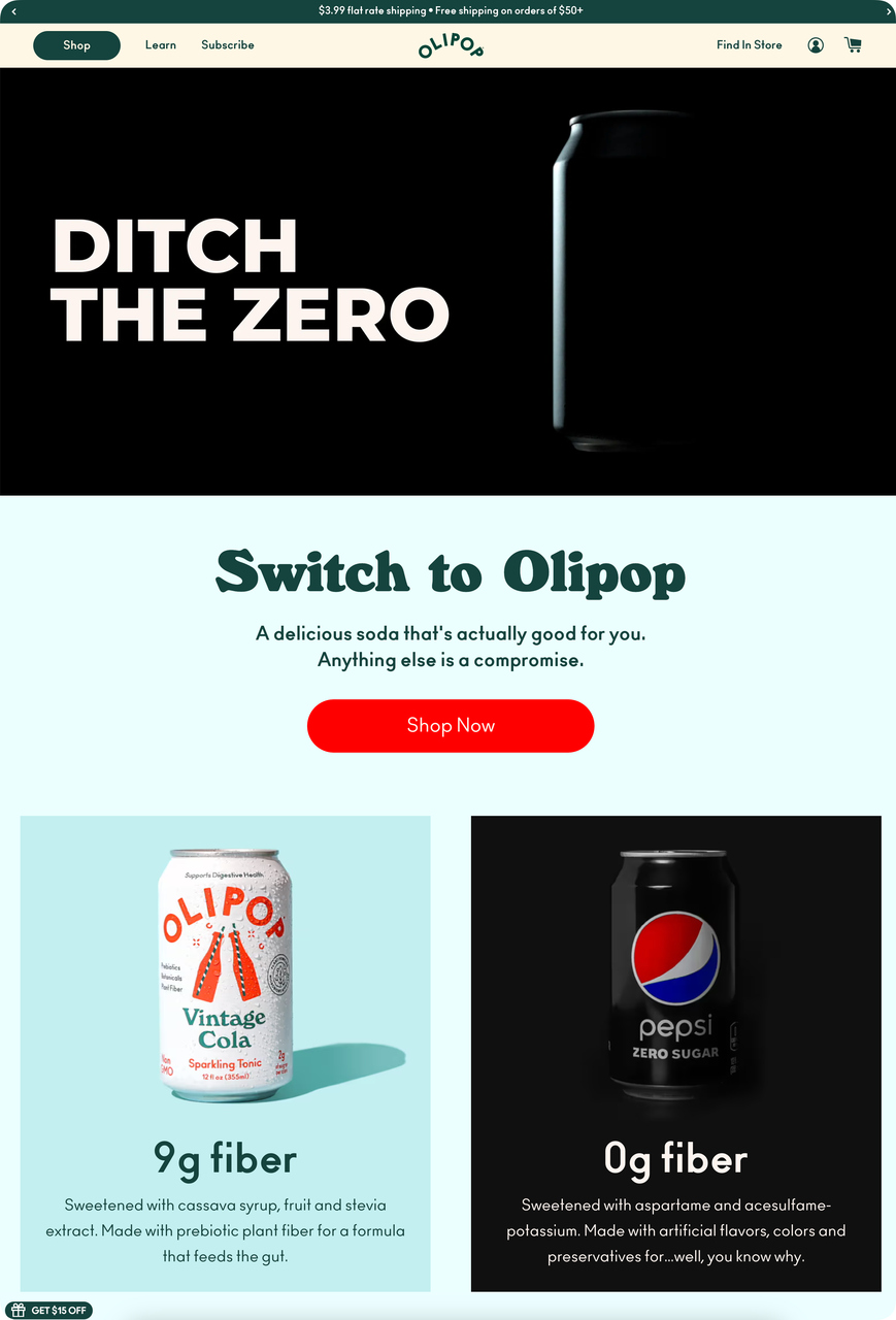
OLIPOP's head-to-head comparison layout
What works: OLIPOP directly compares itself to Pepsi Zero Sugar on the landing page, listing "9g fiber" and "sweetened with cassava syrup" as differentiators. The "Ditch The Zero" headline is confrontational. A single "Shop Now" button follows immediately after the comparison, so the visitor acts while the contrast is fresh.
Why it works: Comparative advertising works when the challenger brand is lesser-known. OLIPOP borrows Pepsi's brand awareness to define itself by contrast. The framing effect ensures visitors process OLIPOP's benefits relative to what they already drink, making the switch feel like an upgrade rather than a gamble.
Key takeaway: If you're a challenger brand, compare yourself directly to the market leader on your landing page. Name them. Show the nutritional or feature gap. Visitors respect brands bold enough to draw a direct line.
9. Hamama: Press Mentions as Credibility Anchors
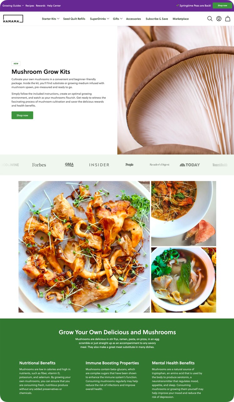
Hamama product page with media credibility bar
What works: Hamama places press logos (Forbes, Insider) in a horizontal bar just below the hero image. The product images show mushrooms at three growth stages plus finished dishes, so the visitor sees the entire journey from kit to plate. A "Shop now" button anchors each section.
Why it works: Authority transfer is the principle at play. When a visitor sees Forbes and Insider logos, their trust in those publications transfers to Hamama. The before-during-after image sequence applies the mental simulation technique: visitors who can picture themselves using a product are 2-3x more likely to purchase than those who only see the final result.
Key takeaway: Show your product's journey from unboxing to final result. If you've earned any press mentions, place the logos above the fold as a horizontal trust bar.
10. No Cow: Inline Star Ratings on Product Cards
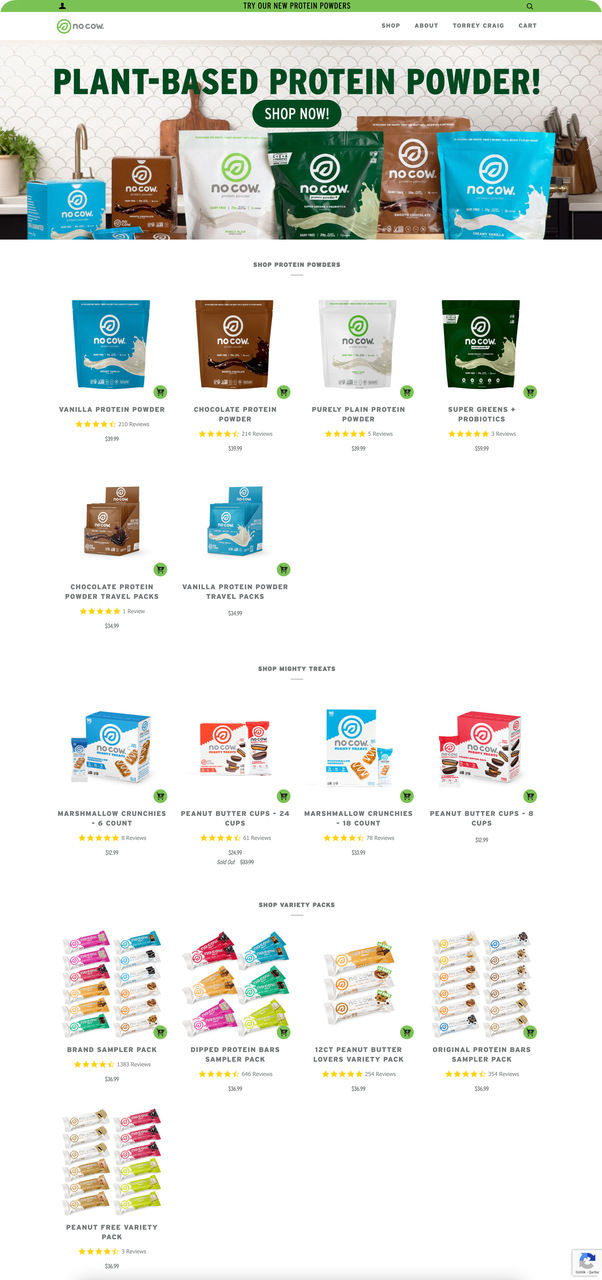
No Cow product grid with review stars
What works: Every product card on No Cow's page shows its star rating directly below the product image. Category links (Protein Powders, Mighty Treats, Variety Packs) let visitors filter without leaving. Bulk purchase discounts are highlighted with badges, encouraging larger orders.
Why it works: The bandwagon effect drives action when visitors see that hundreds or thousands of others have already reviewed a product. Placing ratings at the card level (before the detail page) means social proof influences the browsing decision, not just the purchase decision. Visitors click into products that already feel validated.
Key takeaway: Display star ratings on your product cards, not just product detail pages. Visitors who see 4.5+ stars at the browsing stage click through at higher rates.
Subscription and Recurring Revenue Landing Page Examples
Subscription pages face a harder sell than one-time purchase pages. The visitor isn't just buying a product; they're committing to a relationship. These examples show how top brands reduce that commitment anxiety with transparency, savings math, and step-by-step onboarding flows.
11. Bruvi: Step-by-Step Subscription Onboarding
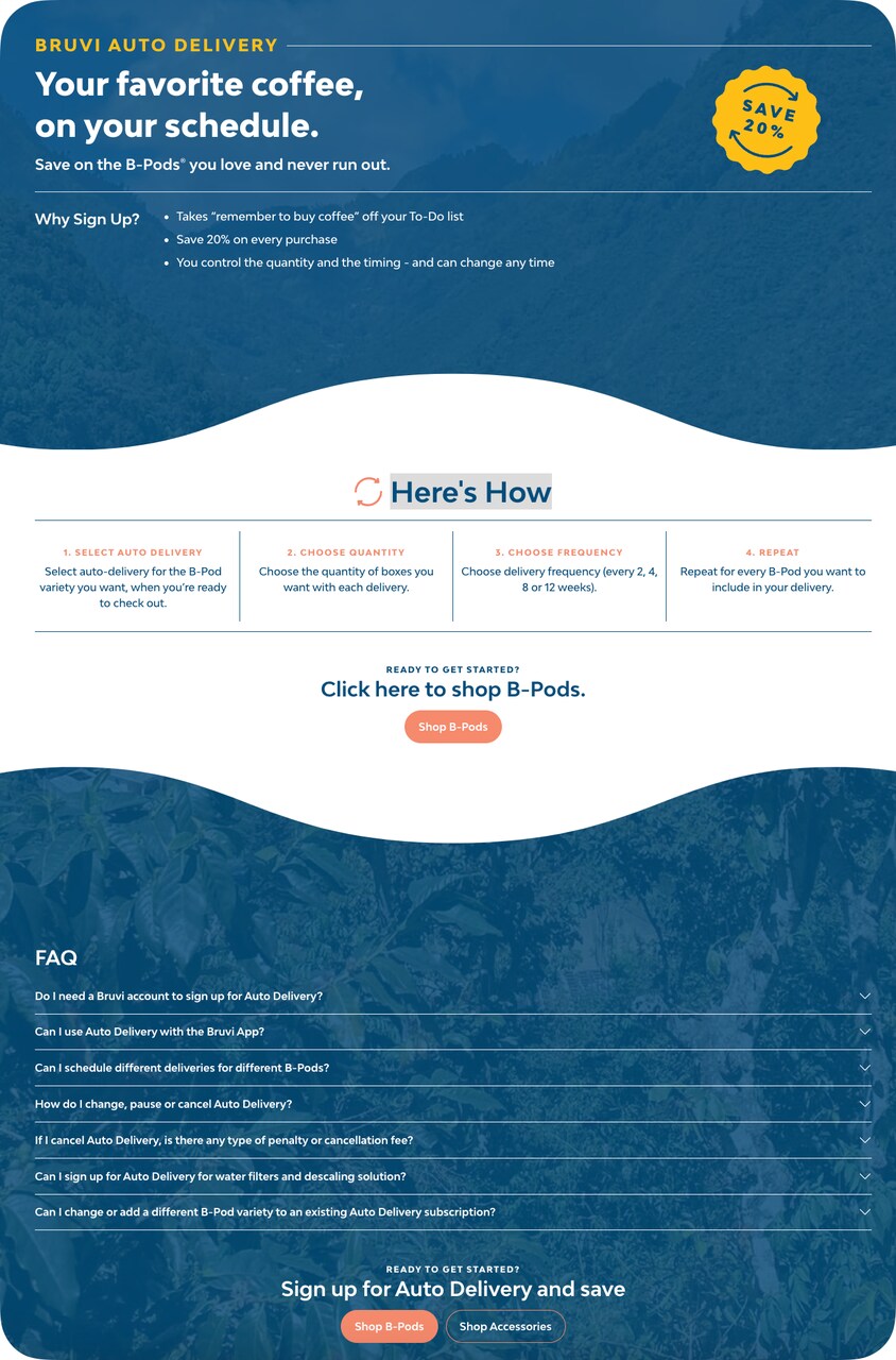
Bruvi subscription flow with savings callout
What works: Bruvi leads with the savings ("Save 20%") and then walks through the subscription in three visual steps. The FAQ section sits at the bottom, addressing cancellation concerns head-on. There's no general site navigation; every element on the page serves the subscription conversion.
Why it works: The processing fluency principle says that things perceived as easy feel more trustworthy. Bruvi's three-step visual breakdown makes subscribing look simpler than a one-time purchase. By explaining the process before asking for commitment, they reduce the unknown. The FAQ acts as an objection-handling layer that catches visitors about to leave.
Key takeaway: Break your subscription into 3 visible steps and show them on the landing page. "Choose → Schedule → Save" is easier to commit to than a single "Subscribe" button with no explanation.
12. Press: Interactive Calculator as a Conversion Tool
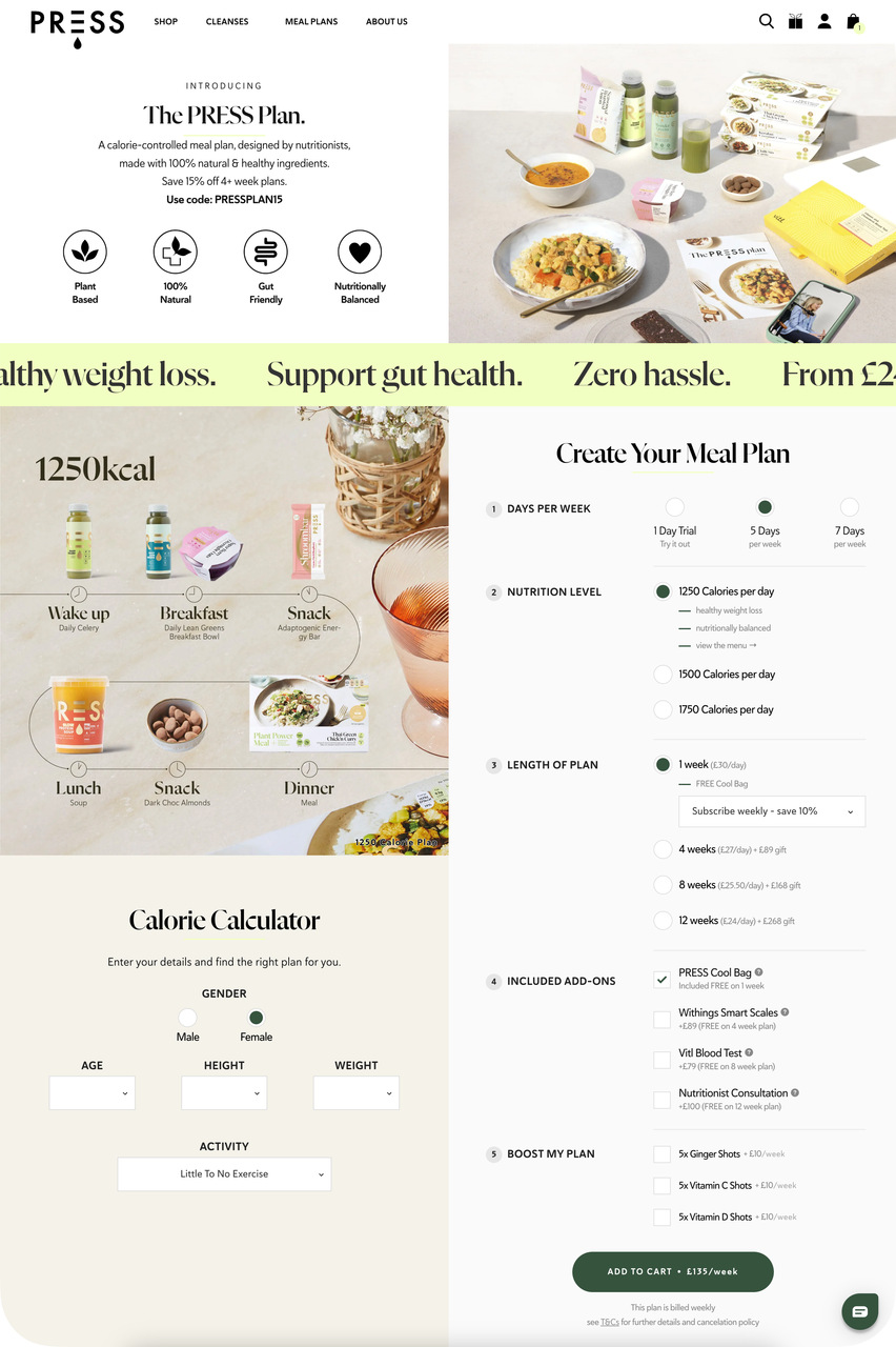
Press meal plan page with interactive calculator
What works: Press embeds a calorie calculator directly on the landing page. Visitors input their details, get a personalized recommendation, and then see matching meal plans with "Add to Cart" buttons. The "How it Works" section follows a logical top-to-bottom sequence.
Why it works: The IKEA effect (people value things they helped create) kicks in when visitors use the calculator. By investing effort into personalized input, visitors become psychologically committed to the output. The personalized recommendation also increases relevance, matching the right plan to the right visitor.
Key takeaway: Add an interactive element (quiz, calculator, or configurator) to your subscription page. Visitors who interact before buying feel ownership of their selection and convert at higher rates.
13. BOXYCHARM: Brand Partnerships as Subscriber Trust Signals
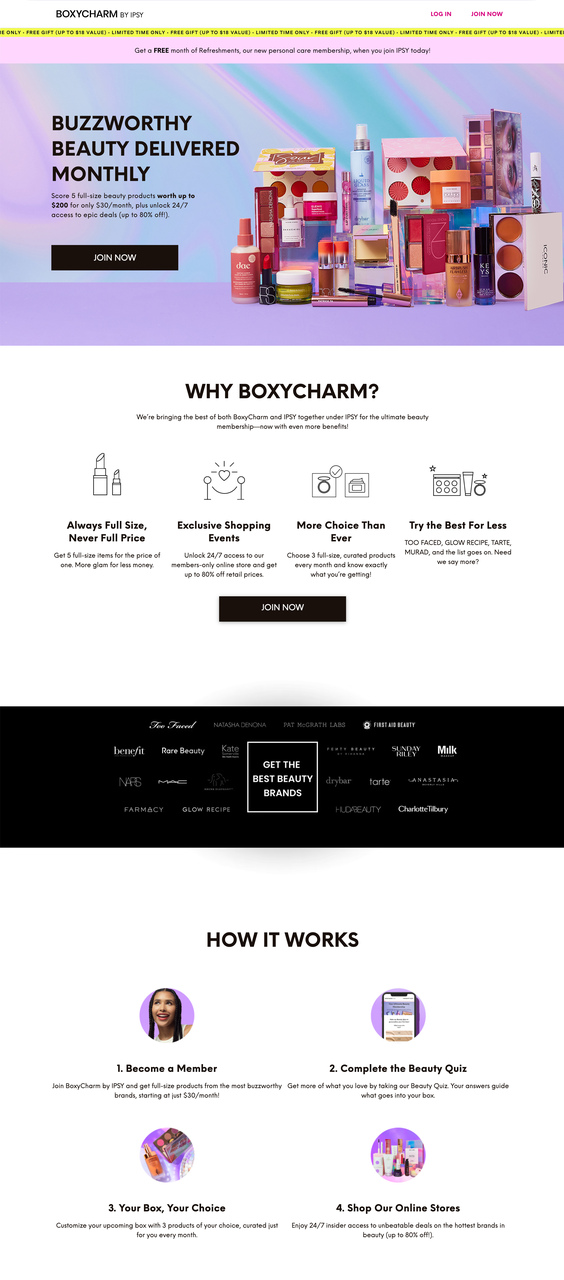
BOXYCHARM subscription page with brand proof
What works: BOXYCHARM displays well-known beauty brand logos (the brands included in the box) prominently on the page. The "WHY BOXYCHARM?" section lists tangible benefits: exclusive shopping events, full-size products (not samples), and member perks. The "How It Works" breakdown covers membership from sign-up to delivery.
Why it works: Association principle (Cialdini's sixth principle of influence) means that BOXYCHARM inherits perceived quality from the brands it features. When visitors see brands they already trust inside the box, the subscription itself feels premium. The explicit "full-size products" callout counters the common subscription box objection that you'll receive miniature samples.
Key takeaway: If your subscription includes products from known brands, feature their logos prominently. Brand association reduces the "what will I actually get?" uncertainty that kills subscription conversions.
14. Package Free: Subscribe-and-Save With Clear Savings Math
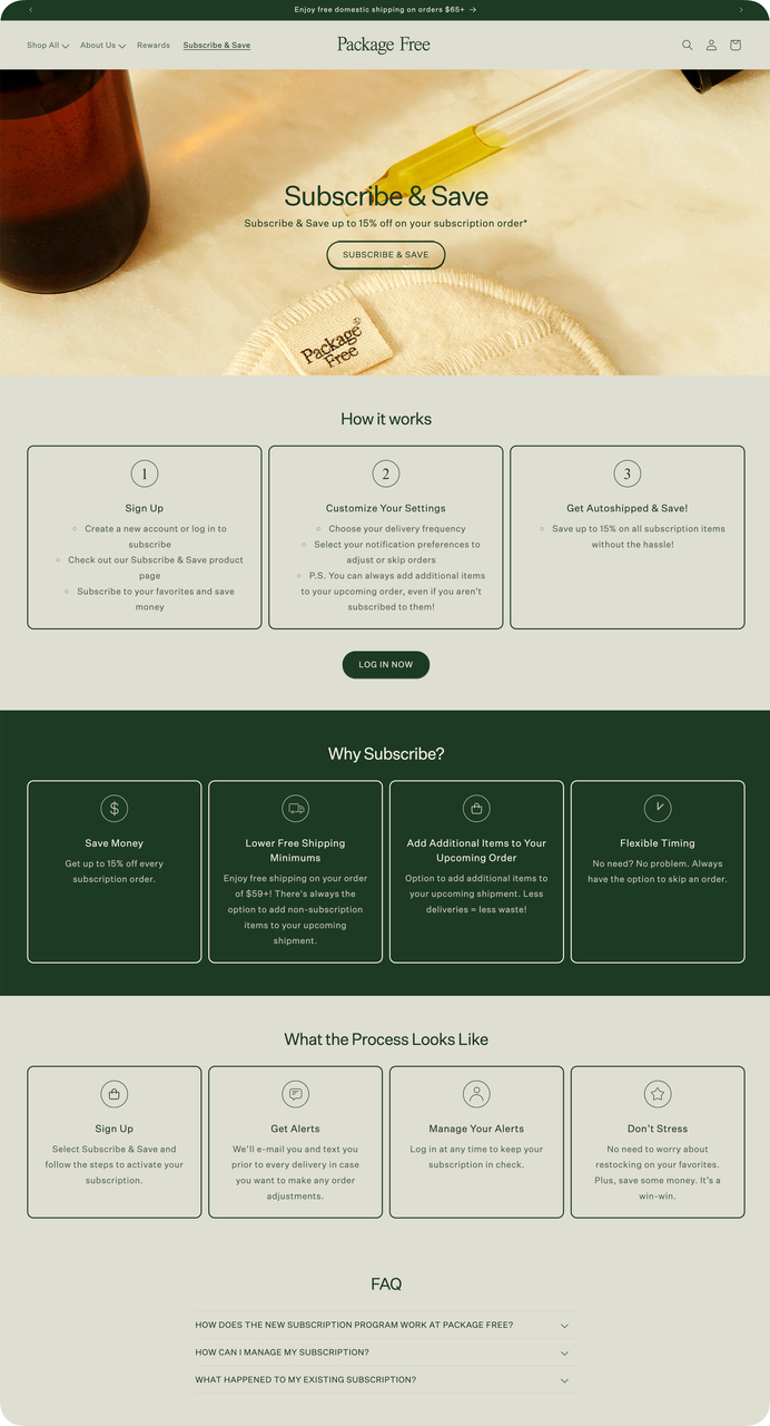
Package Free subscription model with savings
What works: Package Free leads with the financial benefit of subscribing, then explains the process: sign up, customize, auto-ship. The FAQ section addresses "Can I cancel anytime?" directly. A "Log in now" button for existing subscribers shows this isn't a one-way door.
Why it works: Loss aversion (Kahneman and Tversky) means people fear losing money more than they enjoy gaining products. By framing subscription as "saving money" rather than "spending monthly," Package Free taps into the visitor's desire to avoid waste. The "How it works" section applies the landing page best practice of reducing uncertainty through process transparency.
Key takeaway: Frame your subscription as a savings mechanism, not a spending commitment. "Save 15% on every order" works harder than "Subscribe for monthly delivery."
15. The Body Shop: Loyalty Integration With Subscription
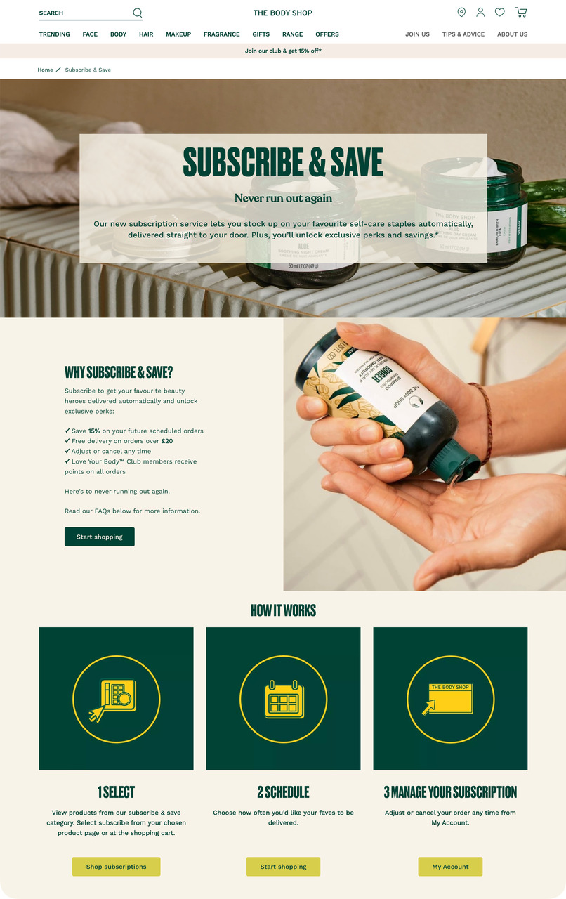
The Body Shop subscription with loyalty perks
What works: The Body Shop layers three incentives: 15% off scheduled orders, free delivery on orders over a threshold, and Love Your Body club member benefits. The page walks through "Select → Schedule → Manage" in a visual sequence. Multiple "Start shopping" CTAs appear at natural reading breaks.
Why it works: Stacking incentives uses the commitment and consistency principle. Once a visitor says "yes" to one benefit (the discount), agreeing to additional benefits (free shipping, loyalty points) feels consistent with that initial decision. The subscription management preview ("Manage Your Subscription") signals that The Body Shop doesn't want to trap you, which paradoxically increases customer loyalty.
Key takeaway: Stack your subscription with loyalty program perks. Visitors who see subscription + loyalty benefits together perceive more value than either offer alone.
Promotional and Seasonal Ecommerce Landing Page Examples
Promotional pages live and die by urgency. They're built for specific campaigns with a defined start and end, which means every element needs to reinforce the time-sensitive nature of the offer. According to Growth Marketing Pro, marketers see a 4.42% drop in conversion rates for every additional second of page load time, so these pages also tend to be stripped down for speed.
16. Rebecca Minkoff: Thematic Product Segmentation
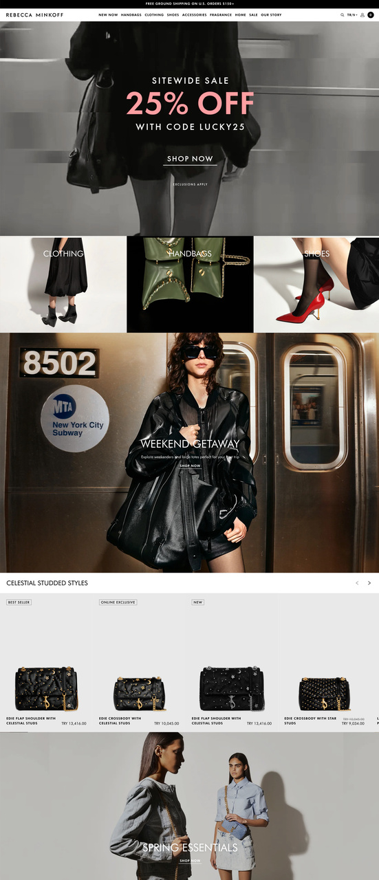
Rebecca Minkoff 25% off promotional layout
What works: Rebecca Minkoff opens with a bold 25% discount announcement and a specific promo code. Below, products are grouped into lifestyle themes ("Weekend Getaway," "Spring Essentials") rather than standard categories. "Best Seller" and "Online Exclusive" tags create hierarchy within the product grid.
Why it works: Thematic segmentation applies the narrative transport theory. Instead of browsing "Handbags" and "Shoes" (functional categories), visitors browse "Weekend Getaway" (an identity they aspire to). This emotional framing increases time on page and average order value because visitors buy the lifestyle, not individual items.
Key takeaway: During promotions, group products by lifestyle themes instead of standard categories. "Date Night Essentials" converts better than "Dresses + Accessories" because it tells a story.
17. Kylie Cosmetics: New Product Launch With Gift Incentive
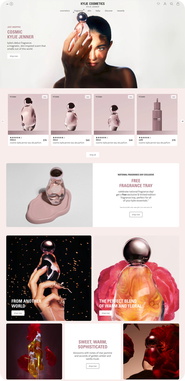
Kylie Cosmetics product launch with gift-with-purchase
What works: "Just Dropped: Cosmic Kylie Jenner" creates immediate newness. The page displays three size variants with pricing, and a free fragrance tray offer adds a gift-with-purchase incentive. Multiple "Shop Now" buttons appear throughout. High-production imagery reflects the brand's premium positioning.
Why it works: The novelty bias drives clicks on "Just Dropped" messaging. Humans are wired to pay attention to new things, and the brain's dopamine system activates more for novel stimuli than familiar ones. The gift-with-purchase uses the reciprocity principle: receiving something (even a tray) creates a subconscious obligation to complete the transaction.
Key takeaway: For product launches, add a free gift that complements the purchase. A fragrance tray with a perfume, a case with headphones. The gift tips hesitant buyers toward checkout.
18. Taylor Stitch: Email Capture Gated by Discount
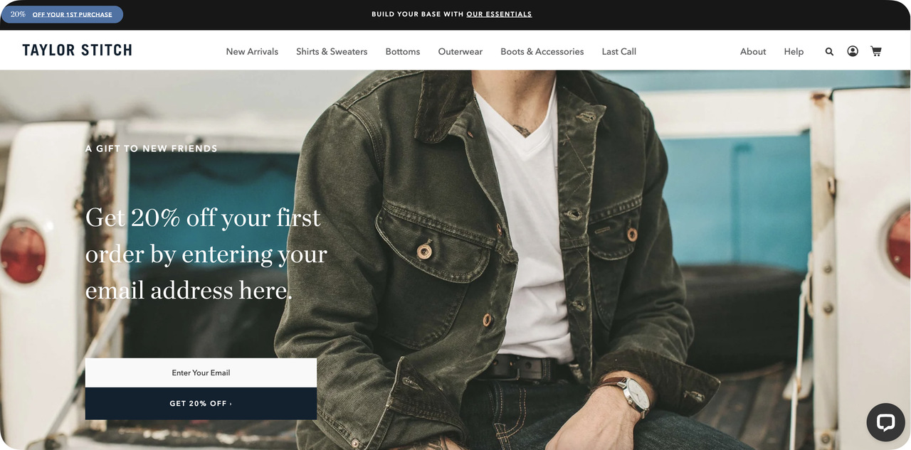
Taylor Stitch email-for-discount exchange
What works: Taylor Stitch leads with "Get 20% off your first order" tied directly to an email signup. The navigation bar still exists but takes a backseat to the discount offer. Category links (New Arrivals, Shirts & Sweaters) are present but don't compete with the primary email capture CTA.
Why it works: The endowment effect makes visitors value their discount more once they've "earned" it by providing their email. This page creates a Shopify-style landing page exchange: the visitor gives an email (low cost) and receives a 20% discount (high perceived value). The asymmetry of the exchange drives conversions.
Key takeaway: Gate your first-order discount behind an email signup, not a popup. Visitors who actively enter their email for a discount convert at higher rates than those who receive an unsolicited popup offer.
19. Allbirds: Sustainability Story as Conversion Driver
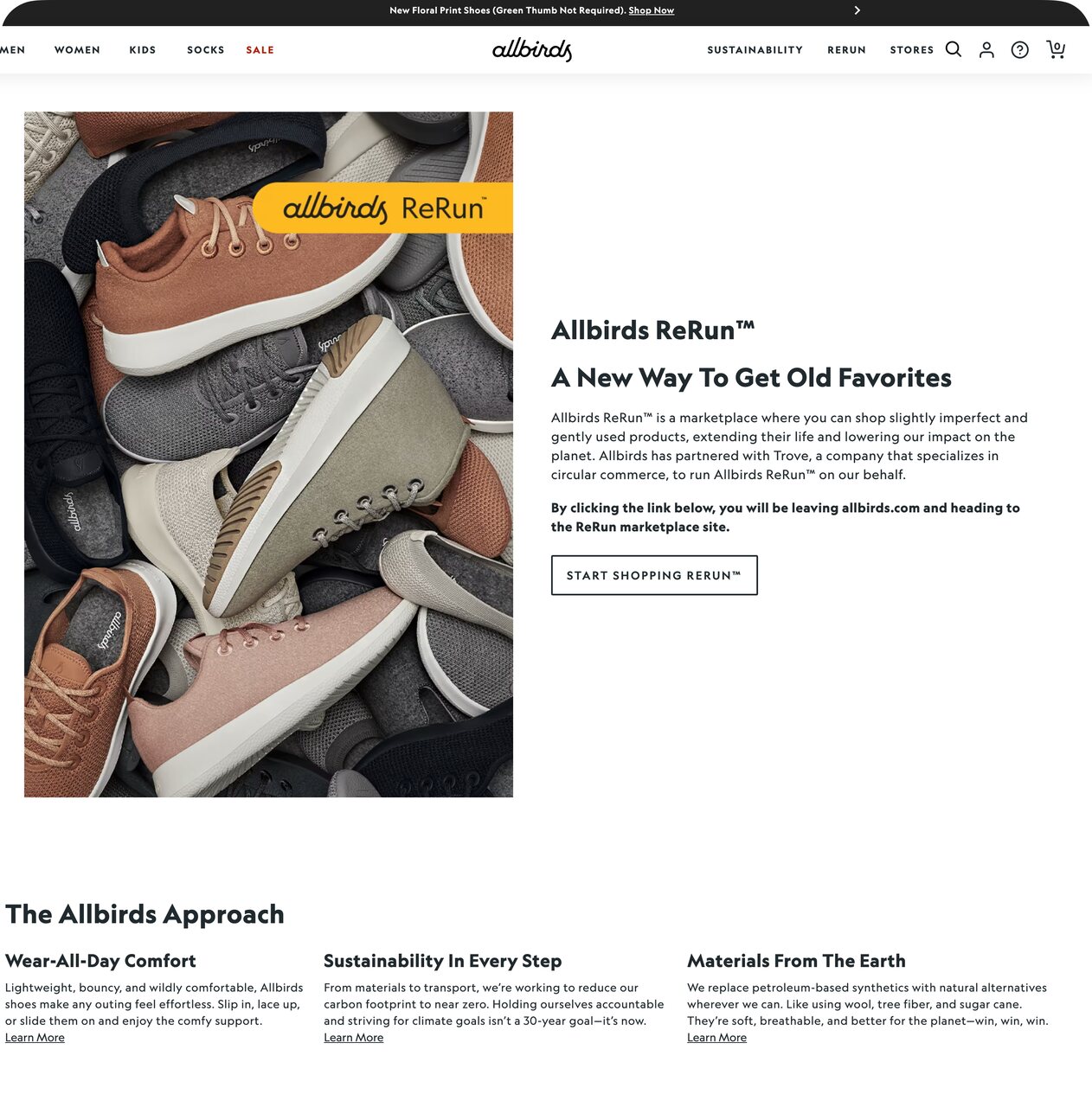
Allbirds sustainability-first messaging
What works: Allbirds leads with "START SHOPPING RERUN," framing secondhand shoes as a deliberate choice rather than a compromise. The page communicates sustainability benefits alongside product imagery, turning environmental consciousness into a purchase motivator.
Why it works: Identity signaling theory explains why sustainability messaging drives conversions for Allbirds' audience. Buying sustainable products lets visitors signal their values to themselves and others. The "ReRun" branding makes secondhand feel premium and intentional, removing the stigma that typically depresses resale conversion rates.
Key takeaway: If sustainability is part of your brand, position it as a premium feature, not a compromise. "ReRun" sounds better than "Used Shoes." The framing determines whether visitors see value or leftovers.
20. Lyre's: Holiday Promo With Ambassador Personalization
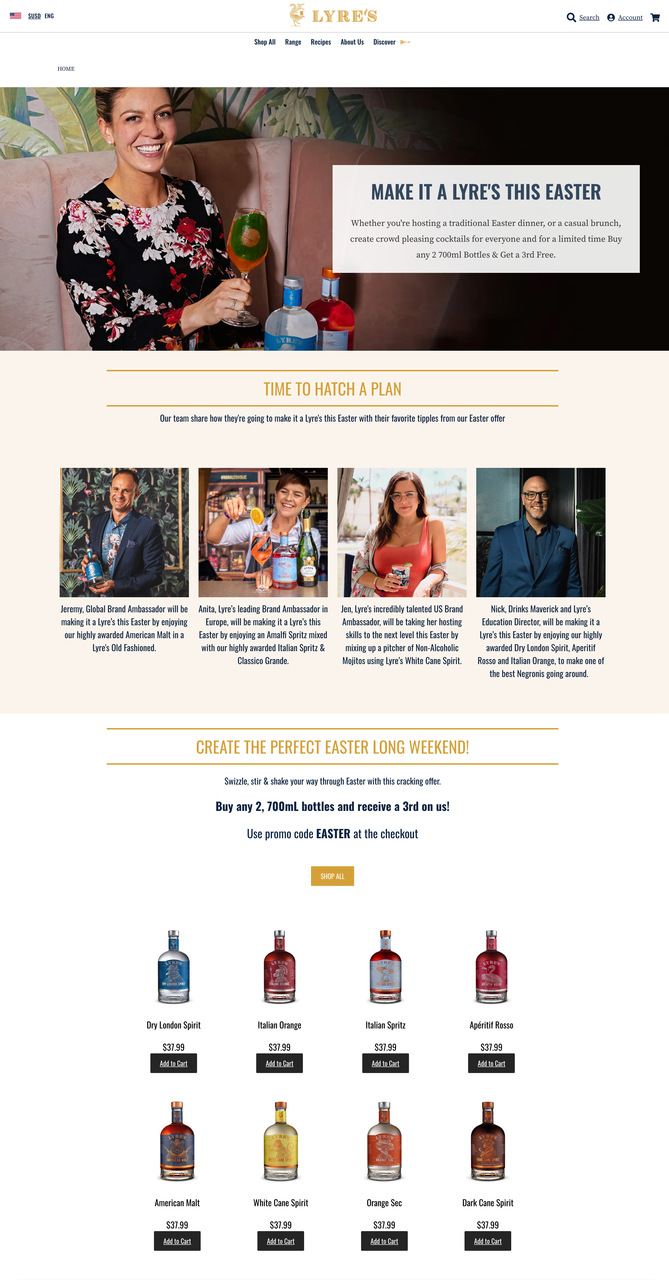
Lyre's seasonal promotion with personal touch
What works: Lyre's runs a buy-two-get-one-free Easter promotion with a promo code. Products display "Add to Cart" buttons for instant purchasing. The brand ambassador section, where real people share their Easter plans with Lyre's products, adds a human layer to the promotional page.
Why it works: Seasonal landing pages that tie promotions to specific holidays create natural urgency without fake countdown timers. The ambassador section applies the social identity theory: when visitors see people like them enjoying the product in a holiday context, they project themselves into that scene. The promotion feels personal rather than mass-marketed.
Key takeaway: For seasonal promotions, feature real people (ambassadors, customers) using your product in the holiday context. Stock photos of Easter eggs won't convert. Real people at Easter dinner will.
Collection and Experience-Driven Landing Page Examples
Collection pages and experience-driven pages serve visitors who are browsing rather than buying a specific item. The challenge is different from product pages: you need to help visitors find what they want without overwhelming them with options. According to HubSpot (via Shopify), nearly two-thirds of marketers report their average landing page conversion rate falls below 10%, and collection pages are often the culprit because they spread attention too thin.
21. Taza Chocolate: Virtual Tasting Kits Bridging Digital and Physical
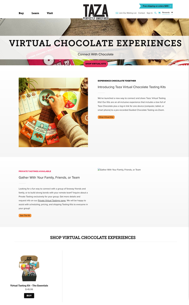
Taza Chocolate virtual tasting experience
What works: Taza Chocolate sells virtual tasting kits with clear pricing on the page. Tabs for "Buy" and private tasting experiences signal multiple purchase paths. The mention of free shipping on orders over a threshold adds a volume incentive. Private tasting links expand the product line beyond physical goods into experiences.
Why it works: Experiential marketing theory shows that experiences create stronger emotional connections than products alone. By selling a virtual tasting rather than just chocolate bars, Taza elevates a commodity product into a shared experience. The pricing transparency (listed directly on the page) eliminates a common friction point for experience purchases, where visitors often expect hidden fees.
Key takeaway: Bundle your product with an experience. A chocolate tasting kit converts better than "buy chocolate" because the experience justifies a higher price point and creates a story the buyer can share.
22. Tkees: Clean Layout With Collection Storytelling
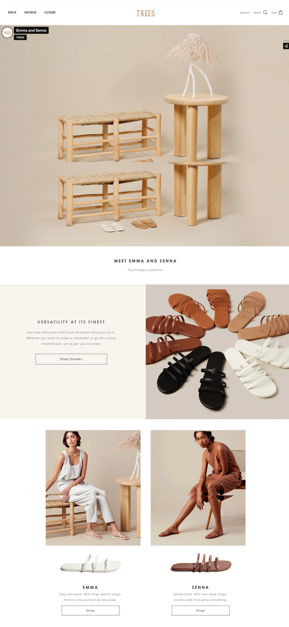
Tkees collection page with editorial layout
What works: Tkees introduces the "Emma and Senna" collection with editorial-style photography and minimal text. Category links (Footwear, Clothing) sit quietly in the navigation. The above-the-fold page layout puts the collection story first and the shop button second, mimicking a fashion magazine spread more than a product catalog.
Why it works: The aesthetic-usability effect means visitors perceive beautiful interfaces as easier to use. Tkees' stripped-down layout creates white space that draws the eye directly to the product. By naming the collection ("Emma and Senna") rather than using generic category labels, Tkees adds personality that transforms browsing into an emotional experience.
Key takeaway: For fashion and lifestyle products, design your collection page like a magazine editorial. Name your collections after people or themes, not product codes. Personality converts.
23. The Body Shop: Niche Audience Targeting With Exclusive Discount
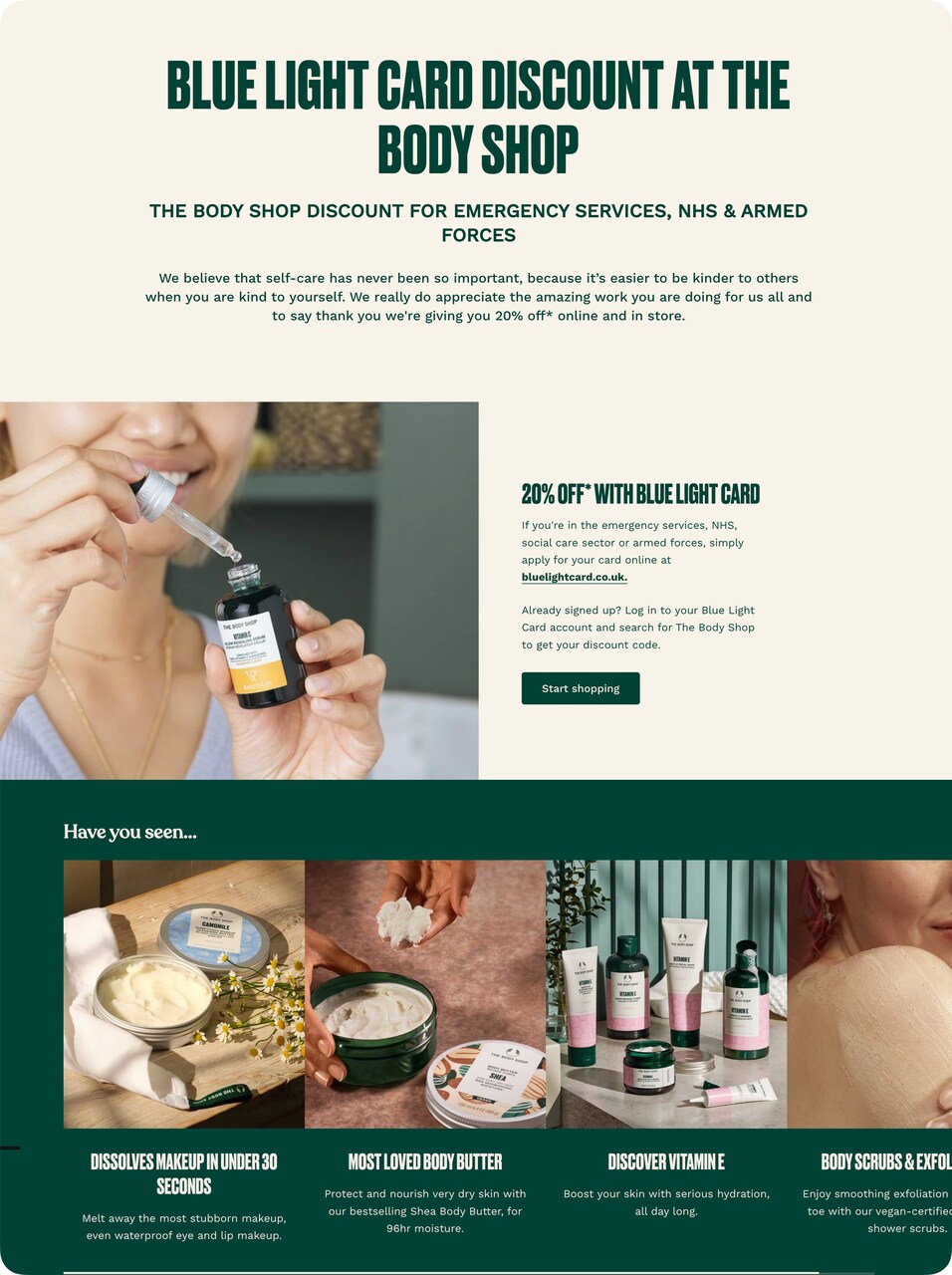
The Body Shop audience-targeted promotion
What works: The Body Shop creates an entirely separate landing page for emergency services, NHS, and armed forces personnel with a 20% Blue Light Card discount. The page thanks the target audience before asking for a purchase, and product images below the offer lead directly to shopping.
Why it works: Audience segmentation at the page level produces higher conversions than generic discounts because the visitor feels personally recognized. The gratitude-first approach (thanking service workers before selling) applies the reciprocity principle in reverse: the brand gives emotional validation first, and the visitor reciprocates with a purchase. This is a textbook example of ecommerce personalization.
Key takeaway: Create separate landing pages for specific audience segments with exclusive offers. A page that says "This is for YOU, specifically" converts dramatically better than a generic discount page.
24. Pottery Barn: Designer Collaboration With Seasonal Storytelling
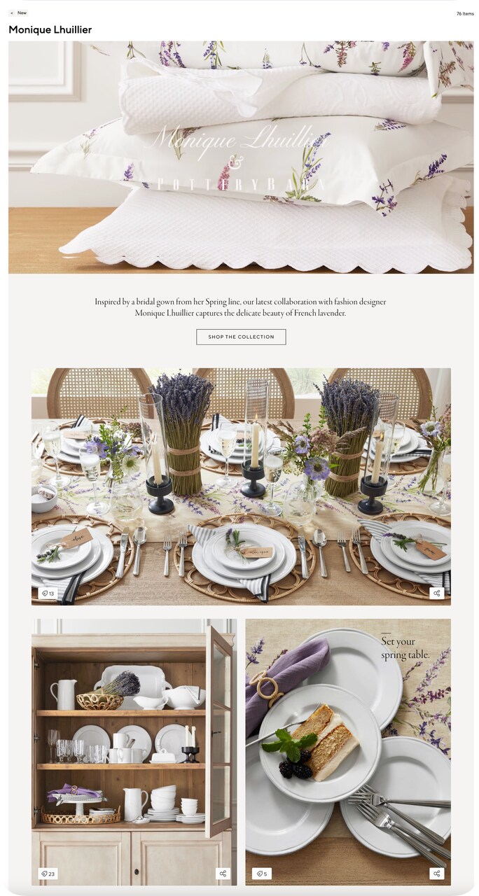
Pottery Barn designer collaboration page
What works: Pottery Barn's collaboration with Monique Lhuillier uses lifestyle photography showing the entire collection in a spring table setting. "Set your spring table" is the seasonal hook. The "76 items" count creates a sense of curated abundance. The backstory ("Inspired by a bridal gown from her Spring line") adds an emotional origin narrative.
Why it works: The halo effect means that the designer's reputation (Monique Lhuillier is known for bridal couture) transfers perceived quality to Pottery Barn's tableware. The origin story activates narrative transportation: visitors who read about the bridal gown inspiration engage emotionally rather than analytically, which increases purchase intent. Mentioning "76 items" uses the anchoring effect to signal a full, curated collection rather than a token collaboration.
Key takeaway: For collaborations, tell the design origin story. "Inspired by a bridal gown" gives the collection an emotional anchor that generic "Shop the Collection" messaging can't match.
Key Elements of High-Converting Ecommerce Landing Pages
After analyzing all 24 examples, several patterns emerge that separate high-converting pages from average ones. These aren't abstract principles; they're structural decisions you can implement today.
Speed drives landing page conversions
Single CTA focus beats multiple options. Every high-performing example on this list has one primary action. Seedlip's "Buy" buttons, Somvai's "Pre-order now," Bruvi's "Subscribe." Pages with competing CTAs dilute attention. If you have a secondary action (like Nuka's "Watch Video"), it should serve the primary goal, not compete with it.
Trust signals need to appear before the fold. Hamama's press mentions, Miracle Made's 30-night trial, BOXYCHARM's brand logos. Visitors make a stay-or-leave decision within 3 seconds of landing. Your credibility markers need to load in that window, not sit at the bottom of a long scroll.
Benefit copy outperforms feature copy. st33p doesn't say "monthly subscription service." It says "no commitment necessary." OLIPOP doesn't list ingredients first. It leads with "9g fiber." Visitors care about outcomes, not specifications. According to LanderLab, top performers in some industries hit 30-40% conversion rates, and benefit-first copy is a consistent pattern among them.
Visual proof reduces purchase anxiety. Hamama shows mushrooms growing. st33p shows tea being brewed. Taza shows chocolate being tasted. When visitors can see the product in use (not just in a studio photo), their confidence in the purchase increases. For products where the result is experiential, lifestyle photography consistently outperforms product-only shots.
Page speed is a conversion factor, not just an SEO factor. According to Genesys Growth, every second of load time costs 7% in conversions, and the critical threshold is 2 seconds. The cleanest examples on this list (Taylor Stitch, Tkees, Allbirds) use minimal design elements that keep page weight low.
Common Mistakes to Avoid in Ecommerce Landing Page Design
I've reviewed hundreds of landing page examples over the years, and the same mistakes show up repeatedly. Avoiding these will put you ahead of most competitors.
Too many navigation options. A landing page is not your homepage. If your top nav has 8 category links, a search bar, and a cart icon, you're leaking visitors to pages that don't convert. The best examples here (Bruvi, Press, Somvai) remove or minimize navigation entirely.
Generic CTAs. "Learn More" and "Click Here" tell the visitor nothing about what happens next. Compare that with st33p's pricing-in-the-button approach or Rebecca Minkoff's "Shop the Sale." Specific CTAs set expectations and reduce hesitation.
No social proof. If your page doesn't have reviews, testimonials, press mentions, or user-generated content, you're asking visitors to trust you blindly. Even one review carousel (like Miracle Made's) or a press bar (like Hamama's) significantly increases ecommerce conversion rates.
Hiding the price. Several of the worst-performing pages I've reviewed bury pricing behind a click. Visitors who can't find the price assume it's higher than it actually is. Seedlip, Taza Chocolate, and No Cow all show pricing directly on the landing page.
Ignoring mobile layout. Over half of ecommerce traffic comes from mobile devices, yet many landing pages are designed desktop-first. Check your mobile landing page layout separately. Buttons need to be thumb-sized, images need to scale, and text needs to remain readable without zooming.
Slow page load times. Heavy hero videos, uncompressed images, and excessive third-party scripts kill conversions before your copy even loads. If your page takes more than 2 seconds to render the first meaningful content, you've already lost a measurable percentage of visitors.
What Separates the Best Ecommerce Landing Pages From Average Ones
After tearing down these 24 ecommerce landing page examples, five patterns matter more than anything else.
First, one page should have one job. Every example that works well does one thing: sell a product, launch a subscription, or promote a sale. The moment you add competing goals, conversion rates drop.
Second, trust loads before the pitch. Press logos, review stars, trial guarantees, and brand partnerships all appear in the first scroll on the highest-converting pages. Visitors decide to stay or leave in under 3 seconds.
Third, benefits beat features every time. "No commitment necessary" lands harder than "monthly subscription service." Lead with what the visitor gains, not what the product does.
Fourth, interaction breeds commitment. Press's calorie calculator, Nuka's video CTA, and Package Free's customization steps all get visitors to invest effort before buying. That effort creates psychological ownership.
Fifth, speed is structural. Pages that load in under 2 seconds hold their traffic. Pages that take 4+ seconds lose nearly a fifth of their visitors before the first image renders.
If you're building or improving your own pages, start with the examples closest to your use case, apply one principle at a time, and measure the result before moving to the next change.
Frequently Asked Questions
How Do You Design an Ecommerce Landing Page?
Start with one goal: what's the single action you want visitors to take? Remove everything that doesn't serve that goal, including full navigation menus, sidebar widgets, and footer links to unrelated pages. Write your headline as a benefit statement, not a product name. Place your CTA above the fold and repeat it after each proof section. Add social proof (reviews, press mentions, testimonials) within the first scroll. Test your page on mobile before desktop, since that's where most of your traffic lands.
What Are Free Ecommerce Landing Page Templates?
Free landing page templates for ecommerce are pre-built page layouts you can customize for your brand. Platforms like Shopify, WordPress (with Elementor or Divi), and dedicated landing page builders offer free tiers. The trade-off with free templates is limited customization and generic design. If you're using a template, focus on customizing three elements: the headline (make it benefit-specific), the hero image (use your own product photography), and the CTA button (use action-specific copy like "Get 20% Off" instead of "Submit").
How Do You Measure the Success of an Ecommerce Landing Page?
Track five metrics: conversion rate (percentage of visitors who complete the desired action), bounce rate (percentage who leave without interacting), average time on page (are visitors reading or scanning?), scroll depth (how far down do they get?), and revenue per visitor (total revenue divided by traffic). Compare these against the product page optimization benchmarks in your industry. A/B test one element at a time to isolate what drives improvement.

How would you rate your experience with this article? 😊