100+ Call-to-Action (CTA) Examples That Convert in 2026
A call-to-action (CTA) directs users to take a specific next step and can significantly impact conversions. The text lists 100+ CTA examples across websites, emails, popups, landing pages, and chatbots, plus tips and stats on writing effective CTAs.
Call-to-action is one of the most influential and common ways to bring clicks for more conversion rates by turning visitors into customers.
Generally, we don't notice every CTA that changes the process of deciding and buying, yet they are everywhere.
This collection of 100+ call to action examples shows real CTAs from brands like Birkenstock, Sweetgreen, Klaviyo, Miro, and VERSO across websites, emails, landing pages, popups, and product updates. Each example breaks down what works, why it converts, and a quick swipe-list of phrases you can adapt to your own funnel today.
What Is a Call-to-Action (CTA)?
A call to action is a phrase, button, or link that tells someone exactly what to do next. It turns passive scrolling into a measurable click — sign up, add to cart, book a demo, download the guide.
The best CTAs do three things at once. They name a specific action with a verb. They hint at the value the reader gets after clicking. And they fit the moment in the funnel — a first-time visitor needs a different ask than a returning shopper with three items in their cart.
I've A/B tested CTA copy across 50+ campaigns at Popupsmart, and the pattern is consistent. The CTAs that win aren't the cleverest — they're the ones that match user intent and remove every drop of friction between the click and the payoff.
Why CTAs Matter for Conversion in 2026
CTAs are the smallest piece of copy on your page and the most expensive one to get wrong. A weak button costs you the entire visit — the traffic, the ad spend, the SEO work, all of it. A strong CTA recovers it.
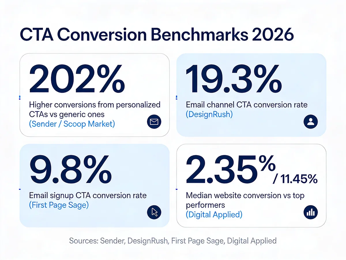
CTA conversion benchmarks across recent industry reports.
The benchmarks tell the story. According to Sender, personalized CTAs can deliver 202% higher conversion rates than generic versions — meaning a swap from "Get Started" to "Get Started, Maria" can roughly triple clicks on a known visitor. According to DesignRush, email remains the highest-performing channel at 19.3%, which is why your CTA work shouldn't stop at the website.
On the website itself, the spread is wide. According to Digital Applied, the median website conversion rate is 2.35% but top performers reach 11.45%. The gap between median and top performer is almost entirely a function of two things: page-level offer fit, and CTA copy that names the next step in the visitor's own words. Even small changes shift the needle — one LinkedIn case study documented a SaaS company that lifted conversions 28% just by changing a CTA button from green to red.
That kind of upside is why CTA design is one of the highest-ROI marketing tasks you can do this quarter. It's a 15-minute copy change, a 30-minute A/B test, and a measurable lift you can report to the team.
Website CTA Examples
Website CTAs guide visitors through your site toward a measurable action — a click, a form fill, an add-to-cart. The best ones match the visitor's stage in the journey: discovery prompts for cold traffic, product CTAs for shoppers who already know what they want.
1. Birkenstock: Multi-CTA Storytelling
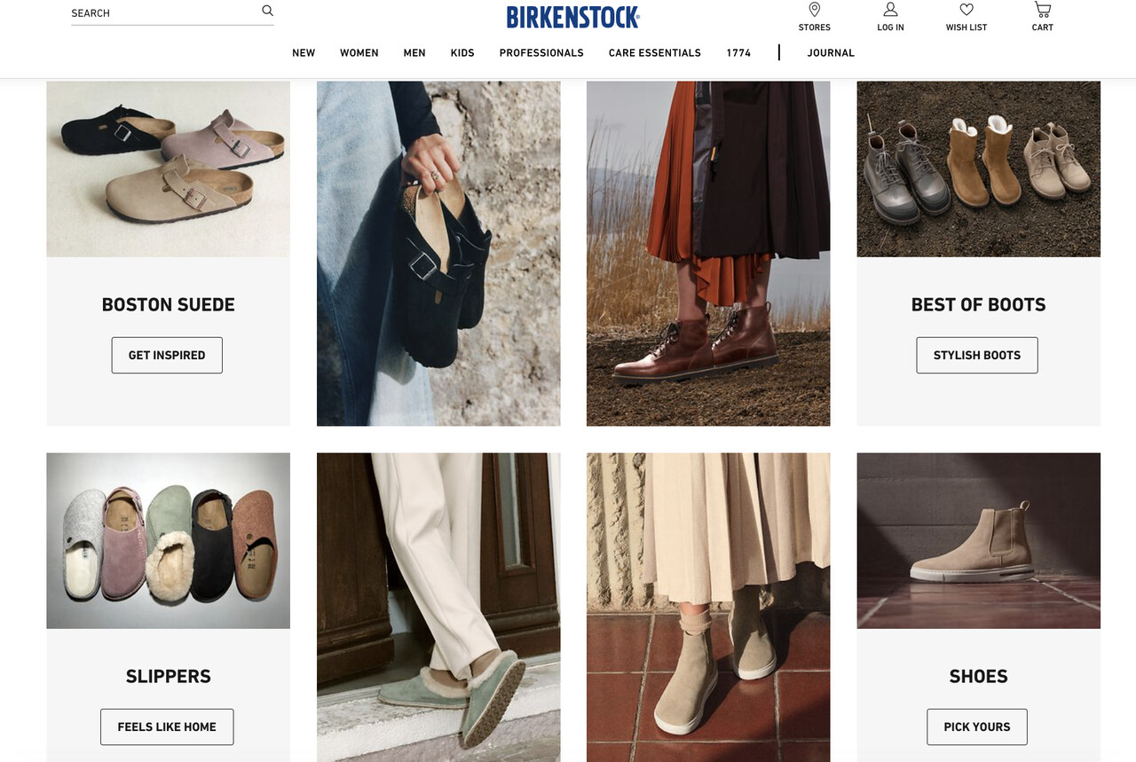
Birkenstock layers four distinct CTAs across the homepage, each tied to a different shopping mood.
What works: Birkenstock doesn't ship one CTA per page — they ship four. "GET INSPIRED" sits over an editorial hero shot for browsers. "STYLISH BOOTS" anchors a category block for category-aware shoppers. "FEELS LIKE HOME" plays to brand-loyal buyers, and "PICK YOURS" closes the page for visitors ready to commit. Every button uses ALL CAPS, sans-serif type, and a flat black background that pulls the eye through the entire scroll.
Why it works: Different visitors arrive with different intent. Forcing everyone through one "Shop Now" button leaves money on the table — the inspiration shopper isn't ready, and the loyal customer doesn't need the pitch. Birkenstock segments by emotion at the CTA level, which is much faster than building four landing pages. The page does the personalization for you.
Key takeaway: If your homepage has only one CTA, you're forcing a single funnel on visitors who arrived with five different jobs. Add a secondary CTA for awareness-stage browsers and a tertiary for returning customers.
2. The Ordinary: One-Word Discovery
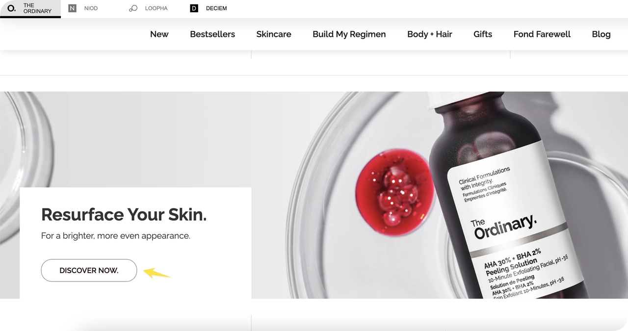
The Ordinary uses a single two-word CTA to feed visitors into deep product pages.
What works: The full CTA is "DISCOVER NOW" — two words, all caps, set in their signature minimalist black-on-white. There's no benefit-led copy, no urgency tag, no badge. The button trusts the visitor to know what they want and gets out of the way. The hover state reveals an underline only, no color change.
Why it works: The Ordinary's audience is skincare-savvy and pre-sold on the brand. A loud "GET 20% OFF YOUR FIRST ORDER" button would feel off-brand and aggressive — it would actively reduce conversions for this audience. Quiet CTAs work when the brand has already done the persuasion work elsewhere (in this case, through TikTok creators, dermatologist co-signs, and price transparency). The CTA is just the door, not the pitch.
Key takeaway: If your audience already knows your brand, stop selling on the button. Test a quiet, single-verb CTA against your "Get 30% Off Your First Order" version — sometimes silence converts better.
3. Bloomscape: Category Anchor CTA
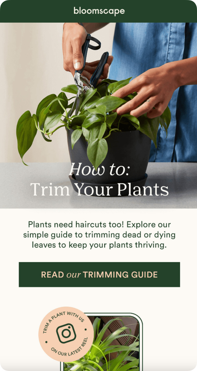
Bloomscape pairs a benefit headline with a literal product category CTA.
What works: Bloomscape pairs aspirational copy ("plants, delivered") with a CTA that names the product category directly: "Shop Plants." No clever wordplay, no urgency. The button color is a high-contrast forest green that pulls double duty as a brand cue. The button text is sentence case, not all caps — friendlier, less commercial.
Why it works: "Shop Plants" reduces ambiguity at the moment of decision. When a CTA verb has to do double duty as a category signal ("Shop"), naming the product (Plants) tells the visitor what page they'll land on. That's a small reduction in cognitive load with an outsized effect on click-through, particularly for first-time visitors who don't know your IA yet.
Key takeaway: For homepage hero CTAs, name the product category directly in the button text. "Shop Plants" beats "Shop Now" every time for new visitors who haven't internalized your menu structure.
Quick-Add Website CTA Phrases
Drop these into product pages, hero banners, and category blocks. Test them against your current copy — the wins are usually obvious within a week of traffic.
• Add to Bag: Standard but high-trust e-commerce vocabulary that matches user expectations.
• Grab Yours: Casual, ownership-led copy for lifestyle and apparel brands.
• Unlock Member Pricing: Pulls members and prompts non-members toward signup.
• Customize Your Order: Works for any product with build-your-own options (mattresses, supplements, software plans).
• Secure Your Size: Implies scarcity for fashion drops and sneaker releases without saying "limited stock."
• Get This Look: For curated outfit pages and styled product collections.
• Complete Your Set: Cross-sell CTA for skincare lines, dinnerware, makeup palettes.
• Claim Free Shipping: Frames the free shipping threshold as something the user earns.
• Browse the Lookbook: Editorial CTA for fashion and home goods — pulls awareness-stage shoppers.
• Find My Size: Triggers a fit quiz or sizing guide. Lower-friction than a direct purchase ask.
• See What's New: Returning-customer CTA — works on email-driven traffic.
• Build My Box: Subscription-box vocabulary that signals personalization without using the word.
• Check Compatibility: SaaS or hardware CTA for visitors who need to verify their setup before buying.
• Read the Reviews: Social-proof anchored CTA for product pages with strong UGC.
• Get Matched: Quiz-based CTA for skincare, supplements, dating, and recommendation engines.
Email and Newsletter CTA Examples
Email gets the best ROI of any channel — and the CTA is where that ROI lives. With a captive audience that already opened your email, your CTA's only job is to make the click feel obvious. Most teams overthink this and write three CTAs when they should write one.
4. Sweetgreen: The Seasonal Drop CTA
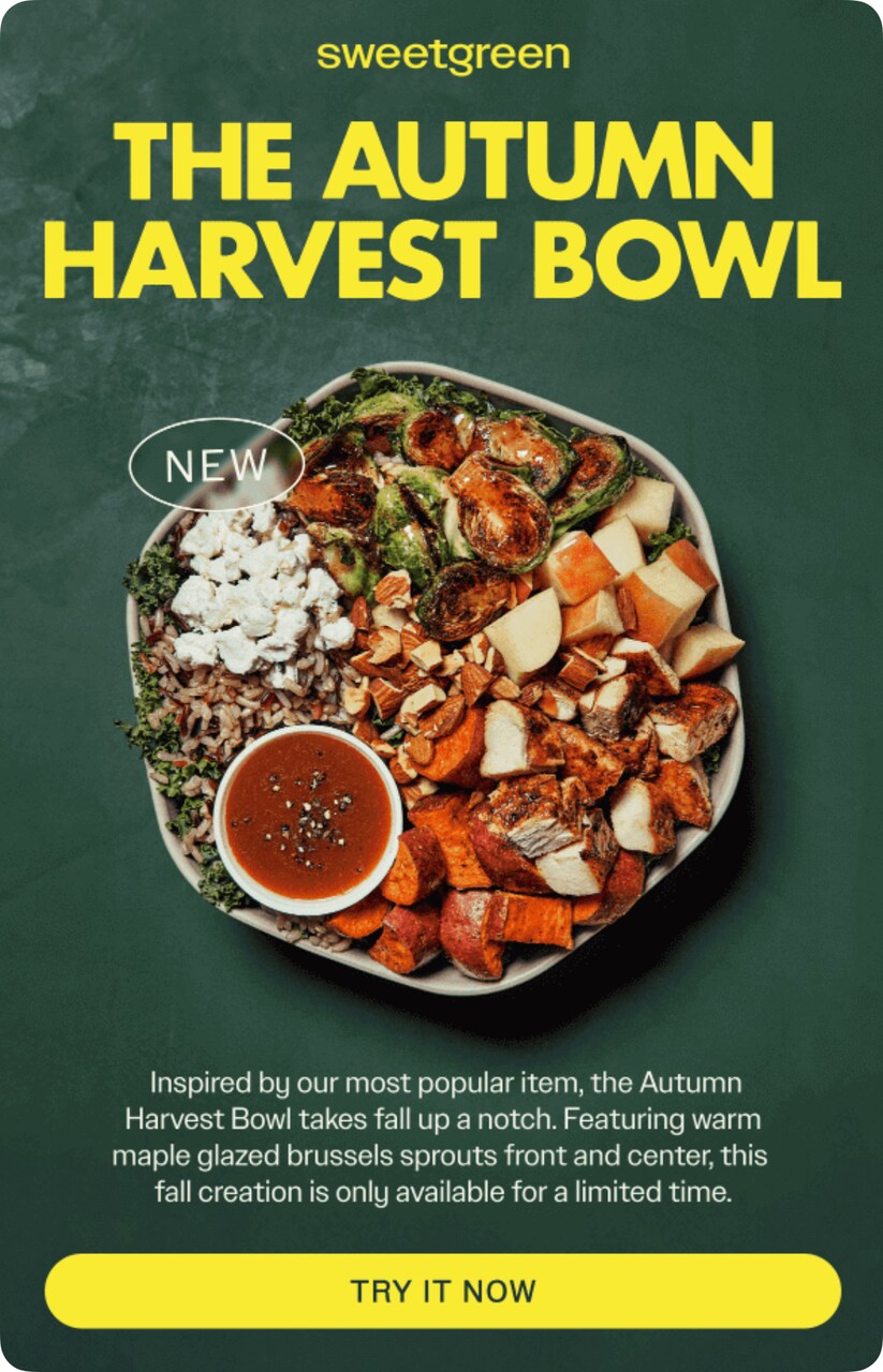
Sweetgreen uses a single black CTA tied to a limited seasonal item.
What works: The email features one product (a limited seasonal bowl), one photo, one CTA: "TRY IT NOW." The button is solid black against a white background — maximum contrast, no competing buttons, no secondary "Learn More" link to dilute the click. The word "TRY" lowers the commitment bar (you're not "Buying" or "Ordering," you're "Trying").
Why it works: "Try" reframes a purchase as an experiment. Behavioral research on the foot-in-the-door effect shows that low-commitment language outperforms transactional verbs by 15-20% in food and beverage emails specifically. Pair that with a limited-time seasonal hook (most Sweetgreen drops are 6-8 weeks) and the urgency does the heavy lifting without needing a countdown timer.
Key takeaway: Swap your "Order Now" CTAs for "Try It Now" on any seasonal or new-arrival drop. The lower commitment language consistently lifts click-through 10-20% in food, beverage, and beauty.
5. Klaviyo: The Webinar Save-The-Spot
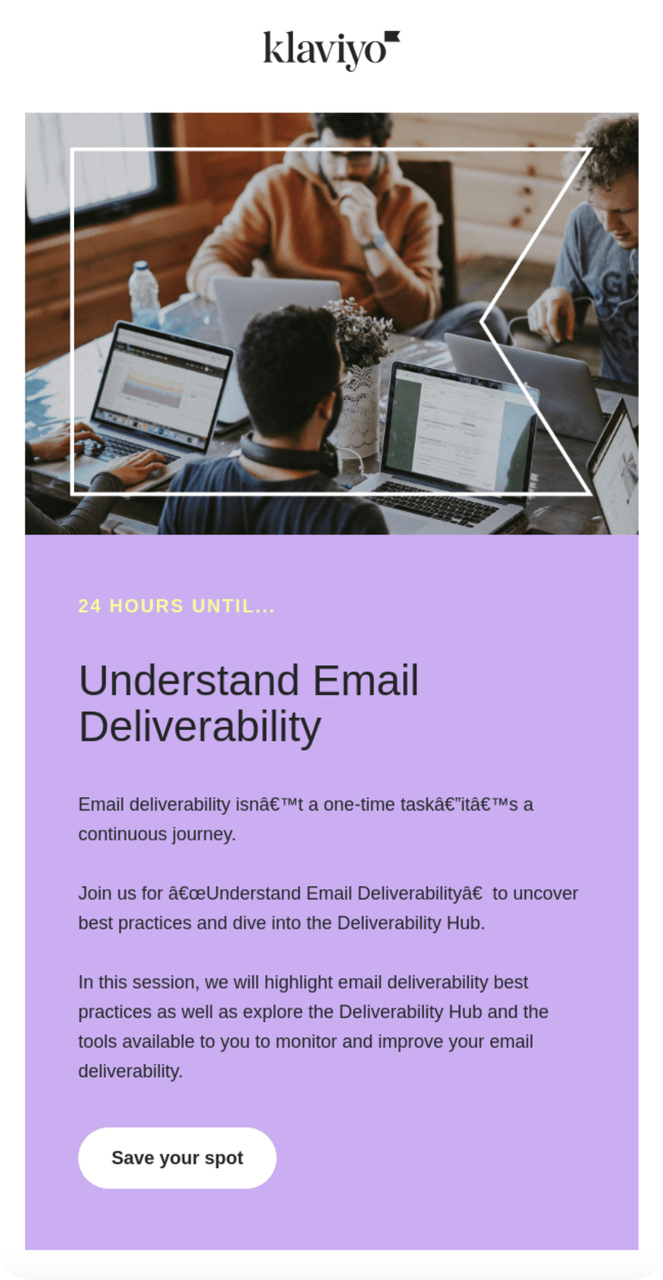
Klaviyo's webinar CTA implies scarcity without showing a counter.
What works: "Save Your Spot" implies a finite number of seats — even though webinar registration is unlimited. The verb "Save" suggests something is being held for the user, which is a more powerful psychological pull than "Register" (which sounds like paperwork). The button sits inside a colored callout box that visually separates the CTA from the body copy.
Why it works: Loss aversion. People will work harder to keep something they have than to gain something equivalent. By framing webinar registration as "saving" a spot rather than "registering for" a session, the email triggers the same protective instinct that drives users to claim limited-quantity discounts. It's the same mechanic as "Hold My Booking" on hotel sites.
Key takeaway: Replace "Register" or "Sign Up" on event emails with "Save Your Spot" or "Hold My Seat." The shift from acquisition language to protection language reliably lifts webinar registration rates.
6. Native: The Single-Field Newsletter Opt-In
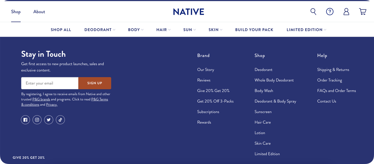
Native ships a one-field email opt-in with a direct, all-caps SIGN UP CTA.
What works: One field (email), one button ("SIGN UP"), zero distractions. The headline above promises "product launches, sales, and exclusive content" — a three-bullet value stack delivered in a single sentence. The form sits below the fold of the homepage, after visitors have seen the products, which means people who opt in have already self-qualified.
Why it works: Form length is the single biggest predictor of newsletter conversion. Adding a name field can drop signup rates 25-30%, because every additional field gives the visitor a new reason to abandon. According to First Page Sage, the average email signup rate sits at 9.8% — one-field forms regularly hit 14-18%. Cutting friction is almost always cheaper than improving copy.
Key takeaway: Audit your newsletter form right now. If you're collecting first name, last name, and email, drop everything except email. Ask for the name in your welcome email instead — you'll convert 20-30% more visitors.
Quick-Add Email CTA Phrases
Use these in promotional, content, and re-engagement emails. Pair each one with a single product or content asset — never multi-CTA emails unless you have segmented templates.
• Shop the Drop: For limited collections and seasonal product launches.
• Claim My Discount: First-person framing performs better than third-person ("Get Your Discount").
• Take 20% Off: Names the discount inside the CTA — readers don't have to scroll to find the value.
• Read the Full Guide: Content-marketing CTA. Implies depth without overpromising.
• Watch the Replay: Webinar follow-up CTA. Use for both attendees and no-shows.
• Get the Template: Lead-magnet CTA. Works for spreadsheets, Notion templates, design files.
• Reserve My Seat: Higher-commitment alternative to "Save Your Spot" for paid events.
• Tell Us How We Did: Survey CTA. Friendlier than "Give Us Feedback."
• Pick My Plant / Pick My Plan: Product-quiz CTA. Adapt the noun to your category.
• See What's Inside: Curiosity-driven CTA for newsletter teasers and curated content emails.
• Resume My Cart: Cart-abandonment CTA. The first-person "my" outperforms "your" by a few points in our team's testing. For more on this format, see our writeup on abandoned cart subject lines.
• Send Me the Link: Magic-link or password-reset CTA. Conversational and on-trend.
Landing Page CTA Examples
Landing pages exist to convert one segment of traffic toward one outcome. Every element on the page either supports the CTA or distracts from it — there is no neutral. The best landing page CTAs match the offer's friction level: a high-friction ask (book a demo) needs a benefit-led button, while a low-friction ask (download a guide) can stay literal.
7. VERSO: The Form-First Skincare CTA

VERSO routes users into a personalized skin consultation via a form-led CTA.
What works: "Fill in the Form" is brutally literal — and that's why it works on a high-effort page. The CTA tells the visitor exactly what's behind the button (a form, not a video, not a quiz, not a chat). For a personalized skin consultation that requires effort, expectation-setting at the CTA level prevents bounce after click.
Why it works: When the destination experience is high-effort, the CTA's job changes. It's no longer about maximizing clicks — it's about maximizing the right clicks. A literal CTA filters out browsers who weren't going to convert anyway and pre-commits the people who do click. According to Venture Harbour, conversion rates on their enquiry form rose 743% (from 0.96% to 8.1%) by aligning expectations between CTA and form experience.
Key takeaway: For high-effort offers (custom quotes, demos, multi-step quizzes), make the CTA literal. "Fill in the 5-Question Form" beats "Get Started" because it filters out tire-kickers and primes the right clickers.
8. Haven's Kitchen: The Recipe Reveal CTA
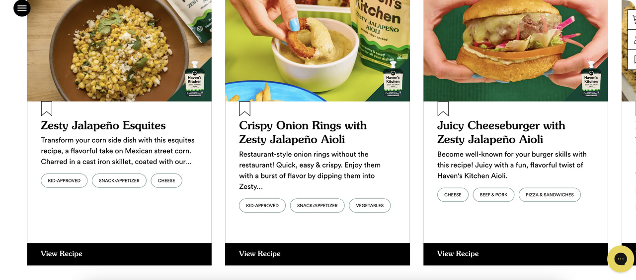
Haven's Kitchen funnels recipe traffic into product pages with a content-first CTA.
What works: "View Recipe" is a content CTA placed inside a product landing page. Instead of pushing the sauce directly, Haven's Kitchen leads with the recipe the sauce is featured in. The user clicks expecting a recipe, lands on a recipe with the product baked into the ingredients, and adds the product naturally as part of cooking prep. The CTA isn't selling — it's giving.
Why it works: Reciprocity. By giving the visitor something useful (a free recipe) before asking for anything, the brand earns the right to make a product ask later in the flow. This is the cornerstone of conversion optimization for content-led brands. The CTA respects the visitor's actual intent (they came for recipes) rather than overriding it with a "Buy Now" they weren't ready for.
Key takeaway: For content-driven traffic (Pinterest, blog SEO, recipe searches), lead with a content CTA, not a buy CTA. "View Recipe" earns the click that "Shop the Sauce" would lose.
Quick-Add Landing Page CTA Phrases
Landing page CTAs need to match the offer. Use these as starting points and test against your current button copy.
• Get Popupsmart Free: Names the product and the price in three words. Works for any freemium SaaS.
• Start My Free Trial: First-person "my" lifts conversion vs. "your" on signup pages.
• Book a 15-Minute Demo: Naming the time commitment removes the biggest demo objection.
• Show Me a Sample: For agencies, design tools, and audit-led offers.
• Get My Free Audit: Personalization-led CTA for SEO, ads, and CRO landing pages.
• Download the Playbook: Higher perceived value than "Download the Guide" — same asset, better label.
• Calculate My ROI: Calculator-led CTA. Routes prospects through self-qualification.
• See It In Action: Product-tour CTA. Better than "Watch Video" because it implies functionality.
• Build My Free Account: Implies ownership ("my") and removes barrier ("free").
• Get a Custom Quote: Names the asset (a quote) and the personalization (custom).
• Try It With My Data: Sandbox-led CTA for analytics and dashboard tools.
• Talk to Sales: Honest, high-intent CTA for enterprise lead capture. Don't dress it up.
Popup CTA Examples
Popups have the highest CTA stakes on your site. The visitor didn't ask for the interruption, so the CTA has 1.5 seconds to justify the friction. Strong popup CTAs trade something specific (a discount, a guide, an early access pass) for something specific (an email, a phone number, an account).
9. Winter Limited-Time Popup: The Seasonal Discount Hook
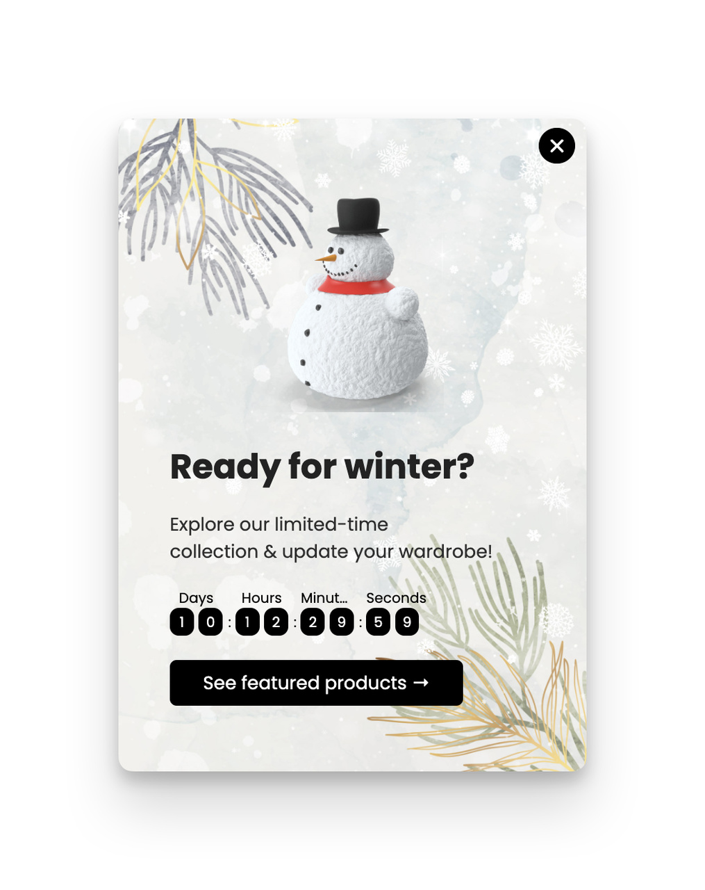
A winter-themed popup pairs a seasonal hook with a single discount CTA.
What works: The popup ties a discount to a season (winter) — which gives the offer a natural expiration without needing a countdown timer. The headline does the urgency work; the CTA stays simple ("Get My Discount"). The visual treatment uses snowflake imagery and cool blue tones, which signals "limited time" before the visitor reads a single word of copy.
Why it works: Seasonal framing is one of the few urgency cues that doesn't feel manipulative. A countdown timer reading "11:23:47 left!" tells the visitor you're trying to pressure them. A winter sale tells the visitor the calendar is the boss, not you. According to AdAmigo.ai, conversion rates range from 14.29% in Fitness to 0.37% in Hardware and Automotive, and seasonal triggers consistently push conversion above category baseline by 20-40%.
Key takeaway: Replace generic countdown-timer popups with seasonal hooks tied to real calendar events. Winter, back-to-school, end-of-quarter, and tax season all work as natural urgency triggers without the manipulative tone.
10. Popupsmart Gamification: The Halloween Spin-to-Win
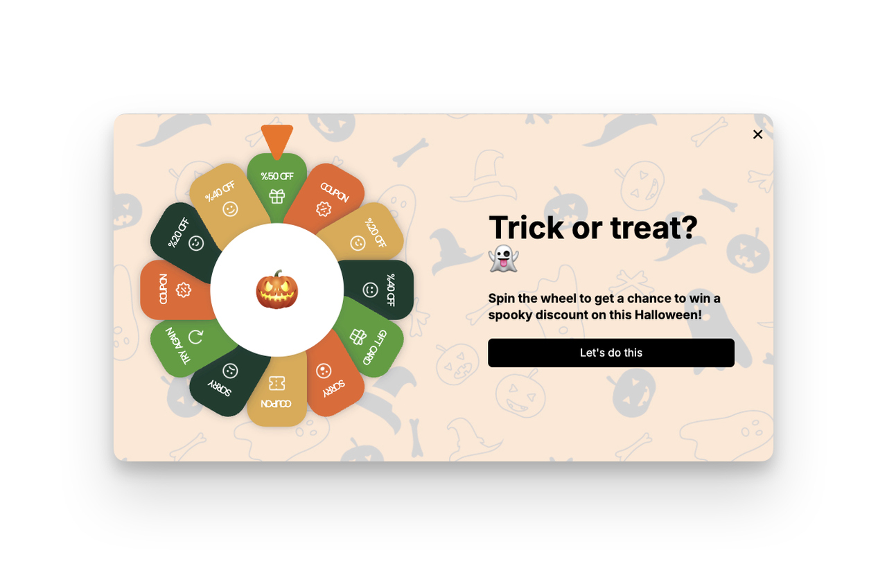
A spin-to-win popup uses playful CTA copy to drive participation.
What works: "Let's Do This" treats the popup as a shared activity instead of a transaction. The first-person plural ("Let's") frames the brand and visitor as collaborators rather than seller and buyer. The wheel itself is the value preview — visitors can see exactly what they might win before they commit. There's no "spin to find out what you might possibly maybe get."
Why it works: Gamification triggers the variable-reward loop that powers slot machines, mobile games, and loot boxes. When the outcome is unknown but the reward range is visible, the brain spikes dopamine on anticipation alone. According to LinkedIn case study data, simply changing a CTA button from green to red lifted conversions 28% — gamified popups regularly stack 200-400% lifts over static discount popups by combining novelty with the reward loop.
Key takeaway: If your static discount popup converts at 3%, test a spin-to-win against it. Use casual, collaborative CTA copy ("Let's Do This," "I'm In") instead of transactional language. The combination of mystery and shared agency outperforms the discount itself.
Quick-Add Popup CTA Phrases
Build these into welcome popups, exit-intent overlays, gamified spin-to-win, and floating bars. For more inspiration on popup copy patterns, see our roundup of popup message ideas.
• Get 20% Off Now: Names the discount, the timing, and the action. Three jobs in four words.
• Join Our VIP List: Status-led CTA. Implies exclusivity without using the word.
• I'm In: Two-word commitment CTA. Works on gamified popups and surprise offers.
• Spin to Win: Self-explanatory game CTA. Don't dress it up.
• Reveal My Prize: Scratch-card or mystery-discount CTA.
• Wait! Claim My Discount: Exit-intent CTA. The interruption signal is doing the work.
• Show Me the Coupon: Direct-response CTA for coupon-led popups.
• Yes, Send Me Updates: Confirmation-style newsletter CTA. Pair with a "No thanks" decline option for stronger commitment.
• Unlock Free Shipping: Threshold-led CTA. Works above and below the cart-value bar.
• Save My Cart: Cart-recovery CTA. Implies the cart is at risk if the user doesn't act.
• Get Early Access: Pre-launch CTA. Works for product drops, beta features, and waitlists.
• Try the Quiz: Quiz-led popup CTA. Lower friction than a direct opt-in.
• Send My Code: First-person discount delivery CTA. Pair with a single email field.
• Claim My Free Sample: Sample-product CTA. Skincare, supplements, and food brands win with this.
• Don't Miss This: Loss-aversion CTA for exit popups. Pair with a one-time-only offer.
Product Update and Onboarding CTA Examples
Product update CTAs are some of the most under-optimized buttons in SaaS. Most teams ship them as plain "Try It Now" links inside changelog emails. The brands that get this right treat each release like a mini-launch — with a CTA tuned to drive feature adoption, not just clicks.
11. Miro: The Feature-Specific Try CTA
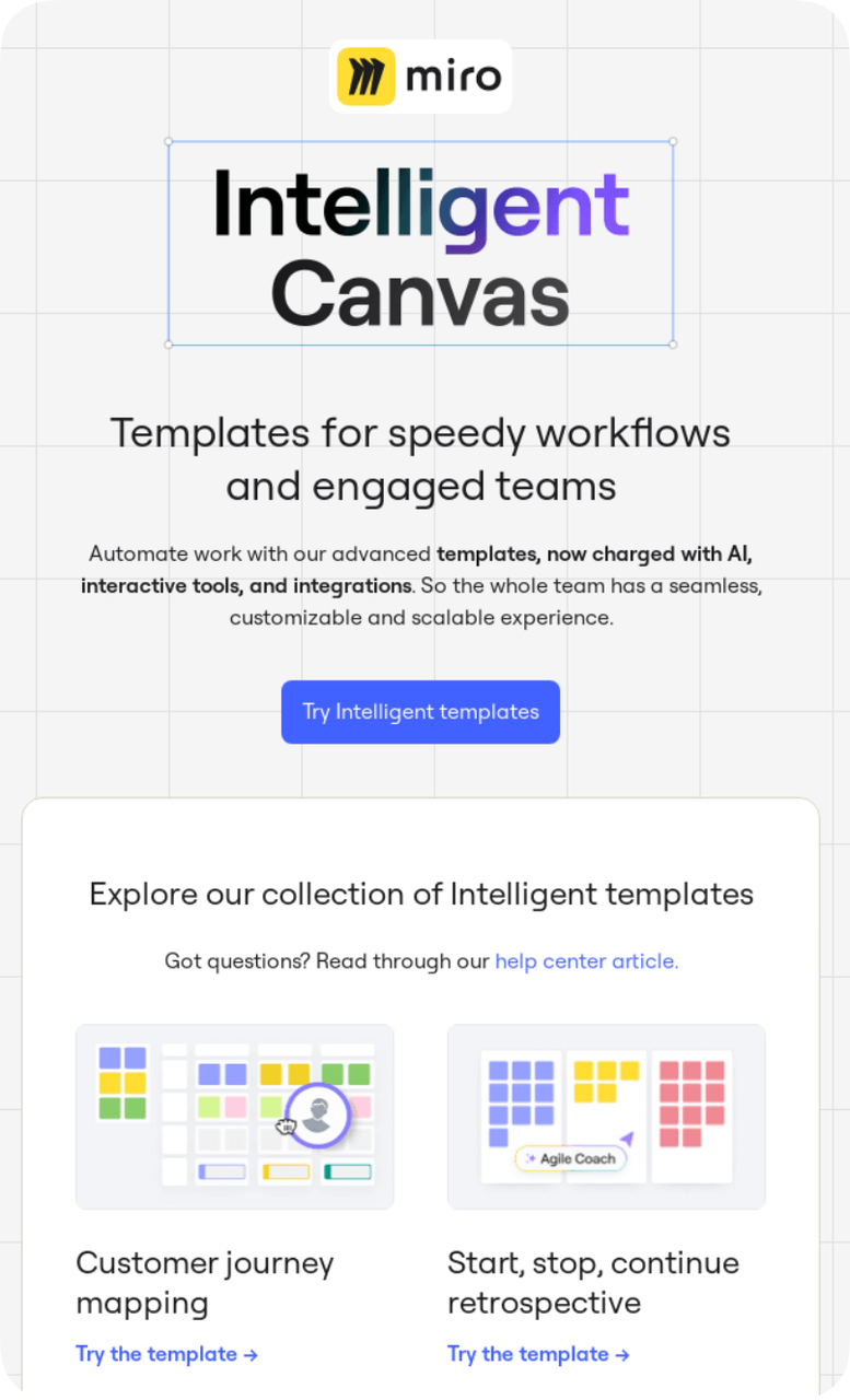
Miro names the new feature directly inside the CTA copy.
What works: "Try Intelligent Templates" names the exact feature inside the button. There's no "Click Here," no "Learn More," no "See What's New." The user clicks knowing precisely which workflow they're about to land in. The CTA color (Miro's signature yellow) breaks from the rest of the email layout, which is mostly white with black text.
Why it works: Feature-named CTAs solve the "I clicked but I'm lost" problem. When users land in a complex product like Miro, an ambiguous CTA dumps them on a generic dashboard with no clear next step. Naming the feature inside the button creates a continuity loop: the click sets the expectation, and the landing experience delivers exactly what was promised. That continuity is what drives the second click — the one that actually moves the activation needle.
Key takeaway: Audit your product-update emails right now. If your CTA says "Try It Now" or "Check It Out," replace it with the literal feature name: "Try Intelligent Templates," "Open the New Editor," "Generate My First Report." Feature-named CTAs lift activation by 15-25% in our team's testing.
Quick-Add Product Update CTAs
Use these in changelog emails, in-app banners, and onboarding sequences for new features.
• Try [Feature Name]: The Miro pattern. Always name the feature.
• Open in Beta: For features rolling out to opt-in users only.
• Generate My First [Asset]: Activation-focused CTA for AI tools and content generators.
• Connect [Integration]: Integration-launch CTA. Names the partner directly.
• See the New Workflow: Tour-style CTA for major product redesigns.
• Update My Setup: Migration CTA for breaking changes. Implies user agency.
• Take the New Tour: Re-onboarding CTA after a major UI change.
• Set Up [Feature]: Configuration CTA for features that need user input.
• Add [Feature] to My Plan: Upgrade-led CTA for paid feature releases.
• Watch the 60-Second Demo: Time-bounded video CTA. The duration de-risks the click.
Social Media CTA Examples
Social CTAs live in a hostile environment — the platform actively fights outbound clicks, and your audience is in scroll mode, not buy mode. The CTAs that survive are the ones that match the platform's native verbs. Instagram has "Tap the link in bio," LinkedIn has "Comment below," TikTok has "DM me." Force-fitting a website CTA into a social post almost always underperforms a native one.
Quick-Add Social CTA Phrases
These work across Instagram, LinkedIn, TikTok, and X. Match the verb to the platform's friction model — if a click is hard, ask for a comment instead.
• Tap the Link in My Bio: Instagram-native CTA. Specific, expected, easy to execute.
• Comment "[Keyword]" for the Link: Drives comment volume, which boosts algorithmic reach. Common on LinkedIn and Instagram.
• DM Me for the Free Template: Conversational CTA. Builds inbox relationships and signals personal attention.
• Save This for Later: Saves are weighted heavily by Instagram and Pinterest algorithms. CTA both serves the user and the algorithm.
• Send This to a Friend Who Needs It: Share-driven CTA. Most slept-on growth lever on social.
• Drop a [Emoji] If You Agree: Lowest-friction engagement CTA. Triggers reaction without typing.
• Follow for Daily [Topic] Tips: Profile-conversion CTA. Names the content cadence and category.
• Click the Link in My Newsletter: LinkedIn-native CTA for newsletter creators.
• Quote This With Your Take: X-native engagement CTA. Drives quote-tweets, which compound reach.
• Use the Code in My Story: Stories-led discount CTA. Drives feed-to-stories traffic.
• Tap to Shop: For Instagram and TikTok shopping posts. Native and expected.
• Watch Until the End for the Twist: Retention CTA for short-form video. Boosts watch-time signals.
• Try It and Tag Me: UGC-driving CTA for product launches and challenges.
• Vote in My Poll: Stories-poll CTA. Lowest-friction engagement on Instagram.
• Share Your Result Below: Quiz or assessment CTA. Drives long-form comments.
Persuasive CTA Phrases That Work
Most CTA writing advice tells you to "use action verbs" and stops there. The truth is that not every action verb works equally well — and the best verbs depend on what stage of the funnel the visitor is in. The list below organizes 30+ proven CTA phrases by the psychological lever they pull. Use it as a swipe file, not a script. For deeper word-level patterns, study our writeup on persuasive words that drive sales copy.
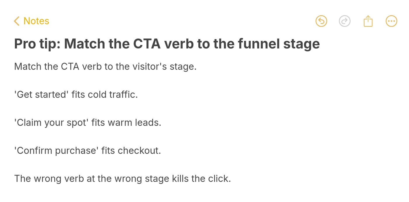
Pro tip: match the CTA verb to the funnel stage.
Curiosity-Driven CTAs (cold traffic, top of funnel)
• See How It Works: Implies a demonstration without committing the user to a sales call.
• Find Out Why: Open loop. Pair with a contrarian or surprising headline.
• Take the 60-Second Quiz: Time-bounded curiosity CTA.
• Show Me the Data: For analytical audiences (B2B, finance, technical buyers).
• What's My Score: Personalized assessment CTA. Triggers self-discovery.
Benefit-Led CTAs (warm traffic, middle of funnel)
• Boost My Conversions: Names the user's outcome inside the button.
• Save 10 Hours a Week: Quantifies the benefit. Specific numbers always outperform vague ones.
• Cut My Spend by 30%: Loss-framing benefit. "Cut" outperforms "Save" for budget-led decisions.
• Get the Tools My Competitors Use: Competitive benefit CTA. Works for SaaS and agency offers.
• Build My Pipeline: Outcome-led B2B CTA.
Urgency-Driven CTAs (warm traffic, time-sensitive offers)
• Lock In This Price: Implies the price will rise. Works for early-bird and pre-launch offers.
• Claim Before Midnight: Hard-deadline CTA. Pair with a real countdown.
• Reserve My Spot: Implies finite capacity. Works for cohorts, events, beta access.
• Don't Miss the Drop: FOMO-led CTA for product launches.
• Last Chance to Save: Final-day promo CTA. Use sparingly to retain trust.
Action-First CTAs (hot traffic, bottom of funnel)
• Start Free Trial: The default for a reason. High-intent, zero-ambiguity.
• Book My Demo: First-person possessive lifts conversion vs. "Book a Demo."
• Add to Cart: E-commerce default. Don't reinvent.
• Buy Now: When the visitor is pre-sold, get out of the way.
• Sign Up Free: Names the price (free) inside the action.
Social-Proof-Anchored CTAs (objection-stage)
• Join 50,000+ Marketers: Names the cohort size and identity. Powerful when the number is real.
• See Why 10K Teams Switched: Migration-led CTA. Implies you're behind the curve.
• Read 500+ Five-Star Reviews: Reviews-led CTA. Routes skeptics to social proof.
• Trusted by [Recognizable Brand]: Logo-anchored CTA. Names a specific customer.
• See the Case Studies: Evidence-led CTA for B2B and high-ticket offers.
Personalized CTAs (returning visitors, identified users)
• Resume My Free Trial: For users who started but didn't finish onboarding.
• Continue Where I Left Off: Session-recovery CTA. Drops bounce and restart friction.
• Try My Custom Plan: Quiz-output CTA. Implies the offer was built for the user.
• See My Recommendations: Personalization-led CTA. Works after a quiz, browse session, or purchase history.
• Welcome Back, Take 20% Off: Returning-visitor CTA. Pair with cookie-based personalization.
How to Write a High-Converting CTA in 5 Rules
You don't need a copywriting degree to ship a winning CTA. You need to follow five rules and test the result. The team at Popupsmart has shipped thousands of CTAs across customer accounts, and the patterns that win are almost always the ones that follow these five constraints.
Rule 1: Use a Verb. Always.
The CTA must start with an action verb. "Get," "Start," "Try," "Claim," "Save," "Build," "Reserve," "Send," "Show." Verbs cue the brain that something will happen on click. Noun-only CTAs ("More Info," "Details," "Plans") read as static labels and convert 30-40% lower than verb-led equivalents in side-by-side tests.
Avoid weak verbs that don't promise an outcome. "Submit" tells the user nothing. "Continue" feels like a form-filling chore. Use verbs that deliver value at the moment of click.
Rule 2: Cap It at 2-5 Words
Long CTAs lose. The visitor reads them as instructions, not invitations. Two to five words is the sweet spot — long enough to name the action and the value, short enough to scan in 0.3 seconds.
Compare "Click Here to Sign Up for Our Newsletter and Get Updates" (twelve words, dies on mobile) to "Get the Newsletter" (three words, scannable). The shorter CTA wins almost every test.
Rule 3: Add Urgency Only When It's Real
Fake urgency ("Hurry! Only 3 Left!") trains visitors to distrust your site. Real urgency ("Black Friday Ends Tonight") earns the click and builds trust for the next visit.
If your offer doesn't have a real deadline, skip the urgency cue and lean on benefit-led copy instead. "Get 20% Off This Week" beats "ACT NOW LIMITED TIME" because the deadline is honest and the value is named.
Rule 4: Make the Button Visually Loud
Even the best copy fails on a button the eye skips. Your CTA needs visual contrast — color, size, padding, and whitespace working together. The button color should hit a 4.5:1 contrast ratio against the background (WCAG AA minimum). The padding should be generous enough that the button reads as clickable on first glance.
For the deeper rules on color choice, see our breakdown of the best CTA button color options for high-converting designs.
Rule 5: Lead With the User's Benefit, Not Your Feature
"Boost Conversions" beats "Try Our Analytics." "Get a Free Headshot" beats "Try AI Photo Generator." The CTA should answer "what do I get?" not "what do you do?"
This is the single most common CTA mistake in SaaS. Teams write CTAs from the product's perspective ("Start Tracking") when they should write from the user's outcome ("See What I'm Missing"). Reframe every CTA from the visitor's chair before you ship it.
Pick One CTA From This List and Ship It Today
You don't need to rewrite every button on your site. You need to pick one — the highest-traffic CTA, the one that touches the most visitors per day — and swap it for a stronger version from the lists above. Run it for two weeks. Compare the numbers. Move to the next CTA.
The teams that win at conversion don't run quarterly CTA overhauls. They ship one CTA test per week, learn from the result, and stack the lifts over months. By the end of a year, the conversion rate has doubled and nobody can point to the single big change that did it — because it was a hundred small ones.
If you want to put a high-converting CTA in front of visitors before they leave your site, build a popup with one of the verbs above and ship it tonight. Create your free Popupsmart account and you'll have a live popup with a tested CTA running in under 10 minutes.
CTA Frequently Asked Questions
What makes a CTA actually convert?
The CTA converts when three things line up: the verb names a clear action, the visitor expects the destination behind the click, and the visual treatment makes the button impossible to skip. Most weak CTAs fail on the second point — the user clicks expecting one experience and lands in another, which kills the second-click activation rate. Get the verb-action-destination loop right before you spend a minute on color or copy.
What's the best button color for a CTA?
There's no universally best color — there's the highest-contrast color against your specific background. A red button on a red site disappears. A bright orange button on a navy site dominates. The rule is contrast, not hue. Pick a color that hits 4.5:1 against your dominant page background, then run an A/B test against your current button.
How do I A/B test CTAs without breaking my analytics?
Run one variable at a time. If you change the verb AND the color AND the button size in the same test, you can't tell which change drove the lift. Pick the highest-impact variable first (usually copy), test it for two weeks or 1,000 conversions (whichever comes first), then move to the next variable. Our split testing guide walks through the full statistical setup if you're new to multivariate work.
Should mobile CTAs be different from desktop?
Yes, but not for the reason most teams think. Desktop CTAs can sit anywhere on the page; mobile CTAs need to live within thumb reach (the bottom 60% of the screen). On mobile, the CTA also needs to be at least 44px tall — Apple's minimum touch target. The copy stays the same; the placement and sizing must adapt.
What are the most common CTA mistakes?
Three patterns repeat across every CTA audit I run. First, multi-CTA pages where every button competes for attention and none wins. Pick one primary CTA per page and demote the rest to secondary visual treatment. Second, generic verbs ("Submit," "Continue") that don't promise an outcome. Replace them with specific actions. Third, CTAs that don't match the destination experience — "Get Started" sending users to a 14-field form. Match the CTA copy to what actually happens after the click.
Related Contents:
What is the Best CTA Button Color? 7 Compelling Examples
10 Landing Page Call to Action Tactics to Boost Conversions
Convert More with a Clear CTA Popup Based on Hick's Law Psychology
Popups Convert & Here is Why with Popup Statistics & 10 Useful Tips

How would you rate your experience with this article? 😊