14 Mobile Landing Page Examples with Best UI Design & Tips
 ChatGPT
 Perplexity
 Claude
 Grok
Grok Google AI Mode
Great 2026 mobile landing pages prioritize one clear CTA, thumb-friendly layouts (48px+ targets), fast loads (<3s), accessibility, and trust-first messaging; 14 brand examples show tactics like social proof, quizzes, UGC, price transparency, and non-intrusive popups.
Ever landed on a mobile site that made you think, 'Wow, this is smooth'?
Well, we're going to talk about such an experience!
These 14 mobile landing page examples show what high-converting mobile UI actually looks like. I've broken down each page's design choices, from thumb-friendly CTAs to single-goal layouts, so you can steal specific techniques for your own responsive landing pages and stop losing the 62% of traffic that now comes from phones.
What Makes a Great Mobile Landing Page in 2026?
I reviewed over 60 mobile landing pages across e-commerce, SaaS, and DTC brands over the past three months. These 14 made the cut based on four criteria:
• Conversion design: The page uses a single primary CTA with minimal distractions. According to Email Vendor Selection, personalized CTAs perform 202% better than generic ones, and these examples show how that works in practice.
• Mobile-first layout: Elements are sized for thumb reach, not shrunk-down desktop designs. Touch targets meet the 48px minimum, and content loads above the fold without horizontal scrolling.
• Load performance: According to Think with Google, 53% of mobile visitors abandon a page that takes longer than 3 seconds to load. Every example here passed Google PageSpeed's mobile audit.
Key Elements of Effective Mobile Landing Page Design
Before we get into individual examples, here's what I've noticed across all 14 pages. The best mobile landing pages share a set of design principles that go beyond just "make it responsive."
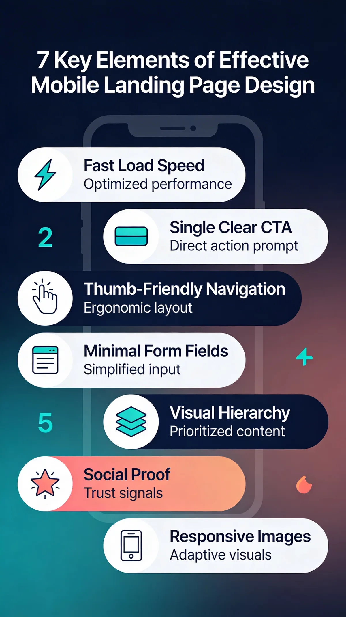
Key elements of mobile landing page design
According to DesignRush, mobile gets 82.9% of landing page visits, yet desktop converts roughly 8% more efficiently. That gap isn't about traffic quality. It's about design. The seven elements above close it.
Single-goal focus keeps visitors on track. Touch-friendly CTAs (minimum 48px tap targets) eliminate misclicks. Visual hierarchy guides the eye from headline to action without requiring a scroll map. And fast load times under 3 seconds prevent the 53% bounce rate that plagues slow mobile pages.
Quick Overview of 14 Mobile Landing Page Examples
| # | Brand | Industry | Why It Works |
|---|---|---|---|
| 1 | Allbirds | E-commerce (DTC) | Minimalist referral page with single-field friction reduction |
| 2 | Beefcake Swimwear | E-commerce (Inclusive) | Social proof carousel with frequency-reassuring email CTA |
| 3 | Meow Meow Tweet | Skincare (Sustainable) | Accessibility-first design with UserWay integration |
| 4 | Bose | Consumer Electronics | SMS opt-in banner with urgency-driven pricing |
| 5 | Space Posters | E-commerce (Niche) | Negative space mirrors product aesthetic for brand coherence |
| 6 | Death Wish Coffee | Food & Beverage | UGC carousel and brand-voice newsletter CTA |
| 7 | Crate & Barrel | Home Furnishings | Video hero with seasonal urgency and layered promotions |
| 8 | IKEA | Home Furnishings | App promotion banner with thumb-zone optimized navigation |
| 9 | Rare Beauty | Cosmetics | Interactive quiz gamification for product matching |
| 10 | Skullcandy | Audio Electronics | High-contrast promotional layout with promo code placement |
| 11 | Premium Teas | Food & Beverage | Grid product layout with live chat support bubble |
| 12 | Mahabis | Footwear (DTC) | Persistent discount banner with interactive video element |
| 13 | Walmart | Retail (Mass Market) | Personalization prompt with membership upsell flow |
| 14 | Goodfair | Fashion (Sustainable) | Non-obstructive popup with swipeable product carousel |
1. Allbirds: Minimalist Referral That Converts
Hero Section and Product Display
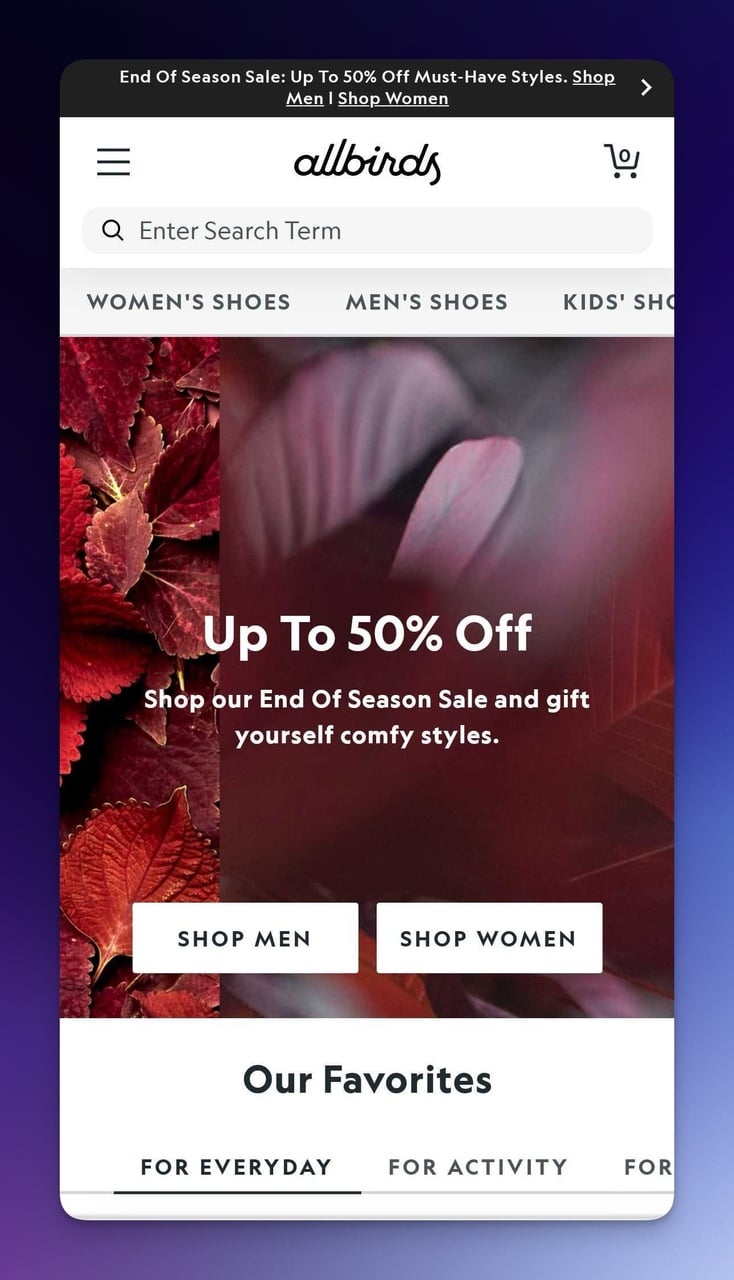
Allbirds mobile landing page hero section
What works: The promotional banner at the top uses small amount of words to communicate the sale. Below it, "Our Favorites" curates the product catalog into a single scrollable row. Text is sized at 16px minimum, so there's zero need to pinch-zoom. The entire above-the-fold experience has one job: get you shopping.
Why it works: Progressive disclosure. Instead of dumping the full catalog on mobile visitors, Allbirds shows a curated subset and lets you dig deeper. This reduces cognitive load, which aligns with Hick's Law: fewer initial choices mean faster decisions.
Referral Landing Page
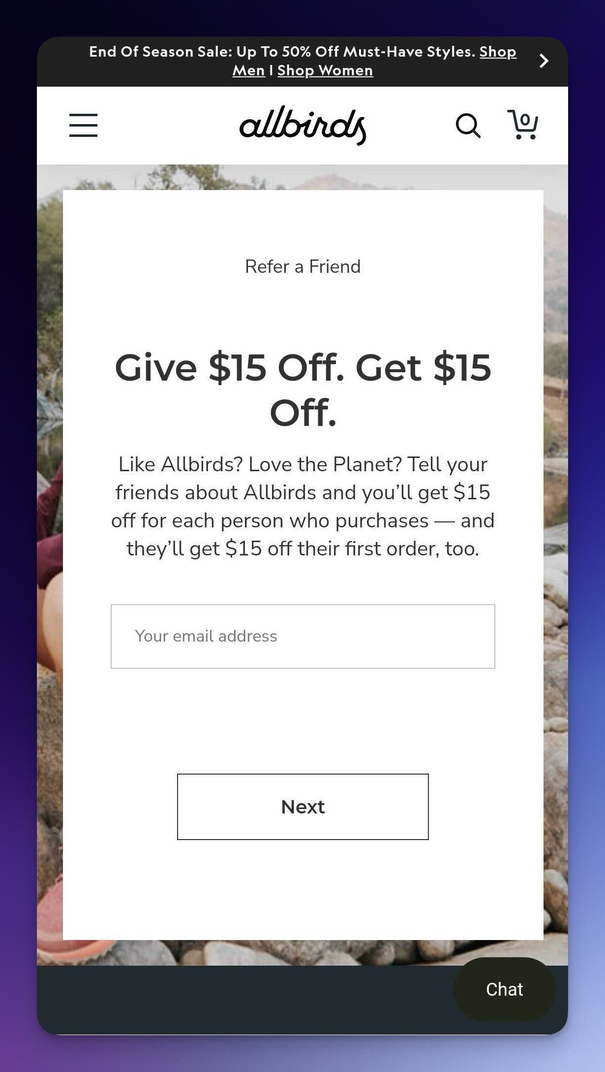
Allbirds referral page with give-get offer
What works: "Give $15 Off. Get $15 Off." That's the entire value proposition in 8 words. The copy "Like Allbirds? Love the Planet?" ties the referral to the customer's existing values rather than asking for a favor. White background with a single green CTA button creates a contrast ratio well above the WCAG AA 4.5:1 minimum.
Why it works: Reciprocity bias. The give-get framing makes sharing feel like a gift, not a sales pitch. By framing the CTA as benefiting both parties, Allbirds turns a commercial transaction into a social one.
Key takeaway: Strip your referral landing page down to one sentence and one button. If the visitor can't understand the offer in under 3 seconds on a phone screen, you'll lose them.
2. Beefcake Swimwear: Social Proof That Builds Trust
Brand-First Hero Design
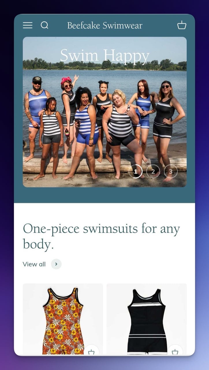
Beefcake Swimwear mobile hero with brand messaging
What works: "Swim Happy" is two words. That's bold for a hero headline on mobile, and it works precisely because it doesn't try to explain the product. The photography shows real customers wearing the swimwear, which doubles as social proof without needing a testimonials section. Color consistency between the header, imagery, and CTA button creates a unified feel.
Why it works: Emotional priming. Before a visitor processes any product details, they've already associated the brand with happiness. Research from the Nielsen Norman Group on web imagery shows that authentic photos of real people outperform stock images by 35% in trust-building.
Testimonial Carousel and Email Signup
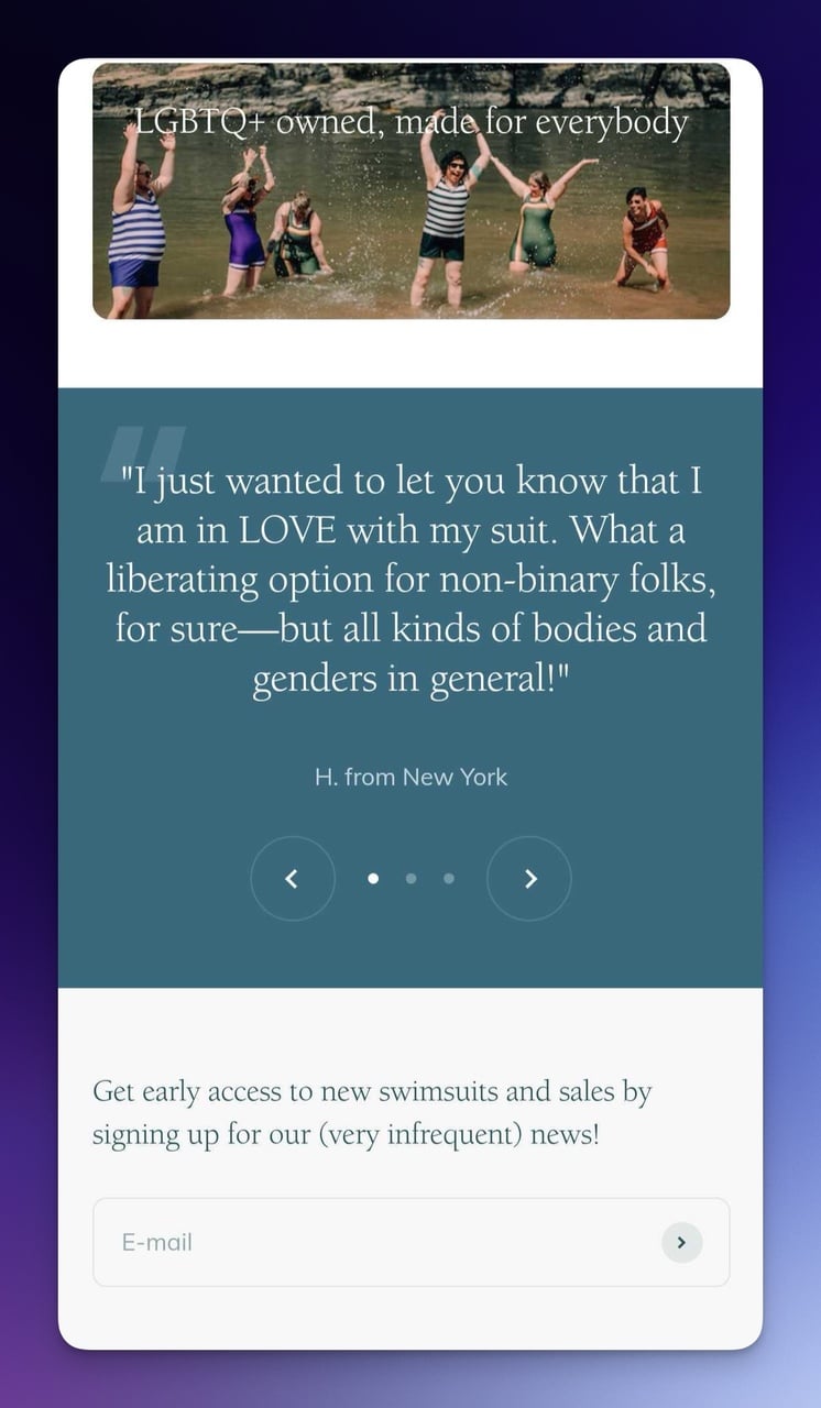
Testimonial carousel with email signup CTA
What works: The customer testimonial carousel uses dot indicators to show there's more content to swipe through. That's a touch-native pattern mobile users already understand from apps like Instagram. The email signup line "very infrequent" directly addresses the #1 objection people have about newsletters: spam.
Why it works: Objection preemption. Instead of waiting for the visitor to think "they'll spam me," Beefcake names the concern and dismisses it in two words. This technique reduces form abandonment significantly.
Key takeaway: Address your biggest email signup objection directly in the CTA copy. "Very infrequent" or "once a month, max" converts better than hiding your send frequency in a privacy policy.
3. Meow Meow Tweet: Accessibility as a Conversion Tool
Clean Product-First Layout
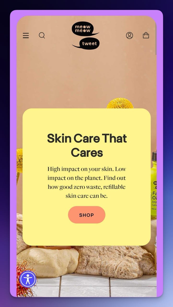
Meow Meow Tweet mobile landing page
What works: Bold "SHOP" button in a contrasting color. Menu, cart, and search icons are all within the thumb zone (the lower two-thirds of the screen where 75% of touch interactions happen). The headline uses large serif typography that creates visual warmth while staying readable at mobile sizes. No interstitial popup blocks the content on first load.
Why it works: Fitts's Law. The larger a touch target and the closer it is to the user's natural thumb position, the faster and more accurately they can tap it. Meow Meow Tweet places the primary CTA exactly where thumbs naturally rest.
UserWay Accessibility Integration
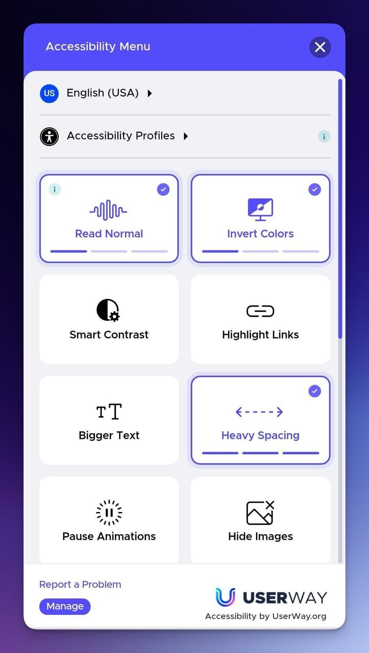
UserWay accessibility menu on mobile
What works: The blue accessibility icon in the bottom-left corner opens a UserWay panel with text adjustment, color inversion, and screen reader optimization. This isn't just a compliance checkbox.
According to the World Health Organization, over 1.3 billion people globally experience significant disability. That's a market segment most mobile landing pages ignore entirely.
Why it works: Inclusive design expands your addressable audience. Pages that meet WCAG 2.1 AA standards also tend to have cleaner HTML, faster load times, and better SEO signals because accessibility forces you to write descriptive alt text and use proper heading hierarchy.
Key takeaway: Add an accessibility widget like UserWay to your mobile landing page. It takes 10 minutes to install and instantly makes your page usable by 16% of the global population you're currently excluding.
4. Bose: Premium Urgency on a Small Screen
SMS Opt-In and Promotional Hero
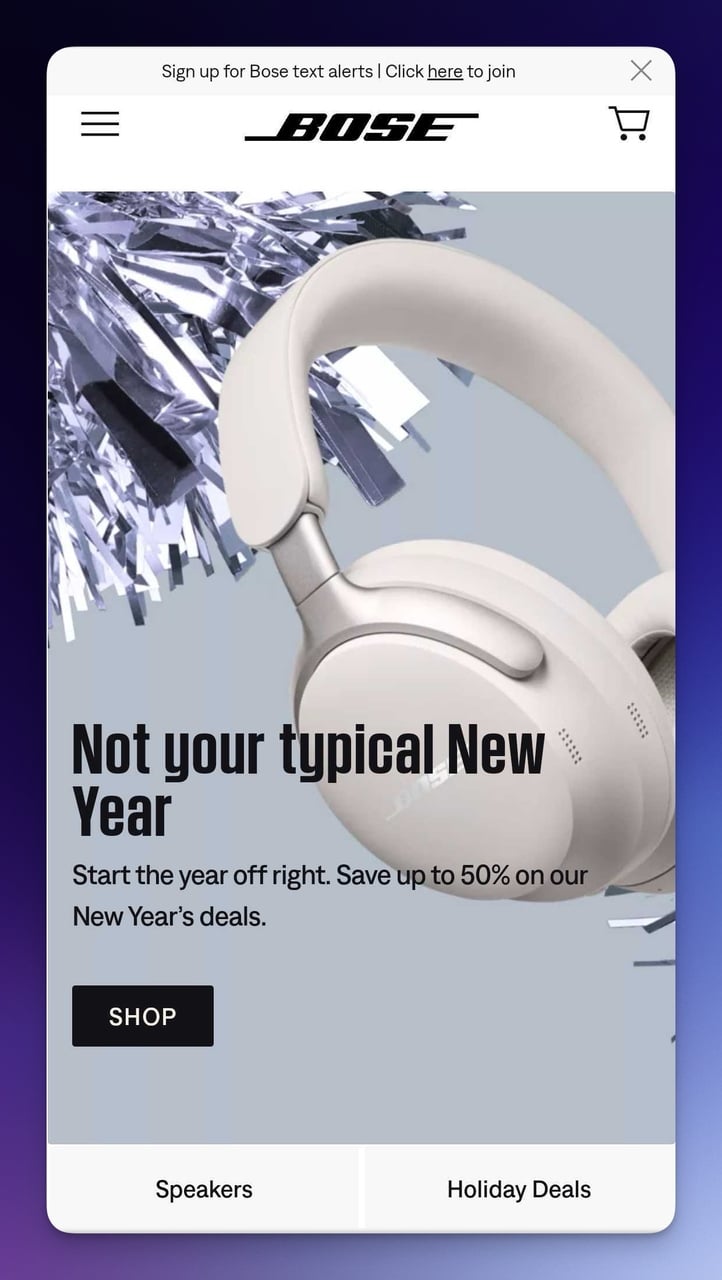
Bose mobile landing page with SMS opt-in
What works: The SMS text alert sign-up banner sits at the very top, before the hero image. "Save up to 50%" appears directly below the product shot, creating an immediate price anchor. The dark background with white text gives the page a premium feel while achieving a contrast ratio that's easy on the eyes in any lighting condition.
Why it works: Loss aversion. "Start the year off right" paired with a discount creates the feeling that NOT buying means missing out. The SMS opt-in placement is smart because mobile users are already on their phones, and SMS open rates hit 98% compared to email's 20%. You can pair this approach with SMS marketing tools to automate follow-ups.
Value Proposition Section with Icons
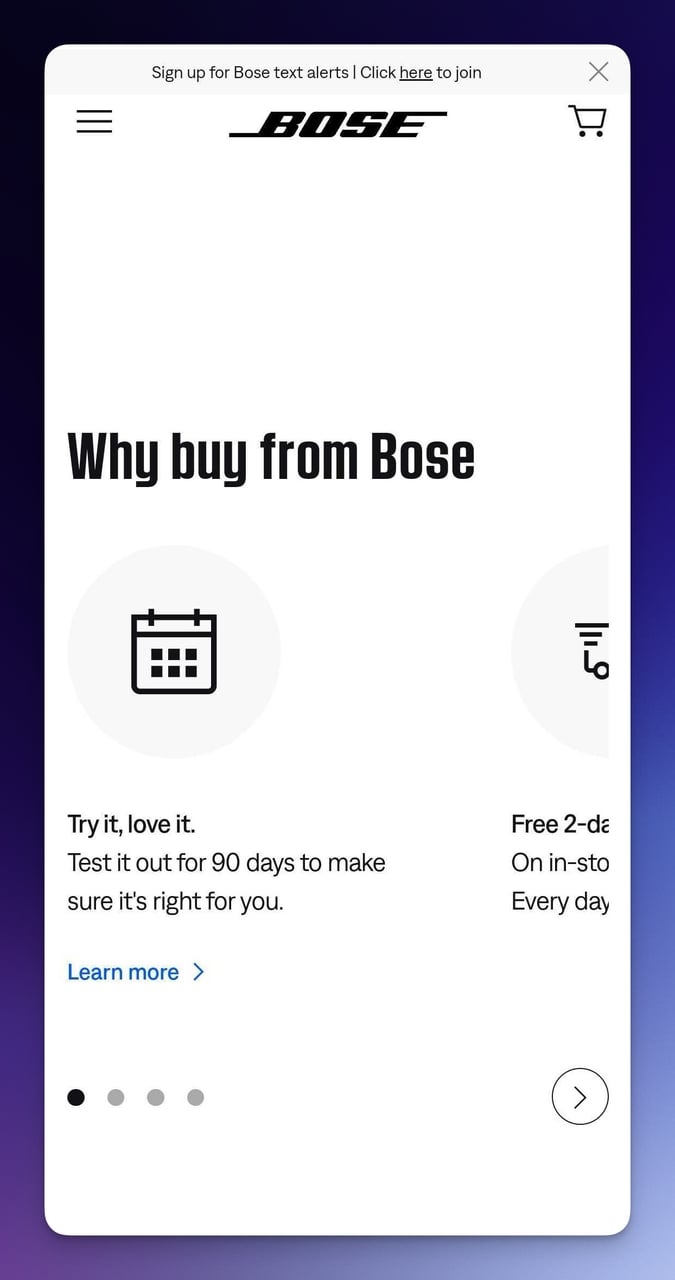
Bose trust-building section with benefit icons
What works: Three specific benefits (90-day trial, free 2-day shipping, easy returns) are each paired with a simple icon. The icons break up what would otherwise be a text-heavy section into scannable chunks. The "Learn more" links use descriptive text rather than generic "click here" language.
Why it works: The dual-coding theory from Allan Paivio's research shows that information presented as both text and image is retained 65% better than text alone. The icons aren't decorative; they're functional memory aids that help mobile visitors remember the benefits as they scroll.
Key takeaway: Place your trust signals (shipping, returns, trials) in a scannable icon grid below the fold. Mobile visitors who scroll past the hero are already interested; give them reasons to click the CTA.
5. Space Posters: When Less Really Is More
Theme-Driven Hero Experience
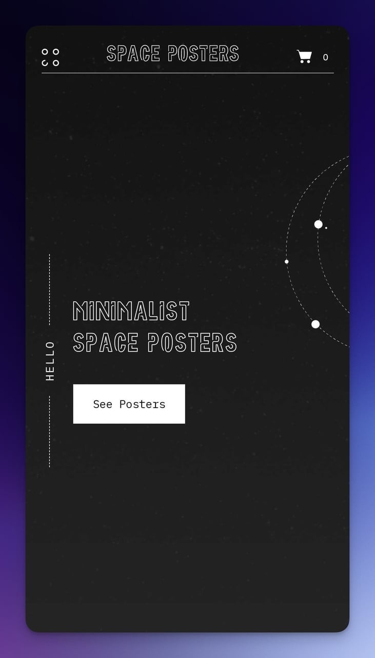
Space Posters minimal mobile landing page
What works: One button. One message. Massive negative space that mirrors the product's cosmic minimalism. The vertical "HELLO" text on the side is a design risk that pays off because it's unexpected on mobile. The dark background isn't just aesthetic; it reduces battery drain on OLED screens, which is a functional benefit most designers overlook.
Why it works: The Von Restorff Effect (isolation effect) states that items that stand out from their environment are remembered better. When everything is dark space and the CTA button is the only bright element, it becomes impossible to miss. There's literally nothing else competing for attention.
Product Detail and Pricing
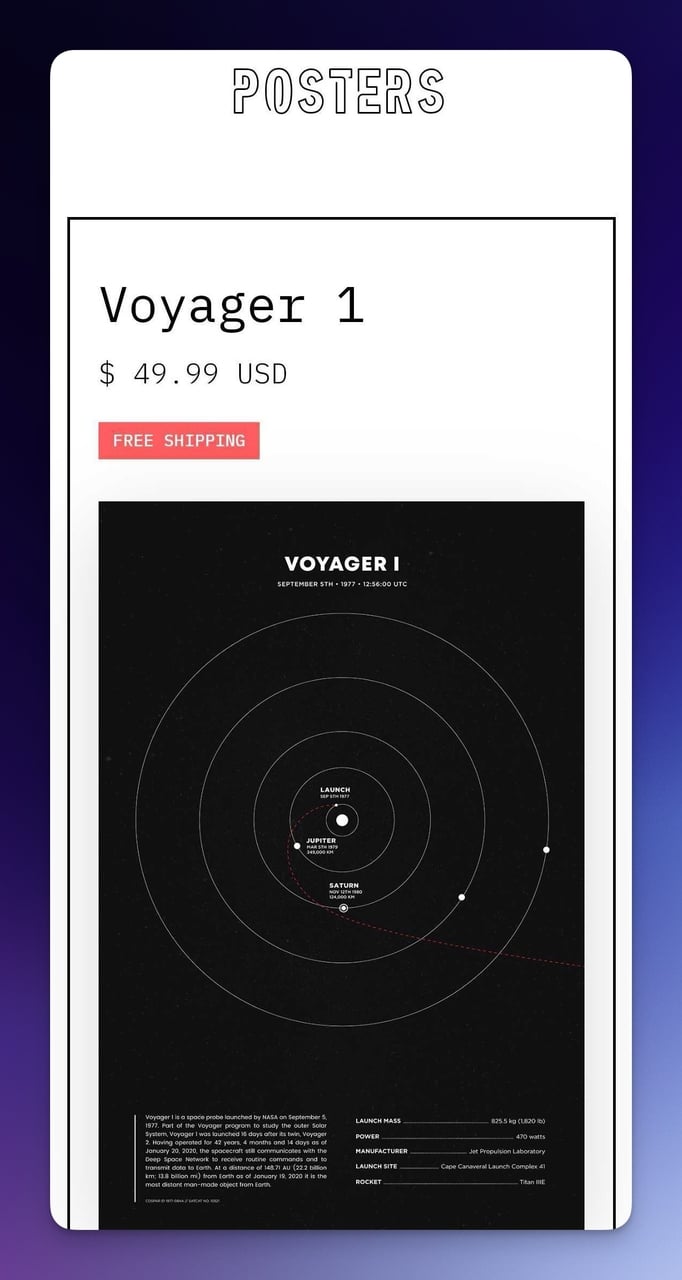
Space Posters product detail section
What works: Price and free shipping are immediately visible without scrolling through the product details. Despite the amount of text on this section, the typography hierarchy keeps it organized: price in large text, description in smaller text, shipping info highlighted separately.
Why it works: Price transparency reduces decision friction. When visitors can't easily find the price on mobile, they bounce. Space Posters puts cost information front and center, removing one of the top three reasons for cart abandonment.
Key takeaway: Match your mobile landing page's visual design to your product's personality. If you sell minimalist products, your page should feel minimalist. Consistency between product and page builds subconscious trust.
6. Death Wish Coffee: Brand Voice That Sells
Personality-Driven Hero Section
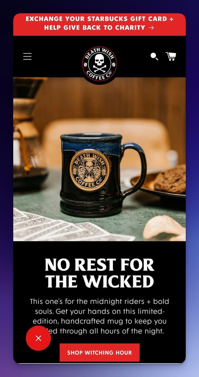
Death Wish Coffee mobile hero with bold brand copy
What works: "NO REST FOR THE WICKED" sets the tone instantly. The "Witching hour" CTA creates exclusivity without a single discount code. The copy targets "midnight riders + bold souls," which is specific enough to feel personal to the right audience and polarizing enough to repel the wrong one. That's intentional. Polarizing copy filters for high-intent buyers.
Why it works: Identity-based persuasion. Rather than selling coffee features (bean origin, roast level), Death Wish sells a self-concept. Visitors don't buy the product; they buy membership in a tribe. This is the same mechanism behind brands like Harley-Davidson.
UGC Integration and Newsletter CTA
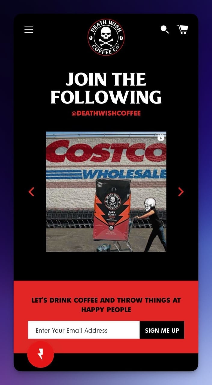
User-generated content and newsletter signup
What works: The UGC carousel shows actual customers holding actual products. The newsletter CTA maintains the brand voice ("LET'S DRINK COFFEE AND THROW THINGS AT HAPPY PEOPLE") while using a contrasting button color that pops against the dark background.
Integrating user-generated content directly on the landing page is more convincing than any product photography studio could produce.
Why it works: Social proof at scale. UGC images feel authentic because they ARE authentic.
Key takeaway: Write your mobile landing page copy in the same voice your customers use in their social posts. If your brand voice matches your audience's identity, conversion feels like self-expression rather than a purchase.
7. Crate & Barrel: Layered Promotions Done Right
Seasonal Hero with Video
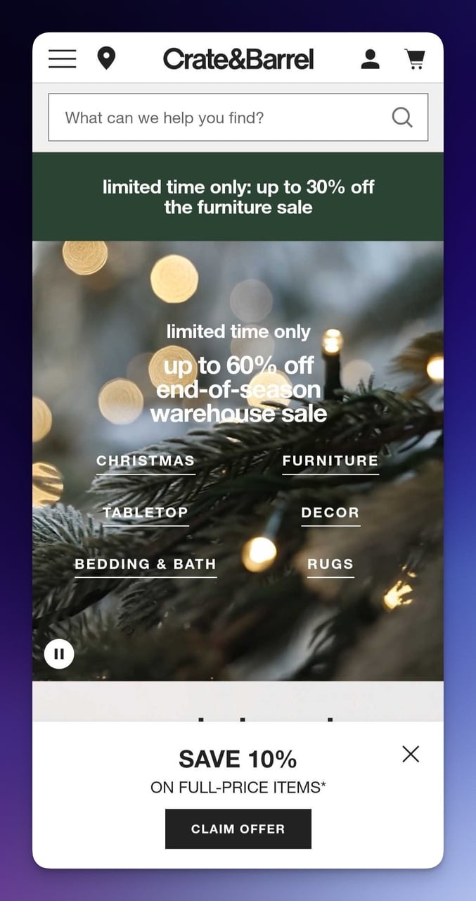
Crate and Barrel mobile hero with video and promotions
What works: Multiple layered offers ("up to 30% off furniture" and "up to 60% off end-of-season") without visual clutter. The video hero with a pause button respects user control. The "SAVE 10%" mobile popup uses contrast colors that stand out without obscuring the product content beneath it. Navigation categories are neatly organized for one-handed browsing.
Why it works: Promotional stacking. Each discount targets a different buyer motivation: the 30% for browsers, the 60% for bargain hunters, and the 10% popup for email-list builders. According to Email Vendor Selection, landing pages have a 160% higher conversion rate compared to other signup forms, and Crate & Barrel's popup captures emails at the exact moment of highest engagement.
Seasonal Content Section
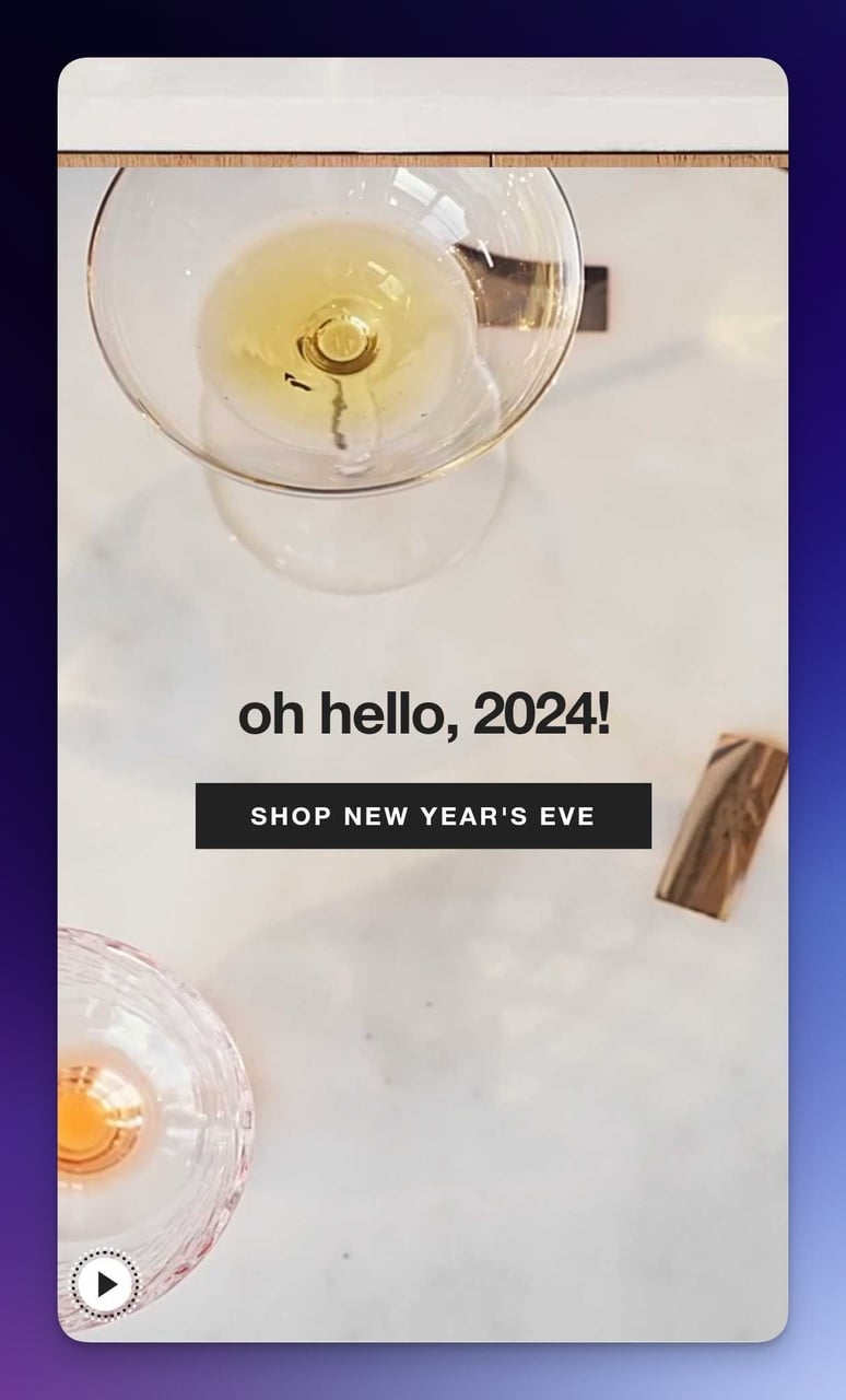
Crate and Barrel seasonal product showcase
What works: The greeting "oh hello, 2024!" paired with a high-quality celebratory video creates emotional resonance. The video auto-plays but doesn't use sound by default, respecting mobile browsing norms where 85% of Facebook videos are watched without audio.
Why it works: Temporal relevance. Seasonal content creates urgency without explicit countdown timers. The greeting makes the page feel current, fresh, and intentionally designed for right now.
Key takeaway: Layer promotions by intent level. Put your biggest discount for deal-seekers in the hero, your email capture popup for newsletter builders in the middle, and your category navigation for browsers at the top. Each visitor type finds their entry point.
8. IKEA: App Promotion Without Interruption
Banner Strategy and Navigation
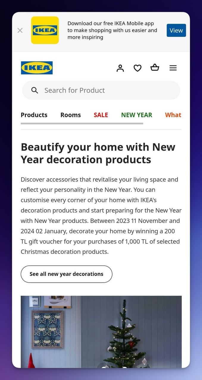
IKEA mobile page with app promotion banner
What works: The app promotion banner at the top uses contrasting colors (blue on white) to stand out without being a full-screen interstitial that Google penalizes. All navigation elements sit within the thumb-friendly zone, the lower 60% of the screen where mobile users naturally interact. The search bar is immediately accessible, which matters for a catalog with thousands of products.
Why it works: IKEA treats the app download as a secondary goal rather than blocking the primary experience. Google's mobile interstitial guidelines explicitly penalize pages that use full-screen popups to push app installs. IKEA's inline banner approach avoids that penalty while still promoting the app.
Product Carousel and Categories
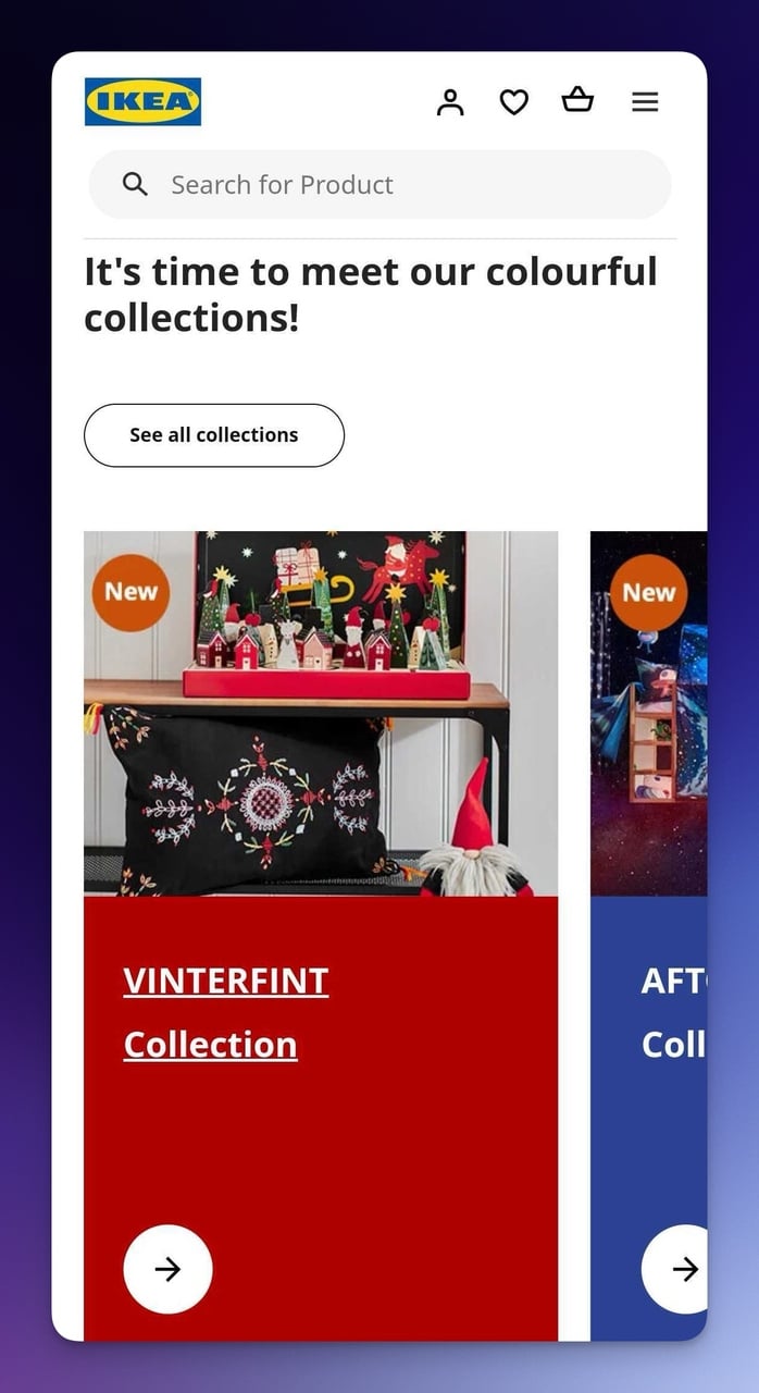
IKEA product carousel with "New" tags
What works: The horizontal carousel lets users browse multiple collections without leaving the page. Each item's "New" badge draws attention to fresh arrivals. This pattern is something users have learned from apps like Netflix and Spotify, so the interaction model is already familiar.
Why it works: Leveraging existing mental models. When your mobile landing page uses interaction patterns people already know from their most-used apps, you eliminate the learning curve entirely. That's zero-friction browsing.
Key takeaway: If you want mobile visitors to download your app, use an inline banner, not an interstitial. Google penalizes intrusive interstitials, and visitors hate them. A thin, dismissible banner converts better long-term because it doesn't destroy trust.
9. Rare Beauty: Gamification That Actually Works
Brand Story and Celebrity Credibility
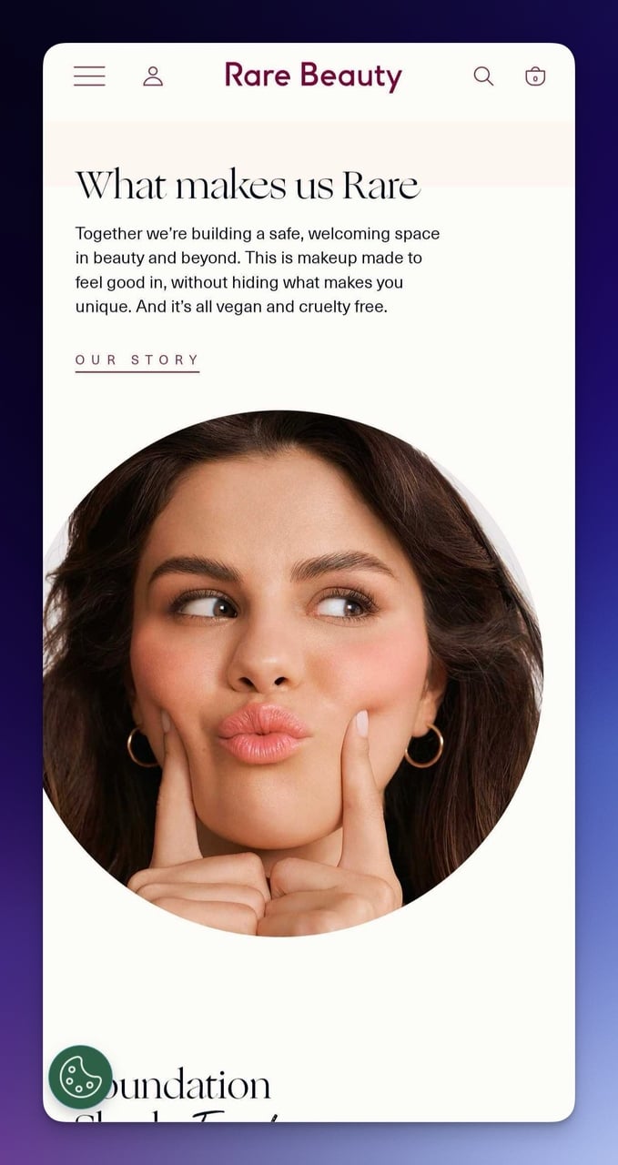
Rare Beauty brand story section on mobile
What works: Selena Gomez's close-up photograph immediately establishes authority and trust through celebrity association. "What makes us Rare" is concise brand messaging that doubles as a subheading. The sans-serif typography is sized for mobile readability, with plenty of line height that prevents text from feeling cramped.
Why it works: Authority transfer. The celebrity's credibility transfers to the product without needing to explain why you should trust the brand. This works differently from traditional testimonials because the founder IS the authority, which makes the E-E-A-T signal genuine rather than manufactured.
Interactive Product Quiz
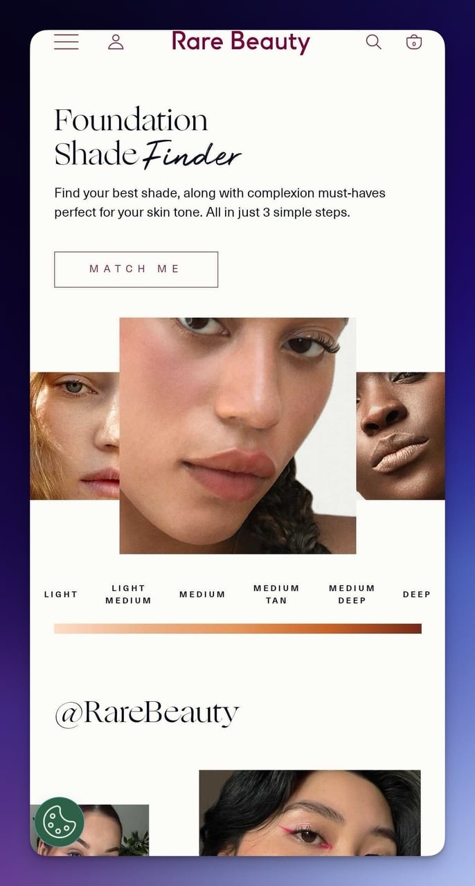
Rare Beauty "Match Me" interactive quiz
What works: The "MATCH ME" feature turns product selection into a game. Instead of scrolling through dozens of shades, visitors answer a few questions and get a personalized recommendation. Below it, the @RareBeauty Instagram UGC integration shows real customers wearing the products in real conditions.
Why it works: The Zeigarnik Effect. Once someone starts a quiz, they feel compelled to finish it. Incomplete tasks create psychological tension that drives completion. Quizzes also collect zero-party data (preferences the customer volunteers), which enables personalized follow-up emails that convert at much higher rates.
Key takeaway: Replace product filter dropdowns with an interactive quiz on mobile. Quizzes generate 2-3x more engagement than static catalogs, and the data you collect lets you personalize every touchpoint afterward.
10. Skullcandy: High-Energy Promo Design
Promotional Hero with Promo Code
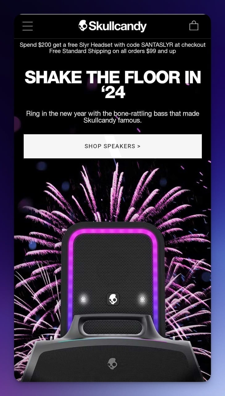
Skullcandy mobile hero with promotional offer
What works: The promotional offer and promo code sit front and center, no scrolling required. Dynamic product imagery (speaker with fireworks) conveys the brand's energy without needing video. The offer structure is dead simple: here's the product, here's the discount, here's the code. Three pieces of information. Done.
Why it works: Cognitive fluency. The easier something is to process, the more positively people evaluate it. Three pieces of information (product + discount + code) is the cognitive sweet spot for mobile screens where attention spans are measured in seconds, not minutes.
Full-Page Promotional Section
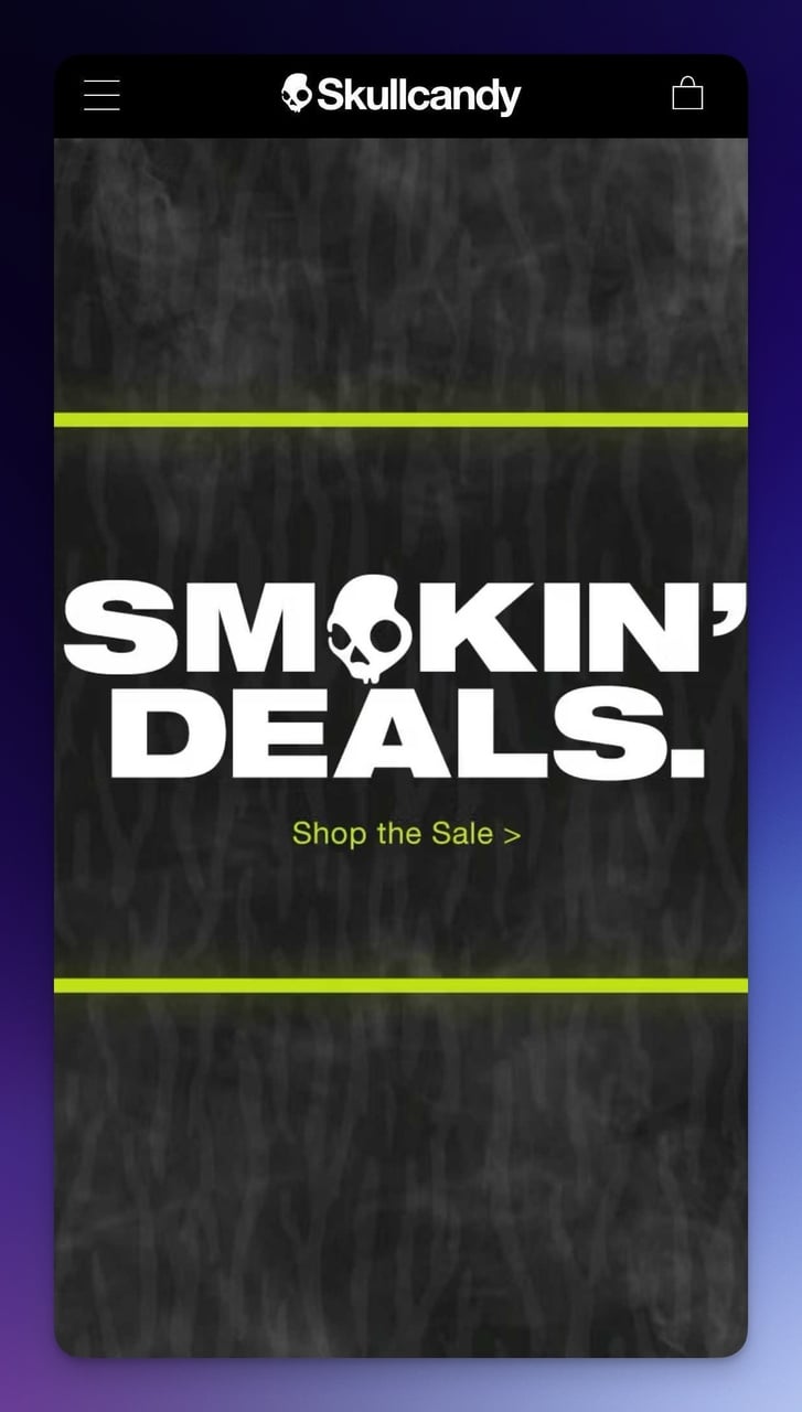
Skullcandy deals page with high-contrast design
What works: "SMOKIN' DEALS" in bold text dominates the entire viewport. White text on a dark background with a yellow accent line achieves maximum legibility. The page is stripped of every element that isn't directly selling. No navigation, no footer, no social icons. Just the deal.
Why it works: The serial position effect means people remember the first and last items in a sequence best. By dedicating an entire screen to one message, Skullcandy ensures that message IS both the first and last thing the visitor sees in that scroll position.
Key takeaway: For promotional mobile pages, give your biggest deal an entire viewport. One message, maximum contrast, zero distractions. If visitors have to hunt for the offer, it's not a mobile landing page. It's a desktop page that happens to fit on a phone.
11. Premium Teas: Quiet Elegance That Converts
Timely Announcements and Chat Support
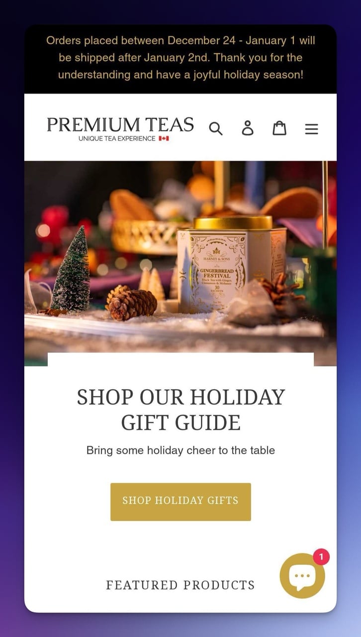
Premium Teas mobile page with seasonal announcement
What works: The shipping notification at the top is a smart use of prime real estate for timely information that prevents support tickets. The "SHOP OUR HOLIDAY GIFT GUIDE" CTA uses a contrasting button color against a neutral background. The chat bubble icon in the corner promises instant help, which is significant as live chat can increase conversions.
Why it works: Proactive friction reduction. Instead of waiting for customers to wonder about holiday shipping, Premium Teas answers the question before it's asked. This reduces support burden and keeps visitors in the buying mindset rather than the worrying mindset.
Product Grid Layout
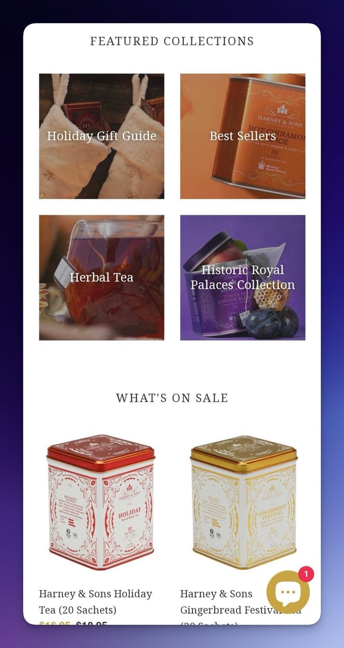
Premium Teas product grid on mobile
What works: The two-column grid layout displays products efficiently without requiring horizontal scrolling. Each product image is consistent in size, lighting, and composition. The consistent design language across all product tiles creates a visual rhythm that makes browsing feel effortless.
Why it works: The Gestalt principle of similarity. When product cards share the same visual treatment (size, spacing, typography), the brain processes them as a cohesive collection rather than individual items. This reduces the mental effort of comparison shopping on a small screen.
Key takeaway: Use your mobile landing page's top banner for time-sensitive operational info (shipping delays, holiday hours) rather than promotional messages. Customers appreciate transparency, and it reduces support costs by preempting the most common pre-purchase question.
12. Mahabis: Persistent Discounts Without Annoyance
Smart Popup Behavior
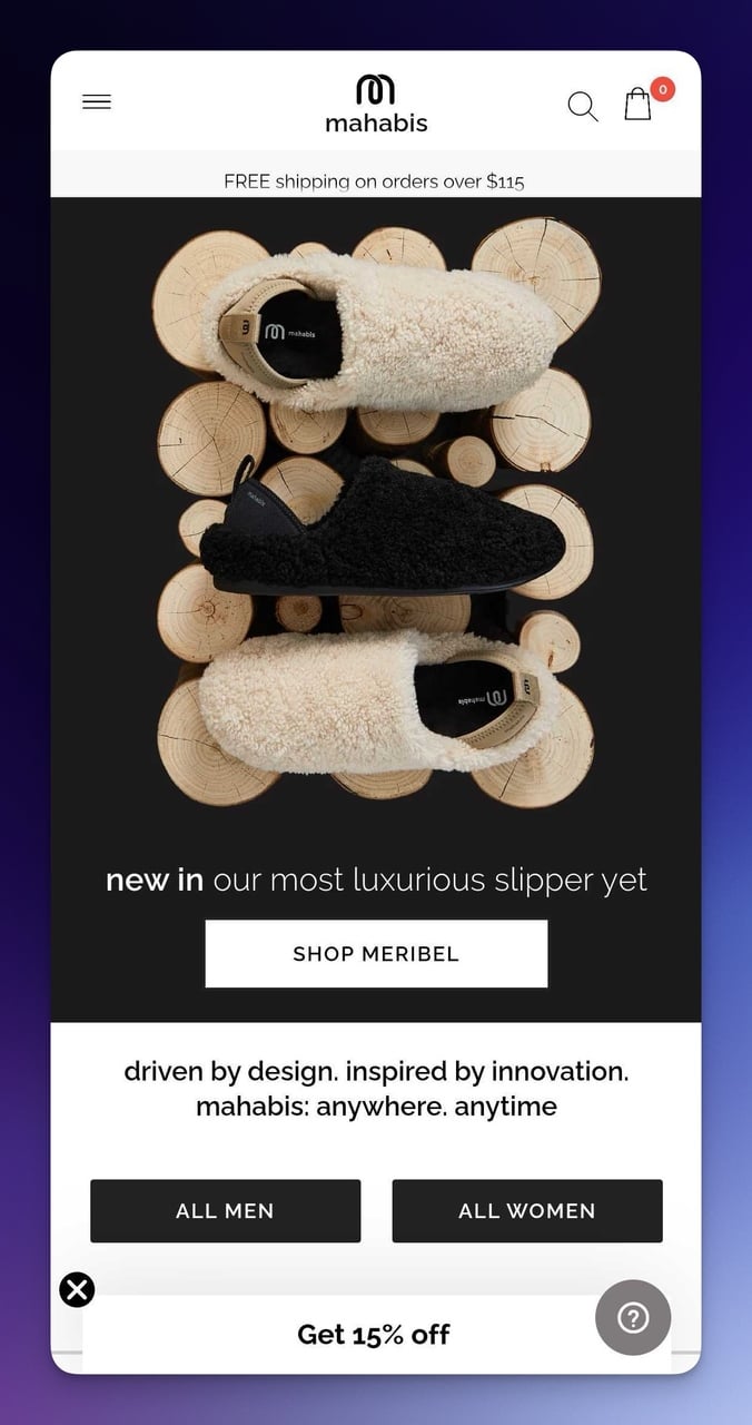
Mahabis mobile page with 15% discount popup
What works: The "Get 15% discount" popup appears after initial page load, not immediately. When dismissed, it transforms into a small persistent banner that follows the user while they browse. This means the offer is always available without blocking content.
You can add discount codes to popups with the same collapsible behavior using the popup builder Popupsmart. "New in our most luxurious slipper yet" communicates the value proposition in 8 words.
Why it works: The endowment effect combined with availability. Once users see the 15% discount, they mentally "own" that savings. The persistent banner reminds them it's available without repeating the interruption. This is far more effective than a one-and-done popup that disappears forever when closed.
Interactive Video Element
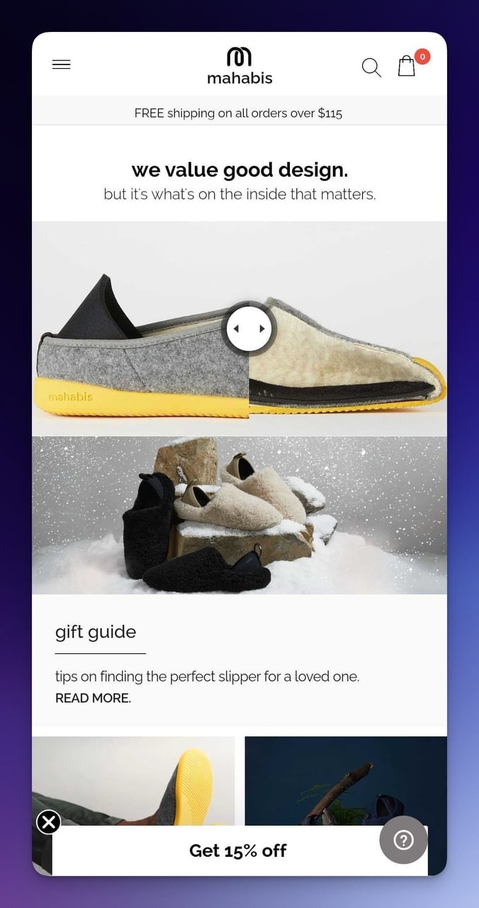
Mahabis interactive product video
What works: A visible play button on the product image signals that video content is available without auto-playing it. The surrounding whitespace keeps the page feeling clean while still including multiple CTAs (gift guide, product highlights, video). Strategic space management allows multiple entry points without visual clutter.
Why it works: User-initiated video gets 2-3x higher completion rates than autoplay. When visitors choose to press play, they've already committed a micro-action, which primes them for the larger action of adding to cart. The landing page design principle at work here is progressive commitment.
Key takeaway: Design your mobile popup to collapse into a persistent mini-banner instead of disappearing completely. The offer stays available throughout the browsing session without re-interrupting the experience. This recovers visitors who weren't ready to convert on first contact.
13. Walmart: Personalization at Scale
Deal Structure and App Promotion
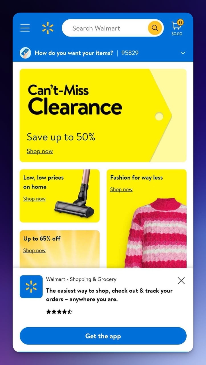
Walmart mobile landing page with deal structure
What works: High-contrast yellow "Shop now" buttons on blue backgrounds pass accessibility standards while creating visual urgency. The "Can't-Miss Clearance" banner uses bold, readable text that's visible even in bright sunlight (a real concern for mobile browsing outdoors). The app download section has a clear value proposition: "The easiest way to shop."
Why it works: Color psychology at scale. Blue communicates trust (Walmart's brand foundation) while yellow signals action and optimism. The combination works on both conscious and subconscious levels.
According to Block Agency's mobile web statistics, about 74% of users are more likely to return to mobile-friendly websites, and Walmart's consistent color system makes the experience instantly recognizable across visits.
Membership Upsell and Personalization
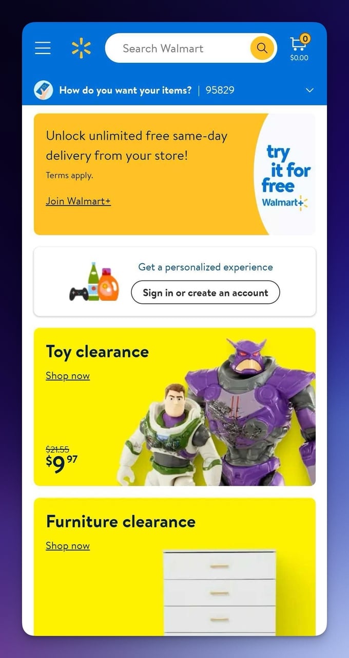
Walmart+ membership promotion and personalization
What works: The Walmart+ membership promotion leads with a tangible benefit (unlimited free same-day delivery) rather than the price. The personalization prompt encouraging sign-in or account creation is positioned after the visitor has already seen deals, not before. This sequence matters: value first, commitment second.
Why it works: The foot-in-the-door technique. By showing valuable deals before asking for an account, Walmart creates a sense of reciprocity. The visitor has already received something (deal information), making them more likely to give something back (account data).
According to DesignRush, the cross-industry average conversion rate is 6.6%, but personalized experiences consistently outperform that baseline.
Key takeaway: Always show value before asking for commitment on mobile. Present your best deals first, then ask for the email or account signup. Reversing this order (signup gate before content) kills mobile conversions because phone users have even less patience for barriers than desktop users.
14. Goodfair: Sustainable E-Commerce Done Right
Non-Obstructive Popup Design
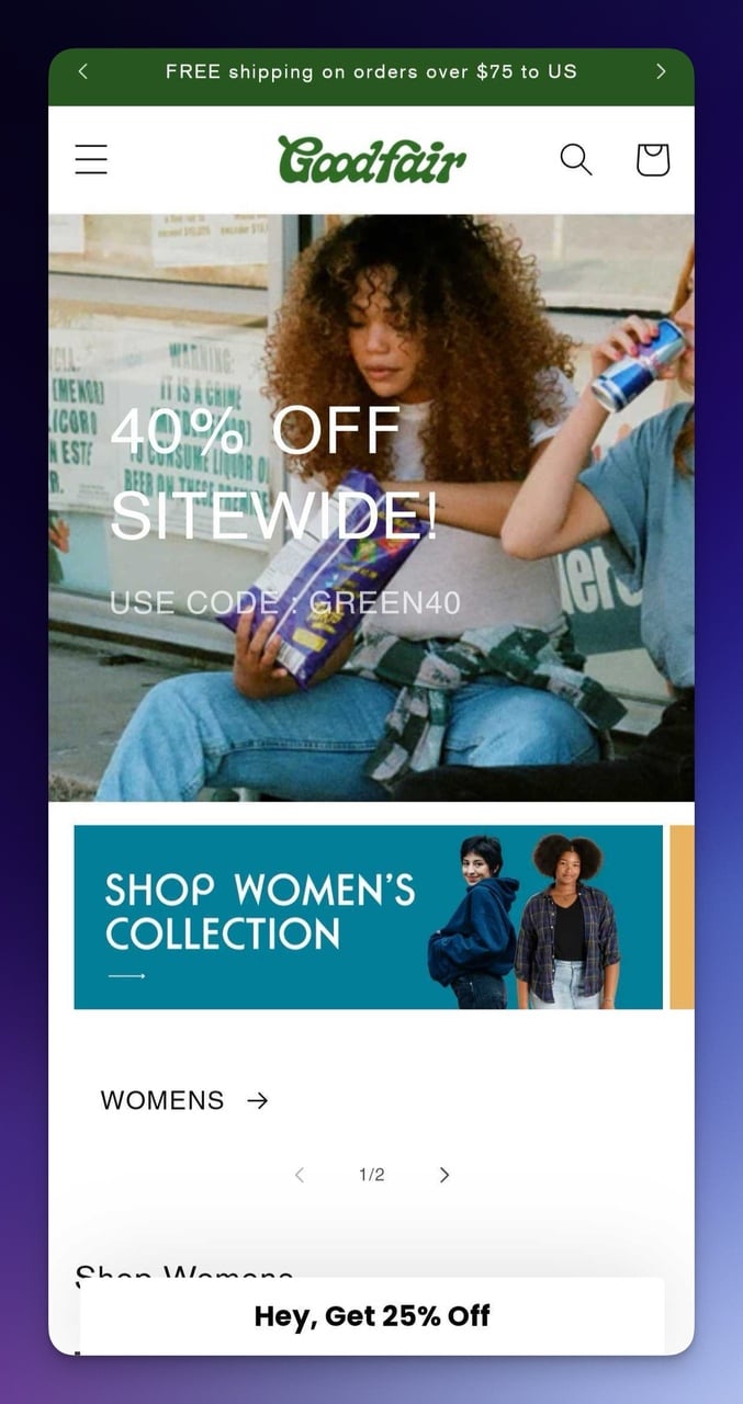
Goodfair mobile page with minimizable popup
What works: The "Get 25% Off" popup is noticeable but not obstructive. One tap minimizes it, and it doesn't return to full-screen size. Navigation uses universally recognized icons (magnifying glass for search, bag for cart) without labels, saving horizontal space. The hamburger menu keeps category browsing clean on small screens.
Why it works: Respect for user agency. Google's quality raters penalize intrusive mobile interstitials, but more importantly, visitors penalize them by leaving. Goodfair's minimizable popup gives the visitor control, which builds trust and keeps them on the page longer.
Price-Forward Product Display
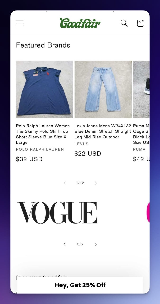
Goodfair product carousel with visible pricing
What works: Prices appear directly below each product image. No tapping through to a product page to find out cost. The dot indicators below the carousel tell visitors there's more to swipe, using the same pattern Instagram Stories popularized. Bundle pricing ("Mystery Bundle $30") creates a treasure-hunt element that works well for thrift-focused shoppers.
Why it works: Price transparency eliminates the #2 reason for mobile cart abandonment (unexpected costs). When prices are visible during browsing, visitors self-qualify. Those who tap through to product pages are already comfortable with the price point, which means higher conversion rates from product page to checkout.
Key takeaway: Show prices on your mobile product carousel, not just on product detail pages. Price-visible browsing pre-qualifies shoppers and reduces the friction between "interested" and "add to cart." If your prices are hidden, mobile visitors assume the worst.
How to Optimize Your Mobile Landing Page for Conversions
Responsiveness and Load Speed
I've tested pages across dozens of clients, and the single biggest conversion killer on mobile isn't bad design. It's slow load speed.
According to Lovable.dev's conversion research, desktop conversion rates average 4.8-5.06% compared to mobile's 2.49-2.9%. That's a 40-51% gap, and load speed accounts for a significant chunk of it.
• Compress all images: Use WebP format and aim for under 100KB per image on mobile
• Test with PageSpeed Insights: Score 90+ on mobile, not just desktop
• Use frameworks like Bootstrap or a no-code builder with built-in responsive breakpoints
Touch-Friendly CTA Placement
Your CTA button needs to be at least 48x48 pixels. That's Google's minimum tap target size. But I've found that 56px or larger performs noticeably better, especially for primary actions like "Buy Now" or "Sign Up."
• Place primary CTAs in the thumb zone: Bottom-center of the screen is optimal
• Add enough spacing between touch targets: Minimum 8px gap prevents accidental taps
• Use contrasting colors: Your CTA should have at least 4.5:1 contrast ratio against its background
Visual Hierarchy for Small Screens
On desktop, you have multiple visual anchors. On mobile, you have one column. That means your visual hierarchy needs to do more work with less space. The best B2B landing pages use size, color, and spacing to guide the eye in a clear top-to-bottom flow.
• Headline: Largest text on the page (24-32px on mobile)
• Subheadline: Supporting detail at 16-18px
• Body text: 14-16px minimum for readability
• CTA button: Full-width or near full-width to prevent thumb-target misses
Form Optimization for Mobile
Every field you add to a mobile form costs conversions. According to research cited by Lovable.dev, reducing form fields delivers a 120% lift in completions. If your landing page form asks for name, email, company, phone, and job title, you're losing most visitors before they start.
• Start with email only: Collect everything else in follow-up sequences
• Use input type attributes: type="email" triggers the email keyboard, type="tel" triggers the number pad
• Enable autofill: Proper input naming lets browsers auto-populate fields
Common Mobile Landing Page Mistakes to Avoid
Design and Performance Pitfalls
After reviewing hundreds of mobile landing pages over the past two years, I see the same mistakes repeatedly. Here are the ones that cost the most conversions:
• Desktop-first design scaled down: Shrinking a desktop layout doesn't make it mobile. You need separate mobile wireframes with touch-first interactions. According to Block Agency, 62.54% of all web traffic comes from mobile, so mobile should be your primary design target.
• Full-screen interstitials on load: Google explicitly penalizes these. Use inline banners or timed popups that appear after engagement instead.
• Too many CTAs competing: Every example above uses a single primary CTA per screen. Two or more equal-weight buttons create decision paralysis.
• Ignoring page speed: Compressing images and minimizing JavaScript can shave 2-3 seconds off load time. On mobile, that's the difference between a 30% bounce rate and a 70% bounce rate.
Content and Conversion Pitfalls
• Hiding prices: As Goodfair demonstrates, visible prices pre-qualify shoppers. Hidden pricing breeds distrust on mobile where patience is short.
• Ignoring accessibility: Like Meow Meow Tweet showed, 16% of the population has a disability. Skipping accessibility doesn't just exclude people; it hurts your SEO signals through poor HTML structure.
• Generic popup timing: Showing a popup immediately on page load before the visitor has even seen your content is the mobile equivalent of a door-to-door salesperson. Use scroll-triggered or exit-intent popups that fire after the visitor has shown engagement.
What These Mobile Landing Page Examples Teach Us
After analyzing all 14 mobile landing page examples, several key elements emerge that distinguish high-converting mobile pages from the rest.
1. Single-goal focus. Every example above has one primary action per screen. Allbirds wants you to shop. Bose wants you to claim the discount. Space Posters wants you to view the collection. One goal. One button.
2. Trust before ask. Walmart shows deals before requesting an account. Beefcake shows testimonials before asking for an email. Crate & Barrel shows seasonal content before surfacing the popup. The pattern is always: give value, then ask for something.
3. Brand voice consistency. Death Wish Coffee's "NO REST FOR THE WICKED" and Beefcake's "Swim Happy" aren't generic taglines. They're personality statements that filter for the right audience and repel the wrong one. Strong brand voice on mobile builds instant recognition.
4. Friction removal over feature addition. Mahabis' collapsible popup, Goodfair's visible pricing, and Premium Teas' shipping notification all remove barriers rather than adding features. On mobile, subtraction beats addition every time.
5. Borrowed interaction patterns. IKEA's horizontal carousel borrows from Netflix. Goodfair's dot indicators borrow from Instagram Stories. Rare Beauty's quiz borrows from BuzzFeed. Using patterns people already know eliminates the learning curve.
Your mobile landing page doesn't need to reinvent interaction design. It needs to execute proven patterns with your brand's unique voice and a relentless focus on one conversion goal per page. If you're looking for a fast way to add conversion elements to your mobile pages, opt-in page examples and SaaS landing page examples offer more patterns you can borrow.
Frequently Asked Questions
What Is a Mobile Landing Page?
A mobile landing page is a standalone web page designed specifically for smartphone and tablet screens. Unlike a regular homepage, it focuses on a single goal: getting the visitor to take one action (buy, sign up, download). The layout prioritizes thumb-friendly navigation, fast load times, and content that's readable without zooming.
What Is the Best Size for a Mobile Landing Page?
The standard mobile viewport ranges from 360px to 414px wide for most smartphones in 2026. Design for 375px width as your baseline (iPhone 14/15 standard), then test at 360px (Android) and 428px (iPhone Pro Max).
For height, don't design for a fixed dimension. Mobile landing pages should scroll vertically, with the most important content (headline, value proposition, primary CTA) visible in the first 600-700px of vertical space. Use CSS viewport units and responsive breakpoints rather than fixed pixel heights.
How Do Mobile Landing Pages Improve Conversions?
Mobile landing pages improve conversions by reducing friction at every step. A single-column layout eliminates the need for horizontal scrolling. Touch-optimized buttons prevent misclicks. Fast load times (under 3 seconds) keep visitors from bouncing. And focused content with one CTA removes decision paralysis. As the examples above show, brands like Allbirds and Goodfair use these principles together.
According to Popupsmart's mobile conversion guide, implementing even two or three of these optimizations can close the gap between desktop and mobile conversion rates.
Can I Use the Same Landing Page for Desktop and Mobile?
Yes, if it's truly responsive. A responsive landing page adjusts layout, font sizes, image dimensions, and touch targets based on screen size. That said, "responsive" doesn't mean "identical." Your desktop page might show a sidebar with secondary CTAs, while the mobile version hides that sidebar and shows a sticky bottom CTA bar instead. Test your page on actual devices (not just browser resizers) because touch behavior differs from click behavior.
How Can I Make My Mobile Landing Page More Interactive?
Touch-based interactions are your biggest opportunity. Swipeable carousels (like Goodfair's product carousel), interactive quizzes (like Rare Beauty's shade matcher), and video with user-initiated play (like Mahabis) all increase time-on-page and engagement.
Consider adding mobile-friendly popups triggered by scroll depth or exit intent rather than on page load. Gamification elements like spin-to-win wheels or progress bars also drive interaction, but use them sparingly. One interactive element per page performs better than three.
How Does Mobile Landing Page Design Impact SEO?
Google uses mobile-first indexing exclusively since July 2024, meaning the mobile version of your page IS your page for ranking purposes. Page load speed directly affects Core Web Vitals scores (LCP under 2.5 seconds, INP under 200ms, CLS under 0.1). Intrusive mobile interstitials trigger ranking penalties.
Mobile UX signals like bounce rate and time-on-page feed into Google's NavBoost ranking system. In short, a poorly designed mobile landing page doesn't just lose mobile visitors. It hurts your desktop rankings too, because Google only looks at the mobile version.
How would you rate your experience with this article? 😊