The average popup conversion rate ranges from 3.09% to 11.09% depending on the platform and measurement method, with top-performing campaigns reaching 28% or higher. Cart abandonment popups convert at 17.12% on average, and mobile popups outperform desktop by over 40% in engagement. These popup conversion statistics draw from benchmark data across billions of popup displays in 2025 and 2026.

Key findings:
• The average popup conversion rate sits at 3.49%, with an interaction rate of 7.05% across 10,000+ campaigns — Popupsmart Benchmark Report
• Mobile popups convert 6.57% of visitors vs. 3.77% on desktop — Gill Andrews
• Exit-intent popups with countdown timers reach 14.41% conversion — Envive AI
• Two-step promotional popups hit an 11.9% conversion rate — Rejoiner
What Is the Average Popup Conversion Rate in 2026?
Popup conversion rates vary widely based on who's measuring and what counts as a "conversion." According to Popupsmart's 2025 benchmark report analyzing 10,000+ campaigns, the average popup conversion rate is 3.49% with an average interaction rate of 7.05%. That gap between interaction and conversion tells you something: most visitors who engage with a popup don't follow through, which means small design and copy changes can move the needle fast.
Other industry research puts the figure higher. Benchmark studies analyzing millions of popup displays report averages between 4.82% and 11.09%, depending on whether they measure all popups or only those that received engagement. The top 10% of popup campaigns routinely exceed 20% conversion rates.
What to do: Don't benchmark your popups against a single "average." Instead, compare against your own industry vertical and popup type. A 3% rate on an informational blog popup is solid. A 3% rate on a cart abandonment popup with a 15% discount? That needs work.
How Do Popup Conversion Rates Differ Across Industries?
Not all popups perform equally. Industry matters more than most marketers realize, because visitor intent and purchase readiness shift dramatically between verticals. A returning shopper on a fashion site is a different animal from a first-time visitor reading a media article.
E-commerce leads the pack at 6.88% average popup conversion, according to industry benchmark studies. Media sites trail at roughly 3.70%. This makes sense: e-commerce visitors often arrive with buying intent, so a well-timed discount or free shipping offer aligns with what they already want.
For a broader perspective, the average website conversion rate in 2026 sits between 2% and 5% across most industries.
According to Martal Group, B2B campaigns typically fall between 1% and 2%. That means a popup converting at even 3.5% is outperforming many entire websites.
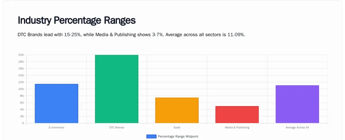
If you're in e-commerce, set your baseline at 5-7% and optimize from there. SaaS and media teams should target 3-5%. Check Shopify conversion rate benchmarks if you're running a Shopify store specifically.
What Makes Cart Abandonment Popups So Effective?
Cart abandonment popups consistently outperform every other popup type. According to Envive AI's conversion lift research, cart abandonment popups achieve a 17.12% average conversion rate, with top performers reaching 42.35%.
The reason is timing and intent. Someone who added items to their cart already demonstrated purchase intent. They're one friction point away from buying. An exit-intent popup that appears right as they move toward the browser tab catches them at peak decision tension.
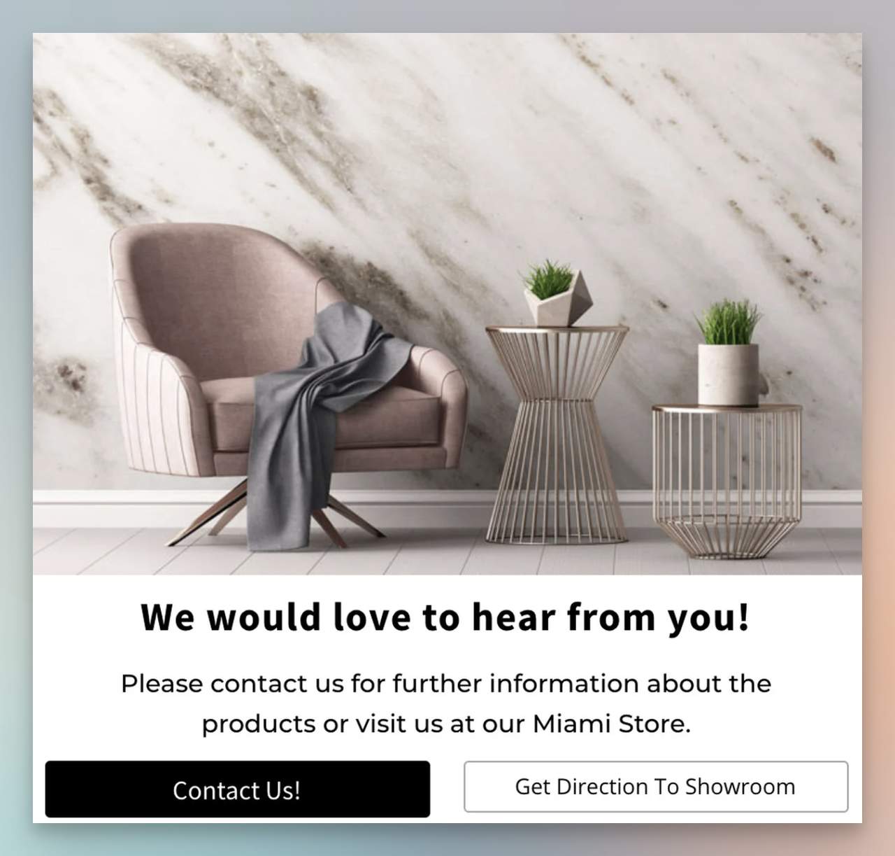
We've seen this play out with Popupsmart clients. One e-commerce brand, Sefa Stone, used a cart abandonment popup paired with a "get directions to showroom" button. After four weeks:
• Popup conversion rate: 10.23%
• Contact inquiries generated: 1,500
• "Get Direction to Showroom" clicks: 358
For more cart abandonment popup examples, we've compiled 15 designs that recovered lost sales across different industries.
Pro tip: Set up exit-intent targeting on your cart and checkout pages. Offer something tangible: free shipping, a time-limited discount, or a reminder of what's in their cart. According to cart abandonment statistics for 2026, over 70% of online shoppers leave without purchasing, so even a small recovery percentage translates to significant revenue.
Do Mobile Popups Convert Better Than Desktop?
Yes, and the gap is bigger than most people expect. According to Gill Andrews' analysis of popup data, mobile popups convert 6.57% of visitors compared to just 3.77% on desktop. That's a 74% higher conversion rate on mobile.
Industry research from multiple benchmark studies confirms mobile popups engage over 40% better than desktop popups overall. The likely explanation: mobile screens force simplicity. A popup on a phone takes up the full viewport, demanding a decision. Desktop users can more easily ignore or scroll past a popup that only covers part of the screen.
But there's a catch. Google penalizes intrusive mobile interstitials, so your mobile popup strategy needs finesse. For guidance on staying within Google's guidelines while still converting, read our mobile vs. desktop popup behavior analysis.
What to do: Design mobile-first popups that are easy to close (large X button, swipe-to-dismiss). Use Popupsmart's exit-intent targeting adapted for touch devices. Test full-screen takeovers against bottom-bar popups on mobile to find what your audience responds to.
What Popup Triggers Produce the Highest Conversion Rates?
The trigger mechanism matters as much as the offer itself. Getting the timing wrong turns a potential conversion into an annoyed bounce.
Exit-Intent Triggers
Exit-intent popups with countdown timers achieve a 14.41% conversion rate, according to Envive AI. Adding urgency to the moment a visitor is about to leave creates a psychological push that static popups can't match.
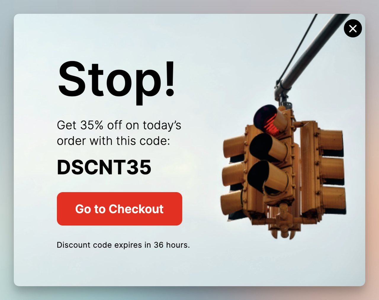
What to do: Combine exit-intent detection with a countdown timer showing 10-15 minutes of remaining offer validity. This taps into loss aversion without feeling manipulative if the offer is genuine.
Multi-Step Popups
According to Rejoiner's email capture research, two-step promotional popups (a pre-step followed by the main form) achieve an 11.9% conversion rate with a 3.8% engagement rate. Three-step sequences get higher initial engagement at 11.3% but convert slightly lower at 8.27%.
Tip: Start with a micro-commitment (a yes/no question or a simple choice) before asking for the email. This primes the visitor psychologically. Two steps generally outperform three for pure conversion rate.
Scroll-Based and Timed Triggers
Showing a popup after a visitor scrolls past 50% of the page or spends 30+ seconds on site filters out drive-by traffic. You're catching people who've already demonstrated interest by optimizing popup timing.

What to do: Test scroll-depth triggers (40-60% of page) against time-delay triggers (15-30 seconds). The winner depends on your content length and visitor behavior patterns.
How Do Images and Design Affect Popup Conversions?
Popup design isn't just aesthetics. According to Luca Tagliaferro's analysis of popup trends, adding images to popups increases click-through rates by over 25%. The same research found that popups with images can boost email signups by 63%.
This makes sense from a cognitive processing standpoint. An image of the product, the ebook cover, or even a relevant lifestyle shot gives visitors a concrete visual of what they're getting. Text alone asks them to imagine value. An image shows it.
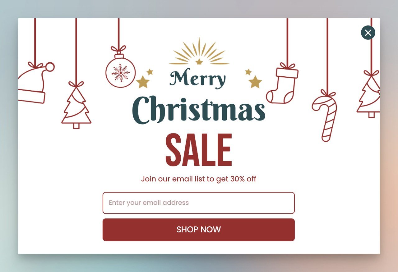
What to do: Include a product image or visual representation of your offer in every popup. For discount popups, show the product with the discounted price overlaid. For lead magnets, show a mockup of the PDF or guide.
12 Proven Tips to Increase Your Popup Conversion Rate
The statistics above tell you what's possible. These tips tell you how to get there. Each one is backed by data from the campaigns we've run at Popupsmart and from broader digital marketing benchmarks.
1. Time Your Popups Based on Visitor Behavior
Don't show a popup the instant someone lands on your page. According to Martal Group's conversion research, a 1-second delay in page load time reduces conversions by 7%. Imagine what a full-screen popup before the page even renders does to bounce rates.
Instead, trigger popups based on engagement signals: scroll depth, time on page, or exit intent. We've found that waiting until a visitor has been on-site for at least 10 seconds filters out the people who were never going to convert anyway.
2. Write a CTA That Tells Visitors Exactly What They Get
"Submit" is not a CTA. Neither is "Click Here." Your button text should describe the specific value the visitor receives.
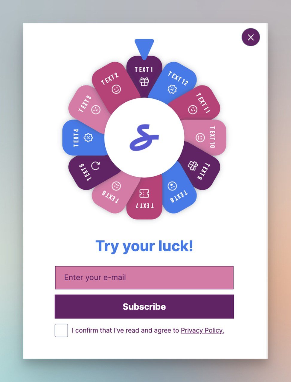
Swap "Subscribe" for "Get My 10% Discount" or "Download the Free Guide." According to Martal Group, personalized CTAs convert over 200% better than generic ones. That single button change can double or triple your popup's performance.
3. Use Gamification to Boost Engagement
Wheel popups and spin-to-win mechanics tap into the same psychological drivers that make slot machines addictive. Industry data shows gamified popups achieve engagement rates between 5% and 20%, with a 13% average conversion rate.
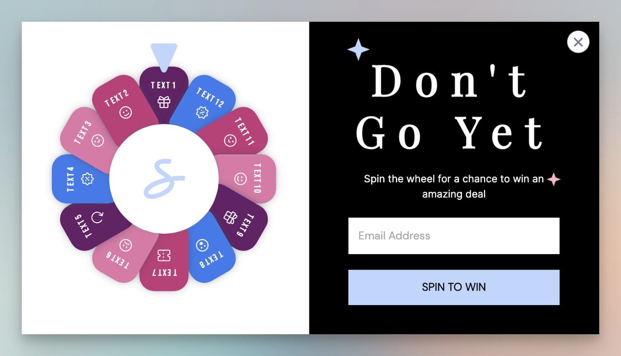
The fun factor lowers resistance. Visitors who spin a wheel feel like they "earned" their discount, which increases both redemption rates and average order value.
4. Make Every Popup Mobile-Responsive
With mobile popups converting at 6.57% vs. 3.77% on desktop, getting mobile right isn't optional. But "mobile-responsive" doesn't mean shrinking a desktop popup to fit a phone screen.
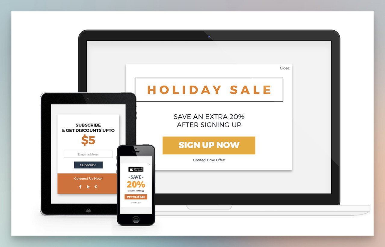
Design separate mobile experiences with larger tap targets, fewer form fields, and easy-to-reach close buttons. Test on actual devices, not just browser simulators.
5. Reduce Form Fields to the Minimum
Every additional field you add to a popup form drops your conversion rate. For most use cases, an email address is all you need at the popup stage. Name, company, phone number, job title? Save those for later in the funnel.

If you absolutely need more data, use progressive profiling: collect the email first, then ask follow-up questions in a welcome email or on a thank-you page. Check our guide on how to increase form conversion rates for more on this approach.
6. Don't Cover Content on Mobile
Google's violatesMobileInterstitialPolicy penalty is real. If your popup hides the main content on mobile before a user has had a chance to engage, you risk both a ranking hit and an instant bounce.
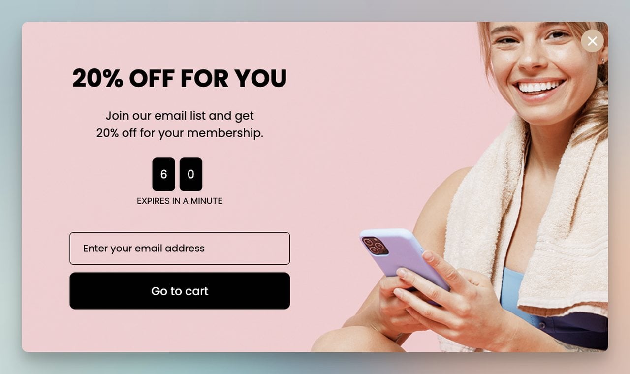
Use bottom bars, slide-ins, or delayed full-screen popups instead of immediate takeovers. Give visitors time to read at least a few paragraphs before showing anything.
7. Deploy Exit-Intent Technology on Key Pages
With over 70% of visitors abandoning sites without converting, exit-intent detection gives you one last shot. Place these popups on product pages, pricing pages, and checkout flows where the cost of losing a visitor is highest.
Cart recovery popups are the highest-impact application. Even recovering 5-10% of abandoning carts can mean thousands in monthly revenue for mid-size stores.
8. Segment Visitors and Personalize Offers
Showing the same popup to every visitor is leaving money on the table. A first-time visitor needs a different message than a returning customer who's viewed three product pages.
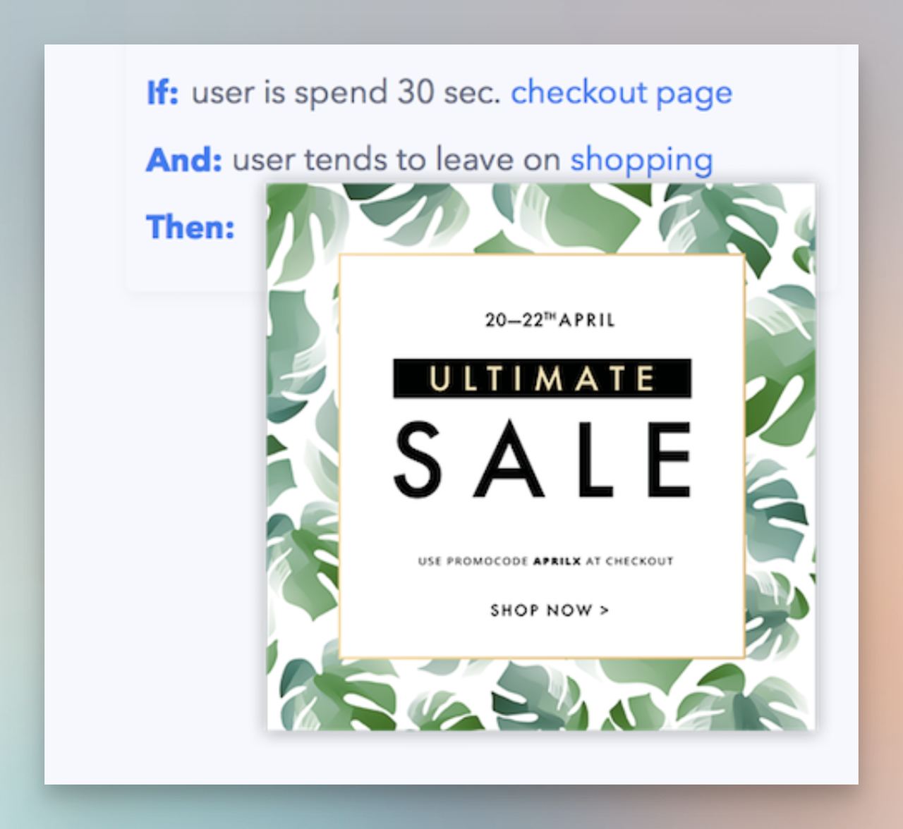
Popupsmart's targeting system lets you segment by page URL, referral source, visit count, and on-site behavior. A visitor from a Google search for "popup pricing" should see a different popup than someone browsing blog content.
9. Prioritize UX with Clear Close Options
Nothing damages trust faster than a popup that's hard to close. If visitors feel trapped, they'll leave your site entirely instead of just closing the popup.
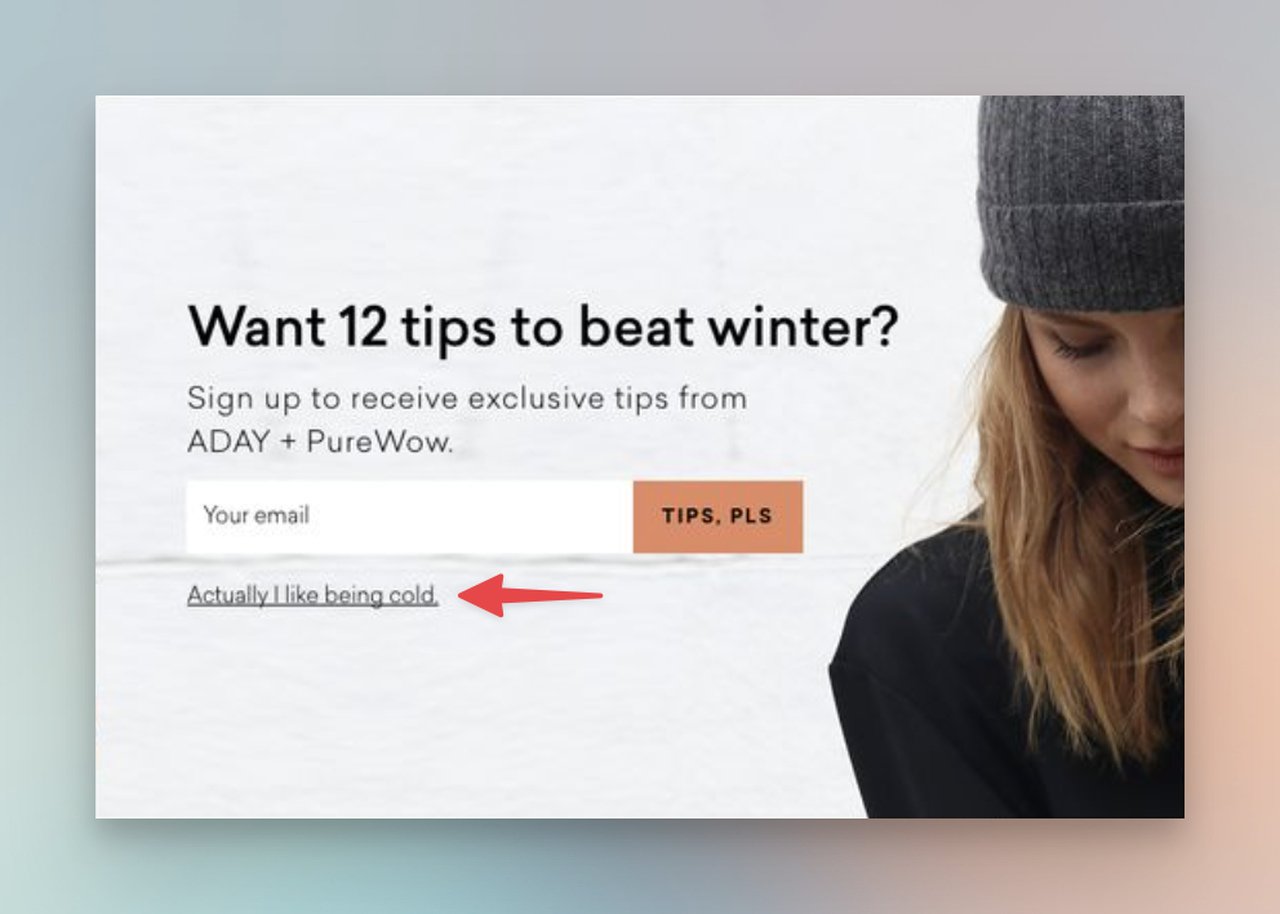
Include a visible X button and a text-based decline option like "No thanks, I'll pay full price." That gentle nudge often converts better than hiding the close button because it reframes the choice. Consider popup UX design best practices when building your layouts.
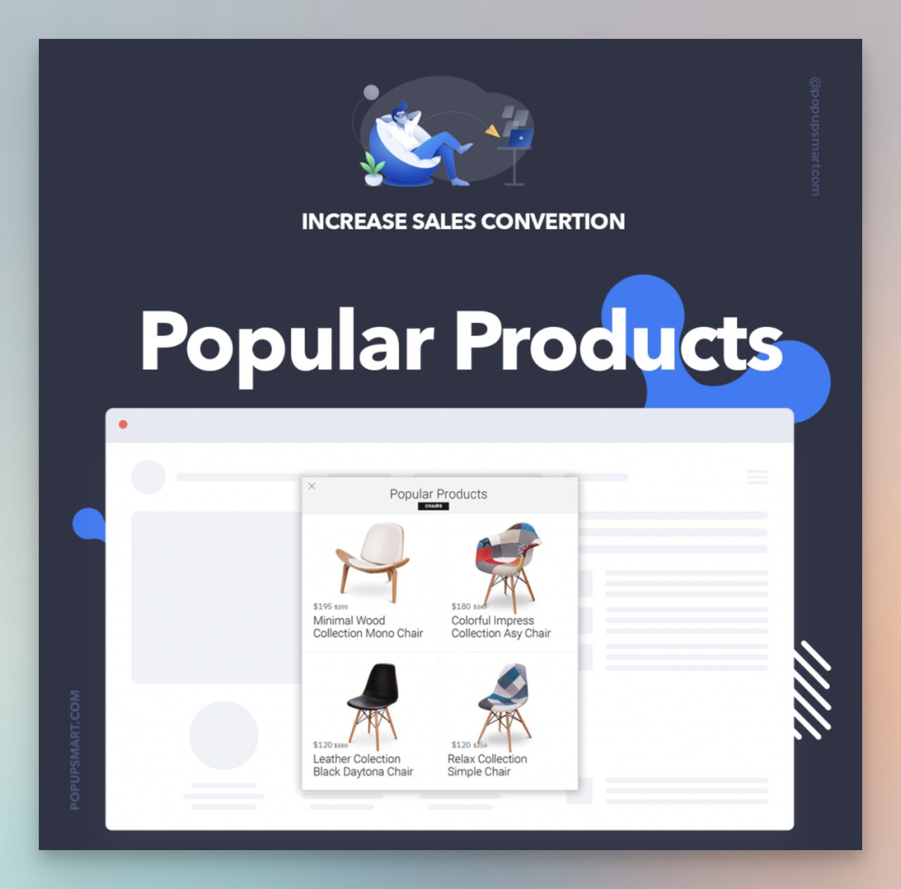
10. Recommend Products Based on Browsing History
Product recommendation popups work because they feel helpful rather than interruptive. If someone browsed running shoes for three minutes, a popup showing "Customers who viewed this also bought these socks" adds value.
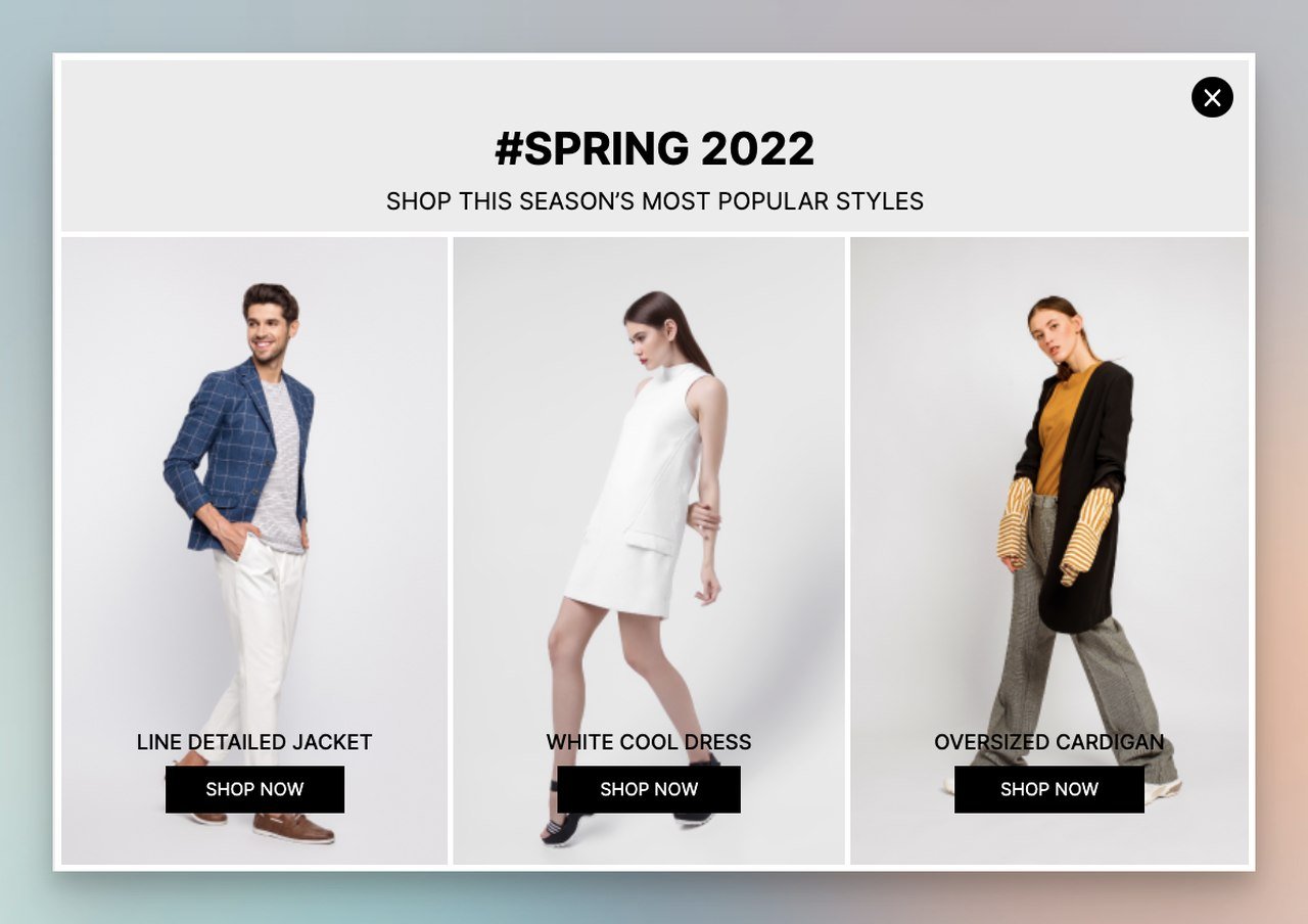
Cross-sell and upsell popups on checkout pages can increase average order value by 10-30% without feeling pushy, as long as the recommendations are relevant to what's already in the cart.
11. Use Urgency and Scarcity (Honestly)
Countdown timers and limited-stock warnings work. But fake urgency backfires. If your "24-hour sale" resets every day, visitors catch on and your brand takes the hit.
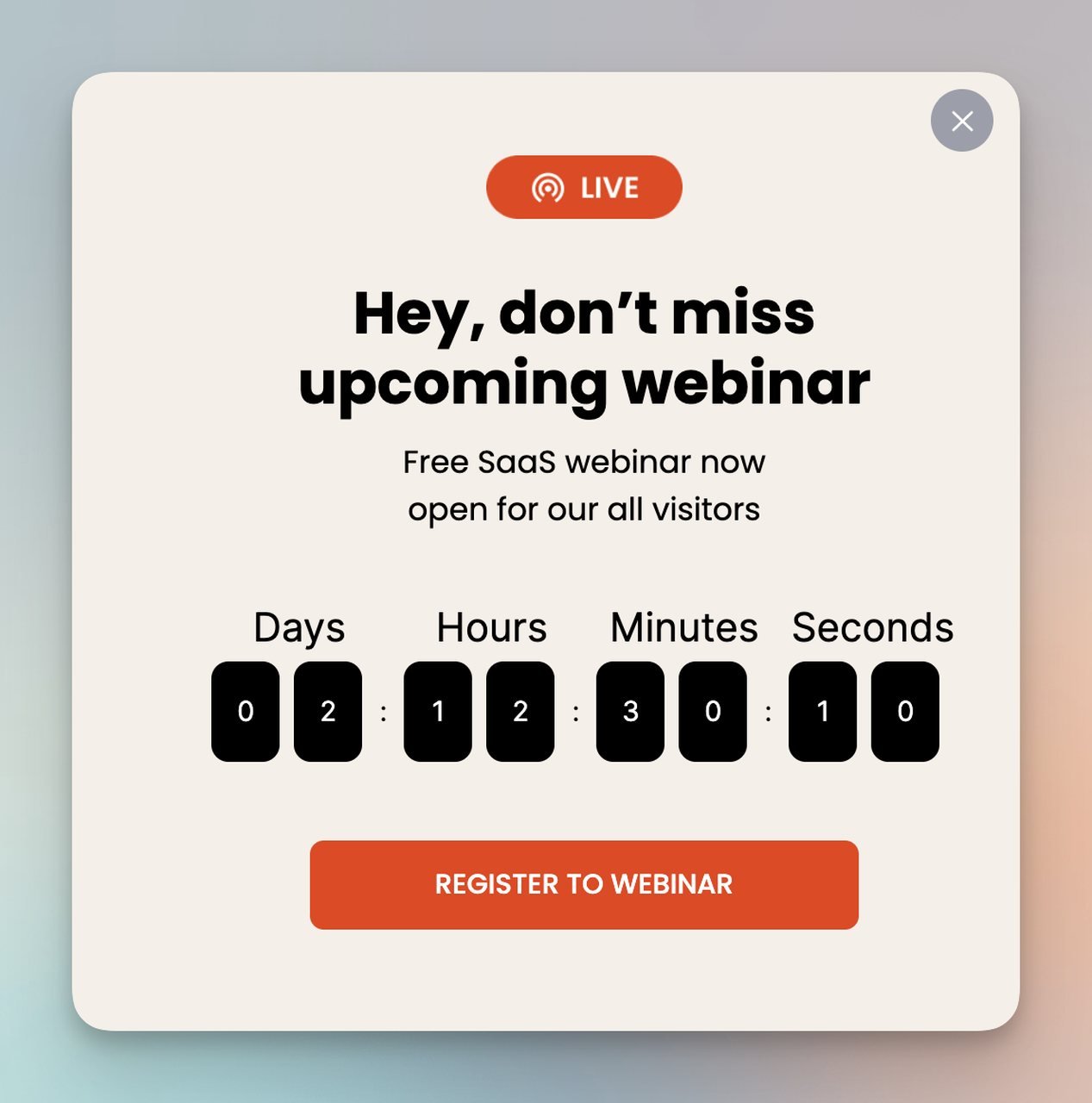
Use emotional trigger words paired with genuine deadlines. "Sale ends Sunday" is stronger than "Limited time offer" because it's specific and verifiable.
12. A/B Test Every Element
The difference between a 3% and an 8% conversion rate often comes down to details you'd never guess without popup A/B testing. Headline phrasing, button color, image choice, timing delay, offer amount. Each variable can shift results.
According to VWO, conversion rate optimization is the second-most-used optimization technique among marketers, with 50% actively testing. Run one variable at a time with a minimum 1,000 impressions per variant before drawing conclusions.
What Are Common Popup Mistakes That Kill Conversions?
Knowing what not to do is just as valuable as knowing best practices. These mistakes show up repeatedly in underperforming campaigns.

- Showing popups immediately on page load. You haven't earned the visitor's attention yet. Wait for engagement signals first.
- Using the same popup for all visitors. Returning customers don't need a "welcome" discount. New visitors from paid ads have different intent than organic traffic. Segment.
- Asking for too much information. Every field beyond email cuts conversion rate. If you need more data, collect it later.
- Ignoring mobile design. A desktop popup shrunk to mobile dimensions is unusable. Build separate mobile layouts.
- Never testing. The popup you launched six months ago isn't optimized. Visitor expectations and competitors change. Test continuously.
Popup Conversion Statistics' Methodology and Sources
We pulled popup conversion statistics from nine distinct sources for this piece, including Popupsmart's own benchmark report (10,000+ campaigns), Rejoiner's email capture research, Envive AI's conversion lift analysis, Luca Tagliaferro's popup trend data, Gill Andrews' study that goes beyond surface-level conversion rates, VWO's CRO survey of active marketers, and Martal Group's B2B conversion research.
Where competitor-sourced data appeared, we applied a strict filter. Several widely cited popup statistics originate from competitor platforms. When those stats referenced third-party research, we traced back to the original source. When the data was proprietary to the competitor, we either cited it without linking or excluded it in favor of neutral sources. All conversion rate figures are from 2024-2026 data unless specifically noted otherwise.
Frequently Asked Questions
What is the average popup conversion rate?
The average popup conversion rate ranges from 3.09% to 11.09% depending on the measurement methodology and platform. Popupsmart's benchmark across 10,000+ campaigns shows 3.49% with a 7.05% interaction rate. The discrepancy between sources comes from how each defines "conversion" (email submit vs. any click vs. form completion) and whether they include popups that received zero engagement in their denominator. For practical planning, use 3-5% as your baseline for general popups and 10-17% for exit-intent and cart abandonment popups.
How can I improve popup conversion rates?
Start with three changes that have the highest impact based on current data. First, switch from immediate display to behavioral triggers (exit-intent, scroll-depth, or time-delay). Second, reduce your form to a single email field. Third, personalize the offer based on the page the visitor is on. According to Martal Group, personalized CTAs convert over 200% better than generic messages. After those fundamentals, A/B test one element at a time: headline, image, CTA text, offer amount, and timing delay.
What are benchmarks for exit-intent popup conversions?
Exit-intent popups convert between 5% and 17% depending on the offer and audience. Cart abandonment exit-intent popups average 17.12%, while general exit-intent popups with countdown timers hit around 14.41%. The highest-performing exit-intent campaigns we've tracked at Popupsmart combine three elements: a specific discount (not "special offer" but "15% off"), a visible countdown timer, and a product image showing what's in the visitor's cart. That combination consistently pushes past 15% conversion.
Why do popups still convert so well?
Popups work because they interrupt passive browsing with an active decision point. Unlike banner ads or sidebar CTAs that blend into the page, a popup demands attention. The visitor has to make a choice: engage or close. That forced decision, when paired with a relevant offer at the right moment, converts far better than passive placement. The data backs this up: even average popups at 3.49% outperform the typical website CTA click-through rate of 2.61% reported by Mailchimp's email marketing benchmarks.

