ChatGPT
 Perplexity
 Claude
 Grok
Grok Google AI Mode
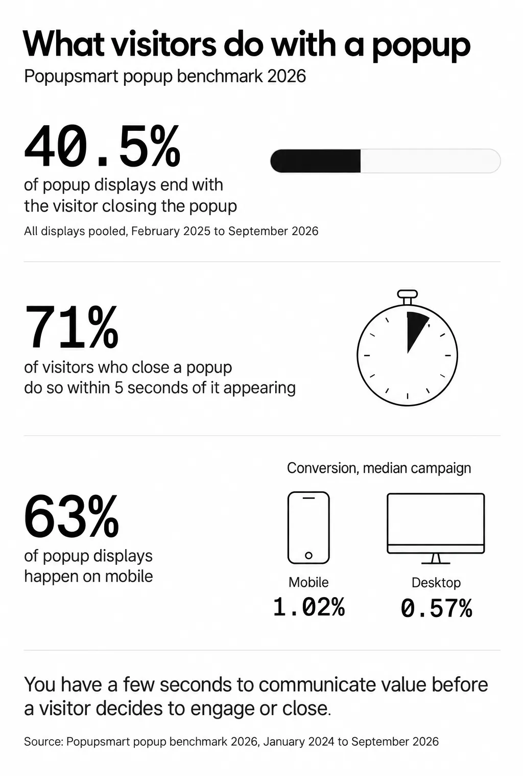
Popupsmart popup benchmark 2026, January 2024 to September 2026; the close rate pools every display since February 2025.
You will realize that almost all online businesses are using popups on their website if you pay attention.
Why do they do that if popups are so annoying?
In this article, I will tell you the common popup mistakes that lower your UX, how to avoid them, and what to do instead to maximize your conversions with better popup UX design.
Every marketer aims at achieving more conversions one way or another. It can be through;
- increasing sales,
- gaining more subscribers,
- getting more traffic, and so on.
All aim at this particular goal, but does each marketer obtain the desired conversion rates? Well, no.
BUT, if you understand the importance of UX and optimize according to it, you can encourage more visitors to take the desired action.
Your website is the critical instrument of delivering your message to the customer.
That is why you need to apply the best UX practices to your website to reach your business goals. The same applies to the popups you use on your site.
The popular misbelief that popups are annoying, and they cause a bad UX is giving way to a new, progressive idea:
Popups CONVERT, with a better popup UX design.

Most popup UX design mistakes fall into the same 11 categories: bad timing, poor targeting, excessive form fields, and intrusive layouts. For each one, I've added what Popupsmart's 2026 benchmark measured about it where we have data, and the UX guidance from NN/g, the W3C and Google where we don't. Here's what to stop doing and what to do instead.
Why Popup UX Design Matters for Conversions in 2026
Popups still work. The problem is that most teams implement them badly, and bad popup UX design costs you money in ways that don't show up in your analytics dashboard immediately.
But here's the catch: that median masks a massive gap between the best popups and the rest. I read that gap as the room popup UX decisions have to work with: who sees the popup, when, on which device, and how easy it is to answer or dismiss. You'll see higher "average" popup conversion rates quoted elsewhere; a median is the middle campaign, so a few very high performers can't pull it up, and ours divides leads by popup displays, not by visitors.
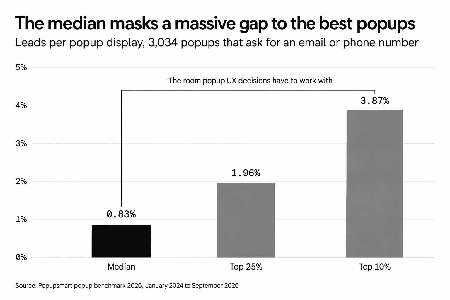
Leads per popup display across 3,034 popups that ask for an email or phone number, January 2024 to September 2026.
As Dr. Ralf Speth, former CEO of Jaguar Land Rover, once said: "If you think good design is expensive, you should look at the cost of bad design." That applies directly to conversion optimization. A popup is a piece of design that every visitor it targets has to deal with, whether they wanted it or not.
What follows are the 11 most common popup UX design mistakes, with specific fixes you can apply today.
Common Mistake 1: Using Intrusive Entry Popups
What This Mistake Looks Like
A visitor clicks your link from Google, and before the page even finishes loading, a full-screen modal slams into view asking for their email. They haven't read a single word of your content. They don't know who you are. They close it (or close your entire tab).
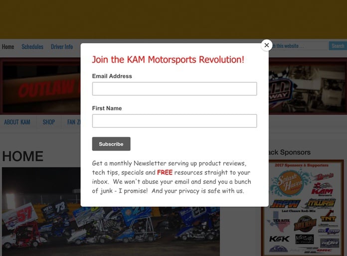
The KAM Motorsports example above is a textbook case: the popup fires before the visitor even knows what the site sells.
Why It Hurts UX and Conversions
Entry popups create an immediate negative impression. Visitors feel ambushed. NN/g puts "showing a popup before the main page content loads" first on its list of problematic popup trends. Google's guidance on intrusive interstitials and dialogs describes them as elements that "obstruct users' view of the content" and warns that they "may lead to poor search performance" (page updated December 10, 2025). We cover the search side in how popups affect SEO. Beyond search, people who came for the content simply leave. In Popupsmart's 2026 benchmark, 40.5% of popup displays end with the visitor closing the popup (all displays pooled, February 2025 to September 2026), and 71% of visitors who close one do so within 5 seconds of it appearing.
What to Do Instead
Give your visitors breathing room. Let them browse your content, understand your value, and then show your popup at the right moment. Here are three alternatives, and what our data says about each:
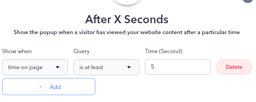
Show popups after X seconds. This gives visitors time to engage with your content first. Waiting also looks better than firing the instant the page loads, though our data only supports a lean: popups that wait before appearing convert 0.83% vs 0.61% for popups shown the instant the page loads (median campaign); the direction holds in every year of data but the difference is not statistically reliable, so treat it as a lean, not a rule.
Trigger on scroll depth. If a visitor scrolls past 50% of your page, they're interested. That's the right moment to offer a lead magnet or newsletter signup. With Popupsmart, you can set scroll-based triggers in seconds.
Use exit intent popups. These fire only when a visitor moves their cursor toward the browser close button. You're catching people who've already decided to leave, so you're not interrupting anyone. That's the UX case, and it holds. The conversion case is weaker than its reputation: exit intent shows no statistically reliable advantage in our benchmark; popups on the most sensitive exit-intent setting converted 1.10% vs 0.78% without exit intent (median campaign), a gap that could be chance. More in do exit-intent popups work.
Pro tip: Don't spend your testing time on 15 seconds versus 30. The exact delay length (0–5 seconds vs 21–60 seconds) makes no measurable difference to conversion in our data, so spend that effort on who sees the popup and on which page, where our data does show differences (Mistake 6). For the data by trigger, see our guide to popup timing.
Common Mistake 2: Ignoring Mobile Responsiveness
What This Mistake Looks Like
Your popup looks great on a 27-inch monitor. But on a phone, it's a disaster: the close button is hidden behind the browser bar, the text overflows, and the form fields are too small to tap. In Popupsmart's 2026 benchmark, 63% of popup displays happen on mobile, and most teams never check how their popups render on a 5.5-inch screen.
Why It Hurts UX and Conversions
If your popup covers the main content on mobile, you're risking the poor search performance Google's guidance on intrusive interstitials warns about. Beyond SEO, mobile users have lower patience thresholds. A popup that takes more than one tap to close will push them to your competitor's site immediately. And mobile is where popups convert better: on mobile the median popup converts 1.02% vs 0.57% on desktop. A broken mobile layout wastes the device that gets most of the displays and the higher rate.
What to Do Instead
Design mobile-first, not mobile-as-an-afterthought. Here's what works:
- A close button that's always on screen, never under the browser toolbar or below the fold of a tall popup. WCAG 2.2 sets the minimum target size at 24 by 24 CSS pixels (SC 2.5.8, Level AA); 44 by 44 (SC 2.5.5, Level AAA) is easier to hit with a thumb.
- A tap outside the popup closes it too. Don't make the X the only exit.
- A size that leaves part of the page visible. Google recommends "banners that take up only a small fraction of the screen" instead of full-page interstitials.
- One or two form fields, each with the right keyboard (
type="email",type="tel"). - A preview on a real phone before the campaign goes live.
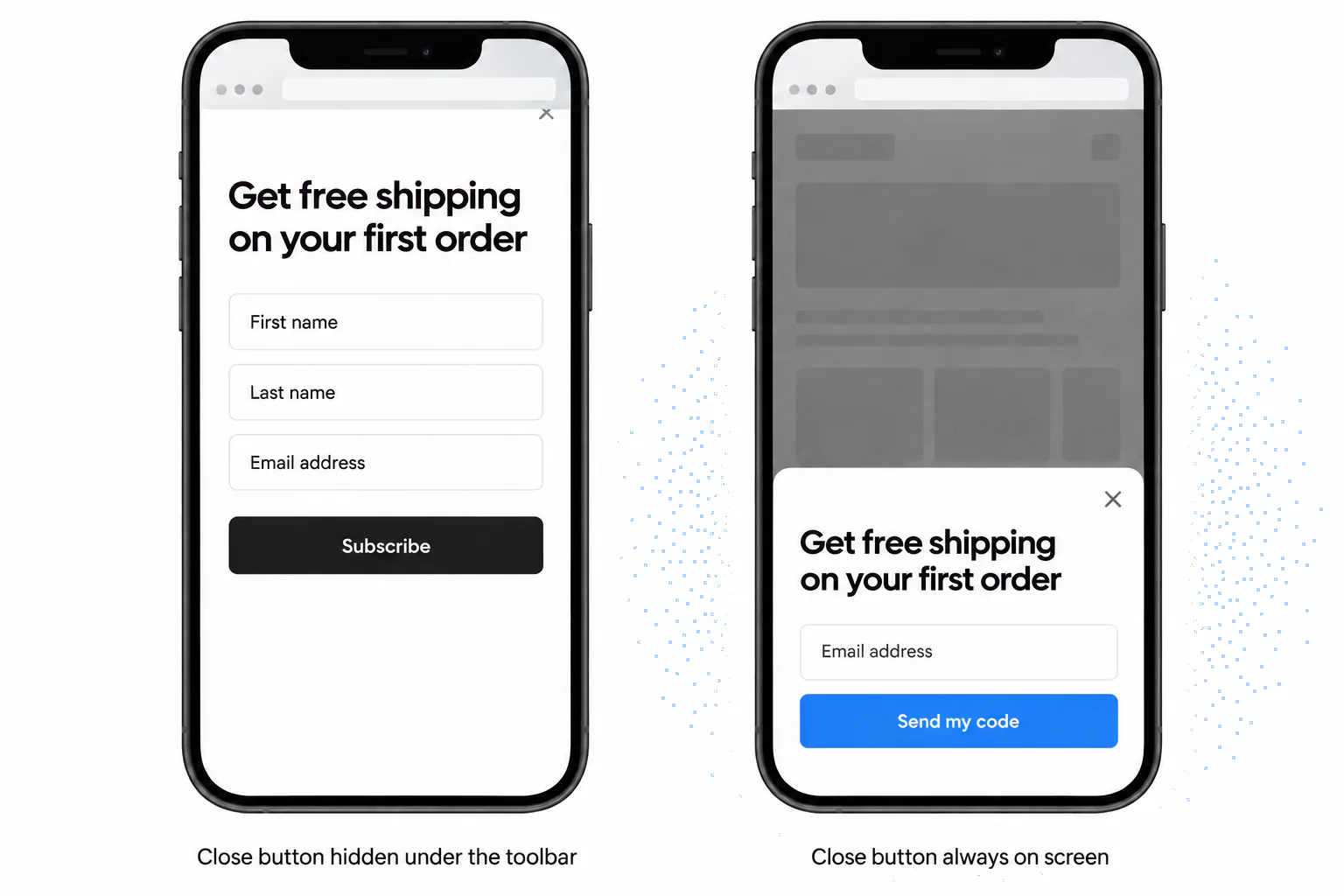
Example design: the same offer as a full-screen popup and as a bottom sheet that leaves the page visible.
Popupsmart lets you target mobile and desktop separately with device targeting, but you should still preview every campaign on a phone before publishing. Make it a rule for your team: no popup goes live without a mobile screenshot in the Slack channel. Our mobile popup design guide has examples that get this right.
Pro tip: Test with the keyboard open. When a visitor taps the email field, the phone's keyboard can cover half the screen; the submit button and the close control should both still be reachable.
Common Mistake 3: Overloading Popups with Content
What This Mistake Looks Like
You open a popup and it contains a headline, three paragraphs of text, a testimonial, an image, a countdown timer, two CTAs, and a form with six fields. The visitor's brain short-circuits. They don't read any of it. They close the popup.
Why It Hurts UX and Conversions
Popups are interruptions by nature. You have a few seconds to communicate value before a visitor decides to engage or close: as Mistake 1 showed, most visitors who close a popup do so within 5 seconds of it appearing. When you stuff too much content into a popup, you overload the visitor's cognitive capacity. The result: decision paralysis. Instead of picking one of your two CTAs, they pick the close button.
What to Do Instead
Follow the "one popup, one goal" principle. Every popup should have:
- one headline that states the offer,
- a line or two of supporting copy, no more,
- one action: a button, or a form with one or two fields,
- a visible way out: a close button, and a polite "No thanks" if you want one.
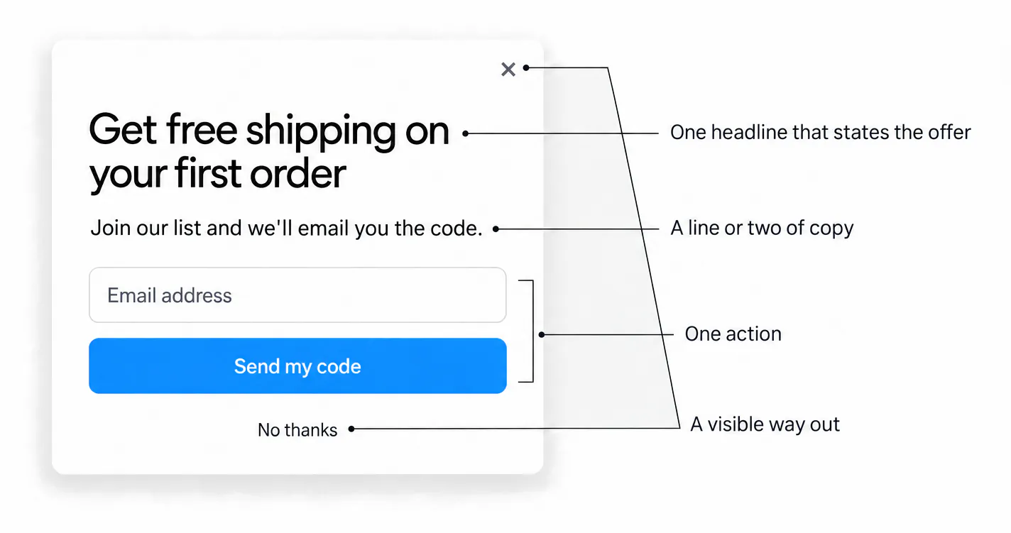
Example design: one popup, one goal.
If you have multiple things to communicate, use separate popups triggered at different moments. A newsletter signup popup doesn't need to also mention your webinar, your free trial, and your latest blog post. Pick one.
Our benchmark doesn't measure clutter directly, so treat this one as a UX principle rather than a measured lift: every extra element competes with the one action you want. Less truly is more with popup design.
Pro tip: Run a "squint test" on every popup before launch: squint your eyes and look at the popup. If you can't immediately tell what the offer is and where to click, it's too busy.
Common Mistake 4: Poor Timing and Targeting
What This Mistake Looks Like
A visitor is halfway through filling out your checkout form. Suddenly, a popup appears asking them to rate their experience. They lose focus, maybe they lose their form progress, and now they're frustrated enough to abandon the purchase entirely.
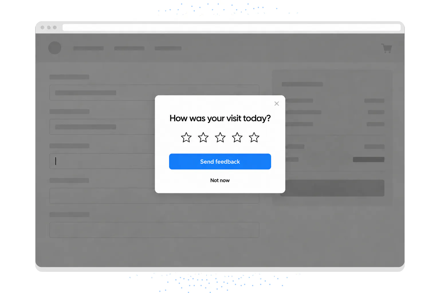
Example design: a feedback request that interrupts a checkout.
Why It Hurts UX and Conversions
According to NNGroup, whether modal or not, most overlays appear at the wrong time, interrupt users during critical tasks, use poor language, and contribute to user disorientation. Timing mistakes don't just lose one conversion. They train visitors to distrust your site. The next time they visit, they'll be primed to close any popup immediately, even the well-timed ones.
What to Do Instead
Match your popup timing to your visitor's task state. Here are the rules to follow:
- Don't prompt before interaction. No popup before the page content has loaded and the visitor has had a chance to look at it.
- Never interrupt a critical task. Checkout forms, a form in progress and a payment step are off limits; NN/g lists interrupting users during critical tasks among its ten problematic trends.
- Ask for feedback after the task, not during it. A rating request belongs on the confirmation page, once the visitor has done something worth rating.
- Don't repeat yourself. Stop showing a popup to people who've already signed up, and limit how often everyone else sees it (Mistake 11 has the data).
Popup timing is not a "set and forget" decision. Review your timing rules monthly and adjust based on CTA performance data.
Pro tip: When the popup fits the moment, people answer fast: 61% of popup leads are submitted within 30 seconds of the popup appearing. If answering it means stopping what they came to do, it's the wrong moment for that visitor.
Common Mistake 5: Neglecting A/B Testing
What This Mistake Looks Like
You design a popup, publish it, and never touch it again. Maybe you picked a green CTA button because someone on the team likes green. Maybe you chose "Sign Up Now" as your button text because it was the first thing that came to mind. You have no data, no comparison, and no idea whether your popup is doing well or badly.
Why It Hurts UX and Conversions
Without A/B testing, you're guessing. And guessing is expensive. It also means testing the wrong things first. The green button is a good example: in Popupsmart's 2026 benchmark, button color, dark vs light popup backgrounds, urgency words and question headlines show no measurable effect on conversion; the data are too noisy to rule out modest effects. The button's wording is a different story (Mistake 8). If you're not testing, you're leaving money on the table every single day the popup runs.
What to Do Instead
Build A/B testing into your popup workflow from day one. Here's a simple framework:
- Test the offer first, then the form, then the words on the button.
- Change one thing per test, so you know what made the difference.
- Let both variants run long enough to collect plenty of displays; don't call a winner after a day.
- Judge on leads per display, the way our benchmark does, not on clicks alone.
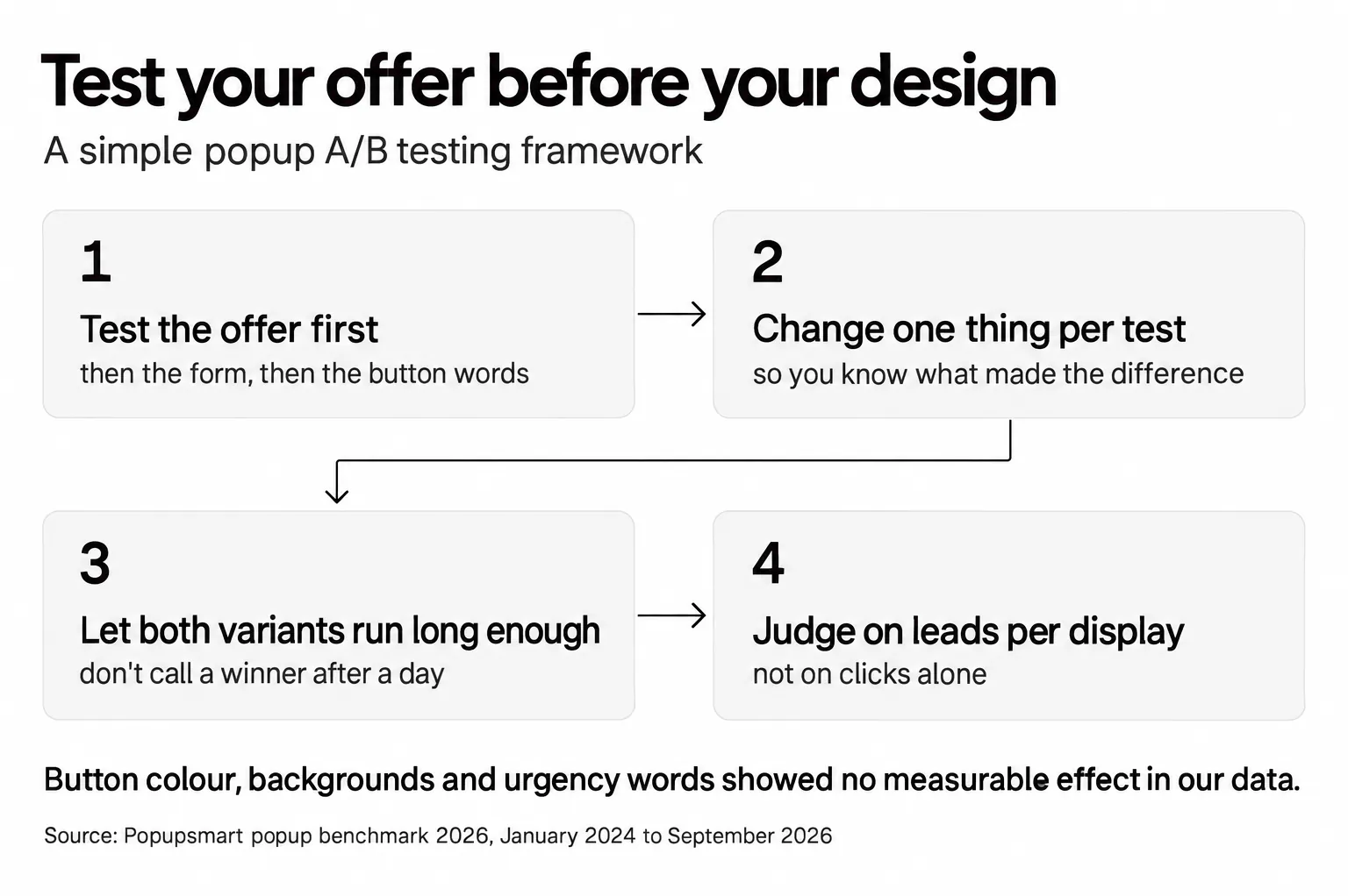
Popupsmart includes built-in A/B testing so you can split traffic between popup variants without third-party tools (on the Advanced plan and above). Our guide to A/B testing for popups walks through the setup, and the results can transform your conversion optimization strategy.
Pro tip: Test your offer before you test your design. A mediocre-looking popup with an irresistible offer will usually outperform a beautiful popup with a weak offer, and the cosmetic changes teams usually test first (color, background, urgency words) didn't show a measurable effect in our data.
Common Mistake 6: Displaying the Same Popup to All Users
What This Mistake Looks Like
Every visitor, regardless of whether they're a first-time blog reader or a returning customer on your pricing page, sees the exact same popup with the exact same message at the exact same moment.
Why It Hurts UX and Conversions
A first-time visitor from an organic search doesn't need the same message as a returning customer from an email campaign. Showing a "Subscribe to our blog" popup to someone who's already subscribed is a waste of their attention and your credibility. One-size-fits-all popups feel impersonal, and impersonal feels irrelevant. Irrelevant popups get closed.
What to Do Instead
Segment your popups by visitor behavior and attributes. Here's what I recommend, with what our benchmark measured for each:
- New vs returning visitors. Popups targeted at new visitors only convert 1.13% vs 0.77% for popups shown to everyone. Give returning visitors a different message, or none.
- Page type. Match the offer to what the visitor is doing on that page (the numbers are below).
- Traffic source. Visitors arriving from an email or SMS campaign convert on popups at 1.81% vs 0.74% for visitors from organic search; they already know you, so skip the introduction.
- Existing subscribers and customers. Exclude them from signup popups.
- Device. Build the mobile version separately (Mistake 2).
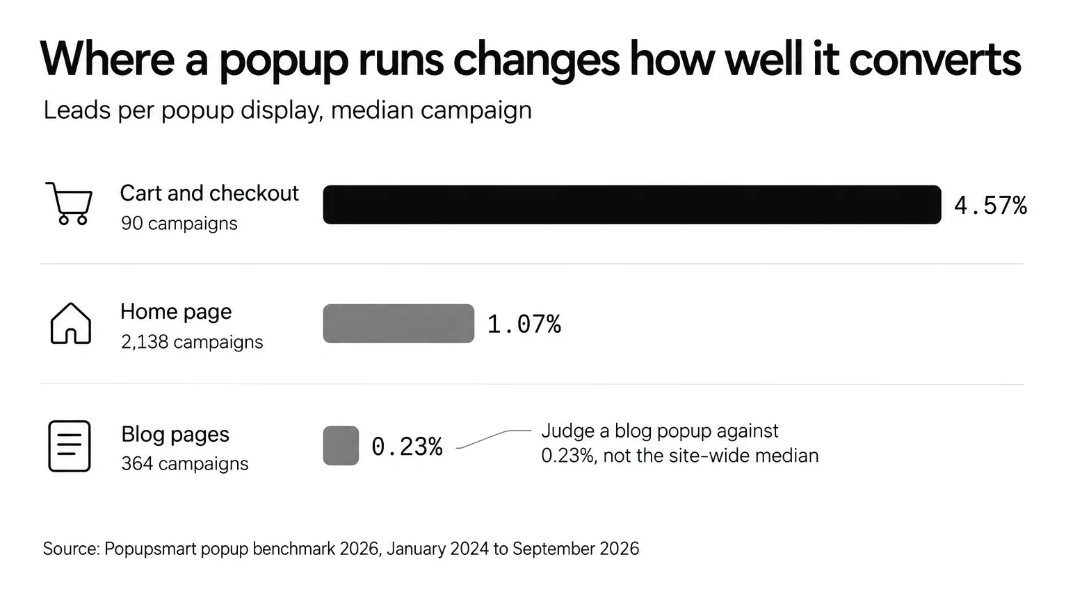
Median campaign, Popupsmart popup benchmark 2026.
This kind of segmentation used to require custom code and cookie management. Now, Popupsmart's targeting rules let you set all of these conditions in a visual builder without writing a single line of JavaScript.
Pro tip: Popups set up with three targeting rules convert 1.09% vs 0.71% for popups with none or one (median campaign). That's a correlation, since marketers who target carefully may also write better offers, but I read it as a good reason to spend your setup time on who sees the popup before you touch the design.
Common Mistake 7: Asking For Too Much Information
What This Mistake Looks Like
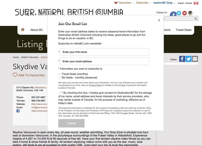
Your popup form asks for: first name, last name, email, company name, phone number, job title, and "How did you hear about us?" The visitor looks at seven empty fields and thinks, "I don't have time for this." They close it.
Why It Hurts UX and Conversions
Long forms cost you leads, and our data shows where the gap opens. Popups asking for one or two fields convert 0.88% and 0.94%, against 0.56% for three fields (median campaign; spin-to-win and other gamified popups are counted separately). The Hello BC example above is a case study in how too many fields create a poor user experience.
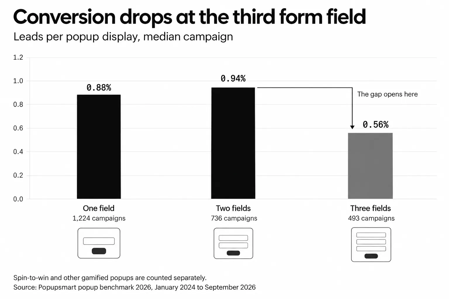
Median campaign; spin-to-win and other gamified popups are counted separately.
What to Do Instead
Ask for the minimum information you need at this stage of the funnel. For top-of-funnel lead capture (which is what most popups are), that's email only. Here's my hierarchy:
- Email only. The default for growing a list.
- Email plus one field, only if you'll use it. Adding a name field alongside the email shows no reliable effect in our data: the overall gap in its favor (1.25% vs 0.88% for email only) reverses among campaigns whose form rarely changed (0.74% vs 0.79%).
- Phone only, for an SMS list. Forms that ask for a phone number instead of an email look weakest (0.46% vs 0.88% for email only), though that gap is not statistically reliable.
- Three fields or more, only where the visitor expects a form, such as a quote request. Splitting it into steps isn't a proven fix: multi-step forms show no measurable conversion advantage over single-step forms once step-1 clicks without contact details are excluded.
You can always collect additional information later through progressive profiling in your email marketing sequences. Get the email first. Enrich the data over time.
Pro tip: Treat "more than 2 fields in a popup" as a red flag during any popup audit: in our benchmark, that's where the gap opens.
Common Mistake 8: Using Unattractive Popup Designs
What This Mistake Looks Like
The popup uses a different font than your site. The colors clash with your brand. The image is low-resolution or irrelevant. The layout looks like it was built in 2008. Visitors don't consciously analyze these details, but they feel the disconnect instantly.
Why It Hurts UX and Conversions
An ugly popup signals low effort and low trust. If your popup looks spammy, visitors assume the offer is spammy too. Design quality directly impacts perceived credibility. A popup that clashes with your brand's visual identity creates cognitive dissonance, and that dissonance erodes trust. For any considered purchase, a cheap-looking popup can disqualify your product before anyone reads your copy.
What to Do Instead
Your popup should feel like a natural extension of your website, not an ad from a third party. Follow these design principles:
- Use your site's fonts and brand colors.
- Keep one visual hierarchy: headline, one supporting line, one button.
- Show the offer in the image, or use no image at all.
- Keep text readable on a phone in daylight: enough contrast, no text baked into images.
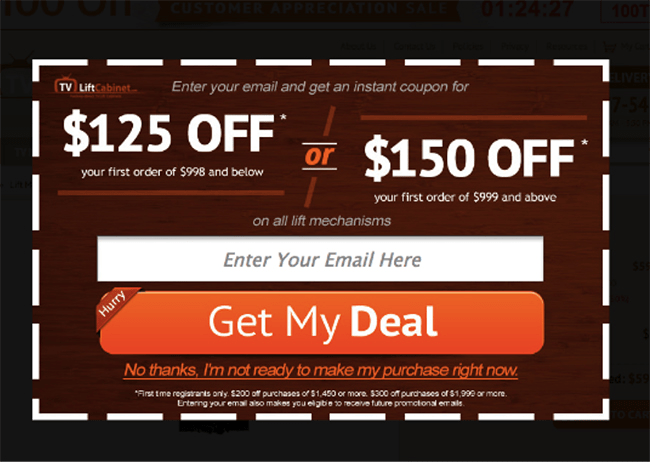
- Offer a visible close button and, if you add a "No thanks" link, word it politely. The coupon popup above makes visitors click "No thanks, I'm not ready to make my purchase right now" to leave.
- Write the button in the first person. The same coupon popup gets this right: "Get My Deal".
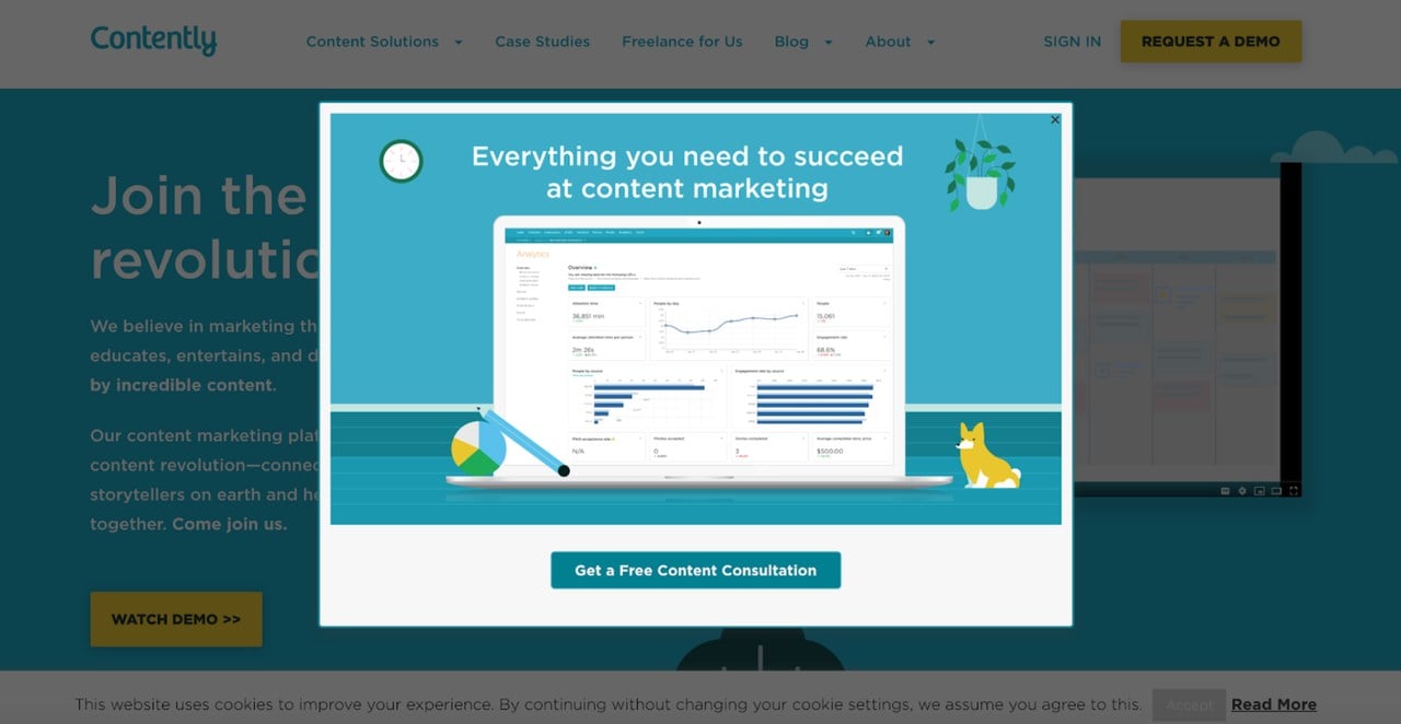
The Contently popup above demonstrates what a well-designed popup looks like: clean layout, brand-consistent colors, clear headline, and a single CTA. Popupsmart's popup templates give you professionally designed starting points that you can customize to match your brand in minutes. For layout, type and color in more depth, see our popup design best practices.
Pro tip: Button wording showed up in our data where button color didn't: first-person buttons ("Send my code") convert 1.18% vs 0.80% for neutral wording (English popups, median campaign). The fewer choices you present, the easier the decision, so offer one button unless there's a specific reason to offer two.
Common Mistake 9: Making Content Inaccessible with Popups
What This Mistake Looks Like
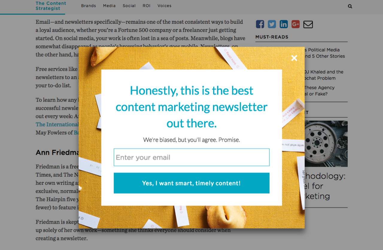
A visitor lands on your blog post to read about a topic they searched for. Before they get past the first paragraph, a full-screen overlay covers the entire article. The only options are to hand over their email or close the popup and try to remember where they were reading.
Why It Hurts UX and Conversions
Content-blocking popups violate the basic contract between your site and the visitor: "You clicked because we promised useful content. Here it is." When you gate that content behind a popup, you break the promise. The visitor feels tricked, and tricked visitors don't convert. They bounce. NN/g's guidance on modal dialogs is blunt: "Do not use modal dialogs for nonessential information that is not related to the current user flow." A content-blocking overlay is also exactly what Google's interstitials guidance asks sites to avoid.
A popup can make content inaccessible in a second way, too: for visitors who use a keyboard or a screen reader, a modal that doesn't manage focus can trap them or leave them lost behind it.
What to Do Instead
Use popup types that don't interfere with content consumption:
- sidebar popups and slide-ins that sit beside the text,
- a floating bar at the top or bottom of the screen,
- teaser popups, which sit at the edge of the page and open the full campaign only when the visitor clicks them,
- an inline form inside the article.
If you must use a full-screen popup, combine it with exit-intent targeting. That way, the popup only appears when the visitor has already finished reading (or is about to leave). The content stays accessible throughout their visit.
Whatever the format, make it work without a mouse. The W3C's WAI-ARIA dialog (modal) pattern describes how a modal popup should behave:
- When it opens, focus moves to an element inside the popup.
- Tab and Shift+Tab move through the popup's own controls and wrap around inside it.
- Escape closes it.
- When it closes, focus returns to the element that opened it or, for a popup that opened on its own, to where the visitor was.
- The tab order includes a visible close button, which the W3C calls "strongly recommended" for all dialogs.
For non-modal formats, WCAG 2.2 adds a newer rule: when a control receives keyboard focus, it must not be entirely hidden by author-created content (SC 2.4.11 Focus Not Obscured, Level AA). A sticky bar that covers the link a keyboard user just tabbed to fails it.
Pro tip: On long articles, try a teaser popup instead of a timed overlay. It keeps the offer one click away without covering a word of the post.
Common Mistake 10: Using Modal Overlays for Cookie/GDPR Notifications
What This Mistake Looks Like
Your cookie consent notice appears as a big modal overlay with a dark background. It forces the visitor to make a decision before they can do anything else on your site. Some implementations even stack the cookie popup on top of another marketing popup, creating a double-interrupt experience.
Why It Hurts UX and Conversions
Modal overlays have trained users to close anything that looks like a popup without reading it. When your GDPR notice uses the same format as an ad, visitors dismiss it reflexively. That means they might not actually consent, which creates compliance issues. NN/g lists "using modal overlays for GDPR and cookie notifications" among its ten problematic popup trends, and the European Data Protection Board's consent guidelines (05/2020) are specific here: a notice that blocks the content until the visitor clicks "Accept cookies" does not give them a genuine choice, so the consent is not freely given (paragraphs 39 to 41), and scrolling or swiping through a page "will not under any circumstances" count as consent (paragraph 86). On top of that, a modal cookie notice adds friction to the first seconds of every visit. Those seconds are critical for first impressions.
What to Do Instead
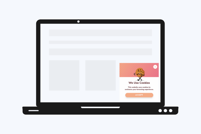
Use non-intrusive formats for compliance messages. NN/g's advice is to "favor nonmodal overlays placed at the bottom or on the side of the page":
- a bottom bar or a corner notice that leaves the page usable, never a content-blocking modal,
- a way to refuse that's as easy to find as the way to accept,
- a link to cookie settings, since the EDPB expects visitors to be free to choose which purposes they accept (paragraph 42),
- no marketing popup until the consent notice has been answered,
- no "by scrolling, you agree" wording.
The example above shows a corner notice approach that's clean, readable, and respects the visitor's browsing experience. It still needs one thing to give visitors a genuine choice: a way to refuse next to Accept.
Pro tip: Keep the consent notice and your marketing popups apart. Let the cookie notice be answered first, then let the first campaign appear, so the visitor never faces two overlays at once.
Common Mistake 11: Displaying Multiple Popups on the Same Page
What This Mistake Looks Like
A visitor arrives on your page. First, a cookie consent modal appears. They close it. Then a newsletter popup fires. They close that too. Then a sidebar promotion slides in. By now, they've spent more time closing popups than reading your content.
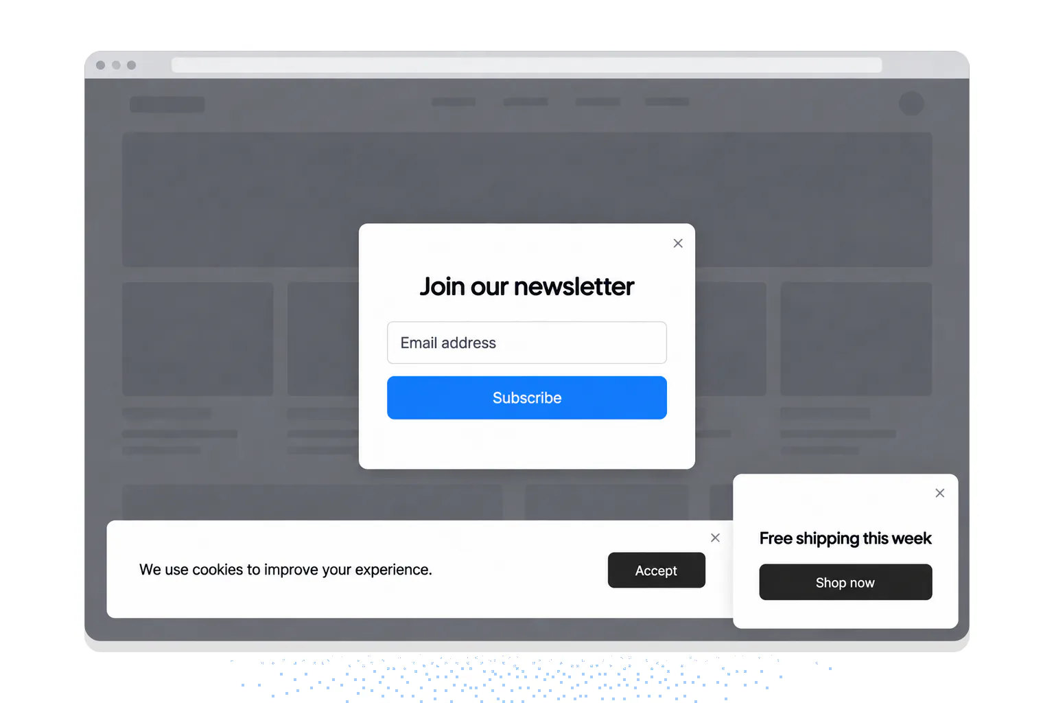
Example design: three overlays the visitor has to close before reading.
Why It Hurts UX and Conversions
Each popup a visitor has to close builds frustration. By the second or third popup, they're not reading your content or your offers. They're hunting for close buttons. NN/g lists "showing multiple popups one after another" among its ten problematic popup trends. Multiple popups can also add images to the page, extra weight a phone has to load.
What to Do Instead
Enforce a strict "one popup per page view" rule. Here's how to implement it:
- Map which campaigns target which pages, and make sure no page matches two of them at once.
- Use URL exclusion rules to keep campaigns apart.
- Stop showing a popup to people who have already signed up.
- Limit how often the same visitor sees a campaign.
- Hold marketing popups until the cookie notice has been answered (Mistake 10).
Repetition has a cost you can measure. In Popupsmart's 2026 benchmark, the first two times a visitor sees a popup in a week convert at similar rates (1.33% and 1.22% of displays, pooled); from the third view conversion falls, and from the sixth view it is 0.41%. Part of that fall may be selection, since someone seeing a popup for the sixth time didn't answer it the first five times, but it's still a good reason to cap views rather than show the same popup on every page.
Pro tip: Popupsmart's page URL targeting lets you include and exclude pages per campaign, which is the simplest way to stop two campaigns from firing on the same page. My rule of thumb: if you have more than 3 active popup campaigns site-wide, audit your targeting rules immediately. Chances are some pages are showing multiple popups without you realizing it.
Best Practices to Replace Popup Mistakes
As designer Frank Chimero said: "People ignore design that ignores people." That principle sits at the heart of every fix in this article. Here's a quick-reference summary of the best practices covered above, with the evidence behind each:
| Mistake | Best Practice Instead | What the evidence shows |
|---|---|---|
| Intrusive entry popups | Time-delayed or scroll-triggered popups | Waiting: 0.83% vs 0.61% on page load, a lean, not a rule; delay length makes no measurable difference |
| No mobile optimization | Mobile-first design with a visible close button | 63% of popup displays are on mobile; mobile 1.02% vs desktop 0.57% (median campaign) |
| Content overload in popups | One headline, one CTA, minimal fields | 71% of visitors who close a popup do so within 5 seconds |
| Poor timing and targeting | Task-aware triggers and frequency caps | NN/g: most overlays appear at the wrong time and interrupt critical tasks |
| No A/B testing | Weekly tests on one variable at a time | Button color, backgrounds and urgency words: no measurable effect |
| Same popup for all users | Behavior-based segmentation | New-visitor targeting 1.13% vs 0.77% for everyone (median campaign) |
| Too many form fields | Email-only capture, progressive profiling | One or two fields 0.88% and 0.94% vs 0.56% for three (median campaign) |
| Ugly popup designs | Brand-consistent templates, single CTA | First-person buttons 1.18% vs 0.80% (English popups, median campaign) |
| Blocking content access | Sidebar or floating bar popups, accessible modals | Center modals 0.88% vs corner/slide-in 0.49% (median campaign); W3C dialog pattern |
| Modal cookie notices | Bottom floating bar for compliance, with a real choice | EDPB 05/2020: blocking content until "Accept" is not freely given consent |
| Multiple popups per page | One popup per page, URL-based targeting | Conversion falls from the third view in a week; 0.41% from the sixth (pooled) |
Methodology: the Popupsmart figures come from our platform data between January 2024 and September 2026 (28,674 campaigns, 499.6 million popup displays); rates are leads or clicks divided by popup displays, not visitors, and "median campaign" means the middle campaign among those with at least 1,000 displays and 14 active days (for lead rates, the 3,034 popups that ask for an email or phone number).
If you're looking for a popup tool that makes implementing these best practices straightforward, Popupsmart includes all the targeting, timing, A/B testing, and mobile optimization features covered in this guide (A/B testing starts on the Advanced plan). You can start with a free account.
Frequently Asked Questions
What is a popover in UX?
A popover is a small overlay element that appears near a trigger element (like a button or link) to show additional contextual information. Unlike modal popups, popovers don't block the rest of the page and they're typically dismissed by clicking anywhere outside them. Popovers work well for tooltips, dropdown menus, and contextual help without disrupting the user's flow. When designing popups and overlays, popovers are considered the least intrusive pattern because they stay attached to their trigger element and don't require a background overlay.
What is the difference between a tooltip and a popup?
Tooltips appear on hover (or tap on mobile) near a specific element and contain brief helper text. They disappear when the cursor moves away. Popups, by contrast, are larger overlay windows that appear based on triggers like time, scroll, or exit intent, and they require deliberate dismissal (clicking a close button or the background). The key difference is intent: tooltips explain a UI element, while popups present offers, capture information, or deliver messages. From a UX perspective, tooltips are informational and passive. Popups are promotional and active.
What is the difference between a pop-up and a modal?
A pop-up is any box or window that appears on top of a web page, triggered by time, scroll, a click or exit intent. A modal is a pop-up that blocks the page behind it until the visitor answers or closes it: in the W3C's words, the windows under a modal dialog are inert. Slide-ins, floating bars and teaser popups are non-modal, so the visitor can keep reading while they're on screen. Every modal is a pop-up; not every pop-up is a modal.
Why is the popup close button missing on mobile?
The common causes are a popup taller than the phone's screen, which pushes the close icon off the visible area or under the browser toolbar, and a mobile layout that hides or shrinks the icon. Always show a visible close control on mobile: keep it inside the visible screen, make it at least 24 by 24 CSS pixels (the WCAG 2.2 AA minimum) and ideally 44 by 44, let a tap outside the popup close it too, and preview the campaign on a real phone before publishing.
Are popups bad for UX?
Not by themselves. Popups become bad UX when they appear before the visitor has seen the page, interrupt a task, hide the way out, or repeat too often. In Popupsmart's 2026 benchmark, 40.5% of popup displays end with the visitor closing the popup (all displays pooled, February 2025 to September 2026), yet the median popup that asks for an email or phone number converts 0.83% of its displays into leads. Timing, targeting and an easy way out are what separate a helpful popup from an annoying one.
What are best practices for popup UX design?
The best practices for popup design and UX in 2026 center on timing, relevance, and restraint. Show popups after visitors engage with your content (not on entry). Keep the design clean with one clear CTA and one or two form fields. Segment your audience so different visitors see relevant messages. Always A/B test your popups and enforce a one-popup-per-page rule. Make sure every popup is mobile-responsive, has a visible close button, and follows Google's guidance on intrusive interstitials. Most importantly, treat popups as a value exchange: you're asking for the visitor's attention, so you need to offer something worth their time.
How can I improve popup UX for mobile users?
Start by switching from full-screen modals to bottom bars or slide-in popups on mobile devices. Keep form fields to one (email only). Make the close button large and easy to tap (at least 44x44 pixels; WCAG 2.2's minimum is 24 by 24 CSS pixels). Test on real phones, not just browser emulators, because viewport behavior and virtual keyboards create layout issues that emulators miss. Size the popup so part of the page stays visible around it. With Popupsmart, you can set separate targeting rules for mobile and desktop, which means you can run different popup types for each device type without duplicating campaigns.
Sources
All external sources were read on September 30, 2026.
- Popupsmart 2026 popup benchmark, January 2024 to September 2026 (methodology in the benchmark report linked at the top of this article).
- NN/g, "Popups: 10 Problematic Trends and Alternatives", Anna Kaley, June 30, 2019.
- NN/g, "Modal & Nonmodal Dialogs: When (& When Not) to Use Them", Therese Fessenden, April 23, 2017.
- W3C WAI-ARIA Authoring Practices Guide, "Dialog (Modal) Pattern".
- W3C, Web Content Accessibility Guidelines (WCAG) 2.2, W3C Recommendation, December 12, 2024 version.
- Google Search Central, "Avoid intrusive interstitials and dialogs", last updated December 10, 2025.
- European Data Protection Board, Guidelines 05/2020 on consent under Regulation 2016/679, adopted May 4, 2020.