ChatGPT
 Perplexity
 Claude
 Grok
Grok Google AI Mode
What Makes a Popup Design Convert?
You don't have to be a designer to build a popup that works. The best-performing popups follow a short list of design principles:
- One goal, one CTA. Each popup should ask for a single action: subscribe, claim a discount, or book a demo. Competing buttons split attention and lower conversions.
- Visual hierarchy and contrast. The CTA button should be the most prominent element on the popup, with enough color contrast to stand out from the background at a glance.
- Concise, benefit-led copy. Lead with what the visitor gets, not with your brand name. People read a popup for what's in it for them.
- On-brand styling. Match your fonts, colors, and tone so the popup feels native to the page instead of like an ad.
- An obvious close button. An easy exit builds trust and keeps the popup from feeling like a trap.
- Mobile-first sizing. Design for the small screen first, keep the close button thumb-reachable, and never block the whole viewport.
- Timing and targeting. Don't fire the instant a visitor lands. Delay a few seconds or wait for exit intent, so the offer shows up when it's relevant.
Popup Design Types at a Glance
Before the examples, a quick reference: which popup design type fits which goal, and the one design tip that makes each one work.
| Popup design type | Best used for | Key design tip |
|---|---|---|
| Coupon / discount | Recovering abandoning shoppers, driving first purchase | Put the discount value in the headline; make the code copy-to-claim |
| Giveaway / gamified wheel | Fast list growth and engagement | Add interaction (spin, scratch) so entering feels like a reward |
| Newsletter / email | Turning visitors into subscribers | One field only (email); add social proof like subscriber count |
| Exit-intent | Catching visitors about to leave | Trigger on mouse-exit, lead with an incentive and urgency |
| Floating bar | Low-friction announcements and offers | Keep it sticky top/bottom so it never blocks content |
| Cookie consent | Compliance and transparency | Plain-language purpose text with a clear accept/decline choice |
| Call / WhatsApp | Phone-call and support conversions | Make the call/CTA button tap-friendly on mobile |
The rules behind these are in popup design best practices further down, and popup UX design has its own post.
How Popup Services Work?
The easiest way to get a good popup design is to use one of the popup service providers, such as Popupsmart.
A popup service;
- Works without a plugin
- Provides advanced targeting options
- Includes template options you can fully customize, so the design ends up looking like yours
Here is how you take the first steps of creating a popup:
First, pick your business goal.
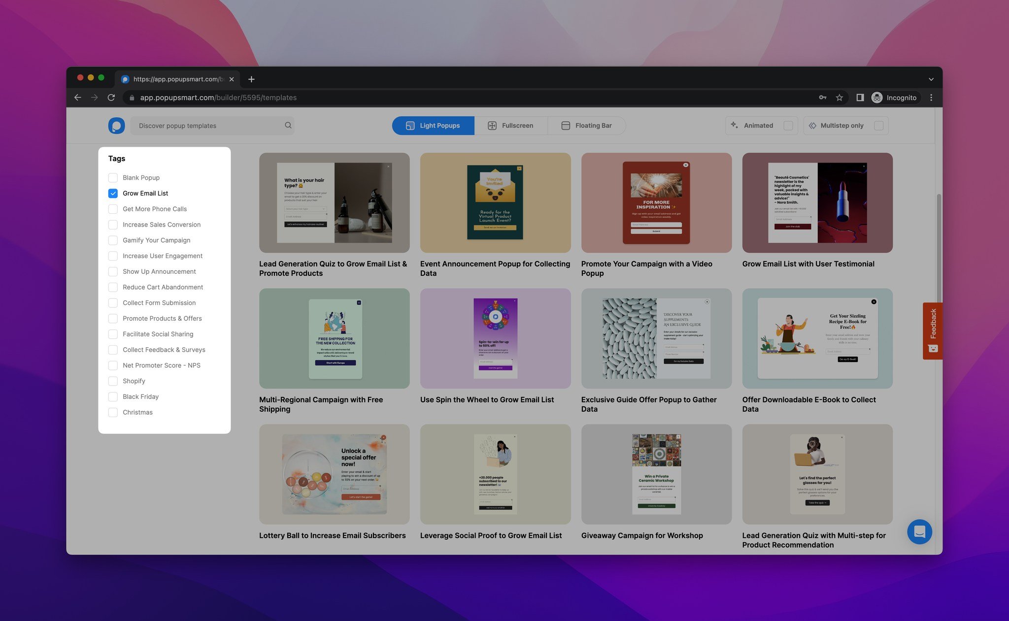
Business goals include:
- Increasing sales conversions
- Growing your email list
- Showing notifications to visitors
- Increasing phone call traffic
Then you select a popup type and the best popup template based on your business goal.
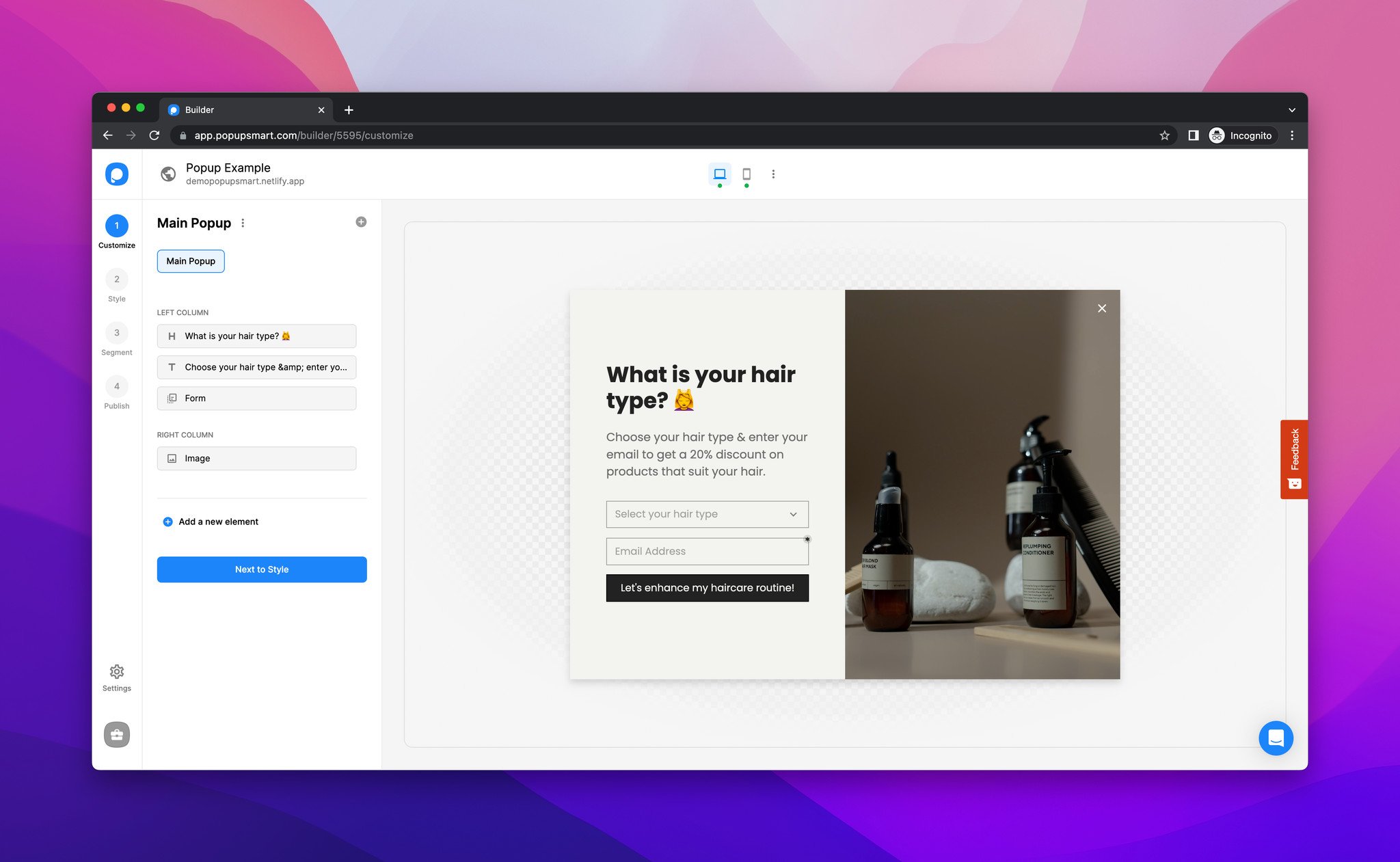
After that, you customize the campaign in Popupsmart's popup builder until it looks like your brand.
That's the setup.
To see what a popup service earns you, run your numbers through our free popup ROI calculator tool.
Below, I go through each popup design, grouped by the business goals I listed above, so you can pick the ones that fit your campaigns.
1. Best Popup Designs To Increase Sales Conversions
The right popup design can increase your sales conversions. Two ways to do it: promote your products, and offer special deals.
Coupon Code Popup
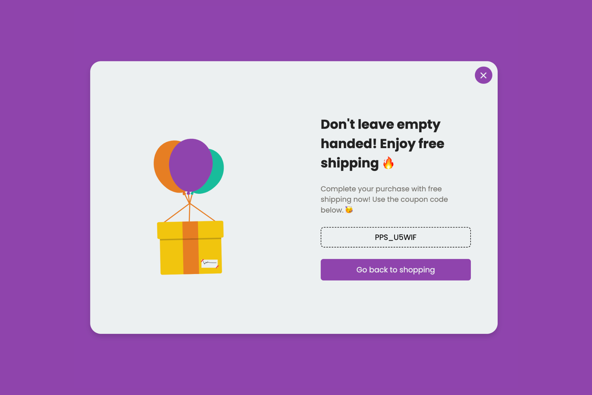
A coupon code popup can help you convert your abandoning visitors. It shows a dynamic coupon code next to a message about your popular products.
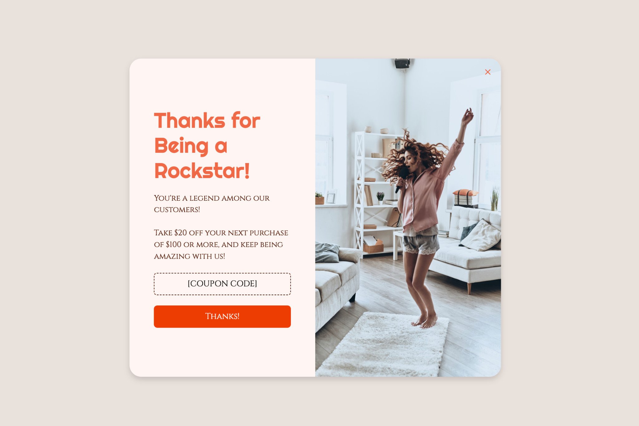
That's a simple way to give your products a second look before the visitor is gone.
Competition & Giveaway Popup
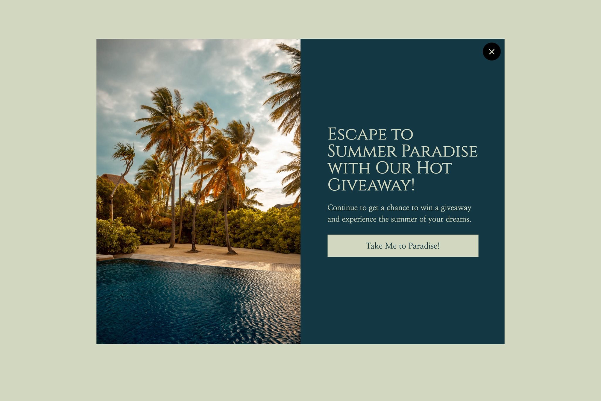
Want your customers to become subscribers? Give them a reason with a giveaway popup design. A giveaway gets people interacting with your website, and some of them go on to make a purchase.
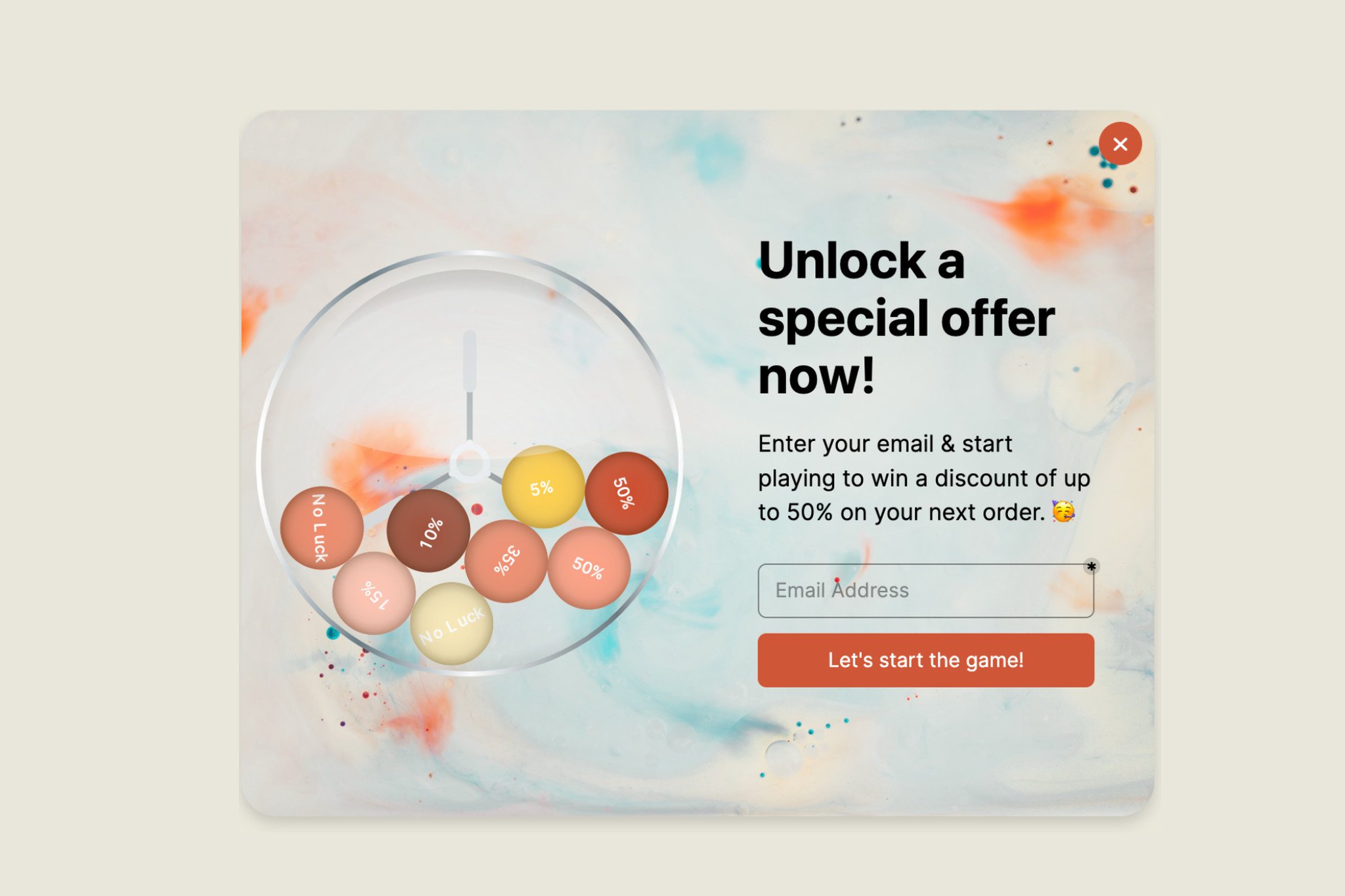
You can use gamification popups for your giveaway campaigns as well.
Product Promotion Popup
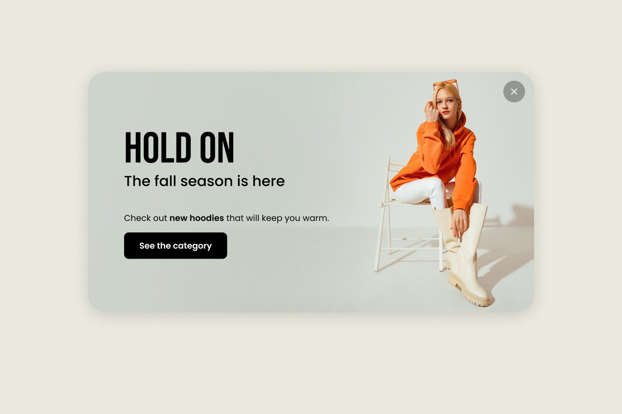
These promotional popups help you put your popular products or services in front of visitors. Show one on the right pages and it can help your sales conversions.
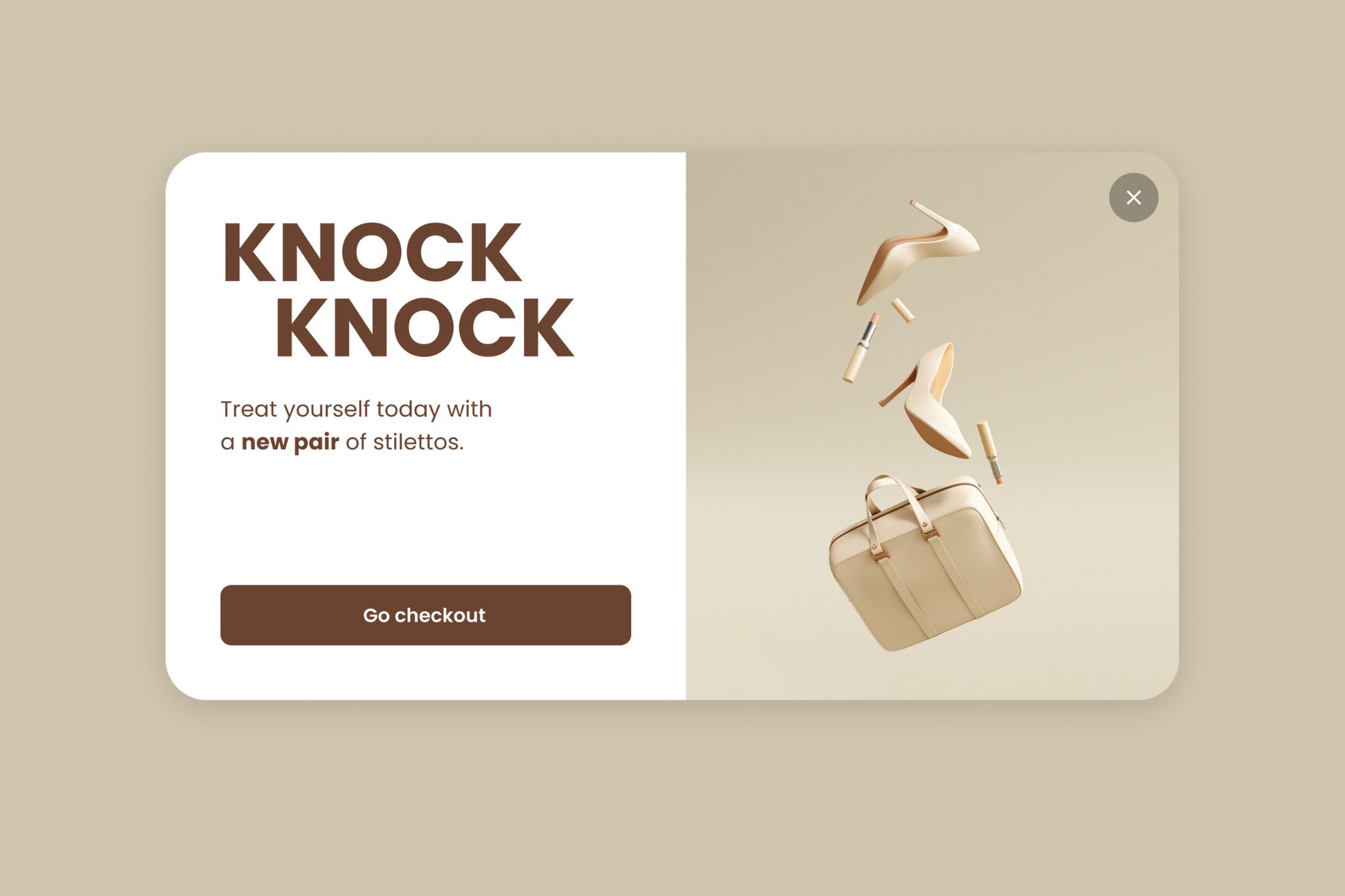
You can include clear product images on your popup to promote your products.
Every popup template is responsive, so it works on mobile devices, tablets and computers. You can also add a sound that plays when the popup appears.
2. Best Popup Designs to Grow Your Email List
If you want to grow your mailing list, these are the designs to look at.
Each one asks visitors for an email without wrecking the user experience. You can browse more formats in our website popup examples roundup.
Join Community Popup
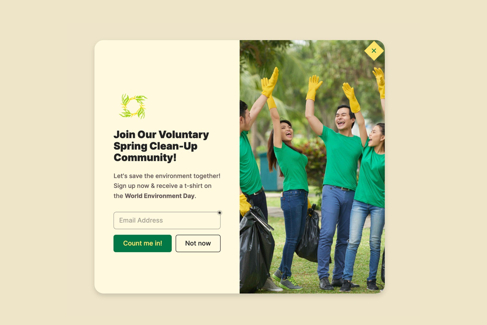
Want visitors to join your community or your services?
These popups ask for their personal information and email address. In return, you get subscribers to your blog page, website, or products.
Call-to-action Popup
A solid call-to-action message gives your website visitors one obvious next step. That's how a visitor starts turning into a loyal fan.
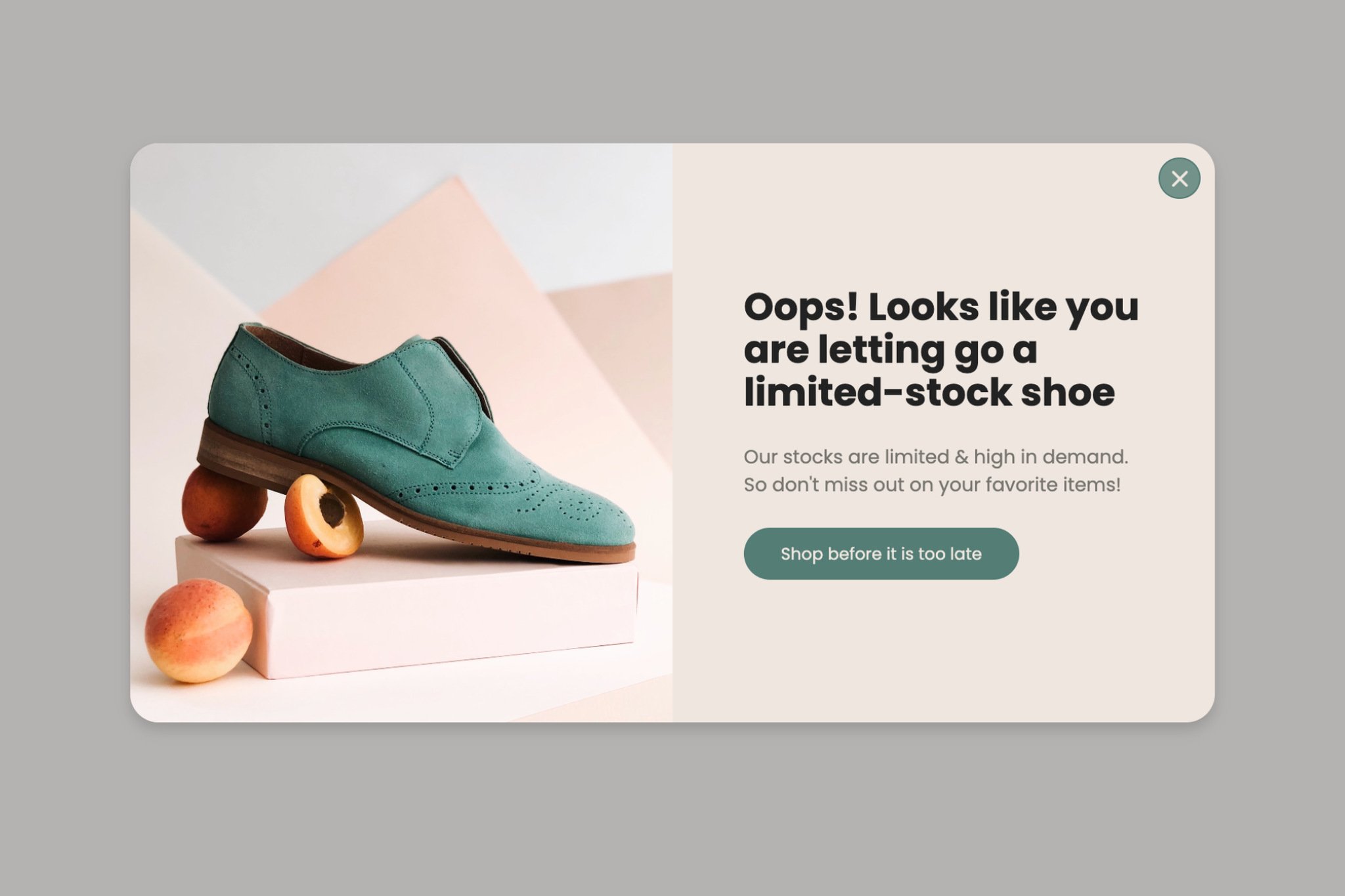
The goal is your message, shown to the right person at the right time.
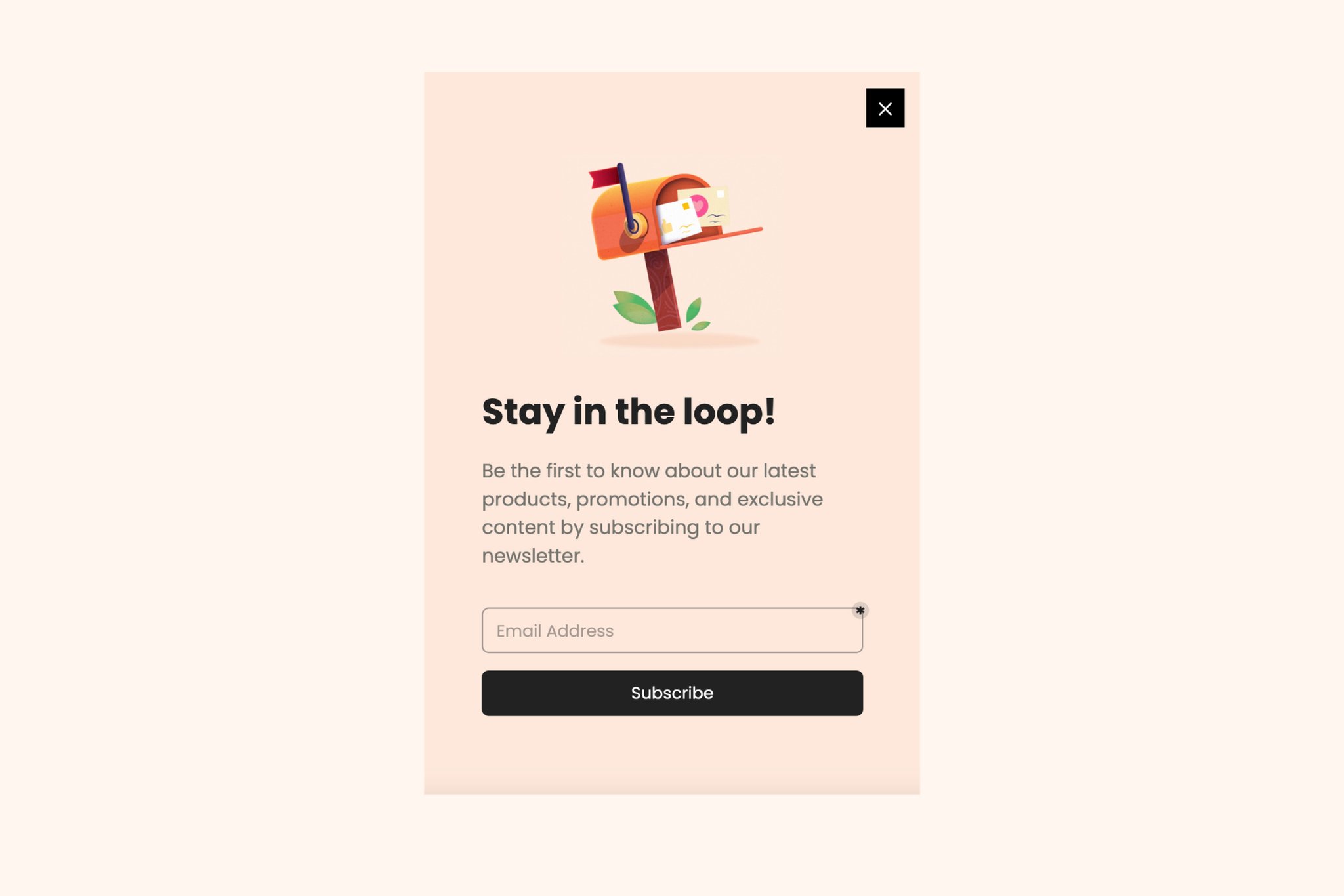
Newsletter Popup
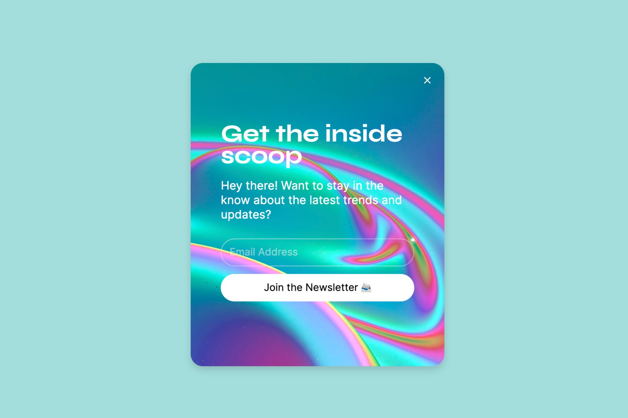
A newsletter popup promotes your signups, and it doesn't have to be one of those dull designs that irritate visitors.
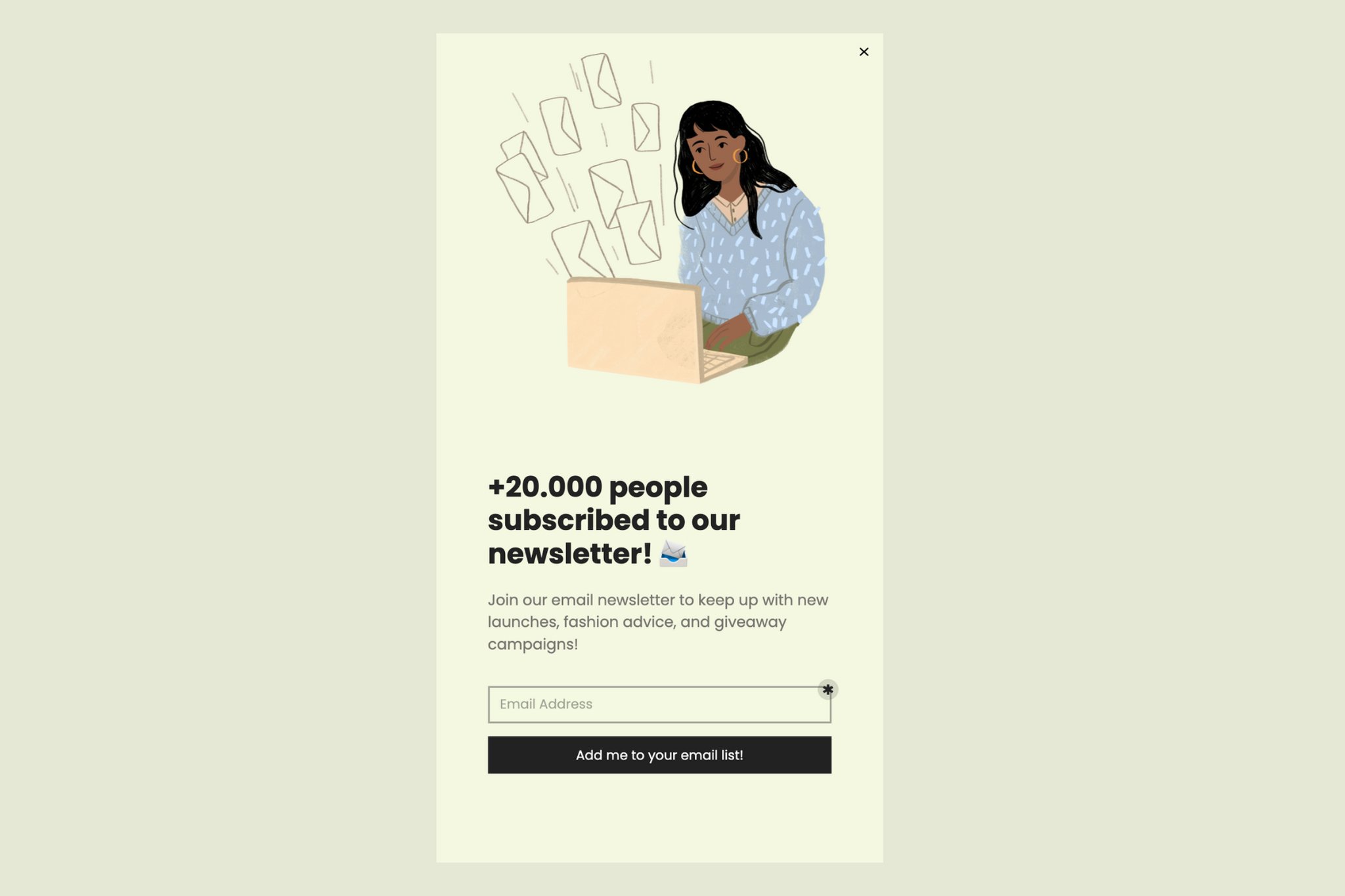
Social proof helps your email list grow, too. Show how many subscribers you have, mention the content they get, and invite visitors to sign up for your newsletter.
Demo Request Popup
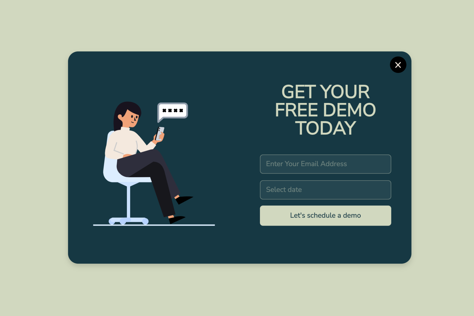
A demo request popup collects the email addresses of people who want to see your product, so you can give them what they asked for.
It can improve your customer support as well.
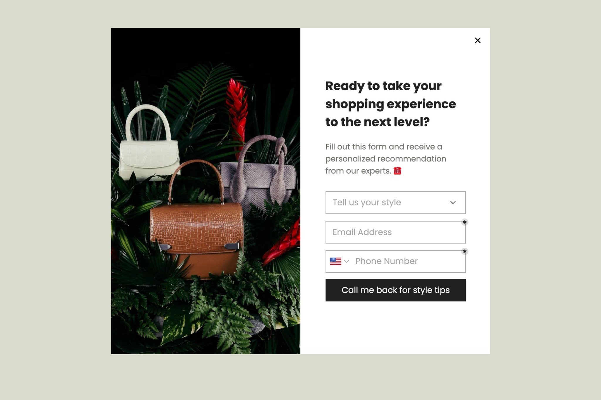
You can also offer personalized support with a popup and get in touch with whoever fills in the form.
Floating Bar Newsletter Popup
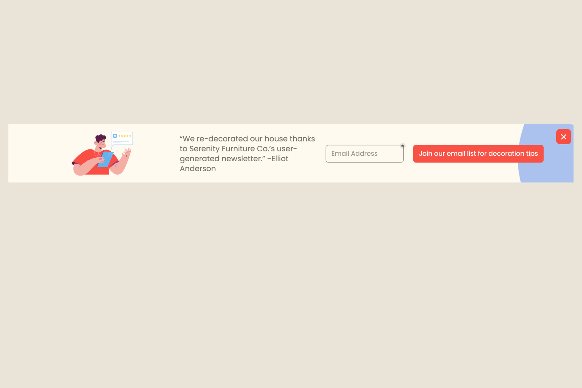
The floating bar popup template sits in a bar at the top or bottom of the browser.
Popupsmart's floating bar popups enable you to create eye-catching header or footer bars that stay visible as visitors scroll through your site.
It's one of the best ways to convert visitors to subscribers without annoying them.
I'd also reach for a floating bar popup design when you want to highlight a sale, promote a content upgrade, or say hello to your visitors.
Lead Magnet Popup
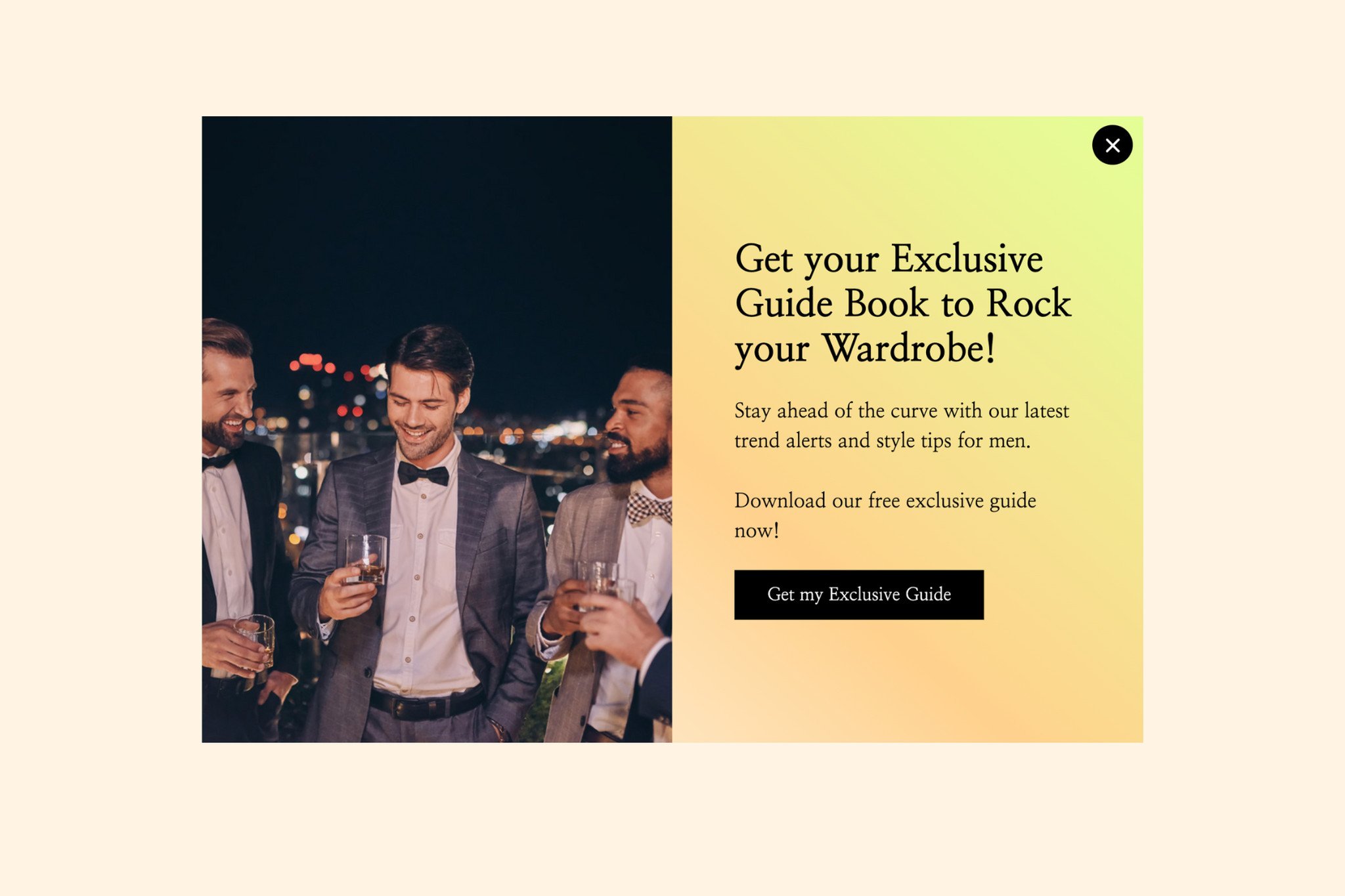
You can display your products with an offer on your popup. That way, people can be encouraged to sign up for your newsletter.
Keep it to a clear image and a headline with a CTA. That's enough to get people engaging.
Wheel Popup
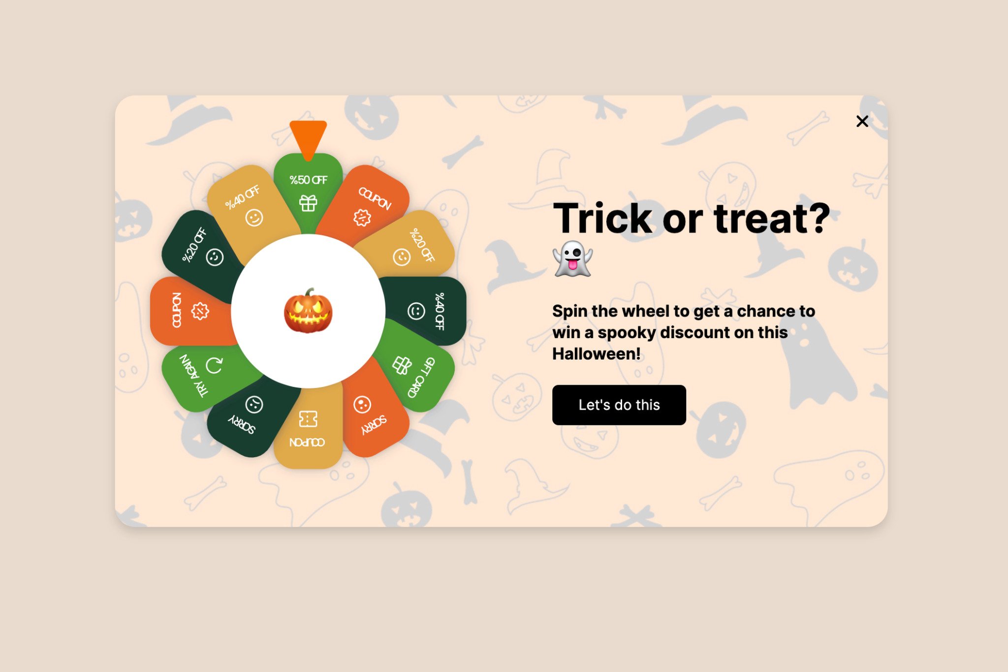
As an unusual popup design, wheel popup templates attract attention and invite visitors to click.
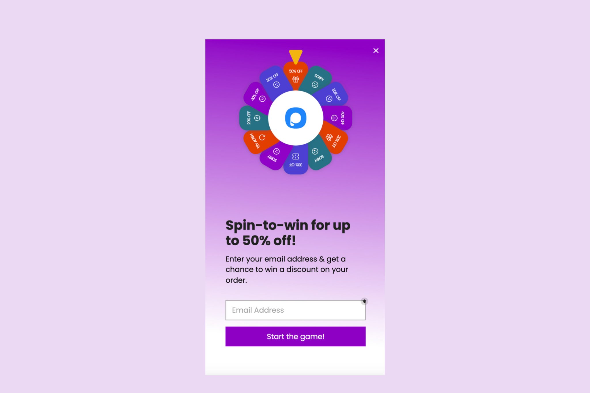
You can create a wheel popup by customizing it for your website. You may set some display rules (in every other popup design) or arrange styles and content. It's all up to you!
It's one of the best popup designs for drawing attention, but don't assume more clicks mean more subscribers.
3. Best Popup Designs to Increase User Engagement
Popups are good at increasing user engagement when they're attention-grabbing and attractive. A well-designed one gets visitors interacting with your website.
Product Updates Popup
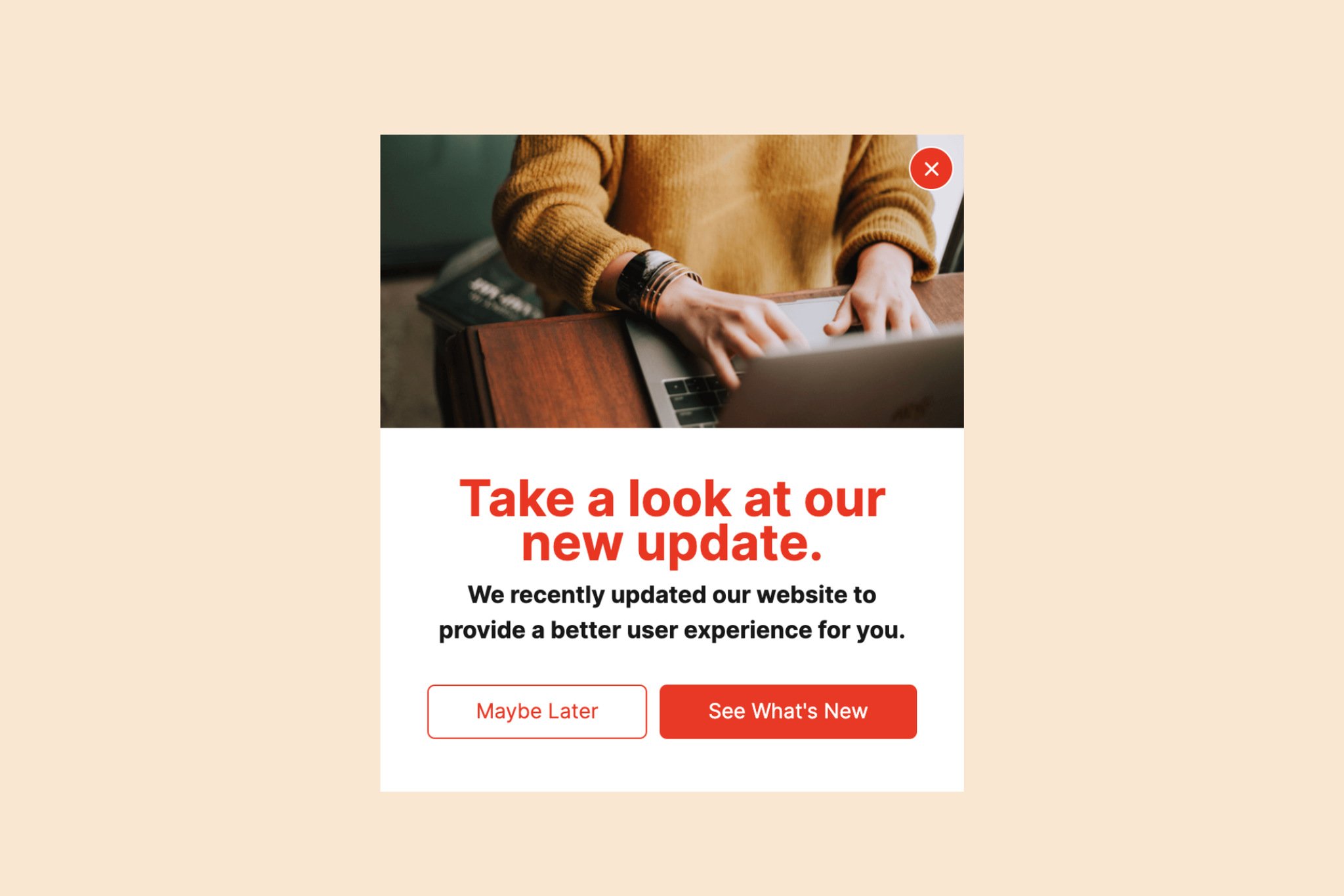
Use this popup to tell your website visitors about new products, the latest updates to your services, and anything else that's new.
If popups have given you a bad experience before, give this one a try. It makes sharing news with your followers easy.
Floating Bar Blog Post Popup
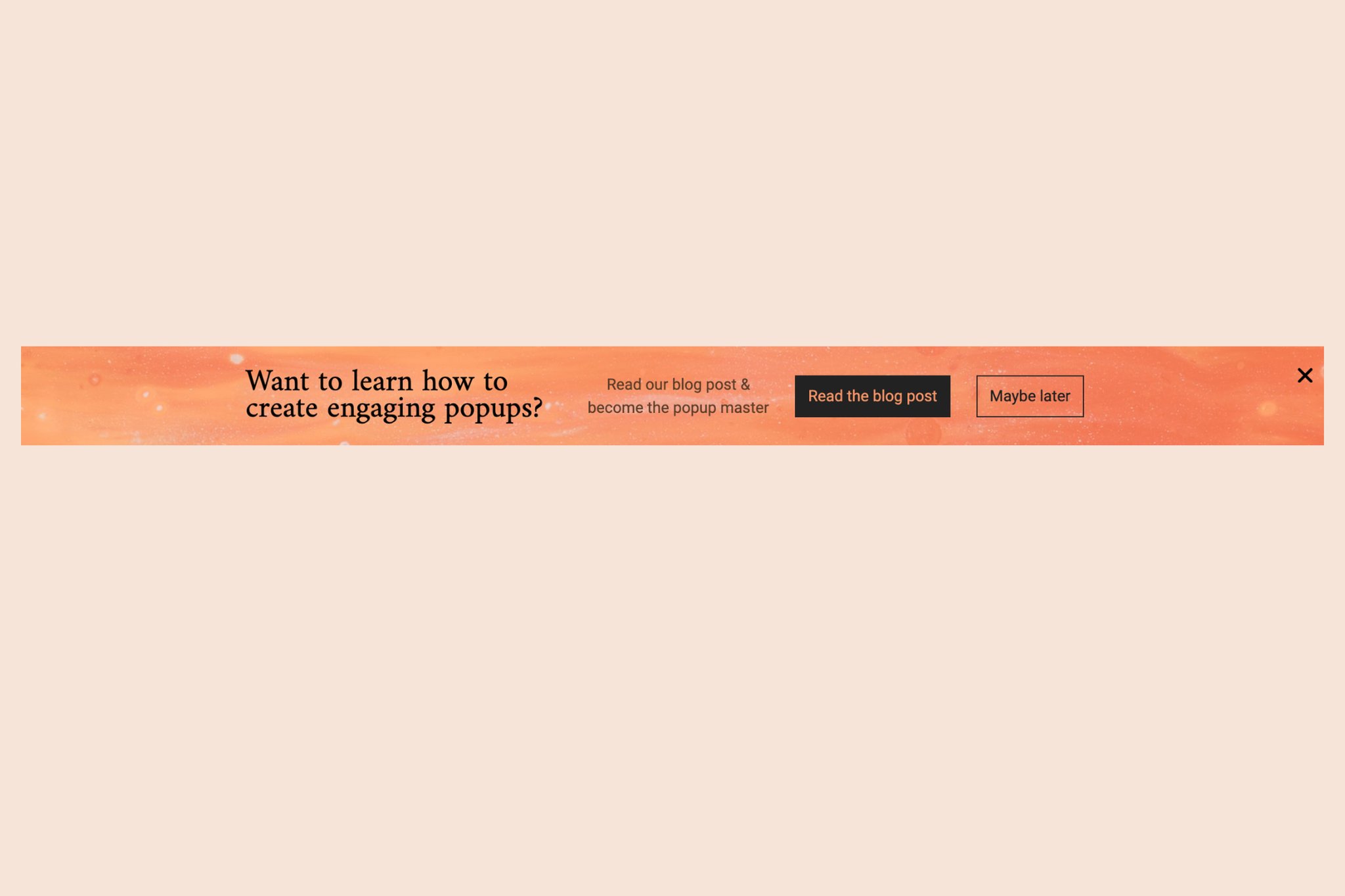
The best part of the floating popup template is that it doesn't interrupt the user experience, so it works for an announcement or a conversion target.
Try the floating bar blog post popup to point readers to your latest blogs or articles.
Because it doesn't block the page, it can help your conversion rates without costing you the visit.
Sidebar Blog Post Popup
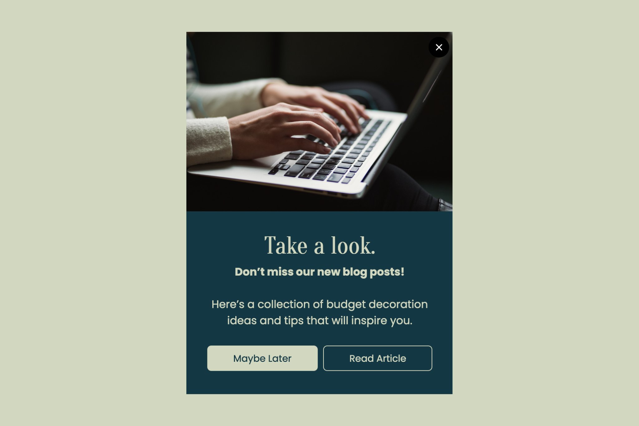
Sidebar blog post designs are another way to guide your visitors to your blog posts or helpful articles. With sidebar popups, your website visitors see notifications instantly.
The sidebar popup template talks to visitors without disturbing them, and it points the interested ones toward your target conversion.
Announcement Popup
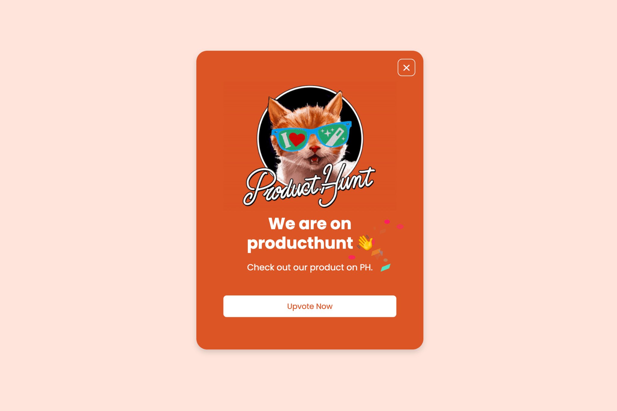
Announcement popups are another way to get your website visitors to act. Give each campaign a clear call-to-action button, then display it where it can increase your conversion rates.
Exit-Intent Popup
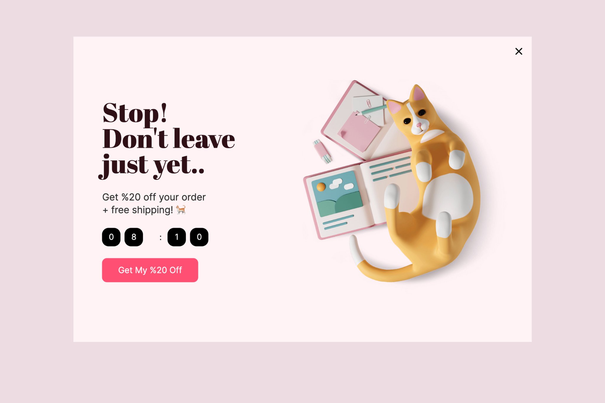
Popups can detect and react to visitor behavior such as abandonment, inactivity time and exit intent.
When a visitor tends to leave the website, the system detects the mouse movements and displays the exit-intent popup.
You can use exit-intent targeting to regain users' attention and guide them towards a solid call to action such as to "Subscribe" or "Get a Discount." That's how an exit-intent popup can improve your website's conversion rate.
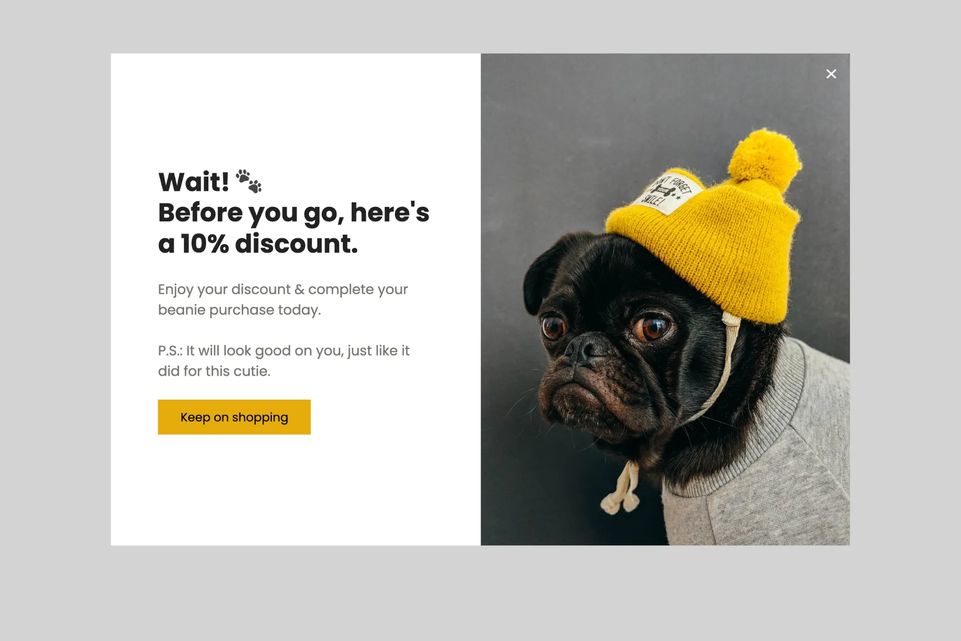
How exit-intent popups work shows why they're great options to lure your customers back with attractive messages or incentives. By asking for your visitors' emails on your incentive, including popups triggered on exit intent, you can improve your email marketing campaigns.
This way, visitors can receive your tempting offer, and you can have a strong list of new high-quality leads.
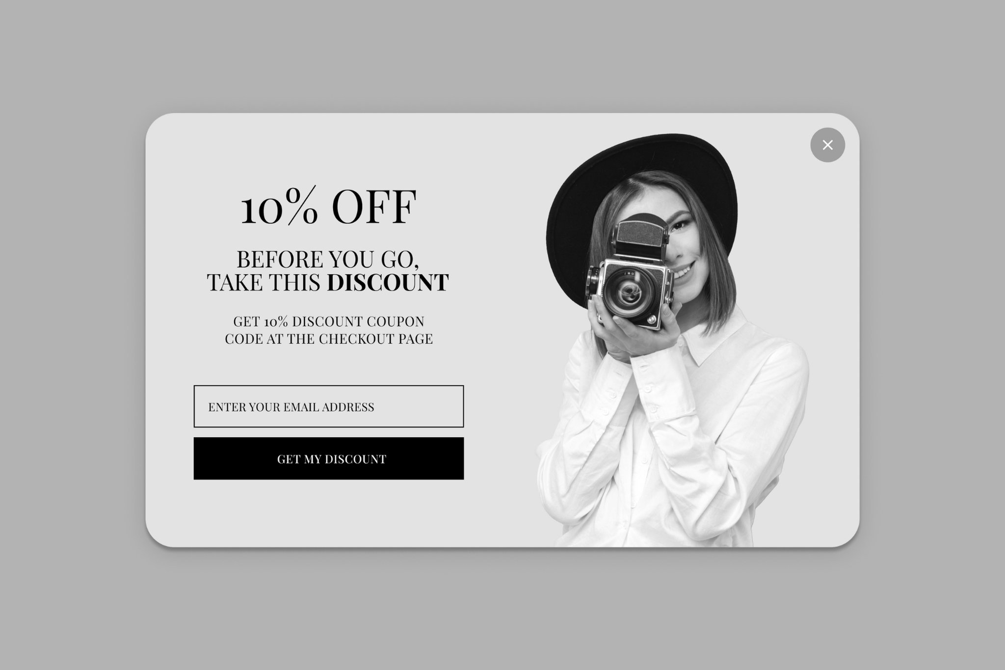
- You can keep your visitors engaged and increase your chances of converting them with exit-intent popups.
- Recommending popular products from your website or showing trendy content to your visitors is another good way to keep them engaged. With exit-intent popup technology, you can test alternative headlines to figure out which one is more effective.
If your website doesn't run an exit-intent popup yet, it's a sensible one to start with.
Cookie Consent Popup
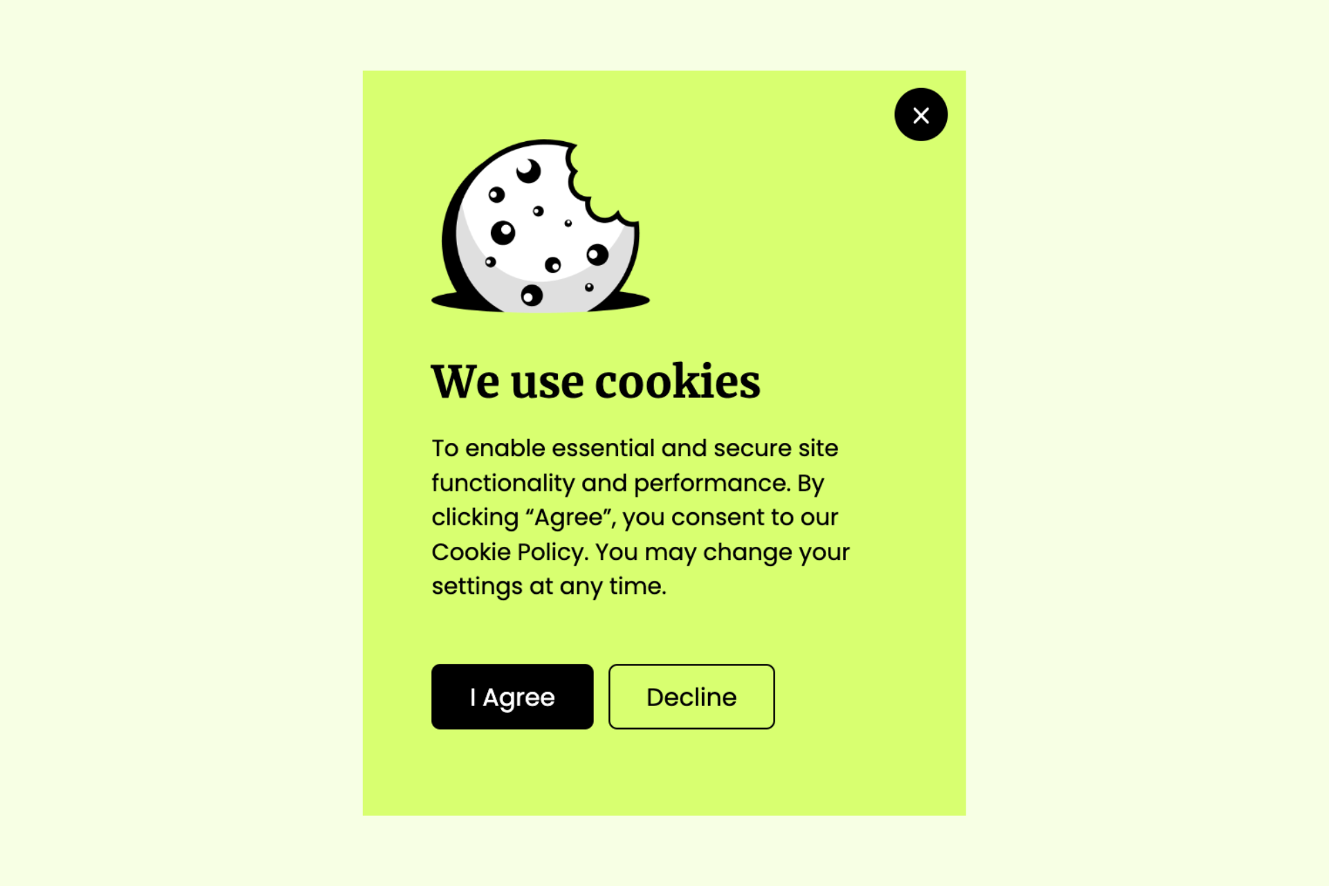
The cookie compliance popups on your website should have:
- Clear information about the purpose of cookies
- An explanation of the tracking technologies in use on the website
- A request for cookie consent when users first arrive
- A link to your cookie policy with the details of cookie usage, purpose, and related third-party activities
4. Best Popup Designs to Increase Your Phone Call Conversions
Increasing your phone calls and conversions with popups is very practical. By including phone call popups, you can offer a better customer support experience as well.
Call Request Popup
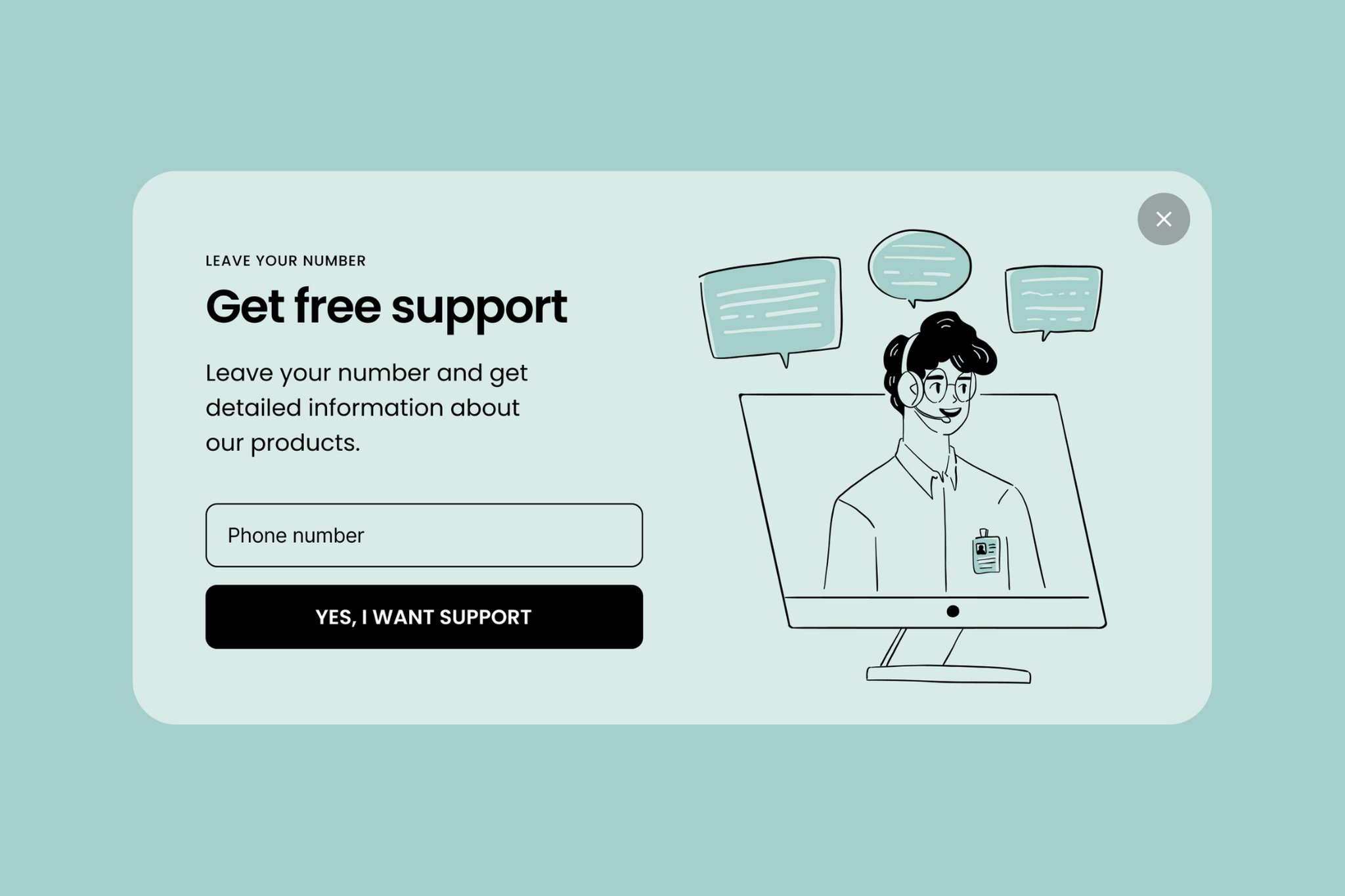
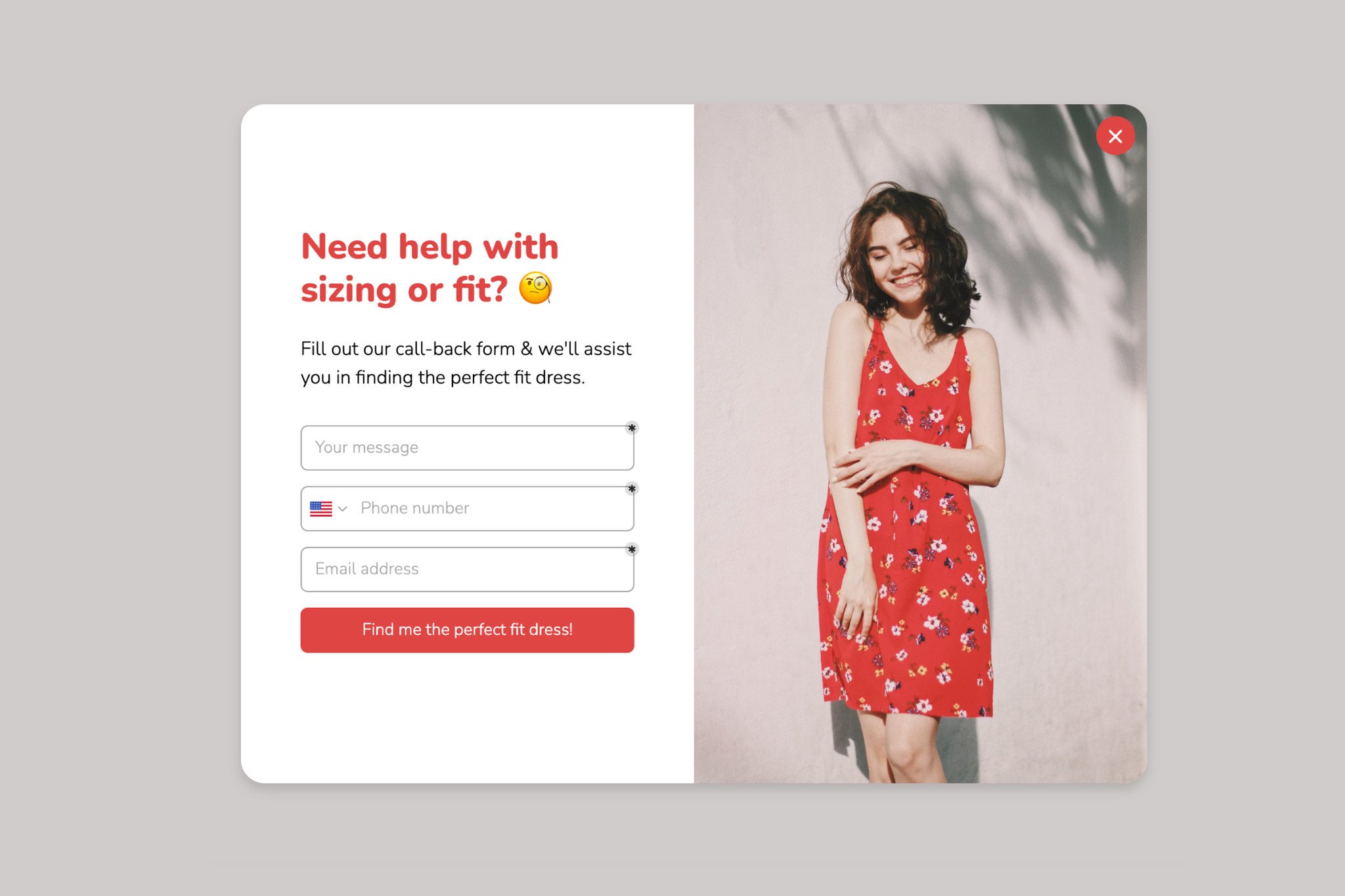
You may let your visitors enter their phone numbers to call them back. In addition, your visitors can directly call you, thanks to the call-to-action button in this popup design.
Phone calls count as conversions too, so don't leave them out of your popup plan.
Once those calls start coming in, you can pair your callback popup with AI call transcription software. Every conversation gets recorded, transcribed, and logged automatically, and your sales or support team doesn't lose track of what a caller asked for.
WhatsApp Call Popup
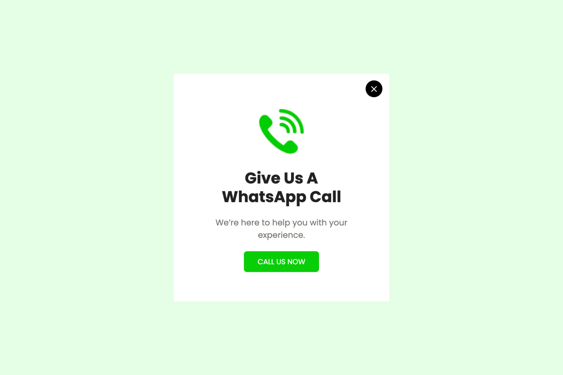
You can directly add a WhatsApp support line to your site. Including these popups on your website can help you to improve your customer support process.
All you have to do is add your phone number. Visitors can then call you straight from the popup.
Popup design best practices that convert
The best popup design asks for one thing and makes it hard to miss: a single objective, a high-contrast button, copy under 30 words, a layout sized for the phone first, a trigger that waits for intent, and a game only when the prize is real. The nine practices below show how to apply that to a website popup, with what our 2026 benchmark measured where it measured something.
Design is one part of the result. For the offer, the form, targeting and frequency, we graded 19 common tips against the same benchmark in popup best practices.
-
Write the objective as one verb before you design anything. Subscribe, buy, claim, book or download. Two verbs means two campaigns, each with its own popup and trigger. If a teammate can't repeat the ask back after a one-sentence description, the popup isn't ready to design.
-
Make the button the most visible thing on the popup, and word it in the first person. Use a button, not a text link, with a verb that matches the offer ("Get my 20% off" says more than "Submit"). In our 2026 benchmark, first-person buttons ("Send my code") convert 1.18% vs 0.80% for neutral wording (English popups, median campaign). Two equal buttons only work when both are the goal, such as sending visitors down one of two product paths. A "No thanks" link should never look like a second option.
-
Build contrast in three places. The button against the popup background, the headline against the body, and the popup against the page. Save one brand color for the button, then check a grayscale screenshot: if the button stops standing out, the hierarchy is broken. Don't expect a jump from changing the color itself. In our benchmark, button colour, dark vs light popup backgrounds, urgency words and question headlines show no measurable effect on conversion; the data are too noisy to rule out modest effects.
-
Make it look like the rest of the site. Use the site's heading font and brand palette, not the popup tool's defaults, and the kind of image the site already uses: a product on a clean background, a person using it, or the bundle the discount covers. Unrelated stock photos hurt, and illustration fits only a brand that is illustrated everywhere else. With no good image, leave it out.
-
Keep the copy under 30 words. Visitors decide quickly. In our benchmark, 71% of visitors who close a popup do so within 5 seconds of it appearing. The headline persuades and the button converts, so terms and consent wording go in small print or on a linked page. Read your popup with a 6-second timer running. If you don't finish, cut.
-
Design at phone width first. Start at a 375px-wide screen and add space for desktop afterwards. Use one column, a close button at Apple's default iOS control size of 44x44 pt (Human Interface Guidelines, checked October 2026), the email keyboard for email fields and the number pad for phone fields, and a button near the bottom where the thumb rests. Most displays happen on a phone, as the mobile figures in this post show.
-
Time it for intent, and cap the repeats. In our benchmark, popups that wait before appearing convert 0.83% vs 0.61% for popups shown the instant the page loads (median campaign); the direction holds in every year of data but the difference is not statistically reliable, so treat it as a lean, not a rule. Design around scroll depth, exit intent, inactivity on a long page or a click the visitor chose to make, and don't fire mid-task in the cart or during a video. Then cap repeats, because the first two times a visitor sees a popup in a week convert at similar rates (1.33% and 1.22% of displays, pooled); from the third view conversion falls, and from the sixth view it is 0.41%, 31% of the first-view rate.
-
Use a game only when the prize is real. The wheel callout above shows what gamification buys you in our data. A wheel suits a high-intent window like Black Friday, with prizes that differ (5%, 10%, 15%, free shipping), an end date and first-time visitors only. It reads as cheap on a B2B demo request, a high-consideration purchase or a quiet premium brand.
-
Change one thing per test. Test the headline or the design, not both. Start with button wording, headline and trigger before colors and fonts, judge a winner by the leads it brings, and read mobile and desktop separately, since the figures below show they convert at different rates.
Common Popup Design Mistakes
Most popups that fail share the same handful of design mistakes. Avoid these and you're already ahead of the average:
- Too many form fields. Every extra field adds friction. Ask for the email first and collect anything else later. In our 2026 benchmark, popups asking for one or two fields convert 0.88% and 0.94%, against 0.56% for three fields (median campaign; spin-to-win and other gamified popups are counted separately).
- No visible close button. A hidden or missing dismiss control feels like a trap and erodes trust.
- Poor mobile sizing. A popup that covers the whole small screen or hides its close button will lose the visit. Design mobile-first.
- Firing instantly. A popup that appears the moment a visitor lands feels irrelevant. Delay it or trigger it on exit intent.
- Low contrast or a buried CTA. If the button doesn't stand out, visitors won't click it. Make the CTA the most prominent element.
- Irrelevant targeting. Showing the wrong offer to the wrong visitor is the fastest way to annoy people. Segment by page at the very least: in our 2026 benchmark, popups on cart and checkout pages convert 4.57% vs 1.07% on the home page (median campaign); blog pages convert 0.23%.
- Stacking popups. A cookie banner, then a chat widget, then an email popup: by the time your offer appears, the visitor has been interrupted three times. Let one modal open on page load and move the rest to later triggers.
Frequently Asked Questions
What makes a good popup design?
A good popup design has one clear goal and a single call to action, a strong visual hierarchy where the CTA is the most prominent element, concise benefit-led copy, on-brand styling so it feels native to the site, an obvious close button, and mobile-first sizing. Timing and targeting matter too — the popup should appear when it is relevant, not the instant a visitor lands.
What is the best popup design for conversions?
There is no single best design, but popups that convert well share a pattern: one image, one benefit-led headline, and one input field. Exit-intent offers and spin-to-win wheels draw attention because they add an incentive at the right moment, but in our 2026 data neither showed a measurable or statistically reliable lead lift. Match the format to the goal — discount coupons for sales, single-field forms for email capture, and floating bars for low-friction announcements. The design details that separate the best popups are copy under 30 words, a button that is the most visible element on the popup, and a trigger that waits for a sign of interest instead of the page load.
How do you design a popup that doesn't annoy visitors?
Delay the popup a few seconds or trigger it on exit intent instead of firing instantly, keep the form to one or two fields, add a clearly visible close button, and target the popup so it is relevant to the page and visitor. Irrelevant popups are the main reason people find them annoying, so relevance and easy dismissal do most of the work.
What size should a website popup be?
On desktop a centered modal usually works best at roughly 500 to 600 pixels wide, small enough to leave the page visible behind it. On mobile the popup should fit within the viewport without covering the full screen, keep the close button reachable with a thumb, and avoid interstitials that block content on entry. Floating bars are a lighter alternative on small screens.
Where can I get free popup design templates?
You can start from Popupsmart's ready-made popup templates and customize them for your brand without coding, or download the free popup design template pack linked below for inspiration. Both give you proven layouts for coupons, email capture, exit-intent, and announcements so you are not designing from a blank canvas.
Final Words
That's the full set. Use these popup designs for ideas, then build your own. An attention-grabbing popup on your website can help increase your conversions and user engagement.
A popup builder like Popupsmart makes the building part practical. It doesn't require any coding knowledge or experience, so you can have a converting popup ready quickly.
If you haven't signed up, register Popupsmart for free today & start creating your conversion-ready popups.
You can also check our Pinterest popup design board to get even more inspired!
If you crave more popup designs for inspiration, download popup design templates. You can also start from ready-made popup templates and customize them without code.
Have thoughts on these popup designs? Share them in the comments section below. 🤓
Explore these blog posts while you are here: