10 Popup Design Best Practices for Higher Conversion in 2026
Guide to high-converting popup design: set clear goals, use standout CTAs, brief persuasive copy, contrast and relevant images, match site style, ask minimal info, make closing easy, optimize for mobile, and add gamification.
Those of you wondering how to make popups catch high-quality leads will find a wealth of inspiration in this guide to popup design best practices.
There is still plenty of controversy surrounding pop-ups. Some people dislike them, while others love using them; But one thing is for sure, popups convert, and they are here to stay!
Popup design best practices in 2026 come down to one rule: every pixel has to earn its interruption. The 10 practices below — one objective per popup, hard contrast, mobile-first sizing, intent-based timing, and gamification only when the offer earns it — are the ones we see lift conversion across the popups our customers ship every month.
Why Popup Design Matters in 2026
I've spent the last several years staring at popup conversion data. Across the 100M+ popups our customers have shipped through Popupsmart, the pattern is brutal and consistent: design decides whether a popup gets ignored, clicked, or hated. Same offer, same audience, same traffic source — a redesign can move conversion rate by 3–5x without changing a single word of the offer itself.
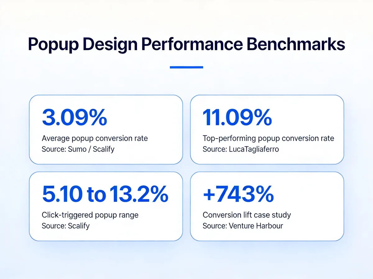
Popup design performance benchmarks across the industry.
The benchmarks tell the same story. According to Scalify, the average popup conversion rate sits at 3.09%, while well-designed campaigns frequently push past 11%. Research aggregated by Luca Tagliaferro places the average closer to 11.09% across 1.8 billion impressions, with email capture popups underperforming the mean and discount popups overperforming it. The gap between bottom and top quartile is almost entirely a design problem, not a traffic problem.
And design has gotten harder. Mobile traffic dominates most stores we see. Privacy banners are stacking on top of marketing popups. Attention spans for any modal are short. The sites winning in 2026 treat popup design as a real product surface — not a marketing afterthought. That's the spirit behind these practices.
10 Popup Design Best Practices That Convert
Below are the 10 practices we recommend in this order: easiest wins first, then the deeper structural shifts. Each section gives you the principle, why it works, what good vs. bad looks like, and a real example screenshot. If you read nothing else, read practice #1 — most underperforming popups die at that step.
1. Lead With One Clear Objective Per Popup
Every popup should have a single answer to the question, "what do I want this visitor to do in the next 6 seconds?" If you can't answer in one verb — subscribe, buy, claim, book, download — the popup is going to underperform.
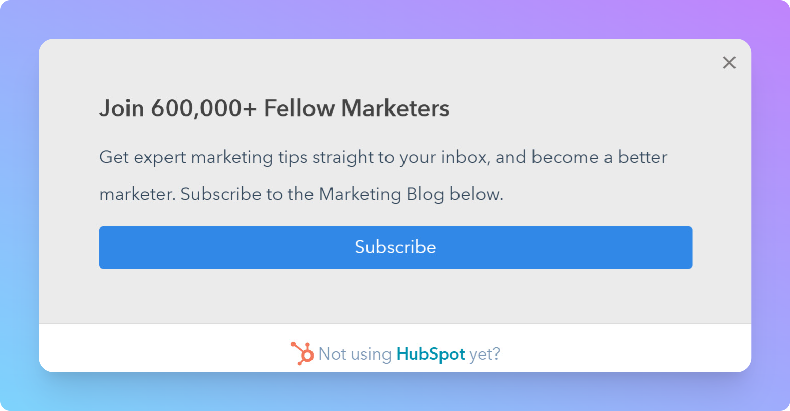
HubSpot's email list popup runs one clear objective: subscribe. Nothing competes for attention.
The trap most teams fall into is bundling. The same popup tries to grow the email list, push a discount, promote a new collection, and link to the blog. The visitor reads three lines, gets confused about what's being asked, and clicks the close button. We've seen single-objective rewrites lift conversion 40–60% with zero change to traffic or design polish — purely from removing the second CTA.
Good looks like the HubSpot pattern above: one headline, one promise, one button, one input field. Bad looks like a popup with two equally weighted CTAs, three pieces of copy fighting for the eye, and a "or browse our blog" link tucked in the corner. If you have two real objectives — say, demo bookings and email subscribes — split them across two campaigns with different triggers, not one popup.
Before you ever open the design tool, write the objective in one sentence. Show it to one teammate. If they can't restate it back to you in five seconds, the popup isn't ready to be designed yet.
2. Make the Call-to-Action Impossible to Miss
The CTA is the only element that has to convert. Treat it accordingly. It needs higher contrast than anything else on the popup, more visual weight, and copy that telegraphs exactly what happens on click.
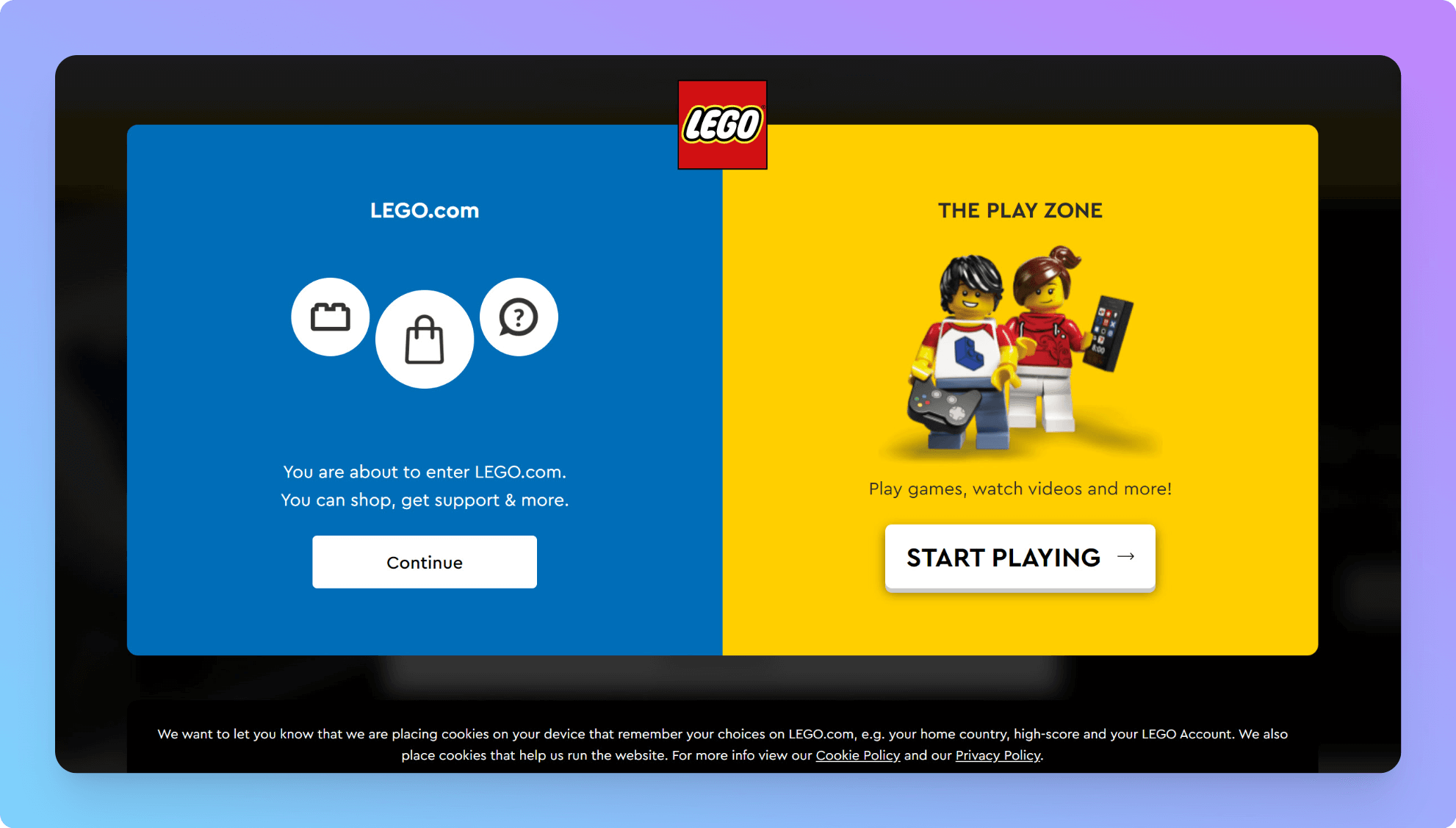
Lego's navigation popup uses two equally weighted CTAs because both are the objective — pick a path.
The Lego example above is interesting because it intentionally breaks the one-CTA rule from practice #1. That's allowed when both options are the actual objective (route the visitor down one of two product paths). What's not allowed is making one CTA the goal and one CTA an escape hatch with similar visual weight — that's a coin flip you're going to lose.
Good CTAs follow three rules: a button, not a text link; a verb that matches the offer ("Get my 20% off" beats "Submit"); and color that pops against the popup background, not just the page. The button should be the brightest, boldest thing on the modal. If a visitor squints and looks at the popup for half a second, they should still see the button.
Bad CTAs are passive ("Continue", "OK", "Submit"), low-contrast (gray on white, light blue on white), or buried in body copy. The fastest A/B test you can run on any popup is rewriting the button label and bumping its contrast. Across the campaigns we look at every week, this single change is responsible for more lift than any other tactic.
3. Use Contrast to Direct the Eye
Contrast isn't a style choice. It's how you tell the visitor's eye where to land first, second, and third. A popup is a 5-second composition: headline, offer, CTA. If contrast doesn't enforce that hierarchy, attention scatters.
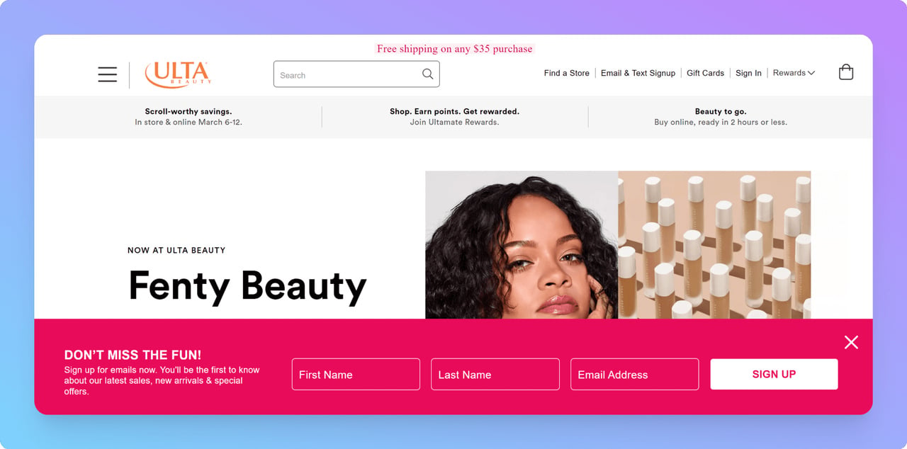
Ulta Beauty's pink floating bar pops against a white site background while staying on-brand.
The Ulta floating bar works because the pink is loud against the white site background, but it isn't a random color — it's pulled from their brand palette, so it reads as part of the site rather than a third-party banner. That's the trick most teams miss. They either go too quiet (popup blends into the page and gets ignored) or too loud in a color that has no relationship to the brand (popup looks like a malware ad and gets reported).
The pattern that works: pick a primary brand color, use it sparingly elsewhere on the page, and reserve it for the CTA button or the popup background. The contrast comes from scarcity. If the popup color appears nowhere else on the page, the eye snaps to it.
Where to look hard at contrast: the CTA button vs. the popup background, the headline vs. the body copy, and the popup as a whole vs. the underlying page. All three need clear separation. If the popup screenshot looks fine in color but turns into mush when you convert it to grayscale, your contrast hierarchy is broken.
4. Match the Popup to Your Brand Style
A popup that looks like it was airdropped in by a third-party tool kills trust the moment it appears. The most-converting popups feel like they were designed by the same team that designed the site — same fonts, same color palette, same photography style, same voice.
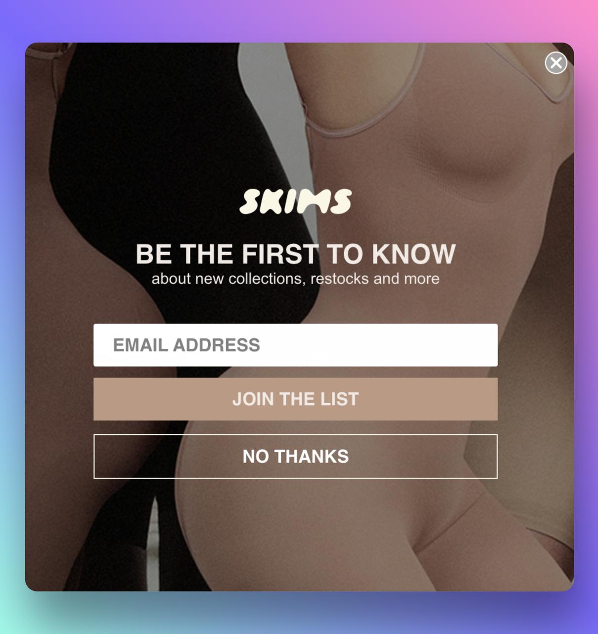
Skims' popup uses the same warm neutrals and product photography as the rest of the site.
Skims pulls this off by using the exact same warm neutral palette and product photography style as the homepage. If you screenshotted the popup out of context, you'd still know which brand it belongs to. That's the bar.
The opposite — a popup styled in default tool colors with stock fonts and a CTA that says "GET 10% OFF NOW!!!" in red — does measurable damage to brand perception even when it converts. We've watched stores lift email signups by 30% after a brand-aligned redesign and simultaneously lift their NPS scores, because the popup stopped feeling like a hostile interruption.
Practical checklist: use the same heading font as the site, pull background and accent colors from the existing brand palette (not the popup tool's defaults), and if the site uses photography, use a real product or lifestyle photo in the popup rather than a generic icon. The popup should feel like a continuation of the site, not an ad layered on top.
5. Keep Copy Under 30 Words
You have somewhere between 2 and 6 seconds before the visitor decides to engage or close. Anything past the 30-word mark gets skipped. The headline does the persuasion; the CTA does the conversion; everything else is overhead.
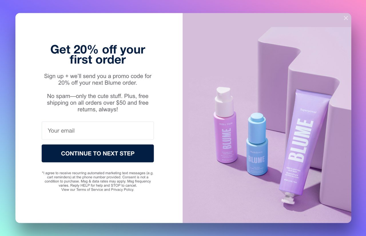
Blume keeps the copy under 20 words: offer, qualifier, CTA. Done.
Blume's popup is a textbook example. Short headline, one-line offer, one input, one button. Maybe 18 words total. The visitor processes it in under 2 seconds and either acts or doesn't. There's no paragraph explaining the value of the email list, no asterisked terms, no "by signing up you agree" wall — that goes in fine print or a linked privacy page.
The 30-word limit forces three good behaviors: it makes you write a headline that does real work, it kills generic filler ("we'd love to keep in touch with you about exciting updates"), and it leaves room for the design to breathe. Most popups feel cramped because the copy is doing too much.
Test this on your own popups. Open one, set a 6-second timer, and read it. If you don't finish, cut. If you finish but can't restate the offer, the headline is wrong. If you finish, get the offer, and want to click — that's the bar.
6. Show the Offer With a Product Image
A popup that shows the product converts better than a popup that describes it. The image gives the visitor an instant frame for what they're getting and what brand they're dealing with. Text-only popups feel like spam; product popups feel like merchandising.
Vitaly anchors the popup with a real lifestyle shot of someone wearing the product.
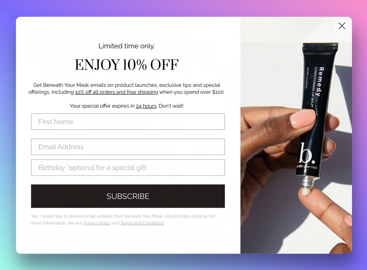
Beneath Your Mask shows the product in use — texture, packaging, and result all communicated visually.
Vitaly anchors their popup with a styled lifestyle shot. Beneath Your Mask shows the product mid-use. Both choices answer the unspoken visitor question: "what am I about to receive 10% off of, and is it actually for me?" That answer should be visual.
What works: a product on a clean background, a person using the product, or a flat-lay of the bundle the discount applies to. What doesn't work: stock photos that have nothing to do with the actual product, generic abstract gradients with text on top, or a logo where a product image should go. If you wouldn't put the image on a product page, don't put it on the popup.
The image also pulls double duty for brand match (practice #4). A real product photo in your existing photography style ties the popup to the rest of the site faster than any color choice can. For more website popup examples that pair imagery with offers well, our examples library is a good next stop.
7. Add Personality With Illustration When It Fits
Photography isn't always right. For brands with playful voices, illustration can do something a product photo can't: communicate personality in a single beat. The risk is that bad illustration looks amateurish; good illustration costs design time and gets dated.
Meowmeow Tweet leans fully into illustration because it matches the rest of the brand.
Meowmeow Tweet's popup works because the brand is illustrated end-to-end. The cat illustration on the popup matches the illustrations on the homepage, the product packaging, and the about page. It feels native, not tacked on. If they swapped to a stock product photo, the popup would feel quieter but more generic.
Illustration is also useful for moments where photography would be awkward — a service business with no physical product, an SaaS tool whose UI isn't visually interesting at popup size, or a context-sensitive moment that needs a custom visual. The COVID-era informational popup pattern below is a good example of illustration solving a context problem photography couldn't.
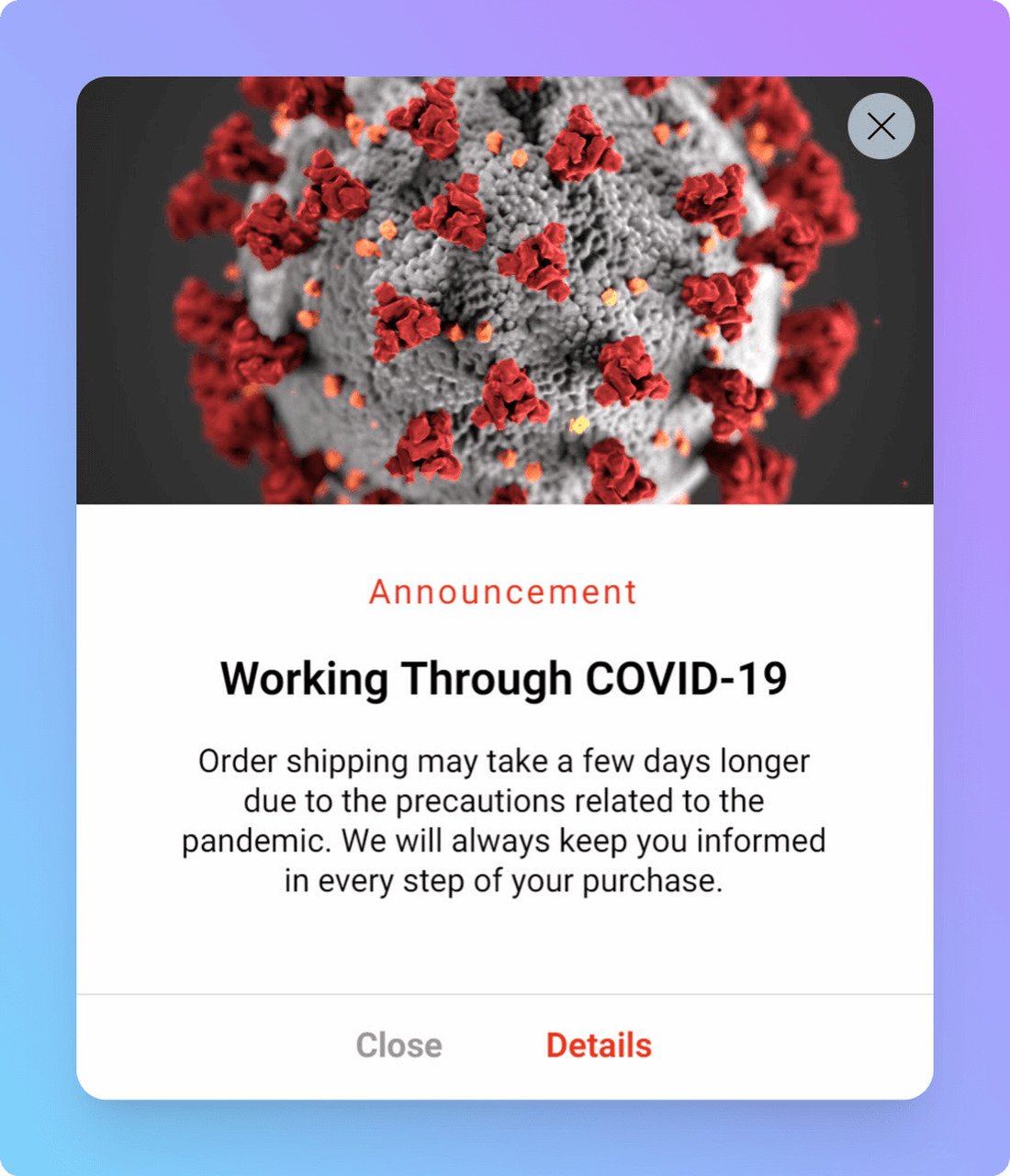
Context-sensitive illustration carries information that a product photo couldn't.
The rule of thumb: if the rest of your brand uses illustration, the popup should too. If the rest of the brand is photography-led, an illustrated popup will feel like an outlier. Consistency with the surrounding system beats the local optimization on the popup itself.
8. Design Mobile-First, Not Mobile-After
The default workflow most teams use is wrong. They design the popup at desktop width, then squish it down to fit a phone, then notice the close button is unreachable, the input field triggers an iOS zoom, and the headline wraps into five lines. Mobile-first reverses the order: design at 375px width, then expand to desktop with extra space if needed.
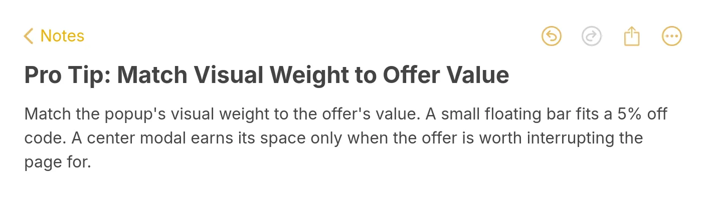
Pro tip: match visual weight to offer value.
What mobile-first actually means in practice: a single-column layout, a close button big enough to hit with a thumb (44x44px minimum), input fields with the right keyboard type (email keyboard for email fields, numeric for phone), and a CTA button placed where a thumb naturally rests — bottom of the popup, not pushed off the visible viewport.
The data we see across thousands of stores is consistent: mobile popups underperform desktop by 30–50% on average, and almost all of that gap is design failures, not user behavior. When mobile gets a real design treatment — not a shrunken desktop — the gap usually closes to within 10%. Sometimes mobile beats desktop, particularly for offers that match a mobile use case (Shopify discount codes, app installs, SMS opt-ins).
If you only have time to fix one thing on mobile, fix the close button. A close button that's 12px in a corner doesn't get tapped — it gets the whole popup angrily dismissed by tapping outside, which usually doesn't trigger the intended close behavior and tanks the user experience. For the deeper failure modes, our writeup on popup UX mistakes goes through what we see most often.
9. Time It for Intent, Not Arrival
The single biggest determinant of popup conversion isn't design — it's timing. A perfectly designed popup fired on page load to a visitor who hasn't even started reading is going to convert worse than a mediocre popup fired at the right moment. Intent-based triggers beat arrival-based triggers by a wide margin.
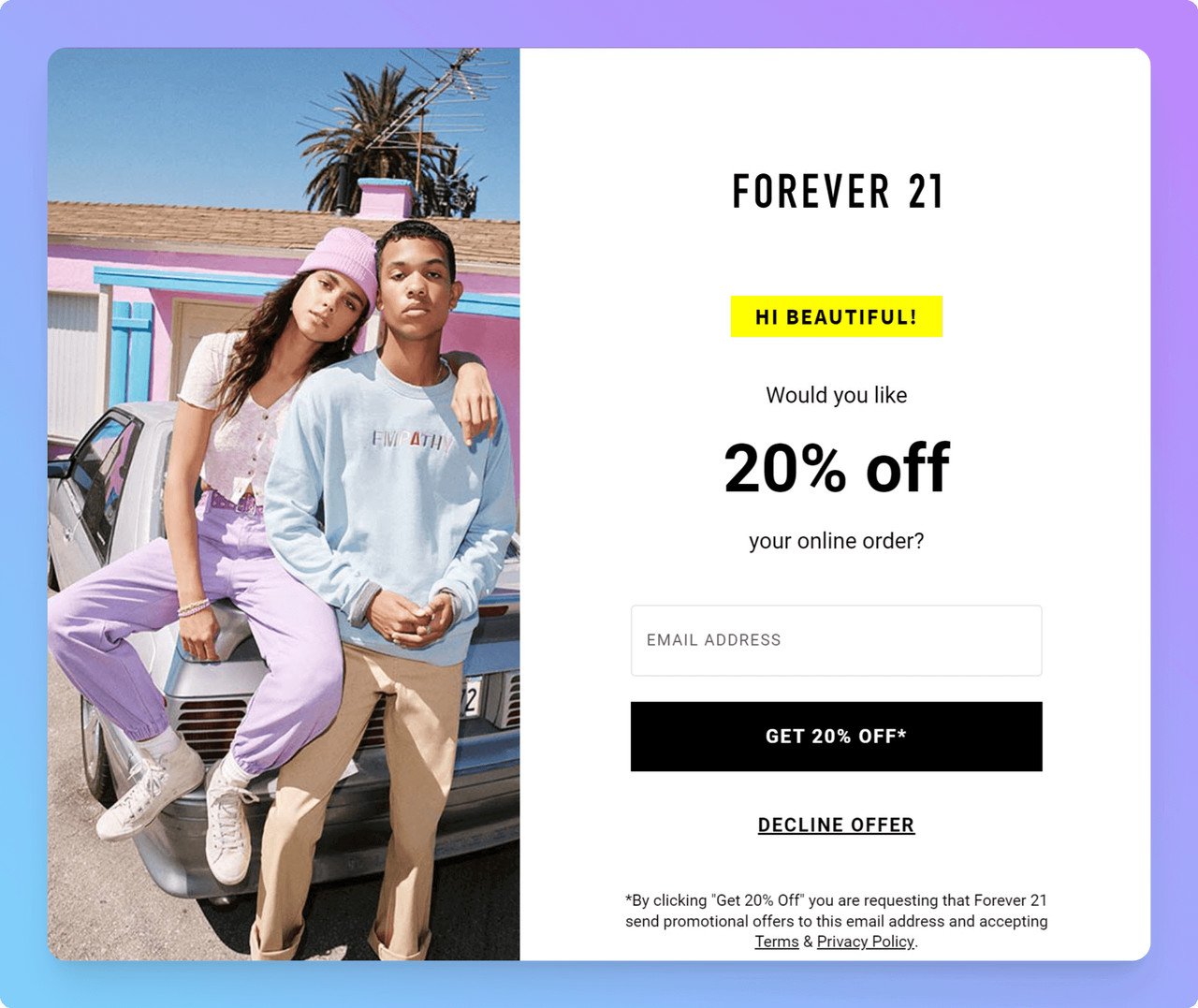
Forever 21's email popup design works because of when it fires, not just how it looks.
The four intent signals worth designing around: scroll depth (visitor scrolled past 50% — they're engaged), exit intent (cursor moves toward the tab close — they're leaving anyway), inactivity (no mouse movement for 30+ seconds on a long page — likely reading), and click intent (clicked an "early bird" or "join waitlist" button — explicitly asked).
Our own demo popup fires on scroll past 60%, not on arrival.
What to avoid: page-load popups on first visits, popups that fire while the visitor is mid-task (filling a cart, watching a video, in checkout), and popups that fire repeatedly on every pageview. Across the data we see, repeat impressions of the same popup beyond impression #2 cut conversion in half. Cap frequency at 1 impression per visitor per 7 days for any given campaign.
According to a Venture Harbour case study, retiming and redesigning their enquiry popup lifted conversion from 0.96% to 8.1% — a 743% increase, almost entirely from triggering at the right moment for the right intent rather than on arrival.
10. Use Gamification Only When the Offer Earns It
Spin-to-win wheels, scratch cards, mystery discount reveals — gamification can pump conversion rates dramatically when the offer matches the moment. It can also cheapen the brand and train visitors to expect a discount on every visit. Use it when the math works, not by default.
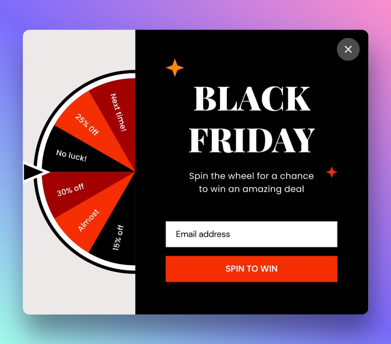
The Black Friday wheel works because the offer is real, time-limited, and the moment is high-intent.
The Black Friday wheel above is a good fit: high-intent shopping window, real discounts on the wheel (not all 5% offers), and a finite campaign window so it doesn't become the default brand experience. According to Rejoiner, two-step interactive popups average 11.9% conversion vs. 3.09% for standard one-step forms — but those gains evaporate if visitors learn the wheel is rigged or the discount is trivial.
Where gamification fails: B2B SaaS demo requests (a wheel doesn't make a demo more credible), high-consideration purchases (no one spins to win on a $4,000 watch), and brands whose voice is premium or quiet (a wheel reads as cheap). It also fails when every "prize" on the wheel is functionally the same — visitors notice fast, and trust drops.
If you do use gamification, give the wheel real spread (5%, 10%, 15%, 20%, free shipping, free gift), cap it to a campaign window, and segment to first-time visitors only. For brands that want the engagement bump without the discount race, a pre-launch waitlist with reveal mechanics can do similar lift without training visitors to wait for a discount popup. Our writeup on discount popup ideas covers the variants we see work most often.
Popup Design Mistakes to Stop Making
Most underperforming popups aren't failing because the design is ugly. They're failing because of a small set of repeated mistakes that quietly tank conversion. The five below are the ones we flag most often when we audit our customers' campaigns.
• Stacking popups on top of popups. Cookie banner, then chat widget, then email capture, then GDPR re-consent. By the time the actual marketing popup fires, the visitor has been interrupted four times and is hostile. Audit every modal that fires on page load and pick one. Push the rest to delayed triggers or kill them.
• Hiding the close button. A close button smaller than 16px, in a low-contrast color, in an unexpected position is a dark pattern. It might lift conversion this week — it cuts return visits and trust longer term. Make it obvious. Visitors who close confidently come back; visitors who feel trapped don't.
• Asking for too many fields. Every input field past the first one drops conversion roughly 10–20%. If you can convert with just an email, ask for just an email. Phone numbers, names, company sizes, and birthdays all belong in a follow-up email or progressive profile, not the first popup.
• Generic stock imagery. A popup with a smiling stock-photo woman in a headset reads as low-trust. So does abstract gradient art with no relationship to the brand. If you can't use a real product photo or a brand-aligned illustration, drop the image entirely. A clean text-and-CTA popup beats a popup carrying a bad image.
• Same popup on every page. A blog reader, a category browser, and a checkout abandoner have different intents and need different popups. Firing the same generic email-capture on every page wastes the highest-intent moments. Segment by URL pattern at minimum, by behavior ideally. The difference between a generic popup and a segmented one is usually 2–3x conversion on the same offer.
How to A/B Test Popup Design Changes
Most popup A/B tests we see are run badly — too few visitors per variant, two variables changed at once, no significance check. The result is teams making "data-driven" decisions on noise. The five tactics below cover what to actually do.
• One variable per test. If you're testing the headline, leave the design alone. If you're testing the design, leave the copy alone. Two variables means you can't attribute the lift, and you'll guess wrong on the next iteration. The exception is full-redesign tests where the whole popup is the variable — in that case, treat it as a directional test, not a precision one.
• Get to statistical significance before calling it. For most popup tests, that's at least 1,000 conversions per variant or roughly 14–21 days of traffic, whichever comes first. Calling a test after 3 days because variant B is winning is how teams ship the wrong design. Use a free significance calculator and aim for p < 0.05 minimum.
• Segment your traffic before testing. Mobile vs. desktop, new vs. returning, organic vs. paid — these segments often respond to design changes in opposite directions. If you only test on combined traffic, you average out the signal. Run separate tests on at least mobile vs. desktop for any popup change worth shipping.
• Test the high-impact elements first. CTA copy, headline, and trigger timing typically move the needle 20–40% per test. Color, font, and image style usually move it 5–10%. Spend the first three test cycles on the high-impact stuff, then move to polish.
• Track downstream metrics, not just popup conversion. A popup that converts at 12% but produces emails that never engage is worse than a popup that converts at 6% with high-quality leads. Tie the popup test back to email open rate, purchase rate, or whatever the real downstream goal is. The popup conversion is the input; the business metric is the output.
Ship a Better Popup Design This Week
If you take only one thing from this guide, take the order. Start with practice #1 — pick a single objective per popup. Then audit your existing popups against #2 (CTA visibility) and #5 (copy under 30 words). Those three changes alone, applied to your current campaigns, will typically lift conversion 30–50% inside two weeks without writing new copy or commissioning new design work.
Once the easy wins are in, move to the structural changes: mobile-first redesign (#8), intent-based timing (#9), and brand-matched style (#4). These take longer to ship but compound — a mobile-first popup that fires on scroll depth, in your brand palette, with one clear objective, is the popup that converts at 8–12% instead of 3%.
The tooling matters less than the discipline. The popups we see winning in 2026 weren't built on the most expensive platform — they were built by teams that decided one objective, wrote one headline, designed one button, and tested one variable at a time. Pick one campaign you're running today and apply the first three practices to it this week. Measure it for two weeks. Then move to the next one. For deeper teardowns of what's working in different niches right now, our libraries on email popup designs and popup software comparison are good places to keep going.
Popup Design FAQ
How often should I refresh popup design?
If a popup has been running unchanged for more than 90 days, it's almost certainly underperforming its potential. Conversion rates on the same popup typically decay 10–20% per quarter as repeat visitors learn to ignore it. Refresh the headline and CTA copy quarterly, refresh the design twice a year, and run an A/B test against the current control any time you're shipping a new offer or seasonal campaign. For ongoing inspiration, our inspirational popups collection is a good place to pull pattern ideas from.
Are animated popups still effective?
Animation works when it serves the design — a subtle entrance animation that draws the eye, a button micro-interaction that confirms the click, a wheel spin that pays off the gamification mechanic. Animation fails when it's noise: bouncing headlines, flashing CTAs, distracting backgrounds. The rule we use: every animation should have a function (signal, confirmation, or feedback). If you can remove it without losing meaning, remove it.
Listed below are some related articles you might find helpful in your research:
27 Perfectly Optimized Popup Designs to Inspire
Popup UX Design: Common Mistakes & What To Do Instead
Email Popup: Complete Guide with 15 Brilliant Examples
Related Terms:

How would you rate your experience with this article? 😊