ChatGPT
 Perplexity
 Claude
 Grok
Grok Google AI Mode
Static popups are everywhere, which is exactly why they get ignored. Movement breaks visual habituation and pulls focus to a single call to action faster than static designs, but it doesn't make a weak offer convert. This guide covers what an animated popup is, why it earns attention in 2026, how to build one in Popupsmart in five steps or by hand in CSS, and ten real examples you can copy this afternoon. It also covers the accessibility rules popup motion has to follow.
What Is an Animated Popup?
An animated popup is a website overlay that uses movement (a looping Lottie file, a short GIF, a CSS slide-in, or a micro-interaction on hover) to grab attention without overwhelming the page. The animation isn't decoration. It's the hook that pulls the eye onto the offer.
Three things separate animated popups from regular ones:
• A moving element: A Lottie JSON, GIF, or CSS-driven transform tied to a CTA, icon, or headline.
• A single focal point: Motion guides the visitor to one action: subscribe, claim, browse, follow.
• A purposeful trigger: Exit intent, scroll depth, or time-on-page, not a load-and-blast that interrupts everything.
Popup motion comes in three kinds. An entrance effect (fade, slide or zoom) plays once as the popup opens. A looping element (a Lottie file or GIF) keeps moving inside the popup. A micro-interaction reacts to the visitor, like a button that shifts on hover. Most good animated popups use one of the three, not all of them.
Animation as an industry keeps growing. According to a Precedence Research forecast carried by Yahoo Finance, the global animation market is projected to grow from USD 492.14 billion in 2026 to USD 953.31 billion by 2035 (a press release published in December 2025). That forecast covers animation as a whole, not popups, so treat it as background rather than proof that motion converts.
Benefits of Using Animated Popups in 2026
Animated popups earn attention in five ways, and the subtler the motion, the better each one works. None of them replaces the offer: motion directs the eye, the offer converts. So test an animated version against a static one before you keep it.
• Attention on one spot: Movement is the first thing the eye catches on a page. Put the moving element next to the button and it points the visitor at the one action you want.
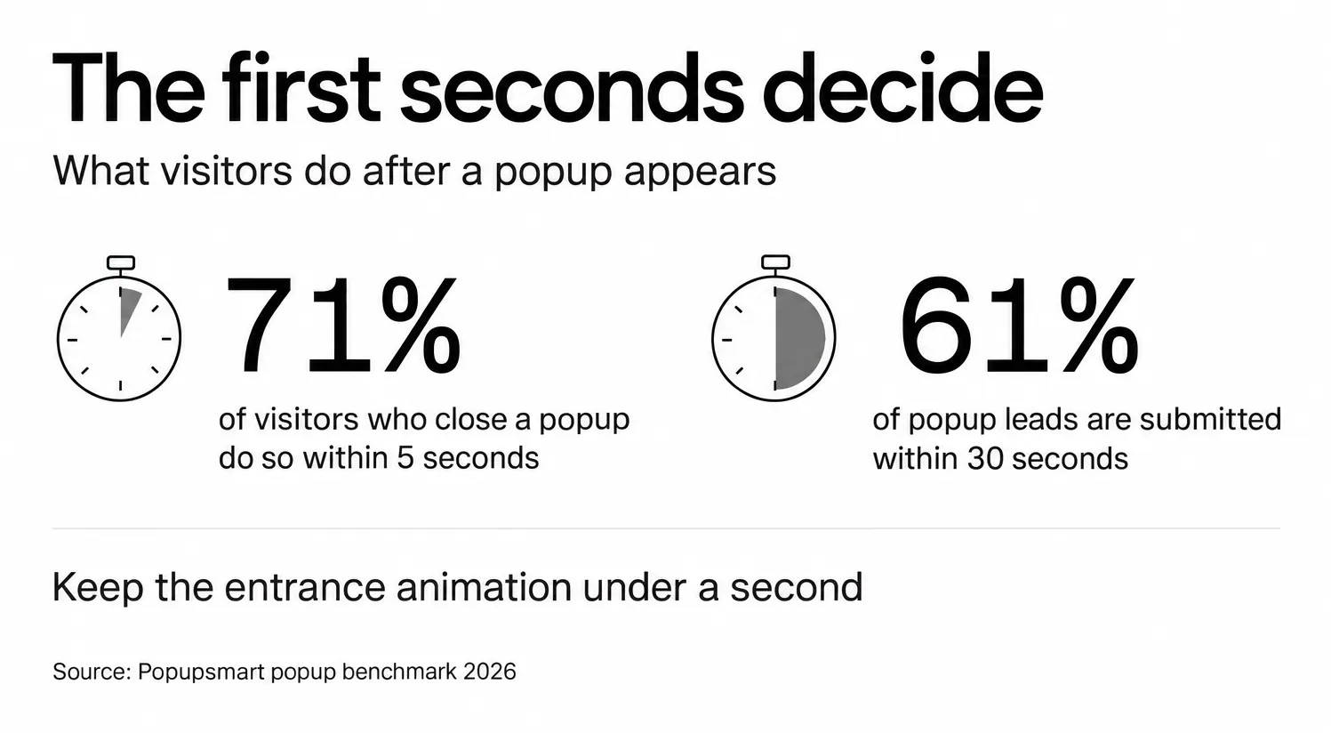
• Lower friction at the entrance: A 1.5-second Lottie loop introduces the popup more gently than a hard fade-in. Visitors finish their sentence, then notice the motion. Keep the entrance itself short, because the first seconds decide: in Popupsmart's 2026 benchmark, 71% of visitors who close a popup do so within 5 seconds of it appearing, and 61% of popup leads are submitted within 30 seconds of the popup appearing.
• Visual differentiation: If a visitor has seen six static popups already today, your animated one feels new. Novelty can buy a moment before they reach for the X.
• Better mobile performance: A Lottie file is vector art, so it looks sharper at 320px width than a GIF, and a simple loop usually weighs far less than a GIF of the same motion.
• Reinforced brand personality: A playful bounce says something different than a stark, motionless box. It's part of your brand voice.
How to Create an Animated Popup with Popupsmart
To create an animated popup in Popupsmart, start a campaign, pick a goal and template, add a Lottie element, upload your animation file, then preview and save. Popupsmart's popup templates include ready-made animated popups you can customize in minutes. For a fully custom look, you can drop in your own Lottie JSON. The five-step flow below is the custom path.
1. Start a new campaign. Open your Popupsmart dashboard and click the blue + New Campaign button in the top right corner.
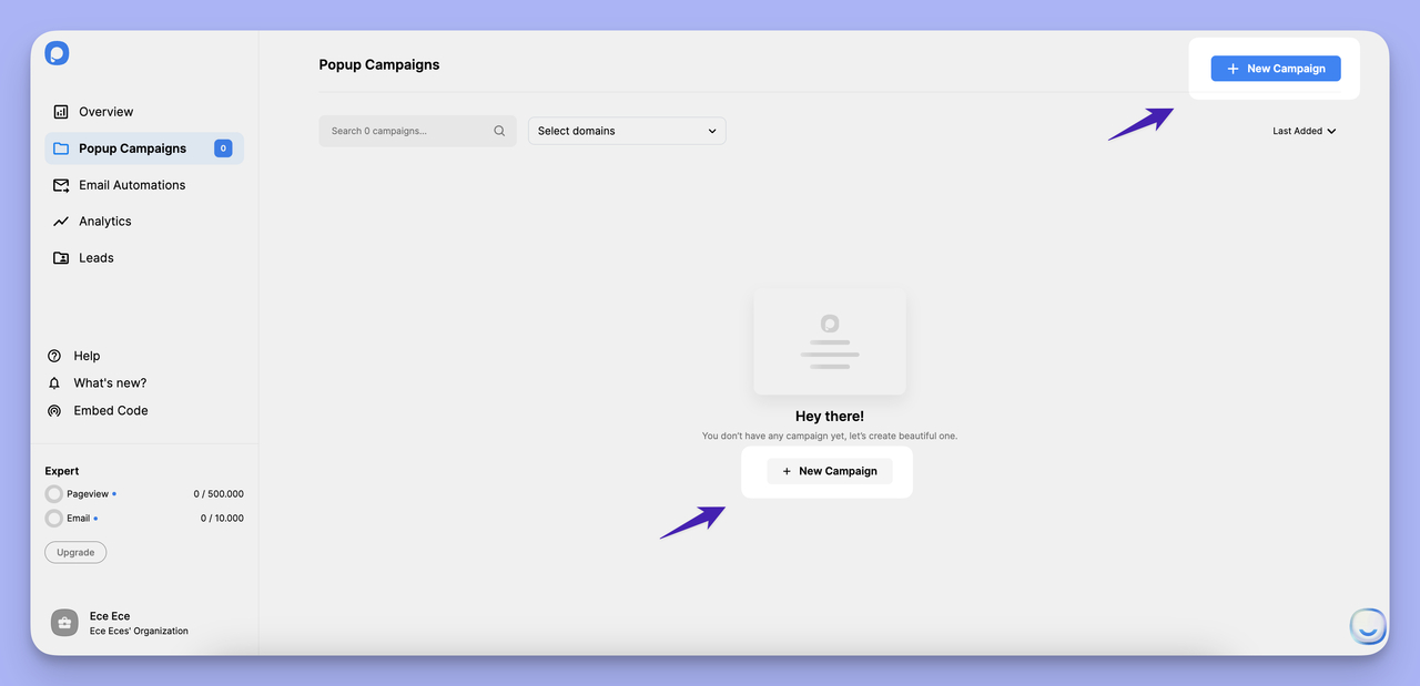
Starting a new campaign from the Popupsmart dashboard
2. Name your campaign and connect your domain. In the modal that appears, give your campaign a clear name like "animated popup" and pick the domain from the dropdown. Hit Save. Naming matters more than you'd think. Three months later, "campaign 47" is meaningless, "homepage exit animated" is not.
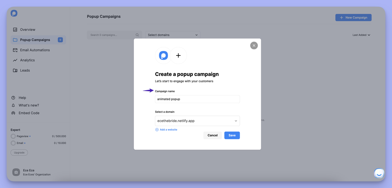
Naming the campaign and connecting a domain
3. Pick a business goal and template. The left sidebar lists goals like "Promote Products & Offers" and "Grow Your Email List." Pick the one that matches your campaign; I'm using Promote Products & Offers for this walkthrough. Popupsmart then filters templates by that intent. I picked Cross-Sell Customer Favorites for this example.
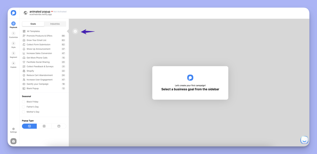
Selecting a business goal from the sidebar
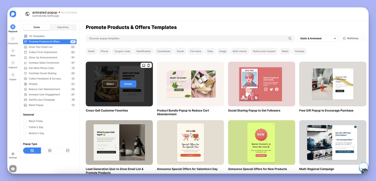
Picking a template that fits the chosen goal
4. Customize the popup and add the Lottie element. You're now in the visual editor. Edit text, swap images, recolor the button. To add the animation, scroll down the left panel under Content Elements and select Lottie. Drop it onto the canvas next to the headline or above the CTA. A Lottie behaves like an image, so if the template already has an image where you want the motion, delete that image first.
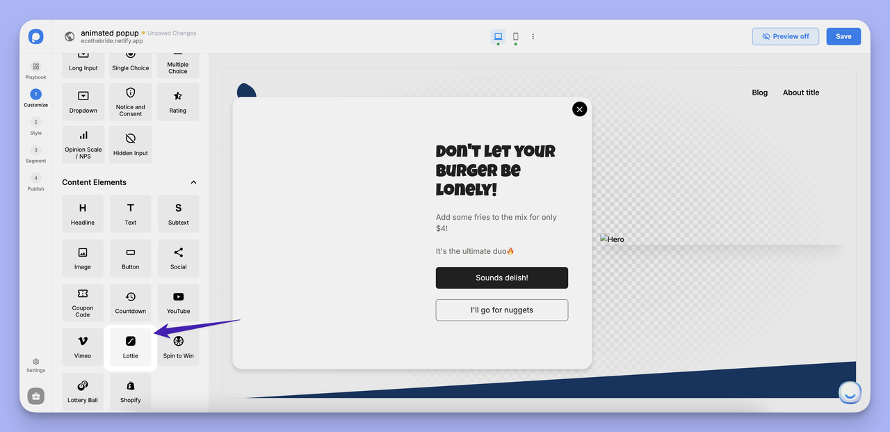
Adding the Lottie element to the popup layout
5. Upload your animation and fine-tune it. Click the Lottie element and you'll see Drop your JSON or browse. Upload a Lottie file from LottieFiles or After Effects. I used a hamburger animation here. Set the size, position, autoplay, and loop. Hit Preview in the top right, then Save. To animate the whole popup background instead, open Style, then Body Style, and switch on the Lottie animation there. Body Style is also where you pick the popup's opening effect. The help center's guide to adding a Lottie animation to a popup shows each screen.
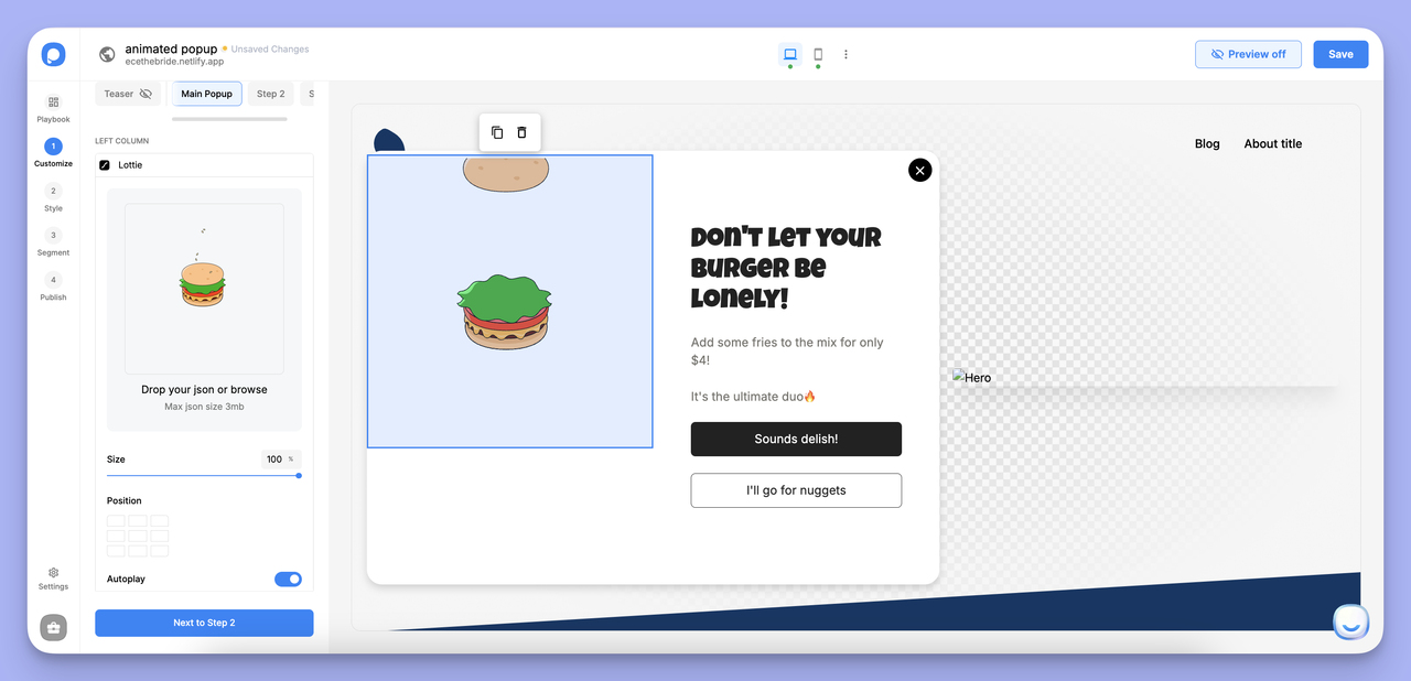
Uploading the Lottie JSON file into the popup
Your finished animated popup looks like this:
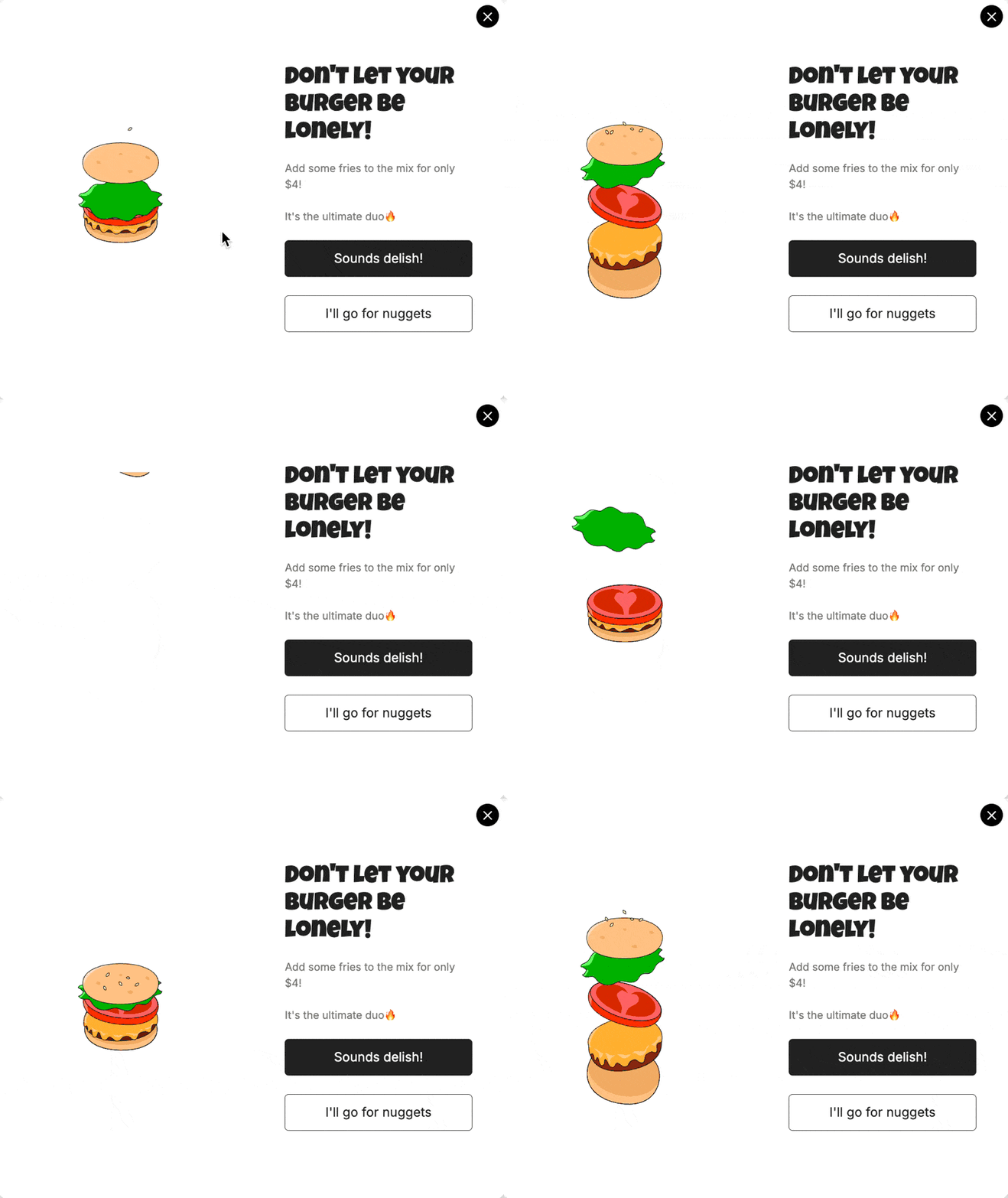
The finished animated popup with a Lottie burger loop
Pro tip: keep your first Lottie under 200KB and run it at 24fps. A small vector loop is enough inside a popup, and anything heavier hurts mobile page speed. Check the page on a real phone before you publish.
10 Perfect Animated Popup Examples
I picked these 10 from Popupsmart's template library because each one teaches a different motion principle. Some use literal product animation, others use abstract decoration. Read the takeaway under each one: the principle travels further than the design.
1. Subscription Popup: The Friendly Inbox Ask
A subscription popup with a looping character illustration
What works: A single-field email capture sits next to a looping character illustration of a woman on her phone. The motion is gentle (a slow chair rock), not jittery, and the illustration's eye-line points at the input field, a classic UX trick that pulls attention toward the action.
Why it works: Character illustrations trigger a "social presence" effect: a familiar human figure makes form-filling feel less transactional. Combine that with directional gaze and the illustration does the pointing for you.
Key takeaway: If your popup has a character illustration, make sure its gaze points at the CTA or input field. A wasted directional cue is a wasted conversion lever.
2. Christmas Sale Popup: Seasonal Mood in Motion
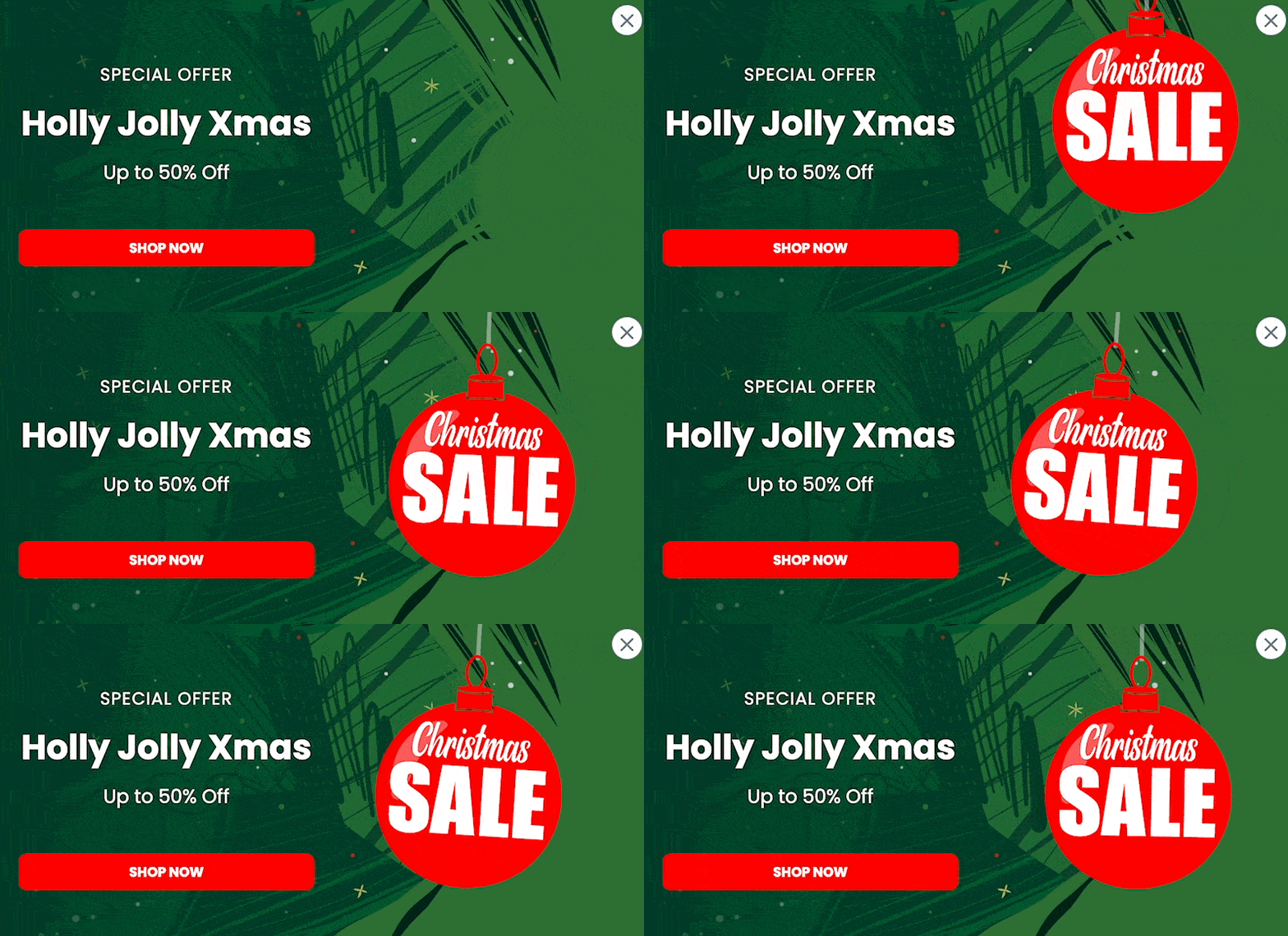
A Christmas popup with a swaying festive decoration
What works: A swaying red ornament anchors the popup, and a bold "Shop Now" button sits below the sale headline. The motion is short, festive, and on-brand for the November-December window.
Why it works: Seasonal motion mirrors the mood visitors are already in. Around Christmas, shoppers scan sites in "festive mode," and a hint of swaying snow or ornaments matches their internal pacing. It feels like part of the season, not an interruption.
Key takeaway: Build a holiday popup library once and reuse it across years. Swap the offer copy, keep the animation: it saves design time, and the motion stays consistent for returning visitors.
3. Exit-Intent Dog Popup: The Friendly Stopper
An exit-intent popup with a coffee-drinking dog illustration
What works: The dog-with-coffee illustration humanizes an interruptive moment. The discount headline reads "Wait!" in friendly type, not "DON'T GO!" in caps. Soft motion, soft copy, hard offer.
Why it works: Exit-intent popups have a baked-in friction problem. Pairing a warm illustration with small motion reduces the threat response: the reader registers "cute animal" before "another popup," so the close-button reflex doesn't fire as fast. Don't expect the trigger alone to carry the campaign, though. In Popupsmart's 2026 benchmark, exit intent shows no statistically reliable advantage: popups on the most sensitive exit-intent setting converted 1.10% vs 0.78% without exit intent (median campaign), a gap that could be chance. Our analysis of whether exit-intent popups work covers when the trigger is still worth using.
Key takeaway: Soften your exit popups with character illustrations instead of stark text. A 200KB Lottie of a friendly mascot is a better bet than a screaming red "WAIT" banner.
4. Discount Code Popup: The Inventory Tease
A discount popup with a phone scrolling through products
What works: The Lottie shows clothing items scrolling on a phone, a mini product display inside the popup. The discount code sits next to it, so visitors see what they could buy and the reward for buying it in one frame.
Why it works: Most discount popups offer 10% off "something." This one offers 10% off "these specific items you're already looking at." That shift from abstract to concrete gives the visitor a reason to want the code. The code itself matters too: in Popupsmart's 2026 benchmark, signup popups that offer a discount code convert 1.46% vs 0.75% for signup popups without one.
Key takeaway: Pull your top-three product silhouettes into a popup animation. Don't just dangle a code. Show what the code is buying.
5. Customer Feedback Popup: Lowering the Survey Barrier
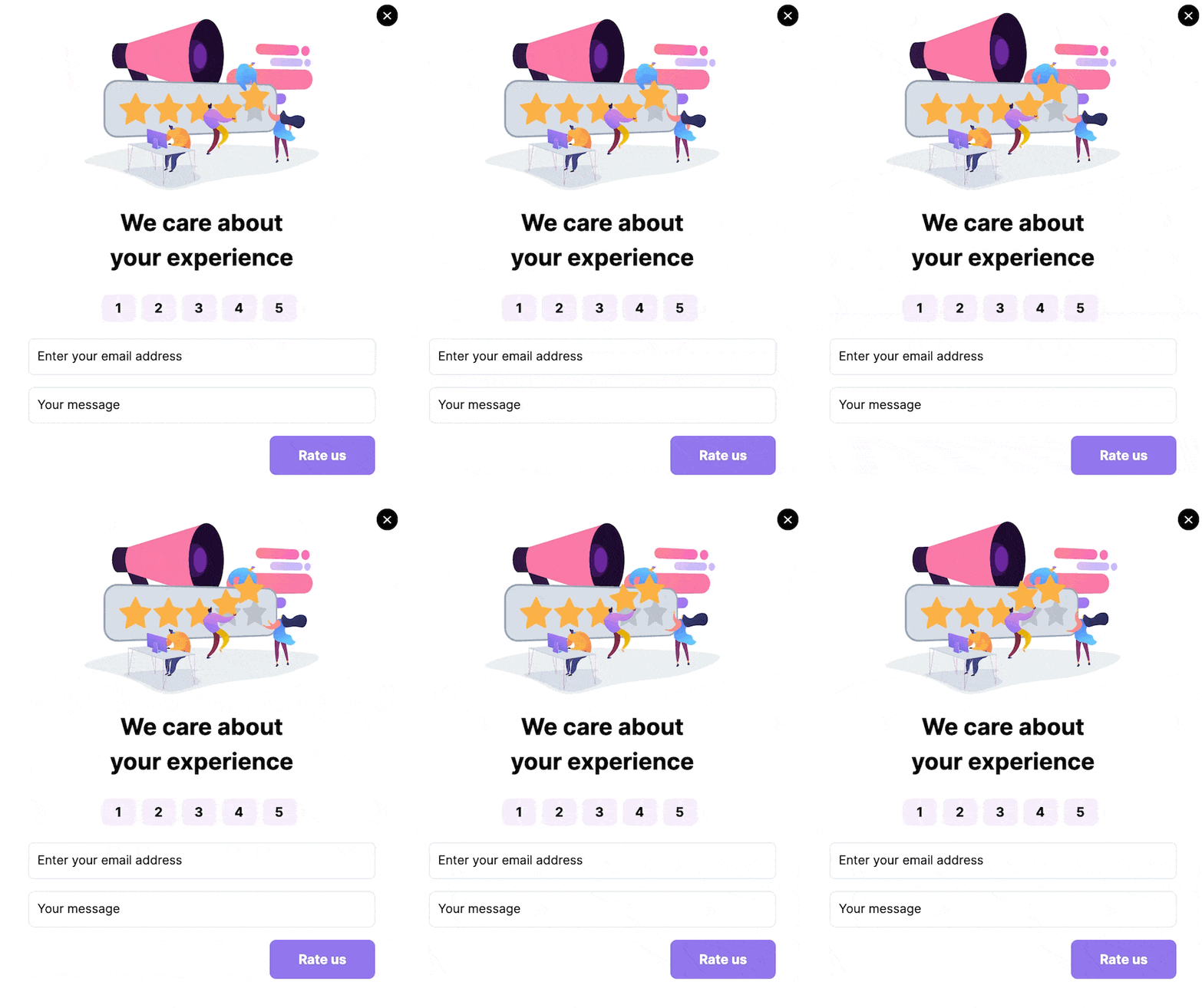
A feedback popup with characters placing stars on a rating bar
What works: Three illustrated characters physically place stars onto a rating bar. The motion demonstrates the action you're asking visitors to take: a tutorial and an invitation in one. No "please take 5 minutes to fill out our survey," just animated stars and a quick prompt.
Why it works: Surveys have a participation problem because the cost is unclear. The animation answers the "how long will this take?" question without words: it's just stars, just one click.
Key takeaway: If your popup asks for an unfamiliar action, animate the action itself. Demonstration beats explanation in popup formats.
6. Black Friday Bomb Popup: The Pattern-Break
A unique Black Friday popup with a ticking-watch bomb
What works: A cartoon bomb with a ticking watch face. Bizarre, unexpected, and nothing to do with shopping, which is exactly the point. By late November, visitors have already seen dozens of Black Friday popups. Yours has to look nothing like the others.
Why it works: Pattern interruption is a foundational attention principle. The brain filters the expected and amplifies the strange. A bomb on a BFCM popup is "wait, what?", and that half-second hesitation is enough to read the offer before the close-tab reflex kicks in.
Key takeaway: For high-noise sales weeks, bet on weird. Match your competitors and you'll be ignored. Pick an animation metaphor that has nothing to do with shopping.
7. Instagram Follow Popup: The Logo as the Hook
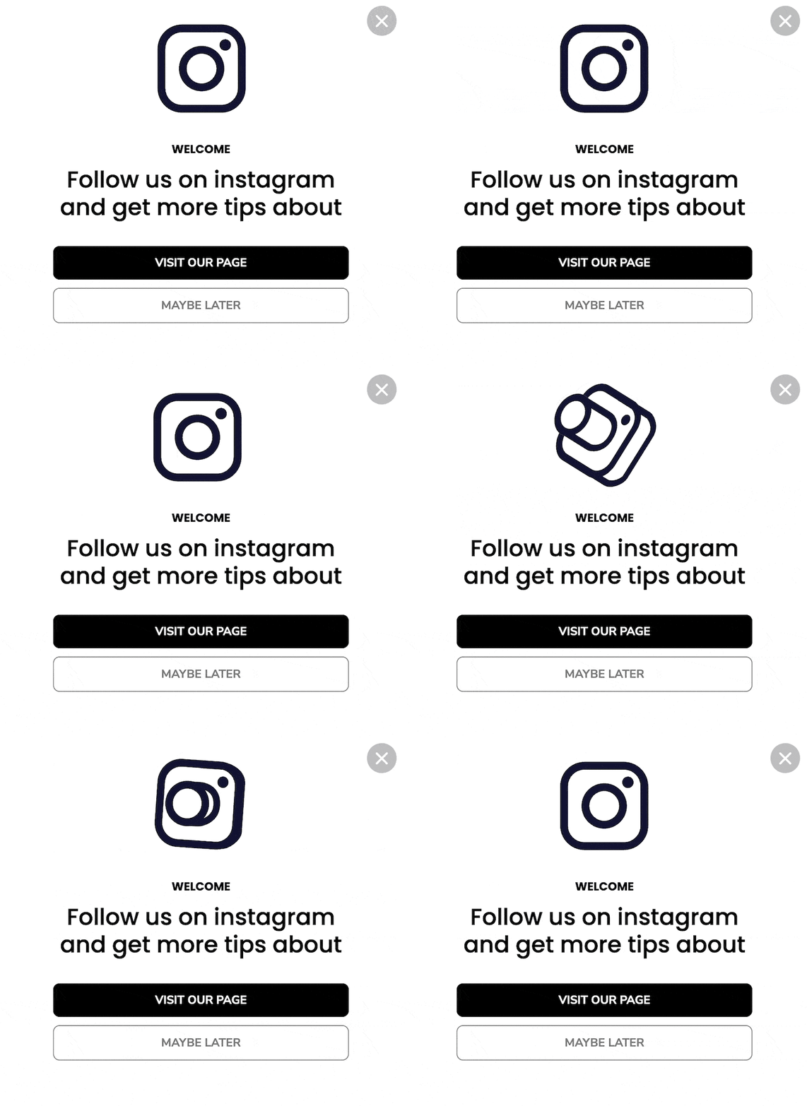
An Instagram follow popup with a pulsing brand logo
What works: A pulsing, color-cycling Instagram logo sits front and center with a "Visit Our Page" primary button. The logo animation taps into the platform's gradient: instantly recognizable, so no explanation is needed about where the visitor is going.
Why it works: Social-follow popups underperform when they ask visitors to commit to an unknown destination. Animating the platform's own logo reduces the cognitive load: the visitor sees Instagram, recognizes Instagram, decides about Instagram.
Key takeaway: When driving traffic to a platform with strong brand recognition, animate the platform's logo, not your offer copy. Brand recognition does the persuasion for free.
8. Multi-Channel Social Popup: The "Follow" Board
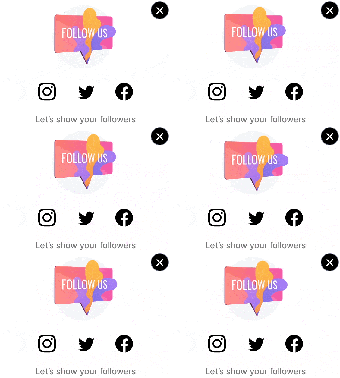
A multi-channel social popup with a "Follow" sign animation
What works: A pink animated board with the word "Follow" sits above three platform buttons. The board sways gently. The animation labels the popup with one verb so a fast-scanning visitor gets the ask in under a second.
Why it works: Multi-channel follow popups often die from choice paralysis: three platforms, three decisions. The animated "Follow" sign re-frames the popup as one decision with three options, which is easier to act on than three competing CTAs.
Key takeaway: If you're asking for follows on multiple platforms, animate the verb, not the platforms. Make "Follow" the loudest element.
9. Black Friday Countdown Timer Popup: Urgency You Can See
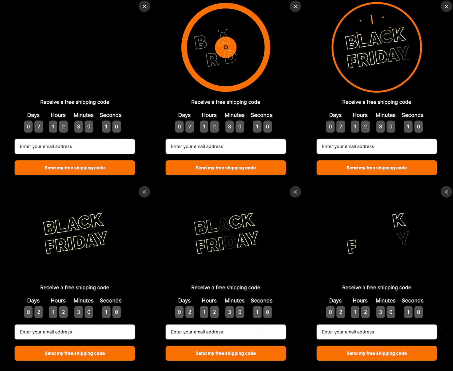
A countdown timer popup with animated Black Friday type
What works: The "Black Friday" headline pulses subtly while a real countdown timer ticks underneath. The animation isn't doing the persuasion (the timer is), but the moving headline keeps the eye on the popup long enough for the timer to register.
Why it works: Countdown timers are a familiar urgency device in conversion design. Pair them with a separate motion element and you get two attention triggers pointing at the same offer. For a deeper look, our countdown timer popup examples piece walks through five examples and how to build one.
Key takeaway: Stack motion types only when the time-sensitive offer justifies it. Save this technique for genuine deadlines, not every Tuesday.
10. Minimalist Animated Popup: When Less Motion Wins
What works: Sometimes the best animated popup has almost no animation. A single accent (a fade-in headline, a subtle button hover, a slow icon rotation) does everything a full Lottie does without competing with the body content.
Why it works: Heavy animation signals "discount store." Light animation signals "premium." For luxury, B2B SaaS, and editorial brands, a 200ms easing on the CTA does more for trust than a looping mascot.
Key takeaway: Match animation intensity to brand tier. Mass-market e-commerce can go bold; SaaS and high-end brands should keep motion under a one-second loop on a single element.
Best Practices for Designing Effective Animated Popups
The best practices for an animated popup come down to six rules: match the motion to the message, keep files light, fit your brand, point the motion at the CTA, test on mobile first, and trigger at the right moment. Check all six before any animated popup goes live. Most rendering and conversion problems trace back to one of these being skipped.
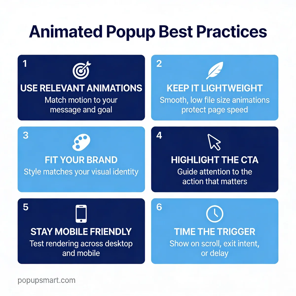
Six best practices for animated popups
1. Match animations to the message. A shopping-cart loop for a sale popup. A pulsing inbox icon for a newsletter signup. The animation should echo what you're offering, not contradict it. A spinning logo on a feedback survey is just noise.
2. Keep file sizes light. A simple Lottie JSON is usually far smaller than a GIF of the same loop, because GIF stores every frame as pixels. Use Lottie for anything over 2 seconds of motion. A heavy popup tanks your whole design effort by slowing the page.
3. Match the animation to your brand style. A luxury label needs slow, smooth easings. A tech startup can get away with playful bounces. Pick the animation library before you pick the popup, not after.
4. Use motion to highlight the CTA. If your animation is on the opposite side of the popup from your button, the visitor's eye won't bridge the gap. Put the motion next to the CTA, or use a directional element to point from animation to action.
5. Test on mobile first. A popup that looks great on a 27-inch monitor often crops or lags on a 360px phone. Build mobile, then scale up. If your popup UX falls apart at 320px width, the desktop polish doesn't matter: in Popupsmart's 2026 benchmark, 63% of popup displays happen on mobile. Our mobile popup guide covers sizing and placement.
6. Time and trigger thoughtfully. Don't fire on page load. Use scroll depth (50%), time-on-page, or exit intent. The animation steals attention; make sure the visitor is ready to give it. The exact wait matters less than people think: in Popupsmart's 2026 benchmark, the exact delay length (0-5 seconds vs 21-60 seconds) makes no measurable difference to conversion. The popup timing guide goes deeper.
How to make popup animation accessible
An accessible animated popup lets visitors turn the motion off, never flashes, and stops moving on its own. Some people get dizzy or nauseous from on-screen motion, and the W3C's Web Content Accessibility Guidelines (WCAG 2.2) set three rules that apply directly to popups:
| WCAG 2.2 success criterion | Level | What it means for a popup |
|---|---|---|
| 2.2.2 Pause, Stop, Hide | A | Motion that starts automatically, lasts more than five seconds and runs beside other content needs a way to pause, stop or hide it |
| 2.3.1 Three Flashes or Below Threshold | A | Nothing in the popup flashes more than three times in any one second |
| 2.3.3 Animation from Interactions | AAA | Motion triggered by the visitor's own action can be disabled, unless it's essential |
The practical tool is the prefers-reduced-motion CSS media feature. MDN's prefers-reduced-motion reference describes it as a way "to detect if a user has enabled a setting on their device to minimize the amount of non-essential motion": Reduce motion on macOS and iOS, Remove animations on Android, Animation effects on Windows 11. MDN lists it as Baseline, available across browsers since January 2020.
Reduced motion doesn't have to mean a popup that snaps open with no animation at all. The W3C's Understanding SC 2.3.3 says motion animation does not include changes of opacity that leave an element's perceived size, shape and position alone. So if you code your own popup, swap the slide or scale for a short fade when the visitor asks for less motion; the CSS example below works that way.
The same idea works for a Lottie file: in reduced-motion mode, show its first frame and don't autoplay. Whatever you build, keep the close button visible from the first frame and reachable with the keyboard.
How to animate a popup with CSS
To animate a popup with CSS, put it in a <dialog> element and animate only opacity and transform: a 240ms fade-and-rise when it opens, a 160ms fade when it closes, and a plain fade for visitors who ask for reduced motion. Google's guide to high-performance CSS animations on web.dev recommends restricting animations to those two properties, because they skip the layout and paint work that makes other animations stutter.
Start with the markup. Calling showModal() opens a <dialog> above the page with a backdrop, makes everything behind it inert and lets the Escape key close it, as MDN's dialog element reference describes. MDN lists <dialog> as Baseline, working across browsers since March 2022.
<button type="button" id="open-popup">Join our newsletter</button>

<dialog class="popup" id="popup" aria-labelledby="popup-title">
  <h2 id="popup-title">Get our weekly tips</h2>
  <p>One short email every Monday. Unsubscribe any time.</p>
  <button type="button" class="popup-close">Close</button>
</dialog>
Then the CSS. The entrance runs on the [open] state. The exit runs on a class the script adds, because a closed dialog is hidden at once and leaves no time for an animation.
.popup {
  border: 0;
  border-radius: 12px;
  padding: 24px;
  max-width: 420px;
}

.popup::backdrop {
  background: rgb(0 0 0 / 0.5);
}

/* Opening: fade in, rise and grow slightly */
.popup[open] {
  animation: popup-in 240ms cubic-bezier(0.23, 1, 0.32, 1);
}

.popup[open]::backdrop {
  animation: fade-in 240ms cubic-bezier(0.23, 1, 0.32, 1);
}

/* Closing: the script adds .is-closing, waits, then closes */
.popup.is-closing {
  animation: popup-out 160ms cubic-bezier(0.23, 1, 0.32, 1) forwards;
}

.popup.is-closing::backdrop {
  animation: fade-out 160ms cubic-bezier(0.23, 1, 0.32, 1) forwards;
}

@keyframes popup-in {
  from { opacity: 0; transform: translateY(8px) scale(0.96); }
}

@keyframes popup-out {
  to { opacity: 0; transform: translateY(8px) scale(0.96); }
}

@keyframes fade-in {
  from { opacity: 0; }
}

@keyframes fade-out {
  to { opacity: 0; }
}

/* Reduced motion: keep a short fade, drop the movement */
@media (prefers-reduced-motion: reduce) {
  .popup[open] { animation-name: fade-in; }
  .popup.is-closing { animation-name: fade-out; }
}
Last, a few lines of JavaScript open the popup, play the exit before closing it, and send the Escape key through the same exit:
const popup = document.getElementById("popup");

document.getElementById("open-popup").addEventListener("click", () => {
  popup.showModal();
});

function closePopup() {
  popup.classList.add("is-closing");
  // Wait for the closing animation to finish, then close the dialog
  const running = popup.getAnimations().map((animation) => animation.finished);
  Promise.allSettled(running).then(() => {
    popup.close();
    popup.classList.remove("is-closing");
  });
}

popup.querySelector(".popup-close").addEventListener("click", closePopup);

// The Escape key fires "cancel": play the same closing animation
popup.addEventListener("cancel", (event) => {
  event.preventDefault();
  closePopup();
});
How the pieces fit together:
- The exit is shorter than the entrance. A visitor who closed the popup has already decided, so don't make them watch it leave.
getAnimations()lists the animations still running on the dialog, so the script closes it the moment the exit ends, or straight away if nothing is running.- With reduced motion on, the media query swaps both animations for a plain fade. MDN's own prefers-reduced-motion example tones a scaling animation down to a dissolve in the same way.
- There's no
transition: allanywhere. It would also animate any layout property that changes, which is the slow kind of animation the web.dev guide warns about.
For a springier pop out animation, start the entrance from scale(0.9) and use a curve that overshoots a little, such as cubic-bezier(0.34, 1.56, 0.64, 1). For the same modal in Bootstrap, Tailwind or jQuery, see our guide on how to create modal popups.
The snippet above passed a headless Chrome check on October 9, 2026. It opens, closes from the button and from the Escape key, and falls back to the fade when reduced motion is on.
Common Mistakes to Avoid with Animated Popups
The most common animated popup mistakes are stacking several animations, looping forever, triggering on page load, blocking the close button and treating motion as the conversion mechanism. Each one is a fast fix once you spot it.
• Overloading with multiple animations: One animated element per popup. Two competes for attention. If you have a Lottie loop, a pulsing button, and a countdown timer, pick one to keep moving and freeze the rest.
• Looping motion that never stops: A 6-second Lottie running forever becomes background noise. Set the animation to play 2-3 times, then freeze on the final frame. Under WCAG 2.2 Success Criterion 2.2.2 (Level A), motion that starts automatically, lasts more than five seconds and runs beside other content needs a way to pause, stop or hide it.
• Triggering on page load: The fastest way to torch your bounce rate: the popup and its animation compete with the page the visitor came to read. Give the visitor a few seconds of content first, or use scroll depth or exit intent. In Popupsmart's 2026 benchmark, popups that wait before appearing convert 0.83% vs 0.61% for popups shown the instant the page loads (median campaign); the direction holds in every year of data but the difference is not statistically reliable, so treat it as a lean, not a rule.
• Animations that block the close button: Your X must always be visible, never overlapped by a moving element, never delayed. WCAG-friendly close behavior is a hard requirement.
• Treating animation as the conversion mechanism: Motion attracts, offers convert. A beautiful Lottie around a weak offer still converts poorly. Fix the offer first, animate second.
Our breakdown of popup design best practices covers the structural pitfalls in more depth, including the layout patterns that work across industries.
Measuring Success of Your Animated Popups
To measure an animated popup, track five numbers: conversion rate, close rate, time to conversion, the mobile and desktop split, and page speed. You can't improve what you don't measure, and "engagement" alone isn't enough. The fairest test is the same popup with and without the animation.
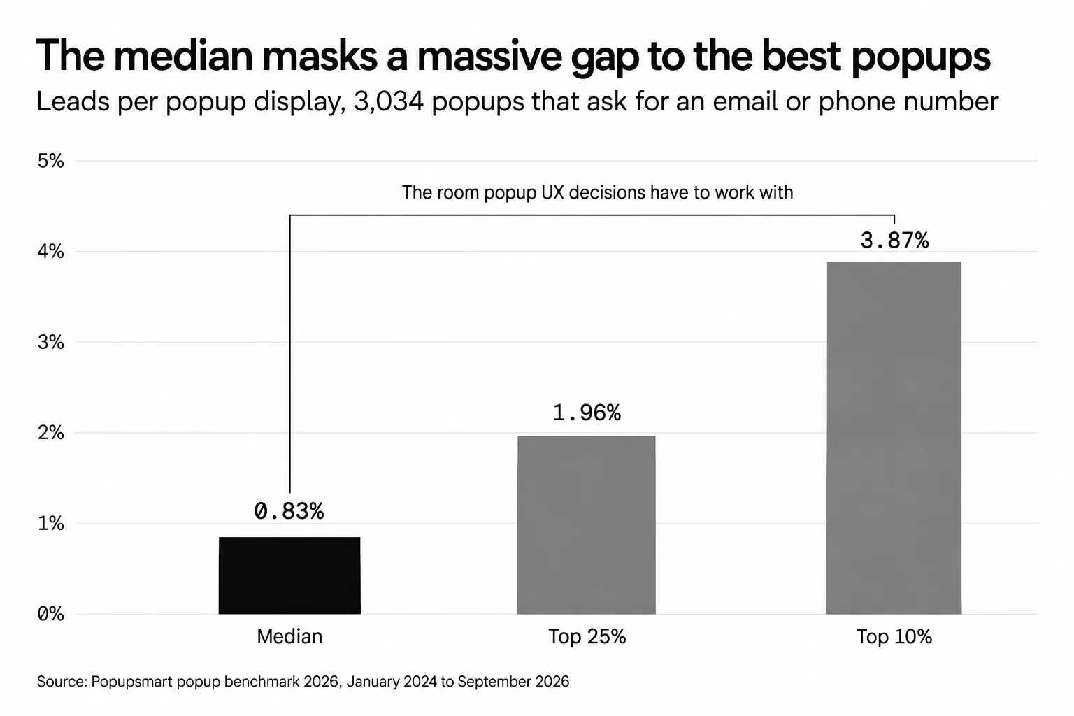
• Conversion rate (primary): Form submissions divided by popup displays. Set your expectations from real data: according to Popupsmart's 2026 popup conversion benchmark, across 3,034 Popupsmart popups that ask for an email or phone number (January 2024 - September 2026, each with at least 1,000 displays and 14 active days), the median converts 0.83% of its displays into leads; the top 25% reach 1.96% and the top 10% reach 3.87%. If you're well below the median, the animation isn't the fix. The offer or timing is broken.
• Close rate: Visitors who hit the X without converting. High close rate plus low conversion means wrong trigger or wrong audience. Low close rate plus low conversion means a boring offer. In Popupsmart's 2026 benchmark, 40.5% of popup displays end with the visitor closing the popup (all displays pooled, February 2025 - September 2026, since close tracking began).
• Time-to-conversion: Seconds between popup show and click. Most leads come early, so an entrance animation that makes visitors wait before they can type is costing you.
• Mobile vs desktop split: In Popupsmart's 2026 benchmark, mobile visitors convert on popups at 1.02% vs 0.57% on desktop, and click at 2.99% vs 1.34% (median campaign). If your popup does worse on phones than on desktop, check the animation's weight and size on a small screen first.
• Page speed impact: Compare the page's Core Web Vitals (LCP, INP and CLS) with the popup on and off. The animation file downloads on every page where the popup can show, so a heavy one costs you even when nobody sees it.
CSS, Lottie or GIF: which format to use
Use CSS for the popup's entrance, Lottie for an illustration that keeps moving, and GIF or video only for real footage. Each format has a job it does best:
| Format | Best for | File and quality | Reduced motion |
|---|---|---|---|
CSS transition or @keyframes |
Entrances: fade, slide, scale | No extra file; animate opacity and transform |
One media query turns it off |
| Lottie (JSON) | Looping illustrations, icons, characters | Vector, stays sharp at any size; needs a player script | Pause it or show the first frame |
| GIF | Short clips you already have | Every frame stored as pixels, 256 colours per frame, so files grow fast | Can't be paused without swapping the file |
| MP4 or WebM video | Real footage, screen recordings | Far smaller than a GIF of the same clip | Use muted and don't autoplay in reduced-motion mode |
Lottie files come from Adobe After Effects through the free Bodymovin plugin, or from libraries like LottieFiles. For video inside a popup, see our guide to video popups.
Tools and Resources for Animated Popup Creation
You don't need a motion designer to ship your first animated popup. A popup builder with Lottie support plus one animation library covers most campaigns. Here's the short toolkit for marketers starting from scratch.
• Popupsmart: Drag-and-drop editor, native Lottie support, pre-built animated templates, and triggers for exit intent, scroll, time, and click. A Lottie can be an element or the whole popup background.
• LottieFiles: A large library of free and paid Lottie animations. Download the JSON and it drops straight into Popupsmart.
• IconScout: Lottie animations, GIFs, and PNG icons in one library, useful when you need a matching animation and icon set.
• Adobe After Effects + Bodymovin: For custom Lottie creation. Bodymovin is a free AE plugin that exports your animation as JSON.
• SVGator: Browser-based animator if you don't want to learn After Effects. Exports clean SVG or Lottie.
If you're still picking a tool stack, our breakdown of popup types and use cases and the collection of popup message examples will help you map tool choice to goal before you commit.
Ship Your First Animated Popup This Week
Static popups are easy to ignore. Animated ones, built with the rules above, earn a second look when the motion serves the offer. The biggest wins come from three moves: match the animation to the message, keep the Lottie under 200KB, and trigger on scroll or exit instead of page load. Then respect reduced motion and test the animated version against a static one.
Pick one example from this guide that fits your next campaign, grab the matching Popupsmart template, swap in a Lottie from LottieFiles, and ship it before the end of the week. The compound learning from a live campaign beats another month of planning.
If you want a refresher on broader popup fundamentals before you build, our welcome popup playbook pairs especially well with this guide for first-impression campaigns.
Frequently Asked Questions
What are pop up animation effects?
Pop up animation effects are the motion behaviors applied to popup overlays: fade-ins, slide-ins, scale-ups, looping Lotties, bounces, and pulses. Good effects last under 1 second on entry, use easing curves (not linear motion), and freeze after a few loops to avoid becoming distracting. They also switch off when the visitor's device asks for reduced motion.
How do I animate a popup with CSS?
Put the popup in a dialog element and animate only opacity and transform. Use @keyframes for a short entrance on the [open] state (opacity 0 to 1, scale 0.96 to 1), add a closing class that plays the reverse before the script calls close(), and add a @media (prefers-reduced-motion: reduce) rule that swaps both for a plain fade. Skip transition: all, which also animates any layout property that changes.
What is a pop out animation?
A pop out animation makes an element grow quickly so it seems to jump toward you, often overshooting slightly before it settles. On a card or button it usually plays on hover. On a popup it's the entrance: transform from scale(0.9) to scale(1) while opacity goes from 0 to 1. Keep the scale change small, and fall back to a plain fade for visitors who prefer reduced motion.
How does an animated popup maker work?
An animated popup maker like Popupsmart gives you a visual editor to build the layout, drop in animation elements (Lottie, GIF, or motion presets), set triggers, and publish via a single JavaScript snippet. An animated popup generator is a no-code tool that produces ready-to-deploy animated popups from templates or drag-and-drop elements. Pick a template, customize the copy and animation, set the audience, publish.
Where can I find free animated popup templates?
Popupsmart includes ready-made animated templates inside the builder, organized by goal. For external files you can drop into custom popups, LottieFiles and IconScout both offer thousands of free Lottie JSONs. Filter for under-100KB files to keep your popup lightweight on mobile, where most popup displays happen.
Are animated popups good or bad for user experience?
Animated popups are good for UX when triggered at the right moment, sized for the device, and using motion that supports the offer. They become bad when they fire on page load, block content, autoplay loud sound, flash, or use motion that pulls attention from the body content. Treat motion as a tool, not a default, and respect the reduced-motion setting.