ChatGPT
 Perplexity
 Claude
 Grok
Grok Google AI Mode
Most of us spend a big part of the day on our phones.
That's why mobile-friendliness has to be on every brand's mind, all the time.
Below are real examples and the design rules behind them, plus what our own popup data says about mobile visitors.
What is a Mobile Popup?
A mobile popup is a popup that appears when someone visits a website on a mobile device.
It does the same job as the desktop popup you already know. What changed is how much it matters now that so much browsing happens on phones.
Phones are where most popups are now seen: in Popupsmart's 2026 benchmark, 63% of popup displays happen on mobile.
So you'll be designing for mobile one way or another.
Why Mobile Popups are Important?
With most popup displays happening on a phone, mobile is where you win or lose sales and revenue, along with a large share of your website traffic.
That's too big to ignore.
The good news: mobile-friendly popups can turn that traffic into an advantage, because they convert without getting in the way of your site.
Optimize your website for mobile devices, keep your popups inside Google's rules, and you get more mobile traffic plus a better experience for mobile commerce (m-commerce).
Mobile visitors respond to popups more than desktop visitors do. They also click more: the median popup records a click on 2.99% of its mobile displays against 1.34% on desktop (median campaign). The full breakdown is in our mobile vs. desktop popup behavior data.
And according to Zippia, a negative mobile experience frustrates 48% of users, and 52% of users are less likely to engage with a company that lacks a responsive mobile design.
Your job is to get visitors to act, with mobile popups that are easy to use.
You may not get a second chance, so reach each visitor with a well-segmented mobile popup the first time.
Mobile Popup Design Best Practices
1. Mobile Popups Differ From Desktop Popups
Showing mobile visitors their own popup is worth the extra step: a phone screen needs its own layout, and Popupsmart's visitor-device targeting lets you run one version per device.
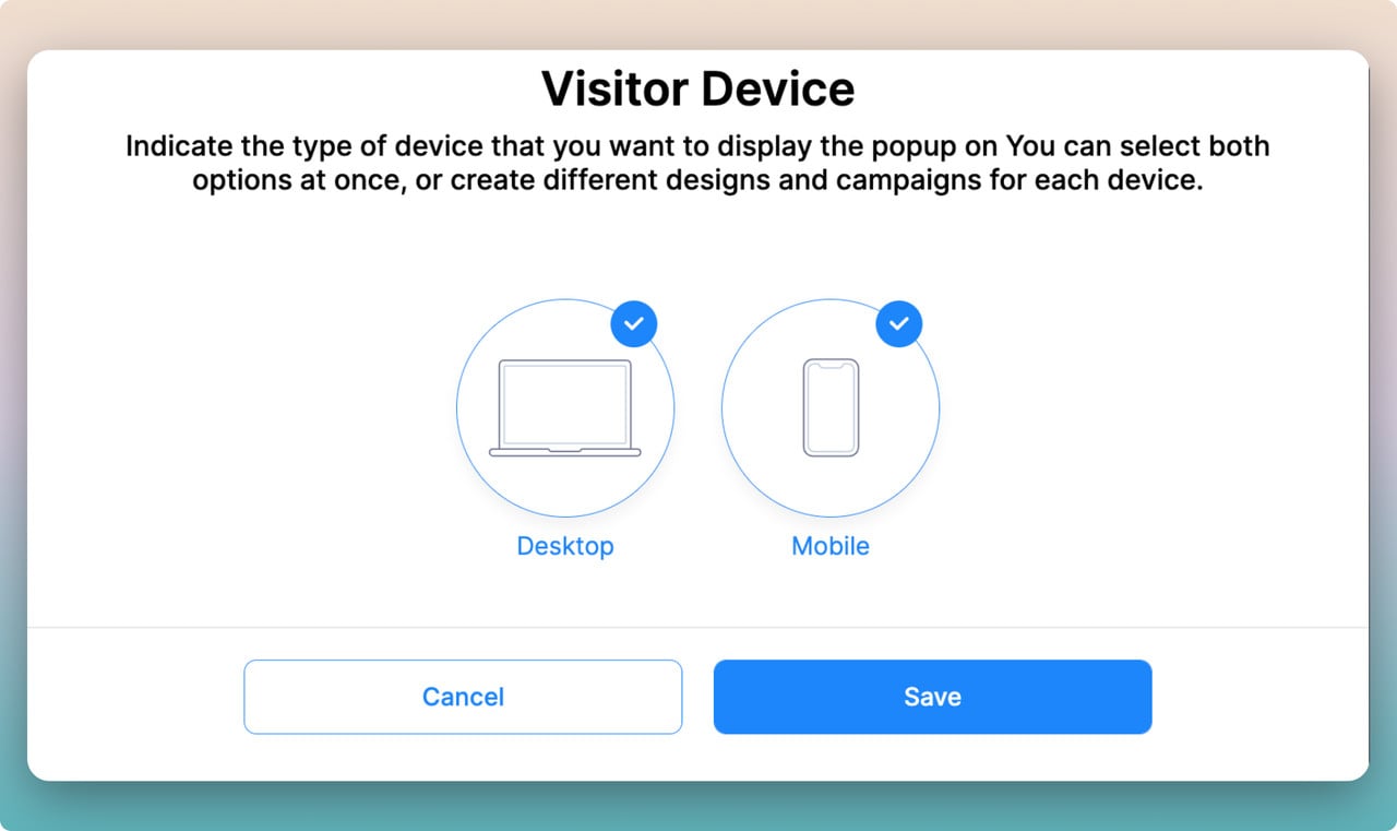
The screen is much smaller, so a desktop popup won't perform the same way on a smartphone or tablet.
Don't let your popup cover the whole screen. On a phone, that distracts and frustrates visitors.
Leave them some room to keep moving around the site, and size the popup around that.
2. It is All about a Better UX
User experience is one of the biggest factors in whether a mobile popup works.
You need a better popup UX to grow traffic to your website and keep up with your competitors in mobile commerce, and that's not easy.
Filling in the input fields on your popups using smart tags can help you have a better UX.
And a popup that doesn't fit the screen is wasted on the device where most popups are seen.
3. Acceptable Screen Space
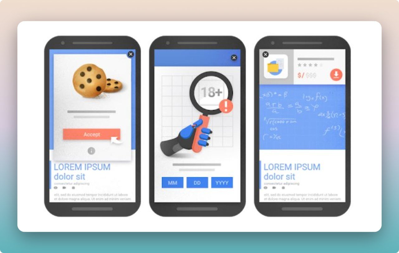
Google's policy doesn't rule out mobile popups. The image above shows how much screen space Google accepts, and how a mobile popup can stay user-friendly inside it.
Because conversion rate optimization matters to e-commerce businesses, Google allows an acceptable amount of screen space for interstitials.
So you can still convert users with popups and stay within Google's guidelines.
Interstitials that meet a legal obligation, such as cookie consent notices and age verification, are not affected by Google's signal if they are used responsibly.
4. Consider Display Timing
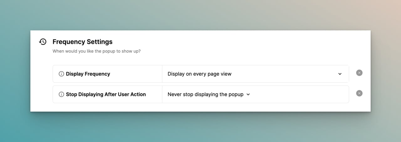
When a popup appears affects how well it converts. In Popupsmart's 2026 benchmark, popups that wait before appearing convert 0.83% against 0.61% for popups shown the instant the page loads (median campaign), a lean rather than a proven gap, and the length of the delay made no measurable difference. See popup timing for the full data.
Exit-intent triggering catches visitors on their way out. Scroll triggers show the popup once someone has scrolled a set amount of your page.
And if a visitor goes quiet for a while, the inactivity trigger (In-activity Mode) brings your offer back into view when they pause.
5. Determine Your Visitors
Picture a popup asking for someone's email address again and again, after they've already given it to you.
Annoying, right?
To avoid that, exclude your returning visitors with Popupsmart, then retarget them with personalized offers and promotions. New visitors are the better audience for an opt-in anyway: the same popup converts better for new visitors in 75% of campaigns (pooled 1.28% against 0.54% of displays).
6. Use Non-Intrusive Popup Targeting
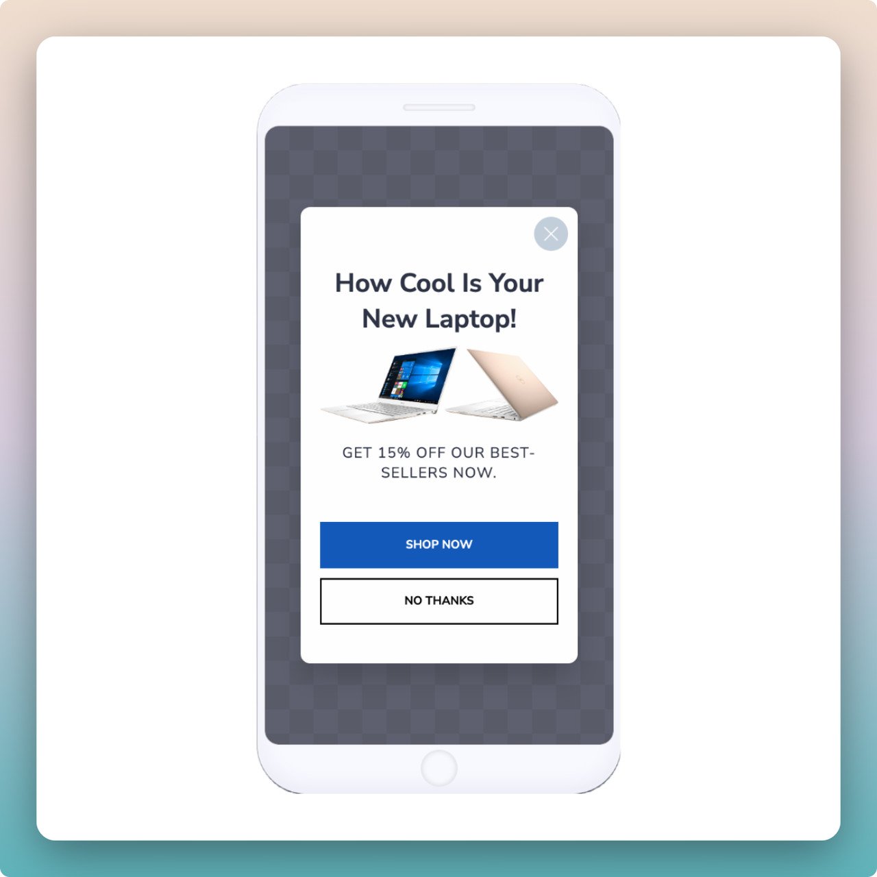
No one wants to fight a popup to get rid of it. Make closing hard, and visitors may leave your website instead.
Closing a Popupsmart popup is easy. Turn on Close when overlay clicked, and visitors can close the popup by tapping anywhere outside it as well as with the close button. Make that exit obvious: 71% of visitors who close a popup do so within 5 seconds of it appearing.
That's how non-intrusive popups drive more conversions without hurting the user experience.
7. Mind the Format & Position
Mobile popups need to meet Google's requirements to be effective without lowering your SEO.
Here are the main ways to do that:
Method 1: Use CTA Triggers
Place reasonably sized calls to action on each page that open the popup when tapped. From there, you can lead visitors to the target page.
Method 2: Embed a Popup on the Second Page
Because Google's mobile popup requirements apply only to the landing page, you can display your popup on the second page.
You should still watch the size and segment of your popup there. Popupsmart detects your visitors' behavior and intent to keep them from leaving.
Method 3: Use Smaller Bottom Popups
Smaller popups at the bottom of the screen don't hide your content, which keeps you clear of Google's interstitial penalty.
8. Trigger with a Valuable Offer
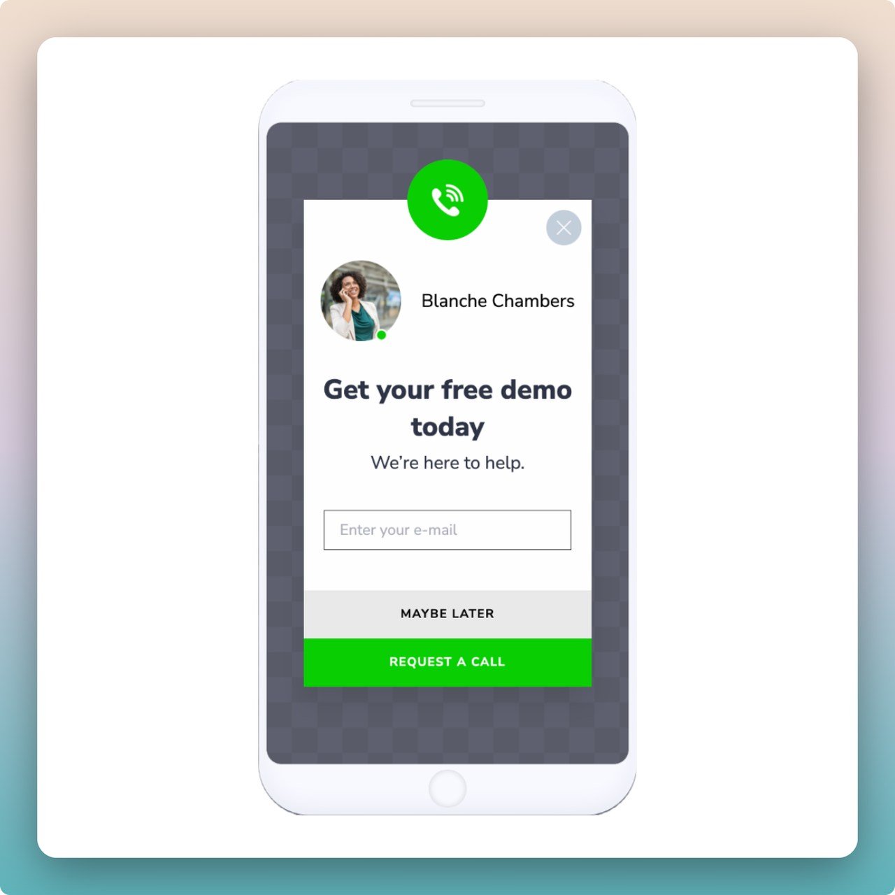
A good incentive on a mobile popup gets people to subscribe to your mailing list, sign up on your website or buy the products you're promoting.
Make special offers, like discount codes or sales, to give visitors a reason to act.
Or skip the discount and make the case that your content is worth it.
9. Make it Visually Pleasant
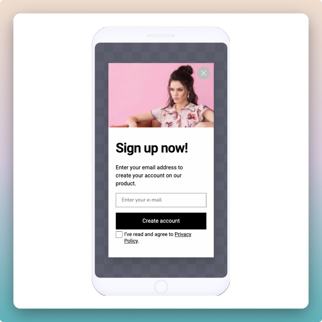
Your popup design matters as much as the message or incentive it carries. It has to stand out, and it has to work on smartphones and tablets.
→ Choose a Contrasting Background
A contrasting background makes your popup stand out on the page.
→ Visuals May Not Be a Good Option
Mobile popups have less room than desktop ones.
So show your mobile popups without visuals, or keep the visuals small enough to fit the space Google considers reasonable.
→ Attractive CTAs
Colorful calls to action catch the eye and are easy to spot. Try contrasting colors for the background and the CTA button, too.
10. GDPR & SEO Compliance
One of the easiest ways to stay within Google's interstitials policy is a popup builder like Popupsmart, where you set each device's size and position yourself.
On the data side, data collected through Popupsmart is handled in line with GDPR and CCPA, with a Data Processing Agreement.
If you collect email addresses from visitors in the EU, ask for consent in the form itself.
Mobile Popup Design Examples
Here are 4 mobile popups worth taking inspiration from.
For a wider set of designs beyond mobile, browse our website popup examples, or start any of these patterns from ready-made mobile popup templates.
Colgate
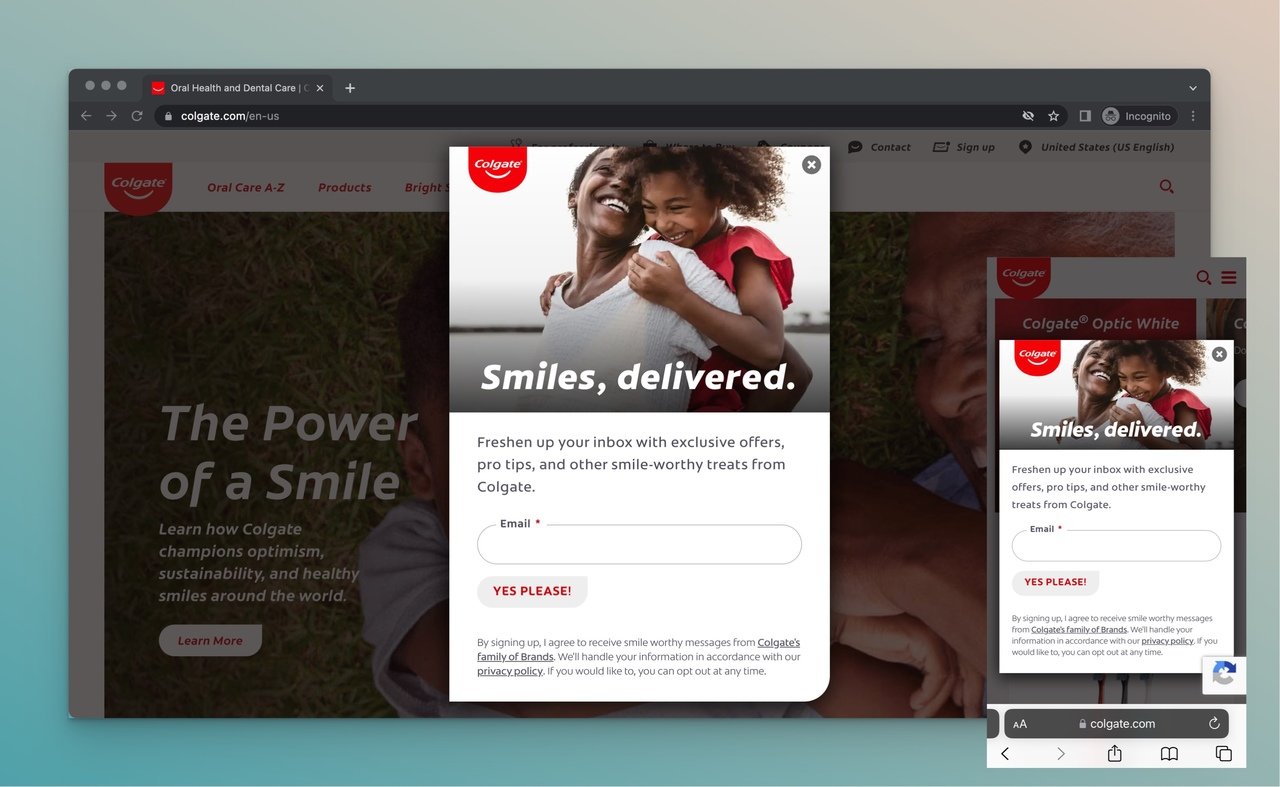
Colgate, the well-known dental care brand, runs a form popup on its homepage.
It grows the email list and keeps visitors up to date on the brand's innovations.
The popup works on both desktop and mobile because it adapts to the screen size and the close button is easy to see.
Visitors keep their freedom, and the brand still gets a popup that feels like its own.
Why the design works: the layout adapts to screen size instead of shrinking the desktop version, and a large, visible close button gives an obvious exit. That's exactly what Google's interstitial guidance rewards.
Aila Cosmetics
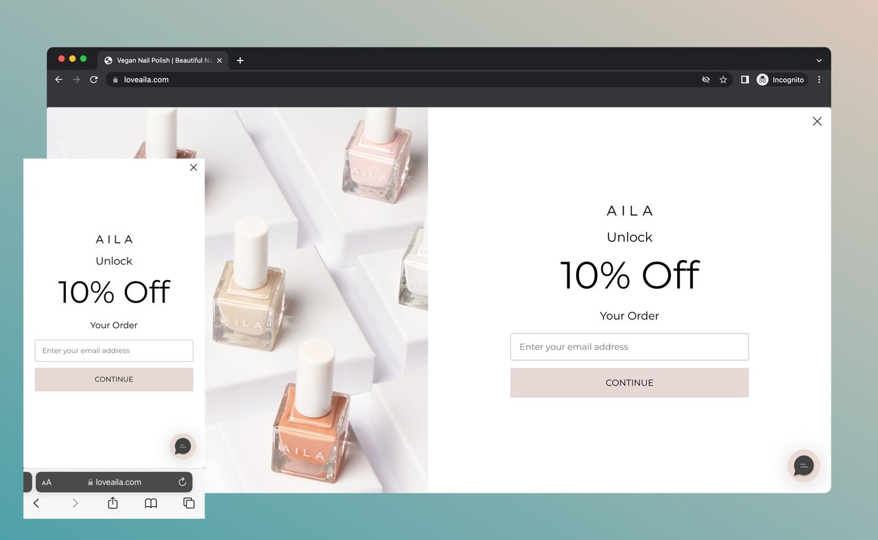
Aila Cosmetics is a nail polish and health brand.
Unlike the other brands here, Aila Cosmetics uses a full-screen popup with a related image.
The goal is email signups in return for a discount, plus a phone number for a confirmation SMS.
The phone number comes in the second step of the popup, and it's optional.
Why the design works: splitting the ask into steps with an optional phone field keeps the first screen to a single decision, which lowers the entry cost for the visitor.
35 Thousand
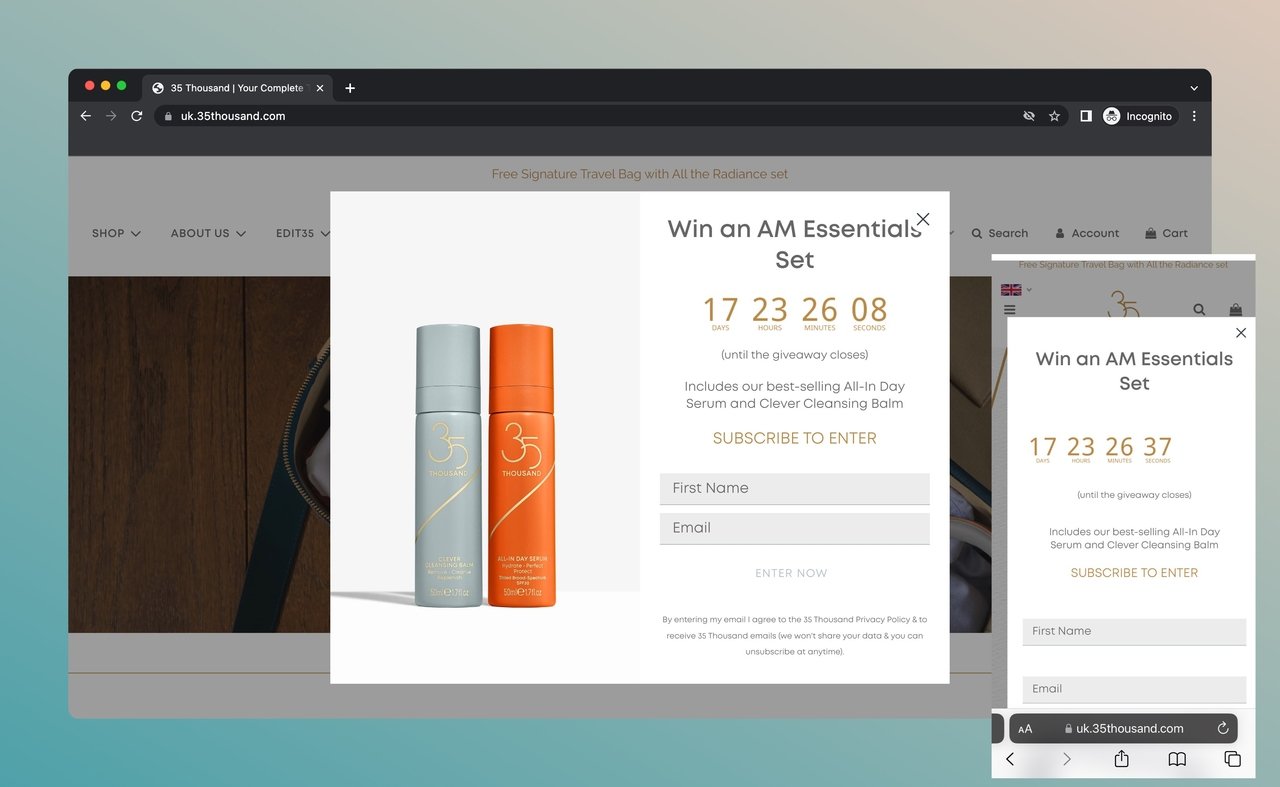
35 Thousand is a brand that produces travel skincare products.
On desktop, the image suits the brand, and the countdown element creates a sense of urgency.
The mobile popup is another story. Its size and fonts could come down.
It still does its job, but it should be adapted to the screen so it doesn't hurt the user experience.
Why the design works: the countdown triggers loss aversion, though the mobile frame and fonts should be sized down so it adds urgency without crowding the screen.
Alleyoop
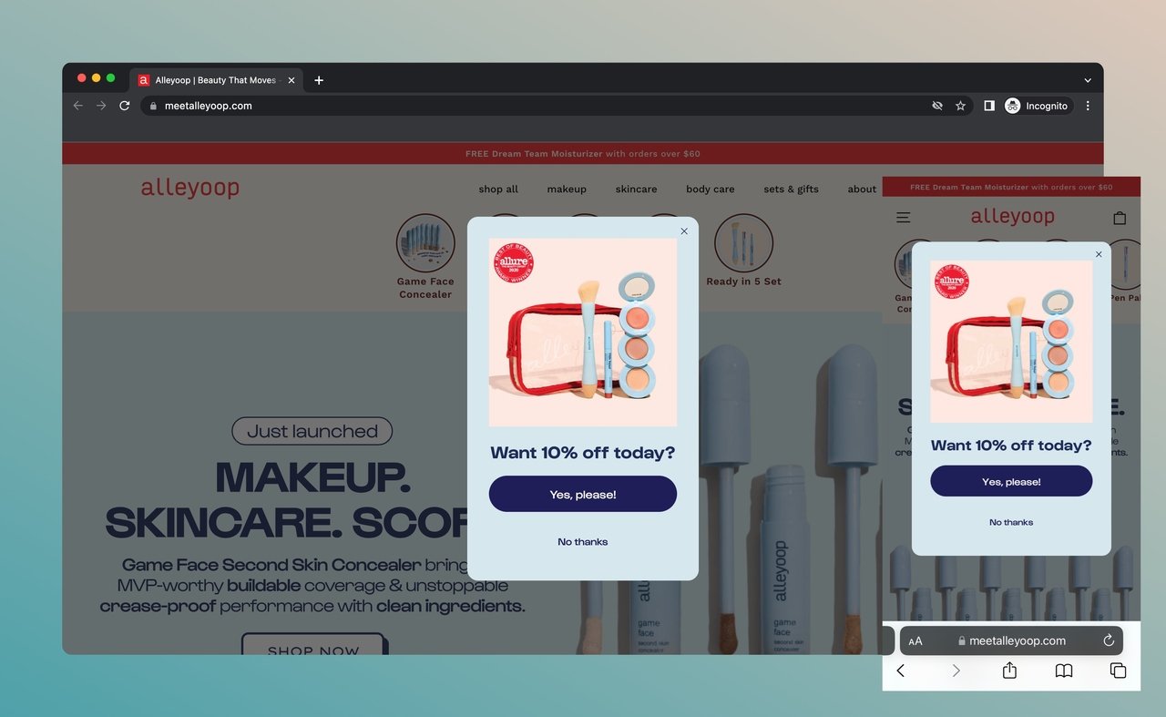
Alleyoop is a cosmetics brand for beauty and body care.
Its light discount popup fits the screens of both desktop and mobile.
The popup's font matches the website. To get the discount, the visitor enters an email address.
In return, they get a custom coupon code for 10% off the cart: a personal, exclusive offer.
Why the design works: matching the site's fonts and colors makes the popup feel native rather than an ad, and a personalized discount popup code rewards the opt-in with a specific, exclusive offer.
Mobile Popup Dimensions & Sizing
Sizing is where most mobile popups go wrong, and it's the part design galleries rarely spell out. A few concrete rules keep your design on the right side of both Google and your visitors:
-
Never cover the main content. Google's guidance treats an interstitial that hides the page as intrusive. A small banner-style or centered popup that leaves the article or product visible around it stays safe.
-
Keep it well under full screen. Cookie or consent notices that take only a reasonable slice of the viewport are the model to follow. Leave clear space so the visitor can still see where they are.
-
Put the close button and CTA within thumb reach. On a phone, the comfortable tap zone is the lower two-thirds of the screen. A close icon stranded in the top corner forces an awkward stretch.
-
Cut the form to the essentials. In Popupsmart's 2026 benchmark, popups asking for one or two fields convert 0.88% and 0.94%, against 0.56% for three fields (median campaign). If you must collect a name and an email, ask for the email first and follow up for the rest.
-
Size fonts for small screens. Headlines and CTA labels need to be legible without pinch-zooming; body copy that works on desktop is often a step too small on mobile.
Selling on mobile specifically? Our guide to ecommerce popups covers product-recommendation and cart layouts that follow these same sizing rules.
Bottom Line
Google's interstitials policy puts it plainly: their "goal is to help users quickly find the best answers to their questions, regardless of the device they’re using."
A better user experience means happier customers and more conversions.
Mobile popups can still convert. Optimize them yourself, or register for Popupsmart for free today and build them there.
Then keep tuning your mobile popups until they serve your m-commerce goals.
Create Conversion-Ready Mobile Popups
FAQs
We focus on the most common questions about mobile popups and their optimization. Take a look!
How to Create Optimized Mobile Popup Campaigns?
To create a well-optimized mobile popup campaign, you must choose an easy-to-use popup builder like Popupsmart that can speed up the designing process with conversion-ready templates. Using advanced features, you can follow the performance of your mobile popup campaigns and do an A/B test to see which one works best for your users.
How to Increase Mobile Popup Engagement?
To increase your mobile popup engagement rate, you must put your user experience and needs above all. Try to avoid heavy complex visuals and write a concise copy and call to action that is clear and navigates users well. Also, avoid too many questions, and add as few input fields as possible.
Do popups convert better on mobile or desktop?
On mobile, in Popupsmart's 2026 benchmark (January 2024 to September 2026): the median popup converts 1.02% of its mobile displays into email or phone leads against 0.57% on desktop, and records a click on 2.99% of mobile displays against 1.34% on desktop. 63% of popup displays happen on mobile. Visitors inside the Instagram or Facebook app show no measurable difference in popup conversion from visitors in a normal mobile browser.
How to Customize My Mobile Popups?
Customizing mobile popups is easier by using advanced features like smart tags that allow you to display dynamic content and address your visitors by their names and provide them with their email addresses. You can also target visitors using exit-intent popups with personalized copies and discounts to prevent them from leaving.
Why Responsive Popups Will Not Solve the Problem?
Responsive popups cannot solve the problem of intrusive popups on mobile devices. Using unreliable responsive popups can hurt the overall mobile user experience. Plus, you can be penalized by Google. Therefore, it is essential to prioritize a better user experience and use non-intrusive popups to take advantage of mobile traffic.
Recommended Blog Posts
Here are some topics you might also be interested in if you enjoyed this blog post:
- 10 Popup Design Best Practices for Higher Conversion in 2026
- Top 13 Popup Use Cases To Increase Conversions
- 5 Best Popup Overlay Examples That Convert in 2026
- 10 Best Popup Message Examples To Get Inspired in 2026
What changed in this post
The mobile figures now come from Popupsmart's 2026 benchmark (1.02% of displays on mobile against 0.57% on desktop; 63% of displays on mobile), in the opening, the meta description and a new FAQ. Sleeknote's 5.60% against 2.86% was removed on 2026-10-01: a competitor's average conversion rate with no year, which the source no longer serves. Removed: an "average popup conversion rate" of 3.5% to 5% with a "top 10% past 50%" claim, and third-party engagement and conversion-lift figures from popup vendors; a mobile-traffic share that its source page no longer shows; and the claim that one form field converts better than two, which our data doesn't support. Corrected: a misquoted Zippia statistic, the inactivity trigger's name, how visitors can close a popup (Close when overlay clicked), and the GDPR sentence, which now uses the wording from our trust center. Added from the benchmark: timing, new-visitor targeting and field-count data.
Initial publication.