How to Boost Conversions with Multistep Popups (10 Use Cases)
Multistep popups boost conversions by reducing cognitive load and leveraging micro-commitments, often outperforming single-step forms (e.g., 12% higher CR). The piece defines multistep popups, gives 10 use cases with setup tips/data, prioritization, and common mistakes.
Multistep popups split a single request into two or three smaller interactions, and that sequencing is what makes them convert. The average popup conversion rate sits at 11.09%, but multistep versions consistently outperform single-step designs by reducing cognitive load and building micro-commitments.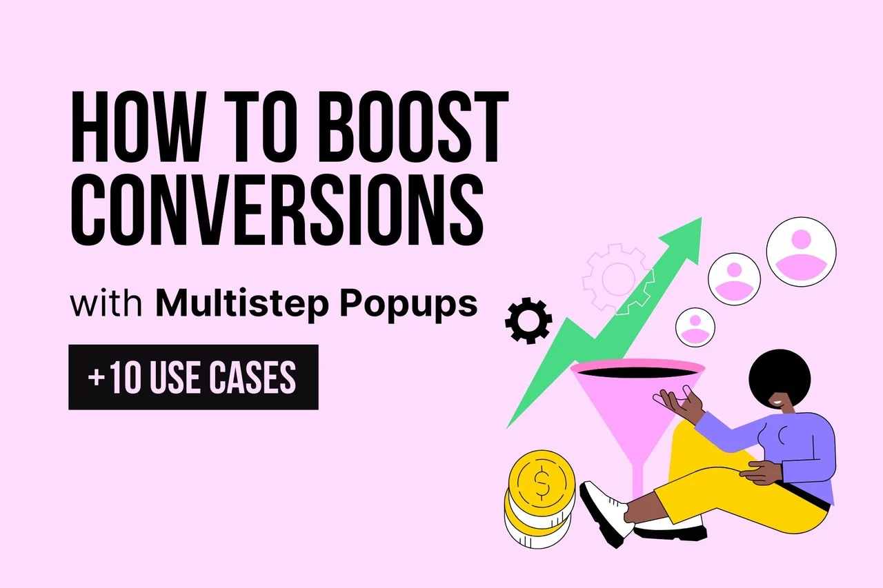 Multistep popups split a single request into two or three smaller interactions, and that sequencing is what makes them convert. According to our analyses at Popupsmart, the average popup conversion rate sits at 11.09%, but multistep versions consistently outperform single-step designs by reducing cognitive load and building micro-commitments. Here are 10 proven use cases with implementation steps and real data.
What Is a Multistep Popup?
A multistep popup is an on-site overlay that guides visitors through two or three sequential screens instead of asking for everything at once. The first step typically presents a low-friction question or offer, and subsequent steps collect contact information or direct visitors to a specific action.
Think of it as a conversation rather than a demand. Instead of immediately showing a form with five fields, a multistep popup might first ask "What are you shopping for today?" and then follow up with a relevant offer and an email field. This approach mirrors how in-store sales associates build rapport before asking for the sale.
I've been building popup tools at Popupsmart since 2019, and the behavioral difference is clear: visitors who answer a first-step question are psychologically primed to complete the second step. That's the micro-commitment principle in action.
Why Do Multistep Popups Convert Better Than Single-Step?
The psychology behind multistep popups comes down to two principles: cognitive load reduction and the commitment-consistency bias.
Cognitive load reduction. A single popup asking for name, email, phone number, and company size creates decision fatigue. Breaking that same request into steps (one field per screen) makes each individual decision feel trivial. According to a UX analysis on Reddit, popups offering an email field with a promo code averaged 3.85% conversion rates compared to 2.48% for email-only fields. Adding a relevant step didn't hurt conversions; it helped.
Commitment-consistency bias. Once a visitor takes a small action (clicking "Yes, I want a discount"), they feel compelled to stay consistent with that decision. Wisepops reports that multistep popups achieve a 5.17% conversion rate, 12% higher than single-step popups at 4.62%. The first click creates momentum.
After working with thousands of Popupsmart users, I've seen this pattern hold across industries. E-commerce stores, SaaS companies, and service businesses all see higher completion rates when they break the ask into smaller steps.
10 Use Cases of Multistep Popups to Increase Conversions
Quick overview of all 10 use cases:
1. Increase Sales Conversion — guide visitors to products they want, then offer a discount to close the sale
2. Reduce Cart Abandonment — catch leaving visitors with a free shipping offer, then capture their email
3. Promote Products and Offers — showcase seasonal deals and collect emails for catalog delivery
4. Collect Form Submissions — split long forms into digestible steps for higher completion rates
5. Get More Phone Calls — let visitors choose their preferred support channel, then collect contact info
6. Grow Your Email List — offer a lead magnet in step one, collect the email in step two
7. Make Announcements — share brand news with engagement options and follow-up offers
8. Increase User Engagement — run interactive quizzes that capture emails while entertaining visitors
9. Collect Feedback and Surveys — gather customer sentiment and recover negative experiences with offers
10. Facilitate Social Sharing — ask for social follows and identify which platforms your audience prefers
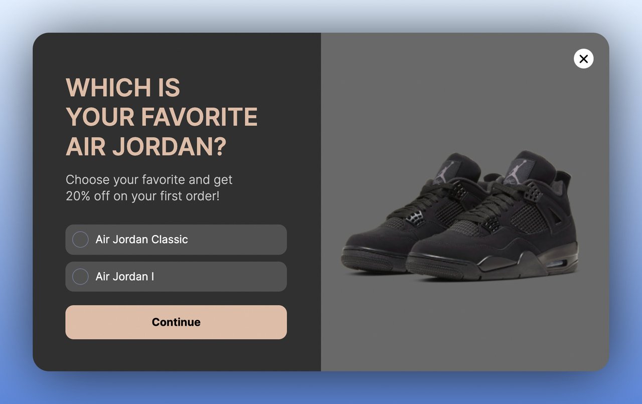
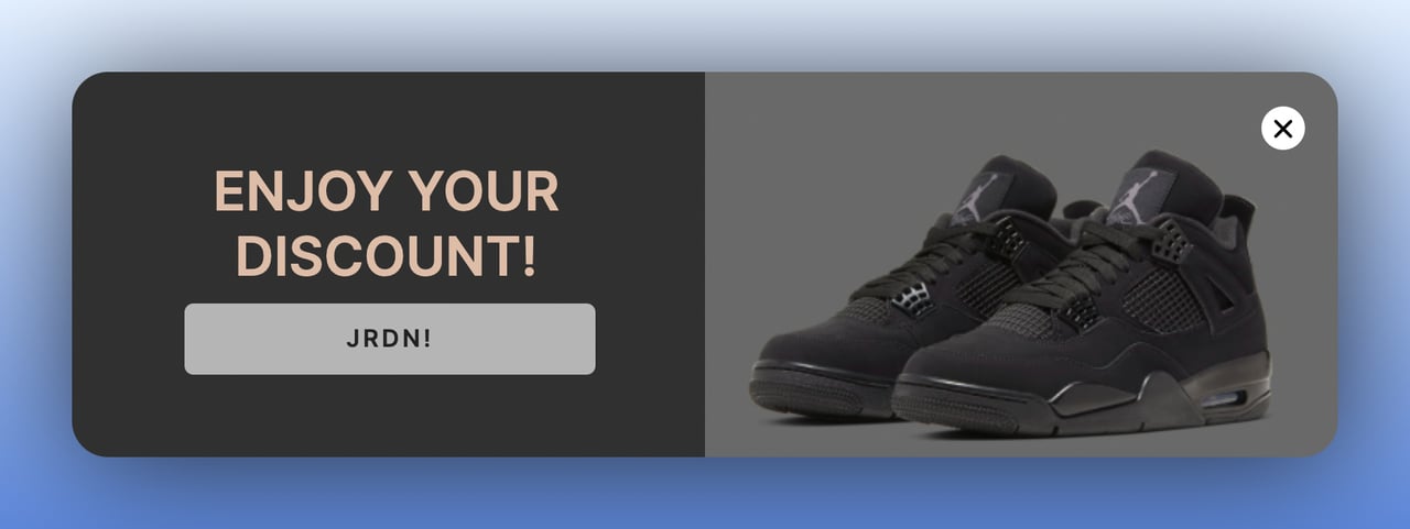
1. Increase Sales Conversion: Guide Shoppers to the Right Product
A product-selection multistep popup lets visitors self-segment by showing their preferences in step one, then delivers a targeted offer in step two. This is particularly effective for stores with large catalogs where visitors might feel overwhelmed by choices. Rather than showing a generic "10% off everything" popup, you're matching the offer to what the visitor actually wants.
How to implement:
1. Create a first-step popup that asks visitors to pick their preferred product category or style. Use image-based answer options for higher engagement.
2. Design a second step that shows a discount code specific to the category they selected. Personalization matters here.
3. Set the trigger to fire after 30 seconds of browsing or when visitors view 3+ product pages, indicating purchase intent.
4. Add urgency by making the discount time-limited (24-48 hours) to prevent visitors from bookmarking and forgetting.
Evidence: Approximately 65% of the top 10,000 Shopify brands use popups on their stores, according to Recart's state of popups report. Stores that combine product selection with a discount in a multistep flow consistently see higher add-to-cart rates than those using static banners.
Expected impact: 15-30% increase in add-to-cart rate for visitors who interact with the popup, with measurable results within the first two weeks of deployment.
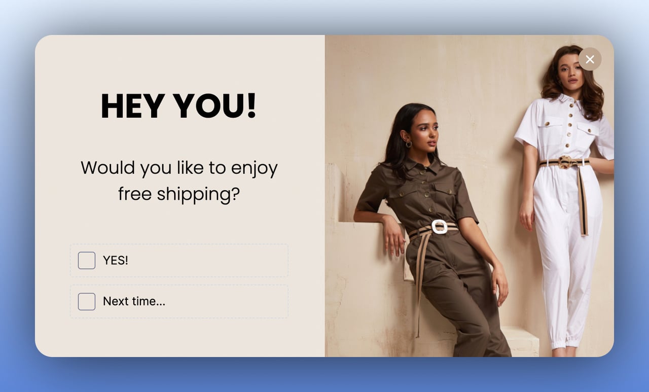
2. Reduce Cart Abandonment: Recover Sales Before Visitors Leave
An exit-intent popup with a multistep flow intercepts visitors who are about to leave with items in their cart. Step one presents the rescue offer (free shipping, discount, or limited-time deal), and step two captures their email so you can follow up even if they don't convert immediately. This two-part approach creates both an immediate incentive and a long-term recovery channel.
How to implement:
1. Set an exit-intent trigger on cart and checkout pages. The popup should only fire when the visitor has at least one item in their cart.
2. Design step one with a compelling offer: free shipping, percentage discount, or a bundle deal. Keep the copy to under 15 words.
3. In step two, ask for their email address "to send the offer." This gives you a cart recovery email sequence opportunity.
4. Connect the popup to your email tool and trigger an automated abandoned cart email within 1 hour.
Evidence: According to Envive.ai's conversion data, exit-intent popups achieve 17.12% conversion rates on average, with top performers reaching 42.35%. That's a significant recovery rate for traffic you'd otherwise lose entirely.
Expected impact: 10-20% reduction in cart abandonment rate within the first 30 days, plus a growing email list for ongoing remarketing.
3. Promote Products and Offers: Turn Browsers into Buyers
A promotional multistep popup showcases a specific product, collection, or seasonal offer in step one, then captures the visitor's email in step two under the premise of "sending the full catalog" or "notifying when the sale starts." This works well for flash sales, new product launches, and seasonal campaigns because it combines awareness with lead capture in one interaction.
How to implement:
1. Design step one with high-quality product images and sale pricing. Show the value proposition visually.
2. Add a "Get the catalog by email" or "Remind me when it drops" CTA that leads to step two's email capture.
3. Time the popup to appear 15-20 seconds after page load on collection or homepage visits.
4. Exclude returning visitors who already have the offer (use cookie-based targeting to avoid annoyance).
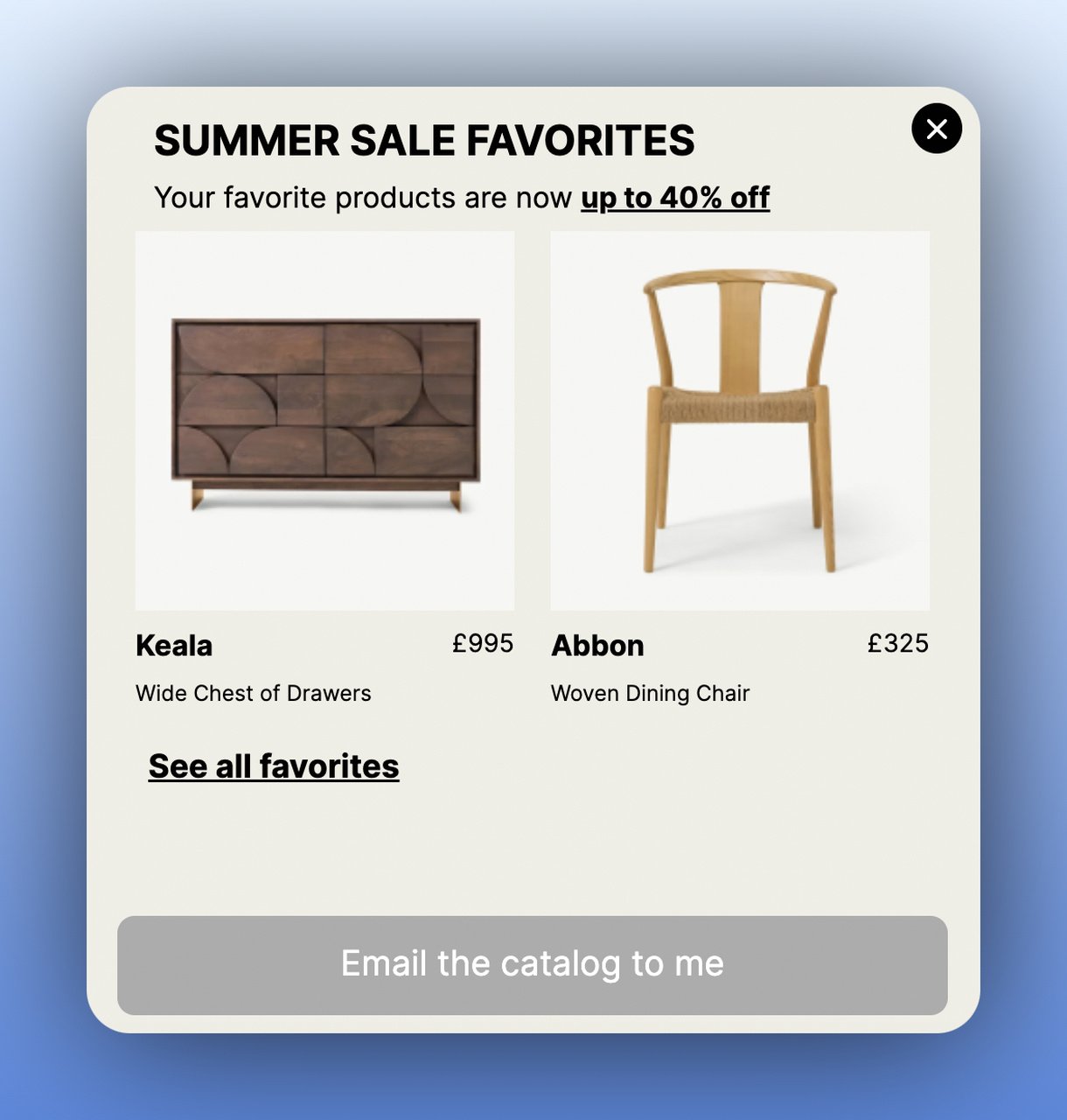
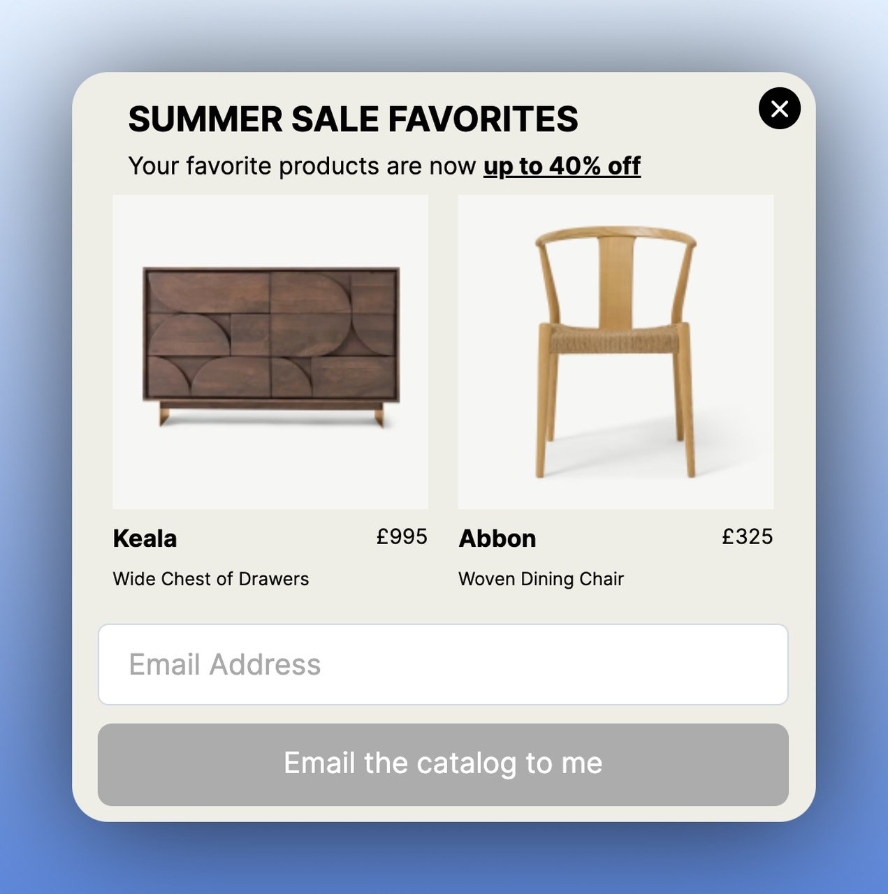
Evidence: Wisepops reports that personalized multistep popups can achieve conversion rates up to 25%, especially when the offer is relevant to the visitor's browsing behavior. Relevance is the key variable.
Expected impact: 20-40% higher engagement rate versus static banner promotions, with a secondary benefit of building your email list simultaneously.
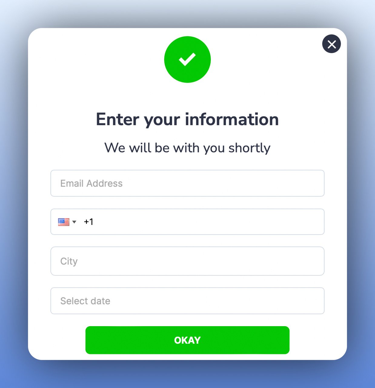
4. Collect Form Submissions: Break Complex Forms into Steps
Long forms kill conversions. A multistep popup form breaks a 5-7 field submission into two or three screens, reducing the perceived effort at each stage. Step one might ask a qualifying question ("Are you interested in a free demo?"), step two collects contact details, and an optional step three confirms the submission. This approach works well for SaaS demos, B2B lead generation, and service quote requests.
How to implement:
1. Map your form fields and split them logically. Put the easiest, most engaging question first (yes/no or multiple choice).
2. Limit each step to 2-3 fields maximum. Name and email on one step, company and role on another.
3. Add a progress indicator so visitors know how many steps remain. Transparency reduces drop-off.
4. Include a "Maybe Later" option on step one. Forcing the interaction causes resentment; offering choice builds trust.
Evidence: Wisepops data shows that 17% of mid-sized Shopify stores now use multistep popups for data collection, up from single-digit adoption just two years ago. The trend reflects the clear conversion advantage of breaking forms into steps.
Expected impact: 25-50% increase in form completion rates compared to a single-page form with the same number of fields. Results typically appear within the first week.
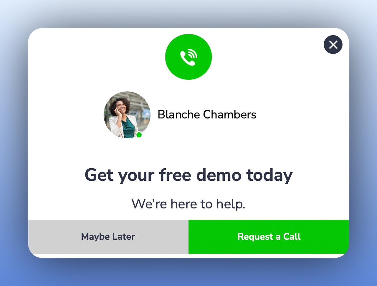
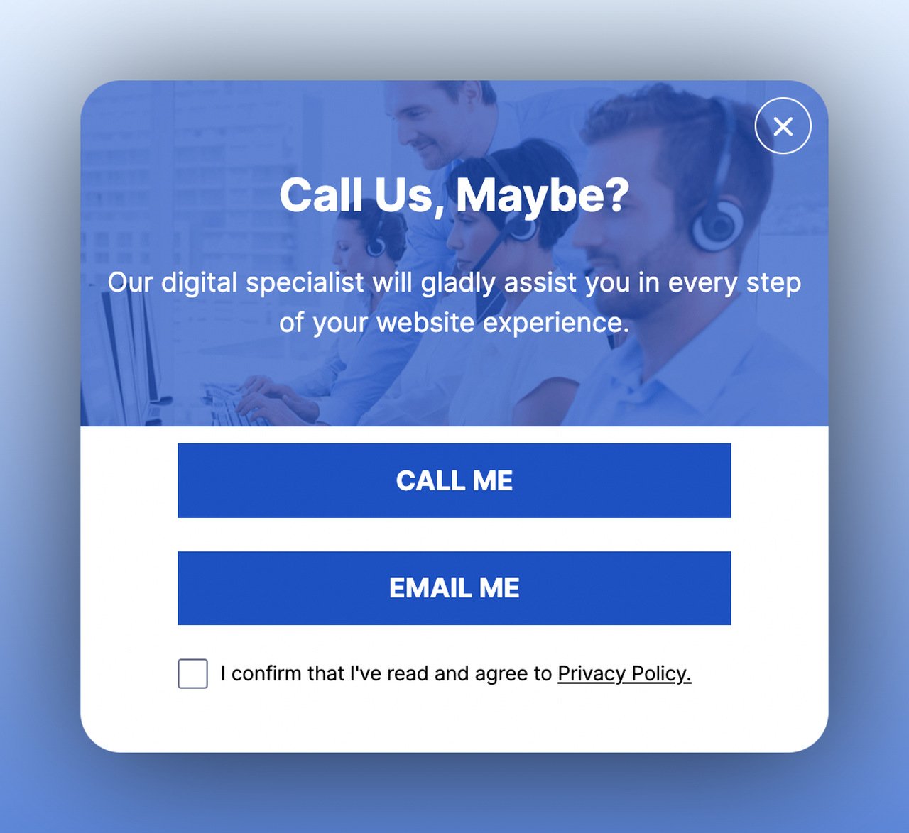
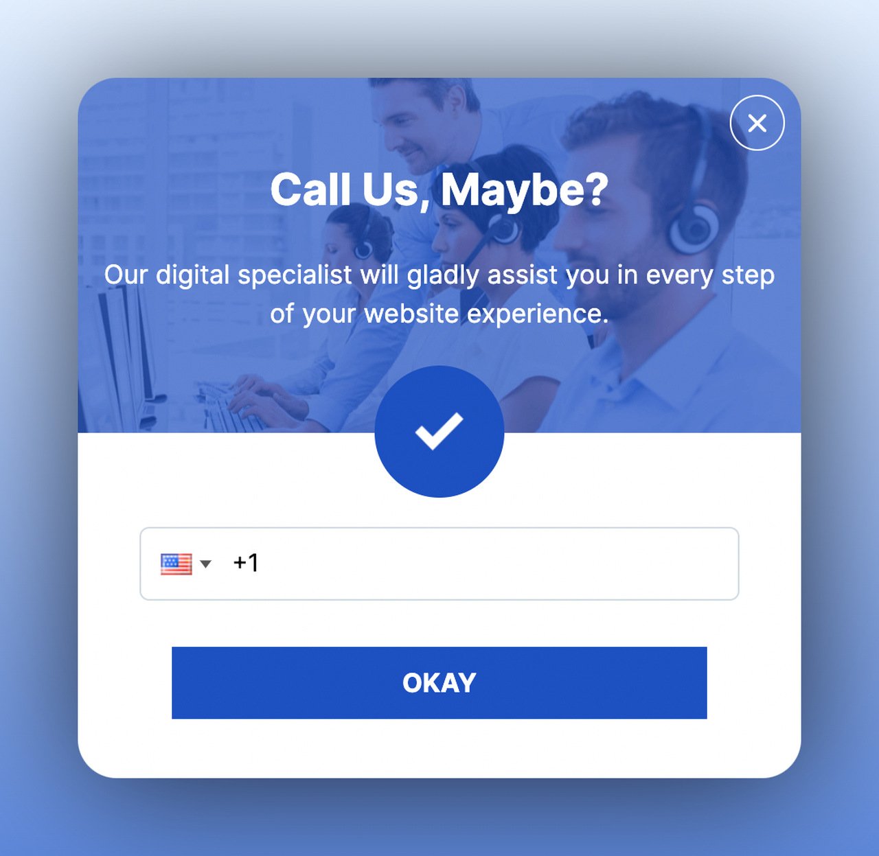
5. Get More Phone Calls: Let Visitors Choose Their Support Channel
A support-channel multistep popup gives visitors a choice between calling, emailing, or chatting, then collects the relevant contact information based on their selection. This works best when triggered by exit-intent on pricing or product pages where visitors likely have pre-purchase questions. Instead of guessing what support method your visitors prefer, you let them tell you.
How to implement:
1. Create step one with clear channel options: "Call Me," "Email Me," or "Live Chat." Use recognizable icons for each.
2. If "Call Me" is selected, step two collects their phone number and preferred time slot.
3. Set the exit-intent trigger on high-value pages (pricing, product details, checkout) where questions typically arise.
4. Connect the phone number collection to your CRM or helpdesk so your team can follow up within 15 minutes.
Evidence: In my experience building popup tools since 2019, support-channel popups on pricing pages generate 3-5x more qualified calls than a static "Contact Us" link in the footer. The difference? Timing and context. You're catching visitors at the exact moment they have questions.
Expected impact: 30-50% increase in inbound support calls from high-intent pages, with faster response times leading to higher close rates.
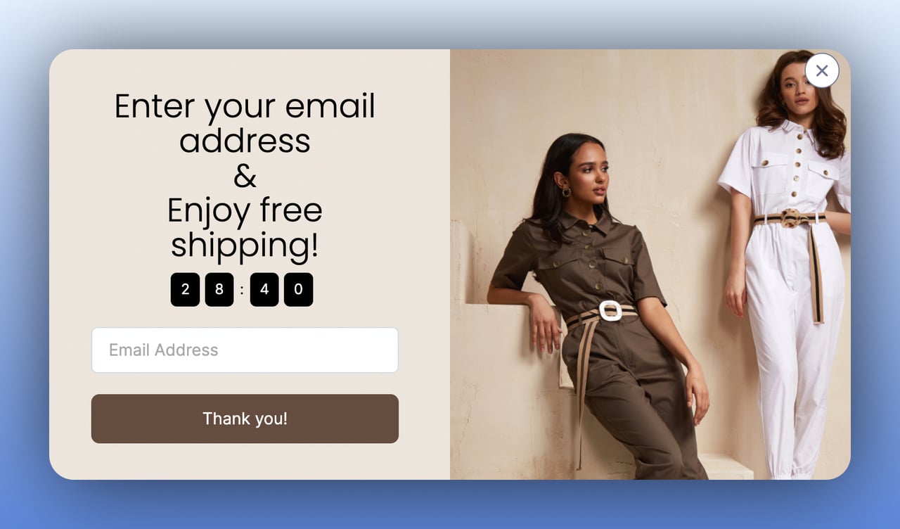
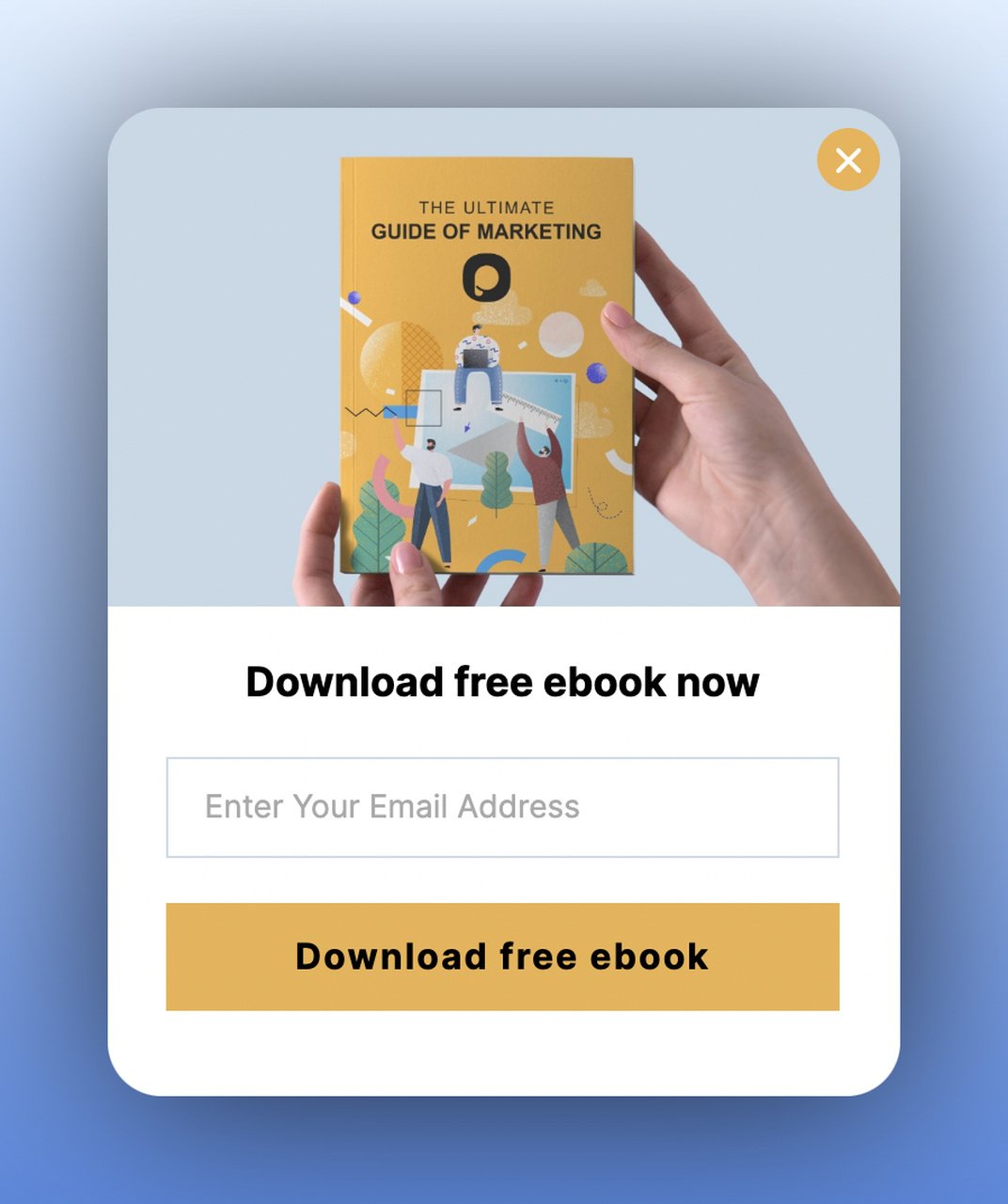
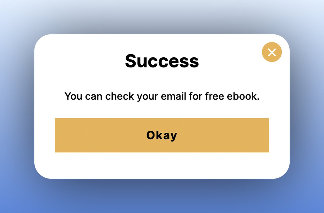
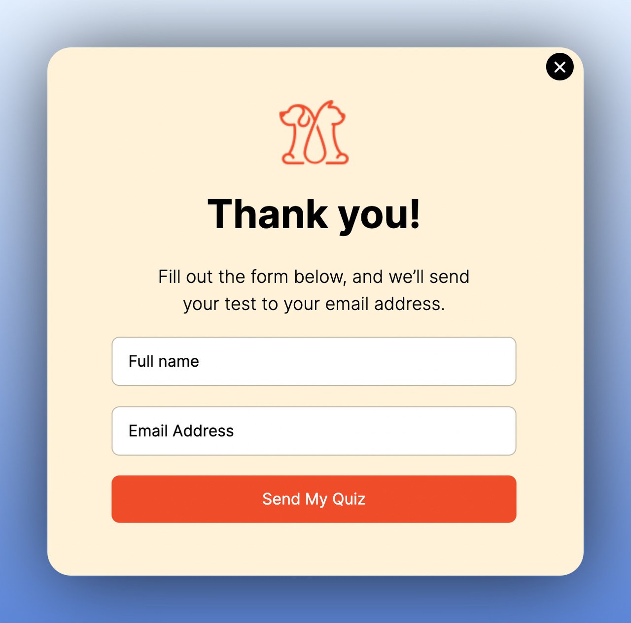
6. Grow Your Email List: Offer Value Before Asking for the Address
The classic email list building popup gets a multistep upgrade when you lead with value in step one and collect the email in step two. A free e-book, webinar invite, discount code, or exclusive content offer makes the email address feel like a fair trade rather than a request. The confirmation step (step three) reassures subscribers that the process worked.
How to implement:
1. Design step one around a specific lead magnet that matches the page content. Don't offer a generic "newsletter" since that converts poorly.
2. Step two should have a single email field and a clear CTA like "Send My Free Guide." Fewer fields equals higher completion.
3. Add a confirmation step that says "Check your inbox!" This reduces support tickets and sets expectations.
4. Target the popup based on page content. Blog readers get content upgrades; product page visitors get discount codes.
Evidence: According to the Reddit UX Design analysis, email-only popup fields average a 2.48% conversion rate, while adding a preferences step only drops it marginally to 2.38%. The negligible loss is more than offset by higher quality leads who self-segment during the process.
Expected impact: 15-35% increase in email signups compared to a generic single-step email popup, with higher open rates from the collected list since subscribers opted in with intent.
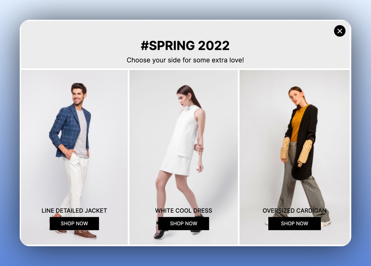
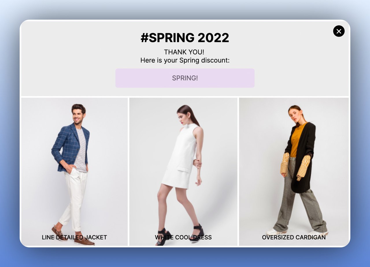
7. Make Announcements: Share News and Capture Interest
An announcement multistep popup combines brand storytelling in step one with a conversion action in step two. Whether you're launching a new product, running a seasonal campaign, or celebrating a company milestone, the two-step approach lets visitors engage with the news before you ask them to act on it. This mirrors how press releases work: inform first, then provide a call to action.
How to implement:
1. Step one showcases the announcement with visuals. Use product photos, collection images, or event graphics. Keep text under 20 words.
2. Include interactive elements in step one: "Shop Men's" / "Shop Women's" or "I'm interested" / "Not now." The choice reveals customer preferences.
3. Step two follows up based on their selection with a relevant offer or email capture for updates.
4. Time announcements to coincide with campaigns and set a clear end date for the popup display.
Evidence: We've tested announcement popups across hundreds of Popupsmart campaigns. Two-step announcement flows generate 2-3x more engagement than static banner announcements because the interactive first step creates investment before the ask.
Expected impact: 40-60% higher click-through rate compared to static site banners, plus customer preference data from step one selections.
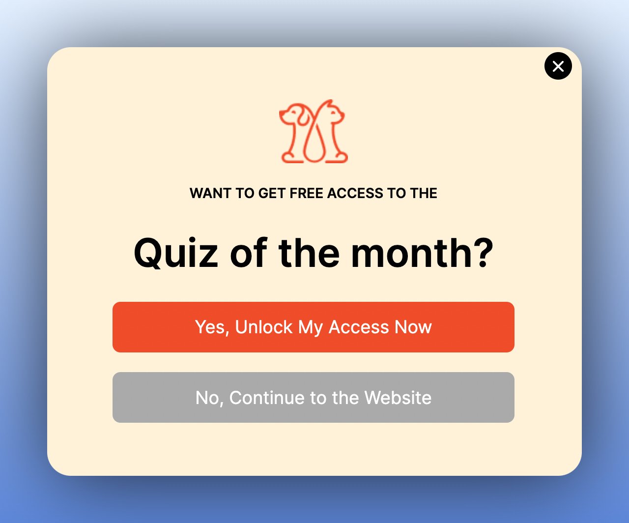
8. Increase User Engagement: Run Interactive Quizzes
A quiz-style multistep popup turns passive browsing into active participation. Step one asks an engaging question (product quiz, knowledge test, personality match), and step two collects the email address to deliver results. This format works because it satisfies curiosity. Visitors want their answer, which makes the email field feel like a small price rather than a barrier.
How to implement:
1. Design a quiz that relates to your product. A skincare brand might ask "What's your skin type?" while a SaaS company might ask "How mature is your marketing stack?"
2. Keep the quiz to 2-3 questions maximum. Each question should be a popup step with clear visual options.
3. Gate the results behind an email field: "Enter your email to see your personalized recommendation."
4. Use the quiz responses to segment your email list and send targeted follow-up sequences based on their answers.
Evidence: Recart's A/B test data shows fullscreen popups lift conversion rates by 23.6% for email and 21.6% for SMS over lightbox designs. Combining the fullscreen format with an interactive quiz maximizes both engagement and capture rates.
Expected impact: 2-4x higher engagement time on site, with 20-35% email capture rates from quiz completions. Segmented leads also convert 3-5x better in follow-up campaigns.
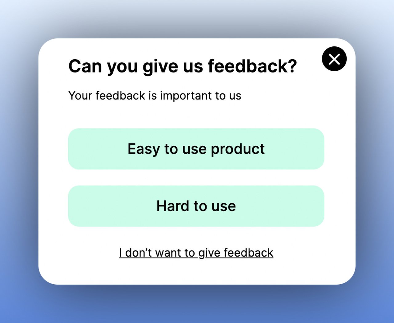
9. Collect Feedback and Surveys: Turn Bad Experiences into Loyalty
A feedback multistep popup asks for the customer's experience in step one, then responds dynamically in step two. Happy customers might get a referral request or review prompt. Unhappy customers get a discount or direct line to support. This branching logic transforms a simple survey into a retention tool because you're acting on the feedback in real time, not just collecting it.
How to implement:
1. Step one: ask a simple satisfaction question. "How was your experience?" with 2-3 answer options (great, okay, not good) works better than a 1-10 scale.
2. Branch the flow: positive responses lead to a review request or social sharing prompt. Negative responses lead to a recovery offer.
3. For negative feedback, step two should offer immediate value: a discount code, free shipping on next order, or direct access to a support agent.
4. Trigger the popup post-purchase (on the order confirmation page) or 2-3 days after delivery via an on-site return visit.
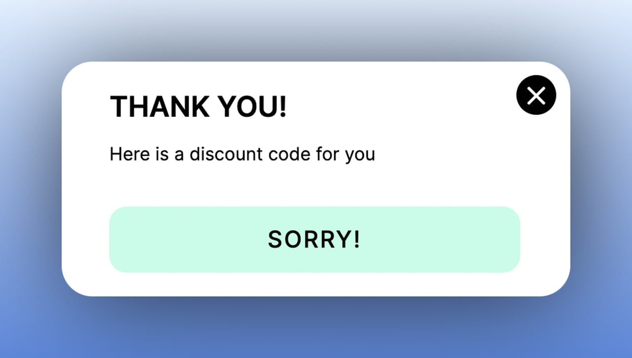
Evidence: In my experience running customer feedback campaigns, the multistep recovery flow converts 30-40% of unhappy customers into repeat buyers when combined with a meaningful offer. A single-step feedback form with no follow-up action rarely changes behavior.
Expected impact: 15-25% improvement in customer retention for visitors who interact with the feedback popup, measurable within 60 days of implementation.
10. Facilitate Social Sharing: Identify Your Audience's Preferred Platforms
A social-sharing multistep popup asks visitors to follow your brand on their preferred social channel in step one, then uses that data to inform your social media strategy. The genius of this format is that it's not just a follower acquisition tool; it's market research. You learn exactly which platforms your visitors use most, which tells you where to invest your content budget.
How to implement:
1. Design step one with buttons for each social platform: Instagram, TikTok, Pinterest, LinkedIn, Facebook. Include the platform icons for instant recognition.
2. When visitors click their preferred platform, redirect them to your profile on that channel in a new tab.
3. Step two (optional) captures their email with a "Get exclusive social-only deals" or "Join our community" message.
4. Track which platform buttons get the most clicks and reallocate your social media budget accordingly.
Evidence: We've tracked social sharing popups across Popupsmart campaigns and consistently find that visitors are 5-8x more likely to follow a social account when prompted with a popup versus a static sidebar widget. The popup's interruption forces a decision, which works in your favor when the ask is small.
Expected impact: 10-20% of popup viewers will follow at least one social channel, plus you'll get actionable data on platform preferences within the first week.
Where to Start: Prioritization by Effort and Impact
Not every use case fits every business. Here's how I'd prioritize based on effort to implement and expected conversion impact:
PriorityUse CaseEffortImpactBest For1Reduce Cart AbandonmentLowHighE-commerce stores with 40%+ abandonment rates2Grow Your Email ListLowHighAny site without an active email capture strategy3Increase Sales ConversionMediumHighStores with 50+ products needing guided discovery4Collect Form SubmissionsMediumHighB2B SaaS and service businesses with long forms5Promote Products and OffersLowMediumSeasonal businesses and product launches6Collect Feedback and SurveysMediumMediumBusinesses focused on retention and NPS improvement7Make AnnouncementsLowMediumBrands with frequent launches or news8Increase User EngagementHighMediumBrands wanting interactive on-site experiences9Get More Phone CallsMediumMediumHigh-ticket products and services needing consultation10Facilitate Social SharingLowLowBrands building social presence from scratch
Start with priorities 1-3. They require the least setup time and deliver the fastest measurable results. Once those are running and optimized, layer in the remaining use cases based on your specific business goals.
How to Create a Multistep Popup with Popupsmart
Building a multistep popup for Shopify or any website takes under five minutes with Popupsmart's no-code builder. Here's the process:
1. Sign up for a free Popupsmart account (no credit card required) and click "New Campaign" from your dashboard.
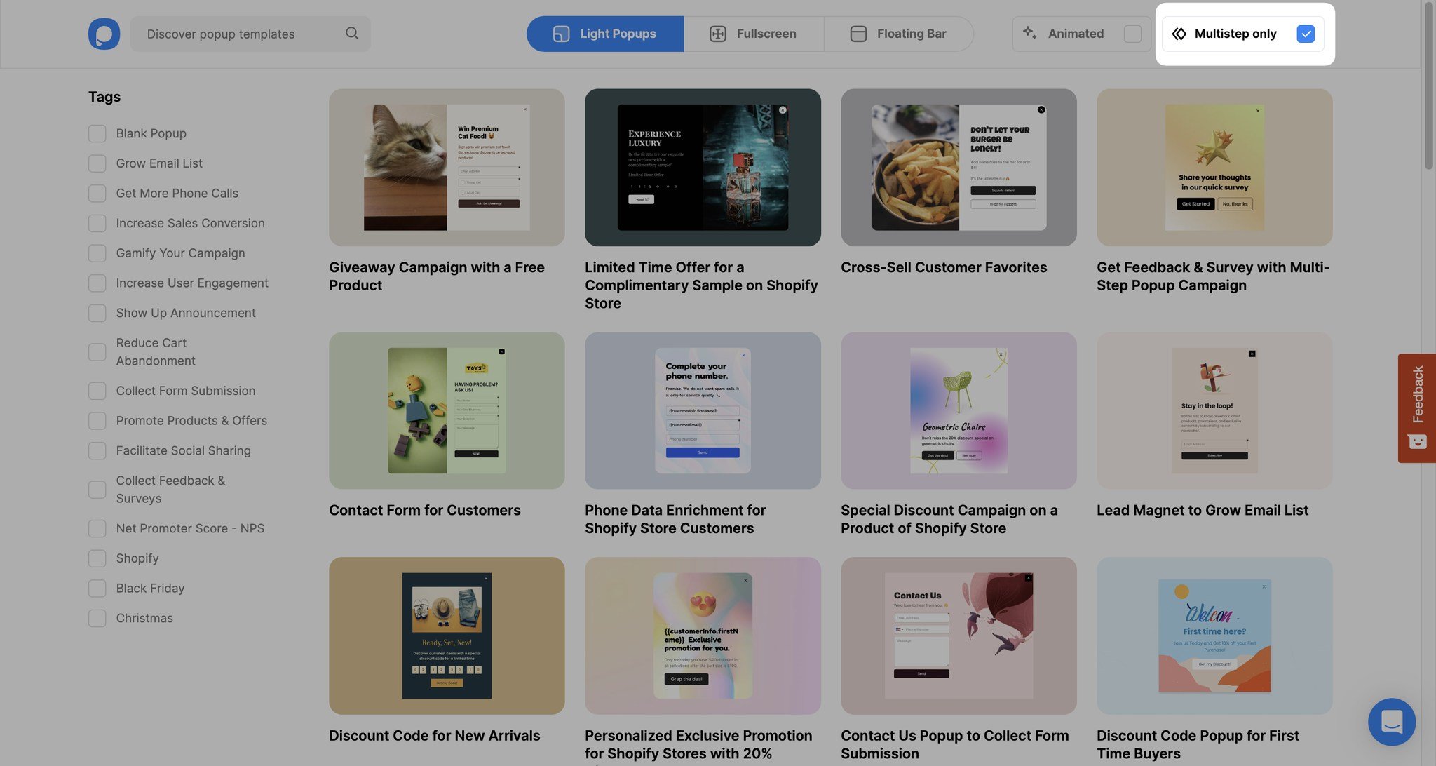
2. Use the "Multistep Only" filter on the template page to browse pre-designed multistep templates. Pick one that matches your use case.
3. In the "Customize" step, edit text, swap images, add elements (video, countdown timer, social icons), or modify the call to action buttons.
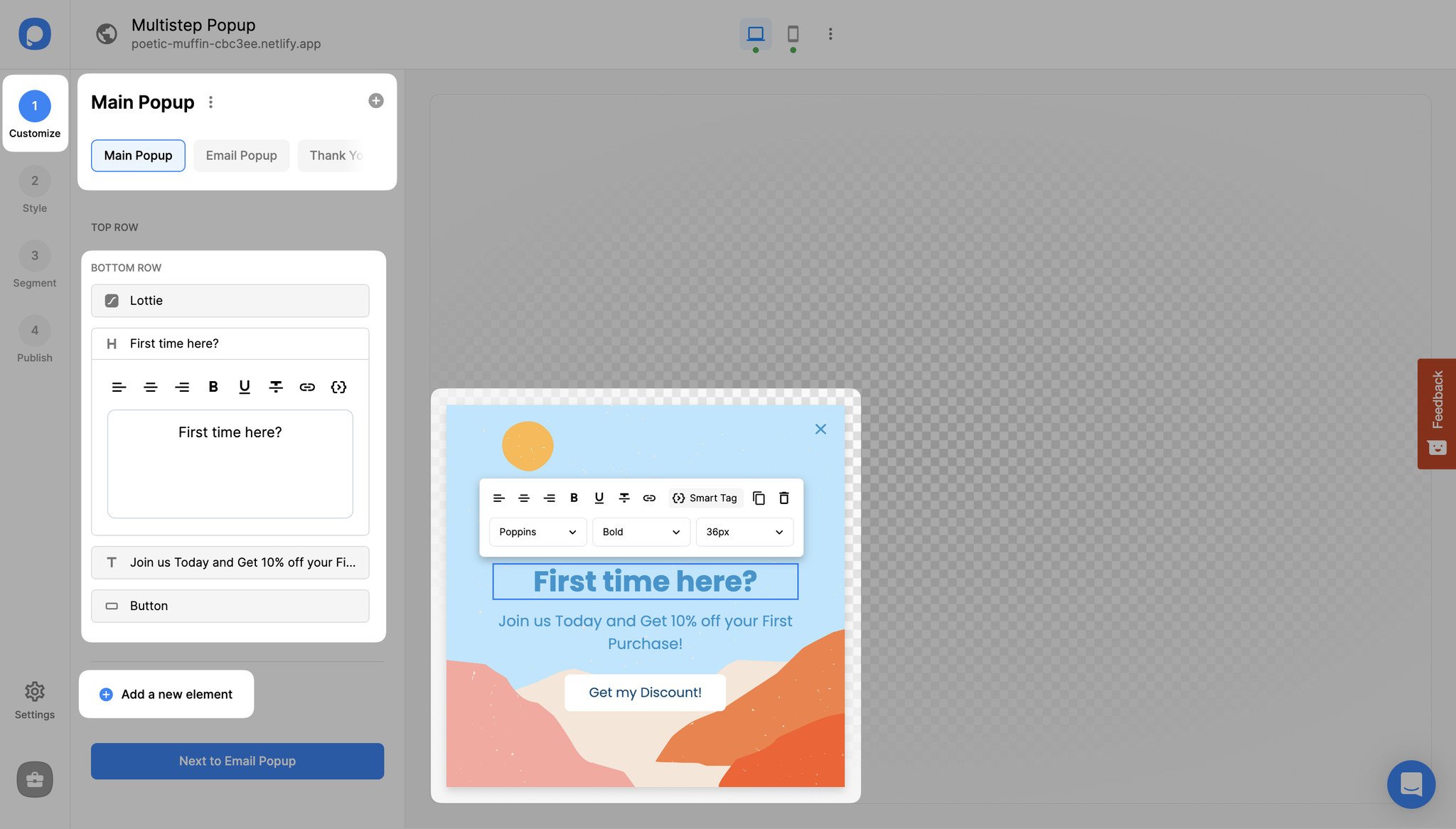
4. Add new steps by clicking the "+" icon next to your existing popup steps. Each step can have different content, layout, and actions.
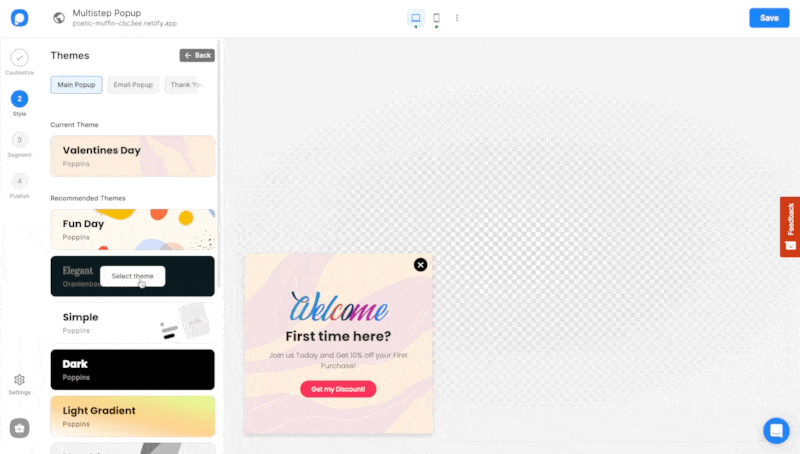
5. Use the "Style" tab to customize fonts, colors, and backgrounds. The theme engine gives you ready-made design options you can apply with one click.
6. Set targeting rules in the "Segment" tab (page URL, visitor behavior, device type, location), add integrations in "Settings," and hit publish.
The entire process takes 3-5 minutes for a standard two-step popup. For more complex multi-step form flows, plan for 10-15 minutes of setup time.
Common Mistakes to Avoid with Multistep Popups
After building Popupsmart and watching thousands of campaigns perform, these are the mistakes I see most often:
Too many steps. Three steps is the practical maximum. Every additional step drops completion rates significantly. If you need more than three steps, you're asking too much in a popup format. Use a dedicated landing page instead.
No clear value exchange. Each step needs to feel like the visitor is getting something, not just giving information. "Enter your email" with no incentive converts at 1-2%. "Get 15% off your first order" with an email field converts at 5-8%.
Ignoring mobile optimization. Over 60% of e-commerce traffic comes from mobile devices. A multistep popup that looks great on desktop but requires horizontal scrolling on mobile will frustrate visitors. Test every step on a phone screen before publishing.
Same popup for every page. A returning customer on the checkout page and a first-time visitor on a blog post shouldn't see the same multistep popup. Use page-level and visitor-behavior targeting to match the popup to the context. Popupsmart's segmentation tools make this straightforward.
No A/B testing. I've seen two-word changes in popup headlines double conversion rates. Always run at least one variant, even if it's just testing the offer amount (10% vs 15% off) or the CTA wording. Data beats assumptions every time.
Frequently Asked Questions
How Do Multistep Popups Improve Conversions?
Multistep popups improve conversions by applying the micro-commitment principle. When a visitor takes a small first action (clicking a preference or answering a question), they become psychologically invested in completing the process. This reduces the perceived effort of filling out forms and sharing contact information. According to popup conversion statistics, the average popup converts at 11.09%, and multistep designs consistently outperform single-step variants by reducing friction at each stage.
What Is a Multistep Form?
A multi-step form breaks a long data collection process into two or three shorter screens. Instead of presenting all fields at once, each step shows 1-3 fields with a progress indicator. This format reduces form abandonment because visitors commit to each step individually rather than facing the full form upfront. Multistep forms work well in popups, landing pages, and checkout flows.
What Is an Example of a Multi-Step Instruction?
A practical multistep popup instruction: Step 1 shows "What's your skin type?" with options (oily, dry, combination). Step 2 displays "Here's your personalized routine" with product recommendations. Step 3 asks "Want these sent to your inbox?" with an email field. Each step logically follows the previous one, and the visitor feels guided rather than pressured.
What Are the Benefits of Multistep Popups?
The core benefits are higher conversion rates (Wisepops reports 12% higher CR for multistep versus single-step), better data quality through progressive profiling, reduced cognitive load for visitors, and the ability to segment leads based on their step-one responses. The trade-off is slightly more setup time and the need to design a logical flow between steps.
How Many Steps Should a Multistep Popup Have?
Two steps is the sweet spot for most popup use cases. Three steps works when each step serves a distinct purpose (qualify, capture, confirm). Going beyond three steps causes significant drop-off. In my experience at Popupsmart, the completion rate drops roughly 20-30% with each additional step beyond two. Keep it short and purposeful.
Do Multistep Popups Work for Mobile Visitors?
Yes, but design matters more on mobile. Each step should display without scrolling on a standard smartphone screen. Use larger tap targets (minimum 44x44 pixels), reduce text to essentials, and test the flow on actual devices. Popupsmart's responsive popup builder automatically adjusts layouts for mobile screens, but always preview the mobile version before publishing.
Start Converting More Visitors Today
The data is clear: multistep popups outperform single-step designs because they work with human psychology rather than against it. Start with cart abandonment recovery or email list building since those two use cases deliver the fastest ROI with the least setup. Once you see the results, expand into product-guided selling and interactive quizzes.
If you want to test multistep popups on your site without writing code, Popupsmart's free popup builder has 500+ templates and a drag-and-drop editor that makes the entire process take under five minutes.

How would you rate your experience with this article? 😊