13 Opt-In Page Examples for Effective Lead Generation
An opt-in page is a focused landing page that collects visitor contact info (usually email) in exchange for value, with key elements like a strong headline, clear offer, visuals, social proof, concise form, CTA, and mobile optimization, plus examples and popup creation steps.
If you want to grow your email list, improve user engagement, and capture potential leads, you've likely heard about the importance of opt-in pages.
Opt-in page examples show exactly what high-converting lead capture looks like across industries. This guide breaks down 13 real-world examples, from newsletter pages to popup opt-ins, analyzing what each does well and why it works, so you can apply the same principles to your own B2B SaaS or e-commerce lead generation pages.
What Is an Opt-In Page?
An opt-in page is a dedicated webpage designed to persuade visitors to share their contact information, usually an email address, in exchange for something of value, like a free e-book, webinar access, or a discount code. It's the cornerstone of any email marketing strategy worth building.
The core mechanic is simple: you offer something your target audience genuinely wants, and they trade their contact details to get it. According to Backlinko's analysis of landing page data, the median conversion rate across all industries is 6.6%, but events and entertainment pages reach 12.3% — a reminder that your offer and audience alignment matter far more than any design tweak.
I've been analyzing opt-in pages, and the pattern is always the same: pages that clearly answer "what do I get and why should I care right now" outperform the beautifully designed pages that bury the offer.
What's the Difference Between an Opt-In Page and a Landing Page?
All opt-in pages are landing pages, but not all landing pages are opt-in pages. Landing pages can serve many goals such as showcasing products, promoting events, driving downloads. Opt-in pages have one specific purpose: collecting contact information in exchange for a defined offer.
| Feature | Landing Page | Opt-In Page |
|---|---|---|
| Primary goal | Varies (sales, awareness, downloads) | Collect email or contact info |
| CTA type | Buy, download, learn more | Subscribe, get access, claim free |
| Form fields | Optional | Required — the whole point |
| Standalone page | Often | Almost always |
| Offer requirement | Optional | Mandatory |
There's also the opt-in form, which is a different thing entirely. An opt-in form is a component, a form element that can live on an opt-in page, in a blog sidebar, in a popup, or anywhere else on your site. Shopify's blog sidebar is a classic example:
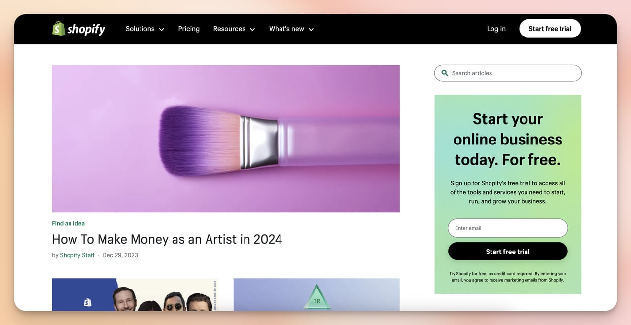
Shopify embeds an opt-in form directly in its blog sidebar
The form itself isn't the page. The page is the full environment with headline, offer, social proof, and form, working together to convert.
What Makes a High-Converting Opt-In Page? (7 Key Elements)
Before walking through examples, here's the framework I use to evaluate them. An opt-in page earns its conversion rate by getting all seven of these right at the same time.
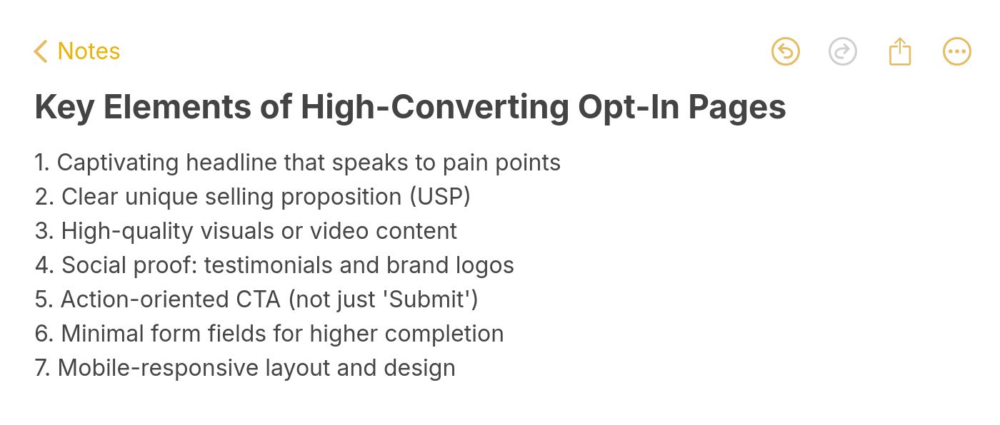
Essential elements for opt-in page success
- Headline that names the specific outcome: Not "Get our newsletter" — something like "Build your 6-step partner program" or "Cut your time-to-hire by 40%." The headline is your first and strongest conversion lever.
- Clear unique value proposition: Spell out exactly what the visitor receives, the format it comes in, and why this particular resource is worth their email address. Zendesk does this well (more on that below).
- Visual elements that match the offer: According to HubSpot's landing page research, 38.6% of marketers say video is the top landing page element that impacts conversion. If your offer is educational, a short video preview often outperforms a static image.
- Social proof that matches the claim: Subscriber counts, brand logos, testimonials — each type works differently. Subscriber counts signal popularity. Brand logos signal authority. Testimonials signal real-world results. Match the proof type to your credibility gap.
- Specific call to action: "Get My Free Ebook" outperforms "Submit" because it restates the value at the moment of commitment. The button is the last thing the user reads before deciding.
- Short, focused form: According to SEOSherpa's landing page statistics roundup, the average landing page conversion rate is 10.76% — and shorter pages with clear CTAs outperform longer ones by 13.5%, based on data from Hostinger's analysis. Every extra field you add creates a drop-off point.
- Mobile-optimized layout: Mobile form popups convert at higher rates than desktop in many tests I've run with Popupsmart campaigns. With mobile traffic now exceeding desktop for most consumer-facing sites, this isn't optional.
13 Opt-In Page Examples That Actually Work
I evaluated roughly 80 opt-in pages over several months and selected these 13 based on four criteria:
- Principle diversity: Each example had to teach a different conversion principle — no two examples rely on the same core mechanic. If an example just repeated what a previous one showed, it didn't make the cut.
- Format variety: The list covers newsletters, e-book downloads, webinar registrations, product trials, subscription plans, quizzes, and popup opt-ins — not just variations of the same squeeze page format.
- Reproducibility: Every design here can be recreated using a no-code tool like Popupsmart's form submission campaigns or a landing page builder. Nothing requires custom development to replicate.
- Specificity of evidence: I can point to exact elements (copy choices, layout decisions, specific form fields) rather than vague "it looks professional" observations.
Here's a quick overview before the full breakdowns:
| # | Brand | Type | Core Principle |
|---|---|---|---|
| 1 | Backlinko | Newsletter | Social proof volume |
| 2 | Dorie Clark | Free workbook | Authority stacking |
| 3 | Make | Webinar registration | Focused simplicity |
| 4 | Wyser | Report download | Multiple CTA placement |
| 5 | Adjust | E-book | Video + social proof |
| 6 | CoSchedule | Course opt-in | Free/paid tiered offer |
| 7 | Yoga Journal | Subscription | Benefit-driven scroll |
| 8 | Blue Apron | Trial signup | Upfront discount offer |
| 9 | Restream | Product promotion | Multi-section structure |
| 10 | Quip | Quiz opt-in | Interactive personalization |
| 11 | Customer.io | Report download | Illustration + dual CTA |
| 12 | AppSumo | Popup opt-in | Immediate discount incentive |
| 13 | Maguire | Popup opt-in | E-commerce first-purchase hook |
1. Backlinko's Newsletter Opt-In Page: The Subscriber-Count Play
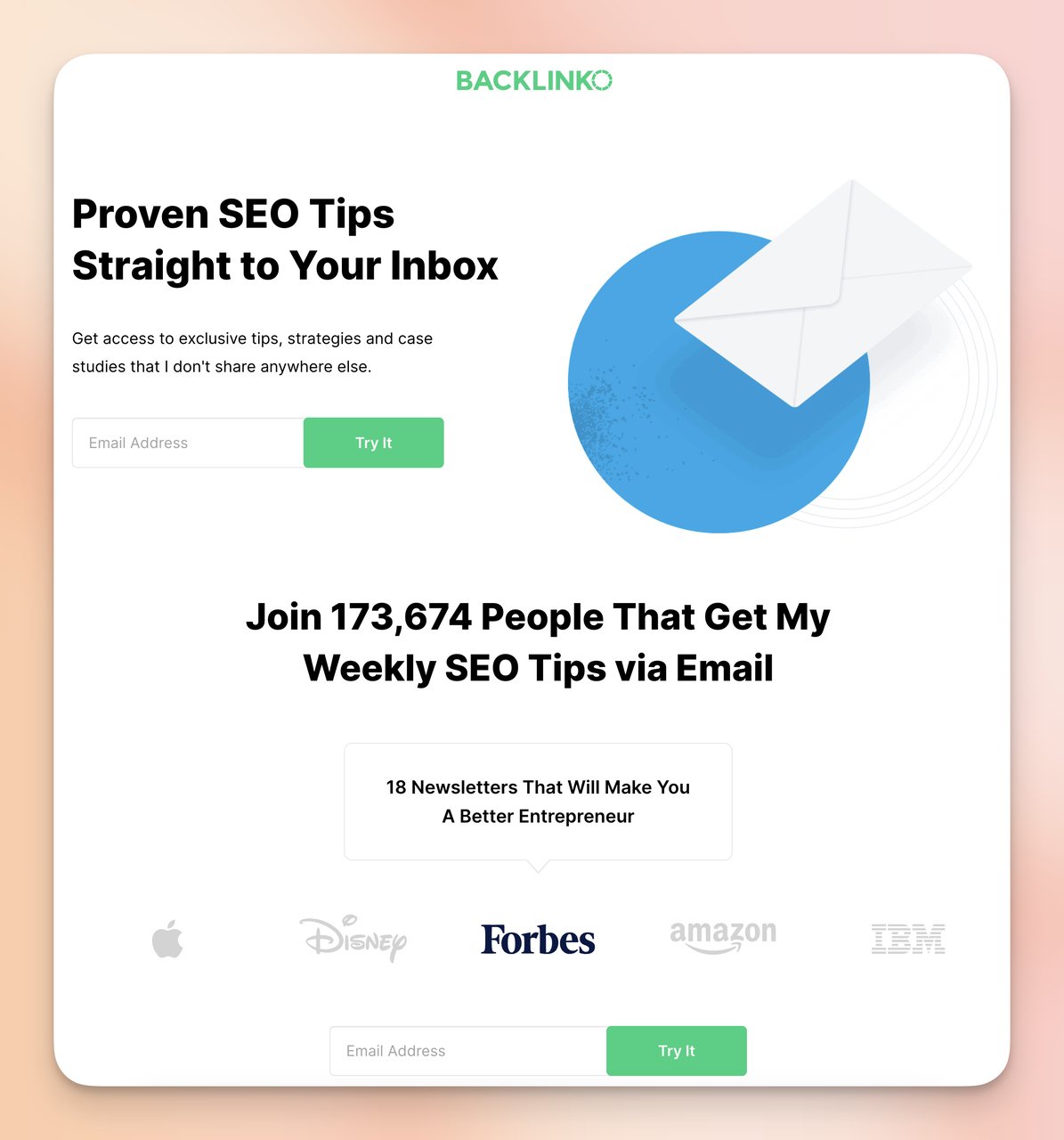
Backlinko's newsletter page leads with the subscriber number
What works: Backlinko's newsletter page does two things that most newsletter opt-ins skip. First, it shows the exact subscriber count prominently — not buried in a footnote, but front and center as the primary trust signal. Second, it displays logos of companies whose employees subscribe. That's a smarter social proof play than testimonials alone, because it signals the audience quality, not just the size.
Why it works: This is herd behavior in action — social proof that answers "who else is doing this." When you see that people at Shopify, Google, or HubSpot have subscribed, you infer that the content is worth their time, and by extension, yours. The page requires only two scrolls to see the complete value proposition, which reduces the cognitive load of evaluating whether to sign up.
Key takeaway: If your newsletter has a meaningful subscriber count (anything over 5,000), put that number in the headline, not in small print. "Join 52,000 SEOs" does more work than "Subscribe to our newsletter."
View Backlinko's newsletter opt-in page
2. Dorie Clark's Free Workbook: Authority Stacking
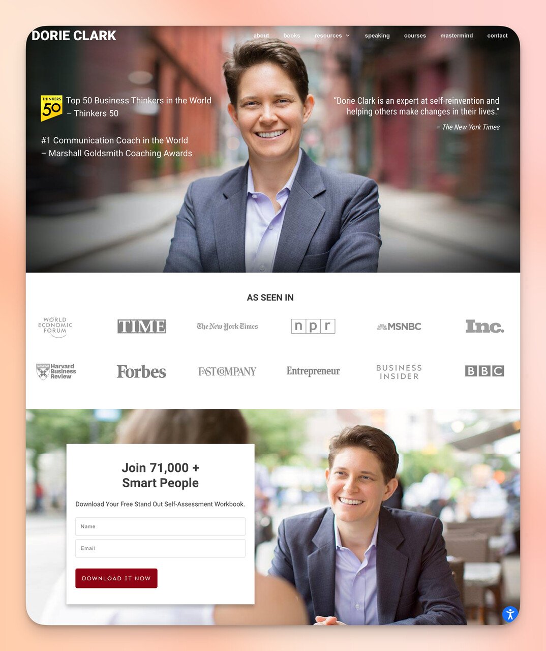
Dorie Clark stacks authority signals from the headline down
What works: Dorie Clark's page layers authority signals from top to bottom. "The New York Times" gets referenced near the top. Her award titles come next. Then comes "Join 71,000+ Smart People" as the final social layer. The workbook itself — a free self-assessment — is well-matched to her audience of professionals trying to advance their careers. The offer is both free and immediately useful, not just a PDF they'll download and never open.
Why it works: Unlike the Backlinko example above, which leads with audience scale, Clark leads with individual credentials. This is authority stacking: piling multiple independent credibility signals so that even if one doesn't resonate with a particular visitor, the next one might. The "Smart People" qualifier in the subscriber message also works as implicit flattery, it tells you something positive about yourself for joining.
Key takeaway: Third-party mentions (press, awards, recognizable companies) work harder than self-descriptions. "As seen in The New York Times" is more convincing than "I'm a bestselling author" even if both are true.
3. Make's Webinar Registration Page: Intentional Minimalism
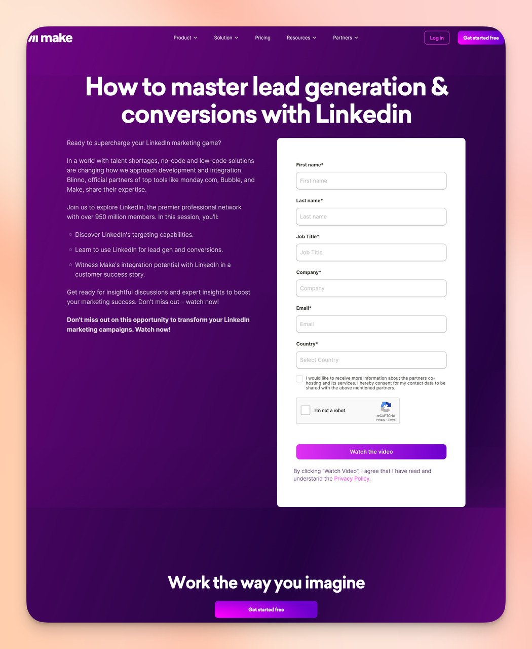
Make's two-column layout keeps the offer and form side by side
What works: Make splits the page cleanly in two: left side explains what you'll learn, right side is the form. No background imagery, no decorative elements. The subtext under the webinar title provides clear expectations such as duration, topics, speaker credentials. That explicit expectation-setting is rare and valuable; most webinar pages just name the topic and hope for the best.
Why it works: Removing visual noise forces the visitor to engage with the copy. There's no background to scan, no icons to click on, no images to evaluate. The only things to read are the value proposition and the form fields. This is a deliberate framing choice: Make is saying "the content is the point, not the aesthetics." For a technical audience (Make users are typically developers or power users), that signal resonates. Compare this to the Adjust example below, which does the opposite by adding video, and you can see that the right approach depends entirely on your audience.
Key takeaway: For technically-minded audiences, visual minimalism can signal credibility rather than lack of effort. Strip out decoration and let the copy carry the weight, but only if your audience values substance over style.
4. Wyser's Report Download Page: The Multiple CTA Approach
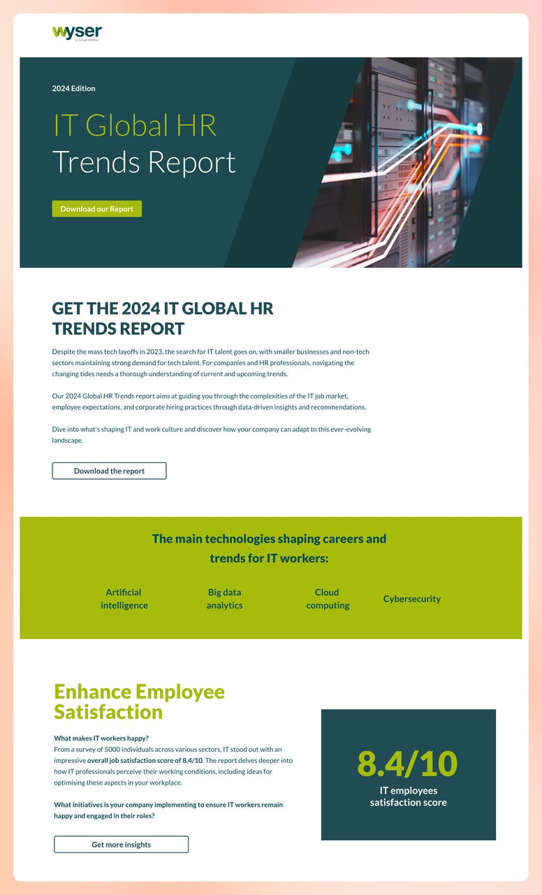
Wyser places CTAs at the top, middle, and bottom of the page
The actual form collects detailed B2B contact information
What works: Wyser places multiple CTAs throughout the page — top, middle, and bottom — all anchoring to the same form. This is a sound B2B tactic for content with enough substance to justify reading. Someone who reads through the IT talent and HR trends content before deciding to download is a warmer lead than someone who signs up immediately. The form itself asks for job title, company, and email, a deliberate choice for B2B lead qualification.
Why it works: Not every visitor makes decisions at the same point in a page. Some will sign up immediately from the top CTA. Others need to read the value description first. Multiple CTAs reduce the friction for both groups — you don't need to scroll back to the top after deciding to convert. The trade-off: the longer form (5+ fields) will reduce raw conversion volume compared to a single email field, but the leads it captures are more qualified. For B2B sales teams, that's often the right trade-off. See our analysis of B2B landing page examples for more on this qualification-vs-volume tension.
Key takeaway: Match your form length to your sales process, not just your conversion rate. If your sales team needs job title and company size to route leads correctly, ask for them — but only if the offer justifies it.
View Wyser's report download page
5. Adjust's E-Book Page: Video as Trust Builder
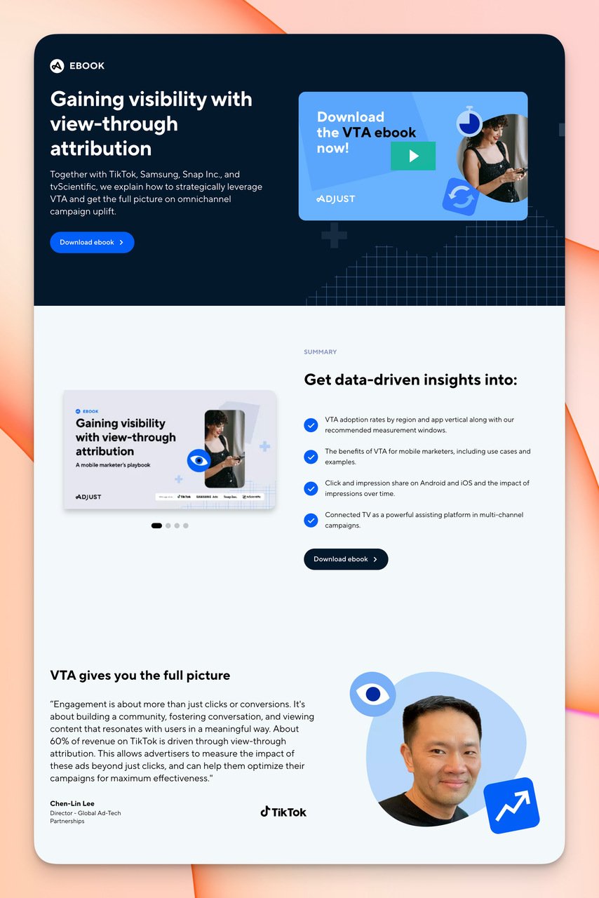
Adjust integrates a video preview directly into the opt-in page
Brand logos appear next to the form to reinforce trust at the decision moment
What works: Adjust places a short video above the fold — not as decoration, but as a content preview that explains what the e-book covers. Below the form, a testimonial quote from an industry practitioner (not a generic "loved it!" review) adds specific credibility. Recognizable company logos sit adjacent to the form fields, so the last thing you see before clicking submit is a row of familiar brand names.
Why it works: The video serves two functions simultaneously: it demonstrates the depth of the content, and it keeps visitors on the page longer (longer dwell time correlates with higher conversion rates). The logo placement is deliberate, logos are positioned next to the form rather than at the top of the page because they function as a final trust nudge right at the conversion moment. This is different from Dorie Clark's approach, which uses logos for opening authority. Here they're used as closing reassurance.
Key takeaway: If you have video content tied to your offer, a 60-90 second preview on the opt-in page will perform better than a written description. Place trust signals closest to the form, not only at the top of the page.
View Adjust's e-book opt-in page
6. CoSchedule's Marketing Course Page: Tiered Free-to-Paid
CoSchedule presents a free course alongside a paid upgrade option
Course curriculum details and social proof in the middle section
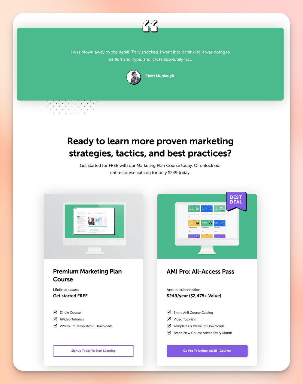
A second CTA section at the bottom captures late deciders
What works: CoSchedule's page includes two CTAs with different value propositions: one for the free marketing course, one for a paid premium resource bundle. The headline addresses an exact pain point: wanting better marketing results. The curriculum is listed in detail, which is rare for free course opt-ins. A testimonial that speaks specifically to outcomes (not just satisfaction) appears halfway down the page.
Why it works: Placing a paid option on a free opt-in page does something counterintuitive, it raises the perceived value of the free offer. When a visitor sees that the premium version costs $X, the free version feels like a bargain worth claiming. This anchoring effect can lift free opt-in rates because the paid price sets a reference point. The detailed curriculum also filters for more committed leads: someone who reads 15 course modules before signing up is more likely to complete the course and convert downstream. This connects to broader email list building strategies where lead quality matters as much as volume.
Key takeaway: Show a paid option on your free opt-in page. It makes the free tier feel more valuable and filters for high-intent subscribers who've already mentally evaluated the upgrade path.
View CoSchedule's marketing course opt-in page
7. Yoga Journal's Subscription Page: Benefit-Driven Scrolling
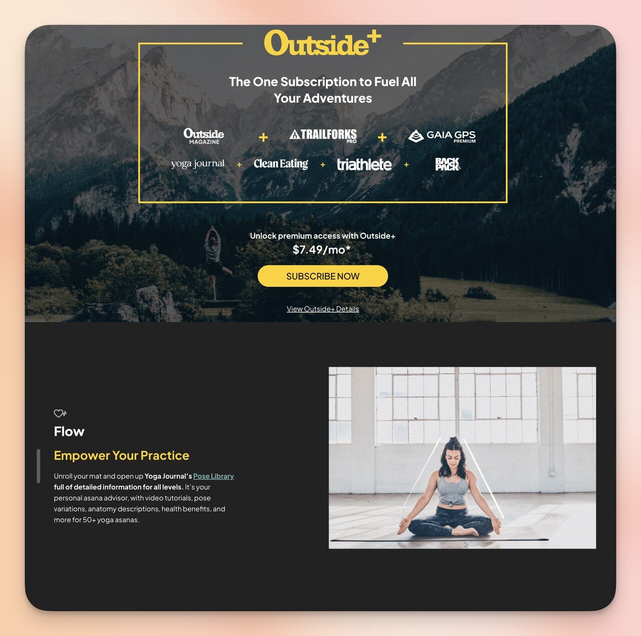
A lifestyle background image signals the category immediately
Clear pricing and per-plan benefits reduce friction at the decision point
What works: Yoga Journal uses a nature background image that immediately signals the wellness context — you know within one second what kind of content you're getting. As you scroll, a fade effect reveals six distinct membership benefits, one at a time. The pricing section shows actual dollar amounts next to each benefit tier, which is less common on subscription opt-in pages (many try to hide pricing until after the email is collected).
Why it works: The fade-reveal scroll pattern is a reading rhythm tool — it prevents the visitor from being overwhelmed by all six benefits at once, which is what happens on pages that list everything immediately. Instead, each benefit gets its moment of attention before the next one appears. Showing real pricing upfront signals confidence in the value of the offer. Hidden pricing creates distrust; transparent pricing attracts the right subscribers and filters out the wrong ones. The result is a lower-friction checkout experience because there's no "gotcha" price reveal after signup.
Key takeaway: For subscription opt-ins, show pricing on the opt-in page rather than after email collection. You'll get fewer signups but much lower churn — people who see the price and still sign up want the product.
8. Blue Apron's Trial Signup Page: Lead with the Discount
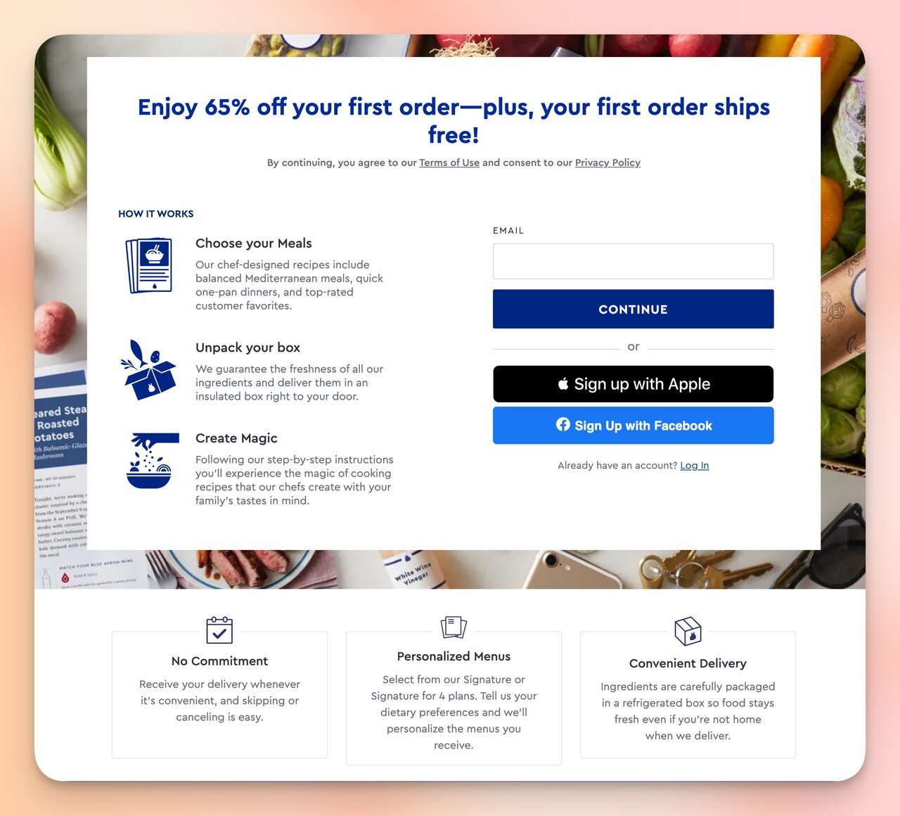
The discount leads the headline — nothing is buried below the fold
What works: Blue Apron opens with a specific discount offer — not "save money" but a concrete amount on the first orders. The headline does two things at once: it states the reward and implies the action (sign up, get the discount). Below the headline, three callouts — "No Commitment," "Personalized Menus," and "Fresh Ingredients" — address the three most common objections to a meal kit subscription in that order. The page doesn't bury the discount or save it as a surprise; it's the first thing you read.
Why it works: Most e-commerce opt-in pages make you work to find out what you're getting. Blue Apron inverts this: the value is the headline. This works because discounts for first-time buyers are a known conversion driver, and withholding the discount amount until after signup creates friction rather than anticipation. The "No Commitment" callout is strategically placed first because subscription hesitancy is the primary objection — answering it immediately removes the most common exit reason before the visitor even sees the form. For e-commerce email capture popup strategies, the same upfront-discount principle applies at the popup level.
Key takeaway: If your offer includes a specific discount, put the exact amount in the headline. "Get $90 off your first three boxes" outperforms "Save on your first order" because the specific number makes the value concrete and quotable.
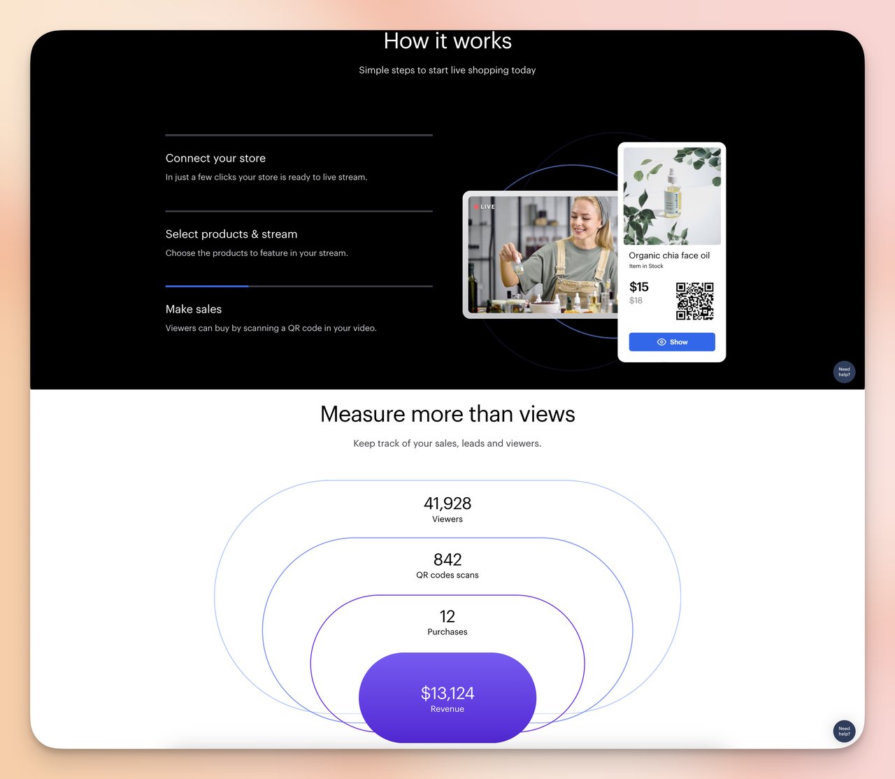
9. Restream's Product Promotion Page: Five-Section Depth
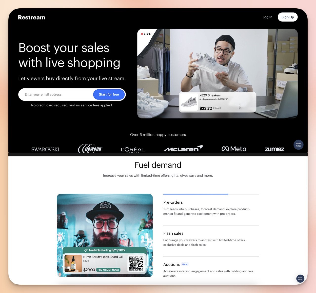
Restream opens with a direct headline and immediate call to action
Features and workflow explanations build confidence before the secondary CTA
What works: Restream's opt-in page is longer than most — five distinct sections. Section 1 is the headline and form. Section 2 lists key product features in short scannable language. Section 3 is a "How It Works" explainer that reduces confusion about what you're signing up for. Section 4 shows analytics and measurable outcomes. The page ends with a repeat of the CTA. Each section handles one objection or question that would otherwise prevent conversion.
Why it works: For a product with real complexity (multi-platform live streaming), a minimal page would underserve skeptical visitors. Someone who reads all five sections and still signs up has higher purchase intent than someone who signs up immediately from the hero section. This is a deliberate filtering mechanism. The risk is that each additional section also gives a reason to leave — which is why the "How It Works" section is so important. It prevents the confusion that causes abandonment mid-page.
Key takeaway: For technically complex products, a longer opt-in page with objection-handling sections often converts better than a minimal page. Add sections based on questions your sales team hears most, not based on what looks clean.
10. Quip's Free Routine Builder: The Quiz as Personalization Engine
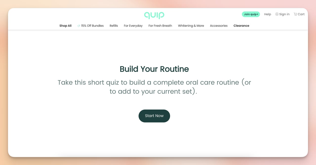
Quip opens with a quiz that personalizes the offer before asking for contact info
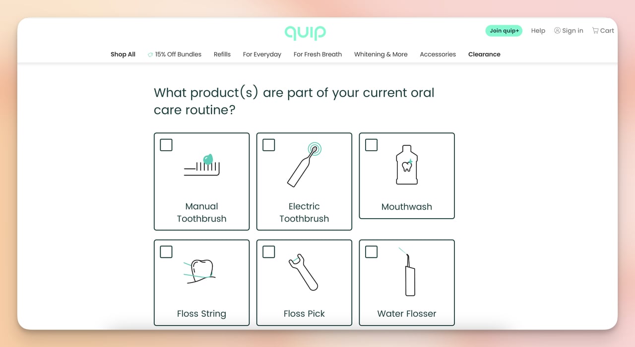
The quiz gathers preference data mid-flow — email comes at the end
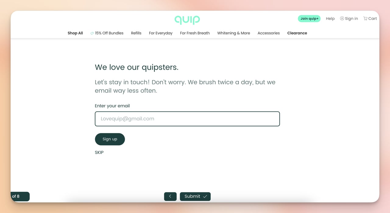
Email collection comes last, after the visitor has already invested in the quiz
What works: Quip doesn't ask for your email upfront. You start the quiz, answer 4-5 questions about your oral health habits and goals, and only at the very end does the page ask for an email to send the personalized routine. The subtext "We're sending emails less frequently" directly addresses the most common fear about giving out your email address.
Why it works: This is the sunk cost effect at work. After spending 3-4 minutes answering quiz questions, visitors have invested time and attention. The email field appears after that investment, when abandonment feels like wasted effort. This is the same principle behind multi-step forms — breaking a form into stages increases completion rates because each step creates micro-commitments. The personalization promise ("your routine") also works harder than a generic "get our newsletter" — the visitor expects something tailored, not batch content. See more personalized product recommendation examples that use the same principle.
Key takeaway: Put your email field at the end of a quiz or multi-step form, not at the beginning. A visitor who's answered 4 questions about their needs is far more likely to give their email than someone who's just arrived at a blank form.
11. Customer.io's State of Messaging Report: Illustration + Dual CTA
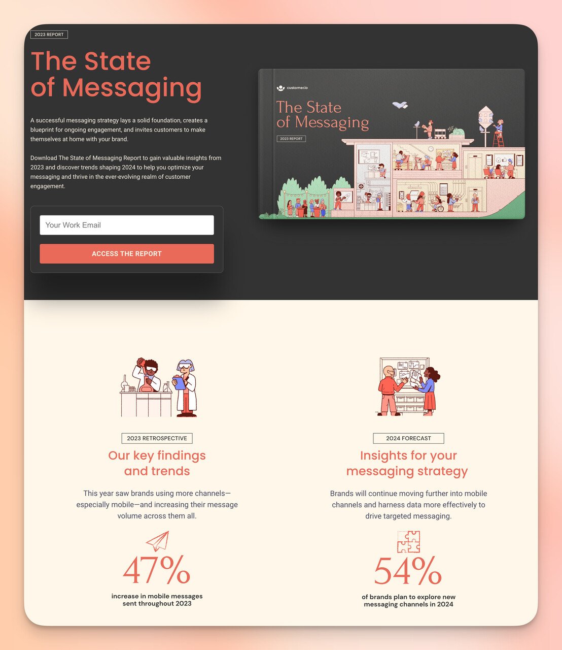
Custom illustration signals content quality before the visitor reads a word
The lower section combines scale proof (7,000 companies) with two conversion paths
What works: Customer.io opens with a custom illustration rather than a stock photo or a product screenshot — an unusual choice that signals the content is original. The report's benefits are listed as bullet points: specific, not vague. The lower section mentions that over 7,000 companies use the service (scale proof), then presents two CTAs: "Book a Demo" and "Start a Trial." These address visitors at two different funnel stages in the same page, which is a deliberate hedge against conversion loss.
Why it works: Custom illustrations take more effort to produce than screenshots or stock images, and that effort signals investment in the content. Visitors draw an implicit connection: if the company spent this much on the marketing page, the actual report is probably worth downloading. The dual CTA is worth noting — most opt-in pages offer one action, but Customer.io captures both the "show me more" visitor (demo) and the "I'm ready to try it" visitor (trial) without forcing either into the wrong path.
Key takeaway: If your audience includes visitors at different purchase stages, offer two CTAs that match those stages rather than forcing everyone through the same funnel step. The cost is more complexity; the gain is fewer lost conversions.
View Customer.io's report opt-in page
Opt-in pages aren't limited to standalone formats. Integrated as popups on your website, they can collect leads from visitors who aren't on a dedicated landing page. You can include just the form and offer text, add a countdown timer for urgency, or gamify your popup campaign with a spin-the-wheel.
Here are two popup opt-in examples worth studying:
12. AppSumo's Popup Opt-In: Immediate Discount Hook
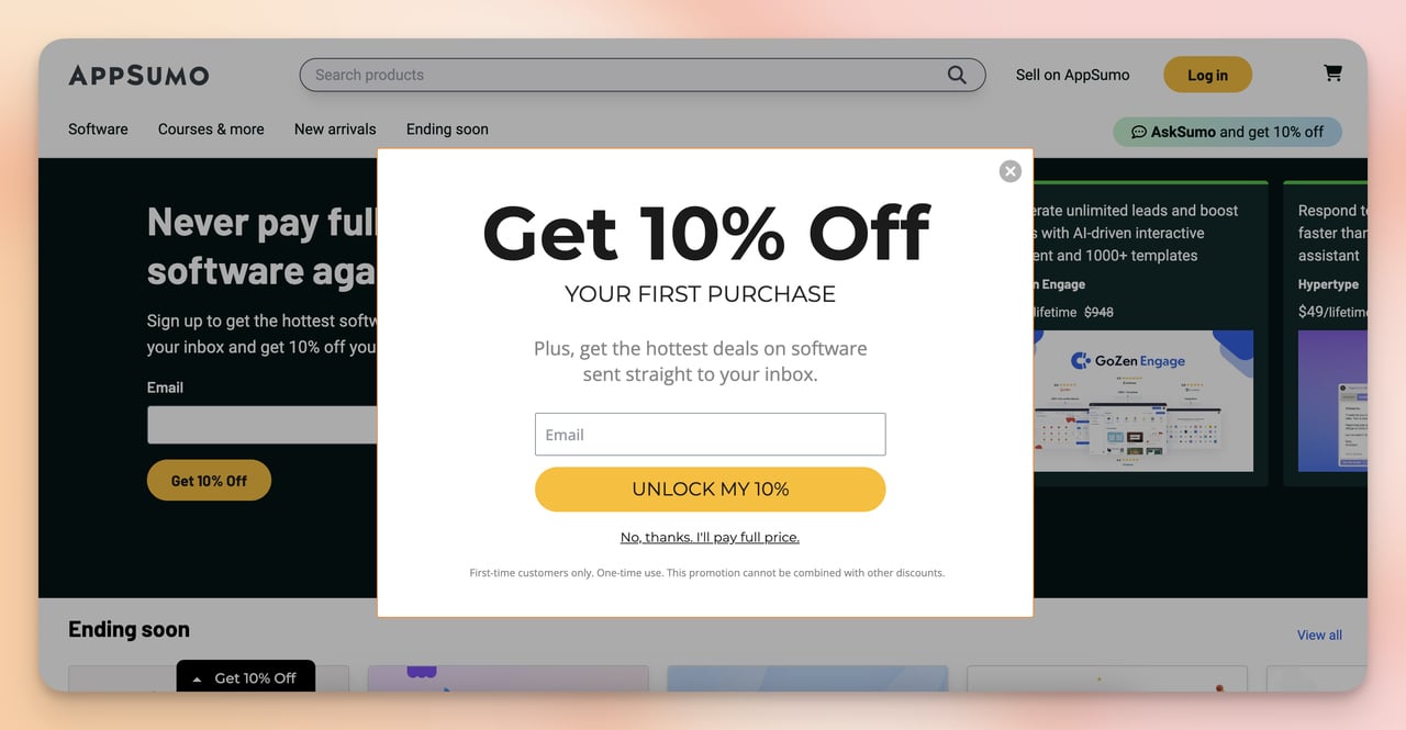
AppSumo's popup leads with a concrete discount for first-time subscribers
What works: AppSumo's popup gets straight to it: enter your email, get 10% off. No extended explanation, no list of benefits, no countdown. Single email field, clear discount amount, direct CTA. For a deal-focused audience (AppSumo's core users are bargain hunters), this directness is a feature, not a shortcut.
Why it works: The audience AppSumo attracts already understands value-for-money trade-offs — they're on the site because they want deals. A popup that says "10% off" matches exactly why they're there. This is audience-to-offer alignment at its most direct. The absence of decoration keeps the eye on the discount. According to our own popup conversion benchmark report, discount-driven email popups consistently outperform informational popups in e-commerce contexts. The reason is simple: the value exchange is immediate and quantifiable.
Key takeaway: For e-commerce audiences, a discount popup with a specific percentage outperforms a "join our newsletter" popup by a wide margin. The specificity of the offer ("10% off" vs. "save money") is what drives the conversion.
13. Maguire's Shopify Store Popup: E-Commerce First-Purchase Hook
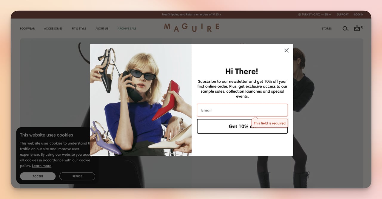
Maguire's popup captures emails with a first-purchase discount offer
What works: Maguire's popup does the e-commerce opt-in right. The offer — 10% off the first purchase — is relevant to a visitor actively browsing products. The form is minimal (email only), the design is on-brand (clean, fashion-forward), and the timing is presumably set to appear after a few seconds of browsing rather than immediately on page load, which would interrupt the shopping experience.
Why it works: The psychology is basic but effective: a visitor browsing a Shopify store is already in buying mode. A popup that offers a discount on the specific thing they're considering adds a reason to commit rather than bouncing. The 10% off "first purchase" framing is better than "10% off" alone because it creates a time-limited use case — the visitor knows the discount expires with their first order, which adds subtle urgency without a countdown. Popups like this are one of the simplest ways e-commerce sites capture contact information at scale, and tools like Popupsmart make the setup straightforward without custom development. For more context, see our guide to Shopify landing page examples that use the same conversion mechanics.
Key takeaway: Tie your popup discount to a specific trigger ("first purchase") rather than offering a general code. "First purchase only" creates a natural urgency without requiring a countdown timer.
Best Practices for Opt-In Page Design
After studying these 13 examples, several patterns show up repeatedly in the pages that perform well. These aren't rules to follow blindly, they're tendencies worth testing against your specific audience.
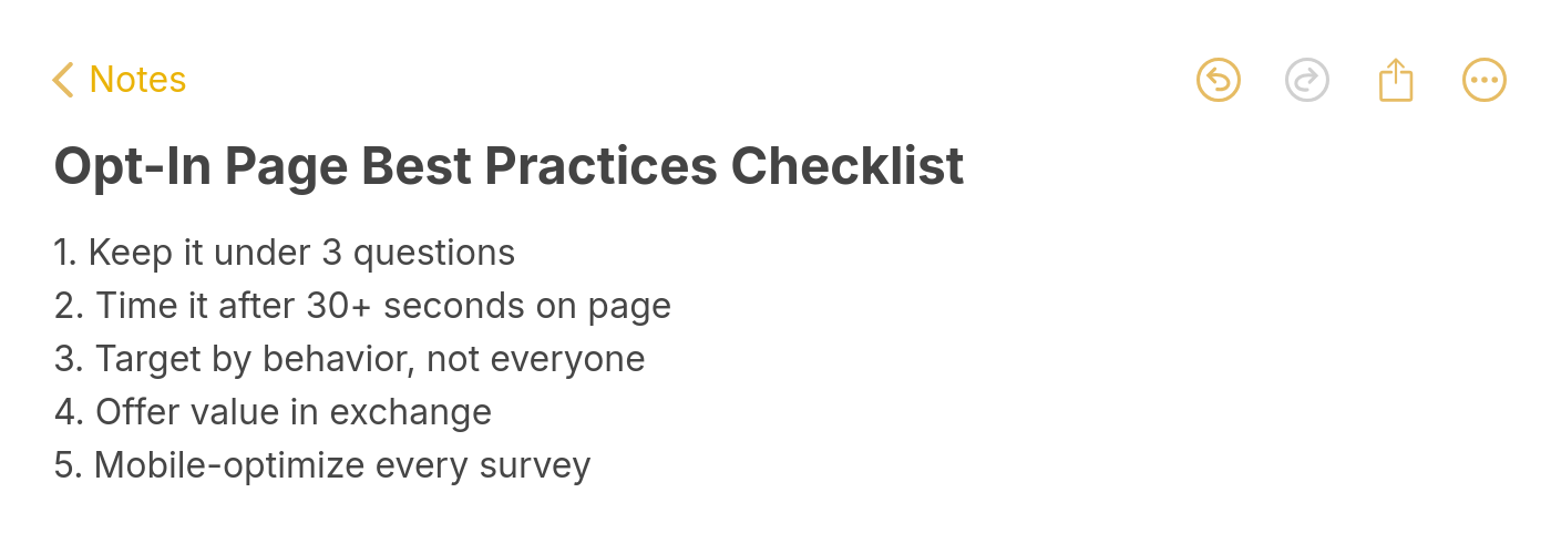
Opt-in page best practices checklist
- Match offer to audience stage: Someone at the awareness stage responds to free educational content (guides, reports, courses). Someone at the decision stage responds to discounts and trials. The examples that fail most often are the ones trying to use an awareness offer with a decision-stage audience, or vice versa.
- Put the highest-value trust signal closest to the form: The Adjust example does this well — logos right next to the email field. Your best social proof belongs at the conversion point, not only at the top of the page.
- Test one field vs. multiple fields: I've seen single-field (email only) forms convert 2-3x higher than five-field forms on the same offer. If you need qualification data, consider collecting it post-signup via email sequence rather than at the opt-in stage.
- Specificity in CTAs: "Get My Free Template" consistently outperforms "Download" which consistently outperforms "Submit." Each step down the specificity scale loses conversion rate. Write the CTA as if finishing the sentence: "I want to ___."
- Address the biggest objection in the subtext: Quip's "We're sending emails less frequently" is the example here. Every offer has a primary objection — identify yours and place the answer visually close to the form.
How to Create Your Own Opt-In Page in 5 Minutes
As a content marketing specialist at Popupsmart, I create and test opt-in forms regularly. Here's the exact process using popup builder Popupsmart's campaign builder, from blank screen to live popup opt-in:
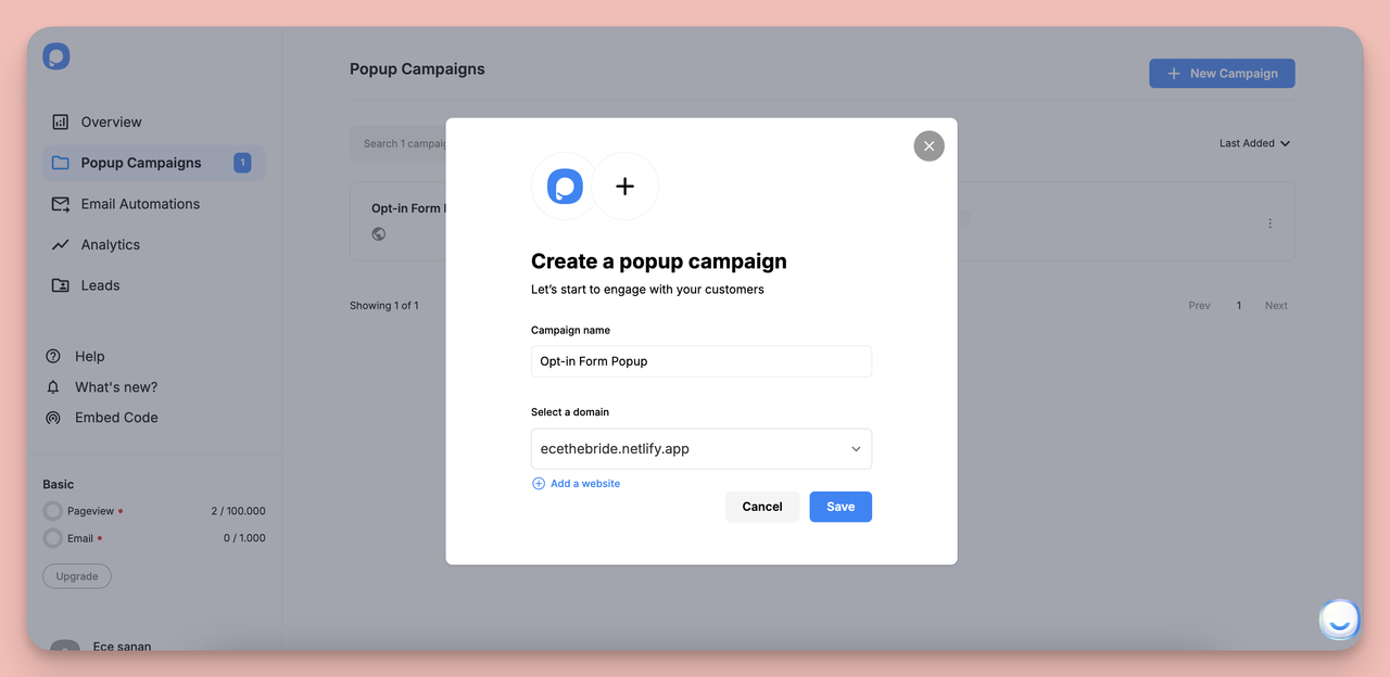
Step 1: Start a New Campaign
Once you sign up to Popupsmart, go to the Popup Campaigns section and click "+ New Campaign." You'll name the campaign first — something like "Newsletter Opt-In — Blog Visitors" keeps it identifiable when you're managing multiple active campaigns.
Step 2: Assign a Domain
Choose the domain you've already linked to your account, or click "Add a Website" to link a new one. The campaign is tied to a specific domain so targeting rules apply correctly.
Name your campaign something specific before moving to the next step
Step 3: Choose a Business Goal
In the Playbook section, select the goal that matches your opt-in objective. For email collection, choose either Collect Form Submission or Grow Email List. These goals filter the template library to show only opt-in-relevant designs.
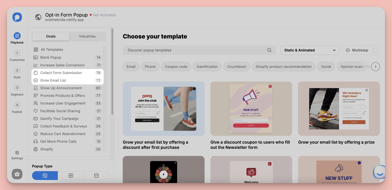
Templates filter by business goal so you see only relevant designs
Step 4: Pick a Template
Browse the filtered templates and pick one that fits your offer type. For visually engaging audiences, the fullscreen popup templates work well. For minimal interfaces (like a SaaS product where users expect clean design), a smaller centered popup with a single field tends to convert better.
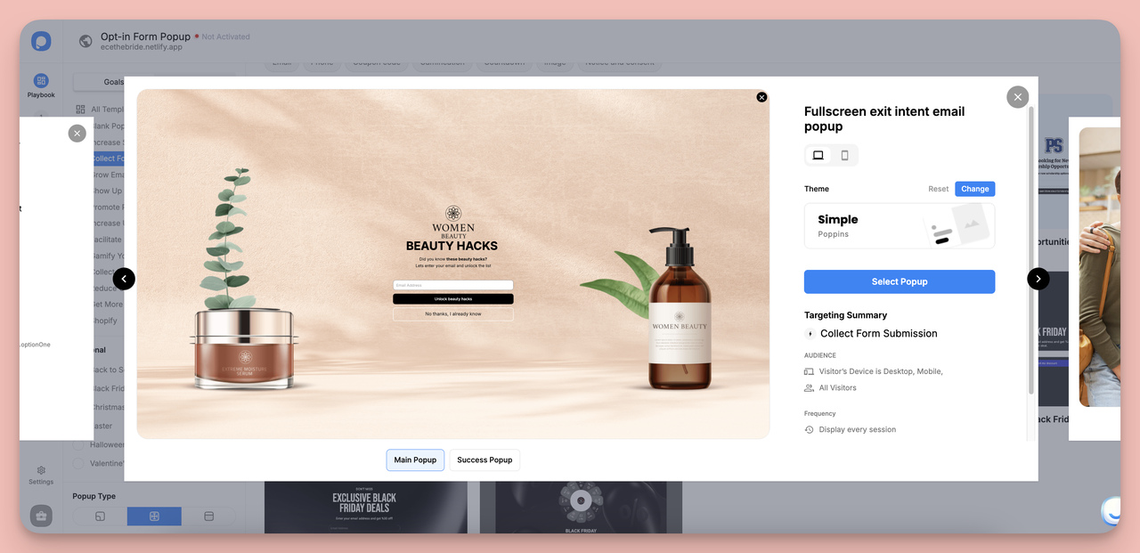
Choose a template that matches your brand style and offer type
Step 5: Customize the Copy and Design
Use the Customize tab to edit text, form fields, and the CTA button. I focus on three things in this step:
- Headline: Name the specific outcome, not the format ("Get 40% more email subscribers" not "Join our newsletter").
- Form fields: Start with email only. Add name only if your email automation requires it for personalization.
- CTA button text: Write it as a first-person action ("Get My Free Guide" not "Download").
Step 6: Set Targeting and Triggers
In the Segment tab, configure who sees the popup and when. The most common trigger options:
- Exit intent (captures abandoning visitors)
- Time delay (shows after 30-60 seconds, when visitor engagement is confirmed)
- Scroll depth (shows after visitor reads 50% of the page — higher intent)
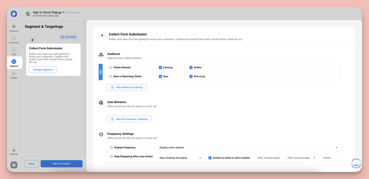
Configure targeting and trigger rules in the Segment tab
Step 7: Preview and Publish
Click Preview to check how the popup renders on desktop and mobile. Mobile rendering is worth checking every time — many templates that look great on desktop have layout issues at smaller breakpoints. Once you're satisfied, click Save and Publish. Your opt-in form is live.
How Visitors Find Opt-In Pages
An opt-in page that nobody reaches doesn't convert. Here are the six main traffic sources that bring visitors to dedicated opt-in pages:
- SEO: For longer-term opt-in pages (evergreen guides, ongoing newsletter signups), organic search can be the largest sustained traffic source. The page needs its own keyword targeting strategy, not just the primary domain's SEO.
- Paid ads: Google, Meta, and LinkedIn ads drive highly targeted traffic to opt-in pages, especially for lead magnets with narrow audience definitions. Paid traffic typically converts at higher rates than organic because of audience matching.
- Email to existing subscribers: Your current email list can drive opt-ins for new offers (upgraded content, event registrations). This sounds counterintuitive but works for nurture-sequence upgrades.
- Social media: According to Shopify's landing page statistics research, paid social media posts convert 10% better than paid search results for landing pages — making social a channel worth testing alongside search.
- Influencer and partner promotion: For B2B, co-branded opt-in pages with a complementary brand can access new audiences without paid ads. For B2C, influencer promo codes linked to opt-in pages are effective for time-limited offers.
- Internal site links: Blog posts, product pages, and even 404 pages can link to opt-in pages. For e-commerce, Shopify email list building tactics often use internal site links alongside popup opt-ins to capture subscribers at multiple touch points.
Key Patterns from Opt-In Page Examples
Looking across all 13 examples, five principles consistently separate the high-performing opt-in pages from the forgettable ones:
- The offer specificity principle: Vague offers ("get our newsletter") lose to specific offers ("get the 47-page SEO playbook we used to grow to 500K monthly visitors"). The more specific the offer, the higher the perceived value.
- The trust placement principle: Social proof belongs closest to the form, not just at the top. The decision moment is the form submit — that's when trust signals do their most work.
- The friction audit: Every form field you add reduces completion rate. Start with email only and add fields only if you have a specific operational reason (not just "it would be nice to know").
- The audience-stage match: Educational offers (guides, reports, courses) work for awareness-stage audiences. Discounts and trials work for consideration-stage audiences. Mixing these up is the most common opt-in page mistake.
- The objection-answer proximity rule: Whatever your audience's primary objection is (spam concerns, pricing, commitment), address it in the subtext directly below the form field — not in the body copy above.
You don't need to implement all five at once. Pick the one that addresses your biggest current gap and test it. Once you have a baseline, run A/B tests on the next principle. That incremental approach to increasing user sign-ups compounds faster than trying to overhaul everything simultaneously.
Ready to put these principles into practice? Start building your own opt-in popup with Popupsmart — free plan available, no-code setup, and it takes about five minutes to go from blank canvas to live campaign.
Frequently Asked Questions About Opt-In Pages
What is the opt-in format?
The standard opt-in format is: headline (stating the offer), value description (explaining what the visitor gets), social proof (testimonials, subscriber counts, or brand logos), a short form (1-3 fields), and a CTA button that restates the offer. This structure can be a full standalone page or a popup on an existing page. The common formats are squeeze pages (minimal, single-focus), long-form opt-in pages (multiple sections, higher-complexity offers), and popup opt-ins (overlaid on existing pages).
What makes a good opt-in page headline?
The best opt-in page headlines name a specific outcome rather than describing a format. "Grow your email list by 40% with these 12 tested popup templates" is stronger than "Download our email marketing guide" because it answers the "what do I get from this" question immediately. According to data from Backlinko's landing page research, pages with outcome-focused headlines outperform format-focused ones across most industries.
How do popup opt-ins compare to standalone opt-in pages?
They serve different functions and aren't really competing formats. Standalone opt-in pages are for dedicated campaigns — SEO, paid ads, or specific offers. Popup opt-ins work on existing traffic, converting visitors who are already on your site. The best-performing setups use both: a standalone page for driving new traffic from external sources, and popup opt-ins to capture subscribers from organic site visitors. For practical examples of how to set up the popup side, see the AI email list building guide which covers automated popup targeting strategies.
Are popup opt-ins still effective?
Yes. Popup opt-ins remain one of the highest-ROI email capture tools available. Our own Popupsmart popup conversion benchmark data shows the average popup conversion rate across campaigns sits around 3.49%, with well-optimized campaigns reaching 10%+. The key is trigger timing — popups that appear immediately on page load convert poorly. Popups triggered by exit intent, scroll depth, or time delay (30+ seconds) perform significantly better because they reach visitors who have already engaged with the content.
Recommended Reading

How would you rate your experience with this article? 😊