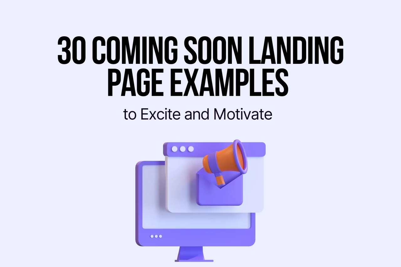
30 Coming Soon Landing Page Examples for 2026
Great coming soon pages aren’t placeholders: they clearly state the value fast, capture leads, look distinctive, and add urgency (timers, beta limits, preorders, social proof). The guide shares 9 build tips, 30 examples across platforms, and optimization stats (short forms, personalized CTAs, A/B tests, mobile).
Coming soon landing pages are the most exciting factor before the website’s real launch.
You can excite your visitors and increase their curiosity about your brand. These 30 coming soon landing page examples show how brands across e-commerce, SaaS, and entertainment build pre-launch buzz, collect emails, and validate demand before going live. Each example includes a design breakdown, the conversion principle behind it, and a takeaway you can apply to your own pre-launch page today.
What Makes a Great Coming Soon Landing Page?
I've reviewed over 100 pre-launch pages across Shopify, WordPress, Webflow, and custom-built sites over the past two years. These 30 made the cut based on four criteria:
• Lead capture mechanism: The page has an email signup form, waitlist, or CTA that actively collects visitor information rather than serving as a dead-end placeholder.
• Value proposition clarity: Within 5 seconds, a visitor can answer "what is this, and why should I care?" Pages that bury the point below the fold didn't qualify.
• Design distinctiveness: The page does something I haven't seen in at least 10 other coming soon examples, whether it's an unusual layout, interactive element, or copy approach.
• Urgency or anticipation element: A countdown timer, limited beta access, pre-order option, or social proof element that motivates visitors to act now rather than forget.
Why Do Coming Soon Pages Matter for Your Business?
A coming soon page isn't a placeholder. It's a pre-launch marketing strategy that starts generating leads before your product even exists.
Here's why that matters for your bottom line:
• Email list building starts day one. Every day without a landing page is a day you're losing potential subscribers who already found you.
• SEO indexing begins early. Google starts crawling your domain the moment it's live. A well-optimized coming soon page gives your site a head start on building domain authority.
• You validate demand before building. According to Woorise, "the best brands aren't just using these pages as placeholders; they're using them to see if their big idea actually sticks."
• Social followers compound. Linking to your social profiles gives visitors a way to stay connected without requiring their email address.
• You collect feedback. Early visitors often have the strongest opinions. A simple feedback form or survey link turns pre-launch traffic into product research.
According to Superside's design research, landing pages have a 160% higher conversion rate than other types of signup forms. That gap gets even wider when you add personalized CTAs, which Email Vendor Selection reports perform 202% better than generic ones.
How to Create an Effective Coming Soon Landing Page: 9 Tips
Before we get into the examples, here are the nine elements that separate forgettable coming soon pages from ones that actually build a waitlist.
1. Lead with your value proposition, not a mystery. Your headline needs to tell visitors what's coming and why they should care. "Something exciting is coming" won't cut it. "The AI writing assistant that cuts editing time by 60%" will.
2. Use strong visuals and intentional design. Your coming soon page is the first impression of your brand. If the design looks rushed, visitors assume the product will be too.

3. Add a countdown timer. Countdowns create urgency. When visitors see a specific launch date ticking down, they're more likely to sign up so they don't miss it. This taps into loss aversion, one of the strongest motivators in behavioral psychology.
4. Include an email signup form with an early access incentive. Don't just ask for emails. Give visitors a reason to hand them over. "Get early access," "Join the VIP list," or "Be the first to know" all outperform a generic "Subscribe." According to Lovable's conversion guide, shortening forms from 11 fields to 4 produced a 120% increase in conversions.
5. Write a clear value proposition. If your visitor can't explain your product to a friend after 10 seconds on the page, your value proposition needs work.
6. Avoid cliches in your copy. "Stay tuned," "Watch this space," and "Coming soon" are filler phrases that add zero value. Replace them with specific, benefit-driven language.
7. Include social media links. Not everyone wants to give you their email. Social follows are a lower-commitment way for interested visitors to stay connected with your brand.
8. Add social proof if you have it. Beta tester quotes, advisor logos, press mentions, or even a "500 people already on the waitlist" counter builds trust before your product ships.
9. Place CTA buttons where visitors actually look. Your primary CTA needs to be above the fold. If the page scrolls, repeat the CTA at the bottom. You can even use a coming soon popup to capture visitors who are about to leave.
Quick Overview of 30 Coming Soon Landing Page Examples
| # | Brand | Category | Why It Works |
|---|---|---|---|
| 1 | Adored Vintage | Shopify | VIP popup captures emails on arrival |
| 2 | Suta | Shopify | Early access offer drives signups |
| 3 | Uppercase Magazine | Shopify | Pre-order section builds anticipation |
| 4 | Cowboy | Shopify | Interactive hero with test ride booking |
| 5 | Notice Hair Co. | Shopify | Community-first email collection |
| 6 | Houston Zoo | WordPress | Event scheduling with clear value prop |
| 7 | Katy Perry | WordPress | Tour dates as coming soon content |
| 8 | Nesswell | WordPress | Beta card offer with wellness branding |
| 9 | Women Working in Technology | GoDaddy | Event-driven pre-registration page |
| 10 | Janz Revolver | GoDaddy | Minimal info + direct contact CTA |
| 11 | Got Good Bones | GoDaddy | Auction date reveals via popup |
| 12 | The Wood Den | GoDaddy | Virtual tour + customer reviews |
| 13 | Cory Mathews | GoDaddy | Self-serve booking system |
| 14 | Amici Barbers | GoDaddy | Appointment booking as pre-launch |
| 15 | Liquid Bidding | GoDaddy | Upcoming auction calendar display |
| 16 | Before Sunset AI | Webflow | Request access with feature preview |
| 17 | TakeProfit | Webflow | Bold visual direction + private beta |
| 18 | Superthread | Webflow | Interactive product demo pre-launch |
| 19 | Creative South | Webflow | Event countdown with ticket sales |
| 20 | Coco | Webflow | Feature walkthrough ending in waitlist |
| 21 | Superlist | Webflow | Interactive design + private beta CTA |
| 22 | Lazy | Other | Product demo + social proof + waitlist |
| 23 | Arc | Other | Curiosity-driven minimal design |
| 24 | Threads | Other | Testimonials with strong CTA loop |
| 25 | Tana | Other | Feature-first with early access gate |
| 26 | Telekinetic Yeti | Other | Tour date reveals with media embeds |
| 27 | Runway Financial | Other | Personality-driven request access page |
| 28 | Manor DAO | Other | Mystery branding with membership CTA |
| 29 | Relay | Other | Direct early access button above fold |
| 30 | Steam Deck | Other | Wishlist CTA with product video hero |
Shopify Coming Soon Page Examples
Shopify powers millions of e-commerce stores, and its merchants have gotten creative with pre-launch pages. These five examples show different approaches to building anticipation on the platform.
1. Adored Vintage: The VIP Email Popup
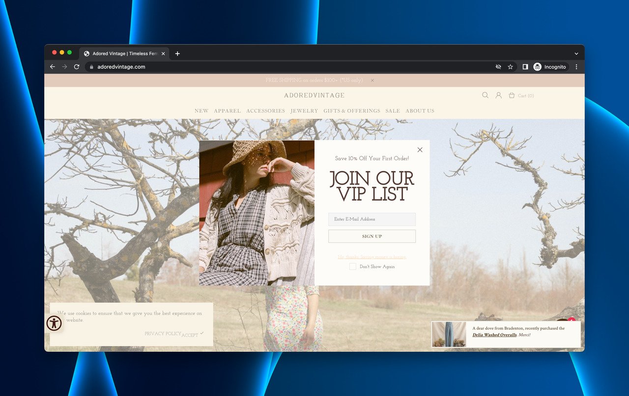
Adored Vintage's VIP popup captures emails on arrival
What works: Adored Vintage (founded in 2012) doesn't use a traditional coming soon page. Instead, a popup greets every visitor with a VIP list signup. The popup fires immediately, before the visitor scrolls, and offers early access to campaigns, deals, and new arrivals. The ask is simple: one email field, one benefit promise.
Why it works: Immediate popups work on returning visitors and brand-curious newcomers because the perceived value ("VIP access") outweighs the cost (one email address). This approach turns every page visit into a lead generation opportunity, not just a dedicated landing page.
Key takeaway: You don't need a separate coming soon page to build a pre-launch list. A well-timed popup on your existing site can capture emails from visitors who are already interested in your brand.
2. Suta: The Cultural Early Access Offer
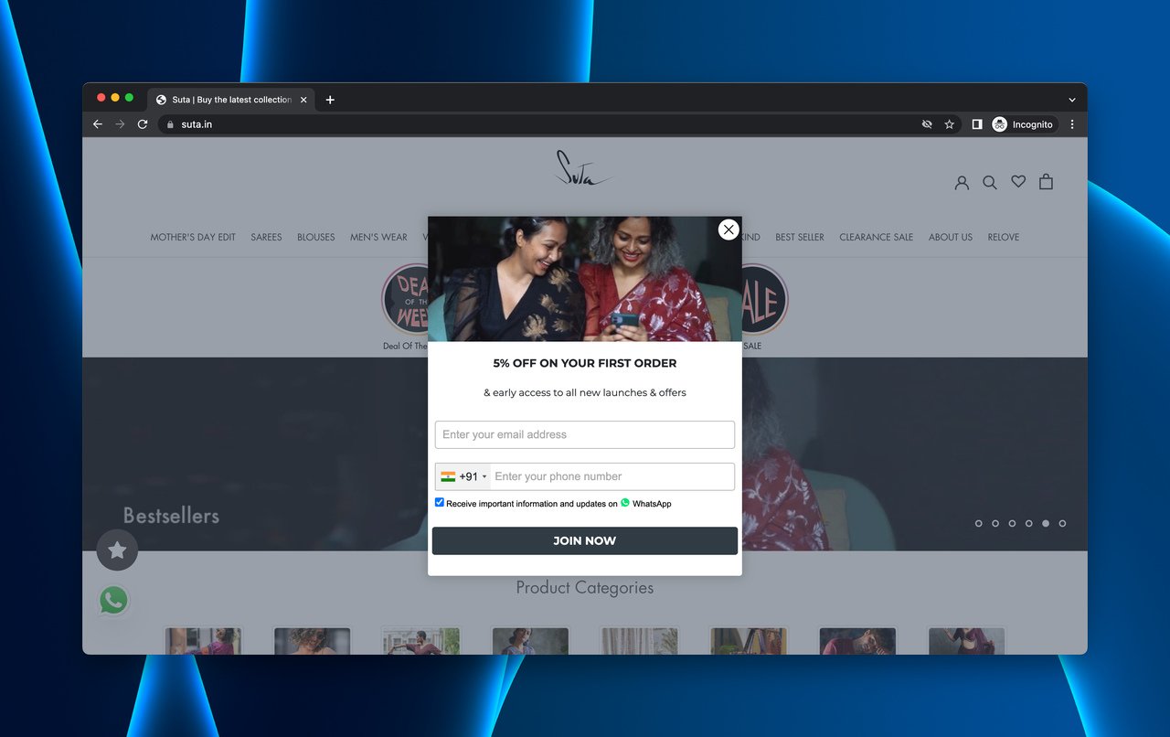
Suta's newsletter popup focuses on early access to new collections
What works: Suta, an Indian handcrafted saree brand, uses a popup that frames email collection as an "early access" opportunity. The popup doesn't say "subscribe to our newsletter." It says "be the first to see new collections." That reframing turns a generic ask into a desirable offer.
Why it works: The language shift from "newsletter" to "early access" triggers the scarcity principle. Visitors feel they're getting something exclusive rather than signing up for marketing emails. Combined with the brand's cultural storytelling, it creates an emotional connection that generic coming soon pages miss entirely.
Key takeaway: Reframe your email capture as an exclusive opportunity rather than a subscription. "Get early access" converts better than "join our mailing list" because it positions the visitor as an insider.
3. Uppercase Magazine: The Pre-Order Countdown
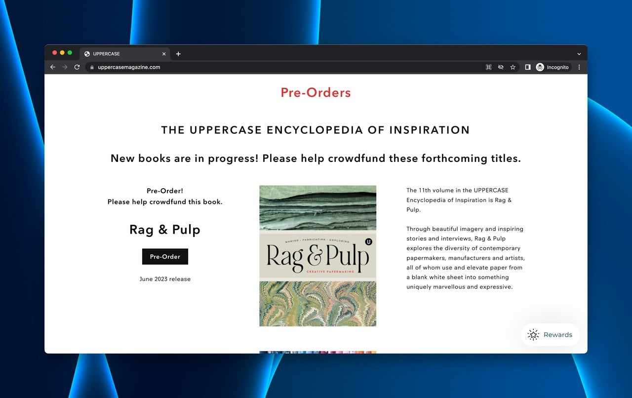
Uppercase Magazine turns future issues into pre-order opportunities
What works: Uppercase Magazine (published since 2009) doesn't treat coming soon as a one-time event. Their landing page features a persistent pre-order section for upcoming quarterly issues. Each future edition has its own product card with a cover preview, description, and pre-order button.
Why it works: By making "coming soon" a permanent part of the page rather than a temporary state, Uppercase turns pre-launch into an ongoing revenue stream. Visitors can commit financially right now, which is a far stronger signal of demand than an email signup. Pre-orders also reduce launch-day risk because you're shipping to confirmed buyers.
Key takeaway: If your product has a recurring release cycle, build a permanent pre-order section instead of a temporary coming soon page. Revenue beats email signups as a validation metric.
4. Cowboy: The Interactive Test Ride Booking
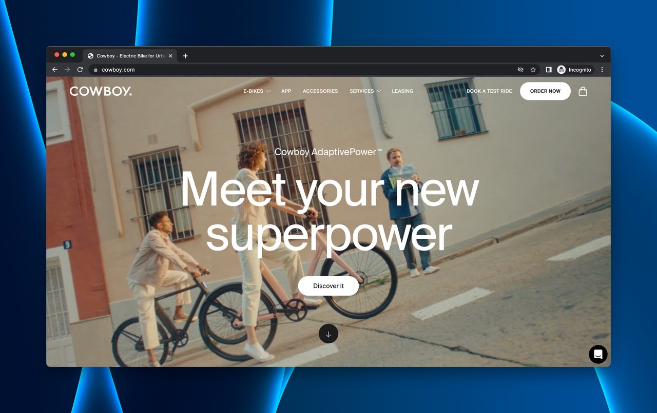
Cowboy's interactive hero section with test ride booking
What works: Cowboy electric bikes uses an interactive above-the-fold hero that feels more like a product experience than a web page. The primary CTA ("Book a Test Ride") appears both in the header navigation and as a popup trigger, giving visitors two paths to the same conversion action.
Why it works: Instead of asking visitors to imagine the product, Cowboy lets them schedule a physical experience. This bridges the gap between digital interest and real-world commitment. The interactive page elements also increase time on page, which correlates with higher conversion rates on pre-launch pages.
Key takeaway: If your product has a physical component, replace "join the waitlist" with an experiential CTA like "book a test ride" or "schedule a demo." Real-world commitment converts to purchase at a much higher rate than email subscriptions.
5. Notice Hair Co.: The Community-First Footer Signup
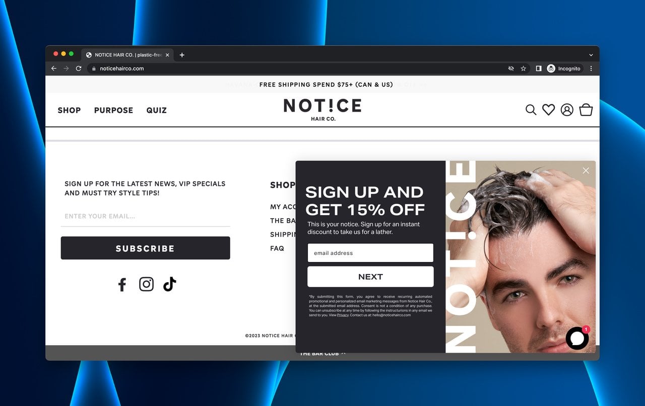
Notice Hair Co. places email capture in the footer with community messaging
What works: Notice Hair Co. doesn't scream "coming soon." The brand's landing page shows a small product catalog, and the email signup lives in the footer. The entire page feels intentionally incomplete, with limited products signaling that more are on the way.
Why it works: The minimalist approach filters for genuinely interested visitors. Only people who scroll the full page and connect with the brand's community-focused messaging will find the signup form. This self-selection means the email list skews toward highly engaged subscribers rather than casual browsers.
Key takeaway: A smaller, more engaged email list outperforms a larger passive one. If your brand has a strong community angle, don't be afraid to make visitors work slightly harder to find the signup. You'll lose volume but gain quality.
WordPress Coming Soon Page Examples
WordPress powers about 43% of all websites, so there's no shortage of coming soon page approaches on the platform. These three examples demonstrate how non-ecommerce brands handle pre-launch.
6. Houston Zoo: The Event Schedule Reveal
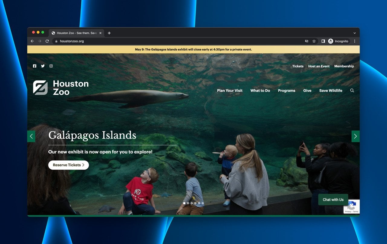
Houston Zoo's landing page doubles as an event calendar
What works: Houston Zoo treats its landing page as a living event calendar. Upcoming visits, reservations, and special events are displayed with specific dates and booking options. The value proposition is immediate: "Plan your visit." No ambiguity, no fluff.
Why it works: Real event photography replaces generic stock images, which builds trust. The page serves dual purposes: it's both an informational resource and a conversion tool. Social media links in the footer create a secondary engagement path for visitors who aren't ready to book. This approach works because it gives visitors a specific, time-bound reason to return.
Key takeaway: For event-based businesses, your coming soon page should function as a live calendar. Specific dates and booking options convert better than vague "stay tuned" messaging because they give visitors a concrete next step.
7. Katy Perry: The Celebrity Announcement Hub
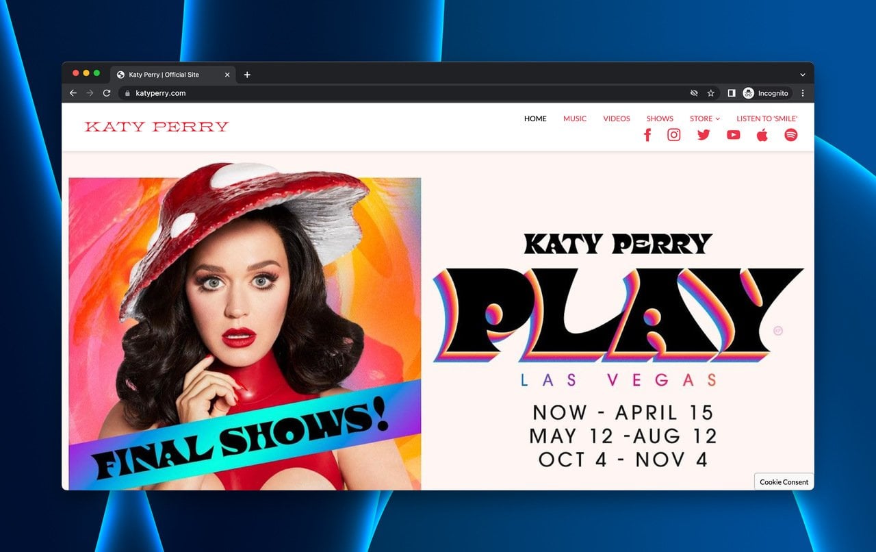
Katy Perry's site uses tour dates as perpetual coming soon content
What works: Katy Perry's official website leads with upcoming concert dates above the fold. Below that, video content and merchandise create multiple engagement layers. The newsletter signup in the footer catches visitors who consume content but aren't ready to buy tickets.
Why it works: Celebrity websites have a built-in advantage: existing demand. The page capitalizes on that by immediately showing what the visitor likely came for (tour dates) and then cross-selling related content. The footer newsletter acts as a safety net for visitors who don't find their city on the tour schedule.
Key takeaway: Lead with the content your audience came for, then layer in secondary conversion paths. Newsletter signups work best as a fallback option for visitors who aren't ready for your primary CTA.
8. Nesswell: The Wellness Beta Card
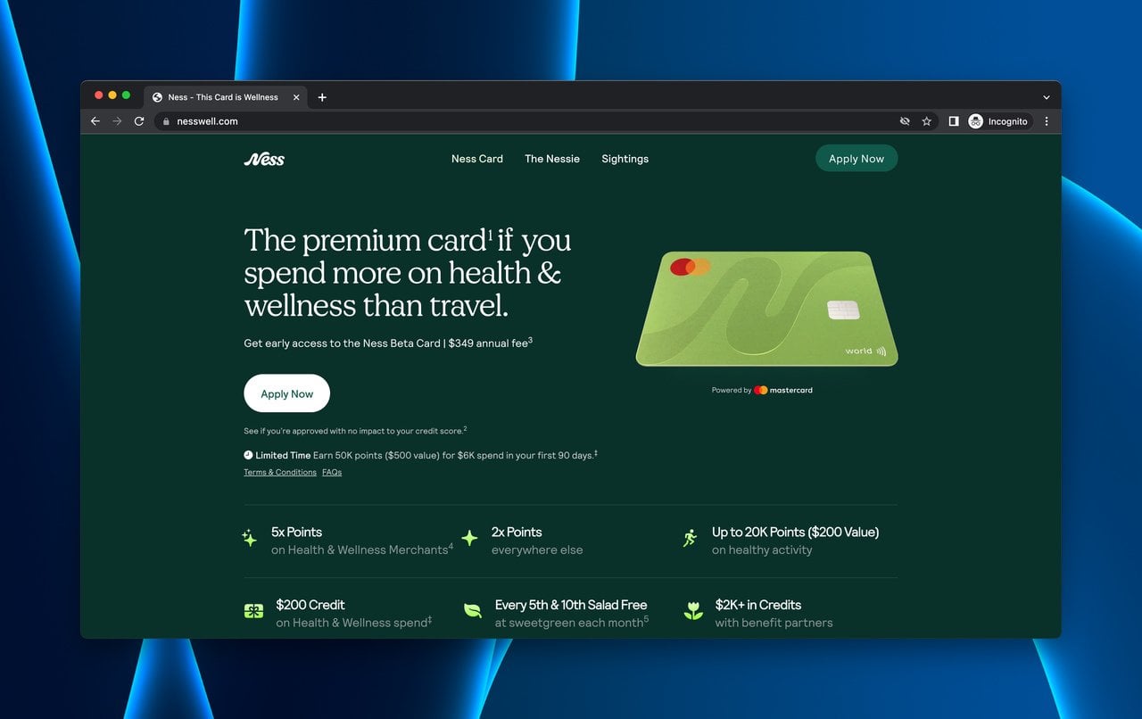
Nesswell's wellness-branded coming soon page for the Ness Beta Card
What works: Nesswell (an anagram for "wellness") offers the Ness Beta Card with a CTA positioned prominently above the fold. The page clearly states terms, advantages, and conditions for potential users. Social proof from early users reinforces credibility. A second CTA button at the page bottom catches scrollers.
Why it works: The green-and-white color scheme immediately signals health and wellness, creating subconscious brand alignment before the visitor reads a single word. The "Beta" label does double duty: it communicates early access exclusivity while managing expectations about product maturity. Placing CTAs at both the top and bottom of the page follows the landing page best practice of capturing visitors at multiple decision points.
Key takeaway: Use color psychology to reinforce your brand's category. Pair it with "beta" or "early access" language to make your coming soon page feel like an exclusive opportunity rather than an incomplete product.
GoDaddy Coming Soon Page Examples
GoDaddy's website builder attracts small businesses and solopreneurs who need a web presence fast. These coming soon pages are simpler by design, but several of them get the fundamentals right.
9. Women Working in Technology: The Conference Pre-Registration
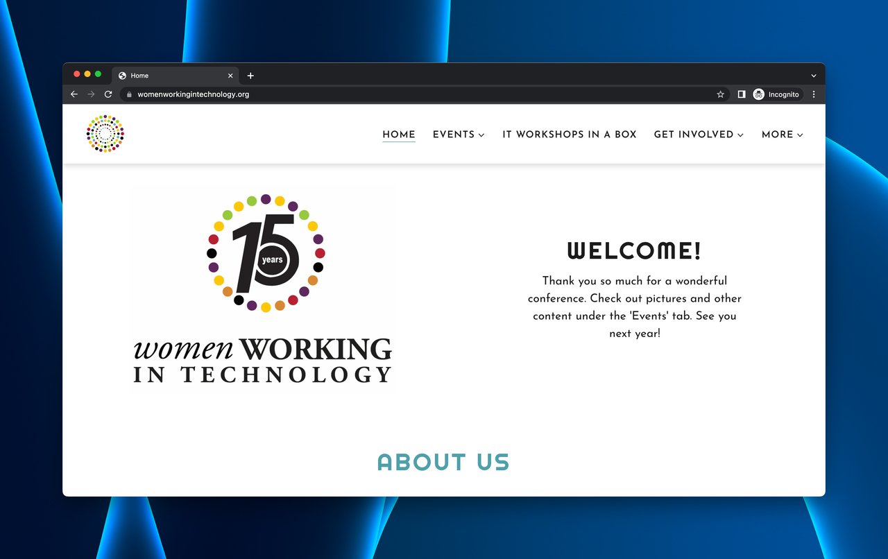
WWT's event-driven coming soon page features speakers and partners
What works: Women Working in Technology (WWT) builds its coming soon page around upcoming virtual conferences. Event videos, partner logos, and board member bios create a content-rich page that answers the natural question: "Who's behind this?"
Why it works: For niche communities, trust matters more than slick design. WWT builds that trust by showing real people (board members), real partnerships (partner logos), and real content (event videos). The weakness here is the absence of a prominent CTA button for event registration, which likely costs them conversions.
Key takeaway: Community-driven coming soon pages should showcase the people and organizations behind the project. But don't forget the CTA. Credibility without a clear next step leaves conversions on the table.
10. Janz Revolver: The Minimal Information Page
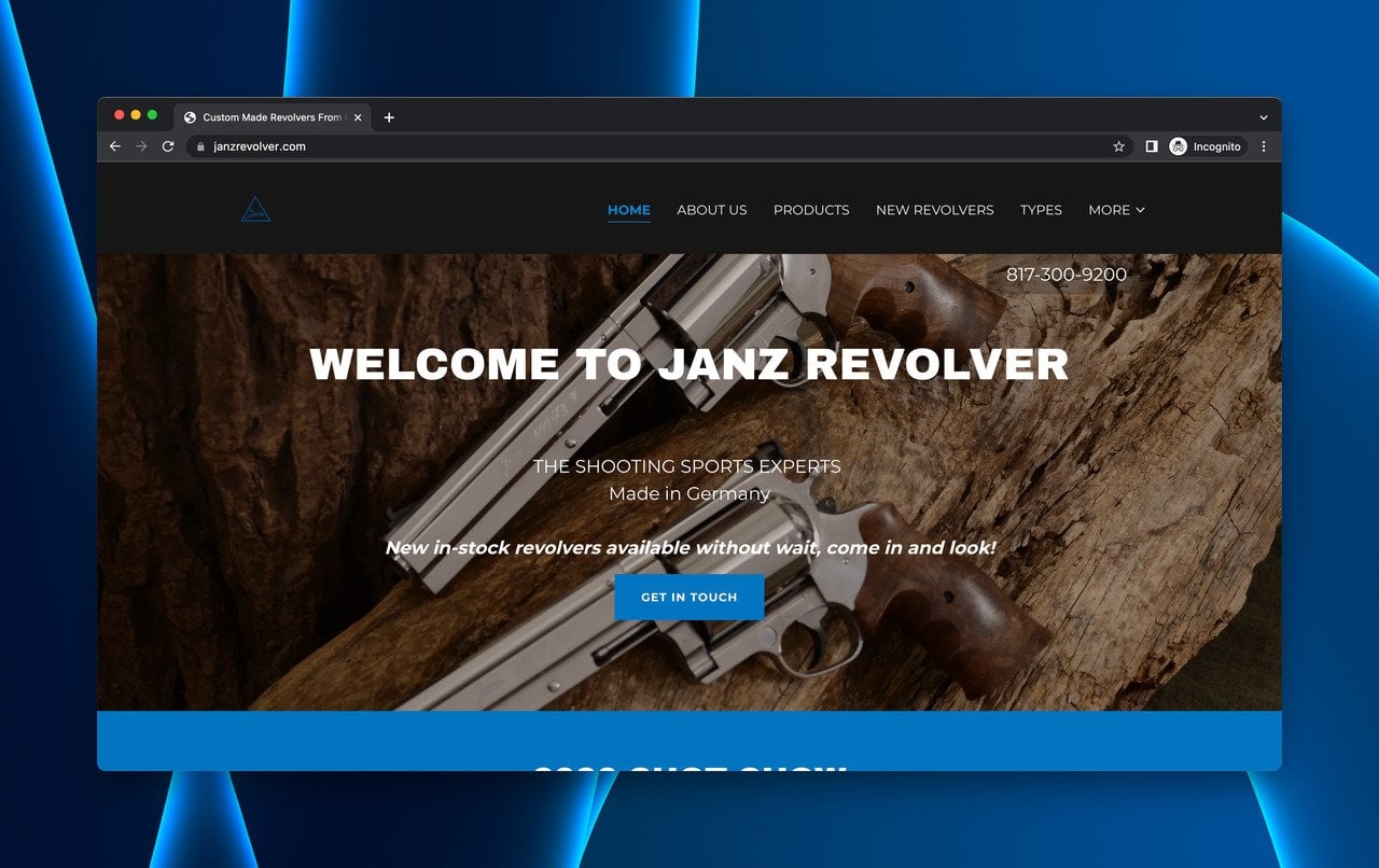
Janz Revolver's stripped-down approach with direct contact CTA
What works: Janz Revolver, a German custom-made revolver manufacturer, keeps their coming soon page extremely lean. Minimal text, a contact CTA, and a phone number in the header. The product stockyard below the fold serves as a visual "coming soon" signal.
Why it works: For high-ticket, niche products, less is more. The buyer for a custom revolver doesn't need 500 words of persuasion. They need to see the craftsmanship (stockyard images) and know how to reach the maker (phone number, contact form). This page respects its audience's expertise and buying process.
Key takeaway: Match your page's information density to your audience's sophistication. Expert buyers for high-ticket products want fast access to specifications and contact information, not marketing copy.
11. Got Good Bones: The Auction Date Popup
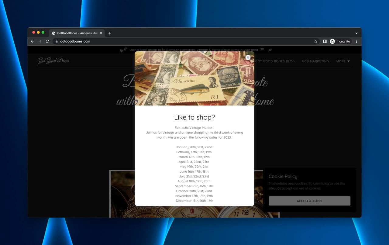
Got Good Bones uses an auction date popup as a coming soon mechanism
What works: Got Good Bones connects antique buyers and sellers through auction events. Their landing page opens with a popup revealing upcoming auction dates and linking to sample images. The main page provides videos, contact information, and brand background.
Why it works: The popup-first approach ensures the most time-sensitive information (auction dates) reaches every visitor regardless of scroll depth. This page is one of the most informative on the list because it stacks multiple content types: video, images, event details, and contact information. Each element serves a different visitor intent.
Key takeaway: If your business runs on scheduled events, use a popup to surface the next event date before anything else. Time-sensitive information loses value the deeper you bury it in the page.
12. The Wood Den: The Virtual Tour Experience
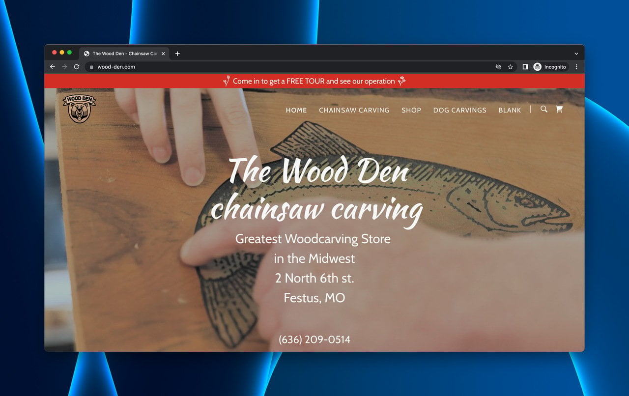
The Wood Den combines virtual tours with social proof
What works: The Wood Den, a handcrafted rustic furniture brand, leads with location info and a floating bar offering virtual tours. The page layers a virtual tour video, available pieces, brand story, and customer reviews. An email subscription bar at the bottom captures remaining interest.
Why it works: Customer reviews placed before the email signup solve the trust problem that most coming soon pages ignore. Visitors see that other people have bought, received, and liked the product before they're asked to commit their email. The virtual tour also reduces the friction of buying handmade furniture online by showing the actual workshop.
Key takeaway: Place social proof before your email capture form. Visitors who read positive reviews first are more willing to share their contact information because trust has already been established.
13. Cory Mathews: The Self-Serve Booking System
Cory Mathews Men's Grooming turns their coming soon page into a booking platform. Visitors select their own appointment dates, creating a "coming soon" experience where they control the timeline. Products and Instagram links round out the page.
What works: The self-serve booking model eliminates back-and-forth communication. Visitors become customers in a single session.
Why it works: Giving visitors control over the "when" transforms a passive coming soon page into an active conversion tool. The Instagram integration keeps the brand visible between appointments.
Key takeaway: For service businesses, let visitors book their own "coming soon" date. Self-serve scheduling converts higher than contact forms because it removes the waiting step.
14. Amici Barbers: The Appointment-as-Anticipation Model
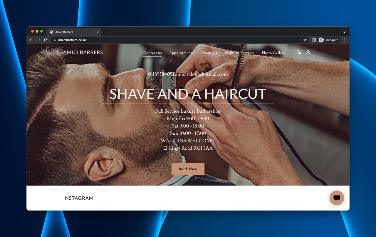
Amici Barbers welcomes visitors with hours and booking options
What works: Amici Barbers greets visitors with a popup showing operating hours, then directs them to appointment booking. The Facebook social link and newsletter signup provide secondary engagement paths.
Why it works: The popup-to-booking flow is efficient. Visitors who care about hours (likely local customers) get their answer immediately, and the booking page is one click away. Unlike Cory Mathews, Amici adds a newsletter option for visitors who aren't ready to book. That layered approach captures leads at different commitment levels.
Key takeaway: Offer multiple commitment levels on your coming soon page. Some visitors are ready to book, some want email updates, and some just want to follow on social media. Capture all three.
15. Liquid Bidding: The Auction Calendar
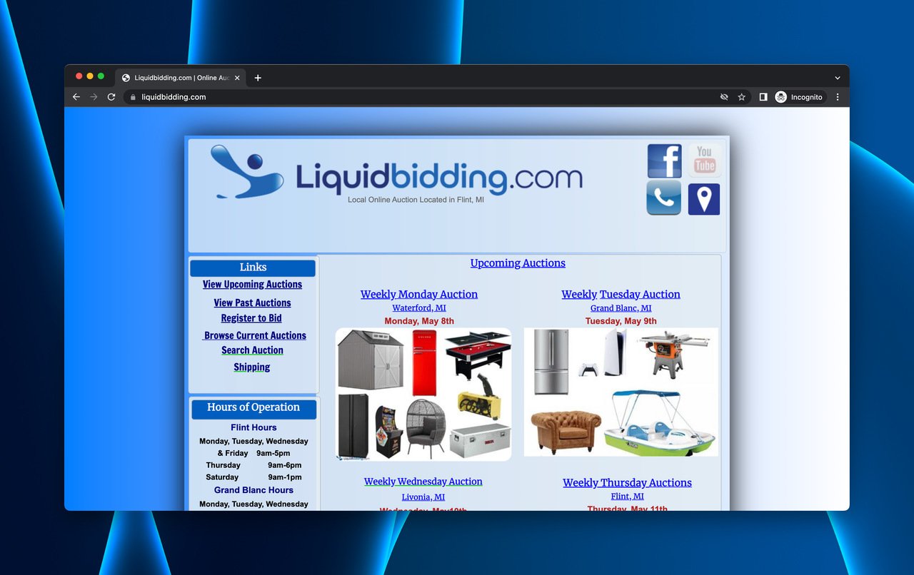
Liquid Bidding's calendar-focused coming soon page
What works: Liquid Bidding strips everything down to what matters: upcoming auction dates. Each auction listing is clickable for details. An email signup captures visitors who want notifications about future auctions.
Why it works: For auction platforms, the product IS the schedule. Liquid Bidding understands this and makes the calendar the entire page. The weakness is design. With only auction listings visible, the page lacks visual appeal and brand personality. But functionally, it gets the job done.
Key takeaway: If your business revolves around scheduled events, make the calendar the hero of your coming soon page. Design matters, but function matters more. A plain page that shows the next auction date outperforms a beautiful page that hides it.
Webflow Coming Soon Page Examples
Webflow attracts design-conscious brands, and it shows. These six examples push the boundaries of what a pre-launch page can look and feel like. If you're building on Webflow, these are worth bookmarking.
16. Before Sunset AI: The Feature Preview Waitlist
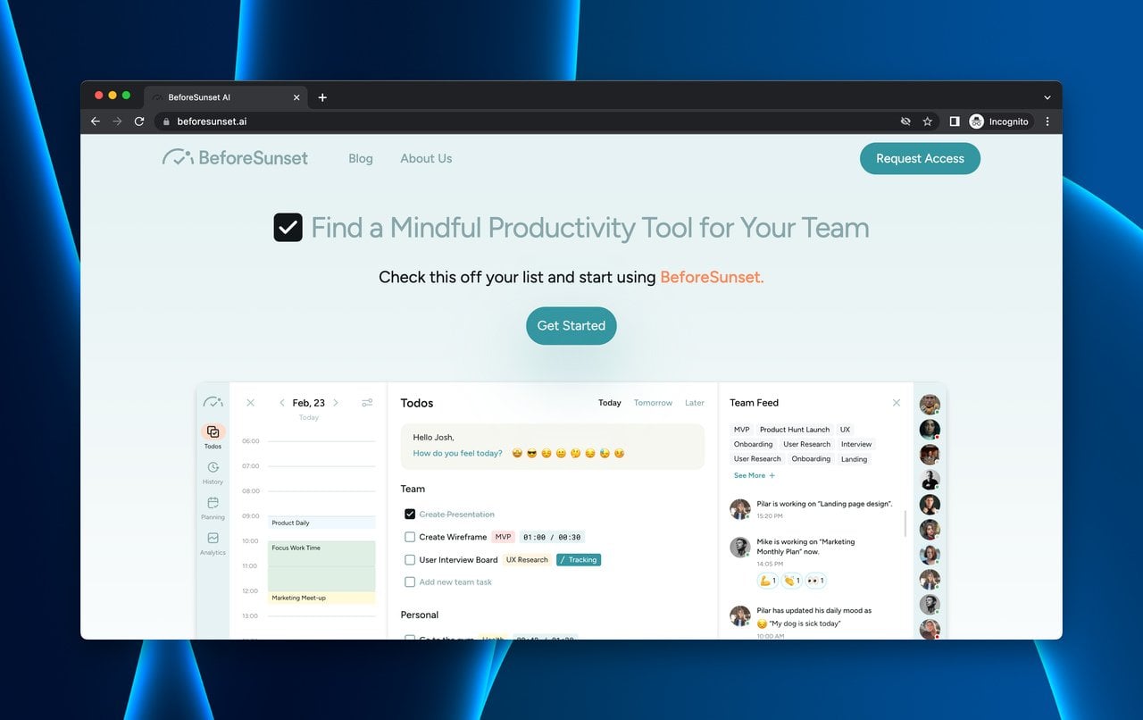
Before Sunset AI previews the product before asking for the signup
What works: Before Sunset AI puts "Request Access" at the top of every page. Below it, the brand walks visitors through features, use cases, and target personas. The page ends with a "Coming Soon" features section that shows the product roadmap. Clicking the CTA triggers an email-only waitlist form.
Why it works: This page follows the B2B landing page best practice of showing value before asking for commitment. By the time visitors reach the CTA, they've seen the dashboard, understood the use cases, and identified whether they're in the target audience. The "Coming Soon" features section does something clever: it generates excitement about features that don't exist yet, turning roadmap items into marketing content.
Key takeaway: Show your product roadmap on your coming soon page. Upcoming features generate anticipation and give visitors a reason to check back, especially if you tie feature launches to waitlist notifications.
17. TakeProfit: The Bold Visual Statement
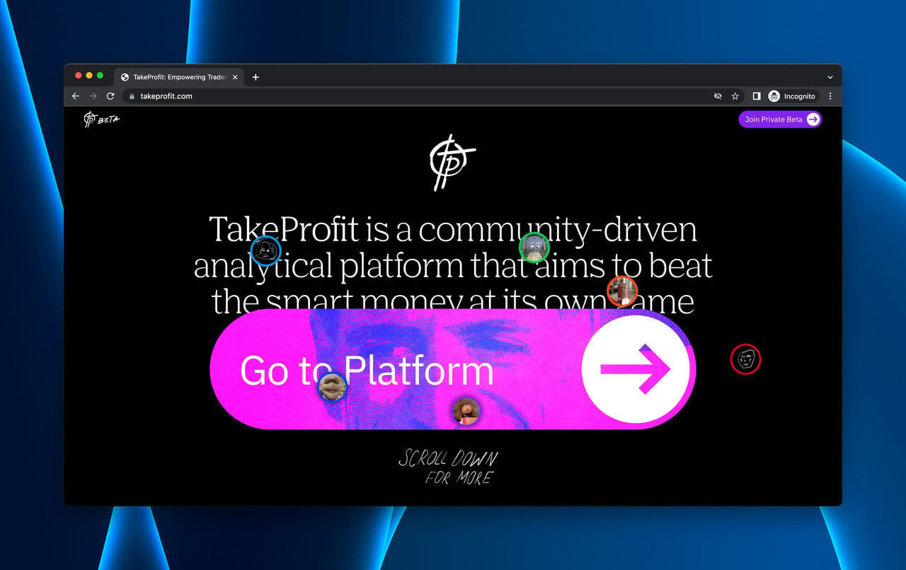
TakeProfit's oversized arrow directs all attention to the platform
What works: TakeProfit breaks every landing page convention. A massive arrow on a black background points visitors toward the platform. The "Join Private Beta" CTA sits in the header. The tone is playful and irreverent throughout.
Why it works: In a market full of sterile fintech landing pages, TakeProfit's personality stands out. The oversized arrow applies Fitts' Law in the most literal way possible: the larger the target, the faster and more accurately users can interact with it. The humor creates memorability, which matters when visitors are comparing multiple trading platforms.
Key takeaway: If every competitor in your space looks the same, be deliberately different. A coming soon page with personality gets shared more often than a polished but forgettable one. Brand voice is a conversion lever.
18. Superthread: The Interactive Product Demo
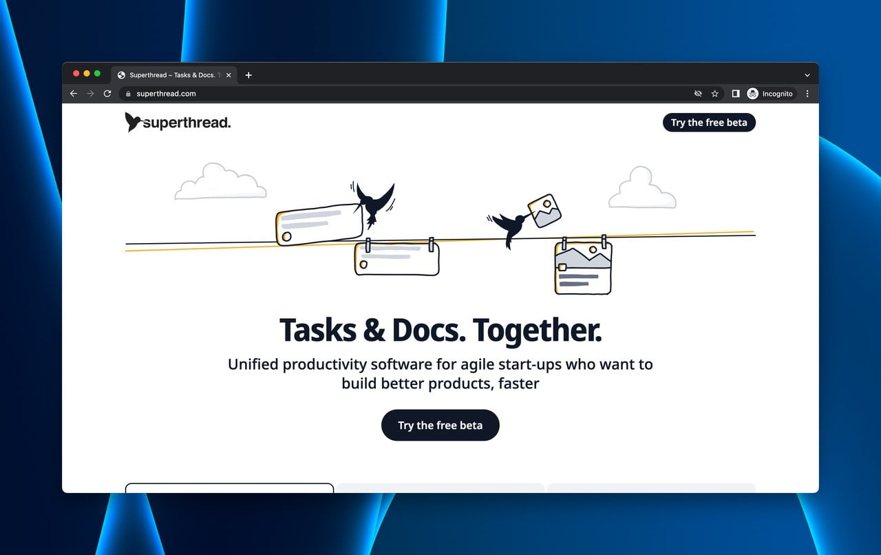
Superthread lets visitors interact with the product before launch
What works: Superthread goes beyond screenshots. The coming soon page features interactive product demonstrations that visitors can click through and explore. After experiencing the product, a CTA offers access.
Why it works: Interactive demos reduce the perceived risk of signing up. Instead of trusting marketing copy, visitors can evaluate the product themselves. This approach also generates qualified leads because only visitors who liked the demo will sign up, making the waitlist more valuable for product feedback.
Key takeaway: Replace static screenshots with interactive demos on your coming soon page. Visitors who experience the product first hand convert at higher rates and provide better early feedback because they already understand what they signed up for.
19. Creative South: The Event Countdown with Tickets
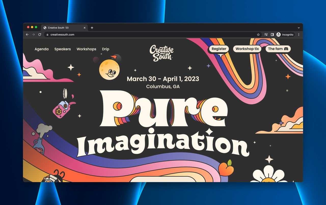
Creative South's elaborate event page serves as a coming soon hub
What works: Creative South (a premier art and design conference) builds a coming soon page that's also a fully functional event site. Dates, speakers, workshop tickets, schedule, accommodations, and sponsorship details all live on one scrollable page. The above-the-fold section is colorful and immediately communicates the event's creative energy.
Why it works: By combining "coming soon" with "buy tickets now," Creative South captures visitors at both ends of the decision spectrum. Early birds can purchase immediately. Undecided visitors can browse speakers and workshops until they find a reason to commit. The page's visual design also serves as proof of concept: if they can make a page this good, the event itself must be worth attending.
Key takeaway: For event-based businesses, your coming soon page should double as a sales page. Don't separate "learn about the event" from "buy tickets." Keep both actions on the same page so the decision is frictionless.
20. Coco: The End-of-Page Waitlist Reveal
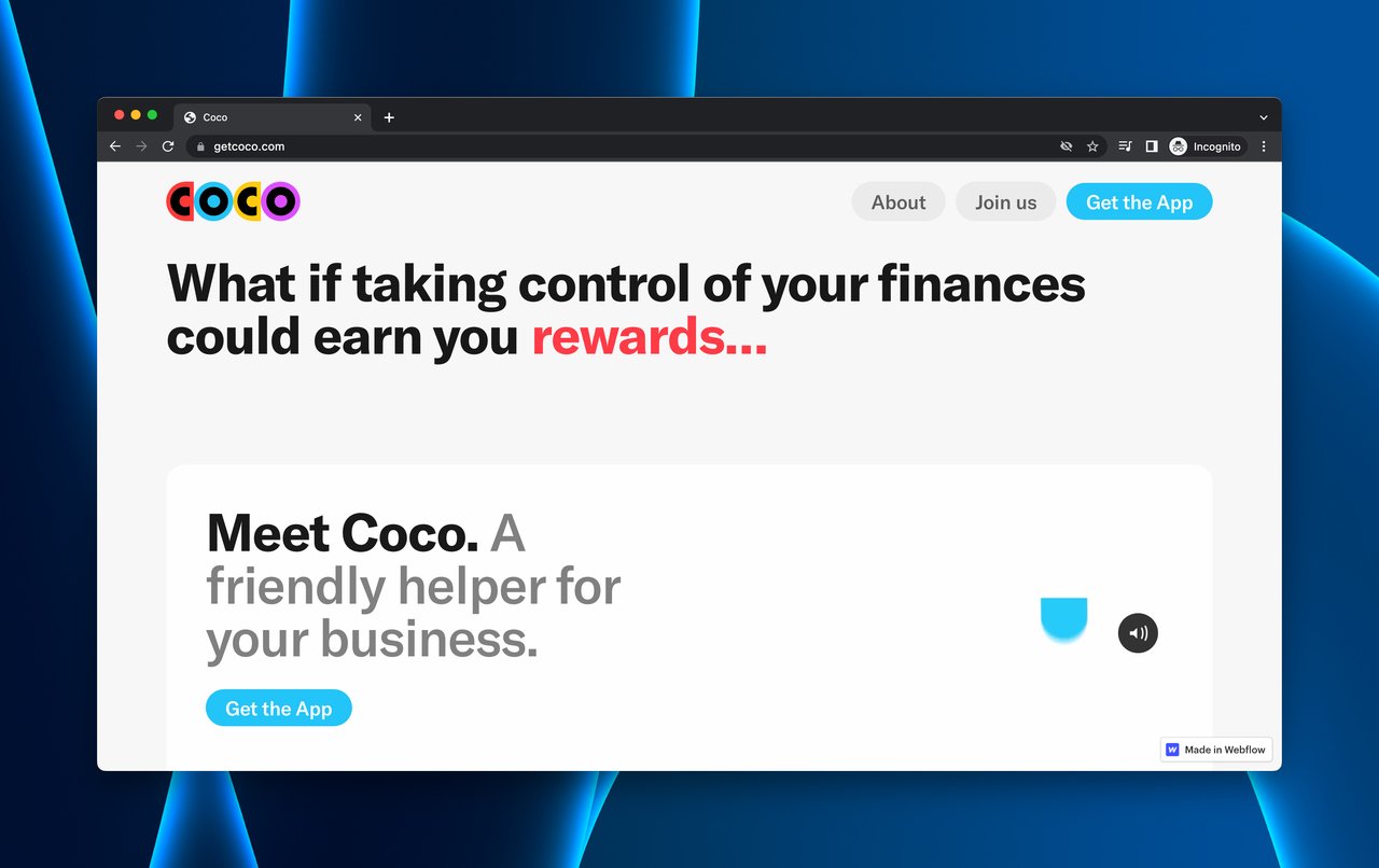
Coco saves the waitlist reveal for the end of the page
What works: Coco (a business finance tool) structures its coming soon page like a sales funnel. The page walks through the product's value proposition, features, and benefits in sequence. The waitlist signup only appears at the very end. Visitors who reach it have consumed the full pitch.
Why it works: Placing the waitlist at the bottom creates a natural qualification filter. Visitors who scroll through the entire page have demonstrated genuine interest. The risk is that some interested visitors might miss it or leave before reaching the bottom. A sticky CTA button or secondary header CTA would solve this without ruining the narrative flow.
Key takeaway: If your product requires explanation, structure your coming soon page as a narrative that builds to the signup. But always add a secondary CTA above the fold for visitors who are already convinced.
21. Superlist: The Animated Private Beta
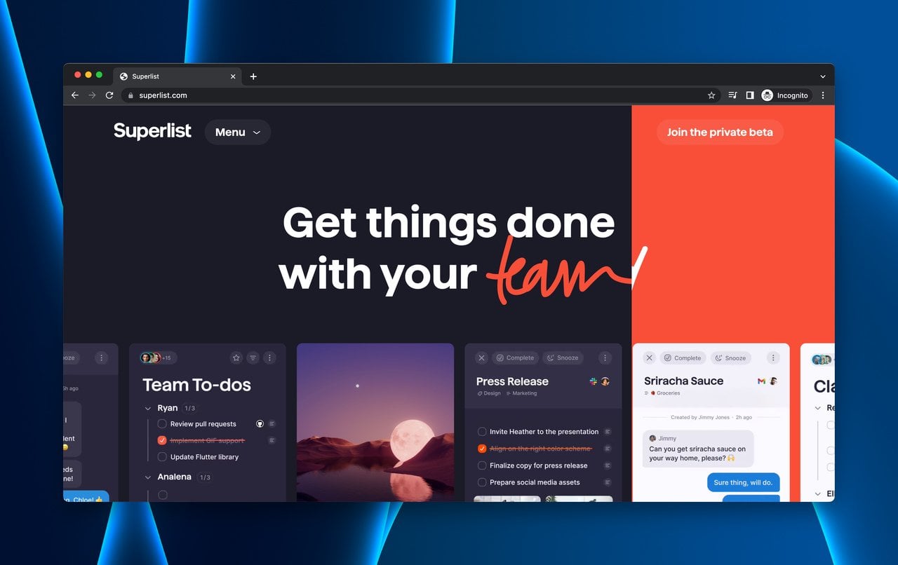
Superlist's interactive design encourages exploration before signup
What works: Superlist (a team productivity app) turns its coming soon page into an interactive experience. Animations respond to cursor movement, and feature sections reveal themselves as visitors scroll. The "Join private beta" CTA is positioned at the top.
Why it works: The interactive elements increase scroll depth and time on page. Visitors who spend more time engaging with a page are statistically more likely to convert. The animations also demonstrate the brand's technical capabilities, which matters for a productivity tool. If they can build a page this smooth, the product probably works well too. Unlike Coco (example #20), Superlist places the CTA at the top so visitors can sign up before or after exploring.
Key takeaway: Use interactive page elements to increase engagement, but put your CTA above the fold. Let visitors choose whether to explore first or sign up immediately.
Other Coming Soon Page Examples
These nine examples come from custom-built platforms, standalone tools, and non-traditional CMS setups. They show that a great coming soon page doesn't depend on the platform you build it on.
22. Lazy: The Full Product Preview
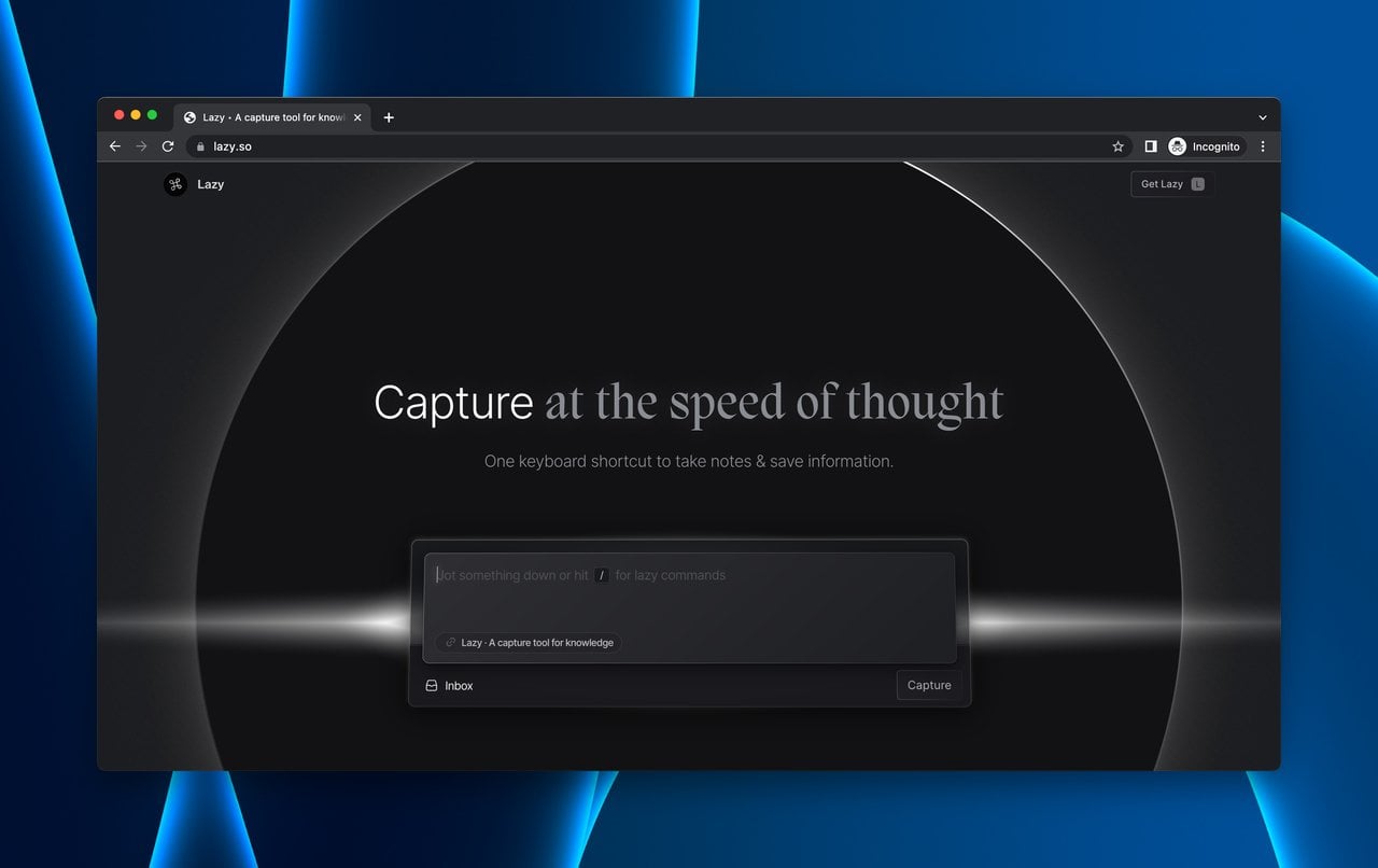
Lazy combines product education with social proof and waitlist access
What works: Lazy (a keyboard shortcut tool) delivers the most information-dense pre-launch page on this list. Custom illustrations explain use cases. User reviews provide social proof. Interactive elements demonstrate the product's functionality. The waitlist access request sits at the bottom, gated behind an email submission.
Why it works: For tools that solve problems visitors didn't know they had, education comes before conversion. Lazy's page teaches visitors what keyboard shortcuts can do before asking them to sign up. The user reviews mid-page act as a trust bridge: "other people found this useful, so maybe I will too." This approach turns a cold audience into a warm one within a single scroll.
Key takeaway: For novel products, your coming soon page needs to educate before it converts. Teach the visitor why they need your product, prove it works with social proof, then ask for the email. The order matters.
23. Arc: The Curiosity-First Approach
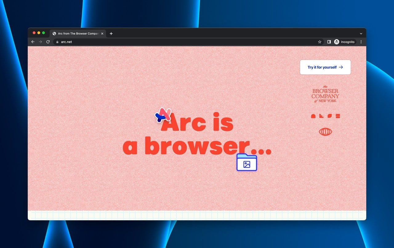
Arc relies on curiosity rather than information to drive signups
What works: Arc browser takes the opposite approach from Lazy. The landing page is deliberately sparse, using bold visuals and minimal text to create intrigue. The CTA says "Try it for yourself" rather than a traditional "Join waitlist."
Why it works: Arc bets on brand awareness and word-of-mouth driving traffic. Visitors who land on this page likely already know what Arc is. The sparse design creates cognitive tension, the brain wants to resolve the mystery, which drives clicks. The weakness: "Try it for yourself" is ambiguous. Visitors don't know if they'll get immediate access or land on a waitlist form until they click.
Key takeaway: Minimalist coming soon pages work best when your brand already has recognition. If you're unknown, prioritize information over mystery. If you're already talked about, curiosity can outperform explanation.
24. Threads: The Testimonial-Driven Loop
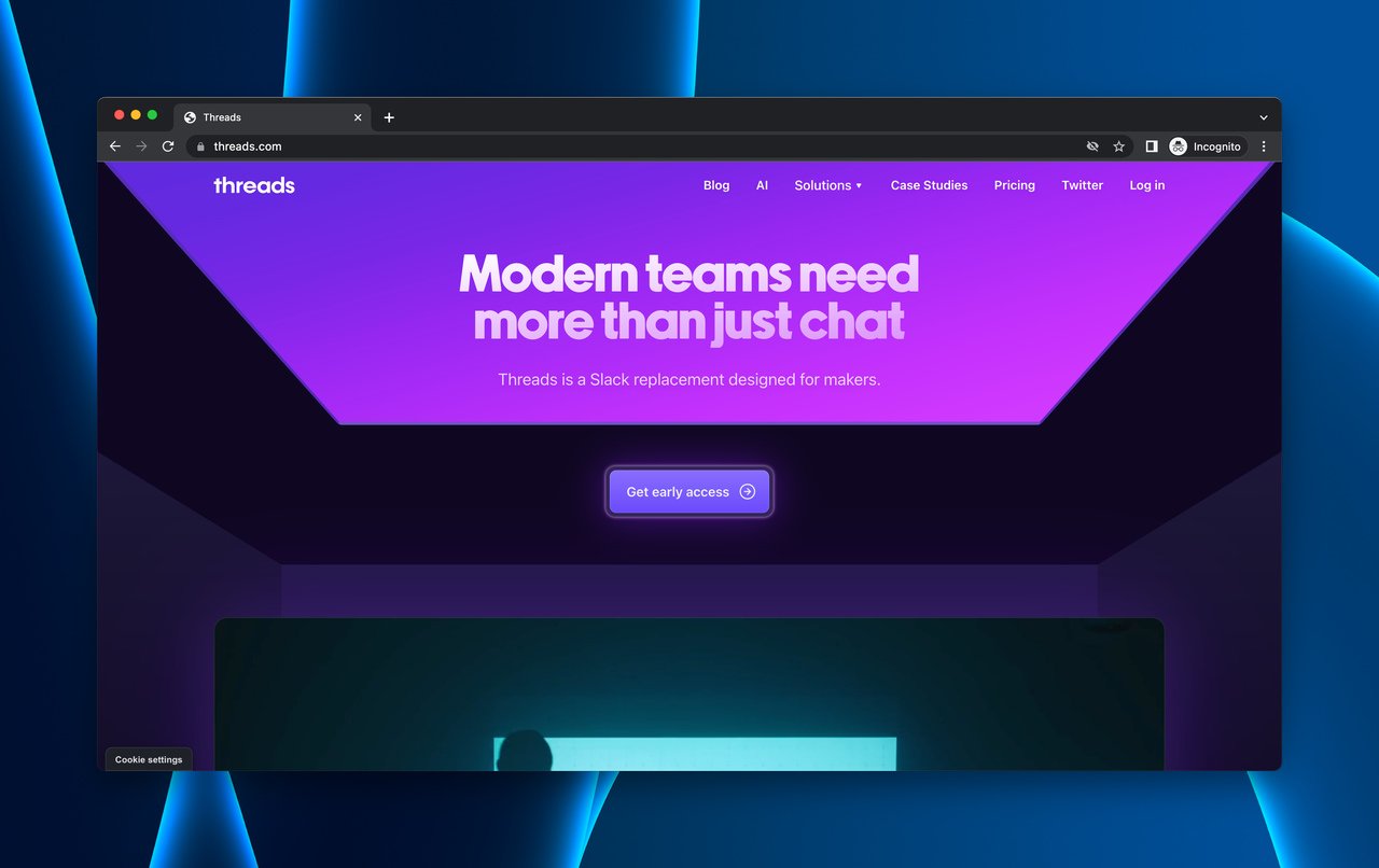
Threads uses testimonials between two CTA placements
What works: Threads (a team workspace platform) sandwiches testimonials between two CTA buttons. The page opens with a clear value proposition and CTA, then shows features via video and interactive images. Testimonials from real users follow. A second CTA closes the page.
Why it works: The top CTA catches decisive visitors. The testimonials catch skeptical ones. The bottom CTA catches visitors who needed convincing and got it. This structure creates two conversion moments with a trust-building bridge between them. The neon-inspired design also differentiates Threads from the typical "blue-and-white SaaS" aesthetic.
Key takeaway: Place testimonials between two CTAs. Visitors who skip the first CTA are signaling that they need more proof. Give them that proof, then present the CTA again. The second CTA typically converts at a higher rate than the first.
25. Tana: The Feature-First Early Access Gate
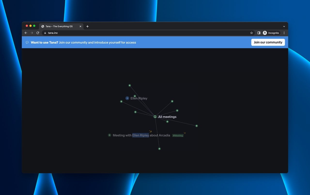
Tana shows every feature before requiring email for early access
What works: Tana (a knowledge management tool) leads with an interactive above-the-fold section, then walks through features with detailed explanations and video demonstrations. User reviews add social proof. Early access is gated behind an email form at the page bottom.
Why it works: Tana's page reads like a product tour rather than a coming soon page. By the time visitors reach the email gate, they've seen enough of the product to make an informed decision about signing up. The feature walkthrough also pre-qualifies leads. Users who sign up after seeing the full feature set are more likely to become active users because they know exactly what they're getting.
Key takeaway: Treat your coming soon page as a product tour. The more a visitor understands your product before signing up, the more likely they are to actually use it when it launches. Pre-qualified leads are worth more than large lists of unqualified ones.
26. Telekinetic Yeti: The Tour Date Reveal

Telekinetic Yeti's page combines tour dates with concert media
What works: Telekinetic Yeti (a psychedelic rock duo) uses their landing page to announce tour dates and drive social media followers. Concert videos and press reviews provide social proof. Tour date links go directly to ticket purchasing pages.
Why it works: The page reduces the distance between interest and purchase. A fan who finds the page can see if a show is near them and buy tickets in two clicks. The concert videos serve a dual purpose: they're entertainment for fans and proof of quality for newcomers. Social media links build an audience that persists between tours, keeping the "coming soon" engine running perpetually.
Key takeaway: Link directly to purchase pages from your coming soon content. Every extra click between "I'm interested" and "I've bought" costs you conversions. If someone wants to buy, let them buy immediately.
27. Runway Financial: The Personality-Driven Access Page
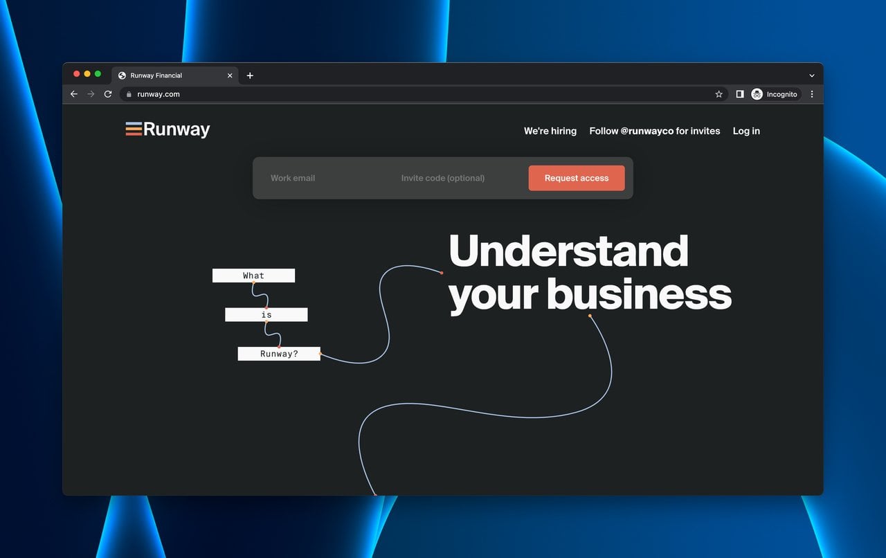
Runway Financial uses humor and personality in its access request page
What works: Runway Financial leads with personality. The copy is self-aware and slightly humorous about financial planning. The "Request Access" CTA is prominent above the fold. The page is built with Svelte for smooth interactions.
Why it works: Financial tools have a personality problem: most of them feel sterile. Runway's humor makes the brand memorable and approachable. The page has gaps compared to other examples (limited feature information, no social proof), but as a first impression, it succeeds by being human. Sometimes brand voice alone is enough to earn a signup.
Key takeaway: Don't underestimate brand voice as a conversion tool. In categories where every competitor sounds the same, a distinctive tone can be the differentiator that earns the signup.
28. Manor DAO: The Mystery Brand
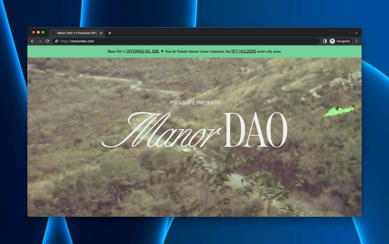
Manor DAO uses mystery and exclusivity to drive membership signups
What works: Manor DAO (an NFT-adjacent investment platform) deliberately withholds details. The page shares conceptual imagery and brand storytelling without explaining exactly what the product does. The membership submission form at the bottom is the only concrete action.
Why it works: For crypto and Web3 audiences, mystery creates FOMO. The target audience is conditioned to "get in early" on opaque projects. This wouldn't work for a B2B SaaS product where buyers need clear ROI justification, but it works in a market where exclusivity is the product. The weakness is real: visitors outside the target audience will bounce immediately because the page doesn't answer basic questions.
Key takeaway: Mystery-based coming soon pages only work when your audience is pre-conditioned to value exclusivity. For most businesses, clarity converts better than curiosity. Know your audience before choosing this approach.
29. Relay: The Direct Early Access Button
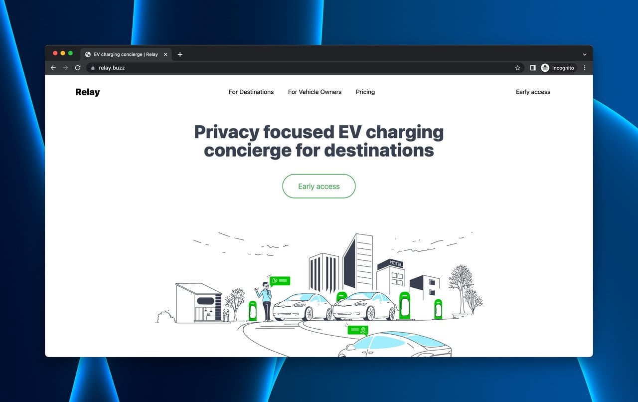
Relay puts early access front and center above the fold
What works: Relay (a tool for managing bad actors in EV networks) keeps the CTA for early access above the fold and visible immediately. Below the fold, the page explains features, how it works, and the problem it solves.
Why it works: For niche B2B products, the visitors who land on your page are already somewhat qualified. They searched for a specific solution. Relay respects that intent by making the signup button immediately accessible. The page could benefit from stronger social proof and more detailed feature explanations, but the core principle is sound: don't make qualified visitors hunt for the signup button.
Key takeaway: For niche B2B tools, put your early access CTA above the fold. Your visitors likely arrived via a specific search query, which means they already know what problem they want to solve. Don't make them scroll for the solution.
30. Steam Deck: The Wishlist CTA with Video Hero
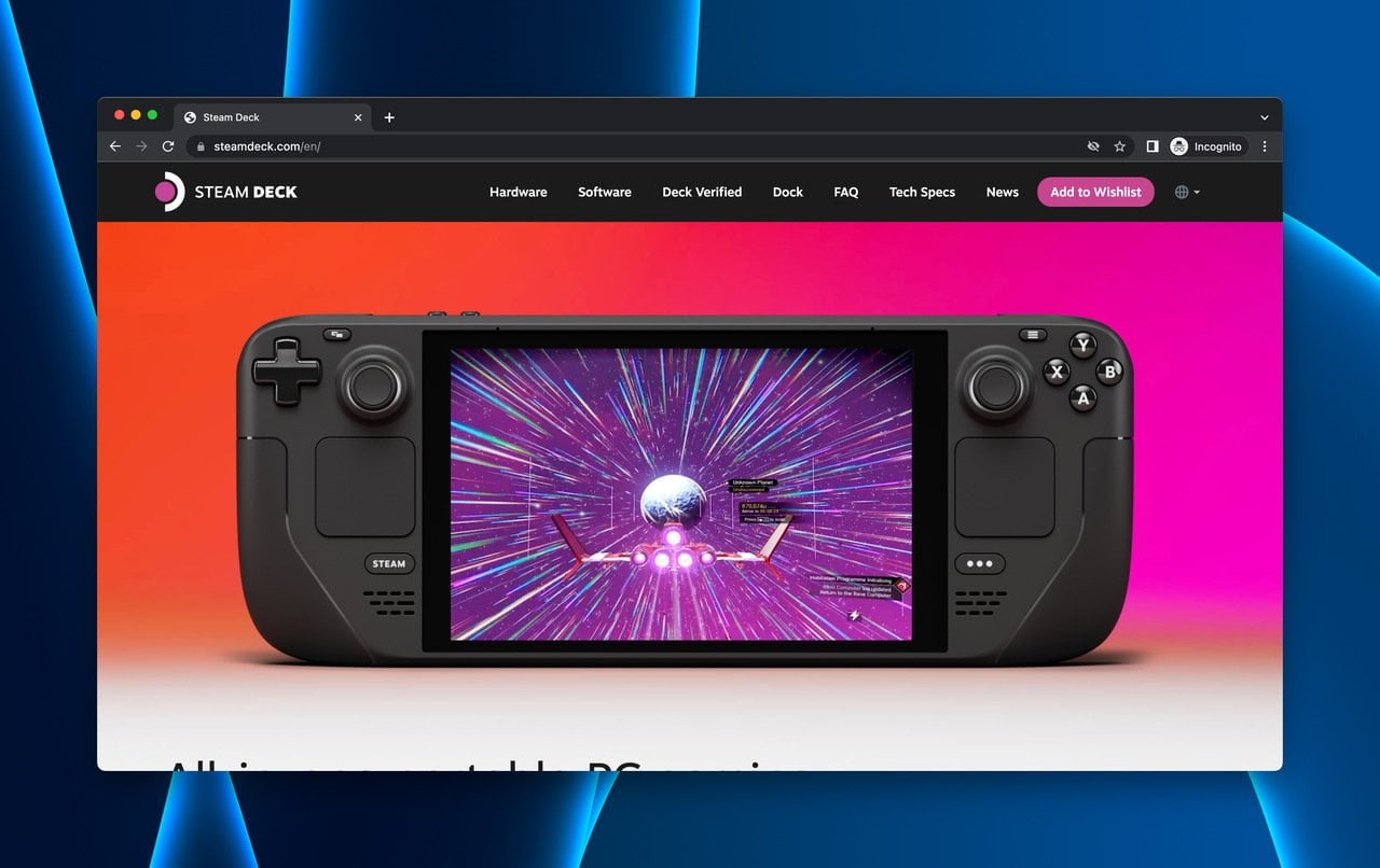
Steam Deck's video hero drives wishlist signups for gaming fans
What works: Steam Deck (Valve's portable gaming PC) opens with a full-width product video that shows the device in action. The "Add to Wishlist" button in the header creates the coming soon effect. Below the fold, pricing tiers, specifications, and compatible game titles give visitors the information they need to decide.
Why it works: Video heroes work for hardware products because they answer the question "what does this look and feel like?" faster than any text or image. The "Add to Wishlist" CTA is specific to gaming culture, where wishlists are a well-understood concept (Steam's platform has trained millions of users to wishlist unreleased games). Using platform-native language ("Wishlist" instead of "Join waitlist") reduces friction because visitors don't need to learn a new mental model.
Key takeaway: Use CTA language that matches your audience's existing behavior patterns. "Add to Wishlist" works for gamers because Steam already trained them on that concept. Find the equivalent for your audience and use it.
How to Optimize Your Coming Soon Page for Conversions
After analyzing these 30 coming soon landing page examples, several patterns stand out. Here are the optimization principles that separate high-performing pre-launch pages from ones that just sit there collecting dust.
Keep your form short. According to Lovable's conversion research, reducing form fields from 11 to 4 increased conversions by 120%. For a coming soon page, one field (email) is usually enough.
Personalize your CTA. Generic "Submit" buttons are conversion killers. Email Vendor Selection reports that personalized CTAs perform 202% better than default ones. Use action-specific language like "Get Early Access" or "Reserve My Spot."
A/B test your page elements. Only 17% of marketers use A/B testing to optimize their landing pages, according to the same study. That means 83% of your competitors are guessing. Test your headline, CTA text, and form placement to find what works for your audience.
Use popups strategically. Several examples on this list (Adored Vintage, Suta, Got Good Bones) use website popups to capture emails. A well-timed email capture popup can boost conversions by capturing visitors who might otherwise leave without signing up. Popup builder tools like Popupsmart let you create these without coding.
Don't ignore mobile. Over half of web traffic comes from mobile devices. If your coming soon page doesn't load fast and look good on a phone screen, you're losing the majority of your potential subscribers. According to Genesys Growth, the median landing page conversion rate across industries is 6.6%. Mobile-optimized pages consistently perform above that benchmark.
Build Your Own Coming Soon Page
These 30 examples prove that pre-launch pages are a marketing tool, not a placeholder. The brands that get the most value from their coming soon pages share three traits: they collect email addresses from day one, they communicate a specific value proposition within 5 seconds, and they give visitors a reason to come back.
Here's what to do next:
• Pick the example closest to your business model and study what makes it work.
• Build a minimum viable coming soon page with at least a headline, value proposition, and email form.
• Add a popup to capture emails from visitors who don't scroll to your form.
• Set up analytics to track conversion rates from day one.
If you're looking for more landing page inspiration, check out our ecommerce landing page examples and B2B landing page examples for industry-specific ideas you can apply to your own pre-launch strategy.
Frequently Asked Questions
What Are Free Coming Soon Landing Page Examples?
Free coming soon page templates are available on platforms like Webflow, WordPress, and Shopify. Webflow offers free starter templates with built-in form components. WordPress has free coming soon plugins (like SeedProd and Coming Soon Page & Maintenance Mode) that add pre-launch pages without custom development. Shopify stores get a default password page that works as a basic coming soon page.
What Are Examples of Coming Soon Page Templates in HTML?
HTML coming soon templates typically include a centered headline, a countdown timer (built with JavaScript), an email input field, a submit button, and social media links. Sites like CodePen and GitHub host open-source coming soon page templates you can download and customize. The basic HTML structure needs a container, heading tag, form element, and footer with social links. Most free HTML templates are responsive and work on mobile without additional configuration.
Do I Need a Coming Soon Page?
It depends on your launch timeline and goals. If you're more than two weeks from launch and want to build an email list, a coming soon page pays for itself. If your product is ready tomorrow and you already have an audience, skip it and launch directly. Coming soon pages are most valuable for new businesses with no existing audience, product launches where you want to validate demand before investing in development, and seasonal or event-based businesses that need to capture interest ahead of time.
How Do I Track the Performance of a Coming Soon Page?
Track three metrics: email signup conversion rate (signups divided by unique visitors), traffic sources (where your visitors are coming from), and bounce rate (how many leave without interacting). Google Analytics handles all three. Set up goal tracking for your email form submission, and you'll have a clear picture of what's working. If you're using a popup for lead generation, most popup tools include built-in analytics that track impressions, clicks, and conversions.
What's the Difference Between a Coming Soon Page and a Maintenance Page?
A coming soon page is for new products or launches that haven't gone live yet. Its goal is marketing: build anticipation, collect emails, and generate buzz. A maintenance page is for existing websites that are temporarily offline for updates. Its goal is communication: tell visitors when the site will be back. They look similar but serve completely different purposes. A maintenance page should set return expectations ("Back in 2 hours"), while a coming soon page should build excitement ("Launching March 15").

How would you rate your experience with this article? 😊