20 Ways to Increase User Sign-ups in 2026
User sign-ups drive revenue, retention, and data, but quality matters. The piece lists 20 tactics to boost sign-ups—reduce form friction, improve CTAs/placement, add incentives, proof, urgency, and iterate with targeting, chat, referrals, and A/B tests.
Increasing user sign-ups requires a mix of form optimization, behavioral targeting, and value-driven incentives. These 20 strategies cover quick wins like simplifying sign-up forms and adding social proof, plus advanced tactics like exit-intent popups and referral programs. Each method includes implementation steps for B2B SaaS and e-commerce teams.
Why Does Increasing User Sign-ups Matter for Your Business?
User sign-ups are the entry point to every growth metric that matters: revenue, retention, and lifetime value. Without a steady flow of registrations, even the best product stalls. Every sign-up is a person raising their hand, saying they want what you offer.
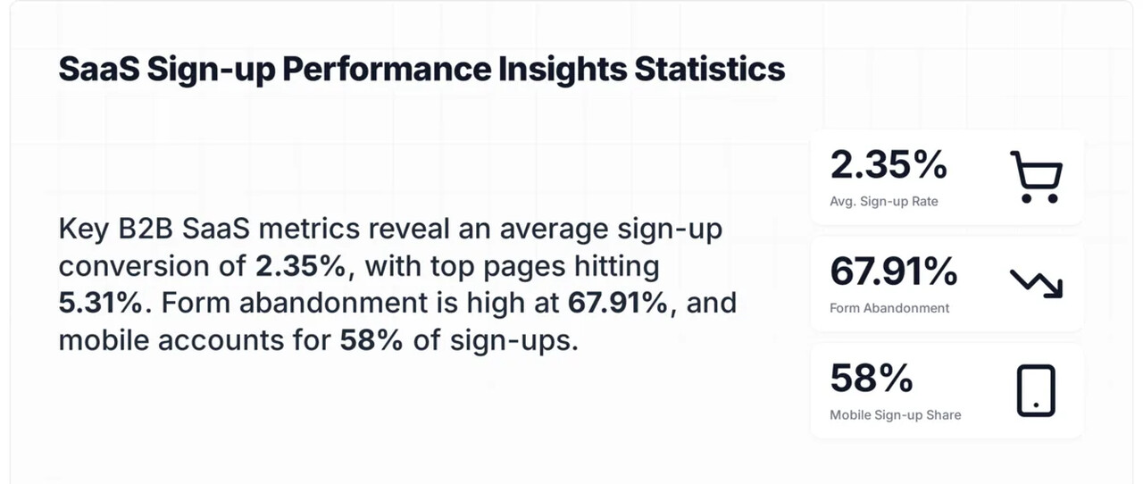
According to Intercom's engagement research, most customers who sign up will use a product only once, which means your sign-up strategy needs to attract the right people, not just more people. A high volume of low-quality registrations wastes support resources and distorts your funnel metrics.
Sign-ups solve several business problems at once:
1. They build a first-party data asset you own (email addresses, preferences, behavior patterns)
2. They open direct communication channels like email and in-app messaging
3. They let you personalize the product experience based on user profiles
4. They create a foundation for user-generated content and community building
5. They feed your conversion funnel with qualified leads who already showed interest
The strategies below are ordered from quickest to implement (under 30 minutes) to most resource-intensive, so you can start seeing results today.
Quick Overview of All 20 Sign-up Strategies
Here are all 20 methods to increase user sign-ups:
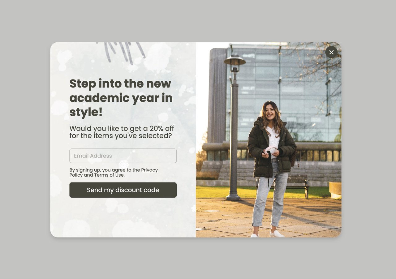
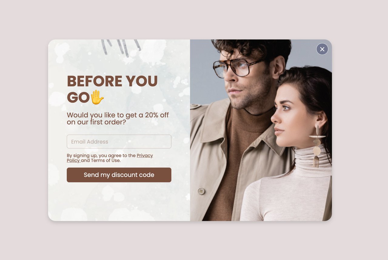
1. Simplify your sign-up form: Remove friction by cutting fields to the bare minimum
2. Know your target audience: Use behavioral data to tailor sign-up messaging
3. Place sign-up buttons where visitors look: Above-the-fold and inline positioning
4. Write CTAs that trigger action: Replace generic text with benefit-driven copy
5. Offer free gifts in exchange for sign-ups: Ebooks, templates, or tools as lead magnets
6. Use discount codes with gamification: Spin-to-win and scratch-card popups
7. Create urgency with countdown timers: Time-limited offers that push immediate action
8. Provide free shipping as a sign-up incentive: E-commerce's highest-converting offer
9. Amplify reach through social media: Cross-channel promotion of sign-up campaigns
10. Add social proof near sign-up forms: Testimonials, user counts, and trust badges
11. Launch seasonal and special campaigns: Holiday and event-driven sign-up pushes
12. Support visitors with live chat: Remove sign-up friction with real-time help
13. Build a newsletter that earns sign-ups: Content-led email list growth
14. Gate premium content behind sign-up: Exchange high-value resources for registrations
15. Create a membership or community tier: Exclusive access as a sign-up driver
16. Display security badges and guarantees: Reduce trust anxiety at the form level
17. Launch a referral program: Turn existing users into acquisition channels
18. Deploy exit-intent popups: Capture abandoning visitors before they leave
19. Collect feedback to trigger sign-ups: Post-interaction surveys that lead to registration
20. A/B test every element of your sign-up flow: Data-driven iteration for continuous gains
1. Simplify Your Sign-up Form: Cut Fields, Gain Registrations
A simplified sign-up form removes every field that isn't strictly necessary for creating an account. Most SaaS products need only an email address (or social login) to get someone started. Every additional field you ask for — name, phone, company size, job title — adds friction that kills conversions.
How to implement:
1. Audit your current form. Count every field, including hidden ones like "How did you hear about us?" and required checkboxes beyond terms of service
2. Cut to one field: email address. If you need more data, collect it during onboarding after the user has committed. Popupsmart popup builder lets you create single-field forms in under five minutes
3. Add social sign-up options (Google, Apple, Microsoft) so users can register with one click instead of typing
4. Make error messages specific. "Invalid email" is better than "Please check your input." Place errors inline next to the field, not in a banner at the top
5. Remove CAPTCHA if your spam rate is below 5%. Use honeypot fields instead — they catch bots without adding friction for real users
According to CXL's conversion research, reducing form fields from 11 to 4 increased sign-ups by 120%. The relationship isn't linear — cutting from 4 to 2 fields shows smaller gains, but going from 6+ fields to 1-2 fields produces the largest jumps.
2. Know Your Target Audience: Build Sign-up Flows That Match Intent
Audience research for sign-ups means understanding what motivates your specific visitors to register, not just who they are demographically. A marketing manager at a 200-person SaaS company signs up for different reasons than a Shopify store owner with 50 orders per month. Your sign-up messaging, timing, and incentives should reflect these differences.
How to implement:
1. Install a behavioral analytics tool (Hotjar, FullStory, or Microsoft Clarity — all have free tiers). Record 500+ sessions and watch where visitors hesitate, scroll past, or abandon sign-up flows
2. Segment your traffic by source. Visitors from Google search behave differently than those from social media or referral links. Create separate sign-up experiences for your top 3 traffic sources
3. Survey existing users within 48 hours of sign-up. Ask one question: "What almost stopped you from signing up?" The answers reveal friction points you can't see in analytics
4. Build 2-3 audience personas with specific sign-up triggers. For each persona, document: what they want to achieve, what they're afraid of, and what would make them sign up right now
We've found that sign-up forms tailored to specific audience segments convert 2-3x better than generic one-size-fits-all forms. When people use audience-specific targeting rules, their popup conversion rates consistently outperform untargeted campaigns.
3. Place Sign-up Buttons Where Visitors Actually Look: Above-the-Fold Positioning
Sign-up placement is about reducing the distance between a visitor's decision to register and the actual form. If someone decides they want to try your product, they shouldn't have to scroll, hunt, or click through multiple pages to find the sign-up button. The best-performing placements put the form exactly where the buying decision happens.
How to implement:
1. Place a primary sign-up CTA in your site header — visible on every page without scrolling. Use a contrasting button color that stands out from your navigation
2. Add inline sign-up forms within blog content at natural decision points. After explaining a benefit or showing a result, embed a form right there. Don't make readers scroll to a separate page
3. Use a sticky bar (also called a floating bar) at the top or bottom of the viewport. It stays visible as visitors scroll without blocking content.
4. Test sidebar placement on desktop for longer content pages. The sign-up form scrolls with the reader and stays accessible throughout the article
5. On mobile, place the primary CTA within the first screen (above 600px viewport height). Mobile users scroll less than desktop users, so below-the-fold placement loses 40-60% of potential sign-ups
According to Neil Patel's sign-up research, placing a prominent sign-up button with a clear value proposition in the hero section of a landing page is one of the most effective quick wins for registration growth.
4. Write CTAs That Trigger Action: Replace "Submit" with Benefit-Driven Copy
Your call-to-action button text is the final micro-decision a visitor makes before signing up. Generic labels like "Submit," "Sign Up," or "Register" tell the user what they're doing but not what they're getting. Benefit-driven CTAs frame the action in terms of the outcome, which consistently outperforms action-only language.
How to implement:
1. Rewrite every CTA button on your site using this formula:[Action Verb] + [Benefit]. "Get My Free Trial" beats "Sign Up." "Start Growing Today" beats "Register Now"
2. Add a one-line value reinforcer directly below the button. Something like "No credit card required. Set up in 2 minutes." This addresses the two biggest hesitations: cost and time
3. Use first-person language on buttons. "Start My Free Trial" outperforms "Start Your Free Trial" because it creates psychological ownership before the user even clicks
4. Test CTA colors. Your button needs to contrast with the surrounding design. According to a CRO case study documented on LinkedIn, simply changing a CTA button color from green to orange led to a 28% increase in sign-ups
In our experience running conversion campaigns at Popupsmart, CTAs that communicate a specific outcome ("Get 500+ Popup Templates Free") convert better than generic CTAs ("Sign Up Now") across both SaaS and e-commerce sites.
5. Offer Free Gifts in Exchange for Sign-ups: Lead Magnets That Convert
A lead magnet is a specific, valuable resource you give away in exchange for a visitor's email address or account registration. The key word is "specific" — a vague promise of "exclusive content" doesn't work. The best lead magnets solve one narrow problem your target audience faces right now, and they deliver the solution immediately after sign-up.
How to implement:
1. Identify your audience's most common question or pain point. Check your support tickets, sales call notes, or search console queries for patterns
2. Create a resource that answers that question completely: a checklist, template, calculator, or short guide. Keep it under 10 pages, longer doesn't mean better for lead magnets
3. Build a popup that presents the lead magnet with a preview image and a single email field. Set targeting rules so the popup appears after 30 seconds on page or at 50% scroll depth
4. Deliver the resource instantly via automated email. Don't make users wait or check back later. Immediate delivery builds trust and trains them to open your future emails
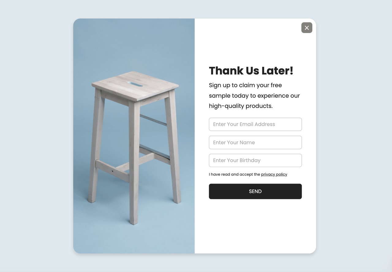
According to lead generation statistics, businesses using targeted lead magnets see 2-3x higher sign-up rates compared to generic "subscribe to our newsletter" forms. The specificity of the offer is what drives the conversion, not just its existence.
6. Use Discount Codes with Gamification: Make Signing Up Feel Like Winning
Gamified sign-up popups turn the registration process from a transaction into an experience. Instead of asking "give us your email for 10% off," you offer "spin the wheel to win up to 30% off." The uncertain reward triggers a psychological response — variable ratio reinforcement — that makes the interaction memorable and the sign-up feel earned rather than traded.
How to implement:
1. Choose a gamification format: spin-to-win wheels, scratch cards, or pick-a-box reveals. Spin wheels are the most tested format and work across both mobile and desktop
2. Set your prize distribution strategically. Make 60-70% of spins land on your target discount (usually 10-15% off), 20% on a smaller prize (free shipping or a mini guide), and 10% on the big prize (25-30% off). Every spin should win something
3. Require email entry before the spin, not after. If users spin first and then see a form, 40-50% will abandon. The curiosity of "what will I win?" is strongest before the reveal
4. Set the popup to trigger on pages with high purchase intent: product pages, pricing pages, or cart pages. Avoid showing gamified popups on blog posts where visitors aren't in buying mode
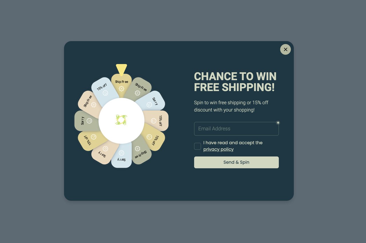
According to AmplifAI's gamification statistics, gamified marketing interactions produce higher engagement rates than static offers. E-commerce stores using spin-to-win popups consistently report sign-up rates above 10%, compared to 2-4% for standard discount popups.
7. Create Urgency with Countdown Timers: Time-Limited Offers That Push Action
Countdown timers work because they shift the decision from "should I sign up eventually?" to "I need to decide now." Loss aversion — the psychological principle that people feel losses more strongly than equivalent gains — is what makes urgency effective. A disappearing offer feels like something being taken away, which motivates action more than a permanent offer that'll always be there.
How to implement:
1. Attach a countdown timer to a specific, genuine offer. "48-hour access to our premium template library" or "This 25% discount expires in 24 hours." The offer must actually expire — fake urgency destroys trust permanently
2. Use our countdown popup templates to display the timer alongside a sign-up form. Place the timer above the form fields so visitors see the deadline before they see the ask
3. Set realistic timeframes. 15-minute countdowns feel manipulative. 24-48 hour windows give people enough time to decide while maintaining urgency. For flash sales, 4-6 hours works well
4. Send a reminder email at the halfway point to users who started but didn't finish signing up. "Your 25% discount expires in 12 hours" recovers 10-15% of abandonments
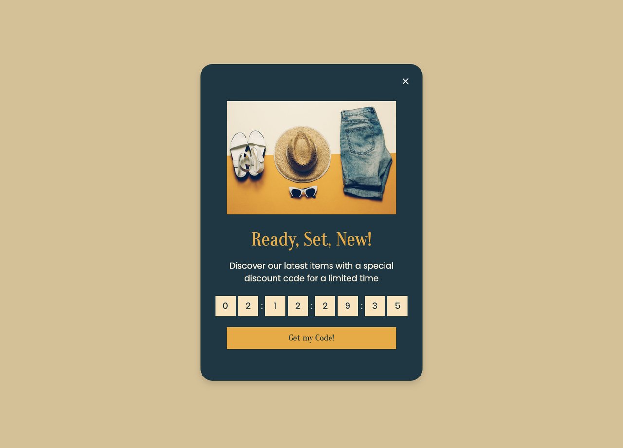
According to ScoreApp's neuromarketing research, scarcity and urgency triggers activate the brain's fear-of-missing-out response, which increases conversion rates on sign-up pages. Countdown timers combined with a genuine limited offer consistently outperform static promotions.
8. Provide Free Shipping as a Sign-up Incentive: E-commerce's Strongest Offer
Free shipping is the single most effective incentive for e-commerce sign-ups because it removes a cost that every online shopper dreads. Unlike percentage discounts that require mental math ("Is 15% off this $47 item worth giving my email?"), free shipping has a clear, universal value. Visitors know exactly what they're saving, and the perceived value often exceeds the actual shipping cost.
How to implement:
1. Create a popup that offers free shipping on the first order in exchange for email sign-up. Display it on product pages and the cart page, these are where shipping cost anxiety peaks
2. Set a minimum order value for the free shipping threshold. "Free shipping on orders over $35 when you sign up" increases both sign-ups and average order value simultaneously
3. Target visitors who've added items to their cart but haven't checked out. Show the free shipping offer as a sticky bar at checkout to capture registrations at the moment of highest intent
4. Auto-apply the free shipping code after sign-up so the user doesn't need to copy-paste anything. Reducing steps between sign-up and benefit delivery improves completion rates
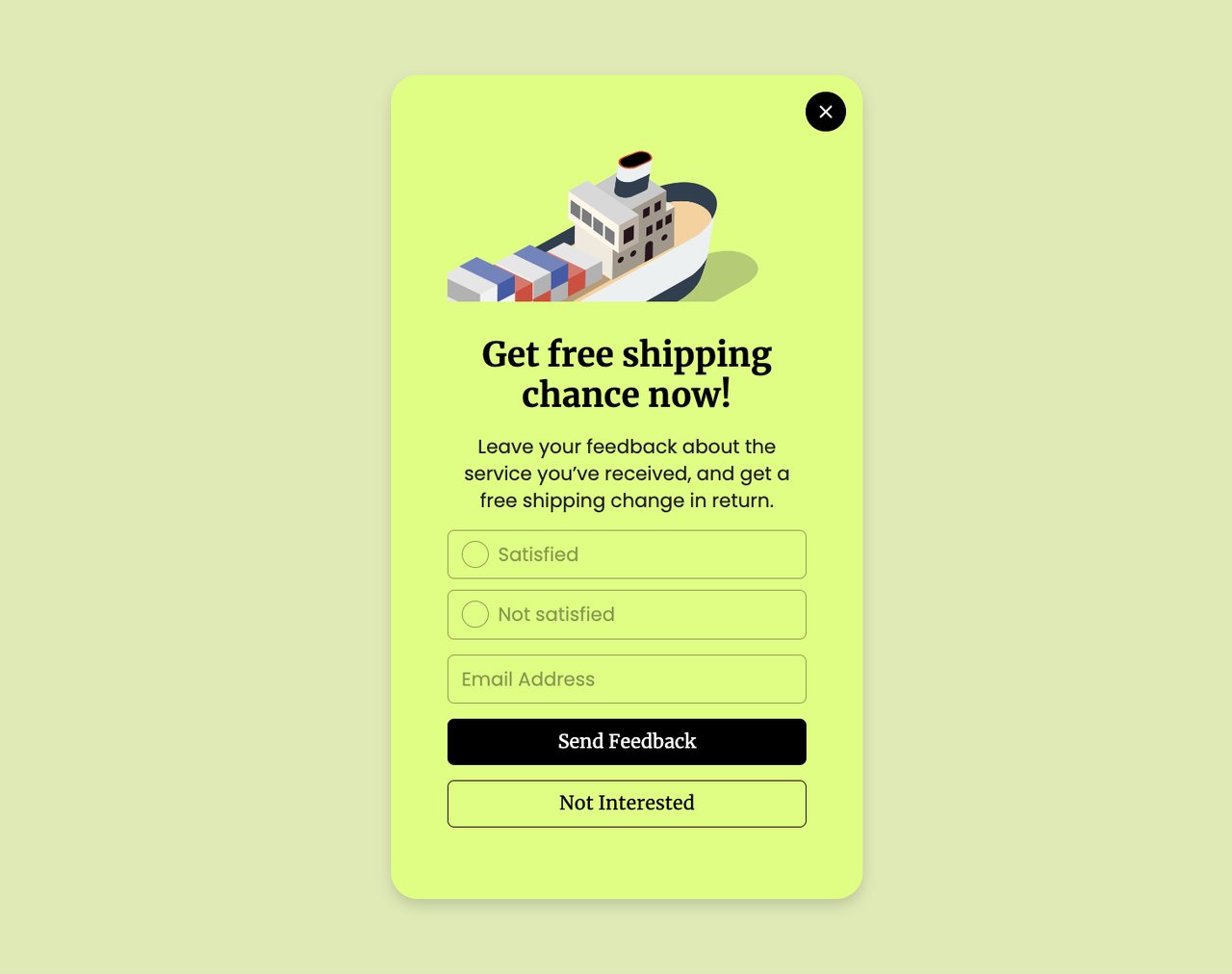
According to HubSpot's marketing statistics, free shipping is consistently ranked as the top motivator for online purchases. E-commerce brands offering free shipping sign-up incentives report 15-30% higher email capture rates than those offering percentage discounts.
9. Amplify Reach Through Social Media: Cross-Channel Sign-up Promotion
Social media extends your sign-up campaigns beyond your website to audiences who haven't visited yet. The goal isn't to collect sign-ups directly on social platforms (conversion rates there are low) but to drive qualified traffic to your sign-up landing pages. Each social channel serves a different function in the sign-up funnel.
How to implement:
1. Create platform-specific teasers for your lead magnet. On LinkedIn, share a data point from your ebook and link to the sign-up page. On Instagram, create a carousel showing 3 key takeaways with "Link in bio" pointing to the form
2. Pin a sign-up promotion to the top of your X and LinkedIn profiles. This converts profile visitors into leads with zero ongoing effort
3. Run "sign up for early access" campaigns for new features or products. Social audiences respond well to exclusivity. "Be the first 500 to try our new dashboard" outperforms "Sign up for our product"
4. Use UTM parameters on every social link so you can track which platform drives the most sign-ups. Allocate more effort to your top-performing channel instead of spreading thin across all platforms
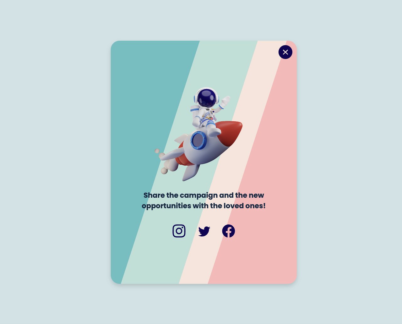
According to Sprout Social's latest data, social media referral traffic accounts for a growing share of website visits, making cross-channel promotion a reliable way to fill the top of your sign-up funnel.
10. Add Social Proof Near Sign-up Forms: Let Other Users Sell the Registration
Social proof works because people use the behavior of others as a shortcut for their own decisions. When a visitor sees "Join 47,000+ marketers" next to a sign-up form, their brain processes that number as validation: if that many people signed up, it must be worth it. The closer the social proof sits to the form, the stronger its effect on conversion.
How to implement:
1. Add a user count directly above or below your sign-up form. Use a specific, real number — "Join 47,382 marketers" is more believable than "Join thousands of users." Update it monthly
2. Place 1-2 short testimonials (under 30 words each) beside the sign-up form. Choose quotes that mention a specific result: "We grew our email list by 340% in 3 months" hits harder than "Great product, love it"
3. Display trust badges from recognized brands near the form. "Trusted by teams at Shopify, HubSpot, and Stripe" leverages brand recognition to reduce sign-up anxiety
4. Create sign-up popups that include a social proof element. A popup saying "1,247 people signed up this week, here's what they got" combines urgency with validation
According to Shapo's social proof research, displaying reviews can increase conversion rates by up to 270%. That same research found that 72% of consumers say positive reviews and testimonials increase their trust in a business.
11. Launch Seasonal and Special Campaigns: Event-Driven Sign-up Pushes
Seasonal campaigns give you a natural reason to promote sign-ups without sounding salesy. Black Friday, New Year, back-to-school, and industry-specific events (like SaaStr for SaaS or Prime Day for e-commerce) create built-in urgency and relevance. The campaign provides the "why now" that pushes fence-sitters to register.
How to implement:
1. Plan your sign-up campaigns around 4-6 key dates per year. For e-commerce: Black Friday, Cyber Monday, Valentine's Day, back-to-school. For B2B SaaS: end-of-quarter pushes, annual conference season, budget planning season (October-December)
2. Create campaign-specific landing pages with sign-up forms that reference the event. "Black Friday Early Access: Sign Up for Our Best Deal of 2026" performs better than a generic sign-up page with a seasonal banner
3. Deploy time-limited campaign popups that auto-deactivate after the event ends. This prevents stale promotions from showing to visitors after the campaign is over
4. Bundle seasonal offers with evergreen value. "Sign up now for 30% off + a free conversion optimization guide" gives the user something that lasts beyond the discount
12. Support Visitors with Live Chat: Remove Sign-up Friction in Real Time
Live chat addresses the gap between "I'm interested" and "I'm not sure enough to sign up." Visitors who have questions about your product, pricing, or data security often leave instead of searching for answers. A chat widget, especially one powered by AI, gives them instant answers at the exact moment their hesitation would otherwise kill the sign-up.
How to implement:
1. Install a chat widget on your sign-up page, pricing page, and homepage. These are the three pages where visitors most often have unanswered questions that block registration
2. Train your AI chatbot on your FAQ, pricing details, and common objections. LiveChatAI lets you train an AI bot on your website content so it can answer product-specific questions without human intervention
3. Set proactive chat triggers. After a visitor spends 60+ seconds on the pricing page without clicking, the chat widget should open with a message like "Have questions about our plans? I can help you pick the right one"
4. Include a sign-up link in chat responses. When the bot answers a question about features or pricing, the follow-up message should include "Ready to try it? Start your free trial here"
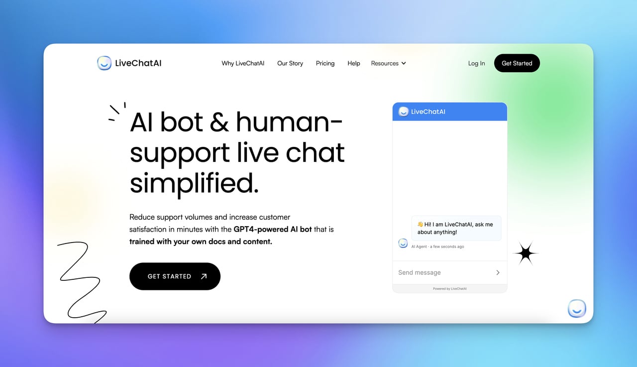
According to Intercom's user engagement research, proactive messaging during the sign-up flow reduces drop-off by addressing objections in real time. Businesses that resolve pre-sign-up questions within 60 seconds see measurably higher completion rates than those relying on FAQ pages alone.
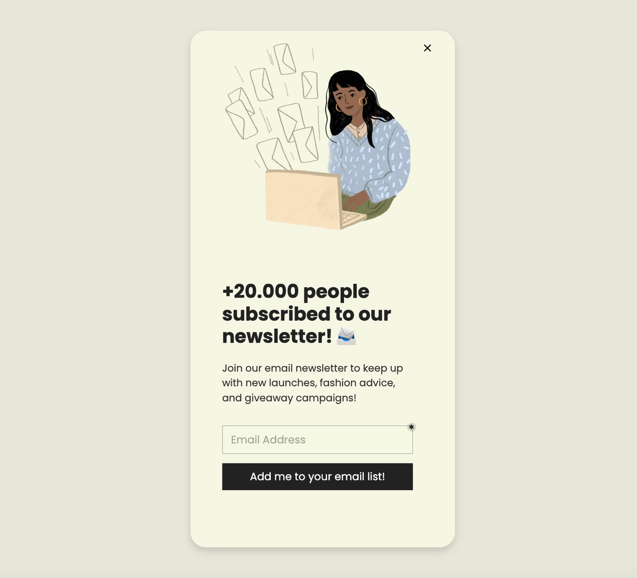
13. Build a Newsletter That Earns Sign-ups: Content-Led Email List Growth
A newsletter sign-up works differently from a product sign-up, visitors are subscribing to your content, not committing to your software. This lower commitment makes newsletters an excellent top-of-funnel sign-up mechanism. Once someone joins your newsletter, you have a direct channel to nurture them toward product sign-up over time.
How to implement:
1. Define your newsletter's specific value proposition. "Weekly SaaS growth tips with real case studies" is subscribable. "Our newsletter" is not. Name it something distinctive if possible
2. Show a preview of what subscribers get. Display a screenshot of a recent newsletter issue or list the top 3 things covered in last month's editions. Transparency reduces "what am I signing up for?" anxiety
3. Place newsletter sign-up forms in three locations: end of every blog post (readers who finished an article are primed), sidebar on desktop, and as a targeted email popup triggered at 70% scroll depth
4. Send re-engagement emails to inactive subscribers every 90 days. A simple "Still want to hear from us?" email re-activates 5-10% of dormant subscribers and cleans your list of dead addresses
According to Orientation Marketing's subscriber growth research, the single biggest barrier to newsletter sign-ups is asking for too much information. Forms that ask for only an email address outperform multi-field forms by 30-50%.
14. Gate Premium Content Behind Sign-up: Exchange Value for Registrations
Gated content works by offering something valuable enough that visitors willingly trade their contact information to access it. The key distinction: gate content that delivers unique, hard-to-find value (original research, proprietary templates, advanced tutorials), not content that visitors can easily find ungated elsewhere. Gating commodity content just frustrates visitors and pushes them to competitors.
How to implement:
1. Identify your highest-performing blog posts (by traffic). Create an expanded version — a downloadable PDF with additional data, templates, or checklists — and gate that behind a sign-up form. The blog post stays ungated for SEO, while the premium version captures sign-ups
2. Use ebook popups to promote gated content on relevant pages. If someone reads your blog post on conversion optimization, show them a popup offering your "50-Point CRO Audit Checklist" in exchange for their email
3. Keep the gating form to one field (email). For B2B SaaS where you need firmographic data, use progressive profiling — collect email first, then ask for company size and role in a follow-up email or during onboarding
4. Preview 20-30% of the gated content on the landing page. Let visitors read the introduction and see the table of contents before asking for their email. This builds confidence that the resource is worth the sign-up
According to Overthink Group's free trial research, Groove HQ found that simplifying their pricing page and offer messaging increased conversions by 358%. The same principle applies to gated content: clarity about what you're offering and why it's valuable drives sign-up rates far more than the gating mechanism itself.
15. Create a Membership or Community Tier: Exclusive Access as a Sign-up Driver
Membership and community models use exclusivity to motivate sign-ups. Instead of offering a one-time download, you offer ongoing access to a group, content library, or set of features that the visitor can't get without registering. This approach works especially well for B2B SaaS companies because it creates a habit loop — members return regularly, deepening their engagement with your brand.
How to implement:
1. Define what members get that non-members don't. This needs to be specific and genuinely exclusive: early access to features, a private Slack channel, monthly webinars with experts, or a template library updated weekly
2. Create a free tier that requires only sign-up (no payment). The free tier should deliver enough value that members recommend it to others, while premium tiers offer deeper access for paying subscribers
3. Add a "Members Only" label to content that requires sign-up. This signals value to non-members and creates a sense of missing out when they see content they can't access
4. Show a targeted popup to returning visitors who haven't signed up. "You've visited 3 times this week, join 5,000 members who get our best resources delivered to their inbox" combines behavioral data with social proof
According to ChurnZero's 2026 customer growth analysis, community-led growth is one of the fastest-rising customer acquisition strategies for SaaS companies. Businesses with active user communities report higher sign-up-to-activation rates because new members feel connected to the product from day one.
16. Display Security Badges and Guarantees: Reduce Trust Anxiety at the Form
Security concerns kill sign-ups silently. Visitors don't usually tell you they left because they didn't trust your form, they just leave. Displaying trust signals (SSL badges, GDPR compliance notices, privacy guarantees) directly on the sign-up form addresses the unspoken question: "Is it safe to give you my email?"
How to implement:
1. Add a small padlock icon or "Your data is encrypted" text directly below the email input field. Proximity matters, trust signals placed in the footer or on a separate privacy page don't reduce form-level anxiety
2. Include a one-line guarantee: "No spam, ever. Unsubscribe in one click." This addresses the two biggest fears: unwanted emails and difficulty opting out
3. If you're GDPR or CCPA compliant, display the relevant badge next to your sign-up form. For B2B SaaS selling to enterprise clients, SOC 2 compliance badges have outsized impact on registration rates
4. Link to your privacy policy from the form, but don't require a checkbox to accept it (unless legally required in your jurisdiction). Required checkboxes add friction that reduces sign-ups by 5-10%
According to LoginRadius's sign-up conversion research, including security indicators and clear privacy assurances on sign-up forms measurably reduces abandonment rates. Sites that added trust badges to their registration forms saw improved completion rates across both B2B and B2C audiences.
17. Launch a Referral Program: Turn Users into Acquisition Channels
A referral program converts your existing users into a scalable sign-up channel. Every satisfied user has colleagues, friends, and professional contacts who face similar problems. A well-structured referral program gives them a reason and a mechanism to bring those people in. The cost per acquisition through referrals is typically 3-5x lower than paid advertising.
How to implement:
1. Design a two-sided incentive. Both the referrer and the new sign-up should get something. "Give your friend 30 days free, get 30 days free" works because both parties benefit equally. One-sided rewards ("Refer a friend and get a $10 credit") produce 40% fewer referrals
2. Make sharing effortless. Generate a unique referral link for each user and let them share via email, Slack, Twitter, or LinkedIn with one click. The more steps required to refer, the fewer referrals you'll get
3. Add a "Share" prompt at the moment of highest satisfaction. For SaaS products, this is right after the user achieves their first success (created their first campaign, saw their first result, completed onboarding). Don't ask for referrals during sign-up, the user hasn't experienced value yet
4. Track and display referral progress. A dashboard showing "2 of 5 referrals complete — unlock premium features" uses goal-gradient effect to push users toward their next referral
According to eMarketer's loyalty program data, well-designed referral and loyalty programs are a top driver of customer retention and new user acquisition. Companies with active referral programs grow their user base 2-3x faster than those relying solely on paid channels.
18. Deploy Exit-Intent Popups: Capture Visitors Before They Leave
Exit-intent popups trigger when a visitor's cursor moves toward the browser's close button or address bar, detected via JavaScript's mouseleave event on the document boundary. Unlike timed popups that interrupt regardless of engagement, exit-intent fires only at the moment of abandonment. You're not disrupting readers — you're catching people who already decided to leave.
How to implement:
1. Create a popup campaign with Popupsmart with the trigger set to "Exit Intent."
2. Target returning visitors only. Set a cookie-based audience rule so first-time visitors don't see the popup. First-time visitors convert 3x lower on exit popups because they haven't built familiarity with your brand yet
3. Offer a lead magnet instead of a discount for B2B SaaS audiences. "Download our 2026 Conversion Optimization Checklist" outperforms "Get 10% off" by roughly 2:1 for B2B
4. Set frequency cap to one impression per visitor per 7 days. Showing the same exit popup on every page visit drops conversion rate by 60% after the third impression
19. Collect Feedback to Trigger Sign-ups: Post-Interaction Surveys That Lead to Registration
Feedback collection as a sign-up strategy works by creating a two-step engagement: first you ask for the visitor's opinion (which feels low-commitment and flattering), then you offer them something in exchange for completing their registration. The act of giving feedback creates a psychological investment in your brand, people who've contributed feel more connected and are more willing to sign up.
How to implement:
1. Deploy a short survey (1-3 questions maximum) after a visitor completes a key action: reading a blog post, browsing a product page, or using a free tool. Trigger the survey at 90% scroll depth or after 2+ minutes on page
2. Ask a question that's genuinely useful to you AND interesting to the visitor. "What's your biggest challenge with [topic of the page]?" works because it's relevant to what they just read and gives you product development insights
3. After the visitor answers, show a second step: "Thanks for sharing. Want personalized tips on solving [their answer]? Sign up and we'll send them this week." The follow-up offer is tailored to what they just told you, which makes it feel personal rather than generic
4. Use the collected feedback data to improve your sign-up flows. If 60% of respondents say "pricing confusion" is their biggest challenge, you know to add pricing clarity to your sign-up page
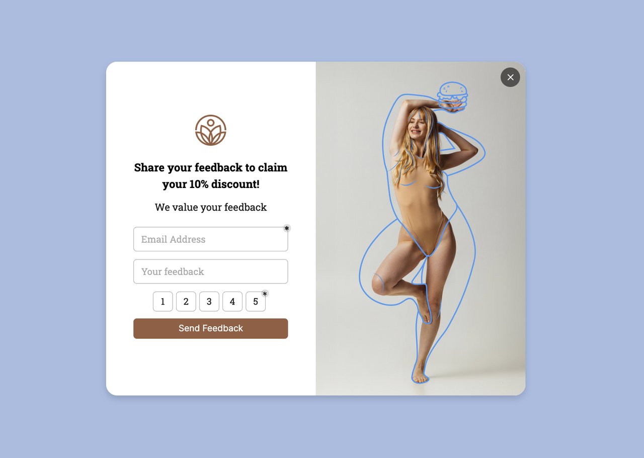
According to UX Planet's case study on improving sign-up flows, understanding user friction through direct feedback and then redesigning the registration experience based on that data produces measurable improvements in completion rates. Feedback-first flows work because they address the specific objections visitors actually have, not the ones you assume.
20. A/B Test Every Element of Your Sign-up Flow: Data-Driven Iteration
A/B testing is the strategy that makes all other strategies work better. Without testing, you're guessing which headline, button color, form length, or popup timing performs best. With testing, you have data. Every 5-10% improvement compounds across your entire funnel, and the businesses that test consistently outgrow those that don't.
How to implement:
1. Start with one test at a time. Change only one variable per test: the CTA button text, the number of form fields, the popup trigger timing, or the headline. Testing multiple changes simultaneously makes it impossible to know which change caused the result
2. Run each test until you reach statistical significance (typically 200-500 conversions per variant). Don't stop a test early because one variant "looks like it's winning" after 50 conversions — you'll make wrong decisions 40% of the time
3. Test in this priority order for maximum impact: (a) the offer itself, (b) the headline/copy, (c) form fields and layout, (d) CTA button text and color, (e) popup timing and targeting rules. The offer matters more than the design — a poorly designed popup with a great offer beats a beautiful popup with a weak offer
4. Use Popupsmart's built-in A/B testing to compare popup variants. Create two versions of the same campaign, split traffic 50/50, and let the data decide. Check the CRO checker to audit your current conversion performance before you start testing
According to CXL's form conversion research, systematic testing of form elements — from field count to button placement to error messaging — produces compounding gains over time. The most successful sign-up optimization programs run 2-4 tests per month and achieve 20-50% cumulative improvement within a quarter.
Where to Start: Prioritization by Effort and Impact
Not all 20 strategies require the same investment. Here's how to prioritize based on what your team can implement this week versus this quarter.
| Priority | Strategy | Effort | Impact | Best For |
|---|---|---|---|---|
| 1 | Simplify sign-up form | Low | High | Any site with 3+ form fields |
| 2 | Write benefit-driven CTAs | Low | High | Sites with generic "Sign Up" buttons |
| 3 | Add social proof near forms | Low | High | Any site with existing testimonials or user counts |
| 4 | Deploy exit-intent popups | Low | High | Sites with 5,000+ monthly visitors losing traffic |
| 5 | Display security badges | Low | Medium | B2B SaaS and sites collecting sensitive data |
| 6 | Offer free shipping incentive | Low | High | E-commerce with existing free shipping capability |
| 7 | Place sign-ups above the fold | Medium | High | Sites where sign-up is buried below the fold |
| 8 | Create lead magnets | Medium | High | Content-heavy sites with engaged blog readers |
| 9 | Use gamified discount popups | Medium | High | E-commerce stores with discount flexibility |
| 10 | Add countdown timers | Medium | Medium | Sites running promotions or limited offers |
| 11 | Build newsletter sign-up | Medium | Medium | Brands publishing regular content |
| 12 | Gate premium content | Medium | Medium | Sites with high-value downloadable resources |
| 13 | Support visitors with live chat | Medium | Medium | SaaS products with complex onboarding |
| 14 | Promote on social media | Medium | Medium | Brands with active social following |
| 15 | Collect feedback-to-sign-up | Medium | Medium | Product teams wanting user insights + sign-ups |
| 16 | Know your target audience | Medium | High | Sites with unsegmented, generic sign-up flows |
| 17 | Launch seasonal campaigns | Medium | High | E-commerce and brands with seasonal relevance |
| 18 | A/B test sign-up elements | Medium | High | Any site with 5,000+ monthly visitors |
| 19 | Launch referral program | High | High | Products with strong user satisfaction |
| 20 | Create membership tier | High | High | Brands with enough content for recurring value |
Week 1 quick wins: Simplify your form, rewrite your CTAs, and add social proof. These three changes take under a day combined and typically produce a 20-40% lift in sign-ups.
Month 1 growth plays: Deploy exit-intent popups, create a lead magnet, and start A/B testing. These require more setup but deliver the strongest ongoing results.
Quarter 1 strategic bets: Launch a referral program, build a community tier, and systematize audience segmentation. These take time to build but create compounding growth that accelerates over each quarter.
Start With Three Sign-up Strategies This Week
You don't need to implement all 20 strategies at once. Start with the three that deliver the fastest results with the least effort:
1. Cut your sign-up form to one field. This takes 30 minutes and produces immediate results. If your current form has more than two fields, you're losing 25-50% of potential sign-ups to friction.
2. Add an exit-intent popup with a lead magnet. You're already losing visitors who leave your site, an exit-intent popup gives you one last chance to capture their email.
3. Place social proof directly next to your sign-up form. Your user count, a customer testimonial, or a trust badge next to the form reduces sign-up anxiety and increases conversions by 15-40%.
Once these three are running and you've collected 2-4 weeks of baseline data, move to A/B testing and the remaining strategies from the prioritization table. Each improvement compounds on the ones before it, and consistent testing is what separates sites that grow from sites that plateau.
Frequently Asked Questions
How do I increase sign-ups without a big budget?
The highest-impact sign-up strategies are free or nearly free. Simplifying your form (cutting fields to email-only), rewriting CTA button text with benefits, and adding your user count near the form cost nothing except 2-3 hours of work. Exit-intent popups through tools like Popupsmart popup builder can be set up in under 15 minutes. Focus on reducing friction in your existing flow before spending money on driving more traffic to a broken funnel.
How do you get your first 1,000 users?
Getting to 1,000 sign-ups requires a different playbook than scaling from 1,000 to 10,000. For your first 1,000: post about your product in relevant Reddit communities and industry forums where your audience already hangs out. Offer your product free to the first 100 users in exchange for feedback. Write 3-5 blog posts targeting long-tail keywords with low competition. Build a simple referral loop where early users can invite colleagues. According to founders discussing this on Reddit, personal outreach and community participation drive the first 100-500 sign-ups for most startups.
How can I optimize sign-up forms for higher conversions?
Start by removing every form field except email. If you need additional data (name, company, role), collect it after sign-up through progressive profiling during onboarding. Add social login options (Google and Apple cover 90%+ of users). Place a trust signal ("No spam, unsubscribe in one click") directly below the form. Test your CTA text — benefit-driven labels like "Get My Free Account" outperform "Submit" by 25-40%. Run one A/B test per week on a single element, and let each test reach 200+ conversions before calling a winner.
What are the best strategies to boost user sign-ups in 2026?
The three strategies with the highest return in 2026 are: (1) AI-powered exit-intent popups that personalize the offer based on visitor behavior, (2) community-led growth where existing users organically bring in new sign-ups, and (3) product-led sign-up experiences where the user gets immediate value before registering (free tools, calculators, or limited product access). The common thread is reducing friction while increasing perceived value at the moment of sign-up.
What should I avoid when trying to increase user sign-ups?
Three mistakes cause the most damage: First, asking for too much information upfront — every field beyond email reduces conversions by 5-10%. Second, using fake urgency or manipulative dark patterns (fake countdown timers that reset). Visitors notice, and it destroys trust permanently. Third, ignoring mobile optimization. Over half of web traffic is mobile, and forms that work fine on desktop often break on smaller screens. Test your sign-up flow on at least three different phone screen sizes before launching.

How would you rate your experience with this article? 😊