Countdown timer popups show a ticking deadline to create urgency and FOMO, boosting conversions and engagement for offers, signups, sales, launches, and cart recovery. The guide explains building one in Popupsmart and best practices.
A countdown timer popup is a website overlay with a ticking clock that ends at a specific deadline, pushing visitors to act before time runs out. Build one in five steps inside Popupsmart: create a campaign, drop in the countdown element, configure hours and styling, add an optional form, and publish. Most stores see a lift the same week.
What is a countdown timer popup?
A countdown timer popup is a small overlay that appears on your website with a clock counting down to a deadline — the end of a sale, a product drop, the close of a registration window, or the moment a discount code expires. The clock is the whole point. Without the ticking numbers, you have a regular promo popup. With them, you have a deadline a visitor can see, and that changes behavior.
I've shipped countdown popups for 50+ Shopify stores at Popupsmart, and the pattern is always the same: a static "Sale ends Friday" line gets ignored. The same offer with a live timer ticking down from 14 hours, 22 minutes pulls clicks. People do not want to do the math themselves. The timer does it for them.
Three things make a countdown popup different from a normal popup. First, the timer must be tied to a real deadline — a returning visitor seeing the same "2 hours left" tomorrow loses trust instantly. Second, the offer behind the timer has to be worth the urgency. A 5% off code with a 24-hour clock feels manipulative. A 25% off code with a 6-hour clock feels like a deal. Third, the popup needs a clear next action — claim the code, add to cart, sign up — not just a "got it" dismiss button.
This format works for both e-commerce and SaaS. E-commerce uses it for flash sales, Black Friday, and abandoned cart recovery. SaaS uses it for trial extension offers, webinar registration windows, and annual-plan discount cutoffs. The mechanics are identical — the deadline drives the click.
Why countdown timer popups work in 2026
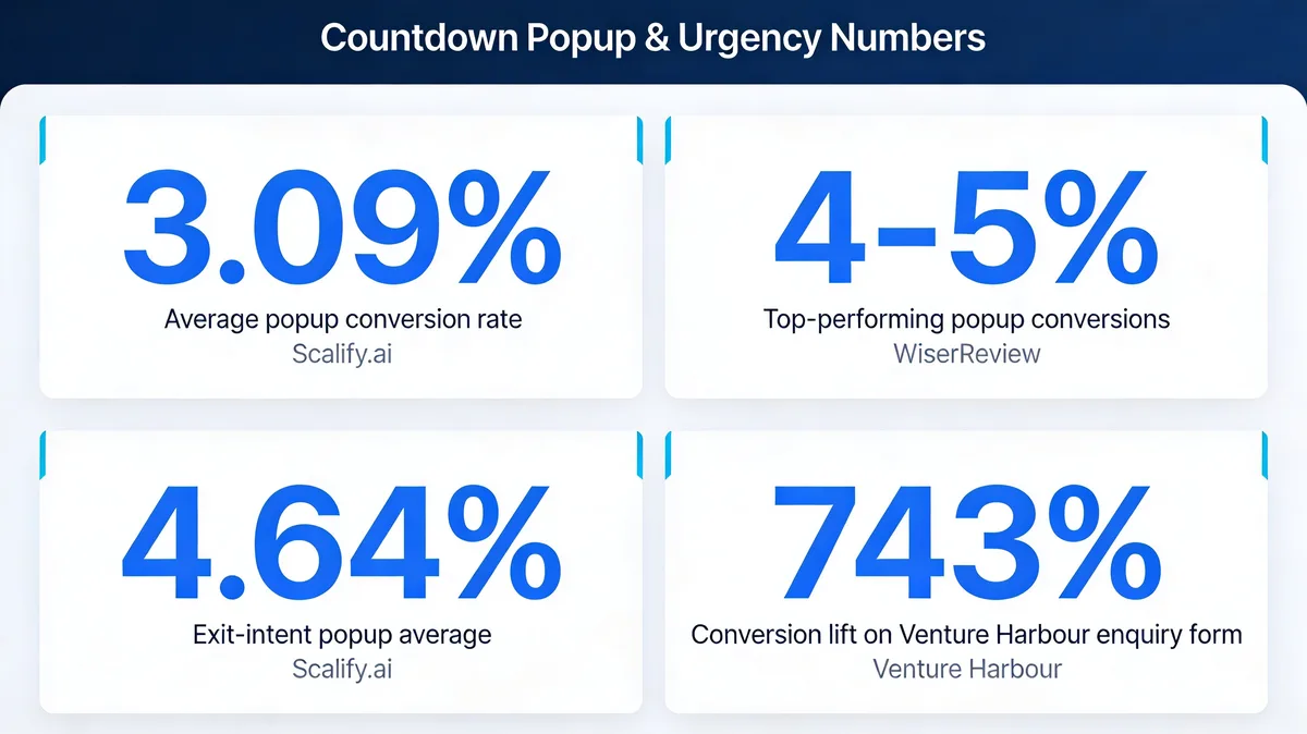
Popups are not a fringe channel anymore. According to Scalify.ai, the average popup conversion rate sits at 3.09% — already above what most websites convert at on cold traffic. Oscar Chat reports that average rates land between 4% and 5% across the industry, with top campaigns climbing higher. And the upside on a well-targeted campaign is much larger than the average suggests.
Popup conversion benchmarks across the industry.
The case studies are wild once you start digging. A Venture Harbour CRO test pushed enquiry form conversion from 0.96% to 8.1% — a 743% lift — by reworking the popup flow around timing and offer. Rejoiner reports two-step promotional popups (where the timer pre-qualifies the visitor before asking for an email) convert at 11.9% — roughly four times the industry average.
So why specifically the countdown variant? Three reasons stand out from running 100+ popup campaigns over the past few years:
• Deadlines beat discounts. A visitor who sees a 20% code with no expiration thinks "I'll come back." A visitor who sees the same code with 03:42:18 ticking down acts now. The timer reframes the decision from "do I want this?" to "do I want this before it disappears?"
• FOMO is measurable, not just emotional. The fear-of-missing-out research is consistent — people overweight imminent loss. A countdown makes the loss visible. You're not telling them to hurry; the clock is.
• Timers travel well across mobile and desktop. A ticking clock reads the same on a 6-inch phone screen as it does on a 27-inch monitor. Most popup elements lose impact on mobile. Timers do not.
The catch is that countdown popups punish lazy implementation harder than standard popups. A fake timer (one that resets every visit) gets noticed within a week and your bounce rate jumps. We'll cover how to avoid that in the best practices section.
How to create a countdown timer popup in 5 steps
Here's the build process inside Popupsmart, end to end. You can complete this in 15-20 minutes the first time you do it. Once you've built one, the next campaign takes maybe 5 minutes — most of the work is reusable.
What you'll need:
• A Popupsmart account (free plan works for the first campaign)
• A real deadline tied to a real offer — discount code, product drop date, or registration cutoff
• 15-20 minutes for your first build, 5 minutes for every campaign after
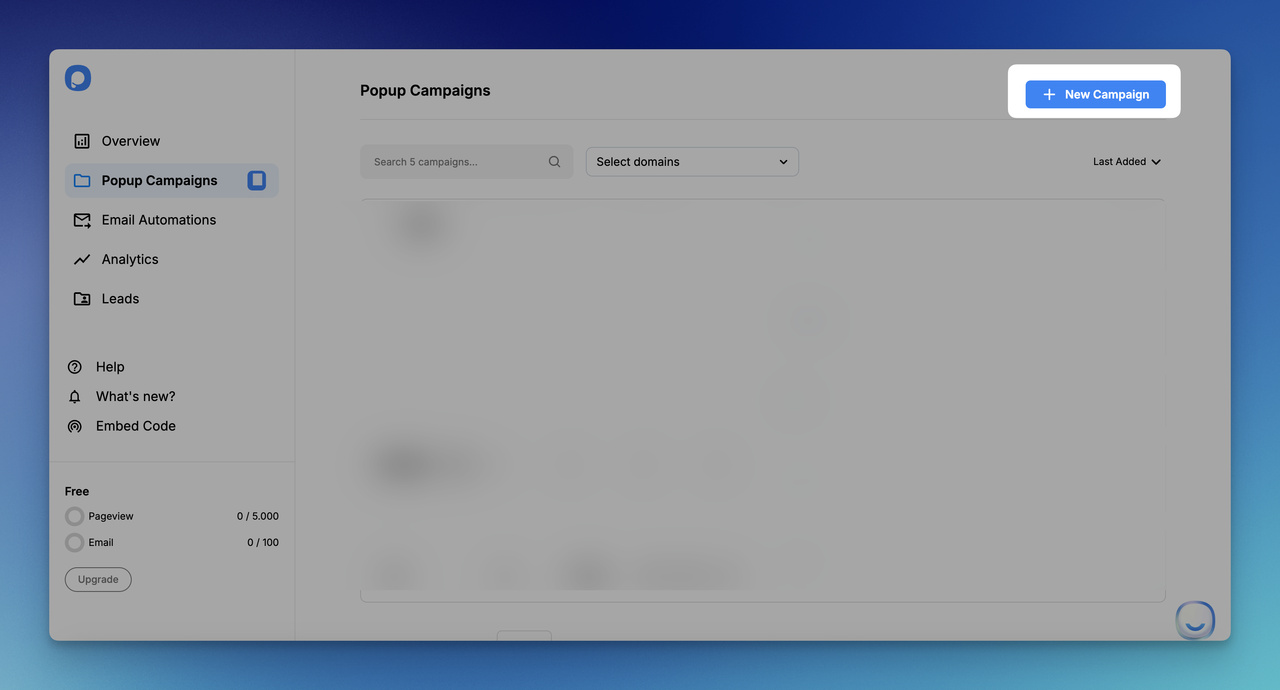
Step 1: Create a new campaign in your Popupsmart dashboard
Start by clicking New Campaign from the Popupsmart dashboard.
Log into your Popupsmart account and click the New Campaign button at the top right of the dashboard. If you don't have an account yet, you can sign up for a free Popupsmart account in about 30 seconds — no credit card required, and the free plan covers your first campaign.
Name the campaign something specific, not "Countdown Test 1." I always use a format like BlackFriday-25off-Nov27 or FlashSale-30off-3hour. Three months from now when you're cloning a campaign for a new sale, the name should tell you exactly what the offer was without opening the editor.
Pick the website you want the campaign to run on from the domain dropdown. If this is your first campaign, you'll be prompted to add your domain and install the Popupsmart script — paste the one-line embed before the closing
tag and you're done. The script loads asynchronously so it does not block your page render.
You'll know it's working when: The dashboard shows a green "Connected" status next to your domain, and you see your new campaign listed under Drafts.
Watch out for:
• Naming campaigns generically: "Test" or "New campaign 3" makes it impossible to find the right one in 6 months. Use offer + discount + duration in the name.
• Forgetting to install the embed: The campaign will save and look fine in preview, but it will not fire on your live site. Always check the connection status before moving on.
Pro tip:If you run multiple stores or multi-region campaigns, use a slug suffix like-USor-EUin the campaign name. I learned this after accidentally targeting US shoppers with a EUR-priced popup during a Cyber Monday push. The name suffix would have caught it.
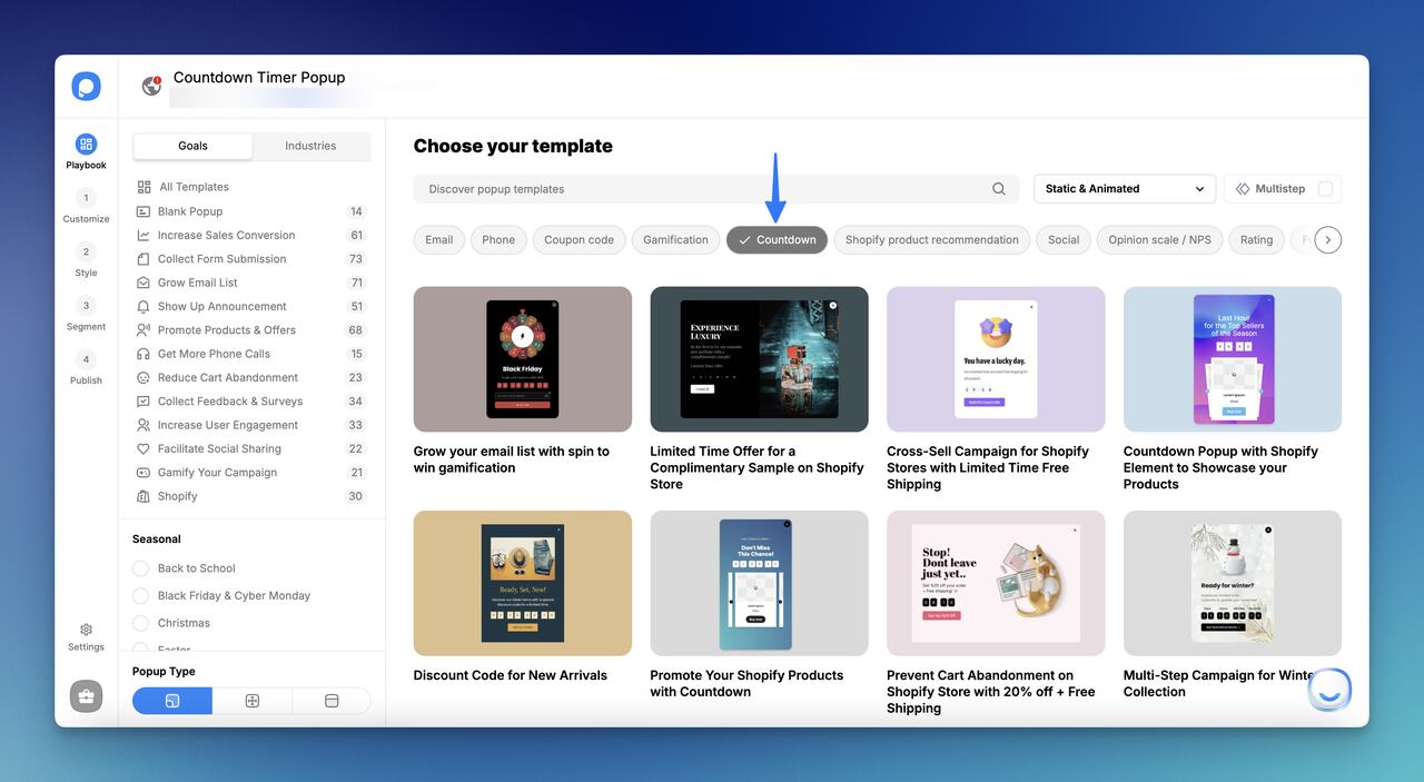
Step 2: Add the countdown element from the playbook
The countdown element sits inside the Popupsmart playbook alongside form, image, and button elements.
Inside the campaign editor, head to the Customize step. You'll see two paths here. The faster path: pick a pre-built countdown template from the Popupsmart Playbook — there are ready-made layouts for Black Friday, flash sales, product launches, and cart recovery. The flexible path: start from a blank popup and add the countdown element yourself.
For the blank-canvas path, click Add a new element on the left sidebar, then select Countdown from the element picker. Drag and drop the countdown block into the position you want — typically center-top of the popup so it's the first thing the eye lands on.
If you're modifying a template, you can keep the existing copy and styling and just swap the countdown's end time and target offer. This is what I do for recurring campaigns — clone last quarter's flash sale popup, change the date, change the discount code, ship it. Total time: about 4 minutes.
You'll know it's working when: A live countdown block appears on your popup canvas with the default time units (days, hours, minutes, seconds) showing.
Watch out for:
• Adding the countdown but no clear offer text: A timer floating above an empty popup makes no sense. Always add a headline ("25% off ends in") and a CTA button before previewing.
• Picking a template with copy that doesn't fit your offer: If you grab the Black Friday template for a regular flash sale, change every line. Leftover seasonal copy is the easiest way to look amateurish.
Pro tip:Save your most-used countdown popup as a custom template inside the playbook. Popupsmart lets you mark a finished design as a reusable template — I have three saved (flash sale, cart recovery, product launch) and they cover roughly 80% of every new campaign I build.
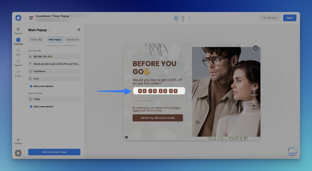
Step 3: Configure the timer (end date, units, and design)
Click the countdown element to open the configuration panel on the right.
Click on the countdown element to open its configuration panel. You'll see four settings that matter:
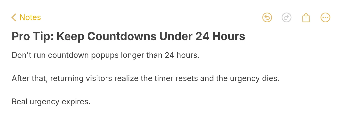
1. End date and time: Set the exact moment the timer hits zero. For Black Friday, that's typically Friday 11:59 PM in your store's primary timezone. For flash sales, set it 6-12 hours from launch — long enough to catch a daily wave of traffic, short enough to feel urgent. Avoid timers longer than 24 hours; we'll cover why in the mistakes section.
2. Time units: Toggle which units to show. For a sale ending in 36 hours, show days/hours/minutes/seconds. For a 4-hour flash sale, hide the days unit — showing "00 days" wastes attention. For deadlines under an hour, hide both days and hours; minutes/seconds creates the highest urgency density.
3. Labels: Toggle the small "DAYS / HOURS / MINUTES / SECONDS" labels under the numbers. For a clean, modern look on a small popup, hide them. For a desktop popup with more real estate, leave them on so the timer is unambiguous at a glance.
4. Style: In the Style sub-step, pick a shape (rounded square is the safest default), set the background color, and match the font to your brand. The timer is the focal point — it should be at least 2x larger than your body copy.
You'll know it's working when: The numbers in the canvas tick down in real time as you preview. If they're frozen, the end date is in the past — fix the date.
Watch out for:
• Timezone mismatches: Popupsmart uses your account timezone by default. If you set a Black Friday end time in EST but most of your traffic is in PST, your popup expires three hours early on the West Coast. Always confirm the timezone in the date picker.
• Tiny timer numbers: If the timer is the same size as your body text, it disappears. The timer should be the largest visual element on the popup, period.
Pro tip:For mobile, set the popup to "bottom bar" placement instead of center modal when the campaign uses a countdown. A center modal on mobile covers the product image; a bottom bar keeps the product visible while the timer stays sticky. In my last A/B test on a Shopify apparel store, the bottom bar variant out-converted the center modal by 34% on mobile traffic.
Step 4: Add an optional email capture form
Pair the countdown with a one-field email form to combine urgency with lead capture.
Many of the highest-converting countdown campaigns combine the timer with a lead capture form. The pattern: "Sale ends in 03:42:18 — drop your email to get the code." This works because the timer pre-qualifies the visitor before you ask for anything. According to Rejoiner, two-step promotional popups convert at 11.9% versus a much lower rate for single-step asks.
To add the form, click Add a new element and select Form. Drag the form below the countdown. Configure one field — email — and set the submit button copy to match the offer ("Send me the code", "Reserve my spot", "Lock in 25% off").
Connect the form to your email tool from the Integrations step. Popupsmart natively integrates with most major email and CRM platforms — pick yours from the list, paste your API key, and pick the list or tag the new emails should land in.
If you don't want lead capture and just want the timer to push direct purchases, skip this step entirely. A countdown popup with a single CTA button (no form) loaded with a discount code copied to clipboard on click also converts well — fewer fields means faster action.
You'll know it's working when: A test submit on the preview successfully shows up in your connected email tool within a few seconds.
Watch out for:
• Asking for too many fields: Email only. Adding name, phone, or birthday tanks conversion. You can collect that later in the welcome flow.
• Generic submit button copy: "Submit" and "Sign up" leave money on the table. Match the button to the urgency — "Get my code before time runs out" beats "Subscribe" by a wide margin in every test I've run.
Pro tip:Use the form's success message to immediately reinforce the deadline. Instead of "Thanks for subscribing!", set the success message to "Code: SAVE25 — use it at checkout before the timer runs out." That keeps the urgency alive after submission and lifts code redemption by a meaningful amount.
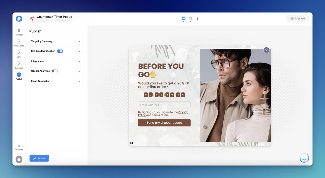
Step 5: Set targeting and publish the campaign
The Publish step lets you set targeting rules and push the campaign live.
The final step is the Segment tab. This is where you decide who sees the popup and when. The defaults are sensible, but the tweaks make a big difference:
Page targeting: Show the popup only on pages that match the offer. A countdown popup pushing a sitewide sale belongs on the homepage and category pages. A cart abandonment countdown belongs on the cart page only — never the homepage. Match the popup to the page intent.
Trigger: Time-on-page (5-15 seconds) for sitewide promos works well. Exit-intent for cart abandonment. Scroll depth (50% reached) for blog content offers. Avoid immediate-on-load for first-time visitors — it feels aggressive and tanks the bounce rate.
Frequency: Show once per session, max twice per visitor. A returning visitor who sees the same countdown three days in a row is a churned customer, not an active one.
Audience: Filter out logged-in customers, completed purchasers (last 30 days), and traffic sources where the offer doesn't apply (e.g., paid traffic landing on a dedicated promo page that already shows the offer).
Hit Save, then Publish. The campaign goes live within seconds. Open your website in an incognito window and trigger the popup to confirm it fires correctly on your live site.
You'll know it's working when: The popup appears in your incognito test, and within an hour you see impressions ticking up in the Popupsmart analytics dashboard.
Watch out for:
• Forgetting to filter logged-in users: Showing a "first-time buyer 25% off" popup to a customer who's bought from you four times burns trust. Always exclude logged-in users from acquisition-style campaigns.
• Publishing without testing the live site: The preview can pass and the live popup can still misfire because of theme conflicts. Always check incognito on the actual domain.
Pro tip:Set up the campaign to expire automatically by setting the campaign end date to match the timer end date. Popupsmart will stop showing the popup the moment the timer hits zero — no manual cleanup, no expired countdown sitting on your site Sunday morning. I learned this the hard way after leaving a "Sale ends Friday" popup live until the following Tuesday.
5 countdown timer popup examples that convert
Here are five real countdown popup formats that have worked across e-commerce and SaaS. Each one solves a specific use case — copy the structure, swap your offer in, ship it.
1. Black Friday countdown popup
Bold type, dark background, single CTA — Black Friday popups should look like the deal feels.
The Black Friday format leans on visual loudness — black or deep red backgrounds, oversized typography, and a single CTA. The timer should count down in days/hours/minutes for the lead-up week, then switch to hours/minutes/seconds in the final 24 hours. Use this on the homepage, category pages, and product pages. Keep the offer dead simple: a sitewide percentage discount or a flat dollar threshold ("free shipping over $50"). For the lead-up phase, swap the CTA from "Shop now" to "Get early access" and pair it with email capture so you build a list to email when the sale opens.
2. Product launch countdown popup
Build anticipation with a clean countdown to the drop time and an early-access email signup.
Product launch popups serve a different goal: build a launch-day audience, not push immediate purchases. The countdown anchors to the drop time. The CTA is "Notify me" or "Get early access" — paired with a one-field email form. Apple does this with teaser pages weeks in advance, and the same psychology works at any scale. Show this popup on your homepage and on the category page where the product will live. Skip targeting on cart and checkout pages. After the launch fires, swap the campaign to a follow-up "now live — shop the drop" popup automatically.
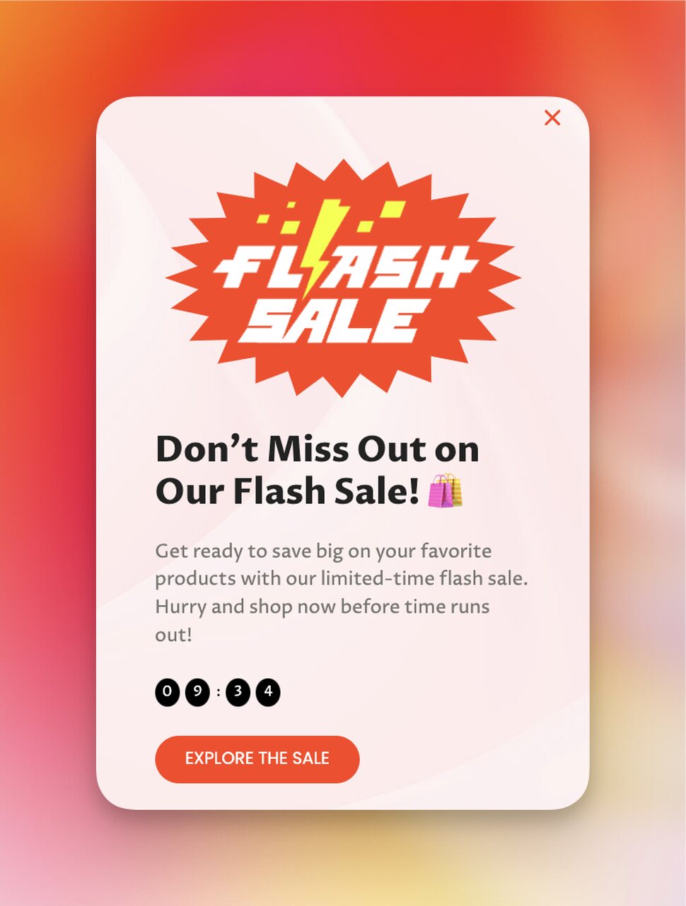
3. Flash sale countdown popup
Short windows (4-12 hours) and a discount code create the tightest urgency loop.
Flash sale popups use the shortest timer windows — typically 4 to 12 hours — and a percentage discount code. Hide the days unit; show only hours/minutes/seconds. The CTA copies the discount to clipboard on click so the visitor can paste it at checkout without leaving the page. Send these on Tuesday-Thursday for highest desktop traffic, or Saturday morning for mobile-heavy traffic. For a deeper play with timing patterns, see our breakdown of scarcity examples — flash sales sit right at the intersection of time scarcity and discount scarcity, which is why they convert harder than either alone.
4. Cart abandonment countdown popup
An exit-intent timer reminds shoppers their cart contents won't be reserved forever.
Cart abandonment popups trigger on exit-intent from the cart or checkout page. The timer represents how long the cart contents are reserved — typically 15 minutes to 1 hour, refreshed each session. The offer is usually a small discount (5-10%) or free shipping if the cart is below your free-ship threshold. Critical: only show this to visitors with items in their cart. Showing a generic abandonment popup to everyone is just an annoying interruption. This format is one of the highest-ROI campaigns you can ship — the visitor has already shown purchase intent, the timer just removes their excuse to delay.
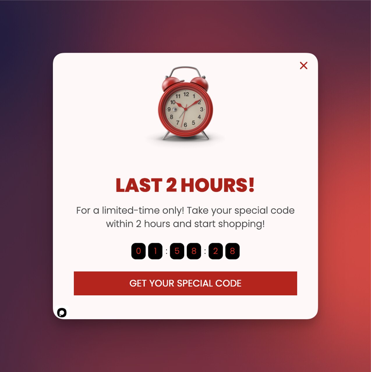
5. Last 2 hours / final call countdown popup
The closing-window popup catches the last wave of buyers in the final hours of any sale.
This is the cleanup campaign — it fires only in the final 2-4 hours of a longer promotion. Hide days and hours; show only minutes/seconds for maximum urgency density. The headline is explicit: "Last 2 hours" or "Final call." The CTA is the same code or offer the original campaign was running, but the messaging shifts from "save 25%" to "don't miss out." Set this as a separate campaign that activates when the main sale's countdown drops below 4 hours.
Best practices for countdown timer popups
Building the popup is the easy part. Making it convert without burning trust is where most teams trip. Here are the rules I've boiled down after running 100+ popup campaigns across SaaS and e-commerce clients.
Pro tip: keep countdown timers under 24 hours so the urgency feels real.
Match the timer length to the decision the buyer is making. A $20 impulse purchase can handle a 4-hour timer. A $400 considered purchase needs at least 24-48 hours so the buyer has time to compare and come back. Mismatching this is the #1 reason countdown campaigns flop — short timers on expensive products feel manipulative, long timers on cheap products feel pointless.
Keep the offer behind the timer worth the urgency. A 5% discount with a 6-hour timer is insulting. A 25% discount with a 6-hour timer feels like a real deal. Calibrate the discount to the urgency — the steeper the deadline, the steeper the offer needs to be. If you can't justify a meaningful discount, use the timer for non-discount offers instead: free shipping cutoff, bonus item with purchase, early access to a drop.
Write copy that names the deadline, not the timer. "Sale ends in 03:42:18" is fine. "Time is running out" with the same timer underneath is better. The headline should describe what happens at zero, not just say "hurry." A returning visitor reads the headline first, the timer second — the headline has to do the persuading.
Design for the timer first, everything else second. The numbers should be the largest visual element on the popup. If your headline is competing for attention with the timer, shrink the headline. The timer is the differentiator — the rest is supporting copy. On mobile, this matters even more: a small timer on a small popup gets ignored.
Test the timer length before the timer copy. The single biggest variable in a countdown campaign is timer duration. Run a 6-hour version vs a 24-hour version on the same offer and the conversion deltas are usually 30-50%, sometimes more. Headline tweaks rarely move the needle that much. Always start your A/B testing with timer length, then move to copy and design.
Match popup placement to device. Center modals on desktop, bottom or top sticky bars on mobile. A center modal on a phone covers the product photo, which is exactly the wrong outcome on a product page. Sticky bars keep the timer visible while the visitor scrolls — perfect for product pages where the buy button is below the fold.
Pair countdown popups with seasonal traffic spikes. Countdown formats compound on holiday and seasonal traffic.
Common mistakes to avoid while creating countdown timer popups
Three mistakes account for roughly 80% of countdown campaign failures I see. Avoid these and you'll outperform most of your competitors by default.
Mistake 1: Fake or resetting timers. The single fastest way to destroy your brand's credibility is a timer that resets every visit. Returning visitors notice within two sessions. They tell other people. They post about it on Reddit. The fix: tie the timer to a real, calendar-anchored deadline, and let it expire when it expires. Popupsmart lets you set a fixed end date; use it. If you want recurring urgency, run new campaigns with new offers — never reset the same timer.
Mistake 2: Running the same countdown popup to everyone. A first-time visitor, a 5-time customer, and a cart-abandoner are not the same audience. They should not see the same popup. Segment by visit count, purchase history, and current page intent. A returning customer who's purchased twice should see a loyalty-tier countdown ("Members-only early access ends in"), not the same first-time buyer 20% off as everyone else. Failing to segment makes the popup feel like spam.
Mistake 3: Timers longer than 24 hours. A 7-day countdown is not urgent. A 3-day countdown is barely urgent. The psychological impact of a timer drops off a cliff past 24 hours — the buyer's internal narrative shifts from "I should act now" to "I have time, I'll come back." If your sale lasts a week, run a soft "sale is live" popup for the first 5 days, then switch to a sharp countdown popup for the final 24 hours. The timer does its actual work in that last day.
Mistake 4: Forgetting mobile entirely. Most popup builders default to desktop-first design. The result is countdown popups that look great on a 27-inch monitor and unreadable on a phone. Test every campaign on a real phone, not just the browser dev tools mobile preview. Adjust font sizes, switch to bottom-bar placement, and confirm the CTA button is tappable with a thumb. Mobile is more than half of most stores' traffic — if the popup fails there, the campaign fails.
Ship your first countdown popup this week
The fastest way to know whether countdown popups work for your store is to ship one and read the data. Pick your next promotion — a flash sale, a launch, a cart recovery push — and build the campaign in Popupsmart this week. Use a real deadline, keep the timer under 24 hours, match the offer to the urgency, and segment away from existing customers.
You'll have your first set of data within 48 hours. From there, A/B test timer length first, then headline, then design. The format compounds — every campaign you ship makes the next one faster to build and easier to optimize. For more conversion-focused inspiration once you've shipped your first one, browse our roundup of website popup examples and our gallery of popup message ideas to spark your next campaign.
Are countdown timer popups effective for all types of businesses?
Countdown popups work best for businesses with a clear deadline-driven offer — e-commerce sales, SaaS trial cutoffs, event registrations, course enrollment windows. They work less well for businesses with no natural deadline, like always-on services or evergreen subscriptions. If you can't tie the timer to something real, the format won't help you. For deadline-friendly businesses, expect lifts in the same range as standard popups (3-5% conversion) on average, with top campaigns running much higher. The format amplifies whatever urgency was already there — it doesn't manufacture it from nothing.
How do I measure the effectiveness of countdown timer popups?
Track three metrics in your Popupsmart analytics: impressions (how many visitors saw it), conversion rate (clicks or form submissions divided by impressions), and revenue attributed to the campaign (track via UTM tags on the CTA link or a unique discount code per campaign). The conversion rate is the headline number, but revenue per impression is the truer measure — a 10% conversion rate on a $5 offer is worse than a 4% conversion rate on a $50 offer. Also watch your bounce rate on pages where the popup fires; if bounce jumps more than 5 percentage points, the popup is too aggressive.
Can countdown timer popups create negative customer experiences?
Yes — if overused, mis-targeted, or backed by fake urgency. The negative experience pattern is consistent: visitor sees the popup, dismisses it, comes back the next day, sees the same "ending soon" timer, realizes it's fake, never trusts the brand again. Avoid this by capping frequency (once per session, max twice per visitor), segmenting away from existing customers, and using only real deadlines. Done well, a countdown popup feels like a helpful nudge ("Hey, this code expires tonight"). Done badly, it feels like a pushy salesperson. The difference is in the targeting, not the format.
How long should a countdown timer popup run?
Under 24 hours for the timer itself, ideally 4-12 hours for flash promotions and 24 hours for sitewide sales. The campaign overall — meaning the popup's active period, not the timer length — should match the underlying promo. A weeklong sale can run a "sale is on" popup for the first 5-6 days, then switch to a sharp countdown popup with a sub-24-hour timer for the final stretch. Past the 24-hour mark on the timer itself, the urgency effect drops off significantly. Anything past 72 hours is just a banner with extra steps.
Do countdown popups work on mobile?
They work on mobile if you design for mobile from the start. Use bottom-bar or top-bar placement instead of center modals on phones — center modals cover product images, which kills the buying decision. Bump font sizes up so the timer is readable at arm's length. Make the CTA button tappable with a thumb (44px minimum hit area). In a recent A/B test on a Shopify apparel store, the mobile bottom-bar variant of a countdown popup out-converted the center-modal variant by roughly a third. Mobile-specific design isn't optional anymore; it's where the traffic lives.
Can I use a countdown timer popup on Shopify or WordPress?
Yes — Popupsmart works on any website with a one-line embed script, including Shopify, WordPress, Wix, Squarespace, Webflow, and custom builds. For Shopify specifically, see our walkthrough on adding a Shopify countdown timer. The setup process is identical across platforms — paste the embed in your theme's footer, build the campaign in the Popupsmart dashboard, publish. There's no platform-specific app install required, which means you can use the same campaign across multiple stores on different platforms without rebuilding.