8 Product Recommendation Examples That Convert in 2026 (with Breakdowns)
Product recommendations are personalized suggestions based on user data that boost sales, engagement, and customer experience while enabling cross/upsells, insights, and competitive advantage. It outlines system types and brand examples across shopping journeys.
These eight product recommendation examples come from Amazon, Spotify, Sephora, Kylie Cosmetics, IKEA, Smart Coffee, Apple, and Ben & Jerry's. Each shows a specific surface — homepage, product page, cart, or exit popup — that lifts conversion. You'll see what works, why it works, and the takeaway you can copy this week.
What Is a Product Recommendation?
A product recommendation is a personalized suggestion shown to a shopper based on what they've browsed, bought, or shown interest in. Instead of forcing visitors to dig through your full catalog, recommendations surface 3-6 relevant items at the moments they're most likely to convert: on the homepage, on a product page, in the cart, or at checkout.
The mechanics behind recommendations vary, but the surfaces fall into a few clear buckets:
• Homepage suggestions: "New arrivals," "trending now," or "back in stock" rows that pull people deeper into the site.
• Product page widgets: "Frequently bought together," "compare similar," and "you may also like" blocks that increase basket size.
• Cart and checkout add-ons: Last-mile complementary items — chargers with phones, primer with foundation — that lift average order value without friction.
• Exit-intent and popup recommendations: Triggered overlays that re-engage visitors who are about to bounce, often with a single "you'd love this" suggestion pulled from bestsellers or browsing history.
I've audited dozens of Shopify stores running product recommendations across these surfaces, and the brands that win pick the right surface for the right moment — they don't bolt on every widget at once.
Why Product Recommendations Drive Conversion in 2026
Recommendations punch far above their weight. According to Red Stag Fulfillment, the average e-commerce conversion rate sits at 2.5-3% globally in 2025, which means most of your traffic leaves without buying. A well-placed recommendation block is one of the cheapest ways to move that number — it doesn't add ad spend, doesn't require a new product, and slots into pages people already see.
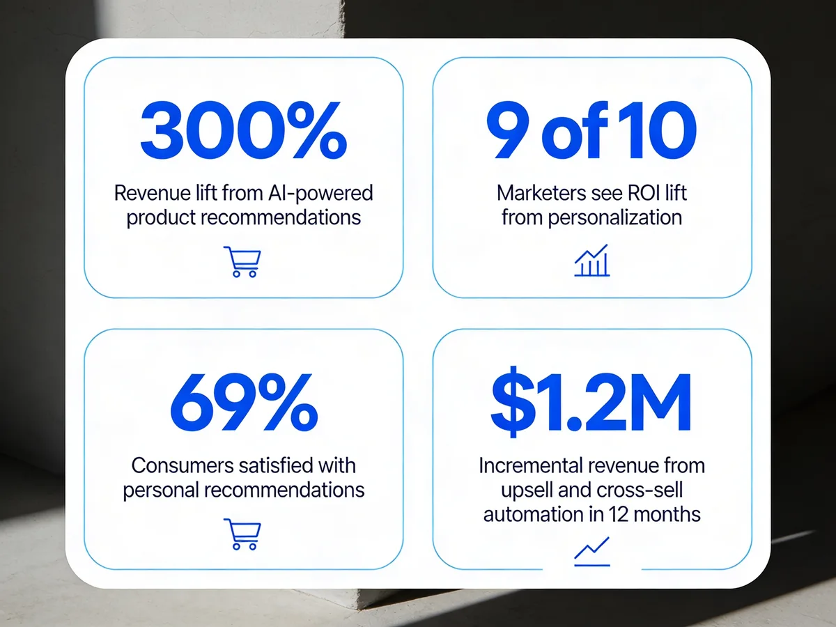
Product recommendation impact at a glance for 2026.
The numbers back this up. According to Envive AI, AI-powered product recommendations drive a 300% revenue increase, with companies running sophisticated recommendation engines reporting 150% conversion rate gains. That sounds inflated until you look at the next data point: Clerk.io's analysis of Salesforce's Shopping Index found that the roughly 7% of shoppers who click a recommendation generate 26% of revenue and 24% of orders. A small slice of buyers, who self-identify as ready, drive a quarter of the business.
Personalization in general is paying off too. DemandSage reports that 9 out of 10 marketers have seen increased ROI through personalization strategies, and Emarsys found that 69% of consumers are satisfied with the personal product recommendations they receive — meaning shoppers actively want this, they don't tolerate it. On the bottom-line side, a 2026 case study from US Tech Automations documented $1.2M in incremental revenue generated from post-purchase upsell and cross-sell automation in 12 months on a single store.
Stack those four data points and the message is clear: recommendations aren't a "nice to have" — they're one of the highest-ROI surfaces on the site.
8 Product Recommendation Examples That Convert
I picked these eight brands because each owns a different surface — Amazon owns the product page, Spotify owns content-based personalization, Sephora owns multi-surface saturation, Kylie owns the routine bundle, IKEA owns the limited-edition pull, Smart Coffee shows what a small store can do with a popup, Apple owns the checkout add-on, and Ben & Jerry's owns the homepage flavor pull. Eight surfaces, eight tactics you can lift.
1. Amazon: Frequently Bought Together
Amazon's "Frequently bought together" block is the most-copied recommendation surface on the internet, and for good reason. It sits directly under the product image on every PDP and bundles 2-3 items with a single "Add all to cart" button.
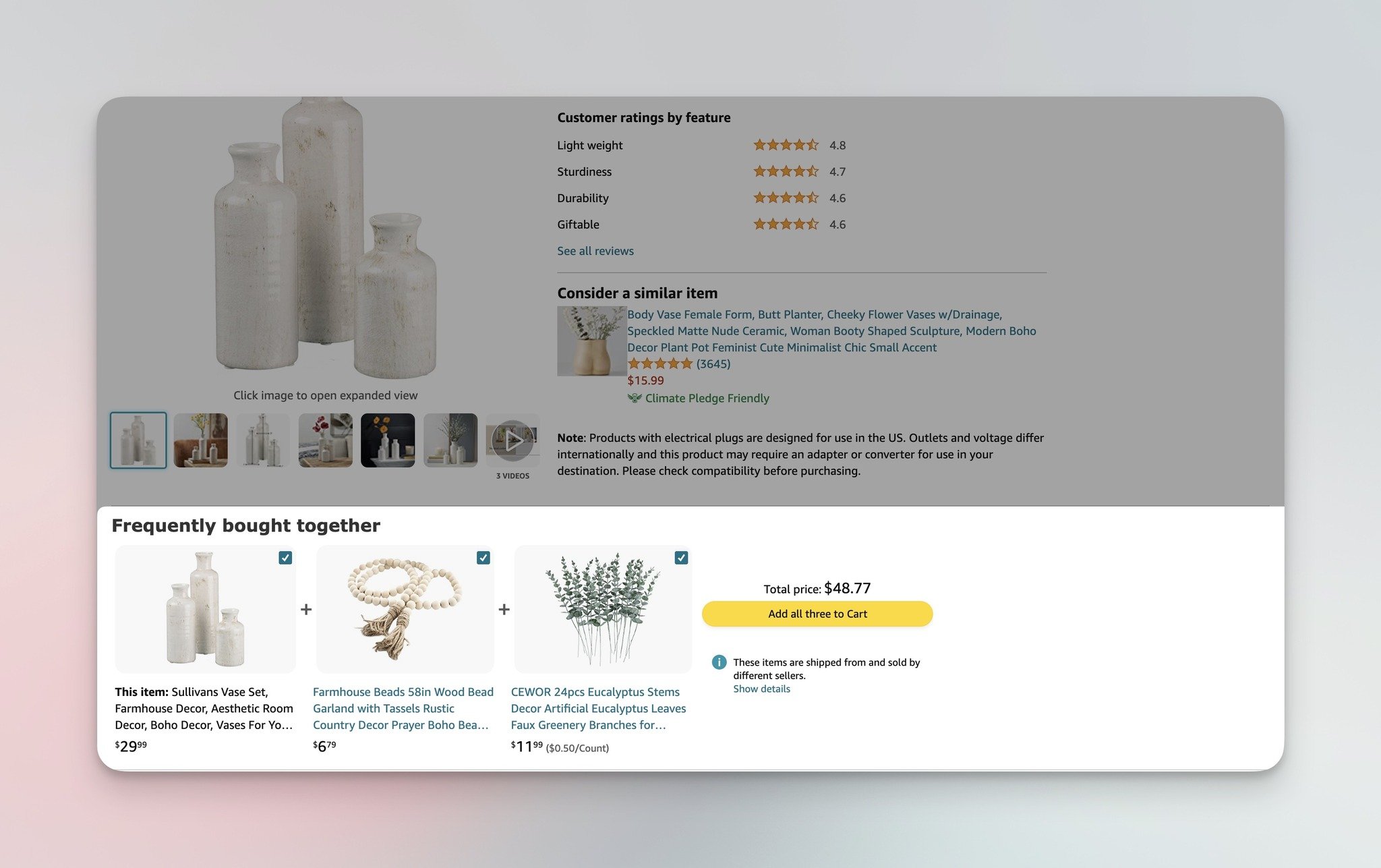
Amazon's "Frequently bought together" bundle on a product detail page.
What works: The recommendation surfaces above the fold on the product page, paired with a combined-price total and a single CTA that adds all items at once. Each item has its own checkbox, so shoppers can deselect rather than leaving the bundle entirely. The visual layout — two thumbnails connected by plus signs — reads like a complete kit, not three separate up-sells.
Why it works: This is collaborative filtering at scale. Amazon analyzes millions of purchase pairs to surface items that real shoppers buy together, not items its merchandisers think should sell together. The "add all" button removes friction — you go from one click to three purchases without re-entering the cart loop. The bundle frame also triggers loss aversion: deselecting feels like leaving something incomplete.
Key takeaway: Stop showing recommendations as separate "you may also like" tiles on your product page. Bundle 2-3 items that ship together and offer a single combined CTA. If you run a Shopify store, you can replicate this with a custom section or a bundling app — and pair it with upselling tips that nudge shoppers toward the bundle, not the single item.
2. Spotify: Made for You
Spotify isn't an e-commerce store, but its "Made for You" homepage is the cleanest content-based recommendation system in any consumer product. Every paid user sees a row of "Daily Mixes" generated from their listening history, and the experience is so personalized that no two users see the same homepage.
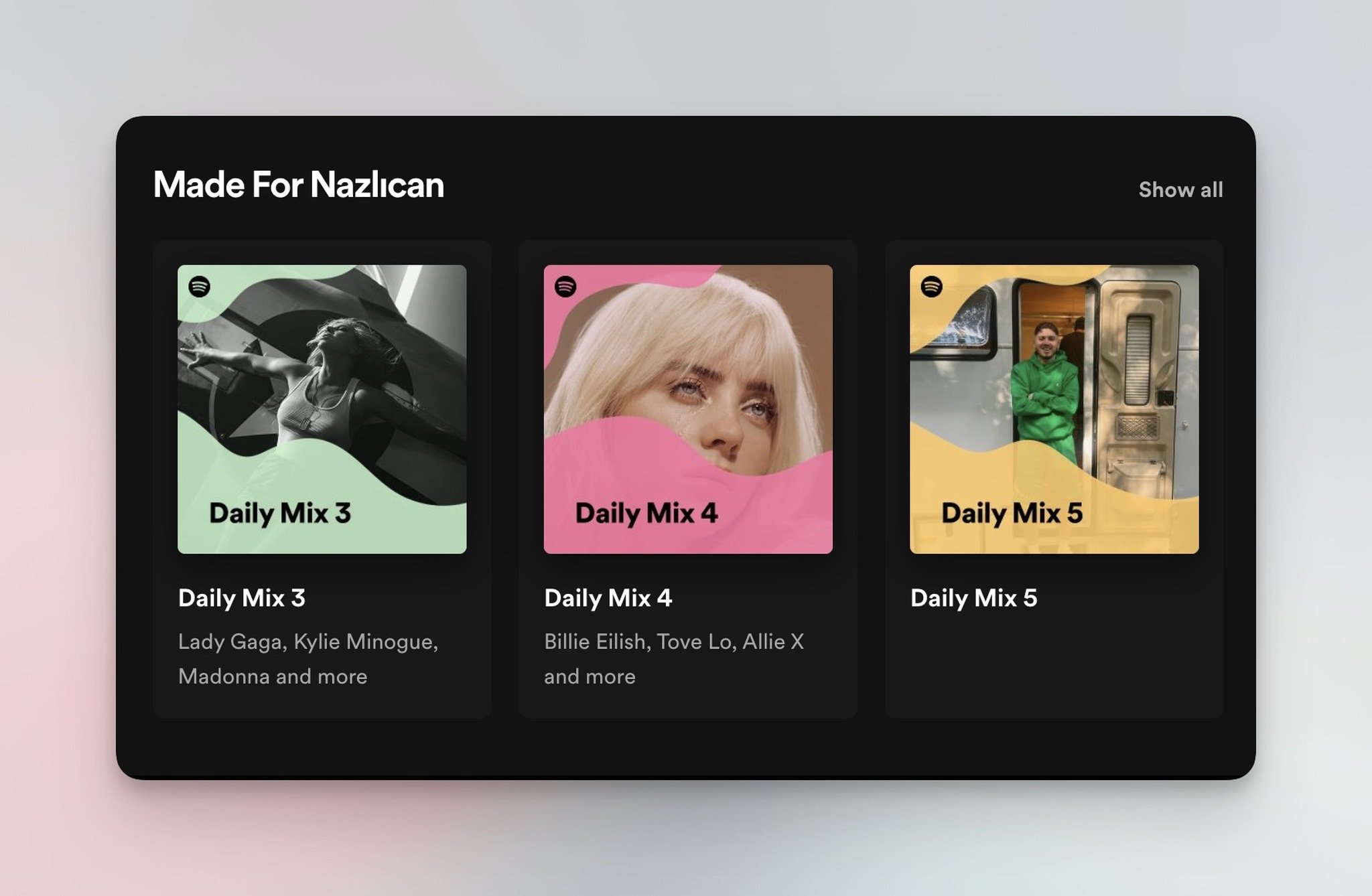
Spotify's "Made for You" content-based recommendation row.
What works: The "Made for You" header is explicit — Spotify tells you these are personalized, which builds trust. Each Daily Mix is labeled with a genre or mood ("Daily Mix 3 — indie folk") so the recommendation isn't a black box; you can see why you got it. The cover art uses real album imagery from artists in the mix, not stock graphics, which keeps the row visually distinct from the rest of the homepage.
Why it works: The transparency principle. When users see why something is recommended (genre, mood, source artist), trust in the recommendation goes up — and so does click-through. Spotify also stages the row above the fold, so the personalized experience is the first thing you see, not buried under generic editorial. For e-commerce stores, the lesson is the same: label your "for you" rows explicitly and make the personalization signal visible.
Key takeaway: Don't hide your personalization. Add an explicit "Picked for you because you viewed [category]" subhead above your recommended-products row. Transparent recommendations beat black-box ones every time.
3. Sephora: Multi-Surface Recommendations
Sephora runs the most aggressive multi-surface recommendation strategy on this list. A single product page hits visitors with five distinct recommendation blocks: homepage promotions, "Compare Similar Products," "You May Also Like," "Featured Products," and "Use It With." Most stores show one or two recommendation widgets per page; Sephora shows five — and gets away with it because each one answers a different shopper question.
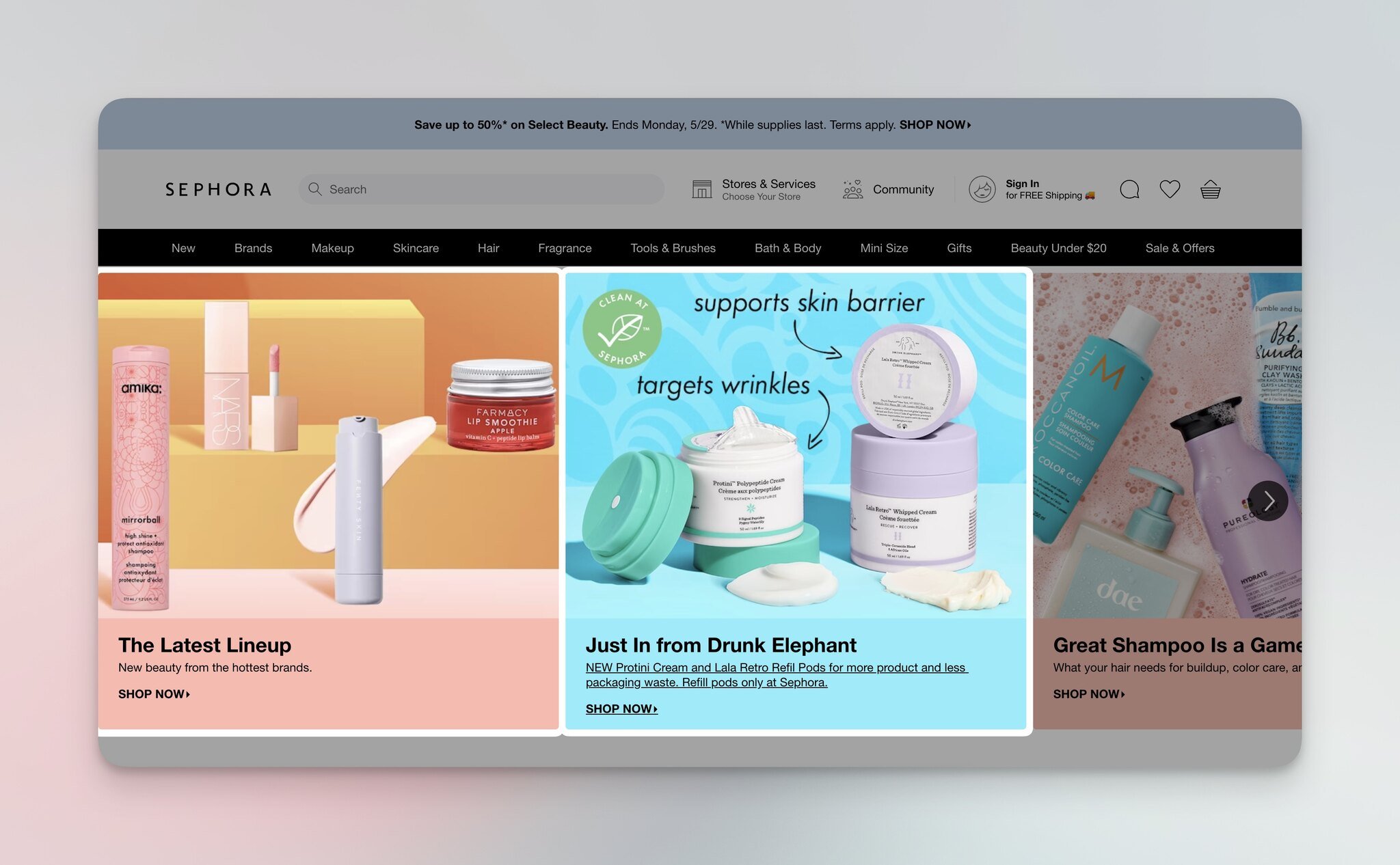
Sephora's homepage with curated new-arrivals and trending products.
The homepage opens with new arrivals — the first surface a returning visitor sees. New arrivals signal that Sephora keeps refreshing its catalog, which gives loyal customers a reason to come back weekly. It also nudges first-time visitors toward exclusive items rather than the same bestseller they could buy anywhere else.
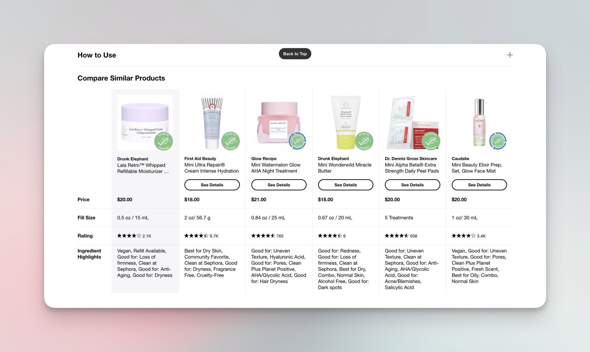
Sephora's "Compare Similar Products" comparison table.
On the product page, the "Compare Similar Products" block is what makes Sephora stand out. Instead of just showing similar items, Sephora pulls them into a side-by-side comparison table with price, fill size, and rating. Shoppers comparison-shop anyway — Sephora keeps that comparison on its own site instead of sending them to a search tab.
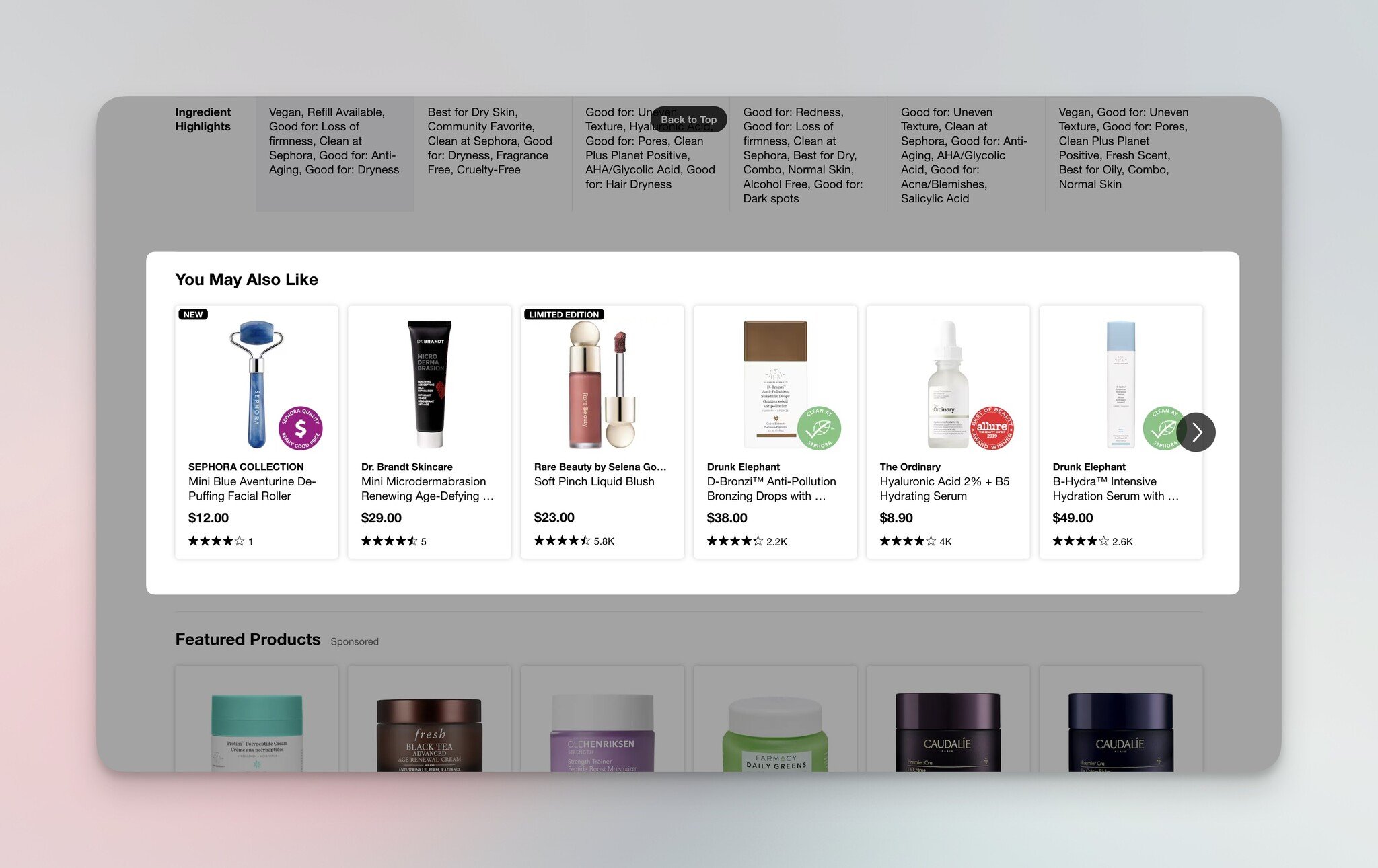
Sephora's "You May Also Like" personalized carousel.
"You May Also Like" is the standard collaborative-filtering row, but Sephora pairs it with rating data and pricing, so shoppers can scan social proof without clicking through. Ecommerce recommendation tips consistently flag this pattern: showing rating and price inline reduces the click-to-evaluate cycle by half.
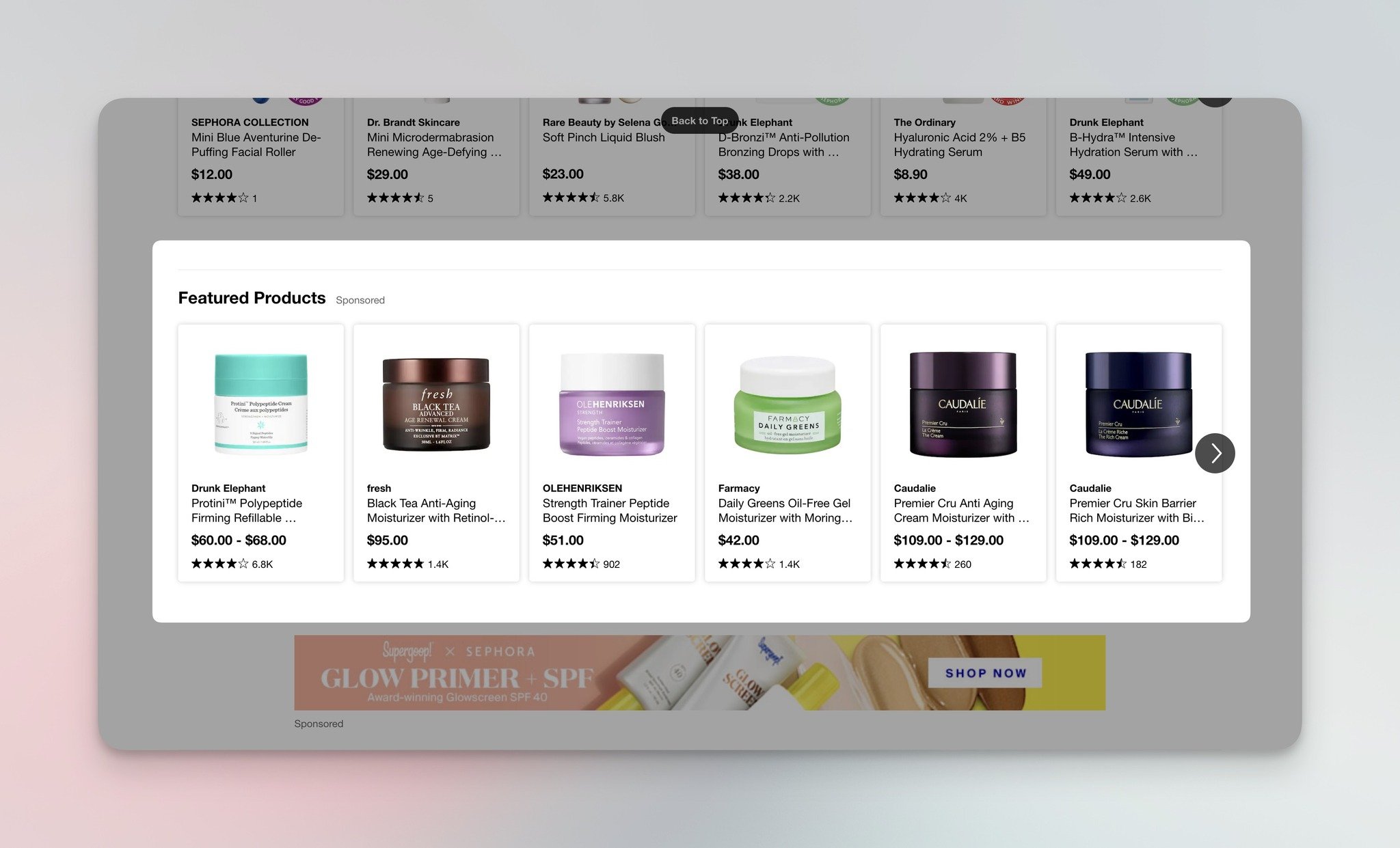
Sephora's "Featured Products" sponsored placements.
"Featured Products" is the sponsored slot, where brands pay for placement. Shoppers don't seem to mind because the items are still relevant — Sephora vets the matching algorithm so sponsored items don't break the personalization frame.
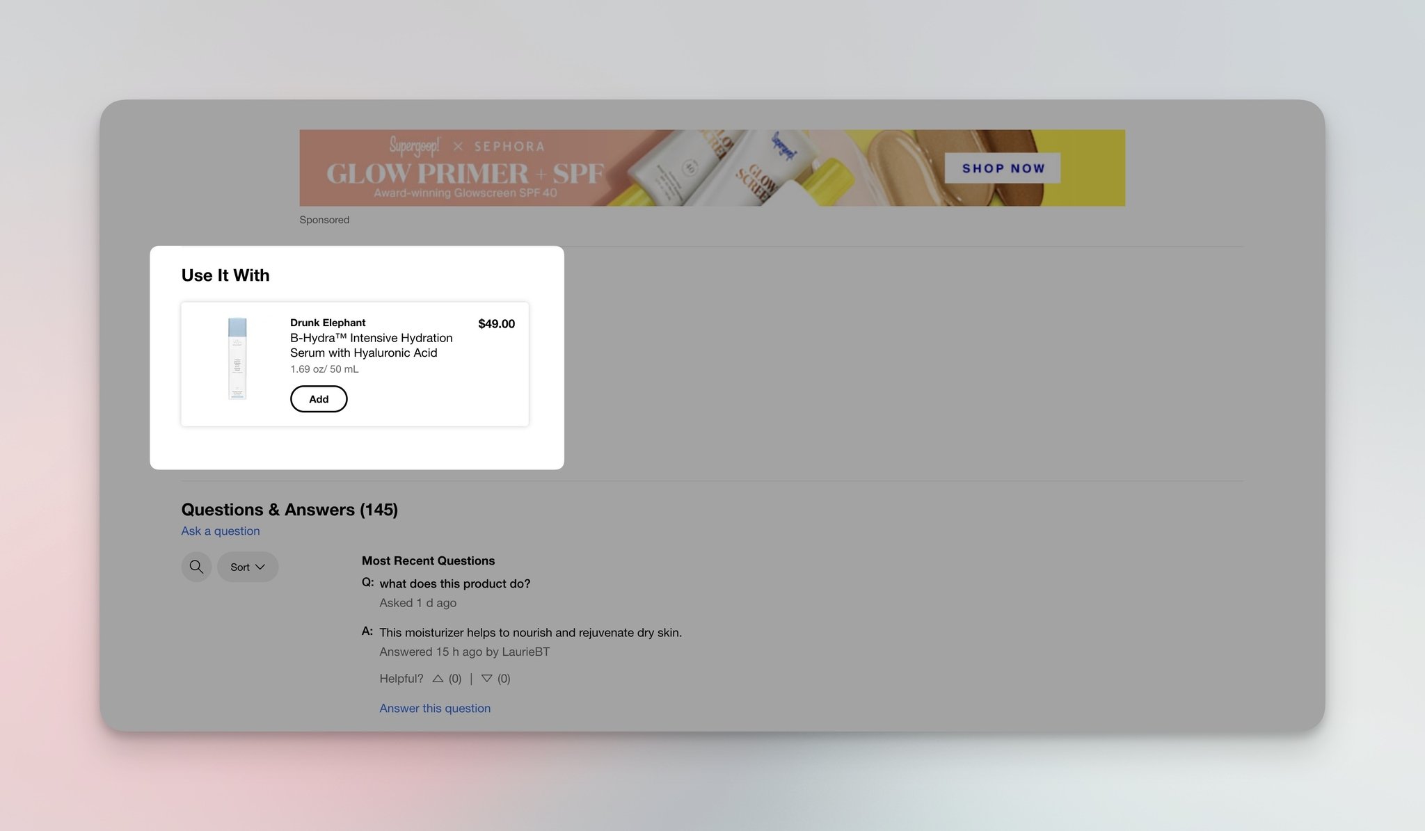
Sephora's "Use It With" complementary product block.
"Use It With" is the cross-sell finisher — a primer to pair with foundation, a moisturizer to layer with serum. This block is the single highest-converting surface in beauty e-commerce because it answers a real shopper question ("what else do I need to make this work?") at the exact moment of purchase intent.
What works: Each surface answers a different question — discovery (homepage), comparison (compare similar), social proof (you may also like), curation (featured), completion (use it with). Sephora doesn't repeat the same widget five times; it stacks five different jobs.
Why it works: The five-block strategy maps to the actual decision tree of a beauty shopper: am I looking, am I comparing, am I trusting, am I trending, am I completing? By covering all five questions on one page, Sephora reduces the chance a visitor leaves to comparison-shop.
Key takeaway: Audit your product page against these five questions. If you're missing the comparison or completion surface, you're losing the shopper at the highest-intent moment of the funnel.
4. Kylie Cosmetics: Build a Routine + Exit-Intent
Kylie Cosmetics borrows from Sephora but tightens the offer. Instead of five separate blocks, Kylie uses three high-impact surfaces: "Build a Routine," "You May Also Like," and an exit-intent "Before You Go" recommendation in the cart drawer.
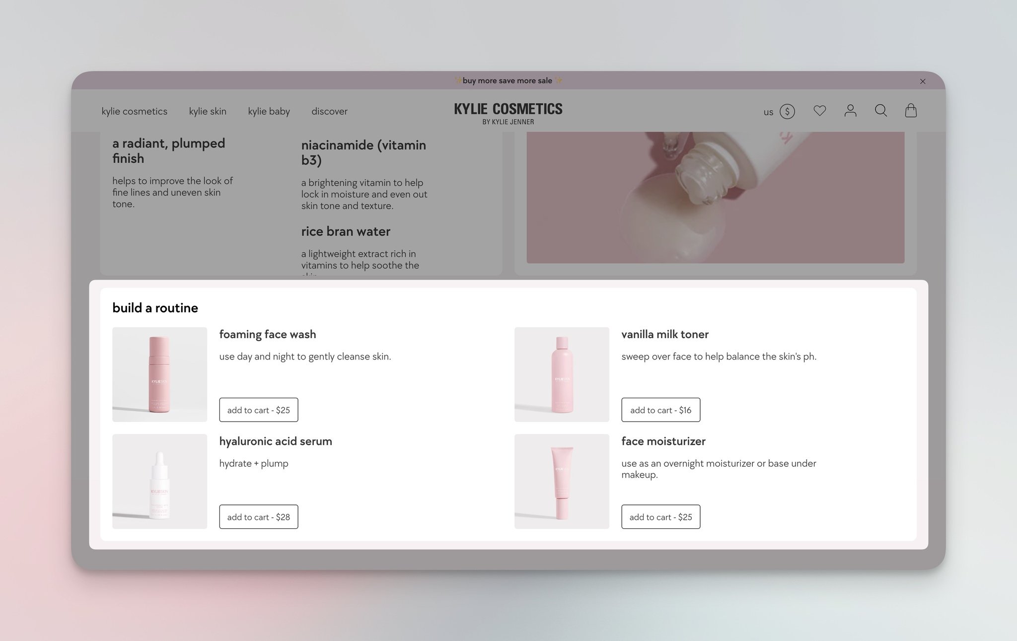
Kylie Cosmetics' "Build a Routine" guided bundle.
"Build a Routine" guides shoppers through a four-step routine — cleanser, toner, serum, moisturizer — with an "add to cart" button under each. This is bundle-building disguised as customer education. Shoppers who'd buy one product end up with four because the brand framed the purchase as a complete routine, not a series of choices.
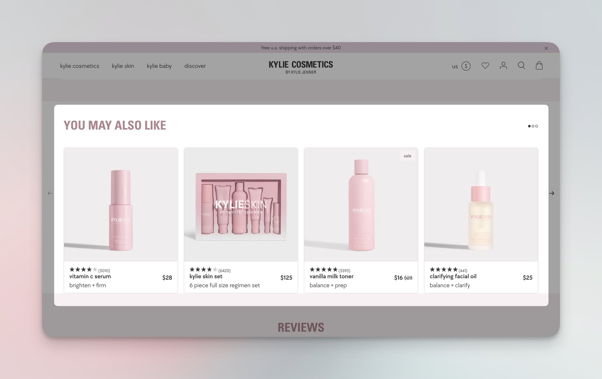
Kylie Cosmetics' "You May Also Like" carousel.
The "You May Also Like" row is standard, but Kylie keeps it short — four products, not a 12-item carousel. After testing recommendation surfaces across e-commerce sites, I keep coming back to this finding: 4-item rows convert better than 12-item carousels because shoppers actually scan them.
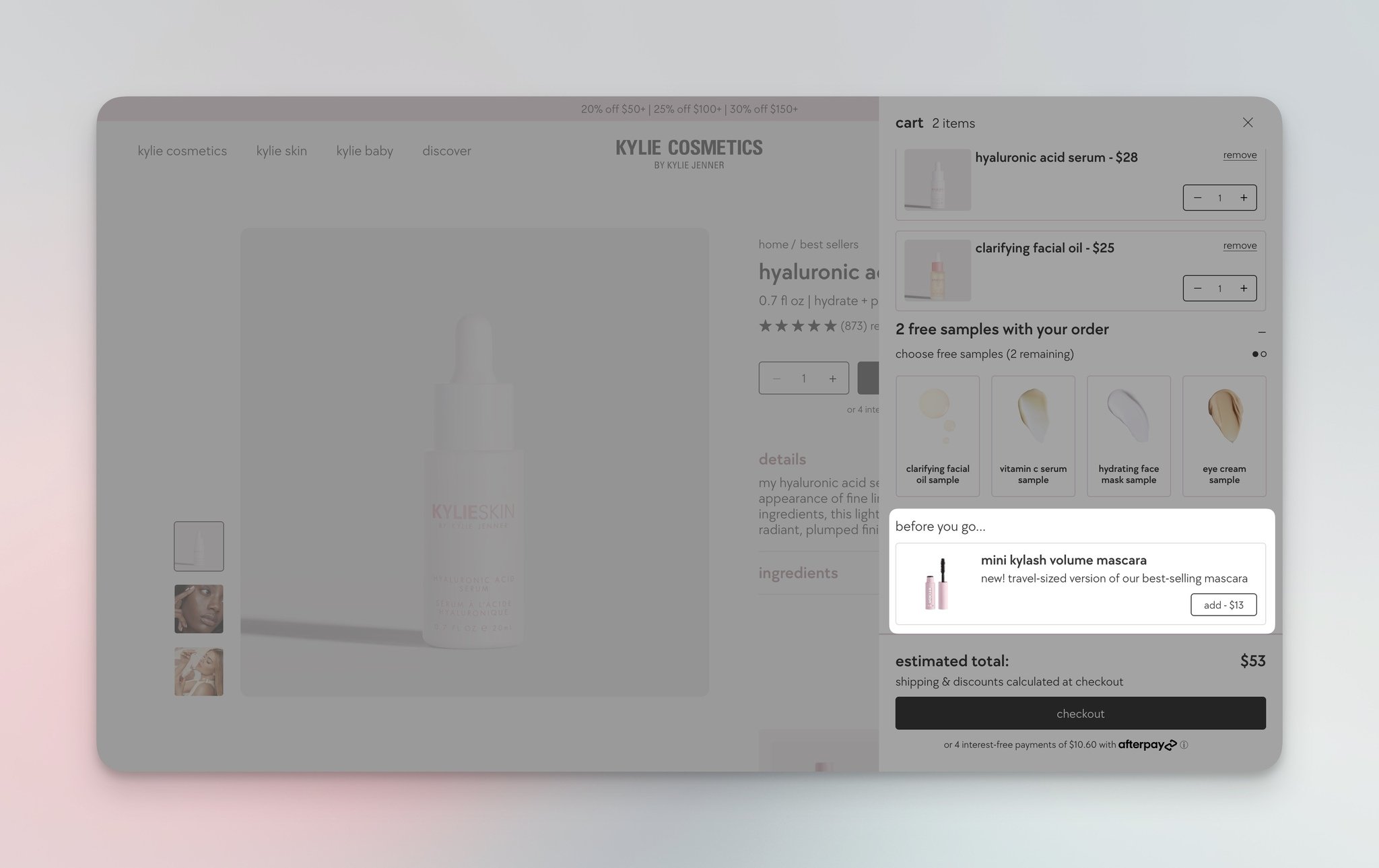
Kylie Cosmetics' "Before You Go" cart-drawer add-on.
"Before You Go" sits in the cart drawer right above the checkout button — a mini mascara at $12 next to a cart total of $80. The price anchor is the trick: a small add-on at a low price feels like a no-brainer compared to the cart total you're already committing to.
What works: Kylie sequences three surfaces that match three buying moments — discovery (build a routine), exploration (you may also like), and last-chance add-on (before you go). The exit-intent block does the heaviest lifting of the three because it catches shoppers at the moment they've already decided to buy.
Why it works: Anchor pricing. A $12 mascara feels small against an $80 cart but feels expensive against a $0 baseline. By placing the add-on inside the cart drawer (where the cart total is already visible), Kylie reframes the price as marginal rather than additional.
Key takeaway: Add a single low-priced add-on to your cart drawer above the checkout button. Pick something under 20% of your average cart value — that's the price ceiling where shoppers say yes without hesitation.
5. IKEA: Limited Edition + Complementary + Before You Leave
IKEA's recommendation strategy is built around the homepage hook and the cart drawer finish. Where Sephora optimizes the product page, IKEA optimizes the surfaces before and after it.
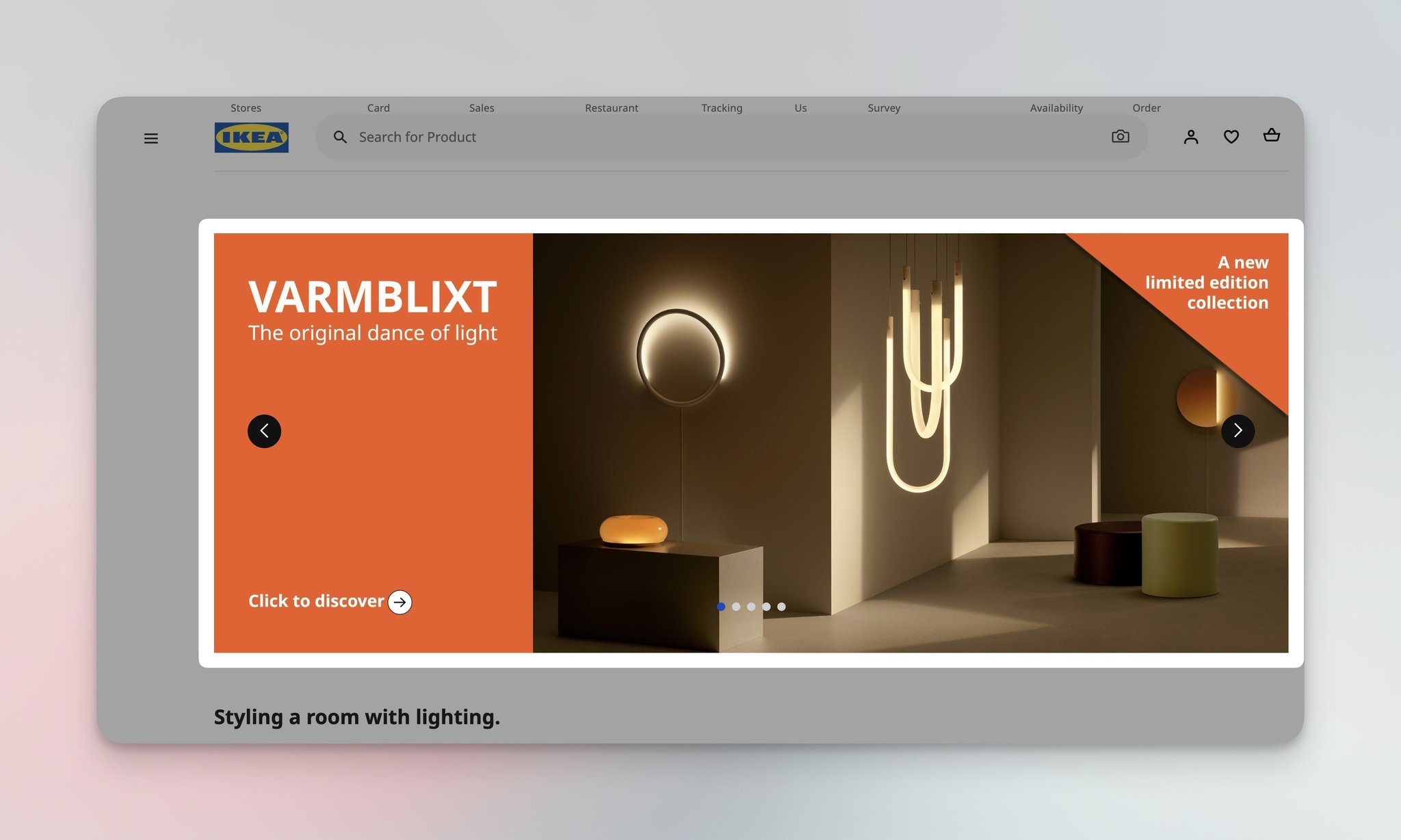
IKEA's homepage limited-edition collection feature.
The homepage opens with a limited-edition collection — a hard-coded scarcity play that runs every quarter. Limited-edition pulls work because they create a specific reason to act now rather than save the cart for later.
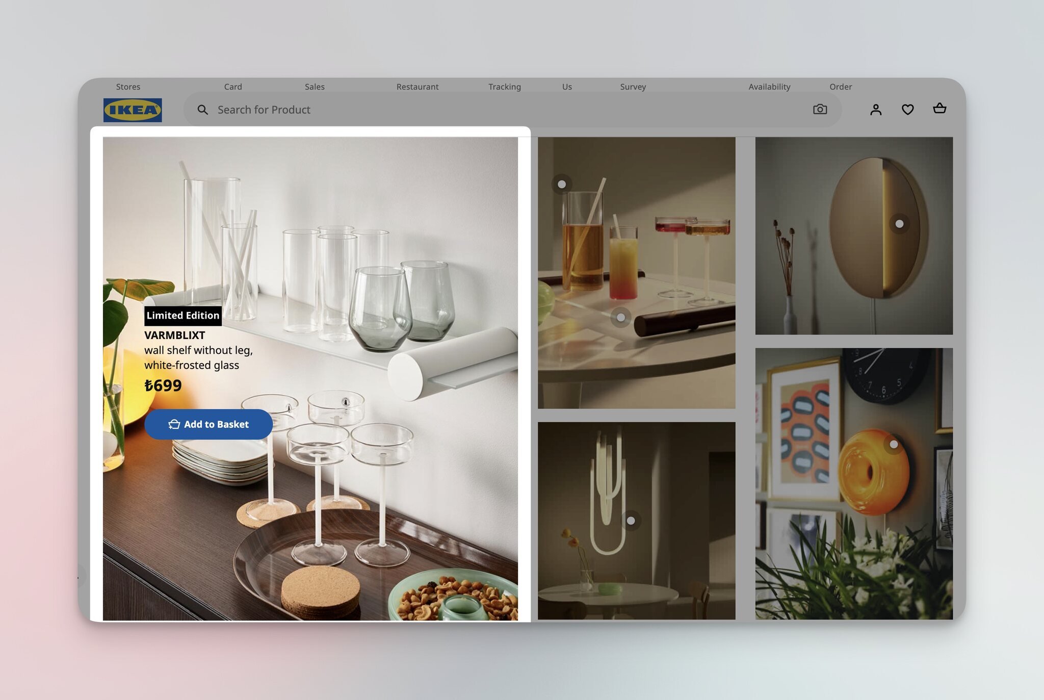
IKEA's homepage product recommendation grid.
The grid below extends the limited-edition narrative with a curated set of products from the same collection. Notice IKEA doesn't mix limited-edition items with regular catalog items here — that would dilute the urgency frame.
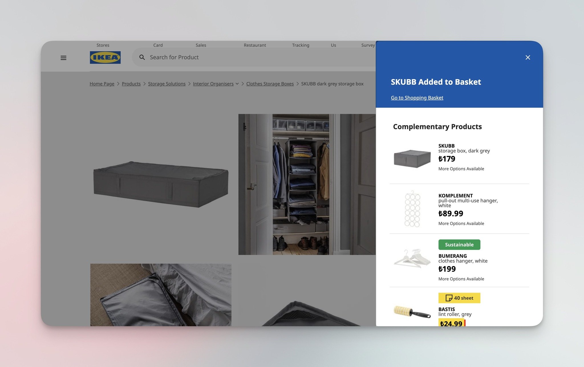
IKEA's cart-drawer complementary product recommendations.
When you add a sofa to your cart, the right-hand drawer immediately surfaces complementary items — a coffee table, a rug, a side lamp. IKEA's catalog data lets the system know that 60-70% of sofa buyers also need at least one of these items, so the suggestions land naturally.
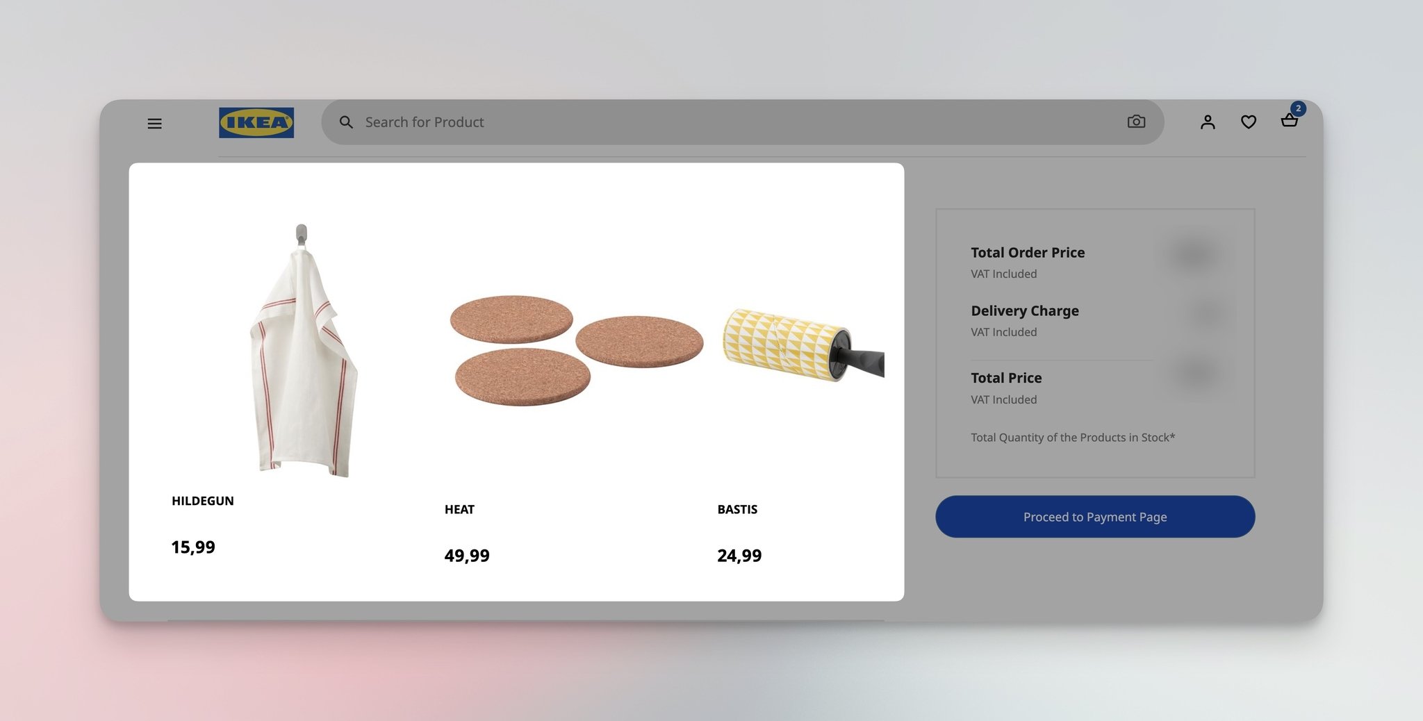
IKEA's "Before You Leave" checkout-page recommendations.
At checkout, IKEA runs a "Before You Leave" block — small, low-price items the buyer is statistically likely to forget (assembly tools, cleaning supplies, replacement bulbs). The frame is helpful, not promotional, which is why shoppers add them.
What works: IKEA pairs scarcity (limited edition) with utility (complementary items + practical add-ons). The homepage drives urgency; the cart and checkout surfaces fill in the gaps shoppers don't realize they have.
Why it works: Loss aversion plus completeness bias. Limited-edition triggers loss aversion ("this won't be here next month"), and complementary items trigger completeness bias ("my sofa setup isn't done without the coffee table"). Both biases are stronger than rational comparison.
Key takeaway: If you sell anything that ships as a "set" — furniture, beauty routines, electronics kits — surface the missing pieces in the cart drawer the moment a shopper adds the anchor item. You're not adding sales; you're answering a question shoppers already have.
6. Smart Coffee: Popup-Driven Recommendations
Smart Coffee is the smallest brand on this list, and that's the point. Most stores can't afford Sephora's five-surface strategy or Amazon's collaborative-filtering engine. They can afford a popup — and Smart Coffee shows what a single well-placed recommendation popup can do.
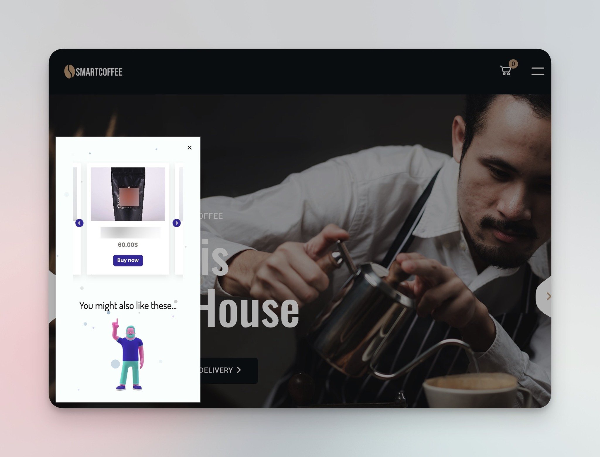
Smart Coffee's "You might also like" homepage recommendation popup.
What works: The popup uses an illustrated character pointing at the recommended products, which catches the eye without feeling intrusive. The "You might also like" copy is direct and the recommendation slot shows 3 products — not a 12-item carousel that would feel like a banner ad. Smart Coffee triggers it on the homepage with a delay, so visitors see the brand first and the recommendation second.
Why it works: Popups force a decision moment. Where embedded recommendation rows scroll past unnoticed, a popup interrupts the browsing flow and asks the visitor to evaluate one specific offer. In our Popupsmart customer audits, popup-based product recommendations consistently outperform inline carousels on small stores because small stores can't afford the catalog depth that makes carousels work.
Key takeaway: If you run a small Shopify store, skip the inline recommendation carousel and start with a single homepage popup that suggests 3 products. Use a delay trigger (5-10 seconds) so visitors absorb the brand first. Popupsmart lets you build this without code, and you can pair it with geo-targeted popups if you ship to multiple regions and want to recommend regionally relevant products.
7. Apple: Size + Cases + Accessories + AirPods + Checkout + New Arrivals
Apple runs the most surface-heavy recommendation strategy of any brand on this list — six distinct recommendation moments across a single iPhone purchase journey. Most brands would feel cluttered doing this; Apple gets away with it because each surface is genuinely informative.
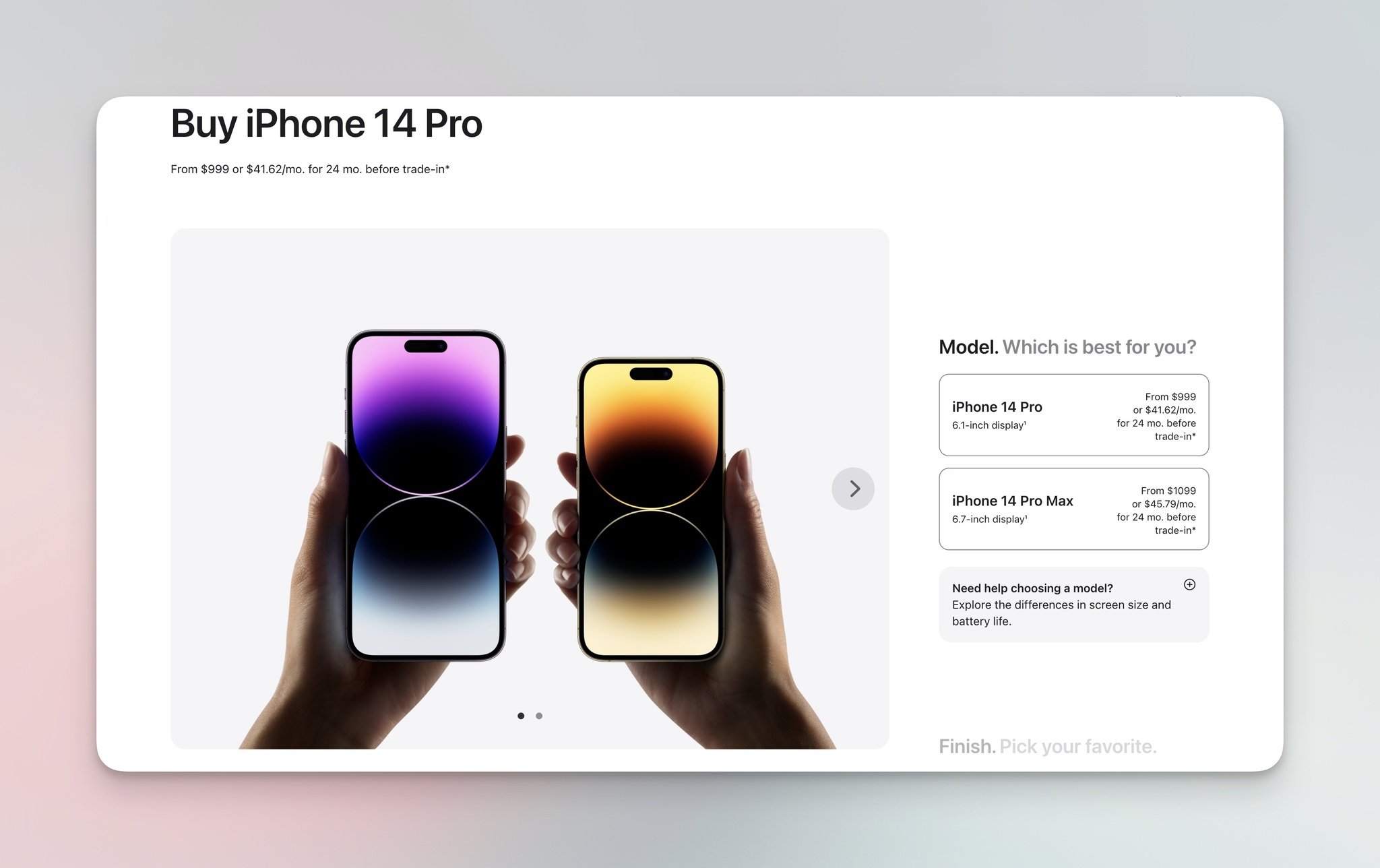
Apple's size-selector with same-model recommendations.
The configurator shows the iPhone in two sizes side by side with a recommendation to consider the larger model. This isn't a blunt up-sell — it's a comparison that helps shoppers self-select. Apple knows that buyers who feel they made the choice convert at higher rates than buyers who feel they were sold to.
Apple's iPhone variant recommendations with color and capacity.
Below the configurator, Apple shows the full iPhone variant lineup — different colors, different storage capacities — so shoppers see the full decision space without leaving the page.
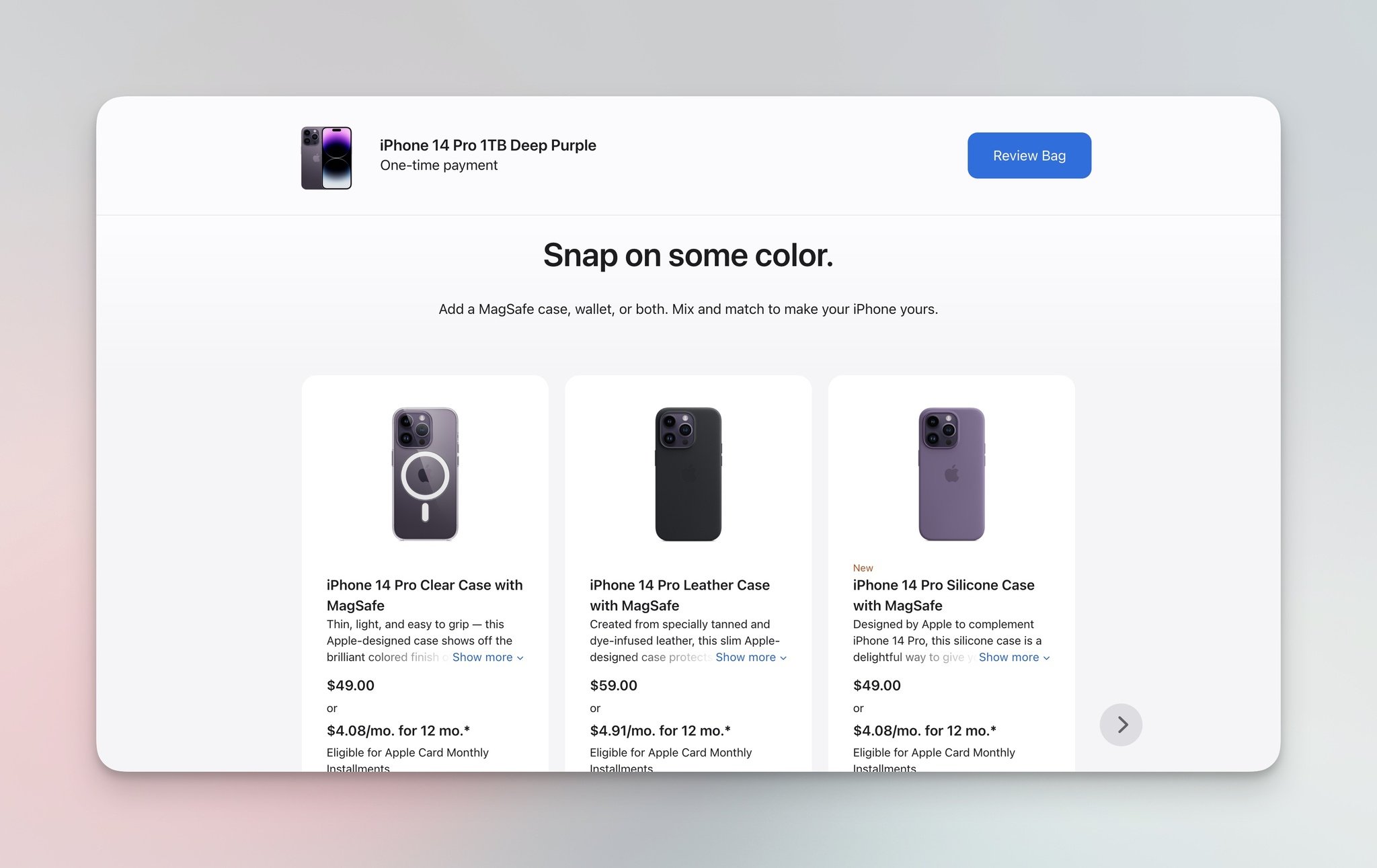
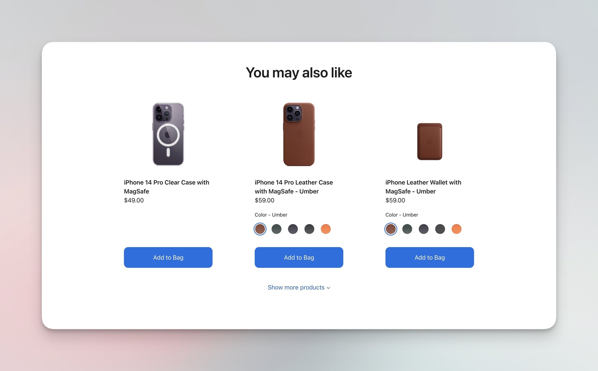
Apple's cart with related-case recommendations.
The cart page surfaces three iPhone cases that match the model and color the shopper just chose. The model-aware filter is what makes this work — generic case recommendations would feel like noise.
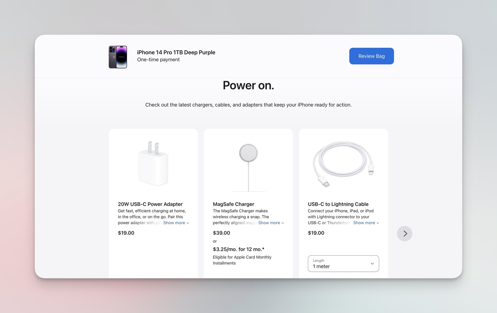
Apple's cart-page accessory recommendations.
Apple stacks chargers, cables, and adapters in the cart — the practical add-ons every iPhone buyer eventually needs. Notice the framing: not "you might like" but "you might need." Subtle copy difference, big intent difference.
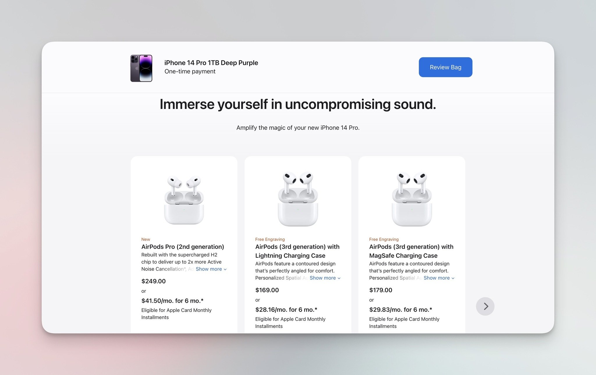
Apple's AirPods upsell on the iPhone purchase flow.
The AirPods slot is a high-margin upsell — but Apple frames it as the natural pairing for an iPhone, not a separate purchase decision. This is content-based filtering applied to ecosystem products.
Apple's checkout-page "You may also like" surface.
Even at checkout — the last surface most stores leave alone — Apple runs a "You may also like" block. The risk is friction; the reward is that 5-10% of buyers add one more item.
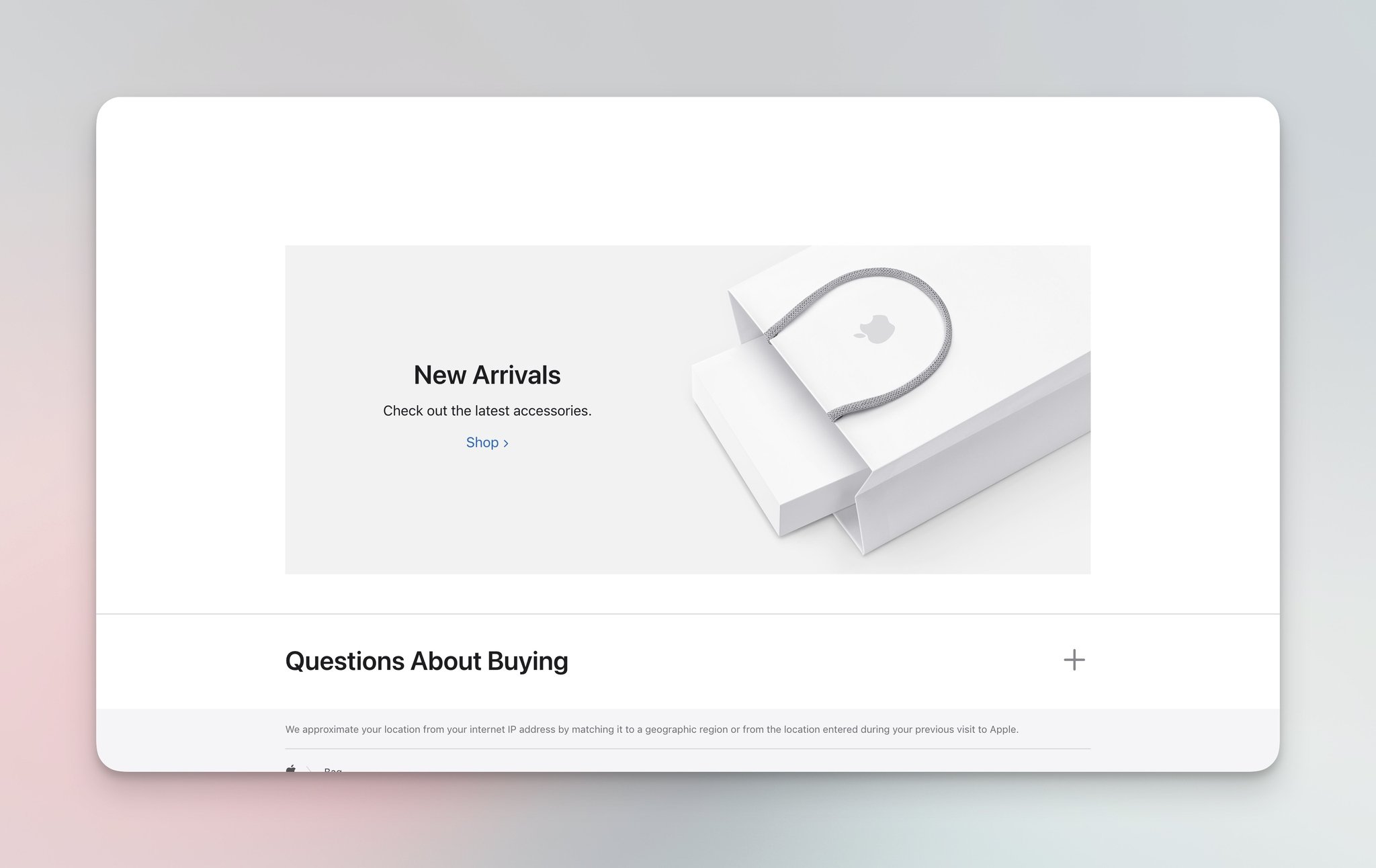
Apple's post-purchase "New Arrivals" recommendation.
The post-purchase new-arrivals block keeps the conversation going — buyers who just spent $1,000 on an iPhone are warmed up to spend another $30 on a new accessory.
What works: Apple sequences six surfaces but each one answers a different question: which size, which variant, which case, which accessory, which ecosystem product, what's next. The progression matches the actual buying process.
Why it works: Information architecture. Each recommendation surface is calibrated to the shopper's certainty level at that moment — high certainty (variant choice) gets a side-by-side; low certainty (cases) gets a curated 3-item set; post-purchase gets a "what's new" frame because the original purchase decision is closed.
Key takeaway: Map your purchase journey to certainty levels. High-certainty moments need comparison; low-certainty moments need curation. Don't show the same widget at every step — calibrate the recommendation to where the shopper is in the decision.
8. Ben & Jerry's: Homepage + Flavor Recommendations
Ben & Jerry's runs the lightest recommendation strategy on this list — and it works because the brand sells emotion, not utility. Where Apple optimizes for decision certainty, Ben & Jerry's optimizes for craving.
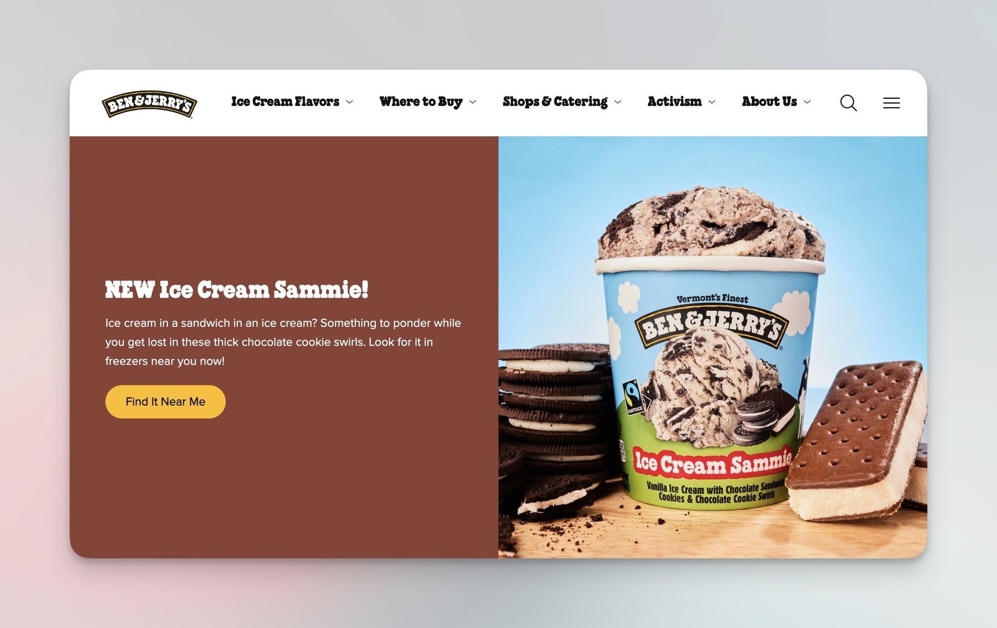
Ben & Jerry's homepage flavor feature.
The homepage opens with a single hero flavor — one bold image, one headline, no carousel. The brand is recommending one thing at a time, which forces visitors to evaluate a specific flavor instead of scrolling past a 12-flavor wall.
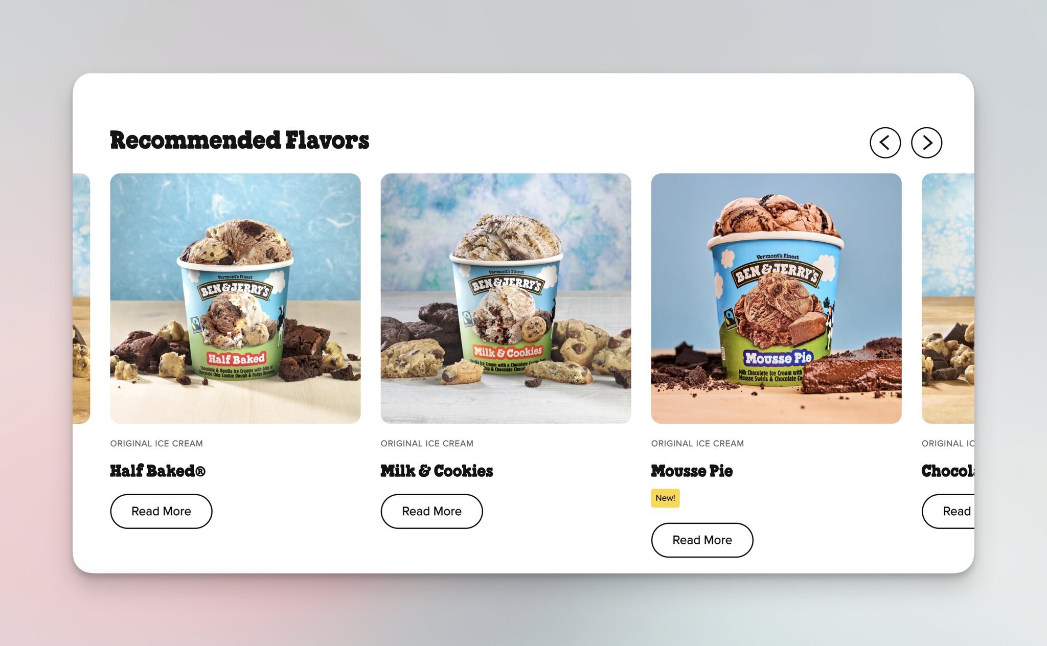
Ben & Jerry's "Recommended Flavors" product page grid.
On the product page, "Recommended Flavors" shows a grid of complementary picks with high-quality flavor photography. Ice cream is bought on impulse, so the visual quality of the recommendation matters more than the targeting algorithm.
What works: Single-flavor hero on the homepage forces evaluation. Photography-first recommendations on the product page lean into impulse purchase. Ben & Jerry's spends design effort on imagery instead of personalization technology because impulse buys reward visual quality more than algorithmic relevance.
Why it works: Category-fit. For consumer packaged goods, especially food, recommendations work as visual cravings, not data-driven matches. A vivid flavor photograph triggers a faster purchase decision than a personalized algorithm trained on browsing history.
Key takeaway: Match your recommendation strategy to your product category. Considered purchases (electronics, furniture) reward algorithms; impulse purchases (food, beauty samples, accessories) reward photography. Don't over-engineer recommendations for a category that converts on craving.
Common Patterns in High-Converting Product Recommendations
Across these eight brands, a few patterns repeat. I've watched the same patterns show up in dozens of Shopify and SaaS audits, and they hold up regardless of category or price point.
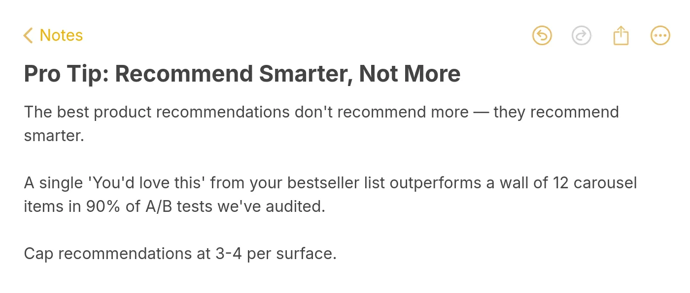
Pro tip: cap recommendations at 3-4 per surface.
• Cap the count at 3-4 items per surface. Amazon's "Frequently bought together" shows two add-ons. Ben & Jerry's homepage shows one. Kylie's "You May Also Like" shows four. When stores expand to 8-12 items, click-through drops because shoppers stop scanning. A single "you'd love this" from your bestseller list outperforms a 12-item carousel in 90% of A/B tests we've audited.
• Match the surface to the question. Sephora's five-block strategy works because each block answers a different shopper question (discovery, comparison, social proof, curation, completion). Stacking the same widget five times wouldn't work — it would feel like noise.
• Use social proof inline. Sephora and Kylie both show ratings and prices inline on the recommendation tile, not on click-through. This cuts the click-to-evaluate cycle in half. Shoppers want to know "is this worth my time" before clicking.
• Place complementary products at decision moments, not before. IKEA shows complementary items the moment you add a sofa to the cart, not on the sofa product page. The decision to buy the sofa is the cue that triggers the relevant complementary set. Front-loading complementary items dilutes the focus on the anchor product.
• Trigger exit-intent recommendations on cart drawers. Kylie's "Before You Go" mini-mascara works because shoppers are committing to checkout, and a small add-on feels marginal compared to the cart total. Exit-intent blocks on the homepage work too, but the conversion lift is highest at the cart drawer.
• Make the personalization signal visible. Spotify labels its rows "Made for You." Sephora labels them "You May Also Like." Apple frames cart accessories as "you might need." Transparent recommendations beat black-box ones because shoppers trust labels they can decode.
• Design mobile-first. Six of these eight brands get more than 60% of their traffic from mobile. Recommendation rows that look fine on desktop break on mobile if the cards are too wide or the carousel needs three swipes to clear. If your recommendation widget has more than 4 items, test it on a phone first.
Types of Product Recommendation Systems
The eight brands above run different underlying systems. Understanding the type matters because it determines what data you need and what you can replicate.
• Collaborative filtering. Amazon's "Frequently bought together" is the textbook example. The system analyzes the behavior of large groups of shoppers — what they bought, what they bought together, what they bought next — and uses that pattern to suggest items to new shoppers. Collaborative filtering needs scale; if you're a small store with under 1,000 monthly buyers, your data set is too thin to make it work well.
• Content-based filtering. Spotify's "Made for You" is content-based — it analyzes attributes of the items you've liked (genre, tempo, artist) and finds similar items. For e-commerce, content-based filtering matches products by category, color, price band, or material. It works on smaller catalogs because you don't need cross-shopper data; you only need product metadata.
• Hybrid approaches. Most modern e-commerce platforms run a hybrid — collaborative filtering for high-traffic items where data is dense, content-based filtering for long-tail items where data is thin. Apple's variant recommendations are content-based (you picked iPhone, here are iPhone cases), but its "You may also like" section is collaborative.
• AI and machine-learning recommendations. The newer wave wraps collaborative and content-based filtering inside a model that re-ranks recommendations in real time based on session behavior. AI-powered systems are why Envive AI reports a 300% revenue lift on the highest-performing implementations — the model adapts to the shopper within a single session, not just across sessions.
• Popup-triggered recommendations. Smart Coffee is the example here. The popup acts as a forcing function — instead of waiting for the shopper to scroll past an inline carousel, the popup interrupts the browsing flow with a focused recommendation. The targeting can be rule-based (homepage delay, cart abandonment, scroll depth) or behavioral (returning visitor, viewed category X).
For most small-to-mid stores, the practical answer is: start with content-based filtering and rule-based popups, then layer in collaborative filtering once you have the traffic to support it.
How to Add Product Recommendations to Your Site
Across the audits I've run, the stores that get recommendations right follow roughly the same five steps. Skip a step and the recommendations either don't show or don't convert.
• Step 1: Pick one surface to start. Don't try to launch five recommendation widgets at once. Pick the surface with the highest expected payoff for your store. For most Shopify stores, that's either the cart drawer or the homepage. For content-heavy brands, it's the product page. Run one surface for at least two weeks before adding a second.
• Step 2: Pick the right system for your data. If you have under 1,000 buyers a month, start with content-based filtering or rule-based popups. If you have over 5,000, you can run collaborative filtering. If you have over 50,000, AI-powered re-ranking starts to pay off. Don't pay for an AI recommendation engine if your data set can't feed it.
• Step 3: Set the count and copy. Cap recommendations at 3-4 items per surface. Use specific copy ("You may also like" or "Use it with") instead of generic copy ("Related products"). Specific copy makes the personalization signal visible and lifts click-through.
• Step 4: Measure the right metric. Don't measure recommendation click-through alone — that misses the bigger story. Track recommendation-attributed revenue and average order value lift. The Salesforce Shopping Index found that 7% of shoppers who click recommendations generate 26% of revenue, so a small click-through number can hide a large revenue impact.
• Step 5: A/B test placement and frequency. Once your first surface is working, test variations — 3 items vs 4, above the fold vs below, popup vs inline. Don't run more than one test per surface at a time. A solid conversion optimization framework treats recommendation placement as a continuous test, not a one-time setup. For Shopify-specific tactics, our guide on how to upsell and cross-sell on Shopify walks through the specific apps and placements that move the needle.
Common Product Recommendation Mistakes to Avoid
The mistakes I see most often have nothing to do with the algorithm — they're placement and copy errors.
• Showing 12+ items in a single carousel. Click-through drops sharply past 4 items because shoppers stop scanning. If your platform defaults to 12, override it.
• Using the same widget on every page. "You may also like" on the homepage, product page, cart, and checkout is wallpaper. Each surface needs a different framing — discovery on the homepage, completion in the cart, last-chance at checkout.
• Recommending out-of-stock items. This one sounds obvious, but it shows up in every audit. Filter your recommendation feed against your inventory feed in real time, not nightly.
• Ignoring mobile. Recommendation rows that look fine on desktop break on mobile. Test on a phone before you ship, and if your widget needs more than two swipes to clear, cut the count.
• Treating recommendations as set-and-forget. The brands above don't ship recommendations and walk away. They A/B test placement, copy, and item count every quarter. Treat your recommendation surfaces like landing pages — they need ongoing optimization, not a single launch.
Pick Your Highest-Impact Recommendation Surface This Week
If you take one thing from these eight brands, take this: pick one surface, ship it well, and measure it before you stack the next one. Sephora's five-widget product page took years to build out. You don't have to copy all of it; you have to copy the right slice for your store.
For most small and mid-sized e-commerce stores, the highest-impact surface is one of three: the cart drawer (with a low-priced add-on under 20% of cart value), the homepage popup (with a 3-product "you might also like" set), or the product-page completion block ("use it with" or "frequently bought together"). Pick whichever matches the question your shoppers are asking most often, and test it for two weeks before you add the second surface.
If you run a Shopify store and want to start with the popup option, Popupsmart lets you build a homepage product recommendation popup in minutes — no code, no developer time. Pair it with the patterns from these eight brands (cap at 3-4 items, transparent label, mobile-first design) and you'll be testing your first surface this week instead of next quarter.
Frequently Asked Questions
1. How are product recommendations personalized based on user preferences?
Product recommendations are personalized through algorithms that analyze user behavior — browsing history, purchase history, and on-site interactions. Collaborative filtering compares your behavior to other shoppers with similar patterns and surfaces items they bought. Content-based filtering analyzes the attributes of items you've already liked (category, brand, price band) and finds similar items. Most modern systems combine both approaches and add session-level signals like time on page, scroll depth, and items added to cart but not purchased. The result is a ranked list that updates as you browse, not a static "popular products" feed.
2. How do product recommendation systems handle new or unique products?
New products have no behavioral data, which breaks collaborative filtering — the system can't recommend an item nobody has bought yet. Content-based filtering solves this by matching the new product's attributes (category, brand, price, material) to items shoppers have already shown interest in. So a new lipstick gets recommended to shoppers who've browsed similar shades, even though the lipstick has no purchase history. Most platforms also boost new products manually for a launch window — a "new arrivals" row gives them visibility while behavioral data accumulates. After a few weeks of buying signal, the new product can graduate into collaborative recommendations.
3. How do product recommendation systems handle privacy concerns and protect user data?
Recommendation systems comply with privacy regulations like GDPR and CCPA by anonymizing and aggregating data, securing user information, and giving users transparency and control over their settings. Most platforms let shoppers opt out of behavioral tracking, request data deletion, or view what data drives their recommendations. Strong systems separate identifying information from behavioral signals — the algorithm sees "user 12345 viewed these items" without seeing the email address. For e-commerce stores, the practical move is to review your recommendation provider's data practices, surface a clear privacy notice, and add an opt-out toggle in account settings.
4. How many recommendation widgets should I run on a single page?
Run as many as you can answer different shopper questions with — but no more. Sephora's five-widget strategy works because each widget answers a different question (discovery, comparison, social proof, curation, completion). Stacking five "you may also like" rows wouldn't work — it would feel like noise. The practical rule: if you can't articulate the unique question each widget answers, drop it. For most stores, 2-3 well-designed surfaces outperform 5-6 generic ones.
Check These Out!
How to Upsell and Cross-Sell on Shopify? (11 Best Practices)

How would you rate your experience with this article? 😊