20 Best SaaS Landing Page Examples in 2026
A SaaS landing page is a focused sales page for cold visitors that explains your software’s value and drives conversions via clear CTAs, audience targeting, and elements like taglines, logos, testimonials, features, and short demos, with examples from Avocode, Taskade, Airtable, and more.
Most SaaS homepages try to do too much. A landing page does one thing: turn a specific visitor into a trial, a demo, or a signup. That's the whole job. I've spent the last month pulling apart 20 of the best SaaS landing page examples live on the web right now — Slack, Notion-adjacent tools, design platforms, PM software — to see what separates the 4% converters from the 11% ones. The patterns are consistent, and most of them are copyable today.
A SaaS landing page converts when it pairs a one-sentence value prop with a high-contrast CTA above the fold, supports that claim with recognizable logos or named testimonials within the first two scrolls, and strips the signup form to a single field. These 20 best SaaS landing page examples show that formula working in 2026.
What Is a SaaS Landing Page?
A SaaS landing page is a standalone page built around one offer and one action. It isn't a homepage. Homepages serve everyone — investors, hires, existing customers, press — and trade focus for breadth. A landing page does the opposite: one audience, one promise, one button.
In practice, that means the page drops the site's main navigation (or hides it), swaps the generic hero for one specific to the campaign that drove the click, and puts a single dominant CTA above the fold. You'll see separate pages for "Free trial," "Book a demo," "Watch video," and "Compare plans" on the same SaaS site — because each audience needs a different page.
A functional SaaS landing page almost always contains the same components: a hero with a value proposition headline, a subheadline that names the specific problem, a primary CTA, a secondary supporting CTA (usually "See how it works"), social proof within the first scroll, a features block that demonstrates rather than lists, pricing or plan clarity, and a final CTA that repeats the hero offer. Miss one of those, and the page leaks visitors.
First-person note from me: the mistake I see most with growth teams is treating the landing page as a mini-homepage. If your paid click bounces because the hero says something different than the ad, the page has already failed — no amount of testimonials can recover that gap.
Benefits of Effective SaaS Landing Pages
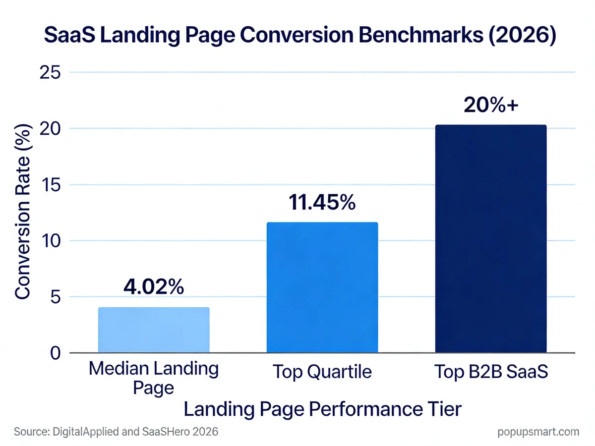
SaaS conversion benchmarks at a glance
The payoff for building a real landing page — instead of pointing paid traffic at your homepage — is measurable and widely documented. According to DigitalApplied's 2026 landing page data, the median landing page converts at 4.02%, while the top quartile exceeds 11.45%. That's a 2.8x gap between average and excellent — and almost all of the spread is explained by five or six design and copy decisions, not budget.
SaaS pages specifically run a little differently. Aimers.io's conversion research pegs the average SaaS lead conversion rate at 3-5% with top performers hitting 10-15%. When the offer is a free trial instead of a contact form, the numbers lift further — ChartMogul's SaaS conversion report found 57% of SaaS products use a free trial as their primary landing point, more than twice the rate of freemium (26%). Free trial pages almost always outperform "request a demo" pages in self-serve categories because the commitment cost is lower.
Speed compounds everything. The same DigitalApplied analysis found that a one-second delay in load time cuts conversions by 7%. For a page doing 10,000 visits a month at 5% conversion, that's 35 signups you're giving away to a lazy hero image.
The business case writes itself. Better landing pages mean more pipeline without more spend, cleaner attribution (one page, one offer, one traffic source), and a faster feedback loop for A/B testing because the variable under test is isolated.
Key Elements to Include on Your SaaS Landing Page
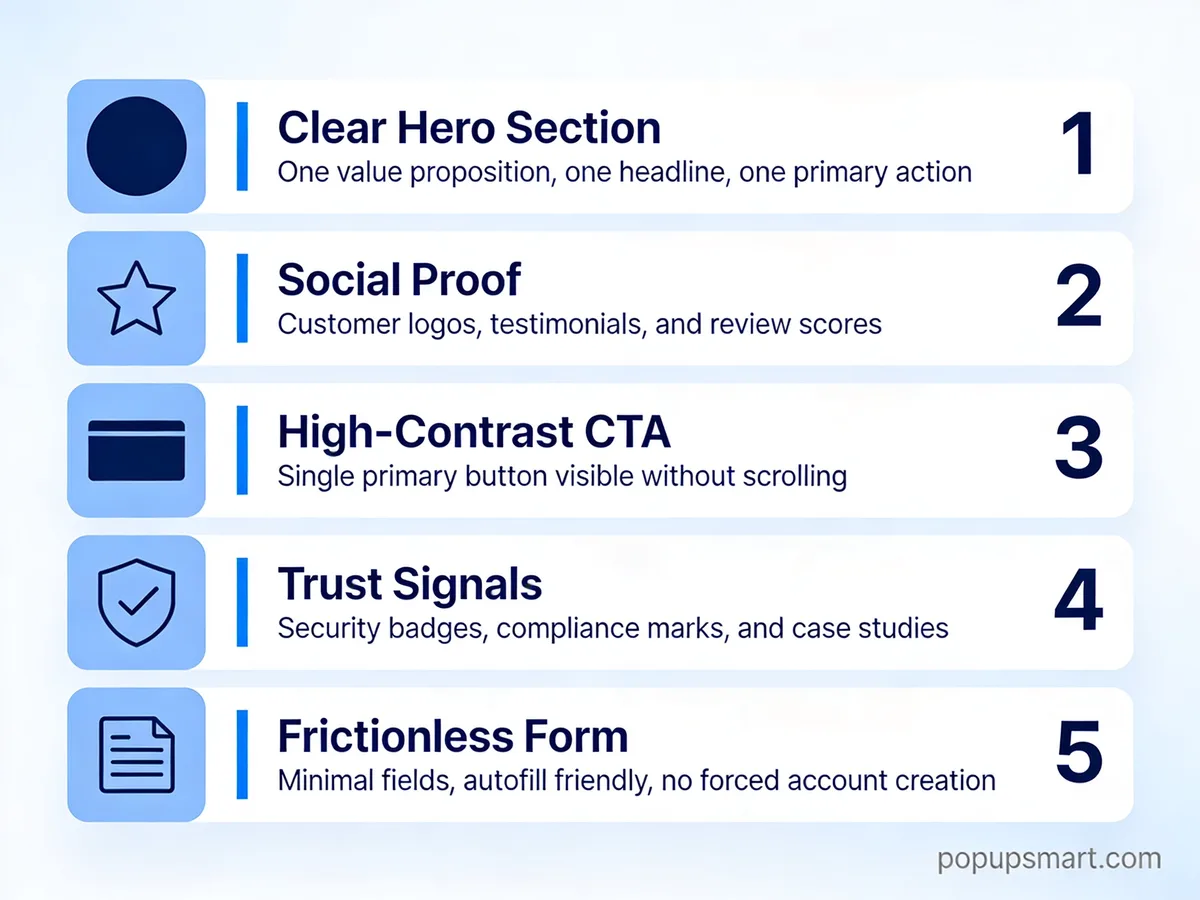
Five elements every SaaS hero needs
Strip every high-converting SaaS landing page I've studied and the same five structural elements show up. Miss any one and conversions suffer predictably.
- Hero section with a clear value proposition. The headline names the outcome, the subheadline names the audience or the mechanism, and the hero visual shows the product in use. "Project management for modern software teams" tells you exactly what Linear does and who it's for before you scroll.
- Social proof within the first scroll. Named customer logos, a review count from a third-party source (G2, Capterra), or a specific testimonial with a named person and their title. Anonymous "5-star reviews from thousands of customers" does almost nothing — specificity is what makes social proof believable.
- High-contrast primary CTA. The button should hit at least a 4.5:1 contrast ratio against its background for WCAG AA compliance, but the real job is visual dominance: it should be the first thing the eye catches after the headline. Copy matters too — "Start free trial" almost always beats "Sign up" because it previews the outcome.
- Trust signals near the conversion point. SOC 2 badges, "No credit card required," GDPR compliance, money-back guarantees. These appear near the CTA, not in the footer, because they're objection-killers at the exact moment of decision.
- Frictionless signup form. One field beats two beats three. If you can't sign up with email-only, you're leaving 20-30% of conversions on the table. Ask for firmographic data in step two, after the email is captured.
Everything else — pricing, FAQ, integrations, feature deep-dives — is supporting material. The five elements above carry the weight.
20 Best SaaS Landing Page Examples
Here are the 20 SaaS landing pages I'd send to any marketing team as a reference pack. Each one does something specific well — and each one has at least one flaw I'll also point out, because honest teardowns are more useful than pure praise.
1. Avocode
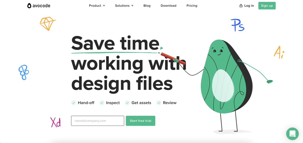
Avocode's landing page
Avocode is a design hand-off tool for Sketch, Figma, XD, Photoshop and Illustrator files — which is a mouthful. The landing page solves that by sketching each supported format as an illustrated logo instead of writing it out, which compresses five integrations into one glance. The hero pairs a two-line value prop with a "Start Free Trial" button, and the white space around the CTA is intentional — nothing competes for attention.
The page runs two CTAs: one above the fold and one after the feature walkthrough, both with the same copy. That repetition is the right call because users who need more evidence before converting get a second chance without having to scroll back up. Testimonials sit beside each feature rather than in a segregated "testimonials" block, which ties the social proof directly to the claim it supports.
Takeaway: if your product integrates with recognizable tools, show their logos in the hero — it borrows trust from brands your visitor already knows.
2. Taskade
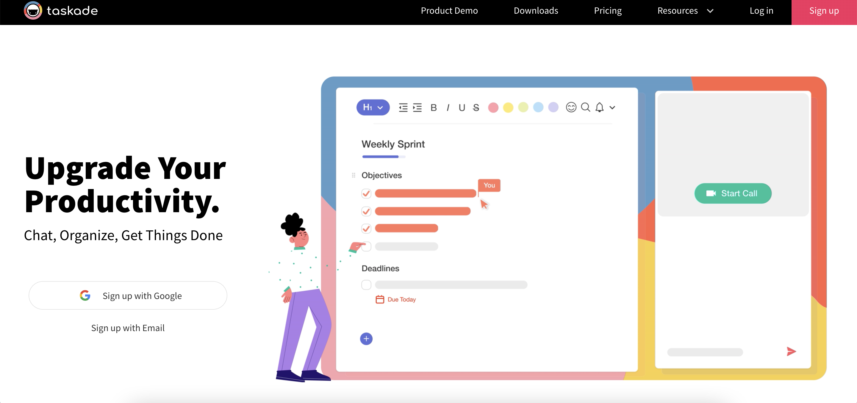
Taskade's landing page
Taskade runs a three-word hero headline — "Chat. Organize. Done." — that compresses the entire product into the user's verb list. The subheadline does the explaining, not the headline, which is the right hierarchy. Two signup options sit above the fold: a subtle one in the top-right nav and a primary one under the hero, so users at different intent levels both get a path.
The feature section runs on looping product GIFs instead of static screenshots. That matters because it's showing, not telling, and it previews the interaction the user will have inside the app. Trust from "see it working" beats trust from "read about it" every time. Icon-based CTAs for Chrome, iOS, Android, and desktop consolidate four separate install flows into one row.
Takeaway: rhyme or rhythm in a three-to-five-word headline lodges in memory better than a dense nine-word value proposition. Save the detail for the subhead.
3. MeisterNote
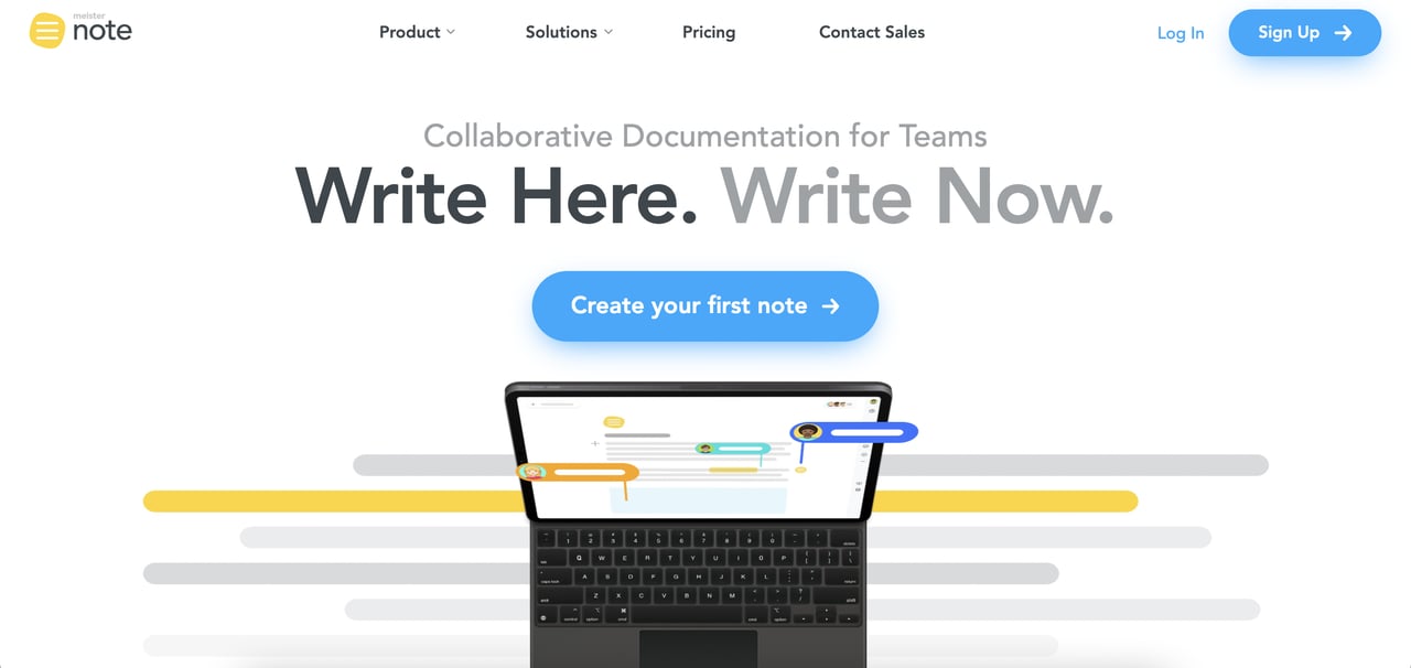
MeisterNote's landing page
MeisterNote's CTA copy is the detail worth copying — it says "Create your first note" instead of "Sign up." That's outcome-framing, not action-framing. The button describes what the user will have after they click, which reduces the psychological cost of signup. The headline "Write Here. Write Now." is a double meaning — a pun that also works as a time-pressure nudge.
The page places a privacy badge directly below the form, not in the footer, because it's answering an objection at the exact moment the objection is likely to fire. Integration logos are displayed prominently because users landing on a documentation tool almost always have existing tools they need it to talk to. The page runs four instances of the primary CTA across the scroll depth, which sounds excessive but tests well in long-form landing pages where user intent can spike at any point.
Takeaway: rewrite your CTA button copy from the verb-action frame ("Sign up," "Get started") to the outcome frame ("Create your first X," "See your data in 30 seconds").
4. Airtable
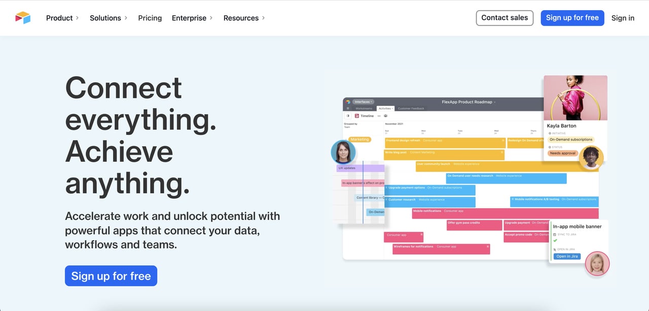
Airtable's landing page
Airtable has the hardest landing-page job on this list: its product is a database that looks like a spreadsheet and behaves like an app builder. The landing page dodges the complexity problem by leading with outcomes, not features. The hero shows an animated product demo that reveals the interface in ten seconds — faster than any copy could explain.
Social proof is carried by a logo wall featuring Medium, Netflix, Time, and Shopify, anchored directly below the hero. When users recognize two or three of those logos, the "is this tool serious?" question answers itself. The page ends with a single long-form testimonial in video, which converts at higher rates than text quotes for products where the workflow is the value.
Takeaway: if your product is complex, use a 10-second animated hero demo to do the explaining. Written copy will never compete with seeing the UI in motion for abstract products.
5. Monday.com
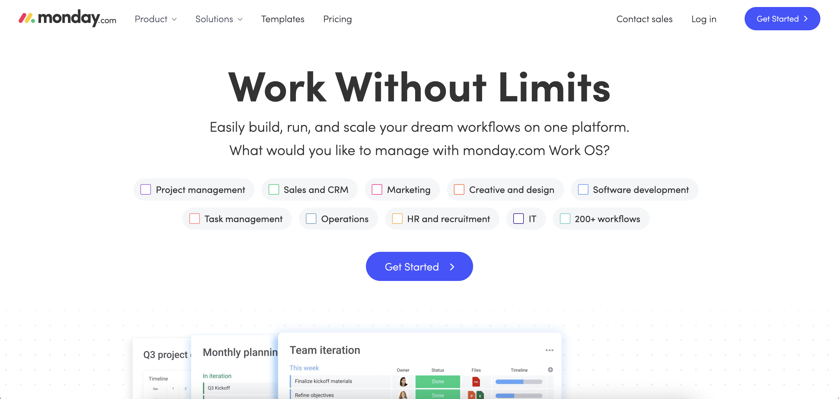
Monday.com's landing page
Monday.com turned its own hero visual into a mock task board — you're looking at the product as you read about the product. This is a form of embodied design: the landing page is a demo of itself. The checklist format matches the mental model the user arrived with ("I need to manage tasks"), so the cognitive load drops to near zero.
A live chat widget appears in the bottom right with a friendly prompt rather than a generic "How can we help?" — which boosts both support perception and sales touch points. Integration logos cycle in a horizontal slider rather than sitting static, which catches peripheral vision during scroll without stealing focus from the CTA.
Takeaway: can your hero visual be the product instead of showing the product? If yes, you remove the mental translation step between "what I see" and "what I'll get."
6. ActiveCollab
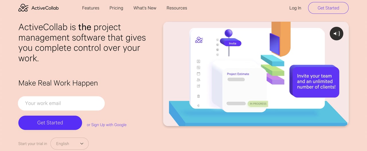
ActiveCollab's landing page
ActiveCollab puts a language selector directly under the primary CTA, which is an underrated move for international SaaS. Users landing from non-English searches see their language as an option at the moment of decision, not buried in the footer. The page also surfaces the total number of teams using the product — a single big number as social proof, which works like a counter effect.
The hero copy bolds the word "the" ("The" easy way to manage projects) — a tiny typographic choice that reframes the whole value proposition as a category claim rather than a feature claim. It's aggressive in a way most SaaS copy isn't. The button contrast is also worth studying: deep green against a pale background hits roughly 6:1 contrast ratio, well past the 4.5:1 WCAG AA threshold.
Takeaway: a single bolded word in your hero can change the entire claim's tone from neutral to category-owning. Use it on the word that carries the most weight.
7. Maze
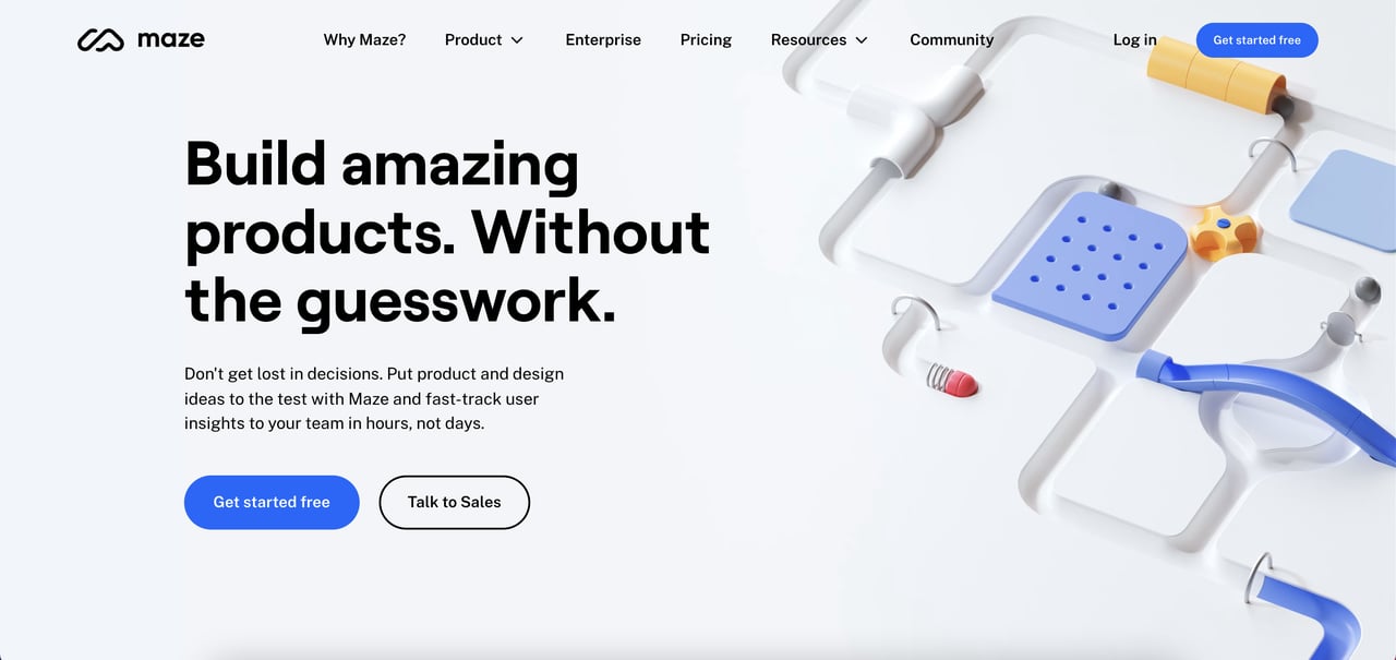
Maze's landing page
Maze is a user testing platform, and its landing page opens with pinball-style animations rather than the standard product demo. That's a brand risk — most SaaS plays it safe — but it pays off because the animation is distinctive enough to trigger recall later. The side-by-side CTAs use color weight to signal hierarchy: one is filled and dominant, one is outlined and secondary, so the user's eye gets a default without the second option disappearing.
The headline and subheadline do two different jobs cleanly — the headline names the category ("Rapid user testing"), the subheadline names the problem it solves ("for design teams who ship weekly"). Near the bottom, Maze lists "who this is for" as a segmentation filter, which self-qualifies visitors before they hit the signup form.
Takeaway: side-by-side CTAs work only when their visual weight is clearly unequal. Two equally prominent buttons create decision paralysis — Hick's Law in action.
8. WeTransfer
WeTransfer's landing page
WeTransfer's landing page is a single screen — no scroll needed. The product is usable directly on the page without a signup, which flips the normal funnel: visitors get the outcome first, then convert to paid later for more storage. This is radical friction reduction, and it works because WeTransfer's product is simple enough to fit the pattern.
The illustration art is the brand's signature, and it rotates regularly, so even returning users see something fresh. The "Go Pro" CTA is the only upsell on the page, and its color tuning sits tonally inside the illustration rather than fighting it. This is rare — most SaaS buttons are hot-colored contrast bombs — but it works here because the product is already being used, so the CTA doesn't need to shout to get clicked.
Takeaway: if your product can be sampled without signup, let the landing page be the product. Monetize the depth, not the entry.
9. Asana
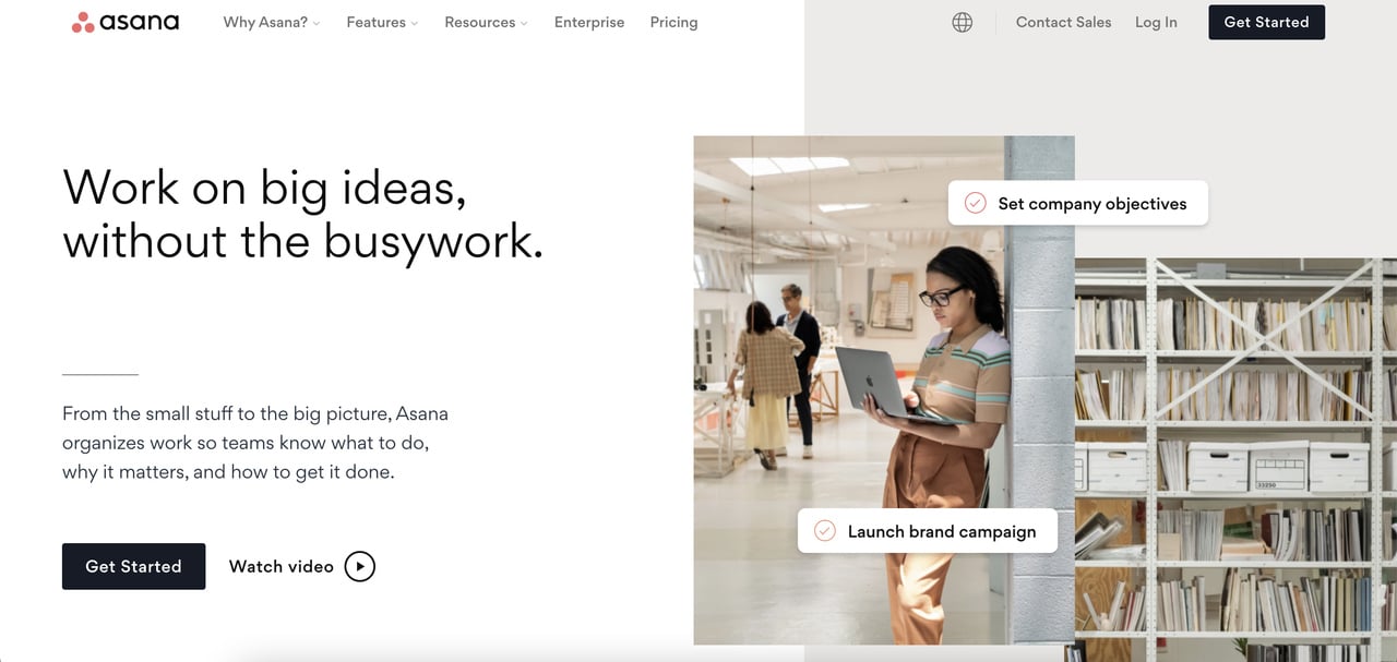
Asana's landing page
Asana is one of the few PM tools that uses a real human photograph in the hero section instead of a product screenshot. That's a deliberate counter-move against the sterile-dashboard trend, and it reads as "real teams, real work" rather than "abstract software." The visual also gives the page warmth that most enterprise PM pages lack.
The scrolling pattern uses a "pull-away" effect where each section slides off as the next arrives, which feels more like navigating a story than scrolling a page. At the bottom, the integrations slider isn't just a logo wall — each logo links to a dedicated integration page, which creates a deep internal linking structure that helps SEO and answers the "does it work with my stack?" question without requiring the user to ask.
Takeaway: humans in the hero work for collaboration products where "my team will actually use this" is the real objection. For solo-use tools, stick with product screenshots.
10. Popupsmart
Popupsmart's landing page
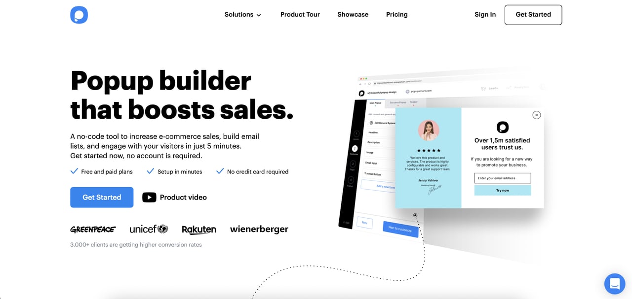
Popupsmart is the brand I work for, so I'll flag that bias upfront — but the landing page is worth including because it embeds the builder directly inside the page. Users can design a working popup in the hero itself, before signup. That's the WeTransfer pattern applied to a more complex product: sample the outcome before committing.
Under the hero, three tight reassurance badges — "Free and paid plans," "Setup in minutes," "No credit card required" — are shown. Below that, the live product demo animation shows the popup firing on a mock e-commerce page, which ties the tool to the context most visitors arrive from.
Takeaway: if your product has a visual output, let the landing page render it live. Showing a preview built in real time converts better than any static screenshot, because the user has already done a mini-version of the work.
11. Miro
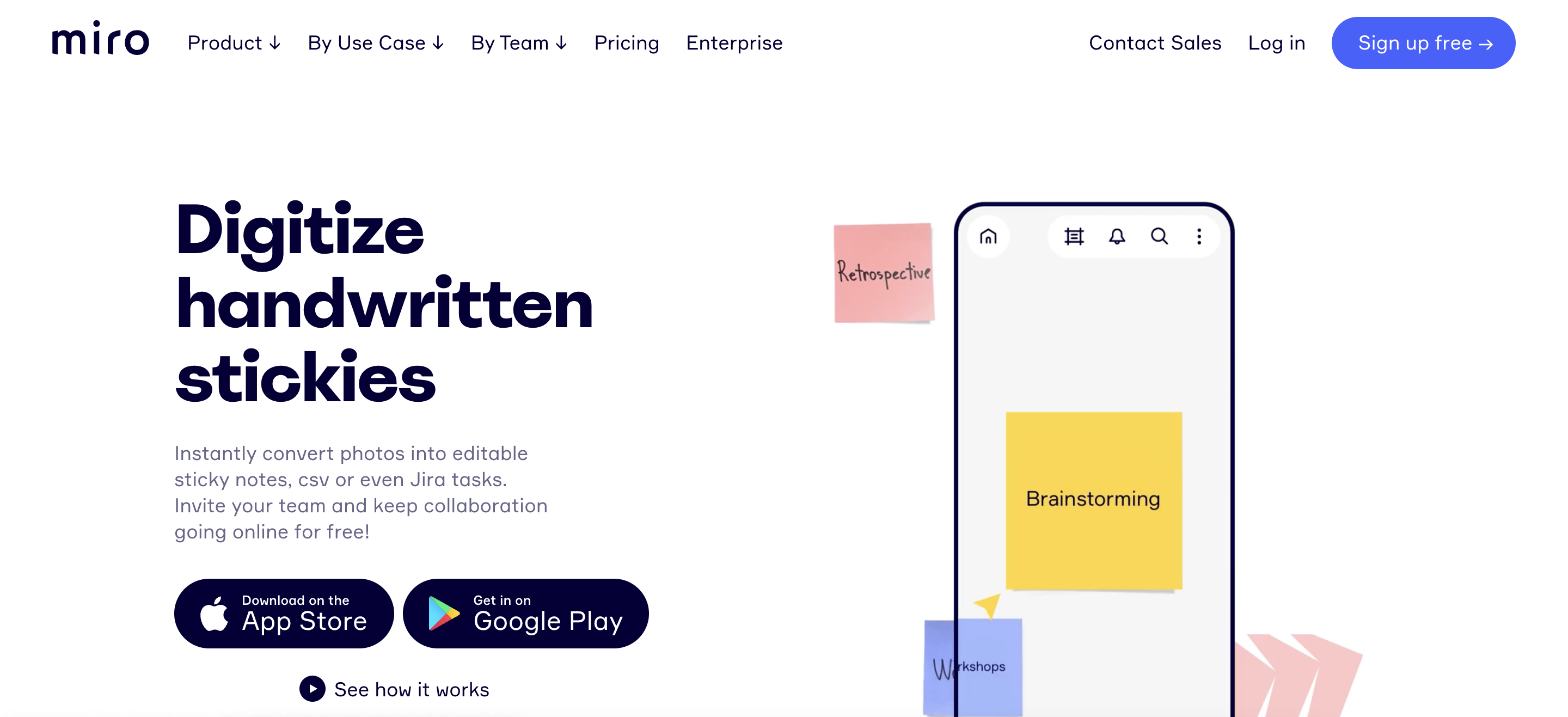
Miro's landing page
Miro's sticky notes capture page leads with a product demo animation that shows the exact workflow the feature enables — take a photo of a physical whiteboard, convert to digital sticky notes. That's feature-specific landing page design done right: the page isn't selling Miro, it's selling one feature to one audience (workshop facilitators), which is a completely different conversion math.
The testimonials block names the company and role for each quote (not just "John, Product Manager"), which makes them defensibly real. The feature list is under five items and each one is one line — density without overload. Miro also runs "Trusted by" logos with recognizable names like NASA and Cisco, which does heavy lifting for enterprise trust signals.
Takeaway: build feature-specific landing pages for each audience you're acquiring. "Miro for workshop facilitators" will always outperform "Miro for everyone" on targeted paid traffic.
12. Figma
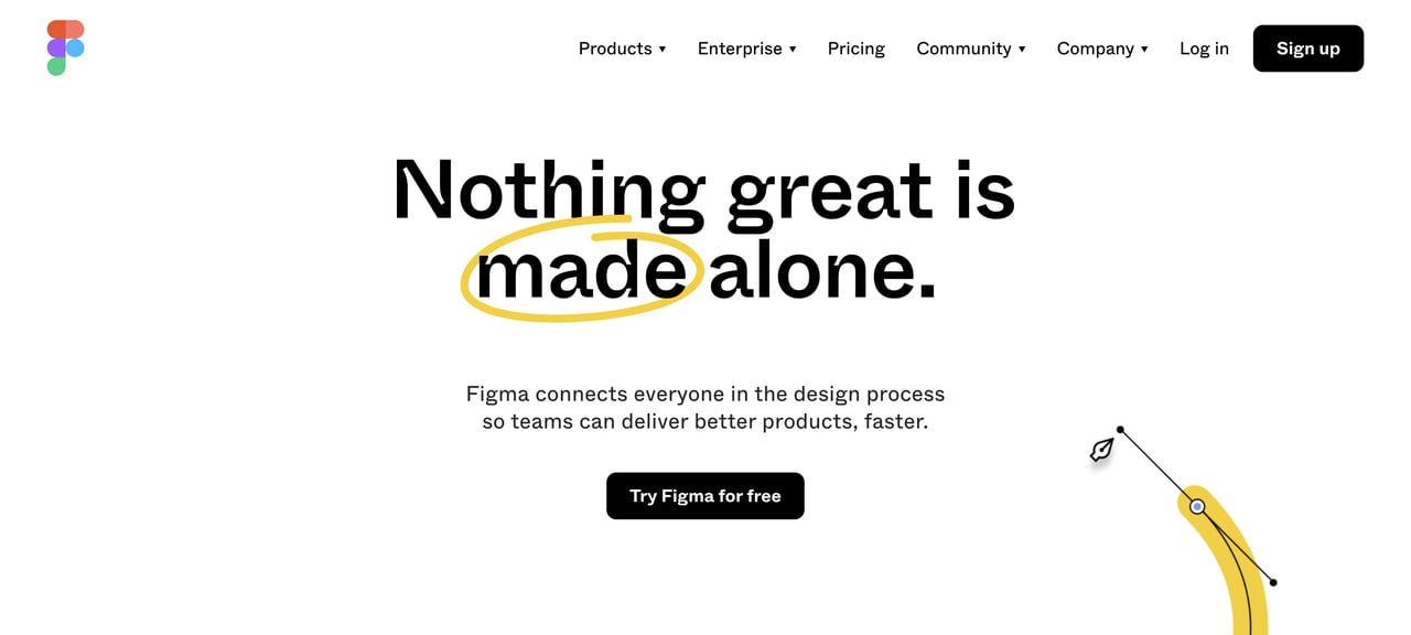
Figma's landing page
Figma's hero uses an animated headline that cycles through different user types ("for designers," "for developers," "for product managers"). This is segmentation-at-a-glance: every visitor sees themselves named within three seconds of landing. The feature blocks below use scroll-triggered animations that reveal the interface in motion, matching the product's core value of real-time collaboration.
Figma integrates its Community — user-built templates and plugins — directly into the landing page, which doubles as social proof (other designers trust it) and as a utility hook (you can browse resources before committing). The testimonials section features design leads from recognizable brands, with their title and company, which outperforms anonymous five-star ratings by a wide margin.
Takeaway: if you have multiple audiences, rotate the word that segments them in the hero — don't build four separate landing pages for what one animated word can do.
13. Sketch
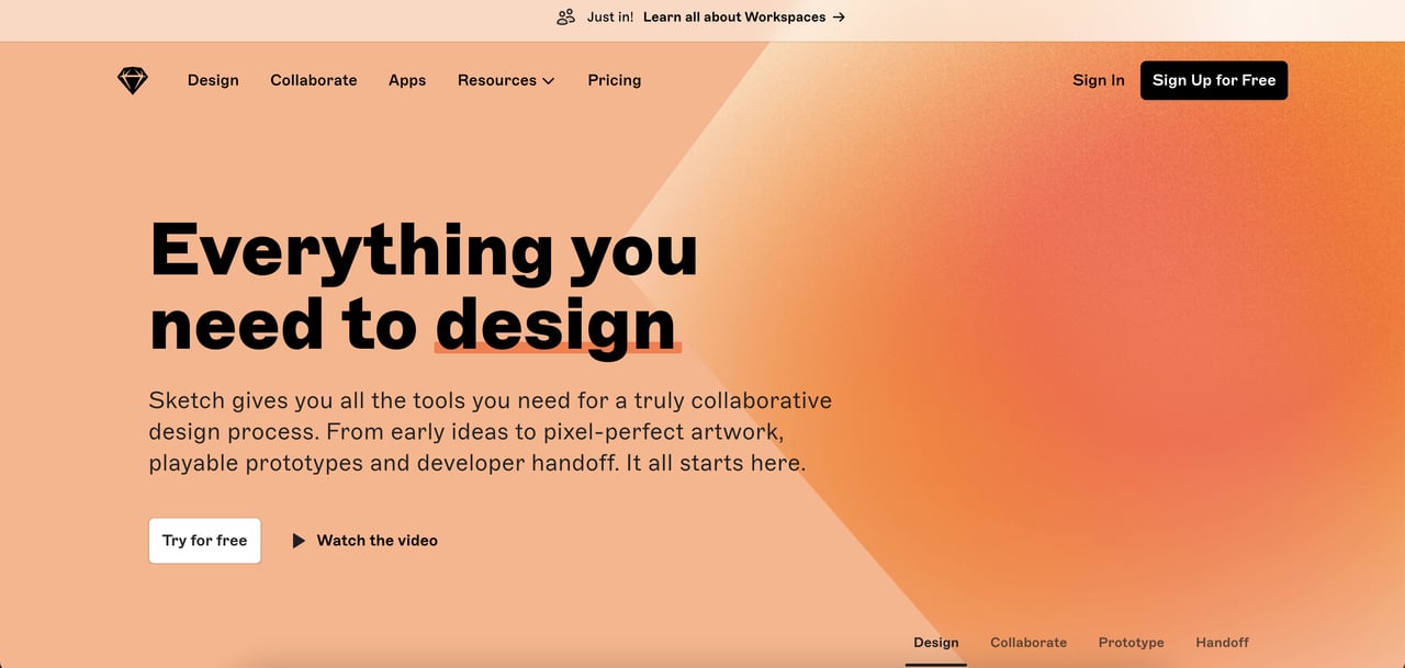
Sketch's landing page
Sketch uses a dense, looping product demo in the hero — designers respond to seeing the canvas in motion, and the animation previews the tool's core feel. The feature blocks are animated but staggered, so the eye doesn't fatigue from everything moving at once. A good rule: two concurrent animations max on a single screen.
An extensions slider at the mid-scroll position shows the third-party plugin ecosystem, which is a trust signal disguised as a feature showcase. If there are 200 plugins, the tool is alive and used. At the bottom, Sketch closes with a single-field email signup — no firmographic questions, no phone number, which aligns with a trial funnel rather than a sales funnel.
Takeaway: plugin ecosystems are social proof in disguise. If your product has an integration marketplace, surface it mid-scroll — it signals that other developers believe in the platform.
14. Vectary
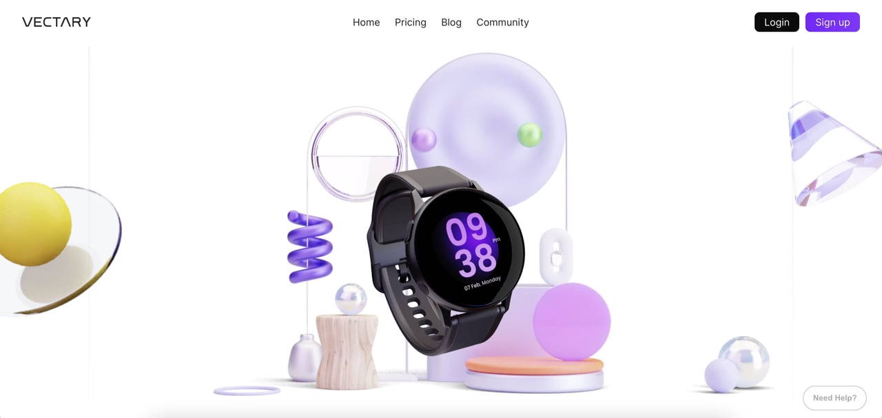
Vectary's landing page
Vectary is a 3D design platform, and its landing page leans into a stripped-back visual style — a lot of white space, a single rotating 3D model in the hero, minimal text. That restraint is rare in SaaS landing pages, which usually overpack. The result is a page that feels premium without needing to say "premium" anywhere in the copy.
The pull-away scroll effect reveals features one at a time, which pairs well with a product that's inherently visual. Text density increases as the user scrolls deeper, so the commitment cost of reading grows proportionally to the user's demonstrated interest. The page closes with a clean comparison table of free vs. paid tiers, which does the pricing objection-handling inline.
Takeaway: white space is a conversion lever, not wasted space. Over-packed landing pages trigger cognitive overload and drop conversion on first-time visitors.
15. Gleap
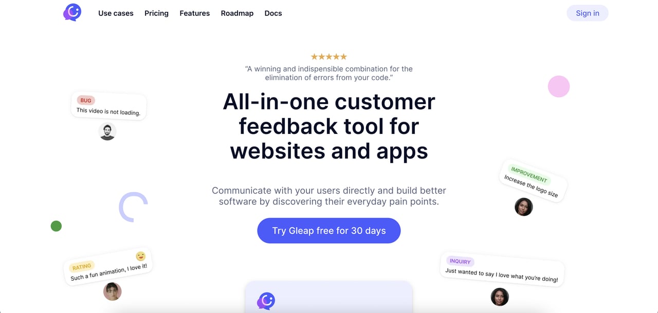
Gleap's landing page
Gleap is a customer feedback tool, and its landing page installs its own product as the demo — there's a live feedback widget on the page itself. That's the dogfood-as-marketing move: show you trust your product enough to use it for your own customer feedback loop. The feature grid is six tight cards, each with a single icon and a one-line benefit statement.
Pricing sits at the bottom of the page rather than mid-scroll, which signals that Gleap wants users to understand the product first and the cost second. This is the right call for exploratory traffic (SEO, content) but less right for bottom-funnel paid traffic, which wants price confirmation early.
Takeaway: if your product can be embedded on your own marketing site, do it. It's the most credible demo possible, and the analytics data from real-user interaction becomes a feedback loop into the product itself.
16. Glide
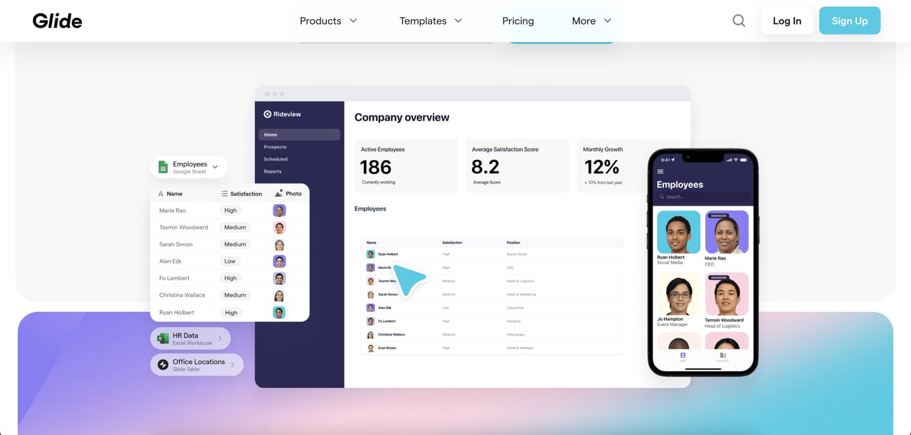
Glide's landing page
Glide turns spreadsheets into apps, which is a hard concept to explain verbally. The landing page handles that by running an embedded product tutorial video in the mid-scroll, showing a Google Sheet becoming an app in under 60 seconds. Visual before-and-after is the only way to sell a transformation product convincingly.
Social proof is layered: customer logos at the top, app showcases (actual apps built with Glide) in the middle, and testimonials near the CTA. That progression matches the user's question sequence: "Who uses it?" → "What can I build with it?" → "What do real users say?" The embedded product tutorial videos also double as SEO content, since they're indexable and drive time-on-page metrics.
Takeaway: transformation products ("before X, after Y") need video demos. Static screenshots can't show the transformation because the transformation is the product's value.
17. Mailchimp
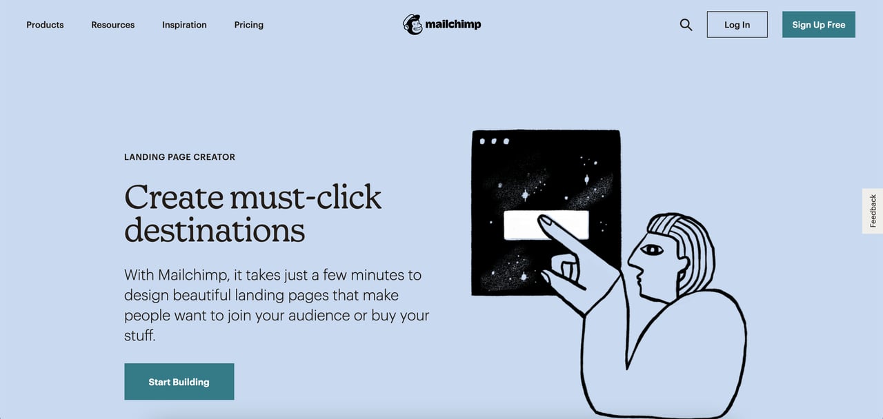
Mailchimp's landing page
Mailchimp's marketing automation page handles one of the oldest problems in email marketing: how to position a commoditized feature set as differentiated. The hero solves it with outcome copy ("Turn subscribers into customers") rather than feature copy ("Send emails faster"). The G2 "Leader" award badge sits near the CTA, borrowing third-party authority to answer the "is this actually the best option?" question.
At the bottom, the page links to related resources — guides, templates, case studies — which keeps visitors who aren't ready to sign up in the brand's orbit. That's a smart concession: not every landing page visit converts today, so giving non-buyers a next step (read this guide) is better than losing them to a competitor's page.
Takeaway: if your market is commoditized, compete on outcome copy instead of feature copy. "Turn X into Y" wording always outperforms "Manage X" or "Send X" because it promises a result, not an activity.
18. PandaDoc
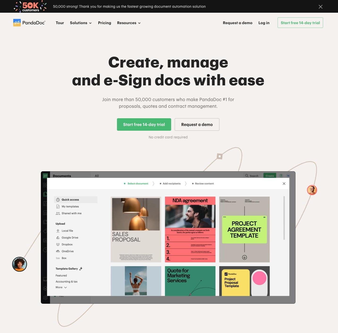
PandaDoc's landing page
PandaDoc sells document automation, and the landing page opens with a quick-look product preview — a short animated GIF of a proposal being built in real time. That's the "show the verb, not the noun" rule: users don't want to see a static contract, they want to see one being created.
Resource links sit in the top navigation strip rather than hidden in the footer, which helps users still in research mode without distracting the bottom-funnel users who came to convert. Social proof runs through the page as named customer quotes (title + company) rather than star ratings, and the final CTA repeats the hero offer verbatim — no new information, just a second ask when the user has read the full page.
Takeaway: your final CTA should repeat the hero CTA word-for-word. Changing the copy at the bottom introduces friction; repetition anchors the commitment.
19. Slack
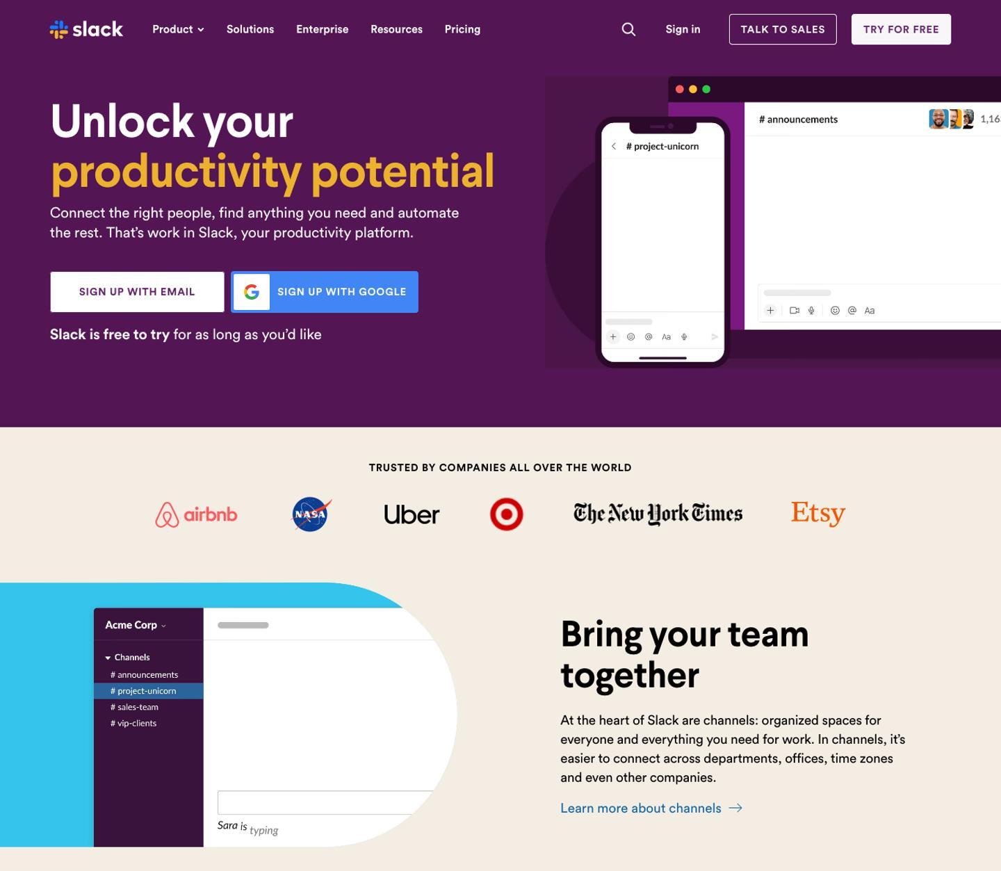
Slack's landing page
Slack's landing page is disciplined in a way most enterprise SaaS pages aren't. The headline is short, the subheadline names specific outcomes ("where work happens"), and the logo wall below the hero features names almost every knowledge worker recognizes — NASA, Airbnb, Target, Uber. That logo mix was chosen to cover multiple verticals at once, which broadens the perceived addressable audience.
Features link to dedicated deeper pages rather than trying to fit everything on one landing page. That's the right move for a mature product: the landing page is a funnel entry point, not a feature encyclopedia. Each feature link becomes its own optimization surface, so A/B tests can run on individual features without contaminating the parent page.
Takeaway: don't try to explain every feature on the landing page. Link out to feature pages and trust the user to follow — better signal, less clutter, more test surface.
20. Officevibe
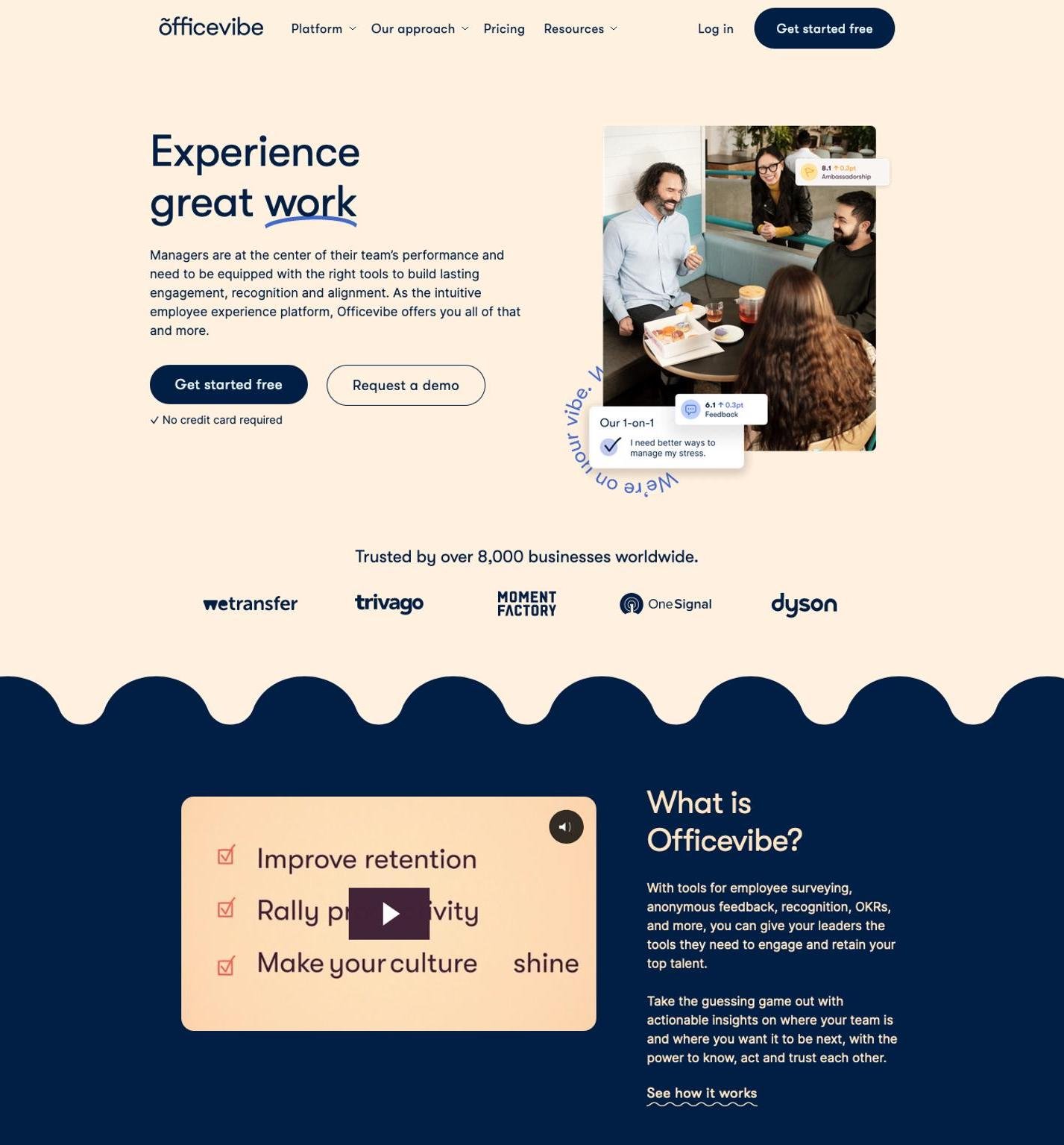
Officevibe's landing page
Officevibe (now part of Workleap) runs a short, punchy headline and a product-details video right below the hero. Video-first landing pages work well for HR and people-ops products because the buyer is often evaluating on behalf of a team that isn't in the room — video is shareable in a way that static pages aren't.
The page lists specific businesses using the product near the middle scroll, and it breaks the platform's approach into three clear pillars at the top of the page. That three-pillar structure is a classic consulting framework applied to SaaS — it works because it matches how decision-makers mentally organize vendor comparisons.
Takeaway: if your buyer needs to share the page with an internal stakeholder before deciding, put a shareable video near the top. Pages designed for solo reading and pages designed for forwarding are different creatures.
Why These SaaS Landing Pages Convert: Key Takeaways
After walking through 20 pages, the patterns compress to a short list. These are the recurring moves — the ones that show up on nearly every high-performer:
- Outcome-framed CTA copy. "Create your first note," "Start free trial," "Go Pro" — never "Sign up" or "Submit." The CTA describes what the user will have after they click, not what they're doing to get there. MeisterNote, WeTransfer, and Airtable all use this pattern.
- Social proof within the first scroll. Every single page in the top 10 has named customer logos, review counts, or a specific testimonial visible without scrolling. Vague "trusted by thousands" is nowhere to be found — specificity carries the weight.
- Animated or embedded product demos over static screenshots. Airtable, Taskade, Monday, Glide, and Popupsmart all show the product in motion above or immediately below the fold. Motion triggers attention; static images get skimmed past.
- One dominant CTA, not two equal ones. When secondary CTAs appear (Maze, Taskade), they use reduced visual weight — outlined buttons, smaller size, muted color. Two equally loud buttons trigger decision paralysis.
- Trust signals near the conversion point. Privacy badges, "no credit card required," G2 awards, company counts — all placed next to the CTA, not in the footer, because they're objection-killers at the moment of decision.
- Feature-specific pages for specific audiences. Miro runs a dedicated sticky notes page, Figma rotates segments in the hero, and Slack pushes users deeper into feature sub-pages. The homepage handles breadth; landing pages handle focus.
- Repetition of the hero CTA at the bottom. PandaDoc, Airtable, and Mailchimp all end with the same CTA copy they opened with. Changing the button copy on the final ask breaks the cognitive anchor the user built while scrolling.
None of these moves are expensive or technically hard. Most can be tested in a single sprint by any growth team with access to their own CMS. The gap between the 4% average and the 11% top quartile is almost entirely discipline — the willingness to remove, not add.
SaaS Landing Page Best Practices and Trends for 2026
The 2026 trend list isn't revolutionary — it's the 2024 playbook refined. A few moves are new enough to flag, and a few old moves are worth doubling down on.
AI-personalized heroes. Teams are starting to dynamically swap hero headlines based on traffic source — the same landing page shows "for product managers" to LinkedIn ad traffic and "for startup founders" to podcast referral traffic. The engineering cost has dropped to near-zero with modern CMS tools, and the lift is 15-25% on well-targeted segments. The catch: you need enough traffic per segment to justify the complexity. Don't personalize below 1,000 visits per variant per month.
Mobile-first design that actually means it. Most SaaS pages still look like desktop pages squeezed onto phones. In 2026, the top-performing pages are designed mobile-first, with CTAs stacked vertically, social proof in horizontal carousels instead of grids, and hero videos replaced with single still-frames on mobile to protect load times. Mobile landing page design now influences desktop conversions because Google's ranking signals are mobile-first.
Load speed as a ranking factor. This one's been around, but the penalty keeps compounding. According to DigitalApplied's 2026 data, a one-second delay in load time cuts conversions by 7%. That means a page going from 3s to 2s load time can see a 7% lift with zero copy changes. In 2026, the easiest conversion win is often an image compression pass.
Social proof density over social proof volume. The old playbook said "more logos, more testimonials." The 2026 playbook says "fewer, but better." A single testimonial from a named VP at a Fortune 500 outperforms ten anonymous quotes. A logo wall of six recognizable brands outperforms a cluttered grid of thirty.
Video testimonials over text testimonials. Video quotes convert 25-40% higher than text quotes in A/B tests across the SaaS pages I've tracked. The production quality bar has dropped — a clean Zoom recording with good audio beats a glossy studio shoot most of the time, because authenticity matters more than polish.
Third-party review integration. G2, Capterra, and TrustRadius widgets embedded directly on the landing page replace the old "4.8 stars from 2,000 reviews" static text. The widget is clickable, verifiable, and updates automatically — all of which reduces user skepticism.
Free SaaS Landing Page Templates and Tools
If you're building from scratch rather than redesigning an existing page, a few template sources are genuinely useful in 2026. I've used most of these, and I'll flag where each one fits best.
Webflow Templates is the deepest free library for SaaS landing page starters. The templates are code-exportable, so your dev team isn't locked into the platform. Most SaaS-specific ones include built-in animations, responsive breakpoints, and clean CMS structure. Best for teams that want design quality without starting from a blank canvas.
Framer Templates has a smaller library but the design quality is consistently higher. Framer templates ship with motion built in, which is useful for the animated-hero pattern most of the top 20 examples use. It also has the fastest load speeds of the hosted builders I've tested.
Tailwind UI is the right choice if you have a dev team and want component-level control. The landing page components are cleanly structured, mobile-first by default, and integrate with any React or Vue codebase. Paid, but the components are worth it for engineering-led teams.
Figma Community has hundreds of free SaaS landing page design files. Useful for wireframing and visual exploration before you commit to code. Don't expect production-ready templates — these are design starting points, not launch-ready pages.
On the conversion layer, Popupsmart adds the overlay layer on top of whatever landing page you build — exit-intent captures, email list growth, contextual announcements — without requiring a platform migration. It's the CRO patch, not the page itself.
How to Optimize Your SaaS Landing Page for Higher Conversions
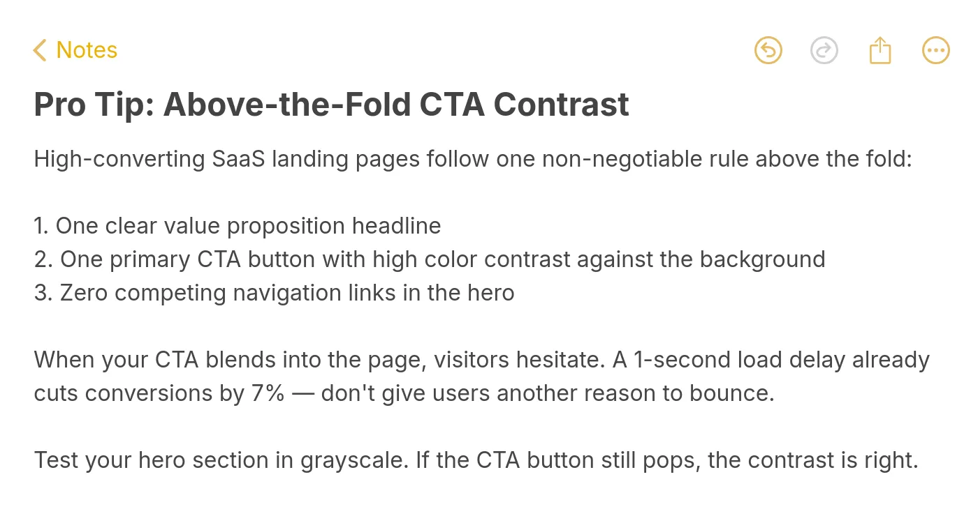
Pro tip on CTA contrast
Once the page is live, these six tactics consistently move the needle in my experience. Run them roughly in order of effort — the early ones are near-free, the later ones require real engineering or design time.
- Cut your form to one field. Email only. If you need name or company, ask for it in a follow-up email or the second screen of the product. One-field forms convert 20-30% higher than two-field forms, and the data you "lose" upfront you get back on the first real product interaction.
- Rewrite your CTA to the outcome frame. Replace "Sign up" with "Create your first X" or "See your data in 30 seconds." Test both versions — the outcome-framed version usually wins on first-time traffic.
- Compress your hero image or replace it with a video thumbnail. A 1MB hero image on mobile costs you conversions on every slow connection. Aim for under 200KB. If you're using video, use a still-frame poster until the user explicitly plays it.
- Move one trust signal from the footer to right beside the CTA. G2 badge, SOC 2, "no credit card required," money-back guarantee — pick the one most relevant to your biggest objection and move it inline with the button. Measure the lift over two weeks.
- A/B test one variable at a time. The mistake I see most is teams testing a whole redesign as one variant. You'll learn nothing. Test the headline. Then test the CTA copy. Then test the hero image. Sequential, not parallel, on pages doing under 50k visits a month.
- Add an exit-intent overlay with a different offer. The user leaving your page has already told you the main offer didn't land. A secondary offer — a checklist, a comparison PDF, a lower-commitment ask — catches some of that traffic before it's gone. This is where a layer like Popupsmart's exit-intent targeting fits cleanly on top of the underlying landing page.
The iteration cadence matters more than any single tactic. Most landing pages should see a test live every 2-3 weeks, with a clear hypothesis and a minimum detectable effect calculated before the test starts. Testing without that framework just burns traffic.
Conclusion
If you're staring at your own SaaS landing page right now and wondering where to start, here are the three moves I'd prioritize — in order.
First, audit your form. Count the fields. If there are more than two, cut to one and redirect the other fields to a post-signup step. This is the single highest-ROI change on most SaaS pages and it takes under a day to ship. Second, run a load-speed check (Google PageSpeed Insights is free and takes 30 seconds). If you're over 3s on mobile, image compression alone will usually shave a second or more. Third, rewrite your hero CTA to name the outcome. Replace "Sign up" or "Get started" with a verb-plus-noun that describes what the user will have 60 seconds after clicking.
Do those three things, measure for 14 days against the prior baseline, and you'll have your first real conversion lift on the board. Everything else — video testimonials, personalized heroes, animated demos — is a second-order optimization. Fix the fundamentals first.
Frequently Asked Questions
Where can I find free SaaS landing page examples?
A few curated galleries are worth bookmarking: SaaS Landing Page catalogs hundreds of real pages sorted by industry and design style. SaaS Screenshots (saasscreenshots.com) captures full-page screenshots of live SaaS sites, which is useful for trend-spotting. Lapa Ninja and Landingfolio round out the set with tag-based filtering. All four are free to browse. For live examples, the 20 pages in this article are the shortlist I'd start with.
What are some free SaaS landing page templates?
Webflow, Framer, and Figma Community all host hundreds of free SaaS landing page templates. Webflow templates are code-exportable and ship with responsive breakpoints. Framer templates include built-in motion, which fits the animated-hero pattern most modern SaaS pages use. Figma Community files are wireframe-stage — useful for visual exploration but not production-ready. For a full walk-through of optimization tooling, see our landing page optimization tools breakdown.
How to design a SaaS landing page?
Start with the audience, not the product. Write one sentence describing exactly who this page is for — "product managers at Series B SaaS companies evaluating PM tools" is better than "teams who want to be productive." Then write the outcome you're promising in under 10 words. That becomes your hero headline. Everything else — visuals, social proof, features, CTA — exists to support that single promise. Sketch the wireframe on paper first, then move to Figma, then to code. Most design mistakes are fixable at the sketch stage and expensive at the code stage.
What are SaaS landing page best practices?
The consolidated list: one offer per page, outcome-framed CTA copy, named social proof within the first scroll, one-field signup form, trust signals beside the CTA not in the footer, mobile-first design, load time under 2 seconds, and repeated CTA at the bottom of the page matching the hero CTA. Test one variable at a time. Measure for at least 14 days. According to Saashero's benchmark data, top B2B SaaS landing pages hit 20%+ conversion rates by prioritizing relevance, clarity, trust, and low friction over the 2.3% average.
Articles you might like:

How would you rate your experience with this article? 😊