How to Increase Mobile Conversion Rates: 20 Ways for 2026
 ChatGPT
 Perplexity
 Claude
 Grok
Grok Google AI Mode
A 2026 guide to boosting mobile conversions: speed up pages (compress images, CDN, caching, fewer redirects), improve UX and scannable content, build trust, simplify checkout/payments, use smart popups/triggers, personalize offers, track behavior, add chat/feedback, and fix errors.
You can increase mobile conversion rates by fixing page speed, simplifying checkout flows, building trust signals, and personalizing the user experience. Mobile sites convert at 2.85% on average versus 3.9% on desktop, but the gap closes fast when you target the right friction points. These 20 strategies work for e-commerce stores, SaaS landing pages, and e-commerce store owners looking to turn mobile traffic into revenue.

Overview of all 20 strategies:
1. Speed up mobile page loads: Shave seconds off load time to cut bounce rates by double digits
2. Compress images and use a CDN: Reduce the 60% of load time caused by unoptimized media
3. Implement AMP or lightweight frameworks: Serve near-instant cached pages for content-heavy sites
4. Design thumb-friendly navigation: Accommodate the 75% of users who tap with one thumb
5. Simplify mobile forms: Cut fields to reduce friction and lift form completion rates
6. Streamline mobile checkout: Address the 18% abandonment rate caused by long processes
7. Add mobile wallet payments: Offer Apple Pay, Google Pay, and PayPal for one-tap purchasing
8. Display trust badges on mobile: Place security seals where hesitant buyers see them first
9. Use mobile-optimized popups: Capture leads without triggering Google's interstitial penalties
10. Deploy exit-intent triggers: Recover abandoning visitors at the exact moment they leave
11. Personalize with AI recommendations: Serve relevant products based on browsing behavior
12. Create urgency with countdown timers: Activate FOMO to push hesitant shoppers over the line
13. Add live chat for mobile support: Answer purchase-blocking questions in real time
14. Write scannable mobile copy: Use short paragraphs and clear headings for small screens
15. Add product videos optimized for mobile: Tap into the 96% of shoppers influenced by video
16. Retarget abandoned mobile users: Bring back visitors who left without converting
17. Track mobile user behavior: Use heatmaps and session recordings to find conversion killers
18. Collect mobile feedback with popup surveys: Identify UX problems directly from your users
19. Fix broken links and 404 errors: Eliminate trust-destroying dead ends on mobile
20. Use real human faces in mobile layouts: Build emotional connection that stock photos can't match
1. Speed Up Mobile Page Loads: The Fastest Path to Higher Conversions
Mobile page speed is the single biggest conversion lever most sites ignore. Every extra second of load time pushes bounce rates higher and kills purchase intent before a visitor even sees your offer. Google uses Core Web Vitals as a ranking signal, and mobile users expect pages to render in under 2.5 seconds.
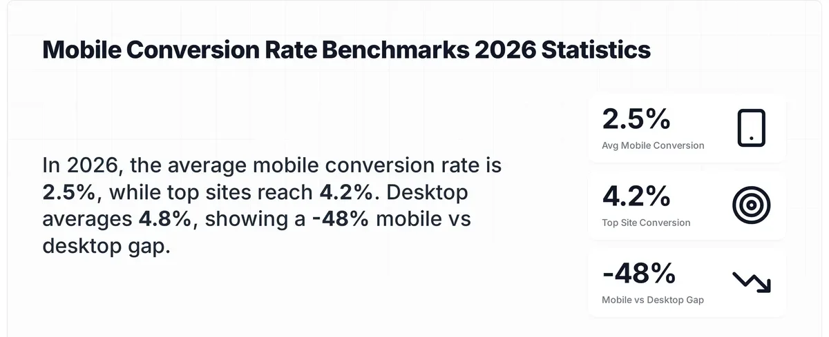
Mobile conversion benchmarks by performance tier
How to implement:
1. Run your top 5 landing pages through Google PageSpeed Insights and note your Largest Contentful Paint (LCP) score. Anything above 2.5 seconds needs work
2. Enable GZIP or Brotli compression on your server — this cuts HTML, CSS, and JavaScript file sizes by 60-80% with a single config change
3. Eliminate render-blocking resources by deferring non-critical JavaScript. Add defer or async to script tags that don't affect above-the-fold content
4. Minimize HTTP requests by combining CSS files and removing unused plugins. Each request adds 50-200ms on mobile networks
5. Reduce server response time (TTFB) to under 200ms. If you're on shared hosting, consider upgrading or using edge caching
According to APM Digest's 2026 mobile performance report, mobile users now expect sub-two-second loads.
2. Compress Images and Use a CDN to Cut Load Times Without Losing Quality
Images account for roughly 60% of total page weight on most mobile sites. Unoptimized product photos and hero banners are the most common reason pages load slowly on cellular connections. A content delivery network (CDN) complements compression by serving files from servers closest to your visitor.
How to implement:
1. Convert all images to WebP format — it's 25-34% smaller than JPEG at equivalent quality and supported by every modern browser
2. Use TinyPNG or ShortPixel to batch-compress existing images. Aim for product images under 100KB each
3. Implement lazy loading with the loading="lazy" attribute on all below-the-fold images. Don't lazy-load your hero image — it needs fetchpriority="high"
4. Set up a CDN like Cloudflare or BunnyCDN. Most offer free tiers that handle image caching automatically
5. Use responsive images with srcset to serve appropriately sized files — don't send 2000px images to 375px phone screens
According to CXL's conversion case study collection, one e-commerce brand found that static images outperformed video on product pages, increasing monthly revenue by $106,000. The takeaway isn't that video is bad, it's that properly optimized, fast-loading images often beat slow-loading rich media on mobile. For most stores, image compression alone delivers measurable speed gains within the first week.
3. Implement AMP or Lightweight Frameworks: Serve Near-Instant Pages
AMP (Accelerated Mobile Pages) strips away heavy JavaScript and enforces strict performance budgets. Pages load from Google's cache in under one second. It's not the right fit for every site, but for content-heavy blogs and landing pages where speed directly affects conversions, AMP delivers measurable results.
How to implement:
1. Identify your highest-traffic, highest-bounce-rate mobile pages — these benefit most from AMP
2. Create AMP versions of those pages using the AMP HTML specification. If you're on WordPress, the official AMP plugin handles this automatically
3. For Shopify stores, consider lightweight theme alternatives instead of full AMP — themes like Dawn are already optimized for Core Web Vitals
4. Validate AMP pages using Google's AMP testing tool before publishing
5. If AMP feels too restrictive, use Partytown or similar libraries to move third-party scripts off the main thread
AMP pages load from Google's cache, which means they render before a user's browser even contacts your server. I've seen content sites get 30-40% lower bounce rates after implementing AMP on their top 20 blog posts. The trade-off is design flexibility, you lose some custom styling options. For landing pages where conversion matters more than branding, that's a trade worth making.
4. Design Thumb-Friendly Navigation and Build for How People Actually Hold Phones
Most mobile design advice focuses on screen size. The real constraint is thumb reach. According to Breakthrough3x's 2026 strategy guide, 75% of users tap screens with one thumb. If your navigation, CTAs, or form fields sit outside the natural thumb zone, you're creating friction that kills conversions.
How to implement:
1. Place primary CTAs in the bottom third of the screen, this is the easiest thumb reach zone for both left and right-handed users
2. Make tap targets at least 48x48 pixels with 8px minimum spacing between them. Smaller targets cause mis-taps and frustration
3. Use a sticky bottom navigation bar for key actions (add to cart, contact, search) instead of hiding them in a hamburger menu
4. Test your site one-handed. Seriously. Hold your phone in one hand and try to complete a purchase. Note every point where you have to use your other hand
5. Simplify Mobile Forms: Fewer Fields Mean More Completions
Long forms are conversion killers on any device, but they're especially punishing on mobile. Typing on a phone is slower, error-prone, and annoying. Every unnecessary field you add increases the chance a user abandons the form entirely. The goal is collecting only what you genuinely need at that stage of the funnel.
How to implement:
1. Audit every form field and ask: "Do we need this information right now, or can we collect it later?" Remove anything that isn't required for the immediate action
2. Use autofill-compatible input types — type="email", type="tel", autocomplete="address-line1" — so browsers can pre-populate fields
3. Break long forms into multi-step sequences. Show a progress bar so users know how close they are to finishing
4. Replace dropdown menus with radio buttons or toggle selects where options are fewer than 5. Dropdowns are clunky on mobile
5. Enable address lookup APIs (Google Places Autocomplete) so users type 3-4 characters instead of a full address
I've tested this across dozens of form conversion rate optimization projects. Cutting a 7-field form down to 3 fields typically lifts completion rates by 30-50%. One SaaS client saw a 41% increase in demo requests just by removing the "company size" and "phone number" fields from their mobile signup form. You can always collect that data in a follow-up email.
6. Streamline Mobile Checkout to Stop Losing Buyers at the Last Step
Cart abandonment on mobile runs significantly higher than desktop. According to Baymard Institute's cart abandonment research, 18% of shoppers abandon carts specifically because the checkout process is too long or complicated. That's revenue walking out the door at the exact moment someone decided to buy.
How to implement:
1. Offer guest checkout as the default option. Forcing account creation before purchase is the second-biggest checkout friction after complexity
2. Reduce checkout to three steps maximum: shipping info, payment, confirmation. Show all three steps in a progress indicator
3. Pre-fill everything possible: shipping address from browser autofill, email from login state, card details from saved payment methods
4. Display order totals (including tax and shipping) early — unexpected costs at the final step cause 48% of all cart abandonments
5. Add inline validation so errors appear immediately, not after the user hits "Submit"
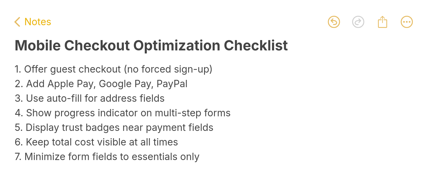
Mobile checkout optimization checklist
According to UXTweak's UX statistics, optimizing checkout design can boost conversion rates by 35.26% for large e-commerce sites. That number aligns with what I've seen in practice, checkout is where the biggest wins hide because it's where intent is highest. A shopper who reaches checkout has already decided to buy. Your only job is to not talk them out of it.
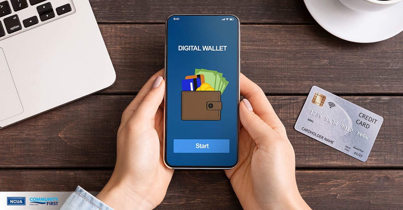
7. Add Mobile Wallet Payments: Enable One-Tap Purchasing
Mobile wallets remove the most painful part of mobile checkout — typing card numbers on a small screen. Apple Pay, Google Pay, and PayPal let users complete purchases with a fingerprint or face scan. Baymard Institute's research shows 7% of shoppers abandon carts specifically because of insufficient payment methods.
How to implement:
1. Enable Apple Pay and Google Pay through your payment processor (Stripe, Shopify Payments, and PayPal all support both)
2. Place wallet payment buttons above traditional card fields — users who see them first convert faster
3. Add PayPal Express checkout as a third option. It's still the most-used digital wallet globally
4. For Shopify stores, enable Shop Pay — it stores customer info across all Shopify stores and achieves higher conversion rates than standard checkout
Digital wallets reduce checkout time from 2-3 minutes to under 10 seconds. That speed difference matters more on mobile, where each additional second of friction compounds. Stores that add wallet payments typically see a 5-12% lift in mobile conversion rates within the first month, with the biggest gains coming from returning customers who've already saved their payment info.
8. Display Trust Badges on Mobile and Reduce Purchase Anxiety Where It Matters
Mobile shoppers are more skeptical than desktop shoppers. The smaller screen, unfamiliar checkout flows, and prevalence of mobile scam ads all contribute to heightened distrust. Trust badges such as SSL seals, payment logos, money-back guarantees serve as visual shortcuts that tell a hesitant buyer "this is safe."
How to implement:
1. Place SSL/security badges directly below the payment form on checkout pages. That's where anxiety peaks
2. Show accepted payment method logos (Visa, Mastercard, PayPal, Apple Pay) near the CTA button — visual recognition builds instant trust
3. Add a money-back guarantee badge on product pages. If you offer a 30-day return policy, make it visible, not buried in footer links
4. Display real customer review counts near the top of product pages. "4.7 stars from 2,341 reviews" is more persuasive than any badge
According to Salesforce's Connected Customer report, 65% of shoppers stop buying from brands they distrust. On mobile, where users can't easily inspect URLs or verify site legitimacy, visible trust signals close that gap. I've seen trust badge placement tests lift checkout conversions by 8-15%, with the strongest results on pages where the average order value exceeds $50.

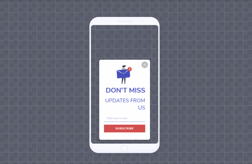
9. Use Mobile-Optimized Popups and Capture Leads Without Hurting UX
Popups get a bad reputation on mobile, mostly because poorly implemented ones cover the entire screen and trigger Google's interstitial penalty. But well-designed, properly timed mobile popups consistently outperform other lead capture methods. The difference is targeting and restraint.
How to implement:
1. Use a no-code popup builder like Popupsmart that enforces mobile-safe sizing by default — campaigns auto-adjust to avoid covering more than 30% of the screen
2. Set display triggers based on behavior, not page load. Show popups after 30+ seconds on page, after 50% scroll depth, or on exit-intent
3. Limit to one popup per page per session. Stacking multiple campaigns on mobile destroys the browsing experience
4. Use slide-in or bottom-bar formats instead of center-screen modals. They're less intrusive and still convert well
5. Set frequency caps — one impression per visitor per 7 days prevents popup fatigue
According to Popupsmart's mobile vs. desktop popup behavior data from 2025, mobile popups achieved an average interaction rate of 62.17% and a conversion rate of 34.15%. Those numbers beat most other on-site lead capture methods. The key is popup timing. Popups shown to engaged visitors (30+ seconds on page) convert at 3-4x the rate of popups fired on page load.
10. Deploy Exit-Intent Triggers to Recover Visitors Who Are About to Leave
Exit-intent technology detects when a mobile user is about to leave — through scroll velocity changes, back-button behavior, or tab switching — and shows a targeted offer at that exact moment. You're not interrupting someone who's engaged. You're catching someone who already decided to go.
How to implement:
1. Set up an exit-intent campaign in your popup tool. On mobile, exit-intent typically triggers on rapid upward scroll (indicating the user is heading for the URL bar) or after a period of inactivity
2. Offer something with immediate value: a discount code, free shipping, or a lead magnet relevant to the page content
3. Target returning visitors only for discount offers — first-time visitors have less brand familiarity, so lead magnets work better for them
4. Keep the offer copy to two lines maximum. On mobile, brevity wins
5. A/B test your offer. We've found that "Free shipping on orders over $50" typically outperforms flat percentage discounts for e-commerce
11. Personalize with AI-Powered Product Recommendations
Generic product grids waste the limited screen space mobile shoppers have. AI-driven recommendation engines analyze browsing behavior, purchase history, and session context to surface products each visitor is most likely to buy. On mobile, where scrolling is the primary navigation mode, putting the right product in front of someone early saves time and lifts conversions.
How to implement:
1. Enable upsell and cross-sell widgets on product pages. Show "Frequently bought together" or "Customers also viewed" blocks below the main product
2. Use browsing history to personalize your homepage for returning visitors. Instead of showing the same hero banner, display recently viewed items or category picks based on past sessions
3. Add "recommended for you" sections to cart pages — this is where cross-sell converts best because purchase intent is already high
4. For Shopify stores, consider an upsell app for Shopify that handles recommendation logic without custom development
According to Adjust's mobile conversion analysis, personalized campaigns are one of the top methods for improving mobile app and site conversion rates. I've seen personalized product recommendations increase average order value by 10-25% on mobile, with the biggest impact on stores with catalogs over 100 products. The more choices you have, the more personalization matters.
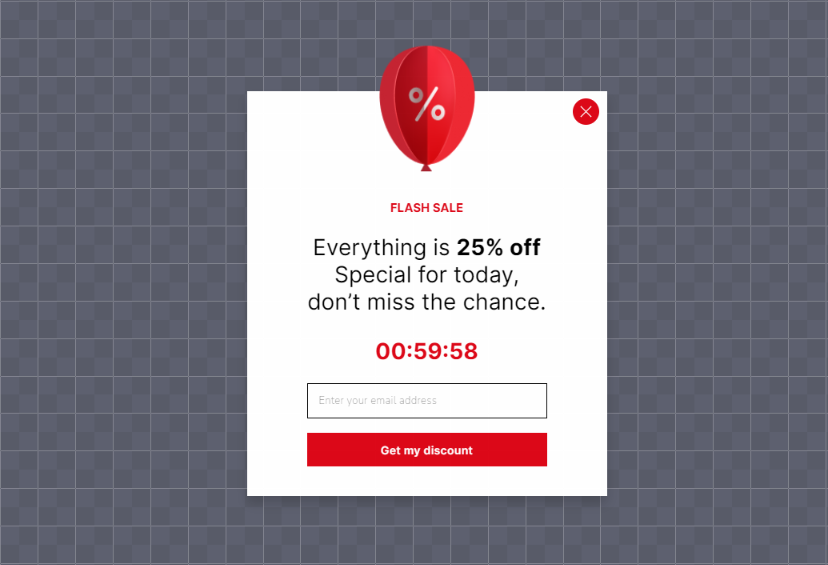
12. Create Urgency with Countdown Timers and Scarcity
FOMO (fear of missing out) works because it shifts the decision from "should I buy this?" to "will I miss out if I don't?" On mobile, where shopping sessions are shorter and more distracted, urgency tactics compress the decision timeline. Countdown timers, low-stock warnings, and limited-time offers all create the perception that waiting has a cost.
How to implement:
1. Add countdown timers to promotional popups and banners. Make them count down to a real deadline — fake urgency erodes trust quickly
2. Show real-time stock levels on product pages when inventory is genuinely low: "Only 3 left in stock"
3. Use urgency-driven copy in CTAs: "Claim your spot" beats "Sign up" and "Get it before midnight" beats "Buy now"
4. Combine urgency with value — "Free shipping ends in 2:34:17" is more effective than a bare timer with no context

According to Linear Design's CRO case studies, L'Axelle saw 93% more clicks after switching to action-oriented copy on their CTAs. That aligns with what I've seen, the words around the urgency mechanism matter as much as the timer itself. Pair countdown timers with genuine scarcity (real deadlines, actual inventory counts) and clear value propositions for the strongest results.
13. Add Live Chat for Mobile Support and Answer Purchase-Blocking Questions Instantly
Mobile shoppers can't easily navigate to a separate FAQ page, open a new tab to email support, or sit through a phone queue. 75% of online shoppers prefer live chat over any other channel because it's immediate and doesn't require leaving the page. On mobile, where context-switching is costly, in-page chat captures questions that would otherwise become abandoned carts.
How to implement:
1. Install a live chat widget that's mobile-responsive. The chat window should open within the same browser tab, not redirect to a new page
2. Use chatbot pre-qualification to handle common questions (shipping times, return policy, sizing) automatically. Route complex queries to a human agent
3. Trigger proactive chat messages on high-intent pages: pricing pages, checkout, and product pages where users spend 30+ seconds
4. If you're a small team, consider free live chat tools to start. Scale to paid solutions as volume grows
14. Write Scannable Mobile Copy to Format Content for Small Screens
Mobile users don't read, they scan. On a 6-inch screen, a wall of text feels overwhelming and triggers an instant back-button tap. Scannable copy uses visual hierarchy, short paragraphs, and strategic formatting to let readers find what they need without scrolling through irrelevant content.
How to implement:
1. Cap paragraphs at 3-4 lines on mobile (roughly 2-3 sentences). When in doubt, break it up
2. Use descriptive subheadings every 150-250 words. Each heading should tell the reader what they'll get from that section
3. Bold key phrases within paragraphs so scanners can extract the main points without reading every word
4. Front-load value — put the most important information in the first sentence of each section, not the last
5. Use bulleted or numbered formats for any list of 3+ items
According to Arounda's UX research, brands that improved how their sites worked on mobile saw a 28% conversion increase and 15% retention lift. Good mobile copy is a core part of that UX equation.
15. Add Product Videos Optimized for Mobile and Let Shoppers See Before They Buy
Static images can't show texture, scale, or a product in use. According to Animoto's research, 96% of online shoppers say product videos impact their buying decisions. On mobile, where users can't physically handle products, video bridges the sensory gap that photos leave open.
How to implement:
1. Record 15-30 second product demos showing the item from multiple angles and in real use. Skip the corporate intro — start with the product immediately
2. For software products, embed short screen recordings showing core features in action. Autoplay (muted) in the hero section works well for SaaS landing pages
3. Compress videos for mobile delivery — aim for 720p resolution and H.264 encoding. Use adaptive bitrate streaming if your hosting supports it
4. Add captions to all videos. Most mobile users watch with sound off while commuting, in meetings, or in public spaces
5. Place videos above the fold on product pages or immediately after the product title and price
One thing I've learned from testing video placement on mobile: thumbnail quality matters as much as the video itself. A compelling thumbnail with a visible play button gets more clicks than an auto-playing video that users scroll past. Test both approaches on your highest-traffic product pages and measure completion rates, not just play rates.
16. Retarget Abandoned Mobile Users and Bring Back Visitors Who Left
Most mobile visitors leave without converting on their first visit. That's normal — mobile sessions are shorter, more distracted, and often happen during commutes or commercial breaks. Retargeting lets you follow up with those visitors through ads, emails, or on-site triggers when they return, keeping your product top of mind until they're ready to buy.
How to implement:
1. Install Meta Pixel and Google Ads remarketing tags to build audience segments of mobile visitors who viewed products but didn't purchase
2. Create separate retargeting campaigns for cart abandoners (high intent) and product page viewers (medium intent). Each group needs different messaging
3. Set up abandoned cart email sequences triggered 1 hour, 24 hours, and 72 hours after abandonment. Include the exact items left in cart with images and a direct link back
4. Use on-site retargeting: when a returning visitor lands on your site, show a popup with their previously viewed items or a personalized discount code
Retargeting abandoned carts can boost conversion rates by up to 26%, according to data from Popupsmart's CRO performance checker. The trick is segmentation, sending the same generic "You forgot something!" email to everyone wastes the opportunity. Cart abandoners who left at the shipping step need different messaging (free shipping offer) than those who bounced from the product page (social proof and reviews).
17. Track Mobile User Behavior and Find Conversion Killers with Data
Guessing why mobile visitors don't convert wastes time and budget. Behavior tracking tools like heatmaps, session recordings, and funnel analytics show you exactly where users get stuck, confused, or frustrated. You can't fix what you can't measure.
How to implement:
1. Install a session recording tool like Smartlook, Hotjar, or Microsoft Clarity (free). Record mobile sessions to watch real users navigate your site
2. Set up mobile-specific heatmaps on your top 5 pages. Pay attention to where users tap, how far they scroll, and where they stop engaging
3. Build a mobile conversion funnel in Google Analytics 4: Landing Page → Product View → Add to Cart → Checkout → Purchase. Identify the step with the biggest drop-off
4. Run weekly reviews of 10-15 session recordings from your checkout funnel. Look for patterns: hesitation, rage-clicking, form abandonment
According to Contentsquare's digital experience benchmark, desktop conversion rates run 74% higher than mobile. That gap exists because many sites still design for desktop first and "adapt" for mobile as an afterthought. Behavior tracking reveals exactly where the mobile experience breaks down. In my experience, the first round of session recording reviews almost always uncovers 2-3 quick fixes that collectively boost conversion rates by 5-10%.
18. Collect Mobile Feedback with Popup Surveys
Analytics tell you what's happening. Feedback tells you why. A short, targeted survey shown at the right moment captures qualitative insights you can't get from heatmaps or funnel data. On mobile, the survey has to be brief — two questions maximum — and timed to avoid disrupting the experience.
How to implement:
1. Use popups to collect surveys to deploy mobile-friendly feedback forms that appear based on behavior triggers
2. Trigger surveys after 30+ seconds on page, on exit-intent, or after a purchase (post-purchase NPS surveys have the highest completion rates)
3. Ask one or two targeted questions: "What almost stopped you from purchasing today?" or "Was anything confusing about this page?"
4. Use a customer feedback tool to aggregate responses and identify patterns. Individual responses are anecdotal; patterns are actionable
5. Target by behavior, not demographics. Show the survey to users who spent 60+ seconds on a page or visited 3+ pages as they're engaged enough to give useful feedback

19. Fix Broken Links and 404 Errors to Eliminate Dead Ends That Kill Trust
Broken links on mobile are worse than on desktop. On desktop, a user can hit the back button, retype a URL, or open a new tab. On mobile, a 404 error feels like a dead end, most users leave the site entirely instead of navigating back. Broken internal links also waste the PageRank flowing through your site, hurting both UX and SEO.
How to implement:
1. Run a crawl with Screaming Frog, Ahrefs, or a free tool like Broken Link Checker to identify all 404 errors and broken links across your site
2. Fix the highest-traffic broken links first. Check Google Search Console's "Pages" report under "Not found (404)" to prioritize by impressions
3. Set up 301 redirects for any pages you've removed or restructured. Don't let old URLs point to nothing
4. Create a useful 404 page that includes search, top product categories, and a link to your homepage. A blank "Page not found" message guarantees a bounce
5. Schedule monthly broken link audits. New breaks appear every time you update product pages, change URLs, or retire blog content
According to Linear Design's CRO case studies, CloudSponge achieved a 33% conversion increase after a full website redesign that included fixing broken navigation flows. That's an extreme example, but the principle holds at smaller scales too. Fixing broken links is low-effort, high-impact work — you're removing obstacles that already exist rather than building something new.
20. Use Real Human Faces in Mobile Layouts
The human brain processes faces 10x faster than text. On mobile, where screen space is limited and attention spans are short, a genuine human face stops the scroll. Real photos of your team, customers, or community create emotional resonance that generic stock imagery simply can't match.
How to implement:
1. Replace stock photos on your homepage, about page, and key landing pages with actual team photos or customer images (with permission)
2. Use customer testimonials with real headshots next to the quote. Named, photographed reviewers are more persuasive than anonymous text
3. Do a reverse image search on any stock photos you're using. If the same image appears on hundreds of other sites, replace it
4. For product pages, include lifestyle photos showing real people using the product in context. Flat product shots on white backgrounds work for Amazon, but on your own site, context sells

According to Linear Design's conversion case studies, The Weather Channel saw a 225% conversion boost by decluttering their homepage — part of which included replacing generic imagery with cleaner, more authentic visuals. Original photography is also a confirmed content quality signal. Glenn Gabe's analysis of 390+ sites recovering from Google's Helpful Content Update found that replacing stock images with original photos was a recurring factor in successful recoveries.
Which Steps You Should Prioritize for Mobile Conversions?
You don't have to implement all 20 strategies at once. Start with the high-impact, low-effort wins and work your way up. Here's how I'd rank them based on typical results across mid-sized e-commerce stores:
| Priority | Strategy | Effort | Impact | Best For |
|---|---|---|---|---|
| 1 | Streamline mobile checkout | Low | High | Any e-commerce store with mobile cart abandonment over 60% |
| 2 | Speed up mobile page loads | Low | High | Sites with LCP over 2.5 seconds |
| 3 | Add mobile wallet payments | Low | High | Stores without Apple Pay or Google Pay enabled |
| 4 | Compress images and use a CDN | Low | Medium | Image-heavy product catalogs |
| 5 | Deploy exit-intent triggers | Low | High | Sites with 10K+ monthly mobile visitors |
| 6 | Display trust badges | Low | Medium | Stores selling products over $50 |
| 7 | Simplify mobile forms | Medium | High | SaaS sites with multi-field signup forms |
| 8 | Use mobile-optimized popups | Medium | High | Lead generation sites and email list builders |
| 9 | Write scannable mobile copy | Medium | Medium | Content-heavy sites and blogs |
| 10 | Add live chat | Medium | Medium | High-ticket products or complex purchases |
| 11 | Track mobile user behavior | Medium | High | Sites that haven't done UX research recently |
| 12 | Collect mobile feedback | Low | Medium | Sites with unexplained conversion drops |
| 13 | Design thumb-friendly navigation | Medium | Medium | Sites with high mobile bounce rates |
| 14 | Personalize with AI recommendations | Medium | High | Stores with 100+ products |
| 15 | Create urgency with countdown timers | Low | Medium | Promotional campaigns and flash sales |
| 16 | Retarget abandoned mobile users | High | High | Stores with significant ad budgets |
| 17 | Add product videos | High | High | Physical product e-commerce |
| 18 | Implement AMP | High | Medium | Content-heavy blogs and news sites |
| 19 | Fix broken links and 404s | Low | Medium | Older sites with content debt |
| 20 | Use real human faces | Medium | Medium | Brands building trust with new audiences |
Conclusion & Three Strategies to Start This Week
You don't need a six-month project plan to improve mobile conversion rates. Pick one strategy from each effort tier and start today:
Quick win (30 minutes): Run your top landing page through Google PageSpeed Insights and fix the first three recommendations. Or enable Apple Pay in your Shopify payment settings — it's a checkbox.
This week (2-3 hours): Set up an exit-intent popup campaign targeting mobile cart abandoners. Use Popupsmart's free plan to test it without commitment. Target returning visitors with a shipping or discount offer.
This month (ongoing): Install Microsoft Clarity (free) and review 10 mobile session recordings per week for the next four weeks. You'll find conversion killers you didn't know existed.
Mobile traffic isn't going to shrink. According to Conversion.com's mobile CRO analysis, mobile phones now account for more than half of all time spent online. The stores and SaaS companies that close the mobile conversion gap today will capture revenue that their competitors leave on the table. Check your current conversion rate against website conversion benchmarks, pick your starting strategy, and measure the results in 30 days.
Frequently Asked Questions
What is a good mobile conversion rate in 2026?
According to Aarki's 2026 mobile commerce report, the average mobile conversion rate sits at 2.85%, while desktop averages 3.9%. Mobile apps deliver roughly 2x the conversion rate of mobile web. A "good" mobile conversion rate depends on your industry — e-commerce averages 1.5-3%, while SaaS free trial signups can range from 3-8%. If you're above 3% on mobile web, you're outperforming most competitors. Above 5%, you're in the top tier.
What is the best way to increase your conversion rate on mobile?
Start with checkout optimization and page speed. These two areas typically deliver the biggest conversion lifts with the least effort. Streamlining checkout addresses the 18% of shoppers who abandon due to process complexity, and fixing page speed tackles the bounce rate problem before visitors even see your product. After those fundamentals, add mobile wallet payments and exit-intent popups for quick additional wins. The best approach depends on where your specific funnel leaks, use Google Analytics 4 to identify your highest-dropout step.
How can I increase my Shopify mobile conversion rate?
Shopify stores should prioritize three things: enable Shop Pay (it pre-fills customer info across all Shopify stores, lifting checkout completion), install a lightweight theme like Dawn that's optimized for Core Web Vitals, and add upsell and cross-sell apps to increase average order value. Beyond that, use Popupsmart's app on Shopify to deploy exit-intent and cart abandonment popups without developer support. Track results through Shopify Analytics and GA4 in parallel.
Why do mobile conversion rates drop?
The most common causes are slow page loads, complex checkout flows, and poor mobile UX (tiny buttons, unreadable text, broken forms). Seasonal patterns also matter, mobile conversion rates typically dip in January after holiday shopping peaks. Technical issues like broken payment integrations, expired SSL certificates, or recent theme updates that weren't tested on mobile can cause sudden drops. If your rate drops overnight, check your payment processor and recent code deployments first. Gradual declines usually indicate UX debt accumulating over time.
How do I optimize mobile UX for better conversions?
Focus on three things: thumb-friendly navigation (CTAs in the bottom third of the screen, 48px minimum tap targets), scannable content (short paragraphs, clear headings, bolded key phrases), and fast page transitions. Install a session recording tool and watch 15-20 mobile sessions weekly. You'll spot UX problems in the first week that quantitative data alone would never reveal.
How often should I update my mobile conversion rate strategy?
Review your mobile conversion data monthly and run a full strategy audit quarterly. Technology changes fast — new browser features, payment methods, and Google algorithm updates all affect mobile performance. The most important habit is continuous testing. Run at least one A/B test per month on your highest-traffic mobile pages, even if it's something small like button color or CTA text. Incremental 2-3% improvements compound into significant gains over a year.
How would you rate your experience with this article? 😊