17 E-commerce Personalization Examples in 2026
E-commerce personalization tailors products, offers, and content to each shopper using behavior and purchase data to boost experience and sales. It highlights benefits, 17 tactics (popups, dynamic content, quizzes, geo, email, recs, chatbots, loyalty), and tips/challenges.
Remember the last time you visited your favorite neighborhood coffee shop, and the barista remembered your order?
The feeling of “they know me here” is what personalization in e-commerce brings to the digital shopping experience.
These 17 ecommerce personalization examples show how brands like Nike, Sephora, and H&M turn browsing data into revenue. Each example includes a screenshot, a breakdown of the specific tactic used, and a takeaway you can apply to your own store without writing a single line of code.
What Is E-commerce Personalization?
E-commerce personalization is the practice of dynamically adjusting your online store's content, product displays, and messaging based on individual visitor behavior, purchase history, and preferences. Instead of showing every shopper the same homepage, a personalized store adapts in real time.
Think of it this way: a first-time visitor from Germany sees prices in euros and a geo-specific shipping banner, while a returning customer who bought running shoes last month sees new arrivals in that category. According to eMarketer's 2025 consumer survey, 83% of US adults want this kind of personalization, and 74% are more likely to buy when they get it.
The goal isn't just "knowing the customer's name." It's reducing friction between what someone wants and the moment they find it.
Why Does Personalization Matter for E-commerce?
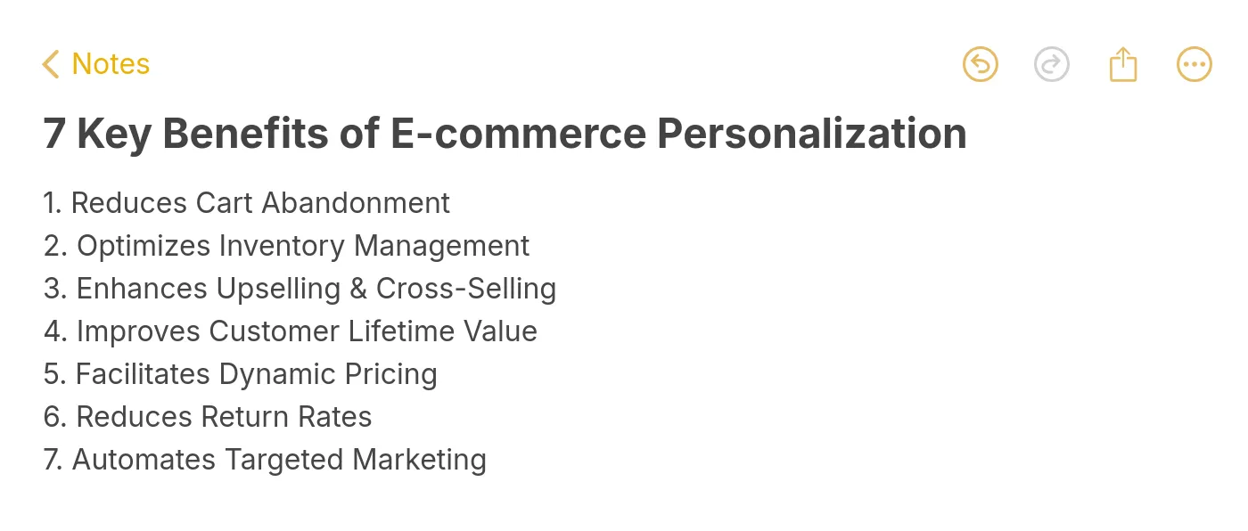
Personalization directly impacts the metrics e-commerce managers care about most. Here are seven reasons it's worth the investment:
• Reduces cart abandonment: Personalized reminders and incentives pull shoppers back before they leave for good. Targeted cart recovery campaigns can recapture 5-15% of abandoned carts.
• Increases average order value: Relevant cross-sells and upsells added at the right moment grow basket size without feeling pushy.
• Improves customer lifetime value: Shoppers who feel understood come back. Repeat purchase rates climb when the experience adapts over time.
• Enables dynamic pricing: Behavioral data lets you test price sensitivity by segment rather than guessing across your entire catalog.
• Cuts return rates: When recommendations match actual preferences, customers keep what they buy.
• Automates targeted marketing: Segmented email and on-site campaigns run on autopilot once the rules are set.
• Boosts conversion rates: According to a GenAIEmbed analysis, 70% of retailers that invested in personalizing their customer experience saw an ROI of at least 400%.
Key benefits of e-commerce personalization
How I Selected These 17 Ecommerce Personalization Examples
I reviewed over 60 e-commerce sites across fashion, beauty, electronics, and lifestyle verticals, then narrowed the list to 17 based on three criteria:
• Tactic diversity: Each example demonstrates a different personalization method, from geolocation popups to AI-powered product quizzes, so the full range of approaches is covered.
• Visual proof: Every example includes a real screenshot captured from the live site. No mockups, no hypotheticals.
• Reproducibility: Each tactic can be replicated using no-code tools like product recommendation engines or popup builders, making them accessible to teams without developer resources.
Overview of 17 E-commerce Personalization Examples
| # | Brand | Category | Personalization Tactic |
|---|---|---|---|
| 1 | Birkenstock | Website | Discount popup with binary CTA |
| 2 | Pull & Bear | Website | Time-zone-adjusted dynamic content |
| 3 | Stitch Fix | Website | Style quiz for curated product picks |
| 4 | Kith | Website | Geolocation store routing |
| 5 | Nike | Website | Predictive search results |
| 6 | Allbirds | Post-purchase follow-up with brand voice | |
| 7 | SONOS | Back-in-stock notification | |
| 8 | Whisky-Me | Cart abandonment with urgency copy | |
| 9 | Prev | Product Recs | "You may also like" engine |
| 10 | Sephora | Product Recs | Complementary product cross-sell |
| 11 | Airbnb | Product Recs | Social proof badges on listings |
| 12 | ASOS | Discounts | First-order welcome discount popup |
| 13 | Camper | Discounts | Early access Black Friday popup |
| 14 | Pacifica Beauty | Support | Live chat with contextual triggers |
| 15 | Best Buy | Support | AI chatbot for product guidance |
| 16 | Champion | Social/UGC | User-generated content gallery |
| 17 | H&M | Loyalty | Tiered loyalty with birthday rewards |
Website Personalization Examples
On-site personalization is where most shoppers first encounter a tailored experience. These five examples show how brands adjust what visitors see the moment they land.
1. Birkenstock: Binary-Choice Discount Popup
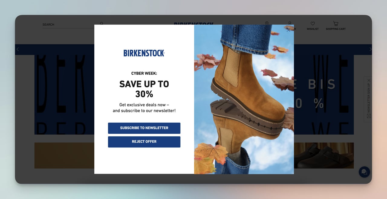
Birkenstock's two-option discount popup
What works: Birkenstock's popup strips the decision down to two paths: "Yes, I want a deal" or "No thanks." There's no email field, no multi-step form, and no dropdown menu cluttering the overlay. The copy is six words. The visual footprint is small enough that it doesn't obscure the product grid behind it.
Why it works: Reducing choices speeds up decisions. When a popup offers a single yes/no action, visitors spend less cognitive energy evaluating it. That popup also doubles as a zero-party data collection point: clicking "yes" signals discount sensitivity, which Birkenstock can use to segment future email campaigns. You can build a similar two-option popup with a popup builder like Popupsmart in under ten minutes.
Key takeaway: Limit your popup to one question with two answers. The simpler the interaction, the higher the opt-in rate.
2. Pull & Bear: Time-Zone-Adjusted Sale Countdown
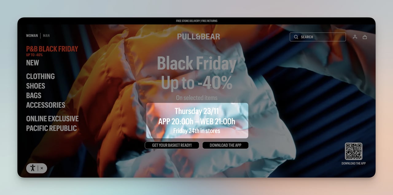
Pull & Bear's localized Black Friday countdown
What works: During Black Friday, Pull & Bear's homepage dynamically adjusted the sale countdown timer to each visitor's local time zone. A shopper in Madrid saw the sale ending at midnight CET, while someone in New York saw it ending at midnight EST. The banner took over the full viewport with high-contrast typography, making the deadline impossible to miss.
Why it works: Urgency loses its power when the deadline feels abstract. "Sale ends tonight" means nothing if the shopper isn't sure what "tonight" refers to. By localizing the countdown, Pull & Bear made the scarcity feel real and personal. This is behavioral targeting at its simplest: using the browser's timezone API to adjust one variable that changes the entire emotional weight of the message.
Key takeaway: Localize your countdown timers to the visitor's time zone. A deadline that matches their clock creates genuine urgency.
3. Stitch Fix: Style Quiz That Builds a Customer Profile
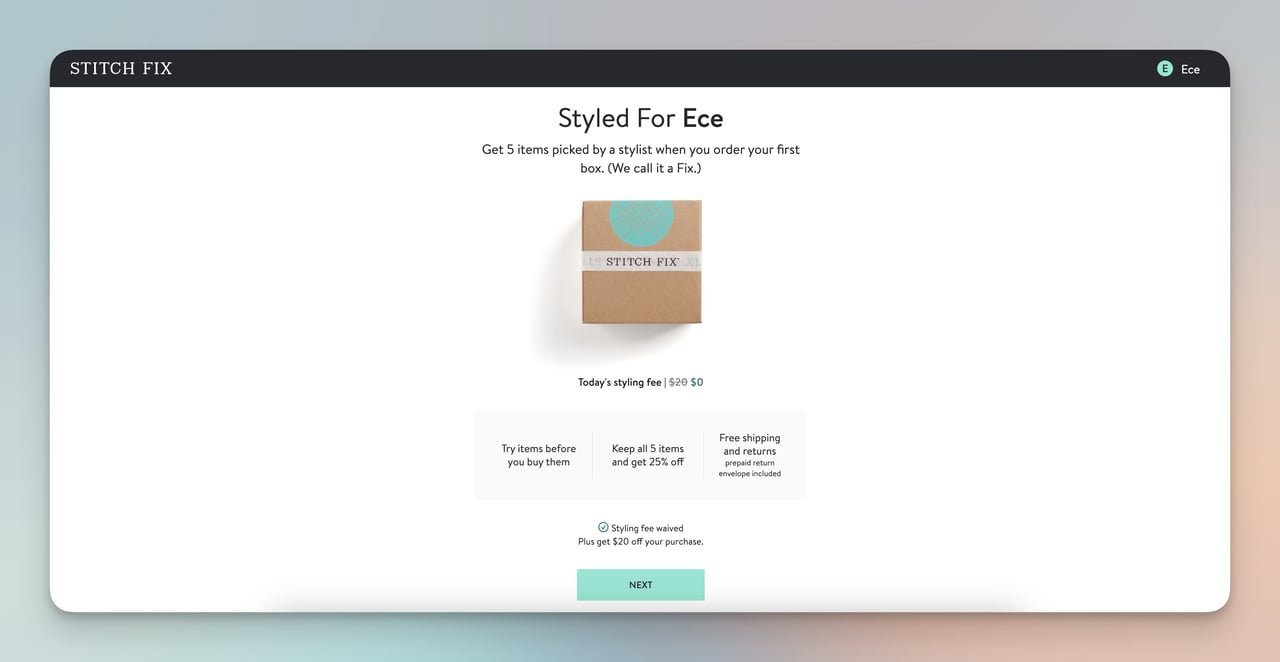
Stitch Fix's interactive style quiz results
What works: Stitch Fix asks new visitors to complete a style quiz covering fit preferences, budget range, and lifestyle needs. The output isn't a generic product page; it's a curated "Fix" of five items hand-selected by a stylist (assisted by their recommendation engine). They also waive the styling fee on the first box, removing the financial barrier to trying the service.
Why it works: Quizzes turn passive browsers into active participants. Each answer the shopper provides is a piece of zero-party data volunteered willingly, which makes the resulting recommendations feel earned rather than intrusive. The waived fee on box one uses the reciprocity principle: Stitch Fix gives something first, which makes the customer more likely to keep (and pay for) the items.
Key takeaway: Use a short quiz (5-8 questions max) to collect preference data upfront, then show products filtered by those answers on the very next screen.
4. Kith: Geolocation Store Routing
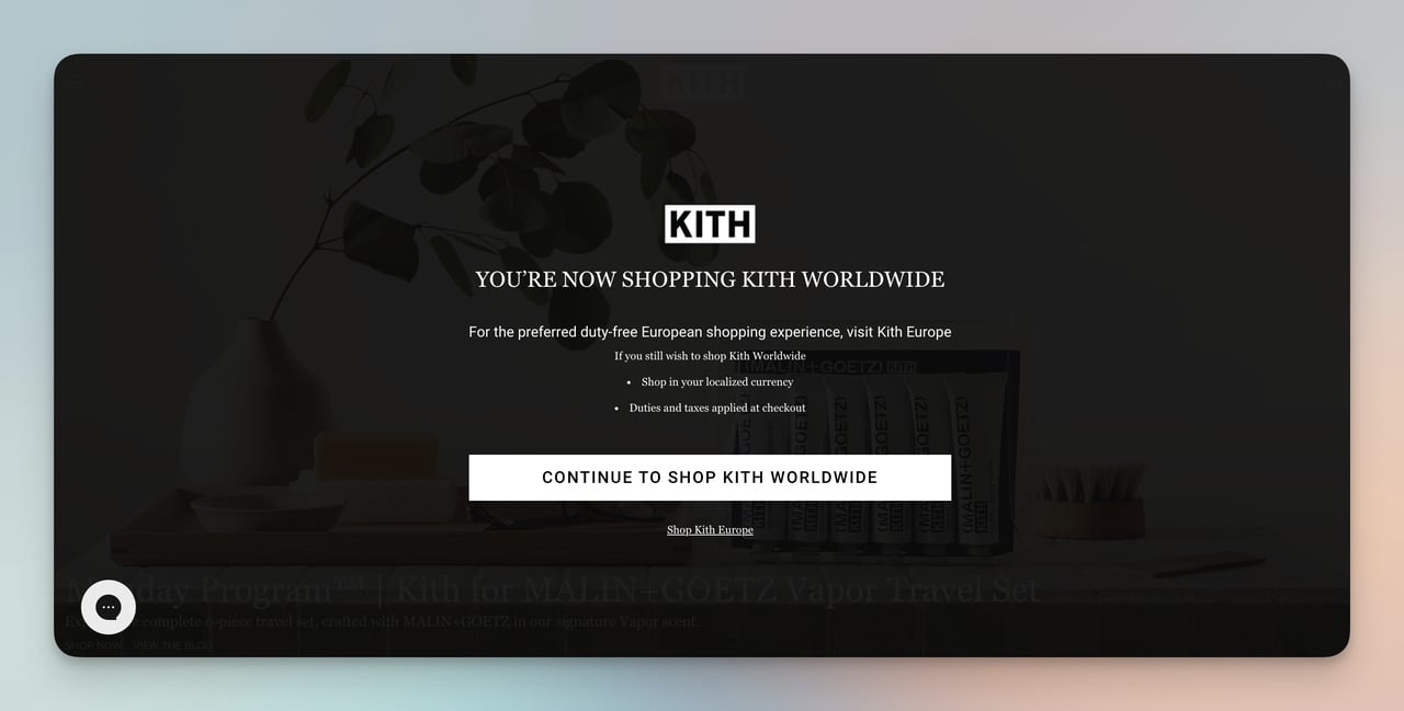
Kith's region-detection overlay
What works: When you land on Kith's site, a full-screen overlay detects your location and routes you to the correct regional store. European visitors get directed to the EU site with local currency, duty-free pricing, and region-specific inventory. The popup is immediate, not buried in a footer dropdown.
Why it works: Checkout surprises kill conversions. When a shopper discovers unexpected duties, taxes, or shipping fees at the payment step, they abandon. Kith front-loads that information by routing visitors to the right store before they start browsing. The result: prices match expectations from the first product page, and geo-targeted popups remove a major source of cart abandonment.
Key takeaway: If you sell internationally, detect location on arrival and redirect to a localized storefront. Don't make shoppers discover pricing surprises at checkout.
5. Nike: Predictive Search With Category Shortcuts
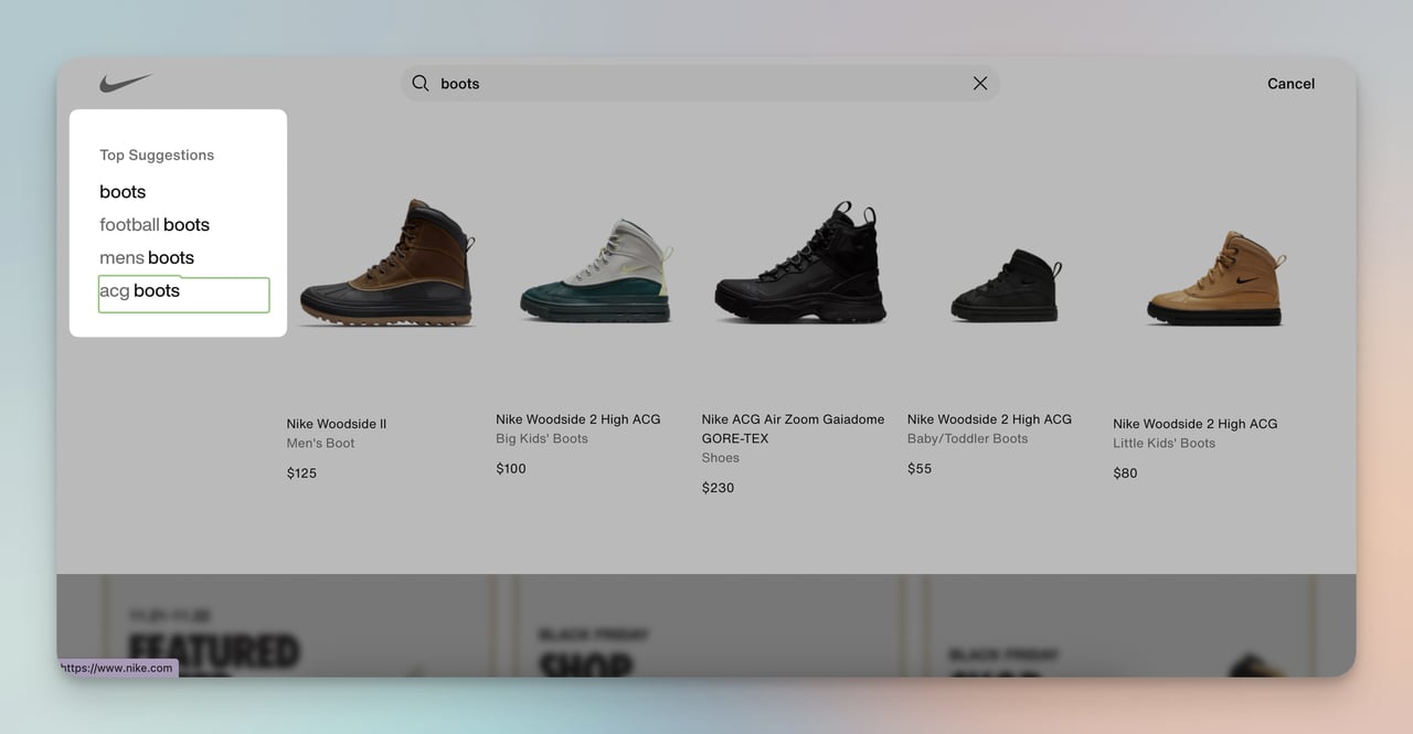
Nike's predictive search suggestions
What works: Typing "boots" into Nike's search bar immediately surfaces category shortcuts like "men's boots" and "ACG boots" alongside specific product results. The search doesn't wait for a full query; it predicts intent after four characters and pre-filters results by the visitor's browsing history and gender selection.
Why it works: Site search is one of the highest-intent actions a visitor can take. Shoppers who use search convert at 2-3x the rate of browsers. By predicting the full query and narrowing results before the shopper finishes typing, Nike shortens the path from intent to product page. This is AI-driven personalization applied to the moment of highest purchase intent.
Key takeaway: Add predictive search with category filters to your site. Shoppers who search are your most motivated visitors, so make their path to the product page as short as possible.
Email and Marketing Personalization Examples
Email remains the highest-ROI personalized channel for e-commerce. These three examples show how triggered, behavior-based emails outperform batch-and-blast campaigns.
6. Allbirds: Post-Purchase Email With Brand Personality
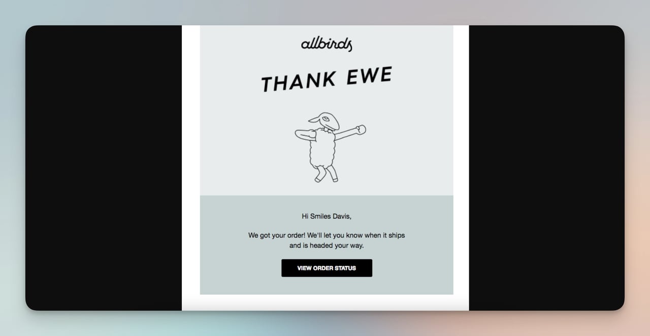
Allbirds' order confirmation email
What works: Allbirds' order confirmation goes beyond the standard transactional receipt. The subject line uses a pun ("Thank Ewe"), the body includes a playful sheep illustration, and the copy confirms the order while promising shipping updates. It reads like a note from a friend, not a system-generated email.
Why it works: Order confirmation emails have open rates above 60%, making them the most-read emails any brand sends. Allbirds treats this high-attention moment as a branding opportunity rather than a transactional obligation. The humor builds emotional connection, which drives the post-purchase experience that turns one-time buyers into repeat customers. Most brands waste this touchpoint on a plain receipt.
Key takeaway: Rewrite your order confirmation email with your brand's voice. It's your most-opened email, and it sets the tone for the entire post-purchase relationship.
7. SONOS: Back-in-Stock Notification
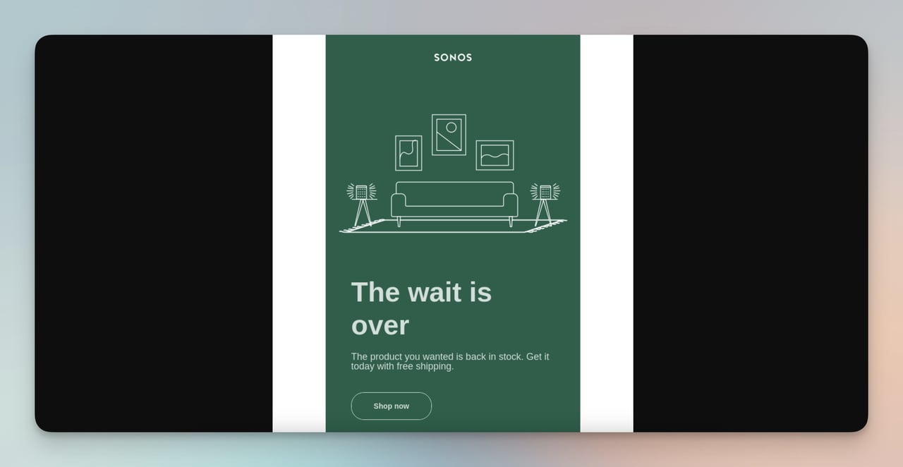
SONOS back-in-stock alert
What works: SONOS sends a targeted email the moment a previously out-of-stock item becomes available again. The email is triggered by inventory data, not a marketing calendar. It includes the specific product the shopper waitlisted, a direct link to buy, and nothing else. No cross-sells, no newsletter content, no distractions.
Why it works: This email arrives at peak purchase intent. The shopper already wanted the product enough to sign up for a notification. By keeping the email focused on that single product with a single CTA, SONOS eliminates decision fatigue. Back-in-stock emails like this typically convert at 3-5x the rate of promotional blasts because the timing and relevance are both perfect.
Key takeaway: Set up automated back-in-stock alerts for your top 20% of SKUs. Keep the email to one product and one button.
8. Whisky-Me: Cart Abandonment With Motivational Copy
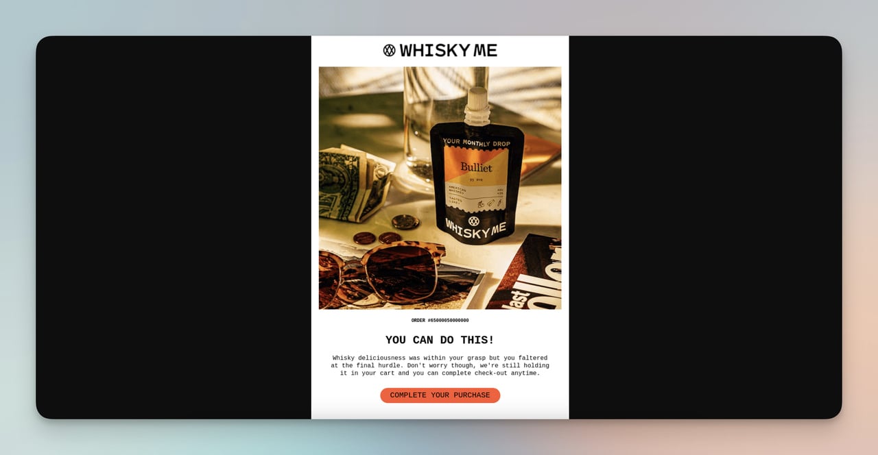
Whisky-Me's abandoned cart recovery email
What works: Whisky-Me's cart abandonment email opens with "You can do this!" instead of the typical "You forgot something." The copy frames the abandoned items as "whisky deliciousness" waiting for the shopper, and the CTA makes completing the purchase feel easy rather than obligatory.
Why it works: Most abandonment emails use guilt ("You left items behind") or generic urgency ("Hurry, stock is limited"). Whisky-Me flips the script by using encouragement, which creates a positive emotional association with completing the purchase. The playful tone matches their brand and avoids the robotic feel of template-driven recovery emails. Creating that sense of urgency through enthusiasm rather than pressure is more effective for lifestyle products.
Key takeaway: Match your abandonment email's tone to your brand voice. Encouragement outperforms guilt for non-essential products.
Product Recommendation Examples
Product recommendations drive 10-30% of e-commerce revenue, according to Dynamic Yield's Personalization Maturity report. These three brands show different approaches to surfacing the right product at the right moment.
9. Prev: "You May Also Like" Based on Browsing History
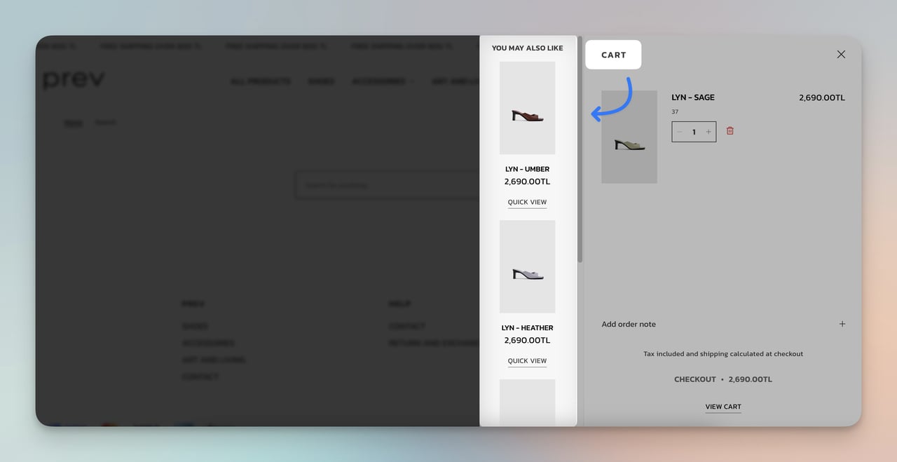
Prev's related product suggestions
What works: While browsing Prev's vegan leather boots, the product page shows a "You might also like" section populated with visually similar boots in different colors and materials. The recommendations aren't random bestsellers; they're filtered by the style and category the shopper is actively viewing.
Why it works: This is collaborative filtering at the product level. By showing alternatives within the same category rather than jumping to unrelated products, Prev keeps the shopper in a buying mindset for the product type they already expressed interest in. It also increases average order value because the shopper might add a second colorway. Check out more product recommendation examples for similar implementations.
Key takeaway: Configure your "also like" section to show products in the same category and price range as the item being viewed. Cross-category recommendations belong on the cart page, not the product page.
10. Sephora: Complementary Product Cross-Sell
Sephora's "complete the look" cross-sell
What works: On a foundation product page, Sephora displays complementary items like primers, setting sprays, and brushes that pair with the selected product. The recommendations are labeled as part of a routine, not random add-ons. Each suggestion includes a one-line reason explaining why it complements the main product.
Why it works: Sephora's cross-sell works because it's contextual, not opportunistic. A primer paired with foundation makes logical sense to the shopper. Framing it as a "routine" taps into the beauty community's existing mental model of multi-step skincare/makeup application. This approach consistently lifts average order value by 15-25% compared to generic "customers also bought" widgets.
Key takeaway: Group your cross-sells into logical "routines" or "kits" that explain why products belong together. Context-driven bundles convert better than algorithmic randomness.
11. Airbnb: Social Proof Badges on Listings
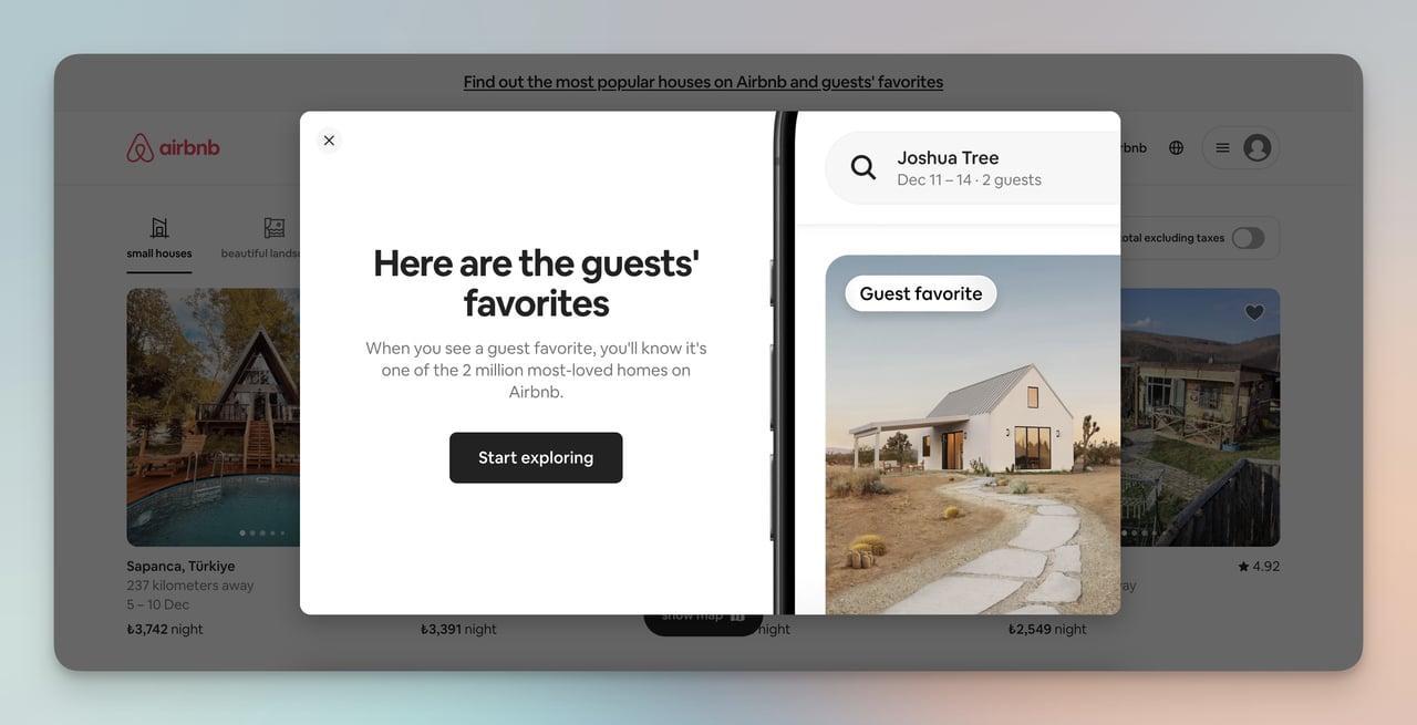
Airbnb's "Guest Favorite" badges
What works: Airbnb labels top-rated properties as "Guest Favorites," a badge earned through consistently high review scores and repeat bookings. The badge appears directly on the search results grid, not buried in the listing detail page. Travelers can filter for Guest Favorites, making highly-rated listings more discoverable.
Why it works: Social proof reduces the perceived risk of a new purchase. For accommodations, where you can't "try before you buy," the stakes feel especially high. The Guest Favorite badge compresses hundreds of reviews into a single trust signal. According to Emarsys' personalization data, 69% of consumers are satisfied with personal product recommendations they receive, and Airbnb's badge system operates on the same principle: let other customers do the convincing.
Key takeaway: Add visible trust badges (top-rated, best-seller, staff pick) to your product grid. Position them on the listing card itself, not just on the detail page.
Personalized Discounts and Offers Examples
Generic discounts erode margins. These two brands show how to make offers feel personal enough that shoppers act on them immediately.
12. ASOS: First-Order Welcome Popup
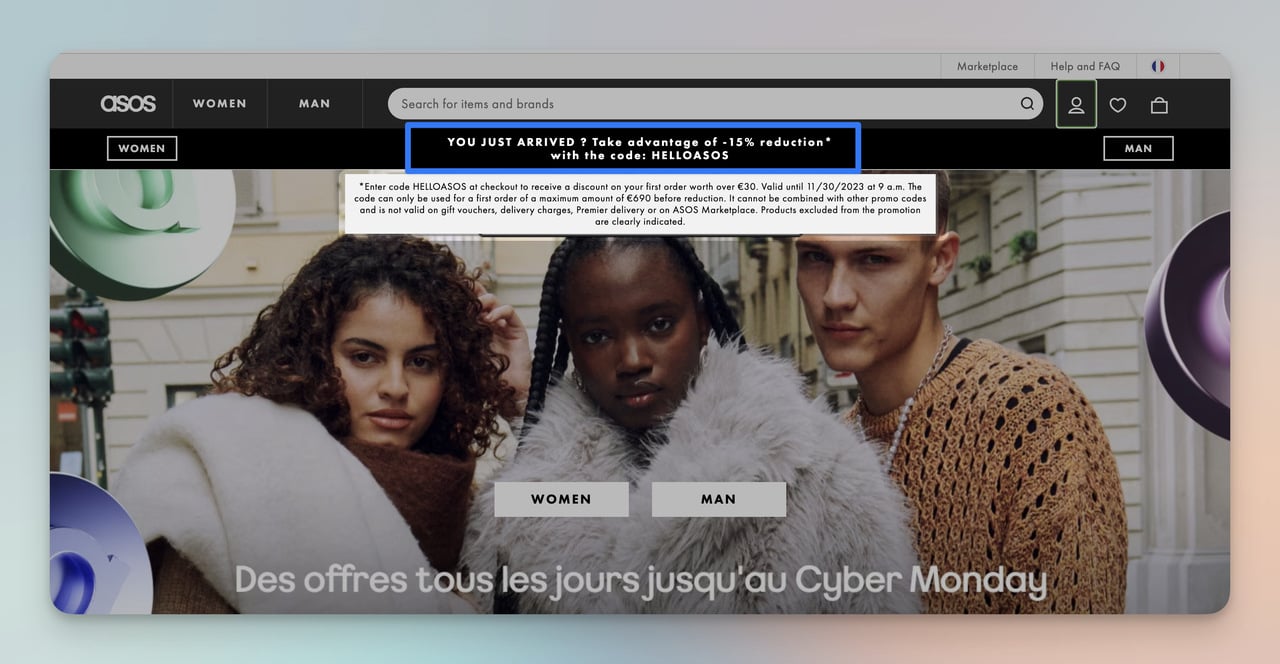
ASOS's 15% new visitor discount
What works: ASOS shows a 15% first-order discount popup only to new visitors. The popup includes a clear expiration date and requires an email to unlock the code. Returning customers who already used the code don't see it again, which prevents discount fatigue from repeated exposure to the same offer.
Why it works: The expiration date creates time-bound urgency without being aggressive. By gating the discount behind an email capture, ASOS turns a margin-reducing promotion into a list-building tool. The visitor gets a genuine incentive; ASOS gets a remarketing channel. This is a limited-time offer structure that pays for itself through the email address alone.
Key takeaway: Gate your first-order discount behind an email capture and set a real expiration date. You'll convert the visitor AND build your list.
13. Camper: Early Access as a Loyalty Trigger
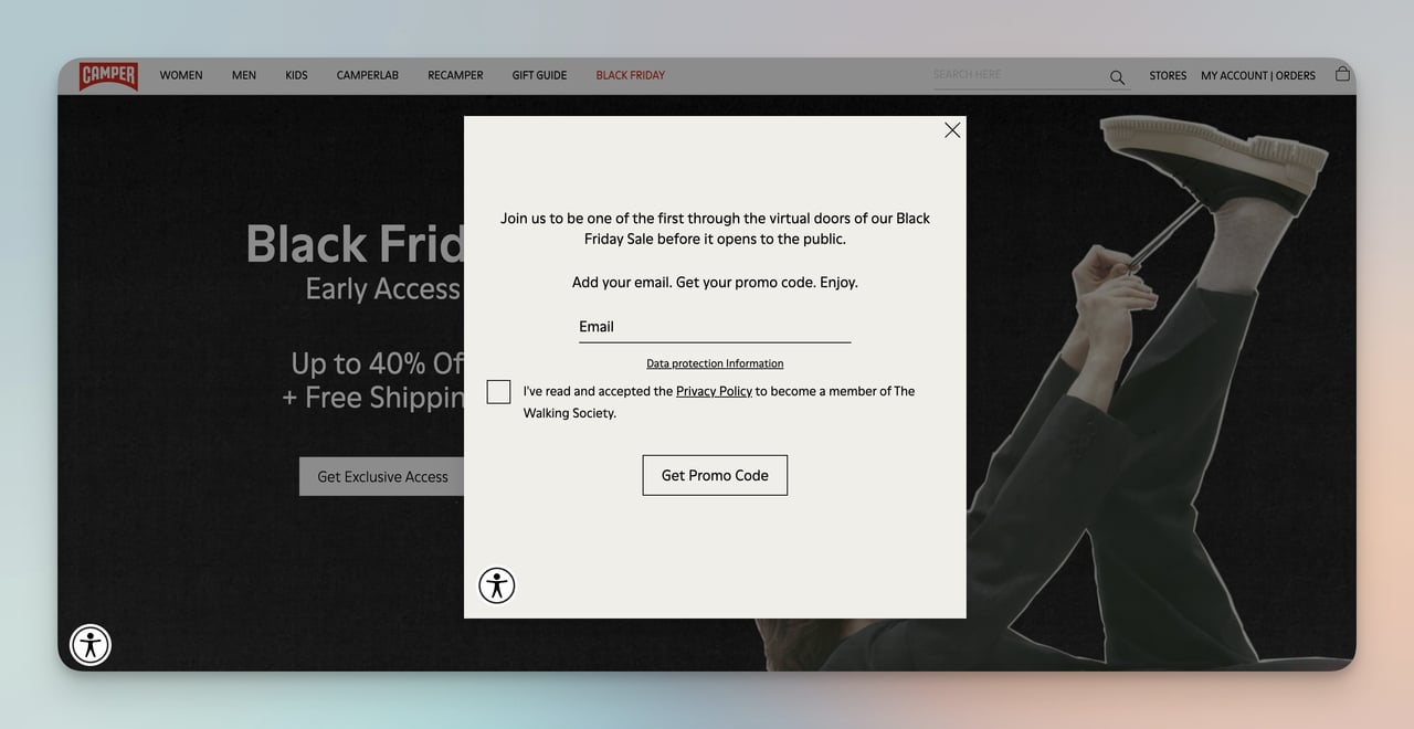
Camper's early access Black Friday popup
What works: Before Black Friday officially started, Camper sent a Black Friday popup offering email subscribers early access to deals. The popup explicitly stated that signing up meant getting first pick before the public sale launched. The exclusivity framing made the email signup feel like joining an insider group.
Why it works: Early access taps into loss aversion. The fear of missing the best deals before stock runs out is a stronger motivator than the discount itself. Camper also pre-builds their email list days before the sale, which means they can send follow-up campaigns during the event to subscribers who browsed but didn't buy. The psychological principle at work is the VIP effect: people value access more than savings.
Key takeaway: Launch your sale promotion 5-7 days early with an "early access" popup. You'll build a pre-sale email list and create anticipation that drives Day 1 revenue.
Customer Service Personalization Examples
Personalized support turns a cost center into a conversion driver. These two examples use chat interfaces to meet shoppers at their moment of hesitation.
14. Pacifica Beauty: Contextual Live Chat
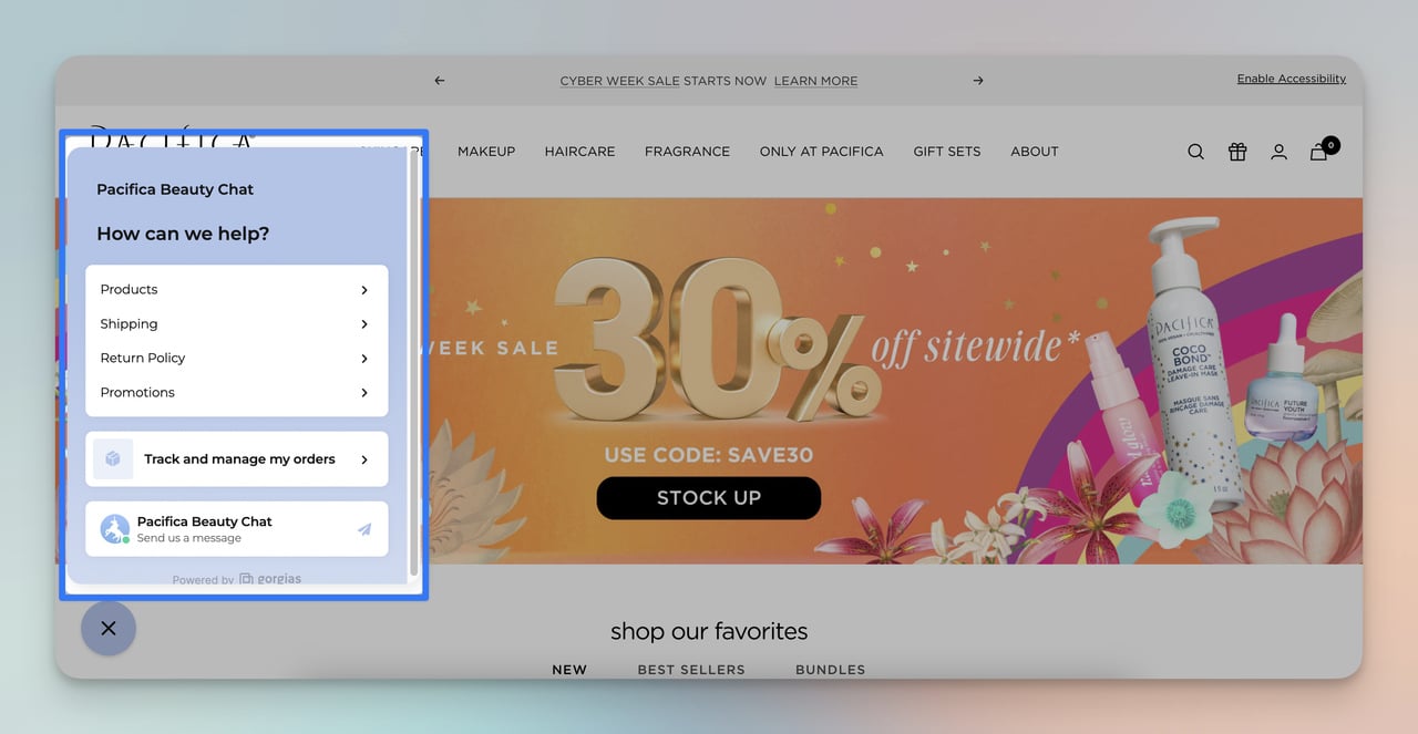
Pacifica Beauty's live chat support
What works: Pacifica Beauty's chat widget appears on product pages after a visitor has been browsing for 30+ seconds without adding to cart. The chat opens with a contextual greeting that references the product category the shopper is viewing. Agents can see the visitor's browsing history in real time, so they don't ask redundant questions.
Why it works: Timing is everything for live chat. Triggering the widget after 30 seconds of inactivity targets visitors who are interested but hesitant, which is the exact moment where a quick answer can push them toward a purchase. The contextual greeting ("Looking for a cruelty-free cleanser?") feels personal rather than intrusive. This kind of proactive support can lift conversion rates by 10-20% on high-consideration product pages.
Key takeaway: Trigger your live chat based on time-on-page, not page load. Target visitors who are browsing but haven't acted.
15. Best Buy: AI Chatbot for Product Guidance
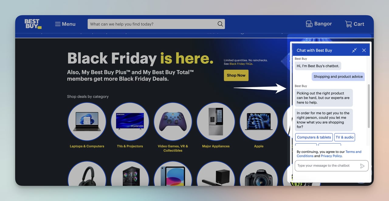
Best Buy's virtual assistant
What works: Best Buy's chatbot handles product comparison questions ("Which laptop is better for video editing?") by pulling specs from their product database and generating side-by-side comparisons. The bot understands follow-up questions, so a shopper can narrow down options without restarting the conversation.
Why it works: Electronics purchases involve high consideration and multiple comparison points (specs, price, compatibility). Best Buy's chatbot compresses what would normally be 30 minutes of tab-switching into a guided conversation. For categories where customers feel overwhelmed by options, AI assistants reduce choice paralysis by acting as a filter. This is predictive analytics applied to the customer service layer.
Key takeaway: Deploy chatbots for product categories with 50+ SKUs and complex specs. Let the bot narrow options based on the shopper's stated needs.
Social and Loyalty Personalization Examples
The final two examples show personalization that extends beyond the transaction. User-generated content and loyalty programs build long-term relationships that make customers resistant to switching brands.
16. Champion: User-Generated Content Gallery
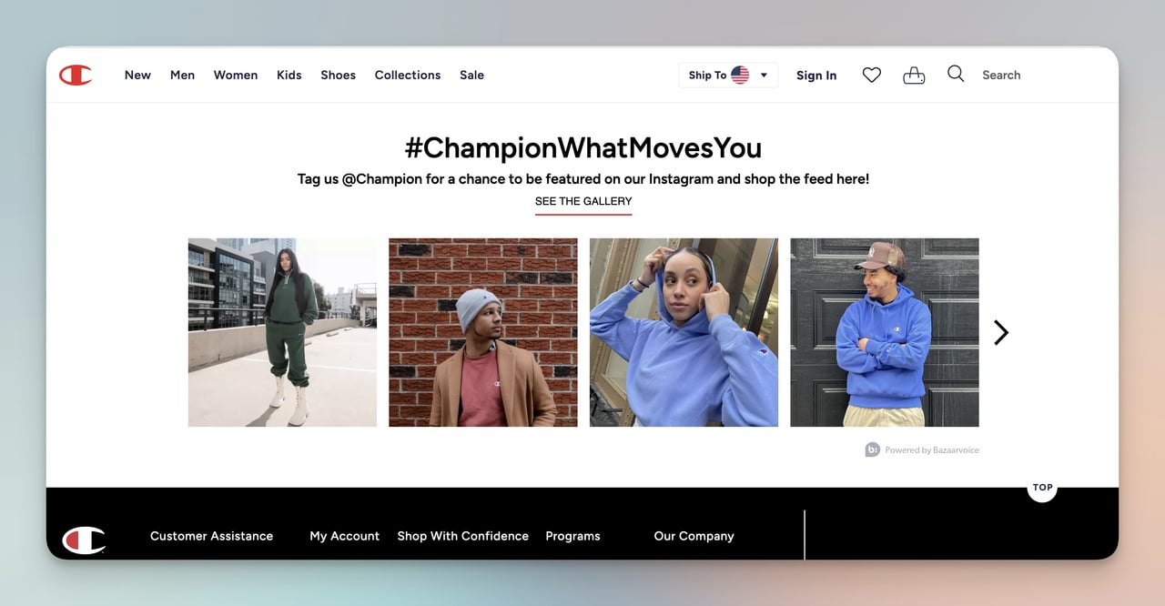
Champion's customer photo gallery
What works: Champion embeds a grid of customer-submitted Instagram photos directly on their product pages. Each photo shows a real person wearing the product in their own environment: gym, street, home. The gallery is shoppable, meaning visitors can click a photo and jump straight to the product shown in it.
Why it works: User-generated content bridges the gap between product photography (aspirational but staged) and reality. Seeing someone who looks like you wearing the product reduces the mental leap from "this looks good on a model" to "this will look good on me." According to TTEC's 2026 retail data, 71% of consumers want brands to learn from their shopping habits over time, and UGC galleries signal that a brand listens to its community.
Key takeaway: Add a shoppable UGC gallery to your top 10 product pages. Real customer photos convert better than professional shots for apparel and lifestyle products.
17. H&M: Tiered Loyalty With Birthday Rewards
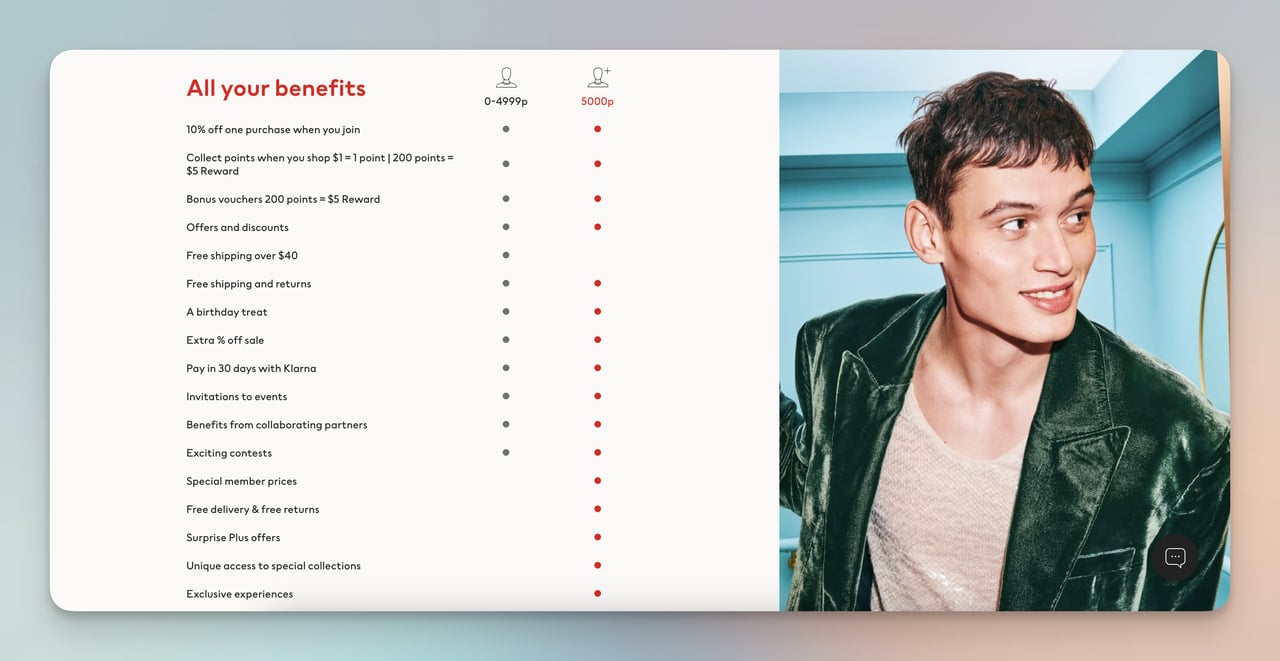
H&M's personalized loyalty tiers
What works: H&M's loyalty program adapts rewards to individual member behavior. Free shipping unlocks after a spending threshold. Birthday gifts arrive automatically. Members get early access to new collections. The program tracks purchase patterns and tailors promotional emails to categories the member actually shops, not blanket promotions across the full catalog.
Why it works: Tiered loyalty programs create a progression loop. Once a customer invests effort to reach a tier, they're less likely to switch to a competitor because they'd lose accumulated benefits. The birthday gift is a small cost to H&M but a high-emotional-value touchpoint that keeps the brand top of mind at a personal moment. H&M also uses purchase data from the program to feed their customer loyalty program strategy with increasingly targeted recommendations.
Key takeaway: Build loyalty tiers that unlock benefits at each level. The switching cost of losing a tier keeps customers from shopping competitors.
How to Start Personalizing Your E-commerce Store
You don't need a six-figure personalization platform to start. These four steps cover the fundamentals for stores at any stage.
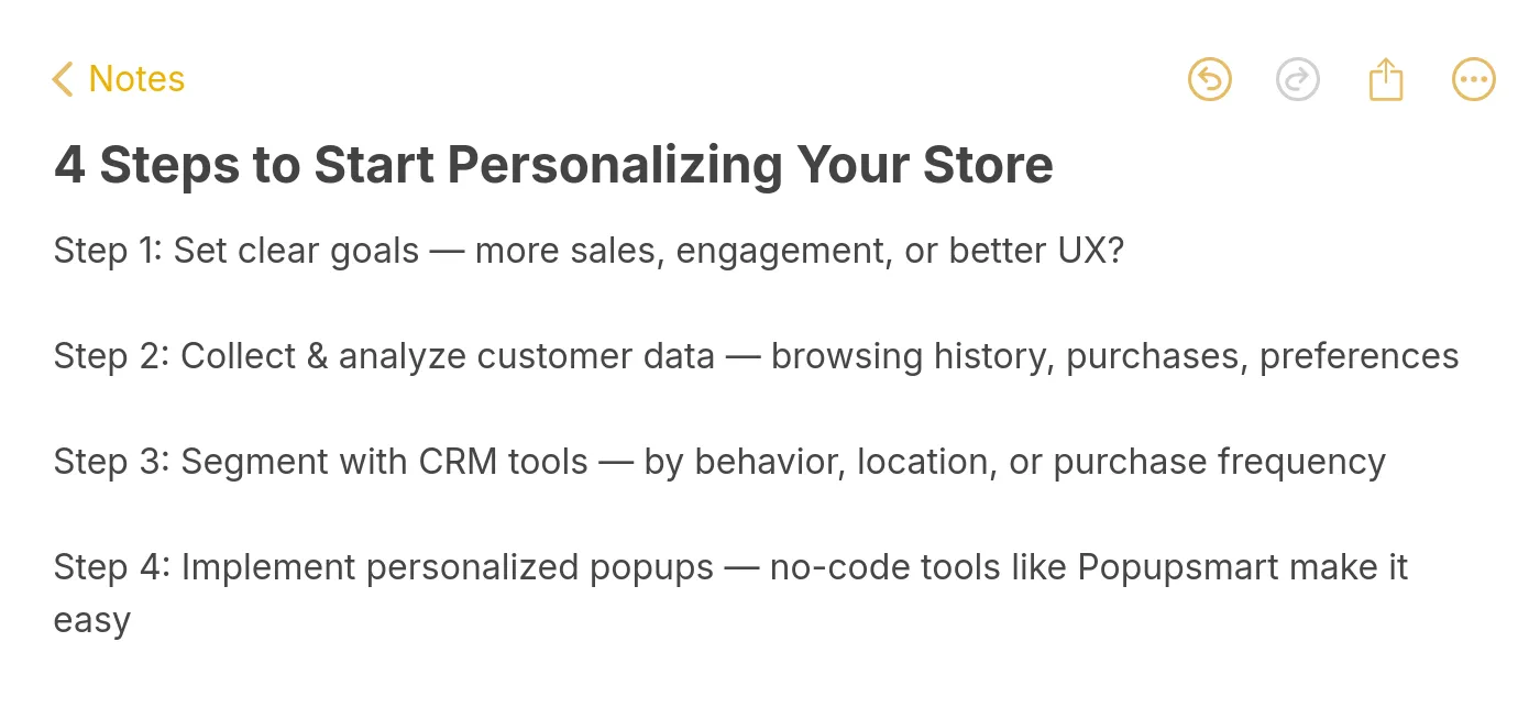
Four steps to begin personalizing
1. Define one measurable goal. Pick a single metric: reduce cart abandonment by 10%, increase average order value by $5, or grow email signups by 20%. A focused goal prevents you from trying to personalize everything at once and measuring nothing.
2. Collect behavioral data. Install analytics to track product views, time on page, and cart additions. Tools like Google Analytics 4 give you enough user data analytics to segment visitors by behavior. You don't need a customer data platform on day one.
3. Segment your audience. Start with three segments: new visitors, returning browsers, and past purchasers. Each group needs different messaging. New visitors need trust signals. Returning browsers need incentives. Past purchasers need cross-sells. Use a CRM or your email platform's product recommendation email features to automate segmentation.
4. Launch your first personalized touchpoint. Pick the lowest-effort, highest-impact tactic from this list. For most stores, that's a welcome popup for new visitors (like ASOS, example #12) or a cart abandonment email sequence (like Whisky-Me, example #8). Email capture popups can be live in 15 minutes with a popup builder like Popupsmart.
E-commerce Personalization Trends to Watch in 2026
Personalization is shifting from reactive (showing products based on past behavior) to predictive (anticipating needs before the shopper expresses them). According to Attentive's 2026 personalization report, 64% of shoppers want marketing to be more personalized, yet most brands still rely on basic segmentation.
Three shifts are reshaping the space:
• AI-powered recommendation engines are moving from "people who bought X also bought Y" to real-time intent prediction based on scroll depth, cursor behavior, and session context.
• Omnichannel personalization is connecting in-store, web, and app experiences. A customer who browses in the physical store receives a follow-up email with the exact products they tried on, tracked via app check-in or loyalty card scan.
• Privacy-first personalization is replacing third-party cookies with zero-party data collection through quizzes, preference centers, and progressive profiling. Brands that relied on retargeting pixels are switching to owned data strategies.
Putting These Personalization Examples to Work
The 17 examples above share one common thread: they use data the shopper already provided (location, browsing behavior, past purchases, quiz answers) to remove friction from the buying process. None of them require exotic technology. Most can be replicated with a CRM, an email platform, and a conversion rate optimization tool.
Start with the tactic closest to your biggest revenue leak. If cart abandonment is your problem, model your recovery emails after Whisky-Me (#8) or SONOS (#7). If new visitor conversion is low, test a welcome popup like ASOS (#12) or Birkenstock (#1). If average order value needs a boost, study Sephora's cross-sell approach (#10).
You can build and launch your first personalized popup in under 15 minutes with Popupsmart. No developers needed, no code to write. Start with one example, measure the result, and expand from there.
Frequently Asked Questions
What is personalization in e-commerce?
E-commerce personalization means adapting your online store's content, product recommendations, pricing, and messaging to each visitor based on their behavior, location, purchase history, and stated preferences. It ranges from simple tactics (showing a returning customer's name) to complex ones (AI-driven product feeds that update in real time based on browsing patterns). The goal is to make each shopper's experience feel individually relevant, which directly increases conversion rates and customer lifetime value.
How do I collect data for e-commerce personalization?
In ecommerce personalization, track user behavior on your website to collect data on product views and time spent per page using methods such as heat maps. Obtain customer feedback on customer experiences and preferences by adding popups to your site. You can do this very easily with Popupsmart’s survey popups. Also track and analyze customer interactions with your email marketing to understand which links they click and which emails effectively lead to purchases.
How does personalization improve ecommerce conversion rates?
Personalization lifts conversions by reducing friction at three critical points: product discovery (search and recommendations surface relevant items faster), decision-making (social proof and reviews reduce uncertainty), and checkout (localized pricing and saved preferences eliminate surprises). According to Ringly's 2026 analysis citing Epsilon data, 80% of consumers are more likely to buy when a brand personalizes the experience. The improvement typically ranges from 5-25% revenue lift depending on the depth of implementation.
What are successful ecommerce personalization strategies?
The most effective strategies combine multiple touchpoints. Start with behavioral product recommendations on product and cart pages. Add triggered email sequences (welcome, abandonment, post-purchase) that reference specific products the shopper viewed. Layer on geo-targeted content for international visitors. Then build a loyalty program that uses purchase data to personalize future offers. The brands in this article that execute best, like Sephora and H&M, use three or more of these strategies simultaneously and connect them through a single e-commerce optimization framework.

How would you rate your experience with this article? 😊