20 Above-the-Fold Examples That Convert in 2026 (with Breakdowns)
 ChatGPT
 Perplexity
 Claude
 Grok
Grok Google AI Mode
Above the fold is the first visible screen of a webpage before scrolling, crucial for first impressions and conversions. The text reviews 20 brand examples and key tips: keep it simple, clear, visual, user-friendly, and include strong CTAs and social proof.
These 20 above the fold examples come from real brands I've audited across SaaS, e-commerce, and DTC. Each teardown shows the exact hero copy, CTA placement, social proof, and visual choice that earns the click before a visitor scrolls. You'll get a pattern checklist, common mistakes, and a testing playbook by the end.
What is above the fold?
Above the fold is the part of a web page a visitor sees before scrolling. The phrase comes from print newspapers. Editors stacked the most important headline, the strongest photo, and the masthead in the top half of the front page so the story sold itself from a newsstand rack. The page literally folded in the middle, and the half facing up had to do all the work.
The web borrowed the term in the late 1990s. Jakob Nielsen's 1996 usability research found that around 76% of users never scrolled, so designers crammed every sign-up form, value prop, and trust badge into the first 600 pixels of a desktop monitor.
That number has shifted a lot since. People scroll now, on every device. But the first viewport is still where the visitor decides whether to keep reading or close the tab. I've audited dozens of above-the-fold designs across SaaS and e-commerce, and the deciding moment almost always happens in those first three or four seconds.
Today, "the fold" isn't a fixed pixel height. It's whatever shows on the visitor's screen, which depends on device, orientation, browser chrome, and zoom level. A 13-inch laptop sees roughly 600 to 800 pixels. A phone in portrait sees 400 to 500. Your hero has to work in all of them.
Why above the fold matters in 2026
According to Digital Applied, the average visitor spends 11 seconds above the fold on desktop and 7 seconds on mobile before they decide to scroll, click, or bounce. That window is the entire window. Miss it and the rest of the page is theoretical.
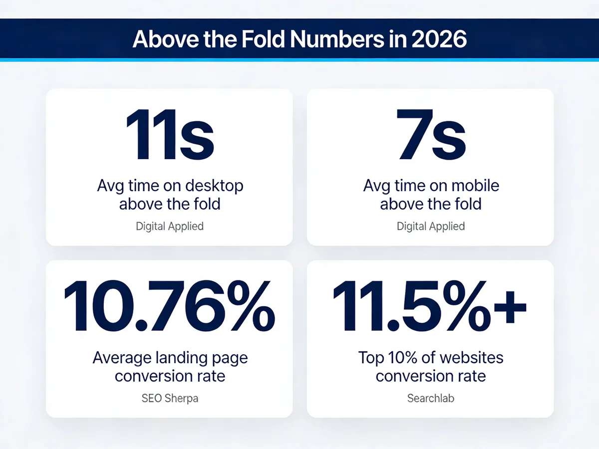
Above-the-fold engagement and conversion benchmarks for 2026.
The conversion math backs this up. SEO Sherpa reports the average landing page conversion rate is 10.76%, but performance varies sharply by industry and design quality. Searchlab notes that the top 10% of websites convert 3 to 5 times better than average, hitting 11.5%+ on their best-performing pages. The pages doing this well almost always have a tight, opinionated above-the-fold section. There's no clutter to scan past, no second hero competing for attention.
I've watched session replays where visitors spend less than three seconds above the fold and leave. I've also watched visitors stare at the hero for nine or ten seconds, reading the headline twice, then click the primary CTA without scrolling. The difference is usually one thing: the visitor knew, within a heartbeat, what the product does and what to do next. When that's clear, scroll depth and time on page both go up because the visitor is now invested. When it's not, you get a bounce, and your retargeting budget pays for nothing.
People still argue that the fold is dead. It isn't. Scroll behavior changed, but the cost of a bad first impression got worse, not better, because attention is more contested than ever.
Key elements of effective above the fold sections
In our Popupsmart customer audits, the above-the-fold sections that convert tend to share a small set of ingredients. Every example in the next section uses some combination of these. Skip more than two and the hero usually underperforms.
• A clear value proposition: One sentence that names the product, the audience, and the outcome. If a stranger can't tell what you sell after reading the headline once, rewrite it. "Inventory management for restaurants that hate spreadsheets" beats "The future of restaurant tech."
• A primary CTA: One button, in the dominant brand color, with action-led copy ("Start free," "Get a demo," "Shop the sale"). Not three buttons. Not a button plus a phone number plus a chat widget all yelling at once. Decision fatigue starts before the visitor scrolls.
• A hero visual that does work: A product screenshot, a real customer photo, a short looping video, or an annotated UI shot. Stock photography of people in suits shaking hands does not count. The visual should show what the product looks like or what life with the product looks like.
• Navigation that matches intent: Top-level links should reflect the visitor's likely next step (Pricing, Product, Customers), not your internal org chart (Solutions, Resources, Company). I've seen conversion lift just from renaming "Resources" to "Templates" because that's what visitors actually wanted.
• Social proof, not vanity metrics: A logo wall of recognizable customers, a star rating with the review count, or a one-line quote from a named customer. "Trusted by industry leaders" is invisible. "Used by 12,400 Shopify stores" is concrete.
• Trust signals where they reduce friction: A G2 badge near a SaaS pricing CTA, a money-back guarantee near an e-commerce purchase button, free-shipping copy on a DTC hero. Place trust where doubt happens, not in a footer nobody reads.
• Scarcity or urgency, used sparingly: Live order counts, low-stock notes, sale countdowns. Real urgency converts. Fake urgency that resets every visit kills trust on the second visit, so don't fake it.
• Mobile-first sizing: Design the hero for a 400-pixel-tall viewport first. If your headline, CTA, and one visual element fit there, you're safe. Then expand for desktop. Most teams do this in reverse, then wonder why mobile bounce is double desktop.
20 above the fold examples that convert
Here are the 20 brand examples I keep coming back to in audits. They span SaaS, e-commerce, fashion, food, automotive, and tooling. Each section explains what the brand actually does above the fold, why the choice works in context, and the takeaway you can borrow tomorrow. For more adjacent inspiration, you can also browse SaaS landing page examples and mobile landing page examples.
1. Ahrefs
Ahrefs is an all-in-one SEO platform built around backlink and keyword data. Their hero has barely changed in years, and that's the point — it tested well, so they kept it.
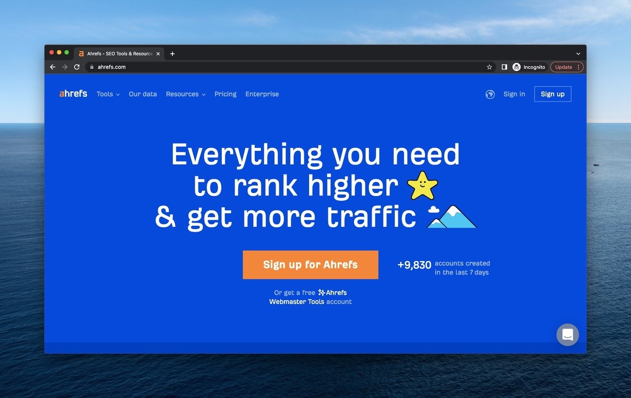
Ahrefs hero with single headline, clear CTA, and live signup count.
What it does: A solid royal-blue background. One headline — "Everything you need to rank higher and get more traffic" — in a font size you can read from across the room. A single primary CTA ("Start a 7-day trial"). A live counter showing recent signups in the last seven days. A quiet help-center chat icon in the bottom right.
Why it works: The headline names the outcome (rank higher, more traffic) without naming a feature. That's the order of operations B2B buyers actually want. The seven-day signup count is dynamic social proof, refreshed daily, which makes the brand feel alive.
Key takeaway: If your headline can't fit on one line at 48px on a laptop, it's too long. Cut feature words and write the outcome instead.
2. Allbirds
Allbirds sells minimalist shoes and apparel built from natural materials. Their hero is unmistakably DTC fashion, but the conversion craft is closer to a SaaS landing page.
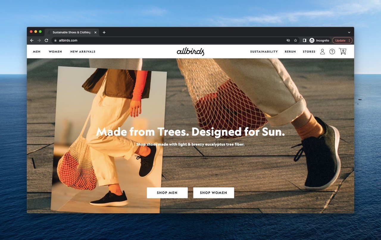
Allbirds hero with seasonal photography and gendered shopping split.
What it does: Full-bleed lifestyle photography of legs walking in the shoes. Tagline emphasizes "made naturally." Two CTAs split shoppers by gender immediately, so the next click is already a category page, not a hub. Top-right icons handle account, help, and cart in the order shoppers expect.
Why it works: Splitting the audience at the hero saves a click and a bounce. Shoe shoppers don't want a unified catalog — they want their section. The "made naturally" tag does brand work in three words instead of a paragraph.
Key takeaway: When your audience self-segments, segment them at the hero. Two CTAs that route to the right category beat one generic "Shop now" every time.
3. Apple
Apple needs no intro, but the discipline of their hero is worth studying. They treat above the fold like a billboard for whatever they want you to care about this month.
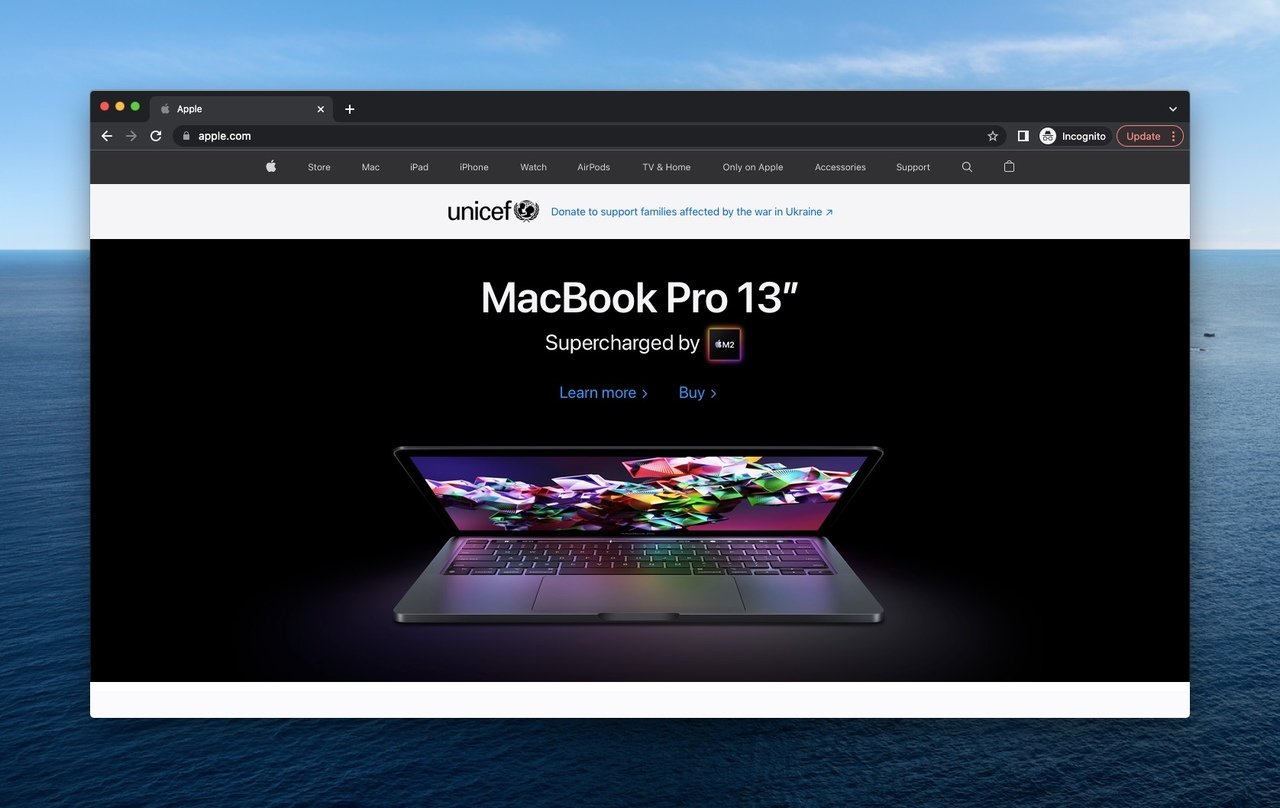
Apple hero with single product, two CTAs, and zero clutter.
What it does: Black background. One product hero shot, beautifully lit. Product name, three-word positioning line, and two CTAs: "Learn more" and "Buy." Top navigation is icon-and-word minimal. A small banner above the hero highlights a UNICEF partnership.
Why it works: The two-CTA pattern (educate or transact) covers both buyer stages without forcing a choice. Apple knows some visitors are researching and some are ready, so they give both a button. The black background eliminates competing visual noise — the product is the only thing your eye can land on.
Key takeaway: Use the "Learn more / Buy" two-CTA split for any product where the buyer journey has both a research and a transaction path. It outperforms a single CTA for considered purchases.
4. Bobo's
Bobo's makes oat bars and snacks aimed at the healthy-but-tasty crowd. Their hero turns a packaged-goods category into a warm, inviting moment.
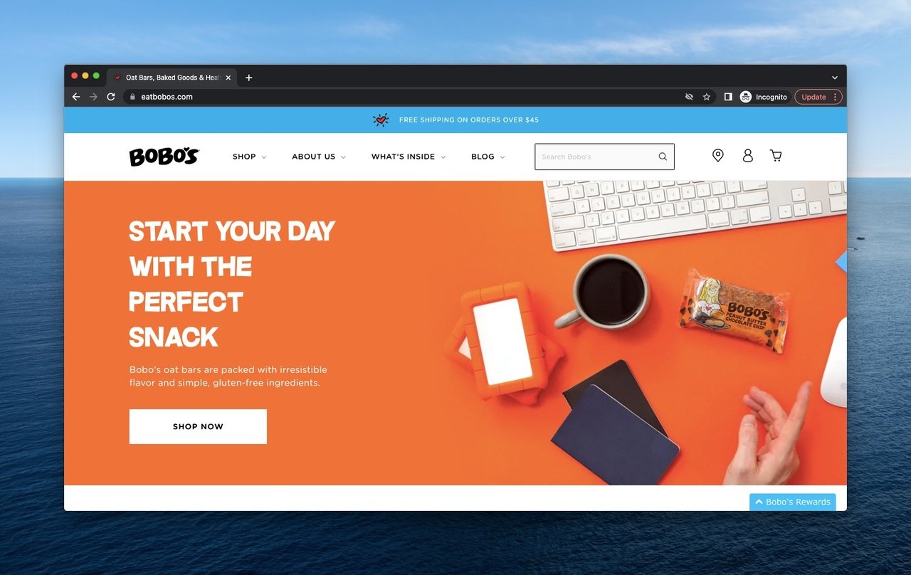
Bobo's hero with warm orange palette and contextual product photography.
What it does: Warm orange background that signals appetite. Product placed in a real-life desk-snack scene with a coffee mug and notebook. A single "Shop now" CTA. Above the nav, a free-shipping campaign bar. A subtle Bobo's Rewards button parks loyalty in the bottom corner without competing for the main click.
Why it works: Showing the product in context (a workday snack break) tells the buyer when and how to use it without a paragraph of copy. Color psychology does the rest — orange is the most appetite-friendly hue in the color wheel for food brands.
Key takeaway: Don't shoot products on a white sweep. Shoot them in the moment of use. A snack on a desk sells better than a snack on a tray.
5. Calvin Klein
Calvin Klein is a fashion house with a strong visual identity. Their hero leans into brand-led design, not product-led, which is unusual and works because the brand is famous.
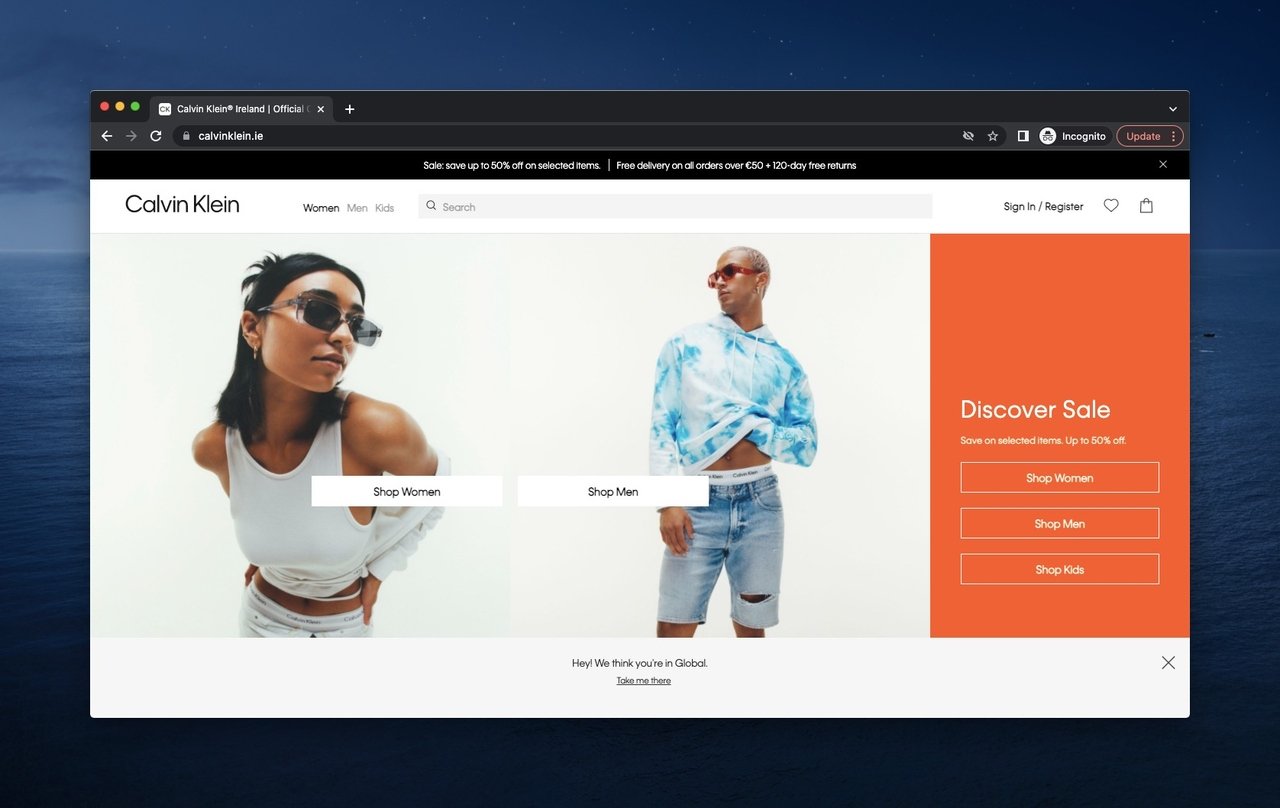
Calvin Klein hero with brand-forward editorial photography.
What it does: A skinny top bar announces a sale immediately. The main hero is editorial fashion photography with two models. Three shopping CTAs split by category sit beneath the photo. A persistent sale-link bar at the bottom drives the urgency call again.
Why it works: When your brand is recognizable, you can sell the lifestyle before the product. Calvin Klein doesn't need to explain what underwear is — they need you to want their underwear. The triple sale signal (top bar, photo styling, bottom bar) makes the discount unmissable without a single popup.
Key takeaway: Earn the right to a brand-led hero before you use one. If you're not a household name, lead with the product and outcome instead.
6. Dyson
Dyson sells premium home appliances. Their hero is moody, dark, and confident — the visual equivalent of an Apple Keynote.
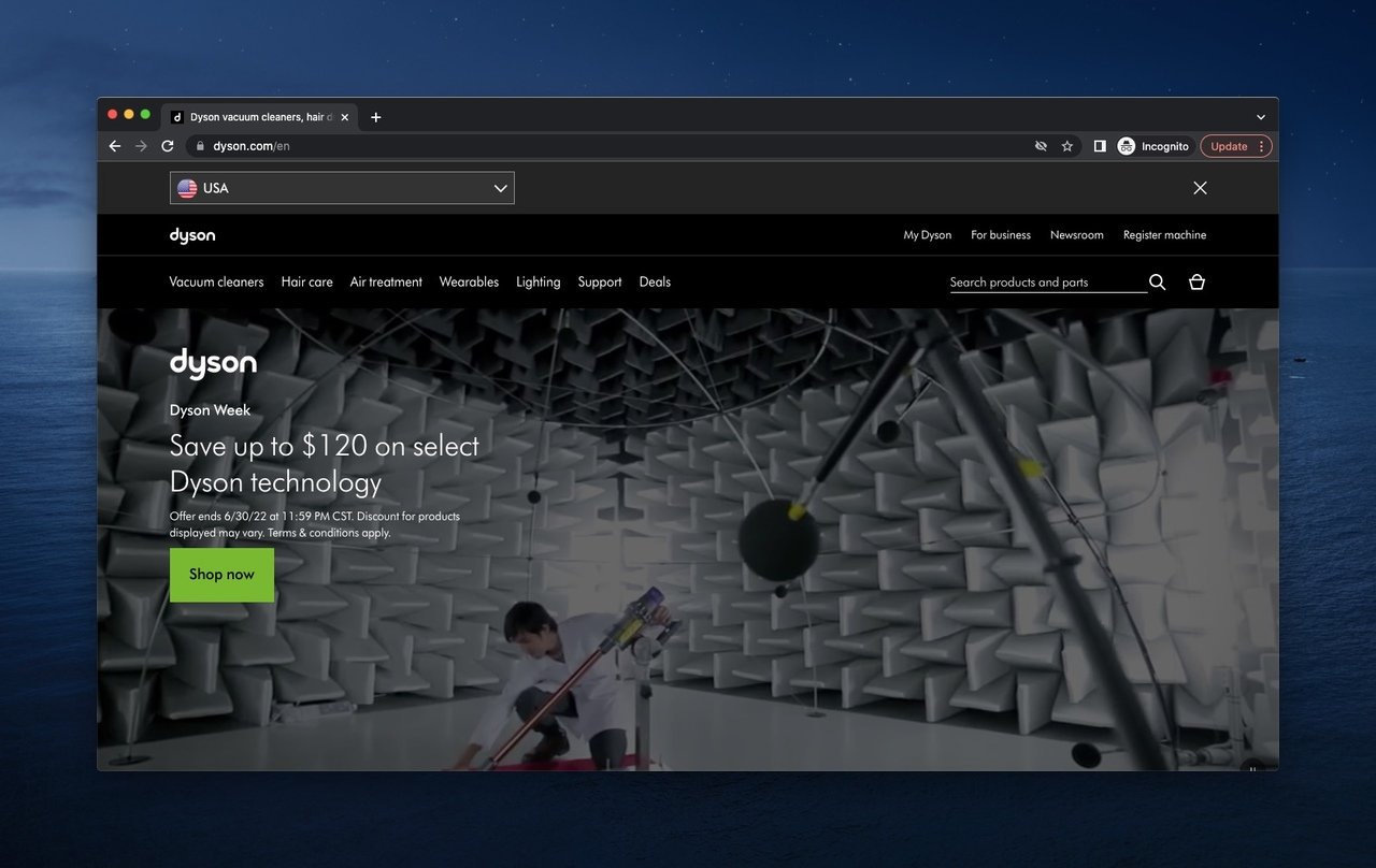
Dyson hero with cinematic product reveal and confident dark palette.
What it does: Dark, almost cinematic backdrop. An animated product shot showing engineering detail. A product name and short claim, paired with a single "Shop" CTA. Top nav is wide and category-driven. A search bar sits prominently in the header.
Why it works: Dark backgrounds reduce visual competition and make a product photo pop. The animation rewards attention — visitors who linger get a slow reveal of engineering detail, which justifies the premium price tag without a single pricing word above the fold.
Key takeaway: If you sell premium hardware, treat the hero like a product launch. Dark backgrounds, single product, slow motion or animated reveal. Save discount language for product pages.
7. EyeBuyDirect
EyeBuyDirect sells affordable prescription glasses online, a category where building trust above the fold matters more than usual.
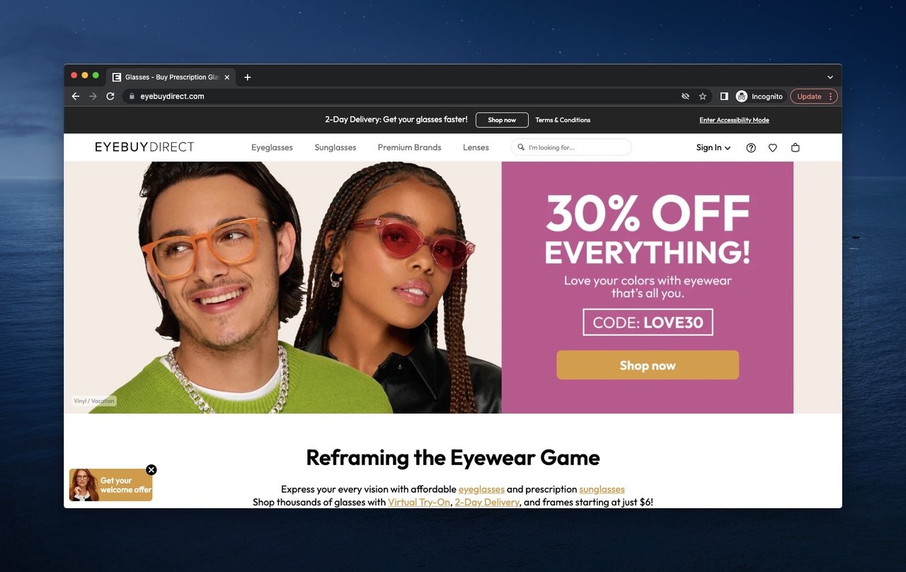
EyeBuyDirect hero with first-time buyer offer and lifestyle photography.
What it does: A lifestyle shot of two people wearing the glasses. A bold first-time-visitor discount code anchored next to the photo. A small bottom-left welcome offer that doubles as a passive popup. Header nav covers categories the way a glasses shopper would search them (Men, Women, Kids, Brands).
Why it works: Buying prescription glasses sight unseen requires a leap of faith. The lifestyle photo shows real people happily wearing the product, which lowers anxiety. The first-time-visitor discount removes the price objection in the same eye-line, so the visitor doesn't have to scroll to find a reason to convert.
Key takeaway: If your category has trust friction (sight-unseen, made-to-order, returns-heavy), put the social proof and the risk-reducer in the hero. Don't bury them on a help page.
8. Fomo
Fomo is a social proof tool that displays live notifications of recent customer actions on websites. Their own hero practices what they preach.
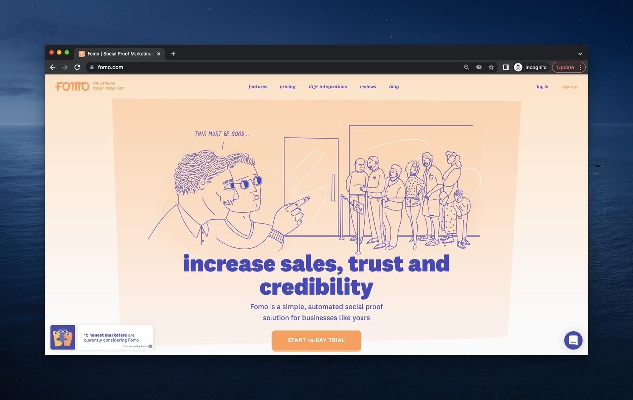
Fomo hero with playful illustration and product-as-proof concept.
What it does: A playful illustration of two characters pointing at a crowd, which visualizes the product concept literally. Headline names the outcome ("turn site visitors into customers with social proof"). A free-trial CTA. A casual nav with category-led links.
Why it works: Illustrations beat stock photography for explaining abstract products. Social proof is invisible — you can't photograph it. So Fomo drew it instead. The casual tone signals "we're a friendly tool, not enterprise software," which matches the small-to-medium business buyer they're targeting.
Key takeaway: When your product is intangible, illustrate the concept rather than photographing the dashboard. A two-second illustration teaches what a screenshot can't.
9. Fossil
Fossil is a fashion accessories brand best known for watches. Their hero leans into seasonal storytelling and product introduction.
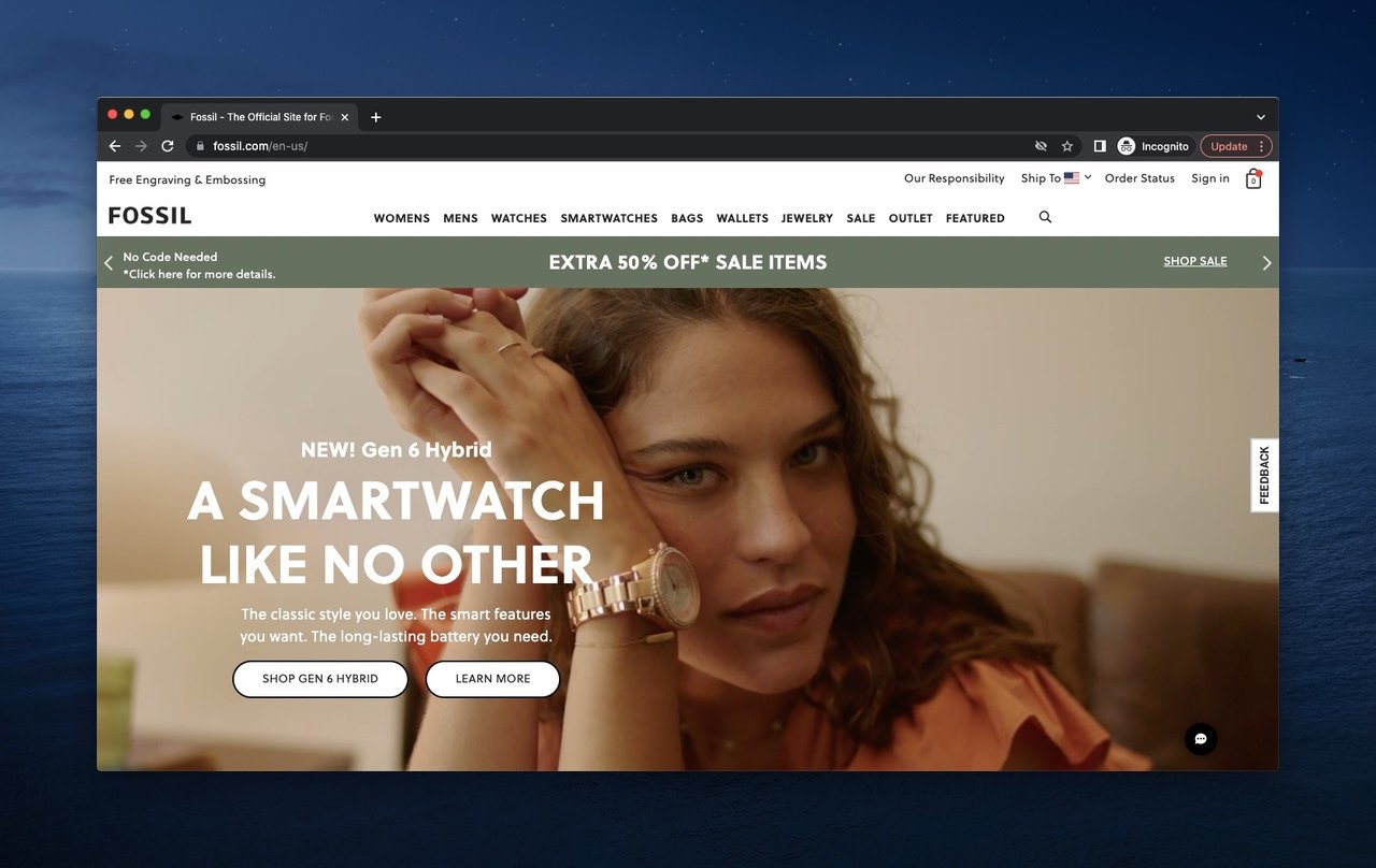
Fossil hero with editorial product photography and dual product CTAs.
What it does: A close, editorial photo of a model wearing the new Gen 6 Hybrid watch. Two CTAs immediately under the image — "Learn more" and "Shop now." A wide top nav exposes every category before the visitor needs to click. Above the header, a slim utility bar covers shipping, order tracking, and account.
Why it works: Showing the watch on a wrist (not floating on a sweep) helps the buyer judge size and proportion, which is the single biggest barrier to buying a watch online. The wide nav reduces the number of clicks to the right product family, which matters because Fossil sells across so many sub-brands.
Key takeaway: For products where fit, scale, or context matters (watches, eyewear, furniture), shoot the product in use, not isolated. It saves a return.
10. HubSpot
HubSpot sells a CRM and marketing platform. Their hero sells the platform with a numbers-first proof point.
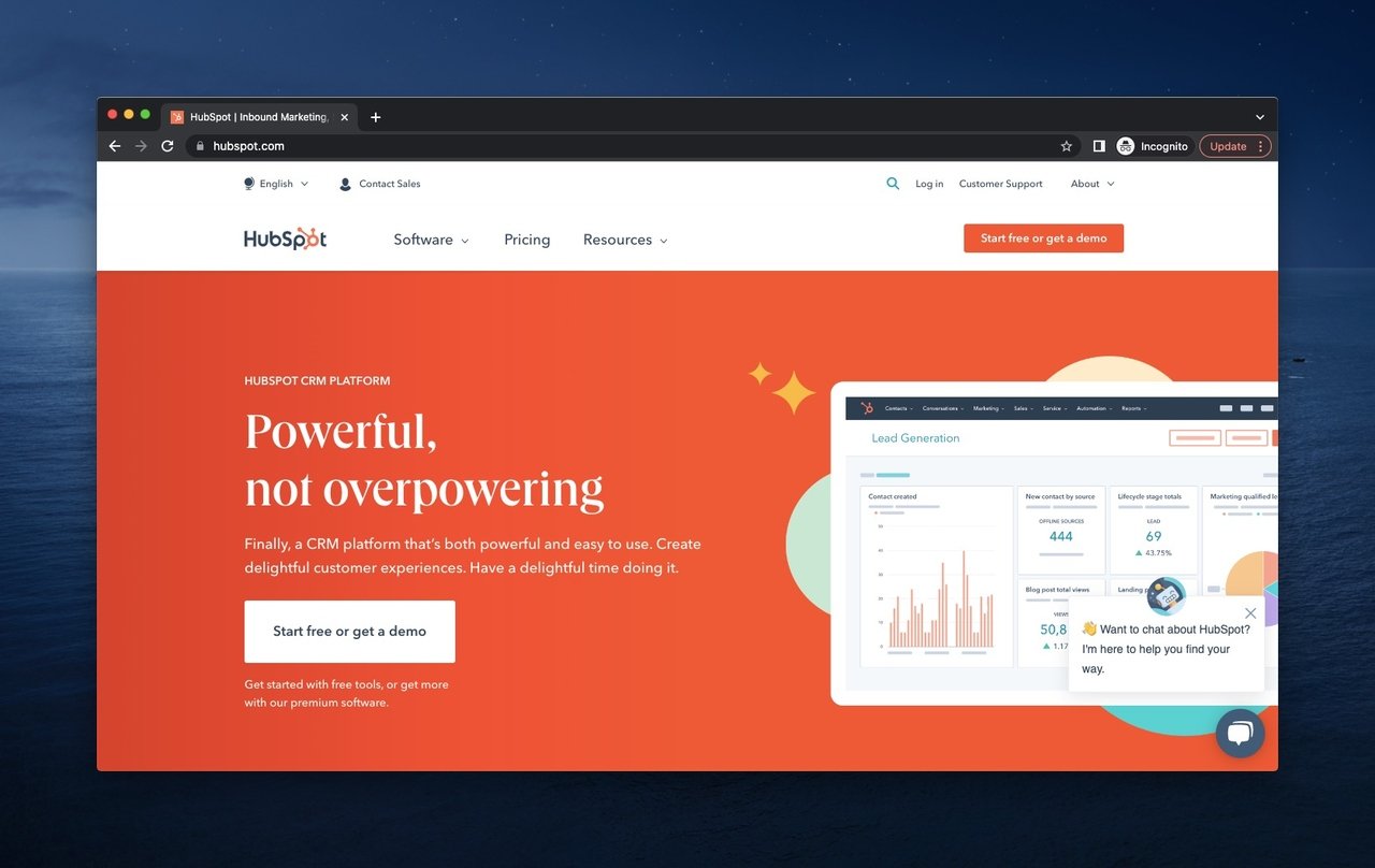
HubSpot hero with proof-led numbers and dual signup paths.
What it does: Their signature orange palette. Headline that names the platform. A small data table showing customer-reported outcomes (lead growth, deal close rate). Two CTAs: "Get a demo" and "Get started free." A live chat widget pops up immediately on first visit.
Why it works: A table of customer outcomes is heavier proof than logos because the numbers are specific. The free-tier CTA covers the self-serve buyer; the demo CTA covers the enterprise buyer. Splitting the funnel at the hero is how HubSpot serves a 10-person agency and a 10,000-person enterprise from the same homepage.
Key takeaway: If your product spans self-serve and sales-led pricing, give both paths a button in the hero. Forcing every visitor through one funnel kills conversion at the wrong end.
11. Instatus
Instatus builds status pages — the public-facing dashboards that tell users when your service is up or down. Their hero is dark, fast, and feature-rich.
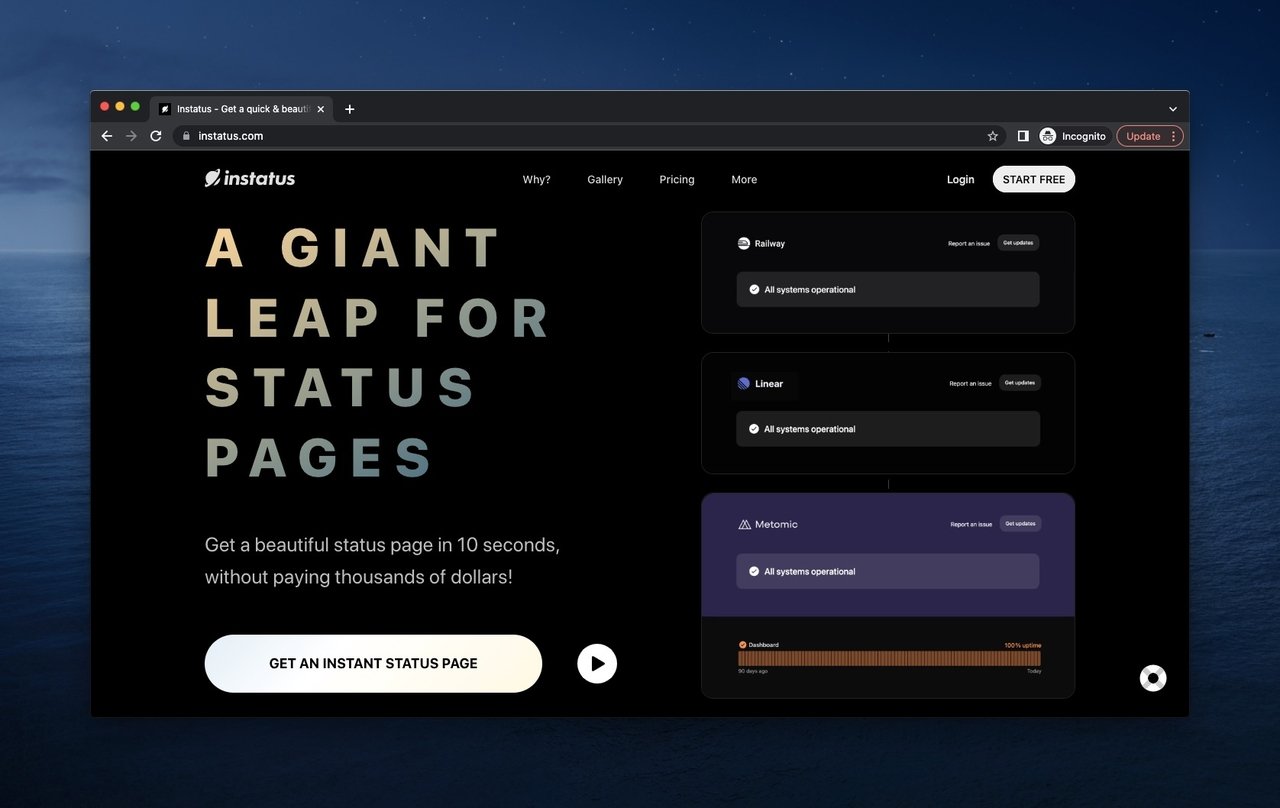
Instatus hero with product preview embedded in the design.
What it does: A black background with a live status-page preview embedded directly in the hero. Headline pitches the product as a "giant leap for status pages." A single "Start free" CTA. Top nav covers Why, How, Pricing, and Customers — the four questions a SaaS buyer asks in order.
Why it works: Embedding the product itself in the hero is the highest-fidelity demo possible. A buyer doesn't have to click "see a demo" — they're already looking at one. The nav order mirrors the SaaS buying funnel, which makes the menu feel like a guided tour rather than a sitemap.
Key takeaway: If your product has visual output (a dashboard, a chart, a status page), put a live or rendered version in the hero. It's worth more than three paragraphs of feature copy.
12. Kylie Cosmetics
Kylie Cosmetics is a celebrity-led beauty brand. Their hero is built around the founder's personal brand and rotating collaborations.
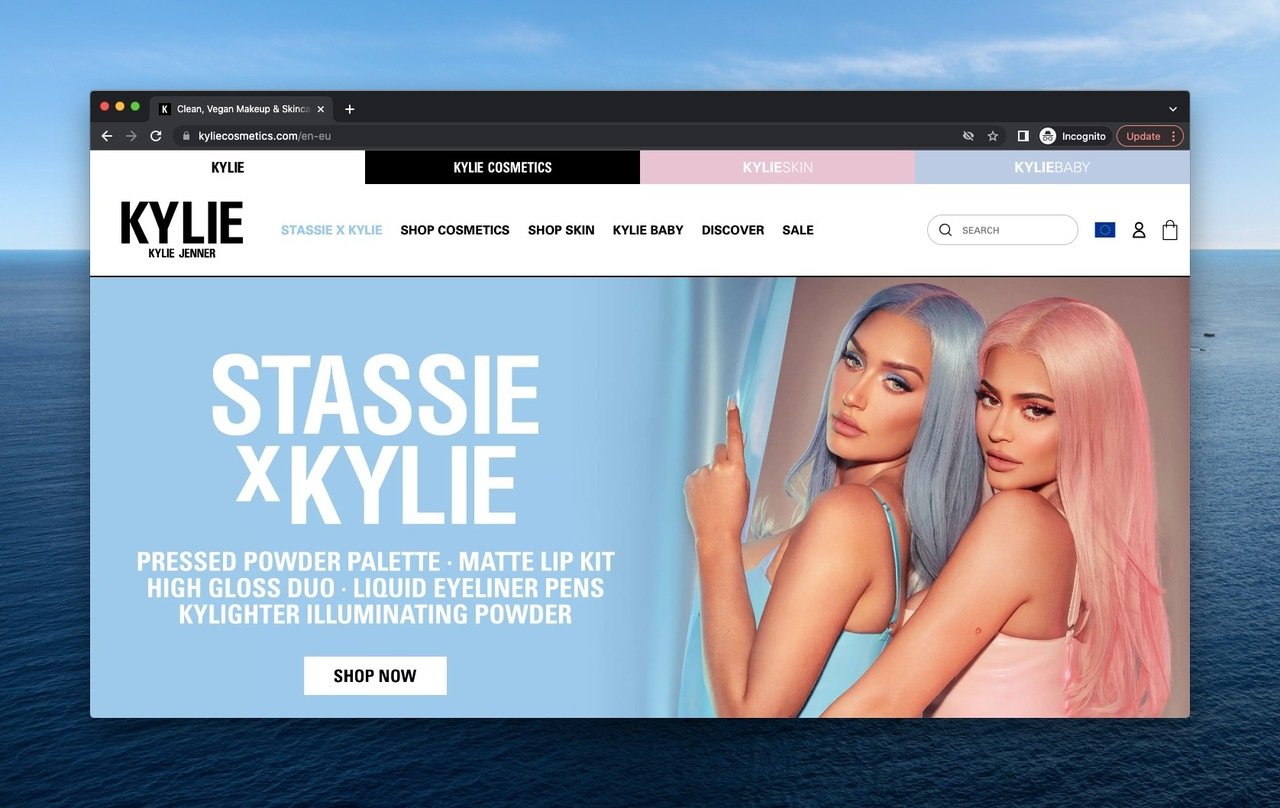
Kylie Cosmetics hero with founder-led collaboration drop.
What it does: Top nav splits by product type and skin concern. Hero photo features Kylie and her collaborator Stassie. Hero headline announces the new drop. A single "Shop the collection" CTA. Search and account icons stay constant in the header so the cart and login never move.
What it does well: Celebrity-led brands win when the founder shows up. Putting Kylie and Stassie in the hero photo is a reminder that the product comes from a recognizable face, not a faceless brand. Rotating the hero around drops creates a "what's new this week" hook that brings repeat visitors back to the homepage.
Key takeaway: If your brand has a face (founder, creator, celebrity), use it. People buy from people. A founder photo in the hero outperforms a product shot for early-stage brands building recognition.
13. Little Caesars
Little Caesars is a pizza chain that competes on speed and price. Their hero is built for one job — get the order started.
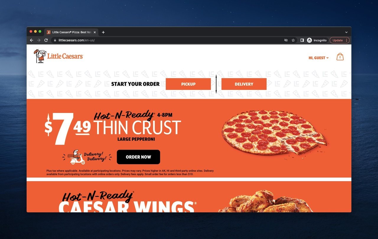
Little Caesars hero with single offer and immediate ordering path.
What it does: A "Hi, Guest" personalized greeting. Cart status visible in the header. The biggest visual is the current promotional offer with a price. Two CTAs: pickup or delivery. Almost nothing else competes for the eye.
Why it works: Hungry visitors don't browse. They order. Little Caesars cuts every step that doesn't move the visitor toward a transaction. The pickup-or-delivery split is the only decision the visitor has to make above the fold, and both paths lead to the same checkout.
Key takeaway: For high-intent transactional categories (food, on-demand services, urgent buys), strip the hero down to one offer and one decision. Anything else is friction.
14. Melula
Melula is a small DTC kids' fashion brand. Their hero is the most minimal on this list, and it works in their favor.
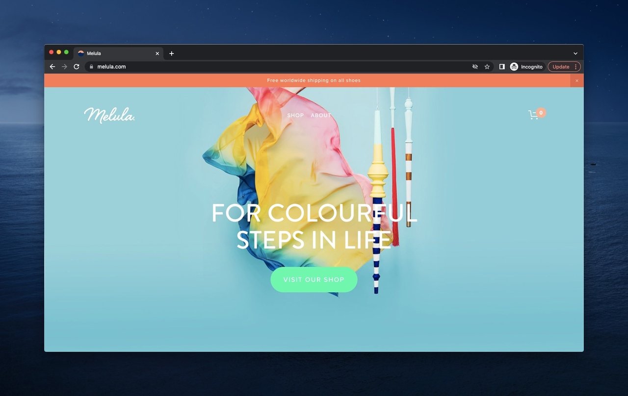
Melula hero with mild palette and minimalist product styling.
What it does: A soft blue background. A playful product styling shot with tissue paper and wooden sticks. A short brand-mood headline. One small "Shop" CTA. A worldwide-shipping bar above the nav.
Why it works: Small brands often try to act big and overcrowd the hero. Melula does the opposite — they treat the hero like a museum vitrine. The whitespace signals premium and quiet, which matches the parent buyer's emotional response to gifting and kids' fashion.
Key takeaway: If your brand competes on craftsmanship or premium feel, use whitespace as a luxury signal. A hero with one product and one button reads as confident; a hero with five offers reads as desperate.
15. Oskar Gydell
Oskar Gydell is a Swedish handmade jewelry brand. Their hero is restrained, photographic, and quietly informative.
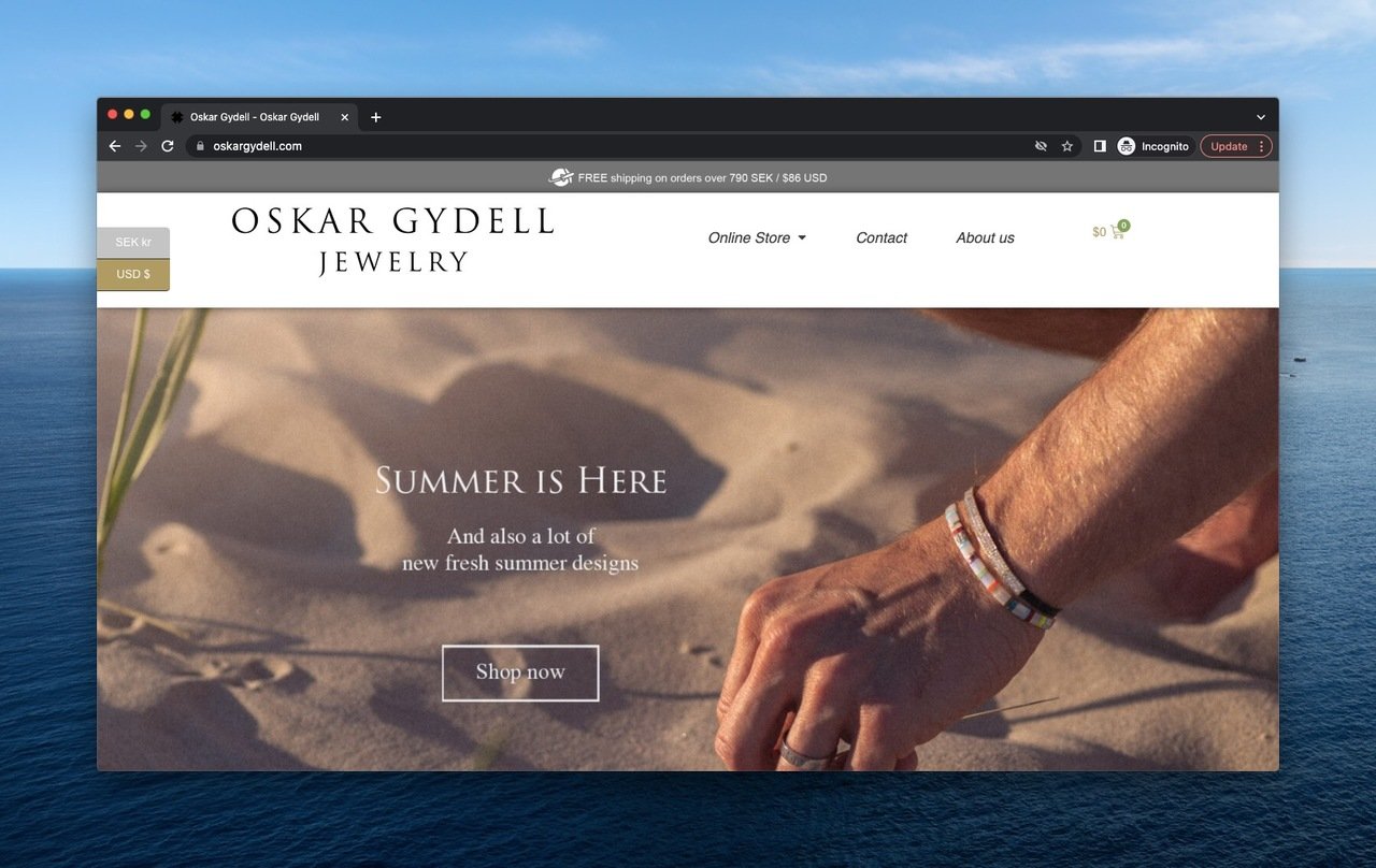
Oskar Gydell hero with location-aware currency and seasonal photography.
What it does: Currency selector pinned to the header based on visitor location. A free-shipping threshold ("over $86 USD") visible at the top. The main hero is a quiet beach photo with the bracelets in soft focus. A short "Shop the collection" CTA.
Why it works: International buyers bounce when prices show in the wrong currency. Auto-detecting and offering a switcher removes a friction point most brands ignore. The free-shipping threshold sits where the conversion objection lives — at the top, before the visitor adds anything to a cart.
Key takeaway: For cross-border DTC, default to local currency from the first byte. Don't make the visitor open a country picker to find out what they'll pay.
16. Popupsmart
Popupsmart is our own no-code popup builder for e-commerce and SaaS websites. After testing hero copy and CTA placement on hundreds of landing pages for our customers, this is the version of the hero we shipped on our own homepage.
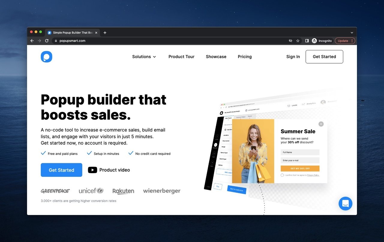
Popupsmart hero with live popup demo and recognizable customer logos.
What it does: A live demo popup is embedded in the hero, so the product literally demonstrates itself. The headline names the outcome (more leads, faster). Logos of recognizable customers (Greenpeace, UNICEF, Rakuten, Wienerberger) sit just under the headline as social proof. A single "Get started" CTA. The top nav is short and intent-led: Solutions, Product Tour, Showcases, Pricing.
Why it works: Showing the product working — not a static screenshot — answers the question "what does this thing actually look like?" instantly. The customer logos do the trust work without a single testimonial paragraph. We tested versions with three CTAs and versions with one; the single-CTA version converted higher every time.
Key takeaway: If you can show your product running live in the hero (a popup, a chart, an interactive component), do it. A working demo beats a screenshot, and a screenshot beats a paragraph.
17. Shopify
Shopify is the e-commerce platform a huge chunk of online stores run on. Their hero stays fresh through frequent rotation but keeps the same conversion structure.
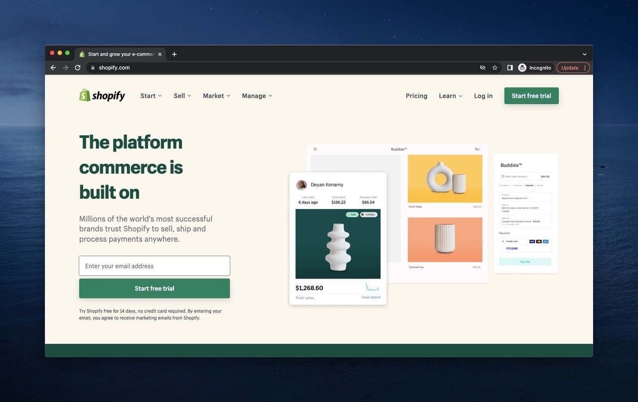
Shopify hero with product preview and email-first signup.
What it does: A live store preview as the hero visual, so the meta-product (a working store) is the demo. A short value prop line about starting and growing a business. An email-capture field with a "Start free trial" CTA — no name field, no phone field, just one input.
Why it works: Single-field email capture lowers signup friction more than any other change you can make to a SaaS hero. Asking for a name doubles the cognitive cost. Shopify learned this years ago and never went back. The store-preview visual makes the abstract idea of "build an online store" tangible in one screenshot.
Key takeaway: Cut your hero signup form to one field. If you need more data, ask for it after the user has signed up and is invested in the product.
18. Tesla
Tesla sells electric cars and clean energy products direct-to-consumer. Their hero is product-first, marketing-second, by design.
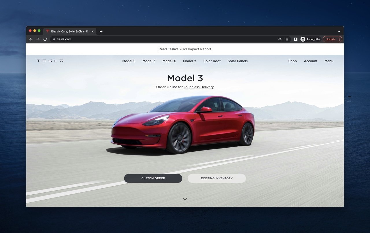
Tesla hero with full-bleed product photography and dual purchase paths.
What it does: A full-bleed photo or short video of a Model 3 driving. Two CTAs: "Custom order" and "View existing inventory." Top nav is sparse and product-first (Model S, Model 3, Model X, Model Y). A small impact-report link sits in the corner for environmentally motivated buyers.
Why it works: Tesla doesn't show a feature list because the audience already knows the features. They show the car, the way a luxury brand shows the car, and let visitors choose between configuring a build or grabbing one already in stock. The two-CTA split mirrors the actual buyer split — patient configurers and ready-to-buy buyers.
Key takeaway: For high-consideration purchases, the hero's job is to show the product beautifully and respect the buyer's prior research. Don't re-explain what they already know.
19. Walmart
Walmart is the opposite of every minimalist hero on this list — and that's the right call for their audience.
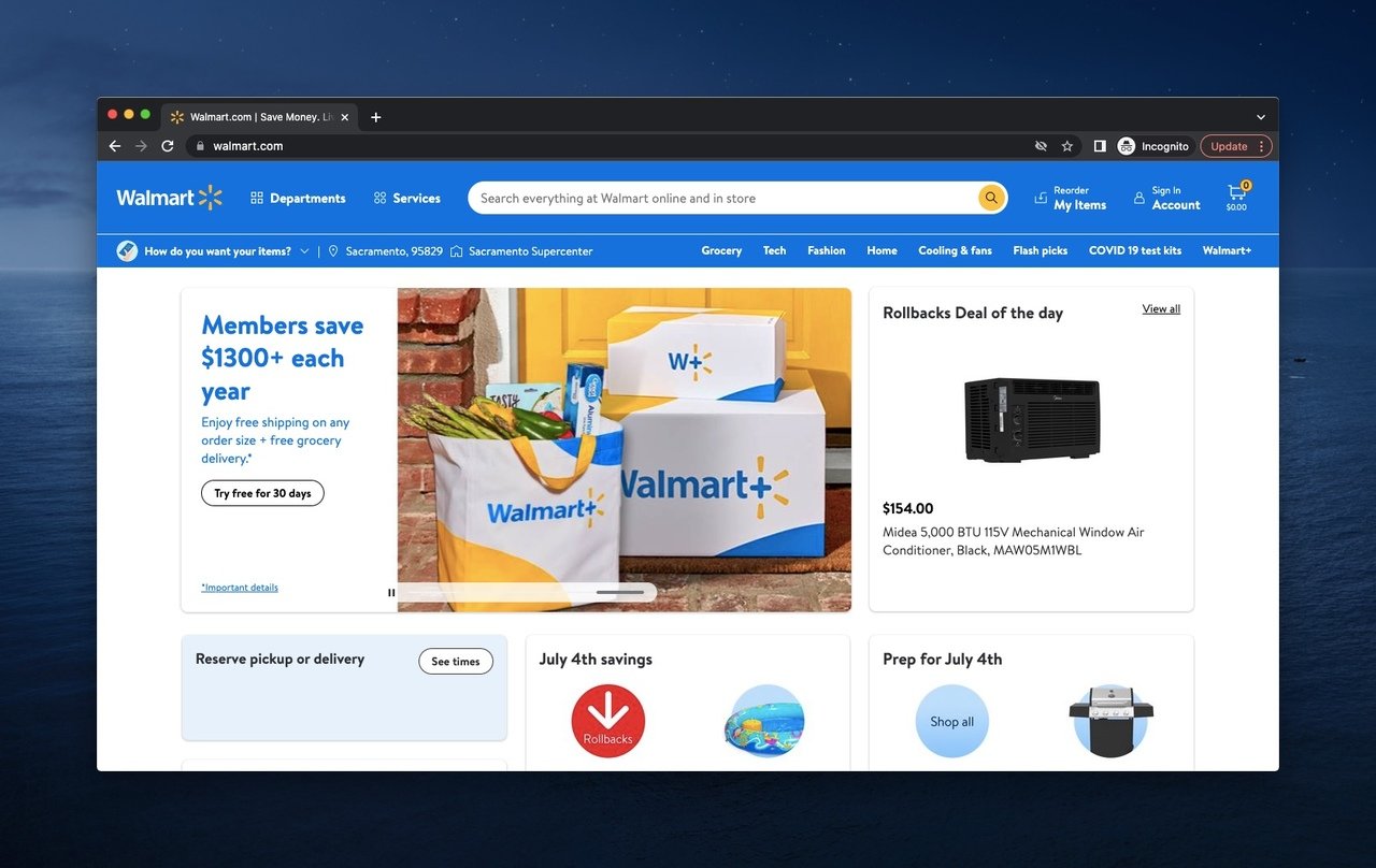
Walmart hero with category-dense layout for purposeful shoppers.
What it does: A dense layout with multiple promotional tiles, category links, and a location-aware delivery date. Search bar at the top with autocomplete. Personalized greeting and cart icon. Multiple CTAs leading to different department pages.
Why it works: Walmart shoppers arrive with a specific item in mind. They aren't browsing — they're hunting. A dense hero with categories and a search bar is exactly what a hunter needs. Minimalism would actively hurt conversion here because it would force more clicks to find groceries, electronics, or pharmacy.
Key takeaway: Match hero density to visitor intent. Browsers want minimalism; hunters want options. If your traffic is search-driven and category-heavy, a dense, organized hero converts better than a clean one.
20. Zapier
Zapier is the workflow-automation platform that connects thousands of apps. Their hero pairs a clear value prop with a working visual demo.
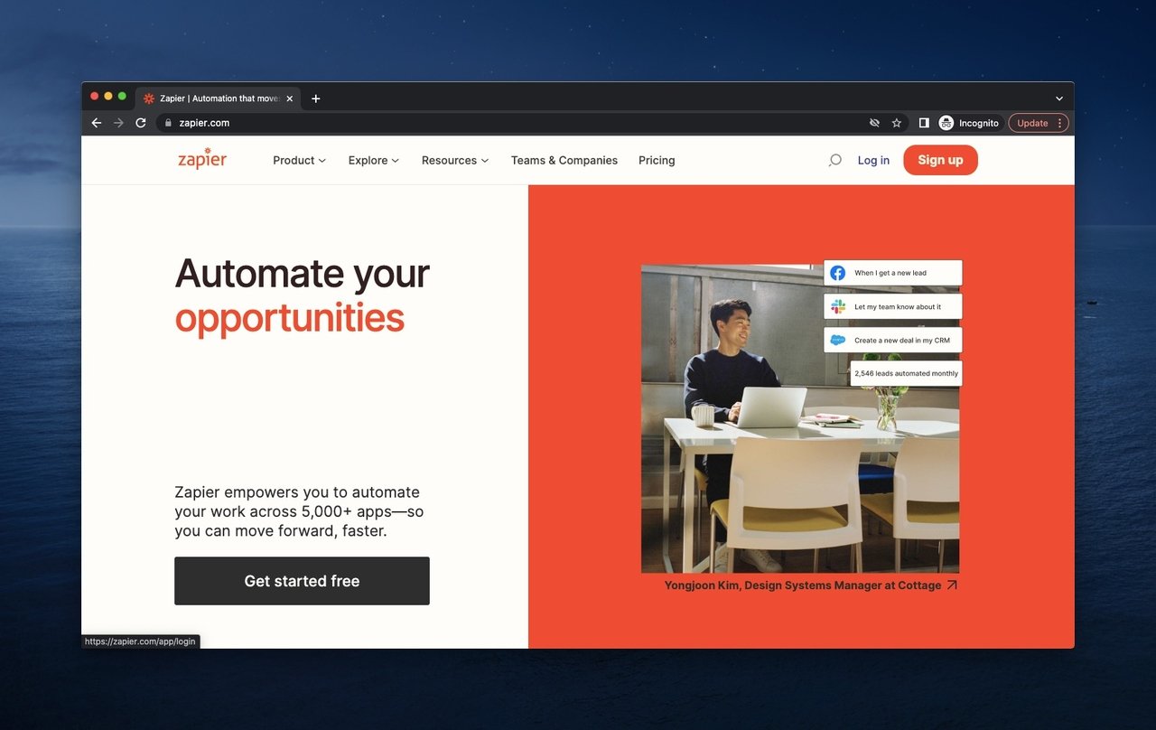
Zapier hero with split layout showing user context and live automation.
What it does: A split-screen layout — left side shows a person working at a desk, right side shows a small animated automation in motion. Headline names the outcome ("automate without code"). A primary CTA ("Sign up free") plus a secondary CTA. Header nav is short and benefit-led.
Why it works: The split-screen pattern is rare and effective for tools that connect two things (people and apps, in Zapier's case). The animation shows the product doing actual work, which sells the magic better than a static dashboard. The person on the left makes the abstract automation concept feel human and relatable.
Key takeaway: If your product bridges two worlds (humans and software, online and offline, this app and that one), use a split-screen hero to visualize the connection. It's faster than explaining it in copy.
Common patterns in high-converting above-the-fold designs
After teardowns of these 20 brands and a few hundred more in audits, the patterns repeat. Here are the ones I see most.
Pro tip: design above the fold for the smallest viewport first.
• One headline, one CTA, one decision: The strongest heroes ask the visitor to make exactly one choice. Even when there are two CTAs, they route to two non-competing paths (research vs. transact). When a hero asks for three or more decisions in the first viewport, conversion drops.
• Outcome-led headlines, not feature-led: "Rank higher and get more traffic" beats "AI-powered backlink analysis tool." Buyers want the outcome named in their language, not yours. Feature words can wait until below the fold.
• Product-as-hero, not stock-photo-as-hero: Real product screenshots, real customer photos, real founder shots. The brands on this list show their actual product or actual users. None of them lead with stock photography of laughing teams in glass offices.
• Social proof at eye level: Customer logos, live signup counts, star ratings, named testimonials. The cheapest and fastest conversion lift in any audit is moving social proof from the footer to within 100 pixels of the primary CTA.
• Friction removed in the same breath as the ask: Free shipping threshold near the cart, free trial line near the signup CTA, money-back guarantee near the buy button. Don't make the visitor scroll to find a reason to say yes. The reason should sit next to the button.
• Top utility bar that earns its space: A slim bar above the main nav for shipping promos, location-aware currency, or active sale countdowns. It's the most underrated piece of real estate on the page because most teams treat it as decoration.
• Mobile parity, not mobile compromise: The brands that convert well on mobile didn't shrink their desktop hero. They re-designed the hero for mobile first, then expanded it. If your mobile hero feels like a punishment compared to desktop, you've built it wrong.
For more pattern inspiration that pairs with these heroes, the announcement bar examples and hello bar examples guides cover the slim utility bar in detail.
Above-the-fold mistakes to avoid
Some patterns kill conversion no matter how good the rest of the page is. These are the ones I see most in audits, ranked by frequency.
• Carousel heroes: Rotating sliders with three to five slides are still everywhere. They convert worse than a single static hero in almost every test I've seen. The first slide gets all the attention; slides two through five exist for nobody. If you have three messages, build three pages, not three slides.
• The "feature soup" headline: "AI-powered, enterprise-ready, secure, scalable platform for modern teams." That's a sentence built by a committee. Cut it. Pick one outcome and one audience, and rewrite.
• CTA invisibility: A "Learn more" button in the same color as the background, the same size as the body text, with no contrast. The CTA should pass a 4.5:1 contrast ratio against its background — the WCAG AA standard — and it should be at least 44 pixels tall on mobile to be tappable.
• Stock-photo team: Five smiling diverse people pointing at a laptop screen. Visitors have seen this image ten thousand times. It signals "we don't have a real product photo." Either show the product or show your real team.
• Mobile hero that buries the CTA: A mobile hero with a tall image that pushes the CTA below the fold on a phone. The CTA has to be visible without scrolling on the smallest viewport you support, or the mobile conversion math breaks. I've seen brands lose half their mobile signups to a hero image that was 80px too tall.
How to test and optimize your above the fold
You can't audit your hero by staring at it. You need data. Here's the testing stack I use across customer audits.
Start with a heatmap. Tools like Hotjar or Microsoft Clarity show you where visitors look and click in the first viewport. If 80% of clicks land on a logo or a nav item instead of the CTA, your CTA isn't pulling its weight. If clicks cluster on a non-clickable element, make that element clickable.
Add a scroll-depth report. What percent of visitors scroll past the fold at all? In our Popupsmart customer data, the median is around 60%, which means 40% of your traffic only ever sees the hero. The lower your scroll-past rate, the more your hero has to do alone.
Watch session replays. Pick 10 to 20 sessions from new visitors. Watch where their cursor lingers, where they hover, where they hesitate. I've watched visitors tap the logo three times because it looked like a CTA, or scroll back up to re-read a headline they didn't get. None of this shows up in click data.
Run a single-variable A/B test. Don't redesign the hero in one go. Test one variable at a time — headline, CTA copy, CTA color, hero image, social proof placement. Run each test long enough to hit statistical significance (2,000+ conversions per variant). Change five things at once and you learn nothing.
Track time-on-fold. Set a 5-second engagement event in your analytics tool that fires only if the visitor stays on the page without scrolling. Compare your time-on-fold against the 11-second desktop and 7-second mobile benchmarks. Visitors leaving in 3 seconds means the hero isn't earning attention. Staying 15 and not converting means the CTA isn't earning the click — different problem, different fix.
Use exit-intent or scroll-triggered popups as a backup. Even a perfect hero won't convert everyone on the first visit. A well-timed popup with a different angle (an offer, a content download, a chat invite) gives you a second chance.
Audit your above the fold this week
Pick your highest-traffic page. Open it on a phone. Set a 5-second timer. Can you tell what the product is, who it's for, and what to do next, before the timer hits zero? If yes, the hero earns attention. If no, you have your first test.
The 20 examples above aren't templates to copy line for line. They're proof that a few stubborn rules — one outcome-led headline, one primary CTA, real social proof, friction removed where the visitor would object — show up in every brand that converts well above the fold. Pick the two you don't currently do, ship them next sprint, and check your scroll-past rate two weeks later. The number will move.
If popups, sticky bars, or hello bars are part of your above-the-fold strategy, that's the part we build at Popupsmart. Free trial, no card, working hero overlay live before lunch.
Frequently asked questions
Is above the fold different on mobile vs. desktop?
Yes, dramatically. Mobile users see roughly half the vertical space desktop users do, and they hold their phone in portrait, so horizontal hero layouts collapse into vertical stacks. The order of elements changes too — on mobile the visitor sees headline first, then visual, then CTA, in that vertical sequence. Don't try to shrink your desktop hero. Re-design it. The brands that convert well on mobile (Allbirds, Shopify, Little Caesars) all built mobile-specific heroes, not responsive shrinks of the desktop version.
How do I test if my above the fold is working?
Track three signals: scroll-past rate (what percent of visitors scroll past the fold), time-on-fold (how long visitors stay before scrolling or leaving), and CTA click-through rate from the hero. A healthy hero usually has a scroll-past rate above 60%, an average time-on-fold of 5 to 11 seconds, and a hero CTA click-through of at least 5%. If any of these are way off, the corresponding element of your hero is the one to test first.
Why is above the fold still important?
Because the first viewport is still where the visitor decides whether to invest more time in your page. Scrolling habits changed, but the cost of a bad first impression got higher, not lower, because every other tab is competing for the same attention. HubSpot notes that compelling above-the-fold content correlates with higher conversion rates and lower bounce rates. Even when visitors scroll, they only scroll if the hero earned the right to be scrolled past.
What is the difference between above the fold and below the fold?
Above the fold is what loads visible on the screen before any scrolling. Below the fold is everything that requires a scroll. Above the fold has to do the persuasion job — value prop, social proof, primary CTA. Below the fold is for elaboration — feature deep-dives, testimonials, FAQ, secondary CTAs. Visitors who never scroll only see above the fold, so it has to work alone. Visitors who do scroll already trust you enough to keep going, so below the fold gets easier to write.
Other Inspirational Blogs
Best Call to Action (CTA) Examples that Boost Sales
17 Best SaaS Landing Page Examples & Why They Work
Increase Form Conversion Rates with 10 Simple But Powerful Ways
Product Page Optimization 101: The Best Tips and Examples
Email List Building: 13 Proven Methods to Grow Your Email List
How would you rate your experience with this article? 😊