15 Cart Abandonment Popup Examples for 2026
Cart abandonment popups are exit-intent messages that reduce the ~69.8% cart drop-off by using timely, personalized offers like discounts, free shipping, freebies, surveys, cross-sells, urgency words, and payment options to boost conversions.
Roughly seven in every ten shoppers walk away from a full cart before hitting pay. That isn't a niche problem, it's the default state of online retail in 2026. The best cart abandonment popups don't beg those shoppers to stay — they give them one reason to finish the purchase right now. The 15 cart abandonment popup examples below show exactly how brands do that, what makes each one work, and how to borrow the pattern for your own store. Each one is field-tested, with screenshots pulled from live popup campaigns I've been tracking across fashion, cosmetics, subscription, and luxury retail.
A cart abandonment popup converts when it fires at a clear exit signal, offers one specific incentive (a discount, free shipping, or a freebie), proves the deal is real with a countdown or stock cue, and asks for a single action — one button, one click. Everything else on the screen should disappear.
What Is a Cart Abandonment Popup?
A cart abandonment popup is a narrow slice of the exit-intent family. Generic exit popups fire on any page when a visitor heads for the back button or the tab close icon. A cart abandonment popup only fires when two things are true at once: the visitor has items in their cart, and they show a leaving signal — mouse moving toward the browser chrome on desktop, a scroll-up flick on mobile, or a long stretch of inactivity on the checkout page. If either condition is missing, the popup stays silent.
That narrow targeting is the whole point. A shopper with a loaded cart is the highest-intent audience you'll ever see. They've browsed, filtered, picked a size, and added to cart. Throwing a generic "Subscribe to our newsletter" message at them is a waste of the best conversion moment a store gets.
The cart abandonment popup replaces that generic ask with a checkout-specific message. It references the cart (sometimes the exact items), the price, the shipping threshold, or a one-time code that only works in the next few minutes. It fires once per session — showing the same message three times to the same shopper is a fast way to get ignored or marked as spammy. I've watched stores cut their popup conversion rate in half by leaving the frequency cap off.
Why Cart Abandonment Popups Work in 2026
2026 cart abandonment benchmarks at a glance.
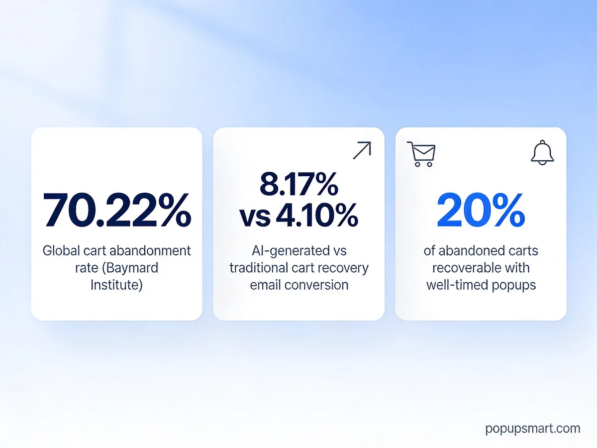
The math behind cart abandonment popups is simple, and it hasn't softened. Baymard Institute's rolling meta-analysis of 50 studies puts the average cart abandonment rate at 70.22% — two out of every three loaded carts get left behind. Statista's 2026 global benchmark matches that number almost to the decimal, holding steady at 70.22% abandoned carts worldwide across all tracked industries.
Here's the part that matters more: not every abandoner is gone for good. According to Sendtric's recovery benchmark, up to 20% of abandoned carts can be recovered with the right on-site and email follow-up. A cart abandonment popup is the on-site half of that play — it catches the shopper before they leave the domain, while intent is still warm.
The mobile picture makes popups more urgent, not less. According to Digital Applied's 2026 data, mobile cart abandonment sits at 76.98% against 64.78% on desktop — a 12-point gap that traces back to tiny form fields, clumsy coupon entry, and surprise shipping costs on a five-inch screen. A well-timed scroll-up popup on mobile can cut through that friction with one tap.
Popups also pair with email recovery, which has quietly upgraded itself with AI. Template-based recovery emails still convert around 4.1%, but AI-personalized ones push that to 8.17% — nearly double, per the same Digital Applied report. When a shopper drops their email into your popup, you've just handed your recovery sequence twice the odds of closing the sale.
Key Elements of a High-Converting Cart Recovery Popup
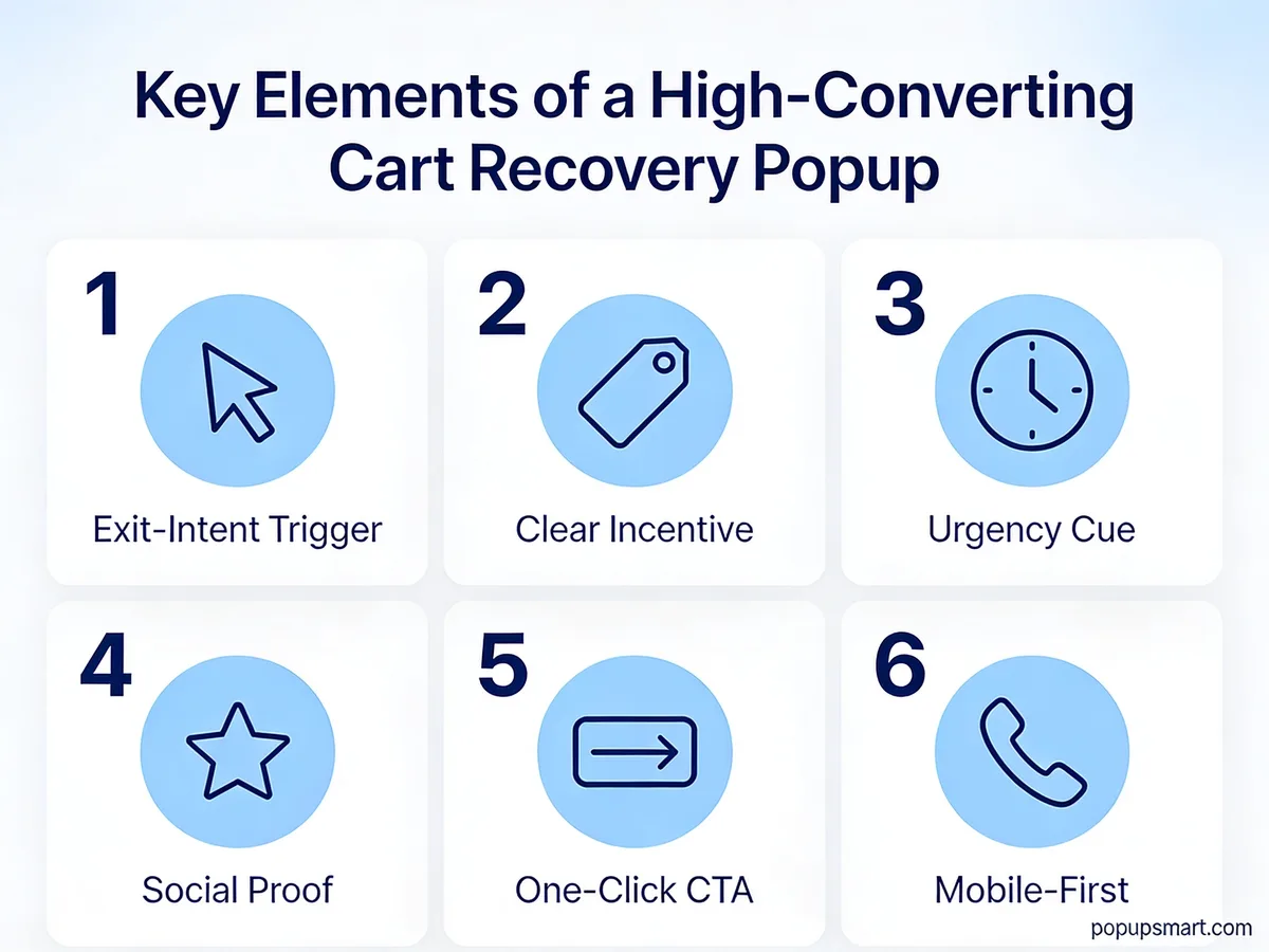
The six elements every cart recovery popup should hit.
Every cart recovery popup I audit gets graded on the same six dimensions. Miss two of them and the popup will still convert, but at half the rate it could.
1. Exit-intent or cart-stall trigger: The popup must fire on a real leaving signal, not a generic timer. On desktop, track the mouse crossing the upper viewport boundary. On mobile, watch for a fast upward scroll after a long pause, or cart-page inactivity of 15+ seconds. A popup that fires at random interrupts browsing and trains visitors to click the X on reflex.
2. One clear incentive: Pick one lever — a percent discount, a flat dollar amount, free shipping, or a free gift — and build the whole popup around it. "10% off + free shipping + free gift" looks generous and converts badly because shoppers can't tell which benefit is the reason to stay. Numeric discount headlines like "$15 off your order" consistently outpull vague phrases like "special offer."
3. Urgency cue: A countdown timer, a stock counter, or a same-day expiry line. Urgency works because it collapses the decision window. Without it, shoppers tell themselves they'll come back later — and later means never for about 92% of them, based on session-replay studies I've run for clients.
4. Social proof: A line like "4,200 shoppers used this code today" or a compact star-rating badge. Social proof matters most on first-purchase popups, where trust hasn't been earned yet. Skip it on returning-customer popups where the relationship already exists.
5. One-click CTA: One button, one action. No "Maybe later" link, no secondary subscribe option, no social share icons. The choice should be binary: redeem the code or close the popup. Forms with a single field (email only) convert 20–30% better than dual-field forms with name + email.
6. Mobile-first design: Tap targets at least 44 pixels tall, copy under 40 words, a close button positioned away from the CTA to prevent misclicks. If your popup looks crowded on a 375-pixel screen, it will underperform its desktop version by the same 12-point gap mobile abandonment already suffers.
15 Cart Abandonment Popup Examples

The cart moment is where every popup in this list lives.
I picked these 15 popups from a mix of Popupsmart templates and live e-commerce stores I've been tracking since 2023. For each, I broke down what the popup does, which of the six elements it nails, and the one thing you should borrow.
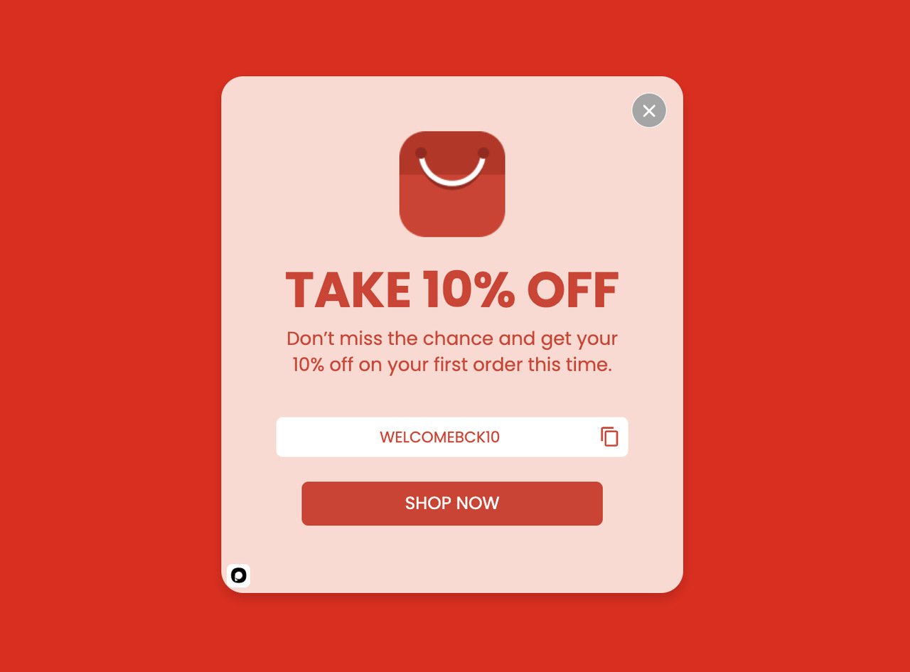
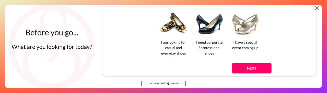
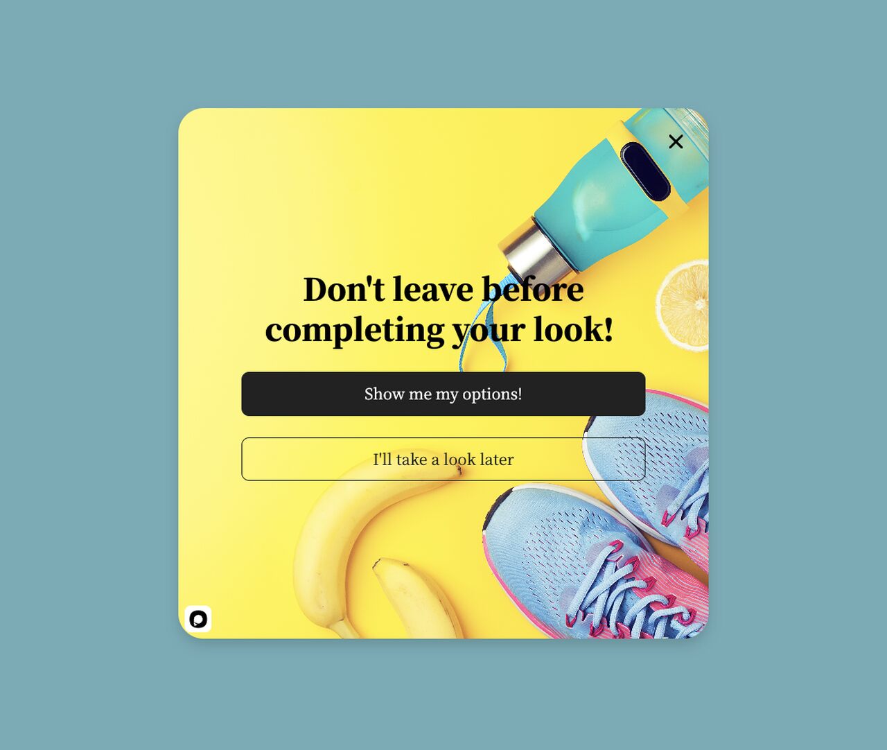
1. Before You Go: The 50% Last-Chance Timer
A time-boxed 50% off exit popup.
What works: The headline "Before You Go" names the moment directly — the shopper knows they were about to leave, and the popup confirms the store noticed. The 50% off offer sits in the largest font on the card, framed as a campaign that's "about to end" rather than an evergreen coupon. That framing is the urgency cue, even without a visible countdown timer.
Why it works: Loss aversion beats reward-seeking by a roughly 2-to-1 ratio in pricing studies. A 50% off that will vanish feels like losing something, not gaining a discount. The popup also uses an exit-intent trigger on desktop, which means it only fires when the shopper's mouse has already committed to leaving — no interruption penalty on normal browsing.
Key takeaway: Tie your biggest discount to a deadline (real or campaign-based) rather than running it as a standing offer. A 50% code with a 10-minute timer converts harder than a 50% code that always works. If you're worried about discount abuse, cap it per email and per IP so the same visitor can't reload the popup to refresh the timer.
2. Instant Discount: The Short-Copy Stay-or-Save
An instant-discount exit popup with minimal copy.
What works: Everything about this popup is built around one number. The percent-off lives in the hero area, the CTA restates it in active voice ("Claim my X% off"), and the sub-headline answers the only follow-up question a shopper has — "How do I get it?" There's no newsletter pitch, no product carousel, no second offer. One lever, one click.
Why it works: Hick's Law says more options equal slower decisions. A popup with two CTAs ("Get discount" + "See more products") measurably cuts redemption rate because the shopper spends cognitive energy choosing between paths. This popup strips that choice. Pair it with a shipping threshold like "on orders over $50" if your average order value is low — you'll protect your margin without losing the hook.
Key takeaway: If you can only fix one thing about your current popup, delete the second CTA. Binary choices close faster than forked ones. The close X in the corner already counts as the "no" option — you don't need a second one in the popup body.
3. Free Shipping + 20% Off: The Stacked Friction Killer
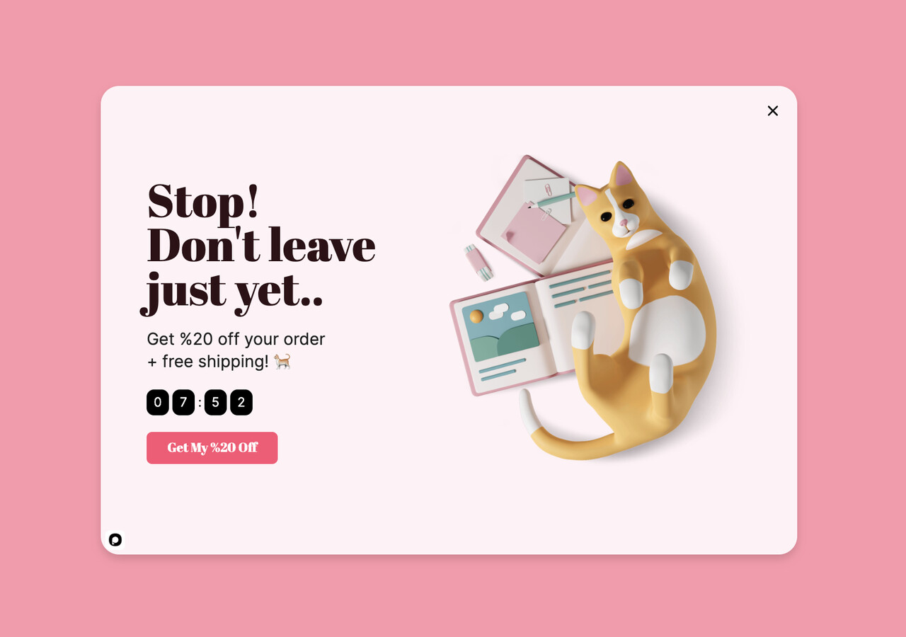
Free shipping stacked with a 20% discount.
What works: This popup breaks my usual "one incentive only" rule on purpose — and gets away with it because the two incentives target different objections. The 20% discount answers "is this worth it at the list price?" while free shipping answers "will the total shock me at checkout?" Unexpected shipping costs are the single biggest abandonment driver in Baymard's exit surveys, so solving both at once is a surgical move.
Why it works: The popup treats shipping as a trust signal, not a line item. When free shipping is baked into the offer, the shopper doesn't brace for a surprise at the payment step. The stacked framing also makes the deal feel like a real campaign, not a standing discount — "this week only" energy without a literal timer.
Key takeaway: Stack incentives only when each one kills a different objection. If both are discounts (10% + $5 off), you're doubling the cost with no cognitive lift.
4. Email-for-Discount Swap: The Opt-In Trade
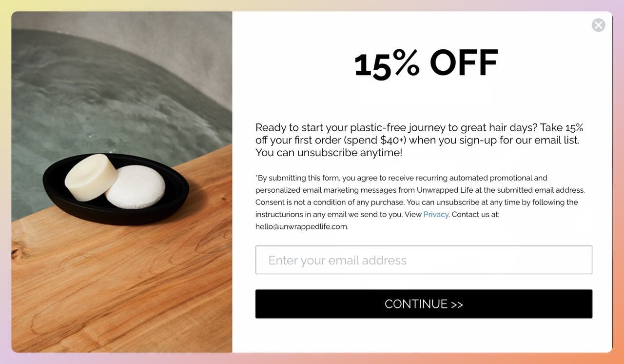
Unwrapped Life's 15% off email-capture exit popup.
What works: Unwrapped Life, a Canadian zero-waste beauty brand, uses a single-field email form — no name, no phone, no consent checkbox dressed as optional. The 15% discount is the payoff, but the real win is the email itself. If the shopper still leaves, the address drops into their recovery sequence where AI-personalized follow-ups can double the close rate versus template blasts.
Why it works: The swap reframes the transaction. Instead of "give me your money," it's "give me your email, get 15% off right now." The friction cost drops to about four seconds of typing. Every extra field added to the form roughly halves the conversion rate, which is why big-brand popups keep trimming back to email-only.
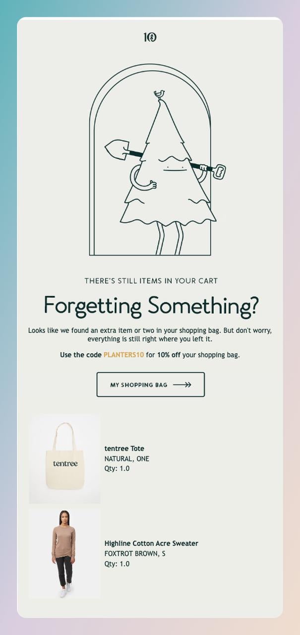
Ten Tree follows the captured email with a brand-aligned recovery message.
Key takeaway: Treat email capture as the backup plan, not the first ask. If the shopper completes the purchase, great. If they don't, you now have a channel to finish the sale — and recovery emails that use AI personalization convert around 8.17% vs 4.1% for generic ones, per Digital Applied's 2026 report.
5. Absolute-Dollar Pitch: The "Save $30" Framing
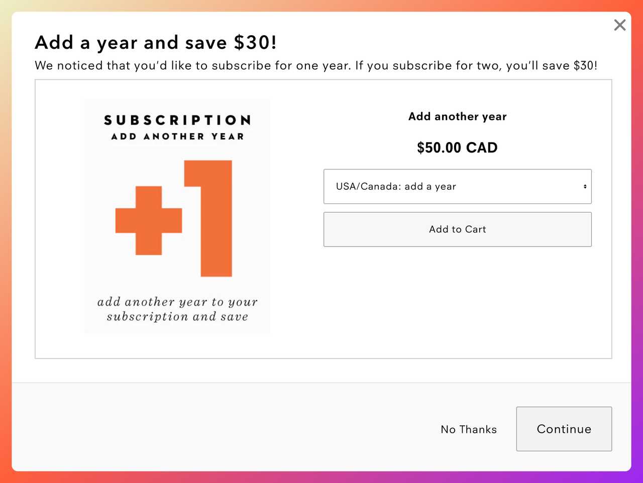
Uppercase Magazine frames savings as dollars, not percentages.
What works: Uppercase Magazine, an indie print publication, runs its exit offer as "Save $30" on a two-year plan — not "30% off." That one word swap changes what the shopper feels. Thirty dollars is a specific thing you can hold; 30% is an abstraction that has to be calculated. For anything over $50, dollar framing outpulls percent framing by a measurable margin.
Why it works: This is the hundred-rule in action: for prices under $100, percent discounts feel bigger. For prices over $100, absolute dollar savings feel bigger. Uppercase's two-year subscription lands well above that threshold, so "Save $30" is the numerically correct framing. The popup also leans on annual commitment, where the perceived savings per-issue get magnified.
Key takeaway: Test percent vs dollar framing at your product price points. If your average cart is over $100, dollar language usually wins. Below $100, percents win.
6. Tangible-Gift Close: The Branded-Freebie Incentive
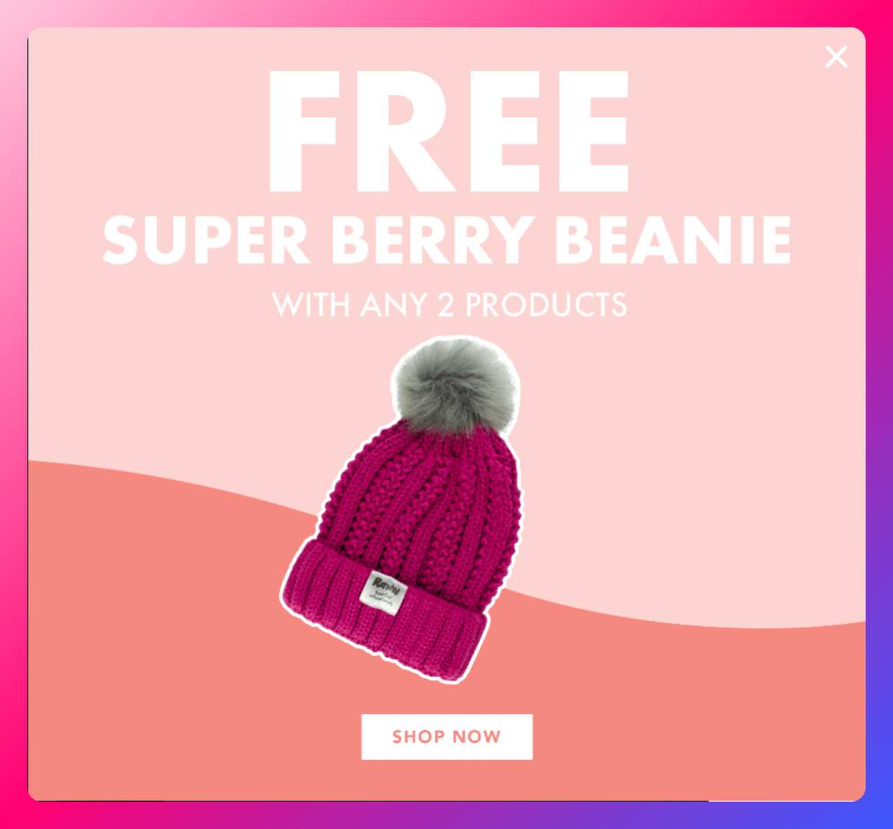
Raww Cosmetics uses a free branded hat as the exit incentive.
What works: Raww, an Australian vegan makeup brand, skips the discount entirely and hands out a physical freebie — a branded hat in the popup above, with a similar promo running again at checkout. Shoppers value free items at about three times their actual cost, a bias behavioral economists have tested across dozens of product categories. A $5 hat feels like a $15 win.
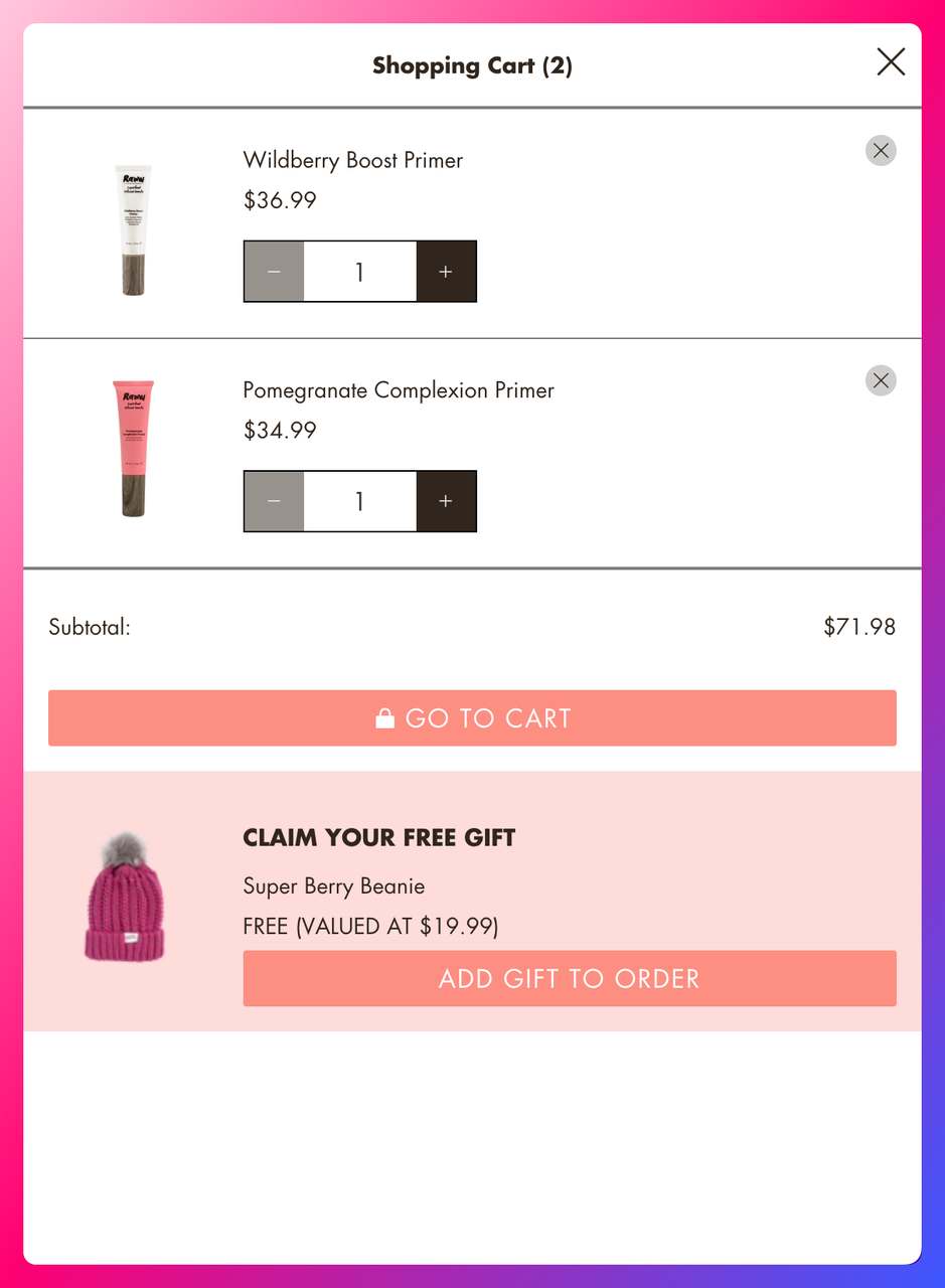
The same free-gift mechanic resurfaces at the checkout step.
Why it works: Freebies change the frame from "spend less" to "get more." Discount popups train customers to wait for coupons before buying; free-gift popups don't erode your price anchor the same way. Raww also shows the hat photographically, which makes the reward feel concrete instead of abstract.
Key takeaway: If your margins can't absorb another percent off, swap the discount for a branded freebie that costs under $5 to produce. It will feel like a bigger win to the shopper and protect your list price.
7. Respectful Save: The "Need More Time?" Soft Ask
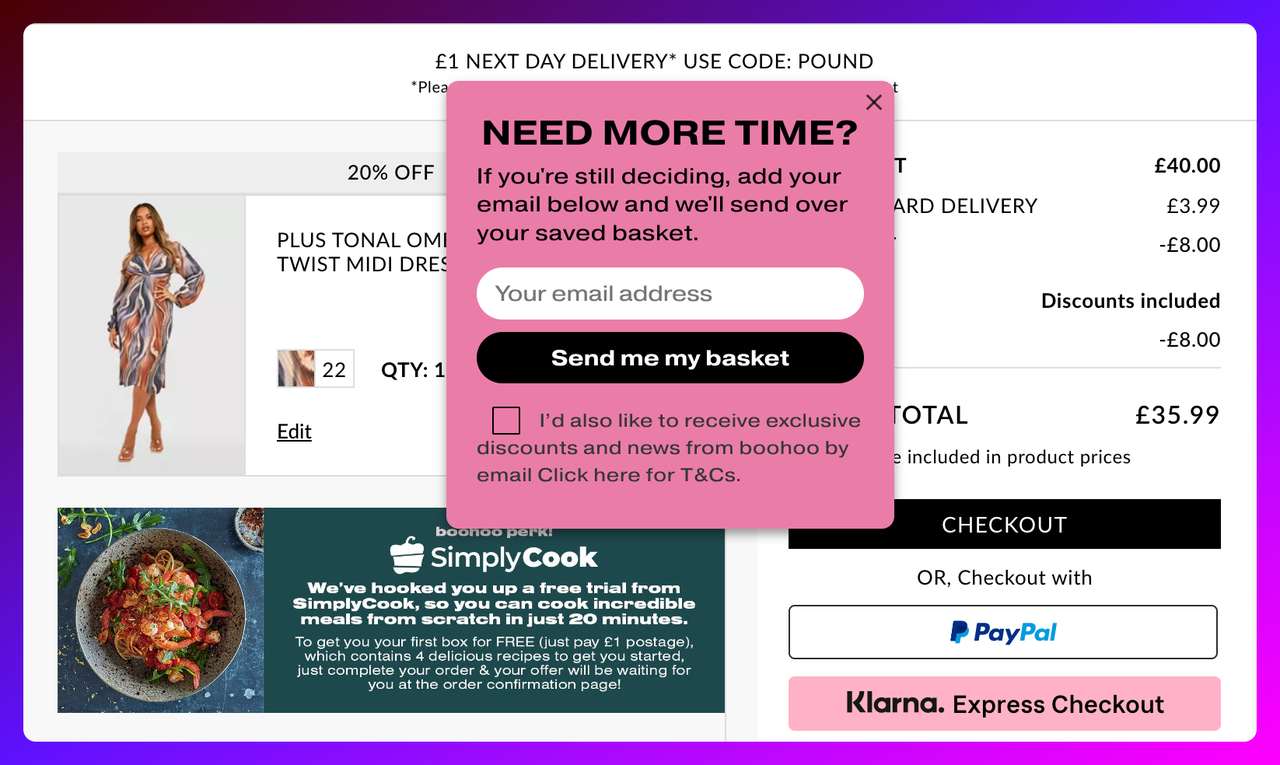
Boohoo's gentle "Need More Time?" exit popup.
What works: Boohoo's popup does something most exit offers don't — it acknowledges that the shopper might not be ready. The headline "Need More Time?" treats hesitation as valid instead of framing it as objection to overcome. The ask is just an email, no discount required. That permission-based tone is rare on fast-fashion sites, which is exactly why it stands out.
Why it works: Psychological reactance is the tendency to push back against any message that feels like pressure. A popup that says "Wait! Don't go!" triggers reactance. A popup that says "Need more time?" sidesteps it. For high-consideration purchases (think multi-item fashion carts or tech bundles), the respectful tone converts better than the aggressive one — and captures the email either way.
Key takeaway: For consideration-heavy carts, write the popup headline as a question, not a command. Questions invite an answer; commands invite a close-click. "Need more time?" and "Still thinking it over?" are both safer openings than "Wait! Don't leave!" for premium or considered purchases.
8. Smart-Tag Personalization: The Prefill Form Layer
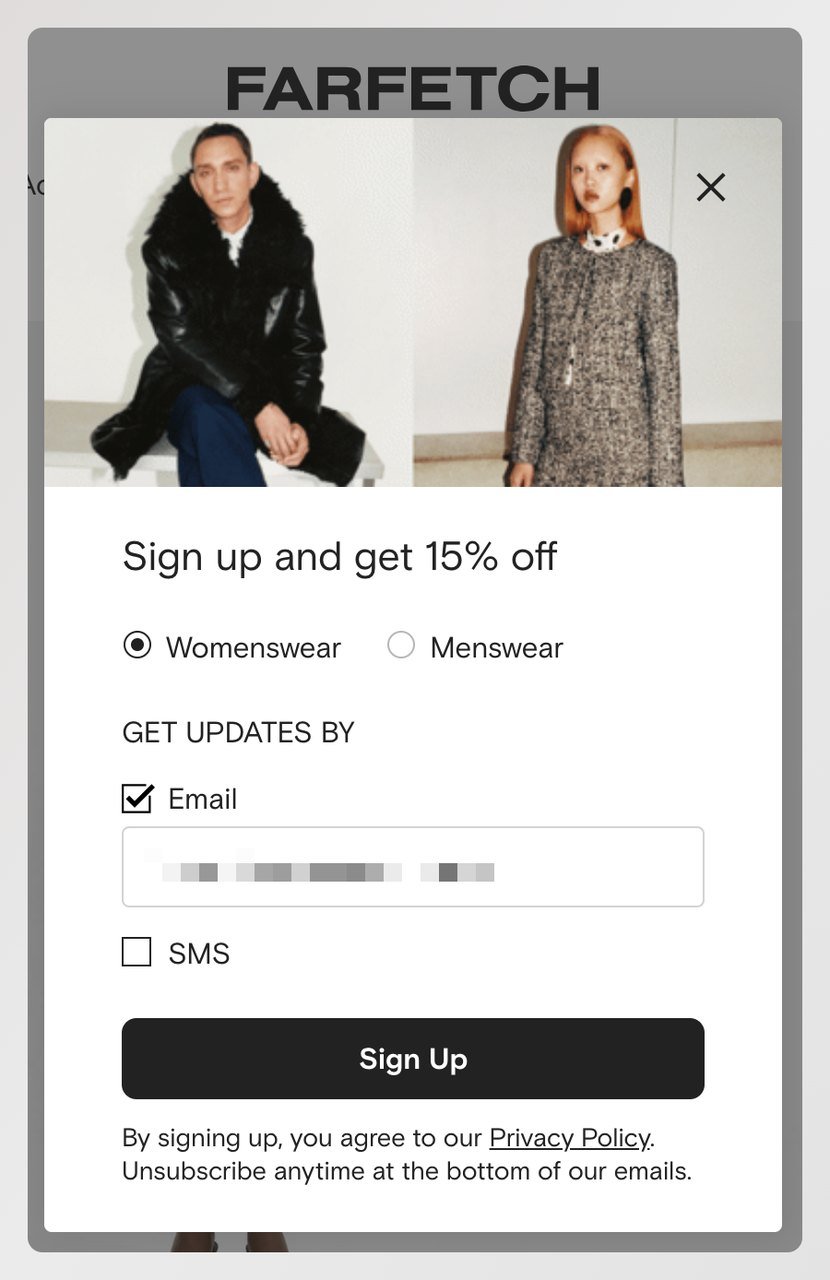
Farfetch prefills gender and email using smart-tag personalization.
What works: Farfetch, the luxury multi-brand retailer, uses dynamic smart tags to prefill the gender selector and the email field. A returning shopper sees their name and their previous preferences; a new shopper sees a clean but personalized form. The 15% discount is the hook, but the real unlock is removing one step from the flow before the shopper even notices.
Why it works: Every input field you eliminate raises conversion. Farfetch isn't reducing the number of fields visually — they're reducing the number of keystrokes. Smart-tag tools (Popupsmart, for example, ships them out of the box) pull the data from your site's session, your CRM, or the URL parameters to prefill forms automatically.
Key takeaway: Audit your popup form for any field you could prefill from session data. Gender, language, currency, and email (for logged-in sessions) are the easy wins. Every prefilled field is one fewer reason to bounce.
9. Feedback-for-Discount Swap: The Survey Trade
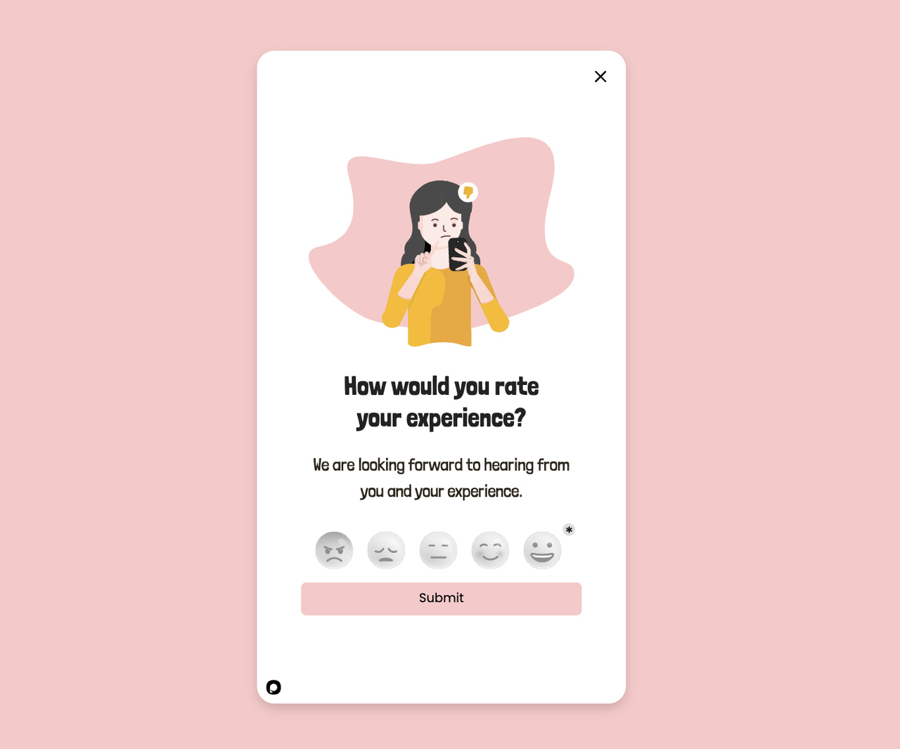
A generic feedback popup template that doubles as a recovery moment.
What works: The Outnet, a luxury off-price retailer, runs an exit popup that asks "Got a Minute?" and offers a 15% discount in exchange for a short survey. The casual phrasing sets expectations (this won't take long), and the survey data actually helps the brand diagnose why carts get abandoned in the first place. Most exit popups are one-shot conversion plays; this one is also a research pipeline.
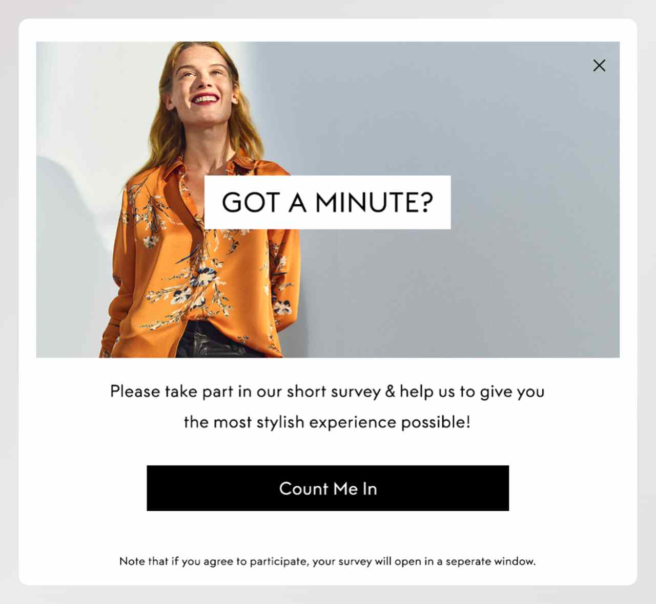
The Outnet's survey-for-discount exit popup.
Why it works: Feedback popups convert decently on their own (around 3–5% response rate for short surveys), but the real ROI is in the compounding data. Over a quarter, a feedback popup at checkout will tell you which price points, shipping thresholds, or payment methods are driving your abandonment — information you can't get from analytics alone. Pair with social proof tactics for a fuller recovery mix.
Key takeaway: If you've already optimized the offer side of your popups and want the next 10% of lift, try a feedback popup on a 20% traffic slice. You'll close some of those shoppers and learn why the rest are leaving.
10. Cross-Sell Rescue: The Adjacent-Product Pivot
Shopbop surfaces related products at exit.
What works: Shopbop and Scarlettos both use their exit popup to show adjacent products, not a discount on the current cart. The assumption is smart: if the shopper is leaving, maybe it's because the item they picked wasn't quite right — not because they changed their mind about buying. A carousel of three to four similar options gives them a path forward without forcing a price cut.
Scarlettos offers alternative shoes at exit.
Why it works: Cross-sell exit popups protect your margin. Instead of discounting the existing cart, you rescue the session by pointing the shopper at something else. This works best when the alternatives are tightly related — same category, similar price, comparable style. A random bestseller feed won't cut it.
Key takeaway: Before you run a cross-sell exit popup, audit your product relationship data. If "customers who viewed this also viewed..." isn't accurate, the popup will show random picks and the conversion rate will tank. Three to four alternatives is the sweet spot — any more and you trigger choice paralysis.
11. First-Purchase Welcome: The New-Visitor Anchor
A first-purchase welcome popup aimed at new visitors.
What works: This popup flips the usual timing. Instead of waiting for the exit signal, it greets first-time visitors with a welcome discount as soon as they add something to the cart. The logic: new shoppers have the highest abandonment risk because they haven't built trust yet. A first-purchase incentive locks in the relationship before doubt sets in.
Why it works: First-time visitors abandon more often than returning ones because they're evaluating the whole store, not just the product. The welcome discount acts as a trust anchor — the store is giving something before asking for anything. You can still fire an exit-intent version for the shoppers who ignore the welcome offer, so the two campaigns stack without cannibalizing each other.
Key takeaway: Segment your cart abandonment popups by visitor status. First-timers get a welcome + exit popup combo. Returning customers get a different message (next-purchase discount, loyalty points) that doesn't insult their history with your brand.
12. Next-Purchase Discount: The Retention Hook
A next-purchase discount popup for repeat visit planning.
What works: Instead of discounting the current cart, this popup offers a code for the next purchase. The shopper who was leaving now has a reason to come back — which can close the current sale at full price if they decide to buy now and save the code for later, or plant a return visit if they don't. Either outcome beats losing the shopper cold.
Why it works: Next-purchase discounts protect your current-order margin. They also work well with email capture because the code only becomes useful if the shopper gives you a way to remember them. And because the reward is future-dated, the copy can play with "your next order" language that feels less like begging and more like a thank-you in advance.
Key takeaway: Use next-purchase popups when you don't want to discount the active cart — say, during peak season or on already-discounted SKUs. It keeps the exit moment productive without eroding today's revenue. Set the code to expire in 14–30 days so the return visit has some urgency baked in.
13. Full-Screen Overlay: The Last-Chance Takeover
A full-screen exit popup with a form-first layout.
What works: A full-screen popup occupies the entire viewport, which sounds aggressive — and it is, but in the right context it's the right move. At the exit moment, the shopper has already decided to leave. The full-screen overlay stops the momentum long enough to land one clean message: the offer, the CTA, nothing else. If you try this on a mid-session trigger, you'll tank UX. At exit, it's the last honest play.
Why it works: Full-screen overlays beat centered modal popups on conversion rate because they remove the visual competition. There's no header nav, no product grid, no "maybe I'll keep browsing" escape hatch. The only paths are the CTA and the close button. Full-screen popups should never run on mobile the same way they run on desktop — a mobile full-screen popup that's hard to close gets flagged by Google as an intrusive interstitial.
Key takeaway: Reserve the full-screen layout for exit-intent on desktop only. Use a smaller sticky-bar or modal variant on mobile to avoid the intrusive-interstitial penalty. Make sure the close button is at least 44 pixels tall and visible without scrolling, no matter the viewport size.
14. Trigger Words: The Power-Phrase Popup
A trigger-word popup built around high-attention phrases.
What works: This popup is built around copy, not design. The headline pairs a power word ("Wait") with a specific offer framing ("Last Offer Before You Go"). Trigger words earn a cognitive cycle the moment a shopper's eyes hit them — they're pattern-interrupts that force a second look. The visual design stays simple because the words are doing the heavy lifting.
Why it works: Copy tests on popup headlines consistently show that power-word headlines outperform neutral headlines by 15–30%. Phrases like "Wait," "Better Hurry," "One-Time Offer," and "Last Chance" create a brief attention hook that buys the rest of the popup a few extra seconds of reader time. Overuse them and they become wallpaper, so rotate your headlines every four to six weeks.
Key takeaway: A/B test your current popup headline against a version that opens with a trigger word. The design stays identical; only the first two or three words change. That test usually produces the biggest single lift on a popup campaign.
15. Alternative Payments: The Financing Nudge
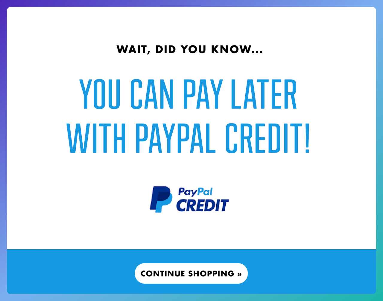
A popup promoting PayPal Credit and alternative checkout options.
What works: This popup doesn't offer a discount or a freebie. It just reminds the shopper that they can split the purchase or pay later with PayPal Credit. For carts above $100, buy-now-pay-later (BNPL) options reduce abandonment measurably because they address a different objection — cash flow, not value. A shopper who was leaving because "this is a lot for one charge" now has a path.
Why it works: The popup converts hesitation about the money into a payment-structure question, not a price question. Braze's analysis of global checkout patterns shows that 68.6% of digital transactions get abandoned before completion, and payment friction sits in the top three causes. Adding a BNPL or alternative-payment popup at exit directly targets that friction without touching your margin.
Key takeaway: If your average order value is above $75, test an alternative-payment exit popup on desktop. You don't need a discount — you just need to surface the payment options your store already accepts but the shopper may have missed. Pair the popup with trust badges (Visa, PayPal, Klarna, Apple Pay) at the bottom of the card to reinforce that the checkout is safe.
Best Practices for Cart Recovery Popups
Once you've picked a pattern from the 15 examples above, the execution details decide whether the popup earns its spot in the session. I've watched well-designed popups fail because of one or two operational missteps. These six are the ones that matter most.
• Cap frequency per visitor: Show the popup once per session per device. A shopper who closes it and sees it three more times in the same browse will bounce faster next time. Most popup tools (Popupsmart included) handle this with a cookie, but double-check the setting.
• Match the popup to the page context: A cart-abandonment popup on a blog post is just a generic exit offer, and it will convert like one. Restrict the trigger to cart and checkout pages only. Segment by URL, not by broad "site-wide" rules.
• Test the discount code before launch: A broken code on a cart-recovery popup wastes the single best conversion moment a store gets. Run through the full flow every time you launch a new promo, and set up a daily automated check for the code's validity.
• Keep copy under 40 words: The popup has maybe four seconds to land. Anything past the fold or past the third line gets ignored. Cut adjectives, cut throat-clearing, cut hedging. Lead with the offer, close with the CTA.
• Design mobile and desktop separately: A responsive popup that scales automatically usually looks cramped on mobile and washed out on desktop. Build two variants, test them independently, and accept that the winning copy may differ between screen sizes.
• Pair popups with email follow-up: The popup catches the shopper on-site. The follow-up email catches the ones who left anyway. Together they recover a larger share than either does alone. For the email half of the play, see our guide on abandoned cart subject lines.
Timing and Trigger Strategies for Cart Abandonment Popups
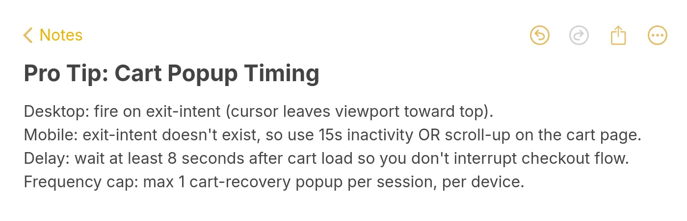
Quick-reference pro tip for cart popup timing.
Trigger choice is where most cart abandonment popups live or die. The wrong trigger fires the perfect popup at the wrong moment and kills the conversion rate regardless of how good the offer is. Here's how I set triggers for clients.
Desktop: exit-intent first, cart-stall backup. Track the mouse crossing the upper browser boundary — that's the cleanest signal a desktop shopper is heading for a tab close or the back button. As a backup, trigger on cart-page inactivity of 30+ seconds. Don't stack both triggers on the same session or you'll fire twice and trip the frequency cap.
Mobile: scroll-up + inactivity. Exit-intent doesn't work on mobile because there's no mouse cursor to track. Use a fast upward scroll after a pause, combined with 15-second inactivity on cart or checkout pages. The inactivity signal catches shoppers who put the phone down mid-checkout and came back with doubts.
Session cap: one popup per device per session. This is the single most-ignored setting in popup tools. Without a cap, a shopper who closes the popup and keeps browsing will see it again, which trains them to close on reflex. One popup per session means one high-intent fire per shopper — that's the math that keeps conversion rates stable over quarters, not just weeks.
Delay after page load: at least 8 seconds. A popup that fires before the page is fully scanned interrupts browsing and reads as spam. Eight seconds is long enough for the shopper to orient, short enough to catch them before they leave. On cart pages specifically, bump this to 15 seconds — the shopper needs time to verify items before any popup should interrupt.
Common Mistakes to Avoid While Creating Cart Abandonment Popups
These are the errors I see most often during popup audits. Each one sounds small, and each one costs measurable conversion rate.
• Popup fires on every page, not just cart/checkout: A "cart abandonment popup" that fires on the homepage is just a generic exit offer with a misleading name. Conversion rates drop by roughly half because you're targeting shoppers who don't have anything in their cart yet. Fix: restrict the trigger to cart-URL patterns.
• Offering a discount you can't afford: 20% off sounds good until you realize it eats the full gross margin on half your SKUs. Map your discount levels to your margin-by-category data, not to a gut-feel number. If 10% is all you can sustain, 10% is the right offer.
• No mobile variant, just a shrunken desktop popup: The desktop layout at 40% of its original size is illegible, and the close button often overlaps the CTA. Fix: design two popups. Mobile copy should be under 20 words, with tap targets at least 44 pixels tall.
• Asking for too much data: A cart-recovery popup that asks for name, email, phone, and SMS consent will convert roughly a quarter as well as an email-only version. Start with one field. If you need more data, ask for it in the post-purchase flow when the shopper has already committed.
• Ignoring popup analytics: Most stores launch a popup and never check the impression-to-click-to-conversion funnel. A 2% conversion rate and a 25% conversion rate look identical from the dashboard summary. Pull the data monthly, compare to the 4–5% baseline for popup conversion rates, and iterate the two worst-performing elements each quarter.
Ship Your First Cart Recovery Popup This Week
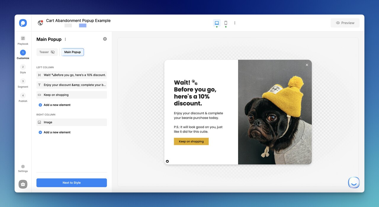
Building a cart recovery popup inside Popupsmart.
Cart abandonment isn't a problem you solve once — it's a tax you pay on every session until the recovery layer is in place. The 15 examples above are a starting kit. Pick the one closest to your store, clone the structure, and put it live on cart and checkout pages this week. Don't over-engineer the first version; a baseline popup launched this Friday will teach you more in two weeks than a perfect popup launched next quarter.
Here's what I'd do in the next seven days, in order. First, build one exit-intent popup with a single-field email capture and a one-time discount code — that's the baseline play that works across industries. Second, layer a mobile-specific variant on scroll-up plus 15-second inactivity, because mobile abandonment is where most of the recoverable revenue hides. Third, pair both with an abandoned cart recovery email sequence so the shoppers who still leave don't walk out empty-handed. A no-code tool like Popupsmart's AI popup builder will get both popups built and live in under an hour.
Frequently Asked Questions
What is a good cart abandonment popup?
A good cart abandonment popup fires at a real exit signal, offers one clear incentive, and asks for one action — nothing else. The copy stays under 40 words, the CTA is a single button, and the form (if any) has one field. Baseline conversion rates for well-built popups land in the 4–5% range, with top performers pushing into double digits on high-intent cart pages. If your popup is converting under 2%, the issue is usually too many competing elements rather than a bad offer.
How do you make a cart abandonment popup?
Pick a no-code popup builder, choose an exit-intent template, customize the offer (discount, free shipping, or free gift), restrict the trigger to cart and checkout URLs, and cap frequency at once per session per device. The whole build should take under an hour. The harder part is iteration: launch a baseline, watch the conversion rate for two weeks, then A/B test one element at a time — headline first, CTA second, offer third. Skip straight to a discount test and you'll never know which change moved the number.
What is the best popup for abandoned cart?
The best popup for your abandoned carts depends on your average order value and margin structure. For carts under $50, a percent-off discount (10–15%) usually wins. For carts over $100, dollar-off framing or free shipping out-converts percent discounts. For stores that can't discount, a free branded gift or a next-purchase code protects margin while still rescuing the session. Test two variants against each other on a 50/50 split, and let the data pick — not gut feel.
What incentives work best in cart abandonment popups?
The best incentive depends on which objection is driving the abandonment. For sticker-shock objections, a percent or dollar discount works. For shipping-cost objections (the single biggest abandonment cause), free shipping or a shipping threshold beats a generic discount. For margin-sensitive stores, a free branded gift or a next-purchase code preserves list price. For new shoppers specifically, a first-purchase welcome discount anchors the relationship before doubt kicks in. Never stack more than two incentives in one popup — the cognitive load kills the redemption rate.
If you enjoyed reading this article, you might as well be interested in the following related topics:
• Best Popup Message Examples To Get Inspired

How would you rate your experience with this article? 😊