ChatGPT
 Perplexity
 Claude
 Grok
Grok Google AI Mode
Flashy design and a catchy headline won't tell you whether a popup converts. Real data will, and A/B testing for popups, also known as split testing, is how you get it.
A/B testing takes the guesswork out. You compare versions of a popup and keep the one that works best, which makes it a cheap way to lift conversions on a small blog or a large e-commerce store.
This post covers what A/B testing for popups involves, which tests our benchmark data says are worth your traffic, how to size a test so you don't crown a false winner, and how to run one in Popupsmart, with real examples along the way. If your store runs on Shopify, our guide on how to A/B test Shopify popups covers the Shopify-specific setup; this one is the general playbook.
What Is A/B Testing for Popups?
The Basics of A/B Testing
A/B testing (or split testing) shows you which version of a popup your visitors respond to best. The goal is to turn more of them into subscribers or buyers. For example, you might test two different call-to-action buttons, popup triggers, designs or timing to see which one drives more signups.
The mechanics are simple. One group of visitors sees Version A (the original), another sees Version B (the variation), and you compare the two on one goal, such as clicks, signups or purchases. Given enough traffic, the numbers show which version wins.
Here's a simple example where only the offer changes:
| Element | Version A | Version B |
|---|---|---|
| Headline | "Join our newsletter" | "Get 10% off your first order" |
| CTA Button | "Subscribe" | "Subscribe" |
| Timing | Appears after 5 seconds | Appears after 5 seconds |
| What you compare | Leads per display | Leads per display |
Everything except the offer stays the same, so whatever difference you measure belongs to the offer. If the headline, the button and the trigger all changed at once, a winner wouldn't tell you which change earned it.
A/B testing can be applied to any part of your popup, including:
- Headline and body copy
- The offer (a discount code, a free guide, no incentive)
- Call-to-action (CTA) button text
- Form fields
- Visuals or images
- Display timing and placement
- Triggers (e.g., exit-intent, scroll percentage, time delay)
- Targeting (which visitors and pages see the popup)
The point is to improve your popups on evidence, not on gut feeling or on trends that may not suit your audience.
Why You Should A/B Test Your Popups
What works on one website can flop on another. A/B testing shows you what works for your audience, on your site.
The spread between ordinary and strong popups is wide. In our popup conversion benchmark report, across 3,034 Popupsmart popups that ask for an email or phone number (January 2024 - September 2026, each with at least 1,000 displays and 14 active days), the median converts 0.83% of its displays into leads; the top 25% reach 1.96% and the top 10% reach 3.87%. Testing is how a popup moves up that range on purpose rather than by luck.
Testing also wastes fewer displays. If one version collects more leads from the same traffic, every display after the test works harder. And each finished test tells you something about your audience that you can reuse in the next popup.
Companies of all sizes run these tests to fine-tune their messaging, enterprise brands like Somfy included.
Key Metrics to Track During Testing
Each metric shows a different side of how visitors react to your popup. These are the ones to watch in A/B tests for popups:
| Metric | What It Tells You |
|---|---|
| Conversion Rate | The percentage of popup displays that end in the desired action (a lead, a signup) |
| Click-Through Rate | The number of people who clicked on the popup out of the total who saw it |
| Bounce Rate | Percentage of users who leave the page without taking any action |
| Exit Rate | How many users left your website after viewing the popup |
| Time on Site | Whether your popup influenced users to stay and explore more content |
| Form Completion Rate | How many users completed and submitted the popup form |
Popupsmart's A/B Testing reports views, interactions, conversion rate and leads for each variant. Bounce rate, exit rate and time on site come from your web analytics tool, so compare them per variant there.
Choose one of these as the primary metric before the test starts, and let it decide the winner. Clicks and leads don't always move together.
Run steadily, A/B testing your popups does more than lift one campaign. It shows you what makes your visitors act, on a blog, a SaaS site or an e-commerce store alike.
Improved Conversion Rates
The most direct benefit is that testing helps increase conversion rates. You find out what works best without redesigning your website or rewriting your marketing strategy.
Popup changes are quick and cheap to make. Instead of paying for more traffic, you get more out of the traffic you already have.
Data-Driven Decision Making
Guessing is expensive. Instead of picking the message, design or timing you happen to like, you let your audience decide by watching how they respond to each version.
Your decisions get easier to defend, too. They rest on performance numbers rather than personal preference or vague feedback.
Better Understanding of User Behavior
Every test also teaches you something about how your audience thinks and what makes them act.
A test can answer questions like:
-> Do users prefer urgent language ("Limited Time Offer") or subtle value-driven messages ("See What's New")?
-> Are users more responsive to visuals or clean, text-only popups?
-> Does offering an incentive increase form submissions?
You can also split results by device type, traffic source and user segment. Maybe mobile visitors respond better to shorter copy and floating bars, while desktop visitors prefer center-screen popups with more detail. Device shows why the split is worth checking: in our benchmark, on mobile the median popup converts 1.02% vs 0.57% on desktop, so a result from all visitors pooled can hide two different audiences.
What you learn carries over to the rest of your marketing.
Key Benefits of A/B Testing
| Benefit | What It Means For You |
|---|---|
| Improved Conversion Rates | More leads, signups, or sales from the traffic you already have |
| Data-Driven Decision Making | Stop guessing: optimize based on real user behavior and numbers |
| Better Understanding of Users | Learn what your audience really wants, and personalize messaging accordingly |
| Efficient Marketing Spend | Get better results without scaling ad spend or redesigning entire funnels |
| Continuous Optimization | Create a feedback loop where your campaigns get smarter and more effective over time |
What to test first: what our benchmark says
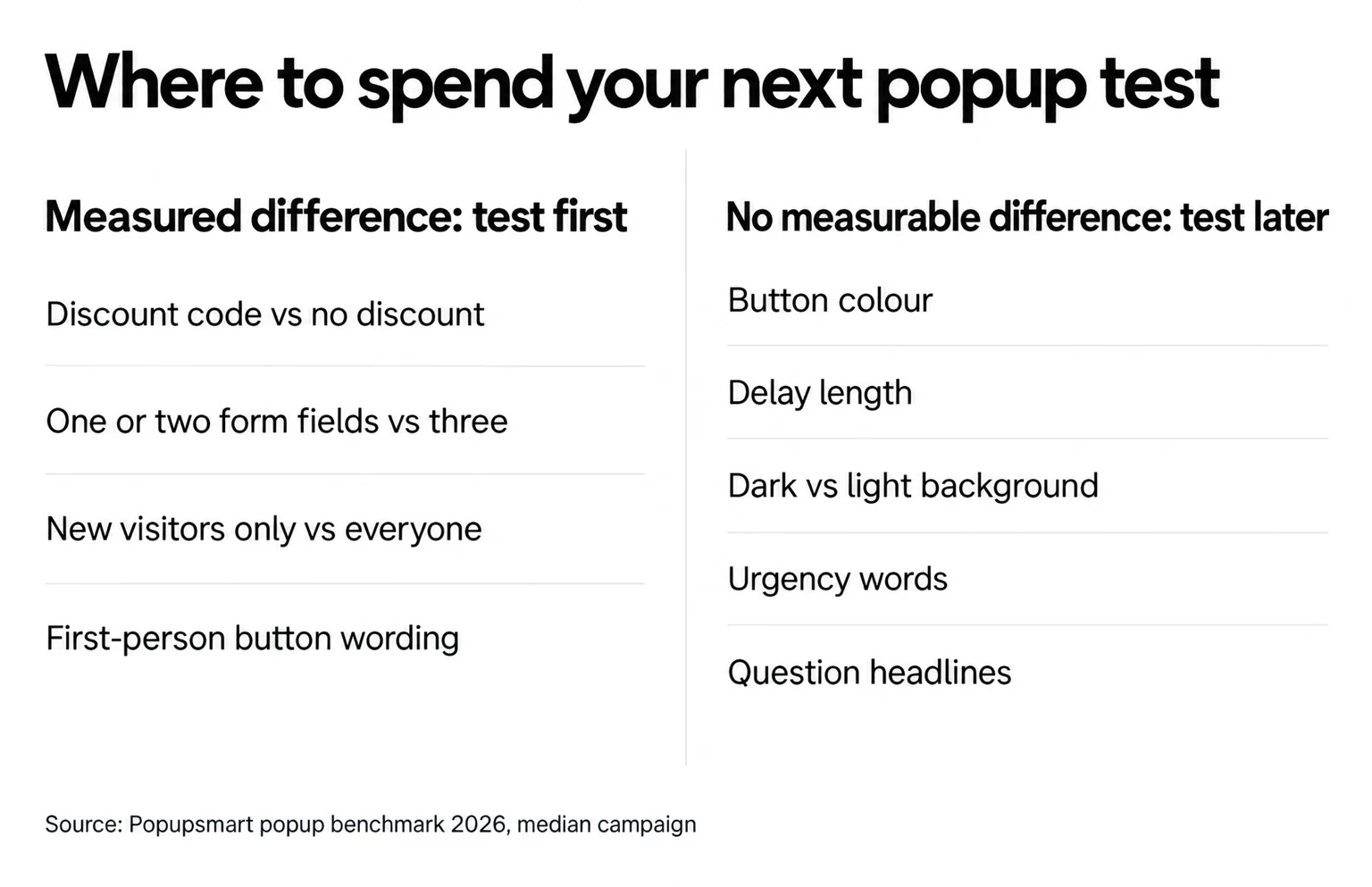
Your traffic is the budget for testing, and each test spends some of it. Our 2026 benchmark covers 28,674 campaigns from 11,533 businesses that ran a popup with Popupsmart between January 2024 and September 2026, so it can't tell you what will win on your site, but it can tell you where differences have shown up across many sites and where they haven't.
One caution before the lists: these are comparisons between campaigns, not controlled experiments. They point you to the tests most likely to be worth the traffic. Your own A/B test is what tells you whether the difference holds for your visitors.
Tests where the benchmark measured a difference
Start here. Each line is a benchmark finding that passed its statistical checks:
| Test idea | What the benchmark found |
|---|---|
| Offer vs no offer | Signup popups that offer a discount code convert 1.46% vs 0.75% for signup popups without one. |
| Stated discount | Popups stating 10% off convert 1.25% vs 0.67% for popups that state no discount. |
| Form length | Popups asking for one or two fields convert 0.88% and 0.94%, against 0.56% for three fields (median campaign; spin-to-win and other gamified popups are counted separately). |
| Button wording | First-person buttons ("Send my code") convert 1.18% vs 0.80% for neutral wording (English popups, median campaign). |
| Audience | Popups targeted at new visitors only convert 1.13% vs 0.77% for popups shown to everyone. |
| Page | Popups on cart and checkout pages convert 4.57% vs 1.07% on the home page (median campaign); blog pages convert 0.23%. |
| Format | Center modal popups convert 0.88% vs 0.49% for corner/slide-in boxes (median campaign). |
Tests that showed no measurable difference
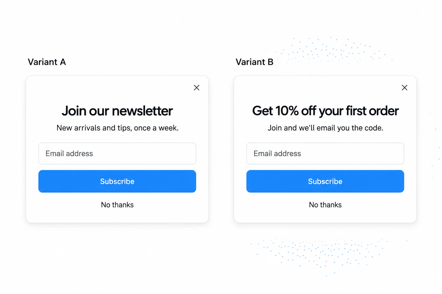
These can wait until the bigger questions are settled. "No measurable difference" isn't proof that they never matter; the data are too noisy to rule out modest effects, and a modest effect needs a lot of traffic to detect in your own test.
| Test idea | What the benchmark found |
|---|---|
| Button colour, background, urgency, questions | Button colour, dark vs light popup backgrounds, urgency words and question headlines show no measurable effect on conversion; the data are too noisy to rule out modest effects. |
| Delay length | The exact delay length (0–5 seconds vs 21–60 seconds) makes no measurable difference to conversion. |
| Discount size | Bigger discounts did not convert measurably better: 10% off converted 1.25%, 20% off 0.91% and 25–30% off 1.33%, but the larger-discount samples are small (78 and 46 campaigns), so the data cannot rule out a real difference either way. |
| Name field | Adding a name field alongside the email shows no reliable effect: the overall gap in its favour (1.25% vs 0.88% for email only) reverses among campaigns whose form rarely changed (0.74% vs 0.79%). |
| Multi-step form | Multi-step forms show no measurable conversion advantage over single-step forms once step-1 clicks without contact details are excluded. |
| Emoji | Emoji in the headline or button come with a slightly higher click rate (2.76% vs 2.20%) but no measurable difference in leads; the click difference is not statistically reliable. |
| Weekend vs weekday | Weekend visitors show no measurable difference in popup conversion from weekday visitors once each popup is compared with itself (2,333 campaigns). |
Button colour is the classic first test, and it's the one the benchmark gives the least reason to run first. Our post on the best CTA button color covers contrast and readability, which matter for accessibility whatever a test says. The same goes for timing: popup timing explains why showing a popup after a short wait matters more than the exact number of seconds.
Leans: worth a test, not a rule
A few gaps point one way but aren't statistically reliable. They're reasonable hypotheses for a test on your own site, which is the only way to settle them:
- Popups that wait before appearing convert 0.83% vs 0.61% for popups shown the instant the page loads (median campaign); the direction holds in every year of data but the difference is not statistically reliable, so treat it as a lean, not a rule.
- Exit intent shows no statistically reliable advantage: popups on the most sensitive exit-intent setting converted 1.10% vs 0.78% without exit intent (median campaign), a gap that could be chance.
- CTA buttons that promise value ("Get", "Claim", "Unlock") look stronger than "Subscribe" / "Join" buttons (1.06% vs 0.77%, English popups, median campaign), but the gap is not statistically reliable.
Our analysis of whether exit-intent popups work goes deeper on the exit-intent lean.
For the full set of findings behind these lists, see our popup best practices, which grades each common tip against the same data.
What Elements Should You Test?
Any element of a popup can become a test. Start with the high-impact ones above. The table shows what a pair of variations looks like for each:
| Element | Why It Matters | Example Variations |
|---|---|---|
| Headline | First thing users see; must grab attention | "Get 10% Off" vs. "Unlock Instant Savings" |
| Call-to-Action | Directs the user to take action | "Join Now" vs. "Get Started Free" |
| Image or Visual | Supports the message and attracts interest | Product photo vs. Illustration |
| Popup Timing | Affects user perception and engagement | 5-second delay vs. Exit-intent |
| Trigger | Defines when the popup appears | Scroll 50% vs. Time delay |
| Popup Position | Impacts visibility and user experience | Center vs. Bottom bar |
| Form Fields | The number of fields can influence conversion rate | Name + Email vs. Email only |
How to A/B Test Your Popups with Popupsmart
An A/B test sounds technical, but you don't need any code to run one. A/B testing is built into Popupsmart: you set up versions of a popup, let them run, and compare the results.
The process is the same for email signups, product sales or form completions: split traffic between variants of a popup campaign and pick a winner on real performance data.
A/B split testing is included on Popupsmart's Advanced ($69 a month), Pro and Expert plans; the Free and Basic plans don't include it. The Popupsmart pricing page lists what else each plan includes.
Creating Your First Test
The steps below follow Popupsmart's A/B testing help article (updated March 2026).
Step-by-Step Guide
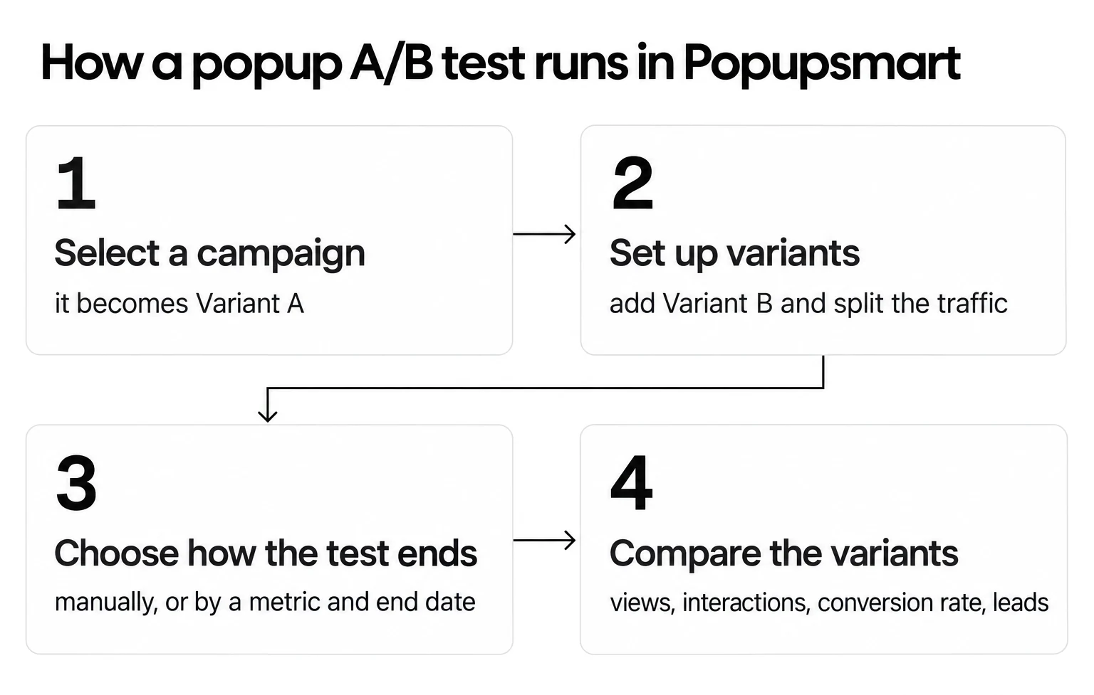
1. Open A/B Testing. Go to A/B Testing in the left sidebar of your Popupsmart dashboard and click Create A/B Test.
2. Select a campaign. Search for the popup campaign you want to test and click Continue. The campaign you pick becomes Variant A, the original.
3. Set up variants and split the traffic. Popupsmart creates Variant B as a variation of the original. Change the one element you're testing in Variant B, and set each variant's traffic share, for example 50% / 50%. Add Variant lets you test more than two versions.
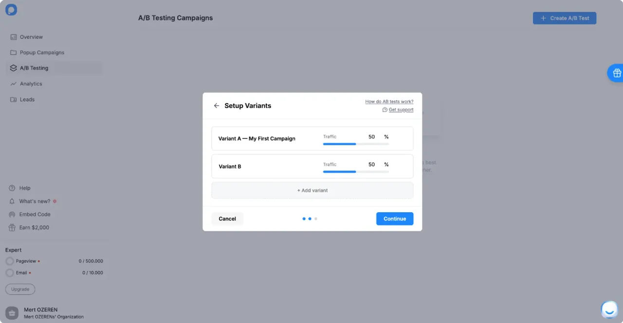
4. Choose how the test ends. Pick Manually to select the winner yourself after reviewing the results (the test runs until you stop it), or Automatically to let Popupsmart pick the winner on a success metric (Lead Number, Interaction or Conversion Rate) when an end date you set is reached.
5. Compare the variants. The test appears in the A/B Testing section, where each variant shows its Views, Interactions, Conversion Rate and Leads. From the same list you can change the test conclusion settings, rename the campaign or delete the test.
How to Analyze the Results
Once the test is live, two questions matter. When do you have enough data? And how do you know which version "wins"?
Four things decide it:
- Sample size, decided before launch: how many displays each variant needs depends on your current conversion rate and the smallest lift worth detecting. A free sample size calculator does the arithmetic.
- Duration in whole weeks: run until each variant reaches that sample, in whole weeks, so both variants see the same mix of weekdays, email sends and campaigns.
- Statistical significance: at the end, check that the difference is unlikely to be chance, usually at 95% confidence, with a significance calculator or your analytics tool.
- Practical significance: a statistically reliable lift that is too small to change your list growth may not be worth the change.
Here's what that means for a popup. Assume a popup that converts 1% of its displays, a round number for the arithmetic rather than a benchmark figure. At 95% confidence and 80% power, the standard two-proportion calculation gives roughly these sample sizes:
| If Variant B would lift conversion from 1% to… | Displays needed per variant |
|---|---|
| 1.2% | about 42,700 |
| 1.5% | about 7,750 |
| 2% | about 2,300 |
Small lifts need a lot of traffic. That's the practical case for testing the offer or the form before the button colour: a change that could double conversion is detectable on a modest site, while a change worth a fifth of a percentage point may never be.
Metrics to Compare:
- Conversion Rate: Which version drove more leads per display?
- CTR (Click-Through Rate): Which popup had a higher click rate?
- Bounce Rate: Did users leave the site immediately after the popup appeared? (from your analytics tool)
- Form Submission Rate: Did one version drive more completed forms?
Before you trust the result, check the split: if you set 50/50 and one variant got far more views than the other, find out why before you read the conversion rates.
Once you've reviewed the data and chosen the best-performing version, deactivate the test and apply the winning popup as your default.
💡A/B testing isn't a one-time task. Visitor behavior shifts, so the next test picks up where the last one ended.
Best Practices for A/B Testing Popups
Pressing start and waiting for results isn't enough. A useful test needs a clear goal, enough time to run, and a plan for reading the result before you see it. Get those right and testing turns into a habit of continuous improvement.
Only Test One Variable at a Time
This is the golden rule of A/B testing. Change several things in one test and you can't tell which change caused the improvement or the drop.
In practice:
-
Create a hypothesis: "I think offering a discount code will increase signups."
-
Test only the offer.
-
Keep everything else exactly the same (design, timing, CTA, etc.).
-
Once you know the winner, then move on to testing a new element.
Make Sure Your Sample Size Is Sufficient
Without a big enough sample, results mislead. On a small site, that means running the test longer.
Take an example. Version A collects 5 leads from 40 displays and Version B collects 7 from 45. Version B looks better at first glance, but at these numbers one or two more conversions would flip the result. The gap is not statistically significant.
You should:
- Work out the sample size before the test starts (see the table above), and don't call a winner until both variants reach it.
- Monitor your traffic: If you don't get enough visitors, extend the test for a few more days or weeks.
- On a low-traffic site, test bigger changes, such as the offer or the number of form fields, where a difference is large enough to detect.
Test Continuously and Iterate
Visitors change, and a popup that already won a test can still get better. Test again around seasonal campaigns and product changes. Each round starts from the last winner, so your popups improve one test at a time.
Know what an A/B test can't tell you
An A/B test between two popups tells you which popup does better. It doesn't tell you whether showing a popup beats showing none, or how the leads it collects behave later. For those questions, compare a group that sees no popup with one that does, and follow lead quality in your email or CRM tool, not in the test.
Real-Life Use Cases and Success Stories
Two examples show how A/B testing for popups plays out in practice: a customer story from e-commerce and a worked scenario from SaaS.
E-commerce Case Study
Somfy, a global leader in home automation solutions, runs popup campaigns across 10+ country sites. Their challenge: create, test and optimize popups quickly for each market.
According to Somfy's customer story, the team A/B tested popup headlines with Popupsmart, and the winning flash sale popup increased the number of checkouts. On its US site, Somfy's cart-abandonment popup reached a 47.27% conversion rate.
Wording and offer changes carry more weight at a high-stakes moment like cart abandonment. Page type shows up in our benchmark too: popups on cart and checkout pages convert 4.57% vs 1.07% on the home page (median campaign).
SaaS Lead Generation Example
SaaS platforms often use popups for product demos, trial signups and email nurturing, so the popup's copy has a direct line to user acquisition.
Picture a mid-size SaaS platform offering productivity tools. It wants to grow its email list and demo bookings. Its current popup offers a free trial with the CTA "Start Free Trial," and conversion rates are decent but flat.
The team builds two versions with the same layout and different CTA copy:
- Hypothesis: visitors who aren't ready for a trial will click a lower-commitment button.
- Version A (Control): "Start Free Trial"
- Version B (Variant): "See It in Action"
- Primary metric: demo requests per display, chosen before launch.
- Sample size: set in advance from the current conversion rate, as in the table above.
Our benchmark only leans on this question: CTA buttons that promise value ("Get", "Claim", "Unlock") look stronger than "Subscribe" / "Join" buttons (1.06% vs 0.77%, English popups, median campaign), but the gap is not statistically reliable. That's exactly the kind of question a test on your own traffic settles.
Final Thoughts on A/B Testing for Popups
Split testing your popups turns each change into something you can measure, whether the goal is a bigger email list, more recovered carts or more SaaS signups.
Each test also teaches you something about your visitors. With Popupsmart, you can run one with no design or coding experience.
Turning Data into Action
This guide covered:
- What A/B testing is and how it applies to popup campaigns
- Which tests our benchmark says to run first, and which showed no measurable difference
- How to run a popup A/B test step by step with Popupsmart
- How to size a test and read the result without crowning a false winner
- Real-world examples from e-commerce and SaaS
None of it pays off until you run a test. One well-designed A/B test can change how you build every popup after it.
Start Testing with Popupsmart Today
If you want a no-code A/B testing tool for your popups, Popupsmart lets you:
- Split traffic between two or more variants of a popup campaign
- Target specific audience segments
- Compare views, interactions, conversion rate and leads per variant
- Pick the winner yourself, or let it be chosen on a metric at an end date you set
- Continuously iterate based on real data
👉 A/B testing starts on the Advanced plan; see Popupsmart pricing to compare plans, then launch your first test. Your visitors are already interacting with your popups: make sure you're showing them the version that works best.
FAQs
❓ What is the ideal duration for an A/B test on popups?
There's no fixed number of days. Work out the sample size before you start, from your current conversion rate and the smallest lift worth detecting, then run the test until each variant has that many displays, in whole weeks so both variants see the same mix of days. Stopping the moment one variant looks ahead is the most common way to crown a false winner.
❓ How many variables should I change in a popup A/B test?
Just one. The golden rule of A/B testing is to isolate variables. If you change multiple elements, like both the CTA and the headline, you won't know which change caused the improvement or decline. To get clear, actionable insights, test one element at a time, such as the offer, the button text or the popup trigger. Once you identify a winning element, move on to testing the next one.
❓ Which popup elements impact conversion rates the most?
In Popupsmart's 2026 benchmark, the clearest differences came from:
- The offer: signup popups that offer a discount code convert 1.46% vs 0.75% for signup popups without one
- The form: popups asking for one or two fields convert 0.88% and 0.94%, against 0.56% for three fields (median campaign)
- Targeting: popups targeted at new visitors only convert 1.13% vs 0.77% for popups shown to everyone
Button colour, delay length and urgency words showed no measurable difference, so they're better saved for later tests.
❓ Can A/B testing popups help reduce bounce rate?
It can tell you whether a popup change does. For instance, if your current popup causes users to leave the page, testing a more subtle design, better copy, or delayed trigger could result in higher engagement. Popupsmart's A/B Testing reports views, interactions, conversion rate and leads per variant; bounce rate and exit rate come from your web analytics, so compare them per variant there. Pick one primary metric before the test starts, so a secondary metric doesn't decide the winner after the fact.
❓ Which Popupsmart plans include A/B testing?
A/B split testing is included on the Advanced, Pro and Expert plans. The Free and Basic plans don't include it. Advanced is $69 a month.