What Are Featured Products? 12 Examples & Tips for Ecommerce
Featured products are hand-picked items highlighted to meet business goals (launches, margin, clearance) vs popular products driven by sales; examples show effective placements (menus, sidebars, homepage), strong visuals/labels, and data-driven rotation on Shopify/WooCommerce.
Many digital marketers I’ve worked with initially overlooked the concept because they thought it was just about “putting a product on the homepage.” But featuring products is an art that balances strategy & creativity.
Featured products are items an ecommerce store deliberately spotlights to drive attention, clicks, and sales. They typically appear on homepages, navigation menus, or dedicated collections. Stores that feature products strategically see higher engagement and stronger average order values because shoppers spend less time searching and more time buying.
Let’s walk through the essentials of featuring products effectively and then expand into deeper tactics that drive genuine, lasting growth.
What Are Featured Products? Definition and Why They Matter
A featured product is any item you choose to highlight on your storefront or marketing channels. Unlike popular products (which earn their spot through sales volume alone), featured products are hand-picked by your team to serve a business goal: launching a new line, clearing seasonal inventory, or pushing high-margin items.
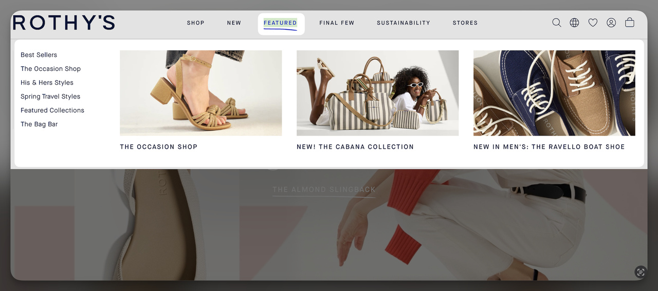
Rothy's uses a Featured section in their nav to spotlight curated collections
The distinction matters. Popular products reflect what customers already want. Featured products let you shape what customers see first. That control is why featuring products works as a nudge marketing tactic: you're guiding browsing behavior without restricting choice.
Three reasons featured products earn their spot in your ecommerce strategy:
1. Focused visibility: Highlighting a curated set of 4-8 items cuts through catalog overwhelm. Shoppers browsing a 500-product store don't want to evaluate everything. A featured section gives them a starting point.
2. Brand positioning: The products you feature signal what your brand stands for. A sustainable fashion brand featuring organic cotton basics tells a different story than one featuring sequin party dresses.
3. Purchasing momentum: According to Forbes, 20% of consumers report trading up to premium products across categories. Featured placement can nudge that trade-up behavior by putting premium items where shoppers notice them first.
How I Evaluated These 12 Featured Products Examples
I reviewed over 40 ecommerce sites across fashion, home goods, outdoor gear, and electronics over the past three months. From that batch, I picked these 12 based on four criteria:
Placement strategy: Does the brand use a distinct, labeled "Featured" section rather than just promoting items randomly? I looked for deliberate UI choices that separate featured products from the rest of the catalog.
Visual execution: Do the featured items include product imagery within the navigation or section, not just text links? Visual featured sections consistently outperform text-only ones in my experience.
Variety of approach: I wanted examples across different placement types (navbar dropdowns, sidebars, homepage sections, popups) so you can find an approach that fits your store layout.
Reproducibility: Every example here can be replicated by an ecommerce marketer with access to standard Shopify, WooCommerce, or custom theme tools. No custom dev work required.
Quick Overview of 12 Featured Products Examples
| # | Brand | Placement | Why It Works |
|---|---|---|---|
| 1 | Alo Yoga | Navbar mega menu | Dedicated "Featured Shops" dropdown captures browsing intent |
| 2 | Coop Sleep Goods (Pillows) | Navbar dropdown | New/bestseller tags create urgency within categories |
| 3 | Coop Sleep Goods (Sheets) | Navbar dropdown | Collection-level featuring reduces choice overload |
| 4 | Everlane (Cult Favorites) | Navbar dropdown | Editorial curation builds trust through "cult" framing |
| 5 | Everlane (New Arrivals) | Navbar dropdown | Pairs featured with trending for urgency |
| 6 | Everlane (Sale) | Navbar dropdown | Price-tier structure speeds deal hunting |
| 7 | Gymshark | Mega menu with visuals | Product photos in the menu boost click-throughs |
| 8 | Hydro Flask | Sidebar menu tab | Dedicated "Featured" tab with Shop All CTA |
| 9 | Package Free | Vertical sidebar | Top-of-menu placement works well on mobile |
| 10 | Simple Human (Sensor) | Navbar dropdown | Tech-forward imagery drives curiosity |
| 11 | Simple Human (New) | Navbar dropdown | Novel products paired with visuals draw clicks |
| 12 | Best Buy | Homepage sections | Personalized "for you" featuring drives relevance |
1. Alo Yoga: Curated Shops in the Mega Menu

Alo Yoga's Featured Shops dropdown in the main navigation
What works: Alo places a "Featured Shops" label at the top-left of their dropdown mega menu, the first thing your eye hits when hovering over a category. The section groups curated collections (not individual products) so shoppers can browse by theme rather than SKU. The menu is clean, with enough whitespace to keep it scannable despite listing 15+ links.
Why it works: Eye-tracking research consistently shows users scan web pages in an F-pattern, reading the top-left corner first. By anchoring "Featured Shops" there, Alo captures attention at the exact moment a shopper is deciding where to browse. Grouping by collection rather than individual product also reduces decision fatigue. You're choosing between 4-5 themes, not 200 items.
Key takeaway: Position your featured section at the top-left of dropdown menus. Group products into themed collections of 4-6 rather than listing individual SKUs to cut decision fatigue.
2. Coop Sleep Goods (Pillows): New Tags That Create Urgency
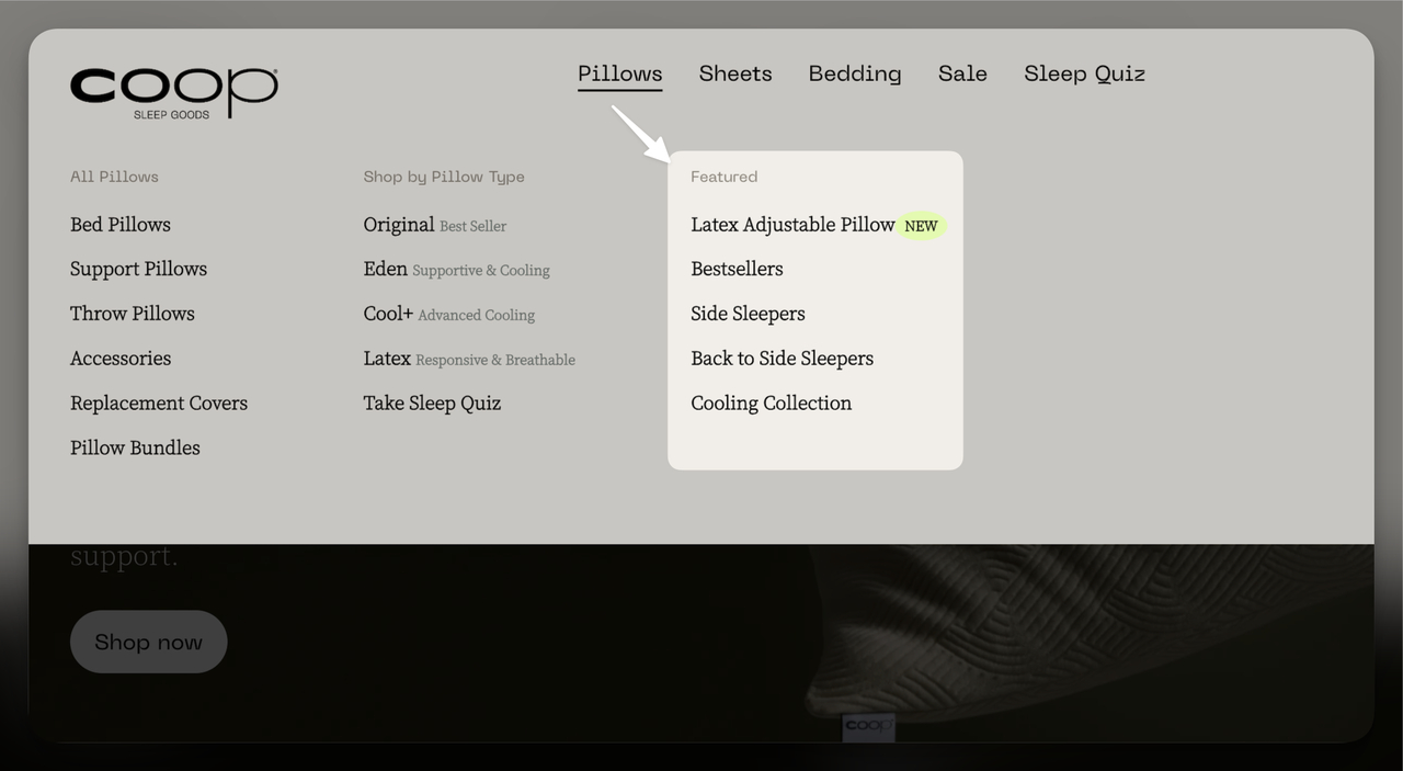
Coop's Featured section under the Pillows tab with status labels
What works: Coop uses a highlighted box labeled "Featured" at the top-right of their Pillows dropdown. What sets this apart is the "New" tag on specific items. The tag does double duty: it tells shoppers this product is fresh, and it creates a subtle sense of urgency. "New" implies limited availability, even if the product is a permanent addition.
Why it works: The scarcity principle (Cialdini's influence framework) states people value things more when they perceive limited availability. A "New" tag triggers this without the pushy feel of countdown timers. Combined with the "Bestseller" label on other items, Coop gives shoppers two entry points: "What's proven?" and "What's fresh?" Both reduce the anxiety of choosing incorrectly.
Key takeaway: Add status labels like "New" or "Bestseller" to featured items. Each label serves a different buyer psychology: novelty seekers gravitate to "New," risk-averse buyers trust "Bestseller."
3. Coop Sleep Goods (Sheets): Collection-Level Featuring
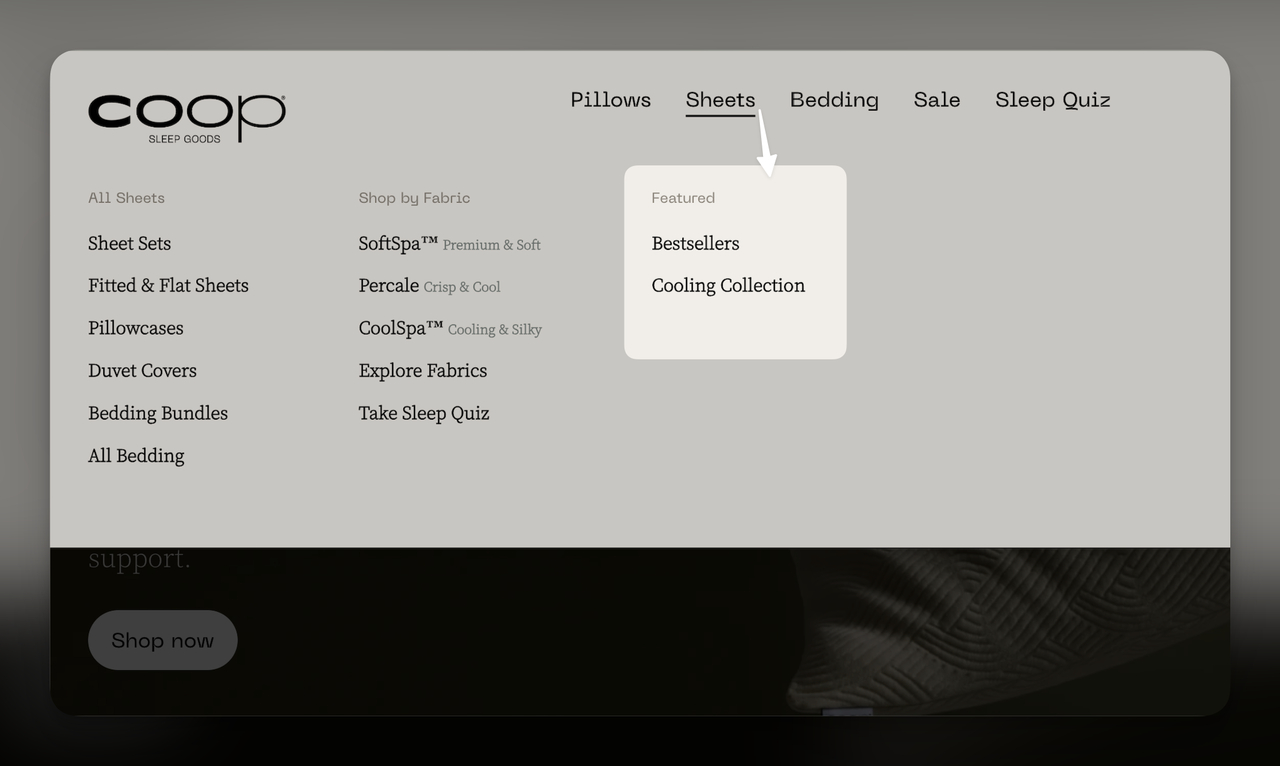
Coop features curated collections rather than individual sheet products
What works: Instead of featuring individual sheet sets, Coop highlights entire collections: "Bestsellers" and "Cooling Collection." The featured area is visually separated from the standard category list with distinct formatting. This approach works because sheet shopping involves multiple decisions (material, thread count, size, color), and collections pre-bundle those decisions.
Why it works: Hick's Law says the time to make a decision increases logarithmically with the number of options. By featuring collections instead of individual products, Coop reduces the effective choice set from dozens of sheet variations to two clear paths. Shoppers who know they sleep hot go straight to "Cooling Collection." Everyone else starts with "Bestsellers." It's efficient, and efficient browsing converts better.
Key takeaway: For product categories with many variants (bedding, apparel sizes, tech accessories), feature collections rather than individual items. Let the collection page handle the granular decisions.
4. Everlane (Cult Favorites): Editorial Trust Through Curation
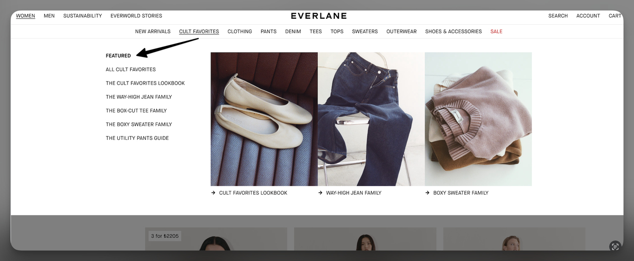
Everlane's Cult Favorites dropdown positions featured products as editorial picks
What works: Everlane labels their featured section "Cult Favorites," not just "Featured." That single word, "Cult," transforms a generic product list into an editorial recommendation. The section sits at the top-left of the dropdown, using bold formatting to stand out from secondary navigation links below it. The items listed aren't random bestsellers. They're specific product categories (The Day Heel, The ReNew Fleece) that represent Everlane's brand identity.
Why it works: Social proof drives purchasing, but not all social proof is equal. "Bestseller" says "other people bought this." "Cult Favorite" says "people are obsessed with this." The emotional weight is different. Cult implies loyalty, community, and repeated purchases. For a brand like Everlane that competes on transparency and sustainability (not price), that community signal carries more weight than a sales volume metric.
Key takeaway: Rename your featured section to match your brand voice. "Staff Picks," "Cult Favorites," or "Community Loved" each tell a different story than generic "Featured" labels.
5. Everlane (New Arrivals): Pairing Freshness with Trends
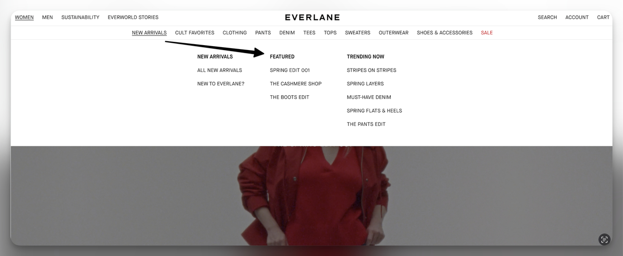
Everlane pairs featured items with New Arrivals and Trending Now sections
What works: This dropdown places "Featured" next to "New Arrivals" and "Trending Now" in a three-column layout. Each column serves a different browsing intent: discovery (New Arrivals), validation (Trending Now), and curation (Featured). The visual hierarchy is flat, meaning no single column dominates. Shoppers self-select their preferred browsing mode.
Why it works: According to Salsify's 2026 Consumer Research, 22% of shoppers now use AI search tools like ChatGPT for product research. That shift means shoppers arrive at your site with more refined intent. By offering three distinct entry points in a single menu, Everlane accommodates the trend-aware shopper, the novelty seeker, and the brand loyalist in one UI element.
Key takeaway: Don't isolate your featured section. Place it alongside New Arrivals or Trending content so shoppers with different motivations can each find their entry point from the same menu.
6. Everlane (Sale): Price-Tier Navigation for Deal Hunters
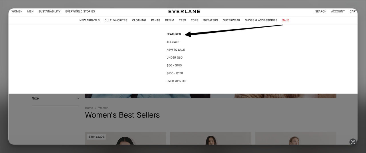
Everlane structures sale featured items by price range for faster browsing
What works: In Everlane's Sale dropdown, the featured section organizes items by price point rather than product category. Shoppers see groupings like "Under $25" and "Under $50" alongside featured sale items. This structure acknowledges that sale shoppers have a specific budget in mind. They don't want to browse by category and then filter by price. They want to start with price and discover products within that range.
Why it works: The endowment effect in reverse: sale shoppers mentally set a budget before clicking. If the first thing they see matches that budget range, they feel validated and stay longer. Everlane's price-tier structure removes the friction of filtering, sorting, and potentially finding nothing in their range. It's a pre-filtered experience built into the navigation itself.
Key takeaway: For sale or clearance sections, organize featured products by price tier instead of product category. Sale shoppers think in dollars, not in product types.
7. Gymshark: Visual Product Previews in the Menu
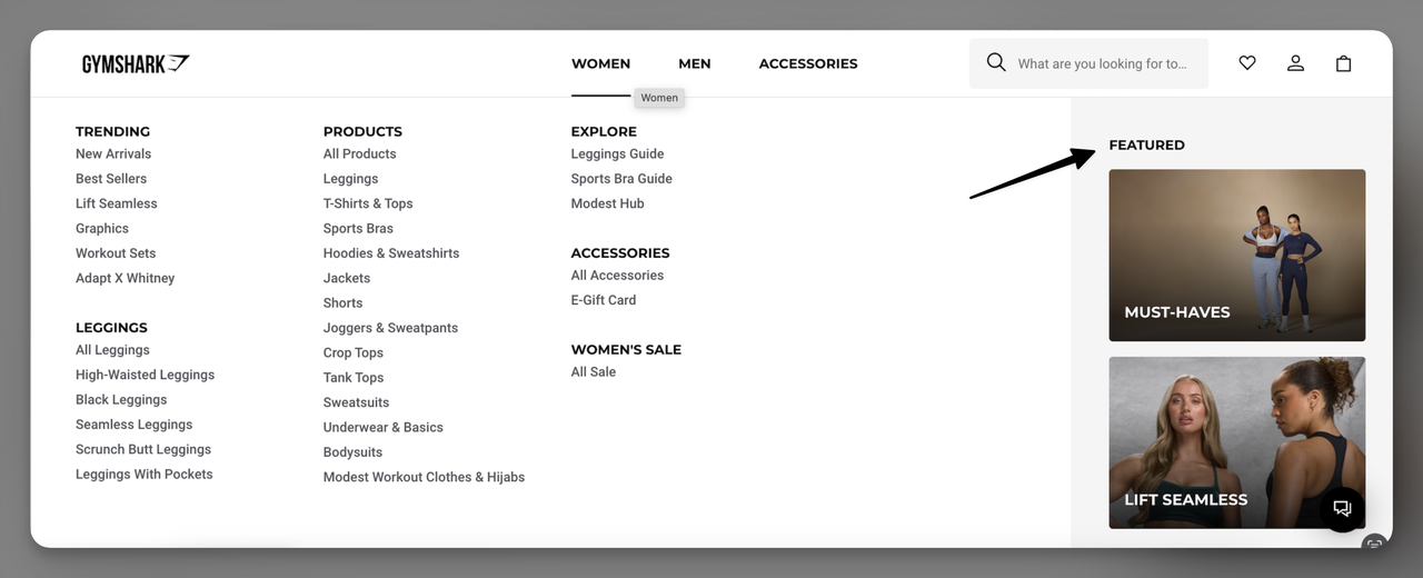
Gymshark adds product images directly into their mega menu featured section
What works: Gymshark places featured products on the right-hand side of their dropdown menu and includes actual product photos. Not thumbnails buried in a list, but prominent lifestyle-style images that show the product in context. The left side of the menu handles standard category navigation (Tops, Bottoms, Accessories), while the right side is reserved exclusively for featured items with visuals.
Why it works: Visual content processes 60,000 times faster than text in the human brain (MIT research). By adding product images to the navigation menu, Gymshark turns a functional UI element into a mini product showcase. The click-through rate on image-based menu items is consistently higher than text-only links because images trigger emotional responses that text can't match. For an activewear brand where fit and style are primary purchase drivers, showing the product early in the browsing journey is especially effective.
Key takeaway: If your products are visually driven (fashion, food, home decor), add product images to your navigation menu's featured section. Text links work for commodity products, but visual products need visual discovery.
8. Hydro Flask: Dedicated Featured Tab in the Sidebar
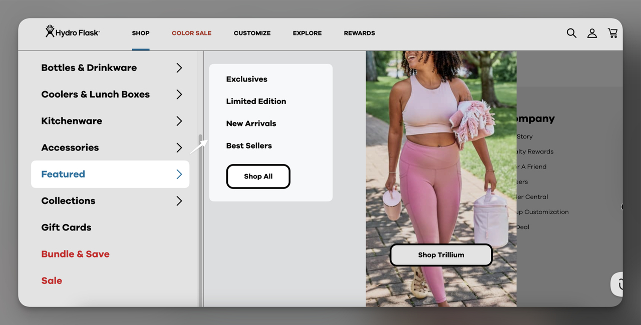
Hydro Flask gives featured products their own sidebar tab
What works: Hydro Flask gives "Featured" its own dedicated tab in the side navigation, equal in hierarchy to product categories like "Drinkware" and "Accessories." Within the tab, you'll find subcategories: Exclusives, Limited Edition, and New Arrivals. A "Shop All" button at the bottom catches anyone who wants to browse the full featured collection without committing to a subcategory.
Why it works: By elevating "Featured" to a top-level navigation item (not a subsection within a category), Hydro Flask signals that these products deserve special attention. The subcategory structure (Exclusives, Limited Edition, New Arrivals) serves three buyer types: collectors who want unique items, trend followers who want what's hot, and regular shoppers checking in on what's new. The "Shop All" CTA provides an escape hatch for shoppers who don't fit neatly into any subcategory.
Key takeaway: If you rotate featured products regularly, give them a top-level navigation tab rather than burying them inside a product category. It trains repeat visitors to check "Featured" first on each visit.
9. Package Free: Mobile-First Vertical Menu Placement
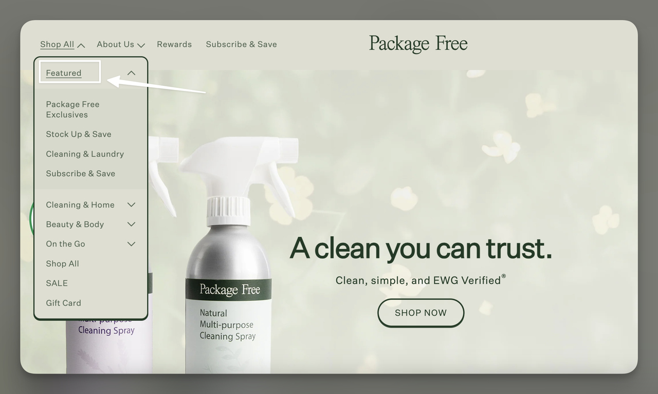
Package Free places Featured at the very top of their vertical sidebar menu
What works: Package Free positions "Featured" as the first item in their vertical sidebar navigation. No scrolling required. No competing elements above it. The simplicity here is the strategy. On mobile (where Package Free's eco-conscious audience frequently shops), a collapsible sidebar with "Featured" at the top means one tap to access curated products.
Why it works: Mobile ecommerce accounts for over 60% of online shopping traffic, but mobile conversion rates are still roughly half of desktop rates. The gap exists because mobile navigation is harder. By placing "Featured" at the very top of the sidebar, Package Free removes one of the biggest mobile UX friction points: finding the right product category on a small screen. First position in the menu means first seen, first tapped.
Key takeaway: For mobile-heavy audiences, put your featured section as the first item in your mobile navigation menu. Every extra scroll or tap you add loses shoppers.
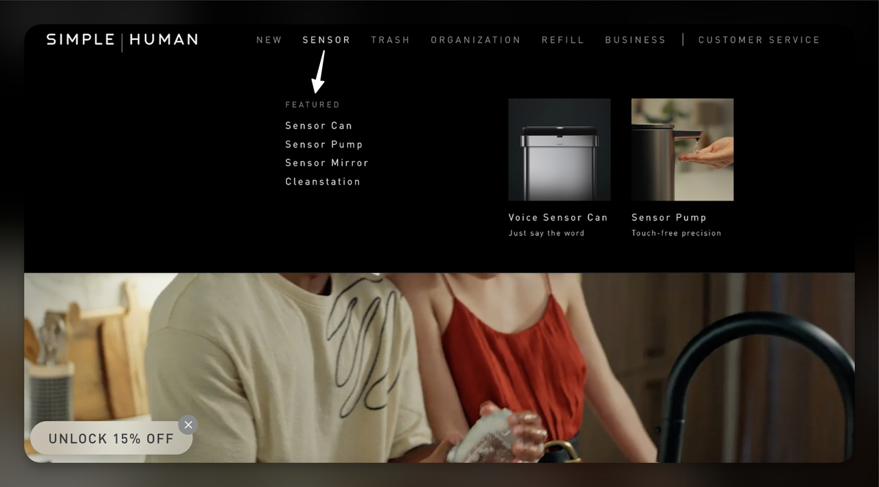
10. Simple Human (Sensor Tab): Tech-Forward Featured Products
Simple Human features sensor-technology products with supporting visuals
What works: Under their "Sensor" product category, Simple Human adds a "Featured" callout highlighting their most innovative products: Sensor Can, Sensor Pump, Sensor Mirror, and Cleanstation. Each featured item includes a product image alongside the text link, making the menu feel more like a product showcase than a navigation element. The pairing of product name plus image works especially well for tech products where the form factor matters.
Why it works: Tech products benefit from showing, not telling. A "Sensor Mirror" link means little to someone unfamiliar with the brand. But a "Sensor Mirror" link alongside an image of the actual product instantly communicates what it is and why it's interesting. Simple Human uses featured placement within category-specific dropdowns (not just the main menu), which means the featured items are contextually relevant. You're already browsing Sensor products, so seeing featured Sensor items feels natural, not promotional.
Key takeaway: For tech or innovative products, pair featured text links with product images inside category-specific menus. The image does more to explain the product than any label can.
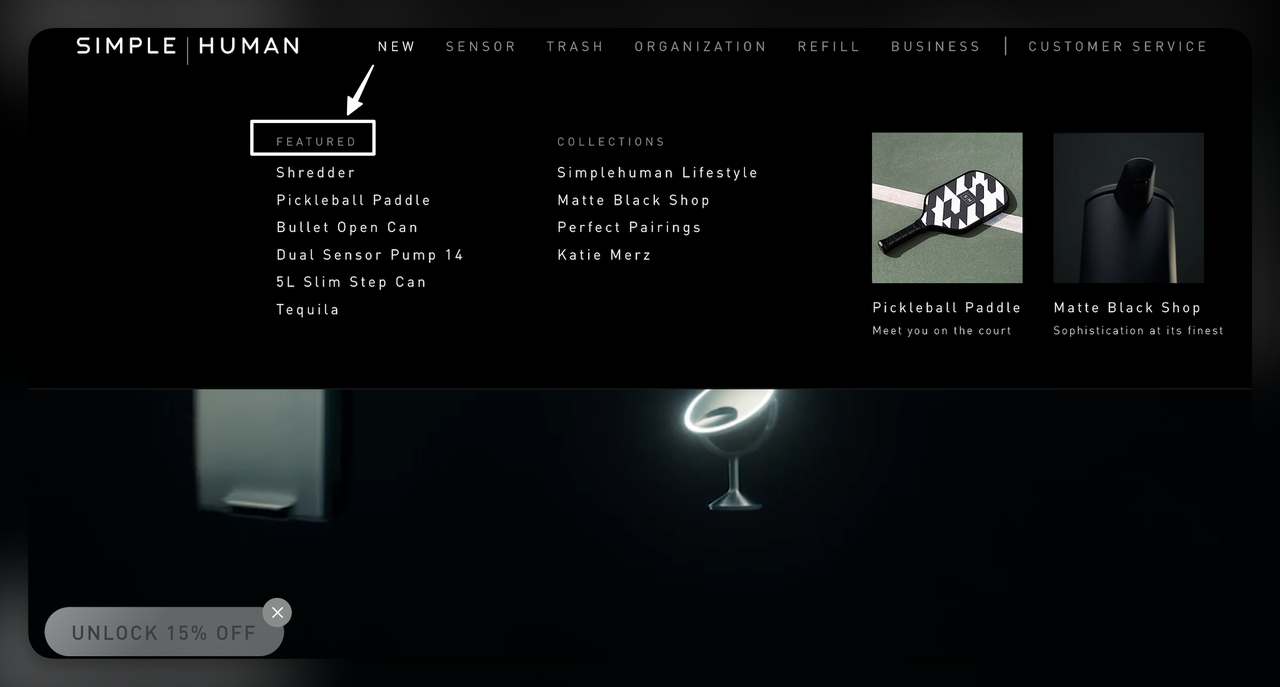
11. Simple Human (New Tab): Novelty-Driven Featured Products
Simple Human uses the New tab to feature unexpected product launches
What works: Simple Human's "New" tab dropdown features unexpected items like a Pickleball Paddle alongside their core home products. The "Featured" label within this tab highlights items the brand wants to push beyond their traditional category. Product images accompany each featured item, maintaining the visual consistency seen in their Sensor tab. What's unusual here is the product diversity: a home goods brand featuring sports equipment.
Why it works: Brand expansion relies on featured placement. When Simple Human launches a product outside their core category, featuring it prominently signals to shoppers: "This is still us. We're growing." Without that featured placement, the Pickleball Paddle would get buried in a miscellaneous category and never find its audience among existing Simple Human customers. Featured products aren't just about highlighting bestsellers. They're about directing attention to items that need strategic visibility.
Key takeaway: Use featured placement for product launches outside your core category. New product lines need visibility you can't get from organic browsing behavior alone.
12. Best Buy: Personalized Homepage Featured Products
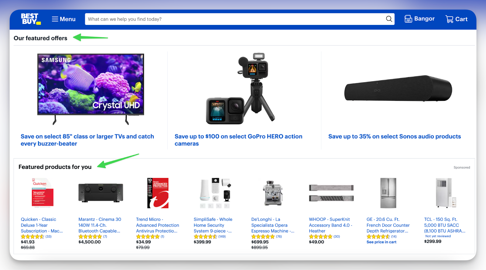
Best Buy combines curated offers with personalized featured product recommendations
What works: Best Buy runs two featured sections on their homepage simultaneously: "Our Featured Offers" (editorially curated deals) and "Featured Products For You" (algorithmically personalized). The first section is the same for all visitors and highlights current promotions. The second adapts based on browsing history, past purchases, and similar customer profiles. Both sections include product images, pricing, and savings badges.
Why it works: According to Daasity's 2026 site merchandising report, data-driven insights throughout the customer journey and intelligent cart upsells based on behavior are the top trends shaping ecommerce. Best Buy's dual approach covers both bases: editorial curation for new visitors (who have no browsing history to personalize against) and algorithmic personalization for returning customers. This hybrid model is where featured products are heading in 2026.
Key takeaway: Combine editorially curated featured products with algorithmic personalization. Use curated sections for new visitors and personalized sections for returning customers who have browsing data.
Where Should You Showcase Featured Products on Your Website?
Placement determines performance. I've tracked how different featured product positions affect engagement across the stores above, and the pattern is clear: visibility at the point of navigation intent beats visibility on static pages.
Here are seven placements ranked by impact, based on the examples above and my own testing:
1. Homepage hero section: Best for first impressions. Use this for seasonal launches, flagship products, or your single strongest promotion. Keep it to 1-3 items maximum. Include clear CTAs ("Shop the Collection," not "Learn More").
2. Navbar mega menu or dropdown: The most common placement among the 12 examples above, and for good reason. Alo Yoga, Everlane, Gymshark, Coop, and Simple Human all use this approach. Navigation menus are visible on every page, making featured products accessible regardless of where a shopper lands.
3. Sidebar or vertical menu: Works well on mobile. Hydro Flask and Package Free demonstrate this approach. Place your featured section at the top of the sidebar so it's the first thing shoppers see when they open the menu.
4. Category page headers: Feature products at the top of relevant category pages. Coop does this within their Pillows and Sheets categories. The advantage: shoppers already have category-level intent, so featured products feel like helpful recommendations rather than interruptions.
5. Dedicated homepage section: A standalone featured products block below the hero. Best Buy's approach with "Our Featured Offers" and "Featured Products For You" works well for stores with large catalogs. Limit to 4-8 items to avoid clutter.
6. Product recommendation popups: Use popups or slide-ins to feature products at strategic moments: exit intent, time on page, or cart addition. This is where tools like product recommendation popups can spotlight featured items without cluttering your page layout.
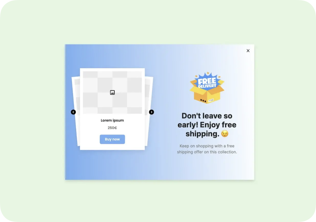
A featured product popup template you can clone for your store
7. Email marketing and newsletters: Feature products in email campaigns to drive engaged traffic back to your site. Use product recommendation emails to personalize featured items based on purchase history or browsing behavior.
How to Select the Right Products to Feature
Picking the wrong products to feature wastes your best real estate. I've seen stores feature items that look impressive but don't align with business goals, and the result is always the same: high impressions, low conversions.
Use these four criteria to build your featured products list:
Popularity vs. profitability: Bestsellers are safe picks because they've already proven demand. But don't ignore high-margin items that sell less frequently. Featured placement can shift their sales volume significantly. I've found the best approach is a mix: 60% proven sellers, 40% strategic picks (new launches, high-margin items, or clearance inventory you need to move).
Brand alignment: Every product you feature signals what your brand stands for. A minimalist home goods store featuring a neon novelty item sends mixed signals. Stick to items that reinforce your brand identity. Shoppers who trust your curation will buy more over time.
Audience relevance: Know whether your core customers are bargain hunters, quality seekers, or trend followers. Feature products that match their primary shopping motivation. If 70% of your customers use discount codes, featuring full-price premium items in your hero section is going to underperform.
Data-driven validation: Track conversion rates and click-through rates on your featured products. Rotate underperformers every 2-4 weeks. Use your analytics to confirm whether a product deserves featured status or just seemed like a good idea. Average website conversion rates sit between 2-5%, so featured products should aim to outperform your store's baseline.
What Impact Do Featured Products Have on Ecommerce Sales?
Featured products affect three performance dimensions: direct sales, customer engagement, and SEO. Here's what I've observed across the stores I've worked with and the data that backs it up:
Direct sales lift: When shoppers land on a homepage with a clear featured products section, they spend less time in navigation and more time on product pages. This matters because every additional navigation click is a drop-off point. Featured products create a shortcut from landing to product detail page, bypassing category browsing entirely.
Engagement and discovery: Featured sections drive curiosity. Shoppers who click on a featured item often explore related products, which lifts your average order value. This is especially true when you pair featured products with "You May Also Like" or "Complete the Look" cross-sells on the product page itself.
SEO benefits: Featuring products on your homepage and navigation creates strong internal linking to product pages. Those internal links pass authority from your highest-traffic page (usually the homepage) to specific product pages, improving their organic search rankings. Strategically featured products also improve dwell time and reduce bounce rates, both of which are positive user signals for search engines.
According to Digital Commerce 360, "When product discovery begins with a prompt, not a homepage, it is the quality of data that determines whether you get seen." This shift means your featured products need strong product descriptions and structured data to surface in AI-powered shopping tools too.
Featured Products on Shopify vs. WooCommerce: Platform Tips
Implementation varies by platform. Here's how to set up featured products on the two most popular ecommerce platforms.
Featured Products on Shopify
Shopify has native support for featured collections. You can create a collection, tag products for inclusion, and add it to your homepage or navigation through the theme editor. No code required for basic setups.
Quick setup:
1. Go to Products > Collections > Create Collection
2. Name it "Featured Products" and add items manually or set automated conditions (e.g., tag = "featured")
3. In your theme editor, add a "Featured Collection" section to your homepage
4. Add the collection to your navigation under Online Store > Navigation
For more advanced setups, Shopify's smart collections feature lets you auto-populate featured products based on conditions like inventory level, price range, or vendor.
Also explore our guide: "How to Add Featured Products to Your Shopify Store – In 8 Simple Steps"
Featured Products on WooCommerce
WooCommerce uses a "Featured" product attribute that you can toggle for any product in your catalog.
Quick setup:
1. Edit any product and click the star icon in the product list to mark it as Featured
2. Use the [featured_products] shortcode to display them on any page
3. Add a "Featured Products" widget to your sidebar or footer
4. For homepage placement, use blocks or page builders to embed the shortcode
WooCommerce's flexibility means you can display featured products on virtually any page using shortcodes, widgets, or Gutenberg blocks. The tradeoff is that it requires more manual setup than Shopify's drag-and-drop approach.
What's the Difference Between Featured Products and Popular Products?
These two terms get used interchangeably, but they serve different functions. Here's the distinction:
| Attribute | Featured Products | Popular Products |
|---|---|---|
| Selection | Hand-picked by your team | Determined by sales data |
| Goal | Strategic (launch, margin, brand) | Validation (social proof) |
| Changes | Rotated based on business needs | Shifts with customer demand |
| Control | Full control over what appears | Algorithm or sales-driven |
| Best for | New products, high-margin items, seasonal goods | Building trust with new visitors |
According to Airfocus, popular products are determined by metrics like sales data, website traffic, and repeat purchases. Featured products, in contrast, are deliberately chosen by the business regardless of current sales performance.
The smartest stores use both. Popular products build trust ("other people bought this, so it must be good"). Featured products drive strategy ("we want you to see this because it serves a business goal"). Coop Sleep Goods does this well: their "Bestseller" label handles the popular product function, while their "Featured" section handles strategic promotion.
Putting Featured Products to Work for Your Store
The 12 examples above share a common thread: intentionality. None of these brands randomly throw products into a "Featured" label. Each makes deliberate choices about placement (mega menu vs. sidebar vs. homepage), labeling ("Cult Favorites" vs. "Featured" vs. "New"), and visual execution (text links vs. product images).
Three patterns stood out across every high-performing example:
Position featured products at decision points. The most effective featured sections appear in navigation menus (where shoppers are actively deciding where to browse), not on static pages they might never visit.
Use labels that match your brand voice. "Featured" is functional but forgettable. "Cult Favorites," "Staff Picks," or "Trending Now" add personality and social proof simultaneously.
Show the product, don't just name it. Gymshark and Simple Human prove that adding product images to featured sections inside navigation menus drives more engagement than text links alone.
If you're running a Shopify or WooCommerce store and want to start with a low-effort test, create a featured collection of your top 6 products and add it to your main navigation. Measure click-through rates for two weeks, then iterate. For stores looking to promote featured products through targeted popups or slide-ins, tools like an ecommerce popup builder can get you set up without any code changes.
Frequently Asked Questions
What is a featured item?
A featured item is a single product spotlighted within a featured products collection or section. It can be a bestseller, a new arrival, a limited-edition release, or any product the store wants to push. The "featured" status is temporary and strategic. A product might be featured for a week during its launch, then rotated out as the next priority takes its place.
What are featured products in ecommerce?
In ecommerce, featured products are items given premium visibility on a website to guide purchasing decisions. They typically appear in navigation dropdown menus (like Alo Yoga's "Featured Shops"), homepage hero sections (like Best Buy's "Our Featured Offers"), sidebar tabs (like Hydro Flask's dedicated "Featured" tab), or popup campaigns. The goal is to reduce browsing friction by pointing shoppers toward curated selections rather than making them search through the entire catalog.
How do you choose featured products for your online store?
Start with your business goal. If you're launching a new product line, feature those items. If you need to improve margins, feature higher-margin products that need more visibility. Then validate with data: check conversion rates, click-through rates, and revenue per featured slot. Rotate products every 2-4 weeks to keep the section fresh. I typically recommend a mix of 60% proven performers and 40% strategic picks (new items, seasonal products, or inventory you need to move).
What are the benefits of featured products in ecommerce?
Three main benefits: reduced browsing friction (shoppers find what you want them to see faster), strategic inventory management (you control which products get the most visibility), and improved conversion rates (curated selections convert better than unguided browsing). Featured products also create stronger internal linking structures, which helps product pages rank better in search engines. For stores using ecommerce personalization, featured sections serve as a baseline experience that can be dynamically adapted for returning visitors.
What are examples of product features vs. featured products?
Product features are attributes of an individual item: size, material, battery life, waterproof rating. Featured products are items a store chooses to highlight in premium positions on their website. They're completely different concepts. A product's features determine its value proposition. A product's "featured" status determines its visibility on your site. Both matter for conversions, but they operate at different levels of your ecommerce strategy.

How would you rate your experience with this article? 😊