12 Captivating Product Headline Examples from Brands
Defines product headlines as attention-grabbing titles/subtitles highlighting benefits, quality and reliability; gives 12 brand examples and tips to improve (know audience, be unique, clear length, social proof, strong CTA plus description/image).
Product headlines are the critical elements of keeping your visitors with you.
The best product headline examples combine specific benefits, emotional triggers, and clear calls to action to turn browsers into buyers. I analyzed 80+ product pages across cosmetics, food, fashion, and tech brands and selected these 12 based on copy originality, and visual impact. Each breakdown below explains what works, why it works, and how you can adapt it.
What Makes a Strong Product Headline?
A product headline is the short, prominent text on a product page or landing page that communicates a product's core benefit and convinces visitors to keep reading. It's not just a name or tagline. A strong headline does three things at once: grabs attention, sets expectations, and moves people toward a purchase decision.
I evaluated 80+ product pages and narrowed this list to 12 based on three criteria:
• Copy originality: The headline uses a technique I didn't see repeated across 10+ other brands (wordplay, sensory language, scarcity framing)
• Visual integration: The headline works with the surrounding imagery rather than sitting on top of a generic background
• Reproducibility: A marketer with a standard landing page builder could recreate the approach in under 30 minutes
According to RiverEditor's 2026 headline research, headlines with numbers get 36% higher click-through rates than those without. That single data point explains why so many of these examples lead with quantities, percentages, or limited-edition counts.
Quick Look at All 12 Product Headline Examples
| # | Brand | Industry | Why It Works |
|---|---|---|---|
| 1 | NYX Cosmetics | Beauty | Pop-culture collaboration as headline hook |
| 2 | Revlon | Beauty | Category-specific wordplay for each product line |
| 3 | Lotus Bakeries | Food | Brand story over brand name |
| 4 | Pernod Ricard | Beverages | Heritage and origin as trust signals |
| 5 | Everlane | Fashion | Minimalist copy matching brand values |
| 6 | Apple | Tech | Curiosity gap with ultra-short copy |
| 7 | Polaroid | Photography | Exclusivity without a CTA |
| 8 | Mucinex | Healthcare | Character-driven storytelling |
| 9 | Dickinson's | Skincare | Ingredient-forward headline with animated proof |
| 10 | Lancome | Luxury Beauty | Contrasting tones across product tiers |
| 11 | Nine West | Fashion | Seasonal urgency paired with action verbs |
| 12 | Follow Your Heart | Vegan Food | Mission-driven copy with recipe CTA |
1. NYX Cosmetics: Pop-Culture Collaboration as a Headline Hook
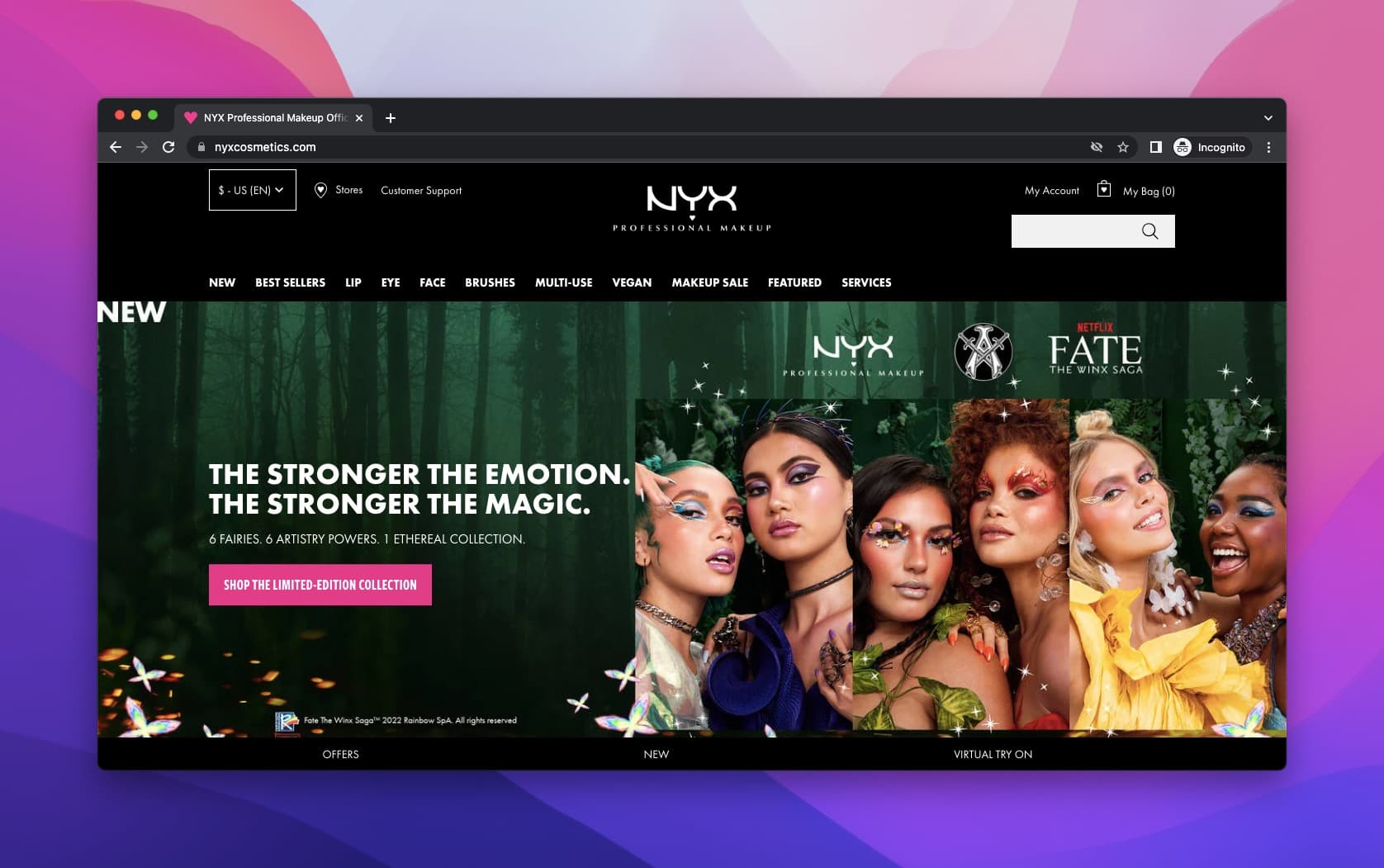
NYX x Fate: The Winx Saga collaboration hero section
What works: NYX, a subsidiary of L'Oreal, tied its headline to the Netflix show Fate: The Winx Saga, borrowing the show's existing audience. The headline references the magical theme of the series rather than leading with product specs. Six models wearing bold, colorful looks fill the hero image, giving visitors an immediate visual reason to scroll. The description below the title keeps it short and benefit-driven, referencing the "newness" of the collection.
Why it works: Co-branding headlines tap into an existing fan base's emotional attachment. Instead of competing for attention from scratch, NYX rides the recognition of a show with millions of viewers. This is the halo effect in action: positive feelings about the show transfer to the product line.
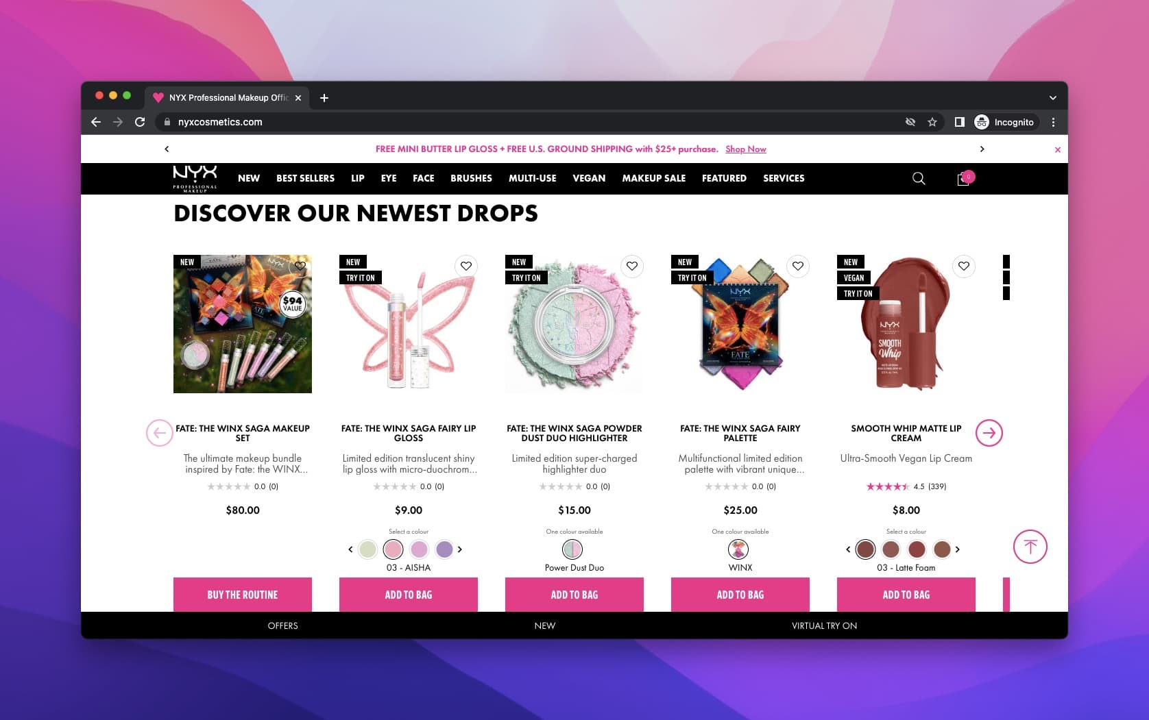
NYX product grid with individual headlines
Below the hero, each product carries its own micro-headline. Some are longer and deliberately tease details, creating a curiosity gap. Every product card includes a CTA button, which keeps the purchase path visible at all times.
Key takeaway: Tie your product headline to a cultural moment or brand collaboration your audience already cares about. It borrows trust and attention you don't have to build from zero.
2. Revlon: Category-Specific Wordplay
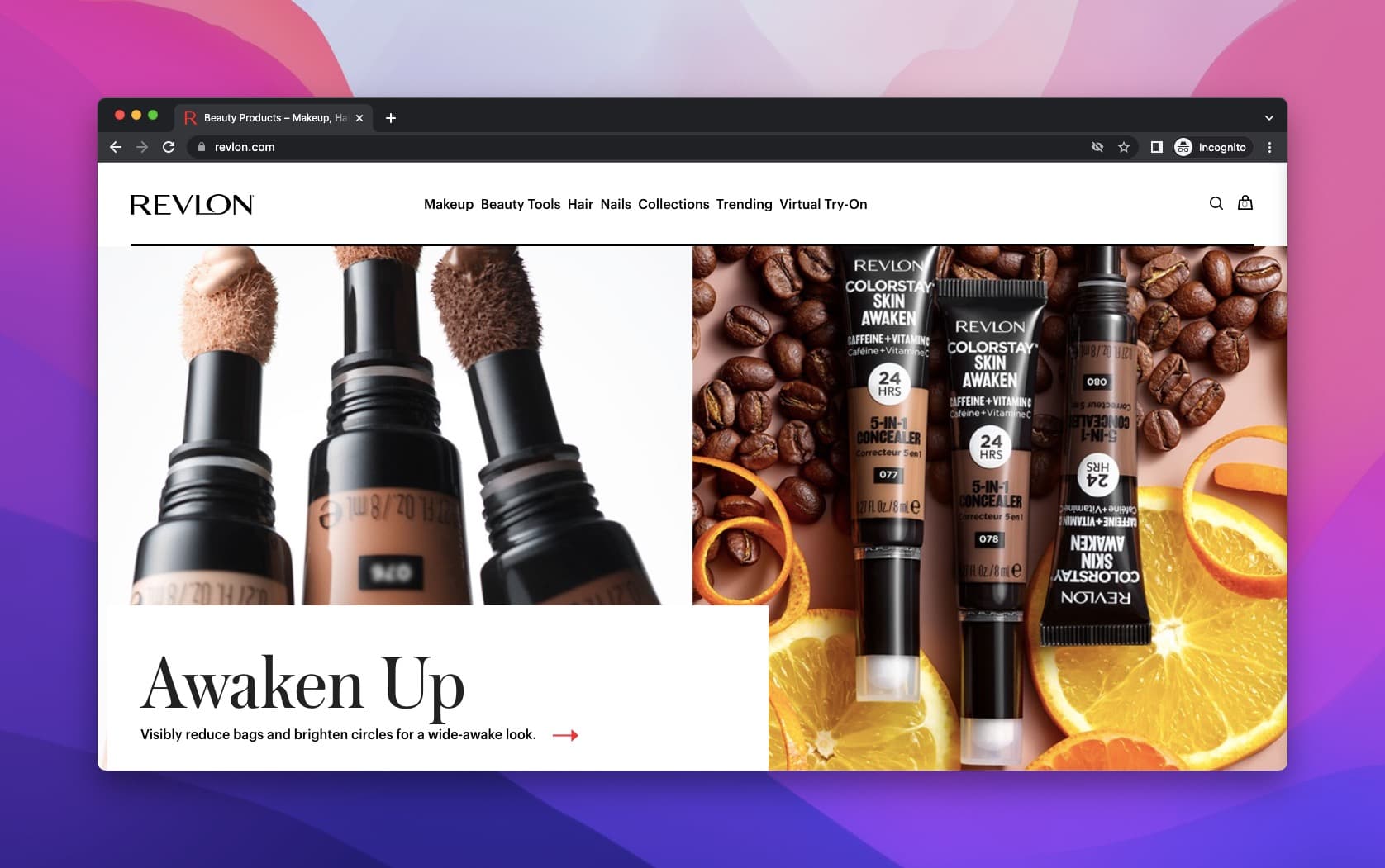
Revlon concealer: "Awaken Up" headline
What works: Revlon doesn't use one generic tagline across all products. Each category gets its own wordplay headline matched to the product's purpose. Concealers get "Awaken Up" (a play on "wake up" tied to the concealing function), while lip crayons get "Wanna Play?" to emphasize color variety and fun. This approach treats every product line as its own mini-campaign.
Why it works: Category-specific headlines signal to visitors that they've landed on a page built for them, not a generic catalog. According to JeremyMac's copywriting statistics compilation, users who scroll through 70% or more of a page are 3x more likely to convert. Tailored headlines reduce early bounces and encourage deeper scrolling.
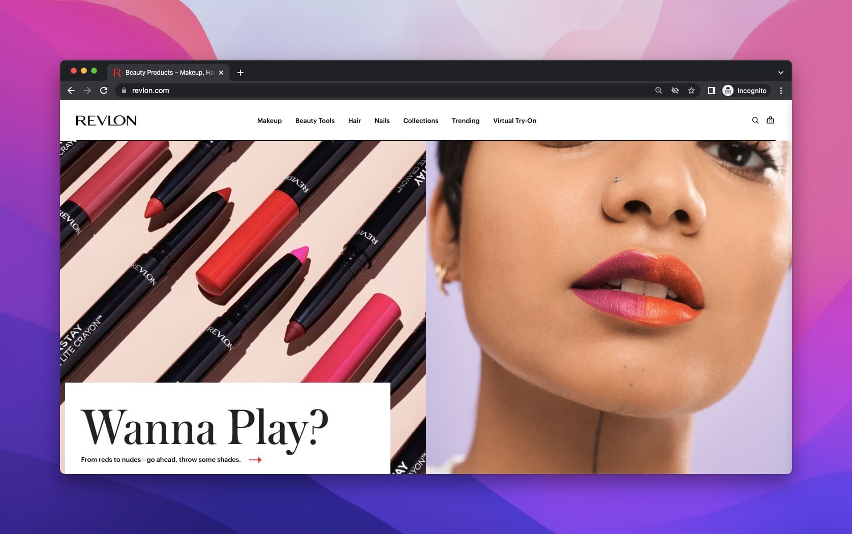
Revlon lip crayons: "Wanna Play?" headline
The full-width product image behind the "Wanna Play?" headline makes the colors impossible to miss. Revlon pairs the visual punch with playful copy, making the headline and image reinforce each other rather than competing for attention.
Key takeaway: Write a different headline for each product category. A one-size-fits-all tagline tells visitors you didn't think about their specific need.
3. Lotus Bakeries: Brand Story Over Brand Name
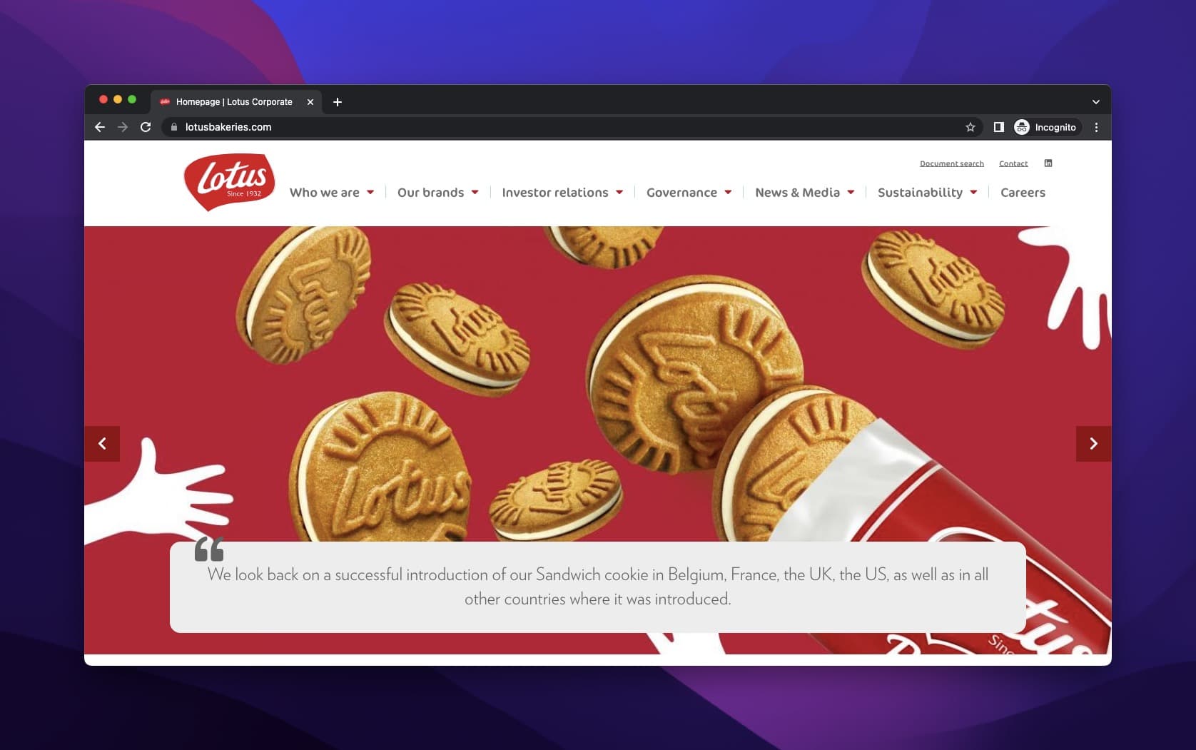
Lotus Bakeries' brand-first product page
What works: Lotus Bakeries, a Belgian company producing biscuits since 1932, doesn't lead with its name. The product headline focuses on the story behind the biscuits: the heritage, the red brand color, and the craft. Visitors absorb the brand identity through visual and narrative cues rather than a stamped logo. The imagery is dense with biscuits, reinforcing what the company does without saying it outright.
Why it works: Brands with high name recognition can afford to let the product speak. Lotus treats its homepage like a gallery, not a catalog. This works because established brands face a different challenge than newcomers: they don't need to introduce themselves, they need to remind you why you already trust them. The technique is unique selling proposition reinforcement through visual consistency.
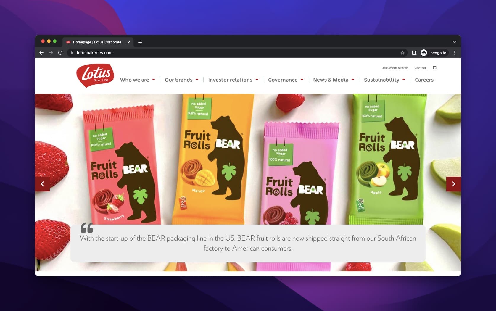
Lotus new product launch with minimal text
For new product launches, Lotus keeps the headline to a simple explanation without even naming the product line. The large product image takes over, and the text serves as a supporting detail.
Key takeaway: If your audience already knows your brand, lead with your story and let visuals carry the product name. Save the hard sell for less recognized product lines.
4. Pernod Ricard: Heritage as a Trust Signal
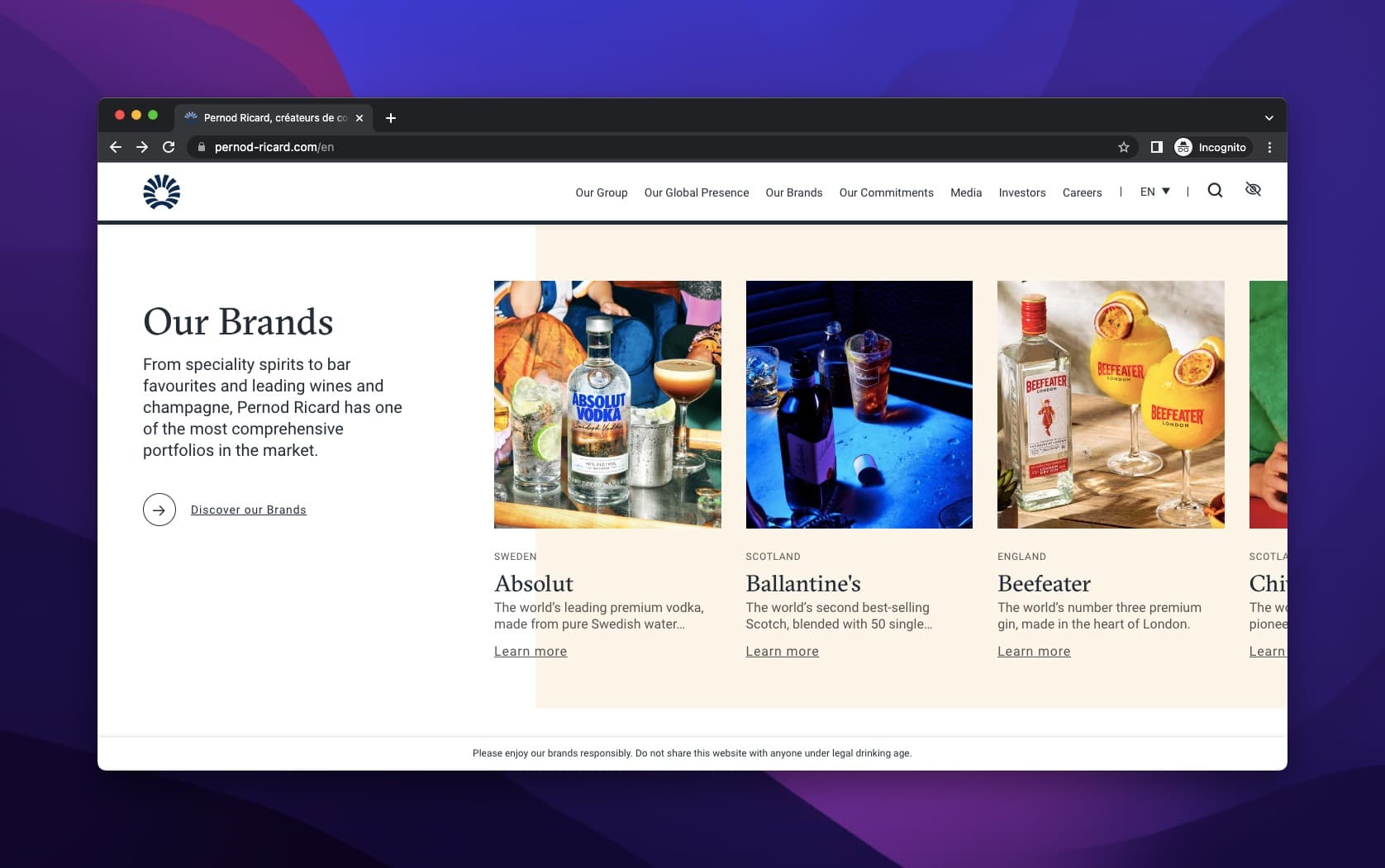
Pernod Ricard's "Our Brands" portfolio page
What works: Pernod Ricard, a French beverage company known for its anise-flavored spirits, uses the headline "Our Brands" as an umbrella and lets each product carry its own name, image, and short description. Every product gets a "Learn More" CTA that leads to a dedicated page. This two-tier approach separates the portfolio overview from deep-dive product storytelling.
Why it works: Portfolio-style product headlines reduce decision fatigue. Instead of forcing visitors to choose from a giant list, Pernod Ricard gives each brand its own space and lets curiosity drive the click. The "Learn More" CTA is low-commitment, which matters for high-consideration purchases like premium spirits.
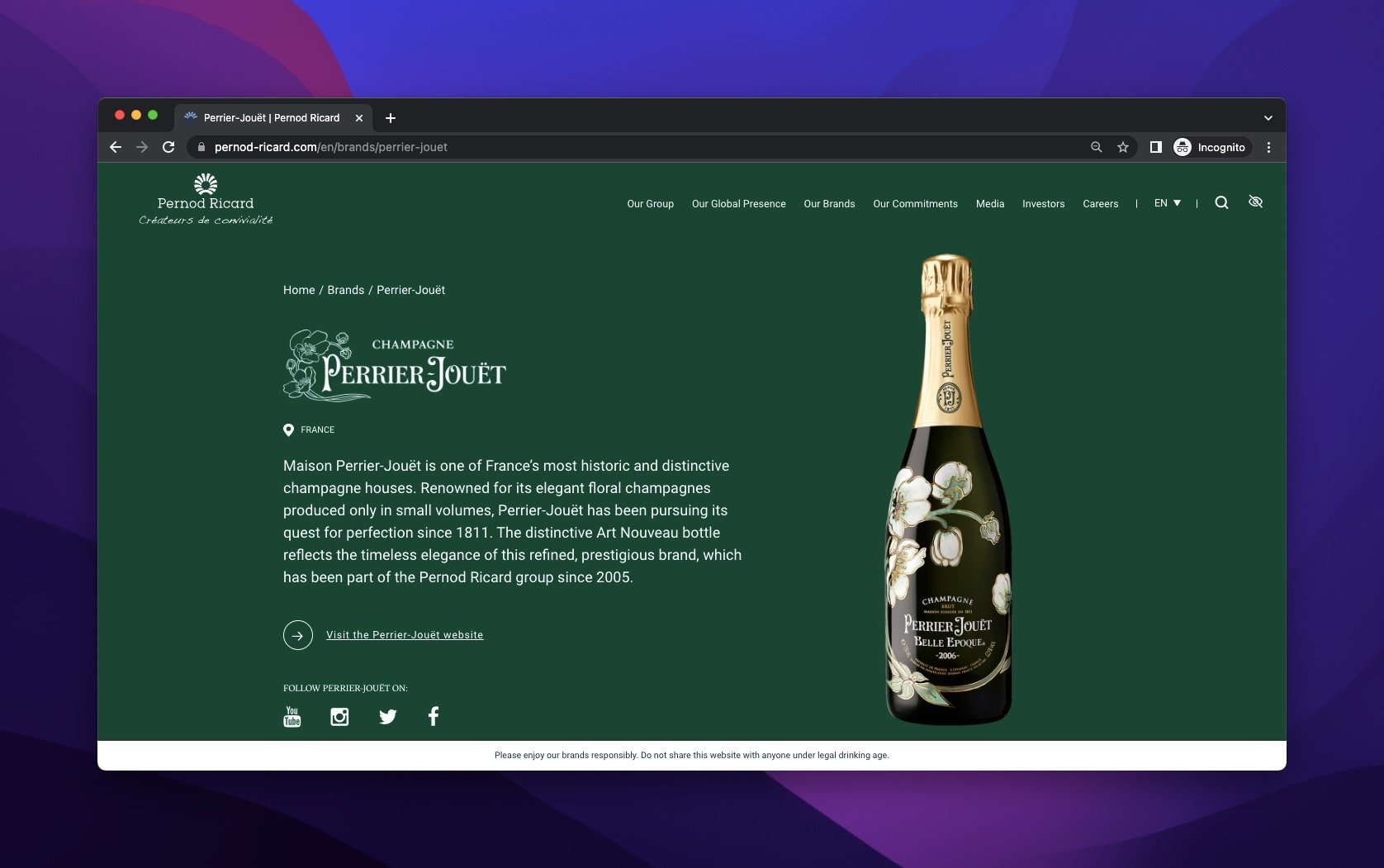
Perrier-Jouet's individual product page with origin story
On individual product pages, Pernod Ricard includes the product's original location and founding date. These heritage details function as trust signals (think of them as social proof from history). The dedicated CTA directs visitors to the product's own website for purchase.
Key takeaway: For brands with multiple product lines, create a portfolio headline that gives each product breathing room. Then use dedicated pages with heritage details to build trust for high-consideration purchases.
5. Everlane: Minimalist Copy That Matches Brand Values
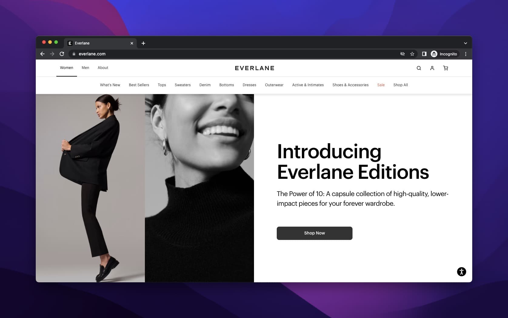
Everlane's new edition announcement
What works: Everlane, a fashion brand built on ethical transparency, uses its product headline to announce new editions with minimal words. The black-and-white palette matches the brand's clean aesthetic. The headline is assertive: it tells you exactly what's new, why it matters, and where to go next. No fluff, no decorative adjectives.
Why it works: When your brand promise is radical transparency, your headline copy needs to feel transparent too. Long, flowery descriptions would undermine the brand positioning. Everlane's spare approach creates a Gestalt effect where whitespace carries as much meaning as the text. The copy-to-image ratio heavily favors the image, which is the right call for fashion where visual appeal drives decisions.
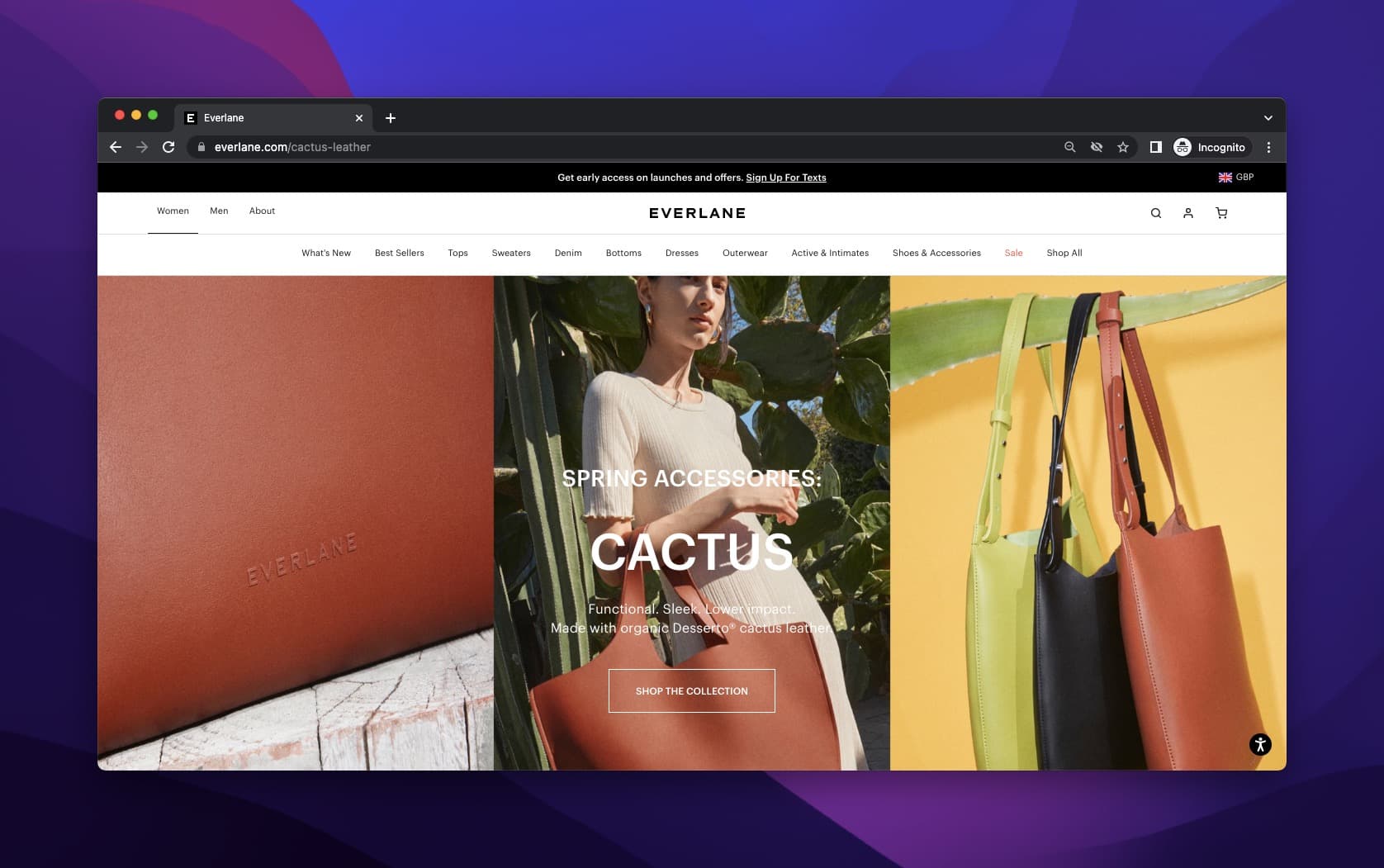
Everlane Cactus collection with image-forward layout
In the Cactus spring series, Everlane pushes the image even further into the background, layering product headline text at the forefront. Despite the readability trade-off, it works because all three conversion elements are present: product name, benefit description, and a CTA button.
Key takeaway: Match your headline's tone and length to your brand's values. If you sell simplicity, your headline should be simple. If you sell luxury, your headline should feel premium.
6. Apple: The Curiosity Gap with Ultra-Short Copy
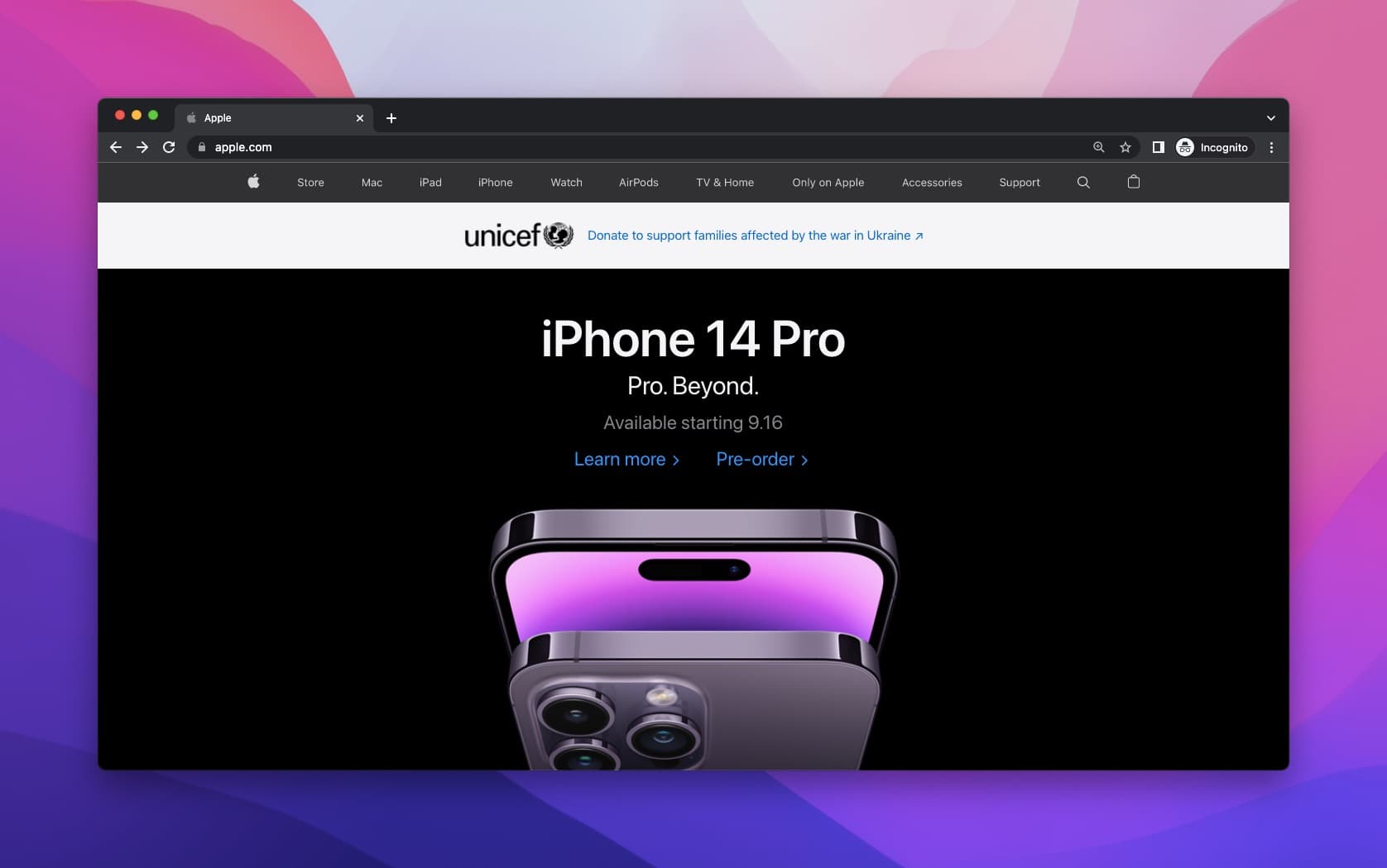
Apple iPhone 14 Pro launch headline
What works: Apple describes a new iPhone with fewer than ten words. No feature list, no spec sheet, no comparison chart. The headline does one thing: make you curious enough to scroll. The black background isolates the product and the text, eliminating distractions. Apple's pre-order announcements add artificial scarcity (limited availability, specific launch dates), which turns the headline into a countdown.
Why it works: Apple benefits from decades of brand equity. Most visitors already know what an iPhone does. The headline doesn't need to educate; it needs to create desire. This is the Zeigarnik effect: incomplete information creates psychological tension that drives people to seek closure (by scrolling, clicking, or pre-ordering). Few brands can pull this off because few have Apple's recognition.
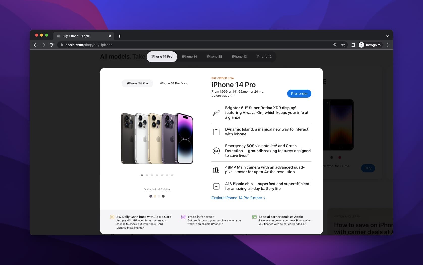
Apple pre-order page with specs as micro-headlines
The pre-order page flips the script. Here, Apple provides a full product headline: colors, sizes, price, payment options, and features. The contrast between the teaser headline and the detail-packed pre-order page creates a satisfying reveal that keeps visitors engaged through the full funnel.
Key takeaway: If your brand has high recognition, say less in your headline. Let curiosity do the selling. If you're a newer brand, you can't afford this approach. Lead with benefits instead.
7. Polaroid: Exclusivity Without a CTA
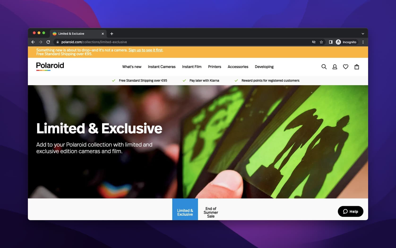
Polaroid's limited edition product page
What works: Polaroid's limited edition page breaks a standard e-commerce rule: there's no CTA in the hero section. The headline and description focus entirely on the product's exclusivity and the craft behind the film. A hand holding the film serves as the hero image, centering the product in a personal, tactile context. The "Add to Cart" buttons only appear further down the page, next to individual products with prices.
Why it works: By withholding the CTA, Polaroid creates a content-first experience that feels more like editorial than e-commerce. This works for niche audiences who already know what they want. Photography enthusiasts don't need to be sold on Polaroid film; they need to be shown which edition is available. The delayed CTA turns the page into a discovery experience rather than a checkout flow.
Key takeaway: For niche products with a passionate audience, try removing the CTA from your hero section. Let the product story build desire before you ask for the sale.
8. Mucinex: Character-Driven Storytelling
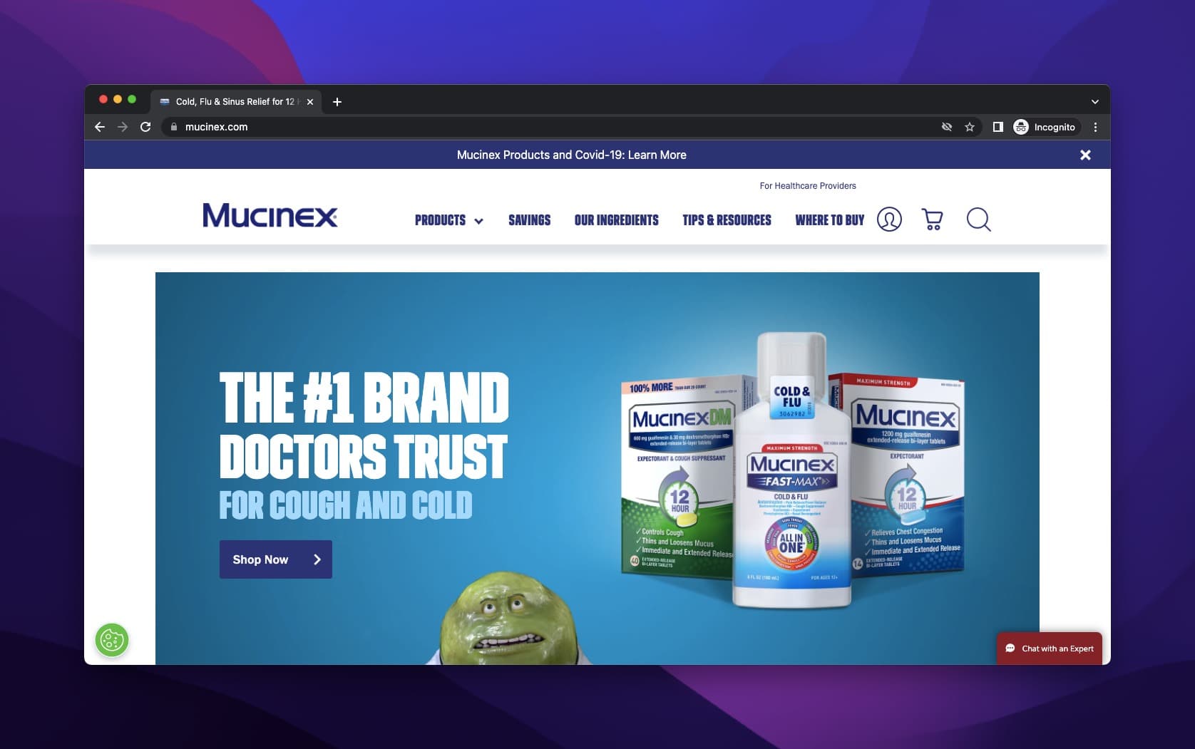
Mucinex's character-driven product page
What works: Mucinex created a branded mascot (the green mucus character) that personifies the problem the product solves. The product headline leans into this character-driven approach, using animated figures to communicate that colds and congestion are more disruptive than people think. Doctor endorsements sit below the headline, providing credibility. A CTA button directs visitors to specific product pages.
Why it works: Character mascots create brand recall that text alone can't match. Think about it: you don't remember most cold medicine headlines, but you probably remember the Mucinex character. This approach shifts the headline's job from "describe the product" to "make the problem feel real and relatable." The doctor reviews underneath add the clinical trust signal that balances the playful mascot.
Key takeaway: If your product solves an unpleasant problem, consider personifying the problem in your headline imagery. Pair it with professional endorsements so the humor doesn't undermine credibility.
9. Dickinson's: Ingredient-Forward Copy with Animated Proof
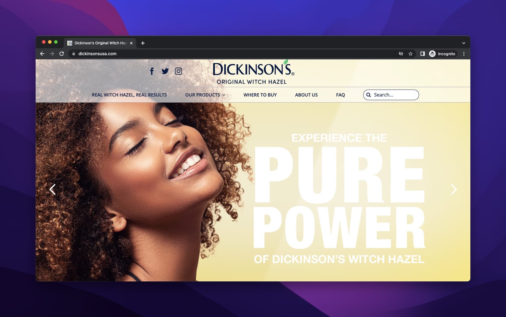
Dickinson's "Pure Solution" hero section
What works: Dickinson's welcomes visitors with a large-format slogan centered on purity, which is one of the brand's core promises. The yellow background and large typography make the headline impossible to miss. The model's relaxed, natural expression reinforces the "pure and simple" messaging without feeling staged.
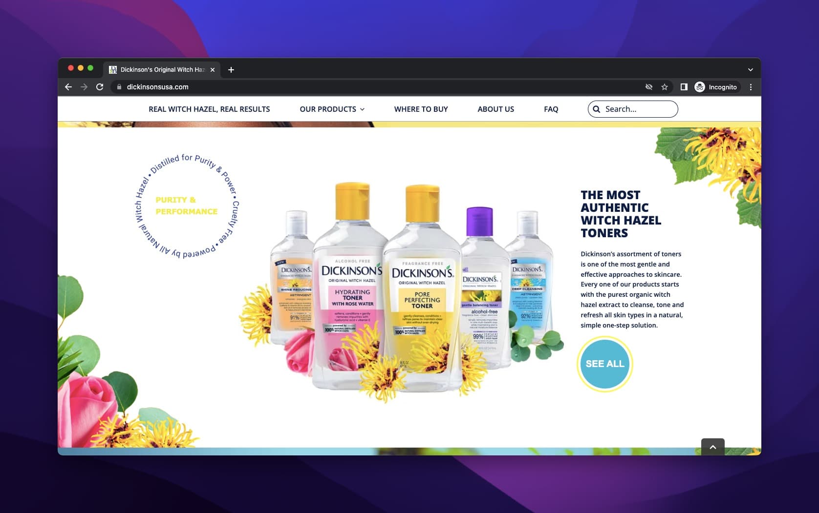
Dickinson's witch hazel toners with animated ingredient highlight
Why it works: Below the hero, the toner products display alongside an animated, spinning circle that highlights the key features of witch hazel. This animation does what a static bullet list can't: it draws the eye repeatedly and creates a sense of motion on an otherwise static page. The ingredient-forward approach works especially well in skincare, where buyers care deeply about what's in the product. The CTA sits next to the product display for anyone ready to buy.
Key takeaway: Lead with your hero ingredient if your product category is ingredient-driven (skincare, food, supplements). Pair it with an animated or interactive element to keep the feature list from feeling flat.
10. Lancome: Contrasting Tones Across Product Tiers
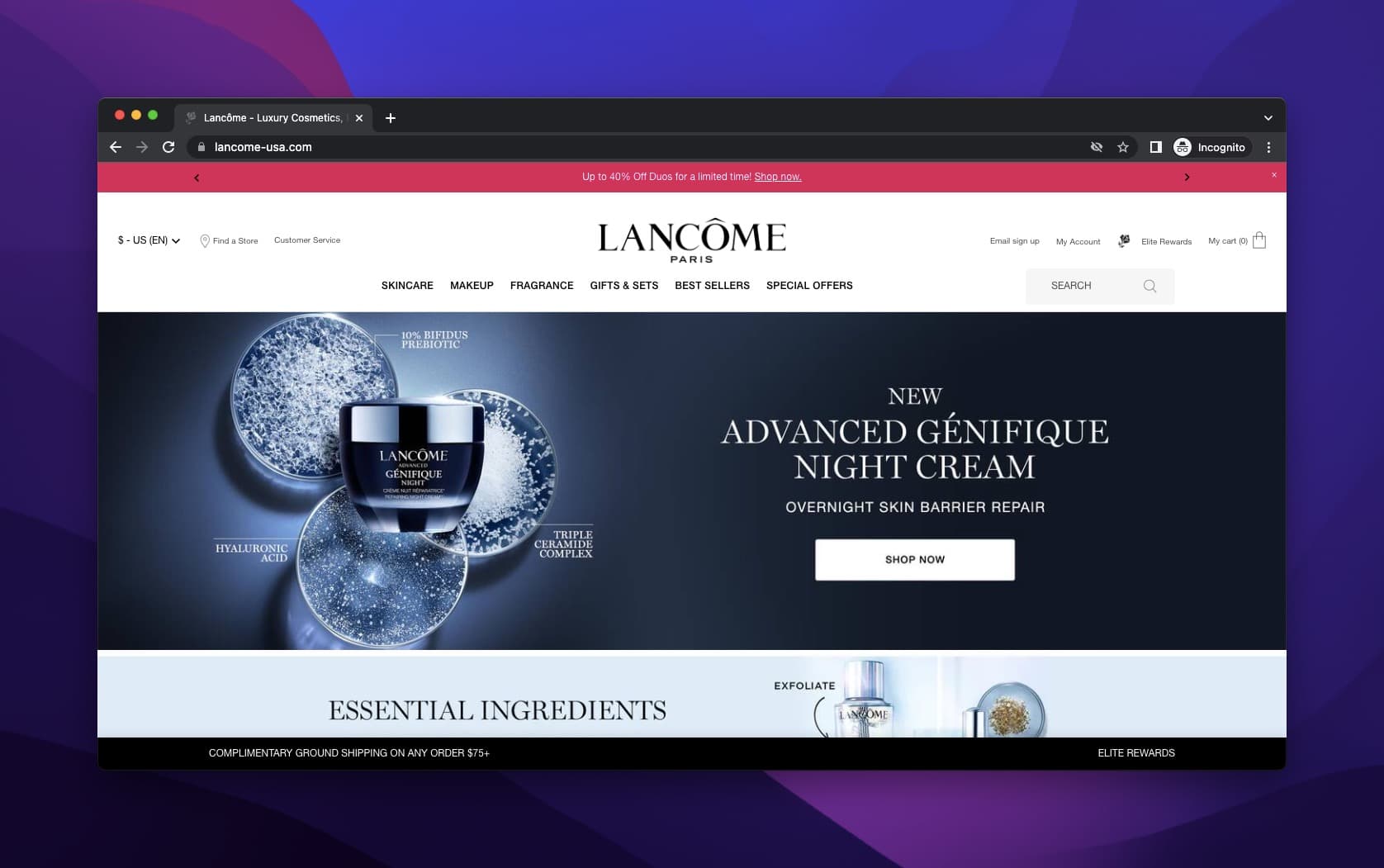
Lancome above-the-fold: dark, elevated tone
What works: Lancome, a L'Oreal partner brand, uses two different visual tones on the same page. The above-the-fold section features a dark background with refined typography and a single product hero. Further down, the page switches to a gold, luminous background with bolder copy. The headline text matches each visual mood: restrained and premium up top, aspirational and intense at the bottom.
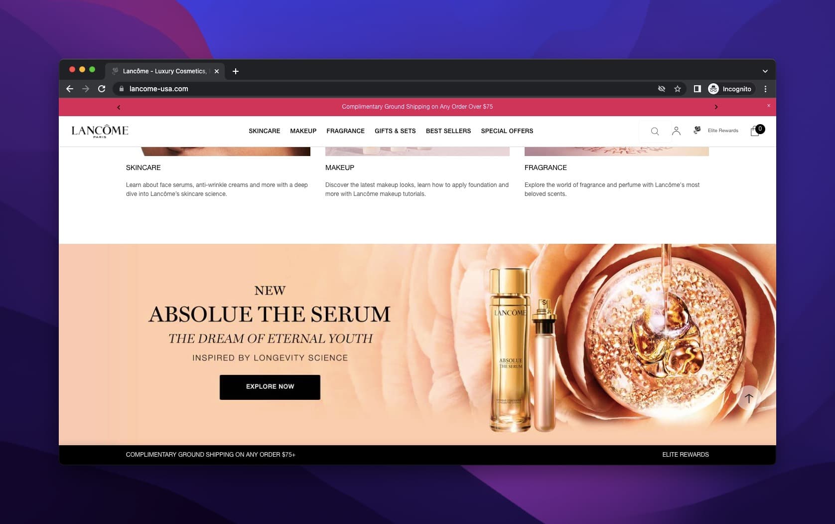
Lancome's gold-toned secondary product section
Why it works: Visual contrast within a single page prevents "banner blindness," the phenomenon where visitors stop seeing elements that look the same. By shifting from dark to gold, Lancome resets the visitor's attention and creates two distinct moments of engagement. The headline copy follows the visual shift: the dark section promises clinical results, while the gold section promises luxury and transformation. This dual-tone approach works for brands with products spanning different price or benefit tiers.
Key takeaway: If you sell products at different price tiers, use contrasting visual tones and headline copy for each tier. A single aesthetic gets ignored after the first scroll.
11. Nine West: Seasonal Urgency with Action Verbs
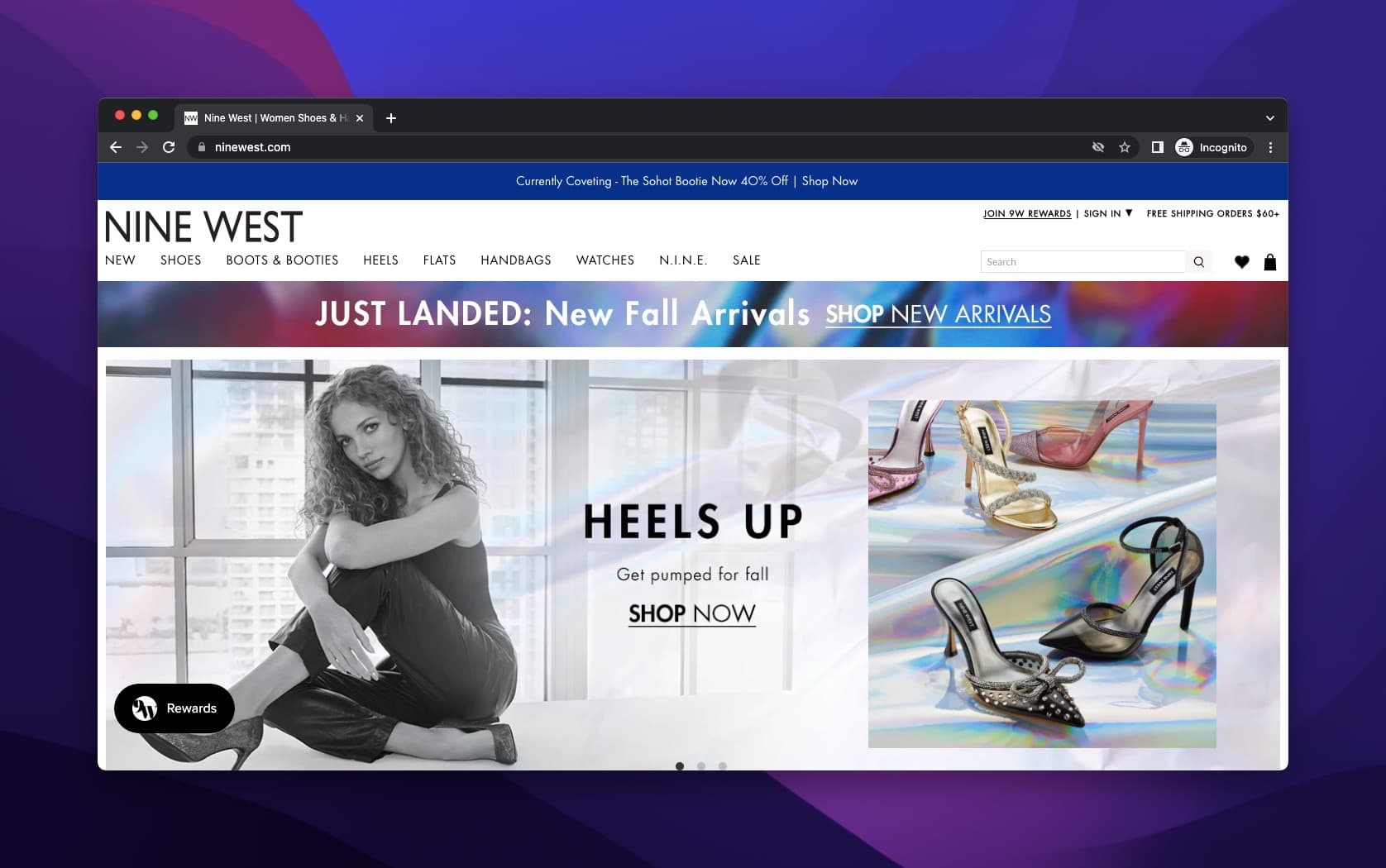
Nine West "Heels Up" campaign
What works: Nine West's product headline for its heels collection uses a two-word action phrase: "Heels Up." It's direct, category-specific, and functions as both a product description and a command. The model image demonstrates the product in use, which makes the headline feel less like marketing and more like a suggestion from a friend. The CTA "Shop Now" sits in a contrasting color.
Why it works: Action verbs in headlines outperform passive descriptions because they create a sense of movement and possibility. "Heels Up" doesn't describe a shoe. It describes an experience. For seasonal campaigns, this matters: seasonal urgency works best when paired with copy that makes the season feel exciting rather than expiring.
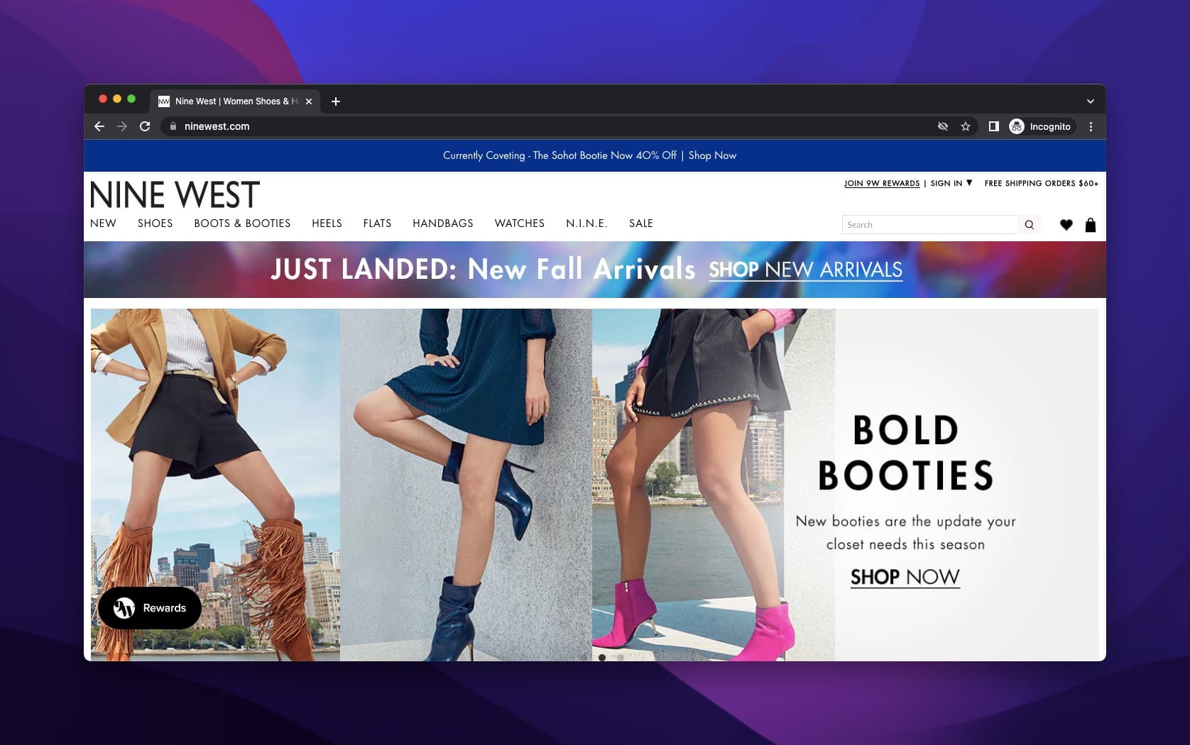
Nine West "Bold Booties" fall campaign
The fall boots campaign follows the same pattern: "Bold Booties" combines an adjective with the product name, creating a mini-brand within the broader collection. Nine West's consistent use of "Shop Now" as the CTA across both campaigns shows that consistency in CTAs can work when the headline itself does the differentiating.
Key takeaway: Use two-word action phrases as product headlines for seasonal collections. They're easy to remember, fast to scan, and they double as hashtags for social promotion.
12. Follow Your Heart: Mission-Driven Copy with a Recipe CTA
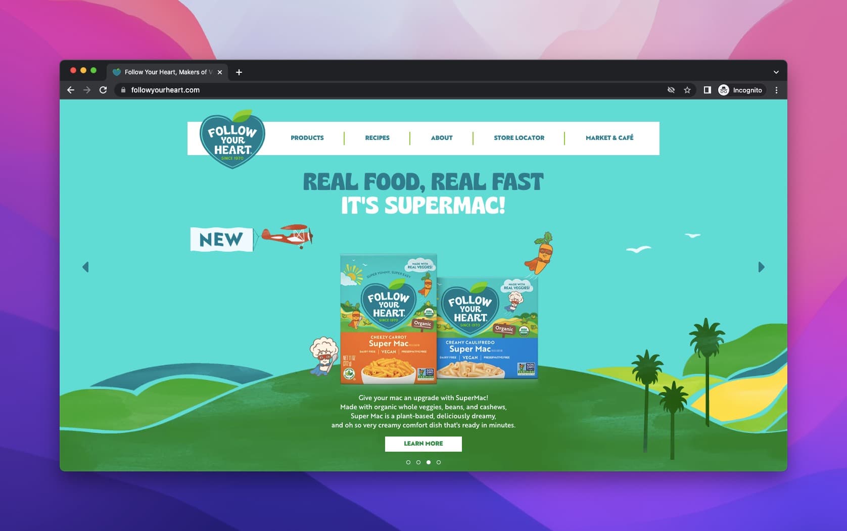
Follow Your Heart's Supermac launch
What works: Follow Your Heart, a vegan food brand committed to sustainability, opens with a motto: "Real Food, Real Fast. It's Supermac!" The headline introduces an upgraded version of an existing product, framing it as both fast and real (addressing the common criticism that vegan food is either slow to prepare or heavily processed). The animated art style matches the brand's green-oriented identity, with nature-inspired illustrations surrounding the product.
Why it works: Mission-driven headlines convert well with values-aligned audiences because they signal "you're in the right place" before describing the product. Follow Your Heart doesn't lead with taste or price. It leads with identity. The perfectly placed CTA sits right below the product description, catching visitors at peak interest.
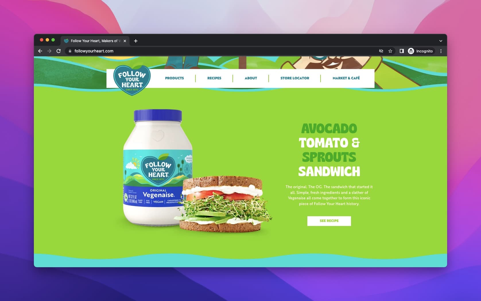
Follow Your Heart product with recipe-based CTA
Further down, the brand shows where the product can be used and provides a recipe CTA instead of a direct purchase button. This is smart for food products: recipes are shareable content that extend the product's reach beyond the product page. The animated, green-oriented illustrations create a consistent world that feels genuine to the brand's sustainability mission.
Key takeaway: If your product serves a values-driven audience (vegan, eco-friendly, ethical), lead your headline with your mission, not your features. Then use a content-based CTA (recipe, guide, tutorial) to extend engagement beyond the purchase.
How to Improve a Product Headline
If your current product headline isn't converting, these seven strategies can fix it. Each one is drawn from the patterns that made the 12 examples above work.
1. Lead with the benefit, not the product name. Unless you have Apple-level brand recognition, your visitors care about what the product does for them, not what it's called. Flip the order: benefit first, product name second.
2. Cut it to under 8 words. The strongest headlines on this list — "Heels Up," "Awaken Up," "Wanna Play?" — are all under 8 words. Short headlines are scannable on mobile, fit inside social share previews, and force you to prioritize the single most compelling idea.
3. Add sensory or emotional language. BLK & Bold's "mouthwatering" language and Lotus Bakeries' "irresistible" positioning work because they trigger a physical or emotional response. Swap abstract adjectives ("great," "innovative") for words your audience can feel.
4. Write different headlines for different product categories. Revlon writes category-specific headlines instead of using one tagline across everything. If you sell multiple products, each one deserves a headline that speaks to its specific buyer's pain point.
5. Test a curiosity gap. Apple's ultra-short approach creates intrigue by withholding information. Try a headline that hints at the result without explaining the mechanism. "The lipstick that stays" beats "Long-lasting matte lipstick formula" because it makes the reader want to learn more.
6. Pair the headline with a CTA. NYX, Lotus Bakeries, and BLK & Bold all pair their headline with a visible CTA button. Polaroid deliberately skipped the CTA for editorial reasons, but most brands skip it by accident. Unless you have a strategic reason, put a CTA within the hero section. You can even use FOMO-driven messaging in the CTA to increase urgency.
7. A/B test against your current version. Pick two formulas from the cheatsheet above and test them against your existing headline. Even a 5% improvement in click-through compounds across every visitor who lands on that page. Start with the highest-traffic product page and work down from there.
Common Product Headline Mistakes and How to Fix Them
After reviewing the 80+ product pages for this analysis, six mistakes showed up repeatedly on the weaker performers:
1. Leading with the brand name instead of the benefit. Unless you're Apple, your brand name doesn't create desire. Lead with what the product does for the buyer.
2. Writing one headline for all product categories. Revlon's category-specific approach outperforms a single tagline because different products attract different buyers. marketing prompt tool can help you generate variations faster.
3. Making the headline too long. The strongest headlines in this list are under 8 words. "Heels Up," "Awaken Up," "Wanna Play?" None of them need a sentence to communicate.
4. Forgetting the CTA. Polaroid deliberately skipped the CTA for strategic reasons (niche audience, editorial feel). Most brands skip it by accident. Unless you have a specific reason, include a CTA within the hero section.
5. Ignoring seasonal relevance. Nine West's "Bold Booties" only works because it's timed to fall. Product headlines that ignore the season miss an emotional connection point. Plan seasonal headline rotations in advance.
6. Using generic stock imagery with the headline. Every strong example on this list pairs the headline with a custom or branded image. Generic stock photos create a disconnect between the headline promise and the visual delivery.
Conclusion: Patterns That Separate Good Product Headlines from Great Ones
Three patterns stood out across these 12 product headline examples:
The best headlines match the brand's personality, not just the product category. NYX sounds playful. Apple sounds mysterious. Lancome sounds premium. Follow Your Heart sounds principled. None of them sound generic, and none of them sound like each other. Your headline should be identifiable as yours even without the logo.
Every strong headline pairs with a purpose-built image. Not a single example on this list uses a generic stock photo. Revlon's lip crayon image explodes with color. Apple's black background isolates the product. Mucinex's mascot personifies the problem. The image isn't decoration. It's the second half of the headline.
The CTA completes the headline's promise. Nine West says "Heels Up" and follows with "Shop Now." Follow Your Heart promises real food and follows with a recipe. The CTA shouldn't feel like a separate element. It should feel like the obvious next step after reading the headline.
If you're building product pages, use these patterns as your starting checklist. Pick one brand from this list that matches your positioning, study their approach, and adapt it. You don't need to reinvent product headlines. You need to execute the principles that already work.
FAQ About Product Headline Examples
What is a headline for a product?
A product headline is the primary text on a product page or landing page that communicates the product's main benefit and compels visitors to take action. It sits above the fold and typically includes a short, attention-grabbing statement paired with a supporting description and a CTA. Strong product headlines don't just name the product; they sell the outcome the buyer cares about.
How do you write a catchy product headline?
Start with your buyer's biggest pain point, not your product's features. Use one of the five formulas from this guide: number + adjective + keyword, action verb + pain point, benefit + "without" + objection, a curiosity question, or superlative + specific claim. Keep it under 60 characters, test two variations against each other, and pair the headline with an image that reinforces (not repeats) the message. Brands like Revlon and Nine West show that two-word headlines often outperform longer ones.
What makes a product headline effective?
Three elements separate effective product headlines from forgettable ones. First, specificity: "Awaken Up" tells you more than "Great Concealer." Second, visual-copy alignment: the headline and the image should tell the same story (Mucinex's character and Lancome's dual-tone pages are good models). Third, a clear next step: whether it's a CTA button, a recipe link, or a scroll prompt, visitors need to know what to do after reading the headline.
How do you adapt product headlines for different industries?
The adaptation comes down to what each industry's buyers value most. Beauty buyers respond to ingredient names and sensory language (Dickinson's "pure solution"). Tech buyers respond to curiosity and status (Apple's minimal approach). Food buyers respond to mission alignment (Follow Your Heart's values-first copy). Fashion buyers respond to seasonal urgency and action verbs (Nine West's "Heels Up"). Identify your industry's primary purchase driver and build the headline around that driver, not around your product specs.
What are common mistakes in product headline writing?
The six most common mistakes are leading with the brand name instead of a benefit, using one headline for all product categories, writing headlines longer than 8 words without a strategic reason, forgetting the CTA in the hero section, ignoring seasonal relevance, and pairing the headline with generic stock images. Each of these reduces conversion rates because they break the connection between the visitor's intent and the page's promise.
Product headline examples are only one of the steps to attract visitors, so check out our other blog posts!

How would you rate your experience with this article? 😊