10 Product Recommendation Email Examples That Convert in 2026
Product recommendation emails promote relevant products to drive e-commerce sales, using tactics like welcome, seasonal, win-back, newsletters, discounts, launches, post-purchase, back-in-stock, loyalty, and cart-abandonment emails, emphasizing personalization, timing, and automation.
These 10 product recommendation email examples come from real e-commerce brands I've audited over the past three years. Each section breaks down the trigger, the layout, the copy hook, and the takeaway you can apply to your next campaign — whether you sell beauty, apparel, software, or subscription boxes on Shopify or any other store.
What is a product recommendation email?
A product recommendation email is a marketing message that suggests specific items to a subscriber based on a signal — a recent purchase, a browsing session, a wish-list save, a sign-up event, or simple membership in a segment. The email is built around the product, not around an announcement. The subject line names a category or a single SKU. The hero image shows the item. The CTA goes straight to the product page.
Two things separate a recommendation email from a regular promo blast. First, the product set is selected for one person or one tightly defined segment, not the entire list. Second, the timing follows a behavior — a browse, a cart event, a refill window, a price drop on a saved item — instead of a calendar slot. That behavioral trigger is what makes the open rates and click rates so much higher than batch sends.
I've audited dozens of e-commerce email programs and the gap between a generic newsletter and a behavior-triggered recommendation email is rarely subtle. The recommendation email almost always wins on revenue per send, often by a factor of three or four, even when the subject line and design look almost identical.
Why product recommendation emails drive revenue in 2026
Personalized recommendations are no longer a nice-to-have for e-commerce. They're the channel doing most of the heavy lifting on revenue, even when they make up a small slice of total email volume. The numbers explain why every Shopify store I look at this year has at least one recommendation flow turned on.
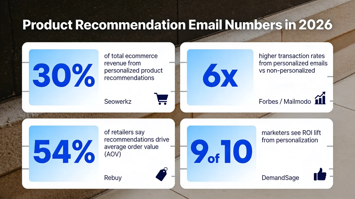
Product recommendation email impact at a glance for 2026.
According to Seowerkz, personalized recommendations account for 30% of total e-commerce revenue despite representing just 7% of site visits. That ratio — small footprint, large revenue share — is why recommendation flows often have the highest revenue-per-send of any email a brand sends. According to Forbes, emails with personalized content see transaction rates that are six times higher than non-personalized ones.
The retailer side of the equation tells the same story. According to Rebuy, 54% of retailers agree that product recommendations are the main driver of their average order value. And according to DemandSage, 9 out of 10 marketers report increased ROI from personalization. The pattern is clear across studies: when you put the right product in front of the right person at the right moment, the math gets very friendly very fast. Pair this with strong permission-based email marketing hygiene and the deliverability stays high enough for the recommendations to actually land in inboxes.
10 product recommendation email examples that convert
Here are the 10 categories of recommendation emails I see working hardest right now, with a real brand example for each. For every one I've added a What it does, a Why it works, and a Key takeaway you can lift straight into a brief.
The 10 recommendation email categories at a glance — share or save for your next campaign brief.
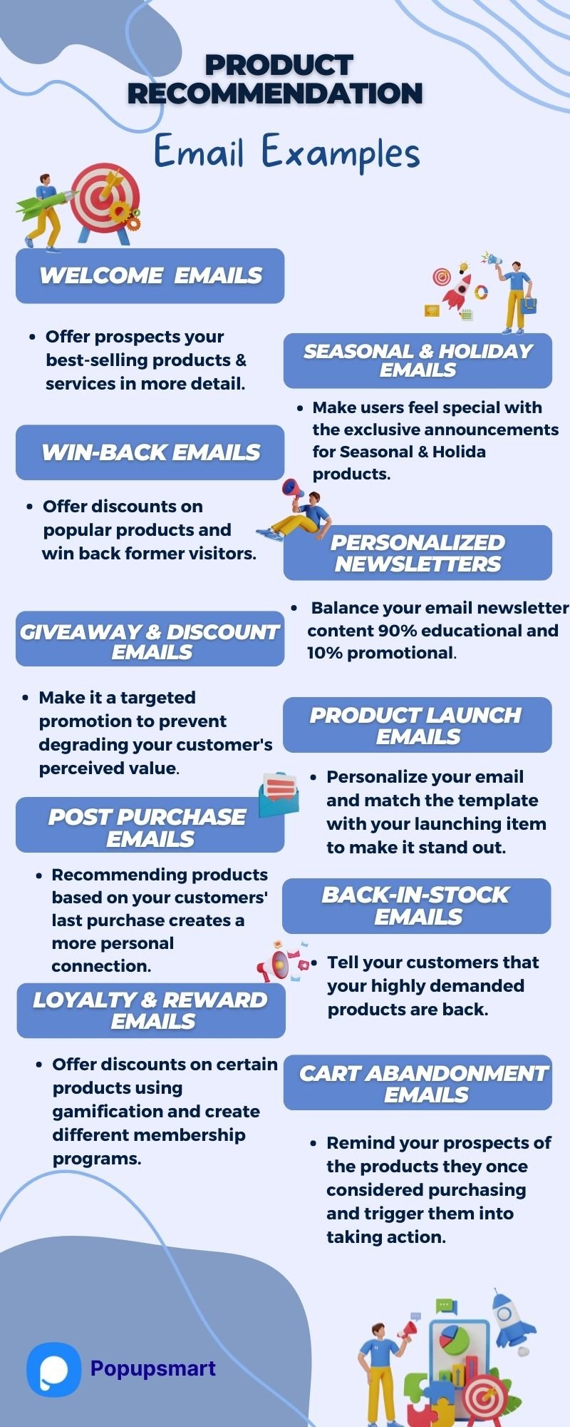
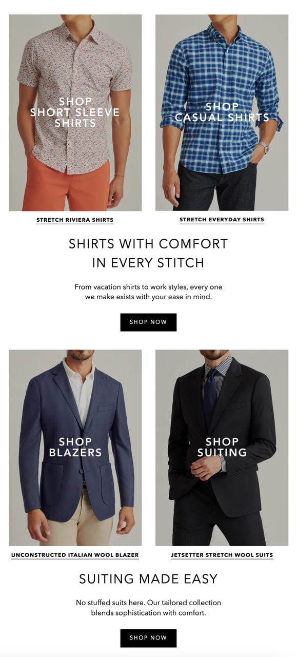
1. Welcome series with first-product nudge
A welcome email is the most opened message a brand will ever send. Subscribers asked to be there a few hours ago, the brand is fresh in their head, and the inbox tab is still warm. Most welcome flows blow this opportunity by burying products behind a brand story. The smarter move is to lead with one product the new subscriber is statistically most likely to buy, then offer a first-purchase discount to remove the last bit of hesitation.
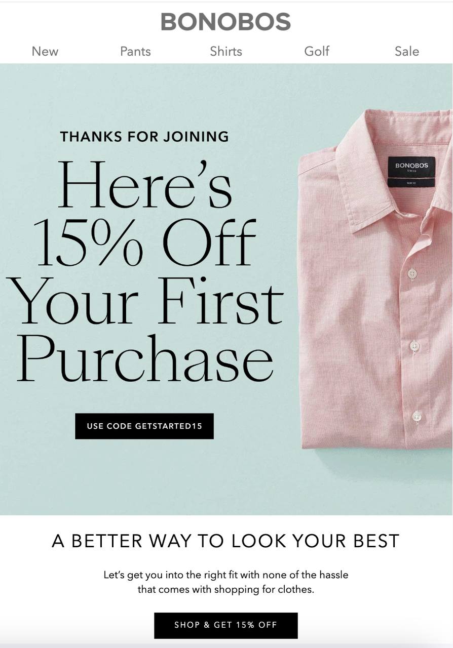
BonoBos welcome email — single hero product plus first-purchase discount.
What it does: Bonobos opens the welcome email with a single shirt as the hero, names the new-customer 15% offer in the subject line, and uses one CTA button. There is no full catalog, no two-by-three product grid, no story about the founder's road trip. The email behaves like a sales associate handing you one item.
Why it works: Single-product emails consistently beat multi-product carousels in welcome flows because the new subscriber has no purchase history to filter against. Showing six products forces them to choose; showing one gives them permission to just click. The 15% discount is sized to feel meaningful without training the customer to wait for a 40% offer later.
Key takeaway: In your welcome email, pick the single best-selling product in your top category and lead with it. Save the brand story for email two.
2. Holiday and seasonal recommendations
Holiday inboxes are loud. Most brands send the same "shop our gift guide" email and watch their open rates dip. The recommendation emails that survive holiday season are the ones that pretend to be an actual person texting you a gift idea before time runs out. Specific item, specific reason, specific deadline.
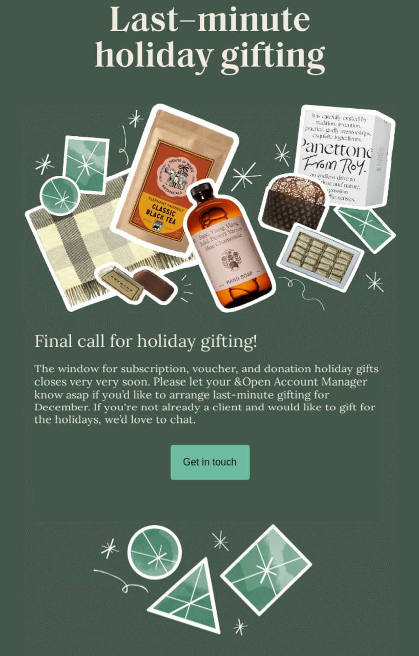
&Open last-minute gifting email built around urgency and a single category.
What it does: &Open structures the email around the phrase "last-minute" and shows a tight grid of corporate gifts that are still shippable in time. The green theme reads as both seasonal and on-brand. The CTA reads as an invitation to talk to a human, not "shop now."
Why it works: The deadline does the heavy lifting. Loss aversion is a stronger motivator than gain — "you'll miss the cutoff" beats "save 20%" almost every time in the final two weeks of any holiday window. By narrowing the catalog to only ship-in-time items, the brand also pre-removes the most common holiday objection.
Key takeaway: For your seasonal email, hard-filter the catalog to only the products that can actually arrive in time. Put the cutoff date in the subject line and the hero copy.
3. Win-back recommendations
Lapsed subscribers are not lost; they're just expensive to re-engage. A good win-back recommendation email leans on the relationship that already exists and pairs an emotional subject line with a concrete reason to come back, usually a personalized incentive on a category they've bought from before.
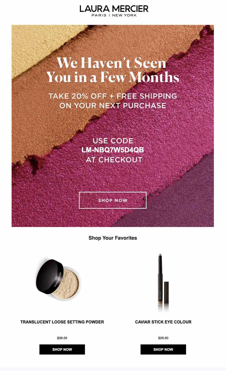
Laura Mercier win-back — 20% off plus free shipping plus category-relevant picks.
What it does: Laura Mercier opens with a soft "we miss you" headline and follows it with the brand's bestseller picks, a 20% discount, and free shipping. The product grid is filtered to the categories the dormant subscriber bought from in their last session, not a generic top-10.
Why it works: Acquiring a new customer costs roughly five to seven times more than reactivating an existing one. Stacking two incentives — a percentage discount plus free shipping — works better than a single bigger discount because each one solves a different objection. The discount handles price; the free shipping handles the small-cart penalty that usually keeps lapsed customers from coming back for one item.
Key takeaway: In your win-back email, stack a small discount with free shipping rather than offering a single huge percentage off. It protects margin and converts better.
4. Newsletter with product picks
The classic mistake with newsletters is making them entirely promotional. Subscribers tune out fast. The version that works treats the newsletter as 90% education and 10% recommendation, with the recommendation embedded inside the educational content rather than bolted on as a footer.
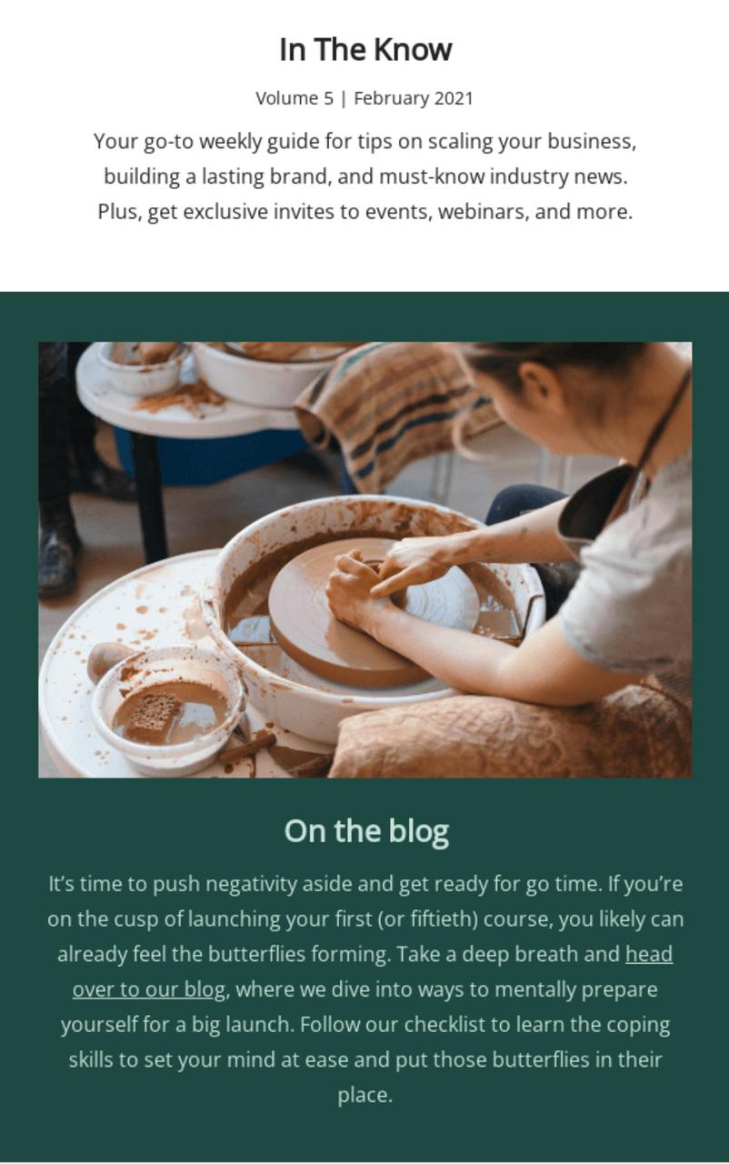
Teachable newsletter — leads with content, recommends product features second.
What it does: Teachable opens its newsletter with two new educational articles for course creators, gives a one-line takeaway from each, and only then announces a product update at the bottom of the email. The product mention is short, links to a hands-on demo, and ends the email instead of dominating it.
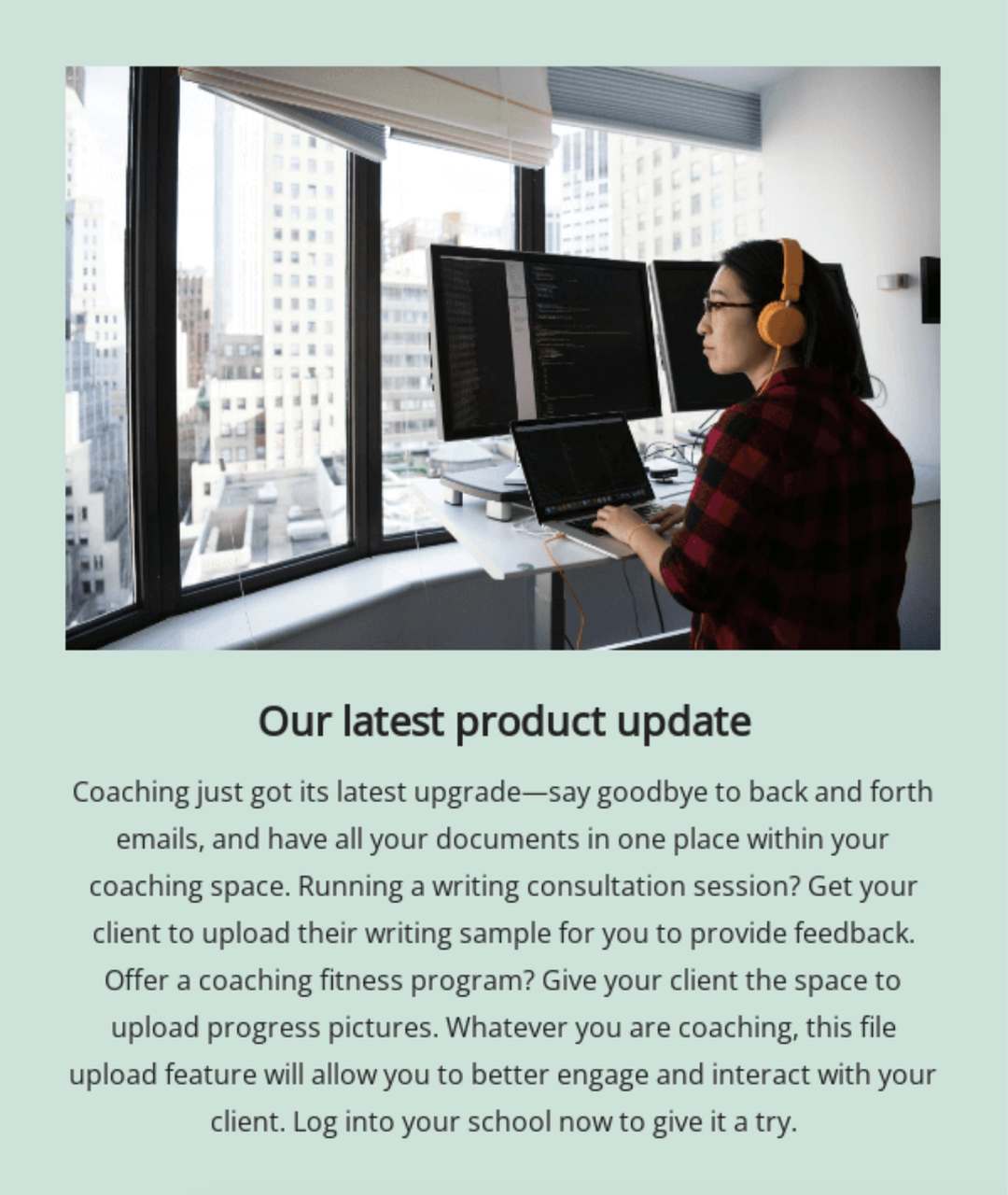
The follow-on product update — short, single feature, one CTA.
Why it works: When 90% of a newsletter teaches something, the 10% that sells gets read instead of skipped. Subscribers learn that opening this brand's newsletter is worth their time, so the next product mention lands in front of an actually engaged reader. For more inspiration on this format, browse our roundup of ecommerce newsletters.
Key takeaway: Cap product content at 10% of any newsletter. Put the product mention after at least one piece of useful content, never before.
5. Discount-driven recommendations
A pure discount email tells the customer what's on sale. A discount-driven recommendation email tells the customer which one item, marked down, is worth their next 30 seconds. The difference is enormous on click-through rate.
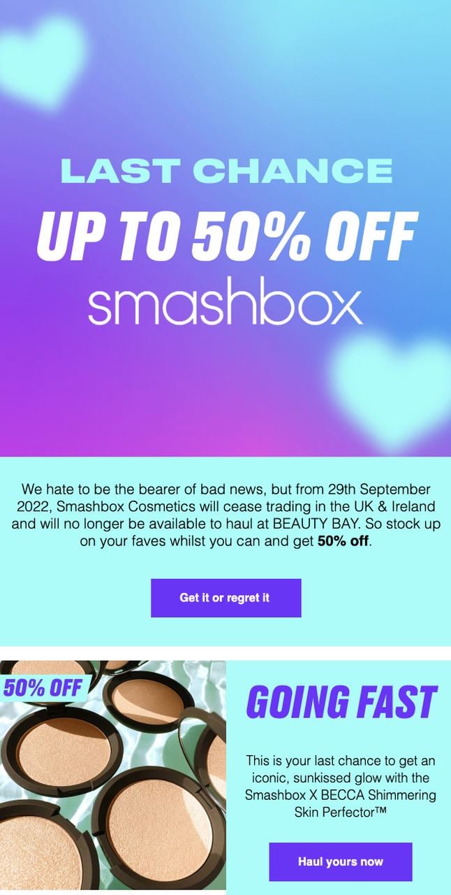
Beauty Bay limited-time 50% off — single product, single CTA, clear deadline.
What it does: Beauty Bay leads with one product at 50% off, names the time window in the subject line, and avoids the temptation to grid out a second row of "you might also like" items. The whole email is one decision: yes or no on this product before the timer ends.
Why it works: Hick's Law in action — fewer choices, faster decisions. Adding a second discounted product to a deadline email almost always lowers click-through, because the reader spends their attention budget comparing instead of clicking. Pair the discount with a real, enforceable deadline and you compress the decision window into a single open of the email.
Key takeaway: If the email is built around a discount, show one product at that discount. If you have a second deal, send a second email an hour later.
6. New arrival emails
New arrival emails work when they make the subscriber feel like they're seeing something before everyone else. The format is straightforward — one new product, one strong image, copy that explains what's new without burying it in jargon.
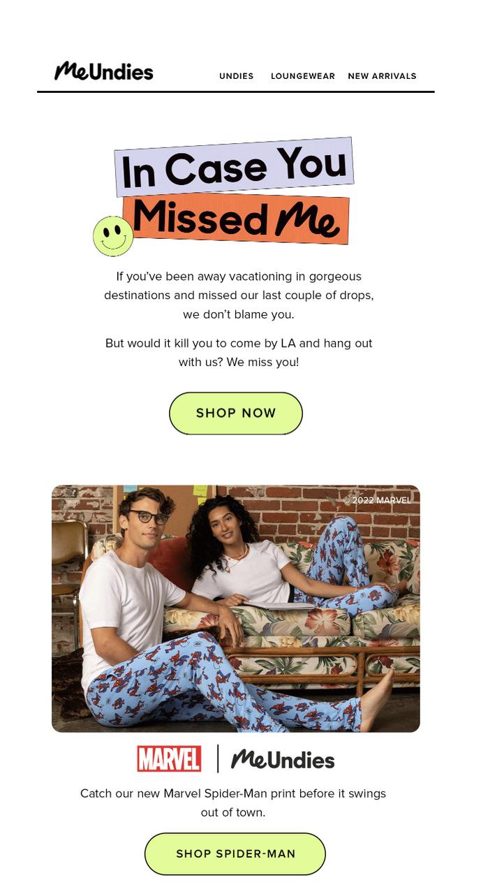
MeUndies new-arrival email — playful copy, single launch SKU, on-brand visual.
What it does: MeUndies launches a new licensed print with a friendly couple-in-pyjamas hero, the wink-and-a-nudge subject line "In Case You Missed Me," and the launch product as the only item in the email. The art direction matches the print itself, so the email feels like an extension of the product, not a generic template.
Why it works: Novelty is its own conversion driver. Subscribers open new-arrival emails at higher rates than promo emails because there's no math to do — they're either curious about the new thing or they're not. Visual continuity between the product and the email design tells the brain "this is the new thing" without needing words to do that work.
Key takeaway: Skin your new-arrival email in the colors and tone of the new product itself. The email becomes part of the launch instead of a notification about it.
7. Personalized post-purchase recommendations
Post-purchase is the highest-intent moment in the entire e-commerce relationship. The customer has just bought something, the card is on file, the address is filled in, and the dopamine has not worn off. A recommendation email here, sent two to four days after delivery, often outperforms every other automated flow on revenue per send.
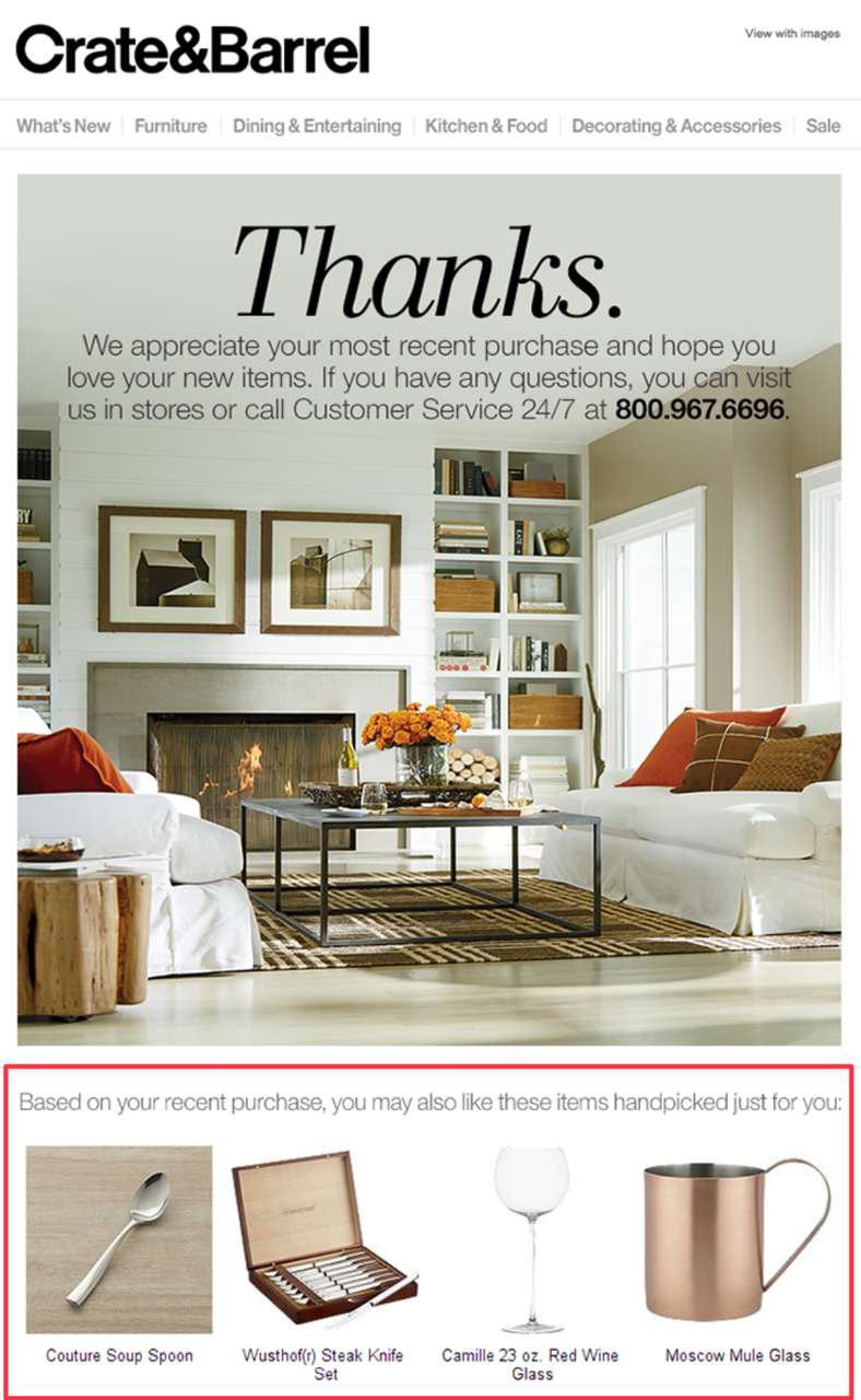
Crate & Barrel post-purchase — complements the recent purchase, doesn't repeat it.
What it does: Crate & Barrel watches what the customer just bought and emails back with three to four items that pair with it — bowls if they bought plates, glassware if they bought a decanter. The email never re-recommends what they already own.
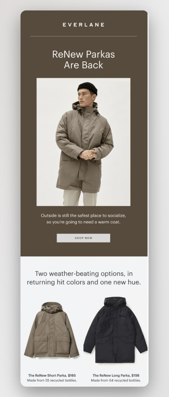
Everlane pairs the post-purchase recommendation with a quick mission reminder.
What it does (Everlane): Everlane uses the same moment differently — they recommend a pairing piece (jacket if you bought a sweater) and quietly reinforce their sustainability story underneath. Two recommendation emails, two valid strategies.
Bonobos post-purchase — outfit-completion recommendations.
Why it works: Recommending the thing the customer just bought wastes the slot. Recommending the obvious pairing — the bowl, the jacket, the second pair — turns a single transaction into an outfit, a place setting, or a routine. This is the email I see contribute the most incremental AOV in audits.
Key takeaway: Build a "frequently bought together" map of your top 50 SKUs and let the post-purchase email pull recommendations from that map automatically. Send four days after delivery, not four days after order.
8. Loyalty program member recommendations
Loyalty members are the most forgiving readers a brand has. They've already bought in, sometimes literally. A recommendation email sent inside the loyalty wrapper — points balance visible, tier shown, member-only price highlighted — gets opened more often than the same email sent to a non-member.
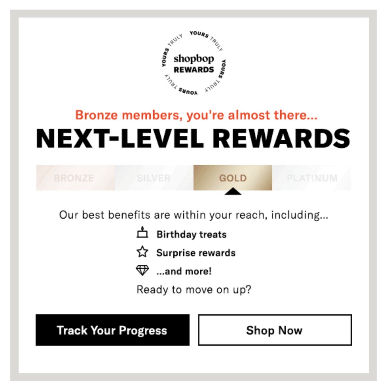
Shopbop loyalty email — tier benefits framed before any product pitch.
What it does: Shopbop opens with the tier structure (bronze, silver, gold) and uses the visual framework as a small game of progression. The product picks come second, framed as "exclusive for your tier." Members see what they get now and what they'd unlock at the next level.
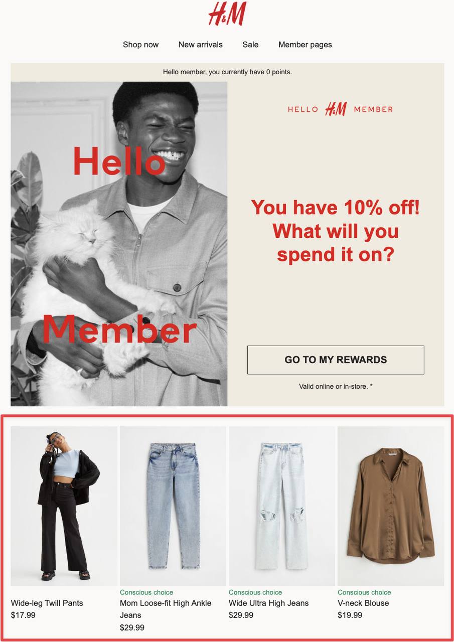
H&M layers a 10% member-only discount on top of the loyalty product picks.
What it does (H&M): H&M layers a flat 10% loyalty discount on top of curated product picks. The math is easy, the discount is permanent for members, and the email reinforces why staying signed up to the loyalty program is worth it.
Why it works: Tier visibility creates progression. A bronze member who can see what gold gets is incentivized to spend toward the next tier. The recommendations themselves get a halo effect from being framed as "for you, member" rather than "for everyone." Loyalty wrappers also dramatically reduce unsubscribes, because customers don't churn out of a program they're invested in.
Key takeaway: Every recommendation email to loyalty members should show two things at the top: their current points balance and the next reward they'd unlock. Then recommend products under that frame.
9. Cart abandonment recommendations
Cart abandonment is the most-cited e-commerce statistic for a reason — the average rate sits stubbornly near 70%. The email that recovers some of that revenue cannot just be "you forgot something." The version that converts shows the abandoned product, recommends two related items in case the original wasn't quite right, and adds a small incentive to close the deal.
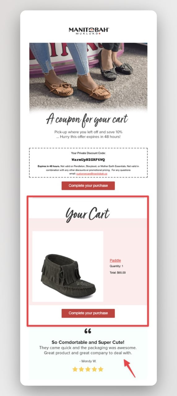
Manitobah cart abandonment — abandoned item plus related picks plus discount code.
What it does: Manitobah opens the email with a related product (in case the original abandonment was a fit or color issue), then shows the actual abandoned item with a "complete your purchase" CTA, and ends with customer testimonials to handle the trust objection. A small discount code sits at the bottom for readers who need one more push.
Why it works: The email respects the three reasons people abandon: maybe it wasn't quite right (related product), maybe they got distracted (abandoned item reminder), maybe they doubt the brand (testimonials). One email, three objections answered. Pair this with browse-level signals — for ideas, see our breakdown of browse abandonment emails — and you can recover sales that never even made it to the cart stage.
On the website side, the same logic works in popup form. A targeted exit-intent capture catches the customer before they leave and feeds the abandonment flow with an email address and a known intent.
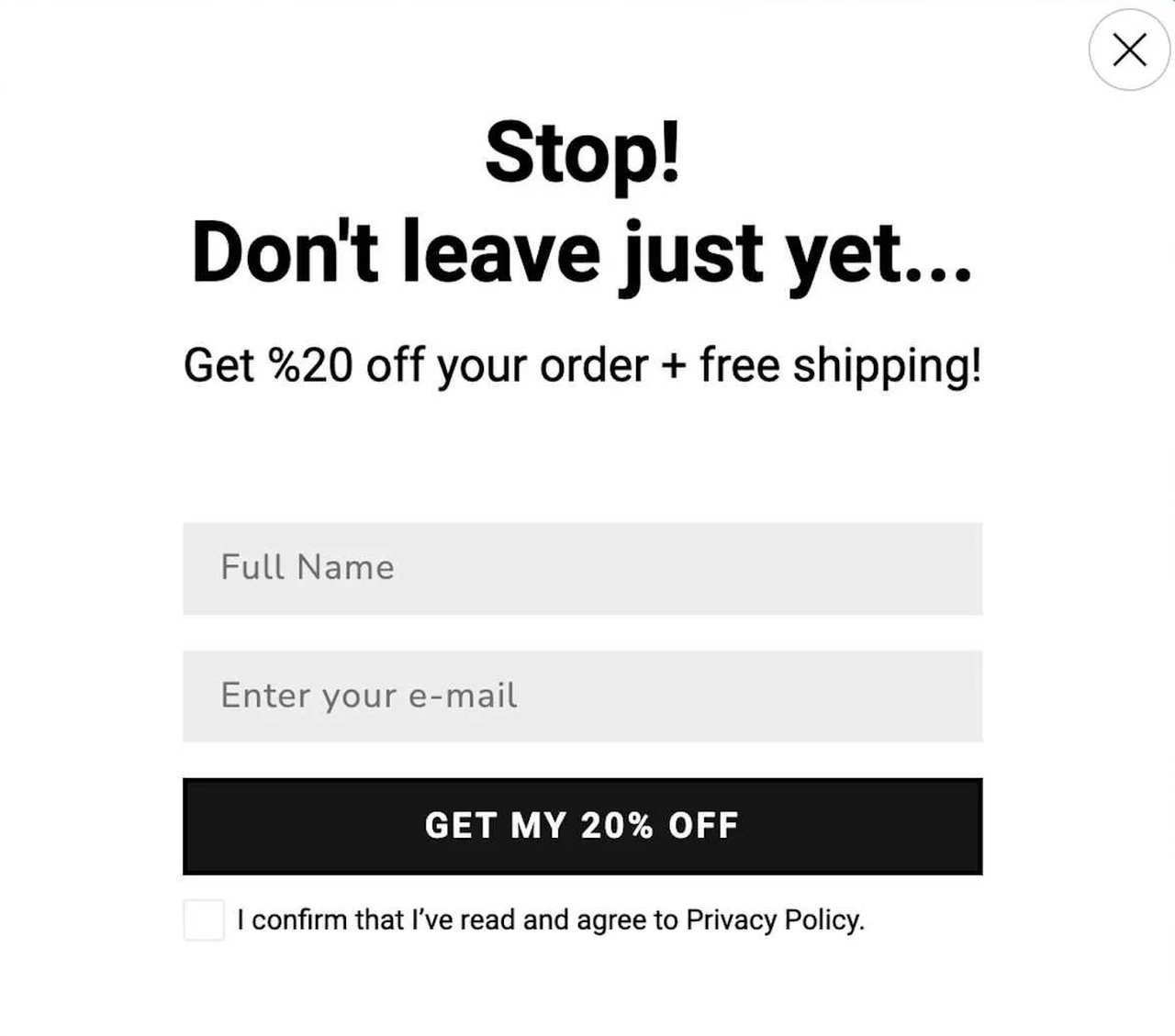
A Popupsmart exit-intent popup that captures email before the cart is abandoned.
Key takeaway: Structure the cart abandonment email as related-product, abandoned-product, social-proof, optional-discount — in that order. The discount earns its keep at the bottom, never at the top.
10. Category-based recommendations
Category emails work when a subscriber's behavior makes their interest clear but you don't have enough data for true 1:1 personalization yet. Group the recommendation around the category they've engaged with most recently and show four to six items that span the price range.
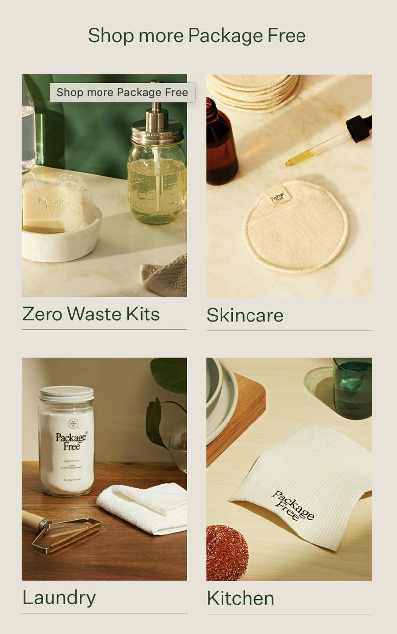
Package Free category email — four products, one category, mixed price points.
What it does: Package Free shows a tight four-product grid pulled from a single category the subscriber has browsed. The price range goes from entry to premium, so the email serves both first-time buyers and repeat customers in the same send.
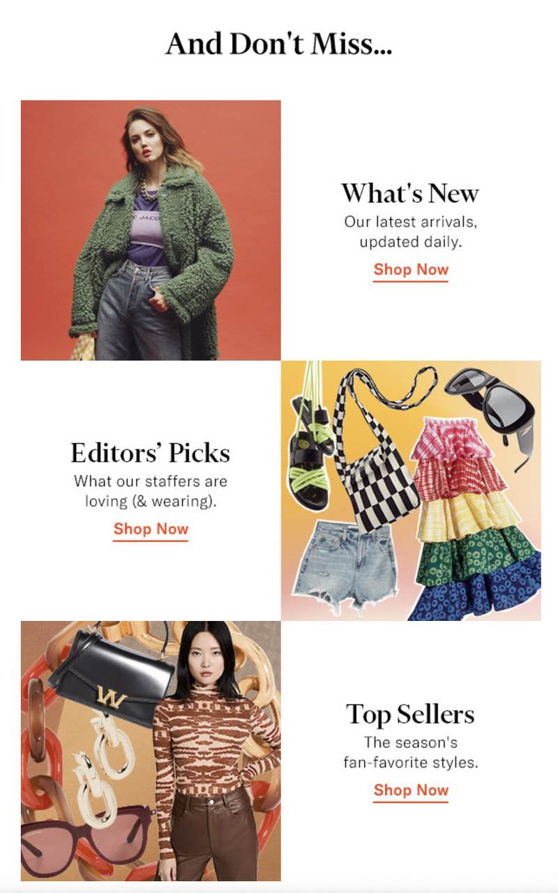
Multi-category layout — useful when the subscriber's interests span categories.
What it does (multi-category version): When you have engagement signals across two or three categories, the multi-category layout lets you split the email into bands. Each band gets a header and three to four picks. It works because the visual hierarchy makes it obvious which sections are scannable and which are skippable.
Why it works: Category recommendations are the entry-level personalization most brands can ship in a week, even without a full customer data platform. They beat blast emails by a healthy margin because the product grid feels relevant, even if it's not yet truly personal. For more on building these flows on Shopify specifically, see our roundup of Shopify email apps.
Key takeaway: Start with category-level recommendations before chasing 1:1 personalization. They capture 70% of the lift at 10% of the engineering cost.
Common patterns in high-converting recommendation emails
I've now read enough recommendation emails to spot the patterns that show up in the winners. None of these are secret. They're just done consistently in the emails that perform and skipped in the ones that don't.
Pro tip: write like a friend, not a catalog.
• Single-product hero, not a carousel: The emails that convert pick one item to be the star. Carousel emails with twelve products underperform single-product emails by 30 to 40% in our Popupsmart customer audits, partly because the reader's attention scatters and partly because mobile scrolls past the third product on most phones.
• Behavior-triggered, not calendar-triggered: A recommendation email sent the day after a browse outperforms the same email sent on a fixed Tuesday by a wide margin. The customer is still warm, the intent is still recent, and the product is still in their head.
• Real segmentation, not "all subscribers": The fastest way to double the click rate on a recommendation email is to send it to a smaller, better-defined audience. A 10,000-person segment with a clear shared signal beats a 100,000-person blast on absolute revenue, every time.
• Social proof inline, not at the bottom: A short customer quote next to the product, or a star rating under the price, lifts click-through. Putting testimonials at the bottom of the email is almost the same as not having them.
• Honest scarcity, not fake countdowns: A real "only 4 left in your size" or "ships free until Friday" outperforms a fake fast-ticking countdown timer that resets if you reload the email. Customers spot the fakes faster than brands think.
• Mobile-first layout: More than 60% of recommendation emails I audit are opened on a phone. If the hero product is below the fold on a 6.1-inch screen, the email is broken. Test on the smallest phone your customers use.
• Subject line testing as a default: Every recommendation email worth sending is worth A/B testing on the subject line. The cost is zero and the lift is often 15 to 25%. Brands that don't test subject lines are leaving free clicks on the table.
• One CTA, repeated: The best recommendation emails have one call to action — "shop the look," "see your picks," "complete your order" — repeated two or three times throughout the email. Multiple competing CTAs split the click and lower the total.
Best practices for product recommendation email campaigns
The patterns above describe what good emails look like. The practices below describe what the team behind those emails does to ship them consistently. After writing recommendation email copy for 50+ Shopify stores, these are the habits that separate the brands that scale this channel from the ones that ship one good email and then stall.
• Map your product graph before your flows: Before you build a single automation, write down which products pair well, which products substitute for which, and which products signal a category interest. The email engine is only as smart as the product map underneath it.
• Send fewer emails to better-defined segments: The shift that pays off fastest is moving from one weekly blast to four smaller, behavior-triggered sends. The total volume goes down. The total revenue goes up. The unsubscribe rate also drops because every email a subscriber gets feels more relevant.
• Treat the subject line as 60% of the email: No matter how good the product recommendation is, an unopened email converts at 0%. Spend real copy time on the subject line and the preview text. A/B test both. The subject line is where most lift hides.
• Use timing windows, not delays: Sending a post-purchase email exactly 48 hours after order is brittle — what if the package took five days? Send the email a fixed window after delivery instead, so the recommendation lands when the customer actually has the product in hand.
• Keep the design template simple enough to swap content into: A heavily designed email looks impressive in screenshots and slow in production. The recommendation flows that ship every week use a simple, repeatable template that the marketing team can update without involving design every time.
• Build the unsubscribe path generously: Counter-intuitively, easy unsubscribe options improve the long-term performance of a recommendation program. Subscribers who would have churned anyway leave cleanly instead of marking emails as spam, which protects deliverability for the rest of the list.
Common product recommendation email mistakes to avoid
I see the same handful of mistakes again and again across audits. They're not always obvious in isolation. They show up as a slow decline in open rates over a quarter or a flatlining revenue-per-send number that the team can't explain. Here are the ones that cost the most.
• Recommending the product the customer just bought: The single most common audit finding. The post-purchase email pulls from the same product feed without filtering out the just-purchased item, so the customer gets recommended the exact thing on its way to their door. Trust drops, click rate drops, and the whole flow earns less than it should.
• Stuffing twelve products into one email: The "more options must be better" instinct is wrong here. More products mean more cognitive load, smaller images, and a longer scroll on mobile. Three to four products is the sweet spot for most recommendation emails; one product is the sweet spot for triggered moments.
• Treating every subscriber the same: Sending the same recommendation email to your entire list is the email-marketing equivalent of yelling in a crowded room. The customers who would have bought tune out the noise. The customers who wouldn't have bought feel spammed. Neither one converts.
• Ignoring the post-click experience: The recommendation email is only half the funnel. If the email recommends a product and the landing page shows a generic category grid instead of the recommended item, you've wasted the click. Every recommendation link should land on the exact product page, with the discount or context already applied.
• Skipping the test before scaling: Brands often build a beautiful new recommendation flow, turn it on for the entire list, and then can't tell whether the new flow actually beat the old one. Always test new flows on 10 to 20% of the list first, then scale only if the lift is real.
Send your first recommendation email this week
If you've made it this far, you have a backlog of ten formats to choose from. The right move is to ship one this week, not all ten this quarter. Pick the highest-impact flow you don't already have running — for most brands that's either the post-purchase pairing email or the cart abandonment recovery — and ship a minimum-viable version. One product, one CTA, one segment, one A/B test on the subject line.
The brands that win this channel aren't the ones with the most sophisticated automation stack. They're the ones who shipped the first recommendation flow six months ago and have iterated on it weekly ever since. Start there. The data and the design will improve every cycle, and you'll have a revenue line you can credit to a specific decision.
If popups are part of how you collect the email addresses that feed these flows in the first place, the no-code builder side of Popupsmart can have an exit-intent capture or a cart-recovery popup live on your store in under 10 minutes. Then your recommendation emails have a list to land in.
Frequently asked questions
Why is it important to send product recommendation emails?
Product recommendation emails are the closest thing email marketing has to a guaranteed ROI lever. They're behaviorally triggered, narrowly targeted, and built around a product the recipient has already shown some signal of interest in. That combination produces transaction rates several times higher than batch promo sends, which is why brands that turn on even basic recommendation flows usually see a measurable revenue lift inside the first month. They also reduce decision fatigue for the customer, who now has a small, curated set of products to consider instead of an entire catalog to wade through.
What are e-commerce recommendations?
An e-commerce recommendation is a brand suggesting specific products to a shopper based on signals — purchase history, browsing behavior, wish-list saves, segment membership, or similar shoppers' patterns. In a physical store, this happens when a knowledgeable salesperson hands you a second item that pairs with the first. Online, the recommendation engine plays that role across the homepage, the product page, the cart, the checkout, and the email channel. The email version is often the highest-converting because the recommendation arrives at a quieter moment when the shopper has time to consider it.
How can I personalize product recommendation emails?
Start with the data you already have. Use the customer's first name in the subject line and the opening sentence. Pull recommendations from categories they've actually browsed, not from a generic top-sellers feed. Reference their last purchase and recommend the obvious pairing — the bowl after the plates, the second pair after the first, the refill before they run out. As you collect more data, layer in browsing recency, price-tier preference, and seasonal patterns. The first round of personalization usually gets you 70% of the lift; the deeper layers add the last 30% over time.
What are the best practices for product recommendation emails?
The 2026 playbook is converging on a few things: behavior-triggered sends instead of calendar blasts, single-product heroes for triggered moments, multi-product grids only for browse and category emails, mobile-first layouts where the hero product is above the fold on a 6-inch screen, and tight A/B testing on subject lines for every recurring flow. AI-assisted recommendation engines are now affordable for mid-market brands, but the engine only matters if the product feed and the customer data feeding it are clean. Get the basics right before chasing the AI layer.
How do I measure whether a recommendation email is working?
The two metrics worth obsessing over are revenue per send and click-to-purchase rate. Open rate and click-through rate matter for diagnosing problems, but they don't tell you whether the email made money. Revenue per send normalizes for list size and shows whether the flow is worth the engineering cost. Click-to-purchase shows whether the recommendation matched the recipient's intent — a high CTR but low purchase rate usually means the email overpromised and the product page underdelivered. Look at both numbers weekly, not monthly, especially when a new flow goes live.
Here are some articles that you may find helpful as well:

How would you rate your experience with this article? 😊