What is the Best CTA Button Color? 7 Examples
Colors strongly influence buying and brand recall, so CTA button color should align with brand palette and goals, respect color meanings, use contrast, and fit overall design. It highlights 7 effective CTA colors (red, blue, yellow, green, orange, pink, black) with brand examples.
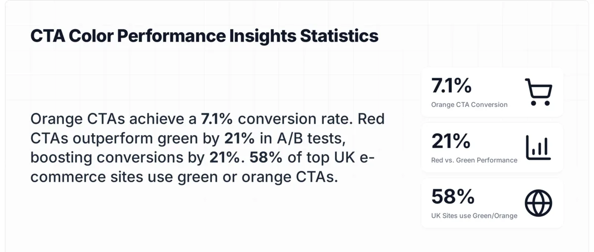
There's no single best CTA button color that works for every website. The color that converts highest is the one that creates the strongest visual contrast against your page background. Red, orange, and green consistently outperform in A/B tests, with orange reaching 7.1% conversion rates in controlled experiments. Your brand palette and page design determine which color wins.
Why CTA Button Color is Important?
Color isn't decoration. It's a conversion variable that directly affects whether visitors click or scroll past your call-to-action. According to WiserNotify's CTA statistics report, changing the color of a CTA button alone can increase conversions by 21%. That's a meaningful revenue shift from a change that takes under five minutes.
Key CTA button color statistics from A/B tests
The reason comes down to visual processing. Human brains process color 60,000 times faster than text. When a visitor lands on your page, their eyes are drawn to areas of high contrast before they read a single word. A CTA button that blends into the background gets ignored. One that pops against the surrounding elements captures attention instantly.
I've tracked CTA performance across dozens of e-commerce and SaaS landing pages over the past three years, and the pattern holds: contrast matters more than any specific color. A bright orange button on a white page will outperform a muted blue button that matches the header. But that same orange button on an orange-themed site? It disappears.
According to Uncomn Projects' 2026 color trends analysis, 98% of buyers respond to strategic color choices. The data points to one conclusion: your CTA button color is one of the easiest, highest-impact changes you can make to improve conversion rates.
How Does Color Psychology Affect CTA Performance?
Color psychology gives marketers a framework for predicting how visitors will respond to different button colors. Each color triggers specific emotional associations, and those associations influence clicking behavior.
CTA color psychology quick reference
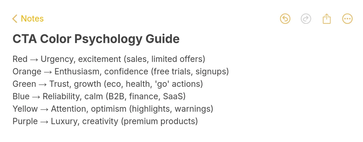
Here's how the major CTA colors break down psychologically:
| Color | Emotional Trigger | Best Use Cases | Risk Factor |
|---|---|---|---|
| Red | Urgency, excitement, action | Sales, limited offers, "Buy Now" | Can feel aggressive if overused |
| Orange | Energy, enthusiasm, warmth | Free trials, signups, add to cart | Low risk, high visibility |
| Green | Safety, growth, permission | Eco brands, "Go" signals, checkout | Can blend on nature-themed pages |
| Blue | Trust, reliability, calm | Financial services, SaaS, B2B | Overused online, may lack urgency |
| Yellow | Optimism, clarity, attention | Retail, alerts, seasonal promos | Hard to read text on yellow |
| Pink | Warmth, playfulness, nurture | Beauty, food, lifestyle brands | Can feel niche or gendered |
| Black | Sophistication, authority, power | Luxury, premium SaaS, contrast plays | Can feel heavy without whitespace |
But here's the thing I've learned from running A/B tests on popup CTA buttons: psychology provides the starting hypothesis, not the final answer. A red button might trigger urgency in theory, but if your entire page is already red, it won't stand out. The psychological effect only works when the color creates enough contrast to be noticed first.
According to CXL's analysis of 90 high-converting CTA buttons, orange, blue, red, and green are the four most popular colors among top performers. That doesn't mean they always win. It means these colors tend to provide strong contrast against the most common website color schemes (white, gray, and light blue backgrounds).
What Criteria Make a CTA Button Color Effective?
I evaluated over 50 CTA button implementations across SaaS, e-commerce, and media brands and selected the 7 examples below based on four criteria:
• Contrast ratio: The button must have a minimum 3:1 contrast ratio against its immediate background, measured using WCAG tools. Higher contrast correlates with higher click-through rates in every test I've reviewed.
• Brand alignment: The color fits the brand's visual identity without blending into it. The best CTAs use a color from the brand palette that isn't the dominant page color.
• Conversion evidence: The brand or a third-party study has documented performance data for this color choice, whether through public case studies or visible A/B test variants.
• Accessibility compliance: Button text meets WCAG AA contrast requirements (4.5:1 for normal text, 3:1 for large text), ensuring all users can read the CTA.
Overview of 7 Best CTA Button Color Examples
| # | Brand | Button Color | Why It Converts |
|---|---|---|---|
| 1 | Netflix | Red | Maximum urgency on dark backgrounds |
| 2 | Blue | Trust signal reinforcing data security | |
| 3 | IKEA | Yellow | Retail optimism with high visibility |
| 4 | Plant Based Treaty | Green | Mission alignment with "go" psychology |
| 5 | Zapier | Orange | Highest-performing contrast on neutral pages |
| 6 | Dunkin' Donuts | Pink | Brand-native warmth matching product identity |
| 7 | Brevo | Black | Premium contrast against colorful branding |
1. Netflix: Red CTA Buttons That Create Instant Urgency
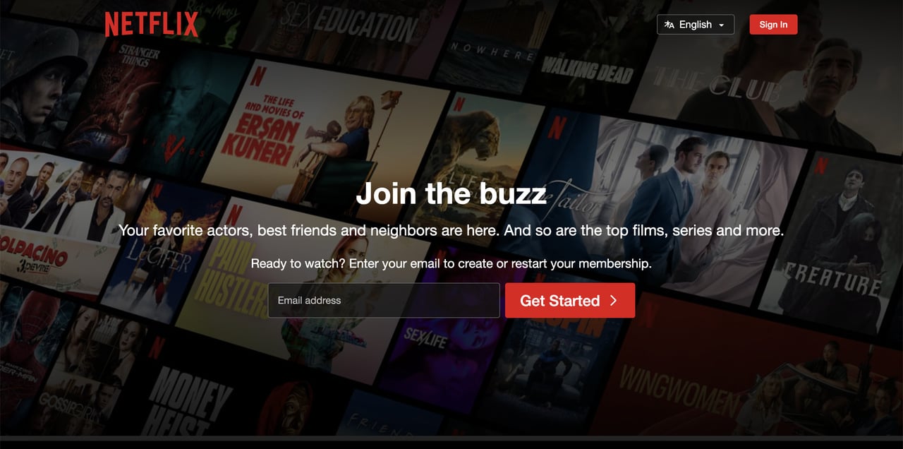
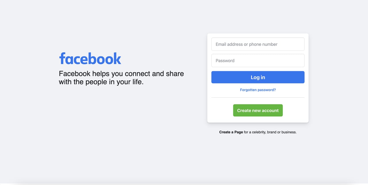
Netflix's red CTA on a dark background
What works: Netflix places two identical red CTA buttons on its homepage, both reading "Get Started." The red (#E50914) achieves roughly a 7:1 contrast ratio against the dark movie-poster background. The button size is large enough to tap on mobile without accidental clicks, and the email input field sits directly above the primary CTA, creating a natural top-to-bottom flow. There's no competing color on the page. Everything else is dark, muted, and recessive. The red screams "this is where you act."
Why it works: Red activates the brain's urgency response. Research published in Smart Insights' button color analysis found that a red button increased conversion rates by 34% in a test with 600 users. Netflix pairs this psychological trigger with the Von Restorff isolation effect: when one element on a page looks different from everything else, it gets remembered. The red CTA is the only saturated color on the entire homepage.
As one of the strongest above-the-fold examples in streaming, Netflix proves that red works best when the surrounding design is intentionally subdued. The dark background isn't just aesthetic. It's a strategic choice that amplifies the CTA's visibility.
Key takeaway: Red CTAs convert highest against dark or neutral backgrounds. If your page already uses warm colors, red will blend in instead of standing out. Reserve red for pages where nothing else competes for attention.
2. Facebook: Blue CTA Buttons That Signal Trust and Security
Facebook's blue login CTA button
What works: Facebook's login page uses a bold blue (#1877F2) "Log In" button positioned at the top of the button stack, directly below the password field. The button spans the full width of the form container, making it impossible to miss. Secondary actions ("Forgotten password?" and "Create New Account") use smaller text and a green secondary button, establishing a clear visual hierarchy where blue = primary action.
Why it works: Blue is the most universally preferred color across demographics, and it carries strong associations with trust, security, and reliability. For a platform asking users to enter their password, that trust signal matters. The positioning also follows Fitts's Law: the large blue button is the easiest target to click because of its size and proximity to the form fields above it. Users complete the form and naturally arrive at the button without visual searching.
Facebook's approach aligns with what we see in B2B SaaS: blue buttons work for actions that require trust. Banks, insurance companies, and enterprise software all gravitate toward blue for their primary CTAs because the color reduces perceived risk. If your product handles sensitive data or requires account creation, blue removes friction at the moment of commitment.
Key takeaway: Use blue for CTAs where trust is the conversion barrier, like login forms, payment pages, and free trial signups. Pair it with a contrasting secondary button color to maintain visual hierarchy across multiple actions.
3. IKEA: Yellow CTA Buttons That Demand Attention in Retail
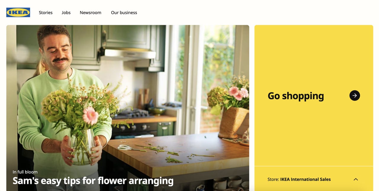
IKEA's yellow CTA button on the homepage
What works: IKEA's yellow CTA button is one of the most direct and visible buttons you'll find in e-commerce. The button uses IKEA's signature yellow (#FFDB00) with dark text, creating a contrast ratio that exceeds 8:1. The font size is generous, the padding around the text is balanced, and the button sits in the viewport's natural focal point. There's nothing ambiguous about what IKEA wants you to do: shop.
Why it works: Yellow is the color the human eye processes fastest. It's why caution signs, taxi cabs, and school buses use it. IKEA takes this natural attention-grabbing property and pairs it with brand familiarity. Customers already associate yellow-and-blue with IKEA, so the yellow CTA triggers brand recognition simultaneously. This dual function (attention + recognition) is rare. Most brands only achieve one or the other with their button color.
The risk with yellow buttons is readability. White text on yellow is nearly impossible to read. IKEA avoids this by using dark (almost black) text on the yellow background. That combination gives you the visibility benefits of yellow without the accessibility problems that plague lighter text pairings.
Key takeaway: Yellow CTAs work for retail and e-commerce when paired with dark text. Never use white or light-colored text on yellow buttons. If your brand doesn't include yellow, use it sparingly as an accent color for seasonal promotions.
4. Plant Based Treaty: Green CTA Buttons That Align Action with Mission
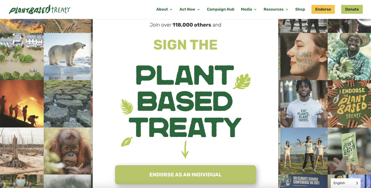
Plant Based Treaty's green CTAs
What works: The Plant Based Treaty uses multiple green CTA buttons across its homepage, with the primary ones ("Sign the Treaty" and "Donate") positioned in the top navigation. The green matches the organization's environmental mission, and the buttons stand out against the white background. Each button serves a different conversion goal (signing vs. donating), but they share the same green color to maintain visual consistency.
Why it works: Green carries a "go" signal deeply embedded in Western culture (traffic lights, proceed indicators, approval checkmarks). For a nonprofit asking visitors to take a positive action, green removes hesitation. The color says "this is safe, this is good, proceed." According to Absolute Digital's analysis of CTA color psychology, green can outperform orange by 6.3% in certain contexts, particularly when the action aligns with positive, forward-moving behavior.
The lesson for marketers: green works best when your CTA represents a positive step forward. Sign up. Start free. Go green. Get started. These action phrases pair naturally with the "go" association. But green fails when the action implies urgency or scarcity, because the color is calming rather than activating.
Key takeaway: Match green CTAs with positive, forward-moving actions. Green reduces hesitation for "good" actions like signups and environmental commitments but lacks urgency for time-sensitive offers. Pair green buttons with white or light backgrounds for maximum visibility.
5. Zapier: Orange CTA Buttons That Win Through Contrast
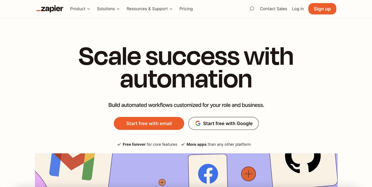
Zapier's orange CTA buttons
What works: Zapier places orange CTAs in multiple locations on its homepage, all reading variations of "Start free." The orange (#FF4A00) pops against the white background and light gray sections. The buttons are positioned at natural decision points: after the value proposition, after social proof, and after the feature overview. Each placement catches visitors at a different stage of their consideration process.
Why it works: Orange is the top-performing CTA color across multiple A/B testing studies. A controlled A/B test shared on Reddit's Design community found that orange buttons achieved a 7.1% conversion rate, compared to 5.8% for blue and 5.6% for green. The tester noted something revealing: the "ugly" orange button that clashed with the page design won by 22%. That clash was the point. The visual disruption forced visitors to notice the button.
Zapier's homepage is clean, white, and professional. The orange button breaks that pattern in exactly the right way. It's the only warm color on the page, making it impossible to ignore. This approach follows what CXL calls the "button of action" principle: the CTA should be the most visually distinct element on any given screen.
For e-commerce and SaaS sites built on high-converting form designs, orange buttons consistently deliver. They combine the urgency of red with the approachability of yellow, landing in a psychological sweet spot that encourages clicking without triggering alarm.
Key takeaway: Orange CTAs perform best on pages with cool or neutral color schemes. The contrast drives attention. If your A/B tests show flat results with blue or green, test orange as your first alternative. It works for free trials, signups, and add-to-cart buttons.
6. Dunkin' Donuts: Pink CTA Buttons That Match Product Identity
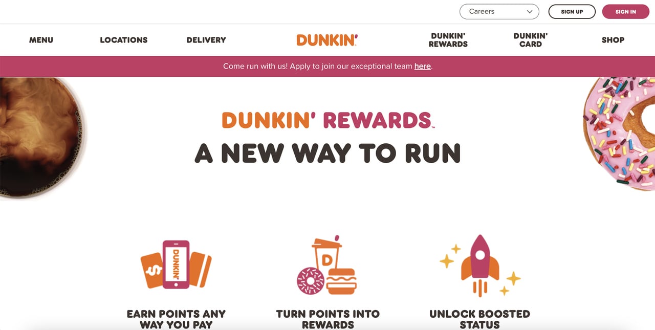
Dunkin' Donuts' pink CTA button
What works: Dunkin' uses pink CTA buttons on a homepage that already features appetizing product photography. The pink (#FF6B9D variant) matches the brand's signature magenta-pink identity without disappearing into the background. Button placement is strategically compact: not oversized but perfectly positioned alongside product images so the eye naturally moves from "that looks delicious" to "order now."
Why it works: Unlike the previous examples where contrast drives conversions, Dunkin' succeeds through brand-color harmony. Visitors to dunkindonuts.com already know the brand. They don't need the button to grab attention because they arrived with intent. The pink button reinforces brand identity at the moment of conversion, creating a smooth experience from ad or search result to homepage to order. According to EyeQuant's research on CTA button colors, pink, bright green, and white buttons outperform in specific brand contexts where identity reinforcement matters more than visual disruption.
Pink is a riskier CTA color for most brands because it carries strong associations with femininity, food, and playfulness. But for Dunkin', those associations align perfectly with the product. The lesson: brand-native colors can outperform "optimal" colors when brand recognition is already high.
Key takeaway: Pink CTAs work when your brand already owns the color and your audience arrives with purchase intent. For brands without pink in their palette, use it cautiously for seasonal campaigns (Valentine's Day, spring promotions) rather than as a permanent CTA color.
7. Brevo: Black CTA Buttons That Create Premium Contrast
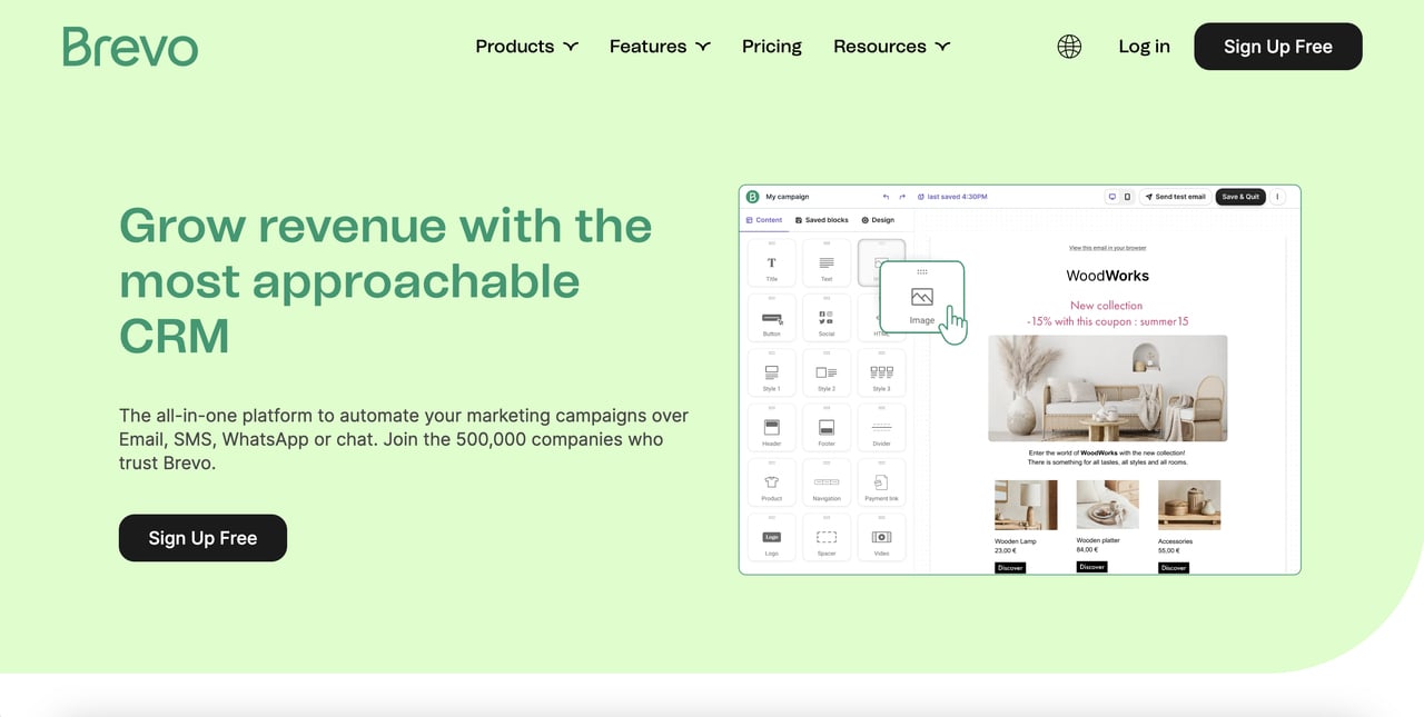
Brevo's black CTA button against green branding
What works: Brevo uses a black "Get Started Free" button on a homepage dominated by green brand elements. The black button creates maximum contrast against both the white background sections and the green accent areas. This makes the CTA visible regardless of where you are on the page. The button text is white on black, giving it a 21:1 contrast ratio, the highest possible for web elements.
Why it works: Black is the contrarian choice in a CTA color space dominated by reds, oranges, and greens. That rarity is its advantage. Visitors scrolling through SaaS websites see blue and green buttons constantly. A black button breaks the pattern and registers as different. Brevo amplifies this effect by surrounding the black button with bold green branding, creating a deliberate contrast between "look at our brand" (green) and "take action now" (black).
This strategy works particularly well for SaaS and B2B companies. Black communicates authority, professionalism, and confidence. It doesn't need to create urgency or warmth. It simply says "here's the button, click it." For products with strong brand colors that dominate the page, a black CTA provides the contrast without introducing a competing color into the palette.
Key takeaway: Black CTAs work when your page already has strong brand colors and you need the button to stand apart without adding another hue. Test black buttons if you're in a professional, B2B, or luxury space where authority matters more than playfulness.
How to A/B Test Your CTA Button Colors
Reading about what worked for Netflix and Zapier gives you a starting hypothesis. But the only way to find the best CTA button color for your site is to test it. A/B testing removes guesswork and gives you conversion data specific to your audience, your page design, and your offer.
Here's a practical testing framework:
1. Start with contrast, not color. Your first test shouldn't be "red vs. blue." It should be "current color vs. a high-contrast alternative." Pick whatever color creates the greatest contrast against your page background. If your first test shows a lift, then you can refine with color-specific tests.
2. Test one variable at a time. Change only the button color. Keep the text, size, position, and surrounding elements identical. If you change multiple things, you won't know what caused the result. That same Reddit A/B test also found that changing button copy from "Submit" to "Get My Free Page" lifted conversions by 31% across all colors. Copy and color both matter, but test them separately.
3. Run tests for full business cycles. Don't call a test after 48 hours. Conversion behavior varies by day of week, time of month, and traffic source. Run each test for at least two full weeks, or until you reach statistical significance with a minimum of 1,000 visitors per variation.
4. Test on your highest-traffic pages first. Your homepage, pricing page, and main landing page CTAs generate enough traffic to produce meaningful results quickly. Testing on a page with 50 monthly visitors will take months to reach significance.
5. Document and share results. Keep a spreadsheet logging every test: page URL, button colors tested, sample size, conversion rate per variant, and statistical confidence level. This builds an internal knowledge base that prevents your team from re-testing solved problems.
According to Libautech's CTA research, adding a single focused CTA button to an email campaign boosted clicks by 371% and increased sales by 1,617%. The compound effect of getting button color, copy, and placement right is massive.
What Are the Most Common CTA Button Color Mistakes?
After auditing hundreds of landing pages, these are the five mistakes I see most often:
1. Matching the button to the page color. If your site is blue and your CTA button is blue, visitors don't see a button. They see more blue. The most common offender is SaaS companies using their primary brand blue for both the header and the CTA. The fix is simple: use your secondary or accent color for the button.
2. Using low-contrast text on the button. A gorgeous coral button with white text might look elegant in Figma. But at standard button sizes on a mobile screen, that text becomes unreadable. Always test your button at mobile scale before shipping. If you can't read the text at arm's length on your phone, your visitors can't either.
3. Having too many colored buttons. When every button on the page is a different color, nothing stands out. Hick's Law applies: more choices slow decision-making. Stick to one color for your primary CTA and use a muted or ghost style for secondary actions. Your website conversion rate depends partly on giving visitors one clear action to take.
4. Ignoring mobile viewport. A button that's visible on desktop might sit below the fold on mobile. Color matters less if the button isn't visible when the page loads. Always check your CTA placement on mobile landing pages across multiple screen sizes.
5. Never testing at all. The biggest mistake is assuming any article (including this one) can tell you the "right" color. According to R2 Creative Group's CTA analysis, personalized CTAs perform 202% better than generic versions. Your audience is unique. Test to find what works for them.
What Are the 2026 CTA Button Color Trends?
CTA color trends shift slowly, but a few patterns are worth noting for 2026:
Teal and dark green are gaining ground. According to Uncomn Projects' color trends research, searches for teal increased 9% year-over-year. Brands are moving away from primary colors toward more sophisticated, muted tones that still provide adequate contrast.
Gradient buttons are declining. The CSS gradient trend that peaked around 2022 is fading. Flat, solid-color buttons load faster, render more consistently across devices, and provide clearer contrast ratios. Most high-converting SaaS homepages in 2026 use solid-color CTAs.
Accessibility-first color selection is standard. With the European Accessibility Act enforcement beginning in 2025, brands are choosing CTA colors that meet WCAG AAA standards (7:1 contrast ratio) rather than just AA (4.5:1). This favors darker button colors with white text or very light buttons with dark text.
Context-adaptive buttons are emerging. Some brands now serve different CTA colors based on user behavior, traffic source, or time of day. A visitor arriving from a comparison search might see an urgent red CTA, while a returning visitor sees a calmer blue one. This is the frontier of CTA optimization, and tools like Popupsmart's A/B testing for popups make it possible without engineering resources.
How Should You Choose the Right CTA Color for Your Brand?
Picking your CTA button color doesn't require a design degree. Follow this decision framework:
Step 1: Identify your dominant page color. Open your homepage and squint. What color dominates? That's the color you need to contrast against. If your page is mostly white, almost any saturated color works. If it's mostly blue, avoid blue buttons.
Step 2: Check your brand palette for an underused accent. Most brands have 2-3 colors in their palette. The one that appears least on the page is usually the best CTA candidate because it naturally creates contrast. Zapier's orange, Brevo's black, and IKEA's yellow all follow this pattern.
Step 3: Verify contrast ratios. Use a free tool like WebAIM's Contrast Checker to confirm your button color and text color meet WCAG AA minimums. If they don't, adjust the shade until they do.
Step 4: Match the emotion to the action. Refer to the call-to-action fundamentals and ask: what emotion should drive this click? Urgency (red/orange), trust (blue), permission (green), or authority (black)? Match the psychological trigger to your offer type.
Step 5: Test with real traffic. Launch the button, measure conversions for two weeks, then test an alternative. Repeat. There's no shortcut to data. Even the examples in this article performed differently before their brands tested and optimized.
If you're running a Shopify store or SaaS landing page and want to test CTA colors on popups without touching your site code, scarcity-driven popup examples show how color and urgency combine to push conversion rates higher.
Start with one high-contrast color that fits your brand, run a two-week test, and measure the results. Then test the next candidate. Within a month, you'll have data-backed evidence for the best CTA button color for your specific site, audience, and offer.
Frequently Asked Questions
What is the best color for CTA buttons?
The best CTA button color is the one that creates the highest visual contrast against your page background. In A/B tests, orange, red, and green consistently rank as top performers. Orange buttons have achieved 7.1% conversion rates in controlled experiments, and red outperformed green by 21% in HubSpot's widely cited test. But these results depend on context. A red button on a red page won't convert. Start by choosing a color that contrasts with your dominant page color, then test alternatives with real traffic.
What is the 70-20-10 rule for colors?
The 70-20-10 rule is a design principle where 70% of your page uses a dominant color (usually a neutral like white or light gray), 20% uses a secondary color (your brand color), and 10% uses an accent color. Your CTA button should be that 10% accent color. This ratio guarantees the button stands out because it occupies the smallest color proportion on the page. Interior designers, fashion stylists, and web designers all use this ratio to create visual balance while directing attention to key elements.
What makes a good CTA button beyond color?
Color is one of five factors that determine CTA button performance. Size matters: the button should be large enough to tap on mobile (minimum 44x44 pixels per Apple's guidelines) but not so large it looks like a banner. Copy matters: action verbs like "Get," "Start," and "Try" outperform passive words like "Submit" or "Learn." Position matters: place the button where visitors naturally look after reading your value proposition. And whitespace matters: padding around the button prevents visual clutter. According to WiserNotify's research, a clear, specific CTA can increase conversion rates by 161%.
Why is contrast more important than color for CTA buttons?
Contrast determines whether visitors notice your button at all. Color determines how they feel about clicking it. If they don't notice it, feelings are irrelevant. Eye-tracking studies show that high-contrast elements receive first fixation within 200 milliseconds of page load. A green button on a green page has zero contrast and zero first fixation, regardless of green's positive psychological associations. This is why the "best" CTA color varies by site: it's always the color that's most different from everything else on the page.
How does CTA button color affect mobile conversions?
Mobile screens are smaller, meaning there's less visual space to create contrast. Colors that work on a 27-inch desktop monitor can blend together on a 6-inch phone screen. For mobile, favor highly saturated, bold CTA colors and increase button padding so the color occupies more screen area. Also account for outdoor viewing: many mobile users browse in daylight, which washes out subtle color differences. High-contrast combinations (white text on dark buttons, or dark text on bright buttons) perform best across all lighting conditions.

How would you rate your experience with this article? 😊