15 Best Browse Abandonment Email Examples in 2026
Browse abandonment emails are automated reminders sent after someone views products but leaves before adding to cart, and can outperform standard campaigns. The piece shares 15 brand examples, subject line ideas, benchmarks, and best practices like fast timing, personalization, clear CTAs, and optional incentives.
Browse abandonment is a shopper behavior that shouldn't be overlooked. Browse abandonment emails recover revenue from shoppers who viewed products but didn't add them to cart. These 15 real-world browse abandonment email examples from brands like Perc Coffee, Judy, and Saatchi Art show proven subject lines, CTAs, and personalization tactics that turn window shoppers into paying customers.
What Is a Browse Abandonment Email?
A browse abandonment email is an automated message triggered when someone visits your product pages but leaves without adding anything to their cart. It's the earliest recovery touchpoint in your email marketing automation flow, catching interest before it fades completely.
Think of it this way: cart abandonment emails target people who already committed to buying (they loaded the cart). Browse abandonment emails go one step earlier. They re-engage people who were just looking around, comparing prices, or killing time on their phones during lunch.
According to ContactPigeon, 97% of first-time visitors leave an e-commerce site without purchasing anything. That's a massive pool of potential buyers you're leaving on the table if you don't have a browse abandonment flow set up.
15 Best Browse Abandonment Email Examples
I reviewed dozens of browse abandonment emails from D2C and e-commerce brands to pick these 15. Each one demonstrates a different tactic, from minimalism to urgency to social proof, so you can find the approach that fits your brand.
| # | Brand | Key Tactic | Why It Stands Out |
|---|---|---|---|
| 1 | Perc Coffee | Minimalist product reminder | Single product focus with dual CTAs |
| 2 | Judy | Appreciation + social proof | Congratulates the browser, adds reviews |
| 3 | Feals | Discount-led incentive | Coupon code above the fold |
| 4 | Buffy | Lifestyle imagery + cross-sell | Product-in-use photo with recommendations |
| 5 | Rareform | Brand values storytelling | Sustainability messaging builds trust |
| 6 | On | Free shipping incentive | Short email with shipping/return offer |
| 7 | Veronica Beard | Brevity and simplicity | Product image + single CTA |
| 8 | Cole Haan | FOMO and scarcity | "Bag this one before it's gone" |
| 9 | Rael | Conversational tone | Friendly copy with product recommendations |
| 10 | Snake River Farms | Brand education | Product reminder + "Learn more" about standards |
| 11 | Herschel Supply Co. | Multi-product showcase | Shows several browsed items at once |
| 12 | Murad Skincare | Benefit-focused copy | "Beautiful skin is waiting" ties product to outcome |
| 13 | TeePublic | Bundling offer | Product bundles to increase AOV |
| 14 | Jord | Scarcity + personality | "Limited quantity" with playful copy |
| 15 | Saatchi Art | Urgency + discount combo | "High Sell-Out Risk" with 10% off |
1. Perc Coffee: The Minimalist Product Reminder
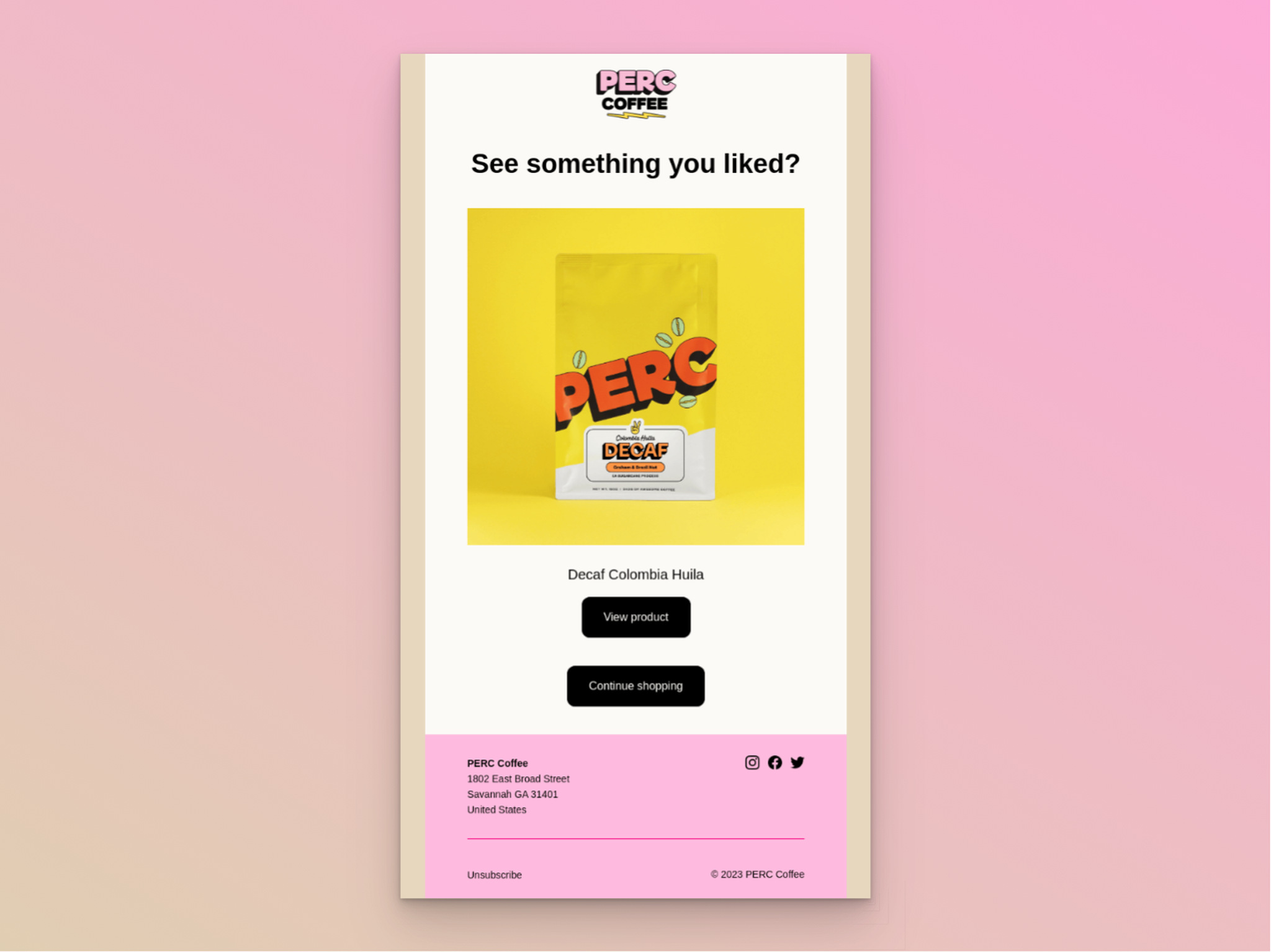
Perc Coffee's browse abandonment email
Subject line: Did something catch your eye?
What works: Perc Coffee strips everything down to the essentials: a question headline ("See something you liked?"), a single product image with the product name, and two CTA buttons. "View product" takes shoppers directly back to the item. "Continue shopping" opens the door to browse more. No fluff, no paragraphs of copy. The question-based subject line creates a micro-commitment. Opening the email to answer the question is the first step toward clicking through.
Why it works: Cognitive load theory says fewer decisions equal faster action. With one product and two clear paths forward, there's nothing to distract or confuse the reader. This works especially well for single-product browsing sessions where the shopper's intent was clear.
Key takeaway: If a shopper browsed one specific product, don't clutter the email with recommendations. Show them exactly what they looked at and give them a direct path back.
2. Judy: Appreciation and Social Proof
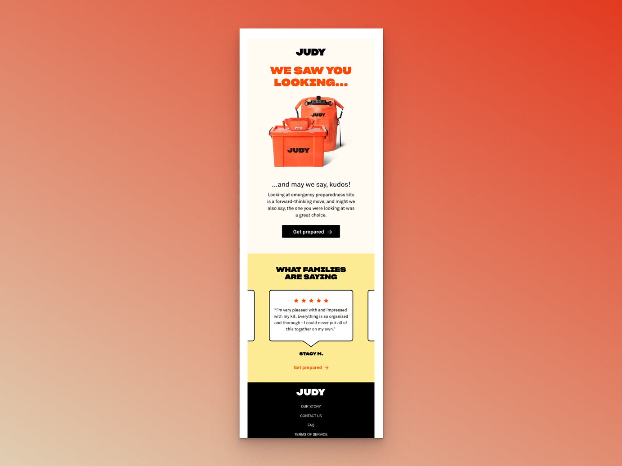
Judy's browse abandonment email
Subject line: nice work
What works: Judy flips the script on typical abandonment emails. Instead of "you forgot something," they congratulate the shopper: "We saw you looking... and may we say, kudos!" The email validates the browsing decision rather than pressuring a purchase. Below, customer reviews with star ratings provide social proof, and a "Get prepared" CTA ties into the brand's emergency preparedness positioning.
Why it works: Positive reinforcement triggers the consistency principle from behavioral psychology. When you tell someone they made a great choice, they're more motivated to follow through on that choice. The social proof section removes doubt by showing other people who already bought and loved the product.
Key takeaway: Try appreciating the browse instead of guilting the abandonment. "Great taste" messaging works better than "you left something behind" for brands selling considered purchases.
3. Feals: Discount-Led Recovery
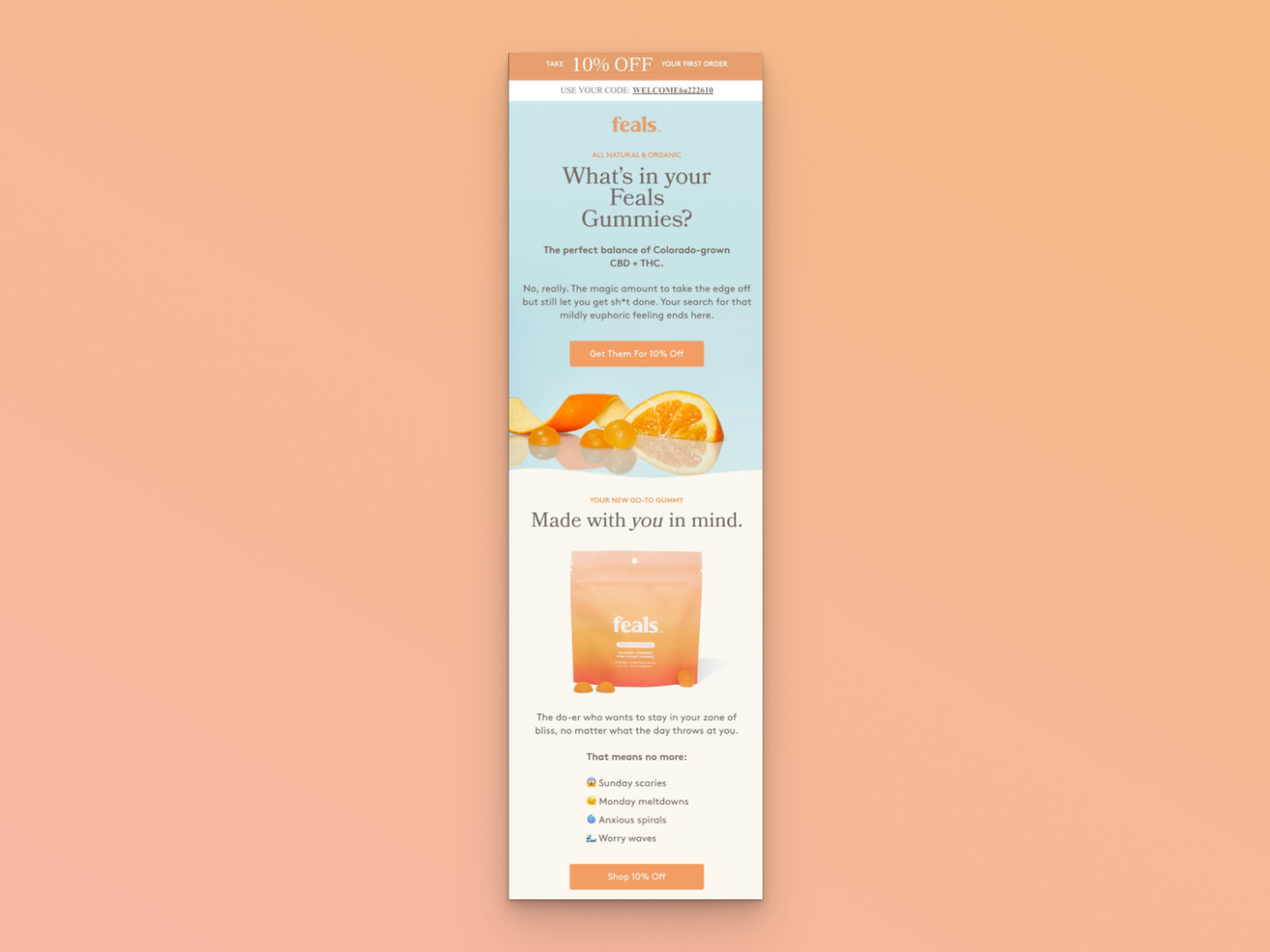
Feals' browse abandonment email
Subject line: Eyeing up the Gummies?
What works: Feals leads with value. Before the headline even appears, there's a discount banner with a coupon code for 10% off the first order. The email body then educates rather than sells, answering "What's in your Feals Gummies?" with natural ingredient callouts, short bullet points, and emojis that match the brand's playful tone. CTAs like "Get them for 10% off" reinforce the incentive throughout.
Why it works: Price is one of the top reasons shoppers abandon. By putting the discount above the fold, Feals removes the biggest objection immediately. The educational content below builds trust for a product category (CBD gummies) where ingredient transparency matters. It's a two-punch approach: lower the price barrier, then raise the trust level.
Key takeaway: If your product has a higher price point or unfamiliar ingredients, lead with a discount to lower resistance, then follow with educational content that justifies the purchase.
4. Buffy: Lifestyle Imagery and Cross-Selling
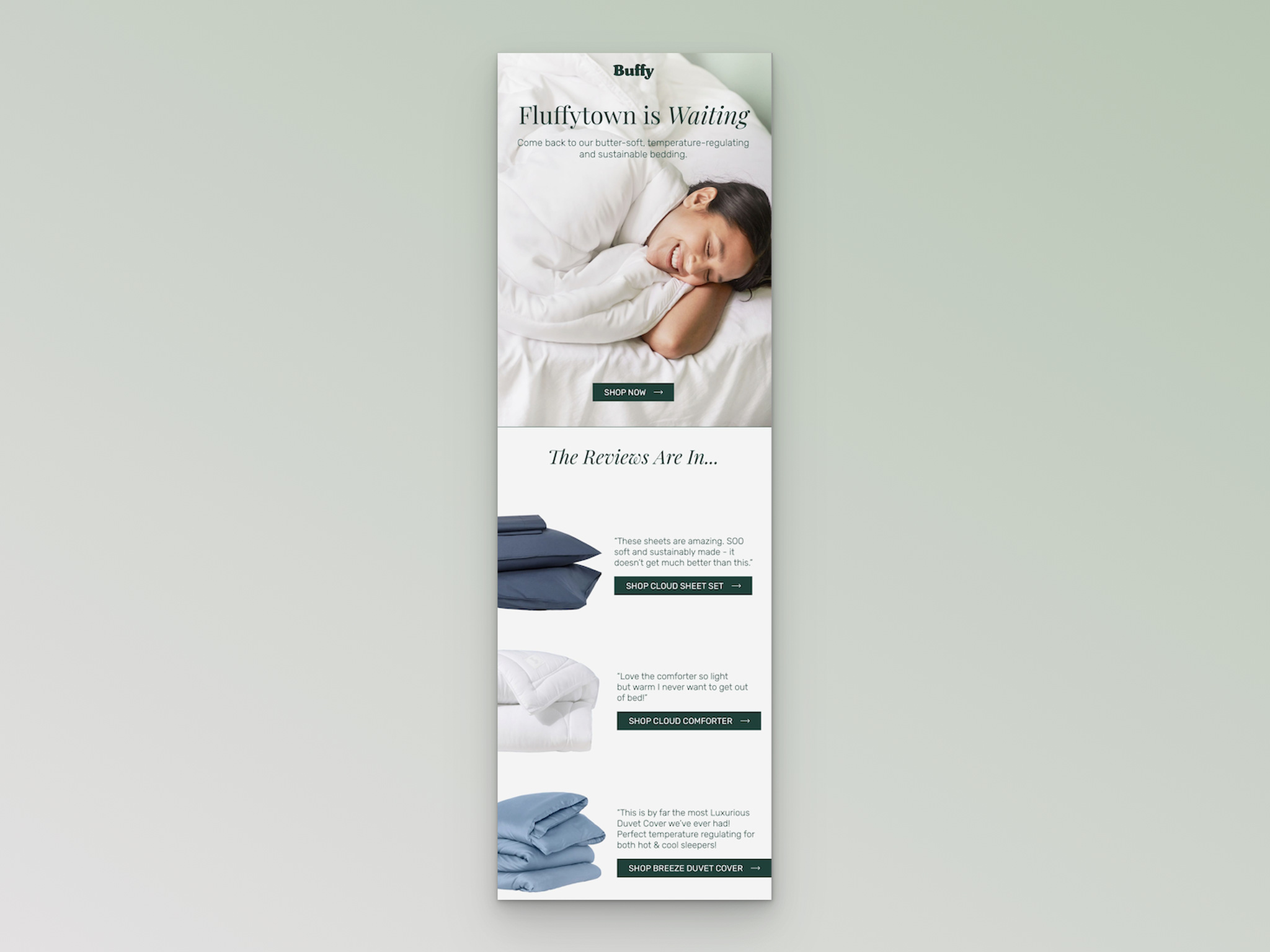
Buffy's browse abandonment email
Subject line: Still looking?
What works: Buffy opens with "Fluffytown is Waiting," a headline that matches the brand's cozy personality. The hero image shows a real person smiling while using their bedding products, not a flat product shot. Below the "Shop now" CTA, the email transitions into cross-sell recommendations with customer reviews alongside each product.
Why it works: Lifestyle photography triggers the endowment effect. Seeing someone enjoy a product makes shoppers imagine themselves using it, which creates a sense of ownership before the purchase. Adding reviews next to cross-sell items reduces friction because the shopper doesn't have to leave the email to check if other people liked the product.
Key takeaway: Use lifestyle images (real people using your product) instead of flat product shots in abandonment emails. Pair cross-sell recommendations with review snippets to reduce one more click.
5. Rareform: Brand Values as a Recovery Tool
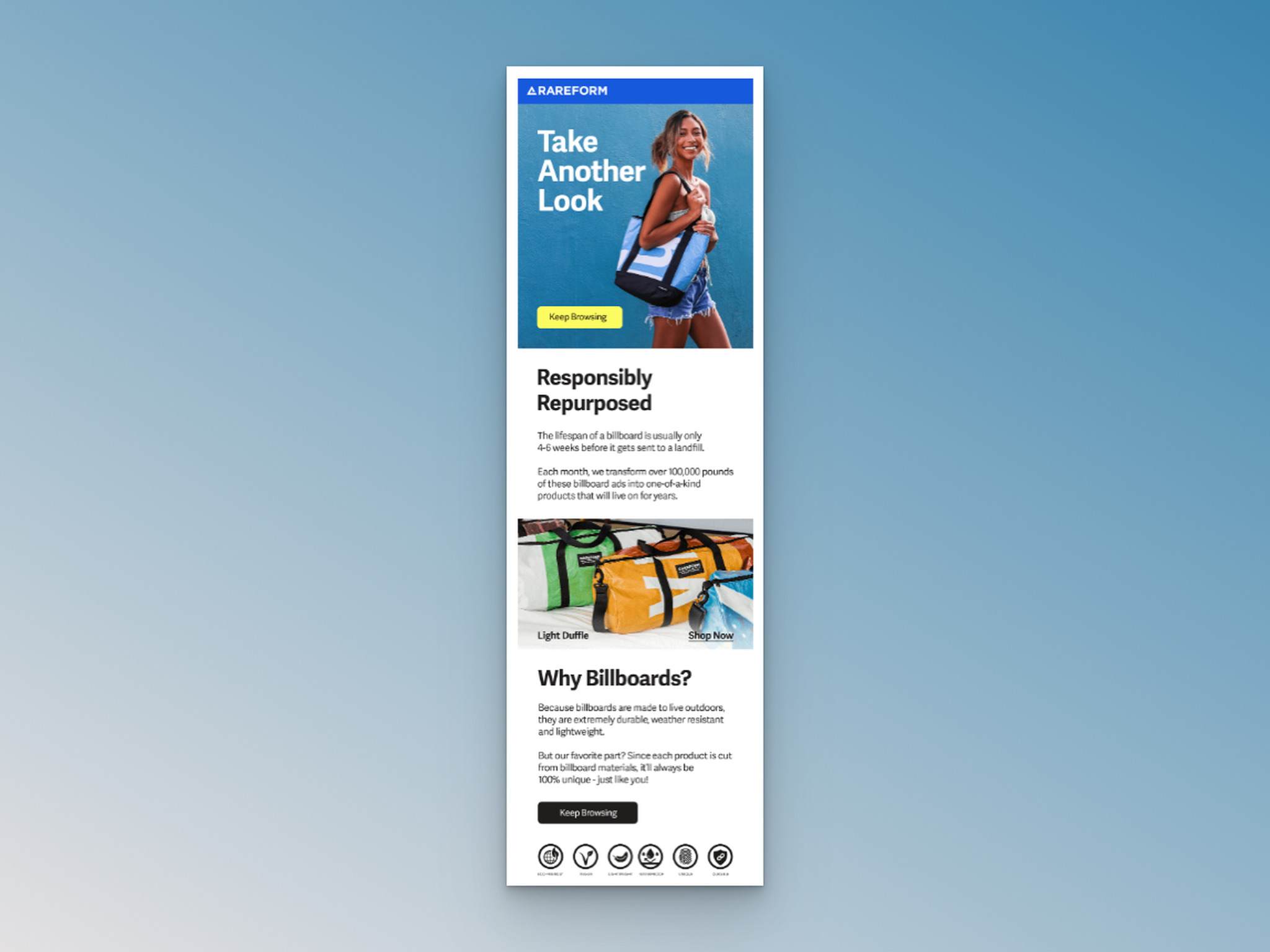
Rareform's browse abandonment email
Subject line: You've got great taste.
What works: Rareform starts with "Take another look" and a lifestyle image, but then does something different. After the first "Keep Browsing" CTA, the email pivots to a "Responsibly Repurposed" section explaining how their bags are made from recycled billboards. A second "Keep Browsing" CTA with a different background color appears at the bottom.
Why it works: For values-driven shoppers (a growing segment in 2026), sustainability messaging can be the tipping point. The browse abandonment email becomes a brand storytelling moment. The two differently styled CTA buttons also create an implicit A/B test within a single email: which button placement and style generates more clicks.
Key takeaway: If your brand has a strong mission or sustainability angle, use the abandonment email to tell that story. It gives hesitant shoppers a reason to buy beyond the product itself.
6. On: Free Shipping as the Hook
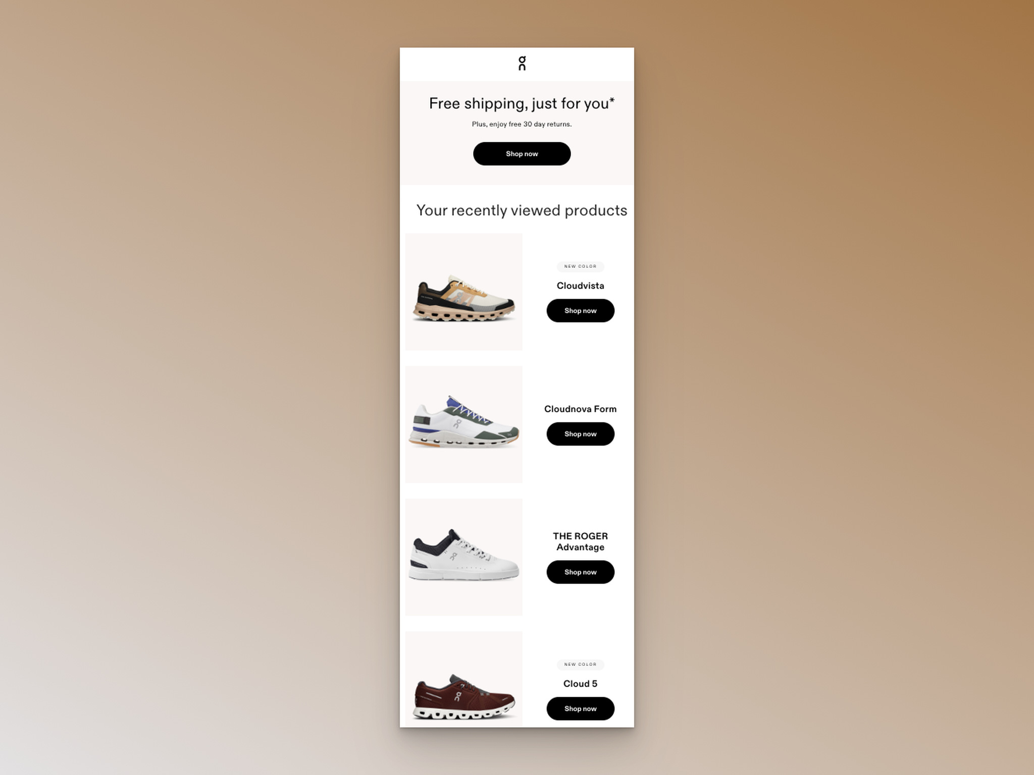
On's browse abandonment email
Subject line: We saw you looking...
What works: On keeps it brutally short. The headline is "Free shipping, just for you*," followed by a single sentence about their 30-day return policy. Below that: the browsed products with images, names, and individual "Shop Now" buttons. No walls of text. No brand story. Just the offer and the products.
Why it works: Shipping costs cause roughly 48% of cart abandonments according to Baymard Institute's research. By leading with free shipping in a browse abandonment email, On removes the cost objection before the shopper even gets to the cart stage. The 30-day return policy handles the second biggest objection: "what if I don't like it?"
Key takeaway: Lead with your strongest incentive (free shipping, free returns) in the headline. Don't bury it at the bottom where most readers never scroll.
7. Veronica Beard: Simplicity That Converts
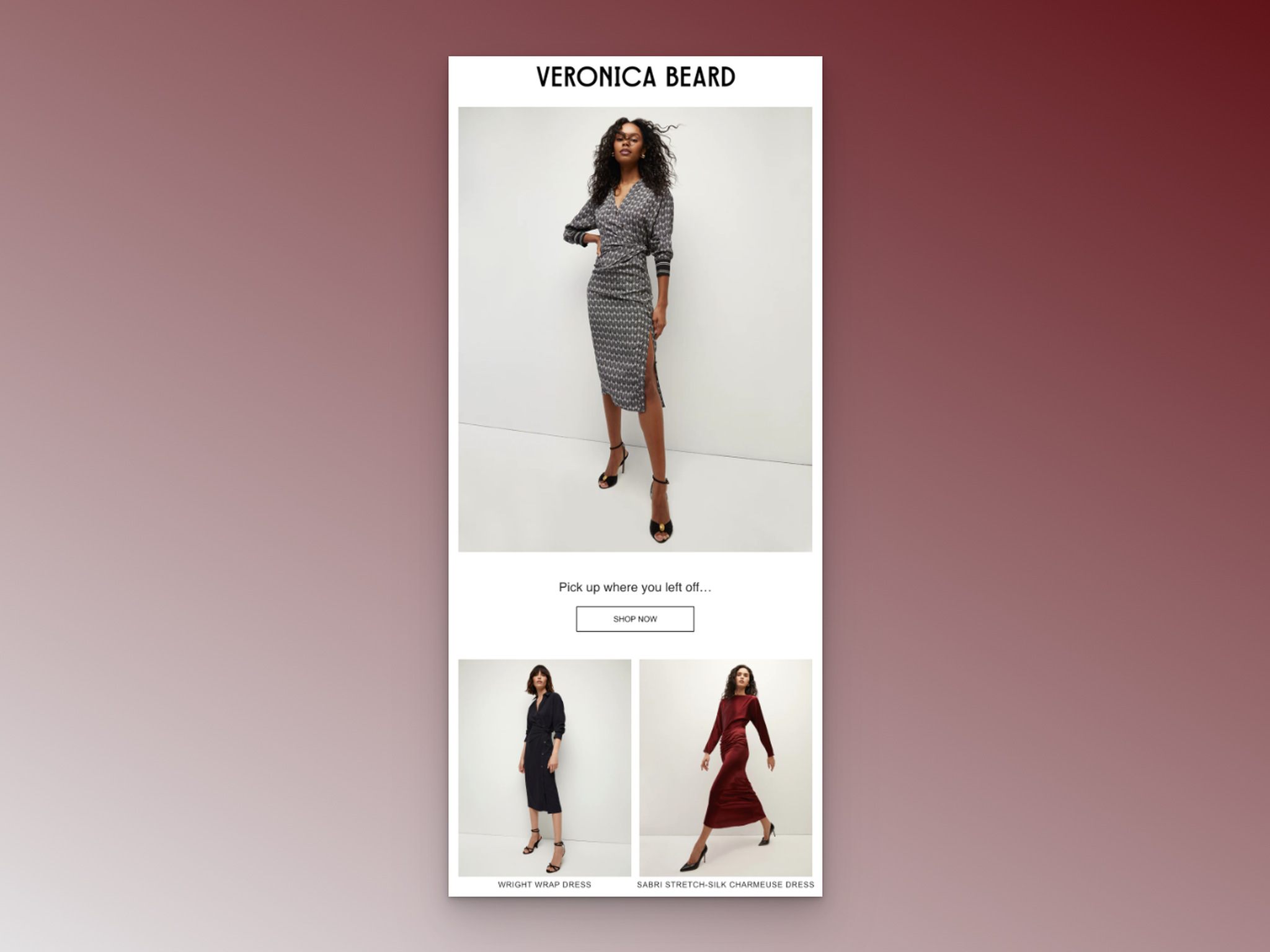
Veronica Beard's browse abandonment email
Subject line: Still Deciding?
What works: Veronica Beard uses a question subject line and delivers an equally concise email. The browsed product image takes center stage. "Pick up where you left off..." is the only copy. One "Shop now" button. Below, a small section showcases other products with images for those who want to keep browsing.
Why it works: For luxury and fashion brands, the product itself should be the star. Long email copy can cheapen the perception. This email respects the shopper's time and intelligence. It says: "We know you were looking at this. Here it is." The recommendation section catches people whose original browse didn't land on the right item.
Key takeaway: When your product speaks for itself visually (fashion, luxury, design), let the image dominate and keep copy under 20 words. Less text can mean more conversions for premium brands.
8. Cole Haan: FOMO-Driven Scarcity
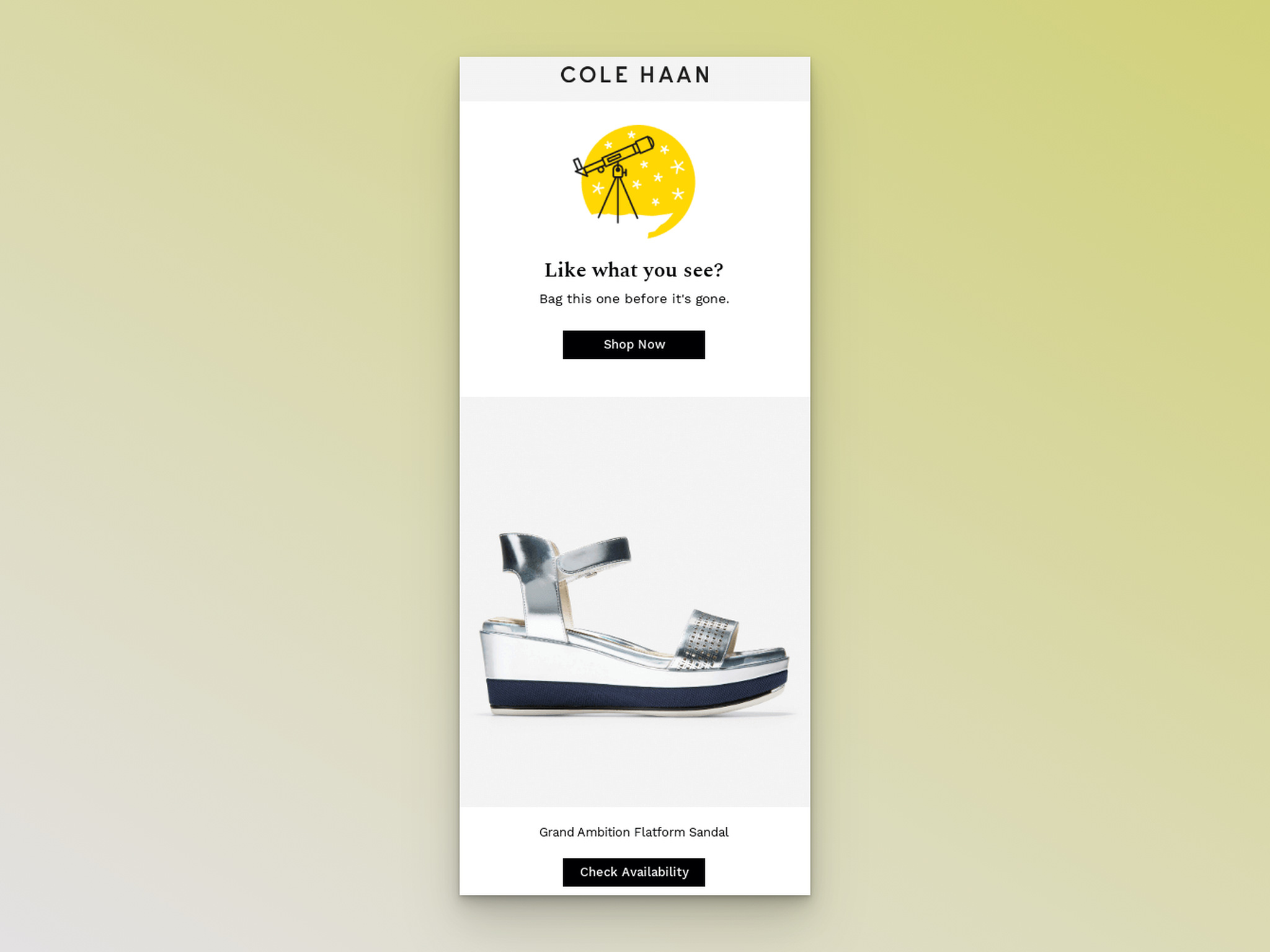
Cole Haan's browse abandonment email
Subject line: Open to see the styles curated for you
What works: Cole Haan adds personalization to the subject line with "curated for you," then builds urgency inside the email. "Like what you see?" opens the copy, followed by "Bag this one before it's gone." The CTA says "Check Availability" instead of the standard "Shop now," which reinforces scarcity. This is a textbook example of using FOMO marketing in emails.
Why it works: Loss aversion (the tendency to prefer avoiding losses over acquiring gains) drives the psychology here. "Before it's gone" and "Check Availability" both imply the product might not be there tomorrow. Shoppers who were on the fence suddenly feel the urgency to act because not buying feels like losing something they already considered theirs.
Key takeaway: Replace generic "Shop now" CTAs with scarcity-driven alternatives like "Check Availability" or "See If It's Still In Stock." It shifts the shopper's mindset from casual to urgent.
9. Rael: Conversational and Colorful
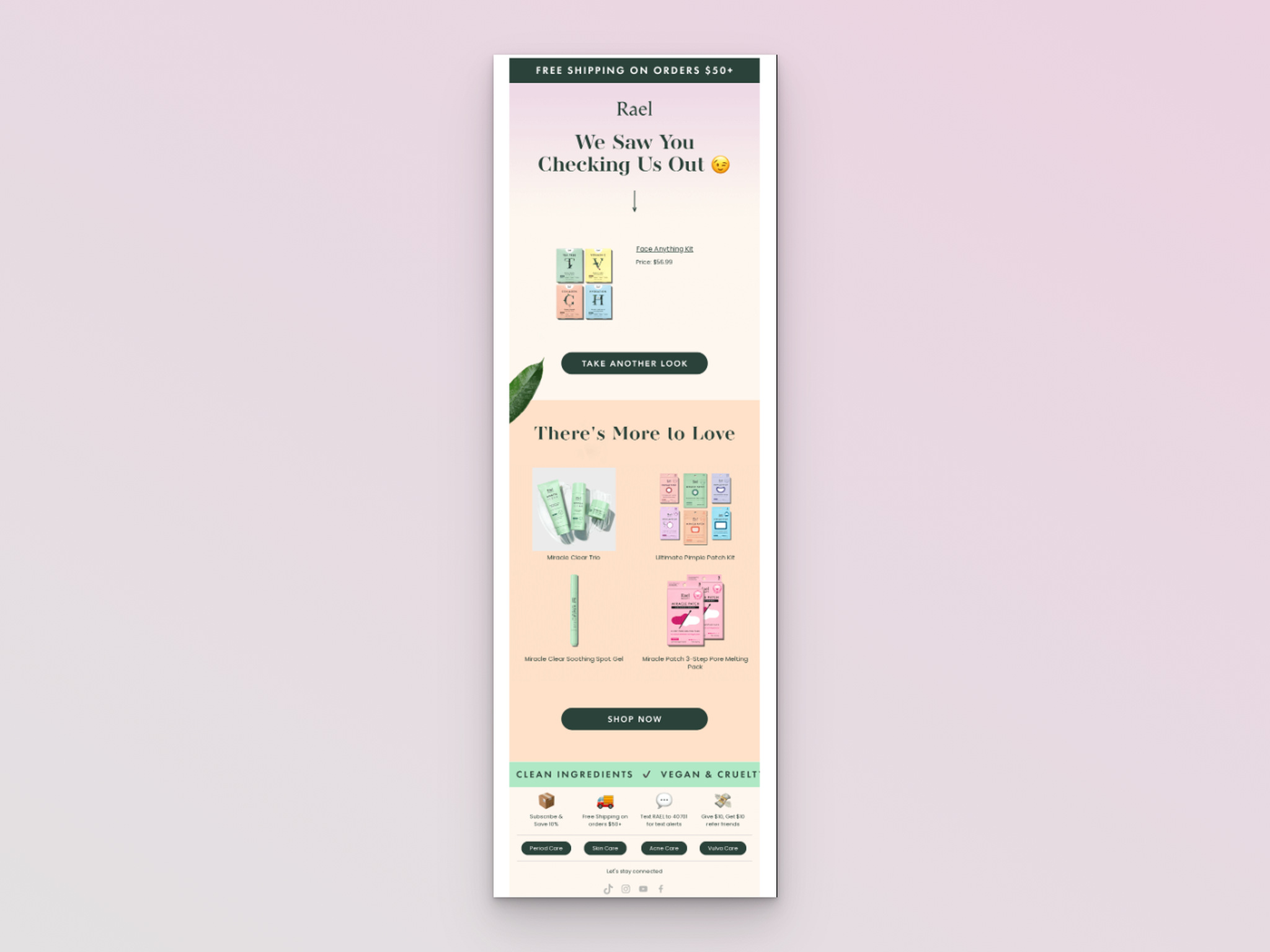
Rael's browse abandonment email
Subject line: We noticed you, noticing us.
What works: Rael nails the conversational tone. The subject line reads like a text from a friend, not a marketing email. Inside, "We saw you checking us out" continues the playful vibe. The email shows the browsed product with full pricing details and a "Take another look" CTA, then transitions to recommendations with a "Shop Now" button.
Why it works: Personal care products involve trust. Nobody wants to feel "marketed to" when choosing something they'll put on their body. Rael's friendly, almost flirtatious tone lowers the sales guard and makes the email feel like a conversation rather than a transaction. The colorful design matches the brand's packaging, creating visual consistency.
Key takeaway: Match your email tone to your product category. Personal care and wellness brands should sound warm and approachable, not corporate. Let your brand personality come through in every line.
10. Snake River Farms: Product Plus Education
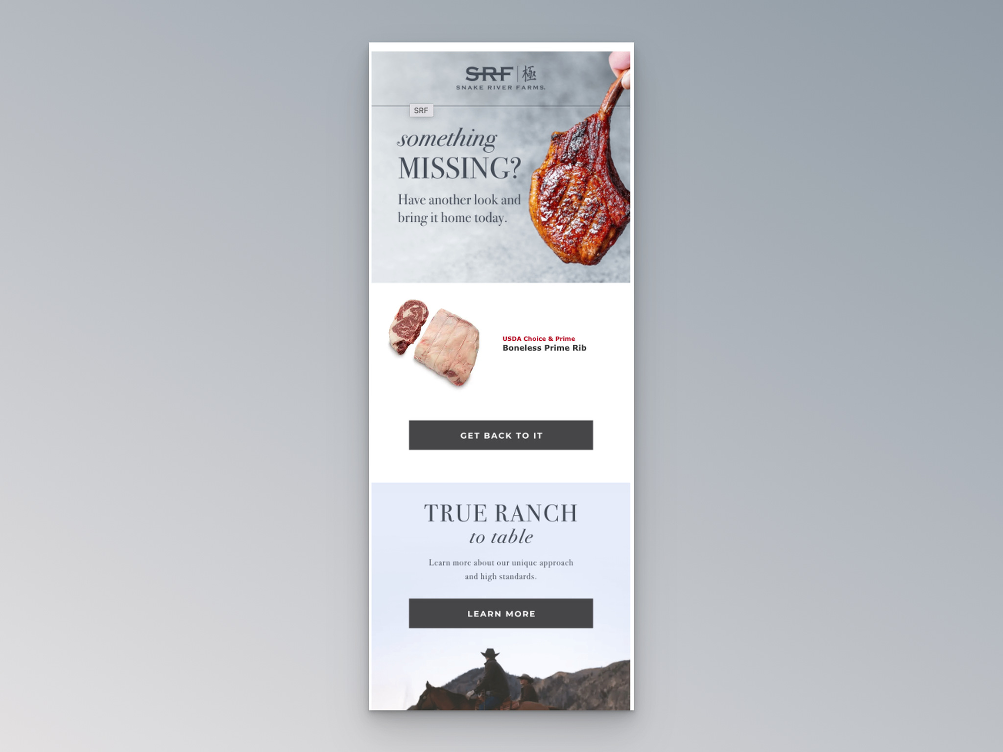
Snake River Farms' browse abandonment email
Subject line: You have great taste
What works: Snake River Farms opens with "Something missing?" and follows with "Have another look and bring it home today," a line that's both catchy and actionable. Product images and a "Get back to it" CTA handle the recovery part. But the email goes further by including a "Learn more" section about their ranching standards and quality approaches.
Why it works: Premium food products need trust-building that goes beyond pretty images. Shoppers spending $100+ on beef want to know about sourcing, grading, and quality standards. By including educational content alongside the product reminder, Snake River Farms addresses the unspoken question: "Is this worth the price?" It turns the abandonment email into a trust-building moment.
Key takeaway: For premium or specialty products, pair your product reminder with a short brand credibility section. Shoppers researching high-ticket items need trust signals, not just product images.
11. Herschel Supply Co.: Multi-Product Display
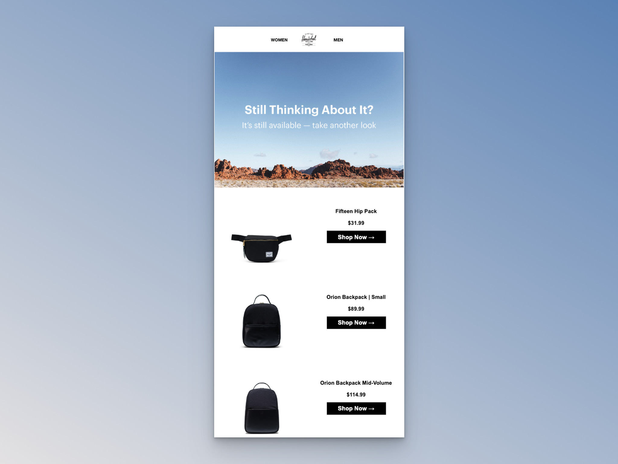
Herschel Supply Co.'s browse abandonment email
Subject line: Looking For Something?
What works: Herschel Supply Co. opens with "Still Thinking About It?" and "It's still available - take another look." Then, instead of showing a single product, the email displays multiple previously browsed items with images, details, and individual "Shop Now" buttons for each one.
Why it works: When a shopper browsed several products in one session, showing all of them increases the chance that at least one triggers a click. This is the shotgun approach: cast a wider net and let the shopper self-select. It also signals that the brand tracked the full browsing session, making the email feel more personalized.
Key takeaway: If your browse abandonment data shows multi-product sessions, display all browsed items rather than picking just one. More options mean more chances to convert.
12. Murad Skincare: Benefit-Focused Copy
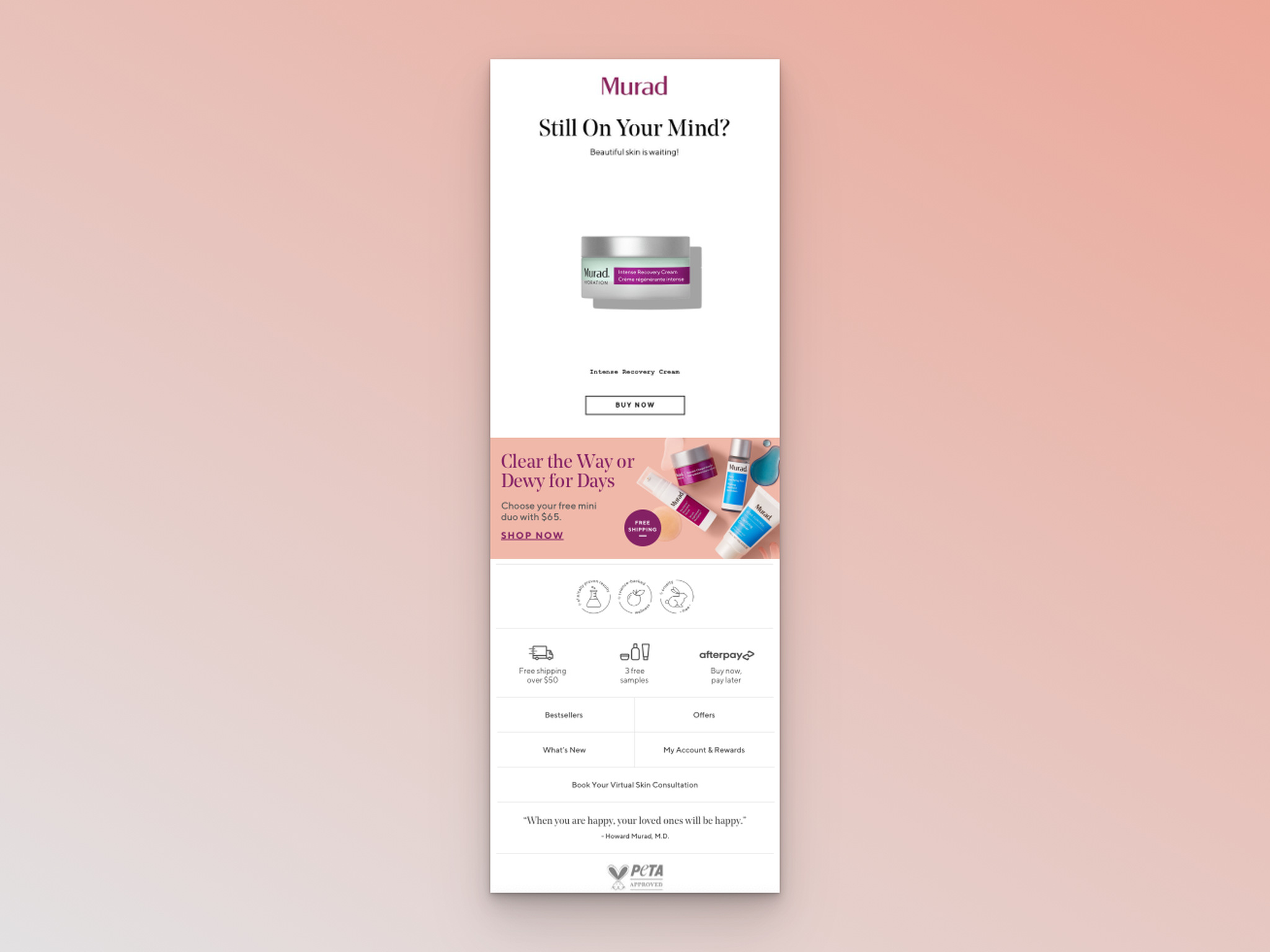
Murad Skincare's browse abandonment email
Subject line: We love the item you're looking at, too.
What works: Murad Skincare opens with "Still On Your Mind?" and immediately ties the product to its outcome: "Beautiful skin is waiting!" The email includes a product image, a "buy now" CTA, cross-sell recommendations, and a footer highlighting free samples, free shipping over $50, and buy now/pay later options with icons.
Why it works: Murad doesn't sell a serum. They sell "beautiful skin." Benefit-focused copy connects the product to the shopper's actual desire (the outcome) rather than the feature (the ingredients). The footer stacks three value-adds (samples, shipping, payment flexibility) to remove every remaining objection without cluttering the main email body.
Key takeaway: Write your browse abandonment email around the benefit your product delivers, not the product itself. "Beautiful skin is waiting" converts better than "your serum is waiting."
13. TeePublic: Bundling to Boost AOV
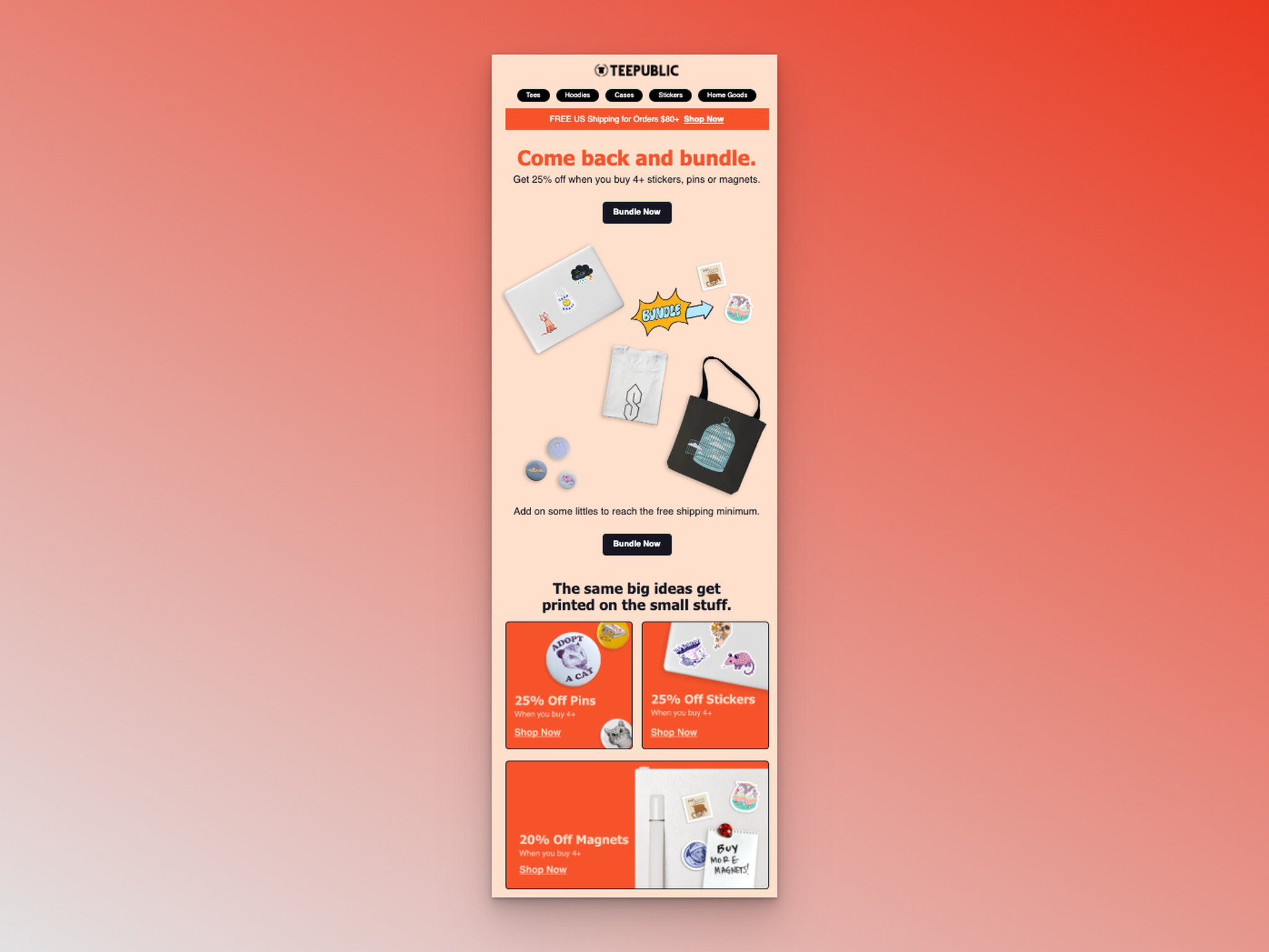
TeePublic's browse abandonment email
Subject line: Small stuff, same big ideas.
What works: TeePublic leads with a free shipping banner, then pivots to "Come back and bundle." Instead of just reminding the shopper about what they browsed, TeePublic offers product bundles with a "Bundle Now" CTA. Additional brand offers with "Shop now" buttons fill out the rest of the email.
Why it works: Bundling transforms an abandonment recovery email into an upselling opportunity. The shopper came for one item, but now they're considering three at a perceived discount. This increases average order value (AOV) while making the shopper feel they're getting a deal. It's a win for both sides.
Key takeaway: Test offering a product bundle in your browse abandonment email instead of just showing the individual item. Bundles can increase AOV by 20-30% while giving shoppers a reason to buy now.
14. Jord: Scarcity With Personality
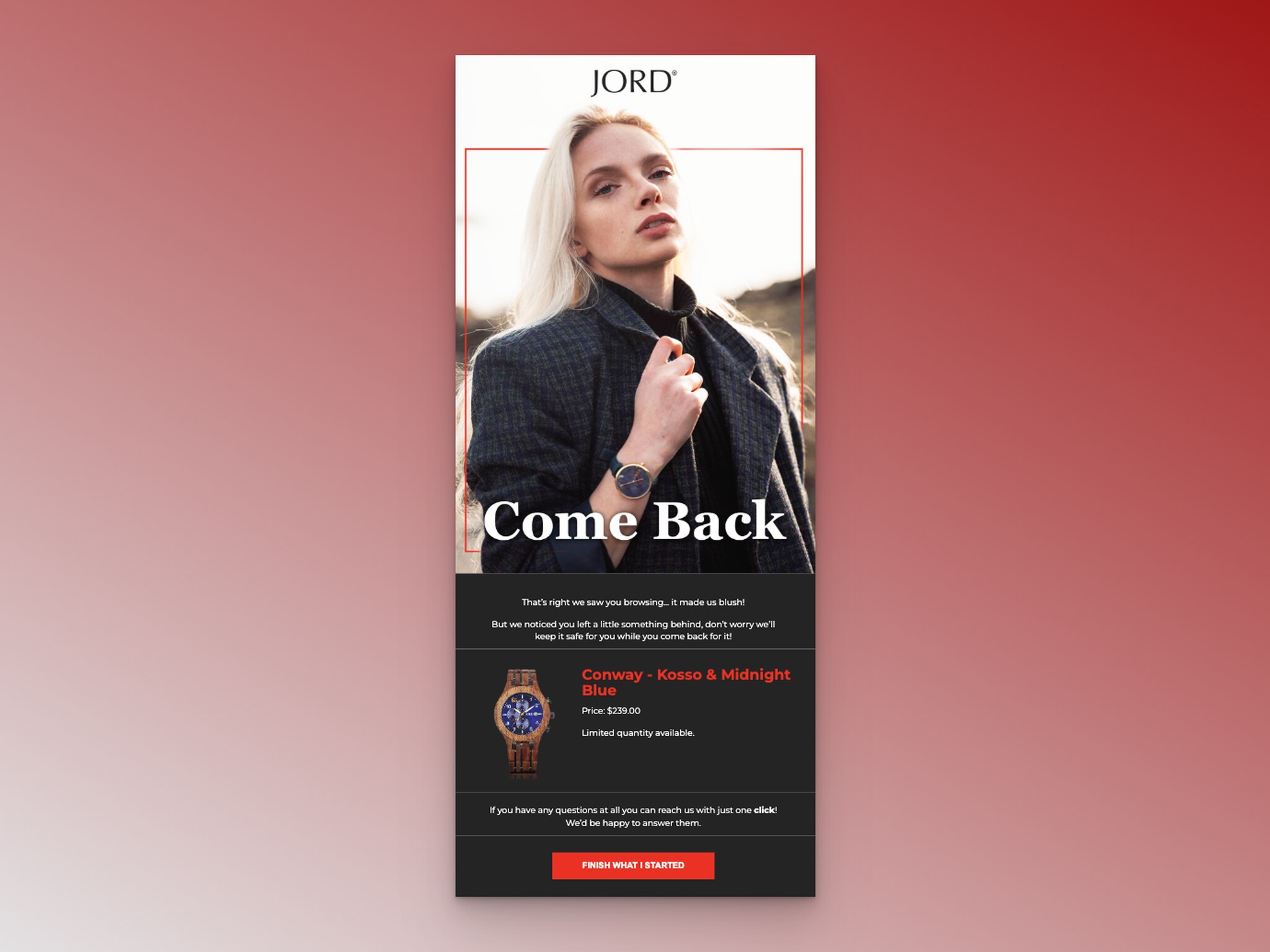
Jord's browse abandonment email
Subject line: No One Gets Left Behind
What works: Jord opens with "Come back," then follows with "That's right, we saw you browsing. It made us blush!" The playful, human tone continues with "Don't worry, we'll keep it safe for you." Product details include the image, name, price, and a "limited quantity available" note that creates sense of urgency without being pushy.
Why it works: Jord combines two techniques that usually feel contradictory: scarcity ("limited quantity") and warmth ("it made us blush"). Most brands pick one lane. Jord manages to create urgency while maintaining a conversational, likable voice. The "we'll keep it safe for you" line builds loyalty even if the shopper doesn't convert right away.
Key takeaway: Scarcity messaging doesn't have to sound aggressive. Wrap "limited quantity" or "selling fast" in friendly, brand-appropriate language to create urgency without alienating your audience.
15. Saatchi Art: Urgency Plus Discount Combo
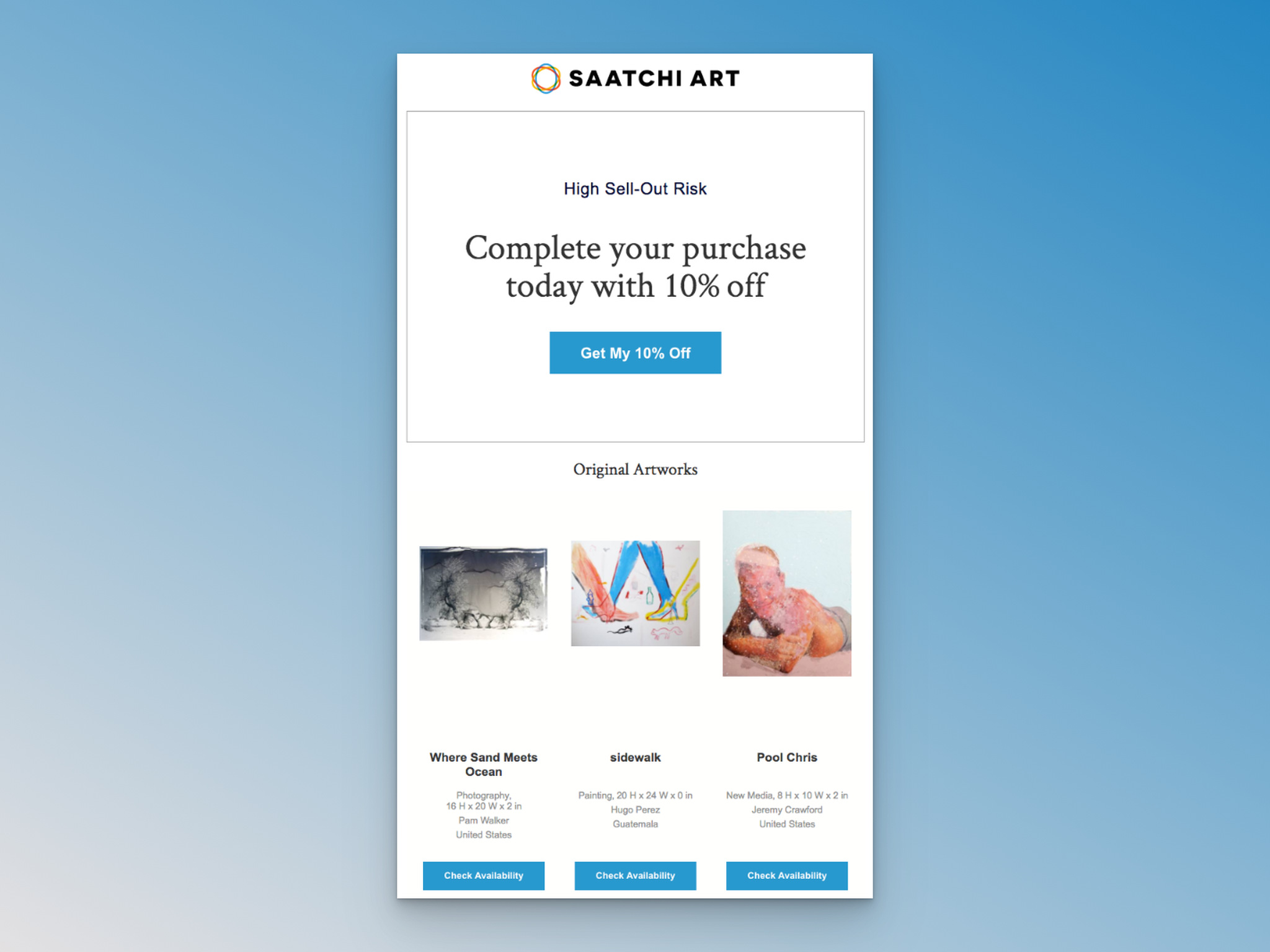
Saatchi Art's browse abandonment email
Subject line: The Artworks You Looked at Are Being Discovered
What works: Saatchi Art layers three conversion triggers: social proof ("are being discovered" implies other shoppers are interested), scarcity ("High Sell-Out Risk" label), and incentive ("Complete your purchase today with 10% off"). The "Get my 10% off" CTA makes the discount feel personal. Individual artworks display with "Check Availability" buttons.
Why it works: Original art is a high-consideration, high-price purchase. Saatchi Art tackles every objection in sequence: "Other people want this" (social proof reduces uncertainty), "it might sell out" (loss aversion creates urgency), and "here's 10% off" (price incentive lowers the barrier). The triple-layer approach works for expensive, one-of-a-kind products where a single tactic might not be enough.
Key takeaway: For high-ticket items, stack multiple persuasion techniques (social proof + scarcity + discount) in one email. A single approach rarely converts when the price tag is significant.
Browse Abandonment Subject Lines That Get Opens
Your subject line determines whether the email gets opened or trashed. After analyzing the 15 examples above and testing subject lines across various e-commerce email capture campaigns, here are 34 browse abandonment subject lines organized by strategy.
Personalized Product Recommendation Subject Lines
These work best when you have the shopper's name and browsing data:
• "Hey [Name], Spotted Something You'll Love?"
• "Your Personalized Picks Await, [Name]!"
• "Did You Forget Something, [Name]?"
• "Take Another Look, [Name]! We've Got Recommendations Just for You."
• "Spotlight on Your Favorites: Take Another Look!"
• "Your Perfect Match Awaits, Dive Back In!"
• "We Found Your Next Must-Have, [Name]!"
• "Curated Just for You: Your Top Picks!"
Urgency and FOMO Subject Lines
Use these when stock is genuinely limited or a sale is ending:
• "Act Fast! These Items Are Selling Out!"
• "Limited Time Only: Complete Your Purchase Now!"
• "Don't Wait! These Items Won't Be Reserved Forever."
• "Urgent: These Items Are Waiting, Grab Them Now!"
• "Hurry Back: [Product] Won't Wait Forever!"
• "Last Chance to Claim Your Cart, Time's Ticking!"
• "Don't Delay: [Product] is in High Demand!"
• "Urgent Reminder: Your Items Are Ready to Go!"
For more urgency-driven ideas, check out 130 FOMO subject line examples.
Curiosity-Driven Subject Lines
These create an open loop the shopper wants to close:
• "Surprise Inside: Open to Find Out!"
• "Something Exciting Awaits You..."
• "You Won't Believe What's Waiting for You!"
• "Ready to Be Amazed? Click to Find Out!"
Problem-Solving Subject Lines
Best for complex or high-consideration products:
• "Having Trouble Deciding? Let Us Help!"
• "Struggling to Find the Perfect [Product]? We've Got You Covered!"
• "Need Assistance? Our Experts Are Here to Guide You!"
• "Stuck in Your Decision? Let Us Make It Easier for You."
• "Stuck in Decision-Making? Your Cart Holds the Answer!"
• "Decision Paralysis? Let This Guide Help You!"
• "Need Help Choosing? Let Us Be Your Guide!"
Playful and Engaging Subject Lines
These match well with casual, fun brand voices:
• "Oops! Looks Like You Forgot Something, Let's Fix That!"
• "Lost and Found: Your Items Are Waiting for You!"
• "Don't Let Your Shopping Trip End Yet, We've Got More!"
• "Ready for Round Two? Let's Complete Your Shopping Spree!"
• "These Items Feel Lonely, Give Them Some Love!"
• "Cart Adventures Await: Let's Pick Up Where You Left Off!"
• "Don't Leave These Hanging, They Miss You!"
Why Browse Abandonment Emails Matter?
Browse abandonment emails aren't optional anymore. They're one of the highest-performing automated email flows you can build, and the data backs that up.
According to Klaviyo's benchmark data, browse abandonment emails achieve a 0.96% conversion rate, which is 9.6x higher than the average email campaign. That gap alone should convince you to prioritize this flow.
Here's why these emails work so well:
- Timing meets intent. The shopper already showed interest by visiting specific product pages. Your email arrives while that interest still exists, making it far more relevant than a generic promotional blast.
- Low friction, high reward. You're not asking someone to do something new. You're reminding them about something they already wanted. That psychological nudge converts at rates most email campaigns can't touch.
- Revenue adds up fast. According to Drip, abandoned carts cost e-commerce marketers $18 billion in revenue each year. Browse abandonment emails capture interest even before the cart stage, adding incremental revenue on top of your cart recovery flows.
If you're already running abandoned cart email campaigns, adding browse abandonment is the logical next step. It fills the gap earlier in the customer journey where most of your traffic actually drops off.
Tips for Effective Browse Abandonment Emails
After working with e-commerce email flows for over 5 years, I've seen what separates high-performing browse abandonment campaigns from ones that sit at a 0.1% click rate. These tips come from real campaign data and the patterns visible across the 15 examples above.
According to Litmus, browse abandonment emails can achieve a 35% open rate, a 6% conversion rate, and a 2% uplift in sales.
Here's how to hit those numbers:
- Send within 1-4 hours. Timing is everything. The product is fresh in the shopper's mind right after they leave. Waiting 24 hours drops conversion rates significantly because the shopper has moved on (or worse, bought from a competitor).
- Personalize with browsed products. Generic "come back" emails don't work. Show the exact product image, name, and price the shopper viewed. Tools like Klaviyo's browse abandonment flow make this automatic by pulling product data from your catalog.
- Write subject lines that match your brand voice. Judy uses playful appreciation. On keeps it straightforward. Cole Haan uses scarcity. Your subject line should sound like your brand, not a template. According to Sendtric, up to 45% of abandonment emails get opened, so your subject line is the first conversion point.
- Include one clear CTA above the fold. Don't make shoppers scroll to find the button. Every example in this post puts the primary CTA within the first scroll, typically right below the product image.
- Add cross-sell recommendations below the fold. If the primary product doesn't convert, alternative suggestions give the shopper another reason to click. Brands like Buffy, Murad, and Herschel all use this tactic.
- Test incentives carefully. Discounts work (Feals, Saatchi Art), but don't train your shoppers to abandon on purpose to get a coupon. Consider reserving discounts for the second or third email in your flow, not the first.
- Optimize for mobile. Over 60% of email opens happen on mobile devices. Your product images, CTAs, and text need to render perfectly on a phone screen. If shoppers have to pinch and zoom, they won't convert.
- Build an automated email flow. A single abandonment email works, but a sequence of 2-3 emails performs better. Email 1: product reminder (1-4 hours). Email 2: social proof or brand story (24 hours). Email 3: discount or last chance (48-72 hours).
- Capture emails before they browse. You can't send a browse abandonment email without an email address. Use email capture popups to collect emails early in the browsing session through welcome discounts, spin-the-wheel offers, or exit-intent forms.
Difference Between Browse Abandonment and Cart Abandonment Emails
These two email types target different stages of the buying journey, and confusing them leads to mismatched messaging.
| Factor | Browse Abandonment | Cart Abandonment |
|---|---|---|
| Trigger | Viewed product page, didn’t add to cart | Added to cart, didn’t complete checkout |
| Buyer Intent | Low to medium (just browsing) | High (committed enough to add to cart) |
| Email Tone | Gentle reminder, discovery-focused | Urgent, recovery-focused |
| Typical Incentive | Product education, social proof | Discount, free shipping, scarcity |
| Send Timing | 1–4 hours after browsing | 30 minutes to 1 hour after abandonment |
| Average Conversion Rate | 0.96% (Klaviyo) | 2–5% (industry average) |
| Volume of Addressable Audience | Much larger (most visitors browse) | Smaller (only cart-adders) |
The biggest mistake I see is treating browse abandonment emails like cart abandonment emails. When someone just browsed, they haven't committed yet, so aggressive "complete your purchase!" copy feels pushy and irrelevant. They didn't start a purchase. They were window shopping.
Browse abandonment emails should feel more like a friendly nudge: "Hey, this caught your eye." Cart abandonment emails can be more direct: "You left items in your cart."
According to Sendtric, up to 20% of all abandonments can be recovered and converted to sales. Running both flows together captures revenue at two different funnel stages, which is why brands like the ones in this post treat them as complementary, not interchangeable. For more on Shopify cart abandonment email setup, we've got a separate guide.
Start Recovering Lost Revenue With Browse Abandonment Emails
These 15 browse abandonment email examples prove there's no single "right" approach. Perc Coffee wins with minimalism. Judy wins with warmth. Saatchi Art wins by stacking urgency, social proof, and discounts. The common thread is that every email is timely, personalized, and gives the shopper a clear reason to come back.
Start with one automated browse abandonment email, something simple like a product reminder sent 2 hours after browsing. Track your open rates and click-throughs. Then iterate: test subject lines, add cross-sells, experiment with incentive timing.
If you want to capture more email addresses before shoppers bounce (so you actually have someone to send these emails to), website overlays and well-placed CTAs can help you build your list faster. The more emails you collect, the bigger your browse abandonment audience gets, and the more revenue you recover.
Frequently Asked Questions
What Are Effective Browse Abandonment Subject Lines?
The most effective browse abandonment subject lines use one of five approaches: personalization ("Hey [Name], spotted something?"), urgency ("These items are selling out"), curiosity ("Something exciting awaits"), problem-solving ("Having trouble deciding?"), or appreciation ("You've got great taste"). Keep them under 50 characters for mobile and test different styles against your audience.
How Do You Set Up Browse Abandonment Email in Klaviyo?
In Klaviyo, go to Flows, click "Create Flow," and select the "Browse Abandonment" template. Set the trigger to "Viewed Product" with a time delay of 2-4 hours. Add conditional splits for people who didn't start checkout. Customize the email template with dynamic product blocks that auto-populate the browsed item's image, name, and price. You'll need your product catalog synced and active tracking on your site.
What Are Browse Abandonment Best Practices?
Send within 1-4 hours of the browse session. Personalize with the exact product they viewed. Use your brand voice in the subject line. Include one clear CTA above the fold. Add cross-sell recommendations below. Build a 2-3 email sequence (reminder, social proof, incentive). A/B test subject lines, send times, and incentive placement. Always optimize for mobile first.
What Is Abandon Browse Copy?
Abandon browse copy is the email text specifically written for people who viewed products without adding to cart. Good abandon browse copy acknowledges the browsing behavior ("We saw you looking"), shows the browsed product, and provides a reason to return (social proof, discount, urgency, or product education). The tone should match your brand: playful for casual brands, polished for luxury, educational for complex products.

How would you rate your experience with this article? 😊