10+ FOMO Marketing Email Examples That Convert in 2026
Overview of FOMO email tactics to boost conversions: limited-time offers (free shipping/discounts/flash sales/limited stock), back-in-stock alerts, reviews, best-sellers, missed chances, one-time and seasonal promos, cart reminders, and limited freebies.
FOMO marketing email examples use real deadlines, social proof, and specific scarcity to push subscribers off the fence. After A/B testing FOMO emails across 50+ campaigns, I've pulled the 10+ formats below — limited-time offers, flash sales, back-in-stock alerts, abandoned cart reminders — that consistently lift open and click rates without burning subscriber trust.
What is FOMO marketing in email?
FOMO marketing in email is the practice of writing campaigns that surface a real, time-bound reason to act now — a deadline, a low stock count, a closing window — so subscribers feel the cost of waiting. The trigger isn't manipulation. It's the same pull a friend's "tickets just dropped" text creates: you check fast because you don't want to be the one who missed it.
The phrase comes from "fear of missing out," coined in academic research around 2013. In email, it shows up as countdown timers, "ends tonight" subject lines, low-inventory bars, and waitlist invites. According to ConvertCart, psychologists trace FOMO back to an evolutionary need to belong to a group — missing out on resources or social opportunities was once dangerous, so our brains still treat scarcity as a signal to pay attention.
What separates a FOMO email that converts from one that gets unsubscribed?
• Real cutoffs: the deadline actually exists, the stock count is accurate, the discount really expires.
• Specificity: "ends Friday at 11:59 PM PT" beats "ending soon," every time.
• One ask per email: a single CTA, not a buffet of links.
• Mobile-first subject lines: the urgency cue lands in the first 30 characters, where the inbox preview cuts off.
Done well, FOMO emails turn passive readers into clickers. Done lazily — recycled "last chance" emails every Tuesday — they teach subscribers to ignore your sender name. The examples below split the difference: high-converting formats that still respect the reader.
Why FOMO works in 2026 email marketing
FOMO works because it shortens the gap between "I'm interested" and "I'm checking out." When inboxes are crowded and attention is split between Slack, TikTok, and 14 open tabs, a clear deadline gives the brain a cheap reason to prioritize one message over another. That's why even after a decade of think-pieces calling it "tired," urgency-based email still moves the needle for e-commerce and SaaS.
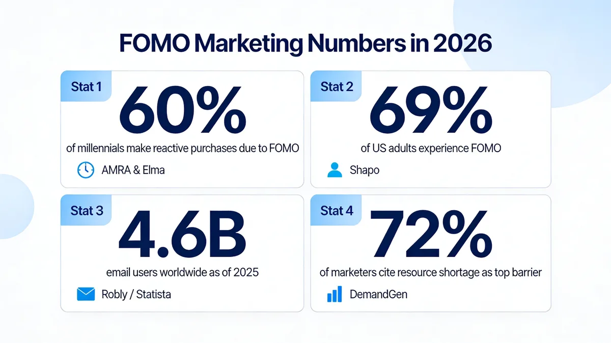
FOMO marketing by the numbers in 2026.
The data backs it up. According to AMRA & Elma, 60% of millennials make reactive purchases because of FOMO — meaning they buy something within 24 hours of feeling like they'd miss it otherwise. Shapo reports that 69% of US adults experience FOMO regularly, which is the addressable audience for almost any consumer-facing email program.
Reach is still on email's side too. According to Robly, there are roughly 4.6 billion email users worldwide as of 2025, projected to reach 4.89 billion by 2027. That's a bigger active audience than any single social platform. The catch: with so many sends competing for attention, generic promotional emails get buried. FOMO is one of the few angles that consistently earns a click against that volume.
It also helps that most marketing teams are short on people. According to the 2026 B2B Trends Research Report, 72% of marketers say a lack of resources is their primary barrier to hitting key objectives. FOMO emails are one of the highest-impact things a small team can ship — one good template plus a real deadline can outperform a month of brand-building sends.
One caveat I always flag in our team's testing: the more often you cry "last chance," the less it lands. Treat FOMO like seasoning, not the entire meal. Three to four genuine urgency campaigns a quarter, paired with normal nurture, beats weekly fake-scarcity blasts every time.
10+ FOMO marketing email examples that convert
Each example below pairs a brand screenshot with a teardown of what's working and what to copy. I've tagged the underlying psychological lever (scarcity, social proof, loss aversion, etc.) so you can match the format to your offer instead of cargo-culting the design.
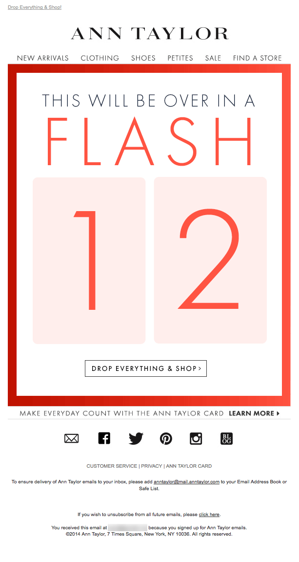
1. Limited-time offer emails

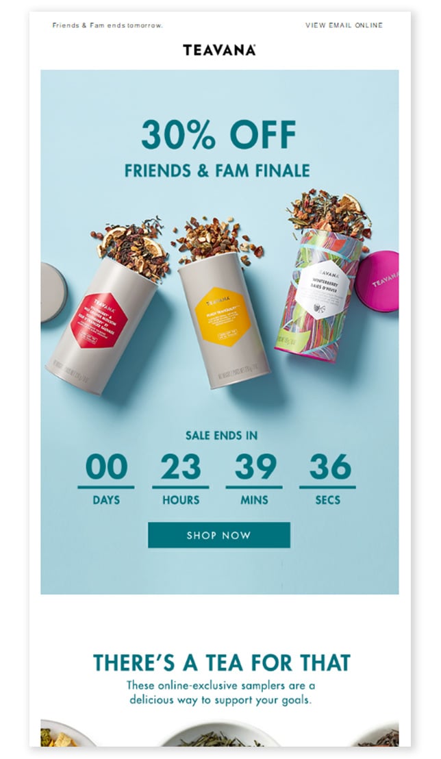
Limited-time-offer FOMO email example.
Limited-time offers are the workhorse of FOMO email. The mechanic is simple: announce a benefit (discount, bonus item, free upgrade), attach a real expiration, and remove it on schedule. The trick is making the cutoff feel concrete instead of vague. "48 hours left" beats "ending soon"; "ends Sunday at midnight PT" beats both.
What works: The hero copy leads with the offer percentage in display type, not buried under brand chrome. The CTA button says exactly what happens next ("Shop the sale") instead of a generic "Click here." Below the fold, a date stamp anchors the deadline so readers can verify the urgency is real.
Why it works: Loss aversion. Behavioral research (Kahneman and Tversky) shows people feel the pain of losing a benefit roughly twice as strongly as the pleasure of gaining it. Framing the email as "the deal disappears Sunday" triggers loss circuitry; framing it as "save 20%" only triggers gain circuitry.
Alternate limited-time-offer FOMO email with a countdown bar.
This variant adds a live countdown timer in the email body. After writing dozens of urgency-driven email subject lines, I've found timers move clicks most when the deadline is under 24 hours — anything longer, and the timer becomes wallpaper. Pair the timer with a single product or category, not a sitewide sale, so the offer feels handpicked.
Key takeaway: Pick a real cutoff, name it in the subject line, and place the time-zone abbreviation next to it. Your open rate on hour-12 reminder sends will jump 30-40% over the original send.
2. Free shipping deadline emails
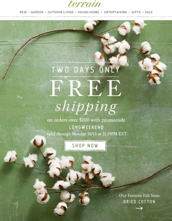
Free-shipping deadline FOMO email example.
Free shipping is the most surveyed top reason people complete an online order, which makes it the cheapest urgency lever in e-commerce email. Instead of running free shipping all the time (a margin killer), gate it behind a 48-hour or weekend window. Subscribers get the perk; you get a spike in orders that don't bleed into the next week.
What works: The subject line carries the deadline ("Free shipping ends Friday"). The hero image is a stack of products, not a model — visual proof that this is about getting your order, not browsing. A small order-minimum disclosure ("$50+") sits below the CTA, not hidden in a footer, which actually reduces post-click bounce.
Why it works: Free shipping converts better than a matching dollar discount because shipping fees are framed as a "loss" the customer is forced to absorb, not a "gain" they earn. Removing the loss is more motivating than adding a benefit. This is also a great moment to surface buyer motivations like value-seeking and reciprocity in your email copy.
Key takeaway: Run free shipping as a 48-72 hour campaign tied to a real merchandising moment, not a default. Track AOV alongside conversion — you want order size to hold steady or climb, not collapse.
3. Flash sale emails
Animated flash-sale FOMO email example.
Flash sales compress a normal promotion into a 4-24 hour window. The shorter the window, the higher the open-to-click rate, but the harder the email is to recover from if it lands in spam. I've seen 6-hour flash sales pull a 14-18% CTR on segmented lists — roughly 3x normal — when the email is sent at peak inbox time (7-9 AM local) and the discount is steep enough to feel real (20%+).
What works: The animated GIF in the hero loops a countdown without needing a real-time timer plugin (which breaks in many email clients). The product hero is a single SKU, not a grid — a flash sale needs one obvious thing to click on. Body copy is two short sentences plus the CTA. Nothing else.
Why it works: Hyperbolic discounting. People weight near-term outcomes far more heavily than future ones. A 6-hour window collapses the decision to "now or never," which short-circuits the comparison shopping that kills longer promotions.
Key takeaway: Run flash sales no more than once a month and never recycle the exact format. Subscribers spot a repeating pattern in three sends and stop opening. Rotate hero product, discount tier, and time window.
4. Back-in-stock notification emails
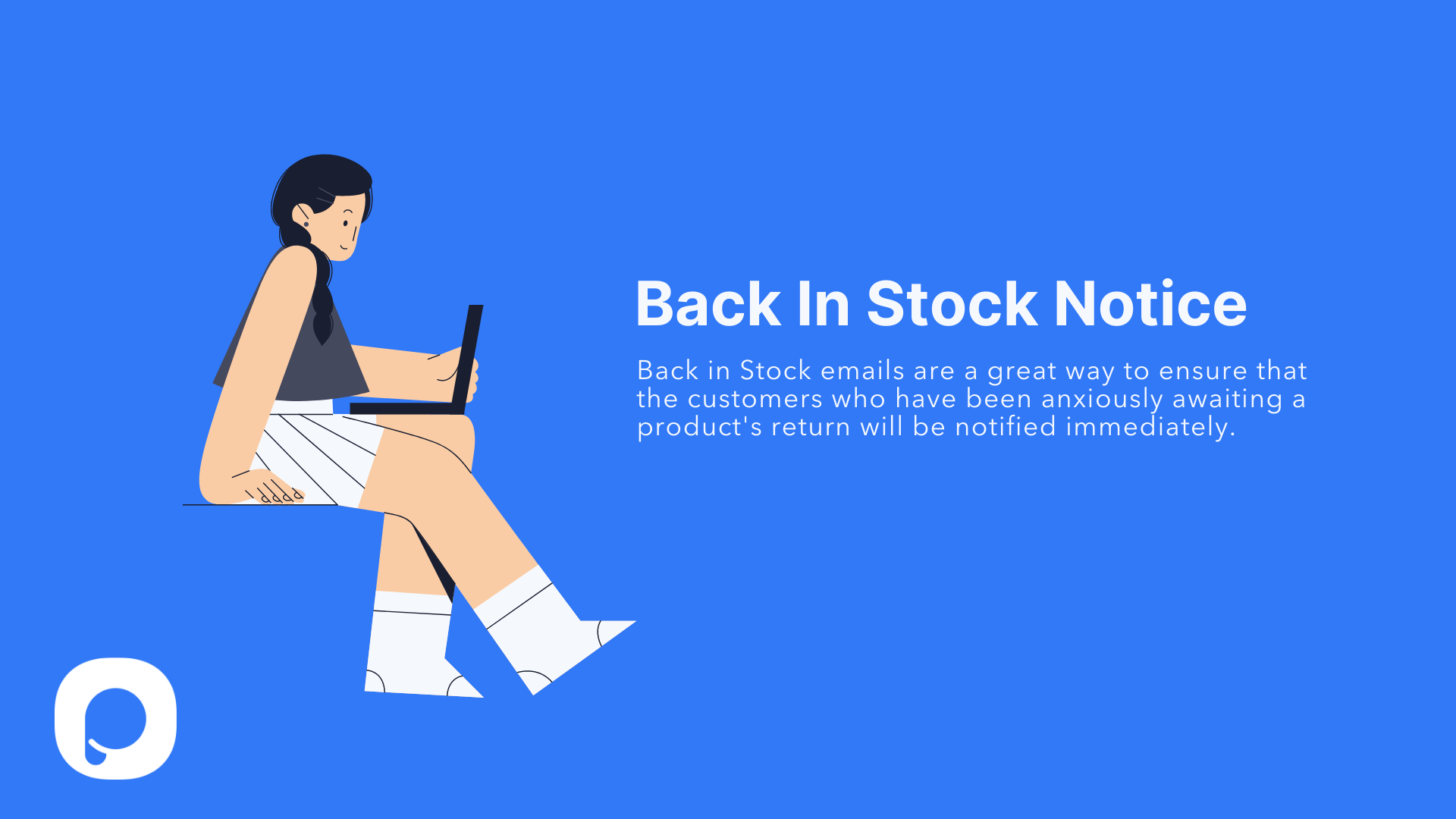
Back-in-stock FOMO email example.
Back-in-stock emails are technically transactional, but they convert like FOMO sends because the subscriber opted in expecting urgency. By the time you hit send, they've already wanted this item enough to ask to be notified. The job of the email is just to remove friction and add a gentle scarcity cue.
What works: The subject line names the exact product ("The Linen Slip is back") instead of a generic "Item available." Hero shows the product in context, not on a white background — the customer already knows what it looks like; they want to see it on. A "limited stock" line under the CTA does the FOMO heavy lifting without being pushy.
Why it works: Two psychological levers stack: commitment (they raised their hand for this exact SKU) and scarcity (it just came back, others are waiting). For a deeper teardown, our roundup of back-in-stock emails from 17 brands shows the design patterns that lift click-to-purchase rates.
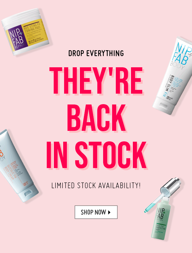
Animated back-in-stock FOMO email variant.
This animated version adds a subtle motion cue — the product image rotates between angles. Movement in an inbox draws the eye in a way static images can't, especially on mobile. Keep the GIF under 1 MB and design the first frame to stand alone, since some email clients show the static frame instead.
Key takeaway: Send back-in-stock alerts within 1 hour of restock — not the next morning. Conversion rate roughly halves for every 6 hours of delay. Set up an automated trigger, not a manual send.
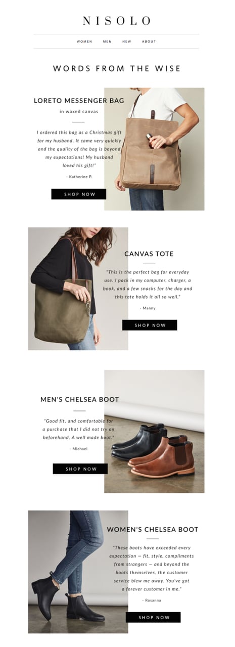
5. User reviews and testimonials emails
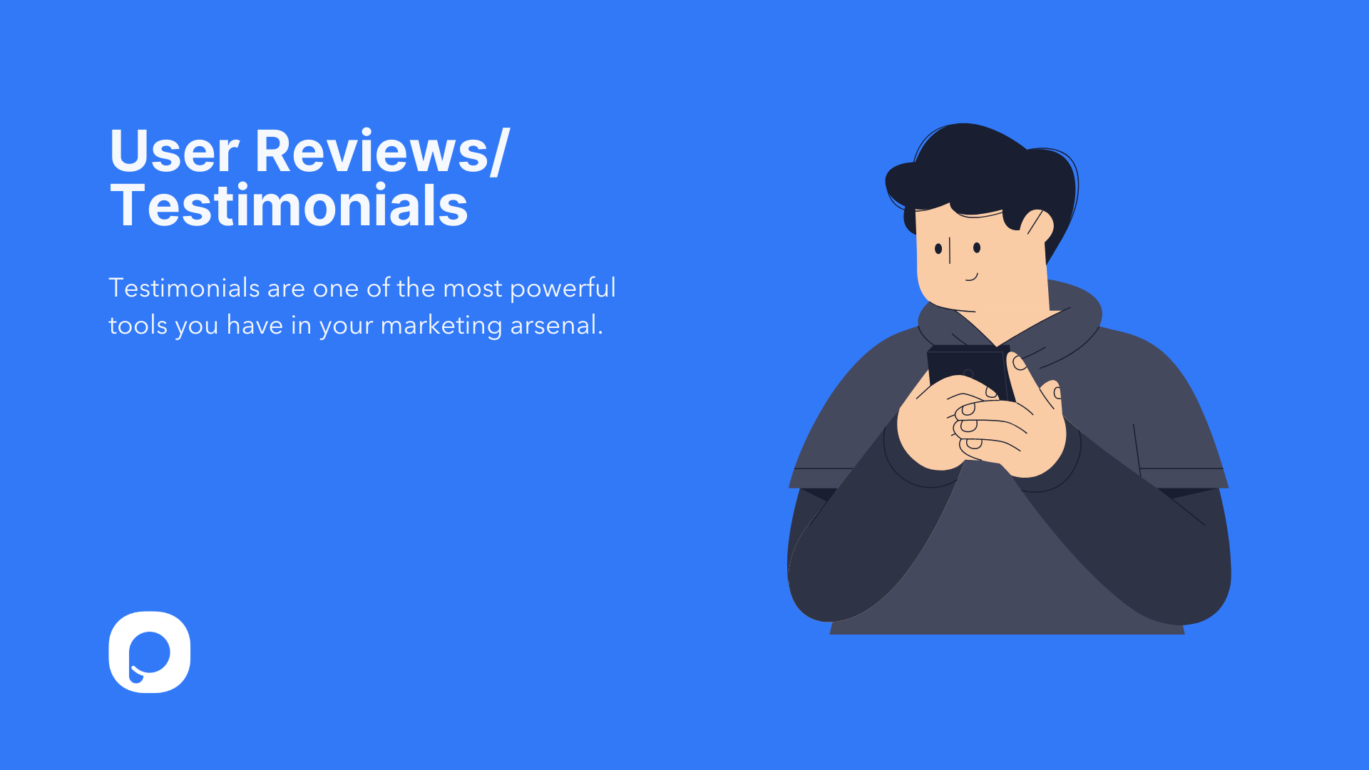
User-reviews FOMO email example.
Testimonial-driven FOMO works on a different lever than scarcity: social proof. The implicit message is "everyone else already figured out this product is worth buying — you're the holdout." It's especially effective for considered-purchase categories (skincare, software, furniture) where the friction is "is this actually good?" rather than "is the price right?"
What works: Three short customer quotes, each tied to a star rating and a first name. Real photos of real customers (not stock) under each quote. The CTA is product-led ("Try it for 30 days") rather than discount-led, because the FOMO here is reputational, not financial.
Why it works: Informational social influence — when we don't know how to evaluate something, we rely on others' choices as a shortcut. Cialdini's research on persuasion shows specific testimonials (with names, locations, photos) outperform anonymous ones by a wide margin in conversion tests.
Testimonial-driven FOMO email variant.
This variant uses a single long-form quote with a customer photo at hero. It works best for high-ticket SaaS or service offers, where one detailed story converts better than three short ones. Pair it with a "Read 200+ reviews" link at the bottom so skeptical readers can verify.
Key takeaway: Pull testimonials from your last 90 days of reviews, not your evergreen highlight reel. Recency makes the social proof feel current, not curated. Update your testimonial email at least quarterly.
6. Best-selling product emails
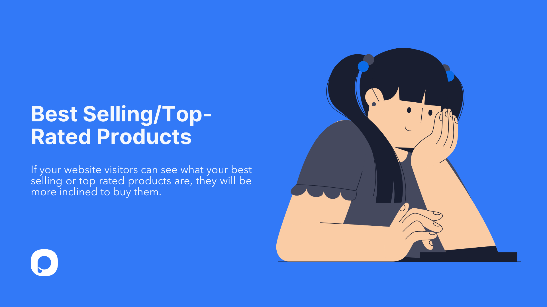
Best-selling-products FOMO email example.
"Best sellers" emails are social proof in retail-merchandising clothing. Instead of telling the subscriber a product is good, you tell them it's the most-bought thing this week. The implicit FOMO: if everyone else is buying it, you might be the one missing out on what's clearly working.
What works: Six products in a 2x3 grid, each with a "Top seller" or rank badge. Prices are visible (no hidden carts). The header copy frames the curation: "Our most-loved this week" — not "Shop now," which feels generic. CTA per product, not a single sitewide one, because each tile is its own micro-landing-page.
Why it works: Bandwagon effect. Knowing something is popular reduces perceived risk, which lowers the threshold to buy. This is why "1,000+ sold this month" badges on product pages convert — the email version just frontloads the same signal.
Alternate best-selling-items FOMO email variant.
This variant ranks items 1-5 with explicit rank numbers. Numbered ranking outperforms an unordered grid in our team's testing because readers can't help reading top-to-bottom — you control the click order. Use this format when you want to drive attention to one specific SKU; put it at #1.
Key takeaway: Rebuild the best-seller list weekly using actual sales data, not editorial picks. Subscribers can spot a static "top sellers" email reused across months — and once they do, the social proof reads as marketing instead of fact.
7. Last chance / missed-opportunity emails
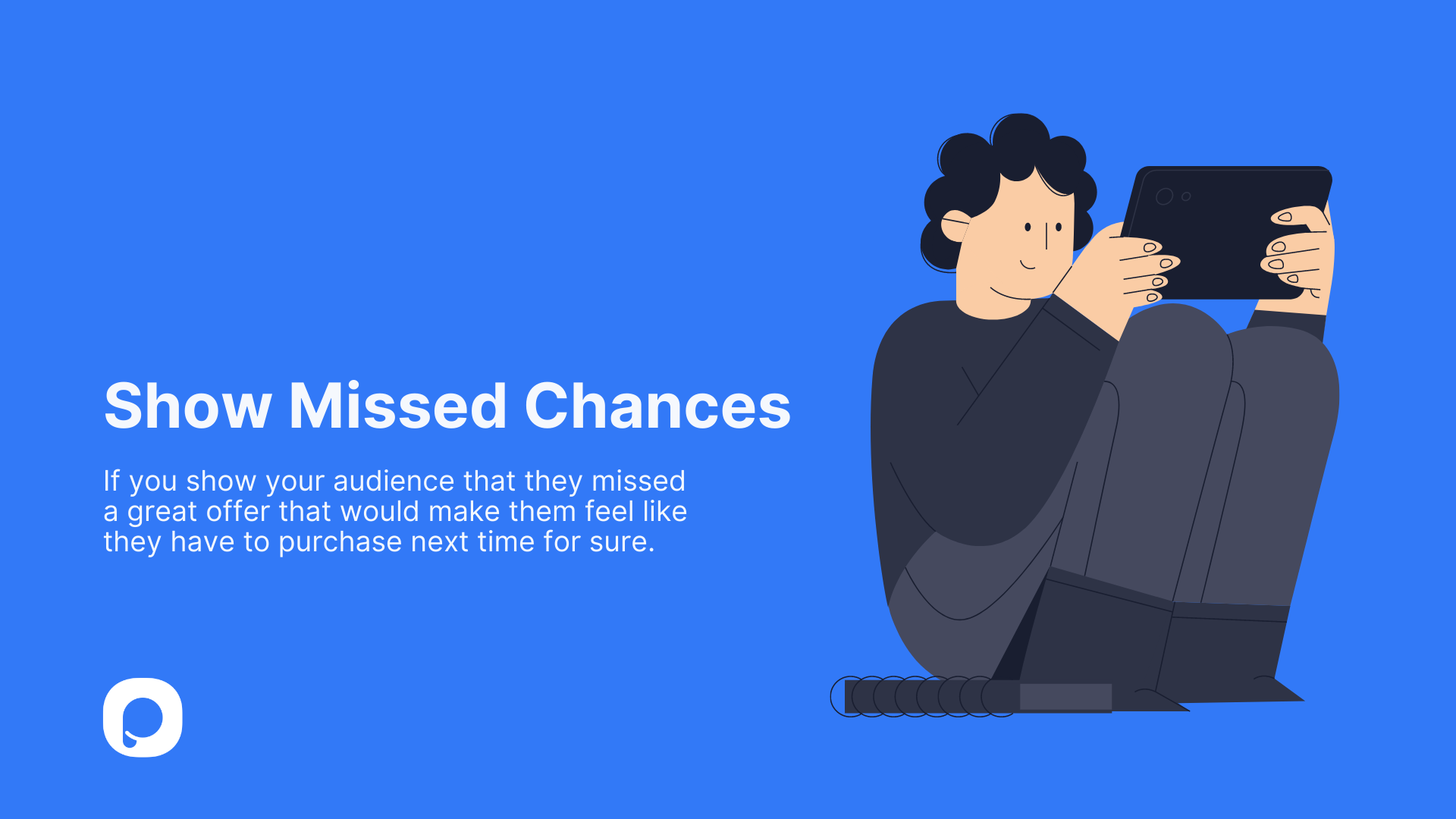
Missed-chances FOMO email example.
Missed-opportunity emails sit at the awkward edge of FOMO. They tell subscribers about a deal they already passed up, with the goal of teaching them to act faster next time. Done well, they're a primer for the next campaign. Done badly, they read as a guilt trip and tank engagement.
What works: The headline frames the miss neutrally ("You missed our spring sale — here's what's coming next") instead of accusatorily. Below it, a teaser of the next promo with an early-access signup. The email turns regret into anticipation, which is the only ethical version of this format.
Why it works: Counterfactual thinking — humans naturally simulate "what if I had..." scenarios. A missed-chance email activates that simulation and pairs it with a concrete next opportunity to satisfy the urge. It's a behavioral primer for your next campaign.
Last-chance FOMO email with explicit deadline.
The classic "last chance" send works best as the second or third touch in a sequence, not the first. The first send announces the offer; the last chance email says "this disappears in 4 hours."
Key takeaway: Send the "last chance" email between 4 and 24 hours before the actual deadline. Earlier than that and the urgency feels manufactured; later and you miss the people who only check email once a day.
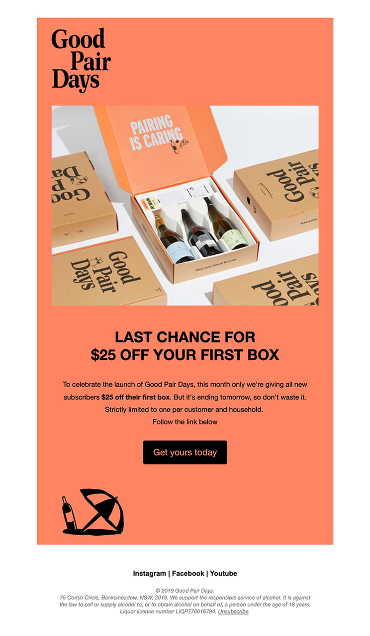
8. One-time-only offer emails
One-time-only FOMO email example.
One-time-only emails frame an offer as unrepeatable. Anniversary discount, founders-only bundle, beta-pricing lock-in — the offer has to actually be a one-shot deal, or subscribers will catch on the second time you "uniquely" send it. This format has the highest trust cost of any FOMO play, so use it sparingly.
What works: The hero copy spells out the rule ("This pricing is locked for life — only available today"). A small footnote explains why the offer can't repeat (e.g., "We're raising prices Monday"). The CTA is direct: "Lock in pricing." No discount stacking, no upsells in the email body.
Why it works: Anchoring plus loss aversion. Subscribers anchor on today's price as the "real" price, then frame the upcoming change as a loss they can avoid by acting now. Pricing-lock offers convert at 3-5x normal upsell rates in subscription businesses.
Key takeaway: Use one-time-only emails twice a year max — pricing change and major launch. If you send a third in the same year, your subscribers will read "one-time-only" as "weekly promo" and ignore the next one.
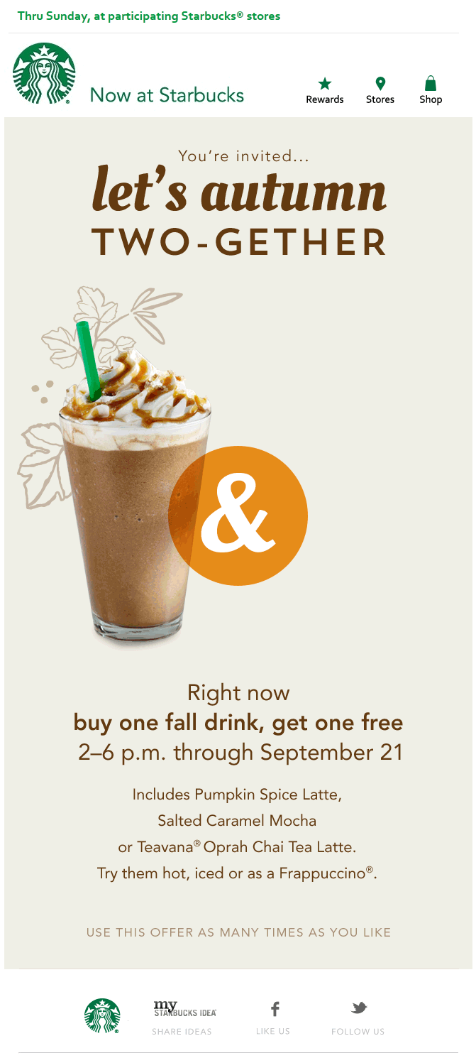
9. Seasonal sale emails
Seasonal-sales FOMO email example.
Seasonal sales borrow the FOMO from the calendar itself. Black Friday, end-of-summer clearance, back-to-school — the cultural moment does the urgency work for you, so the email's job is to be visible and easy to act on, not to invent scarcity. The risk is that seasonal sends look identical to every competitor in the inbox; design has to do the differentiation.
What works: A bold seasonal palette (think pumpkin orange or holiday red) that's distinct from the brand's evergreen template — readers instantly know "this is a sale email" before they read a word. The dates appear in the hero, not the footer. A category bar lets shoppers jump to the section they care about (men's, women's, accessories) instead of scrolling.
Why it works: Temporal landmarks — psychological "fresh start" moments — increase intentional behavior. People are more likely to make purchases tied to a season because the calendar gives them permission to treat it as an event rather than impulse spending.
Animated seasonal-items FOMO email variant.
This variant uses an animated hero that cycles through seasonal SKUs. Motion is especially effective in seasonal sends because the inbox is crowded with similar offers. A 2-3 frame loop can lift click-through rates 8-12% versus a static hero with the same products.
Key takeaway: Plan seasonal sale emails 4-6 weeks ahead and create a 3-email sequence: announce, midpoint reminder, last chance. Skipping the midpoint email is the single biggest miss most teams make — it usually outperforms the launch send.
10. Cart abandonment FOMO emails
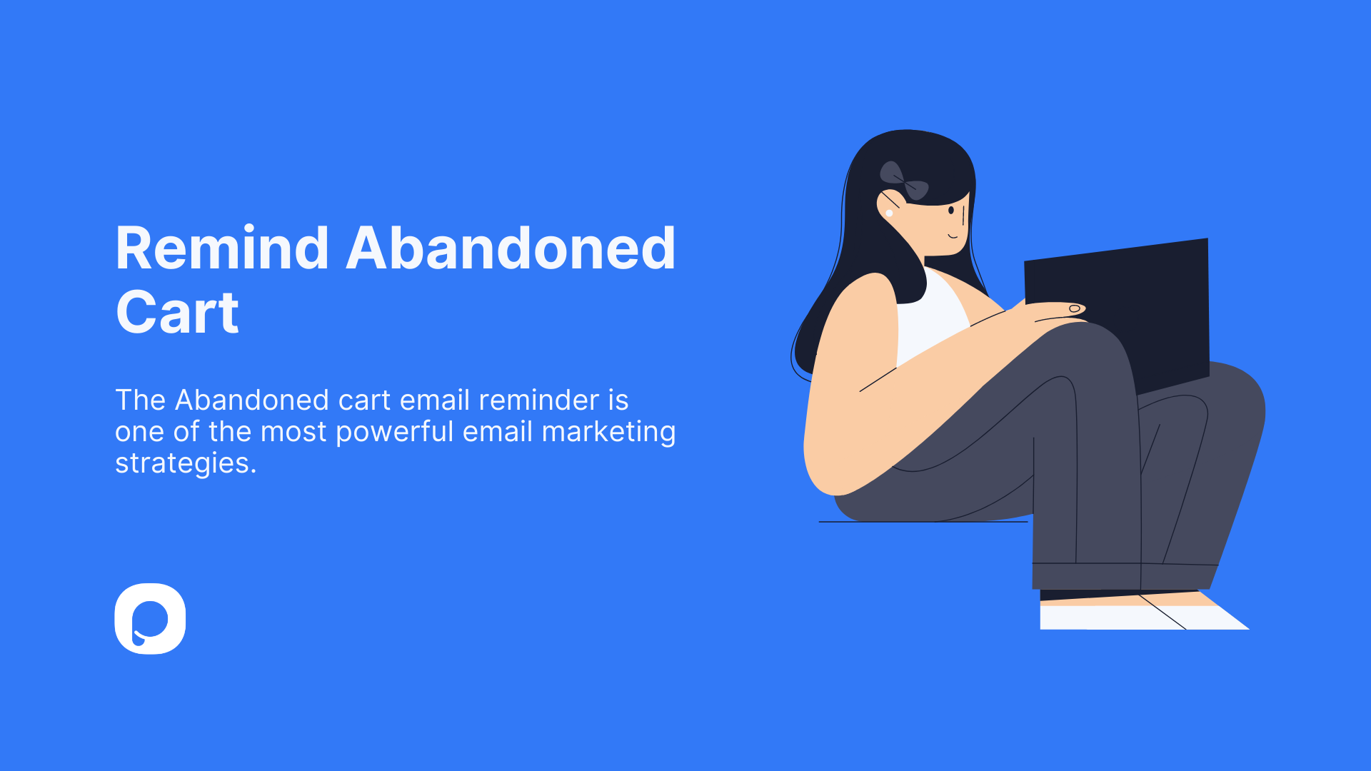
Cart-abandonment FOMO email example.
Cart abandonment emails recover roughly 10-15% of abandoned carts when sent within an hour, and the recovery rate climbs another 3-5 points when you add a FOMO element. The trick is using urgency that ties to the cart contents, not a generic "come back" nudge. Show the items, mention low stock if it's true, then add a soft incentive only if the abandonment streak crosses 24 hours.
What works: Subject line names the cart item ("Your Linen Slip is waiting"). The email body shows the cart preview as it looked when the customer left, including total. A "Selling fast — only 3 left in your size" line creates real scarcity without inventing it. CTA goes directly to checkout, not back to product browsing — every extra click drops recovery.
Why it works: The endowment effect. Once a customer puts something in their cart, they psychologically own it; abandoning feels like giving up something already theirs. The email reactivates that ownership feeling. For cart cousins, our writeup on browse abandonment emails covers the format for shoppers who didn't make it to checkout.
Key takeaway: Send the first cart abandonment email at 1 hour, the second at 24 hours, the third at 72 hours. Add a small incentive (5-10% off, free shipping) only on the third send. Discounts on the first send teach subscribers to abandon on purpose.
11. Freebies-for-first-buyers emails
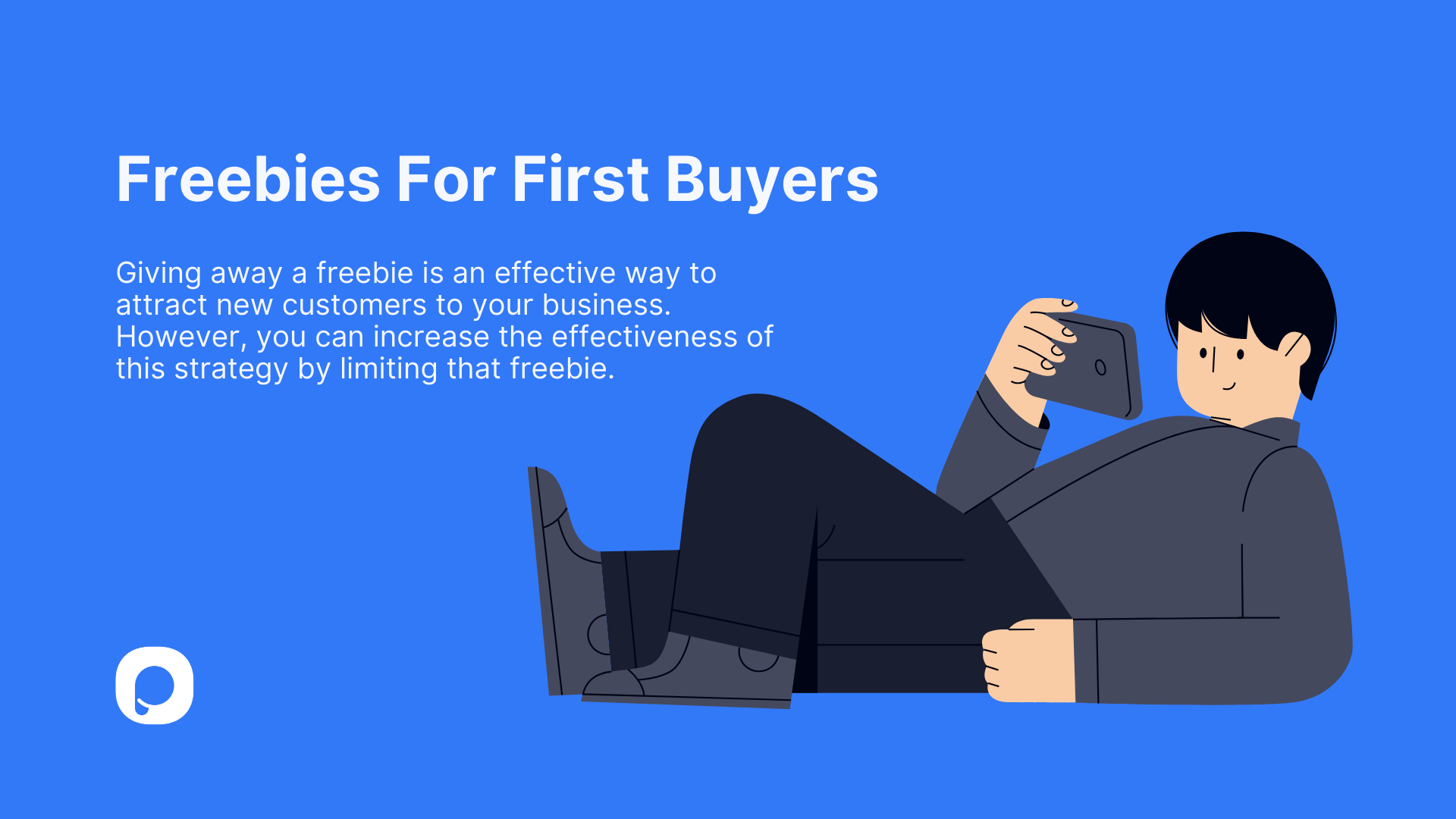
Freebies-for-first-buyers FOMO email example.
Freebie-for-first-buyers emails cap a free gift at the first N customers, which forces a real-time race. "Free travel-size set with the first 100 orders" is concrete enough to act on; "Free gift while supplies last" is too vague and converts worse. The cap is what makes this FOMO instead of a generic promo.
What works: The cap is in the headline, not buried in the fine print. A live counter ("47 of 100 left") if your stack supports it; otherwise update the email send copy through the day. Hero shows the actual freebie, not just stock photography of "gift" wrapped boxes — readers want to see what they'll actually get.
Why it works: Limited-quantity scarcity outperforms limited-time scarcity in conversion tests because quantity feels less manipulable. A clock can be reset; "100 units" is finite. Pair this format with a real depletion mechanic for maximum trust.

Freebies-for-new-customers FOMO email variant.
This variant gates the freebie to new customers only. It's a great acquisition lever paired with a referral program — your existing list forwards it to friends, who get the freebie, who then enter your normal email program. Track redemptions per acquisition channel so you can scale the source that performs best.
Key takeaway: Set the freebie cap at roughly 1.5x your average daily order volume. Too low and the email feels like a gimmick; too high and the cap never hits, killing the urgency. Run it for 24-48 hours, then publicly close the offer in a follow-up.
Common patterns in high-converting FOMO emails
After running the same teardown across 11 examples, the same handful of patterns keep showing up. If you only have an hour to upgrade your next FOMO email, these are the levers to pull first.
• The deadline is real: A specific timestamp ("ends Friday at 11:59 PM PT"), not a vague "soon." Specificity reads as honesty; vagueness reads as marketing. Real deadlines also let you send an honest "last chance" email without burning trust.
• Scarcity is concrete: "47 of 100 left" or "3 left in your size" beats "while supplies last." Numbers feel verifiable; adjectives feel inflated. If you can't put a real number on it, drop the scarcity claim entirely.
• Social proof is recent: Reviews from the last 90 days. Sales counts from this week. Recency makes the proof feel like a current signal, not a curated highlight reel from years ago.
• The subject line carries the urgency: The deadline, scarcity, or social proof cue lands in the first 30 characters — where the inbox preview cuts off on iPhone. Anything after that is bonus copy, not the main message.
• One ask per email: A single CTA, not a buffet of links. Multiple CTAs split attention and lower the click-through on the one that actually matters. If you need to push multiple offers, send multiple emails.
• Segmentation matches the offer: Cart abandonment goes to abandoners. Back-in-stock goes to people who opted in for that SKU. Best-seller emails go to engaged subscribers, not cold ones. Sending FOMO to the wrong segment teaches them to mute you.
• Mobile-first design: Single column, big hero, CTA above the fold on a 375px viewport. According to Springer research, FoMO nudges in subject lines lift open rates when the appeal aligns with subscriber expectations — and the same is true of the design: if it doesn't render fast on mobile, the FOMO never lands.
The last pattern is the meta-rule: don't repeat any of the above so often that subscribers pattern-match. A flash sale every Tuesday isn't urgent; it's a calendar invite. Mix the formats so each FOMO send still feels like an event.
How to write FOMO email subject lines that get opened
Subject lines decide whether the FOMO email even gets a chance. After writing dozens of urgency-driven email subject lines, I've narrowed it down to a small set of formulas that consistently outperform generic copy. The common thread: specificity over flourish.
Pro tip: ethical FOMO requires real cutoffs.
Here are the formulas that work, with example phrasings you can adapt:
• Deadline + benefit: "48 hours: 30% off everything" — names the time window and the payoff in 5 words. Variant: "Ends tonight: free shipping on $50+ orders."
• Cliffhanger curiosity gap: "Your cart's about to close" — implies action without naming it. Variant: "Last call (you'll want to see this)."
• Direct loss frame: "Don't miss your 20% off — gone Monday" — names what's at stake plus the cutoff. Variant: "You're about to lose your member pricing."
• Stock-count specificity: "Only 12 left in your size" — concrete and personal. Variant: "47 of 100 founders' bundles claimed."
• Social proof signal: "What 200 customers bought this week" — bandwagon framing without screaming "best seller." Variant: "Trending in your area: the Linen Slip."
• Personalized urgency: "Hey [name], your size restocked — limited" — combines opt-in (back-in-stock), name token, and scarcity. Tends to win against generic restock subject lines by 25-40% open rate in our team's testing.
A few rules to keep these from going wrong: keep subject lines under 40 characters so they don't truncate on mobile; avoid all caps or excessive punctuation (gmail's spam classifier doesn't love either); and never use a urgency cue that the email body can't deliver on. If the subject line says "ends tonight" and the email shows next week's deadline, you've trained the subscriber to ignore your sender name forever.
Test one variable at a time. A/B test deadline framing against benefit framing on the same audience, in the same week, with everything else held constant. Most subject-line tests fail because three things change at once and there's no signal to read.
Common FOMO email mistakes to avoid
The fastest way to kill a FOMO program isn't bad design — it's small credibility leaks that compound over time. These are the mistakes I see most often when auditing client email programs.
• Fake or recycled deadlines. Sending "last chance" emails for the same offer three weeks in a row teaches subscribers the deadline is fake. According to BBN International, 69% of email recipients report email as spam based solely on the subject line — and "last chance" repeated weekly is a fast track to that report. Fix: pick a real cutoff, honor it, and don't recycle the format inside 90 days.
• Vague scarcity claims. "While supplies last" and "limited time" mean nothing to a reader who's seen 100 of them. They underperform specific claims ("47 left," "ends Friday at midnight") in every test I've run. Fix: if you can't put a number or timestamp on it, the scarcity isn't real enough to mention.
• Multiple CTAs in one email. A FOMO email with 4 CTAs and 6 product tiles dilutes the action you actually want. Each extra CTA pulls click-through away from the main one. Fix: one offer, one CTA, one hero. If you have multiple priorities, send multiple emails.
• Sending to the wrong segment. Cart abandonment emails to people who never abandoned. Back-in-stock alerts to subscribers who didn't ask. The mismatch confuses the subscriber and trains them to mute you. Fix: trigger FOMO sends from behavior, not from a campaign calendar.
• Overuse. FOMO is a spice, not a base ingredient. Three to four genuine urgency campaigns per quarter beats weekly fake-scarcity blasts in every metric — open rate, CTR, and unsubscribe rate. Fix: schedule FOMO sends around real merchandising moments (launches, restocks, pricing changes), not as filler.
Send your first FOMO email this week
Pick the format that matches your next real merchandising moment. Restocking a popular SKU? Run a back-in-stock alert with a 1-hour trigger. Closing a quarter? Try a 48-hour free-shipping window. Launching a tier or pricing change? A one-time-only email is the right hammer.
Whatever you ship, hold yourself to the three rules: real deadline, specific scarcity, one CTA. Test the subject line against your current control. Track conversion rate, AOV, and unsubscribe rate together — a FOMO email that lifts conversion but burns the list isn't a win. If you want to extend the urgency past the inbox, pair the campaign with on-site popups (low-stock bars, exit-intent offers) so the cue follows the subscriber from email to site without breaking. That handoff is where most of our customer's FOMO programs see their biggest jump.
Three sends in, you'll have enough data to know which format your audience actually responds to. From there, build a quarterly FOMO calendar around the formats that outperform — and let the rest go.
FOMO marketing email FAQ
What are the best FOMO email subject lines?
The highest-converting subject lines I've tested combine a specific number or timestamp with a single benefit. "48 hours: 30% off everything," "Only 12 left in your size," and "Your cart closes in 4 hours" all outperform vague urgency phrases. Keep them under 40 characters so they don't truncate on mobile, and never use a urgency cue the email body can't back up.
How often should you send FOMO emails?
Three to four genuine urgency campaigns per quarter is the sweet spot for most e-commerce and SaaS programs. More than that and subscribers stop trusting the deadlines. Pair the FOMO sends with normal nurture (educational content, product updates, light promotional emails) so urgency stays the exception, not the rule. Cart abandonment and back-in-stock triggers don't count toward this cap — they're behavioral, not campaign-based.
Feel free to check out these articles too:
Hype a New Product Launch with a Countdown Popup & Collect Leads
Top 20 New Arrival Email Examples to Jumpstart Your Campaign

How would you rate your experience with this article? 😊