33 Website Popup Examples (+ Practices to Convert)
Website popups are on-page overlays triggered by time, scroll, exit intent, or clicks to drive lead capture, promotions, engagement, and feedback; they can convert well (avg ~11%, top ~42%) but risk annoyance/SEO if intrusive. Best practices stress mobile-friendly design, clear close options, frequency limits, A/B testing, KPI tracking, and GDPR/CCPA compliance, with many real-world examples and use cases.
I've seen how website popups can be transformative tools in digital marketing.
They go beyond capturing emails, serving multiple purposes to meet varied business needs.
Therefore, we'll explore a range of compelling website popup examples, granting you the insights to tailor them to your marketing campaigns effectively.
What Are Website Popups?
Website popups are interactive elements that appear on a webpage to capture user attention and encourage specific actions.
Typically, they appear as small windows or overlays that prompt visitors to engage with content, subscribe to newsletters, or take advantage of special offers.
In my experience, popups are designed to strategically interrupt the user’s browsing experience, ensuring that the message delivered is timely and relevant.
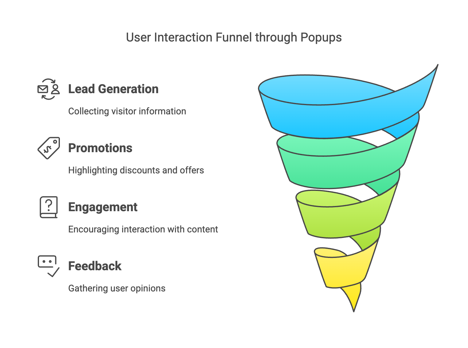
Popups can serve various primary purposes, such as:
- Lead Generation: Collecting visitor information like email addresses in exchange for valuable content.
- Promotions: Highlighting discounts, sales, or special offers to boost immediate sales.
- Engagement: Encouraging users to interact with quizzes, surveys, or social media channels.
- Feedback: Gathering user opinions and feedback to improve products or services.
Furthermore, popups can be deployed using different triggers, each designed to engage users at specific points in their browsing journey:
- Time Delays: Popups appear after the user has spent a predetermined amount of time on the page, indicating engagement and interest.
- Scroll Depth: Triggered when a user scrolls down a certain percentage of the page, ensuring the popup is shown when the user is actively exploring the content.
- Exit Intent: Detects when a user is about to leave the site and displays a popup to capture their attention one last time.
- Click-Triggered: Activated when a user clicks on a specific element, allowing for more targeted interactions.
📊 Statistics Alert: The average conversion rate for website pop-ups is 11.09%, while the top 10% of high-performing popups achieve a conversion rate of 42.35% (OptiMonk, 2025). This significant variation underscores the importance of strategic popup design and deployment.
33 Website Popup Examples That Get Clicks
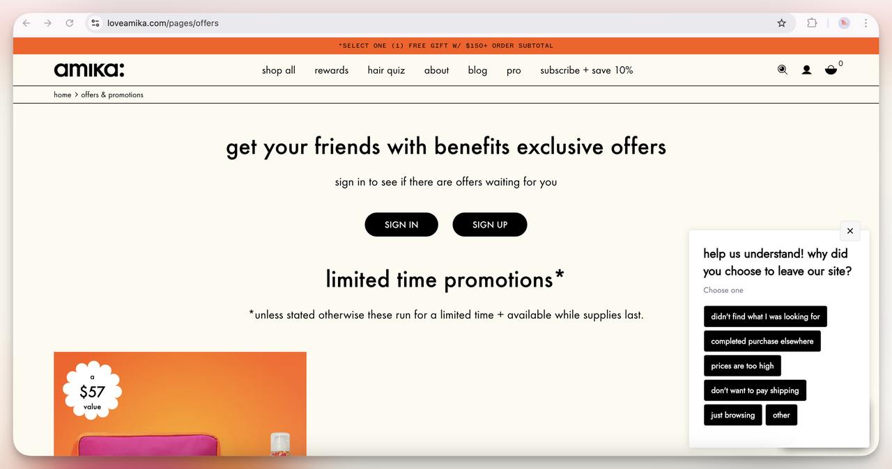
1. Amika Popup (Overlay Exit Intent)
This popup appears when a user is about to leave the site, asking why they are leaving.
I think it’s a great way to collect qualitative data on user behavior. It feels like they’re trying to get insight into potential purchase barriers; maybe their pricing or product offerings aren’t matching expectations.
Smart move for optimizing conversion rates in the long run.
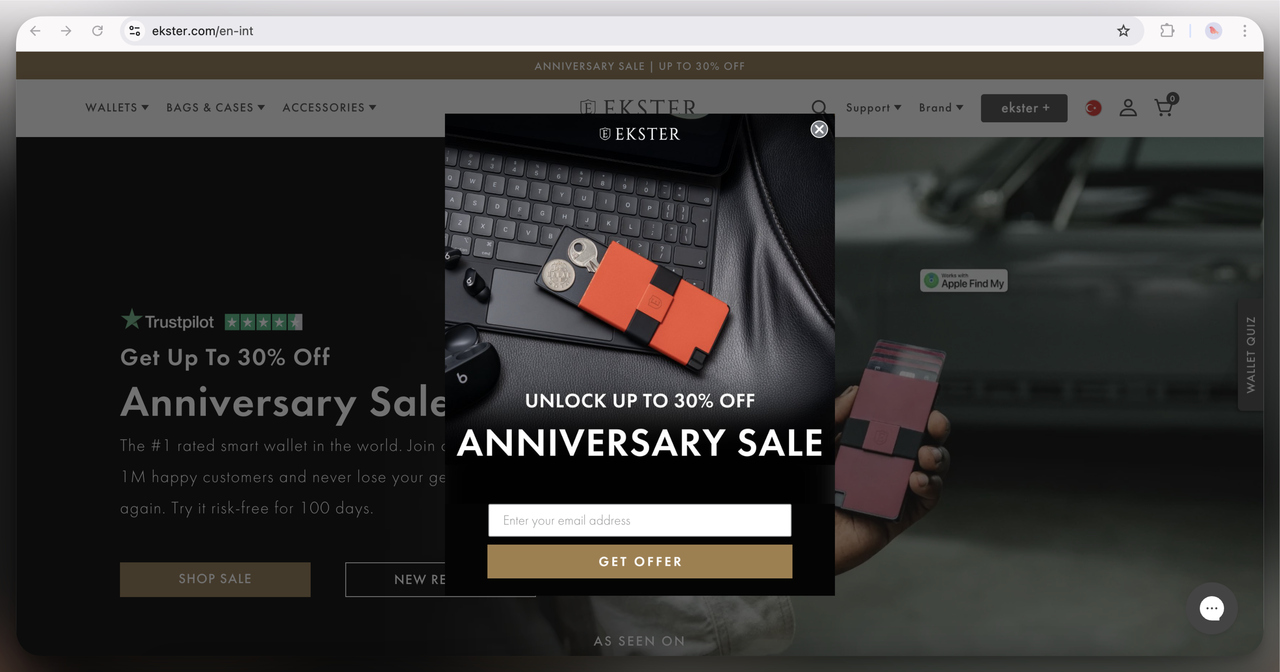
2. Ekster Anniversary Sale Popup (Overlay)
A classic overlay popup that immediately offers a discount (up to 30%) in exchange for an email. I think this works well because it builds urgency with the "anniversary sale" theme. It’s also a strong lead magnet idea because the brand is targeting people who are already interested in the product.
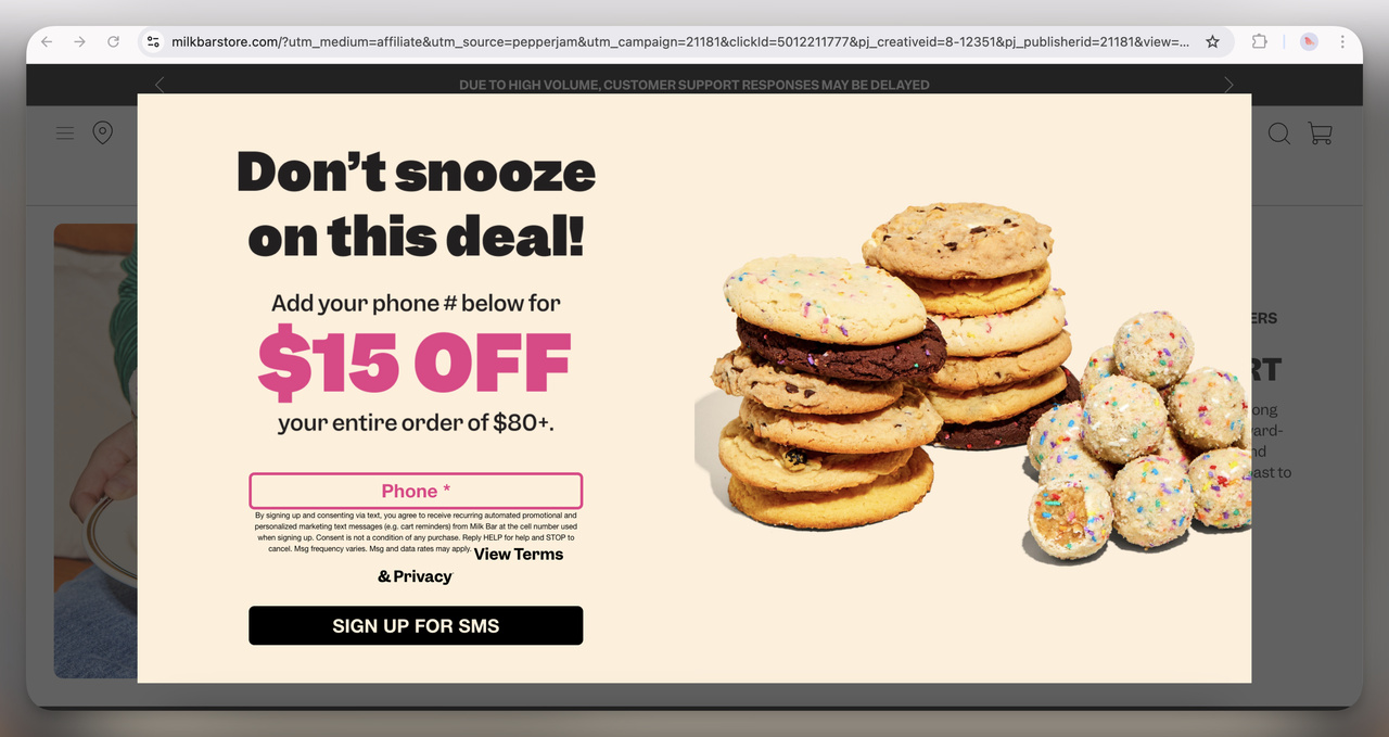
3. Milk Bar Exit-Intent Popup (Full-Screen)
This one is quite aggressive, taking over the whole screen with a discount for phone number submission.
They prioritize SMS marketing over email, which makes sense since SMS open rates are higher. The FOMO-driven copy ("Don’t snooze on this deal!") adds urgency.
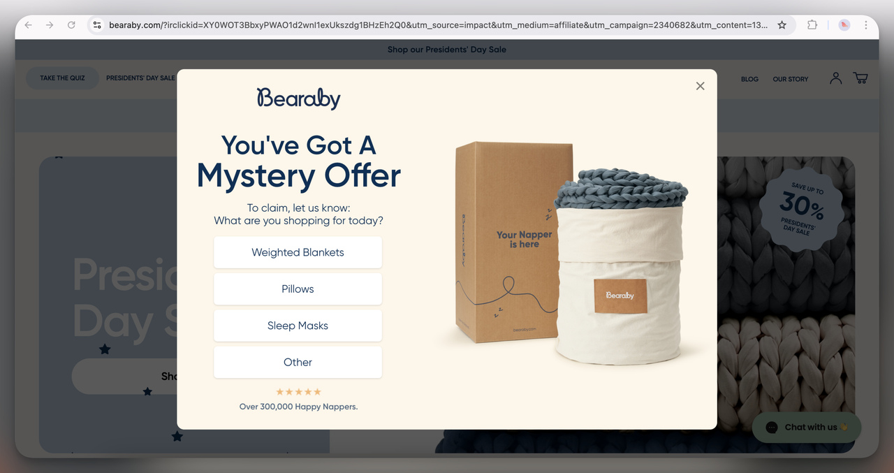
4. Bearaby Mystery Offer Popup (Overlay)
I find this one interesting because it makes the user "work" for their discount by selecting a product category.
This level of interaction can increase engagement while also personalizing the offer. It’s a subtle way to collect data on user preferences too.
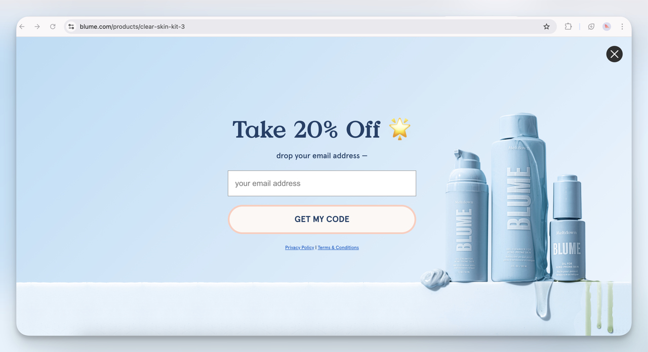
5. Blume Email Capture Popup (Full-Screen)
This is a straightforward full-screen email popup with a clean design.
I think Blume is relying on aesthetic appeal to keep users engaged. The 20% discount is standard, but the softness in color and simple call-to-action make it feel non-intrusive.
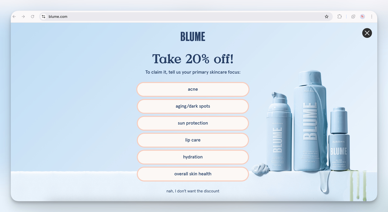
6. Blume Skincare Survey Popup (Full-Screen)
This is a more interactive version of the Blume email popup. Instead of just asking for an email, they’re gathering user preferences.
I think this approach is brilliant because it not only increases conversions but also helps them segment their email list for better targeting.
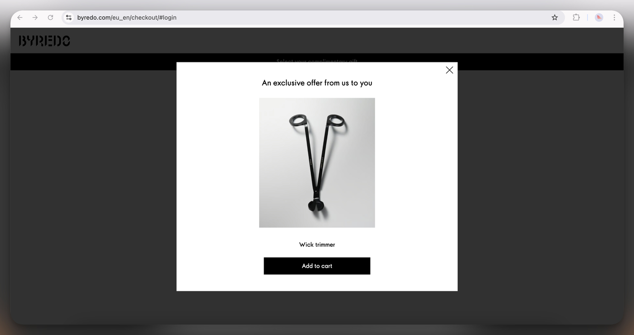
7. Byredo Exit-Intent Popup (Overlay)
A very minimalistic popup offering an exclusive product (a wick trimmer) as an incentive.
I think this aligns well with their luxury branding; rather than offering a discount, they’re providing a product that enhances the experience of their main offering (candles).
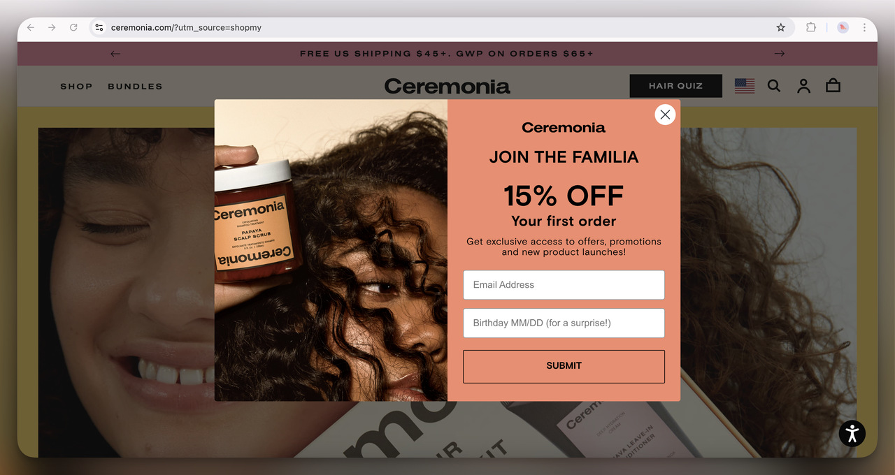
8. Ceremonia Welcome Popup (Overlay)
A simple first-time order discount with an added birthday field for an extra touch. I like how they personalize the experience by making users feel special on their birthday, this is an easy way to build long-term brand loyalty.
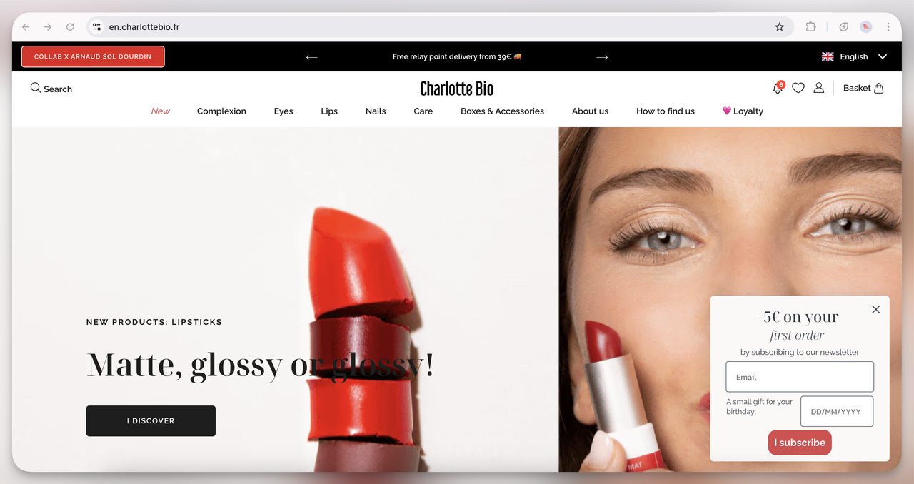
9. Charlotte Bio Birthday Discount Popup (Floating)
Unlike the others, this one is a small floating bar rather than a full-screen or overlay. I think this is less intrusive while still being effective in capturing first-time shoppers.
The birthday reward also gives them another touchpoint for engagement later.
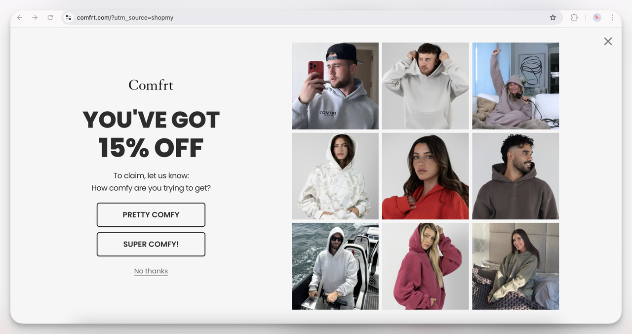
10. Comfrt Interactive Discount Popup (Overlay)
This discount popup feels playful and brand-aligned—it’s all about "comfy" vibes, and the interactive question ("How comfy are you trying to get?") adds a fun touch.
I think this isn’t just about offering 15% off but also engaging users in a light-hearted way that fits the cozy hoodie brand aesthetic. It likely boosts interaction just by making users smile.
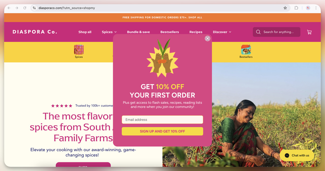
11. Diaspora Co. Welcome Offer Popup (Overlay)
A simple, colorful design that reflects the vibrancy of the brand. The 10% off offer is pretty standard, but what stands out to me is the additional value they highlight; access to flash sales, recipes, and more. I think they’re really trying to build community here, not just grab an email.
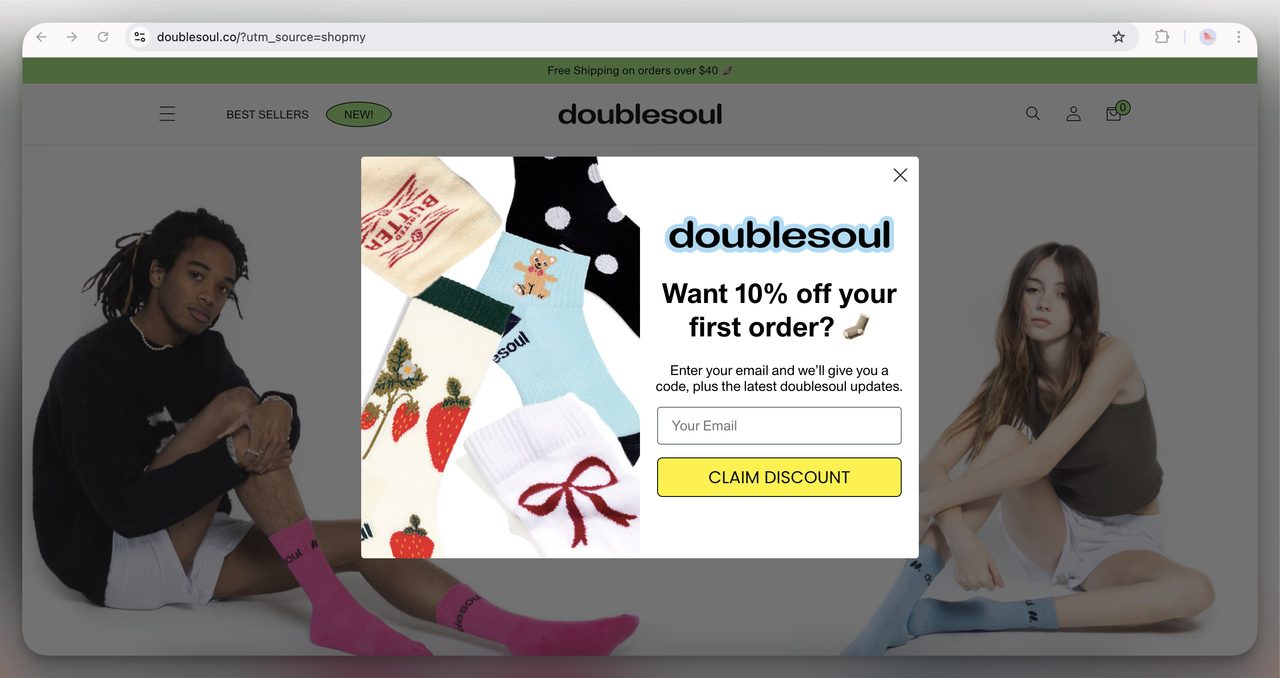
12. Doublesoul First Order Discount Popup (Overlay)
I think the visual use of the product (fun socks) is smart—it immediately highlights what you’re getting.
The 10% off offer is straightforward, but the use of emojis and playful copy keeps it light and friendly. It feels casual, much like their product offering.
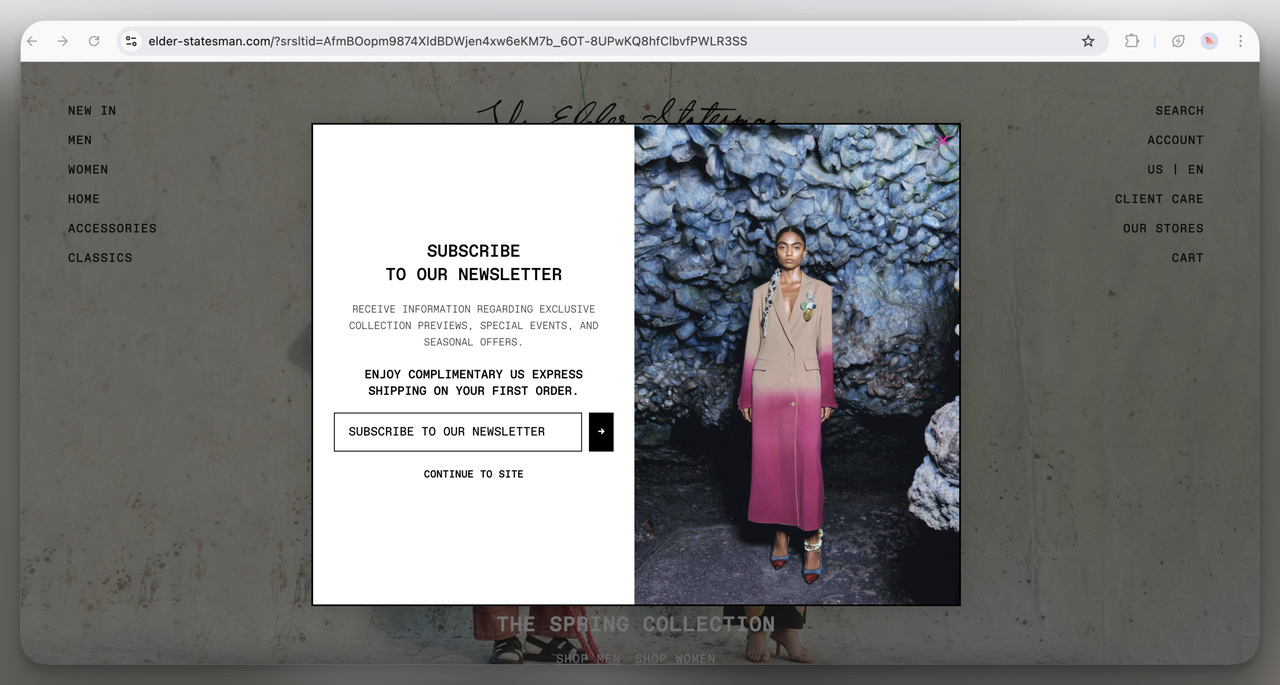
13. Elder Statesman Newsletter Popup (Overlay)
Very minimalist and high-end. I think this approach screams luxury; no loud colors or bold discounts, just an exclusive offer of free shipping and access to special events.
It gives off a premium vibe, which matches the fashion-forward, designer aesthetic of the brand.
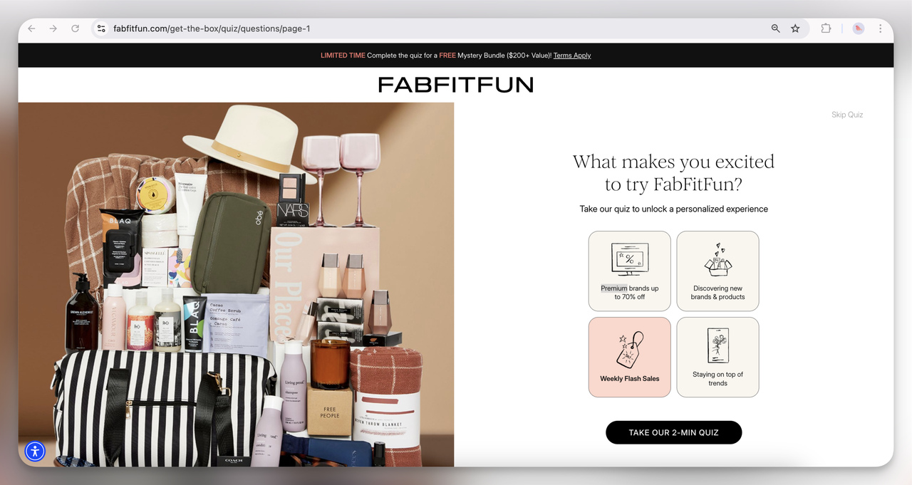
14. FabFitFun Quiz Popup (Interactive Full-Screen)
This one’s all about personalization. I think it’s a smart strategy; by asking what excites users most, they’re gathering valuable data while offering a more tailored shopping experience.
Plus, teasing a “FREE mystery bundle” adds extra incentive to complete the quiz.
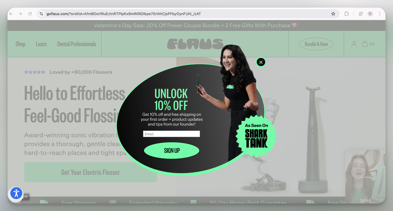
15. Flaus Email Signup Popup (Overlay)
I love the dynamic oval shape of this popup; it visually stands out from the typical rectangle. Offering 10% off along with free shipping is a solid hook, but I think the real kicker here is the "As Seen on Shark Tank" badge, which adds instant credibility and urgency.
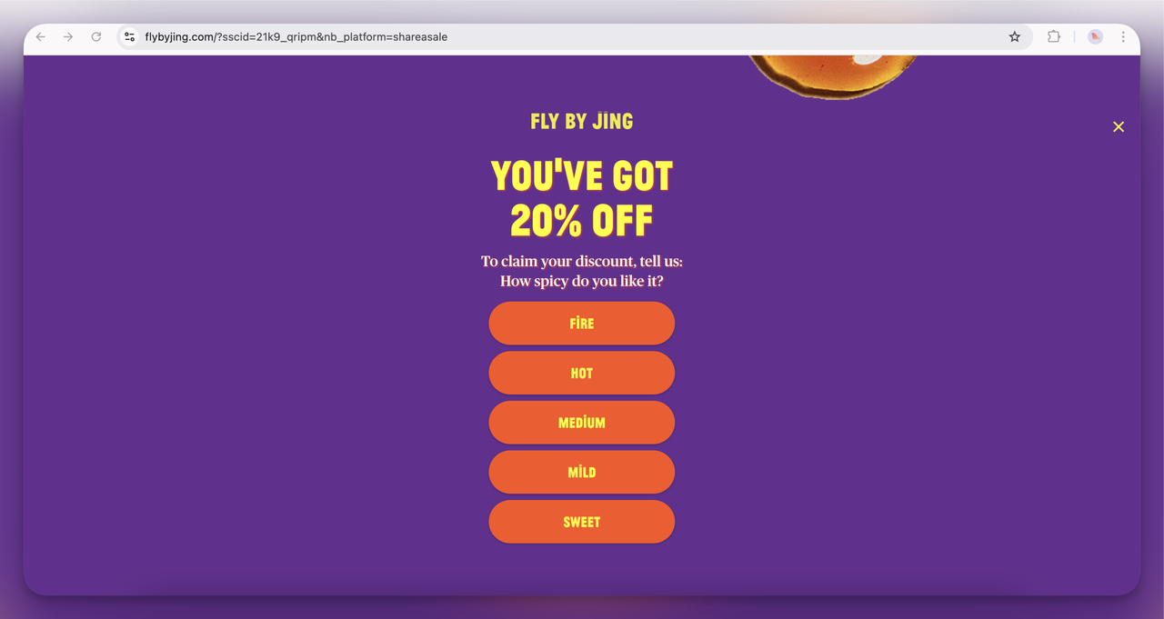
16. Fly By Jing Interactive Discount Popup (Full-Screen)
This spicy quiz is super on-brand! I think it’s a clever way to personalize the experience and make users feel involved while keeping it fun.
Plus, the bold colors and playful copy really embody the brand’s energetic vibe.
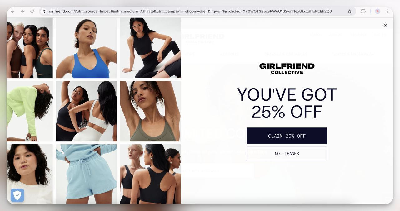
17. Girlfriend Collective Discount Popup (Overlay)
A clean, minimalist design offering a generous 25% off. I think it works because it’s simple and doesn’t overwhelm with too much text.
The inclusion of diverse model images reflects the brand’s inclusive values, which is a subtle but powerful message.
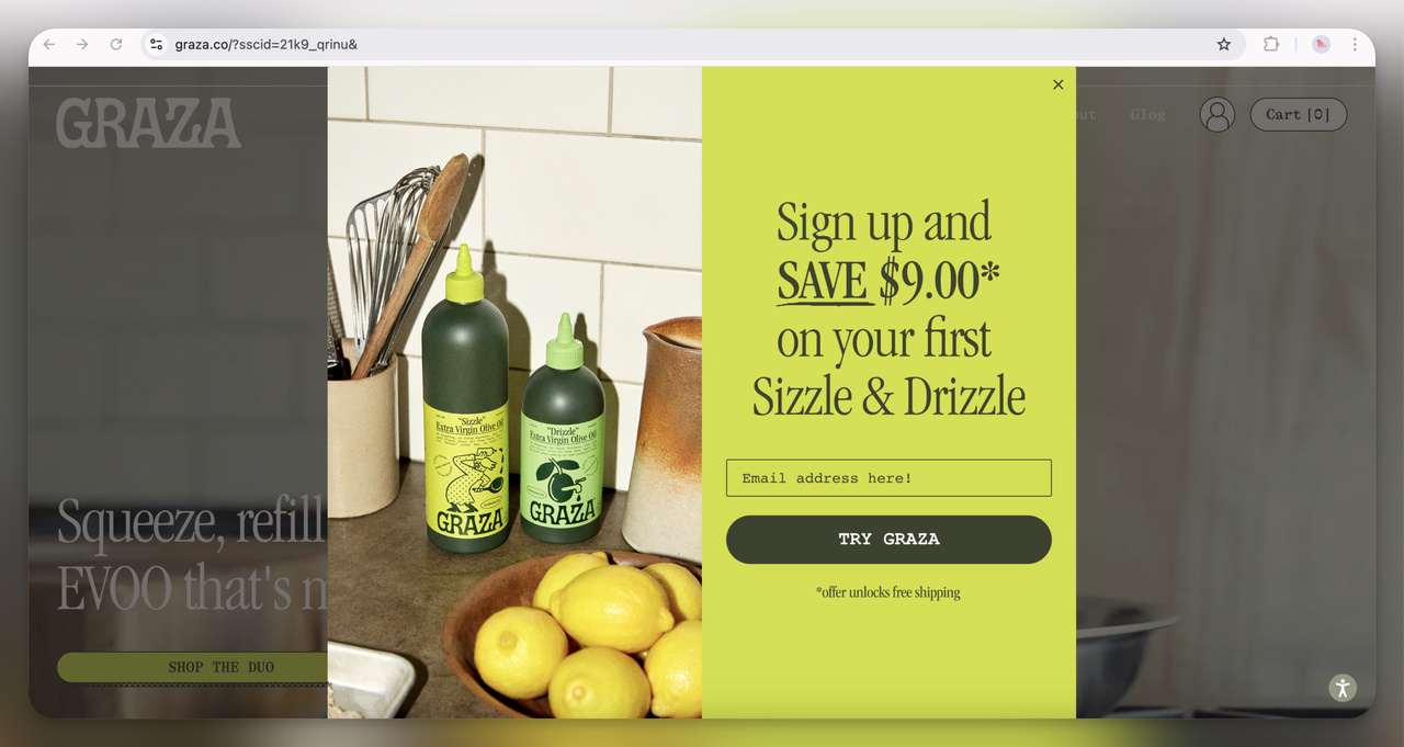
18. Graza Discount Popup (Overlay)
This one immediately grabs attention with its bright neon color; definitely hard to ignore! The $9 discount and free shipping combo is a strong incentive.
I think the casual, handwritten font paired with the kitchen imagery creates a homey, approachable vibe that makes users feel connected to the product.
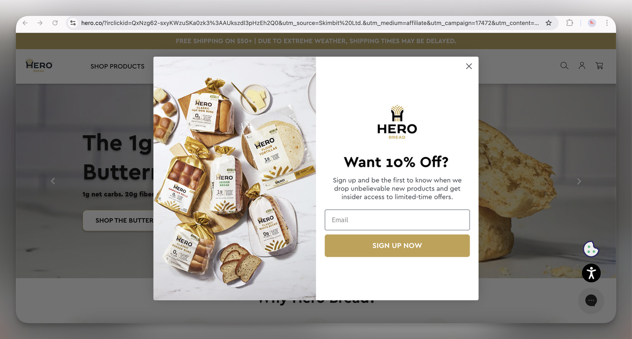
19. Hero Bread Discount Offer Popup (Overlay)
This is a pretty classic email capture popup. I think the 10% discount tied to early access for new products is aimed at building exclusivity. The use of an inviting image of their products reinforces the offer. It feels like they’re saying, "Hey, join our bread-loving family and be the first to try our newest creations!"
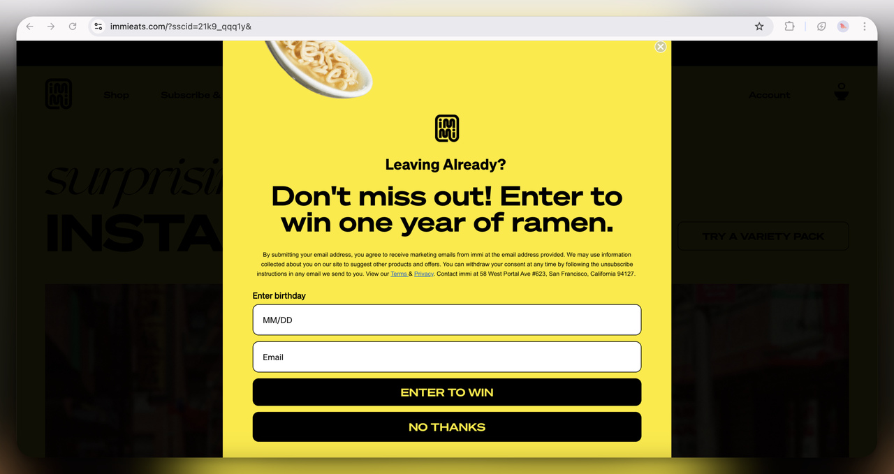
20. Immi Eats Exit-Intent Giveaway Popup (Full-screen)
The bold yellow design and quirky prize—a year of ramen—definitely scream for attention! This feels like their last-ditch attempt to grab attention before a user bounces. I think this works well for a brand with such a fun, playful product.
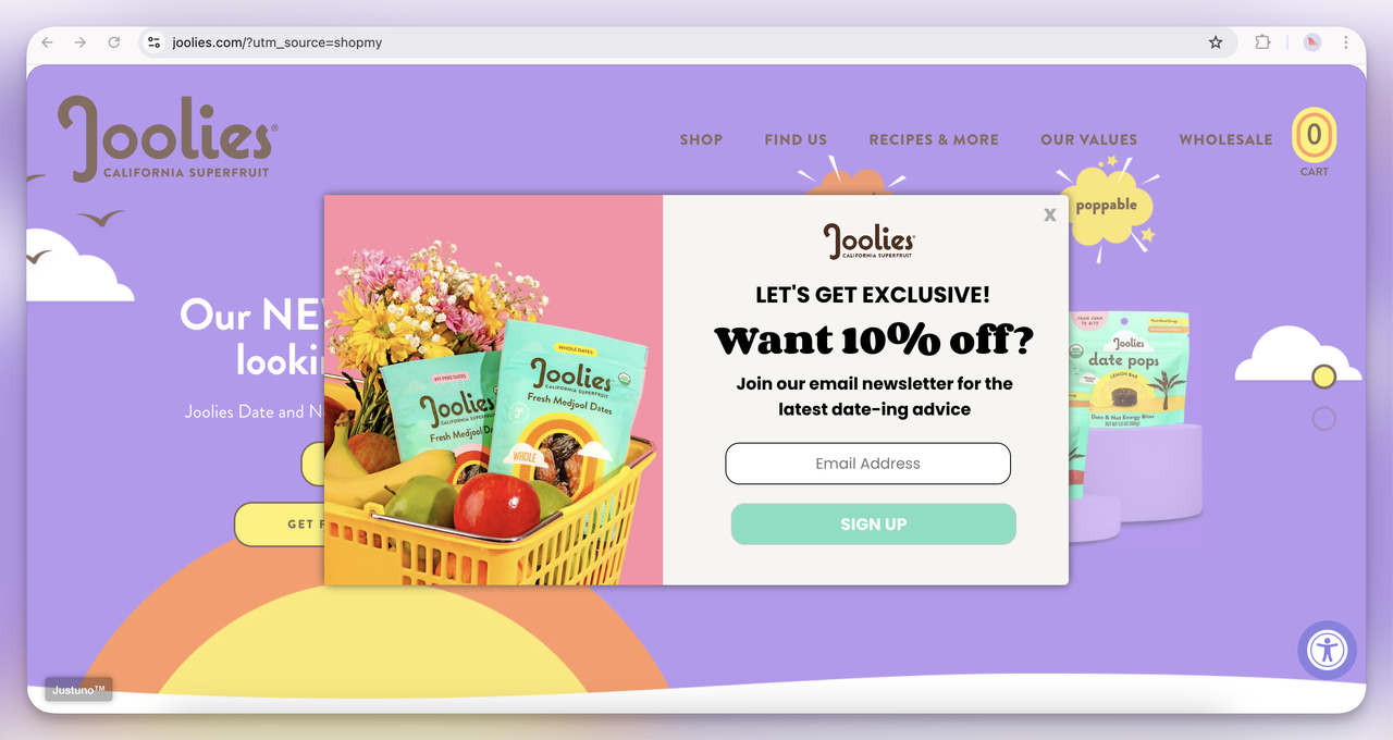
21. Joolies Discount + Newsletter Popup (Overlay)
The playful pastel visuals and puns (“date-ing advice” for dates—get it?) make this popup feel friendly and approachable.
They’re not just offering a discount but positioning their newsletter as something genuinely fun and useful. I think this is a great way to connect with customers who appreciate personality in marketing.
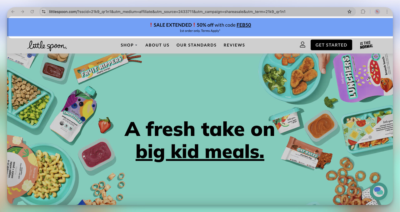
22. Little Spoon Floating Bar
This floating bar, offering 50% off, is hard to miss but doesn’t feel intrusive. It’s a smart tactic to ensure users always have the offer in view, especially during browsing. I think they wanted to keep the discount top-of-mind without interrupting the flow of the experience.
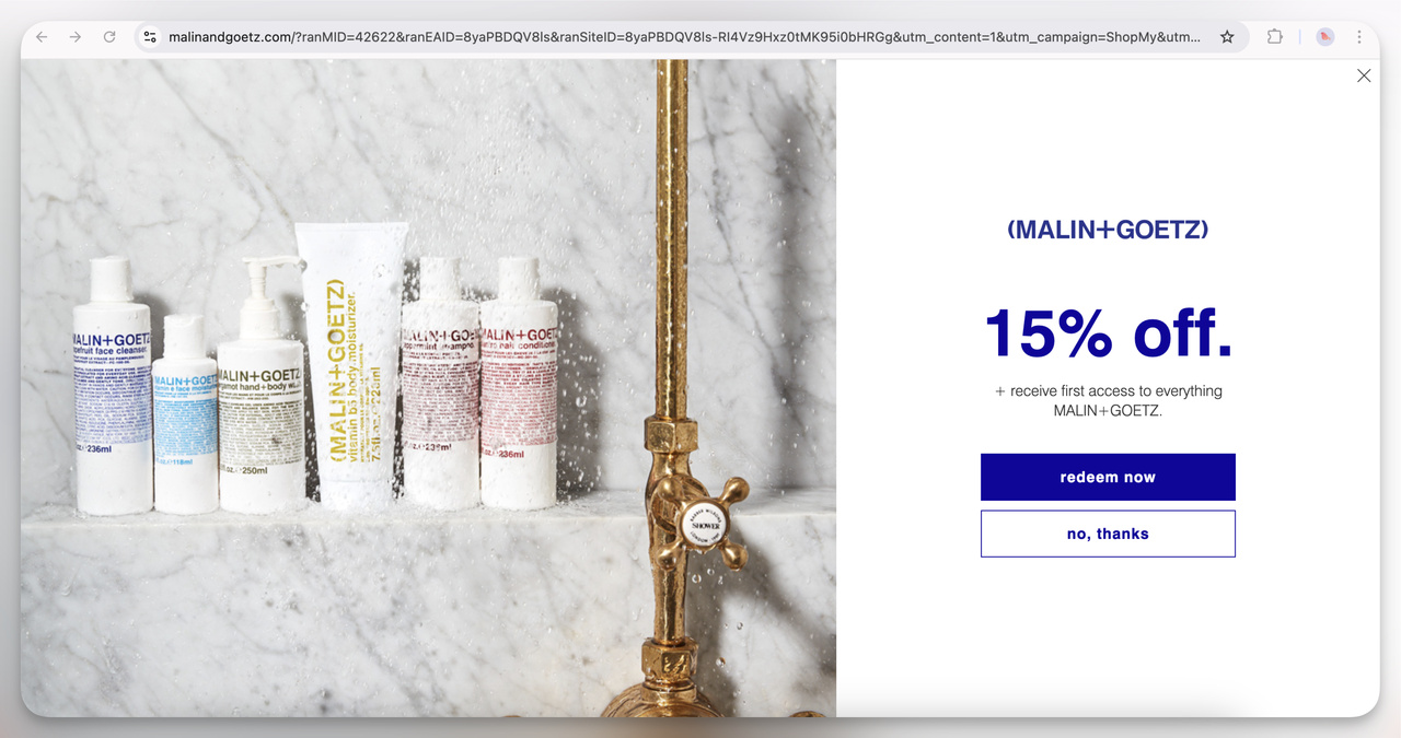
23. Malin + Goetz Discount Popup (Overlay)
The minimalist design reflects their high-end skincare branding. The clean aesthetic paired with a simple 15% off offer gives off a vibe of sophistication. I think they’re targeting users who value simplicity and quality without the bells and whistles.
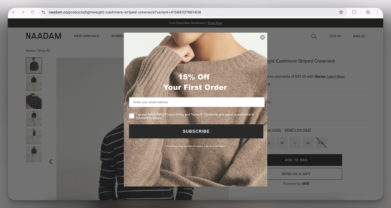
24. Naadam Discount Popup (Overlay)
The soft, cozy cashmere background image fits perfectly with their product vibe. The 15% discount on the first order is pretty standard, but the calming, neutral tones make the offer feel less salesy. I think this is designed to feel like a warm invitation rather than an aggressive sales push.
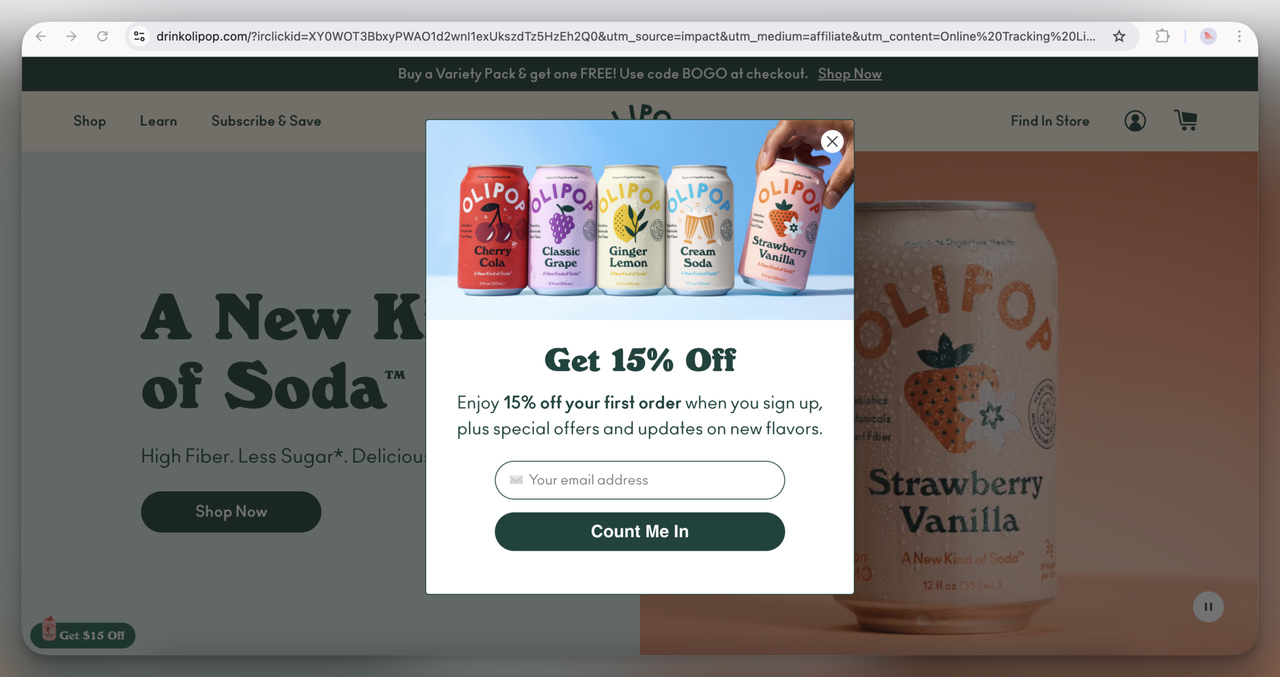
25. Olipop Discount Popup (Overlay)
Bright, colorful, and playful. Offering 15% off with images of vibrant soda cans sets the tone for a fresh, enjoyable shopping experience. I think this aims to engage health-conscious yet playful consumers who love creative branding.
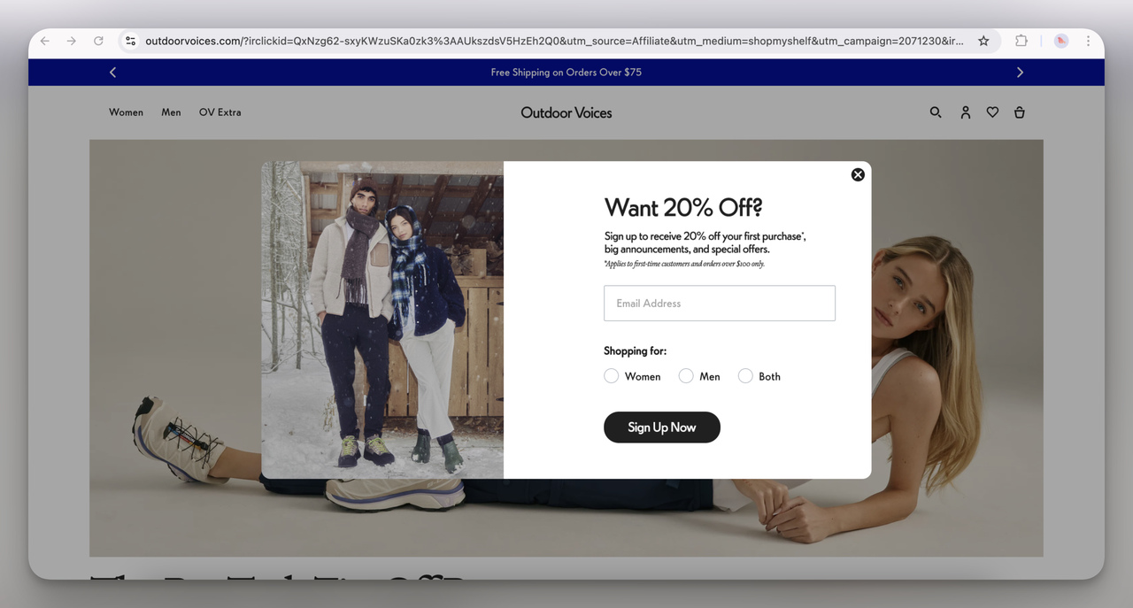
26. Outdoor Voices Signup Popup (Overlay)
The interesting addition here is letting users specify whether they’re shopping for women, men, or both. I think this helps tailor their future email campaigns more effectively. Plus, the 20% off is a solid incentive for new shoppers.
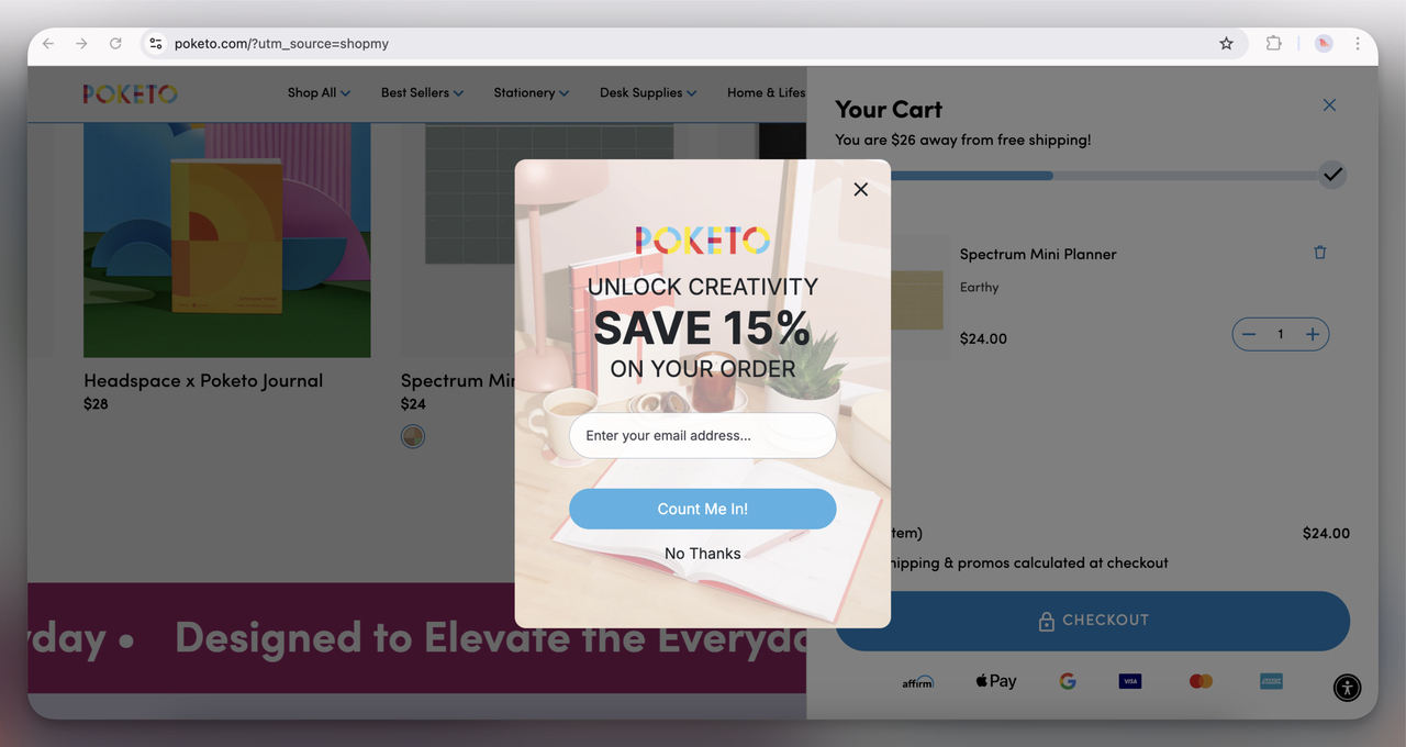
27. Poketo Discount Popup (Overlay)
I love how this one feels creative and inspiring—right in line with the brand’s stationery vibe. The playful desk imagery paired with a solid 15% discount encourages users to think about productivity and creativity. I think the rounded input field softens the design and makes it feel more friendly and approachable.
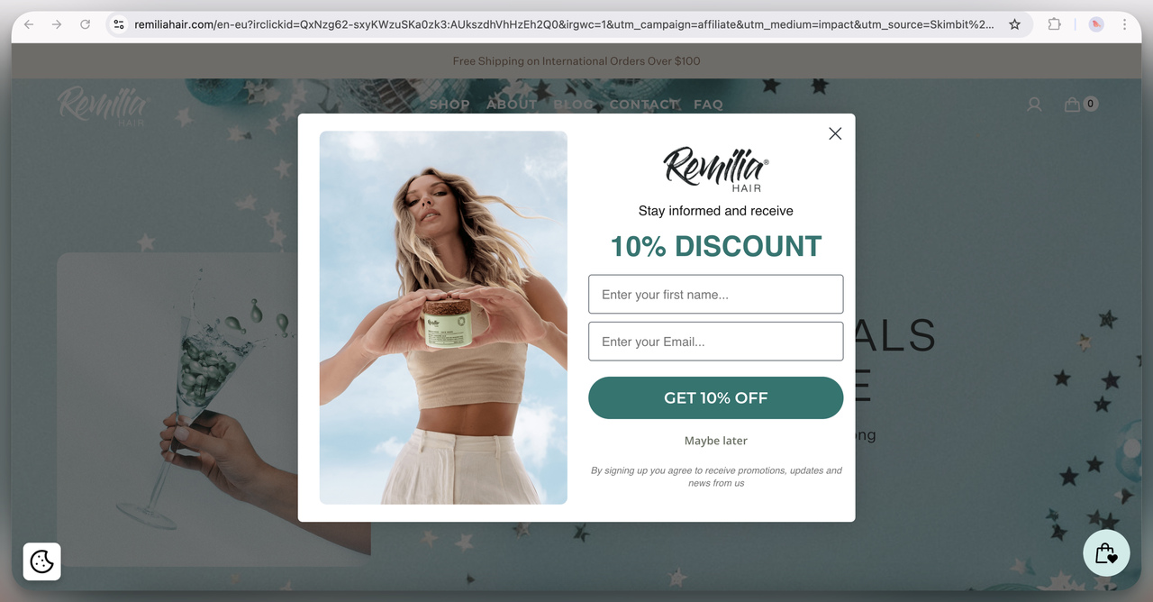
28. Remilia Hair Discount Popup (Overlay)
This design uses a soft, calming color palette with a clean and airy layout. The 10% discount offer is clear and easy to spot. I think it works because the fresh, natural imagery of the model holding the product conveys a feeling of health and vitality, which aligns well with the brand’s hair care focus.
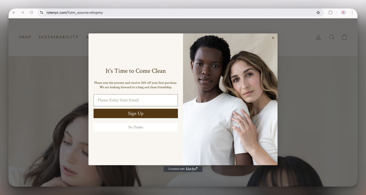
29. Rote NYC Discount Popup (Overlay)
Minimalist and elegant, this popup offers 20% off with a subtle, inviting design. The soft neutral tones and intimate photograph suggest simplicity and purity, which ties in with the brand’s clean beauty mission. It feels personal and sophisticated, creating a sense of trust.
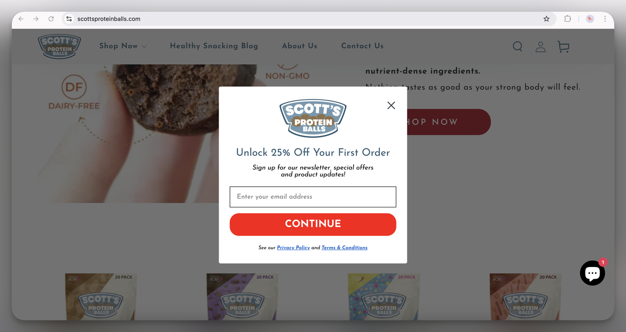
30. Scott’s Protein Balls Discount Popup (Overlay)
This popup is vibrant and bold, offering a solid 25% off. The playful and approachable design reflects the brand’s fun and energetic personality. The bright red button and clear call-to-action make it super easy for users to engage quickly.
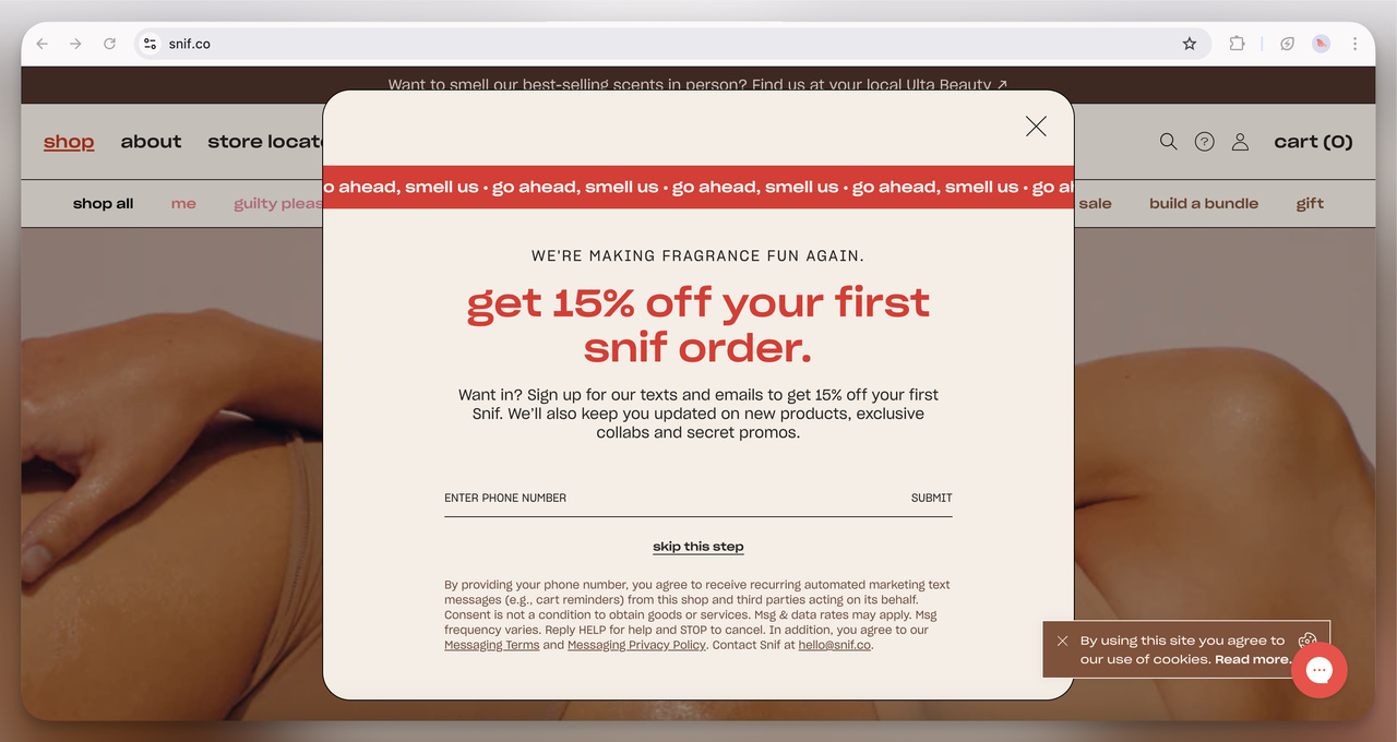
31. Snif Discount Popup (Overlay)
This popup has a playful tone with its bold typography and catchy phrasing. The 15% discount is front and center, and the quirky, scent-related language (“go ahead, smell us”) makes the brand feel fresh and fun. It works well for a fragrance company trying to break traditional norms.
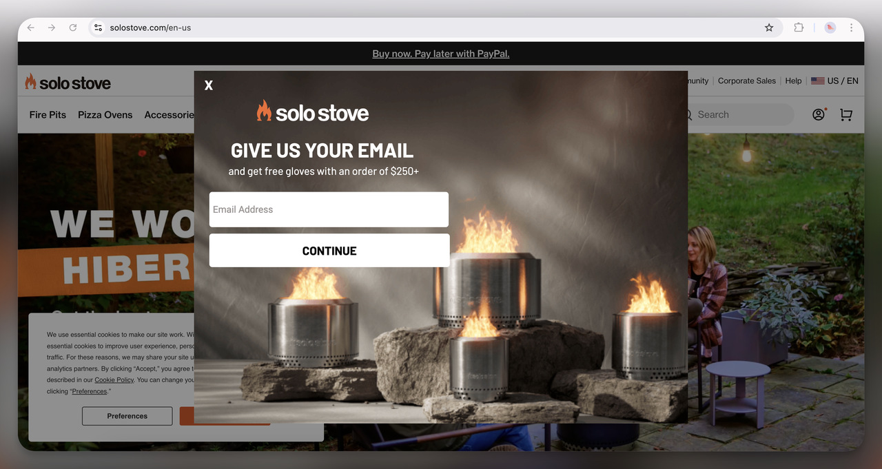
32. Solo Stove Free Gift Popup (Overlay)
The rustic imagery of fire pits sets the tone perfectly for this outdoor brand. Offering free gloves with a purchase over $250 adds a practical incentive for users likely already considering a purchase. The bold fire imagery also captures attention immediately.
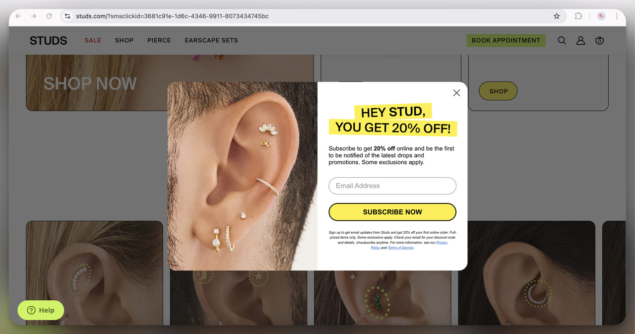
33. Studs Discount Popup (Overlay)
This popup grabs attention with its bold yellow and black color scheme and cheeky headline, “HEY STUD.” Offering 20% off, it’s playful yet straightforward. The up-close image of the ear piercings highlights the product in action, which effectively draws in the target audience.
Pros and Cons of Using Website Popups
While popups can be powerful tools for increasing engagement and conversions, it's important to consider both their benefits and potential drawbacks.
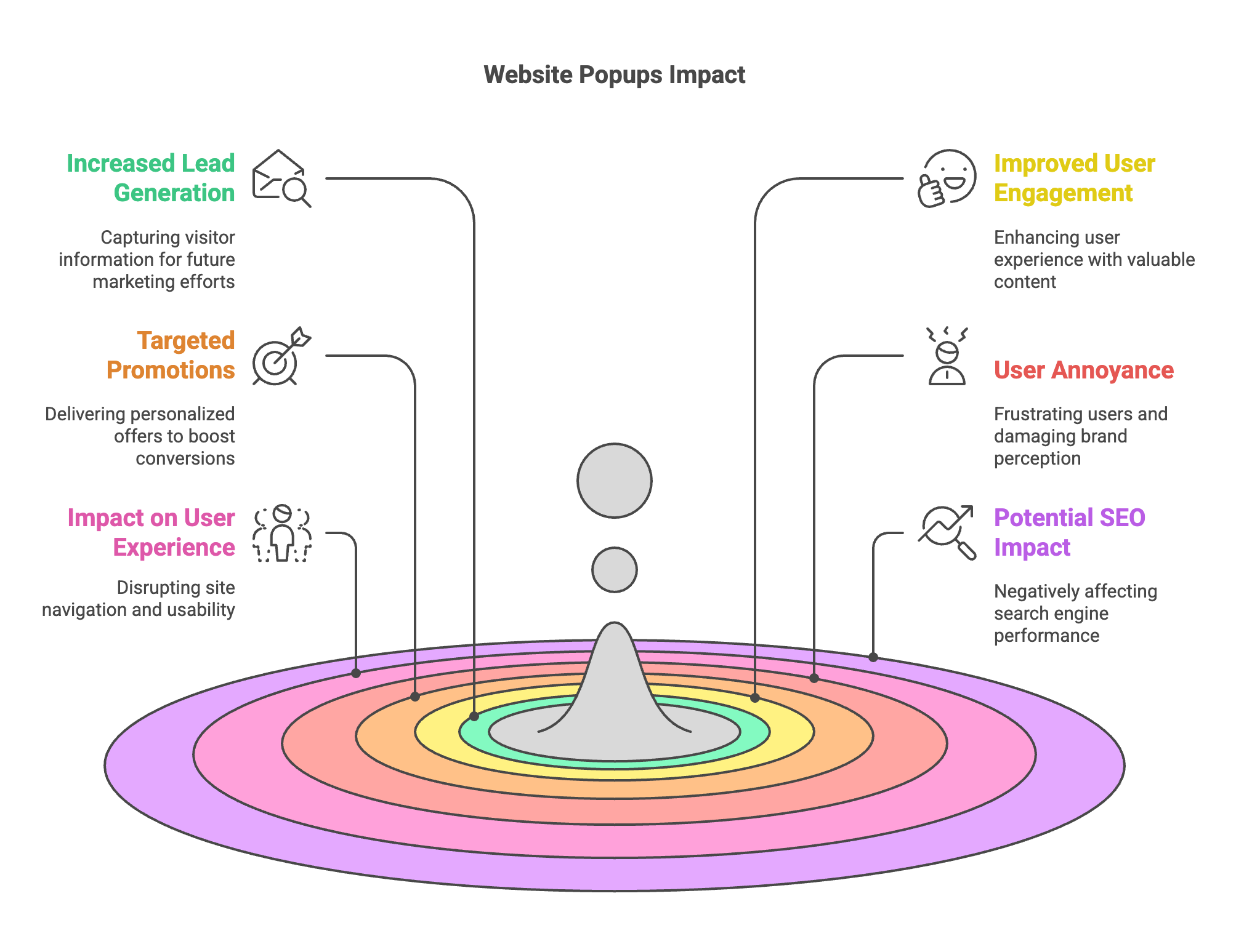
Pros:
- Increased Lead Generation: Popups can effectively capture visitor information, such as email addresses, which can be used for future marketing efforts.
- Improved User Engagement: By offering valuable content or incentives, popups can enhance the overall user experience and keep visitors engaged with your site.
- Targeted Promotions: Popups allow you to deliver personalized offers and messages based on user behavior and preferences, increasing the likelihood of conversions.
Cons:
- User Annoyance: Intrusive or poorly timed popups can frustrate users, leading to a negative perception of your website and brand.
- Impact on User Experience: If not designed thoughtfully, popups can disrupt the browsing experience, making it harder for users to navigate your site.
- Potential SEO Impact: Excessive or aggressive popups may negatively affect your site's SEO performance, as search engines prioritize user-friendly websites.
💡 Pro Tip: To maximize the benefits while minimizing the drawbacks, ensure that your popups are relevant, non-intrusive, and provide genuine value to your visitors.
⭐ Key Takeaway: Balancing the advantages of increased lead generation and engagement with the potential downsides of user annoyance and disrupted experiences is essential for the successful implementation of website popups.
Best Practices for Using Website Popups
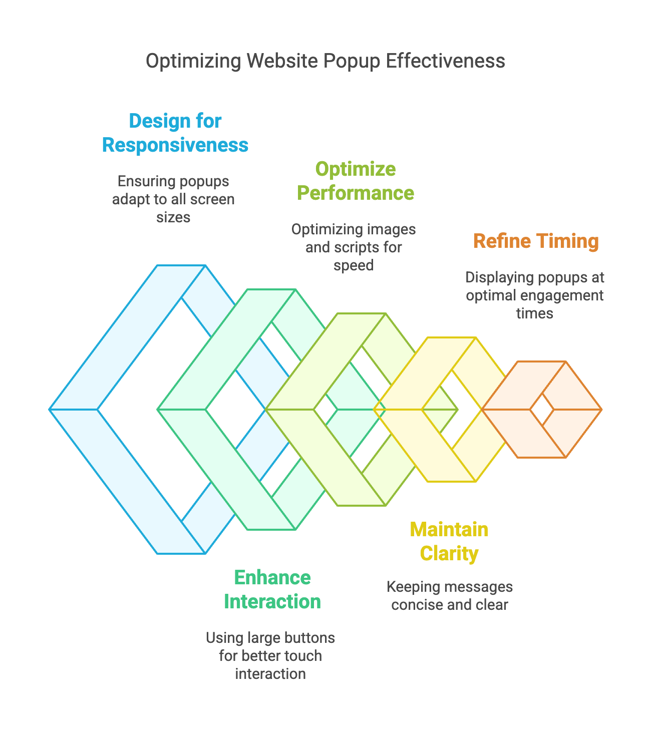
Implementing website popups effectively requires a strategic approach to maximize their benefits while minimizing potential drawbacks.
So, here are the best practices to ensure your website popups enhance your marketing efforts without compromising user experience.
-
Ensure popups adjust seamlessly to various screen sizes for a smooth user experience.
-
Utilize large buttons and easy-to-tap areas for better interaction on touchscreens.
-
Optimize images and scripts to ensure popups load quickly on mobile networks.
-
Keep messages concise and avoid clutter to maintain clarity on smaller screens.
-
Use gentle animations and avoid full-screen popups to prevent disrupting the browsing experience.
-
Provide an easy and visible way for users to close the popup without frustration.
-
Display popups when users are most likely to engage, such as after spending some time on the page.
-
Restrict the number of times a popup appears to the same user to prevent overwhelming them.
-
Test different headlines, images, and CTAs to see what resonates best with your audience.
-
Track conversion rates, click-through rates, and user engagement to identify successful elements.
-
Continuously refine your popups based on test results and performance data to enhance their effectiveness.
-
Adjust when and how popups are displayed based on user behavior and engagement patterns.
-
Inform users about how their data will be used and ensure transparency in data collection practices.
-
Use checkboxes or consent statements to comply with regulations like GDPR and CCPA.
-
Implement robust security measures to protect user information collected through popups.
-
Allow users to easily opt-out or unsubscribe from communications if they choose to do so.
Key Performance Indicators of Website Popups
To gauge your website popups' effectiveness, tracking specific Key Performance Indicators (KPIs) is essential. These metrics provide insights into how well your popups are performing and where improvements can be made.
- Conversion Rates: This measures the percentage of visitors who take the desired action, such as signing up for a newsletter or downloading an ebook. On average, website popups have a conversion rate of 11.09%, but top-performing popups can achieve up to 42.35% (OptiMonk, 2025).
- Click-Through Rates (CTR): CTR indicates how often users click on the popup compared to how often it is displayed. A higher CTR suggests that your popup content and design are compelling.
- Bounce Rates: Monitoring bounce rates helps you understand if popups are causing users to leave your site prematurely. A high bounce rate might indicate that popups are too intrusive or irrelevant to users' needs.
- Engagement Metrics: Metrics such as time spent on page and pages per session can show whether popups contribute to a more engaging experience.
📊 Statistics Alert: Mobile popups have a slightly higher conversion rate of 11.07% compared to 9.69% on desktops, emphasizing the importance of mobile optimization (OptiMonk, 2025).
Varied Use Cases with Real-World Examples
Website popups are versatile tools tailored to meet various marketing objectives.
I've also seen how different types of popups can effectively address specific business needs.
Below, I explore distinct use cases with real-world examples to illustrate their impact.
Lead Capture Popups
Lead capture popups are designed to convert visitors into leads by enticing them to provide their contact information in exchange for valuable content or offers.
- SaaS Company Offering Free Trial: A SaaS provider implemented a lead capture popup offering a free software trial. This strategy resulted in a 25% increase in lead acquisition, significantly expanding their subscriber base.
- E-commerce Site with Exclusive Discounts: An online retailer used a lead capture popup to offer exclusive discounts for first-time customers. This approach led to a 30% boost in email sign-ups, enhancing their marketing reach and sales potential.
📊 Statistics Alert: 55% of businesses using lead capture popups report generating more high-quality leads (Ecommerce Bonsai, 2025), underscoring their effectiveness in lead generation.
Exit-Intent Popups
Exit-intent popups are triggered when a user is about to leave the website, aiming to retain them by offering last-minute incentives.
- Online Bookstore Offering Discount Codes: An online bookstore implemented an exit-intent popup that provided a discount code when users attempted to leave the site. This tactic reduced cart abandonment by 18% and increased overall sales.
- Subscription Service with Exclusive Content: A subscription-based service uses exit-intent popups to offer exclusive content or additional features. This strategy resulted in a 20% increase in email sign-ups, capturing leads that might have otherwise been lost.
💡 Pro Tip: Exit-intent popups are highly effective because they target users when they decide to leave, offering a compelling reason to stay engaged.
Promotional and Seasonal Popups
Promotional and seasonal popups are designed to capitalize on specific events, holidays, or sales periods to boost engagement and drive conversions.
These popups create a sense of urgency and exclusivity, encouraging users to take immediate action.
- Fashion Retailer Showcasing Holiday Sales: A fashion retailer implemented a seasonal popup to highlight their holiday sales and exclusive deals. This strategy resulted in a 25% increase in seasonal sales and heightened customer excitement around the holiday period.
- Electronics Store Promoting Black Friday Deals: An online electronics store used a promotional popup to advertise discounts. The popup attracted attention and led to a 30% surge in sales during the promotional period.
📊 Statistics Alert: Seasonal popups have an average conversion rate of 11.88%, leveraging the urgency of limited-time offers to drive higher engagement and sales (Lucatagliaferro, 2024).
Interactive Popups
Interactive popups engage users by incorporating quizzes, surveys, or interactive forms.
These popups capture leads and provide valuable insights into user preferences and behaviors.
- Skincare Brand Using Quizzes to Recommend Products: A skincare brand integrated an interactive popup that featured a quiz to recommend personalized skincare products. This approach led to a 20% increase in user engagement and a 15% boost in product recommendations.
- Fitness Website Offering Interactive Workout Plans: A fitness website utilized an interactive popup where visitors could input their fitness goals and receive customized workout plans. This interactive element resulted in a 22% rise in lead generation and enhanced user satisfaction.
💡 Pro Tip: Incorporating interactive elements within your popups can significantly enhance user engagement and provide personalized experiences that resonate with your audience.
How to Use Website Popup Examples
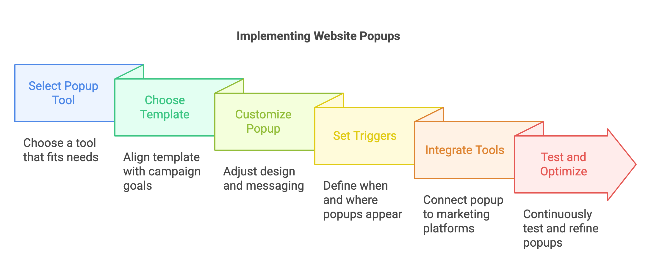
Implementing website popups effectively involves a few key steps to ensure they integrate seamlessly with your website and marketing strategies:
1. Select a Popup Tool: Choose a tool that best fits your needs based on features, ease of use, and budget. We’re suggesting Popupsmart for all these needed features.
2. Choose a Template: Select a template that aligns with your campaign goals, whether it’s lead generation, promotion, or feedback collection.
3. Customize Your Popup: Adjust the design, messaging, and CTA to match your brand and objectives. Incorporate high-quality images and clear, concise text.
4. Set Triggers and Rules: Define when and where your popup will appear using triggers like exit intent, time delays, or scroll depth. Ensure the timing is optimal to maximize engagement without annoying users.
5. Integrate with Marketing Tools: Connect your popup to your email service provider, CRM, or other marketing platforms to automate lead capture and follow-up processes.
6. Test and Optimize: Continuously test different popup elements, such as design, messaging, and triggers, to identify what works best. Use A/B testing to refine your approach based on performance data.
To Conclude
Website popups can drive user engagement, conversions, and capturing leads.
We've explored multiple popup types, each serving a unique purpose to fulfill certain marketing goals.
Website popups have a promising future, with technological advancements set to boost their capabilities further.
Frequently Asked Questions
What Are Some Creative Popup Examples for Social Media Integration?
Integrating social media with website popups can significantly enhance your online presence. Examples include "Follow Us" popups that offer exclusive discounts for following your profiles, "Share Your Purchase" popups encouraging users to share their buys for rewards, and "Social Proof" popups displaying recent posts or follower counts to build trust. These strategies help increase your brand’s credibility and reach.
What Are Some Legal Considerations When Using Website Popups?
When using website popups, it’s crucial to comply with privacy regulations like GDPR and CCPA by obtaining explicit user consent and providing clear privacy notices. Ensure that you handle data securely to protect user information and respect user preferences by allowing easy opt-outs. Non-compliance can result in hefty fines and damage your brand’s reputation.
What Are Some Creative Popup Examples for Content-Driven Blogs?
Content-driven blogs can effectively use interactive popups such as quizzes that offer customized ebooks, scroll-triggered popups providing related resources, and feedback popups requesting user opinions in exchange for free guides. These methods boost user engagement and help grow your subscriber base efficiently.
Check out other related blog posts:

How would you rate your experience with this article? 😊