

This entry covers the website element, not inflatable bars for pools, lakes and boats.
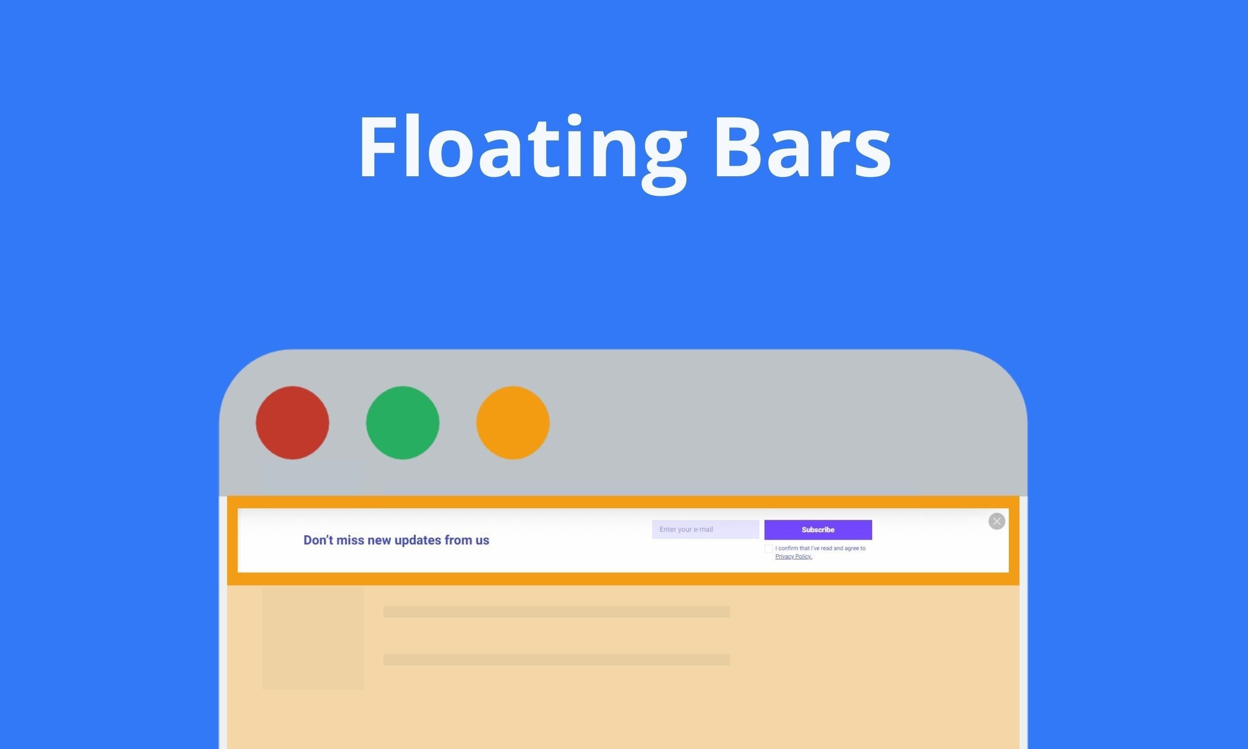
Using sticky floating bars on a website helps to promote campaigns without annoying users. Although we call floating bars ‘popups,’ they have some functional differences.
Floating bars, also known as hello bars, stick to the bottom or top of a web page and stay in their position when scrolled up and down. On the other hand, popups in general are windows that ‘pop up’ on the screen.
Just like other popup types such as sidebar popup and full-screen popup, floating bars prompt customers to take the desired action that leads to conversion (providing information, subscribing, making a purchase, etc.)
When does a floating bar beat a popup?
When the message needs to be seen, not decided on. I use a bar for news the visitor should see but not stop for, and a lightbox when the offer needs a yes or no.
| Format | Where it sits | Blocks the page? | Best for |
|---|---|---|---|
| Floating bar | Top or bottom edge | No | A free-shipping threshold, a sale end date, a cookie or legal notice, an announcement |
| Lightbox popup | Center, page dimmed | Yes, until closed | A lead offer that needs full attention |
| Slide-in (sidebar popup) | A corner or side | Partly | A second offer beside the content |
Our 2026 popup conversion benchmark doesn't hold enough floating-bar campaigns to give a bar-specific conversion rate, so this choice rests on design.
Why You Should Use Floating Bar Popups
A floating bar asks less of the visitor than a popup does. Here’s why that matters:
Non-Intrusive
Visitors who don't want a popup dismiss it fast: across the popups we power, our 2026 benchmark measured that 71% of visitors who close a popup do so within 5 seconds of it appearing. That covers every popup format, not bars alone. A floating bar doesn't force that choice, because the page stays usable around it.
Take a look at our article about Popup UX Design to ensure your popup design is correct.
While traditional popups invade the whole page and prevent user engagement, floating bar popups do not hurt the user experience as they do not interrupt the visitor’s engagement on a web page.
Stays in view
Floating bars work like sticky notes. They stick to the web page and remind the visitors to take action or draw their attention to a campaign. However, floating bars do not come in between the content and the user while grabbing visitors’ eyes.
Uses of Floating Bar
Floating bars are applicable to almost any campaign that aims at more conversions. Here are some of the floating bar uses:
- Floating bars provide an easier way to grow email lists.
- Floating bar popups or hello bars welcome visitors.
- They are ideal for announcements & upcoming events.
- They can be used for product or service promotion.
- They ensure more visitors see sales, discounts, and coupon codes.
For designs to copy, see these announcement bar examples and hello bar examples.
Popupsmart builds floating bars alongside modal popups, slide-ins and full-screen overlays; its popup templates are organized by campaign goal. You can create a floating bar for free with Popupsmart popup builder.
Should a floating bar sit at the top or the bottom?
On desktop, the top edge works: the bar is read first and doesn't compete with the page's own buttons. Phones are harder, and most popup displays happen there.
On a phone, each edge has a cost:
- Bottom: the button sits near the thumb, but the bar can cover a store's sticky add-to-cart button, and some mobile browsers put their own toolbar on that edge.
- Top: the bar clears those buttons but stacks on a sticky header and takes a slice of the first screen.
I check the bottom edge of a product page on a phone first: if a sticky add-to-cart button lives there, the bar goes to the top. Popupsmart targets campaigns by device, so the phone version can run as a separate campaign on the other edge.
Does a floating bar hurt SEO or accessibility?
Not for SEO, if it stays thin. Google's guidance on intrusive interstitials and dialogs says: "Instead of full page interstitials, use banners that take up only a small fraction of the screen."
Accessibility is where bars go wrong. WCAG 2.2's Focus Not Obscured (Minimum) lists sticky headers and footers as content that can cover the item a keyboard user has tabbed to. A sticky notification fails if it entirely hides that item; the W3C's fixes include scroll padding so the banner doesn't overlap other content.
I give every bar a visible close control, even a shipping notice nobody needs to act on, because on a phone the bar covers part of every screen.