How to Create a React Popup & Customize it in 4 Steps
 ChatGPT
 Perplexity
 Claude
 Grok
Grok Google AI Mode
React popups are reusable overlay components controlled by state and triggers, often using portals to avoid z-index issues; effective implementations prioritize accessibility (ARIA, focus trap), performance, and mobile behavior, with library and no-code options like Popupsmart.
Creating popups in React is a common need for web applications, and React's component-based architecture makes it straightforward to build reusable ones. A React popup is a dynamic overlay that displays content on top of a page without navigating away, keeping users in context while collecting input or surfacing information. Whether you're creating a modal, an alert box, or a custom form popup, this guide walks through the full process: how to build one in four steps, how to make it accessible, and which libraries to consider depending on your project's needs.
What is React Popup?
A React popup is an interactive overlay element built with React that renders content above the existing page without full navigation. It uses React's useState hook to control visibility through conditional rendering, and typically includes an overlay backdrop, a trigger event (click, hover, or timer), and a close mechanism.
React's component model means popups are reusable, write once, deploy across multiple views with different content via props.
Five core elements determine how any React popup functions:
- Trigger Events: Popups activate on specific user actions: button clicks, mouse hovers, scroll depth, or time on page. Using React hooks for event handling ensures smooth responses without performance issues.
- State Management: React's useState hook manages visibility. The open boolean drives conditional rendering to show or hide the popup based on user interactions.
- Overlay Backdrop: A semi-transparent layer behind the popup prevents interaction with the underlying page, focusing user attention on the popup content.
- Customizable Elements: CSS styling, animation transitions, and props configuration make popup components reusable across different contexts and visual themes.
- Accessibility Features: ARIA roles, focus trapping, and keyboard support make popups usable for all users, including those on screen readers. Skipping these is one of the most common implementation mistakes.
One key advantage of React popups over vanilla JavaScript implementations is context maintenance.
Instead of redirecting users to a new page or reloading to show a message, a React modal popup overlays content seamlessly — a sign-up form appears on click, collects input, and closes without reloading the page. This keeps bounce metrics low and keeps users in whatever flow they were already in. For e-commerce and SaaS applications, where mid-flow interruptions cause drop-offs, this is a meaningful behavioral difference.
React portals are worth understanding early: they render popup content outside the main DOM hierarchy (typically appended to document.body), which solves z-index conflicts and CSS inheritance issues that arise in nested component trees. For any popup that needs to sit above fixed headers, sidebars, or complex layouts, portals are the right approach.
What Are the Challenges of Implementing React Popups Effectively?
Most popup bugs fall into predictable categories, and knowing them before writing code saves significant debugging time. Here are the ones that trip up implementations most often:
- State management conflicts: useState outgrows local scope fast. Popups that need to open once per session, or depend on auth status, require lifted state via Context or a global manager like Redux or Zustand.
- Accessibility gaps: Missing focus trapping lets keyboard users tab into the obscured page behind the popup. Missing ARIA attributes (role="dialog", aria-modal="true", aria-labelledby) break screen reader interpretation entirely — these aren't optional.
- CSS and z-index conflicts: Overlays nested inside complex component trees inherit unwanted stacking contexts. React portals fix this by rendering at document.body level, outside the cascade.
- Performance re-renders: Heavy popup content that re-renders on unrelated parent state changes causes jank. React.memo and useCallback on the close handler are the two highest-leverage fixes.
- Scaling complexity: What starts as one modal grows into ten popup types with different triggers and state dependencies. In building Popupsmart across thousands of customer integrations, teams that plan a popup manager pattern early ship faster and debug less than those who retrofit it later.
- Exit intent false positives: Raw mouseout events without debouncing fire on any fast cursor movement, not just genuine exit gestures. A 100ms debounce filters out the noise.
Common challenges and their fixes at a glance:
| Challenge | Root Cause | Fix |
|---|---|---|
| Infinite re-renders | useEffect dependencies missing or wrong | Audit dependency arrays; use ESLint's exhaustive-deps rule |
| Focus escaping popup | No focus trap implemented | Add focus trap loop on Tab/Shift+Tab keydown events |
| z-index conflicts | Popup inside nested stacking context | Use React portals to render at document.body level |
| Screen reader confusion | Missing ARIA attributes | Add role="dialog", aria-modal="true", aria-labelledby |
| Mobile scroll lock bugs | overflow:hidden not toggled correctly | Toggle body overflow in useEffect on open state change |
| Popup SEO penalty | Intrusive interstitial on mobile | Delay trigger, ensure easy dismissal, don't block content on load |
How to Create a Popup with React in 4 Steps?

The following steps use the reactjs-popup library for rapid setup, combined with React hooks for state management. The result is a reusable React popup component that handles trigger events, conditional rendering, and overlay display without boilerplate.
Step 1: Install Required Libraries
Run the following in your terminal to install reactjs-popup via npm:
Or with Yarn:
The library includes TypeScript type definitions — no separate @types package required. After installation, import it into your component file. If you're working in a non-React stack, the same popup patterns apply to other frameworks; see our guides on Angular popups and Bootstrap popups for equivalent implementations.
Step 2: Create a Basic Popup in React
The core pattern is a useState boolean controlling the popup's open prop, with a close handler passed as a callback. Here's a working starter component:
The closeOnDocumentClick prop adds click-outside dismissal, which is expected UX behavior. The position prop accepts values like "top center", "bottom left", or "right center" for tooltip-style positioning.
Step 3: Customize Your React Popup
Customization happens through CSS and the library's contentStyle prop. Apply styles that match your site's design system:
For animation, React Transition Group integrates well with this library. Keep animations under 300ms; longer transitions on interactive elements feel sluggish, particularly on mobile.
Step 4: Creating Different Types of Popups in React
Once the basic setup is working, the same pattern extends to specialized popup types. Here's a prompt popup that captures user input in real time:
And here's an exit intent popup that fires when the cursor moves toward the browser's address bar:
Common popup types and their primary use cases:
- Modal Component: Full-focus overlays for confirmations, sign-up forms, or critical decisions. Always implement focus trapping. Use the modal prop in reactjs-popup to enable backdrop rendering automatically.
- Notification Popup: Auto-dismissing alerts with a setTimeout close. Ideal for success/error feedback after form submissions or async operations.
- Tooltip Popup: Hover-triggered overlays for contextual help. Use position="top center" with minimal styling and no backdrop — tooltips should never block the underlying content.
- Exit Intent Popup: Mouse-leave detection for retention offers. Limit to one trigger per session to avoid frustrating users.
For notification popups, use role="alert" and aria-live="polite" so screen readers announce the message without moving focus.
For exit intent, add a 100ms debounce on the mouseout handler — without it, fast cursor movements across the screen trigger false positives.
See the React createPortal documentation for DOM placement details.
How to Make React Popups Accessible?
Accessible React popups require three things working together: correct ARIA attributes, keyboard navigation support with focus trapping, and proper focus management on open and close. Each is required for WCAG 2.1 AA compliance — and for a functional experience for the 26% of adults in the US who live with some form of disability.
Start with three ARIA attributes on the popup container: role="dialog" identifies it to screen readers, aria-modal="true" prevents the virtual cursor from leaving the popup, and aria-labelledby connects the dialog to its heading so the title is announced immediately on focus.
Focus trapping keeps keyboard navigation contained within the popup. Here's a complete implementation using useRef and useEffect:
When the popup closes, focus should return to the element that triggered it. Store a reference to the trigger before opening:
In our experience auditing popup implementations across customer sites, missing focus restoration on close is the single most reported accessibility complaint from screen reader users; it leaves them stranded at the top of the page after dismissing the popup. It's a two-line fix that most tutorials don't mention.
Key accessibility checklist items before shipping any React popup:
- All interactive elements are reachable by keyboard Tab navigation
- Escape key closes the popup (standard expected behavior)
- Color contrast meets 4.5:1 ratio for body text, 3:1 for large text
- Animations respect prefers-reduced-motion media query
- Screen reader tested with VoiceOver (macOS) or NVDA (Windows)
- Focus returns to the trigger element on close
Audit your implementation with Chrome Lighthouse. The Accessibility score catches missing ARIA attributes, contrast failures, and focus management issues automatically.
What are the Best Alternatives to reactjs-popup?
Different projects have different requirements. reactjs-popup works well for simple cases, but larger apps or teams with strict accessibility or design-system requirements often need a different tool. Here's an honest comparison of the main options:
| Library | Bundle Size | Accessibility Built-in | Styling Approach | Best For |
|---|---|---|---|---|
| reactjs-popup | ~5KB | Partial (manual ARIA needed) | CSS classes / contentStyle prop | Simple popups, tooltips, quick prototypes |
| Material UI (MUI) | ~90KB+ (tree-shakeable) | Strong (Dialog component) | MUI theming system + sx prop | Design-system apps, enterprise projects |
| Headless UI | ~7KB | Excellent (built-in focus trap) | Unstyled — bring your own CSS/Tailwind | Teams wanting full style control + accessibility |
| Custom hooks + portals | 0KB (zero dependencies) | Manual (full control) | Fully custom | Performance-critical apps, unique UX requirements |
| Radix UI Dialog | ~8KB | Excellent (WAI-ARIA compliant) | Unstyled primitives | Accessible component libraries, design systems |
Material UI (MUI)
Material UI is ideal if your project already uses the MUI ecosystem. Its dialog components handle accessibility concerns like focus management, keyboard navigation, and backdrop behavior automatically, making it a strong choice for enterprise apps and consistent design systems.
Headless UI
Headless UI provides fully accessible dialog primitives without enforcing styles. It’s especially popular with Tailwind users who want complete visual control while still benefiting from built-in accessibility features such as focus trapping and ARIA attributes.
Custom hooks + portals
Building a custom popup solution with hooks and portals offers maximum flexibility and zero dependencies. This approach is best when performance, bundle size, or highly customized UX interactions are priorities, but it requires manual accessibility implementation.
Mobiscroll
Mobiscroll focuses on mobile-optimized popup experiences, including date pickers, selectors, and form overlays. It’s a strong option when touch-friendly interactions and native-like animations on iOS and Android are essential. See Mobiscroll's React documentation for setup details.
Semantic UI React
Semantic UI React includes pre-styled modal and popup components that integrate well with its design system. It’s a reasonable option if the project already uses Semantic UI, though customization flexibility and maintenance activity are more limited compared to newer libraries.
Radix UI Dialog
Radix UI Dialog offers accessible, unstyled primitives designed for building component libraries and design systems. It provides robust WAI-ARIA compliance and behavior control while leaving styling entirely to the developer.
How to choose?
- Need lightweight simplicity: reactjs-popup
- Need full accessibility with style control: Headless UI or Radix UI
- Already using a component framework: Material UI or Semantic UI
- Need zero dependencies and custom behavior: Custom hooks + portals
- Building mobile-first forms and selectors: Mobiscroll
How to Optimize React Popup Performance?
Performance problems in React popups typically come from three sources: unnecessary re-renders, blocking the main thread during animation, and heavy content loading synchronously. Each has a targeted fix.
Memoization with React.memo prevents the popup component from re-rendering when unrelated parent state changes. Wrap the popup component, and use useCallback for the close handler to maintain referential stability:
React portals improve rendering performance by placing the popup outside the component tree, avoiding CSS cascade recalculations — already shown in the custom hook example above.
CSS transitions over JavaScript animations offload animation work to the GPU, keeping the main thread free for user interactions. Use opacity and transform — these properties are composited by the browser without triggering layout recalculation:
Performance checklist before shipping:
- Profile with React DevTools Profiler; look for unexpected re-renders during popup open/close
- Use Chrome DevTools Performance panel to confirm animation runs on compositor thread (green bars, no layout)
- Verify the Lighthouse Performance score doesn't regress when popup is included on the page
- Test on a mid-range Android device, this reveals performance issues that desktop testing misses
- Throttle event listeners (scroll, mousemove) used for exit intent or scroll-triggered popups
Code splitting with dynamic imports keeps bundles lean when an app has multiple popup types. Use React.lazy() so each popup variant only loads when triggered, not on initial page load.
For complex popup state, particularly popups with multiple internal steps or form states, useReducer is a better fit than multiple useState calls.
Cascading useState updates within a popup can trigger multiple re-renders in sequence; a single reducer handles all state transitions in one update cycle. This is especially relevant for multi-step modals — sign-up flows, onboarding wizards — where each step changes several state values simultaneously.
On the bundler side, tree-shaking unused popup library code reduces shipped JavaScript. Ensure your bundler configuration marks packages as side-effect-free where possible.
For webpack specifically, see the webpack tree-shaking guide, a properly configured setup can reduce popup-related bundle weight by 20-30% by eliminating library code paths that your implementation doesn't use.
How to Use Popup Builder Popupsmart for React Websites
If you're not working in a React codebase, or your team needs to create and iterate on popups without engineering involvement, a no-code popup builder is the faster path. Popupsmart handles targeting, design, and integrations through a visual editor, with no npm installation or state management required.
Let’s look at how you can create a popup with Popupsmart step by step.
Step 1: Create a New Campaign
Sign up for Popupsmart, the free plan is available without a credit card. From the dashboard, click New Campaign.
You'll be prompted to select a business objective first: growing an email list, promoting an offer, collecting feedback, announcing a product, or driving phone calls. Picking the right objective shapes, which templates are shown next, so the popup you build is already aligned with a conversion goal before you touch any design settings.
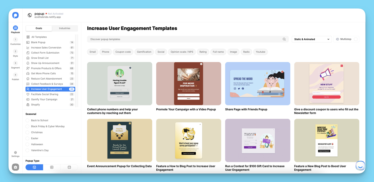
Secondly, you need to select a template that fits your business objective. We have many ready-to-use popup templates that are suitable for different business objectives. By exploring them, you can choose a template for the various aims of your business.
With popups created with Popupsmart, you can:
- Grow your email list and target your visitors.
- Show an announcement of your products and services to your customers.
- Comply with cookie laws and take your visitors’ consent for storing cookies.
- Increase phone calls and build stronger relationships with your visitors in an old-fashioned way.
- Promote your products and services by presenting special offers to your audience.
- Collect form submissions to gather personal information and data of your visitors to enhance their user experience.
For this popup creation guide, we’ll use a template designed to collect feedback.
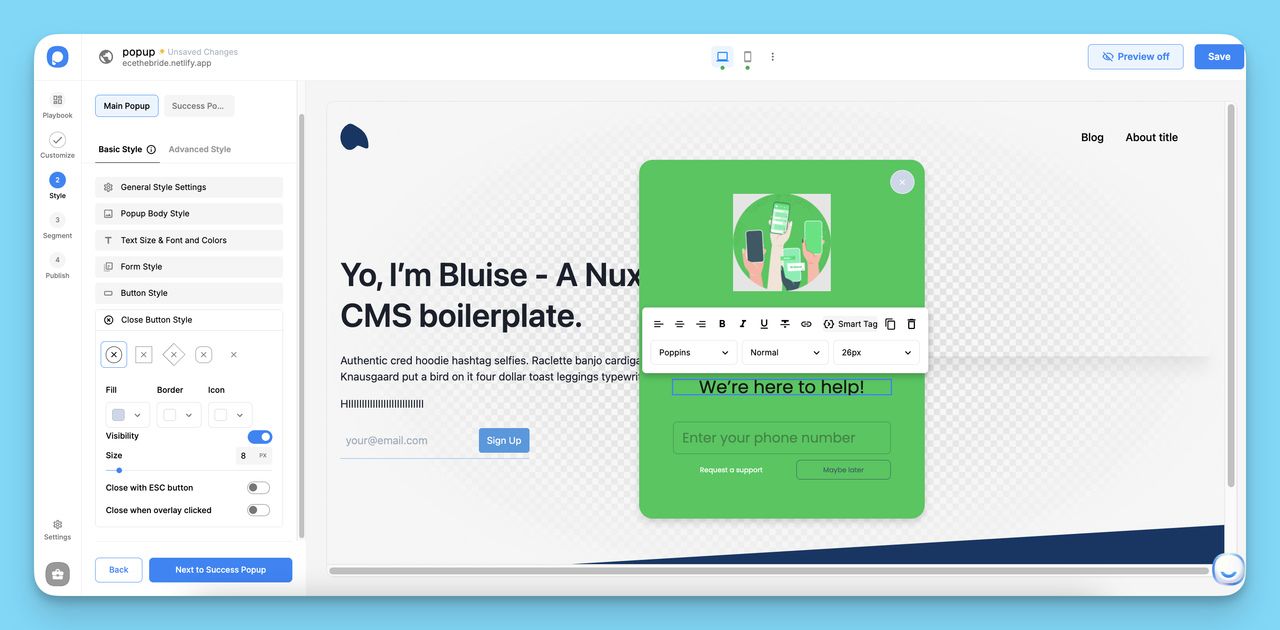
Step 2: Customize Your Popup Design
After you choose your template, the popup builder screen will show up. In the “Customize” section, where you can play with your popup independently! You can customize your layout’s position, size, color palette & fonts to design your popup more suitable for your website.
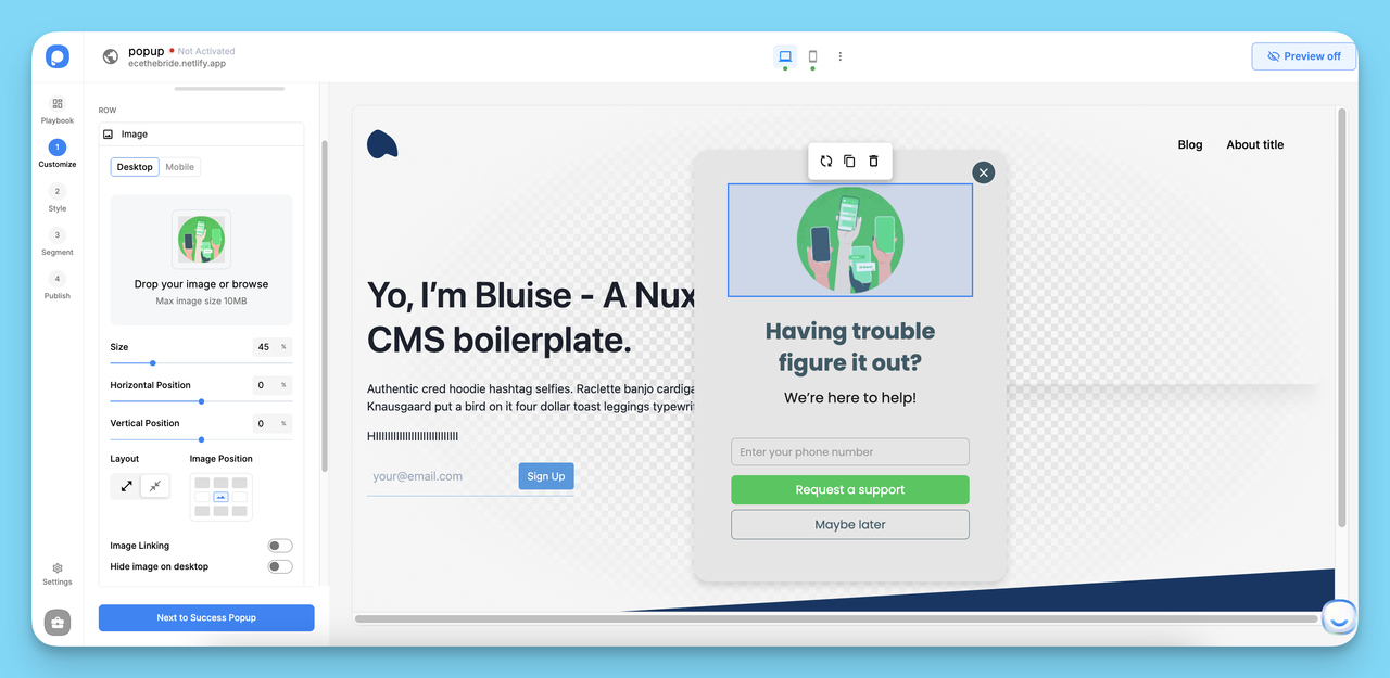
You can edit a popup’s image, text, and input fields according to your business as well.
A few customization decisions worth getting right at this stage:
- CTA button copy: Specific action phrases ("Get the free guide") consistently outperform generic ones ("Submit" or "Click here").
- Close button visibility: A clearly visible close option reduces frustration and the bounce rate signals that come with it, don't hide it to force engagement.
- Mobile preview: Switch to the mobile view in the editor before moving on. What looks good at desktop width can overlap critical content on smaller screens, which risks an SEO interstitial penalty.
You can personalize each element you add to your popup to make it more engaging. By clicking on the elements of a popup’s block, you can customize its style according to your needs!
Step 3: Configure Targeting and Trigger Rules
When you have finished customizing your popup and made sure that it looks remarkable, go to the “Target” section.
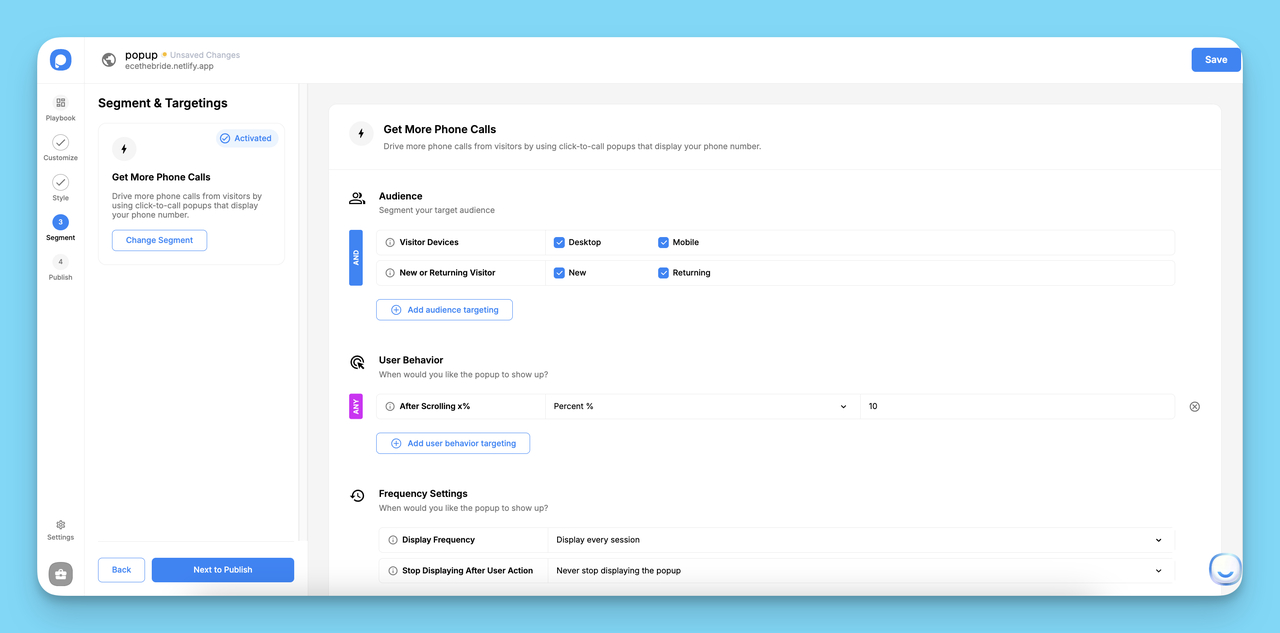
Targeting is where no-code popup builders justify their existence over coded implementations; the rules engine handles behavior logic that would otherwise require custom JavaScript. In the Targeting section, set:
- Audience filters: Show the popup to new visitors only, returning visitors, specific traffic sources, or visitors from a particular country or device type.
- Behavior triggers: Choose from exit intent (cursor moves toward the browser bar), scroll depth (fires after the visitor scrolls 50% or 75% of the page), time on page (fires after X seconds), or click triggers on a specific element.
- Frequency caps: Control how often the same visitor sees the popup — once per session, once per day, or a set number of times total. This is the most important setting for avoiding the frustration that leads to high bounce rates.
- Page-level targeting: Restrict the popup to specific URLs or URL patterns so it only appears where it's relevant to the visitor's context.
There are different targeting options that you can choose according to your business objective.
By setting triggers on the “Audience,” “User Behavior,” and “Frequency Settings” parts, you can build an advanced popup with innovative targeting features to reach your visitors properly.
When you are done with this part, click on the “Save” button and go to the “Settings” part.
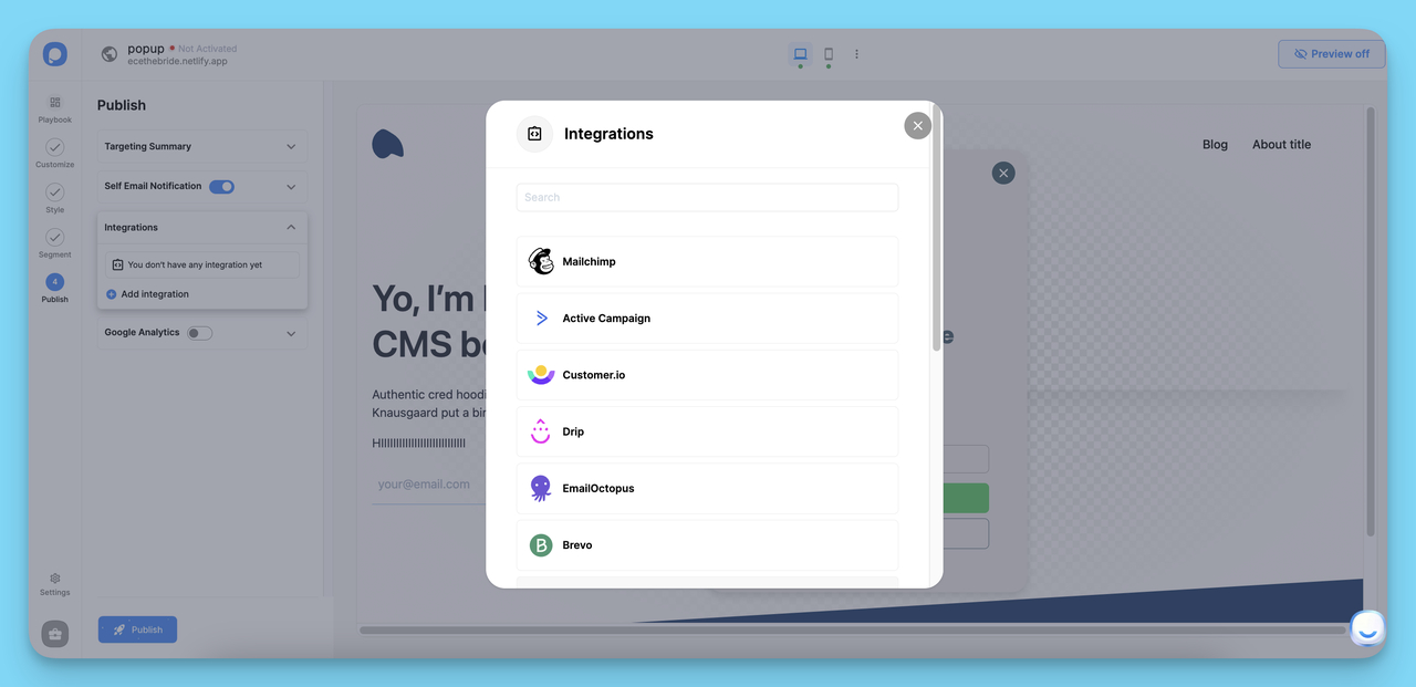
Step 4: Connect Integrations and Publish
Before publishing, connect any tools you need in the Settings panel. Popupsmart integrates with over 50 platforms — email marketing tools (Mailchimp, Klaviyo, HubSpot), CRMs, Google Analytics, and Zapier for custom workflows. For lead-generation popups, connecting directly to your email platform means new subscribers land in your list without any manual export steps.
Click on the “Save & Publish” buttons when you are all set and ready to go!
When you finish creating your popup, add the embed code of your popup to your website’s code injection part. You can easily add it before the closing body tag. Besides, you can add popups with Google Tag Manager to your website.
You can see the Popupsmart embed code when you click on the “Publish” button.
You can verify your website from this modal and publish your engaging popup!
Now you can create your own popup to collect feedback, promote your products or services and increase conversions!
Popupsmart integrates with many marketing tools and websites such as Mailchimp, HubSpot, Shopify, Sendinblue, and Squarespace; which makes the digital marketing process of companies even better.
While coding offers flexibility, no-code tools like Popupsmart excel in speed and targeting, complementing React for non-dev teams.
Wrap Up
React popups are built around a simple core, useState for visibility, portals for DOM placement, and event handlers for triggers, but getting them right requires attention to accessibility, performance, and mobile behavior. The four-step process in this guide covers the essentials: install a library, set up state management, customize with CSS, and extend to specific popup types.
The most important things to get right from the start: write an accessible component with ARIA attributes and focus trapping, use React portals to avoid z-index conflicts, and test on real mobile devices before shipping. Skipping any of these creates problems that are significantly harder to fix after launch.
If you'd rather skip the code entirely, Popupsmart lets you build, target, and publish popups through a visual editor, no npm, no state management, free plan available. It's a practical option for marketing teams who need to iterate quickly without engineering involvement.
FAQ about React Popups
What's the difference between a popup and a modal in React?
A popup is a lightweight overlay for quick information or contextual alerts, often positioned near a trigger element (like a tooltip or notification). A modal is a specific type of popup that takes over the full screen with an overlay backdrop, demands user attention, and requires explicit dismissal.
Modals always need focus trapping; simple popups may not. Use modals for critical decisions or forms, and lighter popups for supplementary information. The modal design best practices guide on UX Planet covers the decision criteria in detail.
How do I handle multiple popups on the same page without conflicts?
Managing multiple popups on one page requires centralized state to prevent two popups from opening simultaneously. Use React Context or a state management library like Redux to track which popup (if any) is currently open. Render each popup through a React portal to isolate its CSS and z-index from others. Assign unique keys to each popup component for predictable reconciliation. For testing, tools like the Storybook actions addon let you simulate multi-popup interactions in isolation.
Can I create a React popup with TypeScript?
Yes, and TypeScript adds significant value for popup components. Define interfaces for your popup's props; open state, close handler, children, and any content-specific props, to catch type mismatches at compile time rather than runtime. Most major popup libraries, including reactjs-popup, MUI, and Headless UI, ship with TypeScript definitions. The TypeScript React handbook covers component typing patterns in depth.
How do I test React popups effectively?
Use Jest and React Testing Library for unit tests, verify the popup opens on trigger click, closes on the close button, and closes on Escape. Add ARIA attribute assertions to catch accessibility regressions. Use Cypress or Playwright for end-to-end keyboard navigation tests. Key edge cases: rapid open/close cycles and correct focus restoration after close. The React Testing Library docs cover accessible selector strategies.
How do React popups impact SEO?
Popups themselves don't harm SEO, but intrusive implementations do. Google penalizes mobile interstitials that block page content immediately on load or make content inaccessible without dismissal — this is measured through mobile usability signals and Core Web Vitals. To avoid penalties: delay popup triggers past initial page render, ensure all page content is accessible to Googlebot regardless of popup state, and make dismissal obvious and easy. Exit intent popups that only fire on cursor movement toward the address bar are generally safe, as Google's crawler doesn't trigger mouse events.
What's the right way to handle popup state in a large React application?
In large apps, managing popup visibility as local component state doesn't scale. When multiple components need to trigger the same popup, or when popup content depends on global data (auth state, user profile, cart contents), lift the popup state to a Context provider or your existing state management solution.
Create a single PopupManager context that tracks which popup is active, what data to display, and handles open/close transitions globally. This prevents duplicate popup instances, makes testing easier, and gives you a single place to add analytics tracking for popup interactions.
Check out these blog posts as well:
How would you rate your experience with this article? 😊