ChatGPT
 Perplexity
 Claude
 Grok
Grok Google AI Mode
Spend any time online and you've seen an ad pop up in the middle of your browsing. You've probably clicked one, too.
From PHP popups to React popups or modals, there are many ways to create popups for your website. This guide is about the Bootstrap modal popup.
A Bootstrap popup is a small window that displays a message or information that requires user attention.
It catches a visitor's attention and sends them to the next step on your site, for example to subscribe to your newsletter, download an eBook, or schedule a call with your sales team. Used well, modal popups on your site can increase subscribers, generate more leads and grow sales.
Below, we explain what a Bootstrap modal popup is and how to create one for your website. Every code sample is checked against Bootstrap 5.3.8, the current release on getbootstrap.com on 1 October 2026.
At the end there's a better alternative to bootstrap popups, for when you'd rather build and publish popups without coding.
What is Bootstrap Modal Popup?
A Bootstrap modal popup is a dialog box/window that appears on top of everything on your website.
It’s an interactive component with a heading (text or an image), some text, and at least one button. Bootstrap modals are responsive by design and have wide browser compatibility. The code is clean, with detailed documentation behind it.
A bootstrap popup shows extra information without loading the page again. Visitors see what's relevant in the popup box and stay on the page they were reading.
According to the Bootstrap 5.3 modal documentation, modals are built with HTML, CSS, and JavaScript. They sit over everything else in the document, remove scroll from the <body> so the modal content scrolls instead, and close when the visitor clicks the backdrop. Bootstrap supports one modal window at a time; nested modals aren't supported.
For developers, Bootstrap means a good-looking site up and running quickly, without much worry about design. For designers, it's a solid foundation for creating interesting Bootstrap themes.
Common uses for a Bootstrap modal popup:
- Inquiry/contact forms
- Lead generation/signup forms
- Login/registration forms
- Search forms
- Alerts/notifications
- Help/tips
- Displaying full-screen images & videos
The Bootstrap modal plugin makes flexible dialog boxes easy to build. Each one has the same basic structure, which the example further down follows: a header, a body, and a footer with the action buttons.
Modal, popover or tooltip: which Bootstrap popup do you need?
"Bootstrap popup" can mean three different components. Most searchers want the modal; the popover is the second most common meaning.
| Component | What it looks like | Opens on | Use it for |
|---|---|---|---|
Modal (.modal) |
A dialog over the whole page, with a dimmed backdrop | A button, a link or JavaScript | Forms, confirmations, signups, videos |
Popover (data-bs-toggle="popover") |
A small box with a title, attached to one element | Click (or focus, or hover) | A short explanation next to a button or term |
Tooltip (data-bs-toggle="tooltip") |
A one-line label | Hover or keyboard focus | Naming an icon button |
The rest of this guide builds the modal first, then shows the popover in a short section of its own.
How to create a Bootstrap 5.3 modal popup
Five steps take you from an empty page to a modal that opens on a click or after a delay, and doesn't nag returning visitors.
Step 1: Load Bootstrap 5.3 from the CDN
Put the CSS in the <head> and the JavaScript bundle before the closing </body> tag. These are the jsDelivr links and integrity hashes getbootstrap.com lists for 5.3.8:
<!-- In the <head> -->
<link href="https://cdn.jsdelivr.net/npm/bootstrap@5.3.8/dist/css/bootstrap.min.css" rel="stylesheet" integrity="sha384-sRIl4kxILFvY47J16cr9ZwB07vP4J8+LH7qKQnuqkuIAvNWLzeN8tE5YBujZqJLB" crossorigin="anonymous">

<!-- Before </body> -->
<script src="https://cdn.jsdelivr.net/npm/bootstrap@5.3.8/dist/js/bootstrap.bundle.min.js" integrity="sha384-FKyoEForCGlyvwx9Hj09JcYn3nv7wiPVlz7YYwJrWVcXK/BmnVDxM+D2scQbITxI" crossorigin="anonymous"></script>
The bundle includes Popper, which popovers and tooltips need. A modal alone works with bootstrap.min.js too, but the bundle saves you a second decision later.
Step 2: Add the modal markup
Place the modal HTML at the top level of the <body>, not inside a header or another element with position: fixed. Here is the confirmation modal from the original version of this post, updated for Bootstrap 5.3 with the attributes a screen reader needs:
<!-- Modal HTML -->
<div id="myModal" class="modal fade" tabindex="-1" aria-labelledby="myModalLabel" aria-hidden="true">
    <div class="modal-dialog">
        <div class="modal-content">
            <div class="modal-header">
                <h5 class="modal-title" id="myModalLabel">Confirmation</h5>
                <button type="button" class="btn-close" data-bs-dismiss="modal" aria-label="Close"></button>
            </div>
            <div class="modal-body">
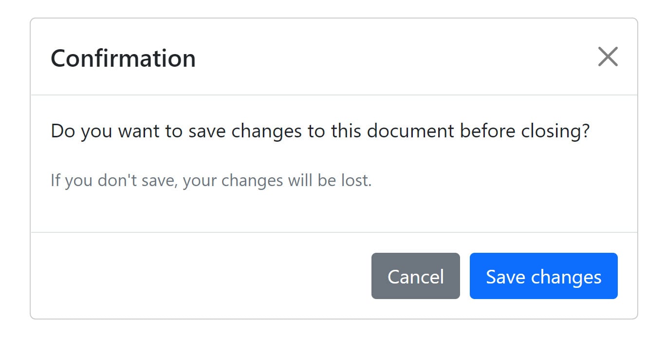
                <p>Do you want to save changes to this document before closing?</p>
                <p class="text-secondary"><small>If you don't save, your changes will be lost.</small></p>
            </div>
            <div class="modal-footer">
                <button type="button" class="btn btn-secondary" data-bs-dismiss="modal">Cancel</button>
                <button type="button" class="btn btn-primary">Save changes</button>
            </div>
        </div>
    </div>
</div>
The confirmation example is adapted from Tutorial Republic's Bootstrap modal tutorial. Once it opens, it looks like this:
Step 3: Open the modal with a button or with JavaScript
Both ways below open the same modal. The data attributes need no script of your own; the JavaScript API is what you use when something other than a click should open it.
<button type="button" class="btn btn-primary" data-bs-toggle="modal" data-bs-target="#myModal">
  Open the confirmation
</button>
<button type="button" class="btn btn-primary" id="openConfirmation">
  Open the confirmation
</button>

<script>
  const myModal = bootstrap.Modal.getOrCreateInstance('#myModal');
  document.querySelector('#openConfirmation').addEventListener('click', () => {
    myModal.show();
  });
</script>
getOrCreateInstance returns the modal Bootstrap already made for that element, or makes one, so you never end up with two instances fighting over the same dialog.
data-toggle, data-target and data-dismiss; Bootstrap 5 ignores them. Every attribute in 5.3 starts with data-bs-. Mixing the two in one snippet is the most common reason a modal doesn't open.Step 4: Show the modal on page load, after a delay
The window can open on its own once the “document object model” has loaded through JavaScript. The first version of this post did that with jQuery, the moment the page loaded. In Bootstrap 5 you don't need jQuery, and you don't need to open the modal the instant the page loads either:
<script>
  document.addEventListener('DOMContentLoaded', () => {
    const myModal = new bootstrap.Modal('#myModal');
    setTimeout(() => myModal.show(), 5000); // wait 5 seconds
  });
</script>
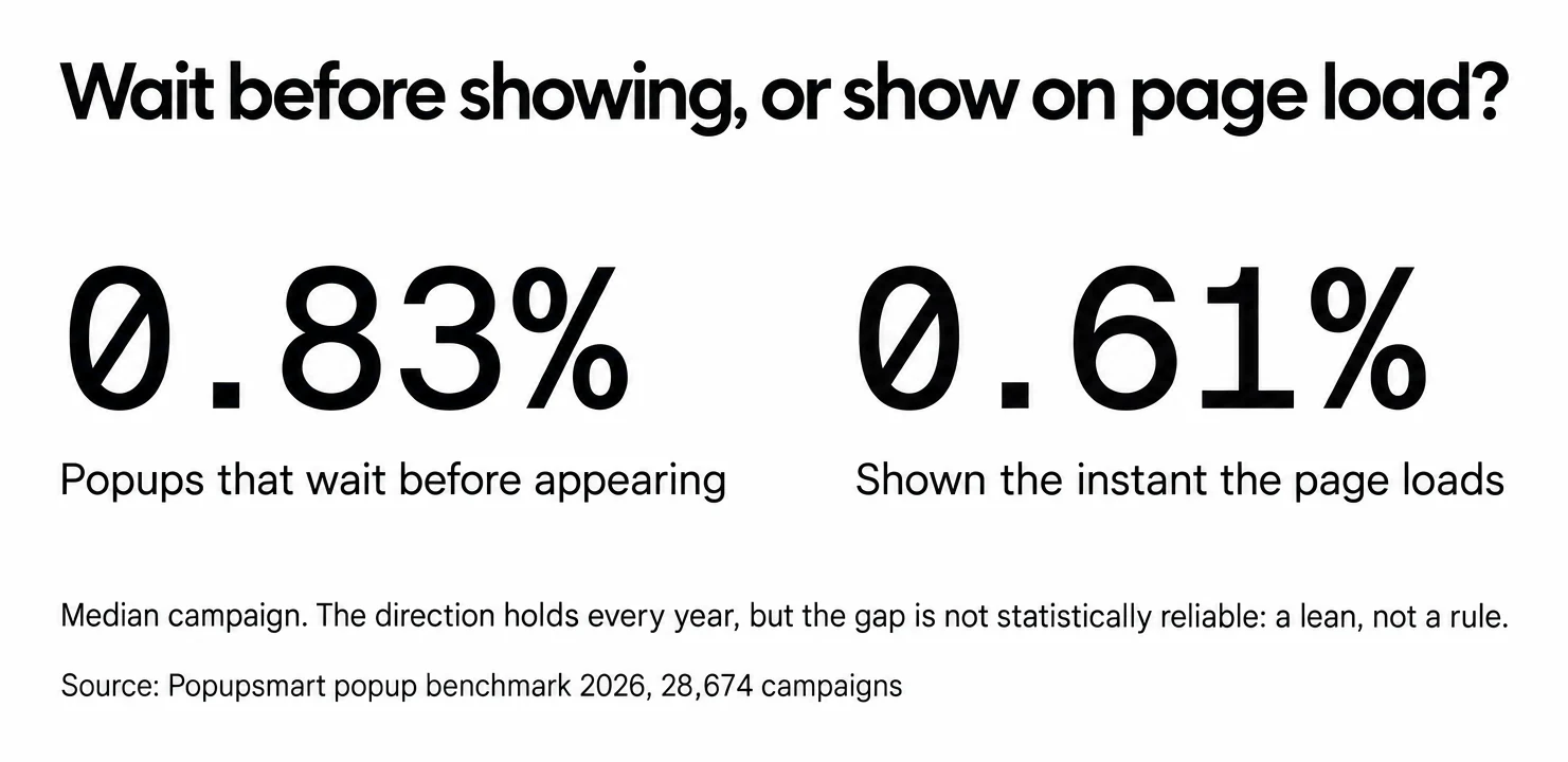
Why wait at all? In Popupsmart's popup benchmark 2026, popups that wait before appearing convert 0.83% vs 0.61% for popups shown the instant the page loads (median campaign); the direction holds in every year of data but the difference is not statistically reliable, so treat it as a lean, not a rule. How long you wait matters less: the exact delay length (0-5 seconds vs 21-60 seconds) makes no measurable difference to conversion. Our guide to popup timing covers the other triggers.
$("#myModal").modal("show"); opens the modal. You just don't need to load jQuery for it anymore.Step 5: Cap how often the modal shows
A modal that opens on every page view is the fastest way to annoy returning visitors. Bootstrap has no frequency setting, so store the views in localStorage:
<script>
  const KEY = 'myModalViews';
  const WEEK = 7  24  60  60  1000;

  document.addEventListener('DOMContentLoaded', () => {
    const now = Date.now();
    const views = JSON.parse(localStorage.getItem(KEY) || '[]').filter((t) => now - t < WEEK);
    if (views.length >= 2) return; // at most twice a week

    const myModal = new bootstrap.Modal('#myModal');
    setTimeout(() => {
      myModal.show();
      views.push(now);
      localStorage.setItem(KEY, JSON.stringify(views));
    }, 5000);
  });
</script>
Why two? Showing a popup a second time caused no measurable drop in conversion within the same campaign; the decline begins with the third showing. When a visitor submits the form inside the modal, set a separate flag and stop showing it to them altogether.
Changing the Bootstrap Modal’s Size
Modals are medium-sized by default. To change that, add the .modal-sm class for small modals or the .modal-lg class for large modals. Bootstrap 5.3 adds .modal-xl for extra-large modals and a set of fullscreen classes.
Small Modal
<div class="modal-dialog modal-sm">
Large Modal
<div class="modal-dialog modal-lg">
Fullscreen on phones only
<div class="modal-dialog modal-fullscreen-sm-down">
Class on .modal-dialog |
Result in Bootstrap 5.3 |
|---|---|
.modal-sm |
Small, 300px max width |
| none | Default, 500px max width |
.modal-lg |
Large, 800px max width |
.modal-xl |
Extra large, 1140px max width |
.modal-fullscreen |
Covers the whole viewport at every size |
.modal-fullscreen-sm-down |
Fullscreen below 576px, normal above |
.modal-dialog-centered |
Centred vertically |
.modal-dialog-scrollable |
The body scrolls inside the modal, not the page |
Two more options change behaviour rather than size. data-bs-backdrop="static" keeps the modal open when the visitor clicks outside it, and data-bs-keyboard="false" stops the Escape key from closing it; use them only for a step the visitor must finish, never for a marketing popup. Removing the .fade class turns the animation off. Bootstrap already respects the prefers-reduced-motion setting.
Bootstrap modal events, methods and accessibility
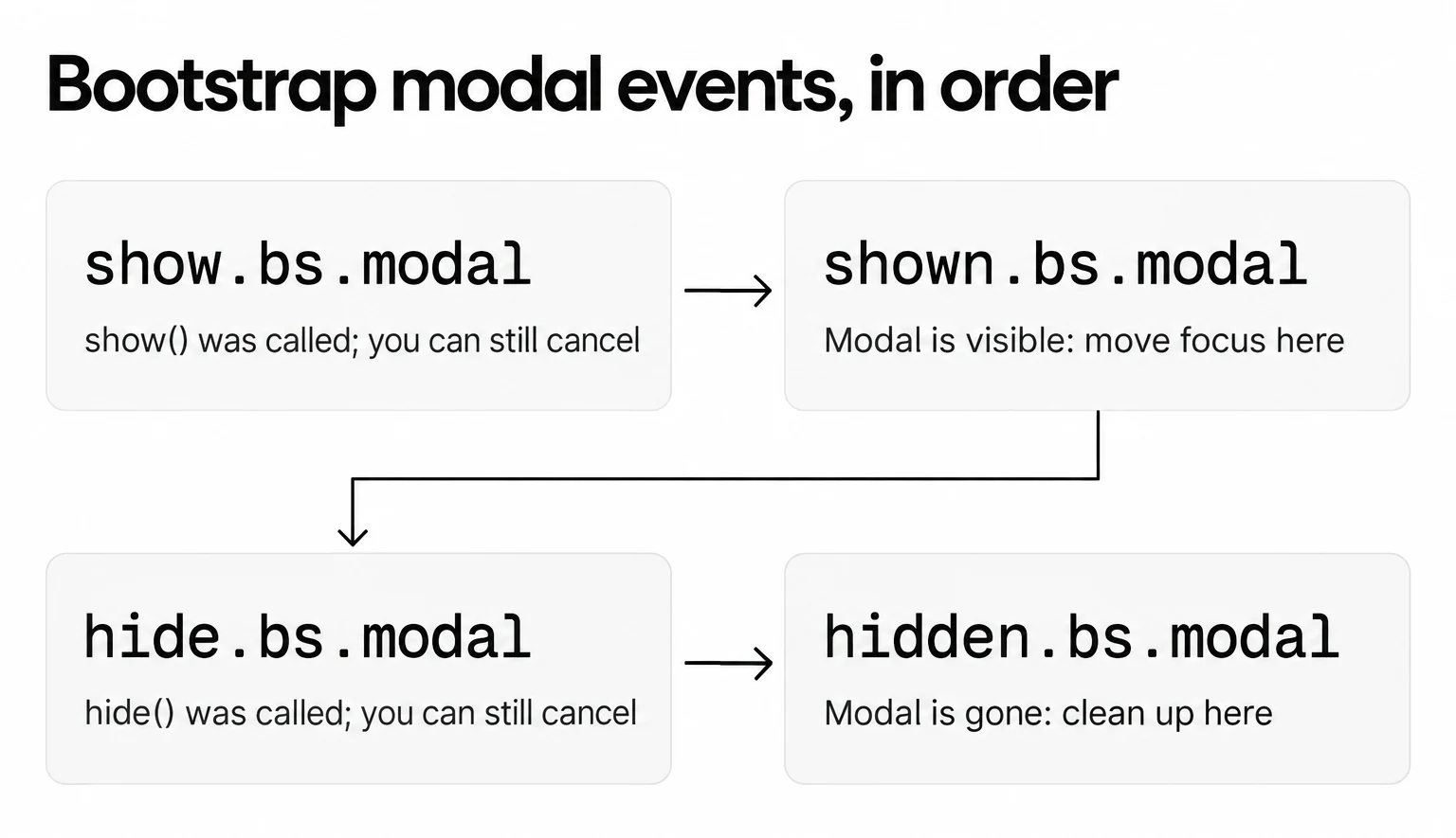
Every modal fires four events on the .modal element, in this order. They are where your own code hooks in: analytics, focus, clean-up.
| Event | When it fires | Typical use |
|---|---|---|
show.bs.modal |
As soon as show() is called; event.preventDefault() cancels it |
Load content, or stop the modal from opening |
shown.bs.modal |
When the modal is visible, after the transition | Move focus to the first field, record a view |
hide.bs.modal |
As soon as hide() is called; can be cancelled |
Ask "are you sure?" before a form is lost |
hidden.bs.modal |
When the modal is fully hidden | Reset the form, stop a video |
hidePrevented.bs.modal (special case) |
A click outside or Escape on a static modal | Shake the dialog to show it's still waiting |
The methods are show(), hide(), toggle(), handleUpdate() (when the modal's height changes while it's open) and dispose(), plus the static bootstrap.Modal.getInstance() and getOrCreateInstance(). All of them are asynchronous: they return as soon as the transition starts, so code that must run after the modal is visible belongs in shown.bs.modal.
The HTML autofocus attribute has no effect inside a Bootstrap modal. To put the cursor in the email field, focus it on shown.bs.modal:
<script>
  document.getElementById('myModal').addEventListener('shown.bs.modal', () => {
    document.getElementById('myModalEmail').focus();
  });
</script>
For accessibility, Bootstrap does part of the work: it adds role="dialog" itself, traps focus inside the modal while it's open, and closes it on Escape. The rest is yours:
- Add
aria-labelledbyon.modal, pointing at theidof the modal title, andaria-describedbyif the body explains something. - Give the icon-only close button
aria-label="Close". - Keep one visible way out: the close button, a "No thanks" button, or both.
- Don't open a second modal on top of the first.
shown.bs.modal, not on your show() call. A cancelled show.bs.modal never displays the modal, and counting it would inflate every rate you calculate from views.How to create a Bootstrap popover
A popover is the small "popup" attached to a button or a term. Two things differ from the modal: it needs Popper (included in bootstrap.bundle.min.js), and it's opt-in, so nothing happens until you initialize it.
<button type="button" class="btn btn-primary" data-bs-toggle="popover"
        data-bs-title="Free shipping"
        data-bs-content="Orders over the threshold ship free. No code needed.">
  Shipping info
</button>

<script>
  document.querySelectorAll('[data-bs-toggle="popover"]')
    .forEach((el) => new bootstrap.Popover(el));
</script>
By default a popover closes only when the same button is clicked again. To close it on the visitor's next click anywhere, use data-bs-trigger="focus" on an element that can take focus, such as <a tabindex="0" role="button">. Popovers on disabled elements need a wrapper element, and an empty title and content never show.
Complete example: a newsletter popup in Bootstrap 5.3
Here is the whole thing put together for a common marketing use: a signup modal that offers a free-shipping code. It uses everything from steps 1 to 5: the CDN files, the markup, the delayed open, the frequency cap and the focus hand-off.
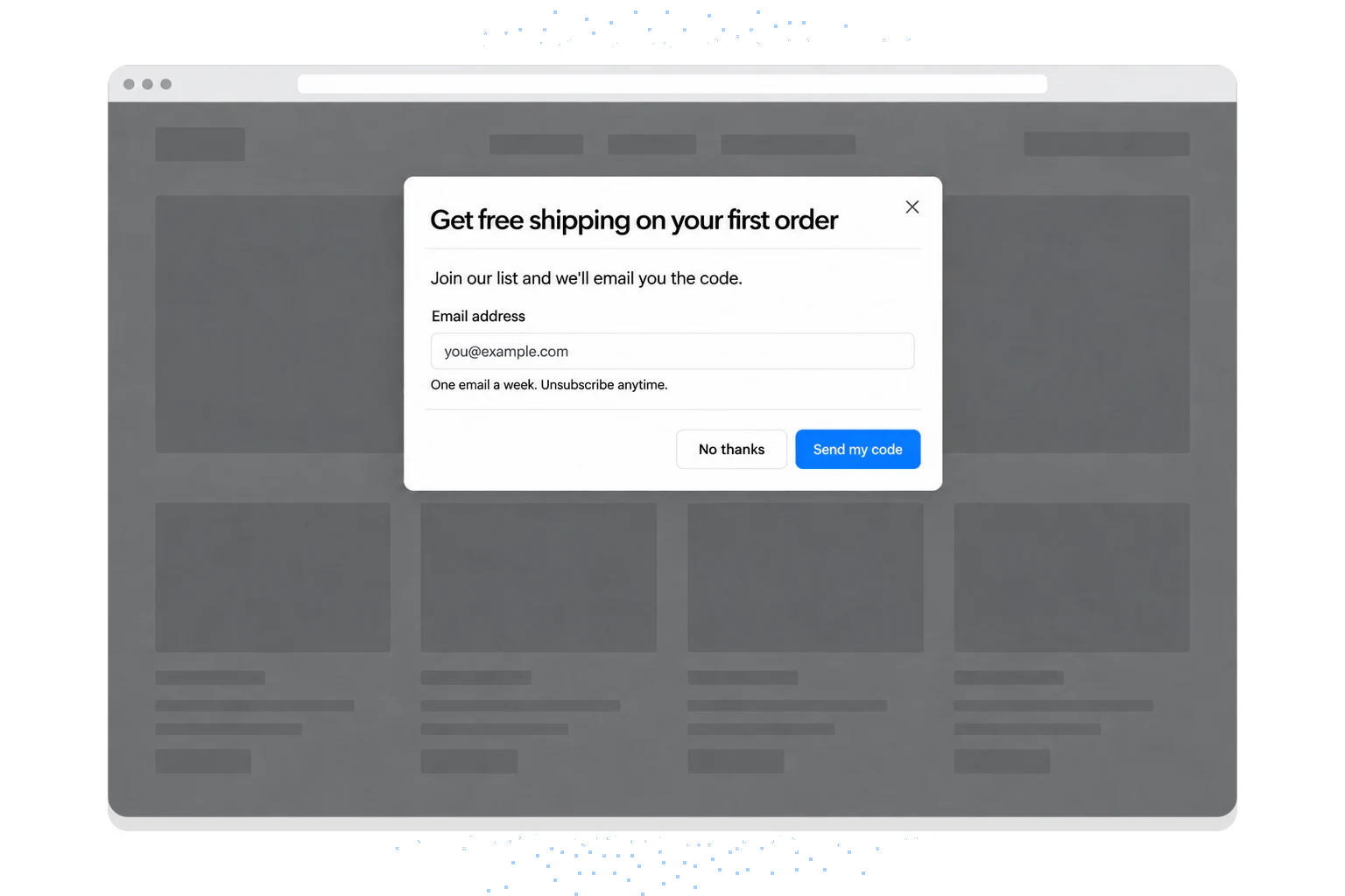
<div class="modal fade" id="newsletterModal" tabindex="-1" aria-labelledby="newsletterTitle" aria-describedby="newsletterText" aria-hidden="true">
  <div class="modal-dialog modal-dialog-centered modal-fullscreen-sm-down">
    <form class="modal-content" action="/subscribe" method="post">
      <div class="modal-header">
        <h2 class="modal-title fs-5" id="newsletterTitle">Get free shipping on your first order</h2>
        <button type="button" class="btn-close" data-bs-dismiss="modal" aria-label="Close"></button>
      </div>
      <div class="modal-body">
        <p id="newsletterText">Join our list and we'll email you the code.</p>
        <label for="newsletterEmail" class="form-label">Email address</label>
        <input type="email" class="form-control" id="newsletterEmail" name="email" placeholder="you@example.com" required>
        <div class="form-text">One email a week. Unsubscribe anytime.</div>
      </div>
      <div class="modal-footer">
        <button type="button" class="btn btn-outline-secondary" data-bs-dismiss="modal">No thanks</button>
        <button type="submit" class="btn btn-primary">Send my code</button>
      </div>
    </form>
  </div>
</div>
Bootstrap draws the form; it doesn't send it anywhere. The action has to point at your own endpoint or your email tool's signup URL, and when the form is submitted, set the "already subscribed" flag from step 5 in localStorage.
The two choices inside the form are the ones our data can speak to. First-person buttons ("Send my code") convert 1.18% vs 0.80% for neutral wording (English popups, median campaign). And popups asking for one or two fields convert 0.88% and 0.94%, against 0.56% for three fields (median campaign; spin-to-win and other gamified popups are counted separately). So one email field and a button that says what the visitor gets. More on the form itself in our guide to creating popup forms.
If you'd rather open this modal from a button than on a timer, the same markup works with the data attributes from step 3; our guide to building a popup that opens on a button click compares that with Popupsmart's no-code on-click trigger.
Use Popupsmart as Bootstrap Modal Popup Alternative
A Bootstrap modal will do whatever you're willing to code. For marketing popups, though, there's a simpler way.
Everything in steps 4 and 5 (the delay, the frequency cap, the "already subscribed" flag) is code you write and maintain yourself, and sending the email somewhere needs a backend. Popupsmart is a no-code popup builder that replaces that code with settings: you paste one embed code on your site once, then build, target and publish popups from the dashboard. Popupsmart has a free plan at $0.
You can make different types of popups with it: a modal popup to collect leads, a call-to-action popup to convert more visitors into customers, or a product popup to grow your email list and sales.
Popups drive traffic to your site and bring in new leads and customers. You can also use them to:
- Grow your email list and target your visitors.
- Show an announcement of your products and services to your customers.
- Comply with cookie laws and take your visitors' consent for storing cookies.
- Increase phone calls and build stronger relationships with your visitors in an old-fashioned way.
- Promote your products and services by presenting special offers to your audience.
- Collect form submission to gather personal information and data of your visitors to enhance their user experience.
| What you need | Bootstrap modal | Popupsmart |
|---|---|---|
| Popup design | HTML and Bootstrap classes | Popup templates you edit visually |
| Delay, exit intent, scroll triggers | JavaScript you write | Settings in the Segment step |
| Frequency cap | localStorage code |
View frequency setting |
| Sending leads to an email tool | Your own endpoint | Built-in integrations, Mailchimp included |
| Install | Bootstrap CSS and JS on every page | One embed code before </body> |
Here's how to build one in Popupsmart, from sign-up to publish.
How to Create a Popup with Popupsmart?
Step 1: Sign up or sign in to your Popupsmart account.
Step 2: Add Popupsmart to your site. Click "Embed Code" in the left bar of the dashboard, copy your unique embed code and paste it just before the closing </body> tag of your website's template. Or add popups to your website using Google Tag Manager. You only do this once.
Step 3: Click "+ New Campaign", give your campaign a name and choose your website. Then, select a layout from the pre-made templates that is suitable for your website. (Don’t worry there are lots of choices!)
Step 4: Customize your popup in the "Customize" and "Style" steps so the template matches your campaign and your brand. You can edit the layout's image, headline and description.
Make sure your CTA is intriguing enough to attract the audience and make them engage with what you've asked in the first place.
Step 5: You can also optimize the target of your popup in this step. In the "Segment" step, you can schedule your popups, set the view frequency, or select your visitor behavior more specifically: after a number of seconds, after scrolling, on exit intent, or on a click.
Step 6: Here you can add the final touches to your popup and publish it.
Popupsmart integrates with email marketing tools including the Mailchimp email marketing service provider, so each lead goes straight to your list. You can also set up "Respondent email notifications" in the settings.
Make sure to verify your website: verification works only when the embed code is on your site, and popups show only on verified websites.
When the design is done, click the “Publish” button.
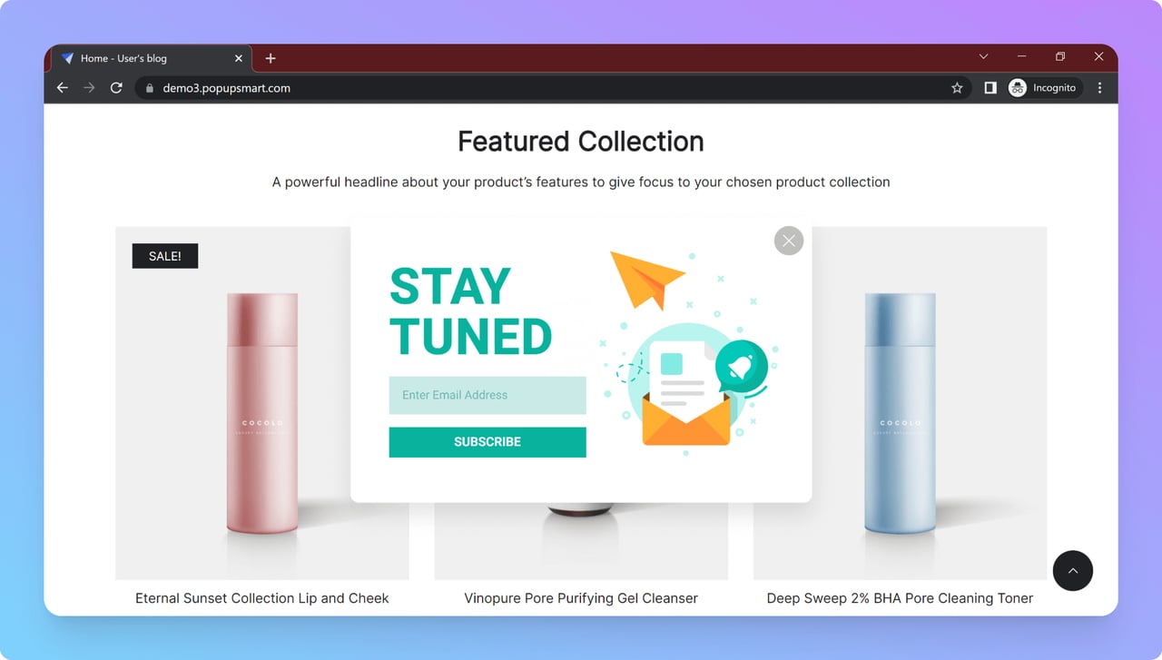
The following is the final look of the popup we created to promote a product:
Your next popup skips the embed code step, since it's already on your site.
Frequently asked questions
Which Bootstrap version should I use for a modal popup?
Use Bootstrap 5.3. The current release on getbootstrap.com is 5.3.8 (checked on 1 October 2026). Load bootstrap.min.css and bootstrap.bundle.min.js from the jsDelivr CDN, pinned to 5.3.8, and use the data-bs-* attributes. Bootstrap 5 doesn't need jQuery.
Why is my Bootstrap modal not opening?
The three usual causes: the Bootstrap JavaScript file isn't loaded (you need bootstrap.bundle.min.js or bootstrap.min.js, not only the CSS), the button uses Bootstrap 4 attributes (data-toggle and data-target instead of data-bs-toggle and data-bs-target), or the modal HTML sits inside another element with position: fixed. Put the modal at the top level of the body.
How do I open a Bootstrap modal on page load?
Create the modal with new bootstrap.Modal('#myModal') inside a DOMContentLoaded listener and call show(). To show it after a delay, wrap show() in setTimeout. In Popupsmart's 2026 benchmark, popups that wait before appearing convert 0.83% vs 0.61% for popups shown the instant the page loads (median campaign), a lean that is not statistically reliable.
Can I open a Bootstrap modal from another modal?
Not as a nested modal. Bootstrap supports one modal window at a time. You can switch between modals: a button inside the first modal with data-bs-toggle="modal" and data-bs-target pointing at the second one hides the first and opens the second.
What is the difference between a Bootstrap modal and a popover?
A modal is a dialog that opens over the whole page, dims it with a backdrop and holds focus until it closes. A popover is a small box attached to one element, positioned with Popper, for a short explanation. Popovers are opt-in: you have to initialize them with new bootstrap.Popover().
Do Bootstrap popups work on mobile?
Yes. Bootstrap modals are responsive, and classes such as .modal-fullscreen-sm-down make a modal cover the screen on small phones. Bootstrap notes some caveats with position: fixed on mobile browsers, so test your modal on a real phone.
Final Thoughts
If you’ve never created a bootstrap popup before, the code in this guide is enough to build your first one. Bootstrap leaves plenty of room to get creative after that.
One of the best things about Bootstrap popups is that they’re responsive and mobile-compatible, so visitors see them properly on phones as well as desktops.
If you want to save time and keep an eye on your conversions, though, we suggest you choose Popupsmart instead!
Popupsmart is a flexible alternative to Bootstrap popups. You can start for free, the editor is easy to use, and new templates are added regularly.
Get Started with Popupsmart Today!
Check out these blog posts as well: