How to Create Modal Tailwind CSS Popups for Your Website
 ChatGPT
 Perplexity
 Claude
 Grok
Grok Google AI Mode
Explains Tailwind CSS as a utility-first, highly customizable framework for fast, responsive UI building, then covers modal popups (uses, triggers, elements, JS options/methods) and how to create/integrate them via Popupsmart templates.
Grabbing customers’ attention to increase sales conversions is critical, and it can be done with popups easily!
Modal tailwind CSS popups are mostly preferred because of their functionality.
We explained Tailwind CSS and modal popup concepts. You can learn how to create popups for your website here as well!
Tailwind CSS
CSS means how elements of HTML will be shown on a website screen.
Tailwind CSS is a customizable framework that makes it very practical and easy to use on websites. In addition, it is a utility-based framework so that you can create interfaces with customizable options.
Tailwind CSS has a different approach than other frameworks. It gives you more control over your website. By adding a tailwind CSS file from the CDN in a link form, you can use it easily.
All you need to do is add the link to the HTML page’s head part. Besides, it is possible to add customizable codes to your website.
Because of these features, Tailwind CSS is suitable for making websites in a short period of time. Apart from these, Tailwind is not about specific designs and set layouts.
In that way, you can decide how your site will look by bringing different elements together.
In addition, it gives the advantage of creating unique websites with customization options.
For example, you can adjust the sizing, fonts, colors, and shadows of elements you want to add to your website. Tailwind CSS code can look like this:
<div class="space-y-5">
 <div class="p-3 bg-white shadow rounded-lg">
   <h3 class="text-xs border-b">font-sans</h3>
   <p class="font-sans">
     The quick brown fox jumps over the lazy dog.
   </p>
 </div>
 <div class="p-3 bg-white shadow rounded-lg">
   <h3 class="text-xs border-b">font-serif</h3>
   <p class="font-serif">
     The quick brown fox jumps over the lazy dog.
   </p>
 </div>
 <div class="p-3 bg-white shadow rounded-lg">
   <h3 class="text-xs border-b">font-mono</h3>
   <p class="font-mono">
     The quick brown fox jumps over the lazy dog.
   </p>
 </div>
</div>
When you add this code, you can adjust it with different fonts. And the result will look like this:
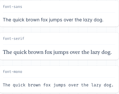
(Source)
What is Modal Popup?
Modal popups are mostly preferred for newsletter signups and login forms. In order to control, register and login forms, modal popups are used most of the time. Also, so as to show notifications, these popups can be used on a website.
With modal popups, it is possible to show tips, search forms, full-screen videos and images, and contact forms.
A modal popup on a website indicates the last-updated page without loading again. So you do not have to enter the information once again. In that way, relevant information can be seen without losing time.
One of the most significant features of modal popups, they are silent. Therefore, in order for them to activate, there should be triggers.
These triggers can be set for specific actions to activate modal popups. For example, highlighting newsletter popups and notifications is very useful.
These types of popups can be created with CSS, HTML and JavaScript. We’ll be focusing on CSS modal tailwind popups and their creation steps.
Modal Tailwind CSS Popup
As we have explained before, using customizable codes makes it possible to create popups for your website. So, decide on your popups style according to your website’s personality and start playing with it!
With Tailwind, taking a CSS file as raw form and processing it over a configuration file is very easy. The output is produced after this configuration process, and the tailwind CSS popup becomes ready to use.
Modal Tailwind CSS has many advantages, such as:
- Having minimum code lines in a file
- Customizable designs
- Making responsive websites
- Also, making changes afterward is simple since adjusting options are easy to use. Tailwind popup forms are convenient and very accessible!
Modal popup tailwind CSS code can look like this:
<!-- Button trigger modal -->
<button type="button" class="px-6
      py-2.5
      bg-blue-600
      text-white
      font-medium
      text-xs
      leading-tight
      uppercase
      rounded
      shadow-md
      hover:bg-blue-700 hover:shadow-lg
      focus:bg-blue-700 focus:shadow-lg focus:outline-none focus:ring-0
      active:bg-blue-800 active:shadow-lg
      transition
      duration-150
      ease-in-out" data-bs-toggle="modal" data-bs-target="#exampleModal">
  Launch demo modal
</button>

<!-- Modal -->
<div class="modal fade fixed top-0 left-0 hidden w-full h-full outline-none overflow-x-hidden overflow-y-auto"
  id="exampleModal" tabindex="-1" aria-labelledby="exampleModalLabel" aria-hidden="true">
  <div class="modal-dialog relative w-auto pointer-events-none">
    <div
      class="modal-content border-none shadow-lg relative flex flex-col w-full pointer-events-auto bg-white bg-clip-padding rounded-md outline-none text-current">
      <div
        class="modal-header flex flex-shrink-0 items-center justify-between p-4 border-b border-gray-200 rounded-t-md">
        <h5 class="text-xl font-medium leading-normal text-gray-800" id="exampleModalLabel">Modal title</h5>
        <button type="button"
          class="btn-close box-content w-4 h-4 p-1 text-black border-none rounded-none opacity-50 focus:shadow-none focus:outline-none focus:opacity-100 hover:text-black hover:opacity-75 hover:no-underline"
          data-bs-dismiss="modal" aria-label="Close"></button>
      </div>
      <div class="modal-body relative p-4">
        Modal body text goes here.
      </div>
      <div
        class="modal-footer flex flex-shrink-0 flex-wrap items-center justify-end p-4 border-t border-gray-200 rounded-b-md">
        <button type="button" class="px-6
          py-2.5
          bg-purple-600
          text-white
          font-medium
          text-xs
          leading-tight
          uppercase
          rounded
          shadow-md
          hover:bg-purple-700 hover:shadow-lg
          focus:bg-purple-700 focus:shadow-lg focus:outline-none focus:ring-0
          active:bg-purple-800 active:shadow-lg
          transition
          duration-150
          ease-in-out" data-bs-dismiss="modal">Close</button>
        <button type="button" class="px-6
      py-2.5
      bg-blue-600
      text-white
      font-medium
      text-xs
      leading-tight
      uppercase
      rounded
      shadow-md
      hover:bg-blue-700 hover:shadow-lg
      focus:bg-blue-700 focus:shadow-lg focus:outline-none focus:ring-0
      active:bg-blue-800 active:shadow-lg
      transition
      duration-150
      ease-in-out
      ml-1">Save changes</button>
      </div>
    </div>
  </div>
</div>
When you add this code to your website, the final result looks like this:
(Source)
Modal Tailwind CSS Popup Elements
Form Element
This modal example utilizes a form element to gather information from users without requiring them to navigate away from the current page. It's a convenient solution for user authentication, such as login or registration forms.
By embedding the form directly within the modal, the user remains engaged with the active content while seamlessly providing input, whether it's entering an email, password, or other details.
This approach enhances user experience by making the interaction smooth and efficient. Perfect for scenarios like sign-ins, registrations, or other data collection needs.
<!-- Modal toggle -->
<button data-modal-target="authentication-modal" data-modal-toggle="authentication-modal" class="block text-white bg-blue-700 hover:bg-blue-800 focus:ring-4 focus:outline-none focus:ring-blue-300 font-medium rounded-lg text-sm px-5 py-2.5 text-center dark:bg-blue-600 dark:hover:bg-blue-700 dark:focus:ring-blue-800" type="button">
  Toggle modal
</button>

<!-- Main modal -->
<div id="authentication-modal" tabindex="-1" aria-hidden="true" class="hidden overflow-y-auto overflow-x-hidden fixed top-0 right-0 left-0 z-50 justify-center items-center w-full md:inset-0 h-[calc(100%-1rem)] max-h-full">
    <div class="relative p-4 w-full max-w-md max-h-full">
        <!-- Modal content -->
        <div class="relative bg-white rounded-lg shadow dark:bg-gray-700">
            <!-- Modal header -->
            <div class="flex items-center justify-between p-4 md:p-5 border-b rounded-t dark:border-gray-600">
                <h3 class="text-xl font-semibold text-gray-900 dark:text-white">
                    Sign in to our platform
                </h3>
                <button type="button" class="end-2.5 text-gray-400 bg-transparent hover:bg-gray-200 hover:text-gray-900 rounded-lg text-sm w-8 h-8 ms-auto inline-flex justify-center items-center dark:hover:bg-gray-600 dark:hover:text-white" data-modal-hide="authentication-modal">
                    <svg class="w-3 h-3" aria-hidden="true" xmlns="http://www.w3.org/2000/svg" fill="none" viewBox="0 0 14 14">
                        <path stroke="currentColor" stroke-linecap="round" stroke-linejoin="round" stroke-width="2" d="m1 1 6 6m0 0 6 6M7 7l6-6M7 7l-6 6"/>
                    </svg>
                    <span class="sr-only">Close modal</span>
                </button>
            </div>
            <!-- Modal body -->
            <div class="p-4 md:p-5">
                <form class="space-y-4" action="#">
                    <div>
                        <label for="email" class="block mb-2 text-sm font-medium text-gray-900 dark:text-white">Your email</label>
                        <input type="email" name="email" id="email" class="bg-gray-50 border border-gray-300 text-gray-900 text-sm rounded-lg focus:ring-blue-500 focus:border-blue-500 block w-full p-2.5 dark:bg-gray-600 dark:border-gray-500 dark:placeholder-gray-400 dark:text-white" placeholder="[email protected]" required />
                    </div>
                    <div>
                        <label for="password" class="block mb-2 text-sm font-medium text-gray-900 dark:text-white">Your password</label>
                        <input type="password" name="password" id="password" placeholder="••••••••" class="bg-gray-50 border border-gray-300 text-gray-900 text-sm rounded-lg focus:ring-blue-500 focus:border-blue-500 block w-full p-2.5 dark:bg-gray-600 dark:border-gray-500 dark:placeholder-gray-400 dark:text-white" required />
                    </div>
                    <div class="flex justify-between">
                        <div class="flex items-start">
                            <div class="flex items-center h-5">
                                <input id="remember" type="checkbox" value="" class="w-4 h-4 border border-gray-300 rounded bg-gray-50 focus:ring-3 focus:ring-blue-300 dark:bg-gray-600 dark:border-gray-500 dark:focus:ring-blue-600 dark:ring-offset-gray-800 dark:focus:ring-offset-gray-800" required />
                            </div>
                            <label for="remember" class="ms-2 text-sm font-medium text-gray-900 dark:text-gray-300">Remember me</label>
                        </div>
                        <a href="#" class="text-sm text-blue-700 hover:underline dark:text-blue-500">Lost Password?</a>
                    </div>
                    <button type="submit" class="w-full text-white bg-blue-700 hover:bg-blue-800 focus:ring-4 focus:outline-none focus:ring-blue-300 font-medium rounded-lg text-sm px-5 py-2.5 text-center dark:bg-blue-600 dark:hover:bg-blue-700 dark:focus:ring-blue-800">Login to your account</button>
                    <div class="text-sm font-medium text-gray-500 dark:text-gray-300">
                        Not registered? <a href="#" class="text-blue-700 hover:underline dark:text-blue-500">Create account</a>
                    </div>
                </form>
            </div>
        </div>
    </div>
</div>
Radio Input Element
Radio inputs allow you to present a list of options to users within a modal by using advanced radio inputs. It provides a clean and customized design, enabling users to easily select one option from the list without leaving the current page.
This setup is ideal for forms, surveys, or preference selections, ensuring an intuitive and streamlined user experience.
Timeline Element
A timeline is a visual representation of a sequence of events in chronological order.
It helps users understand the progression of activities, updates, or milestones, often used for product changelogs, project phases, or historical events.
<!-- Modal toggle -->
<button data-modal-target="timeline-modal" data-modal-toggle="timeline-modal" class="block text-white bg-blue-700 hover:bg-blue-800 focus:ring-4 focus:outline-none focus:ring-blue-300 font-medium rounded-lg text-sm px-5 py-2.5 text-center dark:bg-blue-600 dark:hover:bg-blue-700 dark:focus:ring-blue-800" type="button">
  Toggle modal
</button>

<!-- Main modal -->
<div id="timeline-modal" tabindex="-1" aria-hidden="true" class="hidden overflow-y-auto overflow-x-hidden fixed top-0 right-0 left-0 z-50 justify-center items-center w-full md:inset-0 h-[calc(100%-1rem)] max-h-full">
    <div class="relative p-4 w-full max-w-md max-h-full">
        <!-- Modal content -->
        <div class="relative bg-white rounded-lg shadow dark:bg-gray-700">
                <!-- Modal header -->
                <div class="flex items-center justify-between p-4 md:p-5 border-b rounded-t dark:border-gray-600">
                    <h3 class="text-lg font-semibold text-gray-900 dark:text-white">
                        Changelog
                    </h3>
                    <button type="button" class="text-gray-400 bg-transparent hover:bg-gray-200 hover:text-gray-900 rounded-lg text-sm h-8 w-8 ms-auto inline-flex justify-center items-center dark:hover:bg-gray-600 dark:hover:text-white" data-modal-toggle="timeline-modal">
                        <svg class="w-3 h-3" aria-hidden="true" xmlns="http://www.w3.org/2000/svg" fill="none" viewBox="0 0 14 14">
                            <path stroke="currentColor" stroke-linecap="round" stroke-linejoin="round" stroke-width="2" d="m1 1 6 6m0 0 6 6M7 7l6-6M7 7l-6 6"/>
                        </svg>
                        <span class="sr-only">Close modal</span>
                    </button>
                </div>
                <!-- Modal body -->
                <div class="p-4 md:p-5">
                    <ol class="relative border-s border-gray-200 dark:border-gray-600 ms-3.5 mb-4 md:mb-5">
                        <li class="mb-10 ms-8">
                            <span class="absolute flex items-center justify-center w-6 h-6 bg-gray-100 rounded-full -start-3.5 ring-8 ring-white dark:ring-gray-700 dark:bg-gray-600">
                                <svg class="w-2.5 h-2.5 text-gray-500 dark:text-gray-400" aria-hidden="true" xmlns="http://www.w3.org/2000/svg" fill="none" viewBox="0 0 20 20"><path fill="currentColor" d="M6 1a1 1 0 0 0-2 0h2ZM4 4a1 1 0 0 0 2 0H4Zm7-3a1 1 0 1 0-2 0h2ZM9 4a1 1 0 1 0 2 0H9Zm7-3a1 1 0 1 0-2 0h2Zm-2 3a1 1 0 1 0 2 0h-2ZM1 6a1 1 0 0 0 0 2V6Zm18 2a1 1 0 1 0 0-2v2ZM5 11v-1H4v1h1Zm0 .01H4v1h1v-1Zm.01 0v1h1v-1h-1Zm0-.01h1v-1h-1v1ZM10 11v-1H9v1h1Zm0 .01H9v1h1v-1Zm.01 0v1h1v-1h-1Zm0-.01h1v-1h-1v1ZM10 15v-1H9v1h1Zm0 .01H9v1h1v-1Zm.01 0v1h1v-1h-1Zm0-.01h1v-1h-1v1ZM15 15v-1h-1v1h1Zm0 .01h-1v1h1v-1Zm.01 0v1h1v-1h-1Zm0-.01h1v-1h-1v1ZM15 11v-1h-1v1h1Zm0 .01h-1v1h1v-1Zm.01 0v1h1v-1h-1Zm0-.01h1v-1h-1v1ZM5 15v-1H4v1h1Zm0 .01H4v1h1v-1Zm.01 0v1h1v-1h-1Zm0-.01h1v-1h-1v1ZM2 4h16V2H2v2Zm16 0h2a2 2 0 0 0-2-2v2Zm0 0v14h2V4h-2Zm0 14v2a2 2 0 0 0 2-2h-2Zm0 0H2v2h16v-2ZM2 18H0a2 2 0 0 0 2 2v-2Zm0 0V4H0v14h2ZM2 4V2a2 2 0 0 0-2 2h2Zm2-3v3h2V1H4Zm5 0v3h2V1H9Zm5 0v3h2V1h-2ZM1 8h18V6H1v2Zm3 3v.01h2V11H4Zm1 1.01h.01v-2H5v2Zm1.01-1V11h-2v.01h2Zm-1-1.01H5v2h.01v-2ZM9 11v.01h2V11H9Zm1 1.01h.01v-2H10v2Zm1.01-1V11h-2v.01h2Zm-1-1.01H10v2h.01v-2ZM9 15v.01h2V15H9Zm1 1.01h.01v-2H10v2Zm1.01-1V15h-2v.01h2Zm-1-1.01H10v2h.01v-2ZM14 15v.01h2V15h-2Zm1 1.01h.01v-2H15v2Zm1.01-1V15h-2v.01h2Zm-1-1.01H15v2h.01v-2ZM14 11v.01h2V11h-2Zm1 1.01h.01v-2H15v2Zm1.01-1V11h-2v.01h2Zm-1-1.01H15v2h.01v-2ZM4 15v.01h2V15H4Zm1 1.01h.01v-2H5v2Zm1.01-1V15h-2v.01h2Zm-1-1.01H5v2h.01v-2Z"/></svg>
                            </span>
                            <h3 class="flex items-start mb-1 text-lg font-semibold text-gray-900 dark:text-white">Flowbite Application UI v2.0.0 <span class="bg-blue-100 text-blue-800 text-sm font-medium mr-2 px-2.5 py-0.5 rounded dark:bg-blue-900 dark:text-blue-300 ms-3">Latest</span></h3>
                            <time class="block mb-3 text-sm font-normal leading-none text-gray-500 dark:text-gray-400">Released on Nov 10th, 2023</time>
                            <button type="button" class="py-2 px-3 inline-flex items-center text-sm font-medium text-gray-900 focus:outline-none bg-white rounded-lg border border-gray-200 hover:bg-gray-100 hover:text-blue-700 focus:z-10 focus:ring-4 focus:ring-gray-100 dark:focus:ring-gray-700 dark:bg-gray-800 dark:text-gray-400 dark:border-gray-600 dark:hover:text-white dark:hover:bg-gray-700">
                                <svg class="w-3 h-3 me-1.5" aria-hidden="true" xmlns="http://www.w3.org/2000/svg" fill="currentColor" viewBox="0 0 20 20"><path d="M14.707 7.793a1 1 0 0 0-1.414 0L11 10.086V1.5a1 1 0 0 0-2 0v8.586L6.707 7.793a1 1 0 1 0-1.414 1.414l4 4a1 1 0 0 0 1.416 0l4-4a1 1 0 0 0-.002-1.414Z"/><path d="M18 12h-2.55l-2.975 2.975a3.5 3.5 0 0 1-4.95 0L4.55 12H2a2 2 0 0 0-2 2v4a2 2 0 0 0 2 2h16a2 2 0 0 0 2-2v-4a2 2 0 0 0-2-2Zm-3 5a1 1 0 1 1 0-2 1 1 0 0 1 0 2Z"/></svg>
                                Download
                            </button>
                        </li>
                        <li class="mb-10 ms-8">
                            <span class="absolute flex items-center justify-center w-6 h-6 bg-gray-100 rounded-full -start-3.5 ring-8 ring-white dark:ring-gray-700 dark:bg-gray-600">
                                <svg class="w-2.5 h-2.5 text-gray-500 dark:text-gray-400" aria-hidden="true" xmlns="http://www.w3.org/2000/svg" fill="none" viewBox="0 0 20 20"><path fill="currentColor" d="M6 1a1 1 0 0 0-2 0h2ZM4 4a1 1 0 0 0 2 0H4Zm7-3a1 1 0 1 0-2 0h2ZM9 4a1 1 0 1 0 2 0H9Zm7-3a1 1 0 1 0-2 0h2Zm-2 3a1 1 0 1 0 2 0h-2ZM1 6a1 1 0 0 0 0 2V6Zm18 2a1 1 0 1 0 0-2v2ZM5 11v-1H4v1h1Zm0 .01H4v1h1v-1Zm.01 0v1h1v-1h-1Zm0-.01h1v-1h-1v1ZM10 11v-1H9v1h1Zm0 .01H9v1h1v-1Zm.01 0v1h1v-1h-1Zm0-.01h1v-1h-1v1ZM10 15v-1H9v1h1Zm0 .01H9v1h1v-1Zm.01 0v1h1v-1h-1Zm0-.01h1v-1h-1v1ZM15 15v-1h-1v1h1Zm0 .01h-1v1h1v-1Zm.01 0v1h1v-1h-1Zm0-.01h1v-1h-1v1ZM15 11v-1h-1v1h1Zm0 .01h-1v1h1v-1Zm.01 0v1h1v-1h-1Zm0-.01h1v-1h-1v1ZM5 15v-1H4v1h1Zm0 .01H4v1h1v-1Zm.01 0v1h1v-1h-1Zm0-.01h1v-1h-1v1ZM2 4h16V2H2v2Zm16 0h2a2 2 0 0 0-2-2v2Zm0 0v14h2V4h-2Zm0 14v2a2 2 0 0 0 2-2h-2Zm0 0H2v2h16v-2ZM2 18H0a2 2 0 0 0 2 2v-2Zm0 0V4H0v14h2ZM2 4V2a2 2 0 0 0-2 2h2Zm2-3v3h2V1H4Zm5 0v3h2V1H9Zm5 0v3h2V1h-2ZM1 8h18V6H1v2Zm3 3v.01h2V11H4Zm1 1.01h.01v-2H5v2Zm1.01-1V11h-2v.01h2Zm-1-1.01H5v2h.01v-2ZM9 11v.01h2V11H9Zm1 1.01h.01v-2H10v2Zm1.01-1V11h-2v.01h2Zm-1-1.01H10v2h.01v-2ZM9 15v.01h2V15H9Zm1 1.01h.01v-2H10v2Zm1.01-1V15h-2v.01h2Zm-1-1.01H10v2h.01v-2ZM14 15v.01h2V15h-2Zm1 1.01h.01v-2H15v2Zm1.01-1V15h-2v.01h2Zm-1-1.01H15v2h.01v-2ZM14 11v.01h2V11h-2Zm1 1.01h.01v-2H15v2Zm1.01-1V11h-2v.01h2Zm-1-1.01H15v2h.01v-2ZM4 15v.01h2V15H4Zm1 1.01h.01v-2H5v2Zm1.01-1V15h-2v.01h2Zm-1-1.01H5v2h.01v-2Z"/></svg>
                            </span>
                            <h3 class="mb-1 text-lg font-semibold text-gray-900 dark:text-white">Flowbite Figma v2.8.0</h3>
                            <time class="block mb-3 text-sm font-normal leading-none text-gray-500 dark:text-gray-400">Released on Oct 7th, 2023</time>
                            <button type="button" class="py-2 px-3 inline-flex items-center text-sm font-medium text-gray-900 focus:outline-none bg-white rounded-lg border border-gray-200 hover:bg-gray-100 hover:text-blue-700 focus:z-10 focus:ring-4 focus:ring-gray-100 dark:focus:ring-gray-700 dark:bg-gray-800 dark:text-gray-400 dark:border-gray-600 dark:hover:text-white dark:hover:bg-gray-700">
                                <svg class="w-3 h-3 me-1.5" aria-hidden="true" viewBox="0 0 30 45" fill="none" xmlns="http://www.w3.org/2000/svg"><path d="M7.50012 45C11.6401 45 15.0002 41.6399 15.0002 37.4999V29.9999H7.50012C3.36009 29.9999 0 33.3599 0 37.4999C0 41.6399 3.36009 45 7.50012 45Z" fill="#0ACF83"/><path d="M0 22.5C0 18.36 3.36009 14.9999 7.50012 14.9999H15.0002V29.9999H7.50012C3.36009 30.0001 0 26.64 0 22.5Z" fill="#A259FF"/><path d="M0 7.50006C0 3.36006 3.36009 0 7.50012 0H15.0002V14.9999H7.50012C3.36009 14.9999 0 11.6401 0 7.50006Z" fill="#F24E1E"/><path d="M15.0002 0H22.4999C26.6399 0 30 3.36006 30 7.50006C30 11.6401 26.6399 14.9999 22.4999 14.9999L15.0002 14.9999V0Z" fill="#FF7262"/><path d="M30 22.5C30 26.64 26.6399 30 22.4999 30C18.3599 30 14.9998 26.64 14.9998 22.5C14.9998 18.36 18.3599 14.9999 22.4999 14.9999C26.6399 14.9999 30 18.36 30 22.5Z" fill="#1ABCFE"/></svg>
                                Duplicate in Figma
                            </button>
                        </li>
                        <li class="ms-8">
                            <span class="absolute flex items-center justify-center w-6 h-6 bg-gray-100 rounded-full -start-3.5 ring-8 ring-white dark:ring-gray-700 dark:bg-gray-600">
                                <svg class="w-2.5 h-2.5 text-gray-500 dark:text-gray-400" aria-hidden="true" xmlns="http://www.w3.org/2000/svg" fill="none" viewBox="0 0 20 20"><path fill="currentColor" d="M6 1a1 1 0 0 0-2 0h2ZM4 4a1 1 0 0 0 2 0H4Zm7-3a1 1 0 1 0-2 0h2ZM9 4a1 1 0 1 0 2 0H9Zm7-3a1 1 0 1 0-2 0h2Zm-2 3a1 1 0 1 0 2 0h-2ZM1 6a1 1 0 0 0 0 2V6Zm18 2a1 1 0 1 0 0-2v2ZM5 11v-1H4v1h1Zm0 .01H4v1h1v-1Zm.01 0v1h1v-1h-1Zm0-.01h1v-1h-1v1ZM10 11v-1H9v1h1Zm0 .01H9v1h1v-1Zm.01 0v1h1v-1h-1Zm0-.01h1v-1h-1v1ZM10 15v-1H9v1h1Zm0 .01H9v1h1v-1Zm.01 0v1h1v-1h-1Zm0-.01h1v-1h-1v1ZM15 15v-1h-1v1h1Zm0 .01h-1v1h1v-1Zm.01 0v1h1v-1h-1Zm0-.01h1v-1h-1v1ZM15 11v-1h-1v1h1Zm0 .01h-1v1h1v-1Zm.01 0v1h1v-1h-1Zm0-.01h1v-1h-1v1ZM5 15v-1H4v1h1Zm0 .01H4v1h1v-1Zm.01 0v1h1v-1h-1Zm0-.01h1v-1h-1v1ZM2 4h16V2H2v2Zm16 0h2a2 2 0 0 0-2-2v2Zm0 0v14h2V4h-2Zm0 14v2a2 2 0 0 0 2-2h-2Zm0 0H2v2h16v-2ZM2 18H0a2 2 0 0 0 2 2v-2Zm0 0V4H0v14h2ZM2 4V2a2 2 0 0 0-2 2h2Zm2-3v3h2V1H4Zm5 0v3h2V1H9Zm5 0v3h2V1h-2ZM1 8h18V6H1v2Zm3 3v.01h2V11H4Zm1 1.01h.01v-2H5v2Zm1.01-1V11h-2v.01h2Zm-1-1.01H5v2h.01v-2ZM9 11v.01h2V11H9Zm1 1.01h.01v-2H10v2Zm1.01-1V11h-2v.01h2Zm-1-1.01H10v2h.01v-2ZM9 15v.01h2V15H9Zm1 1.01h.01v-2H10v2Zm1.01-1V15h-2v.01h2Zm-1-1.01H10v2h.01v-2ZM14 15v.01h2V15h-2Zm1 1.01h.01v-2H15v2Zm1.01-1V15h-2v.01h2Zm-1-1.01H15v2h.01v-2ZM14 11v.01h2V11h-2Zm1 1.01h.01v-2H15v2Zm1.01-1V11h-2v.01h2Zm-1-1.01H15v2h.01v-2ZM4 15v.01h2V15H4Zm1 1.01h.01v-2H5v2Zm1.01-1V15h-2v.01h2Zm-1-1.01H5v2h.01v-2Z"/></svg>
                            </span>
                            <h3 class="mb-1 text-lg font-semibold text-gray-900 dark:text-white">Flowbite Library v1.2.2</h3>
                            <time class="block mb-3 text-sm font-normal leading-none text-gray-500 dark:text-gray-400">Released on December 2nd, 2021</time>
                        </li>
                    </ol>
                    <button class="text-white inline-flex w-full justify-center bg-blue-700 hover:bg-blue-800 focus:ring-4 focus:outline-none focus:ring-blue-300 font-medium rounded-lg text-sm px-5 py-2.5 text-center dark:bg-blue-600 dark:hover:bg-blue-700 dark:focus:ring-blue-800">
                    My Downloads
                    </button>
                </div>
            </div>
    </div>
</div>
Progress Bar Element
A progress bar is a graphical element that displays a task's completion status, showing how much has been completed and how much remains.
It is often used for processes like file uploads, downloads, or ongoing tasks.
<!-- Modal toggle -->
<button data-modal-target="progress-modal" data-modal-toggle="progress-modal" class="block text-white bg-blue-700 hover:bg-blue-800 focus:ring-4 focus:outline-none focus:ring-blue-300 font-medium rounded-lg text-sm px-5 py-2.5 text-center dark:bg-blue-600 dark:hover:bg-blue-700 dark:focus:ring-blue-800" type="button">
  Toggle modal
</button>

<!-- Main modal -->
<div id="progress-modal" tabindex="-1" aria-hidden="true" class="hidden overflow-y-auto overflow-x-hidden fixed top-0 right-0 left-0 z-50 justify-center items-center w-full md:inset-0 h-[calc(100%-1rem)] max-h-full">
    <div class="relative p-4 w-full max-w-md max-h-full">
        <!-- Modal content -->
        <div class="relative bg-white rounded-lg shadow dark:bg-gray-700">
            <button type="button" class="absolute top-3 end-2.5 text-gray-400 bg-transparent hover:bg-gray-200 hover:text-gray-900 rounded-lg text-sm w-8 h-8 ms-auto inline-flex justify-center items-center dark:hover:bg-gray-600 dark:hover:text-white" data-modal-hide="progress-modal">
                <svg class="w-3 h-3" aria-hidden="true" xmlns="http://www.w3.org/2000/svg" fill="none" viewBox="0 0 14 14">
                    <path stroke="currentColor" stroke-linecap="round" stroke-linejoin="round" stroke-width="2" d="m1 1 6 6m0 0 6 6M7 7l6-6M7 7l-6 6"/>
                </svg>
                <span class="sr-only">Close modal</span>
            </button>
            <div class="p-4 md:p-5">
                <svg class="w-10 h-10 text-gray-400 dark:text-gray-500 mb-4" aria-hidden="true" xmlns="http://www.w3.org/2000/svg" fill="currentColor" viewBox="0 0 16 20">
                    <path d="M8 5.625c4.418 0 8-1.063 8-2.375S12.418.875 8 .875 0 1.938 0 3.25s3.582 2.375 8 2.375Zm0 13.5c4.963 0 8-1.538 8-2.375v-4.019c-.052.029-.112.054-.165.082a8.08 8.08 0 0 1-.745.353c-.193.081-.394.158-.6.231l-.189.067c-2.04.628-4.165.936-6.3.911a20.601 20.601 0 0 1-6.3-.911l-.189-.067a10.719 10.719 0 0 1-.852-.34 8.08 8.08 0 0 1-.493-.244c-.053-.028-.113-.053-.165-.082v4.019C0 17.587 3.037 19.125 8 19.125Zm7.09-12.709c-.193.081-.394.158-.6.231l-.189.067a20.6 20.6 0 0 1-6.3.911 20.6 20.6 0 0 1-6.3-.911l-.189-.067a10.719 10.719 0 0 1-.852-.34 8.08 8.08 0 0 1-.493-.244C.112 6.035.052 6.01 0 5.981V10c0 .837 3.037 2.375 8 2.375s8-1.538 8-2.375V5.981c-.052.029-.112.054-.165.082a8.08 8.08 0 0 1-.745.353Z"/>
                </svg>
                <h3 class="mb-1 text-xl font-bold text-gray-900 dark:text-white">Approaching Full Capacity</h3>
                <p class="text-gray-500 dark:text-gray-400 mb-6">Choosing the right server storage solution is essential for maintaining data integrity.<p>
                <div class="flex justify-between mb-1 text-gray-500 dark:text-gray-400">
                    <span class="text-base font-normal">My storage</span>
                    <span class="text-sm font-semibold text-gray-900 dark:text-white">376,3 of 500 GB used</span>
                </div>
                <div class="w-full bg-gray-200 rounded-full h-2.5 dark:bg-gray-600">
                    <div class="bg-orange-500 h-2.5 rounded-full" style="width: 85%"></div>
                </div>
                <!-- Modal footer -->
                <div class="flex items-center mt-6 space-x-4 rtl:space-x-reverse">
                    <button data-modal-hide="progress-modal" type="button" class="text-white bg-blue-700 hover:bg-blue-800 focus:ring-4 focus:outline-none focus:ring-blue-300 font-medium rounded-lg text-sm px-5 py-2.5 text-center dark:bg-blue-600 dark:hover:bg-blue-700 dark:focus:ring-blue-800">Upgrade to PRO</button>
                    <button data-modal-hide="progress-modal" type="button" class="py-2.5 px-5 text-sm font-medium text-gray-900 focus:outline-none bg-white rounded-lg border border-gray-200 hover:bg-gray-100 hover:text-blue-700 focus:z-10 focus:ring-4 focus:ring-gray-100 dark:focus:ring-gray-700 dark:bg-gray-800 dark:text-gray-400 dark:border-gray-600 dark:hover:text-white dark:hover:bg-gray-700">Cancel</button>
                </div>
            </div>
        </div>
    </div>
</div>
Placement
The placement option allows you to position the modal element relative to the document body. By using the data-modal-placement attribute, you can define the placement using a combination of vertical and horizontal values from the available options:
{top|center|bottom}-{left|center|right}
<div class="block space-y-4 md:flex md:space-y-0 md:space-x-4 md:rtl:space-x-reverse">
    <!-- Modal toggle -->
    <button data-modal-target="top-left-modal" data-modal-toggle="top-left-modal" class="block w-full md:w-auto text-white bg-blue-700 hover:bg-blue-800 focus:ring-4 focus:outline-none focus:ring-blue-300 font-medium rounded-lg text-sm px-5 py-2.5 text-center dark:bg-blue-600 dark:hover:bg-blue-700 dark:focus:ring-blue-800" type="button">
    Top left
    </button>
    <button data-modal-target="top-right-modal" data-modal-toggle="top-right-modal" class="block w-full md:w-auto text-white bg-blue-700 hover:bg-blue-800 focus:ring-4 focus:outline-none focus:ring-blue-300 font-medium rounded-lg text-sm px-5 py-2.5 text-center dark:bg-blue-600 dark:hover:bg-blue-700 dark:focus:ring-blue-800" type="button">
    Top right
    </button>
    <button data-modal-target="bottom-left-modal" data-modal-toggle="bottom-left-modal" class="block w-full md:w-auto text-white bg-blue-700 hover:bg-blue-800 focus:ring-4 focus:outline-none focus:ring-blue-300 font-medium rounded-lg text-sm px-5 py-2.5 text-center dark:bg-blue-600 dark:hover:bg-blue-700 dark:focus:ring-blue-800" type="button">
    Bottom left
    </button>
    <button data-modal-target="bottom-right-modal" data-modal-toggle="bottom-right-modal" class="block w-full md:w-auto text-white bg-blue-700 hover:bg-blue-800 focus:ring-4 focus:outline-none focus:ring-blue-300 font-medium rounded-lg text-sm px-5 py-2.5 text-center dark:bg-blue-600 dark:hover:bg-blue-700 dark:focus:ring-blue-800" type="button">
    Bottom right
    </button>
</div>

<!-- Top Left Modal -->
<div id="top-left-modal" data-modal-placement="top-left" tabindex="-1" class="fixed top-0 left-0 right-0 z-50 hidden w-full p-4 overflow-x-hidden overflow-y-auto md:inset-0 h-[calc(100%-1rem)] max-h-full">
    <div class="relative w-full max-w-2xl max-h-full">
        <!-- Modal content -->
        <div class="relative bg-white rounded-lg shadow dark:bg-gray-700">
            <!-- Modal header -->
            <div class="flex items-center justify-between p-4 md:p-5 border-b rounded-t dark:border-gray-600">
                <h3 class="text-xl font-medium text-gray-900 dark:text-white">
                    Top left modal
                </h3>
                <button type="button" class="text-gray-400 bg-transparent hover:bg-gray-200 hover:text-gray-900 rounded-lg text-sm w-8 h-8 ms-auto inline-flex justify-center items-center dark:hover:bg-gray-600 dark:hover:text-white" data-modal-hide="top-left-modal">
                    <svg class="w-3 h-3" aria-hidden="true" xmlns="http://www.w3.org/2000/svg" fill="none" viewBox="0 0 14 14">
                        <path stroke="currentColor" stroke-linecap="round" stroke-linejoin="round" stroke-width="2" d="m1 1 6 6m0 0 6 6M7 7l6-6M7 7l-6 6"/>
                    </svg>
                    <span class="sr-only">Close modal</span>
                </button>
            </div>
            <!-- Modal body -->
            <div class="p-4 md:p-5 space-y-4">
                <p class="text-base leading-relaxed text-gray-500 dark:text-gray-400">
                    With less than a month to go before the European Union enacts new consumer privacy laws for its citizens, companies around the world are updating their terms of service agreements to comply.
                </p>
                <p class="text-base leading-relaxed text-gray-500 dark:text-gray-400">
                    The European Union’s General Data Protection Regulation (G.D.P.R.) goes into effect on May 25 and is meant to ensure a common set of data rights in the European Union. It requires organizations to notify users as soon as possible of high-risk data breaches that could personally affect them.
                </p>
            </div>
            <!-- Modal footer -->
            <div class="flex items-center p-4 md:p-5 border-t border-gray-200 rounded-b dark:border-gray-600">
                <button data-modal-hide="top-left-modal" type="button" class="text-white bg-blue-700 hover:bg-blue-800 focus:ring-4 focus:outline-none focus:ring-blue-300 font-medium rounded-lg text-sm px-5 py-2.5 text-center dark:bg-blue-600 dark:hover:bg-blue-700 dark:focus:ring-blue-800">I accept</button>
                <button data-modal-hide="top-left-modal" type="button" class="py-2.5 px-5 ms-3 text-sm font-medium text-gray-900 focus:outline-none bg-white rounded-lg border border-gray-200 hover:bg-gray-100 hover:text-blue-700 focus:z-10 focus:ring-4 focus:ring-gray-100 dark:focus:ring-gray-700 dark:bg-gray-800 dark:text-gray-400 dark:border-gray-600 dark:hover:text-white dark:hover:bg-gray-700">Decline</button>
            </div>
        </div>
    </div>
</div>

<!-- Top Right Modal -->
<div id="top-right-modal" data-modal-placement="top-right" tabindex="-1" class="fixed top-0 left-0 right-0 z-50 hidden w-full p-4 overflow-x-hidden overflow-y-auto md:inset-0 h-[calc(100%-1rem)] max-h-full">
    <div class="relative w-full max-w-2xl max-h-full">
        <!-- Modal content -->
        <div class="relative bg-white rounded-lg shadow dark:bg-gray-700">
            <!-- Modal header -->
            <div class="flex items-center justify-between p-4 md:p-5 border-b rounded-t dark:border-gray-600">
                <h3 class="text-xl font-medium text-gray-900 dark:text-white">
                    Top right modal
                </h3>
                <button type="button" class="text-gray-400 bg-transparent hover:bg-gray-200 hover:text-gray-900 rounded-lg text-sm w-8 h-8 ms-auto inline-flex justify-center items-center dark:hover:bg-gray-600 dark:hover:text-white" data-modal-hide="top-right-modal">
                    <svg class="w-3 h-3" aria-hidden="true" xmlns="http://www.w3.org/2000/svg" fill="none" viewBox="0 0 14 14">
                        <path stroke="currentColor" stroke-linecap="round" stroke-linejoin="round" stroke-width="2" d="m1 1 6 6m0 0 6 6M7 7l6-6M7 7l-6 6"/>
                    </svg>
                    <span class="sr-only">Close modal</span>
                </button>
            </div>
            <!-- Modal body -->
            <div class="p-4 md:p-5 space-y-4">
                <p class="text-base leading-relaxed text-gray-500 dark:text-gray-400">
                    With less than a month to go before the European Union enacts new consumer privacy laws for its citizens, companies around the world are updating their terms of service agreements to comply.
                </p>
                <p class="text-base leading-relaxed text-gray-500 dark:text-gray-400">
                    The European Union’s General Data Protection Regulation (G.D.P.R.) goes into effect on May 25 and is meant to ensure a common set of data rights in the European Union. It requires organizations to notify users as soon as possible of high-risk data breaches that could personally affect them.
                </p>
            </div>
            <!-- Modal footer -->
            <div class="flex items-center p-4 md:p-5 space-x-3 rtl:space-x-reverse border-t border-gray-200 rounded-b dark:border-gray-600">
                <button data-modal-hide="top-right-modal" type="button" class="text-white bg-blue-700 hover:bg-blue-800 focus:ring-4 focus:outline-none focus:ring-blue-300 font-medium rounded-lg text-sm px-5 py-2.5 text-center dark:bg-blue-600 dark:hover:bg-blue-700 dark:focus:ring-blue-800">I accept</button>
                <button data-modal-hide="top-right-modal" type="button" class="py-2.5 px-5 ms-3 text-sm font-medium text-gray-900 focus:outline-none bg-white rounded-lg border border-gray-200 hover:bg-gray-100 hover:text-blue-700 focus:z-10 focus:ring-4 focus:ring-gray-100 dark:focus:ring-gray-700 dark:bg-gray-800 dark:text-gray-400 dark:border-gray-600 dark:hover:text-white dark:hover:bg-gray-700">Decline</button>
            </div>
        </div>
    </div>
</div>

<!-- Bottom Left Modal -->
<div id="bottom-left-modal" data-modal-placement="bottom-left" tabindex="-1" class="fixed top-0 left-0 right-0 z-50 hidden w-full p-4 overflow-x-hidden overflow-y-auto md:inset-0 h-[calc(100%-1rem)] max-h-full">
    <div class="relative w-full max-w-2xl max-h-full">
        <!-- Modal content -->
        <div class="relative bg-white rounded-lg shadow dark:bg-gray-700">
            <!-- Modal header -->
            <div class="flex items-center justify-between p-4 md:p-5 border-b rounded-t dark:border-gray-600">
                <h3 class="text-xl font-medium text-gray-900 dark:text-white">
                    Bottom left modal
                </h3>
                <button type="button" class="text-gray-400 bg-transparent hover:bg-gray-200 hover:text-gray-900 rounded-lg text-sm w-8 h-8 ms-auto inline-flex justify-center items-center dark:hover:bg-gray-600 dark:hover:text-white" data-modal-hide="bottom-left-modal">
                    <svg class="w-3 h-3" aria-hidden="true" xmlns="http://www.w3.org/2000/svg" fill="none" viewBox="0 0 14 14">
                        <path stroke="currentColor" stroke-linecap="round" stroke-linejoin="round" stroke-width="2" d="m1 1 6 6m0 0 6 6M7 7l6-6M7 7l-6 6"/>
                    </svg>
                    <span class="sr-only">Close modal</span>
                </button>
            </div>
            <!-- Modal body -->
            <div class="p-4 md:p-5 space-y-4">
                <p class="text-base leading-relaxed text-gray-500 dark:text-gray-400">
                    With less than a month to go before the European Union enacts new consumer privacy laws for its citizens, companies around the world are updating their terms of service agreements to comply.
                </p>
                <p class="text-base leading-relaxed text-gray-500 dark:text-gray-400">
                    The European Union’s General Data Protection Regulation (G.D.P.R.) goes into effect on May 25 and is meant to ensure a common set of data rights in the European Union. It requires organizations to notify users as soon as possible of high-risk data breaches that could personally affect them.
                </p>
            </div>
            <!-- Modal footer -->
            <div class="flex items-center p-4 md:p-5 space-x-3 rtl:space-x-reverse border-t border-gray-200 rounded-b dark:border-gray-600">
                <button data-modal-hide="bottom-left-modal" type="button" class="text-white bg-blue-700 hover:bg-blue-800 focus:ring-4 focus:outline-none focus:ring-blue-300 font-medium rounded-lg text-sm px-5 py-2.5 text-center dark:bg-blue-600 dark:hover:bg-blue-700 dark:focus:ring-blue-800">I accept</button>
                <button data-modal-hide="bottom-left-modal" type="button" class="py-2.5 px-5 ms-3 text-sm font-medium text-gray-900 focus:outline-none bg-white rounded-lg border border-gray-200 hover:bg-gray-100 hover:text-blue-700 focus:z-10 focus:ring-4 focus:ring-gray-100 dark:focus:ring-gray-700 dark:bg-gray-800 dark:text-gray-400 dark:border-gray-600 dark:hover:text-white dark:hover:bg-gray-700">Decline</button>
            </div>
        </div>
    </div>
</div>

<!-- Bottom Right Modal -->
<div id="bottom-right-modal" data-modal-placement="bottom-right" tabindex="-1" class="fixed top-0 left-0 right-0 z-50 hidden w-full p-4 overflow-x-hidden overflow-y-auto md:inset-0 h-[calc(100%-1rem)] max-h-full">
    <div class="relative w-full max-w-2xl max-h-full">
        <!-- Modal content -->
        <div class="relative bg-white rounded-lg shadow dark:bg-gray-700">
            <!-- Modal header -->
            <div class="flex items-center justify-between p-4 md:p-5 border-b rounded-t dark:border-gray-600">
                <h3 class="text-xl font-medium text-gray-900 dark:text-white">
                    Bottom right modal
                </h3>
                <button type="button" class="text-gray-400 bg-transparent hover:bg-gray-200 hover:text-gray-900 rounded-lg text-sm w-8 h-8 ms-auto inline-flex justify-center items-center dark:hover:bg-gray-600 dark:hover:text-white" data-modal-hide="bottom-right-modal">
                    <svg class="w-3 h-3" aria-hidden="true" xmlns="http://www.w3.org/2000/svg" fill="none" viewBox="0 0 14 14">
                        <path stroke="currentColor" stroke-linecap="round" stroke-linejoin="round" stroke-width="2" d="m1 1 6 6m0 0 6 6M7 7l6-6M7 7l-6 6"/>
                    </svg>
                    <span class="sr-only">Close modal</span>
                </button>
            </div>
            <!-- Modal body -->
            <div class="p-4 md:p-5 space-y-4">
                <p class="text-base leading-relaxed text-gray-500 dark:text-gray-400">
                    With less than a month to go before the European Union enacts new consumer privacy laws for its citizens, companies around the world are updating their terms of service agreements to comply.
                </p>
                <p class="text-base leading-relaxed text-gray-500 dark:text-gray-400">
                    The European Union’s General Data Protection Regulation (G.D.P.R.) goes into effect on May 25 and is meant to ensure a common set of data rights in the European Union. It requires organizations to notify users as soon as possible of high-risk data breaches that could personally affect them.
                </p>
            </div>
            <!-- Modal footer -->
            <div class="flex items-center p-4 md:p-5 space-x-3 rtl:space-x-reverse border-t border-gray-200 rounded-b dark:border-gray-600">
                <button data-modal-hide="bottom-right-modal" type="button" class="text-white bg-blue-700 hover:bg-blue-800 focus:ring-4 focus:outline-none focus:ring-blue-300 font-medium rounded-lg text-sm px-5 py-2.5 text-center dark:bg-blue-600 dark:hover:bg-blue-700 dark:focus:ring-blue-800">I accept</button>
                <button data-modal-hide="bottom-right-modal" type="button" class="py-2.5 px-5 ms-3 text-sm font-medium text-gray-900 focus:outline-none bg-white rounded-lg border border-gray-200 hover:bg-gray-100 hover:text-blue-700 focus:z-10 focus:ring-4 focus:ring-gray-100 dark:focus:ring-gray-700 dark:bg-gray-800 dark:text-gray-400 dark:border-gray-600 dark:hover:text-white dark:hover:bg-gray-700">Decline</button>
            </div>
        </div>
    </div>
</div>
Object Parameters
To initialize a Modal object, you need to provide the following parameters:
- targetEl (Type: Element, Required):
Set the main modal element as a JavaScript object. - options (Type: Object, Optional):
Use this parameter to set the default state of the modal, including placement and animations. - instanceOptions (Type: Object, Optional):
An object of options that allows you to:
- Set a custom ID for the instance added to the Instance Manager.
- Define whether to override an existing instance.
Options
These options can be used as the second parameter for the Modal object to control various aspects:
- placement (Type: String):
Set the position of the modal relative to the document body.
Available values: {top|center|right}-{left|center|right}
Example: top-left, bottom-right. - backdrop (Type: String):
Choose between static or dynamic to control whether the modal can be closed by clicking outside. - backdropClasses (Type: String):
Provide Tailwind CSS classes for styling the backdrop element.
Example: 'bg-blue-500 dark:bg-blue-400'. - closable (Type: Boolean):
Set to false to prevent closing the modal by hitting the ESC key or clicking the backdrop. - onHide (Type: Function):
A callback function that is triggered when the modal has been hidden. - onShow (Type: Function):
A callback function that is triggered when the modal is shown. - onToggle (Type: Function):
A callback function triggered when the modal's visibility is toggled.
Methods
Use these methods to control the modal's behavior directly through JavaScript:
- toggle(): Toggles the visibility of the modal element.
- show(): Shows the modal element.
- hide(): Hides the modal element.
- isHidden(): Returns true if the modal is hidden.
- isVisible(): Returns true if the modal is visible.
- updateOnShow(callback): Sets a custom callback function to be triggered when the modal is shown.
- updateOnHide(callback): Sets a custom callback function to be triggered when the modal is hidden.
- updateOnToggle(callback): Sets a custom callback function to be triggered when the modal visibility is toggled.
Create Modal Tailwind CSS Popups with Popupsmart
You can create modal tailwind popups by using Popupsmart easily. Popupsmart is a no-code smart popup builder that allows you to create unique popups.
According to your aim, you can build different types of popups and add them to your website in under 5 minutes.
Popups created with Popupsmart can be used to
You can also get feedback with forms in your popups and reach out to your customers more effectively.
Popupsmart Templates & Creating a Modal Popup
There are so many different popup templates that you can choose from on Popupsmart.
Sign up & start creating your popup by clicking the “+ New Campaign” button.
According to different business objectives, these templates can vary.
You can check out the popup templates on the Popupsmart Playbook or the step of Playbook while creating a popup:
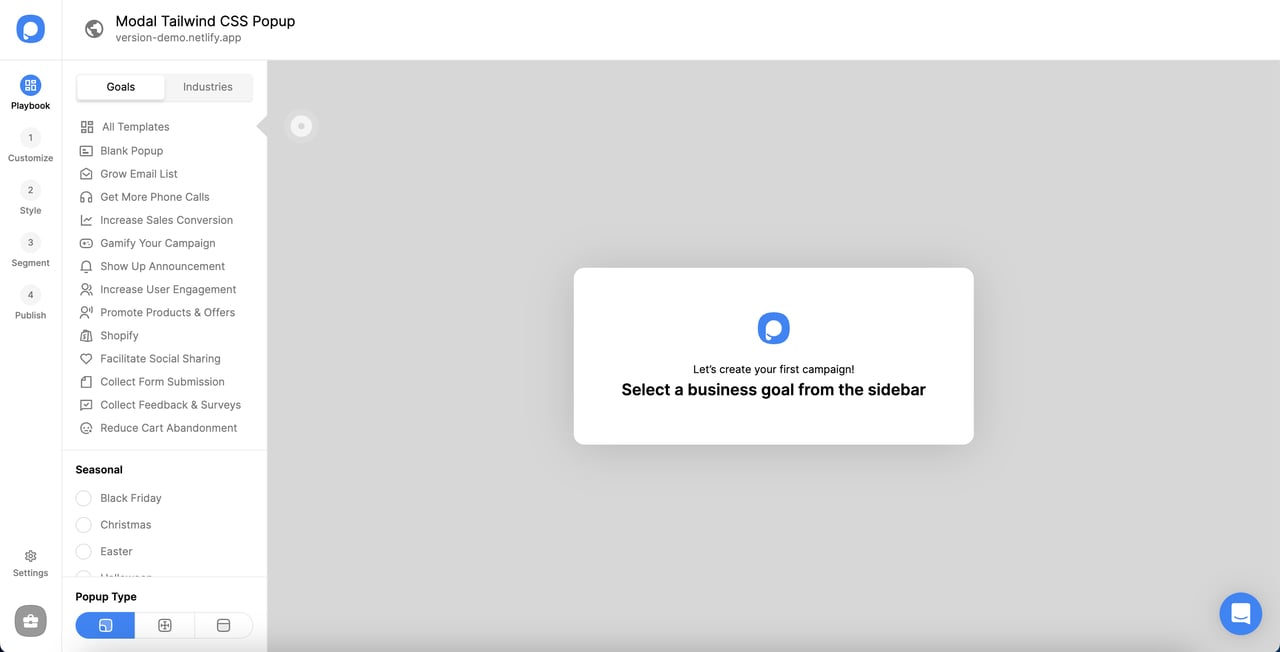
It is also possible to choose a template based on your goal and customize it according to your brand’s identity.
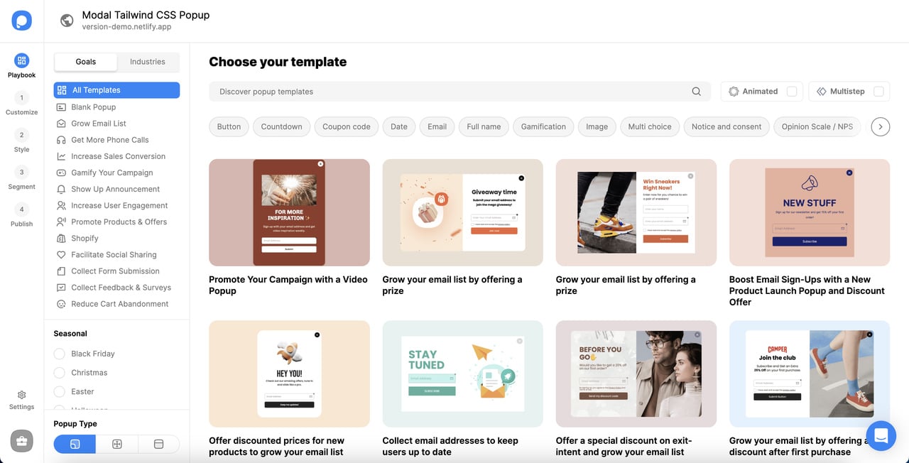
For inspirational advice, you can check out popup designs for inspiration.
Consider your aim of popups and decide on these templates. You can customize the fonts, colors of your popup.
Don’t forget to add an attention-getting and well-written headline and text. Also, add your products’ and services’ images to your popup for better effect.
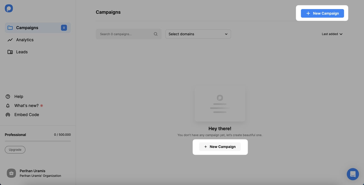
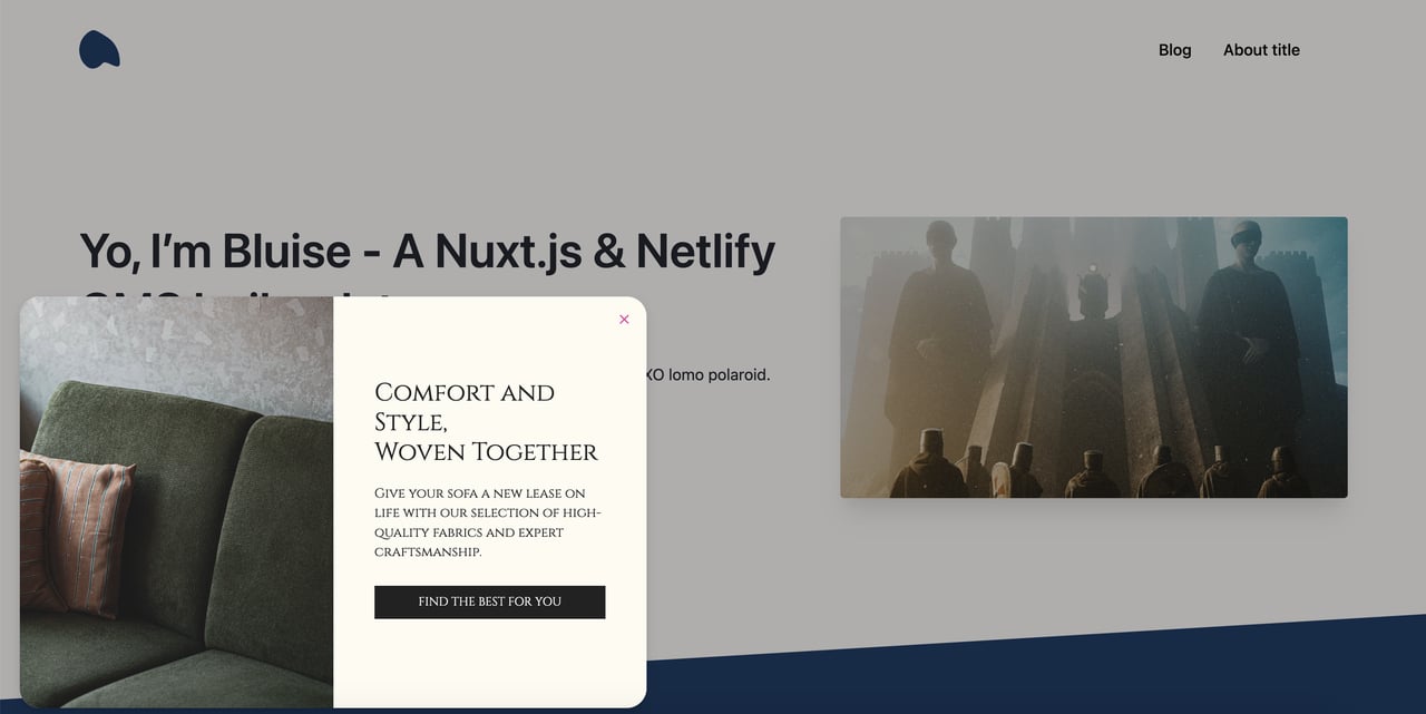
For example, we have changed a template to encourage visitors to join the survey and re-positioned.
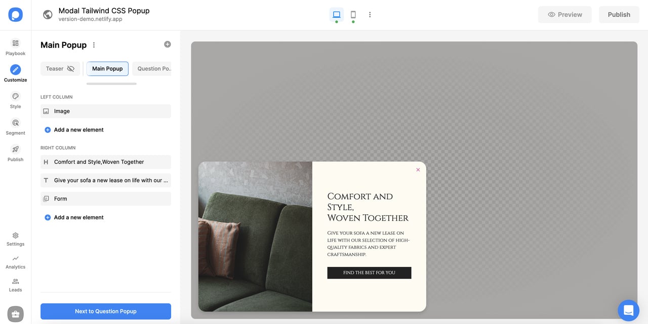
In the "Customize" and "Style" section, editing all elements is possible.
Modal Tailwind CSS Popup Integration with Popupsmart
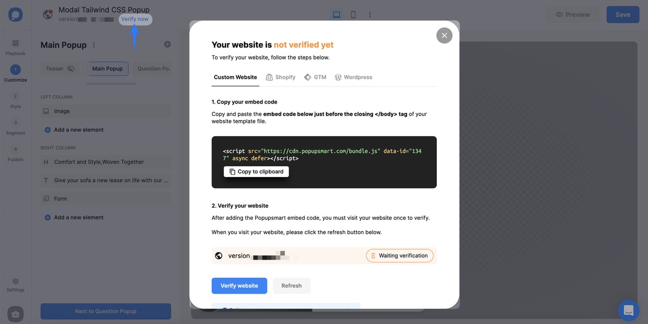
When you finish creating your popup and choose target options, your popup becomes ready to publish!
Adding a popup to your website is very easy since Popupsmart has a user-friendly integration system that is well adaptable.
All you have to do is copy and paste the code you get after finalizing your popup.
Then, in the Publish section, you can get the code quickly by clicking "Verify now" next to your domain.
Then you can add this code to your website, and your popup is ready to go! It should look like this:
There are different ways to embed your code based on your CMS and we can offer you help whenever you need.
When it is ready to use, your popup can look like this on your website:
Why Do We Use Modal Tailwind CSS Popups?
- 🔥 User Engagement: Modals allow users to focus on specific content or actions (e.g., forms, notifications) without leaving the current page, improving engagement.
- ⚡ Seamless User Experience: Since modals display content within the same page, users can interact with them without disrupting their workflow or navigating to another page.
- 🎨 Customizable Design: Tailwind CSS allows you to easily customize modals in terms of appearance, size, and placement using utility classes, making it easy to match your website's design.
- 📱 Responsiveness: Tailwind's responsive design features ensure that modals adapt seamlessly to different screen sizes, providing a consistent experience across devices.
- ♿ Accessibility: When implemented correctly, modals enhance accessibility by focusing user attention on critical actions (like confirmations or inputs) while providing controls for easy dismissal.
- 🔧 Flexibility: Tailwind CSS modals can be easily integrated with JavaScript to create dynamic and interactive elements, such as login forms, alerts, or popups for various purposes.
FAQ
What is Tailwind CSS used for?
Tailwind CSS is used for creating websites fastly. It is highly customizable and easy to use with different options. It is used for creating interfaces on a website. You can customize each element of your website with tailwind CSS. Consequently, it is possible to create unique websites with different features.
How do you make a Tailwind popup in CSS?
With the help of codes and customizations, you can create Tailwind popups in CSS. By following these steps & ideas we have given in previous sections, you can build your own modal tailwind CSS popups. In addition, modal tailwind CSS popups are entirely customizable, giving you the autonomy to construct the elements of your website.
Popupsmart makes it even easier with its well-designed popup templates. You can personalize these templates in a short period of time. Consider adding these popups to reach your target audience and grow your email list.
Conclusion
That is all about creating modal tailwind CSS popups!
We hope you enjoyed reading about this topic and learned how to create your own popup.
Though modal tailwind CSS popups might not always be needed, there is always a better and easier way to create one with Popupsmart.
Check out these content as well:
How would you rate your experience with this article? 😊