If you plan to launch a new product or promote new collections, new arrival email examples can inspire you for your next email marketing campaign. The best new arrival email examples use sharp subject lines, bold product visuals, and a single clear CTA to turn a product announcement into immediate sales. We analyzed 20 emails from brands like Apple, Adidas, and Michael Kors, breaking down the design choices, copy tactics, and psychological triggers that make each one convert.

What Is a New Arrival Email?
A new arrival email is a targeted message sent to your subscriber list announcing a new product, collection, or service. Unlike generic promotional blasts, these emails build anticipation around something fresh and give subscribers a reason to visit your store right now.
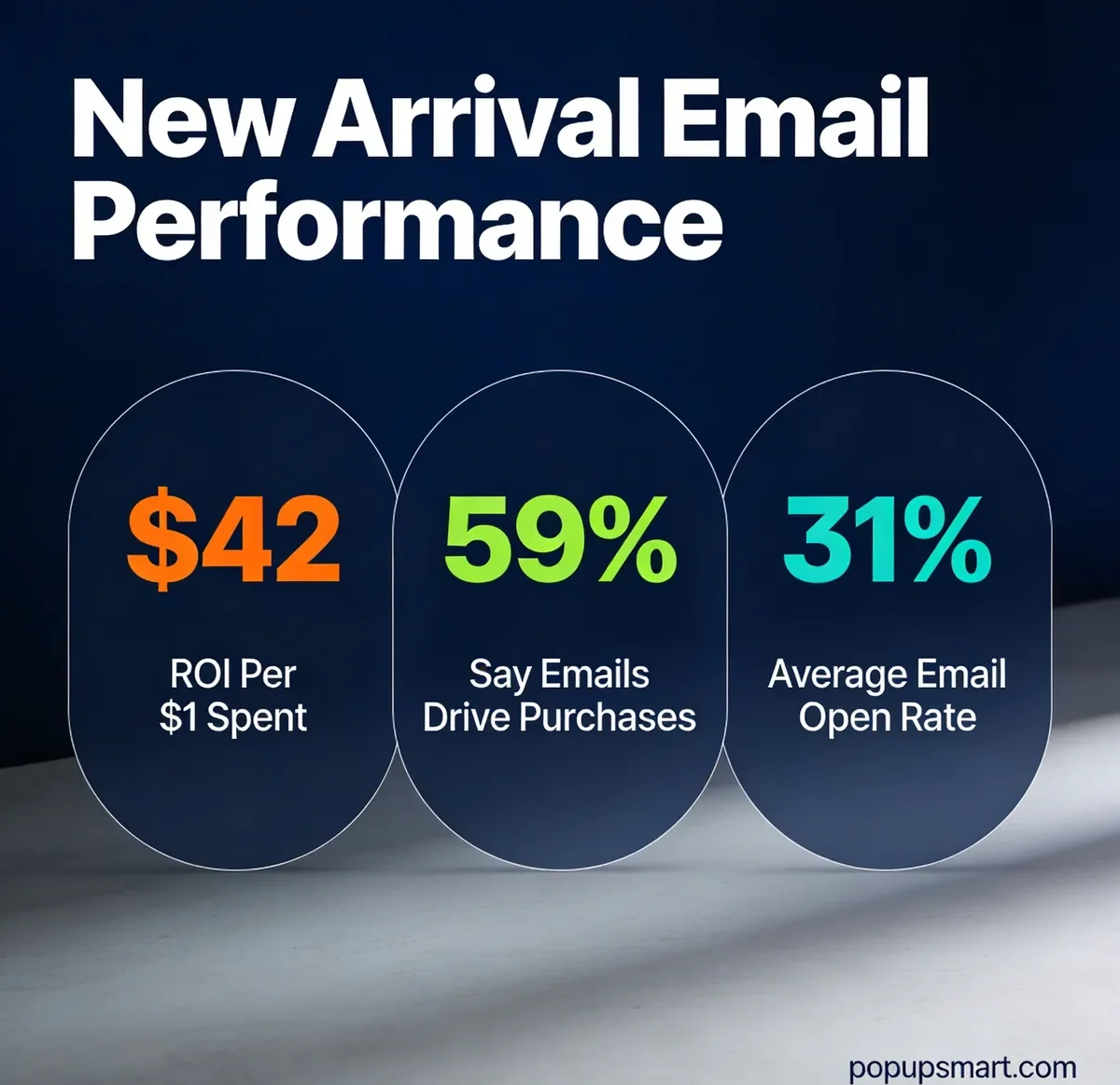
For e-commerce and SaaS brands, new arrival emails serve a dual purpose: they drive immediate revenue from engaged subscribers and they reinforce brand loyalty by making customers feel like insiders who get first access. According to HubSpot's marketing research, 59% of consumers say marketing emails directly influence their purchase decisions.
I've reviewed hundreds of product launch emails over the past three years while helping e-commerce teams optimize their campaigns. The pattern is clear: brands that pair strong visuals with urgency-driven copy consistently outperform those that treat new arrivals as routine updates.
Why New Arrival Emails Work?
New arrival emails tap into two psychological triggers that generic campaigns can't match: novelty bias and fear of missing out. When subscribers see something they haven't encountered before, their curiosity spikes. Combine that with limited-stock messaging or an exclusive first-look framing, and you've built urgency without resorting to fake countdown timers.
The numbers back this up. According to Klaviyo's email benchmarks, the average email campaign open rate across all industries sits at 31%, with top performers hitting 45.1%. New arrival emails typically outperform that average because subscribers are genuinely curious about what's new.
Here's why these emails deserve a permanent spot in your email marketing strategy:
• Revenue generation: Email marketing returns an average of $42 for every dollar spent, according to Campaign Monitor
• Customer retention: Regular product updates keep your brand top of mind between purchases
• Segmentation opportunities: New arrivals let you target specific customer segments based on past purchase behavior and browsing history
• Brand building: Consistent, well-designed launch emails reinforce your brand identity with every send
20 Best New Arrival Email Examples
I evaluated over 50 new arrival emails and selected these 20 based on four criteria: visual impact, copy quality, CTA clarity, and whether the email teaches a distinct marketing principle. Each example below includes a subject line breakdown, design analysis, and a takeaway you can apply to your next campaign.
1. Adidas x Gucci: The Co-Brand Collaboration
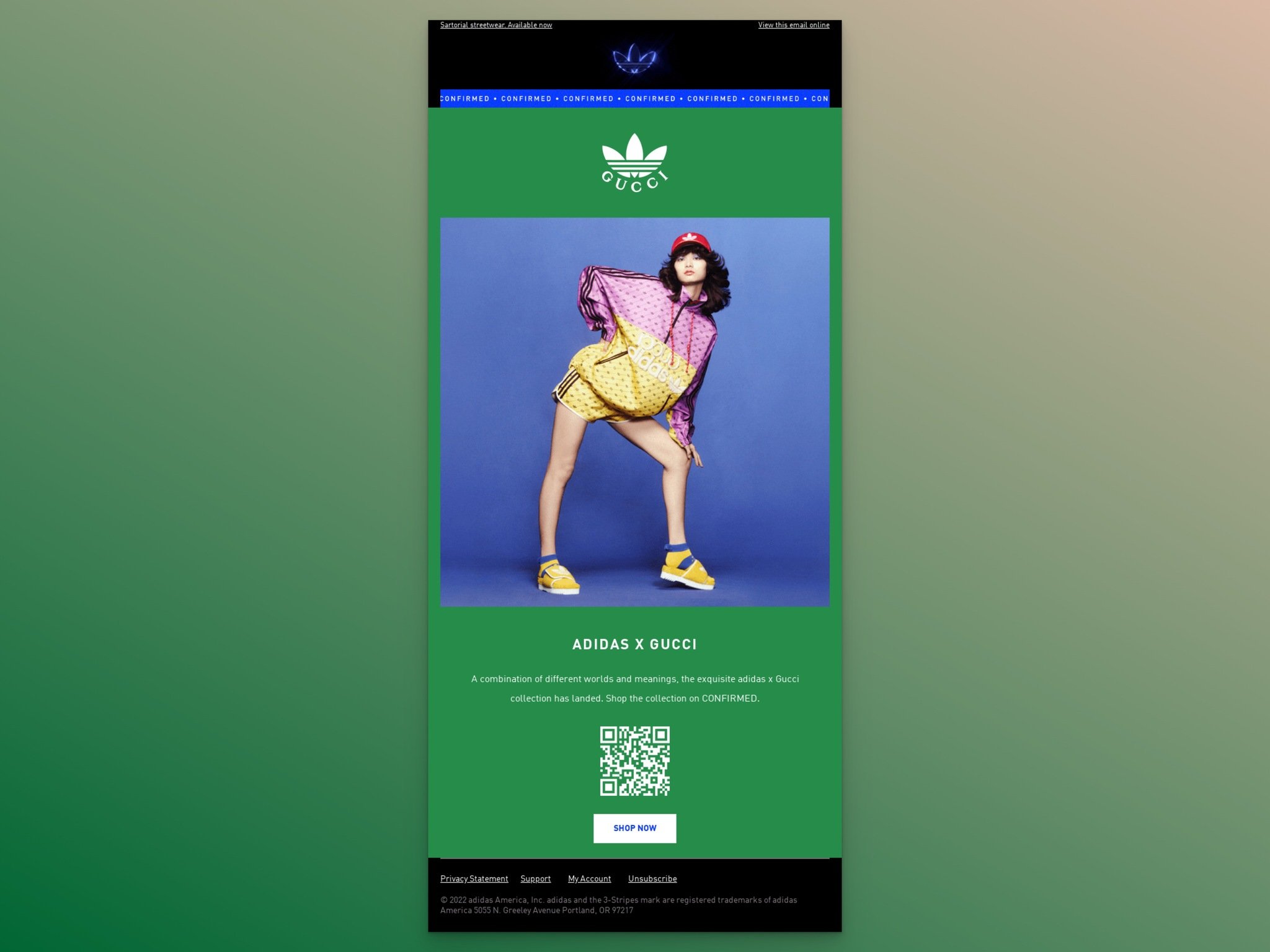
Subject Line: Adidas x Gucci
What works: The dual-logo header immediately signals that this isn't a standard Adidas email. The headline "The exquisite Adidas x Gucci collection has landed" uses the word "landed" to create event-like framing. A QR code at the bottom of the email eliminates friction for mobile users who want to shop instantly without navigating through links.
Why it works: Co-brand collaborations carry built-in social proof. When two established brands endorse each other, the perceived value of the collection increases. The QR code is a smart addition. It removes one click from the purchase path, and in e-commerce, every removed step can improve conversion rates.
Key takeaway: If you're running a collaboration or partnership launch, lead with both brand identities visually. Add a QR code for mobile shoppers who want to skip the link-clicking process entirely.
2. e.l.f. Cosmetics: The Minimal Attention-Grabber

Subject Line: Announcing something NEW, just for you
What works: The headline "cancel your pores" is three words. That's it. It's bold, slightly irreverent, and immediately tells you what the product does. The email pairs this with clear product shots and a free shipping banner at the top. According to Forbes' 2026 marketing report, 72% of brands now rank email as their most effective channel, and e.l.f. demonstrates why: they cut everything that doesn't serve the conversion goal.
Why it works: Cognitive load theory says fewer elements mean faster decisions. By limiting the email to one headline, product images, and a free shipping incentive, e.l.f. gives subscribers exactly three reasons to click: curiosity (the headline), desire (the product images), and a risk reducer (free shipping).
Key takeaway: Write your headline in under five words. If you can't describe your product's main benefit that briefly, keep editing until you can.
3. Apple: The Feature-Led Story
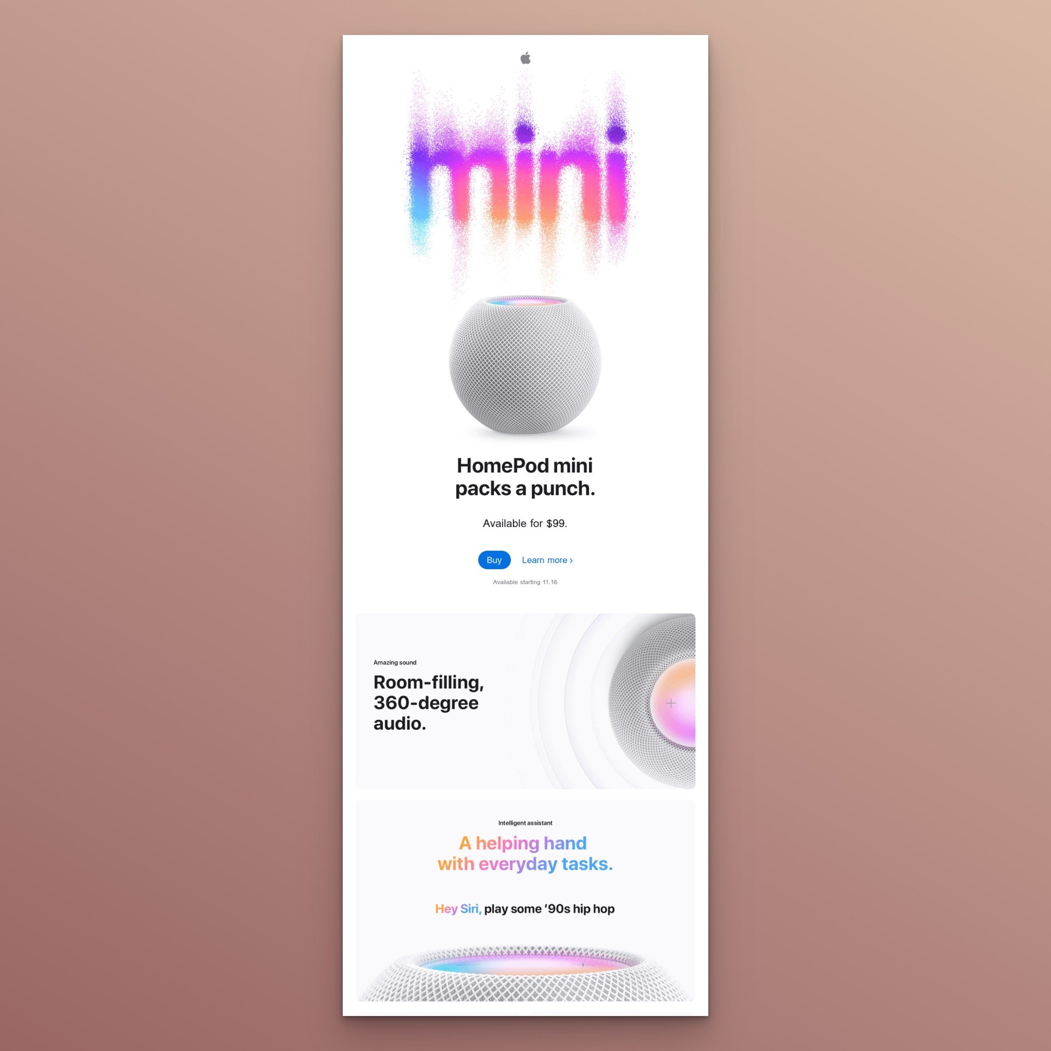
Subject Line: Get big sound from HomePod mini for $99.
What works: Apple opens with "HomePod mini packs a punch" and immediately follows with the price point. The email then walks through individual product features, each paired with a single image. The price appears again at the end: "All for $99." Two CTA buttons ("Buy" and "Learn more") give readers a binary choice.
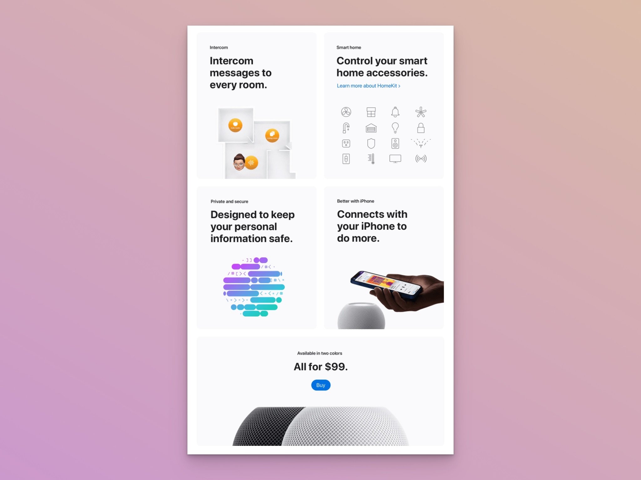
Why it works: Price anchoring. By stating the price at the top and repeating it at the bottom, Apple frames every feature in between as a value justification. The reader processes each feature thinking "and I get all of this for $99." This technique works especially well for product announcement emails where the price is competitive.
Key takeaway: Repeat your price point at the start and end of your email. Place product features between the two mentions so every benefit feels like added value rather than a cost justification.
4. re_grocery: The Values-Driven Launch
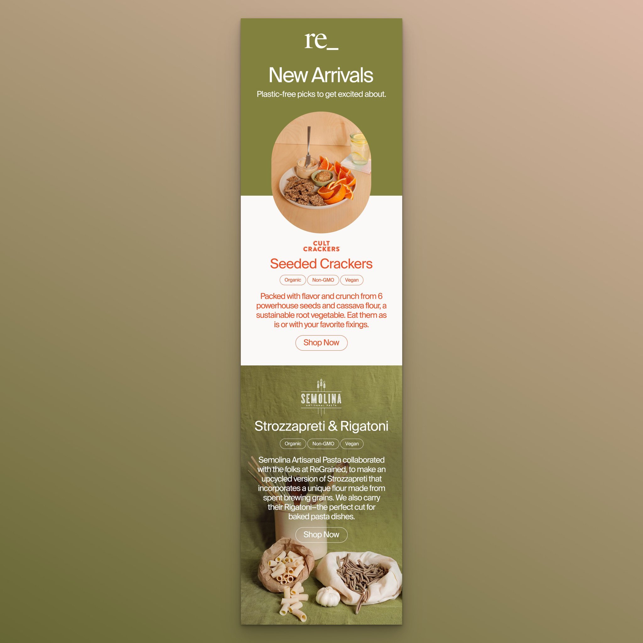
Subject Line: New Arrivals from re_grocery
What works: The subheading "Plastic-free picks to get excited about" immediately signals what this brand stands for. Product descriptions highlight that items are organic, vegan, and non-GMO. Each product gets its own "Shop Now" button, and the color palette across product images and text stays consistent throughout.
Why it works: For values-driven consumers, the product's origin story matters as much as the product itself. By leading with sustainability credentials rather than burying them in fine print, re_grocery filters for high-intent buyers who share those values. This audience segments itself, and self-segmented audiences convert at higher rates.
Key takeaway: Lead with your brand values in the subheading if your audience cares about sustainability, ethics, or sourcing. Don't make them scroll to find out what you stand for.
5. Mr. Porter: The Curated Collection
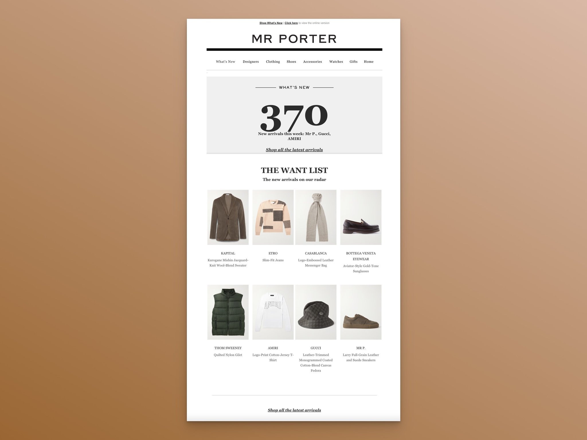
Subject Line: Our favourite new arrivals
What works: Mr. Porter opens with "What's new" and immediately tells subscribers they have 370 new arrivals that week. The "THE WANT LIST" section curates a handful of highlights with clear images, titles, and brief descriptions. The email closes with "Shop all the latest arrivals" for those who want to browse everything.
Why it works: The paradox of choice suggests too many options can paralyze decision-making. Mr. Porter solves this by curating a "want list" from 370 items, essentially pre-selecting the best pieces for you. Subscribers who trust the curation click the highlights; those who prefer autonomy click the "shop all" link. Both paths work.
Key takeaway: If you're launching a large collection, don't dump everything into one email. Curate 5-8 highlights and link to the full collection separately.
6. Bloomscape: The Seasonal Welcome
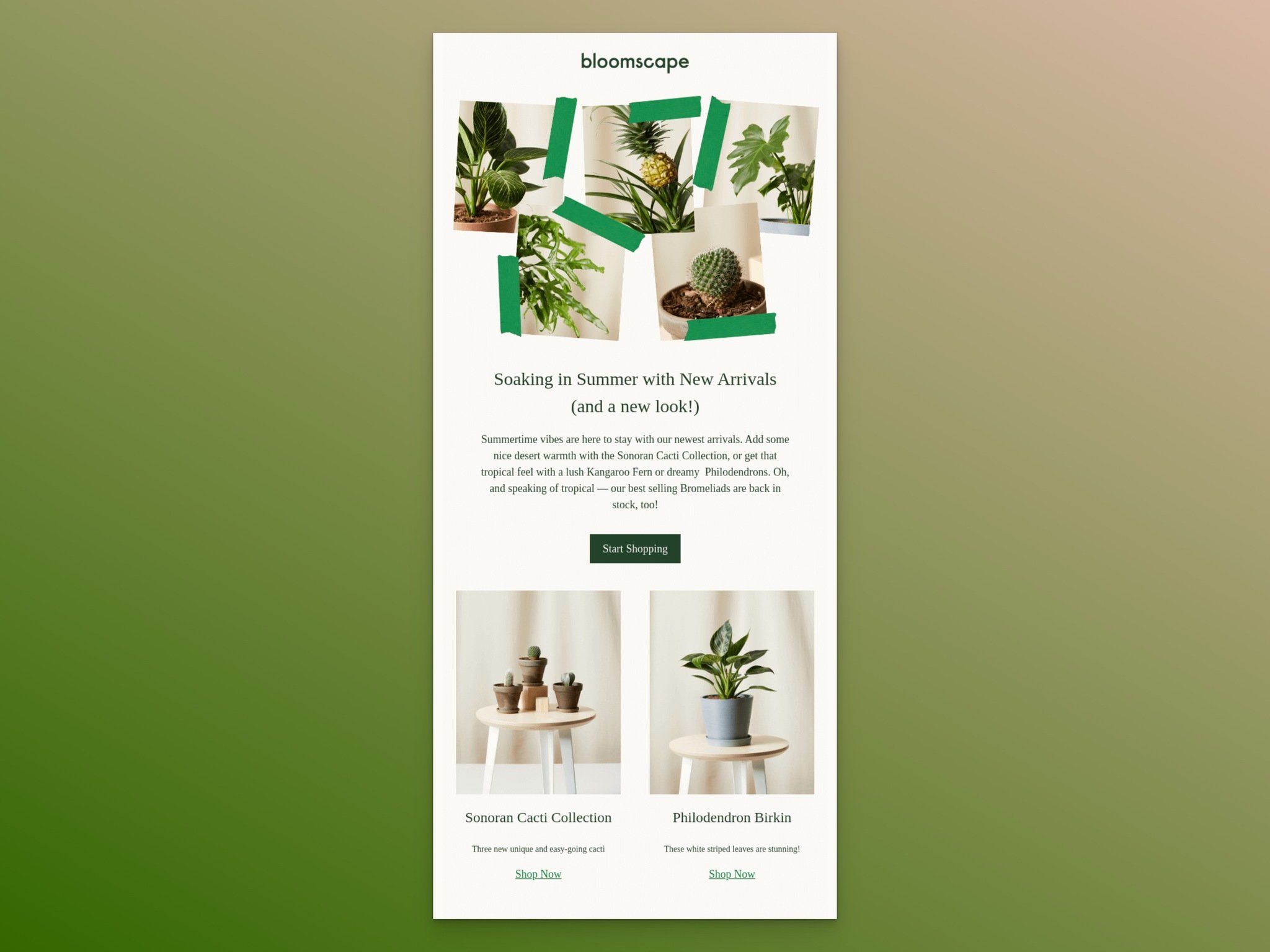
Subject Line: New Arrivals Just In!
What works: "Soaking in Summer with New Arrivals (and a new look!)" ties the product launch to a season, making the email feel timely rather than random. The conversational tone ("Summertime vibes are here to stay") sounds like a friend texting you about something cool they found. Product images are scattered throughout rather than grouped at the bottom.
Why it works: Seasonal framing creates a natural deadline. Summer won't last forever, and neither will these products. The casual tone reduces the "being sold to" feeling that makes subscribers hit delete. Bloomscape treats their new arrival email like a conversation, not a catalog.
Key takeaway: Tie your new arrival launch to a season, holiday, or cultural moment. It gives subscribers a reason to act now instead of bookmarking the email for later.
7. Samsung: The Single-Product Spotlight
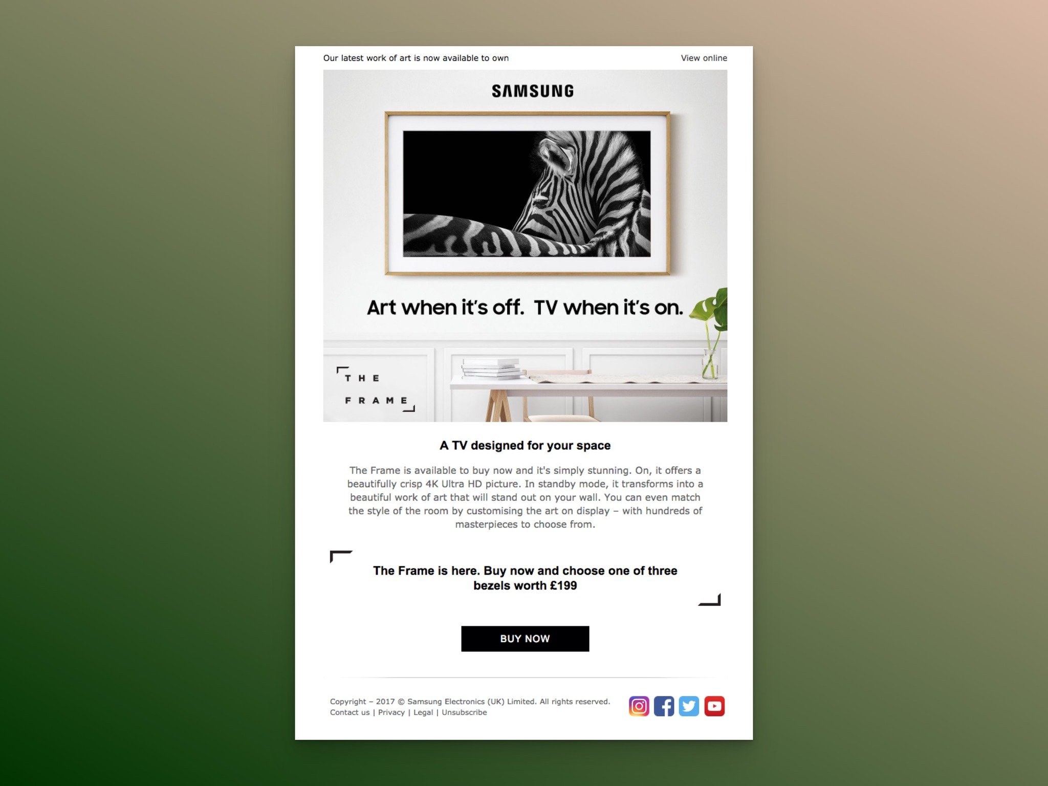
Subject Line: The Frame is here, and its a masterpiece
What works: Samsung dedicates the entire email to one product. The headline "Art when it's off. TV when it's on." positions The Frame as a lifestyle product, not just another television. Feature descriptions are short, the pricing includes a bonus (choose one of three bezels worth $199), and the email closes with a single "Buy Now" button.
Why it works: When you sell one product per email, you eliminate comparison anxiety. The subscriber doesn't need to decide which product to explore first. Samsung's lifestyle positioning also raises the perceived value: this isn't a TV purchase, it's a home decor decision. That reframing justifies the price point.
Key takeaway: Reserve single-product emails for your flagship launches. Give the product enough room to tell its full story instead of competing for attention with other items.
8. Hardgraft: The Image-First Approach
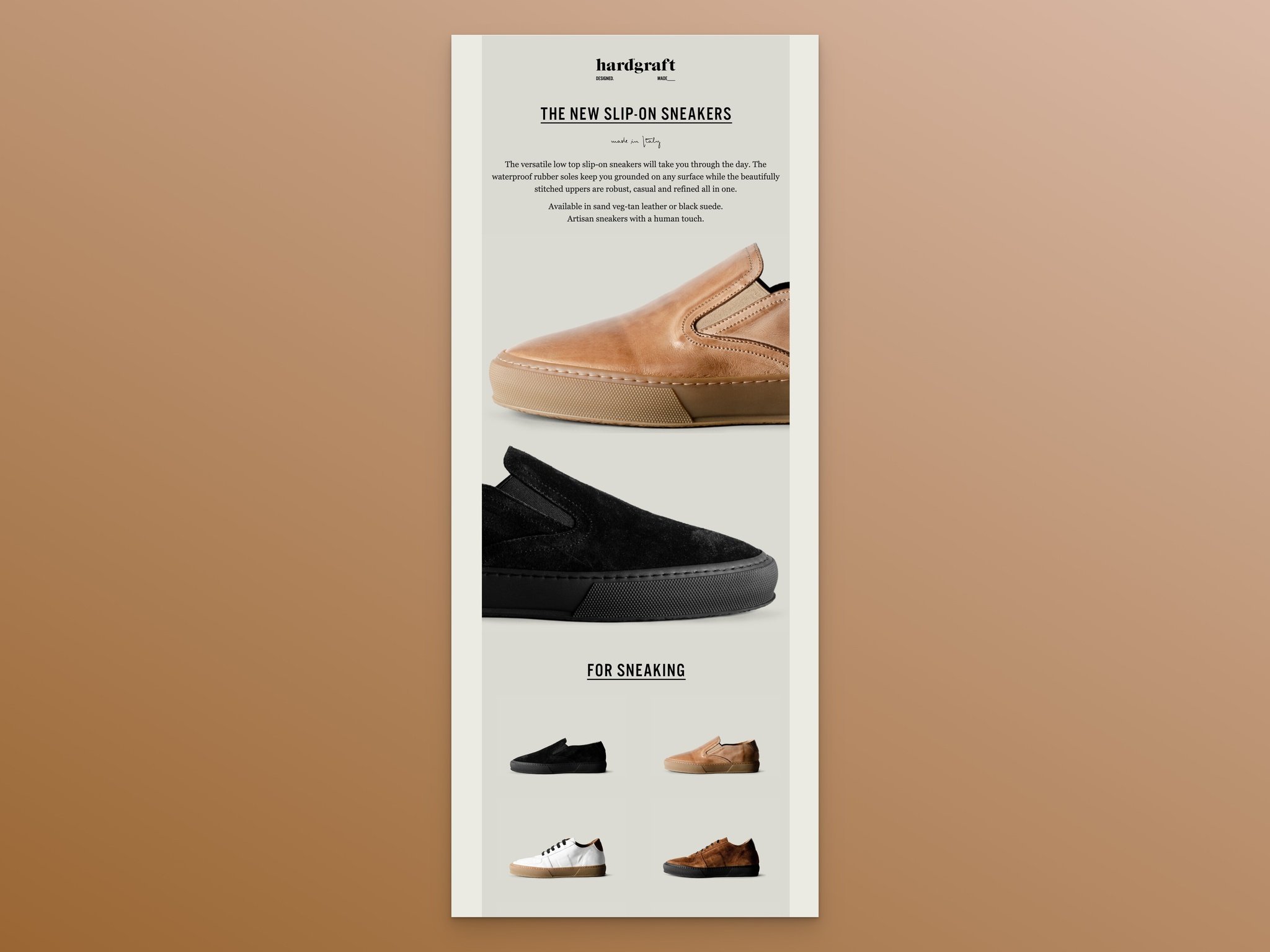
Subject Line: Slip on these sneakers
What works: The headline "THE NEW SLIP-ON SNEAKERS" is direct and descriptive. The body copy is a single short paragraph. Everything else is photography: large hero shots of the product, followed by smaller thumbnails of related items in the collection. The images do the selling here.
Why it works: For premium physical products, photography communicates quality faster than any copy can. Hardgraft understands that their audience evaluates products visually first and reads copy second. The minimal text respects the subscriber's time and lets the craftsmanship speak for itself.
Key takeaway: If your product's quality shows in its appearance, invest in photography over copywriting. Use text only to name the product and add one sentence of context.
9. Michael Kors: The Scarcity Play

Subject Line: Special Delivery: Limited-Edition Bags
What works: "ONLY 500 MADE" as the opening headline is hard to ignore. The copy describes new arrival products as receiving "royal treatment," elevating the perceived exclusivity. Two product-specific CTAs ("SHOP CECE" and "SHOP WHITNEY") let subscribers go directly to the bag they want. Store locations are listed at the bottom for in-person shoppers.
Why it works: Scarcity is one of the most documented conversion triggers in marketing psychology. When something is limited, its perceived value increases. Michael Kors makes the scarcity concrete by stating the exact production number (500), which feels more credible than vague "limited edition" claims.
Key takeaway: State the exact quantity when using scarcity in your subject lines and headlines. "Only 500 made" converts better than "limited edition" because specificity builds trust.
10. Ashley & Co: The Niche-Audience Email
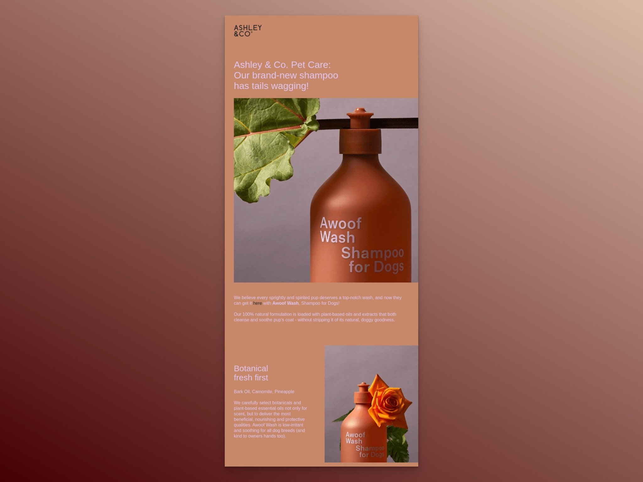
Subject Line: Sit! Stay... You'll Love This New Arrival
What works: The subject line uses a dog command ("Sit! Stay...") as a hook, immediately signaling that this email is for pet owners. The headline "Our brand-new shampoo has tails wagging!" continues the playful tone. Product features are explained with matching imagery throughout.
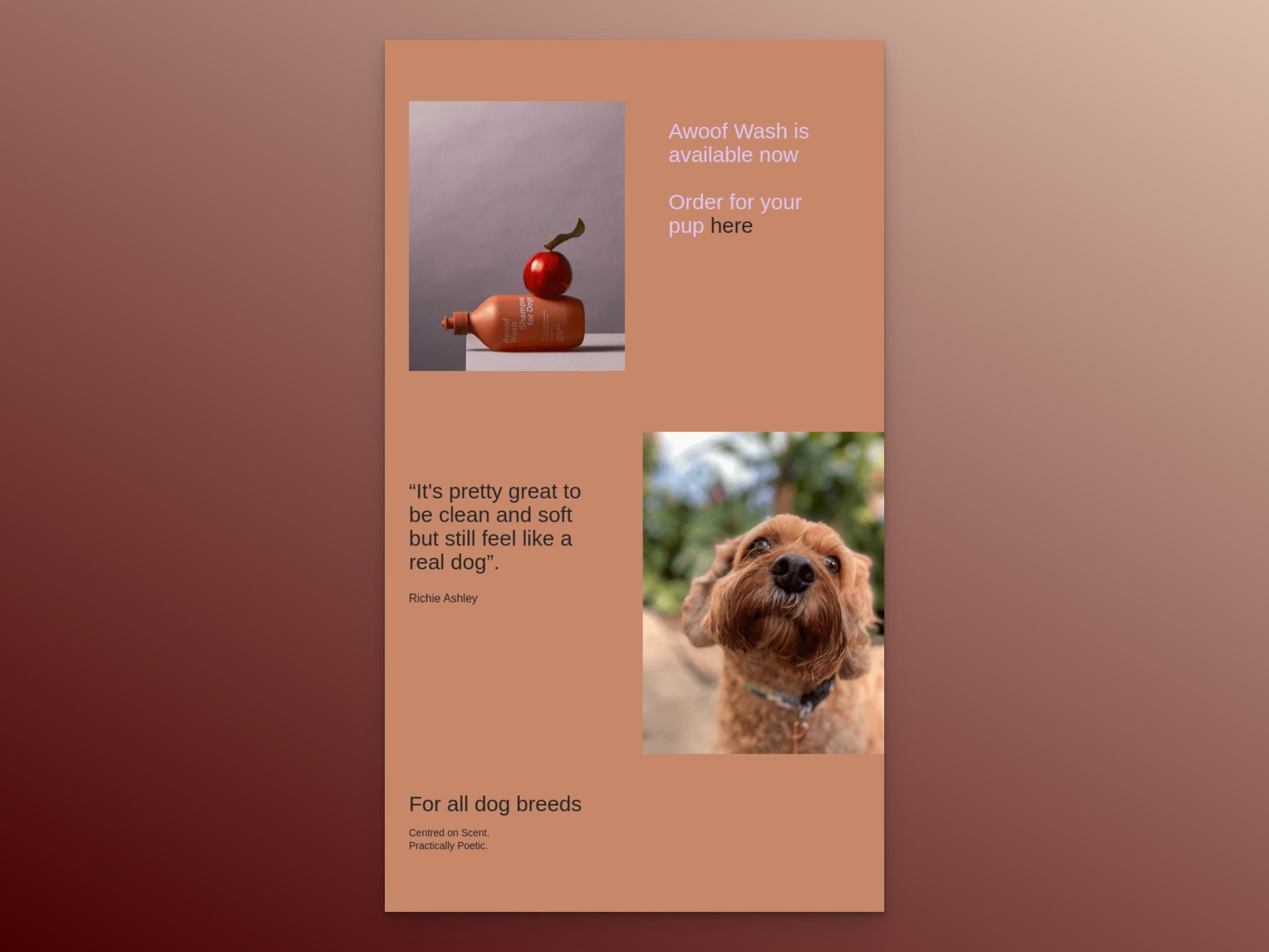
Why it works: When your new arrival targets a specific audience segment, mirror their language. Dog owners respond to pet-related puns and imagery. The closing puppy photo isn't just cute; it reinforces the emotional connection between the product and the subscriber's pet. This is audience segmentation done right.
Key takeaway: Match your email's tone and imagery to your specific audience segment. A pet product email should sound like it was written by someone who owns pets, not by a generic marketing team.
11. MailNinja: The Service Launch

Subject Line: Something amazing has just landed!
What works: MailNinja proves that new arrival emails aren't just for physical products. They're launching a free email marketing calendar, and the headline "Introducing your free email marketing content calendar" leads with the benefit (it's free) and the utility (it's a content calendar). The "Signup, free" CTA appears early, and screenshots show what users will actually get.
Why it works: SaaS and service businesses often struggle with new arrival emails because there's no physical product to photograph. MailNinja solves this by showing the actual product interface. Screenshots function as the "product image" equivalent, giving subscribers a preview of what they'll receive after signing up.
Key takeaway: For digital products or services, use interface screenshots as your "product photography." Show what the user will see after they sign up, not just what the product does in abstract.
12. Italic: The Pre-Launch Teaser

Subject Line: Tomorrow: Italic Beauty
What works: This email goes out before the product is available. "COMING SOON" and "Tomorrow" create a countdown effect without an actual countdown timer. "Get ready for a new era of prestige skincare" positions the launch as a brand moment, not just another product drop. The CTA "Get notified first" turns the email into a lead capture tool for the actual launch.
Why it works: Pre-launch emails build anticipation, but they also serve a data collection purpose. Subscribers who click "Get notified first" are self-identifying as high-intent buyers. When the product actually launches, you've already built a warm list of people who explicitly asked to hear about it. According to Originality.ai's email research, email reaches 4.55 billion users globally, and 99% check their inbox daily. Pre-launch emails capitalize on that daily habit.
Key takeaway: Send a teaser email 24-48 hours before your launch. Use a "notify me" CTA to build a segment of high-intent buyers you can target with the actual launch email.
13. Alex & Ani: The Discount-Driven Launch
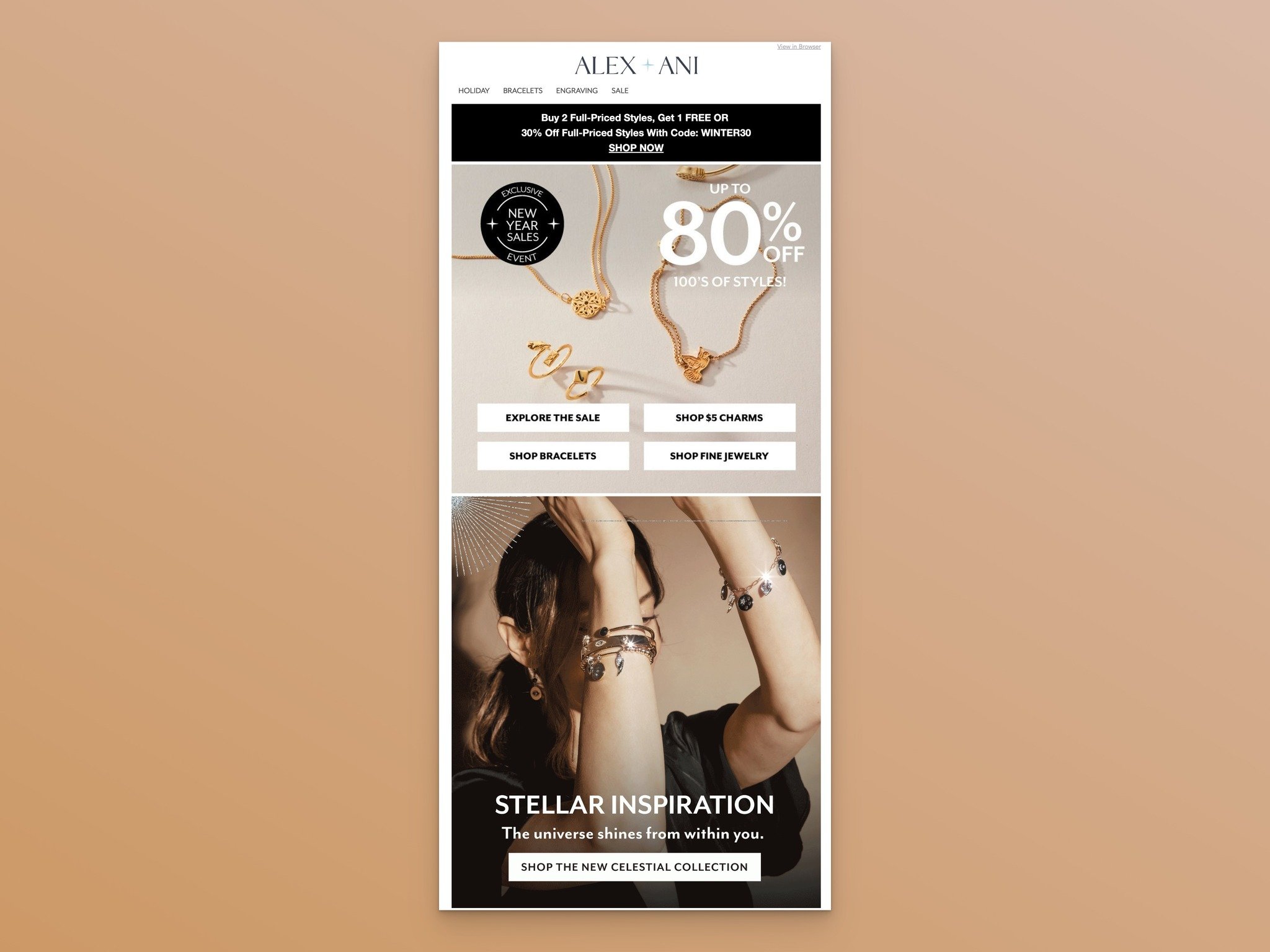
Subject Line: 30% Off New Arrivals
What works: The discount (up to 80% off) dominates the email in large, bold font. Collection-specific CTA buttons let subscribers jump directly to the category they care about. Product images with pricing details are sprinkled throughout, and the discount offer is restated near the bottom alongside shipping information.

Why it works: Pairing a new arrival with a discount removes the "I'll wait for a sale" objection that delays many first purchases. The email essentially says: "It's new AND it's already discounted." For price-sensitive audiences, this combination drives faster action than a full-price launch followed by a later sale.
Key takeaway: If your audience is price-sensitive, launch new arrivals with an introductory discount. You'll generate volume quickly and can raise the price later once reviews and social proof accumulate.
14. Rifle Paper Co.: The Lifestyle Visual

Subject Line: New Spring Fabric is Here!
What works: "INTRODUCING Primavera" is elegant and matches the brand's aesthetic. The email mixes product shots with lifestyle images showing a real person using the fabric. The "Shop Fabric" CTA is specific to the product category, and a "Read more" button caters to subscribers who want the backstory before buying.
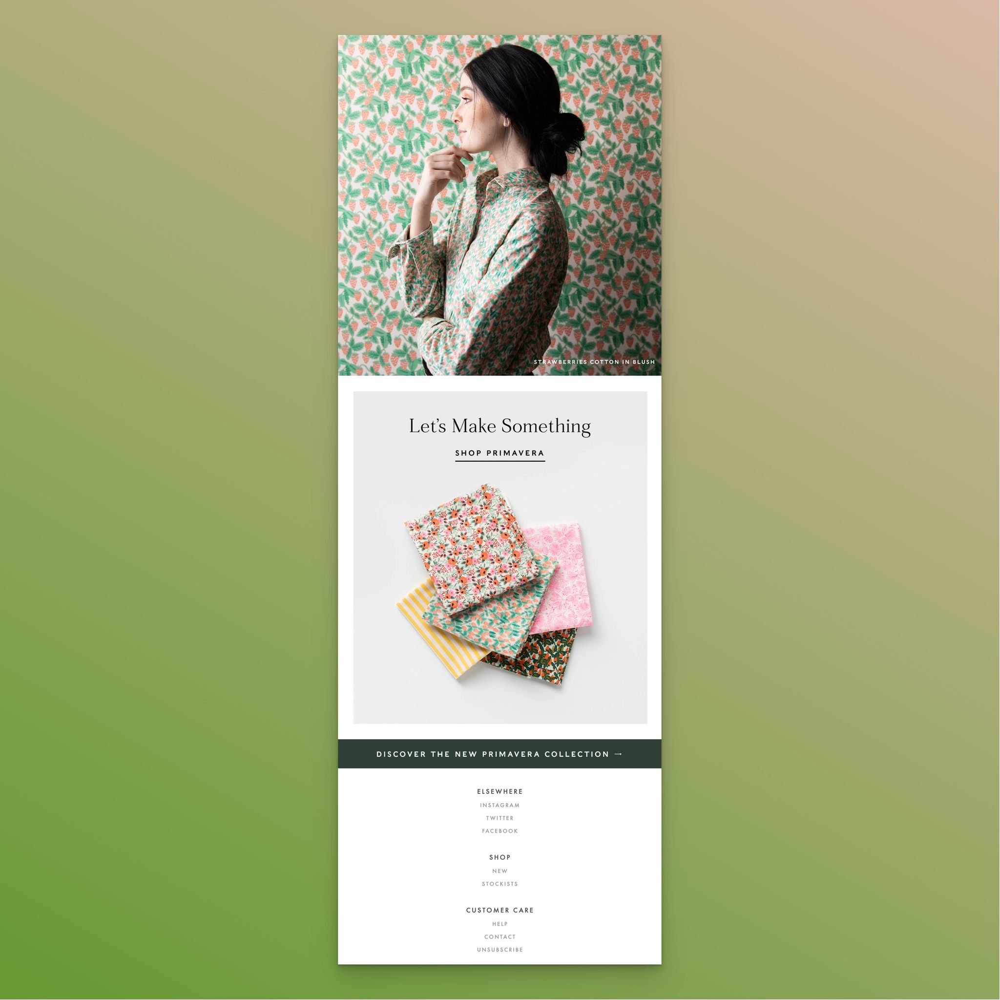
Why it works: Lifestyle photography bridges the imagination gap. A flat product shot shows you what the fabric looks like. A photo of someone sewing with it shows you what your finished project could look like. That mental leap from "product" to "result" is what triggers the purchase decision, especially for craft-oriented audiences.
Key takeaway: Include at least one lifestyle image showing your product in use. Products photographed in context convert better than isolated product shots because they help subscribers picture the end result.
15. Moment: The Color-Coordinated Drop

Subject Line: peachy merch is here
What works: The entire email's color palette matches the product: peach tones from header to footer. The hero image is large enough to fill most of the viewport on mobile. "Get Yours" as a CTA feels personal and urgent. The second product is introduced with a lifestyle shot of someone holding it.

Why it works: "Available in limited quantities. Get 'em while you can." is direct and conversational. It creates urgency without the heavy-handed tactics that make subscribers distrust your brand. The color coordination isn't just aesthetic; it creates visual consistency that makes the email feel like a curated experience rather than a sales pitch.
Key takeaway: Match your email's entire color scheme to your product. It creates a cohesive brand moment and makes the email feel intentional rather than template-generated.
16. J. Crew: The Holiday Tie-In
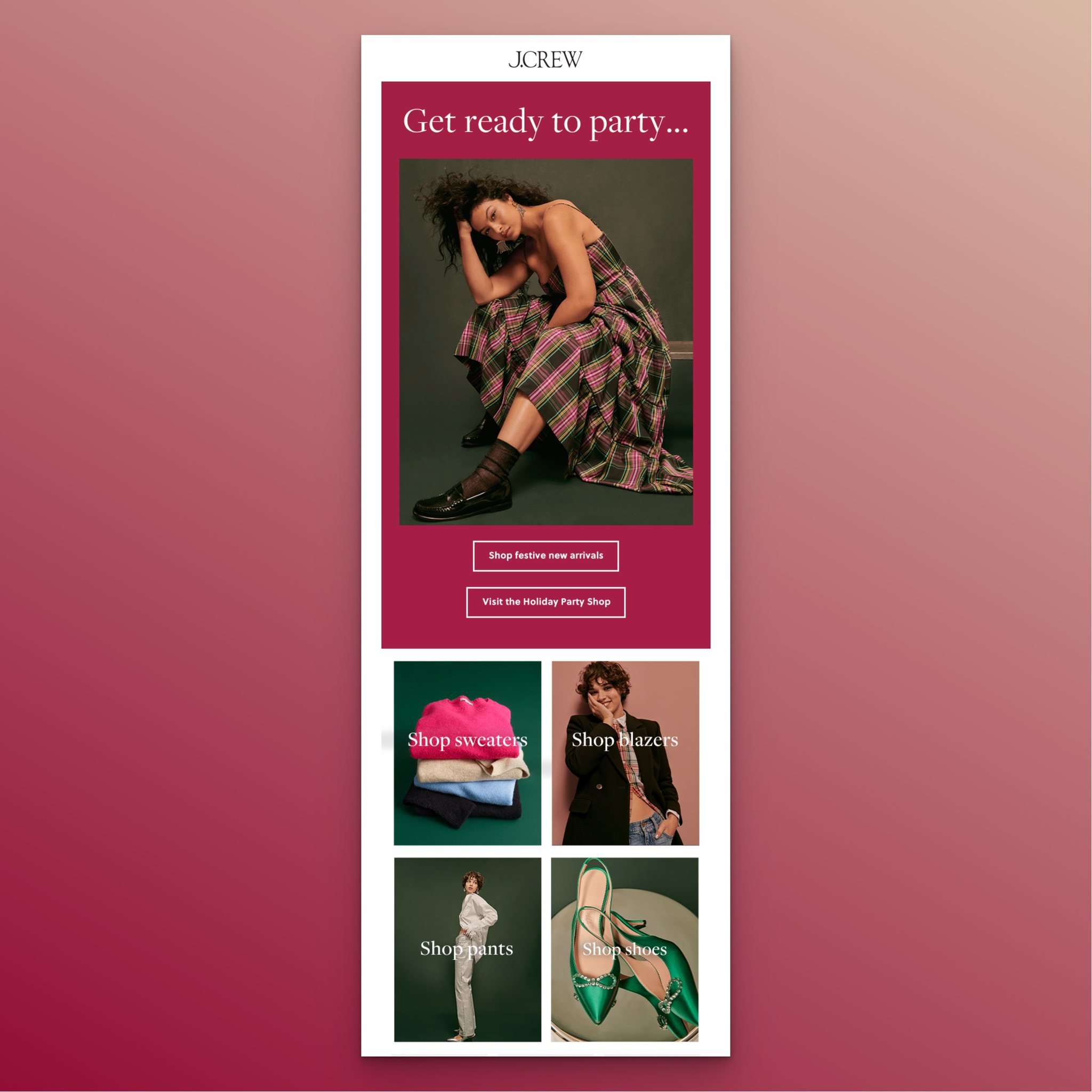
Subject Line: Get ready to party...with 50% off new arrivals
What works: J. Crew combines a new arrival announcement with a holiday sale and a seasonal theme in a single email. "Get ready to party..." creates excitement, while "50% off new arrivals" provides the financial incentive. The dual CTAs ("Shop festive new arrivals" and "Visit the Holiday Party Shop") let subscribers choose their shopping path. This is a textbook example of tying new arrivals to seasonal campaigns.
Why it works: Holiday shoppers already have their wallets open. By positioning new arrivals within a holiday context, J. Crew converts seasonal browsing intent into product-specific purchases. The 50% discount in the subject line ensures the email gets opened in a crowded holiday inbox.
Key takeaway: Time your biggest new arrival launches to coincide with holidays or shopping events. Subscribers are already in a buying mindset, so your email competes with less psychological resistance.
17. GAP: The Multi-Collection Showcase
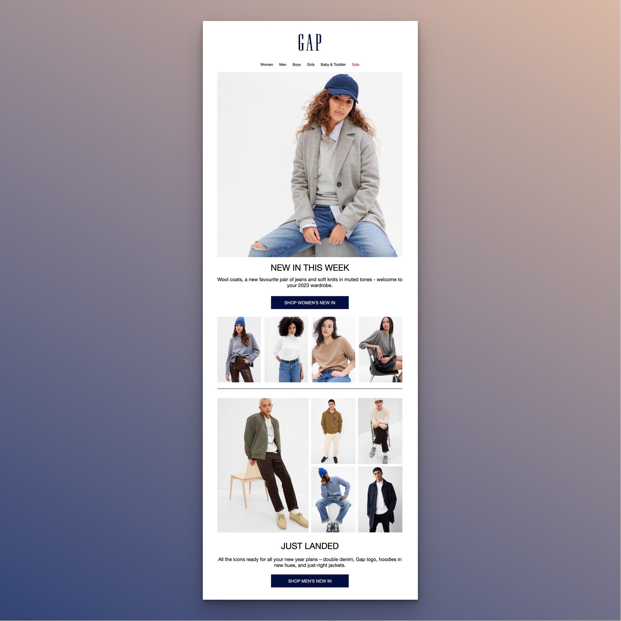
Subject Line: Start the new year off with fresh layers
What works: GAP segments their new arrivals by audience right inside the email. Women's, men's, and baby & toddler collections each get their own section with dedicated images and CTAs. The headline "NEW IN THIS WEEK" creates a recurring habit, and "THE BIG GAP SALE" at the bottom catches anyone who scrolled past the individual sections.
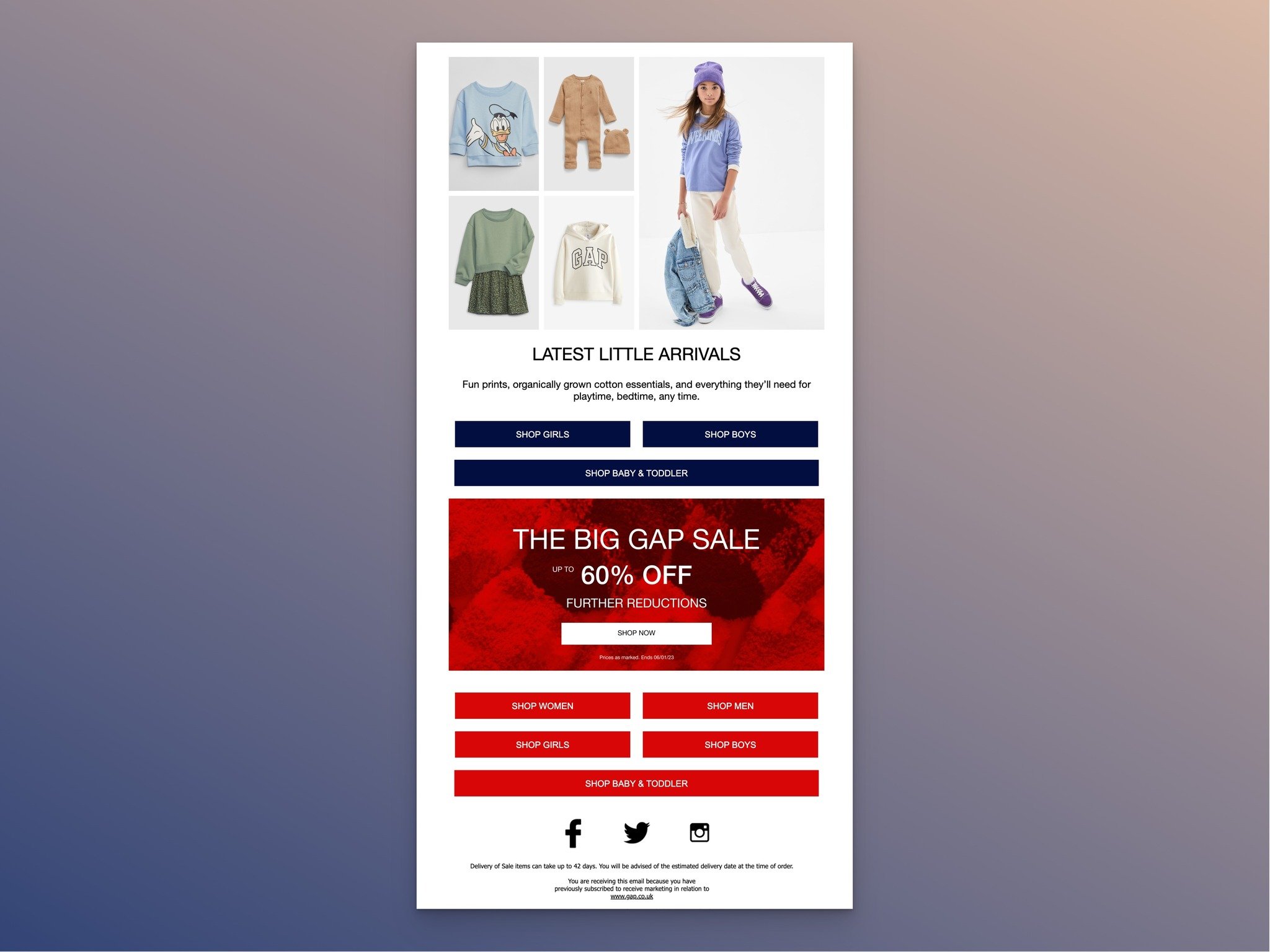
Why it works: One email, multiple audience segments. Instead of sending three separate emails (which risks fatigue), GAP lets each subscriber self-select the collection that's relevant to them. The "NEW IN THIS WEEK" framing also sets an expectation: subscribers start looking forward to weekly updates.
Key takeaway: If you serve multiple audience segments, structure your email with clear sections per segment. Use descriptive CTAs like "Shop Women's New In" so subscribers can jump directly to their section.
18. Athletic Brewing Co: The Mixed-Media Launch

Subject Line: Introducing Athletic Lite
What works: "THIS IS ATHLETIC LITE" opens with confidence. The email layers multiple content types: hero product shot, feature callouts, a link to a product video, a lifestyle photo of friends enjoying the product, and a customer loyalty program plug at the bottom. Text alert signup buttons add another engagement channel.
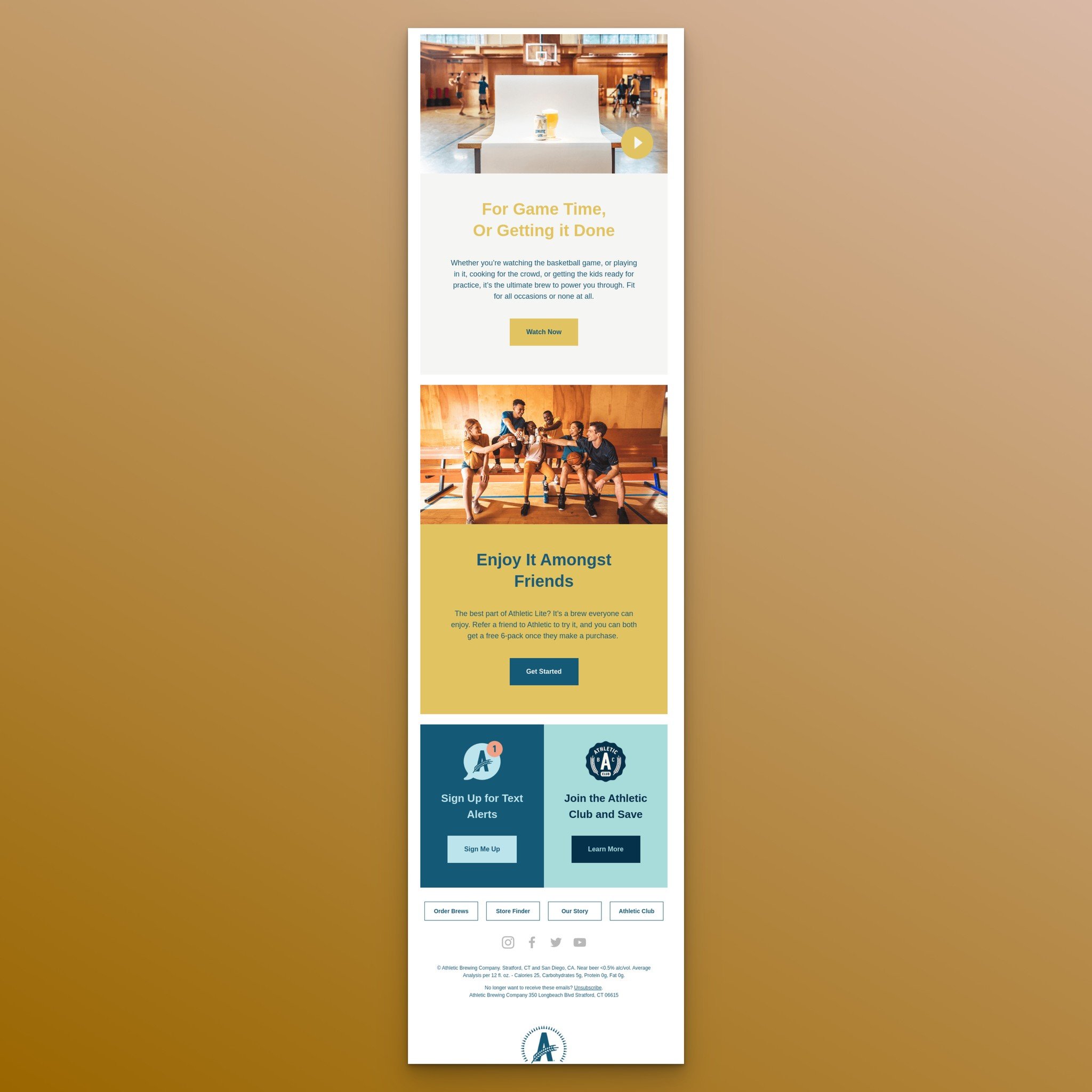
Why it works: Different subscribers consume content differently. Some want to read about features. Others want to watch a video. Some respond to social proof (the friends photo). By including all three content formats, Athletic Brewing maximizes the chance that every subscriber finds something that resonates with their preferred learning style.
Key takeaway: Mix content formats in your launch emails: product photography, feature copy, video links, and lifestyle imagery. Different subscribers convert through different content types.
19. Adidas: The Minimalist Announcement
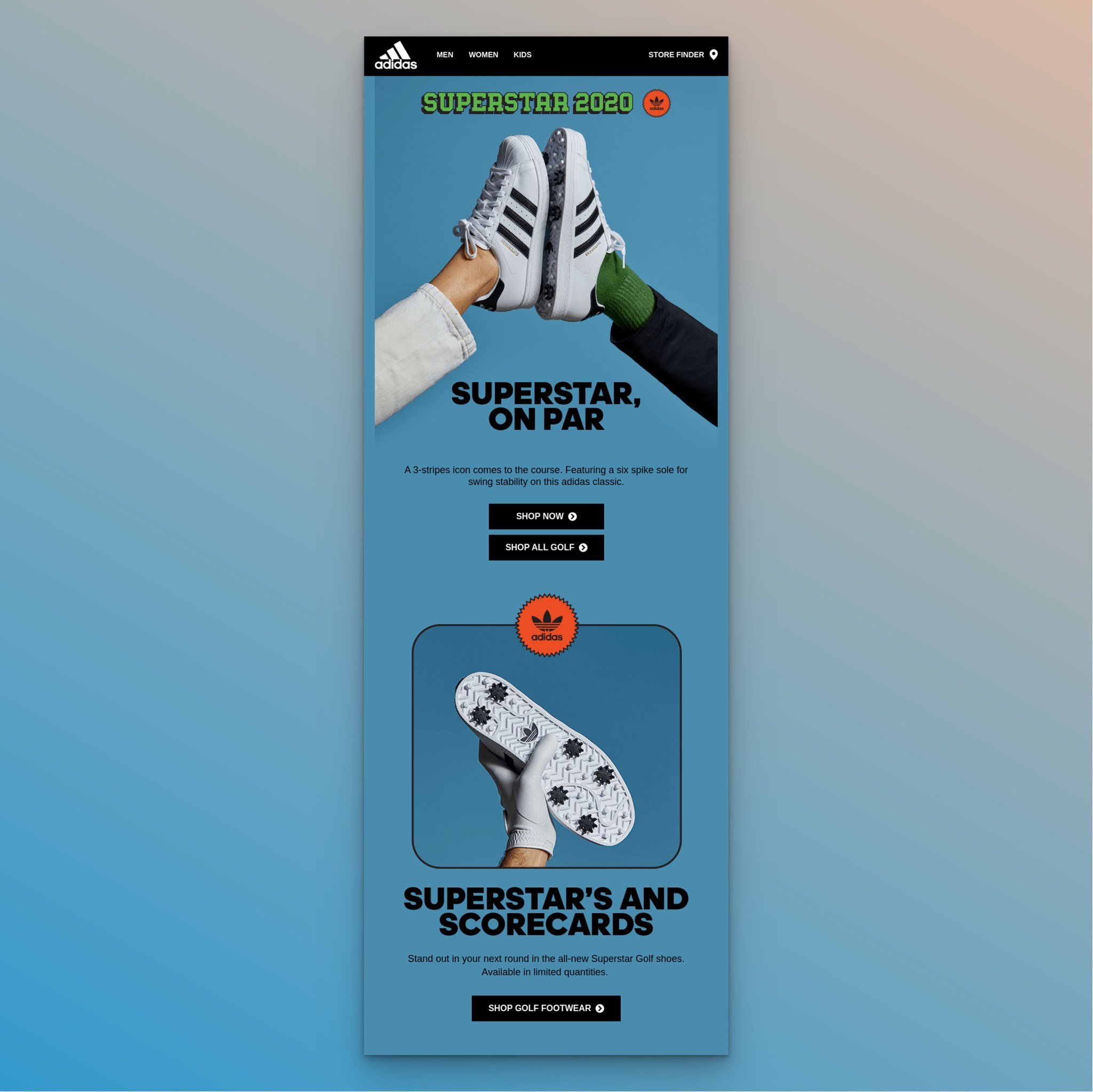
Subject Line: Superstar on par
What works: Adidas strips the email down to its essentials: product name, one hero image, a sentence of copy, and CTA buttons. A second product angle appears lower in the email with minimal description. The entire email can be consumed in under 10 seconds.
Why it works: For established brands with strong recognition, less really is more. Adidas doesn't need to explain who they are or why you should trust them. They just need to show you the product. The brevity also works in their favor for mobile readers, where scroll depth drops sharply after the first viewport.
Key takeaway: If your brand has strong recognition, test ultra-short emails. Sometimes two sentences and a great product photo outperform a 500-word email because they respect the subscriber's time.
20. Bellroy: The Brand Story Email
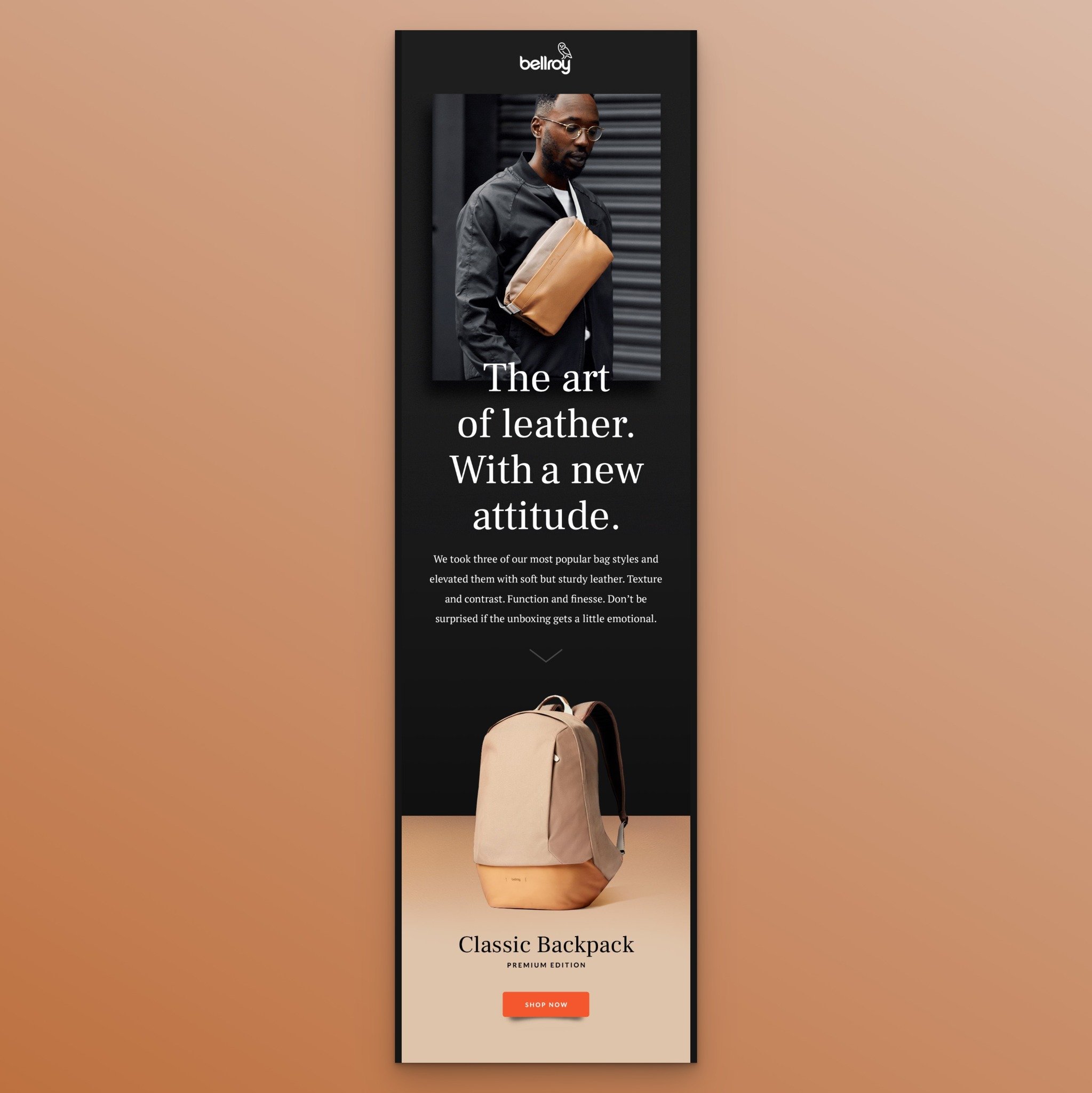
Subject Line: Introducing: Bellroy Premium
What works: "The art of leather. With a new attitude." positions this as more than a product launch; it's a brand evolution. The email combines product shots with a "Shop Now" button, then goes deeper: a promotional video link, and a closing quote from the brand's founding designer. It's part announcement, part brand manifesto.
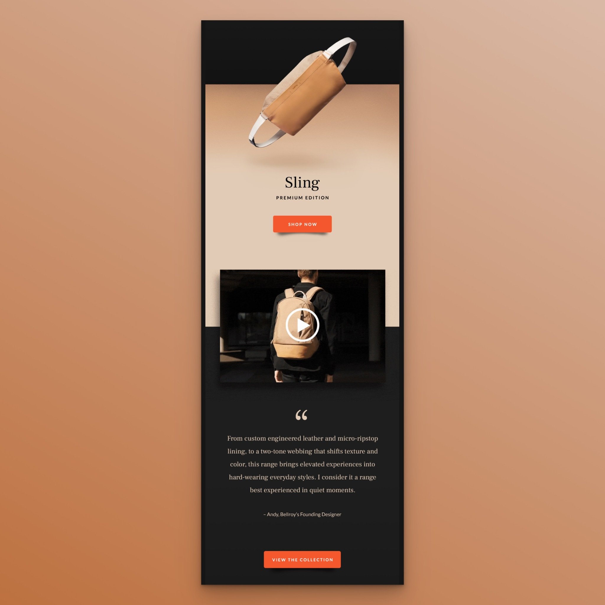
Why it works: The founder's quote adds authenticity that no amount of marketing copy can replicate. When subscribers read words from the actual designer, the product gains a human origin story. This is particularly effective for premium products where customers want to know the "why" behind the price tag.
Key takeaway: Include a quote from your founder, designer, or product lead in your launch email. It adds a human element that builds trust and differentiates your email from template-driven competitors.
Best Practices for New Arrival Emails
After analyzing these 20 examples, clear patterns emerge. Here are the practices that separate high-performing new arrival emails from the ones subscribers ignore.
Write subject lines that preview the benefit. The best-performing subject lines in our examples either state the product name directly (Apple, Italic) or lead with the incentive (J. Crew's "50% off new arrivals"). Avoid vague teasers. According to Campaign Monitor's research, emails with personalized subject lines are 26% more likely to be opened.
Use one primary CTA per email section. Every high-performing example in this list has a dominant call to action. Samsung uses "Buy Now." Italic uses "Get notified first." Ashley & Co uses "Order for your pup here." When you give subscribers one clear action, they're more likely to take it. Multiple competing CTAs dilute click-through rates.
Match your email design to your brand identity. Moment's peach color scheme, Rifle Paper Co.'s artisan aesthetic, and Apple's minimalism all reflect their brand. Your new arrival email is a brand touchpoint. If it looks like a generic template, it undermines the "new and special" framing you're trying to create.
Include product images from multiple angles. Hardgraft, Apple, and Bellroy all show their products from different perspectives within a single email. For physical products, this reduces uncertainty. For digital products, use screenshots showing different features or views.
Segment by audience when possible. GAP's multi-collection approach and Ashley & Co's niche targeting demonstrate that one-size-fits-all emails underperform targeted ones. If your email capture strategy collects preference data, use it to send relevant new arrivals to the right segments.
A/B test your subject lines. Run split tests on subject line length, personalization, and whether to include emojis or discount percentages. According to HubSpot's marketing data, email marketing drives a 2.8% conversion rate for B2C brands. Even small subject line improvements compound over thousands of sends.
Combine new arrivals with an incentive. Alex & Ani and J. Crew both pair new products with discounts. If offering a discount isn't viable, consider free shipping, early access, or a bundling deal. The incentive doesn't need to be large. It just needs to tip the balance for subscribers who are on the fence.
New Arrival Email Subject Line Ideas
Your subject line determines whether subscribers open your email or scroll past it. I've organized these ideas by strategy based on what worked in the examples above.
Curiosity-driven subject lines:
• You haven't seen this before
• Something new just dropped
• Open for a surprise (hint: it's new)
• This changes everything
Urgency-driven subject lines:
• Only 200 available. New drop inside
• First access: new collection drops at midnight
• New arrivals + free shipping (this weekend only)
• Selling fast: our newest launch is almost gone
Benefit-driven subject lines:
• New arrivals starting at $19
• 30% off our latest collection (this week only)
• Your wardrobe upgrade just arrived
• Fresh styles, shipped free today
Seasonal subject lines:
• Spring just arrived in your inbox
• New summer collection: your warm-weather essentials
• Fall favorites: just landed
• New year, new arrivals (and 40% off)
Brand collaboration subject lines:
• [Brand A] x [Brand B]: the collection is live
• We teamed up with [Partner] for something special
• A collab you didn't see coming
Start Building Your New Arrival Email Strategy
The 20 new arrival email examples above share a common thread: they all treat a product launch as an event, not a routine notification. Whether you're running a luxury collaboration (Adidas x Gucci), a minimalist announcement (Hardgraft), or a discount-driven launch (Alex & Ani), the formula stays the same: strong visual, clear benefit, one CTA.
Pick two or three tactics from this list that match your brand's voice and your audience's expectations. Test them against your current approach. If you're building your email list from scratch, pair these emails with email popups to grow your subscriber base before your next launch.
The brands winning at email marketing aren't doing anything mysterious. They're sending the right product to the right audience at the right time, wrapped in design that matches who they are. Your new arrival email should do the same.
Frequently Asked Questions
How do I announce a new product through email?
Start by building a teaser campaign 1-2 weeks before the launch. Send a pre-launch email (like Italic's "Tomorrow: Italic Beauty" approach) to gauge interest and build a segment of subscribers who want early access. On launch day, send the full announcement with clear product images, a benefit-driven headline, and a single prominent CTA. Follow up 48 hours later with a reminder email targeting subscribers who opened but didn't click.
What makes a great new arrival email subject line?
The highest-performing subject lines in our analysis share three traits: they're under 50 characters, they mention either the product name or the incentive, and they create a reason to open now rather than later. Apple's "Get big sound from HomePod mini for $99" packs the product, the benefit, and the price into one line. J. Crew's "Get ready to party...with 50% off new arrivals" uses the ellipsis to create a pause that leads to the payoff. Test whether your audience responds better to specificity or curiosity.
How often should I send new arrival emails?
It depends on your launch cadence. Brands with weekly inventory updates can send weekly. If you launch products monthly or quarterly, send a teaser 2-3 days before and the main announcement on launch day. The key is matching frequency to your actual product pipeline. Subscribers will lose interest if your "new arrivals" are recycled products. Building an announcement bar on your site can supplement email frequency without cluttering inboxes.
What are tips for boosting sales with new arrival emails?
Combine new arrivals with time-limited incentives (introductory pricing, free shipping, or bundled discounts). Segment your list so each subscriber sees arrivals relevant to their past purchases. Include multiple product angles and lifestyle images. Use back-in-stock email sequences for items that sell out quickly, then cross-reference those with new arrival announcements for similar products. Finally, pair your email campaigns with on-site popup messages to capture visitors who arrive from the email but don't purchase immediately.
Can new arrival emails work for SaaS and service businesses?
Absolutely. MailNinja's example in this list proves that service businesses can use the same framework. Replace product photography with interface screenshots or demo videos. Frame new features, tools, or resources as "new arrivals" using product launch email formatting. SaaS companies can announce new integrations, feature updates, or free tools using the same structure: benefit-driven headline, visual preview, and a clear CTA.


