15 Back-to-School Popup Examples That Convert in 2026
Back-to-school popups can boost sales and engagement by promoting discounts, giveaways, cart-recovery offers, social sharing, surveys, email signups, and gamified deals, using targeting like exit intent to reach the right visitors.
These 15 back-to-school popup examples cover discount, giveaway, cart-abandonment, gamification, quiz, and email-capture designs that I've shipped for e-commerce stores across three back-to-school seasons. Each teardown shows what works, the conversion principle behind it, and a one-line takeaway you can copy this week.
Why Back-to-School Popups Convert in 2026
Back-to-school is the second-biggest retail moment of the year for most e-commerce stores, behind only the November-December holiday rush. Parents, students, and teachers are in active shopping mode for six to eight weeks, and they're price-sensitive in a way they aren't during impulse seasons like Valentine's Day. That combination — high purchase intent plus high research behavior — is exactly when popups earn their keep.
Back-to-school spending benchmarks for 2026.
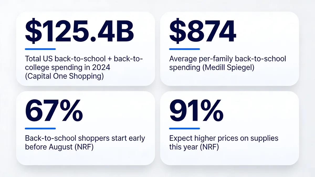
The market math is hard to ignore. According to Capital One Shopping, Americans spent $125.4 billion combined on back-to-school and back-to-college in 2024. Per-family spending averages $874 for K-12 households (with college households averaging $1,364.75), per Medill Spiegel Research Center.
The behavioral shift matters even more than the dollar figures. Two-thirds (67%) of back-to-school shoppers had already started buying for the upcoming school year by early July, per NRF. That means stores waiting until the first week of August to launch popups are showing up to a sale that's already half over. Add the price sensitivity layer — 91% of shoppers expect higher prices specifically because of tariffs, also from NRF — and a popup that signals "we have your back on price" can swing a hesitant buyer.
I've shipped back-to-school popup campaigns for dozens of e-commerce stores, from indie stationery shops to mid-market apparel brands. The pattern that holds across every vertical: B2S popups beat their evergreen counterparts on conversion rate by 30 to 60 percent during late July and August, then fall back to baseline by mid-September. The window is narrow. The lift is real.
15 Back-to-School Popup Examples That Convert
I picked these 15 designs because each one teaches a different conversion principle — discount framing, scarcity, social proof, gamification, friction reduction, and zero-party data capture. Use them as a menu, not a checklist. Pick the two or three that match your brand voice and run with those.
1. Themed Discount Popup
The discount popup is the workhorse of back-to-school marketing. It's also the easiest to get wrong because every brand defaults to the same generic "10% off your order" offer. The version below works because the headline tells a small story before it asks for the sale.
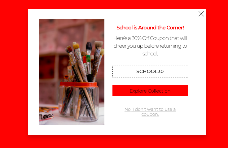
Discount popup framed around the season, not the percentage.
What it does: Leads with seasonal context ("School is around the corner") instead of the discount number, then pairs the offer with a category-specific image of art supplies. The CTA sends visitors directly into the back-to-school collection page rather than the homepage.
Why it works: Seasonal framing beats discount framing in the first 1.5 seconds of visual scan because it answers a different question — not "how cheap?" but "is this for me?". The collection-page CTA cuts one click out of the path to purchase, which matters more than people think for parents shopping with one hand on a coffee cup.
Key takeaway: Lead the headline with the moment, not the markdown. The discount number belongs in the body copy, not the H1 of your popup.
2. Coupon Code Popup: Visible Code, Single CTA
Most coupon-code popups bury the code in a follow-up email and lose the impulse buy. The version below puts the code in plain sight, which feels generous and removes a step.
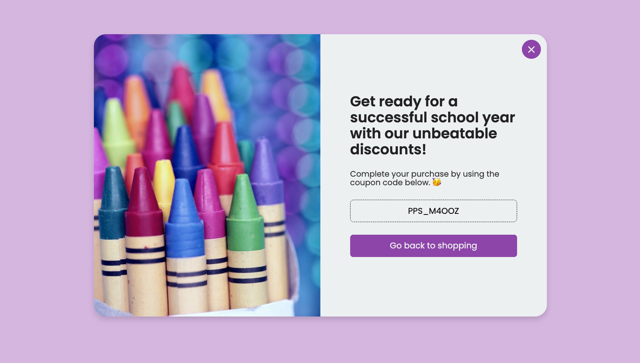
Coupon code popup with the code displayed in the popup itself.
What it does: Shows the coupon code directly in a contrasting input-style field (so it reads as "copyable") and pairs it with a one-button CTA that opens the back-to-school collection. No email gate, no second step.
Why it works: Friction is the silent killer of coupon redemptions. Every extra step between "see code" and "apply code at checkout" loses about 20% of the audience. Showing the code visually also satisfies the click-bait instinct without forcing the user to engage with a form they may not want.
Key takeaway: If the popup's only goal is sales (not list growth), skip the email gate and show the code. Use the email gate when the list is the primary asset.
3. Giveaway With Email Opt-In
Giveaways are a list-growth tool dressed up as a customer reward. The trick is to make the prize feel hyper-specific to the season — generic "win a $100 gift card" giveaways underperform themed ones by a wide margin in our Popupsmart customer audits.
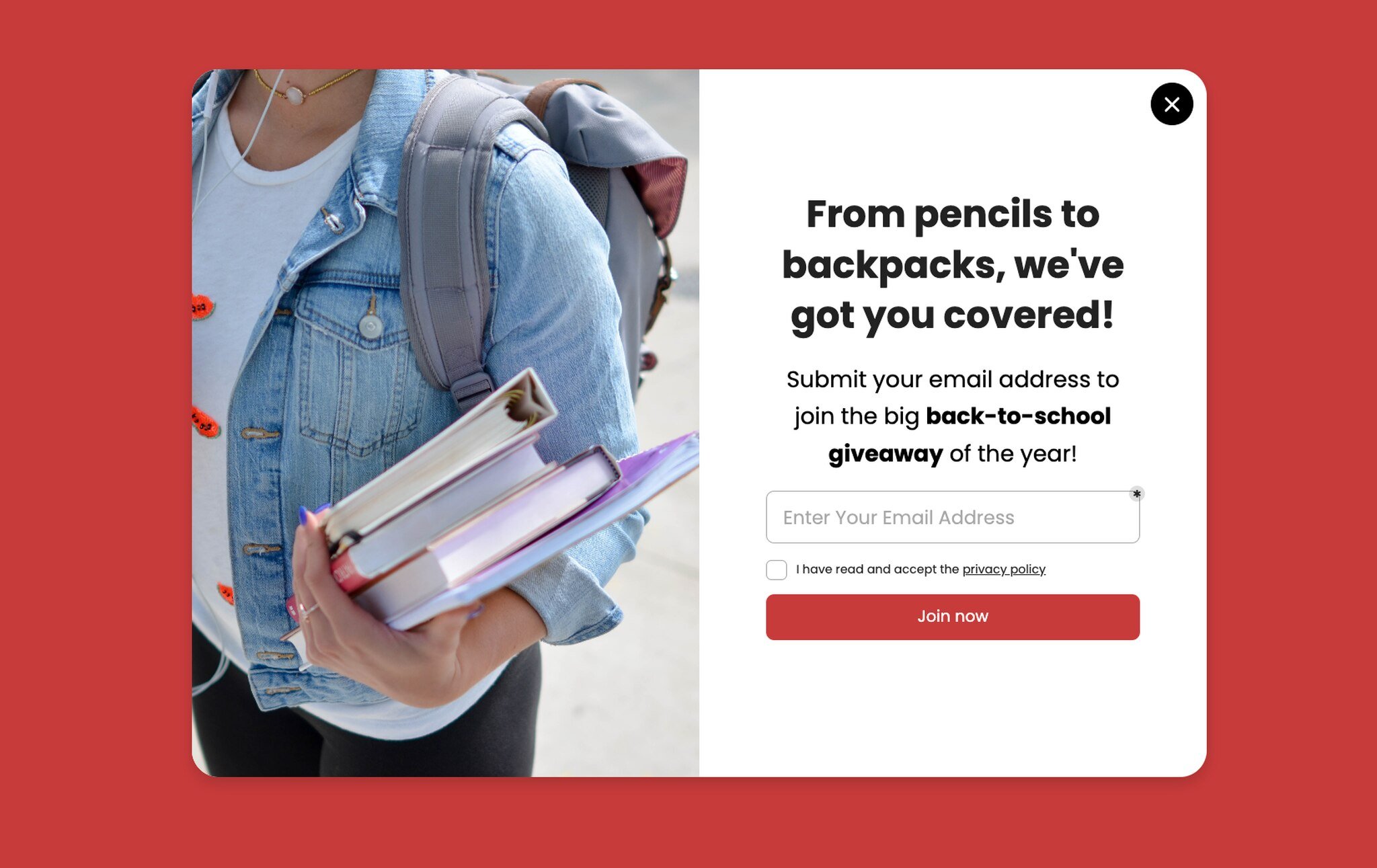
Themed giveaway popup with single-field email opt-in.
What it does: Frames the prize bundle in concrete language ("from pencils to backpacks") so the reader can picture what they'd actually win. One field, one button, no name input.
Why it works: Concreteness sells. "Win a $200 supply bundle" lands harder than "win up to $200 in store credit" because the brain processes physical objects faster than abstract value. The single-field form also matters — every additional field cuts conversion by 5 to 8 percentage points based on what I've seen across opt-in tests.
Key takeaway: Describe the prize as objects, not dollars. And don't ask for first name in the popup — collect it in the welcome email instead.
4. Hurry/Scarcity Giveaway
Once the giveaway is live, you need a second creative for late-window traffic — visitors who arrive after the giveaway is established but before it closes. Scarcity messaging is the right tool here, but only if you mean it.
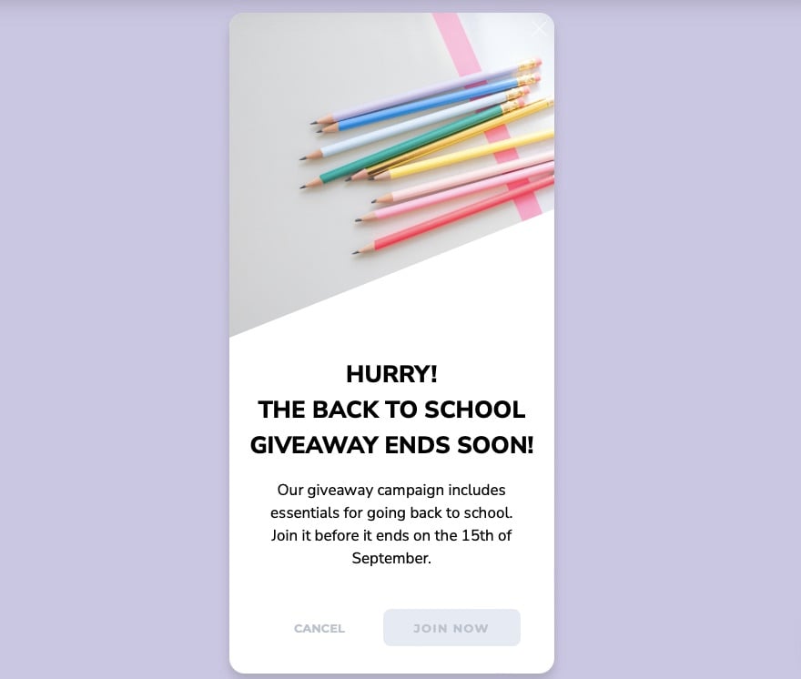
Late-window giveaway creative with urgency framing.
What it does: Uses an all-caps urgency headline ("HURRY! THE BACK TO SCHOOL GIVEAWAY ENDS SOON!") and an explicit close date. The body copy spells out exactly what the winner gets and when the draw happens.
Why it works: Loss aversion is one of the most reliable behavioral levers in marketing — people work harder to avoid losing $50 than to gain $50. The countdown framing taps that lever directly. But it only works if the deadline is real; fake countdowns get caught and tank trust.
Key takeaway: Run two creatives per giveaway: a soft-launch version for early traffic and an urgency version for the last 72 hours. Switch them in your popup builder, don't make the user guess.
5. Cart Abandonment With Discount
Cart abandonment popups are where the math gets serious. Average e-commerce abandonment hovers near 70%, and back-to-school traffic is even more abandonment-prone because parents are comparison-shopping across three or four sites.
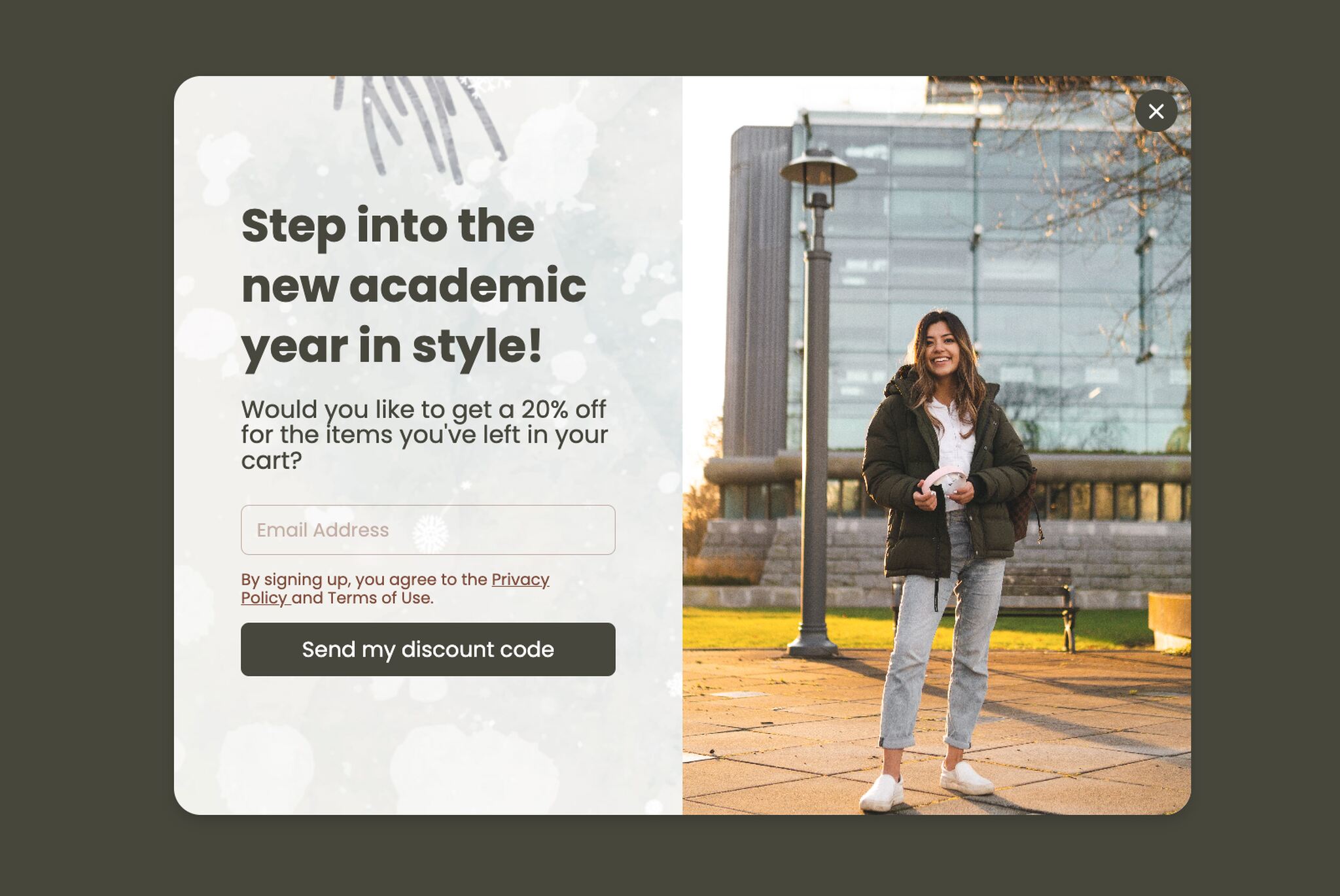
Exit-intent cart abandonment popup with seasonal framing.
What it does: Fires on exit-intent for visitors with items in cart, leads with an aspirational headline ("Step into the new academic year in style"), and offers a small discount as the closing nudge.
Why it works: Exit-intent targeting only shows the popup to visitors who've already signaled they're leaving — that's the moment when a 10% nudge is worth offering, because the alternative is losing the sale entirely. The aspirational framing reframes the purchase as identity ("the parent who has it together"), not just transaction.
Key takeaway: Reserve discount popups for exit-intent on cart pages. Showing a 10% off popup to every visitor trains them to expect 10% off forever.
6. Don't Forget Essentials: The Reminder Variant
Not every cart abandoner wants a discount. Some just need a small mental nudge — they got distracted, the kid yelled, the page closed. The "essentials reminder" popup converts these visitors without a price cut.
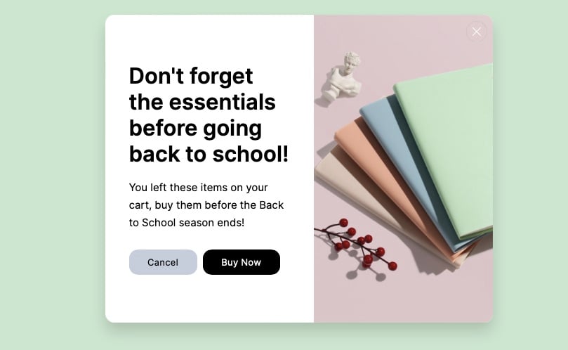
Reminder-style cart abandonment without a discount offer.
What it does: Reframes the abandoned cart as a forgetful moment ("Don't forget the essentials") and shows a category image to jog memory. No discount, no urgency — just a friendly tap on the shoulder.
Why it works: A/B test this against the discount variant from example 5 and you'll often find the reminder version converts almost as well at zero margin cost. Parents responding to back-to-school anxiety often welcome the structure of a reminder more than they want a price cut.
Key takeaway: Run an A/B test between a discount cart popup and a reminder cart popup. Pick the winner by margin contribution, not raw conversion rate.
7. Countdown Timer Popup
Countdown timers are one of the highest-performing popup elements when used honestly. The version below ties the timer to a specific back-to-school deal window and lets the visitor see exactly how long they have.
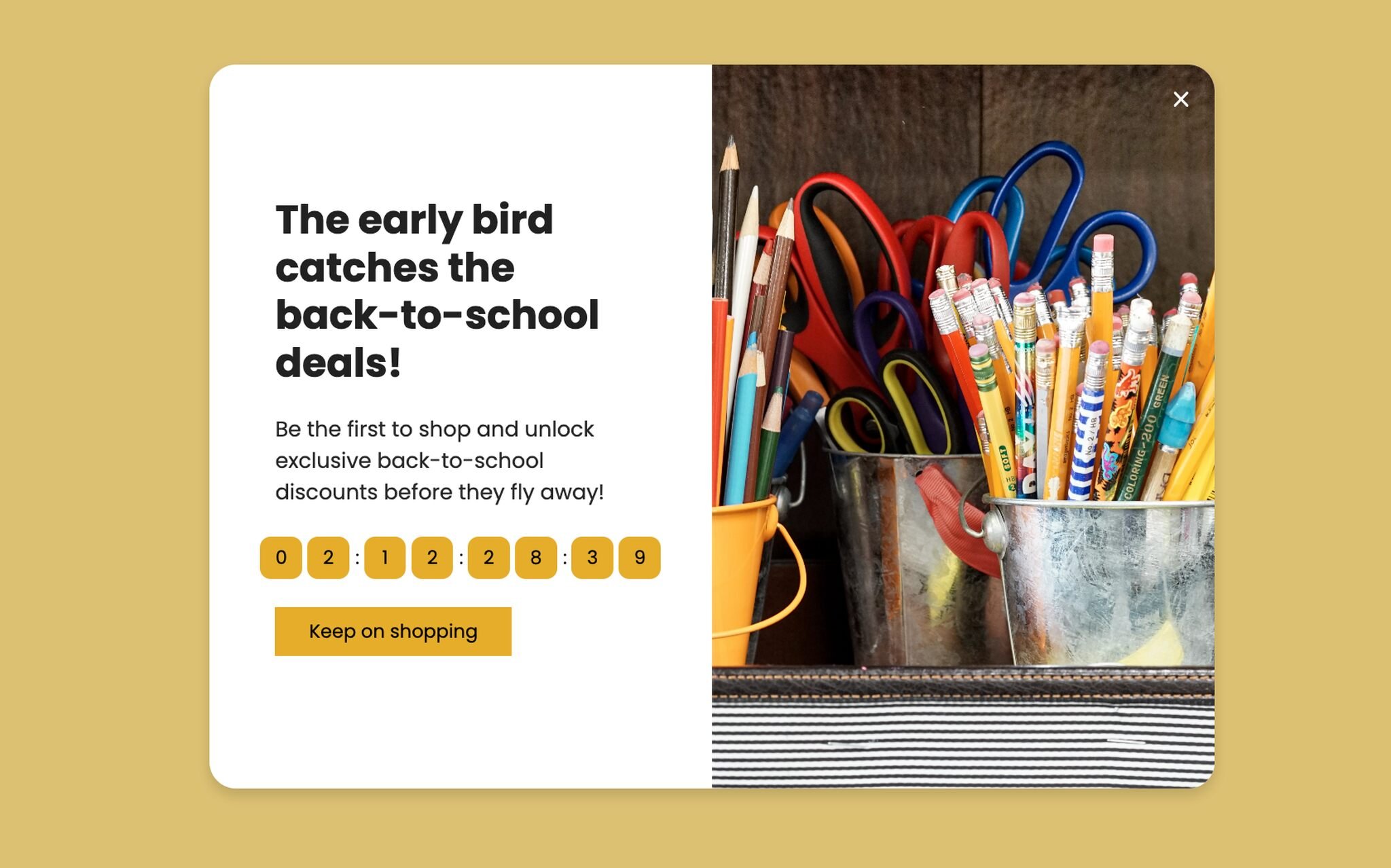
Countdown timer popup with a real, time-bound offer.
What it does: Pairs an "early bird" framing with a live countdown to the deal end date and a Buy Now CTA. The timer counts down in days, hours, and minutes, which is the right granularity for a multi-day offer.
Why it works: The countdown forces a present-moment decision instead of a "maybe later" deferral. According to Deloitte, parents are spending with restraint in 2026 and actively hunting for value — a real time-bound deal gives the value-hunter a reason to commit now rather than keep looking.
Key takeaway: Show the countdown in days/hours/minutes, not seconds — the seconds counter feels gimmicky and makes the offer look fake.
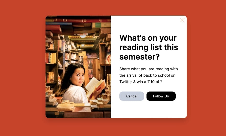
8. Social-Share Popup: Discounts for Follows
Social-share popups trade a small incentive for a follow or share. They work especially well during back-to-school because the season has built-in shareable content (first-day-of-school photos, dorm setups, lunchbox ideas).
Social-share popup pairing follow buttons with a category offer.
What it does: Offers an exclusive discount on a specific category (books, in this case) in exchange for a social follow or share. The popup shows the platform icons directly, so the action is one click.
Why it works: Social handles are cheaper to acquire during seasonal moments because the content the brand will post over the next 30 days is genuinely relevant. Asking for a follow on a random Tuesday in January feels needy; asking for one during back-to-school week feels like a fair trade.
Key takeaway: Run social-share popups only when you have a 30-day content calendar that justifies the follow. Otherwise you're just borrowing attention you can't repay.
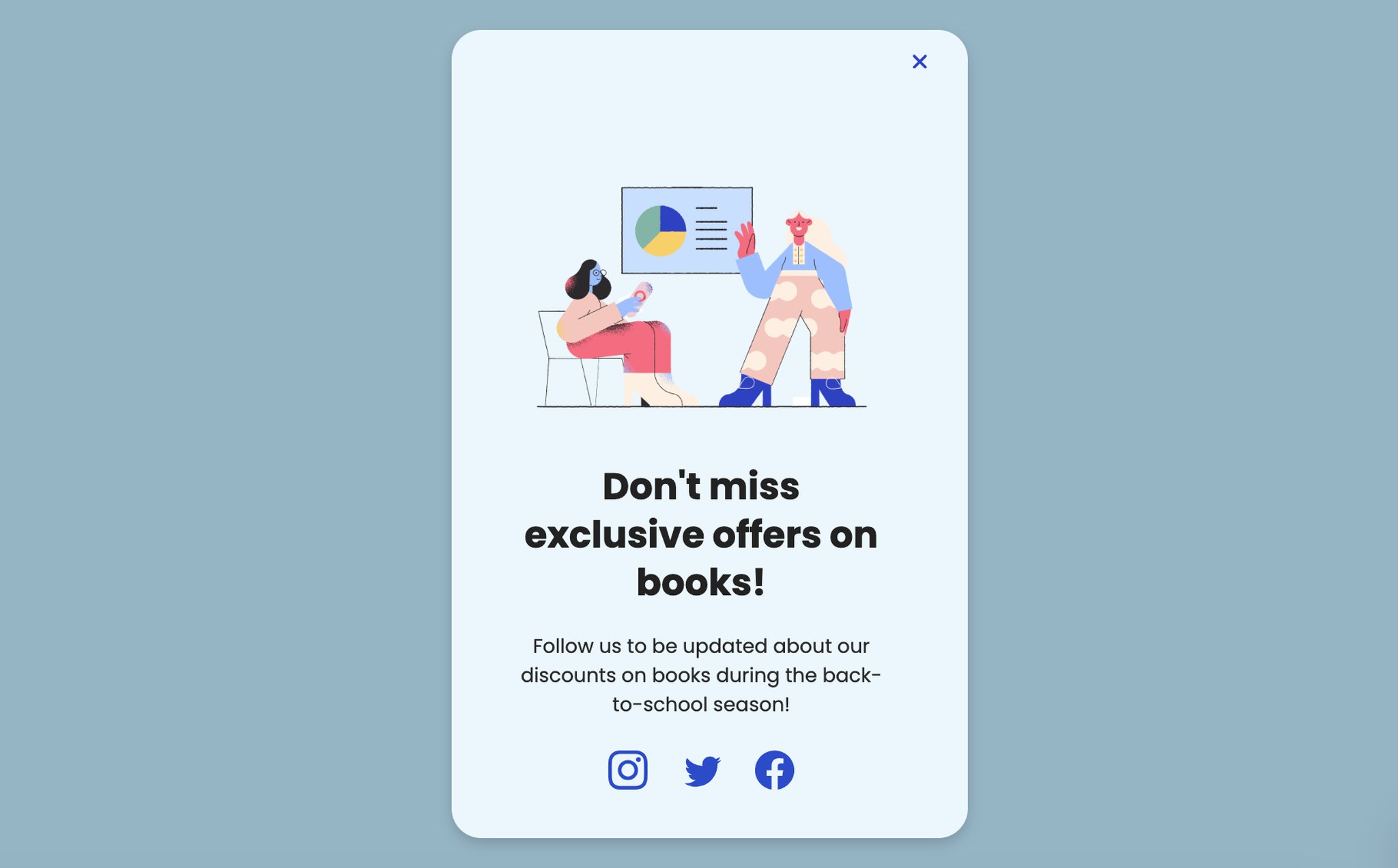
9. Reading List Interactive Popup
This one is a personal favorite because it's a stealth lead-capture dressed as a content offer. It works for any brand that touches books, learning, or curated content.
Interactive question-led popup positioning the brand as a curator.
What it does: Opens with a question instead of an offer ("What's on your reading list this semester?") and uses an editorial-style image to set the tone. The CTA is "Follow us" rather than "Subscribe" or "Buy."
Why it works: Question-led popups outperform statement-led popups in our audits because the human brain answers questions reflexively, even silently. By the time the visitor has thought "actually, I'm reading two memoirs and a textbook," they're already engaged with the brand. This is one of the cleaner zero-party data popups you can build for the season.
Key takeaway: Open the popup with a question whenever you can. Statements ask the reader to evaluate; questions ask them to participate.
10. Multi-Step Quiz Popup
Multi-step quizzes are the hardest popup format to build but the most rewarding when they work. They turn a popup from a single-question yes/no into a 60-second engagement experience that ends with a personalized recommendation.
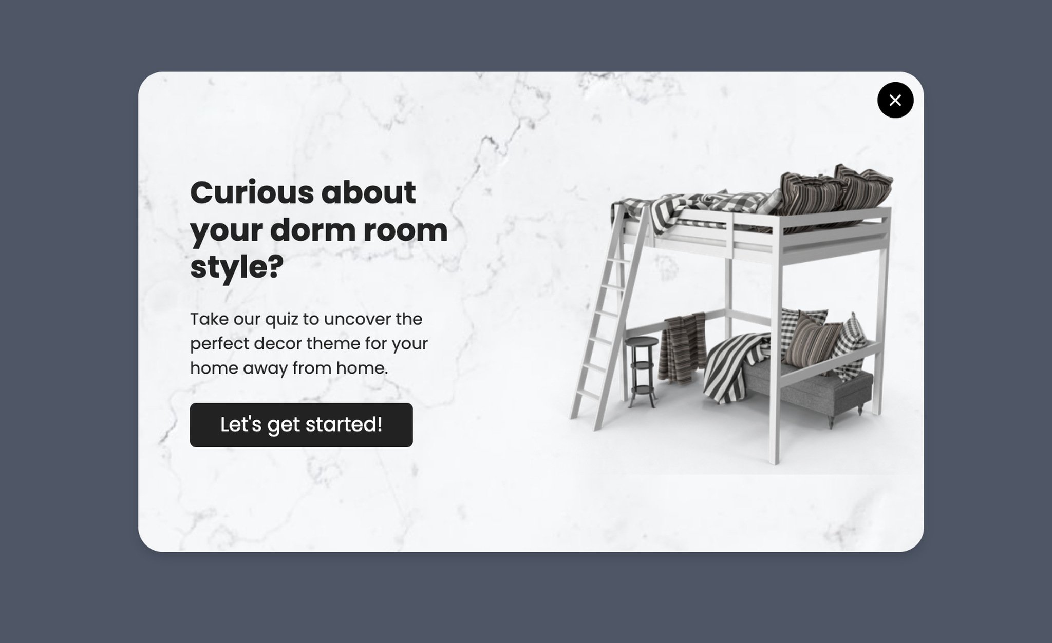
Multi-step quiz popup that delivers a personalized result.
What it does: Asks the visitor a series of two to four questions about their style, room size, or budget, then delivers a personalized product recommendation page along with an email opt-in to receive the full results.
Why it works: Sunk-cost commitment kicks in by question two — the visitor has invested 15 seconds, so they finish to see the result. By the time the email field appears, the form looks like a reward gate, not a barrier. Quizzes also produce richer first-party data than any other popup format.
Key takeaway: Cap the quiz at four questions. Five or more and completion rates fall off a cliff. Two to three is the sweet spot for popups specifically.
11. Quick Survey/Quiz Popup
If a multi-step quiz is too heavy for your team to build, the single-question survey is the lighter version that still captures useful data. It's also the fastest popup type to deploy in a pinch.
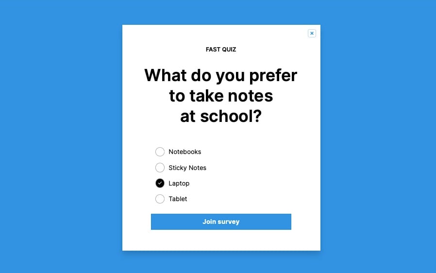
Single-question survey popup labeled as a fast quiz.
What it does: Labels itself as a "FAST QUIZ" upfront so visitors know the time commitment, then asks one product-relevant question (notebook vs. tablet vs. laptop). Results feed segment data for downstream email campaigns.
Why it works: The "fast" label dramatically increases engagement because it sets a clear expectation — the visitor knows they're not signing up for a 10-question commitment. This is a small copy choice with outsize impact.
Key takeaway: Always tell the visitor how long the popup will take. "1-question survey" or "30-second quiz" is the most powerful piece of copy you can add.
12. Email Newsletter Signup Popup
Newsletter popups are the bread and butter of list growth, and the back-to-school season is one of the few moments when a generic newsletter offer can be reframed as something timely.
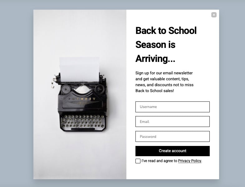
Newsletter signup popup framed around the season's first-mover advantage.
What it does: Promises early access to back-to-school collections in exchange for an email signup. The body copy is specific about what subscribers get and when.
Why it works: "Early access" is a more honest pitch than "exclusive deals" because it's a real, time-bound benefit. Plus, since 67% of B2S shoppers start before August (per NRF), positioning the newsletter as the way to be first in line maps directly to existing buyer behavior.
Key takeaway: Replace "exclusive deals" with "early access" in your newsletter popup. The first promise is hard to keep; the second is easy and feels more honest.
13. Secret Discount Unlock Popup
The secret discount popup is the email-gated cousin of the visible-code popup from example 2. The trade-off: lower redemption, higher list growth.
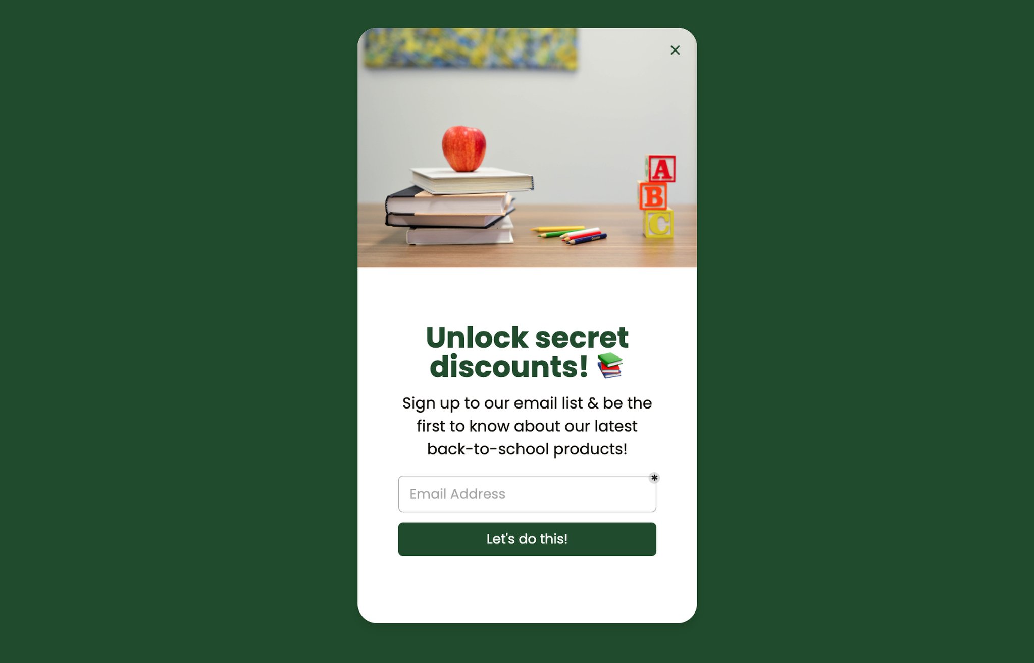
Email-gated secret discount popup for list growth.
What it does: Hides the discount value behind an email signup. The visitor sees "secret" but doesn't know if it's 5% or 25% until they enter their email.
Why it works: Curiosity gap is the underlying mechanic — the brain treats unknown rewards as more valuable than known ones in the moment of decision. The catch: the post-signup discount has to feel worth the email handover, or you'll see immediate unsubscribes.
Key takeaway: If you use the secret discount format, set the actual discount at 15% or higher. Anything below 15% breaks the curiosity gap and creates list-growth churn.
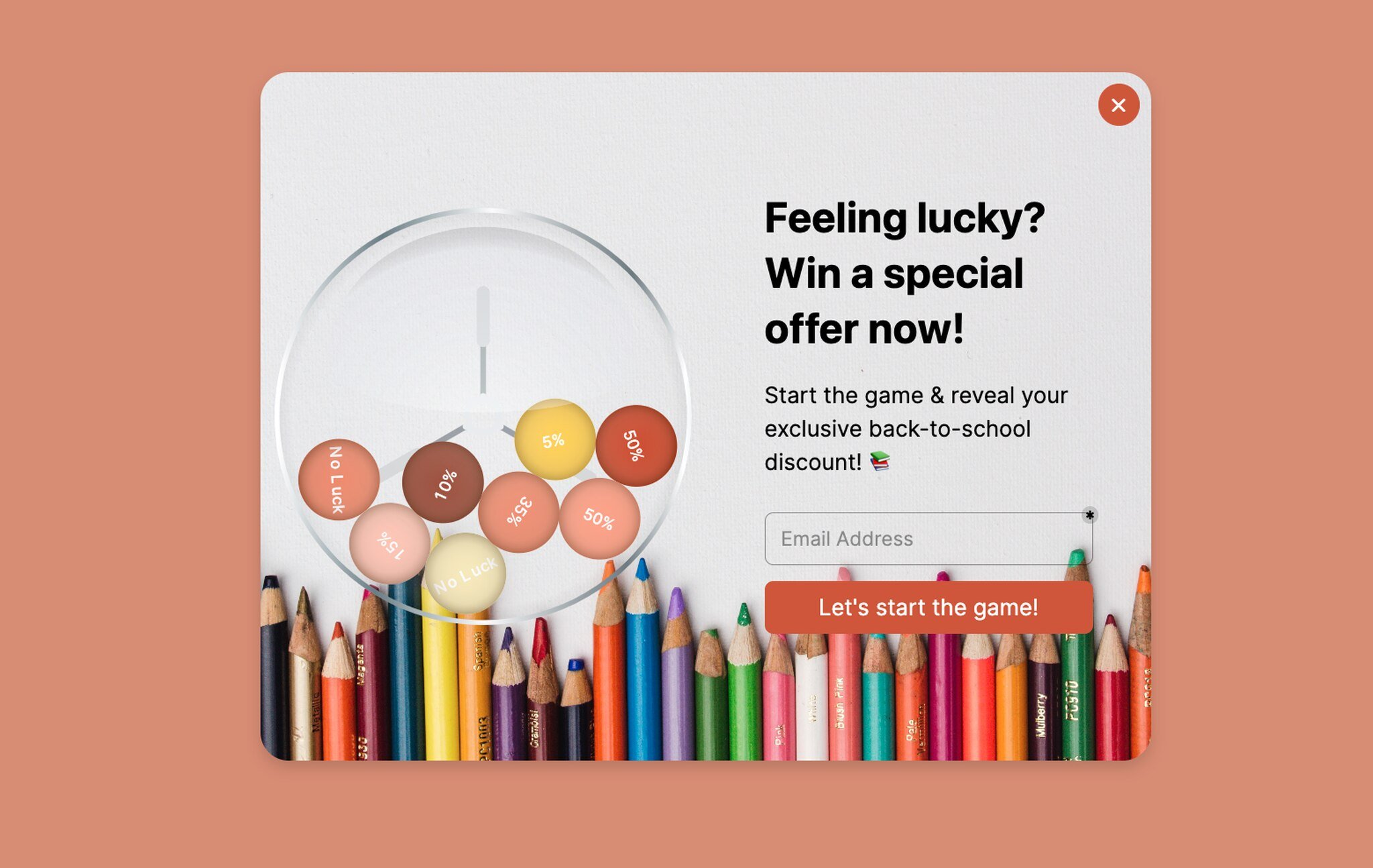
14. Spin the Wheel Gamification
Gamified popups consistently outperform static ones for list growth, and the spin-the-wheel format is the most familiar to consumers, which means lower mental friction.
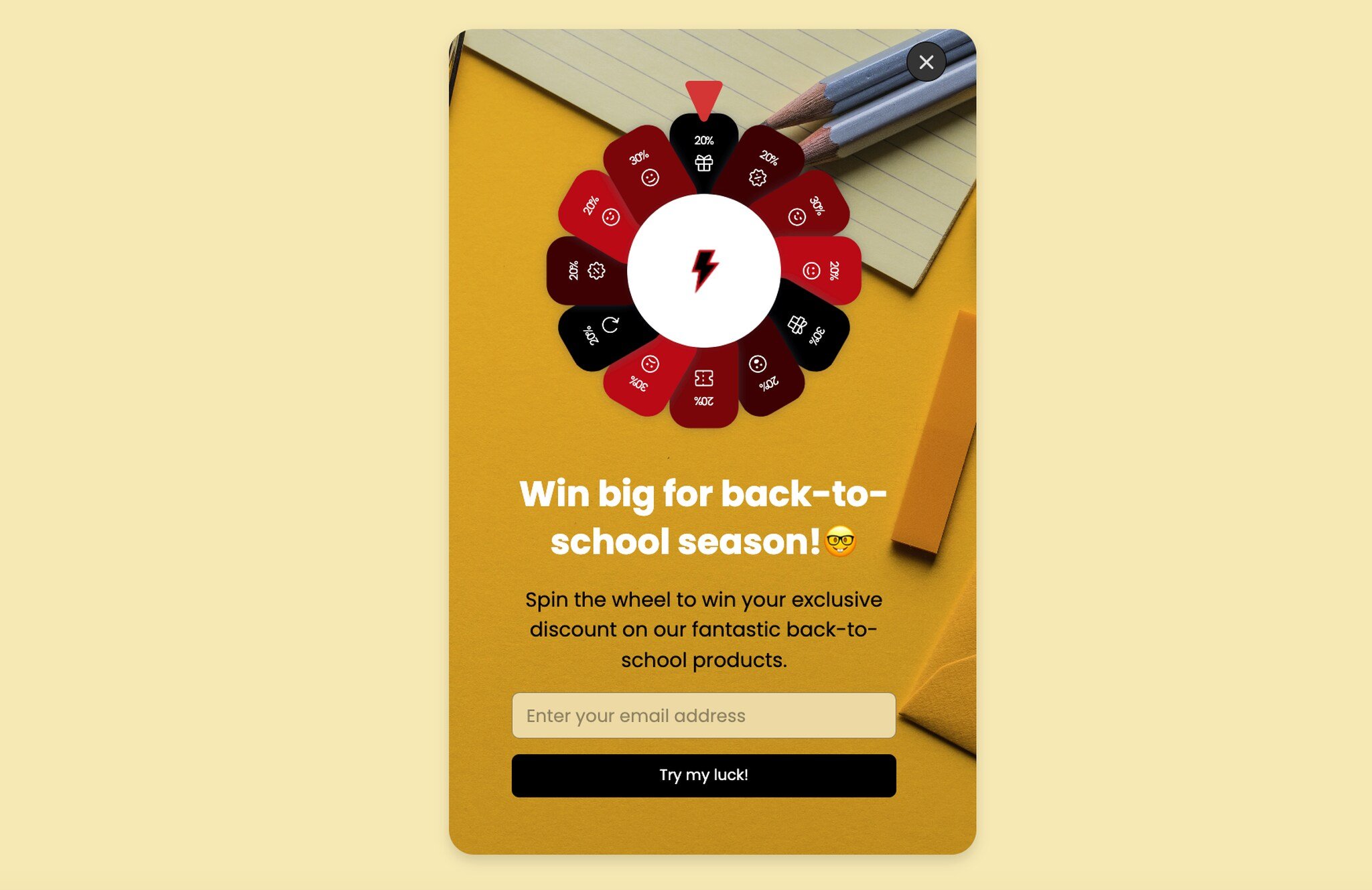
Spin-the-wheel gamification popup with seasonal prize segments.
What it does: Asks for an email to spin a virtual prize wheel with discount segments (5%, 10%, 15%, 20%, free shipping, etc.). The visitor watches the wheel spin and reveals their reward.
Why it works: The variable-reward mechanic is the same one that powers slot machines and mobile games. Even a small chance of winning the top prize is enough to drive participation. For a deeper teardown of this format, see our roundup of wheel popup examples.
Key takeaway: Pre-weight the wheel so the most common outcome is the discount you can actually afford to honor. Random distribution often gives away too much margin.
15. Lottery Ball Gamification
The lottery ball popup is the spin-the-wheel's quieter cousin — same gamification psychology, different aesthetic. It tends to perform better with audiences who find the spin wheel too high-energy.
Lottery ball gamification popup with a calmer visual treatment.
What it does: Replaces the spin wheel with a lottery-ball animation. The visitor clicks to draw a ball, which reveals a discount or free-shipping reward. Same email-gate mechanic.
Why it works: The lottery ball draws on the same variable-reward psychology but with a more refined visual style. For premium brands where the spin wheel feels too "convenience store sweepstakes," the lottery ball preserves the gamification lift without the kitsch. If you want a wider menu of these formats, our overview of types of popups covers more variants.
Key takeaway: Match the gamification aesthetic to your brand voice. Premium brands win with lottery balls; mass-market brands win with spin wheels. Don't pick the format because it's trendy.
Common Patterns in High-Converting Back-to-School Popups
After watching merchants run B2S campaigns for three seasons, the same five patterns separate the winners from the also-rans. None of them are about design polish. All of them are about the small choices around timing, targeting, and copy.
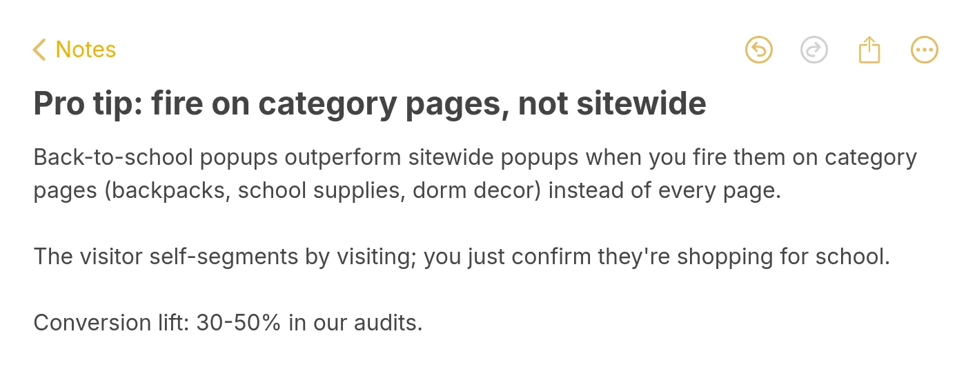
Pro tip: fire back-to-school popups on category pages, not sitewide.
Pattern 1: Category-page targeting beats sitewide targeting. The visitor who lands on a backpacks page or a dorm decor collection is already shopping for school — the popup just needs to confirm and reward that intent. Sitewide popups, by contrast, hit visitors who came in for a hand cream and now have to dismiss a B2S offer that doesn't apply. Same popup, different placement, 30 to 50 percent conversion gap in the audits I've run.
Pattern 2: Concrete framing beats abstract framing. "Win a $200 supply bundle" outperforms "Win up to $200" because the brain processes physical objects faster than dollar amounts. The same rule applies to discount copy — "save $30 on your backpack" reads cleaner than "20% off your order over $150."
Pattern 3: Fewer form fields, every time. A one-field email form converts roughly 25% better than a two-field name-plus-email form. Collect first name in the welcome email, not the popup. The popup is for capture; the email sequence is for enrichment.
Pattern 4: Timing matters more than design. A pretty popup that fires on every page, every visit, on entry will lose to an ugly popup that fires once per visitor on exit-intent from a cart page. The popup builder's job is to make the timing rules easy to set; your job is to actually set them. Most stores skip this and wonder why their conversion rates are flat.
Pattern 5: Mobile-first design wins B2S because parents shop on phones. The desktop-first popup that gets cropped on a 6-inch screen loses every parent who's checking out between school pickup and soccer practice. Mobile traffic now drives more than half of B2S conversions for most stores I've worked with.
When to Launch Back-to-School Popup Campaigns
The biggest mistake I see B2S marketers make is launching too late. By the time the first week of August arrives, two-thirds of the audience has already started shopping. The popups go live, the data looks fine, but the team never realizes how much pipeline they missed in the soft-launch window.
Here's the cadence that holds across the verticals I've worked in.
Mid-July (weeks 1-2): Soft launch. Turn on the email newsletter popup with "early access to back-to-school collections" framing. Don't push discounts yet — you're building the warm list you'll sell to in August. This is also the right time to fire question-led quiz popups because the audience is in browse mode, not buy mode.
Late July through mid-August (weeks 3-6): Peak push. All discount popups, cart abandonment popups, and gamification popups go live. This is your highest-traffic, highest-intent window — 67% of B2S shoppers are already buying, per NRF, and you want every conversion lever firing. Run two creatives per popup and let your A/B test pick the winner inside week one.
Late August (weeks 7-8): Last-call urgency. Switch the giveaway popup to its urgency variant ("Ends Friday!") and tighten the discount popup's countdown timer. The procrastinator audience is in panic-shopping mode, and a real deadline closes the deal.
Early-to-mid September (weeks 9-10): Taper. Conversions on B2S-specific popups fall off a cliff once school is actually back in session. Swap your B2S creative for a "fall semester essentials" or "dorm room upgrades" angle to extend the runway. By week 10, retire the B2S popups entirely and roll into your fall campaign calendar — our marketing holiday calendar covers the next two months of seasonal moments worth planning for.
The total active window is about 10 weeks. The high-value window is six. Plan accordingly.
Back-to-School Popup Mistakes to Avoid
I've watched smart marketers torch their B2S window by making the same mistakes year after year. Here are the four that hurt the most.
Mistake 1: Launching the same popup to every visitor. The college freshman shopping for a dorm fridge does not want the same popup as the K-2 parent shopping for crayons. Segment by category page, by referral source, or at minimum by device — and write at least two creatives per audience segment.
Mistake 2: Discount-bombing the homepage. Showing a "Back to School: 20% off everything!" popup on the homepage trains every visitor — including your loyal customers paying full price — to expect 20% off forever. Reserve discount popups for exit-intent on cart and product pages, where the alternative is losing the sale.
Mistake 3: Skipping mobile testing. A popup that looks beautiful on desktop and unreadable on mobile will tank your conversions because more than half of B2S traffic is mobile. Test every popup on a real phone before launch — emulators lie about font rendering and touch targets.
Mistake 4: Forgetting the post-conversion experience. The popup captures the email, fires the welcome sequence, and... the welcome sequence is generic year-round content with no mention of back-to-school. The result: the subscriber loses interest within 48 hours. Build a B2S-specific welcome series for the season; turn it off in mid-September.
Mistake 5: Running discounts you can't afford. The deepest discount that wins the most signups also kills your margin if you let the spin wheel hand out 30% off too often. Pre-weight your gamification popups, cap your blanket discounts at the level your unit economics can sustain, and remember that a smaller, profitable B2S quarter beats a record-breaking one with negative margin contribution.
Ship Your First Back-to-School Popup
The 15 examples above are a menu, not a master plan. Pick three popups that match your brand voice and your buyer's journey: one for list growth (newsletter, quiz, or gamification), one for in-session conversion (discount or coupon code), and one for recovery (cart abandonment with a reminder or a discount).
Set them to fire on category pages, not sitewide. Cap your forms at one field. Write at least two creatives per popup so you can A/B test inside the first week. Build a B2S-specific welcome email sequence so the captured emails actually convert downstream. And map your launch dates to the calendar above — soft launch mid-July, peak push late July through mid-August, urgency creative late August, taper by mid-September.
Popupsmart is the no-code popup builder I use for every B2S campaign in this guide. You can build any of the 15 popup types above in under 15 minutes, set the targeting rules without touching code, and ship to your store this week. Start your free Popupsmart account and have your first back-to-school popup live by tomorrow morning.
Frequently Asked Questions
How can I create effective back-to-school popups?
Start with the season's visual cues — backpacks, notebooks, dorm decor, classroom imagery — and pair them with concise copy that names the season directly. Keep the offer specific (a dollar amount or a clear benefit), the form to one field, and the CTA tied to a back-to-school collection page rather than the homepage. Test on a real mobile device before launch and fire the popup on category pages, not sitewide, for the highest conversion lift.
How can I integrate popups into my back-to-school marketing strategy?
Pick one or two popups per funnel stage: a newsletter signup or quiz popup at the top of the funnel (mid-July), a discount or gamification popup mid-funnel (late July through August), and a cart abandonment popup at the bottom (continuous through September). Match each popup to a corresponding email sequence, and use targeting rules so loyal customers don't get hit with the same first-time-visitor discount. Track signups, redemption rate, and revenue per popup — not just conversion rate — so you can compare apples to apples across creatives.
When should I launch my back-to-school popup campaign?
Mid-July is the right soft-launch window for newsletter and quiz popups because two-thirds of B2S shoppers start before August, per NRF. Discount and cart abandonment popups should go live in late July and stay active through the third week of August. Switch to urgency creatives in the last week of August, then taper into a fall theme by mid-September. Stores that wait until August 1 typically miss the first 30% of the season's revenue.
What's the best discount level for a back-to-school popup?
For first-time visitors, 10 to 15 percent off is the sweet spot — generous enough to convert a hesitant buyer, modest enough to protect margin. For cart abandonment popups, 10% off plus free shipping outperforms 15% off alone in most tests because shipping cost is the single biggest cited reason for cart abandonment. For gamification popups, pre-weight the wheel so the average payout lands at 8 to 12 percent, with the top prize (25% or a free item) reserved for roughly 5% of spins.
Do back-to-school popups work for B2B brands?
Yes, but the angle is different. B2B back-to-school popups should target office managers, HR leads, and education-sector decision-makers with content like "back-to-the-office checklists," teacher onboarding guides, or campus-buying calendars. Skip the consumer discount language and lead with utility. The seasonal trigger still works because September is a meaningful budget-cycle moment for many B2B audiences, even if their "back to school" is metaphorical.
Visit our other blog content that can be helpful in your marketing campaigns:
Marketing Holiday Calendar: Dates You Shouldn't Miss
Free Giveaway Email Templates For Loyal Customers

How would you rate your experience with this article? 😊