How to Build a Popup That Opens on a Button Click
 ChatGPT
 Perplexity
 Claude
 Grok
Grok Google AI Mode
Popupsmart explains why on-click popups outperform intrusive ones and shares 3 ways to build them: custom HTML/CSS/JS modal, Popupsmart’s on-click targeting builder, or a teaser that opens a popup. Includes use cases and optimization tips.
If you’re struggling to engage website visitors without overwhelming them, a popup that opens with a button click could be your game-changer.
Popups that appear automatically can annoy users, with 68% of visitors leaving websites due to intrusive popups. In my experience, on-click popups strike the perfect balance, empowering users to engage on their terms while boosting conversions effortlessly. This guide dives into three straightforward methods to create a popup triggered by a button click, backed by fresh data and real-world examples to help you optimize your website’s performance.
Quick Summary By Popupsmart
Struggling with low engagement or high bounce rates? This blog post reveals three proven methods to create on-click popups that boost conversions by empowering users to trigger them with a button. From coding a custom HTML popup to using Popupsmart’s user-friendly builder or adding teasers, you’ll learn practical steps, backed by 2024–2025 statistics and case studies, to enhance user experience and drive results.
Why Show Popup on Button Click
The Problem: Intrusive Popups Push Visitors Away
Traditional popups often disrupt the user experience, appearing at the wrong time and driving visitors away. In 2024, 73% of users reported closing popups without engaging. This creates a challenge: how do you capture attention without frustrating your audience?
The Agitation: Missed Opportunities and Poor Engagement
When popups interrupt browsing, they break user flow, leading to higher bounce rates and lost conversions. I’ve seen websites lose potential leads because popups appeared before visitors were ready to engage. The Zeigarnik Effect—where incomplete tasks drive action—can’t work if users feel forced. Worse, 64% of e-commerce sites report lower conversion rates due to poorly timed popups.
The Solution: On-Click Popups Empower Users
On-click popups solve this by letting users decide when to engage, creating a sense of control and boosting interaction. Here’s why they’re a must-have:
- Compelling Clickable Buttons → A two-step opt-in mechanism empowers visitors to trigger the popup by clicking a button with a compelling call-to-action, instantly capturing attention.
- Harness the Zeigarnik Effect → By initiating an action (clicking the button), users feel compelled to complete the task, increasing engagement.
- Deepen User Commitment → This initial click signals intent, making users 45% more likely to convert.
- Enhanced User Experience → Users shape their journey, reducing frustration and fostering positive interactions.
- Tailored Call-to-Action Precision → Strategically placed buttons align with user intent, ensuring relevance.
- Seamless Integration Across Platforms → On-click popups work flawlessly on desktop and mobile, with 82% of users preferring mobile-optimized popups.
💡 Pro Tip: Place buttons where users are most likely to engage, like near high-traffic CTAs or product pages, to maximize clicks.
How to Build a Popup That Opens on a Button Click (3 Methods)
1. How to Build a Popup Opens via Button with HTML
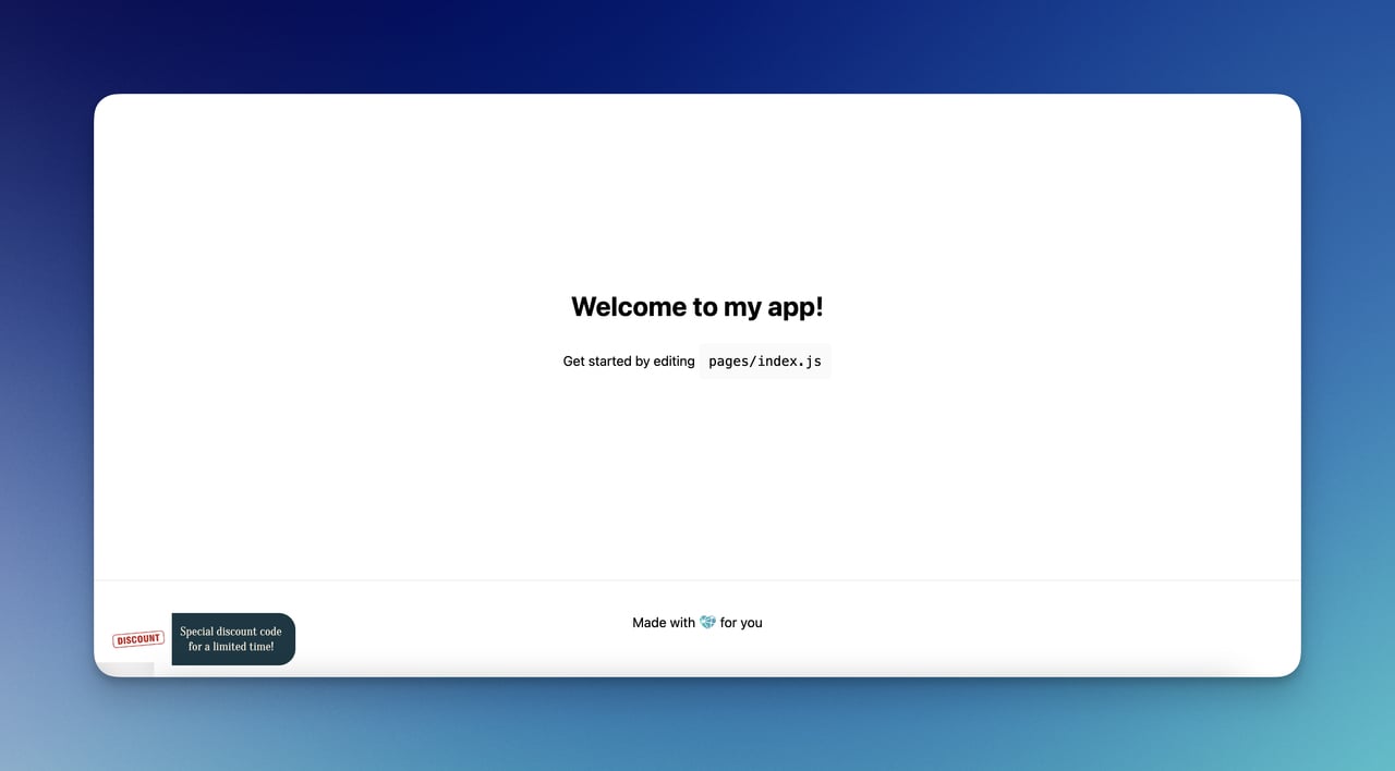
Our first method is creating a popup that opens via an HTML button.
We explained the step-by-step process and included a popup opens via button HTML code examples. You can adjust it according to your needs and style preferences.
Step 1: Begin by setting up the basic HTML structure for your popup.
First, let's define the basic structure in HTML. This includes the button to trigger the popup and the popup itself, which we'll call a modal.
Create a
<!-- Trigger/Open The Modal -->
<button id="myBtn">Open Modal</button>
<!-- The Modal -->
<div id="myModal" class="modal">
<!-- Modal content -->
<div class="modal-content">
<span class="close">×</span>
<p>Some text in the Modal..</p>
</div>
</div>
Step 2: Then, add some CSS to style the modal. This CSS includes basic styling plus making the modal appear in the center of the screen and hidden by default.
Syle the popup to make it visually appealing and match your website's design.
Use CSS to set the popup's position, size, colors, and typography. You can also add effects like animations or transitions to enhance the user experience.
Your CSS code for your popup needs to look like this:
/* The Modal (background) */
.modal {
  display: none; /* Hidden by default */
  position: fixed; /* Stay in place */
  z-index: 1; /* Sit on top */
  left: 0;
  top: 0;
  width: 100%; /* Full width */
  height: 100%; /* Full height */
  overflow: auto; /* Enable scroll if needed */
  background-color: rgb(0,0,0); /* Fallback color */
  background-color: rgba(0,0,0,0.4); /* Black w/ opacity */
}
/* Modal Content */
.modal-content {
  position: relative;
  background-color: #fefefe;
  margin: auto;
  padding: 0;
  border: 1px solid #888;
  width: 80%;
  box-shadow: 0 4px 8px 0 rgba(0,0,0,0.2),0 6px 20px 0 rgba(0,0,0,0.19);
  animation-name: animatetop;
  animation-duration: 0.4s
}
/* Add Animation */
@keyframes animatetop {
  from {top: -300px; opacity: 0}
  to {top: 0; opacity: 1}
}
/* The Close Button */
.close {
  color: white;
  float: right;
  font-size: 28px;
  font-weight: bold;
}
.close:hover,
.close:focus {
  color: #000;
  text-decoration: none;
  cursor: pointer;
}
Step 3: Finally, use JavaScript to add functionality to the button that will trigger the popup to open when clicked.
Create an event listener for the button click event, and use it to toggle the visibility of the popup by changing its display property.
You can use JavaScript to add the functionality to open the modal when the button is clicked and to close it when the user clicks on the 'x' or outside the modal with a code like this:
// Get the modal
var modal = document.getElementById("myModal");
// Get the button that opens the modal
var btn = document.getElementById("myBtn");
// Get the  element that closes the modal
var span = document.getElementsByClassName("close")[0];
// When the user clicks the button, open the modal
btn.onclick = function() {
  modal.style.display = "block";
}
// When the user clicks on  (x), close the modal
span.onclick = function() {
  modal.style.display = "none";
}
// When the user clicks anywhere outside of the modal, close it
window.onclick = function(event) {
  if (event.target == modal) {
    modal.style.display = "none";
  }
This method creates a customizable modal popup that can be styled and animated.
It uses basic HTML for the structure, CSS for styling and animations, and JavaScript for functionality.
You can expand this basic example by adding more content, styling, and functionality to the modal.
When all of these are combined, your popup builder open via button HTML code will be like this:
<title>Modal Popup Example</title>
    <style>
        /* The Modal (background) */
        .modal {
            display: none; /* Hidden by default */
            position: fixed; /* Stay in place */
            z-index: 1; /* Sit on top */
            left: 0;
            top: 0;
            width: 100%; /* Full width */
            height: 100%; /* Full height */
            overflow: auto; /* Enable scroll if needed */
            background-color: rgb(0,0,0); /* Fallback color */
            background-color: rgba(0,0,0,0.4); /* Black w/ opacity */
        }
        /* Modal Content */
        .modal-content {
            position: relative;
            background-color: #fefefe;
            margin: auto;
            padding: 0;
            border: 1px solid #888;
            width: 80%;
            box-shadow: 0 4px 8px 0 rgba(0,0,0,0.2),0 6px 20px 0 rgba(0,0,0,0.19);
            animation-name: animatetop;
            animation-duration: 0.4s;
        }
        /* Add Animation */
        @keyframes animatetop {
            from {top: -300px; opacity: 0}
            to {top: 0; opacity: 1}
        }
        /* The Close Button */
        .close {
            color: white;
            float: right;
            font-size: 28px;
            font-weight: bold;
        }
        .close:hover,
        .close:focus {
            color: #000;
            text-decoration: none;
            cursor: pointer;
        }
    </style>

    <!-- Trigger/Open The Modal -->
    <button id="myBtn">Open Modal</button>
    <!-- The Modal -->
    <div id="myModal" class="modal">
      <!-- Modal content -->
      <div class="modal-content">
        <span class="close">×</span>
        <p>Some text in the Modal..</p>
      </div>
    </div>
    <script>
        // Get the modal
        var modal = document.getElementById("myModal");
        // Get the button that opens the modal
        var btn = document.getElementById("myBtn");
        // Get the <span> element that closes the modal
        var span = document.getElementsByClassName("close")[0];
        // When the user clicks the button, open the modal
        btn.onclick = function() {
            modal.style.display = "block";
        }
        // When the user clicks on <span> (x), close the modal
        span.onclick = function() {
            modal.style.display = "none";
        }
        // When the user clicks anywhere outside of the modal, close it
        window.onclick = function(event) {
            if (event.target == modal) {
                modal.style.display = "none";
            }
        }
    </script>
2. How to Build a Popup Opens via Button with On-Click Targeting
We will be using Popupsmart to create our on-click popup form.
You can create on-click popup forms or show any popup with a button click on any website, such as a WordPress or Shopify popup form on-click.
Popupsmart is a popup builder that allows you to build modern popups simply and generate leads and sales.
We ensure you achieve your business goals with our user-friendly popup designs and smart audience-targeting technology.
And yes, with Popupsmart, you can create a button and launch your popup campaign super easily by clicking the button. Here's how.
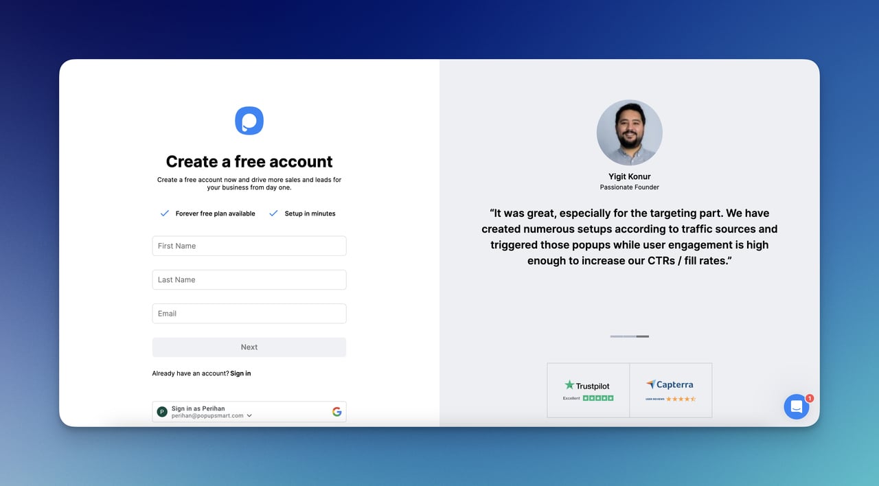
Step 1: Create a Popupsmart Account.
You can simply go to the Popupsmart Register page.
With your first name, last name, and email address, you are set to go.
To integrate your Popupsmart account with your website, you can use your Embed Code on the left sidebar.
Copy your embed code and paste it into the source code of your website.
For a clearer process, you can check How To Embed The Code On Your Site.
Or, there is a chance to set up your Popupsmart account with Google Tag Manager as well.
To create your first popup campaign, here is a helpful video for you to check:
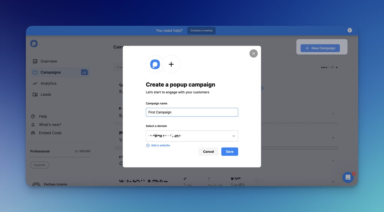
Step 2: Create a New Campaign.
After you view your dashboard, there is a button to create a new campaign, such as “+ New Campaign.” Click on it.
Then, you should name your campaign and save the changes by determining your website.
Step 3: Choose a Popup Template.
When you move forward with your campaign, there are many different templates that you can choose from.
If you want to see templates beforehand, check Popupsmart Playbook now.
Otherwise, the first step of your campaign is to decide the templates to start your campaign.
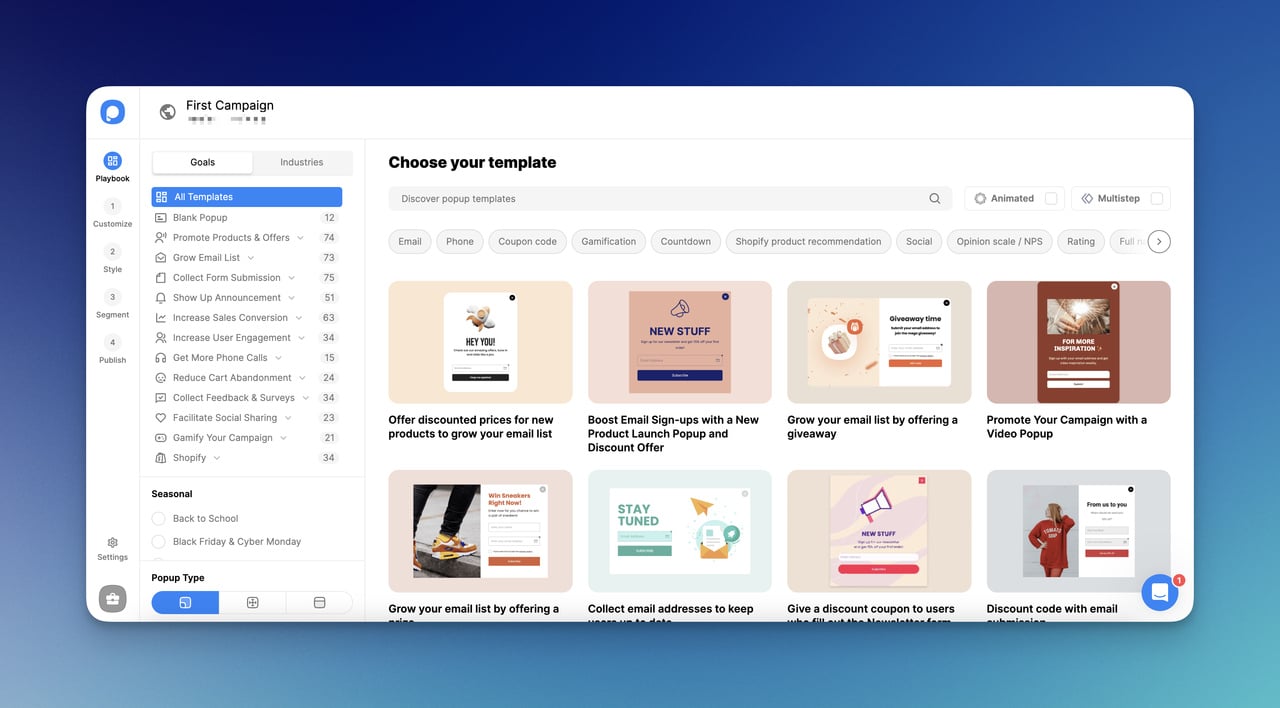
If you want to go with a blank template, there are also different blank popup templates, too.
You can choose a blank template and fully customize it by yourself.
Step 4: Customize Your Popup Campaign.
With the 1st and 2nd steps, you can customize your popup body and style it as you like.
You can check Popupsmart elements to add.
That’s how you can diversify your campaign to interact with your visitors.
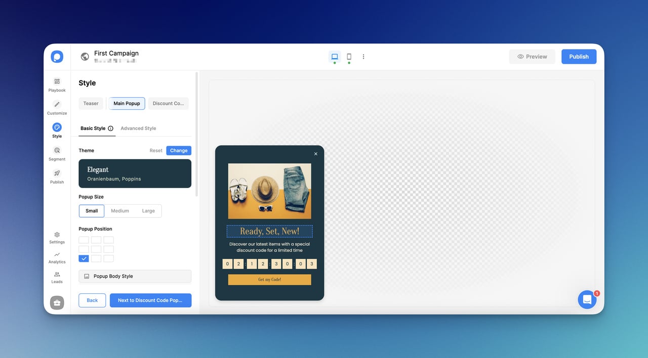
The customize step and style step work coordinatively. However, they address different areas effectively.
Step 5: Add ‘On-Click Targeting’ on the Segment Step.
When you go to the Segment step, add “On-Click Targeting” in the ‘User Behaviour’ section.
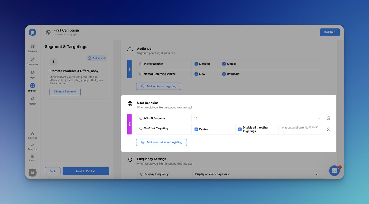
By choosing “On-Click Targeting”, you will easily manage to open your popup with a simple button click.
Step 6: Add a Custom Code to Your Website.
There is one more thing to do to activate your targeting.
Here is the following code to add to your source code of the website:
<button onclick="window.ps.show({ id: xxxxxx });">Open It</button>
For the ID, you should enter your own ID on the On-Click targeting.
You can customize the part, ‘Open It, ' as you like. You should even differentiate it according to the needs of your campaign.
If you are wondering more about On-Click targeting, you can check it out: On-Click Targeting.
Step 7: Save and Publish Your Campaign.
After arranging your campaign’s segmentation, you should save your campaign and move to the next step.
The Publish step is where you overview the campaign details and get ready to publish.
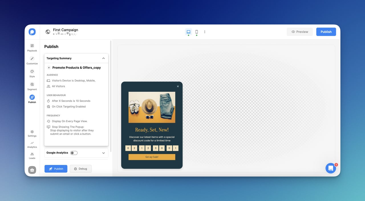
And that’s all!
You can click and activate the popup easily.
3. How to Build a Popup That Opens on a Button Click with a Teaser
A teaser is a mini popup that comes before or after the main popup.
It engages with visitors in a friendly way.
It generally remains on the website with or without a main popup.
Using a teaser is effective when you announce a new event, attract your visitors, or use a help center when you need help.
Since they are tinier, they can be used as a button to click to open a popup.
Therefore, using a teaser will be nearly a solution for opening a popup with a button click for you.
To create a teaser, follow the steps previously explained for creating a popup campaign with Popupsmart.
Then, from the “Customize” part, go to the “Teaser” and select “Show.”
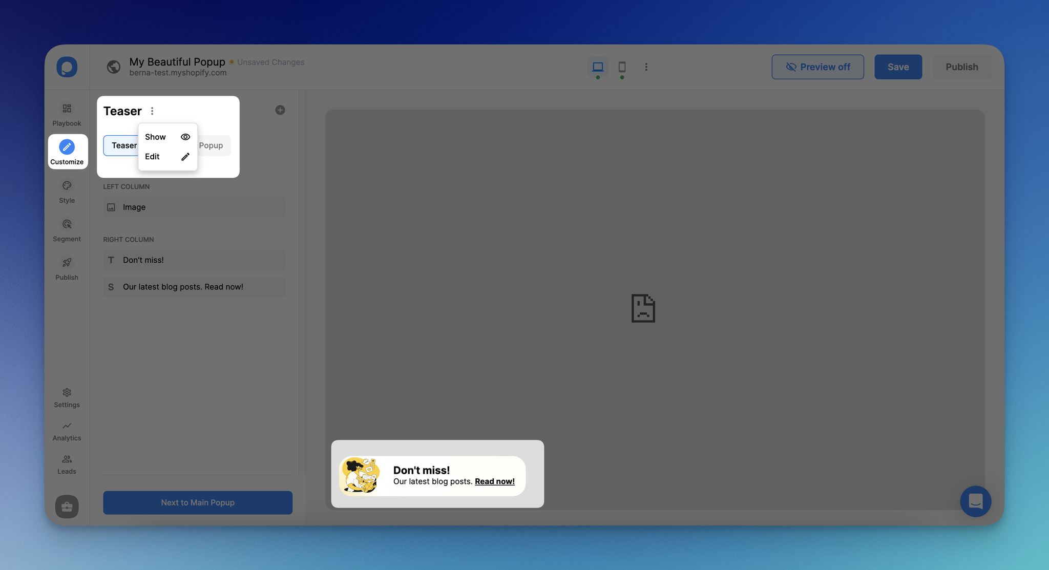
Once you select to show your teaser popup, you can customize it according to your needs as well.
Use Cases of a Popup That Opens on a Button Click
- Lead generation: By filling out a simple form, encourage visitors to subscribe to newsletters, updates, or exclusive offers. Offer free resources or discounts on your button to entice sign-ups and grow your email list for future marketing efforts.
- Promotional offers: Drive immediate action by first showcasing limited-time promotions with a button. Use attractive visuals and compelling copy to encourage users to purchase with your popup that opens after a button click.
- Content engagement: By showing the button, guide users to relevant blog posts, articles, or downloadable resources based on their interests or browsing behavior. Use targeted messaging and personalized recommendations to enhance user experience and encourage further exploration of your site's content.
- Event announcements: Increase attendance for webinars, workshops, or live events by announcing them via popups that open with a button click. Provide event details, registration links, and highlights to create buzz and encourage visitors to RSVP or learn more about the event.
- Feedback collection: Collect feedback from your audience by inviting them to participate in surveys, polls, or feedback forms. Use popups to ask for feedback on products, services, or website usability, and offer incentives such as discounts or entry into prize draws to encourage participation.
Best Practices for Optimizing On-Click Popups
Design for Clarity and Appeal
- Use Bold CTAs: Buttons with action-oriented text like “Get Started” or “Claim Offer” increase clicks by 30%.
- Keep It Simple: Avoid cluttered designs. A clean popup with one clear goal (e.g., email capture) performs best.
Optimize for Mobile
- Responsive Design: Ensure your popup scales properly on mobile, as mobile users account for 60% of conversions.
- Fast Load Times: Compress images and minimize code to reduce load times, as 53% of users abandon sites that take over 3 seconds to load.
Test and Analyze Performance
- A/B Testing: Test different button colors, text, and popup designs. A/B testing can improve conversion rates by up to 20%.
- Track Metrics: Use Popupsmart’s analytics to monitor click-through and conversion rates. For more on tracking, see Popupsmart Analytics help documentations.
Common Mistakes to Avoid
Overloading the Popup
- Too Much Content: Don’t cram forms, images, and text into one popup. Focus on a single action to avoid overwhelming users.
- Poor Timing: Even on-click popups can annoy if the button is overused. Limit triggers to high-intent areas like checkout pages.
Ignoring Accessibility
- Keyboard Navigation: Ensure popups are accessible via keyboard for users with disabilities. 25% of web users rely on accessibility features.
- Color Contrast: Use high-contrast colors for readability, adhering to WCAG guidelines.
Conclusion
We hope this tutorial and three different methods clarify how to open a popup with a button click.
Now, you can show a popup campaign that opens on a button click easily.
You can use the best method that suits your needs and increase your conversions!
While optimizing your button and popup campaign, include attractive and catchy CTA words to encourage visitors to engage!
Frequently Asked Questions
Is Popupsmart Compatible with CMS to Display Popup Campaigns?
Yes, it is. When you decide to create and publish your popup, all you need to do is customize your campaign and make sure that your embed code is working properly on your website.
How Can I Ensure a Seamless UX with Popups?
Focusing on the timing and relevance of your popups is essential. Utilize the features to allow users to initiate interactions when they are ready, reducing the likelihood of interrupting their browsing experience.
Can I Track the Performance of My Popups?
Yes, Popupsmart provides Leads and Analytics pages, where you can monitor metrics such as conversion rates, click-through rates, and engagement data to assess the effectiveness of your popups and make data-driven improvements.
Recommended Blog Posts
If you are trying to leverage your conversion rates with popups, here are some helpful articles you might like:
How would you rate your experience with this article? 😊