How to Create Modal Popups? / Bootstrap & jQuery & CSS
 ChatGPT
 Perplexity
 Claude
 Grok
Grok Google AI Mode
Modal popups are triggered dialog boxes that show extra info without reloading a page, often used for forms, alerts, media, and tips; they can improve usability and load times if used well. The text covers building modals with Bootstrap, jQuery, or CSS, and recommends Popupsmart for fast, template-based creation and integrations.
Modal popups are often used on the web for initiating newsletter signups, demonstrating notifications/alerts, and controlling registration and login forms.
You can use various ways to create the modal popups by using HTML, CSS, and JavaScript. Therefore, now you'll specifically learn step by step about Bootstrap Modal Popup, jQuery Modal Popup, and CSS Modal Popup.

Then, I'll finally give you a very simple&actionable way to create and implement popups. However, you should first learn why modal popups are used and why they are so important.
What is Modal Popup?
A modal popup or dialog box helps show the last-updated web page. The benefit of a modal popup is showing added information and not loading the page again. It is important for a better user experience because it provides users with the ability to view relevant information in the popup box on a similar web page.
Modals remain silent till when they are triggered and they're generally used to focus on the user on a single call to be active or to emphasize information such as signup forms and alert.
There’re many places that Modal Popups are involved in:
- Inquiry/contact forms
- Lead generation/signup forms
- Login/registration forms
- Search forms
- Alerts/notifications
- Help/tips
- Displaying full-screen images & videos
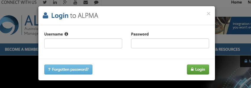
You can create your popups around your aims. For example, Alpma permits users to login everywhere on site.
Although popups have a bad reputation about their usage, when you use them correctly, you can benefit from them to:
- increase your website usability.
- decrease the load times.
- clarify all designs.
After learning why modal popups are so important, now we can learn how to create them.
Bootstrap Modal Popup
As you read above, modal popups help users so that they can take actions before moving somewhere else. It can sometimes be used to alert users or take information.
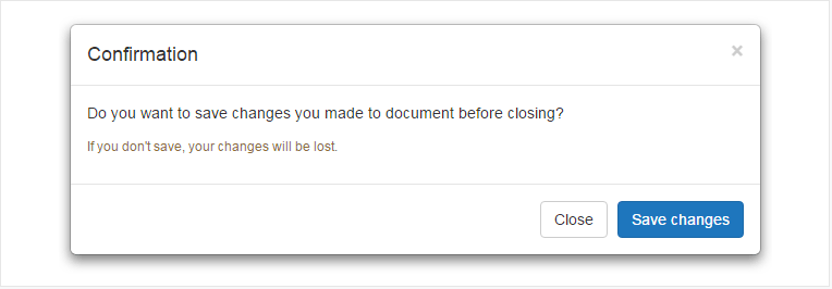
Bootstrap modal plugin helps you create very useful and functional modal popups or dialog boxes. You can check the example below to understand how you can create your own modal popup with a header, footer and message body.
<pre class="tCont active hljs javascript"><div id=<span class="hljs-string">"myModal"</span> <span class="hljs-class"><span class="hljs-keyword">class</span></span>=<span class="hljs-string">"modal fade"</span>>
<span class="xml"><span class="hljs-tag"><<span class="hljs-name">div</span> <span class="hljs-attr">class</span>=<span class="hljs-string">"modal-dialog"</span>></span>
<span class="hljs-tag"><<span class="hljs-name">div</span> <span class="hljs-attr">class</span>=<span class="hljs-string">"modal-content"</span>></span>
<span class="hljs-tag"><<span class="hljs-name">div</span> <span class="hljs-attr">class</span>=<span class="hljs-string">"modal-header"</span>></span>
<span class="hljs-tag"><<span class="hljs-name">button</span> <span class="hljs-attr">type</span>=<span class="hljs-string">"button"</span> <span class="hljs-attr">class</span>=<span class="hljs-string">"close"</span> <span class="hljs-attr">data-dismiss</span>=<span class="hljs-string">"modal"</span> <span class="hljs-attr">aria-hidden</span>=<span class="hljs-string">"true"</span>></span>×<span class="hljs-tag"></<span class="hljs-name">button</span>></span>
<span class="hljs-tag"><<span class="hljs-name">h4</span> <span class="hljs-attr">class</span>=<span class="hljs-string">"modal-title"</span>></span>Confirmation<span class="hljs-tag"></<span class="hljs-name">h4</span>></span>
<span class="hljs-tag"></<span class="hljs-name">div</span>></span>
<span class="hljs-tag"><<span class="hljs-name">div</span> <span class="hljs-attr">class</span>=<span class="hljs-string">"modal-body"</span>></span>
<span class="hljs-tag"><<span class="hljs-name">p</span>></span>Do you want to save changes you made to document before closing?<span class="hljs-tag"></<span class="hljs-name">p</span>></span>
<span class="hljs-tag"><<span class="hljs-name">p</span> <span class="hljs-attr">class</span>=<span class="hljs-string">"text-warning"</span>></span><span class="hljs-tag"><<span class="hljs-name">small</span>></span>If you don't save, your changes will be lost.<span class="hljs-tag"></<span class="hljs-name">small</span>></span><span class="hljs-tag"></<span class="hljs-name">p</span>></span>
<span class="hljs-tag"></<span class="hljs-name">div</span>></span>
<span class="hljs-tag"><<span class="hljs-name">div</span> <span class="hljs-attr">class</span>=<span class="hljs-string">"modal-footer"</span>></span>
<span class="hljs-tag"><<span class="hljs-name">button</span> <span class="hljs-attr">type</span>=<span class="hljs-string">"button"</span> <span class="hljs-attr">class</span>=<span class="hljs-string">"btn btn-default"</span> <span class="hljs-attr">data-dismiss</span>=<span class="hljs-string">"modal"</span>></span>Close<span class="hljs-tag"></<span class="hljs-name">button</span>></span>
<span class="hljs-tag"><<span class="hljs-name">button</span> <span class="hljs-attr">type</span>=<span class="hljs-string">"button"</span> <span class="hljs-attr">class</span>=<span class="hljs-string">"btn btn-primary"</span>></span>Save changes<span class="hljs-tag"></<span class="hljs-name">button</span>></span>
<span class="hljs-tag"></<span class="hljs-name">div</span>></span>
<span class="hljs-tag"></<span class="hljs-name">div</span>></span>
<span class="hljs-tag"></<span class="hljs-name">div</span>></span></span>
<<span class="hljs-regexp">/div></span>
When the “document object model” is loaded through JavaScript, the window will automatically open.
jQuery Modal Popup
jQuery modal dialog boxes are an excellent way to demonstrate information quickly. If you prepare properly while creating jQuery modal dialog boxes, you can alert your users or show errors with the cool websites. (Because of the contemporary modal!)
Let’s look at the jQuery example!
<script ></script>
<script>
$(document).ready(function(){
$("button").click(function(){
$("#test").hide();
});
});
</script>
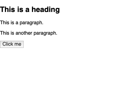
<h2>This is a heading</h2>
<p>This is a paragraph.</p>
<p id="test">This is another paragraph.</p>
<button>Click me</button>
After this, you can see the following:
CSS Modal Popup
CSS is a language that describes how the HTML elements are to be displayed on screen. Therefore, we firstly look at HTML then examine the CSS.
<div class="container">
<div class="interior">
<a class="btn" href="#open-modal"><i class="fas fa-external-link-alt"></i> Basic CSS-Only Modal</a>
</div>
</div>
<div id="open-modal" class="modal-window">
<div>
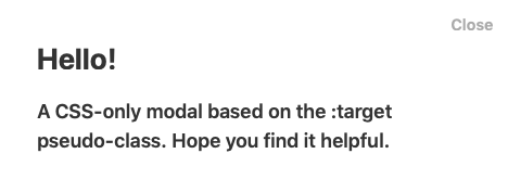
<a href="#" title="Close" class="modal-close">Close</a>
<h1>Hello!</h1>
<div>A CSS-only modal based on the :target pseudo-class. Hope you find it helpful.</div>
</div>
</div>
Then, add CSS!
.modal-window {
  position: fixed;
  background-color: rgba(255, 255, 255, 0.25);
  top: 0;
  right: 0;
  bottom: 0;
  left: 0;
  z-index: 999;
  opacity: 0;
  pointer-events: none;
  -webkit-transition: all 0.3s;
  -moz-transition: all 0.3s;
  transition: all 0.3s;
  &:target {
    opacity: 1;
    pointer-events: auto;
  }
  &>div {
    width: 400px;
    position: absolute;
    top: 50%;
    left: 50%;
    transform: translate(-50%, -50%);
    padding: 2em;
    background: #ffffff;
    color: #333333;
  }
  header {
    font-weight: bold;
  }
  h1 {
    font-size: 150%;
    margin: 0 0 15px;
    color: #333333;
  }
}

.modal-close {
  color: #aaa;
  line-height: 50px;
  font-size: 80%;
  position: absolute;
  right: 0;
  text-align: center;
  top: 0;
  width: 70px;
  text-decoration: none;
  &:hover {
    color: #000;
  }
}

/* Demo Styles */

html,
body {
  height: 100%;
}

body {
  font: 600 18px/1.5 -apple-system, BlinkMacSystemFont, "Segoe UI", Roboto, Oxygen-Sans, Ubuntu, Cantarell, "Helvetica Neue", sans-serif;
  background-color: #f69d75;
  color: #555555
}

a {
  color: inherit;
}

.container {
  display: grid;
  justify-content: center;
  align-items: center;
  height: 100vh;
}

.btn {
  background-color: #fff;
  padding: 1em 1.5em;
  border-radius: 3px;
  text-decoration: none;
  i {
    padding-right: 0.3em;
  }
}
It looks like this:
What Do We Recommend? Popupsmart: A Simple Popup Creator Service
Undoubtedly, you can make your modal popups for whichever purpose and wherever they apply on your web page. However, there’s a more functional and simple way to create modal popups.
Smart popup builder, Popupsmart makes everything on your behalf. For the first step you should determine why you need a popup. It can be to increase sales conversion, grow an email list, or increase phone calls. After that, by choosing your aims you can move to the next steps:
Popupsmart’s Design
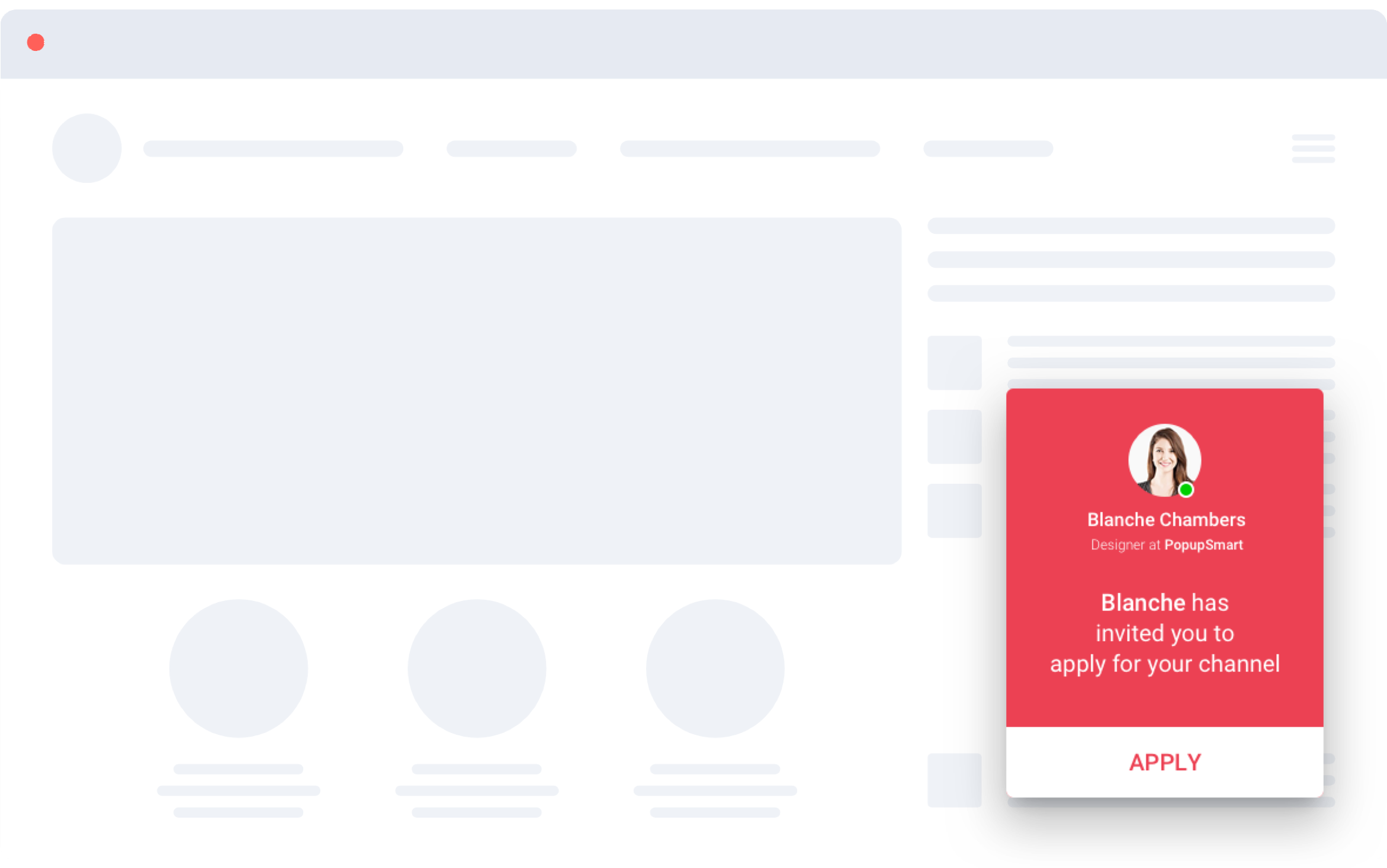
There are many ready templates from which you can choose. If you want to guide your audience with an “Announcement Popup”, you can select this:
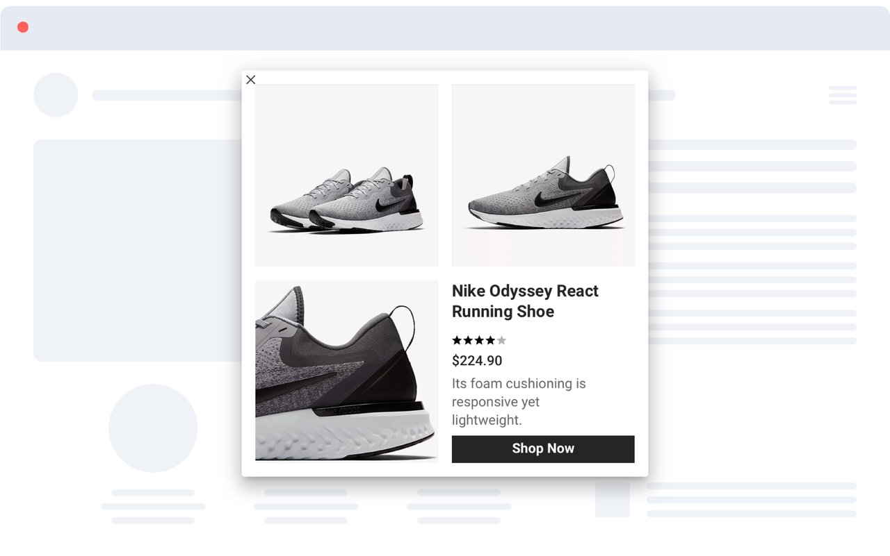
Or if you want to increase sales conversion with a “Product Promotion Popup”, your popup can be designed as such:
Popupsmart’s Display
You can customize your message briefly based on the visitor’s behavior to increase conversion, engagement and sales rate. Also, Popupsmart enables its users to install popups in 1 minute which are compatible with all website platforms.

Popupsmart’s Integration System
After selecting your business goal and compatible popup templates, you customize and publish them with the Popupsmart’s user-friendly system without any technical issue.
How would you rate your experience with this article? 😊