Multi-Step Forms for Shopify: Increase Conversions with Smarter Popups
Guide to multi-step popup forms on Shopify: why they convert better, when to use them, and best practices (steps, copy, targeting, mobile, personalization, privacy). Includes a no-code Popupsmart setup and optimization tips.
Multi-step forms on Shopify are popup forms that split the signup process into smaller steps instead of asking for all information at once. This approach reduces friction, lowers abandonment, and drives higher conversion rates for lead generation and email capture.
Why Shopify stores use multi-step popup forms:
- Increase popup form conversion by reducing perceived effort
- Guide visitors through one clear action at a time
- Perform better on mobile and high-bounce traffic
Multi-step popup forms rely on progressive disclosure, showing only what’s necessary at each step. Rather than overwhelming visitors, they keep momentum and make completion feel easier.
In my experience optimizing lead generation popups for Shopify stores with Popupsmart, I’ve seen multi-step forms outperform single-step popups even when the offer stays the same. The improvement usually comes from changing how the form asks for commitment, not what it offers.
With this guide, I’ll break down when multi-step popup forms work best on Shopify and how to design them for sustainable conversion rate optimization.
What This Blog Covers 🧭
In this guide, you’ll learn:
🧩 What multi-step popup forms are and how they work on Shopify 📈 Why multi-step forms convert better than single-step popups 🎯 Best practices for step structure, copy, targeting, and mobile UX ⚖️ When to use multi-step vs. single-step popup forms ⚙️ A no-code, Shopify-native setup workflow with Popupsmart 🔍 Advanced tips on personalization, privacy, and optimization
By the end, you’ll know exactly how to use multi-step forms on Shopify to reduce friction and increase conversion rates, without adding complexity.
🤌 Benefits of Multi-Step Popup Forms for Higher Conversion Rates
Multi-step popup forms stand out because they reduce friction at the exact moment visitors hesitate. In my experience working on multi-step forms for Shopify, the biggest improvement usually comes from one thing: making the opt-in process feel lighter. Instead of overwhelming users with multiple fields at once, multi-step form design guides them through small, manageable actions, which directly leads to higher conversion rates.
What I consistently see across e-commerce projects is this: when forms feel easier, users stay engaged longer. By using progressive disclosure methods, multi-step popup forms keep attention focused on a single step, improving popup form conversion without changing the incentive or traffic source.
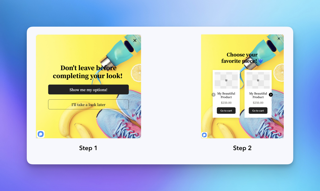 Popupsmart's ready to use multistep popup form template for Shopify
🏃 Reducing Form Abandonment and Increasing Engagement
Form abandonment is one of the most common issues with lead generation popups. Multi-step popup forms address this by showing only what’s necessary at each stage, which lowers cognitive load and keeps users moving forward.
Multiple studies in UX form design research show that progressive, step-based forms reduce cognitive load and improve engagement. This aligns closely with what I’ve seen while optimizing Shopify popups for real stores, especially when traffic comes from mobile or first-time visitors.
In practice, multi-step forms help because they:
- Reduce perceived effort by limiting visible form fields
- Improve user experience optimization through clear progression
- Encourage completion with visual cues like progress indicators
When I combine this structure with exit-intent triggers, engagement usually improves even further. Visitors feel guided rather than interrupted, which often results in lower bounce rate metrics and stronger opt-in behavior.
I’ve also seen how this structure supports early audience segmentation. By starting with a simple question or choice, you gather intent data first, before asking for contact details, which makes the opt-in feel more natural. This works because users are more likely to complete tasks that feel short, predictable, and already in progress.
🌎 Real-World Improvements in Popup Form Conversion
The performance gap between single-step and multi-step popup forms becomes even clearer when you look at real campaign data. Industry benchmarks show that popup conversion rates range widely, with multi-step designs frequently performing at the higher end of that range. Similar patterns appear across multiple CRO studies, especially in mobile-focused e-commerce funnels.
This is especially noticeable on mobile. Mobile-responsive layouts paired with multi-step popup forms tend to perform better because each step fits naturally within smaller screens. In several Shopify projects I’ve worked on, simply switching to a multi-step structure improved engagement analytics and increased opt-ins without any changes to copy or design.
Multi-step forms also make it easier to introduce opt-in incentives gradually. This is especially effective for Shopify stores where most traffic comes from first-time visitors. Instead of leading with a discount, you can first ask about intent, then present the incentive as a logical next step. This approach supports long-term conversion rate optimization rather than short-term spikes.
🆚 One-Step vs. Multi-Step Popup Forms: When to Use Each
Single-step popup forms still have their place. They work well for very simple asks, such as a basic newsletter signup where only an email address is required. However, they tend to struggle once more context or personalization is needed.
Multi-step popup forms perform better than single-step forms when:
- The offer requires explanation or choice
- You want to reduce form abandonment
- Personalization or segmentation matters
- The form is part of a broader conversion funnel
Based on my experience, switching from one-step to multi-step forms for landing page integration often leads to immediate improvements. By spreading the interaction across steps, you can apply form field minimization and call-to-action optimization more effectively, which results in higher-quality leads.
For Shopify stores focused on sustainable growth, these benefits make multi-step popup forms a practical choice, not a trend. They fit naturally into modern CRO software workflows and provide clearer data through analytics tracking tools, making ongoing optimization much easier.
Next, I’ll break down how to design multi-step popup forms on Shopify so these benefits translate into real conversion gains.
🎨 Designing Multi-Step Popup Forms: Best Practices and Strategies
Great multi-step popup forms don’t just collect data, they guide users through a clear, low-friction experience that leads to higher conversion rates. In my experience designing multi-step forms for Shopify and e-commerce landing pages, the biggest gains come from aligning form structure with how users naturally make decisions.
Building on the benefits we covered earlier, like reducing abandonment through progressive disclosure, this section focuses on practical design strategies you can apply immediately. The goal is simple: make lead generation popups feel intentional, lightweight, and easy to complete.
Effective multi-step form design starts with understanding user flow. When forms fail, it’s usually because they ignore basic UX principles like clarity, pacing, and feedback. When they succeed, it’s because each step feels obvious and purposeful. Tools like Popupsmart support this approach by allowing step-based flows, conditional logic, and mobile-friendly layouts without adding technical complexity.
⌨️ Key Design Principles for Effective Multi-Step Forms
Logical progression is essential for multi-step popup forms. Each step should focus on a single action, ideally with no more than 3–4 fields. This form field minimization approach reduces cognitive load and directly supports conversion rate optimization.
Research from UX form design best practices shows that grouping fields into clear, sequential steps improves completion rates by making tasks feel shorter and more manageable.
Key principles to prioritize:
- Start simple: Begin with low-effort questions before requesting personal details
- Clear CTAs: Use action-oriented language that explains what happens next
- Visual continuity: Match typography, colors, and spacing with the main site
These popup forms best practices help maintain momentum inside the conversion funnel and align naturally with inbound marketing strategies.
📱 Designing for Mobile-First Experiences
On Shopify, a large share of popup interactions happen on mobile. That makes mobile-responsive layouts non-negotiable for multi-step popup forms.
From what I’ve seen optimizing mobile-heavy stores, small adjustments often make a big difference:
- Larger tap targets and readable font sizes
- Vertical layouts that scroll naturally
- Minimal keyboard interaction when possible
Mobile-friendly, step-based forms work especially well because each step fits comfortably on smaller screens. Studies in mobile UX and form usability research consistently show that shorter, sequential interactions outperform long, static forms on mobile devices.
This is also where A/B testing popups becomes valuable. Testing step order, CTA copy, or field types often reveals quick wins that improve popup form conversion without redesigning the entire flow.
🧑💻 Using Conditional Logic for Personalization
Conditional logic allows multi-step popup forms to adapt based on user input, making the experience feel personalized instead of generic. For example, an e-commerce visitor might see different follow-up questions than a B2B user.
This personalization-driven approach:
- Improves relevance by hiding unnecessary fields
- Increases completion rates by reducing friction
- Produces cleaner data for analytics tracking tools
In Popupsmart campaigns I’ve worked on, conditional logic helped segment leads early in the funnel, which made opt-in incentives feel more relevant and improved lead quality downstream.
When combined with audience segmentation, conditional flows turn popup forms into guided conversations rather than static questionnaires.
💧 Adding Interactive Elements Without Overcomplicating the Form
Interactive elements like short quizzes or calculators can significantly increase engagement when used intentionally. A simple “find your best option” quiz, for example, can naturally lead into email capture without feeling forced.
The key is restraint:
- Keep interactions short
- Make the value clear upfront
- Tie results directly to the opt-in
UX research on interactive form engagement shows that users are more willing to share information when they receive immediate, personalized feedback in return.
When paired with exit-intent triggers, interactive multi-step popup forms can re-engage hesitant visitors at the right moment, without increasing bounce rates.
These strategies work best when applied together. Thoughtful structure, mobile-first design, personalization, and light interactivity turn multi-step popup forms into reliable conversion tools. With Popupsmart, these patterns can be implemented quickly, allowing teams to focus on optimization instead of setup.
↕️ Implementing Multi-Step Forms on Shopify with Popupsmart
If you already have a Shopify store, setting up multi-step forms on Shopify with Popupsmart is a straight-through flow: install the app, create your campaign, choose a multi-step template, customize the popup, then publish it. You don’t need to deal with theme code, you simply enable the Popupsmart embed in Shopify when prompted.
Popupsmart offers templates for multi-step popup forms, with built-in A/B testing popups to refine opt-in incentives.
Pros: Fast setup and strong data insights from over 10,000 campaigns, as per Popupsmart benchmark report.
Cons: Might feel basic for ultra-custom needs, but it's ideal for e-commerce.
Step 1 — Install Popupsmart on Shopify
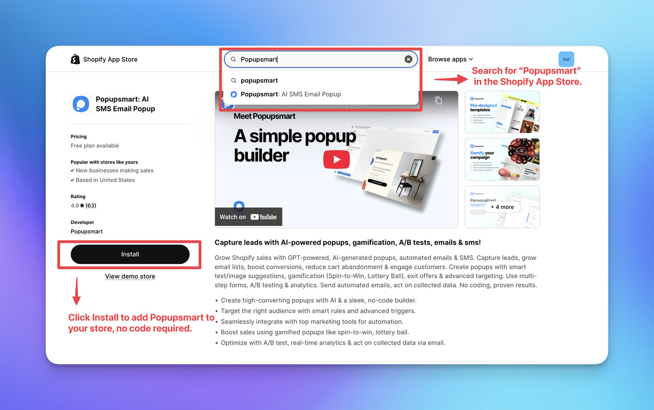
- Open the Shopify App Store
- Search for “Popupsmart: AI SMS Email Popup”
- Click Install and approve permissions
Shopify will redirect you into Popupsmart automatically once the installation is complete.
Step 2 — Create a New Campaign in Popupsmart
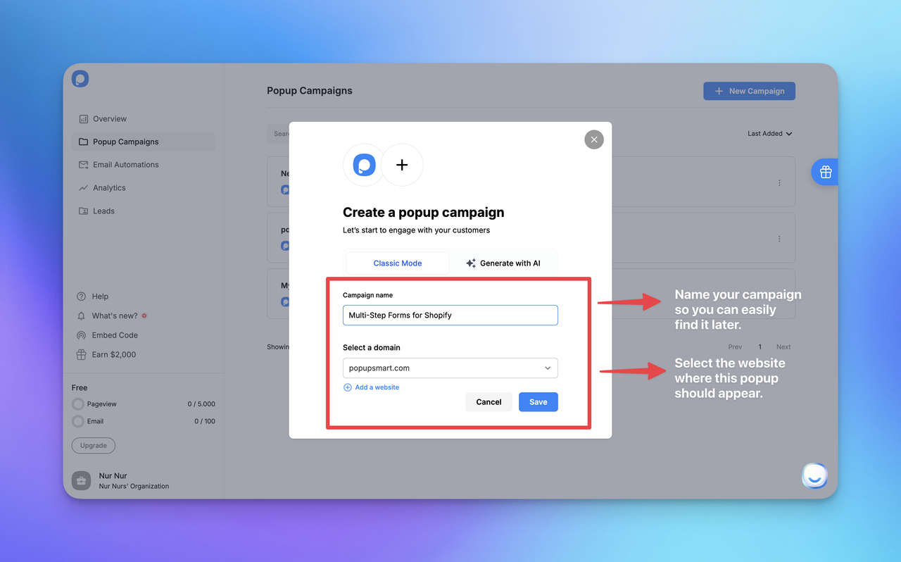
Inside Popupsmart:
- Click New Campaign (top-right)
- Add your campaign name and confirm your store/domain
- You’ll land in the builder (Playbook) to start designing your popup
Step 3 — Choose a Multi-Step Template
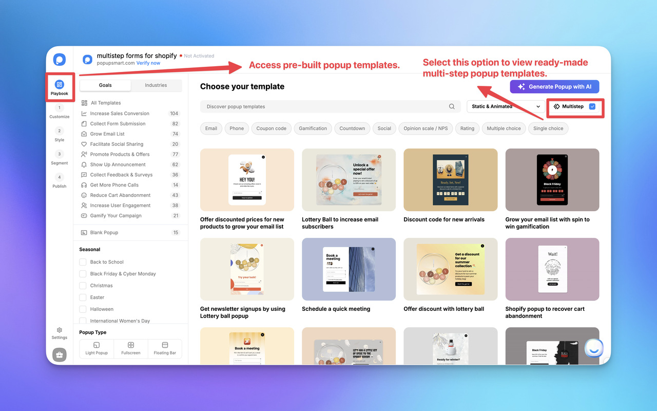
In the Playbook screen, enable the Multi-step option (top-right).
Once it’s on, you’ll see multi-step templates you can start from.
Step 4 — Customize the Popup (Customize + Style)
You’ll mainly work in two areas:
- Customize: edit images, copy, form elements, and steps
- Style: adjust general + advanced styling such as popup size, position, spacing, and element-level design
This is where your multi-step flow becomes “lightweight” and conversion-friendly.
Step 5 — Select Segment & Targeting
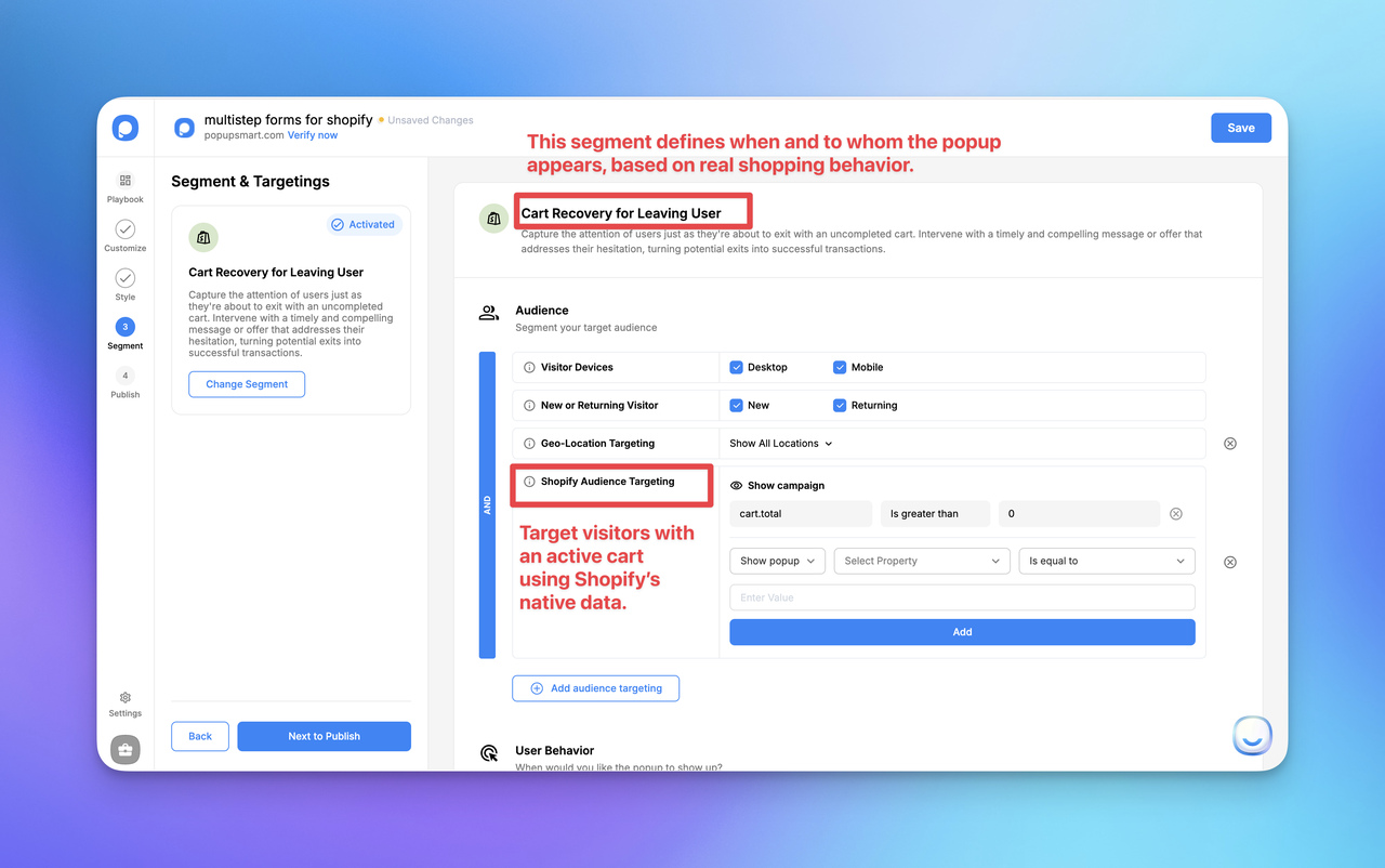
In Segment & Targeting, choose the audience logic based on your goal. Popupsmart includes predefined segments, including Shopify-focused options, so you can pick what matches your use case.
For example, in this blog I’m using “Cart Recovery for Leaving Users” (I’ll include a screenshot) to show how Shopify audience rules can target visitors with an active cart.
Step 6 — Publish (and Enable Shopify App Embed if Needed)
In the Publish step, you can optionally turn on key actions like:
- Autoresponder Email (send an automated email after form submission)
- Self Email Notification (get notified when someone fills the popup)
- Integrations (send leads/data to your CRM or messaging tools)
- Google Analytics (track popup events automatically)
Then click Publish.
If Popupsmart isn’t enabled in your Shopify theme yet, you’ll see a “Verify Popupsmart App” prompt. Shopify will take you to your theme editor, where you enable Popupsmart Embed under App embeds and save.
To keep this blog focused on multi-step forms, I’m not going deep into every verification screen here. If you want the full end-to-end setup (including the verify → save → refresh steps), follow the Shopify getting started guide.
✈️ Advanced Trends and Considerations for Multi-Step Popup Forms
Multi-step popup forms are evolving beyond simple step-based layouts. As user expectations increase, these forms are starting to blend personalization, behavioral insights, and responsible data practices to drive higher conversion rates without compromising trust.
Based on my experience optimizing lead generation popups for e-commerce brands, the biggest shift isn’t about adding more features, it’s about making forms feel smarter, lighter, and more intentional. This section looks at where multi-step popup forms are heading next and what to consider as you design for the future.
🧠 Smarter Personalization with Dynamic Form Logic
| Trend / Consideration | What it means for multi-step popup forms | Best practice (Shopify-friendly) | What to avoid |
|---|---|---|---|
| Dynamic personalization | Steps/fields adjust based on intent signals (device, pages, behavior) | Keep early steps low-effort, then personalize later steps | Over-personalizing too early or asking for too much data upfront |
| Light gamification | Small interactive touches (progress feedback, quick choices) | Use minimal “momentum” elements (progress indicator, 1-click choices) | Turning the popup into a game that slows completion |
| Privacy-first design | Clear consent + minimal data collection | Collect only what you need per step + explain usage clearly | Dark patterns, pre-checked consent, unclear data handling |
| Mobile performance | Multi-step flow must feel fast on mobile | Large tap targets + short steps + lightweight assets | Heavy animations, slow load, cluttered layouts |
| Measurement & iteration | Optimization based on behavior and results | Track step drop-offs + run A/B tests on one variable | Testing too many changes at once or ignoring step-level data |
The next phase of multi-step popup forms focuses on context-aware personalization. Instead of showing the same steps to every visitor, forms are increasingly adapting based on behavior, device type, and intent signals.
In practice, this means:
- Skipping irrelevant questions
- Adjusting steps based on browsing context
- Showing fewer fields to low-intent visitors
I’ve seen this approach significantly improve user experience optimization, especially on Shopify stores where most traffic comes from first-time visitors. When a form feels relevant, users are far less likely to abandon it mid-flow.
Looking to 2026, trends point to even smarter evolutions. According to Bit Form's growth insights, multi-step forms will dominate with voice-activated options, letting users speak responses for hands-free ease. This aligns with emerging voice tech, potentially lifting popup form conversion on mobile devices. Plus, AI can auto-fill based on data, but always with consent to avoid privacy pitfalls.
Why does this matter? It supports inbound marketing best practices by creating seamless email capture techniques.
🎮 Gamification: When (and When Not) to Use It
Gamification is often discussed alongside multi-step popup forms, but it’s not always the right solution. While interactive elements like quizzes or progress-based rewards can increase engagement, they also introduce friction if overused.
From what I’ve observed:
- Light gamification works best when the offer needs explanation
- Traditional multi-step designs perform better for fast opt-ins
- Hybrid approaches often outperform extremes
For example, a simple progress bar or choice-based first step can create momentum without turning the form into a distraction. The most effective multi-step form design balances clarity with engagement, not novelty for its own sake.
When evaluating gamification, always ask:
Does this help the user move forward faster, or slow them down?
🕵️♀️ Privacy, Compliance, and Ethical Design
As multi-step popup forms become more personalized, privacy and compliance become non-negotiable. Regulations like GDPR and CCPA require clear consent, transparent data usage, and minimal data collection.
Best practices I consistently recommend:
- Collect only what you need at each step
- Clearly explain how data will be used
- Avoid dark patterns or misleading copy
Ethical form design isn’t just about compliance, it directly impacts long-term popup form conversion. Users who feel respected are more likely to complete forms and stay engaged with your brand.
For teams building multi-step popup forms on Shopify, this also means choosing tools and integrations that support secure data handling and clear consent flows. Trust is a conversion lever, not a legal checkbox.
🏍️ Designing for Sustainability and Performance
One often-overlooked consideration is performance. Heavy scripts, excessive animations, and overly complex logic can hurt page speed and mobile experience.
Modern multi-step popup forms should be:
- Lightweight
- Mobile-first
- Easy to update and test
Reducing technical overhead not only improves conversion rate optimization but also supports a better overall page experience, something Google increasingly values.
As multi-step popup forms continue to evolve, the most successful implementations will focus on relevance, restraint, and responsibility. New features matter far less than thoughtful execution. When innovation supports user intent, rather than distracting from it, multi-step forms remain one of the most effective lead generation tools available.
🚀 Conclusion: Optimizing Your Strategy with Multi-Step Popup Forms
Multi-step popup forms are no longer just a conversion tactic, they’re a long-term strategy for building sustainable lead generation and achieving higher conversion rates without increasing traffic. When designed thoughtfully, they reduce friction, lower abandonment, and turn hesitant visitors into engaged leads.
Across the examples and frameworks covered in this guide, one pattern remains consistent: multi-step popup forms work best when they respect user intent. Progressive disclosure, lightweight steps, and clear value exchange allow forms to feel helpful rather than intrusive, especially for Shopify stores where most visitors are still in the discovery phase.
📁 Key Takeaways to Apply Immediately
To get consistent results from multi-step popup forms, focus on the fundamentals:
- Design for momentum: Keep early steps simple and ask for commitment gradually
- Segment with intent: Use audience segmentation to show the right message at the right moment
- Optimize with data: Track step-level drop-offs and refine based on real behavior
- Think mobile-first: Ensure every step works smoothly on smaller screens
These principles don’t just improve popup form conversion, they strengthen your entire conversion funnel over time.
👣 Your Next Step
If you’re ready to apply this in practice, start by launching a simple multi-step popup on your Shopify store and iterate from there.
With Popupsmart, you can install the app from the Shopify App Store, create your multi-step campaign visually, and publish it using Shopify’s native App Embed system, no code required.
From there, test small changes: step order, copy, or targeting rules. The biggest gains often come from subtle improvements, not complex setups.
Mastering multi-step popup forms isn’t about chasing short-term spikes. It’s about building a system that adapts to user behavior, earns trust, and compounds results over time. Apply what you’ve learned here, and you’ll be well-positioned to turn more visitors into meaningful, long-term relationships.
FAQs
1. What are multi-step forms on Shopify?
Multi-step forms on Shopify break the signup process into smaller steps, showing one question or action at a time to reduce friction and improve completion rates.
2. Do multi-step forms convert better than single-step popups?
Yes. Multi-step forms typically achieve higher conversion rates because they lower cognitive load and make opt-ins feel easier and more intentional.
3. When should I use multi-step forms instead of single-step forms?
Use multi-step forms when you need segmentation, context, or multiple data points. Single-step forms work best for very simple email-only signups.
4. Are multi-step forms effective on mobile Shopify stores?
Yes. Multi-step forms perform especially well on mobile because each step fits naturally on smaller screens and reduces overwhelm.
5. Can I create multi-step forms on Shopify without coding?
Yes. You can install a Shopify app like Popupsmart, build your multi-step popup visually, and publish it using Shopify’s App Embed system without writing code.
6. How do multi-step forms reduce form abandonment?
They use progressive disclosure, showing only what’s necessary at each step, which keeps users engaged and less likely to abandon the form.
7. Are multi-step forms compliant with GDPR and privacy regulations?
They can be compliant if you clearly explain data usage, collect only essential information, and include proper consent options.

How would you rate your experience with this article? 😊